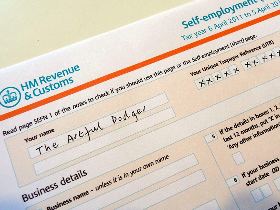
 At an event at the London Palladium on 6 December staged to protest against elements in the recent Budget, the Conservative leader, Kemi Badenoch, was asked whether she would introduce a flat-rate income tax if the Conservatives were returned to government. She replied that it was a very attractive idea. But first the economy would need ‘rewiring’ so that the tax burden could be lightened.
A flat-rate income tax system could take various forms, but the main feature is that there is a single rate of income tax. The specific rate would depend on how much the government wanted to raise. Also it could apply to just income tax, or to both income tax and social insurance (national insurance contributions (NICs) in the UK), or to income tax, social insurance and the withdrawal rate of social benefits. It could also apply to local/state taxes as well as national/federal taxes.
Take the simplest case of a flat-rate income tax with no personal allowance. In this system the marginal and average rate of tax is the same for everyone. This is known as a proportional tax.
Most countries have a progressive income tax system. This normally involves personal allowances (i.e. a zero rate up to a certain level of income) and then various tax bands, with the marginal rate rising when particular tax thresholds are reached. In England, Wales and Northern Ireland, there are three tax bands: 20%, 40% and 45%. Thus the higher a person’s income is, the higher their average rate of tax.
A regressive tax, by contrast, would be one where the average rate of tax fell as incomes rose. The extreme case of a regressive tax would be a lump-sum tax (such as a TV or other licence), which would be same absolute amount for everyone liable to it, irrespective of their income. This was the case with the ‘poll tax’ (or Community Charge, to give it its official title), introduced by Margaret Thatcher’s government in 1989 in Scotland and 1990 in the rest of the UK. It was a local tax, with each taxpayer taxed the same fixed sum, with the precise amount being set by each local authority. After protests and riots, it was replaced in 1993 by the current system of local taxation (Council Tax) based on property values in bands.
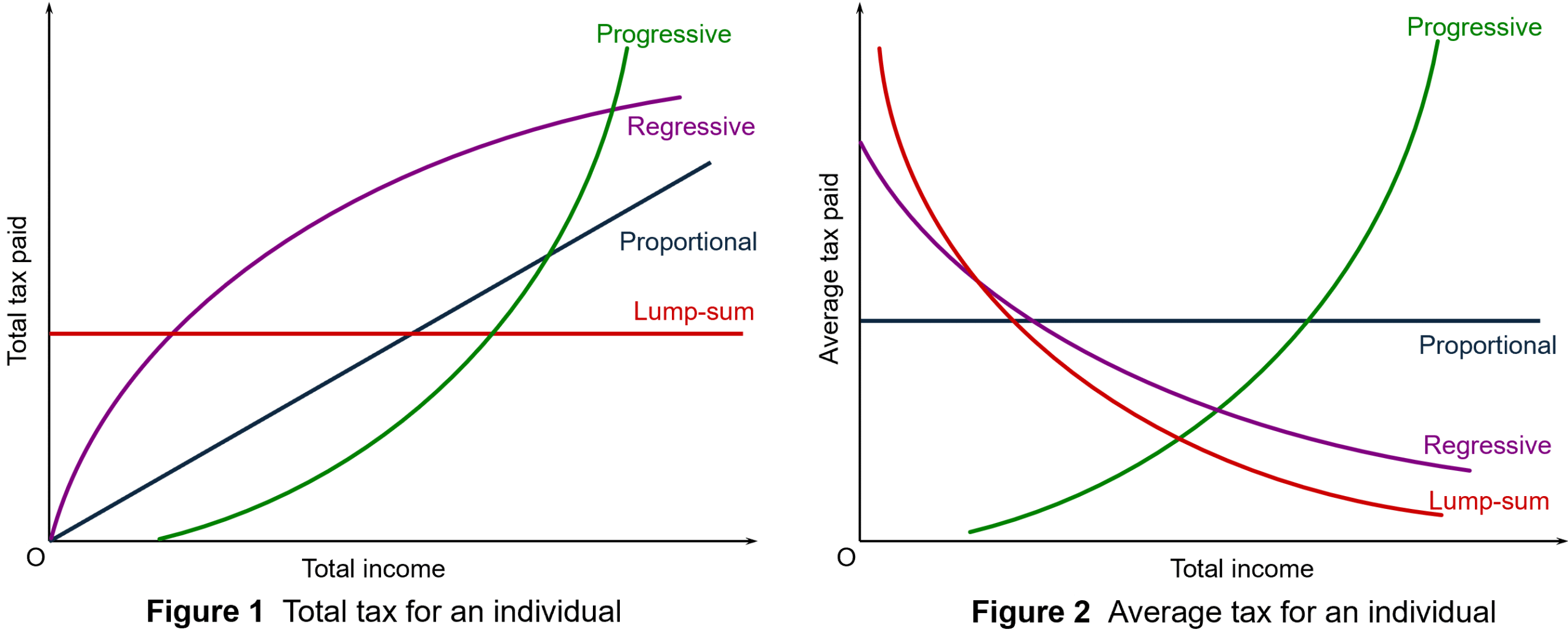
Figures 1 and 2 illustrate these different categories of tax: see Figure 11.12 in Economics, 12th edition. (Click here for a PowerPoint.) Income taxes in most countries are progressive, although just how progressive depends on the differences between the tax bands and the size of personal tax-free allowances. A flat-rate income tax with no allowances is shown by the black line in each diagram, the slope in Figure 1 and the height in Figure 2 depending on the tax rate.
Arguments for a flat-rate income tax
Generally, arguments in favour of flat-rate taxes come from the political right. The two main arguments in favour are tax simplification and incentives.
Advocates argue that a flat tax system makes tax collection easier and makes tax evasion harder. If there are no exemptions, then it can be easier to check that people are paying their taxes and working out the correct amount they owe. It is argued that, in contrast, high tax rates on top earners can encourage tax evasion.
Flat taxes can also be part of a drive to reduce the size of the informal economy. As the VoxEU article states:
Unlike progressive taxes, which include complex and numerous exceptions left to the tax collectors’ discretion, the flat tax is clear cut. In combination with the low rate, its simplicity considerably reduces the stimuli for being informal.
Several post-communist countries in Eastern Europe adopted flat taxes, but for most they were seen as a temporary measure to reduce the informal sector and clamp down on tax evasion. Most have now adopted progressive taxes, with the exceptions of Bulgaria and until recently Russia.
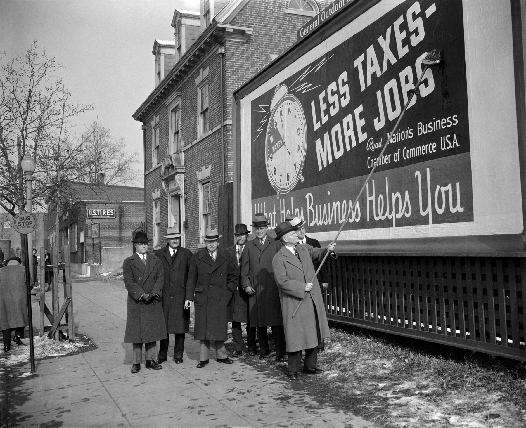 The second major argument is that lower taxes for higher earners, especially for entrepreneurs, can act as a positive incentive. People work harder and there is more investment. The argument here is that the positive substitution effect from the lower tax (work is more profitable now and hence people substitute work for leisure) is greater than the negative income effect (lower taxes increase take-home pay so that people do not need to work so much now to maintain their standard of living).
Then there is the question of tax evasion. With high rates of income tax for top earners, such people may employ accountants to exploit tax loopholes and hide earnings. This could be seen as highly unfair by middle-income earners who are still paying relatively high rates of tax. Even though a move to flat taxes is likely to mean a cut in tax rates for high earners, the tax take from them could be higher. There is evidence that post-communist and developing countries that have adopted flat taxes have found an increase in tax revenues as evasion is harder.
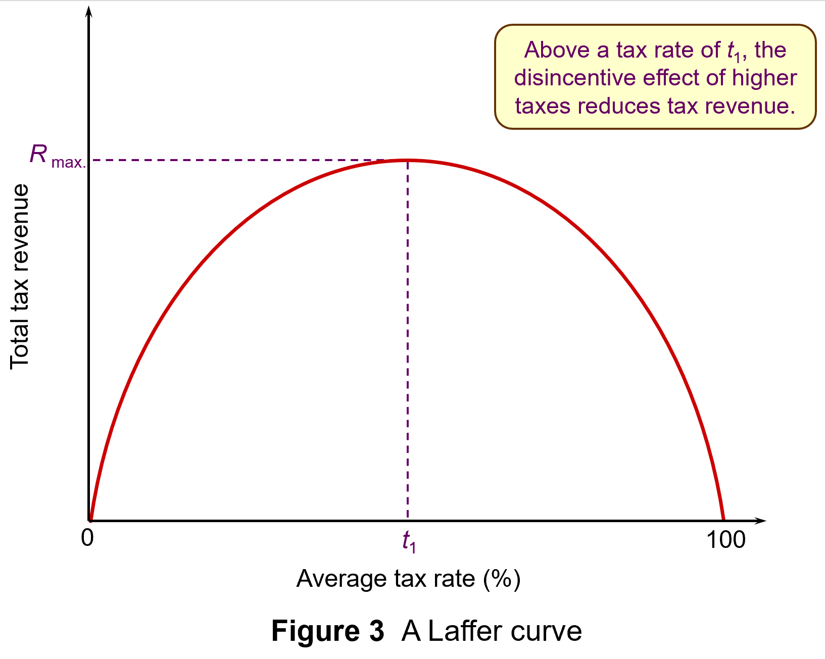 The Laffer curve is often used to illustrate such arguments that high top tax rates can lead to lower tax revenue. Professor Art Laffer was one of President Reagan’s advisers during his first administration (1981–4): see Box 11.3 in Economics, 11th edition. Laffer was a strong advocate of income tax cuts, arguing that substantial increases in output would result and that tax revenues could consequently increase.
The Laffer curve in Figure 3 shows tax revenues increasing as the tax rate increases – but only up to a certain tax rate (t1). Thereafter, tax rates become so high that the resulting fall in output more than offsets the rise in tax rate. When the tax rate reaches 100 per cent, the revenue will once more fall to zero, since no one will bother to work. (Click here for a PowerPoint)
However, as Box 11.3 explains, evidence suggests that tax rates in most countries were well below t1 in the 1980s and certainly are now, given the cuts in income tax rates that have been made around the world over the past 20 years.
Arguments against flat-rate income taxes
 The main argument against moving from a progressive to a flat-rate income tax in an advanced country, such as the UK, is that is would involve a large-scale redistribution of income from the poor to the rich. If the tax were designed to raise the same amount of revenue as at present, those on low incomes would pay more tax than now, as their tax rate would rise to the new flat rate. Those on high incomes would pay less tax, as their marginal rate would fall to the new flat rate.
If a new flat-rate tax in the UK also replaced national insurance contributions (NICs), then the effect would be less extreme as NICs are currently initially progressive, as there is a personal allowance before the 8% rate is applied (on incomes above £12 570 in 2024/25). But above a higher NI threshold (£50 270 in 2024/25), the marginal rate drops to 2%, making it a regressive tax beyond that level. Figure 4 shows tax and NI rates in England, Wales and Northern Ireland for 2024/25. (Click here for a PowerPoint.)
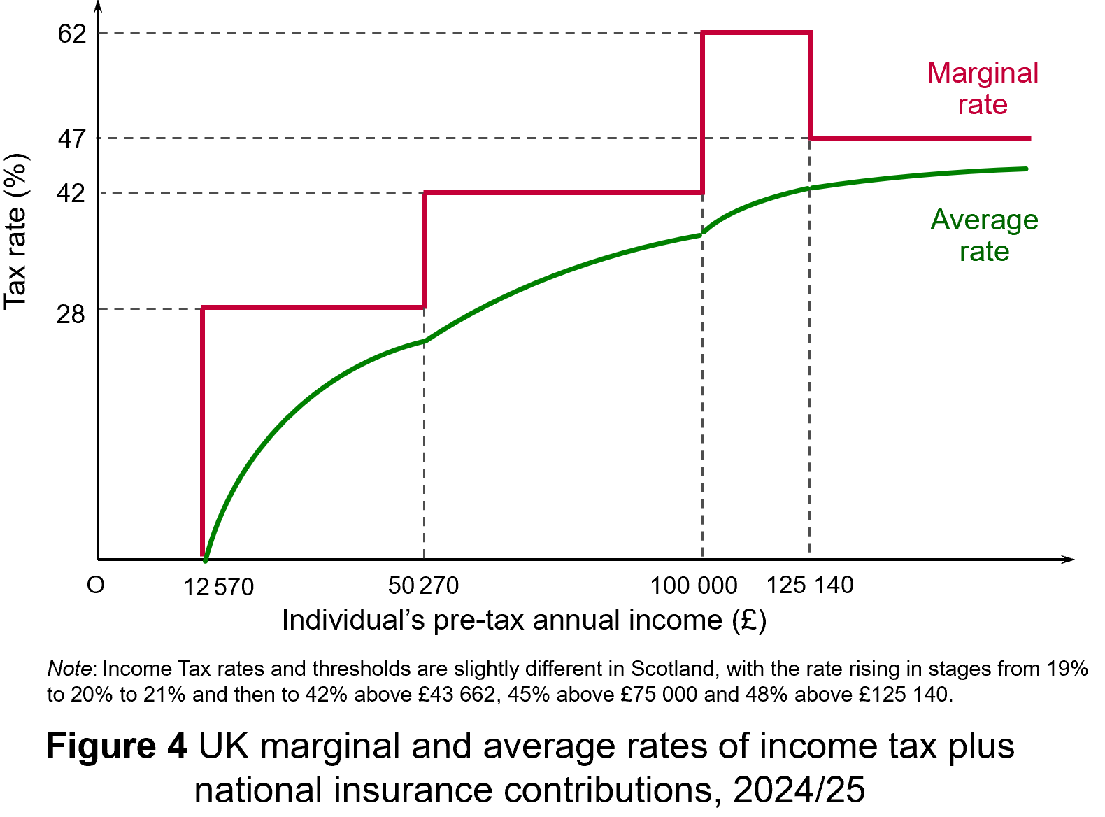 Nevertheless, even if a new flat-rate tax replaced NICs as well as varying rates of income tax, it would still involve a large-scale redistribution from low-income earners to high-income earners. The effect would be mitigated somewhat if personal allowances were raised so that the tax only applied to mid-to-higher incomes. Then the redistribution would be from middle-income earners to high-income earners and also somewhat to low-income earners: i.e. those below, or only a little above, the new higher personal allowance. If, on the other hand, personal allowances were scrapped so that the flat tax applied to all incomes, then there would be a massive redistribution from people on low incomes, including very low incomes, to those on high incomes.
 One of the arguments used to justify a flat-rate tax is that its simplicity would ensure greater compliance. But in an advanced country, compliance is high, except, perhaps, for those on very high incomes. Most people in the UK and many other countries, have tax deducted automatically from their wages. People cannot avoid such taxes.
As far as the self-employed are concerned, they file tax returns online and the software automatically works out the tax due. There are no complex calculations that have to be performed by the individual. There is come scope for tax evasion by charging various expenditures to the business that are really personal spending, but the tax authorities can ask for evidence and sometimes do, with penalties for false claims.
What tax evasion does take place, could still do so with a flat tax. At a rate of, say, 20%, it would still be financially beneficial for a dishonest person to lie if they could get way with it.
Conclusions
If the government did try to introduce a flat-rate income tax, there would probably be an outcry. Also, as some rich people would gain a very large amount of money, the number of people gaining would be lower than the number losing if the total revenue raised were to remain the same. In other words, it would be politically difficult to achieve if the number of losers exceeded the number of gainers.
It is true that if the top rate of income tax were very high, then reducing it might bring in more revenue. But at 45%, or 47% if you include NICs, the top marginal rate in the UK is relatively low compared with other countries. In 2024, the UK had the second lowest top rate of tax out of Western European countries (behind Norway and Switzerland) and only the 16th highest out of 33 European countries when Central and Eastern European countries are also included (see the final ink below under ‘Information’). Reducing the UK’s top rate would be unlikely to bring in more revenue and would redistribute income to high-income earners.
Articles
- Flat tax rate is an ‘attractive idea’, Kemi Badenoch says
The Guardian, Helena Horton (16/12/24)
- Tories could move to a system of ‘flat taxes’ where everyone pays the same rate, Kemi Badenoch indicates
Mail Online, Jason Groves (16/12/24)
- Flat Tax: What It Is and How It Works
Investopedia (8/11/24)
- Flat tax reform in Ukraine: Lessons from Bulgaria
VoxEU, Simeon Djankov (11/12/22)
- Why not… introduce a flat tax?
BBC News, Brian Wheeler (3/7/13)
- Five country cases illustrate how best to improve tax collection
IMF Finance and Development Magazine, Bernardin Akitoby (March 2018)
- Flat taxes and the desire to increase inequality
Funding the Future blog, Richard Murphy (15/5/14)
- Options for a UK ‘flat tax’: some simple simulations
IFS Briefing Note, Stuart Adam and James Browne (August 2006)
- Are the Flat Tax Folks Winning — or Have They Already Won?
Inequality.org, Sam Pizzigati (20/4/24)
Information
Questions
- Distinguish between progressive, proportional, regressive and lump-sum taxes. Into which of these four categories would you place (a) VAT, (b) motor fuel duties, (c) tobacco duties, (d) road-fund licence, (e) inheritance tax? Where the answer is either progressive or regressive, how progressive or regressive are they?
- What are the income and substitution effects of changing tax rates?
- Explain the Laffer curve and consider whether it is likely to be symmetrical.
- Discuss the desirability of having a flat tax set at a relatively high rate (say 25%) with tax-free personal allowances up to the level of income considered to be the poverty threshold. (In the UK the poverty threshold is often defined as 60% of median income.)
- In the London Palladium event where Kemi Badenoch stated that flat taxes were a very attractive idea, she also said that ‘We cannot afford flat taxes where we are now. We need to make sure we rewire our economy so that we can lighten the burden of tax and the regulation on individuals and on those businesses that are just starting out, in particular’. What do you think she meant by this?
- Find out what Bulgaria’s experience of a flat tax of 10% has been.
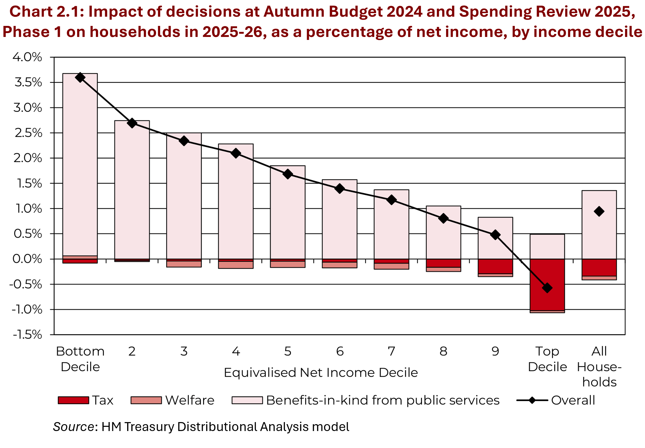 The first Budget of the new UK Labour government was announced on 30 October 2024. It contained a number of measures that will help to tackle inequality. These include extra spending on health and education. This will benefit households on lower incomes the most as a percentage of net income. Increases in tax, by contrast, will be paid predominantly by those on higher incomes. The Chart opposite (taken from the Budget Report) illustrates this. It shows that the poorest 10% will benefit from the largest percentage gain, while the richest 10% will be the only decile that loses.
But one of the major ways of tackling inequality and poverty was raising the minimum wage. The so-called ‘National Living Wage (NLW)’, paid to those aged 21 and over, will rise in April by 6.7% – from £11.44 to £12.41 per hour. The minimum wage paid to those aged 18 to 20 will rise 16.3% from £8.60 to £10.00 and for 16 and 17 year-olds and apprentices it will rise £18% from £6.40 to £7.55.
 It has been an objective of governments for several years to relate the minimum wage to the median wage. In 2015, the Conservative Government set a target of raising the minimum wage rate to 60 per cent of median hourly earnings by 2020. When that target was hit a new one was set to reach two-thirds of median hourly earnings by 2024.
The Labour government has set a new remit for the minimum wage (NLW). There are two floors. The first is the previously agreed one, that the NLW should be at least two-thirds of median hourly earnings; the second is that it should fully compensate for cost of living rises and for expected inflation up to March 2026. The new rate of £12.41 will meet both criteria. According to the Low Pay Commission, ‘Wages have risen faster than inflation over the past 12 months, and are forecast to continue to do so up to March 2026’. This makes the first floor the dominant one: meeting the first floor automatically meets the second.
How effective is the minimum wage in reducing poverty and inequality?
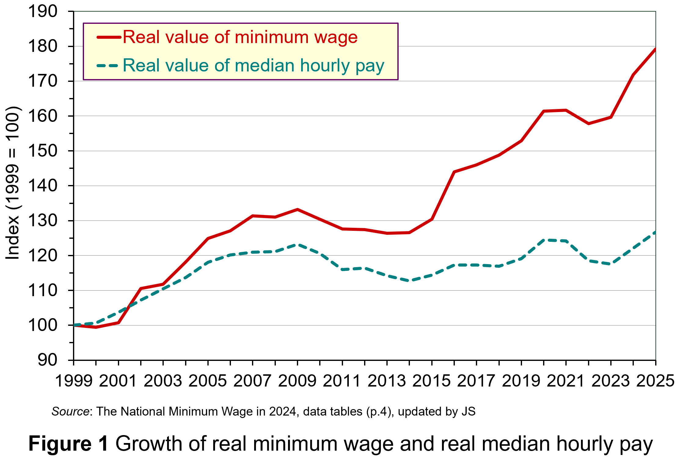 Figure 1 shows the growth in minimum wage rates since their introduction in 1999. The figures are real figures (i.e. after taking into account CPI inflation) and are expressed as an index, with 1999 = 100. The chart also shows the growth in real median hourly pay. (Click here for a Powerpoint.)
As you can see, the growth in real minimum wage rates has considerably exceeded the growth in real median hourly pay. This has had a substantial effect on raising the incomes of the poorest workers and thereby has helped to reduce poverty and inequality.
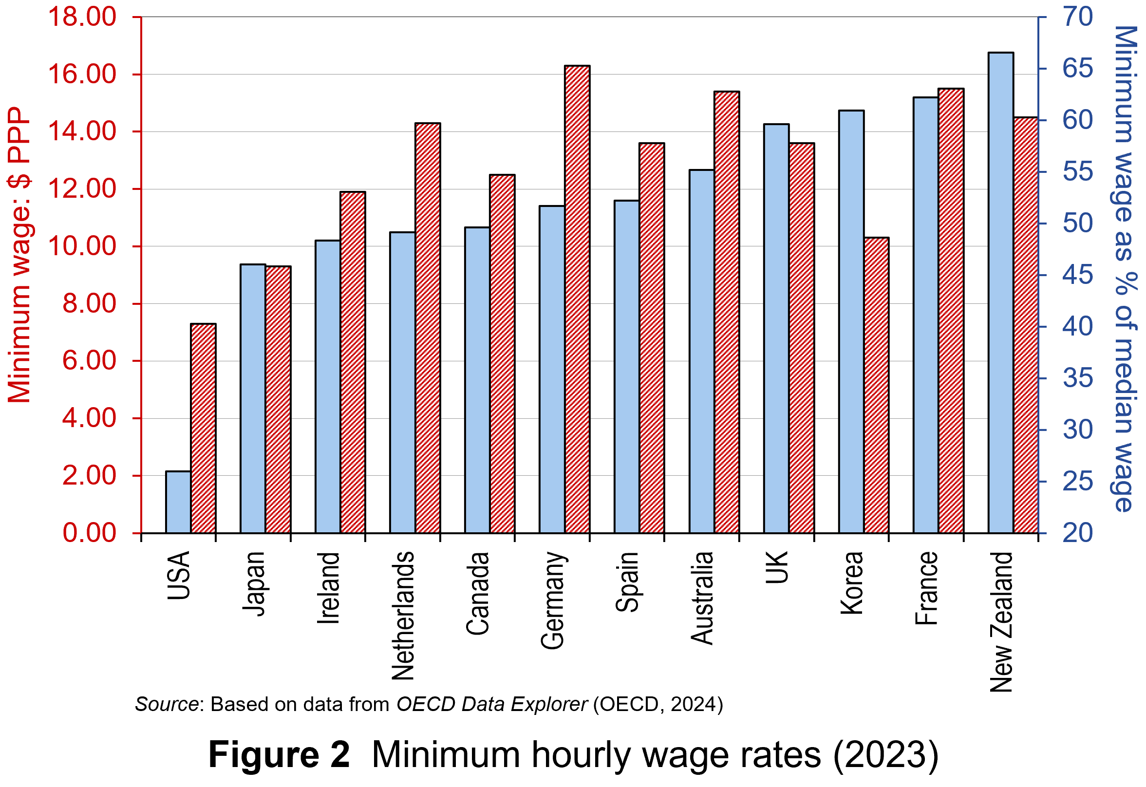 The UK minimum wage compares relatively favourably with other high-income economies. Figure 2 shows minimum wage rates in 12 high-income countries in 2023 – the latest year for which data are available. (Click here for a PowerPoint.) The red bars (striped) show hourly minimum wage rates in US dollars at purchasing-power parity (PPP) rates. PPP rates correct current exchange rates to reflect the purchasing power of each country’s currency. The blue bars (plain) show minimum wage rates as a percentage of the median wage rate. In 2023 the UK had the fourth highest minimum wage of the 12 countries on this measure (59.6%). As we have seen above, the 2025 rate is expected to be 2/3 of the median rate.
Minimum wages are just one mechanism for reducing poverty and inequality. Others include the use of the tax and benefit system to redistribute incomes. The direct provision of services, such as health, education and housing at affordable rents can make a significant difference and, as we have seen, have been a major focus of the October 2024 Budget.
The government has been criticised, however, for not removing the two-child limit to extra benefits in Universal Credit (introduced in 2017). The cap clearly disadvantages poor families with more than two children. What is more, for workers on Universal Credit, more than half of the gains from the higher minimum wages will lost because they will result in lower benefit entitlement. Also the freeze in (nominal) personal income tax allowances will mean more poor people will pay tax even with no rise in real incomes.
Effects on employment: analysis
A worry about raising the minimum wage rate is that it could reduce employment in firms already paying the minimum wage and thus facing a wage rise.
In the case of a firm operating in competitive labour and goods markets, the demand for low-skilled workers is relatively wage sensitive. Any rise in wage rates, and hence prices, by this firm alone would lead to a large fall in sales and hence in employment.
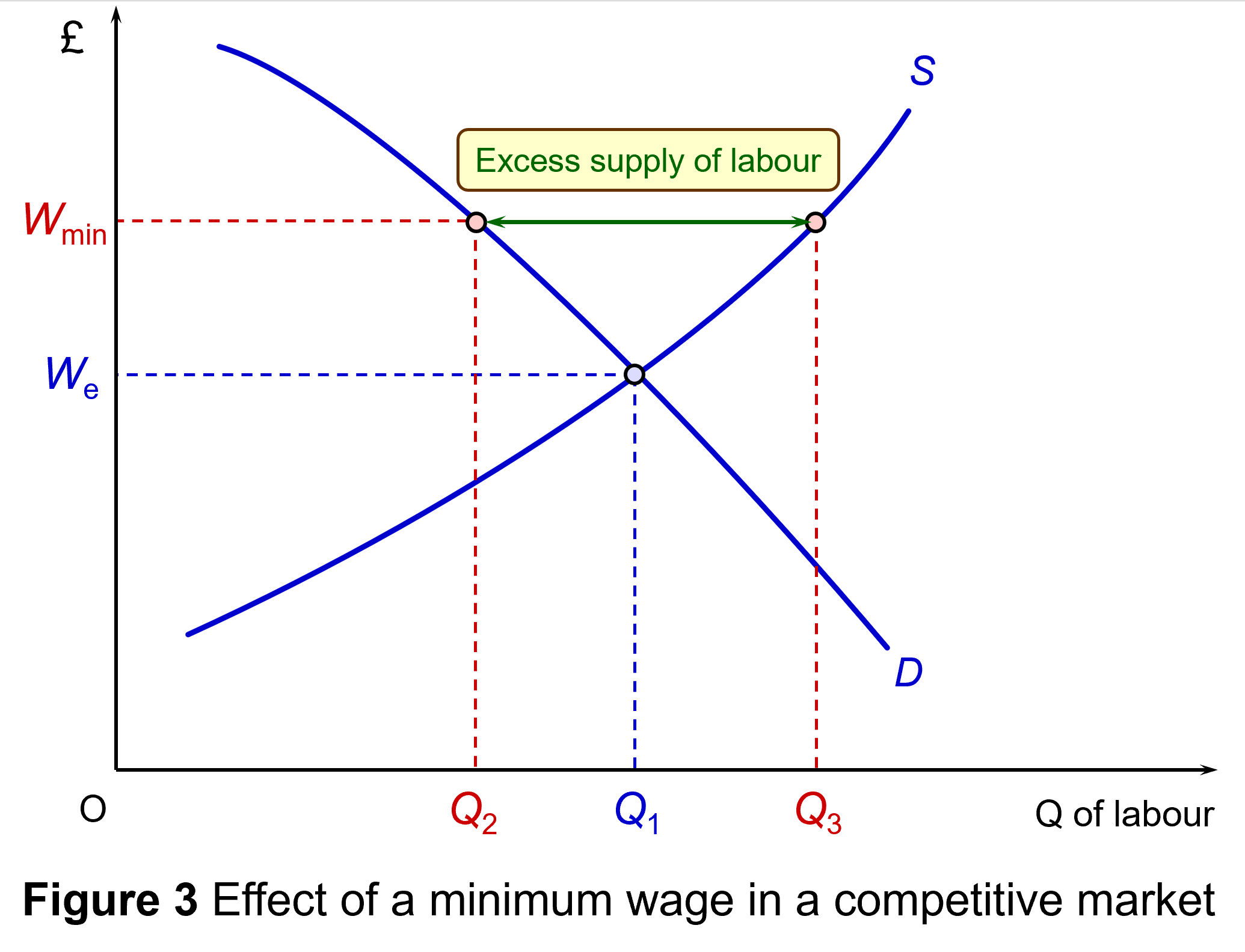 This is illustrated in Figure 3 (click here for a PowerPoint). Assume that the minimum wage is initially the equilibrium wage rate We. Now assume that the minimum wage is raised to Wmin. This will cause a surplus of labour (i.e. unemployment) of Q3 – Q2. Labour supply rises from Q1 to Q3 and the demand for labour falls from Q1 to Q2.
But, given that all firms face the minimum wage, individual employers are more able to pass on higher wages in higher prices, knowing that their competitors are doing the same. The quantity of labour demanded in any given market will not fall so much – the demand is less wage elastic; and the quantity of labour supplied in any given market will rise less – the supply is less wage elastic. Any unemployment will be less than that illustrated in Figure 3. If, at the same time, the economy expands so that the demand-for-labour curve shifts to the right, there may be no unemployment at all.
When employers have a degree of monopsony power, it is not even certain that they would want to reduce employment. This is illustrated in Figure 4: click here for a PowerPoint (you can skip this section if you are not familiar with the analysis).
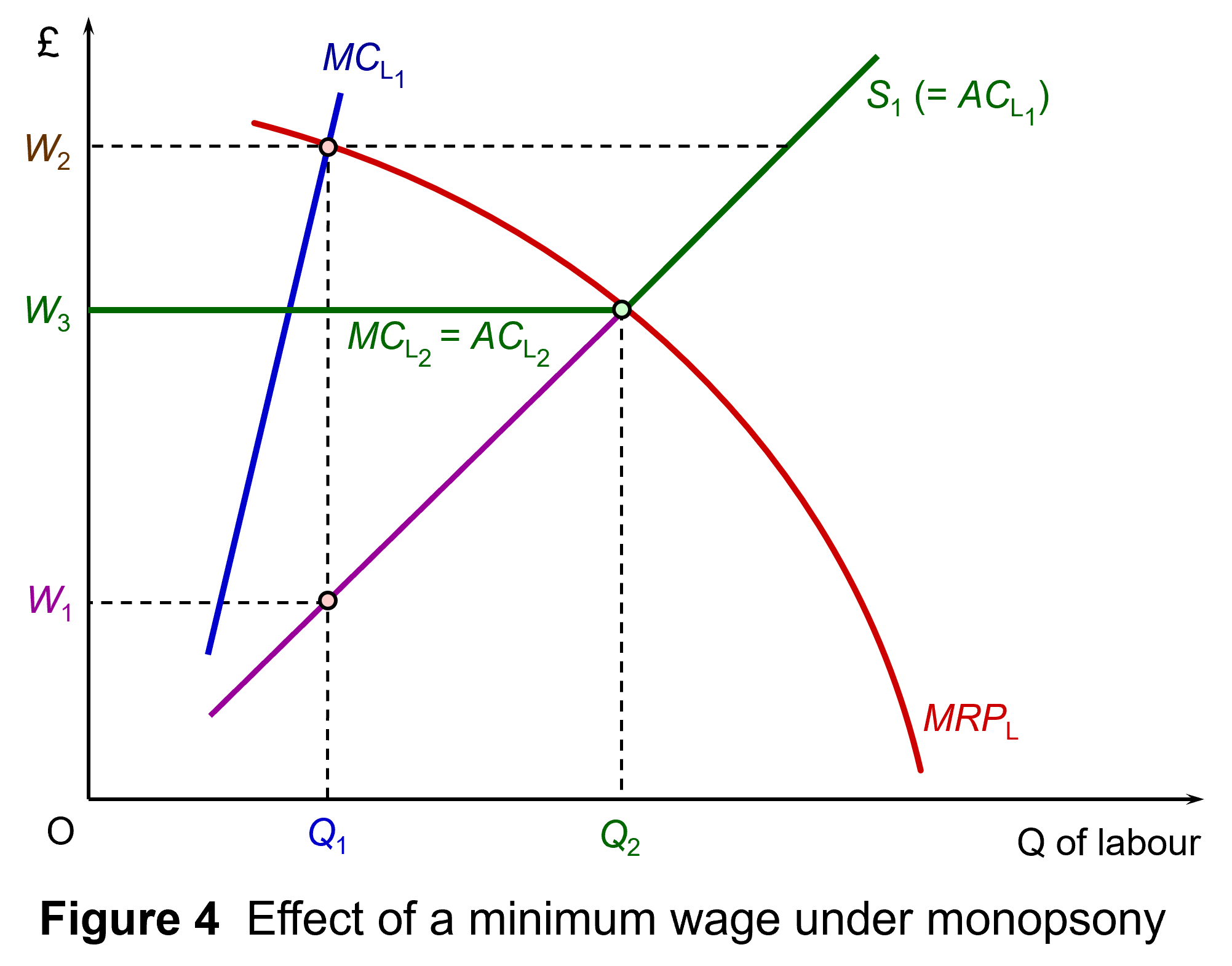 Assume initially that there is no minimum wage. The supply of labour to the monopsony employer is given by curve SL1, which is also the average cost of labour ACL1. A higher employment by the firm will drive up the wage; a lower employment will drive it down. This gives a marginal cost of labour curve of MCL1. Profit-maximising employment will be Q1, where the marginal cost of labour equals the marginal revenue product of labour (MRPL). The wage, given by the SL1 (=ACL1) line will be W1.
Now assume that there is a minimum wage. Assume also that the initial minimum wage is at or below W1. The profit-maximising employment is thus Q1 at a wage rate of W1.
The minimum wage can be be raised as high as W2 and the firm will still want to employ as many workers as at W1. The point is that the firm can no longer drive down the wage rate by employing fewer workers, and so the ACL1 curve becomes horizontal at the new minimum wage and hence will be the same as the MCL curve (MCL2 = ACL2). Profit-maximising employment will be where the MRPL curve equals this horizontal MCL curve. The incentive to cut its workforce, therefore, has been removed.
Again, if we extend the analysis to the whole economy, a rise in the minimum wage will be partly passed on in higher prices or stimulate employers to increase labour productivity. The effect will be to shift the (MRPL) curve upwards to the right, thereby allowing the firm to pass on higher wages and reducing any incentive to reduce employment.
Effects on employment: evidence
There is little evidence that raising the minimum wage in stages will create unemployment, although it may cause some redeployment. In the Low Pay Commission’s 2019 report, 20 years of the National Minimum Wage (see link below), it stated that since 2000 it had commissioned more than 30 research projects looking at the NMW’s effects on hours and employment and had found no strong evidence of negative effects. Employers had adjusted to minimum wages in various ways. These included reducing profits, increasing prices and restructuring their business and workforce.
Along with our commissioned work, other economists have examined the employment effects of the NMW in the UK and have for the most part found no impact. This is consistent with international evidence suggesting that carefully set minimum wages do not have noticeable employment effects. While some jobs may be lost following a minimum wage increase, increasing employment elsewhere offsets this. (p.20)
There is general agreement, however, that a very large increase in minimum wages will impact on employment. This, however, should not be relevant to the rise in the NLW from £11.44 to £12.41 per hour in April 2025, which represents a real rise of around 4.5%. This at worst should have only a modest effect on employment and could be offset by economic growth.
 What, however, has concerned commentators more is the rise in employers’ National Insurance contributions (NICs) that were announced in the Budget. In April 2025, the rate will increase from 13.8% to 15%. Employers’ NICs are paid for each employee on all wages above a certain annual threshold. This threshold will fall in April from £9100 to £5000. So the cost to an employer of an employee earning £38 000 per annum in 2024/25 would be £38 000 + ((£38 000 – £9100) × 0.138) = £41 988.20. For the year 2025/26 it will rise to £38 000 + ((£38 000 – £5000) × 0.15) = £42 950. This is a rise of 2.29%. (Note that £38 000 will be approximately the median wage in 2025/26.)
However, for employees on the new minimum wage, the percentage rise in employer NICs will be somewhat higher. A person on the new NLW of £12.41, working 40 hours per week and 52 weeks per year (assuming paid holidays), will earn an annual wage of £25 812.80. Under the old employer NIC rates, the employer would have paid (£25 812.80 + (£25 812.80 – £9100) × 0.138) = £28 119.17. For the year 2025/26, it will rise to £25 812.80 + ((£25 812.80 – £5000) × 0.15) = £28 934.72. This is a rise of 2.90%.
This larger percentage rise in employers’ wage costs for people on minimum wages than those on median wages, when combined with the rise in the NLW, could have an impact on the employment of those on minimum wages. Whether it does or not will depend on how rapid growth is and how much employers can absorb the extra costs through greater productivity and/or passing on the costs to their customers.
Articles
- National Living Wage to increase to £12.21 in April 2025
Low Pay Commission, Press Release (29/10/24)
- Rachel Reeves hands low-paid a £1,400 boost as minimum wage to rise by 6.7%
Independent, Archie Mitchell and Millie Cooke (31/10/24)
- Minimum wage to rise to £12.21 an hour next year
BBC News, Michael Race (29/10/24)
- What Labour’s first budget means for wages, taxes, business, the NHS and plans to grow the economy – experts explain
The Conversation, Rachel Scarfe et al. (30/10/24)
- The two-child limit: poverty, incentives and cost
Institute for Fiscal Studies, Eduin Latimer and Tom Waters (17/6/24)
UK Government reports and information
Data
Questions
- How is the October 2024 Budget likely to affect the distribution of income?
- What are the benefits and limitations of statutory minimum wages in reducing (a) poverty and (b) inequality?
- Under what circumstances will a rise in the minimum wage lead or not lead to an increase in unemployment?
- Find out what is meant by the UK Real Living Wage (RLW) and distinguish it from the UK National Living Wage (NLW). Why is the RLW higher?
- Why is the median wage rather than the mean wage used in setting the NLW?
 We continue to live through incredibly turbulent times. In the past decade or so we have experienced a global financial crisis, a global health emergency, seen the UK’s departure from the European Union, and witnessed increasing levels of geopolitical tension and conflict. Add to this the effects from the climate emergency and it easy to see why the issue of economic uncertainty is so important when thinking about a country’s economic prospects.
In this blog we consider how we can capture this uncertainty through a World Uncertainty Index and the ways by which economic uncertainty impacts on the macroeconomic environment.
World Uncertainty Index
Hites Ahir, Nicholas Bloom and Davide Furceri have constructed a measure of uncertainty known as the World Uncertainty Index (WUI). This tracks uncertainty around the world using the process of ‘text mining’ the country reports produced by the Economist Intelligence Unit. The words searched for are ‘uncertain’, ‘uncertainty’ and ‘uncertainties’ and a tally is recorded based on the number of times they occur per 1000 words of text. To produce the index this figure is then multiplied up by 100 000. A higher number therefore indicates a greater level of uncertainty. For more information on the construction of the index see the 2022 article by Ahir, Bloom and Furceri linked below.
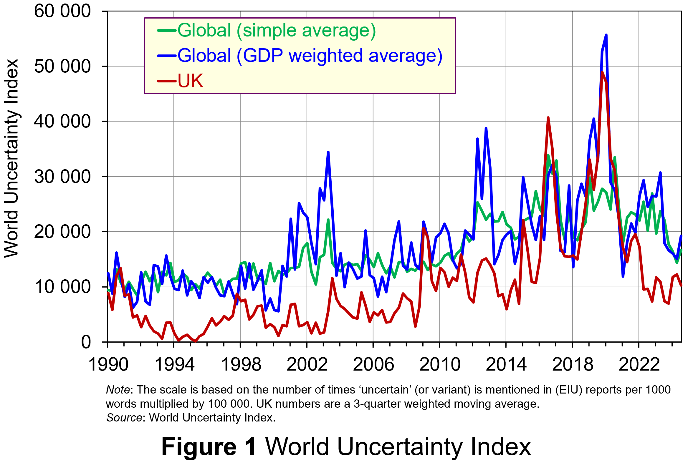 Figure 1 (click here for a PowerPoint) shows the WUI both globally and in the UK quarterly since 1991. The global index covers 143 countries and is presented as both a simple average and a GDP weighted average. The UK WUI is also shown. This is a three-quarter weighted average, the authors’ preferred measure for individual countries, where increasing weights of 0.1, 0.3 and 0.6 are used for the three most recent quarters.
From Figure 1 we can see how the level of uncertainty has been particularly volatile over the past decade or more. Events such as the sovereign debt crisis in parts of Europe in the early 2010s, the Brexit referendum in 2016, the COVID-pandemic in 2020–21 and the invasion of Ukraine in 2022 all played their part in affecting uncertainty domestically and internationally.
Uncertainty, risk-aversion and aggregate demand
Now the question turns to how uncertainty affects economies. One way of addressing this is to think about ways in which uncertainty affects the choices that people and businesses make. In doing so, we could think about the impact of uncertainty on components of aggregate demand, such as household consumption and investment, or capital expenditures by firms.
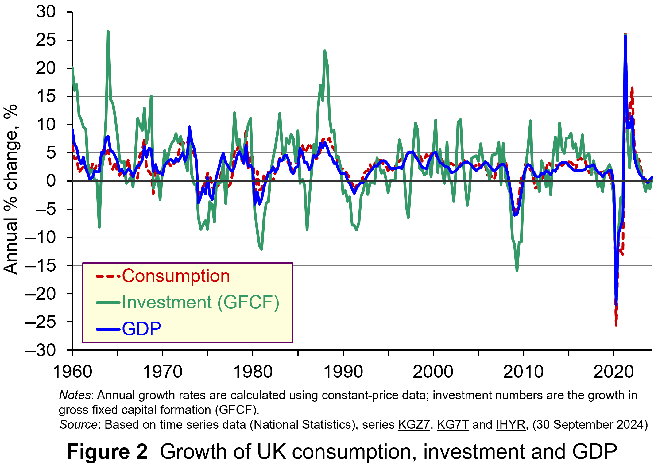 As Figure 2 shows (click here for a PowerPoint), investment is particularly volatile, and much more so than household spending. Some of this can be attributed to the ‘lumpiness’ of investment decisions since these expenditures tend to be characterised by indivisibility and irreversibility. This means that they are often relatively costly to finance and are ‘all or nothing’ decisions. In the context of uncertainty, it can make sense therefore for firms to wait for news that makes the future clearer. In this sense, we can think of uncertainty rather like a fog that firms are peering through. The thicker the fog, the more uncertain the future and the more cautious firms are likely to be.
The greater caution that many firms are likely to adopt in more uncertain times is consistent with the property of risk-aversion that we often attribute to a range of economic agents. When applied to household spending decisions, risk-aversion is often used to explain why households are willing to hold a buffer stock of savings to self-insure against unforeseen events and their future financial outcomes being worse than expected. Hence, in more uncertain times households are likely to want to increase this buffer further.
 The theory of buffer-stock saving was popularised by Christopher Carroll in 1992 (see link below). It implies that in the presence of uncertainty, people are prepared to consume less today in order to increase levels of saving, pay off existing debts, or borrow less relative to that in the absence of uncertainty. The extent of the buffer of financial wealth that people want to hold will depend on their own appetite for risk, the level of uncertainty, and the moderating effect from their own impatience and, hence, present bias for consuming today.
Risk aversion is consistent with the property of diminishing marginal utility of income or consumption. In other words, as people’s total spending volumes increase, their levels of utility or satisfaction increase but at an increasingly slower rate. It is this which explains why individuals are willing to engage with the financial system to reallocate their expected life-time earnings and have a smoother consumption profile than would otherwise be the case from their fluctuating incomes.
Yet diminishing marginal utility not only explains consumption smoothing, but also why people are willing to engage with the financial system to have financial buffers as self-insurance. It explains why people save more or borrow less today than suggested by our base-line consumption smoothing model. It is the result of people’s greater dislike (and loss of utility) from their financial affairs being worse than expected than their like (and additional utility) from them being better than expected. This tendency is only likely to increase the more uncertain times are. The result is that uncertainty tends to lower household consumption with perhaps ‘big-ticket items’, such as cars, furniture, and expensive electronic goods, being particularly sensitive to uncertainty.
Uncertainty and confidence
Uncertainty does not just affect risk; it also affects confidence. Risk and confidence are often considered together, not least because their effects in generating and transmitting shocks can be difficult to disentangle.
We can think of confidence as capturing our mood or sentiment, particularly with respect to future economic developments. Figure 3 plots the Uncertainty Index for the UK alongside the OECD’s composite consumer and business confidence indicators. Values above 100 for the confidence indicators indicate greater confidence about the future economic situation and near-term business environment, while values below 100 indicate pessimism towards the future economic and business environments.
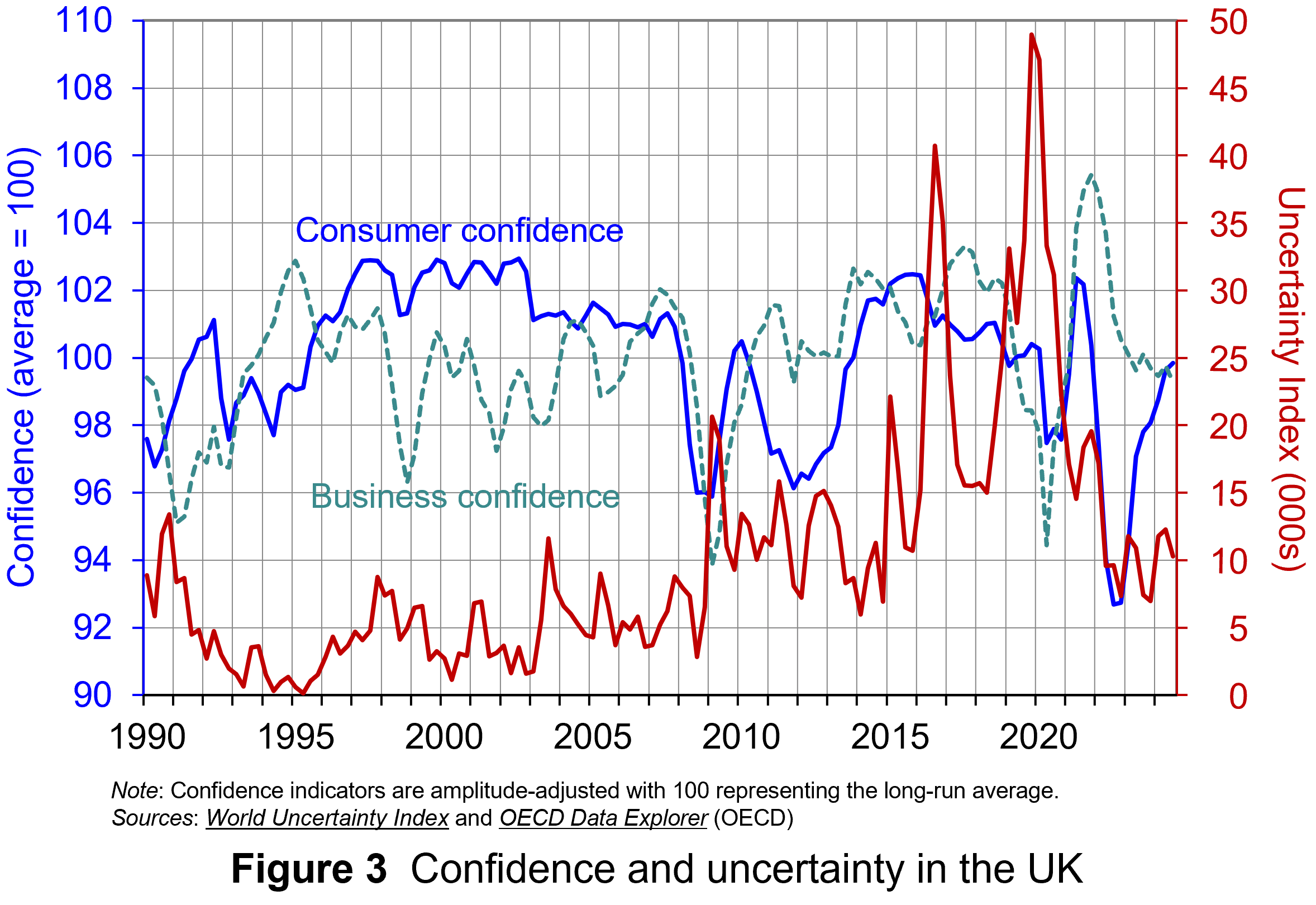 Figure 3 suggests that the relationship between confidence and uncertainty is rather more complex than perhaps is generally understood (click here for a PowerPoint). Haddow, Hare, Hooley and Shakir (see link below) argue that the evidence tends to point to changes in uncertainty affecting confidence, but with less evidence that changes in confidence affect uncertainty.
To illustrate this, consider the global financial crisis of the late 2000s. The argument can be made that the heightened uncertainty about future prospects for households and businesses helped to erode their confidence in the future. The result was that people and businesses revised down their expectations of the future (pessimism). However, although people were more pessimistic about the future, this was more likely to have been the result of uncertainty rather than the cause of further uncertainty.
Conclusion
For economists and policymakers alike, indicators of uncertainty, such as the Ahir, Bloom and Furceri World Uncertainty Index, are invaluable tools in understanding and forecasting behaviour and the likely economic outcomes that follow. Some uncertainty is inevitable, but the persistence of greater uncertainty since the global financial crisis of the late 2000s compares quite starkly with the relatively lower and more stable levels of uncertainty seen from the mid-1990s up to the crisis. Hence the recent frequency and size of changes in uncertainty show how important it to understand how uncertainty effects transmit through economies.
Academic papers
- The World Uncertainty Index
National Bureau of Economic Research, Working Paper 29763, Hites Ahir, Nicholas Bloom and Davide Furceri (February 2022)
- The Buffer-Stock Theory of Saving: Some Macroeconomic Evidence
Brookings Papers on Economic Activity, Christopher D Carroll (Vol 2, 1992)
- Macroeconomic uncertainty: what is it, how can we measure it and why does it matter?
Bank of England Quarterly Bulletin, 2013 Q2, Abigail Haddow, Chris Hare, John Hooley and Tamarah Shakir (13/6/13)
Articles
Data
Questions
- (a) Explain what is meant by the concept of diminishing marginal utility of consumption.
(b) Explain how this concept helps us to understand both consumption smoothing and the motivation to engage in buffer-stock saving.
- Explain the distinction between confidence and uncertainty when analysing macroeconomic shocks.
- Discuss which types of expenditures you think are likely to be most susceptible to uncertainty shocks.
- Discuss how economic uncertainty might affect productivity and the growth of potential output.
- How might the interconnectedness of economies affect the transmission of uncertainty effects through economies?
 A common practice of international investors is to take part in the so-called ‘carry trade’. This involves taking advantage of nominal interest rate differences between countries. For example, assume that interest rates are low in Japan and high in the USA. It is thus profitable to borrow yen in Japan at the low interest rate, exchange it into US dollars and deposit the money at the higher interest rate available in the USA. If there is no change in the exchange rate between the dollar and the yen, the investor makes a profit equal to the difference in the interest rates.
Rather than depositing the money in a US bank account, an alternative is to purchase US bonds or other assets in the USA, where the return is again higher than that in Japan.
If, however, interest-rate differentials narrow, there is the possibility of the carry trade ‘unwinding’. Not only may the carry trade prove unprofitable (or less so), but investors may withdraw their deposits and pay back the loans. This, as we shall, can have adverse consequences on exchange rates.
The problem of an unwinding of the carry trade is not new. It worsened the underlying problems of the financial crisis in 2008. The question today is whether history is about to repeat itself with a new round of unwinding of the carry trade threatening economic growth and recovery around the world.
We start by looking at what happened in 2008.
The carry trade and the 2008 financial crisis
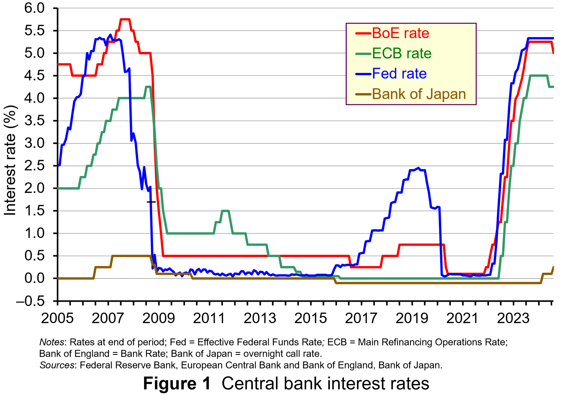 Prior to the financial crisis of 2008, current account deficit countries, such as the UK, USA and Australia, typically had relatively high interest rates, while current account surplus countries such as Japan and Switzerland had relatively low ones. Figure 1 shows central bank interest rates from 2005 to the current day (click here for a PowerPoint).
The carry trade saw investors borrowing money in Japan and Switzerland, exchanging it on the foreign exchange market, with the currency then deposited in the UK, USA and Australia. Hundreds of billions worth of dollars were involved in this carry trade.
If, however, the higher interest rates in the UK and other deficit countries were simply to compensate investors for the risk of currency depreciation, then there would be no excessive inflow of finance. The benefit of the higher interest rate would be offset by a depreciating currency. But the carry trade had the effect of making deficit currencies appreciate, thereby further boosting the carry trade by speculation of further exchange rate rises.
Thus the currencies of deficit countries appreciated, making their goods less competitive and worsening their current account deficit. Between 1996 and 2006, the average current account deficits as a percentage of GDP for Australia, the USA and the UK were close to 4½, 4 and 2, respectively. Between January 1996 and December 2006, the broad-based real exchange rate index of the Australian dollar appreciated by 17%, of the US dollar by 4% and of sterling by some 23%.
 Currencies of surplus countries depreciated, making their goods more competitive and further boosting their current account surpluses. For example, between 2004 and 2006 the average current account surpluses as a percentage of GDP for Japan and Switzerland were 3½ and 13, respectively. Their short-term interest rates averaged a mere 0.1% and 1.0% respectively (compared with 3.4%, 4.7% and 5.7% for the USA, the UK and Australia). Yet between January 2004 and December 2006, the real exchange rate index of the yen depreciated by 21%, while that of the Swiss franc depreciated by 6%.
With the credit crunch of 2007/8, the carry trade unwound. Much of the money deposited in the USA had been in highly risky assets, such as sub-prime mortgages. Investors scrambled to sell their assets in the USA, UK and the EU. Loans from Japan and Switzerland were repaid and these countries, seen as ‘safe havens’, attracted deposits. The currencies of deficit countries, such as the UK and USA, began to depreciate and those of surplus countries, such as Japan and Switzerland, began to appreciate. Between September 2007 and September 2008, the real exchange rate indices of the US dollar and sterling depreciated by 2% and 13% respectively; the yen and the Swiss franc appreciated by 3% and 2¾%.
This represented a ‘double whammy’ for Japanese exporters. Not only did its currency appreciate, making its exports more expensive in dollars, euros, pounds, etc., but the global recession saw consumers around the world buying less. As a result, the Japanese economy suffered the worst recession of the G7 economies.
The carry trade in recent months
Since 2016, there has been a re-emergence of the carry trade as the Fed began raising interest rates while the Bank of Japan kept rates at the ultra low level of –0.1% (see Figure 1). The process slowed down when the USA lowered interest rates in 2020 in response to the pandemic and fears of recession. But when the USA, the EU and the UK began raising rates at the beginning of 2022 in response to global inflationary pressures, while Japan kept its main rate at –0.1%, so the carry trade resumed in earnest. Cross-border loans originating in Japan (not all of it from the carry trade) had risen to ¥157tn ($1tn) by March 2024 – a rise of 21% from 2021.
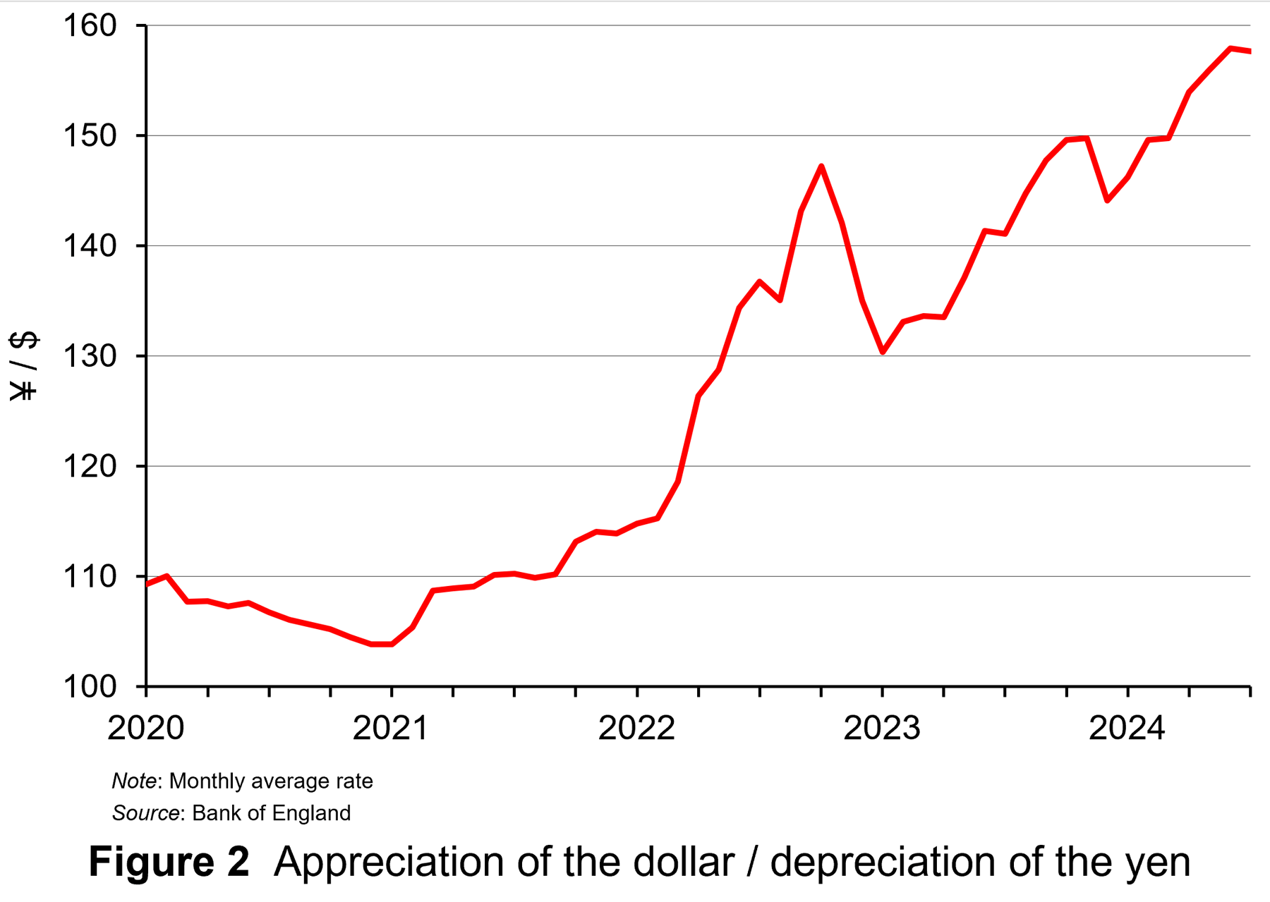 The process boosted US stock markets and contributed to the dollar appreciating against the yen (see Figure 2: click here for a PowerPoint).
Although this depreciation of the yen helped Japanese exports, it also led to rising prices. Japanese inflation rose steadily throughout 2022. In the 12 months to January 2022 the inflation rate was 0.5% (having been negative from October 2020 to August 2021). By January 2023, the annual rate had risen to 4.3% – a rate not seen since 1981. The Bank of Japan was cautious about raising interest rates to suppress this inflation, however, for fear of damaging growth and causing the exchange rate to appreciate and thereby damaging exports. Indeed, quarterly economic growth fell from 1.3% in 2023 Q1 to –1.0% in 2023 Q3.
But then, with growth rebounding and the yen depreciating further, in March 2024 the Bank of Japan decided to raise its key rate from –0.1% to 0.1%. This initially had the effect of stabilising the exchange rate. But then with the yen depreciating further and inflation rising from 2.5% to 2.8% in May and staying at this level in June, the Bank of Japan increased the key rate again at the end of July – this time to 0.25% – and there were expectations that there would be another rise before the end of the year.
At the same time, there were expectations that the Fed would soon lower its main rate (the Federal Funds Rate) from its level of 5.33%. The ECB and the Bank of England had already begun lowering their main rates in response to lower inflation. The carry trade rapidly unwound. Investors sold US, EU and UK assets and began repaying yen loans.
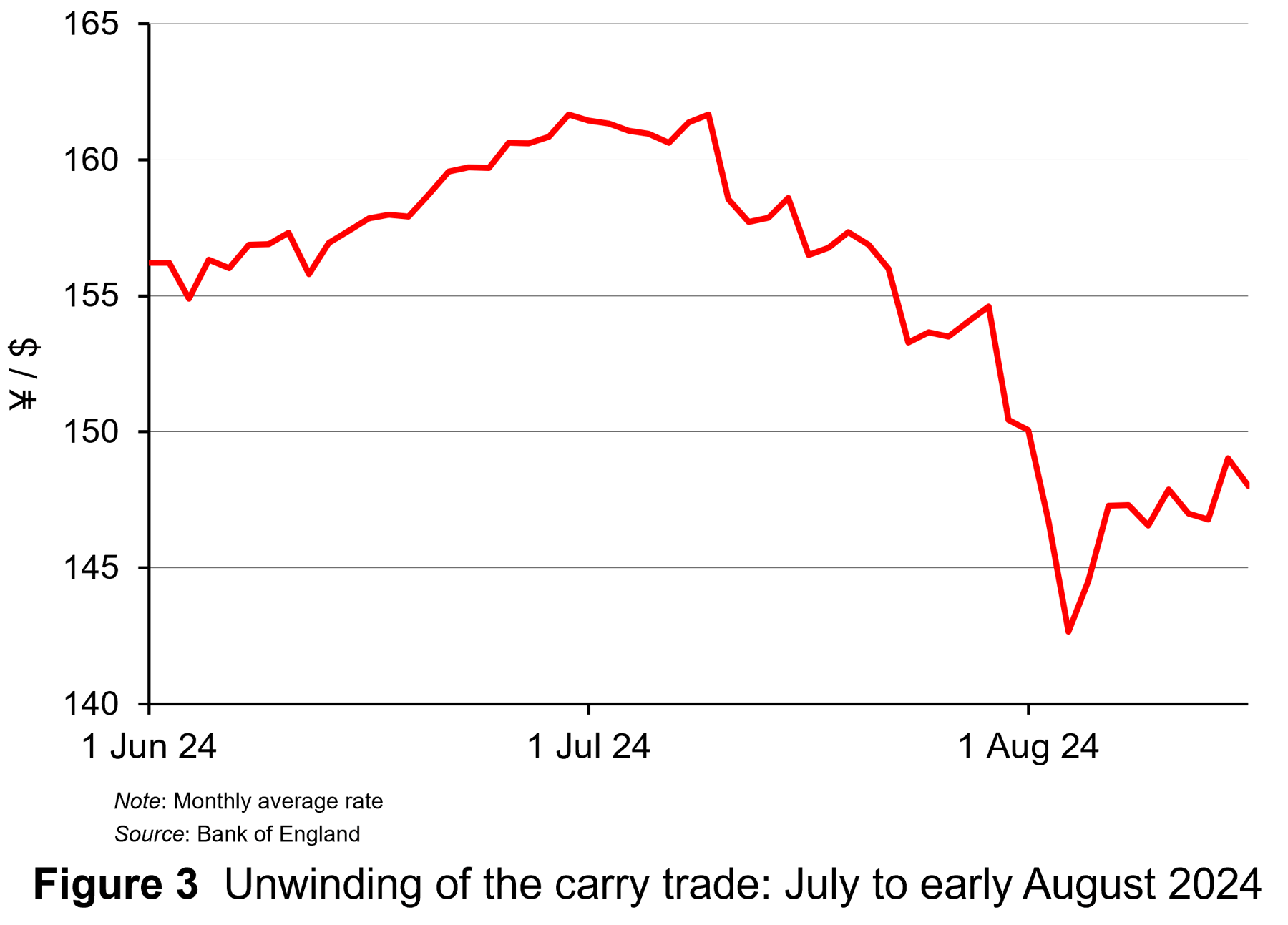 The result was a rapid appreciation of the yen as Figure 3 shows (click here for a PowerPoint). Between 31 July (the date the Bank of Japan raised interest rates the second time) and 5 August, the dollar depreciated against the yen from ¥150.4 to ¥142.7. In other words, the value of 100 yen appreciated from $0.66 to $0.70 – an appreciation of the yen of 6.1%.
Fears about the unwinding of the carry trade led to falls in stock markets around the world. Not only were investors selling shares to pay back the loans, but fears of the continuing process put further downward pressure on shares. From 31 July to 5 August, the US S&P 500 fell by 6.1% and the tech-heavy Nasdaq by 8.0%.
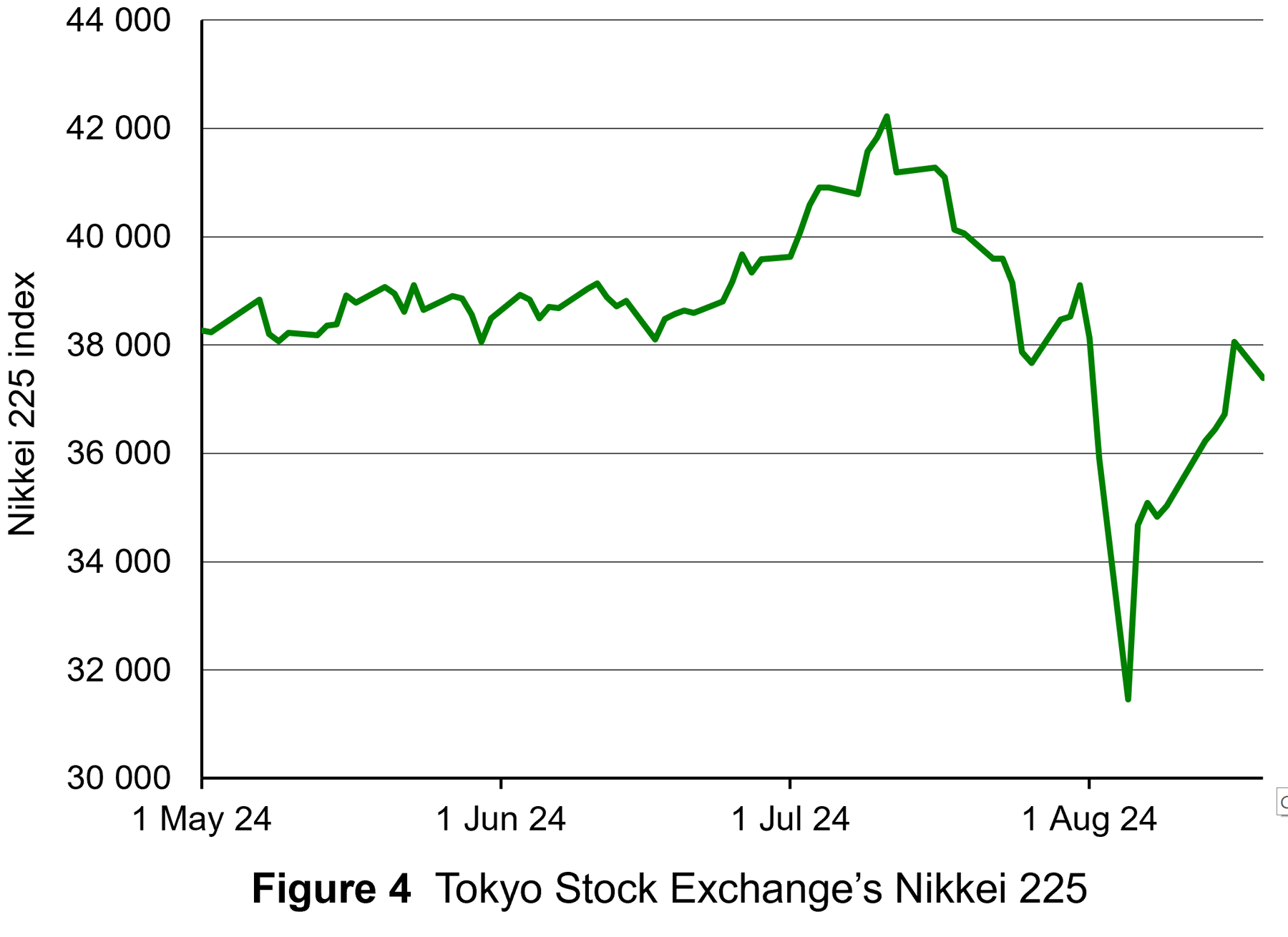 As far as the Tokyo stock market was concerned, the appreciation of the yen sparked fears that the large Japanese export sector would be damaged. Investors rushed to sell shares. Between 31 July and 5 August, the Nikkei 225 (the main Japanese stock market index) fell by 19.5% – its biggest short-term fall ever (see Figure 4: click here for a PowerPoint).
Although the yen has since depreciated slightly (a rise in the yen/dollar rate) and stock markets have recovered somewhat, expectations of many investors are that the unwinding of the yen carry trade has some way to go. This could result in a further appreciation of the yen from current levels of around ¥100 = $0.67 to around $0.86 in a couple of years’ time.
There are also fears about the carry trade in the Chinese currency, the yuan. Some $500 billion of foreign currency holdings have been acquired with yuan since 2022. As with the Japanese carry trade, this has been encouraged by low Chinese interest rates and a depreciating yuan. Not only are Chinese companies investing abroad, but foreign companies operating in China have been using their yuan earnings from their Chinese operations to invest abroad rather than in China. The Chinese carry trade, however, has been restricted by the limited convertibility of the yuan. If the Chinese carry trade begins to unwind when the Chinese economy begins to recover and interest rates begin to rise, the effect will probably be more limited than with the yen.
Articles
- A popular trading strategy just blew up in investors’ faces
CNN, Allison Morrow (7/8/24)
- The big ‘carry trade’ unwind is far from over, strategists warn
CNBC, Sam Meredith (13/8/24)
- Unwinding of yen ‘carry trade’ still threatens markets, say analysts
Financial Times, Leo Lewis and David Keohane (7/8/24)
- The yen carry trade sell-off marks a step change in the business cycle
Financial Times, John Plender (10/8/24)
- Forbes Money Markets Global Markets React To The Japanese Yen Carry Trade Unwind
Forbes, Frank Holmes (12/8/24)
- 7 unwinding carry trades that crashed the markets
Alt21 (26/1/23)
- A carry crash also kicked off the global financial crisis 17 years ago — here’s why it’s unlikely to get as bad this time
The Conversation, Charles Read (9/8/24)
- What is the Chinese yuan carry trade and how is it different from the yen’s?
Reuters, Winni Zhou and Summer Zhen (13/8/24)
- Carry Trade That Blew Up Markets Is Attracting Hedge Funds Again
Yahoo Finance/Bloomberg, David Finnerty and Ruth Carson (16/8/24)
- Currency Carry Trades 101
Investopedia, Kathy Lien (9/8/24)
- Carry Trades Torpedoed The Market. They’re Still Everywhere.
Finimize, Stéphane Renevier (13/8/24)
Questions
- What factors drive the currency carry trade?
- Is the carry trade a form of arbitrage?
- Find out and explain what has happened to the Japanese yen since this blog was written.
- Find out and explain some other examples of carry trades.
- Why are expectations so important in determining the extent and timing of the unwinding of carry trades?
 In the first of a series of updated blogs focusing on the importance of the distinction between nominal and real values we look at the issue of earnings. Here we update the blog Getting Real with Pay written back in February 2019. Then, we noted how the macroeconomic environment since the financial crisis of the late 2000s had continued to affect people’s pay. Specifically, we observed that there had been no growth in real or inflation-adjusted pay. In other words, people were no better off in 2019 than in 2008.
In this updated blog, we consider to what extent the picture has changed five years down the line. While we do not consider the distributional impact on pay, the aggregate picture nonetheless continues to paint a very stark picture, with consequences for living standards and financial wellbeing.
While the distinction between nominal and real values is perhaps best known in relation to GDP and economic growth, the distinction is also applied frequently to analyse the movement of one price relative to prices in general. One example is that of movements in pay (earnings) relative to consumer prices.
Pay reflects the price of labour. The value of our actual pay is our nominal pay. If our pay rises more quickly than consumer prices, then our real pay increases. This means that our purchasing power rises and so the volume of goods and services we can afford increases. On the other hand, if our actual pay rises less quickly than consumer prices then our real pay falls. When real pay falls, purchasing power falls and the volume of goods and services we can afford falls.
Figures from the Office for National Statistics show that in January 2000 regular weekly pay (excluding bonuses and before taxes and other deductions from pay) was £293. By April 2024 this had risen to £640. This is an increase of 118 per cent. Over the same period, the consumer prices index known as the CPIH, which, unlike the better-known CPI, includes owner-occupied housing costs and council tax, rose by 82 per cent. Therefore, the figures are consistent with a rise both in nominal and real pay between January 2000 to April 2024. However, this masks a rather different picture that has emerged since the global financial crisis of the late 2000s.
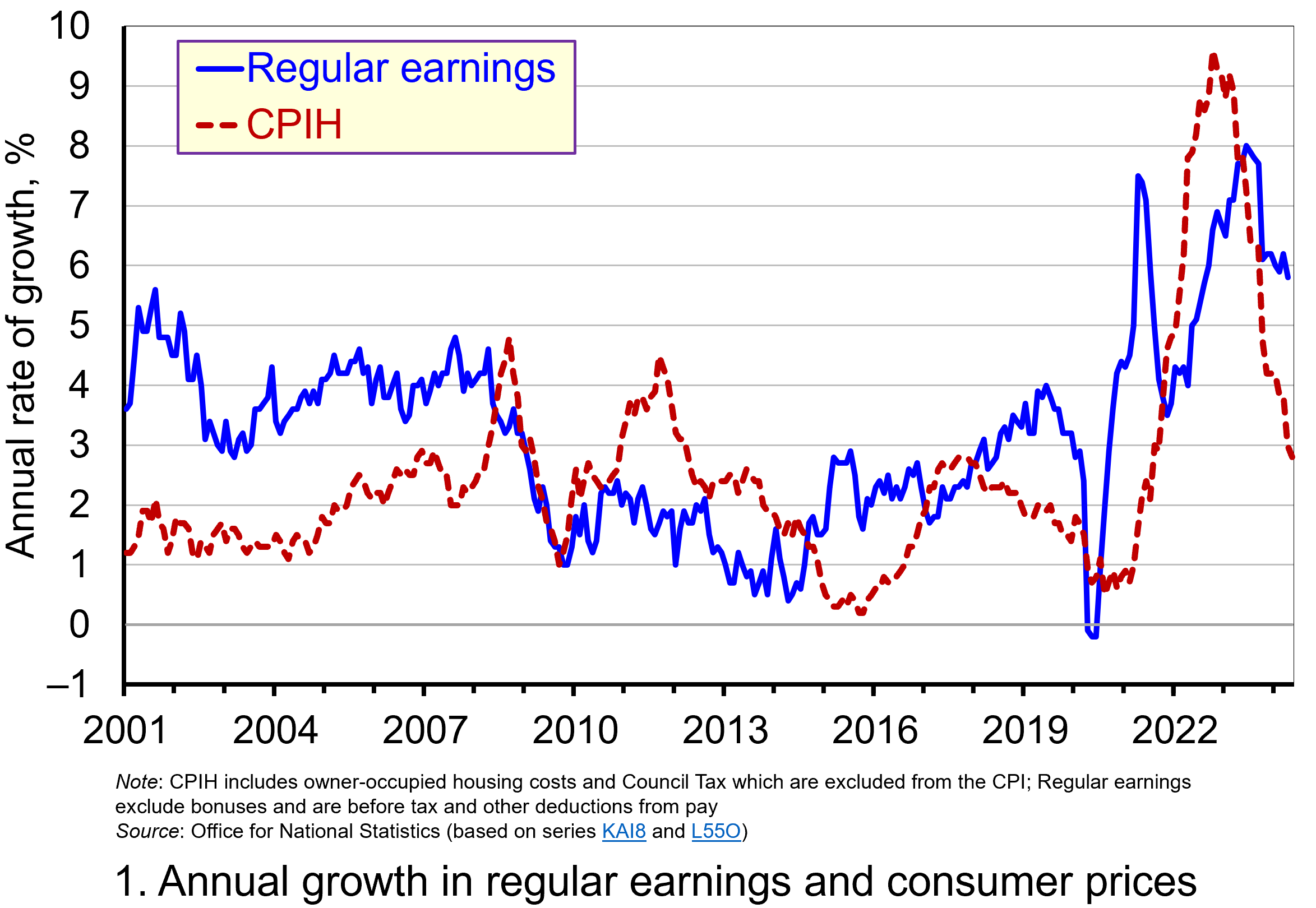 Chart 1 shows the annual percentage changes in actual (nominal) regular weekly pay and the CPIH since January 2001. Each value is simply the percentage change from 12 months earlier. The period up to June 2008 saw the annual growth of weekly pay outstrip the growth of consumer prices – the blue line in the chart is above the red dashed line. Therefore, the real value of pay rose. However, from June 2008 to August 2014 pay growth consistently fell short of the rate of consumer price inflation – the blue line is below the red dashed line. The result was that average real weekly pay fell. (Click here to download a PowerPoint copy of the chart.)
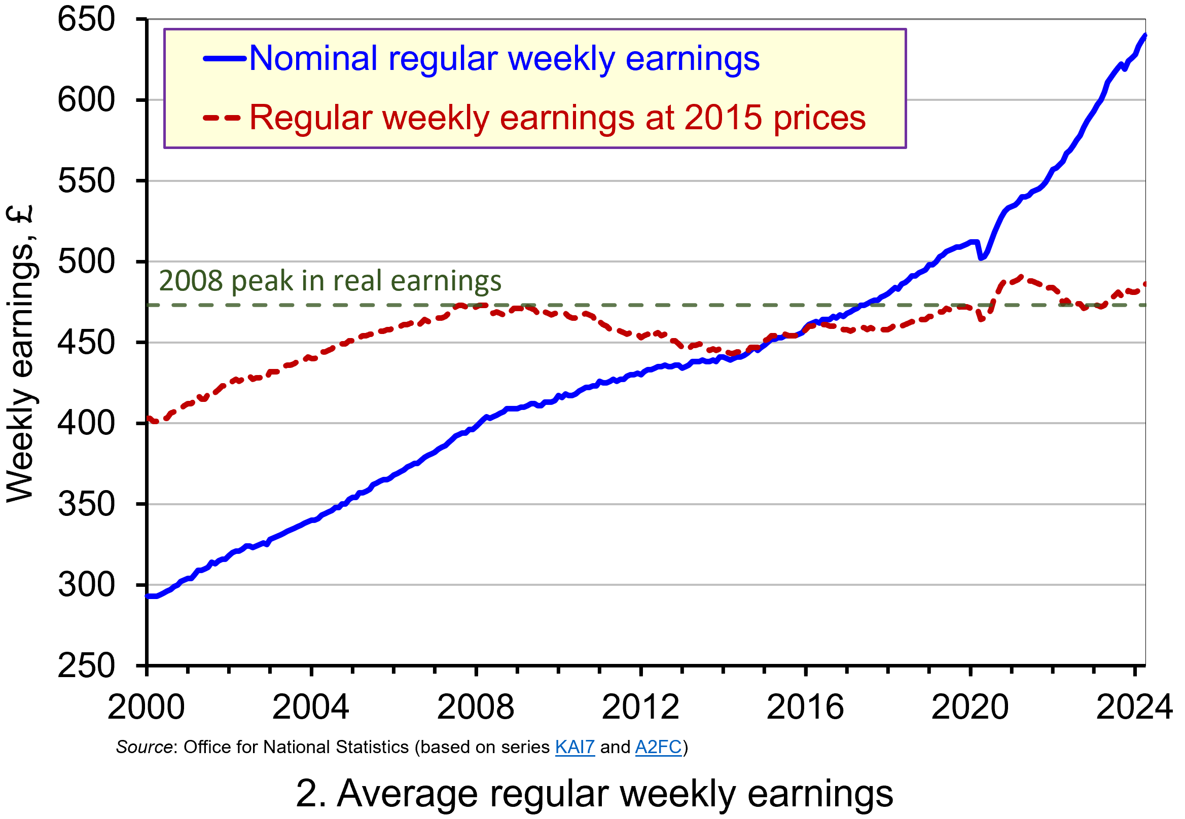 Chart 2 show the average levels of nominal and real weekly pay. The real series is adjusted for inflation. It is calculated by deflating the nominal pay values by the CPIH. Since the CPIH is a price index whose value averages 100 across 2015, the real pay values are at constant 2015 consumer prices. From the chart, we can see that the real value of weekly pay peaked in April 2008 at £473 at 2015 prices. The subsequent period saw rates of pay increases that were lower than rates of consumer price inflation. This meant that by March 2014 the real value of weekly pay had fallen by 6.3 per cent to £443 at 2015 prices. (Click here to download a PowerPoint copy of the chart.)
Although real (inflation-adjusted) pay recovered a little after 2014, 2017 again saw consumer price inflation rates greater than those of pay inflation (see Chart 1). This meant that at the start of 2018 real earnings were 3.2 per cent lower than their 2008-peak (see Chart 2). Real earnings then began to recover, buoyed by the economic rebound following the relaxation of COVID lockdown measures and increasing staffing pressures. Real earnings finally passed their 2008-peak in August 2020. By April 2021 regular weekly pay reached £491 at 2015 prices which was 3.8 per cent above the pre-global financial crisis peak.
However, the boost to real wages was to be short-lived as inflationary pressures rose markedly. While some of this was attributable to the same pressures that were driving up wages, inflationary pressures were fuelled further by the commodity price shock arising from Russia’s invasion of Ukraine and, in particular, its impact on energy prices. This saw the CPIH inflation rate rise to 9.6 per cent in October 2022 (while the CPI inflation rate peaked in the same month at 11.1 per cent). The result was that real weekly earnings fell by 2.7 per cent between January and October 2022 to stand at £471 at 2015 consumer prices. Consequently, average pay was once again below its pre-global financial crisis level.
Although inflationary pressures have recently weakened and real earnings have begun to recover, real regular weekly earnings in April 20024 (£486 at 2015 prices) were a mere 2.7 per cent higher than back in the first half of 2008. This compares to a nominal increase of around 58 per cent over the same period thereby demonstrating the importance of the distinction between nominal and real values in understanding what developments in pay mean for the purchasing power of households.
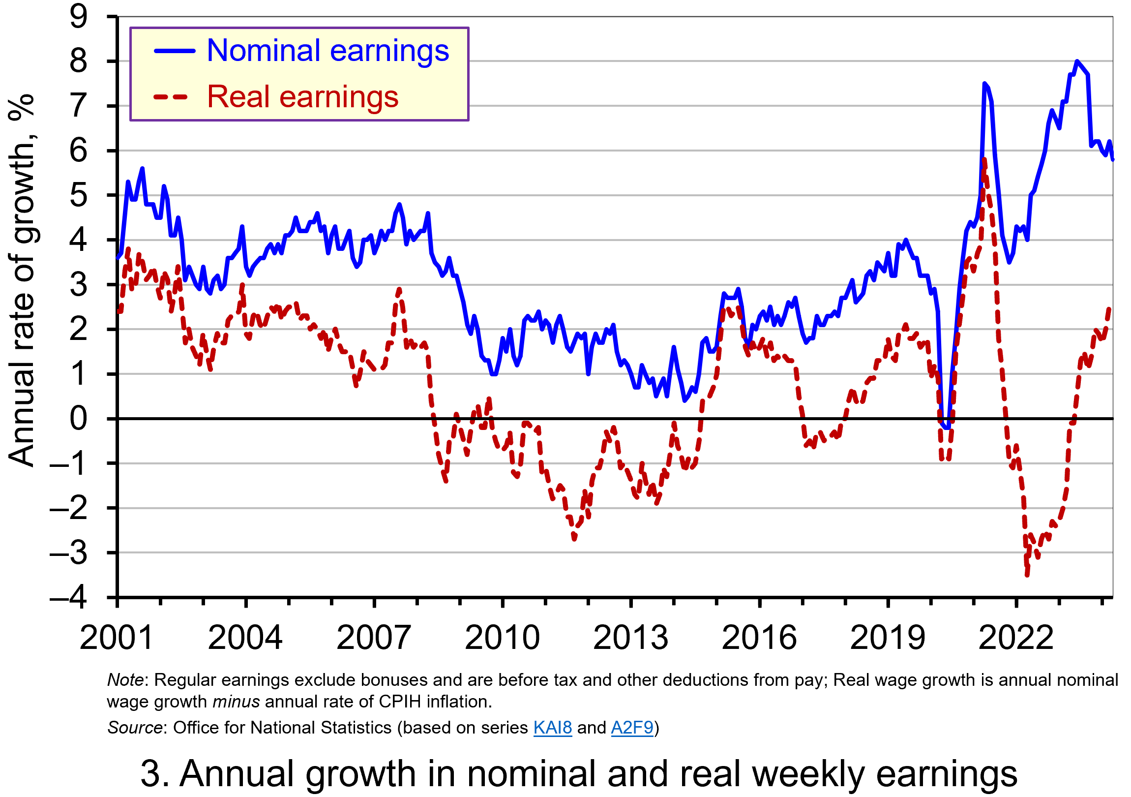 Chart 3 reinforces the importance of the nominal-real distinction. It shows nicely the sustained period of real pay deflation (negative rates of pay inflation) that followed the financial crisis, and the significant rates of real pay deflation associated with the recent inflation shock.
The result is that since June 2008 the average annual rate of growth of real regular weekly pay has been 0.1 per cent, despite nominal pay increasing at an annual rate of 2.9 per cent. In contrast, the period from January 2001 to May 2008 saw real regular weekly pay grow at an annual rate of 2.1 per cent with nominal pay growing at an annual rate of 4.0 per cent. (Click here to download a PowerPoint copy of the chart.)
If we think about the growth of nominal earnings, we can identify two important determinants.
The first is the expected rate of inflation. Workers will understandably want wage growth at least to match the growth in prices so as to maintain their purchasing power.
The second factor is the growth in labour productivity. Firms will be more willing to grant pay increases if workers are more productive, since productivity helps to offset pay increases and maintain firms’ profit margins. Consequently, since over time the actual rate of inflation will tend to mirror the expected rate, the growth of real pay is closely related to the growth of labour productivity. This is significant because, as John discusses in his blog The Productivity Puzzle (14 April 2024), labour productivity growth in the UK, as measured by national output per worker hour, has stalled since the global financial crisis.
Understanding the stagnation of real earnings therefore nicely highlights the interconnectedness of economic variables. In this case, it highlights the connections between productivity, levels of investment and people’s purchasing power. It is not surprising, therefore, that the stagnation of both real earnings and productivity growth since the global financial crisis have become two of the most keenly debated macroeconomic issues of recent times. Indeed, it is likely that their behaviour will continue to shape macroeconomic debates and broader conversations around government policy for some time.
Articles
Questions
- Using the examples of both GDP and earnings, explain how the distinction between nominal and real relates to the distinction between values and volumes.
- In what circumstances would an increase in actual pay translate into a reduction in real pay?
- In what circumstances would a decrease in actual pay translate into an increase in real pay?
- What factors might explain the reduction in real rates of pay seen in the UK following the financial crisis of 2007–8?
- Of what importance might the growth in real rates of pay be for consumption and aggregate demand?
- Why is the growth of real pay an indicator of financial well-being? What other indicators might be included in measuring financial well-being?
- Assume that you have been asked to undertake a distributional analysis of real earnings since the financial crisis. What might be the focus of your analysis? What information would you therefore need to collect?
 At an event at the London Palladium on 6 December staged to protest against elements in the recent Budget, the Conservative leader, Kemi Badenoch, was asked whether she would introduce a flat-rate income tax if the Conservatives were returned to government. She replied that it was a very attractive idea. But first the economy would need ‘rewiring’ so that the tax burden could be lightened.
 The second major argument is that lower taxes for higher earners, especially for entrepreneurs, can act as a positive incentive. People work harder and there is more investment. The argument here is that the positive substitution effect from the lower tax (work is more profitable now and hence people substitute work for leisure) is greater than the negative income effect (lower taxes increase take-home pay so that people do not need to work so much now to maintain their standard of living).
 The Laffer curve is often used to illustrate such arguments that high top tax rates can lead to lower tax revenue. Professor Art Laffer was one of President Reagan’s advisers during his first administration (1981–4): see Box 11.3 in Economics, 11th edition. Laffer was a strong advocate of income tax cuts, arguing that substantial increases in output would result and that tax revenues could consequently increase.
  The main argument against moving from a progressive to a flat-rate income tax in an advanced country, such as the UK, is that is would involve a large-scale redistribution of income from the poor to the rich. If the tax were designed to raise the same amount of revenue as at present, those on low incomes would pay more tax than now, as their tax rate would rise to the new flat rate. Those on high incomes would pay less tax, as their marginal rate would fall to the new flat rate.
 Nevertheless, even if a new flat-rate tax replaced NICs as well as varying rates of income tax, it would still involve a large-scale redistribution from low-income earners to high-income earners. The effect would be mitigated somewhat if personal allowances were raised so that the tax only applied to mid-to-higher incomes. Then the redistribution would be from middle-income earners to high-income earners and also somewhat to low-income earners: i.e. those below, or only a little above, the new higher personal allowance. If, on the other hand, personal allowances were scrapped so that the flat tax applied to all incomes, then there would be a massive redistribution from people on low incomes, including very low incomes, to those on high incomes.
 One of the arguments used to justify a flat-rate tax is that its simplicity would ensure greater compliance. But in an advanced country, compliance is high, except, perhaps, for those on very high incomes. Most people in the UK and many other countries, have tax deducted automatically from their wages. People cannot avoid such taxes.
 The first Budget of the new UK Labour government was announced on 30 October 2024. It contained a number of measures that will help to tackle inequality. These include extra spending on health and education. This will benefit households on lower incomes the most as a percentage of net income. Increases in tax, by contrast, will be paid predominantly by those on higher incomes. The Chart opposite (taken from the
  It has been an objective of governments for several years to relate the minimum wage to the median wage. In 2015, the Conservative Government set a target of raising the minimum wage rate to 60 per cent of median hourly earnings by 2020. When that target was hit a new one was set to reach two-thirds of median hourly earnings by 2024.
 Figure 1 shows the growth in minimum wage rates since their introduction in 1999. The figures are real figures (i.e. after taking into account CPI inflation) and are expressed as an index, with 1999 = 100. The chart also shows the growth in real median hourly pay. (Click
  The UK minimum wage compares relatively favourably with other high-income economies. Figure 2 shows minimum wage rates in 12 high-income countries in 2023 – the latest year for which data are available. (Click
  This is illustrated in Figure 3 (click
  Assume initially that there is no minimum wage. The supply of labour to the monopsony employer is given by curve SL1, which is also the average cost of labour ACL1. A higher employment by the firm will drive up the wage; a lower employment will drive it down. This gives a marginal cost of labour curve of MCL1. Profit-maximising employment will be Q1, where the marginal cost of labour equals the marginal revenue product of labour (MRPL). The wage, given by the SL1 (=ACL1) line will be W1.
  What, however, has concerned commentators more is the rise in employers’ National Insurance contributions (NICs) that were announced in the Budget. In April 2025, the rate will increase from 13.8% to 15%. Employers’ NICs are paid for each employee on all wages above a certain annual threshold. This threshold will fall in April from £9100 to £5000. So the cost to an employer of an employee earning £38 000 per annum in 2024/25 would be £38 000 + ((£38 000 – £9100) × 0.138) = £41 988.20. For the year 2025/26 it will rise to £38 000 + ((£38 000 – £5000) × 0.15) = £42 950. This is a rise of 2.29%. (Note that £38 000 will be approximately the median wage in 2025/26.)
 We continue to live through incredibly turbulent times. In the past decade or so we have experienced a global financial crisis, a global health emergency, seen the UK’s departure from the European Union, and witnessed increasing levels of geopolitical tension and conflict. Add to this the effects from the climate emergency and it easy to see why the issue of economic uncertainty is so important when thinking about a country’s economic prospects.
 Figure 1 (click
  As Figure 2 shows (click
  The theory of buffer-stock saving was popularised by Christopher Carroll in 1992 (see link below). It implies that in the presence of uncertainty, people are prepared to consume less today in order to increase levels of saving, pay off existing debts, or borrow less relative to that in the absence of uncertainty. The extent of the buffer of financial wealth that people want to hold will depend on their own appetite for risk, the level of uncertainty, and the moderating effect from their own impatience and, hence, present bias for consuming today.
 Figure 3 suggests that the relationship between confidence and uncertainty is rather more complex than perhaps is generally understood (click
  A common practice of international investors is to take part in the so-called ‘carry trade’. This involves taking advantage of nominal interest rate differences between countries. For example, assume that interest rates are low in Japan and high in the USA. It is thus profitable to borrow yen in Japan at the low interest rate, exchange it into US dollars and deposit the money at the higher interest rate available in the USA. If there is no change in the exchange rate between the dollar and the yen, the investor makes a profit equal to the difference in the interest rates.
 Prior to the financial crisis of 2008, current account deficit countries, such as the UK, USA and Australia, typically had relatively high interest rates, while current account surplus countries such as Japan and Switzerland had relatively low ones. Figure 1 shows central bank interest rates from 2005 to the current day (click
  Currencies of surplus countries depreciated, making their goods more competitive and further boosting their current account surpluses. For example, between 2004 and 2006 the average current account surpluses as a percentage of GDP for Japan and Switzerland were 3½ and 13, respectively. Their short-term interest rates averaged a mere 0.1% and 1.0% respectively (compared with 3.4%, 4.7% and 5.7% for the USA, the UK and Australia). Yet between January 2004 and December 2006, the real exchange rate index of the yen depreciated by 21%, while that of the Swiss franc depreciated by 6%.
 The process boosted US stock markets and contributed to the dollar appreciating against the yen (see Figure 2: click
  The result was a rapid appreciation of the yen as Figure 3 shows (click
  As far as the Tokyo stock market was concerned, the appreciation of the yen sparked fears that the large Japanese export sector would be damaged. Investors rushed to sell shares. Between 31 July and 5 August, the Nikkei 225 (the main Japanese stock market index) fell by 19.5% – its biggest short-term fall ever (see Figure 4: click
  In the first of a series of updated blogs focusing on the importance of the distinction between nominal and real values we look at the issue of earnings. Here we update the blog
  Chart 1 shows the annual percentage changes in actual (nominal) regular weekly pay and the CPIH since January 2001. Each value is simply the percentage change from 12 months earlier. The period up to June 2008 saw the annual growth of weekly pay outstrip the growth of consumer prices – the blue line in the chart is above the red dashed line. Therefore, the real value of pay rose. However, from June 2008 to August 2014 pay growth consistently fell short of the rate of consumer price inflation – the blue line is below the red dashed line. The result was that average real weekly pay fell. (Click
  Chart 2 show the average levels of nominal and real weekly pay. The real series is adjusted for inflation. It is calculated by deflating the nominal pay values by the CPIH. Since the CPIH is a price index whose value averages 100 across 2015, the real pay values are at constant 2015 consumer prices. From the chart, we can see that the real value of weekly pay peaked in April 2008 at £473 at 2015 prices. The subsequent period saw rates of pay increases that were lower than rates of consumer price inflation. This meant that by March 2014 the real value of weekly pay had fallen by 6.3 per cent to £443 at 2015 prices. (Click
  Chart 3 reinforces the importance of the nominal-real distinction. It shows nicely the sustained period of real pay deflation (negative rates of pay inflation) that followed the financial crisis, and the significant rates of real pay deflation associated with the recent inflation shock.