 In the first of a series of updated blogs focusing on the importance of the distinction between nominal and real values we look at the issue of earnings. Here we update the blog Getting Real with Pay written back in February 2019. Then, we noted how the macroeconomic environment since the financial crisis of the late 2000s had continued to affect people’s pay. Specifically, we observed that there had been no growth in real or inflation-adjusted pay. In other words, people were no better off in 2019 than in 2008.
In this updated blog, we consider to what extent the picture has changed five years down the line. While we do not consider the distributional impact on pay, the aggregate picture nonetheless continues to paint a very stark picture, with consequences for living standards and financial wellbeing.
While the distinction between nominal and real values is perhaps best known in relation to GDP and economic growth, the distinction is also applied frequently to analyse the movement of one price relative to prices in general. One example is that of movements in pay (earnings) relative to consumer prices.
Pay reflects the price of labour. The value of our actual pay is our nominal pay. If our pay rises more quickly than consumer prices, then our real pay increases. This means that our purchasing power rises and so the volume of goods and services we can afford increases. On the other hand, if our actual pay rises less quickly than consumer prices then our real pay falls. When real pay falls, purchasing power falls and the volume of goods and services we can afford falls.
Figures from the Office for National Statistics show that in January 2000 regular weekly pay (excluding bonuses and before taxes and other deductions from pay) was £293. By April 2024 this had risen to £640. This is an increase of 118 per cent. Over the same period, the consumer prices index known as the CPIH, which, unlike the better-known CPI, includes owner-occupied housing costs and council tax, rose by 82 per cent. Therefore, the figures are consistent with a rise both in nominal and real pay between January 2000 to April 2024. However, this masks a rather different picture that has emerged since the global financial crisis of the late 2000s.
 Chart 1 shows the annual percentage changes in actual (nominal) regular weekly pay and the CPIH since January 2001. Each value is simply the percentage change from 12 months earlier. The period up to June 2008 saw the annual growth of weekly pay outstrip the growth of consumer prices – the blue line in the chart is above the red dashed line. Therefore, the real value of pay rose. However, from June 2008 to August 2014 pay growth consistently fell short of the rate of consumer price inflation – the blue line is below the red dashed line. The result was that average real weekly pay fell. (Click here to download a PowerPoint copy of the chart.)
 Chart 2 show the average levels of nominal and real weekly pay. The real series is adjusted for inflation. It is calculated by deflating the nominal pay values by the CPIH. Since the CPIH is a price index whose value averages 100 across 2015, the real pay values are at constant 2015 consumer prices. From the chart, we can see that the real value of weekly pay peaked in April 2008 at £473 at 2015 prices. The subsequent period saw rates of pay increases that were lower than rates of consumer price inflation. This meant that by March 2014 the real value of weekly pay had fallen by 6.3 per cent to £443 at 2015 prices. (Click here to download a PowerPoint copy of the chart.)
Although real (inflation-adjusted) pay recovered a little after 2014, 2017 again saw consumer price inflation rates greater than those of pay inflation (see Chart 1). This meant that at the start of 2018 real earnings were 3.2 per cent lower than their 2008-peak (see Chart 2). Real earnings then began to recover, buoyed by the economic rebound following the relaxation of COVID lockdown measures and increasing staffing pressures. Real earnings finally passed their 2008-peak in August 2020. By April 2021 regular weekly pay reached £491 at 2015 prices which was 3.8 per cent above the pre-global financial crisis peak.
However, the boost to real wages was to be short-lived as inflationary pressures rose markedly. While some of this was attributable to the same pressures that were driving up wages, inflationary pressures were fuelled further by the commodity price shock arising from Russia’s invasion of Ukraine and, in particular, its impact on energy prices. This saw the CPIH inflation rate rise to 9.6 per cent in October 2022 (while the CPI inflation rate peaked in the same month at 11.1 per cent). The result was that real weekly earnings fell by 2.7 per cent between January and October 2022 to stand at £471 at 2015 consumer prices. Consequently, average pay was once again below its pre-global financial crisis level.
Although inflationary pressures have recently weakened and real earnings have begun to recover, real regular weekly earnings in April 20024 (£486 at 2015 prices) were a mere 2.7 per cent higher than back in the first half of 2008. This compares to a nominal increase of around 58 per cent over the same period thereby demonstrating the importance of the distinction between nominal and real values in understanding what developments in pay mean for the purchasing power of households.
 Chart 3 reinforces the importance of the nominal-real distinction. It shows nicely the sustained period of real pay deflation (negative rates of pay inflation) that followed the financial crisis, and the significant rates of real pay deflation associated with the recent inflation shock.
The result is that since June 2008 the average annual rate of growth of real regular weekly pay has been 0.1 per cent, despite nominal pay increasing at an annual rate of 2.9 per cent. In contrast, the period from January 2001 to May 2008 saw real regular weekly pay grow at an annual rate of 2.1 per cent with nominal pay growing at an annual rate of 4.0 per cent. (Click here to download a PowerPoint copy of the chart.)
If we think about the growth of nominal earnings, we can identify two important determinants.
The first is the expected rate of inflation. Workers will understandably want wage growth at least to match the growth in prices so as to maintain their purchasing power.
The second factor is the growth in labour productivity. Firms will be more willing to grant pay increases if workers are more productive, since productivity helps to offset pay increases and maintain firms’ profit margins. Consequently, since over time the actual rate of inflation will tend to mirror the expected rate, the growth of real pay is closely related to the growth of labour productivity. This is significant because, as John discusses in his blog The Productivity Puzzle (14 April 2024), labour productivity growth in the UK, as measured by national output per worker hour, has stalled since the global financial crisis.
Understanding the stagnation of real earnings therefore nicely highlights the interconnectedness of economic variables. In this case, it highlights the connections between productivity, levels of investment and people’s purchasing power. It is not surprising, therefore, that the stagnation of both real earnings and productivity growth since the global financial crisis have become two of the most keenly debated macroeconomic issues of recent times. Indeed, it is likely that their behaviour will continue to shape macroeconomic debates and broader conversations around government policy for some time.
Articles
Questions
- Using the examples of both GDP and earnings, explain how the distinction between nominal and real relates to the distinction between values and volumes.
- In what circumstances would an increase in actual pay translate into a reduction in real pay?
- In what circumstances would a decrease in actual pay translate into an increase in real pay?
- What factors might explain the reduction in real rates of pay seen in the UK following the financial crisis of 2007–8?
- Of what importance might the growth in real rates of pay be for consumption and aggregate demand?
- Why is the growth of real pay an indicator of financial well-being? What other indicators might be included in measuring financial well-being?
- Assume that you have been asked to undertake a distributional analysis of real earnings since the financial crisis. What might be the focus of your analysis? What information would you therefore need to collect?
One of the most enduring characteristics of the macroeconomic environment since the financial crisis of the late 2000s has been its impact on people’s pay. We apply the distinction between nominal and real values to evidence the adverse impact on the typical purchasing power of workers. While we do not consider here the distributional impact on pay, the aggregate picture nonetheless paints a very stark picture of recent patterns in pay and, in turn, the consequences for living standards and wellbeing.
While the distinction between nominal and real values is perhaps best know in relation to GDP and economic growth (see the need to get real with GDP), the distinction is also applied frequently to analyse the movement of one price relative to prices in general. One example is that of movements in pay (earnings) relative to consumer prices.
Pay reflects the price of labour. The value of our actual pay is our nominal pay. If our pay rises more quickly than consumer prices, then our real pay increases. This means that our purchasing power rises and so the volume of goods and services we can afford increases. On the other hand, if our actual pay rises less quickly than consumer prices then our real pay falls. When real pay falls, purchasing power falls and the volume of goods and services we can afford falls.
Figures from the Office for National Statistics show that in January 2000 regular weekly pay (excluding bonuses and before taxes and other deductions from pay) was £293. By December 2018 this had risen to £495. This is an increase of 69 per cent. Over the same period the consumer prices index known as the CPIH, which, unlike the better-known CPI, includes owner-occupied housing costs and Council Tax, rose by 49 per cent. Therefore, the figures are consistent with a rise both in nominal and real pay between January 2000 to December 2018. However, this masks the fact that in recent times real earnings have fallen.
 Chart 1 shows the annual percentage changes in actual (nominal) regular weekly pay and the CPIH since January 2001. Each value is simply the percentage change from 12 months earlier. The period up to June 2008 saw the annual growth of weekly pay outstrip the growth of consumer prices – the blue line in the chart is above the red line. Therefore, the real value of pay rose. However, from June 2008 to August 2014 pay growth consistently fell short of the rate of consumer price inflation – the blue line is below the red line. The result was that average real weekly pay fell. (Click here to download a PowerPoint copy of the chart.)
 Chart 2 show the average levels of nominal and real weekly pay. The real series is adjusted for inflation. It is calculated by deflating the nominal pay values by the CPIH. Since the CPIH is a price index whose value averages 100 across 2015, the real pay values are at constant 2015 prices. From the chart, we can see that the real value of weekly pay peaked in March 2008 at £482.01 at 2015 prices. The subsequent period saw rates of pay inflation that were lower than rates of consumer price inflation. This meant that by March 2014 the real value of weekly pay had fallen by 8.8 per cent to £439.56 at 2015 prices. (Click here to download a PowerPoint copy of the chart.)
Although real (inflation-adjusted) pay recovered a little during 2015 and 2016, 2017 again saw consumer price inflation rates greater than those of pay inflation (see Chart 1). Consequently, the average level of real weekly pay fell by 1 per cent between January and November 2017. Since then, real regular pay has again increased. In December 2018, average real pay weekly pay was £462.18 at 2015 prices: an increase of 1.1 per cent from November 2017. Nonetheless, inflation-adjusted average weekly pay in December 2018 remained 4.1 per cent below its March 2008 level.
 Chart 3 shows very clearly the importance of the distinction between real and nominal when analysing the growth of earnings. The sustained period of real pay deflation (negative rates of pay inflation) that followed the financial crisis can be seen much more clearly by plotting growth rates rather than their levels. Since June 2008 the average annual growth of real regular weekly pay has been −0.2 per cent, despite nominal pay increasing at an annual rate of 2 per cent. In the period from January 2001 to May 2008 real regular weekly pay had grown at an annual rate of 2.1 per cent with nominal pay growing at an annual rate of 4.0 per cent. (Click here to download a PowerPoint copy of the chart.)
The distinction between nominal and real helps us to understand better why some argue that patterns in pay, living standards and well-being have been fundamental in characterising the macroeconomic environment since the financial crisis. Indeed, it is not unreasonable to suggest that these patterns have helped to shape macroeconomic debates and broader conversations around the role of government and of public policy and its priorities.
Articles
Questions
- Using the example of GDP and earnings, explain how the distinction between nominal and real relates to the distinction between values and volumes.
- In what circumstances would an increase in actual pay translate into a reduction in real pay?
- In what circumstances would a decrease in actual pay translate into an increase in real pay?
- What factors might explain the reduction in real rates of pay seen in the UK following the financial crisis?
- Of what importance might the growth in real rates of pay be for consumption and aggregate demand?
- Why is the growth of real pay an indicator of financial well-being? What other indicators might be included in measuring financial well-being?
- Assume that you have been asked to undertake a distributional analysis of real earnings since the financial crisis. What might be the focus of your analysis? What information would you therefore need to collect?
 In the second of a series of blogs looking at applications of the distinction between nominal and real indicators, we revisit the blog Getting Real with Growth last updated in October 2021.
In this blog, we discuss how, in making a meaningful comparison over time of a country’s national income and, therefore, the aggregate purchasing power of its people, we need to take inflation into account. Likewise, if we want to analyse changes in the volume of production, we need to eliminate the effects of price changes on GDP. This is important when analysing the business cycle and identifying periods of boom or bust. Hence, in this updated blog we take another look at what real GDP data reveal about both longer-term economic growth and the extent of economic volatility – or what we refer to as the twin characteristics of economic growth.
Real and nominal GDP
The nominal (or current-price) estimate for UK gross domestic product in 2023 was £2.687 trillion. The estimate of national output or national income is based primarily on the production of final goods and services and, hence, purchased by the final user. It therefore largely excludes intermediate goods and services: i.e. goods and services that are transformed or used up in the process of making something else, although data on imports and exports do include intermediate goods and services. The 2023 figure represents a nominal increase in national income of 7.2 per cent on the £2.51 trillion recorded in 2022. These values make no adjustment for inflation and therefore reflect the prices of output that were prevailing at the time.
 Chart 1 shows current-price estimates of GDP from 1955, when the value of GDP was estimated at £19.2 billion. The £2.687 trillion figure recorded for 2023 is an increase of over 140 times that in 1955, a figure that rises to 160 times if we compare the 1950 value with the latest IMF estimate for 2027. However, if we want to make a more meaningful comparison of the country’s national income we need to adjust for inflation. (Click here to download a PowerPoint of the chart.)
Long-term growth in real GDP
If we measure GDP at constant prices, we eliminate the effect of inflation. To construct a constant-price series for GDP, a process known as chain-linking is used. This involves taking consecutive pairs of years, e.g. 2022 and 2023, and estimating what GDP would be in the most recent year (in this case, 2023) if the previous year’s prices (i.e. 2022) had continued to prevail. By calculating the percentage change from the previous year’s GDP value we have an estimate of the volume change. If this is repeated for other pairs of years, we have a series of percentage changes that capture the volume changes from year-to-year. Finally, a reference year is chosen and the percentage volume changes are applied backwards and forwards from the nominal GDP value for the reference year.
In effect, a real GDP series creates a quantity measure in monetary terms. Chart 1 shows GDP at constant 2019 prices (real GDP) alongside GDP at current prices (nominal GDP). Consider first the real GDP numbers for 1955 and 2023. GDP in 1950 at 2019 prices was £491.2 billion. This is higher than the current-price value because prices in 2019 (the reference year) were higher than those in 1955. Meanwhile, GDP in 2023 when measured at 2019 prices was £2.273 trillion. This constant-price value is smaller than the corresponding current-price value because prices in 2019 where lower than those in 2023.
 Between 1955 and 2023 real GDP increased 4.6 times. If we extend the period to 2027, again using the latest IMF estimates, the increase is 4.9 times. Because we have removed the effect of inflation, the real growth figure is much lower than the nominal growth figure.
Crucially, what we are left with is an indicator of the long-term growth in the volume of the economy’s output and hence an increase in national income that is backed up by an increase in production. Whereas nominal growth rates are affected by changes in both volumes and prices, real growth rates reflect only changes in volumes.
The upward trajectory observed in constant-price GDP is therefore evidence of positive longer-term growth. This is one of the twin characteristics of growth.
Short-term fluctuations in the growth of real GDP
The second characteristic is fluctuations in the rate of growth from period to period. We can see this second characteristic more clearly by plotting the percentage change in real GDP from year to year.
 Chart 2 shows the annual rate of growth in real GDP each year from 1955 to 2025. From it, we see the inherent instability that is a key characteristic of the macroeconomic environment. This instability is, of course, mirrored in the output path of real GDP in Chart 1, but the annual rates of growth show the instability more clearly. We can readily see the impact on national output of the global financial crisis of 2007–8 and the global COVID pandemic.
In 2009, constant-price GDP in the UK fell by 4.6 per cent, whereas current-price GDP fell by 2.8 per cent. Then, in 2020, constant-price GDP and, hence, the volume of national output fell by 10.4 per cent, as compared to a 5.8 per cent fall in current-price GDP. These global, ‘once-in-a-generation’ shocks are stark examples of the instability that characterises economies and which generate the ‘ups and downs’ in an economy’s output path, known more simply as ‘the business cycle’. (Click here to download a PowerPoint copy of the chart.)
Determinants of long-and short-term growth
 The twin characteristics of growth can be seen simultaneously by combining the output path (shown by the levels of real GDP) with the annual rates of growth. This is shown in Chart 3. The longer-term growth seen in the economy’s output path is generally argued to be driven by the quantity and quality of the economy’s resources, and their effectiveness when combined in production (i.e. their productivity). In other words, it is the supply side of the economy that determines the trajectory of the output path over the longer term. (Click here to download a PowerPoint copy of the chart.)
However, the fluctuations we observe in short-term growth rates tend to reflect shocks, also known as impulses, that originate either from the ability and or willingness of purchasers to consume (demand-side shocks) or producers to supply (supply-side shocks). These impulses are then amplified (or ‘propagated’) via the multiplier, expectations and other factors, and their effects, therefore, transmitted through the economy. Unusually in the case of the pandemic, the lockdown measures employed by governments around the world resulted in simultaneous negative aggregate demand and aggregate supply shocks.
Persistence effects
Explanations of the business cycle and of long-term growth are not mutually exclusive. The shocks and the propagation mechanisms that help to create and shape the business cycle can themselves have enduring or persistent effects on output. The global financial crisis, fuelled by unsustainable lending and the overstretch of private-sector balance sheets, which then spilt over to the public sector as governments attempted to stabilise the financial system and support aggregate demand, is argued by some to have created the conditions for low-growth persistence seen in many countries in the 2010s. This type of persistence is known as hysteresis as it originates from a negative demand shock.
Economists and policymakers were similarly concerned that the pandemic would also generate persistence in the form of scarring effects that might again affect the economy’s output path. Such concerns help to explain why many governments introduced furlough schemes to protect jobs and employment income, as well as provide grants or loans to business.
Per capita output
To finish, it is important to recognise that, when thinking about living standards, it is the growth in real GDP per capita that we need to consider. A rise in real GDP will only lead to a rise in overall living standards if it is faster than the rise in population.
 Our final chart therefore replicates Chart 3 but for real GDP per capita. Between 1955 and 2023 real GDP per capita grew by a factor of 3.45, which increases to 3.6 when we consider the period up to 2027. The average rate of growth of real GDP per capita up to 2023 was 1.87 per cent (lower than the 2.34 per cent increase in real GDP).
But the rate of increase in real GDP per capita was much higher before 2007 than it has been since. If we look at the period up to 2007 and, hence, before the global financial crisis, the figure is 2.32 per cent (2.7 per cent for real GDP), whereas from 2008 to 2023 the average rate of growth of real GDP per capita was a mere 0.42 per cent (1.1 per cent for real GDP). (Click here to download a PowerPoint copy of the chart.)
The final chart therefore reiterates the messages from recent blogs, such as Getting Real with Pay and The Productivity Puzzle, that long-term economic growth and the growth of real wages have slowed dramatically since the financial crisis. This has had important implications for the wellbeing of all sectors of the economy. The stagnation of living standards is therefore one of the most important economic issues of our time. It is one that the incoming Labour government will be keen to address.
Data and Reports
Articles
Questions
- What do you understand by the term ‘macroeconomic environment’? What data could be used to describe the macroeconomic environment?
- When a country experiences positive rates of inflation, which is higher: nominal economic growth or real economic growth?
- Does an increase in nominal GDP mean a country’s production has increased? Explain your answer.
- Does a decrease in nominal GDP mean a country’s production has decreased? Explain your answer.
- Why does a change in the growth of real GDP allow us to focus on what has happened to the volume of production?
- What does the concept of the ‘business cycle’ have to do with real rates of economic growth?
- When would falls in real GDP be classified as a recession?
- Distinguish between the concepts of ‘short-term growth’ and ‘longer-term growth’.
- What do you understand by the term ‘persistence’ in macroeconomics? Given examples of persistence effects and the means by which they can be generated?
- Discuss the proposition that the pandemic could have a positive effect on longer-term growth rates because of the ways that people and business have had to adapt.
 The past decade or so has seen large-scale economic turbulence. As we saw in the blog Fiscal impulses, governments have responded with large fiscal interventions. The COVID-19 pandemic, for example, led to a positive fiscal impulse in the UK in 2020, as measured by the change in the structural primary balance, of over 12 per cent of national income.
The scale of these interventions has led to a significant increase in the public-sector debt-to-GDP ratio in many countries. The recent interest rates hikes arising from central banks responding to inflationary pressures have put additional pressure on the financial well-being of governments, not least on the financing of their debt. Here we discuss these pressures in the context of the ‘r – g’ rule of sustainable public debt.
Public-sector debt and borrowing
 Chart 1 shows the path of UK public-sector net debt and net borrowing, as percentages of GDP, since 1990. Debt is a stock concept and is the result of accumulated flows of past borrowing. Net debt is simply gross debt less liquid financial assets, which mainly consist of foreign exchange reserves and cash deposits. Net borrowing is the headline measure of the sector’s deficit and is based on when expenditures and receipts (largely taxation) are recorded rather than when cash is actually paid or received. (Click here for a PowerPoint of Chart 1)
Chart 1 shows the impact of the fiscal interventions associated with the global financial crisis and the COVID-19 pandemic, when net borrowing rose to 10 per cent and 15 per cent of GDP respectively. The former contributed to the debt-to-GDP ratio rising from 35.6 per cent in 2007/8 to 81.6 per cent in 2014/15, while the pandemic and subsequent cost-of-living interventions contributed to the ratio rising from 85.2 per cent in 2019/20 to around 98 per cent in 2023/24.
Sustainability of the public finances
") The ratcheting up of debt levels affects debt servicing costs and hence the budgetary position of government. Yet the recent increases in interest rates also raise the costs faced by governments in financing future deficits or refinancing existing debts that are due to mature. In addition, a continuation of the low economic growth that has beset the UK economy since the global financial crisis also has implications for the burden imposed on the public sector by its debts, and hence the sustainability of the public finances. After all, low growth has implications for spending commitments, and, of course, the flow of receipts.
The ratcheting up of debt levels affects debt servicing costs and hence the budgetary position of government. Yet the recent increases in interest rates also raise the costs faced by governments in financing future deficits or refinancing existing debts that are due to mature. In addition, a continuation of the low economic growth that has beset the UK economy since the global financial crisis also has implications for the burden imposed on the public sector by its debts, and hence the sustainability of the public finances. After all, low growth has implications for spending commitments, and, of course, the flow of receipts.
The analysis therefore implies that the sustainability of public-sector debt is dependent on at least three factors: existing debt levels, the implied average interest rate facing the public sector on its debts, and the rate of economic growth. These three factors turn out to underpin a well-known rule relating to the fiscal arithmetic of public-sector debt. The rule is sometimes known as the ‘r – g’ rule (i.e. the interest rate minus the growth rate).
Underpinning the fiscal arithmetic that determines the path of public-sector debt is the concept of the ‘primary balance’. This is the difference between the sector’s receipts and its expenditures less its debt interest payments. A primary surplus (a positive primary balance) means that receipts exceed expenditures less debt interest payments, whereas a primary deficit (a negative primary balance) means that receipts fall short. The fiscal arithmetic necessary to prevent the debt-to-GDP ratio rising produces the following stable debt equation or ‘r – g’ rule:
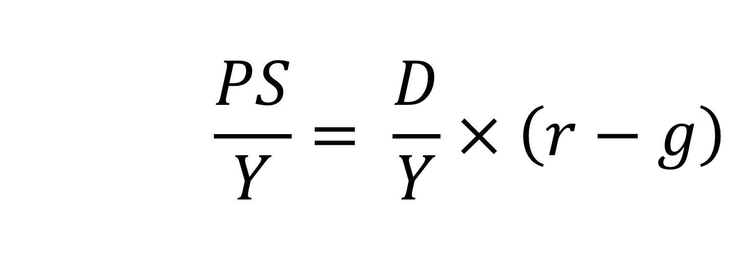
On the left-hand side of the stable debt equation is the required primary surplus (PS) to GDP (Y) ratio. Moving to the right-hand side, the first term is the existing debt-to-GDP ratio (D/Y). The second term ‘r – g’, is the differential between the average implied interest rate the government pays on its debt and the growth rate of the economy. These terms can be expressed in either nominal or real terms as this does not affect the differential.
To illustrate the rule consider a country whose existing debt-to-GDP ratio is 1 (i.e. 100 per cent) and the ‘r – g’ differential is 0.02 (2 percentage points). In this scenario they would need to run a primary surplus to GDP ratio of 0.02 (i.e. 2 percent of GDP).
The ‘r – g‘ differential
The ‘r – g’ differential reflects macroeconomic and financial conditions. The fiscal arithmetic shows that these are important for the dynamics of public-sector debt. The fiscal arithmetic is straightforward when r = g as any primary deficit will cause the debt-to-GDP ratio to rise, while a primary surplus will cause the ratio to fall. The larger is g relative to r the more favourable are the conditions for the path of debt. Importantly, if the differential is negative (r < g), it is possible for the public sector to run a primary deficit, up to the amount that the stable debt equation permits.
 Consider Charts 2 and 3 to understand how the ‘r – g’ differential has affected debt sustainability in the UK since 1990. Chart 2 plots the implied yield on 10-year government bonds, alongside the annual rate of nominal growth (click here for a PowerPoint). As John explains in his blog The bond roller coaster, the yield is calculated as the coupon rate that would have to be paid for the market price of a bond to equal its face value. Over the period, the average annual nominal growth rate was 4.5 per cent, while the implied interest rate was almost identical at 4.6 per cent. The average annual rate of CPI inflation over this period was 2.8 per cent.
 Chart 3 plots the ‘r – g’ differential which is simply the difference between the two series in Chart 2, along with a 12-month rolling average of the differential to help show better the direction of the differential by smoothing out some of the short-term volatility (click here for a PowerPoint). The differential across the period is a mere 0.1 percentage points implying that macroeconomic and financial conditions have typically been neutral in supporting debt sustainability. However, this does mask some significant changes across the period.
We observe a general downward trend in the ‘r – g’ differential from 1990 up to the time of the global financial crisis. Indeed between 2003 and 2007 we observe a favourable negative differential which helps to support the sustainability of public debt and therefore the well-being of the public finances. This downward trend of the ‘r – g’ differential was interrupted by the financial crisis, driven by a significant contraction in economic activity. This led to a positive spike in the differential of over 7 percentage points.
 Yet the negative differential resumed in 2010 and continued up to the pandemic. Again, this is indicative of the macroeconomic and financial environments being supportive of the public finances. It was, however, largely driven by low interest rates rather than by economic growth.
Consequently, the negative ‘r – g’ differential meant that the public sector could continue to run primary deficits during the 2010s, despite the now much higher debt-to-GDP ratio. Yet, weak growth was placing limits on this. Chart 4 indeed shows that primary deficits fell across the decade (click here for a PowerPoint).
The pandemic and beyond
 The pandemic saw the ‘r – g’ differential again turn markedly positive, averaging 7 percentage points in the four quarters from Q2 of 2020. While the differential again turned negative, the debt-to-GDP ratio had also increased substantially because of large-scale fiscal interventions. This made the negative differential even more important for the sustainability of the public finances. The question is how long the negative differential can last.
Looking forward, the fiscal arithmetic is indeed uncertain and worryingly is likely to be less favourable. Interest rates have risen and, although inflationary pressures may be easing somewhat, interest rates are likely to remain much higher than during the past decade. Geopolitical tensions and global fragmentation pose future inflationary concerns and a further drag on growth.
As well as the short-term concerns over growth, there remain long-standing issues of low productivity which must be tackled if the growth of the UK economy’s potential output is to be raised. These concerns all point to the important ‘r – g’ differential become increasingly less negative, if not positive. If so the fiscal arithmetic could mean increasingly hard maths for policymakers.
Articles
- The budget deficit: a short guide
House of Commons Library (8/6/23)
- If markets are right about long real rates, public debt ratios will increase for some time. We must make sure that they do not explode.
Peterson Institute for International Economics, Olivier Blanchard (6/11/23)
- The UK government’s debt nightmare
ITV News, Robert Peston (13/7/23)
- National debt could hit 300% of GDP by 2070s, independent watchdog the OBR warns
Sky News, James Sillars (13/7/23)
- How much money is the UK government borrowing, and does it matter?
BBC News (20/10/23)
- Cost of national debt hits 20-year high
BBC News, Vishala Sri-Pathma & Faisal Islam (4/10/23)
- Bond markets could see ‘mini boom-bust cycles’ as global government debt to soar by $5 trillion a yea
Markets Insider, Filip De Mott (16/11/23)
- The counterintuitive truth about deficits for bond investors
Financial Times, Matt King (17/11/23)
- UK government borrowing almost £20bn lower than expected
The Guardian, Richard Partington (20/10/23)
- Controlling debt is just a means — it is not a government’s end
Financial Times, Martin Wolf (13/11/23)
Data
Questions
- What is meant by each of the following terms: (a) net borrowing; (b) primary deficit; (c) net debt?
- Explain how the following affect the path of the public-sector debt-to-GDP ratio: (a) interest rates; (b) economic growth; (c) the existing debt-to-GDP ratio.
- Which factors during the 2010s were affecting the fiscal arithmetic of public debt positively, and which negatively?
- Discuss the prospects for the fiscal arithmetic of public debt in the coming years.
- Assume that a country has an existing public-sector debt-to-GDP ratio of 60 percent.
(a) Using the ‘rule of thumb’ for public debt dynamics, calculate the approximate primary balance it would need to run in the coming year if the expected average real interest rate on the debt were 3 per cent and real economic growth were 2 per cent?
(b) Repeat (a) but now assume that real economic growth is expected to be 4 per cent.
(c) Repeat (a) but now assume that the existing public-sector debt-to-GDP ratio is 120 per cent.
(d) Using your results from (a) to (c) discuss the factors that affect the fiscal arithmetic of the growth of public-sector debt.
 Firms are increasingly having to take into account the interests of a wide range of stakeholders, such as consumers, workers, the local community and society in general (see the blog, Evolving Economics). However, with many firms, the key stakeholders that influence decisions are shareholders. And because many shareholders are footloose and not committed to any one company, their main interests are short-term profit and share value. This leads to under-investment and too little innovation. It has also led to excessive pay for senior executives, which for many years has grown substantially faster than the pay of their employees. Indeed, executive pay in the UK is now, per pound of turnover, the highest in the world.
So is there an alternative model of capitalism, which better serves the interests of a wider range of stakeholders? One model is that of employee ownership. Perhaps the most famous example of this is the John Lewis Partnership, which owns both the department stores and the Waitrose chain of supermarkets. As the partnership’s site claims, ‘when you’re part of it, you put your heart into it’. Although the John Lewis Partnership is the largest in the UK, there are over 330 employee-owned businesses across the UK, with over 200 000 employee owners contributing some £30bn per year to UK GDP. Again, to quote the John Lewis site:
Businesses range from manufacturers, to community health services, to insurance brokers. Together they deliver 4% of UK GDP annually, with this contribution growing. They are united by an ethos that puts people first, involving the workforce in key decision-making and realising the potential and commitment of their employees.
A recent example of a company moving, at least partly, in this direction is BT, which has announced that that every one of its 100 000 employees will get shares worth £500 every year. Employees will need to hold their shares for at least three years before they can sell them. The aim is to motivate staff and help the company achieve a turnaround from its recent lacklustre performance, which had resulted in its laying off 13 000 of its 100 000-strong workforce.
 Another recent example of a company adopting employee ownership is Richer Sounds, the retail TV and hi-fi chain. Its owner and founder, Julian Richer, announced that he had transferred 60% of his shares into a John Lewis-style trust for the chain’s 531 employees. In addition to owning 60% of the company, employees will receive £1000 for every year they have worked for the retailer. A new advisory council, made up of current staff, will advise the management board, which is taking over the running of the firm from Richer.
According to the Employee Ownership Association (EOA), a further 50 businesses are preparing to follow suit and adopt forms of employee ownership. As The Conversation article linked below states:
As a form of stakeholder capitalism, the evidence shows that employee ownership boosts employee commitment and motivation, which leads to greater innovation and productivity.
Indeed, a study of employee ownership models in the US published in April found it narrowed gender and racial wealth gaps. Surveying 200 employees from 21 companies with employee ownership plans, Joseph Blasi and his colleagues at Rutgers University found employees had significantly more wealth than the average US worker.
The researchers also found that the participatory management practices that accompanied the employee ownership schemes led to employees improving their communication skills and learning management skills, which had helped them make better financial decisions at home.
But, although employee ownership brings benefits, not only to the employees themselves, but also more widely to society, there is no simple mechanism for achieving it when shareholders are unlikely to want to relinquish their shares. Employee buyout schemes require funding; and banks are often cautious about providing such funding. What is more, there needs to be an employee trust overseeing the running of the company which takes a long-term perspective and not just that of current employees, who might otherwise be tempted to sell the company to another seeking to take it over.
Articles
Report
Questions
- What are the main benefits of employee ownership?
- Are there any disadvantages of employee ownership and, if so, what are they?
- What are the main barriers to the adoption of employee ownership?
- What are the main recommendations from The Ownership Effect Inquiry? (See linked report above.)
- What are the findings of the responses to the employee share ownership questions in the US General Social Survey (GSS)? (See linked Global Banking & Finance Review article above.)