 In a blog in October 2024, we looked at global uncertainty and how it can be captured in a World Uncertainty Index. The blog stated that ‘We continue to live through incredibly turbulent times. In the past decade or so we have experienced a global financial crisis, a global health emergency, seen the UK’s departure from the European Union, and witnessed increasing levels of geopolitical tension and conflict’.
Since then, Donald Trump has been elected for a second term and has introduced sweeping tariffs. What is more, the tariffs announced on so-called ‘Liberation Day‘ have not remained fixed, but have fluctuated with negotiations and threatened retaliation. The resulting uncertainty makes it very hard for businesses to plan and many have been unwilling to commit to investment decisions. The uncertainty has been compounded by geopolitical events, such as the continuing war in Ukraine, the war in Gaza and the June 13 Israeli attack on Iran.
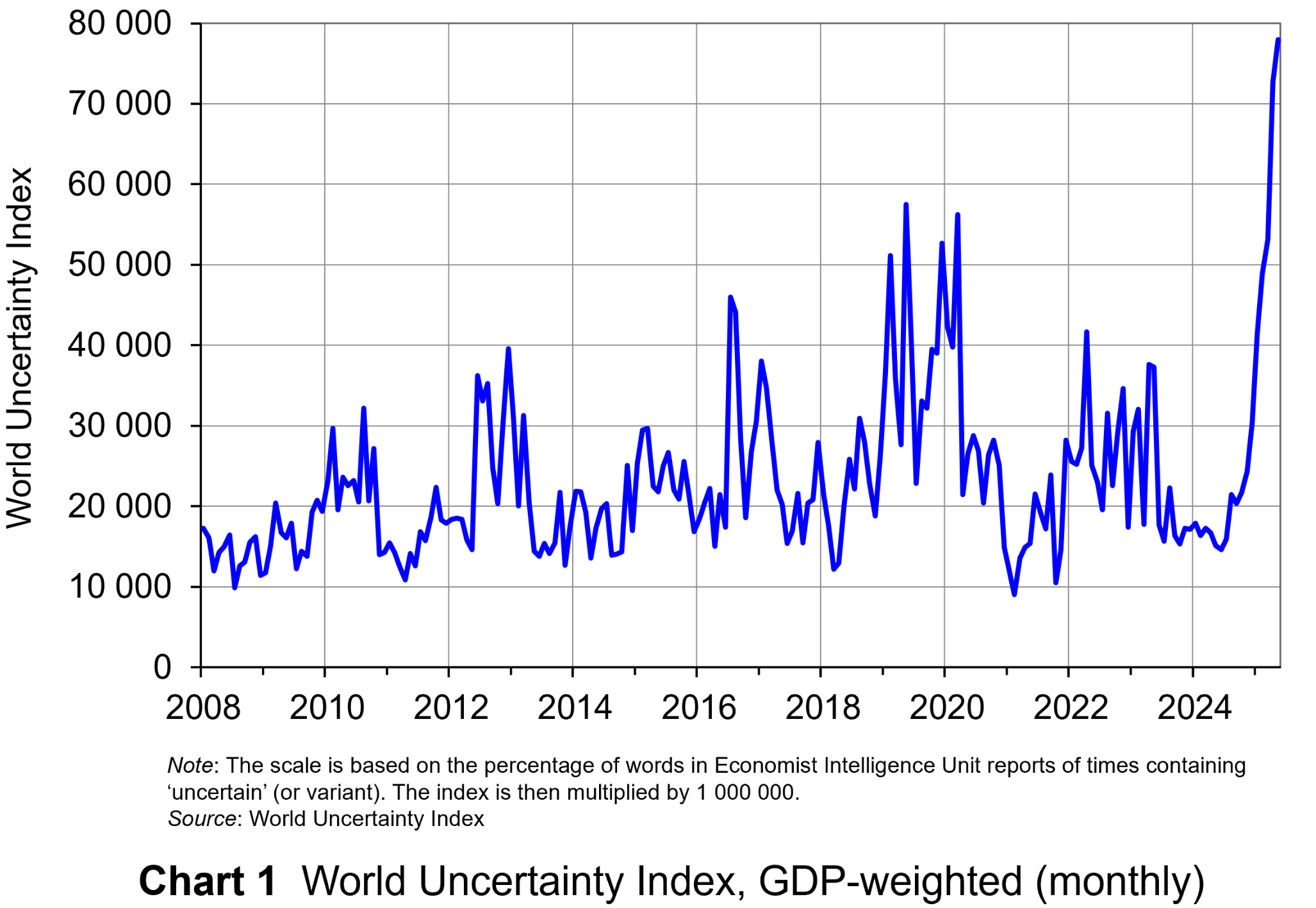 The World Uncertainty Index (WUI) tracks uncertainty around the world by applying a form of text mining known as ‘term frequency’ to the country reports produced by the Economist Intelligence Unit (EIU). The words searched for are ‘uncertain’, ‘uncertainty’ and ‘uncertainties’ and the number of times they occur as percentage of the total words is recorded. To produce the WUI this figure is then multiplied by 1m. A higher WUI number indicates a greater level of uncertainty.
The monthly global average WUI is shown in Chart 1 (click here for a PowerPoint). It is based on 71 countries. Since 2008 the WUI has averaged a little over 23 000: i.e. 2.3 per cent of the text in EIU reports contains the word ‘uncertainty’ or a close variant. In May 2025, it was almost 79 000 – the highest since the index was first complied in 2008. The previous highest was in March 2020, at the start of the COVID-19 outbreak, when the index rose to just over 56 000.
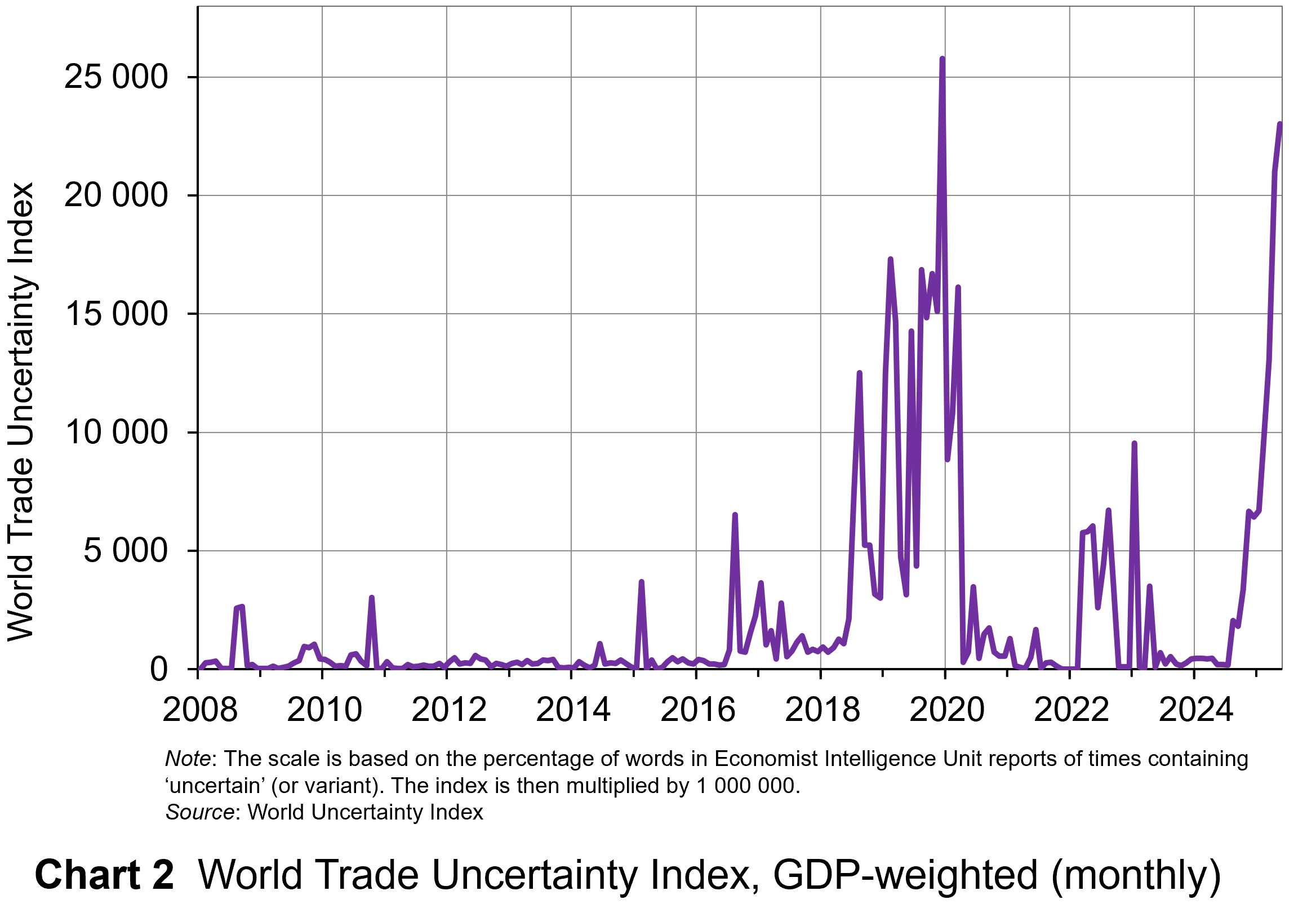 The second chart shows the World Trade Uncertainty Index (WTUI), published on the same site as the WUI (click here for a PowerPoint). The method adopted in its construction therefore mirrors that for the WUI but counts the number of times in EIU country reports ‘uncertainty’ is mentioned within proximity to a word related to trade, such as ‘protectionism’, ‘NAFTA’, ‘tariff’, ‘trade’, ‘UNCTAD’ or ‘WTO.’
The chart shows that in May 2025, the WTUI had risen to just over 23 000 – the second highest since December 2019, when President Trump imposed a new round of tariffs on Chinese imports and announced that he would restore steel tariffs on Brazil and Argentina. Since 2008, the WTUI has averaged just 2228.
It remains to be seen whether more stability in trade relations and geopolitics will allow WUI and WUTI to decline once more, or whether greater instability will simply lead to greater uncertainty, with damaging consequences for investment and also for consumption and employment.
Articles
Uncertainty Indices
Questions
- Explain what is meant by ‘text mining’. What are its strengths and weaknesses in assessing business, consumer and trade uncertainty?
- Explain how the UK Monthly EPU Index is derived.
- Why has uncertainty increased so dramatically since the start of 2025?
- Compare indices based on text mining with confidence indices.
- Plot consumer and business/industry confidence indicators for the past 24 months, using EC data. Do they correspond with the WUI?
- How may uncertainty affect consumers’ decisions?
 The Digital Markets Act (DMA) outlines a new regulatory approach that the European Commission (EC) is taking to address concerns over the lack of competition in digital platform markets. The DMA complements existing European Union competition law and officially came into force on 1st November 2022.
In the first stage of this new regulatory approach, the EC identified ten core platform services (CPS). Examples include search engines, online social networking services, video sharing services, cloud computing services, web browsers and operating systems. These services act as important gateways for large numbers of businesses and consumers to interact with one another. They also have some important economic characteristics, such as large economies of scale and very strong network effects.
The next stage of the regulatory process was to assess which of the large established businesses should be designated as ‘gatekeepers’ of these CPS. To be judged as a gatekeeper, a business had to meet three qualitative criteria. Using quantitative thresholds as a guide to see if these qualitative criteria had been met, the following six companies were designated as gatekeepers by the EC in September 2023: Alphabet (Google’s parent company), Amazon, Apple, ByteDance (owner of TikTok), Meta (owner of Facebook) and Microsoft. Individual companies can be gatekeeper for more than one CPS. For example, Apple was judged to be a gatekeeper for both web browsers (Safari) and operating systems (iOS and iPadOS).
Rules and compliance
 Once a business has been designated as a gatekeeper for one or more CPS, the DMA imposes a set of rules on its future conduct. Some of these rules refer to conduct that the business must follow, while others refer to types of behaviour that are prohibited. The EC sometimes refer to these rules as a list of “do’s” and “don’ts”.
One of the rules refers to interoperability. This is the degree to which different (a) software, (b) devices and (c) other applications can work seamlessly together (i.e. share functionality/data) without requiring any actions by the user (i.e. how compatible they are with one another).
For example, consider the degree of interoperability between the operating system of a gatekeeper, such as Apple, and other hardware/software services. One of the requirements of the DMA is for the gatekeeper to provide the same degree of interoperability for the hardware/software services provided by rival businesses as they do for similar hardware/software services they supply. This is sometimes referred to as the interoperability obligation.
Once a business is designated as a gatekeeper, it has 6 months to submit a compliance report to the EC that demonstrates how it is meeting the rules set out in the DMA. This should include descriptions of any changes the company has had to make to its conduct to meet the new requirements. Further compliance reports must then be submitted on an annual basis.
If, after assessing a compliance report, the EC suspects that a gatekeeper is still acting in ways that do not comply with the DMA, then it can launch either a non-compliance or specification procedure.
The case of Apple
 Apple submitted its first compliance report on 7 March 2024. It was far less extensive than those completed by other designated gatekeepers and adopted a very different tone: it directly challenged the EC’s view that the DMA rules would have a positive impact on consumer welfare.
In September 2024, the EC launched its first two specification proceedings that focused on Apple’s compliance with the interoperability obligation.
The first of these proceedings opened a formal discussion with Apple over the interoperability between the iPhone operating system (iOS) and connected devices such as smartwatches and headphones. The proceeding identified nine features that gave the iOS greater functional compatibility with connected devices produced by Apple than with those made by other businesses. For example:
- Only users of connected devices produced by Apple can (a) receive iOS notifications that contain images or other attachments and (b) select the iOS notifications they want to appear on the device.
- Only users of Apple’s wireless headphones have intelligent audio switching functionality that allows them to switch automatically to the device playing the most relevant audio.
- The Airdrop function, which enables users to share files wirelessly between devices, only works if they are both produced by Apple.
- Only connected devices made by Apple have the functionality for high-bandwidth data transfer from an iPhone without having to rely on network or cellular connection. This is useful for gaming and AI services.
The second specification proceeding focused on the process developed by Apple to deal with requests from other businesses that wanted to develop hardware or software services that are compatible with the iOS.
On 18th December 2024, the EC informed Apple of its preliminary specification decisions and opened a consultation exercise with other interested parties about the suitability of its proposals. Once this process was completed, the EC informed Apple of its final specification decisions on 19 March 2025.
The EC’s decisions
 The first decision included a set of measures that Apple must take to improve the interoperability of connected devices produced by other businesses with the iOS. The EC stated that:
The interoperability solutions for third parties will have to be equally effective to those available to Apple and must not require more cumbersome system setting or additional user friction.
The second decision outlined measures that Apple had to take to improve the process of dealing with requests for greater compatibility with the iOS. For example, it should provide outside businesses with more (a) access to technical documentation, (b) predictable timelines for the reviews and (c) timely updates.
Apple argued that being forced to introduce these measures will (a) create significant additional costs, (b) limit its ability to develop products that work seamlessly with one another and (c) lead to its having to share sensitive customer information with its rivals.
On 30th May 2025, Apple filed an appeal against the EC’s specification decisions to the General Court of the European Union. It will be interesting to see what judgment is made on this case by the General Court and the implications this has for the enforcement of the DMA.
Video
Articles
- The EU Digital Markets Act – The Holy Grail of Big Tech Regulation?
Morrison & Foerster, Andreas Grünwald, Christoph Nüßing and Theresa Oehm (19/7/22)
- Commission starts first proceedings to specify Apple’s interoperability obligations under the Digital Markets Act
EC Press Release (19/9/24)
- Apple hits out at Meta’s numerous interoperability requests
Reuters, Foo Yun Chee (19/12/24)
- 1st Anniversary of the Digital Markets Act (DMA): Lessons learned and road ahead
Hausfeld Competition Bulletin, Ann-Christin Richter and René Galle (28/3/25)
- EU accuses Google and Apple of breaking its rules, risking Trump clash
The Guardian, Rob Davies and Dan Milmo (19/3/25)
- Brussels takes action against Google and Apple despite Trump threat
Financial Times, Barbara Moens (19/3/25)
- Brussels Takes Action Against Google And Apple Despite Trump Threat
GNC (19/3/25)
- Commission provides guidance under Digital Markets Act to facilitate development of innovative products on Apple’s platforms
EC Press Release (19/3/25)
- European Commission Fines Both Apple, Meta For DMA Breaches
Silicon UK, Tom Jowitt (23/4/25)
- Apple Appeals European Commission Order on Interoperability With Competitors’ Products
PYMNTS (2/6/25)
- https://dig.watch/updates/apple-sues-european-commission-over-dma-interoperability-ruling
The Digital Watch (6/6/25)
- Meta, Apple Launch Legal Challenges to EU DMA Rulings
PYMNTS (3/6/25)
Questions
- Identifying core platform services is similar to defining relevant markets in standard competition policy but takes a more legalistic approach. Discuss some of the problems of defining a relevant market for a digital platform.
- Outline the three qualitative criteria and the quantitative thresholds that are used by the EC to designate a digital platform as a gatekeeper of a core platform service.
- Find an example of a digital platform that met the quantitative thresholds but did not meet the qualitative criteria and so was not designated as a gatekeeper.
- Find an example of a digital platform that did not meet the quantitative thresholds but did meet the qualitative criteria and so was designated as a gatekeeper.
- Interoperability is a type of conduct that is sometimes referred to as self-preferencing: i.e. behaviour by a digital platform that gives its own products/services preferential treatment over those provided by other firms that use the same platform. What other types of conduct are possible examples of self-preferencing?
- What is the difference between a non-compliance procedure and a specification procedure? Find some recent examples of non-compliance procedures that have been undertaken by the EC to enforce the DMA.
- What are the potential advantages and disadvantages for consumer welfare of the specification decisions made by the EC?
 The enforcement of Article 102 of the Treaty on the Functioning of the European Union (TFEU) by the European Commission (EC) tends to focus on exclusionary abuses by firms with significant market power. Exclusionary abuses are actions that limit or prevent competition, as opposed to exploitative abuses that directly harm the consumer, such as charging high prices.
The treatment of exclusionary abuses has evolved over time. Initially, the approach towards enforcement was form-based (i.e. the nature of the abuses), but this changed when the EC produced new guidelines in 2009 which signalled a move to a more effects-based approach.
The EC plans to produce a new set of guidelines in 2025 and published a draft version in August 2024 as part of the consultation process with businesses and other stakeholders. These draft guidelines indicate a partial shift back to a form-based approach. Any moves in this direction made by the EC are likely to influence both national-level competition authorities and the courts.
The form-based approach to policy enforcement
A form-based approach to the enforcement of Article 102 assumes that certain types of business conduct are inherently anti-competitive except in very exceptional circumstances. In other words, there is a presumption that the characteristics or form of the behaviour mean that it must have a negative impact on competition and consumer welfare in virtually all real-world cases.
With a form-based approach to enforcement there is no requirement for the authorities to carry out detailed case-specific analyses of business conduct as part of an investigation. This had been the approach adopted by the EC before 2009. It is possible, however, that the same form of business conduct could have anti-competitive effects in some market situations but pro-competitive effects in others. The EC was criticised for not making enough allowance for the chances of this happening.
The effects-based approach to policy enforcement
 In response to this criticism the European Union published a new set of guidelines in 2009 which signalled that the enforcement of Article 102 was moving to a more effects-based approach. The effects-based approach uses economic analysis to assess the impact of a dominant firm’s conduct on a case-by-case basis. Context-specific evidence is examined by the competition authorities to see if the behaviour effectively excludes rival businesses from the market that are just as efficient as the dominant firm.
The use of economics in this effects-based approach gradually increased over time. Initially, the analysis was predominately based on theoretical arguments, but increasingly cases included sophisticated analysis of market-specific evidence using econometric models and market simulations. This, however, led to the following issues.
- The increasing use of complex economic analysis makes it more difficult to meet the evidentiary standards of the courts and prove a case. As the effects-based approach places a greater burden on the competition authorities to meet these evidentiary standards (i.e. provide evidence of case-specific anti-competitive effects of the conduct) it disproportionality affects their ability to prove cases.
- Businesses with significant market power are more likely to make large profits and so have access to greater resources than government-funded competition authorities. Therefore, they will be able to employ more economic consultants with the relevant technical expertise to (a) carry out the analysis and (b) communicate the findings effectively in a court case
This led to concerns that the competition authorities were losing cases where there was strong evidence of exclusionary conduct by the dominant firm.
In response to these concerns, the EC announced in 2023 that it would be revising its 2009 guidelines to improve enforcement of Article 102.
The draft guidelines
The draft guidelines published in August 2024 split different types of potentially anti-competitive conduct by dominant firms into three categories.
The first category includes types of conduct where there is a strong presumption of anti-competitive effects: i.e. the sole purpose of the business behaviour is to restrict competition. These types of conduct are referred to as a ‘naked restriction’ and the documentation provides the following three examples:
- making payments to customers (typically other businesses) on the condition that they cancel or postpone the launch of a product that uses inputs produced by the dominant firm’s rivals;
- threatening to withdraw discounts offered to suppliers unless they agree to supply the dominant firm’s product in place of a similar product produced by a rival firm;
- actively dismantling infrastructure used by a rival firm.
The guidelines indicate a form-based approach will be taken when investigating these types of conduct as the EC will not have to provide any case-specific evidence of anti-competitive effects. A business under investigation can challenge the presumption of anti-competitive effects with appropriate evidence, but the guidelines make it clear that this would only succeed in exceptional circumstances. In other words, it is highly unlikely that the conduct could ever be justified on pro-competitive grounds.
 The second category of anti-competitive conduct includes actions that are also presumed to have a negative impact on competition. The presumption, however, is not as strong as with naked restrictions, so firms have a better chance of proving pro-competitive effects.
There is a form-based element towards this second category of conduct as the EC will not have to provide any initial case specific evidence of anti-competitive effects. But, if a business under investigation does submit evidence to challenge the presumption of anti-competitive effects, the EC must demonstrate that (a) it has fully assessed this evidence and (b) the evidence is insufficient to prove that the conduct does have pro-competitive effects. As part of this process, the EC can provide its own case-specific evidence. Therefore, for this second category of conduct, the initial burden of proof effectively shifts from the competition authority to the firm under investigation, making it more of a form-based approach. However, if the firm uses relevant evidence to appeal its case, the burden shifts back to the competition authority and becomes a more effects-based approach.
The third category includes types of conduct where the EC must initially provide case-specific evidence that it reduces competition. For this category of conduct, the approach towards enforcement remains the same as in the 2009 guidelines and an effects-based approach is adopted.
It will be interesting to see the extent to which the final guidelines (a) follow the approach outlined in the draft guidance and (b) influence the enforcement of Article 102 by the EC and other national-level competition authorities.
Articles
Questions
- What exactly does it mean if a firm has ‘significant’ market power?
- What methods do competitions authorities use to assess whether a firm has a dominant market position?
- Explain the difference between conduct by dominant firm that is (a) an exploitative abuse of its market power and (b) an exclusionary abuse of its market power.
- Explain why a form-based approach towards the enforcement of competition policy is more likely to lead to Type 1 errors (false positives), whereas an effects-based approach is more likely to lead to Type 2 errors (false negatives).
- Provide some examples of exclusionary abuses that are not considered to be naked restrictions.
- Competition policy guidance documents commonly refer to ‘competition on the merits’. What is the precise meaning of this term?
 The UK signed three trade deals in May – one with the USA, one with India and one with the EU. It is hoped by the government that these trade deals will provide a welcome boost to the UK economy.
The deal with the USA reduced tariffs on UK car exports to the USA from 27.5% to 10%, and on steel and aluminium exports from 25% to 0%. Pharmaceutical exports would also get more favourable treatment and there would be ‘reciprocal market access on beef’ (but with no lowering of food standards). Nevertheless, President Trump’s baseline tariff of 10% on most goods remains, as with other countries. However, a ruling by the US Court of International Trade has found that the Trump’s use of emergency powers to justify the sweeping use of tariffs is wrong. The Trump administration is appealing against the ruling and until the appeal is heard, the tariffs have been reinstated. Also, on May 30, the Trump administration announced that tariffs on steel and aluminium imports would rise from 25% to 50%. It remained to be seen whether this would affect the deal to reduce the rate to zero for British steel and aluminium imports.
The deal with India involves a reduction in tariffs on UK exports – some to zero – and simplified trade rules, faster customs clearance, less paperwork and the freedom for UK businesses to provide telecommunications and construction services. In return, tariffs will be reduced to zero on 99% of Indian exports to the UK. The UK government estimates that deal will result in trade between the two countries increasing by over 30%, with the UK’s GDP expanding by around 0.1 percentage points per year.
UK-EU trade
 Perhaps the most significant new trade deal, however, is with the EU. This is a major advance on the current post-Brexit Trade and Cooperation Agreement (TCA). Under the TCA, there are no tariffs or quotas on UK goods exports to the EU or EU goods exports to the UK. However, to ensure that it is EU and UK business that benefits from these ‘trade preferences’, firms must show that their products fulfil ‘rules of origin’ requirements.
Under rules of origin requirements, when a good is imported into the UK from outside the EU and then has value added to it by processing, packaging, cleaning, remixing, preserving, refashioning, etc., it can only count as a UK good if sufficient value or weight is added. The proportions vary by product, but generally goods must have approximately 50 per cent UK content (or 80 per cent of the weight of foodstuffs) to qualify for tariff-free access to the EU. As a result, many goods exported to the EU with a proportion of imported components face tariffs.
 Also, the TCA does not include free trade in services. The UK is a major exporter of services, including legal, financial, accounting, IT and engineering. It has a positive trade in services balance with the EU, unlike its negative trade in goods balance. Although some of the barriers which apply to other non-EU countries have been reduced for the UK in the TCA, UK service providers still face barriers which impose costs. For example, some EU countries limit the time that businesspeople providing services can stay in their countries to six months in any twelve. Also, since Brexit, UK artists and musicians have faced restrictions when touring and working in the EU. They can only work up to 90 out of every 180 days. This causes problems for longer tours and for musicians and crew who work in multiple bands or orchestras.
Perhaps the greatest barrier to trade under the TCA has been the large range of non-tariff measures (NTMs), such as customs checks, rules-of-origin and other paperwork, meeting various regulations and standards, and sanitary and phytosanitary checks on foodstuffs, plants and animals. Both the OBR and the Bank of England estimate that these post-Brexit trade restrictions are reducing UK GDP by around 4% and will continue to do so unless trade with the EU becomes freer.
The new UK-EU trade deal
The deal struck in mid-May reduces many of the administrative barriers to trade. Perhaps the most significant are the border checks on food, animal and plant shipments to and from the EU. Many of these checks will be scrapped. The new sanitary and phytosanitary (SPS) agreement allows many UK food products to be exported that previously were banned or proved too administratively costly. To achieve this free movement, the UK will generally follow EU standards, or similar standards so as to avoids harming EU trade. UK food exporters have generally welcomed the deal.
British steel exports to the EU will be protected from new EU rules and tariffs. This should save UK steel some £25m per year. Also, the EU has agreed to recognise UK carbon emissions caps, meaning that UK exports to the EU will avoid around £800m of carbon border taxes.
 The post-Brexit fishing deal between the UK and EU, which saw a reduction of 25% in EU fishing quotas in UK waters, will be extended for another 12 years. Many UK fishers, however, had hoped for scrapping EU access to UK waters. The deal also allows various sea foods, including certain shellfish, to be exported to the EU for the first time since Brexit.
Other elements of the deal include a new security and defence partnership, the use of e-gates for UK travellers to the EU and an agreement to work towards a young person’s mobility scheme, allowing young people from the UK/EU to work and travel freely in the EU/UK again for a period of time.
The elements of the deal concerned with trade represent freer trade, but not totally free trade. The UK is not rejoining the customs union or single market. Nevertheless, strong supporters of Brexit have criticised the deal as a movement towards greater alignment of standards and thus a dilution of UK sovereignty. Supporters of greater alignment, on the other hand, argue that the deal does not go far enough and that even freer trade and less red tape would bring greater benefits to the UK.
Articles
UK-US trade deal
UK-India trade deal
UK-EU trade deal
- UK-EU trade deal: What is in the Brexit reset agreement?
Sky News, Alix Culbertson (19/5/25)
- The key takeaways from Keir Starmer’s Brexit reset deal with EU
Independent, Millie Cooke (20/5/25)
- UK-EU deal unpacked: All the Brexit red tape set for a chop
Politico, Sophie Inge, Jon Stone and Charlie Cooper (19/5/25)
- UK-EU trade deal: Britain to get a £9bn boost to the economy by 2040
MoneyWeek, Katie Williams (19/5/25)
- UK and EU sign new trade, fishing and defence deal – what do economists think?
The Conversation, Maria Garcia, Conor O’Kane, Kamran Mahroof, Mausam Budhathoki and Phil Tomlinson (19/5/25)
- PM secures new agreement with the EU to support British business
The Manufacturer (19/5/25)
Questions
- Outline the main elements of (a) the UK-US trade deal, (b) the UK-India trade deal and (c) the UK-EU trade deal. How much is it claimed that each deal will add to UK GDP?
- What trade barriers remain in each of the three deals?
- What elements are missing from the UK-EU trade deal that campaigners have been pushing for?
- Under what circumstances do free trade deals lead to (a) trade creation; (b) trade diversion?
- Would you expect the UK-EU trade deal on balance to lead to trade creation or trade diversion? Explain why.
 In a 1987 address to the US nation, Republican President Ronald Reagan discussed the question of tariffs. His message was clear.
You see, at first, when someone says, ‘Let’s impose tariffs on foreign imports,’ it looks like they’re doing the patriotic thing by protecting American products and jobs. And sometimes for a short while it works – but only for a short time. What eventually occurs is:
First, homegrown industries start relying on government protection in the form of high tariffs. They stop competing and stop making the innovative management and technological changes they need to succeed in world markets.
And then, while all this is going on, something even worse occurs: high tariffs inevitably lead to retaliation by foreign countries and the triggering of fierce trade wars. The result is more and more tariffs, higher and higher trade barriers, and less and less competition. So, soon, because of the prices made artificially high by tariffs that subsidise inefficiency and poor management, people stop buying.
Then the worst happens: markets shrink and collapse; businesses and industries shut down; and millions of people lose their jobs.
The memory of all this occurring back in the thirties made me determined when I came to Washington to spare the American people the protectionist legislation that destroys prosperity.
Now, it hasn’t always been easy. There are those in this Congress, just as there were back in the ’30s, who want to go for the quick political advantage, who will risk America’s prosperity for the sake of a short-term appeal to some special interest group, who forget that more than five million American jobs are directly tied to the foreign export business and additional millions are tied to imports.
For those of us who lived through the Great Depression, the memory of the suffering it caused is deep and searing. And today, many economic analysts and historians argue that high tariff legislation, passed back in that period called the Smoot-Hawley Tariff, greatly deepened the Depression and prevented economic recovery.
 He returned to the topic of tariffs in November 1988, when he reflected on the benefits of free and fair trade and the dangers of protectionism.
Here in America, as we reflect on the many things we have to be grateful for, we should take a moment to recognize that one of the key factors behind our nation’s great prosperity is the open trade policy that allows the American people to freely exchange goods and services with free people around the world. The freedom to trade is not a new issue for America.
In 1776 our Founding Fathers signed the Declaration of Independence, charging the British with a number of offenses, among them, and I quote, ‘cutting off our trade with all parts of the world’.
And that same year, a Scottish economist named Adam Smith launched another revolution with a book entitled ‘The Wealth of Nations’, which exposed for all time the folly of protectionism. Over the past 200 years, not only has the argument against tariffs and trade barriers won nearly universal agreement among economists but it has also proven itself in the real world, where we have seen free-trading nations prosper while protectionist countries fall behind.
America’s most recent experiment with protectionism was a disaster for the working men and women of this country. When Congress passed the Smoot-Hawley tariff in 1930, we were told that it would protect America from foreign competition and save jobs in this country – the same line we hear today. The actual result was the Great Depression, the worst economic catastrophe in our history; one out of four Americans were thrown out of work. Two years later, when I cast my first ballot for President, I voted for Franklin Delano Roosevelt, who opposed protectionism and called for the repeal of that disastrous tariff.
Ever since that time, the American people have stayed true to our heritage by rejecting the siren song of protectionism. In recent years, the trade deficit led some misguided politicians to call for protectionism, warning that otherwise we would lose jobs. But they were wrong again. In fact, the United States not only didn’t lose jobs, we created more jobs than all the countries of Western Europe, Canada, and Japan combined. The record is clear that when America’s total trade has increased, American jobs have also increased. And when our total trade has declined, so have the number of jobs.
Part of the difficulty in accepting the good news about trade is in our words. We too often talk about trade while using the vocabulary of war. In war, for one side to win, the other must lose. But commerce is not warfare. Trade is an economic alliance that benefits both countries. There are no losers, only winners. And trade helps strengthen the free world.
Yet today protectionism is being used by some American politicians as a cheap form of nationalism, a fig leaf for those unwilling to maintain America’s military strength and who lack the resolve to stand up to real enemies – countries that would use violence against us or our allies. Our peaceful trading partners are not our enemies; they are our allies.
We should beware of the demagogs who are ready to declare a trade war against our friends – weakening our economy, our national security, and the entire free world – all while cynically waving the American flag. The expansion of the international economy is not a foreign invasion; it is an American triumph, one we worked hard to achieve, and something central to our vision of a peaceful and prosperous world of freedom.
After the Second World War, America led the way to dismantle trade barriers and create a world trading system that set the stage for decades of unparalleled economic growth. And in one week, when important multilateral trade talks are held in Montreal, we will be in the forefront of efforts to improve this system. We want to open more markets for our products, to see to it that all nations play by the rules, and to seek improvement in such areas as dispute resolution and agriculture. We also want to bring the benefits of free trade to new areas, including services, investment, and the protection of intellectual property. Our negotiators will be working hard for all of us.
Yes, back in 1776, our Founding Fathers believed that free trade was worth fighting for. And we can celebrate their victory because today trade is at the core of the alliance that secure the peace and guarantee our freedom; it is the source of our prosperity and the path to an even brighter future for America.
The questions below address whether these radio addresses by President Reagan are relevant in today’s context of the imposition of tariffs by President Trump.
Videos of Radio Addresses
Articles and postings
Questions
- Summarise Ronald Reagan’s arguments.
- How would Donald Trump reply to these arguments?
- Can tariffs ever be justified on efficiency grounds?
- Can tariffs be justified as a bargaining ploy? Can they be used as a means of achieving freer and fairer trade?
- Find out why the Smoot-Hawley Tariff Act was introduced in 1930 and what were its consequences.
- How does the World Trade Organization seek to promote freer and fairer trade? How does it resolve trade disputes?
 In a blog in October 2024, we looked at global uncertainty and how it can be captured in a World Uncertainty Index. The blog stated that ‘We continue to live through incredibly turbulent times. In the past decade or so we have experienced a global financial crisis, a global health emergency, seen the UK’s departure from the European Union, and witnessed increasing levels of geopolitical tension and conflict’.
  The World Uncertainty Index (WUI) tracks uncertainty around the world by applying a form of text mining known as ‘term frequency’ to the country reports produced by the Economist Intelligence Unit (EIU). The words searched for are ‘uncertain’, ‘uncertainty’ and ‘uncertainties’ and the number of times they occur as percentage of the total words is recorded. To produce the WUI this figure is then multiplied by 1m. A higher WUI number indicates a greater level of uncertainty.
 The second chart shows the World Trade Uncertainty Index (WTUI), published on the same site as the WUI (click here for a PowerPoint). The method adopted in its construction therefore mirrors that for the WUI but counts the number of times in EIU country reports ‘uncertainty’ is mentioned within proximity to a word related to trade, such as ‘protectionism’, ‘NAFTA’, ‘tariff’, ‘trade’, ‘UNCTAD’ or ‘WTO.’
  The Digital Markets Act (DMA) outlines a new regulatory approach that the European Commission (EC) is taking to address concerns over the lack of competition in digital platform markets. The DMA complements existing European Union competition law and officially came into force on 1st November 2022.
 Once a business has been designated as a gatekeeper for one or more CPS, the DMA imposes a set of rules on its future conduct. Some of these rules refer to conduct that the business must follow, while others refer to types of behaviour that are prohibited. The EC sometimes refer to these rules as a list of “do’s” and “don’ts”.
 Apple submitted its first compliance report on 7 March 2024. It was far less extensive than those completed by other designated gatekeepers and adopted a very different tone: it directly challenged the EC’s view that the DMA rules would have a positive impact on consumer welfare.
 The first decision included a set of measures that Apple must take to improve the interoperability of connected devices produced by other businesses with the iOS. The EC stated that:
 The enforcement of Article 102 of the Treaty on the Functioning of the European Union (TFEU) by the European Commission (EC) tends to focus on exclusionary abuses by firms with significant market power. Exclusionary abuses are actions that limit or prevent competition, as opposed to exploitative abuses that directly harm the consumer, such as charging high prices.
 In response to this criticism the European Union published a new set of guidelines in 2009 which signalled that the enforcement of Article 102 was moving to a more effects-based approach. The effects-based approach uses economic analysis to assess the impact of a dominant firm’s conduct on a case-by-case basis. Context-specific evidence is examined by the competition authorities to see if the behaviour effectively excludes rival businesses from the market that are just as efficient as the dominant firm.
 The second category of anti-competitive conduct includes actions that are also presumed to have a negative impact on competition. The presumption, however, is not as strong as with naked restrictions, so firms have a better chance of proving pro-competitive effects.
  The UK signed three trade deals in May – one with the USA, one with India and one with the EU. It is hoped by the government that these trade deals will provide a welcome boost to the UK economy.
 Perhaps the most significant new trade deal, however, is with the EU. This is a major advance on the current post-Brexit Trade and Cooperation Agreement (TCA). Under the TCA, there are no tariffs or quotas on UK goods exports to the EU or EU goods exports to the UK. However, to ensure that it is EU and UK business that benefits from these ‘trade preferences’, firms must show that their products fulfil ‘rules of origin’ requirements.
 Also, the TCA does not include free trade in services. The UK is a major exporter of services, including legal, financial, accounting, IT and engineering. It has a positive trade in services balance with the EU, unlike its negative trade in goods balance. Although some of the barriers which apply to other non-EU countries have been reduced for the UK in the TCA, UK service providers still face barriers which impose costs. For example, some EU countries limit the time that businesspeople providing services can stay in their countries to six months in any twelve. Also, since Brexit, UK artists and musicians have faced restrictions when touring and working in the EU. They can only work up to 90 out of every 180 days. This causes problems for longer tours and for musicians and crew who work in multiple bands or orchestras.
 The post-Brexit fishing deal between the UK and EU, which saw a reduction of 25% in EU fishing quotas in UK waters, will be extended for another 12 years. Many UK fishers, however, had hoped for scrapping EU access to UK waters. The deal also allows various sea foods, including certain shellfish, to be exported to the EU for the first time since Brexit.
 In a 1987 address to the US nation, Republican President Ronald Reagan discussed the question of tariffs. His message was clear.
  He returned to the topic of tariffs in November 1988, when he reflected on the benefits of free and fair trade and the dangers of protectionism.