 In the first of a series of updated blogs focusing on the importance of the distinction between nominal and real values we look at the issue of earnings. Here we update the blog Getting Real with Pay written back in February 2019. Then, we noted how the macroeconomic environment since the financial crisis of the late 2000s had continued to affect people’s pay. Specifically, we observed that there had been no growth in real or inflation-adjusted pay. In other words, people were no better off in 2019 than in 2008.
In this updated blog, we consider to what extent the picture has changed five years down the line. While we do not consider the distributional impact on pay, the aggregate picture nonetheless continues to paint a very stark picture, with consequences for living standards and financial wellbeing.
While the distinction between nominal and real values is perhaps best known in relation to GDP and economic growth, the distinction is also applied frequently to analyse the movement of one price relative to prices in general. One example is that of movements in pay (earnings) relative to consumer prices.
Pay reflects the price of labour. The value of our actual pay is our nominal pay. If our pay rises more quickly than consumer prices, then our real pay increases. This means that our purchasing power rises and so the volume of goods and services we can afford increases. On the other hand, if our actual pay rises less quickly than consumer prices then our real pay falls. When real pay falls, purchasing power falls and the volume of goods and services we can afford falls.
Figures from the Office for National Statistics show that in January 2000 regular weekly pay (excluding bonuses and before taxes and other deductions from pay) was £293. By April 2024 this had risen to £640. This is an increase of 118 per cent. Over the same period, the consumer prices index known as the CPIH, which, unlike the better-known CPI, includes owner-occupied housing costs and council tax, rose by 82 per cent. Therefore, the figures are consistent with a rise both in nominal and real pay between January 2000 to April 2024. However, this masks a rather different picture that has emerged since the global financial crisis of the late 2000s.
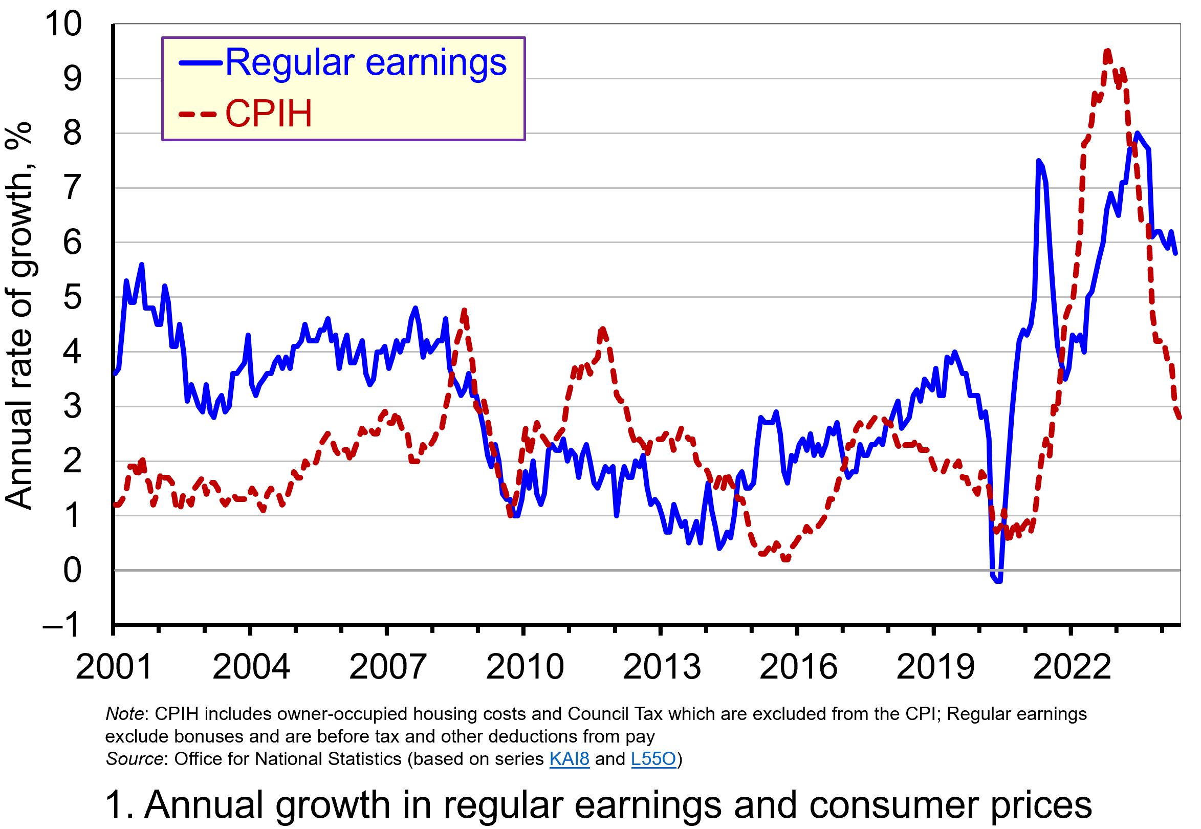 Chart 1 shows the annual percentage changes in actual (nominal) regular weekly pay and the CPIH since January 2001. Each value is simply the percentage change from 12 months earlier. The period up to June 2008 saw the annual growth of weekly pay outstrip the growth of consumer prices – the blue line in the chart is above the red dashed line. Therefore, the real value of pay rose. However, from June 2008 to August 2014 pay growth consistently fell short of the rate of consumer price inflation – the blue line is below the red dashed line. The result was that average real weekly pay fell. (Click here to download a PowerPoint copy of the chart.)
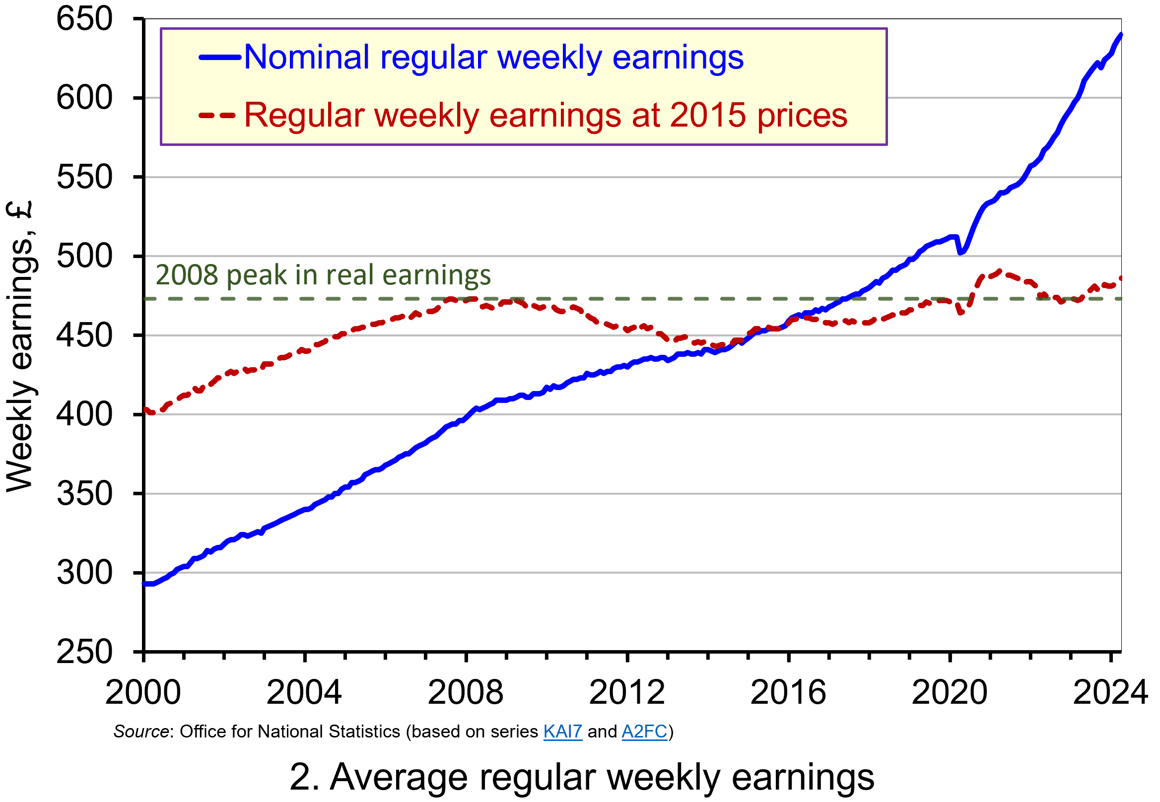 Chart 2 show the average levels of nominal and real weekly pay. The real series is adjusted for inflation. It is calculated by deflating the nominal pay values by the CPIH. Since the CPIH is a price index whose value averages 100 across 2015, the real pay values are at constant 2015 consumer prices. From the chart, we can see that the real value of weekly pay peaked in April 2008 at £473 at 2015 prices. The subsequent period saw rates of pay increases that were lower than rates of consumer price inflation. This meant that by March 2014 the real value of weekly pay had fallen by 6.3 per cent to £443 at 2015 prices. (Click here to download a PowerPoint copy of the chart.)
Although real (inflation-adjusted) pay recovered a little after 2014, 2017 again saw consumer price inflation rates greater than those of pay inflation (see Chart 1). This meant that at the start of 2018 real earnings were 3.2 per cent lower than their 2008-peak (see Chart 2). Real earnings then began to recover, buoyed by the economic rebound following the relaxation of COVID lockdown measures and increasing staffing pressures. Real earnings finally passed their 2008-peak in August 2020. By April 2021 regular weekly pay reached £491 at 2015 prices which was 3.8 per cent above the pre-global financial crisis peak.
However, the boost to real wages was to be short-lived as inflationary pressures rose markedly. While some of this was attributable to the same pressures that were driving up wages, inflationary pressures were fuelled further by the commodity price shock arising from Russia’s invasion of Ukraine and, in particular, its impact on energy prices. This saw the CPIH inflation rate rise to 9.6 per cent in October 2022 (while the CPI inflation rate peaked in the same month at 11.1 per cent). The result was that real weekly earnings fell by 2.7 per cent between January and October 2022 to stand at £471 at 2015 consumer prices. Consequently, average pay was once again below its pre-global financial crisis level.
Although inflationary pressures have recently weakened and real earnings have begun to recover, real regular weekly earnings in April 20024 (£486 at 2015 prices) were a mere 2.7 per cent higher than back in the first half of 2008. This compares to a nominal increase of around 58 per cent over the same period thereby demonstrating the importance of the distinction between nominal and real values in understanding what developments in pay mean for the purchasing power of households.
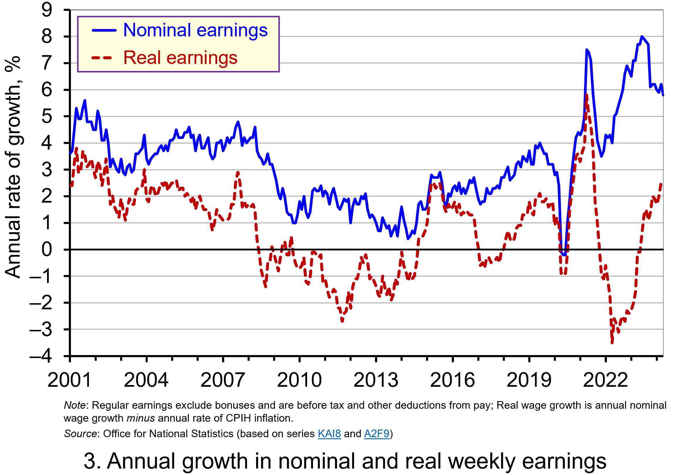 Chart 3 reinforces the importance of the nominal-real distinction. It shows nicely the sustained period of real pay deflation (negative rates of pay inflation) that followed the financial crisis, and the significant rates of real pay deflation associated with the recent inflation shock.
The result is that since June 2008 the average annual rate of growth of real regular weekly pay has been 0.1 per cent, despite nominal pay increasing at an annual rate of 2.9 per cent. In contrast, the period from January 2001 to May 2008 saw real regular weekly pay grow at an annual rate of 2.1 per cent with nominal pay growing at an annual rate of 4.0 per cent. (Click here to download a PowerPoint copy of the chart.)
If we think about the growth of nominal earnings, we can identify two important determinants.
The first is the expected rate of inflation. Workers will understandably want wage growth at least to match the growth in prices so as to maintain their purchasing power.
The second factor is the growth in labour productivity. Firms will be more willing to grant pay increases if workers are more productive, since productivity helps to offset pay increases and maintain firms’ profit margins. Consequently, since over time the actual rate of inflation will tend to mirror the expected rate, the growth of real pay is closely related to the growth of labour productivity. This is significant because, as John discusses in his blog The Productivity Puzzle (14 April 2024), labour productivity growth in the UK, as measured by national output per worker hour, has stalled since the global financial crisis.
Understanding the stagnation of real earnings therefore nicely highlights the interconnectedness of economic variables. In this case, it highlights the connections between productivity, levels of investment and people’s purchasing power. It is not surprising, therefore, that the stagnation of both real earnings and productivity growth since the global financial crisis have become two of the most keenly debated macroeconomic issues of recent times. Indeed, it is likely that their behaviour will continue to shape macroeconomic debates and broader conversations around government policy for some time.
Articles
- Seven key facts about UK living standards
- UK living standards have lagged most peer nations since 2010, report finds
- How are UK living standards faring ahead of the general election?
- UK wage growth still high despite unemployment rise
- Low wages under Tories have pushed 900,000 UK children into poverty, report finds
- UK wage growth: How to lose £14,000 in 14 years
- Concern for Bank of England as real earnings growth at highest rate since 2021
Institute of Fiscal Studies, Jonathan Cribb and Tom Waters (31/5/24)
Financial Times, Delphine Strauss (31/5/24)
National Institute of Economic and Social Research (29/5/24)
BBC News (14/5/24)
The Guardian, Hazel Sheffield and Larry Elliott (25/6/24)
Tortoise Media, Barney Macintyre (1/7/24)
Sky News, James Sillars (16/04/24)
Questions
- Using the examples of both GDP and earnings, explain how the distinction between nominal and real relates to the distinction between values and volumes.
- In what circumstances would an increase in actual pay translate into a reduction in real pay?
- In what circumstances would a decrease in actual pay translate into an increase in real pay?
- What factors might explain the reduction in real rates of pay seen in the UK following the financial crisis of 2007–8?
- Of what importance might the growth in real rates of pay be for consumption and aggregate demand?
- Why is the growth of real pay an indicator of financial well-being? What other indicators might be included in measuring financial well-being?
- Assume that you have been asked to undertake a distributional analysis of real earnings since the financial crisis. What might be the focus of your analysis? What information would you therefore need to collect?
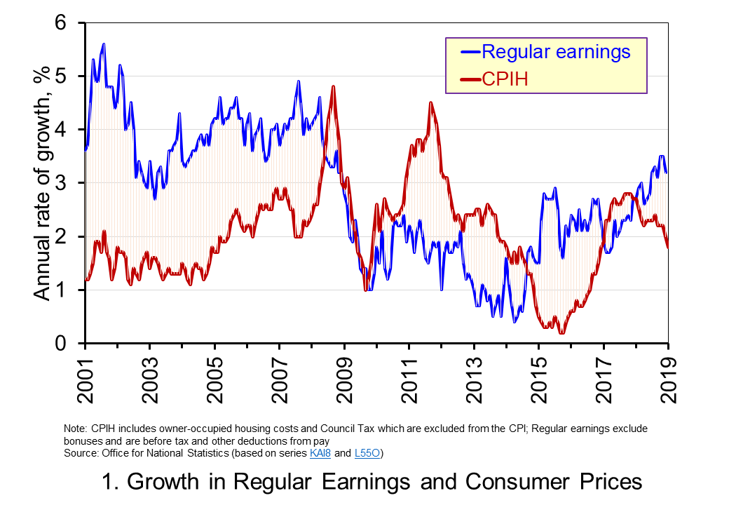 Chart 1 shows the annual percentage changes in actual (nominal) regular weekly pay and the CPIH since January 2001. Each value is simply the percentage change from 12 months earlier. The period up to June 2008 saw the annual growth of weekly pay outstrip the growth of consumer prices – the blue line in the chart is above the red line. Therefore, the real value of pay rose. However, from June 2008 to August 2014 pay growth consistently fell short of the rate of consumer price inflation – the blue line is below the red line. The result was that average real weekly pay fell. (Click
 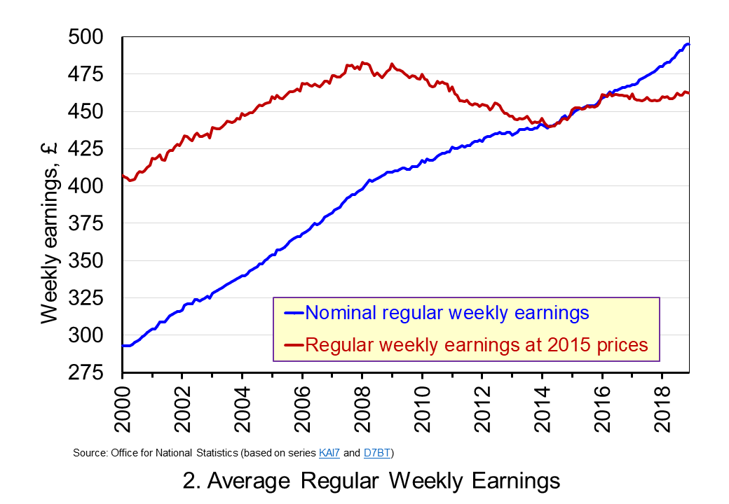 Chart 2 show the average levels of nominal and real weekly pay. The real series is adjusted for inflation. It is calculated by deflating the nominal pay values by the CPIH. Since the CPIH is a price index whose value averages 100 across 2015, the real pay values are at constant 2015 prices. From the chart, we can see that the real value of weekly pay peaked in March 2008 at £482.01 at 2015 prices. The subsequent period saw rates of pay inflation that were lower than rates of consumer price inflation. This meant that by March 2014 the real value of weekly pay had fallen by 8.8 per cent to £439.56 at 2015 prices. (Click
 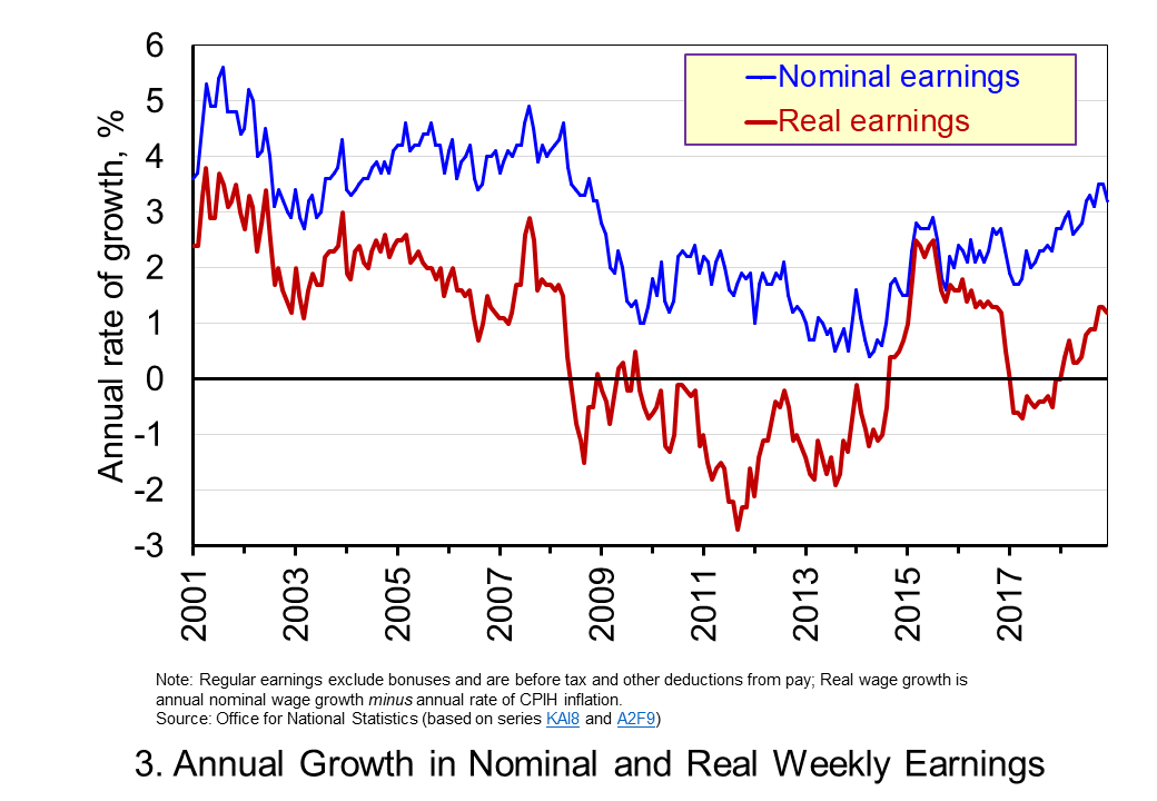 Chart 3 shows very clearly the importance of the distinction between real and nominal when analysing the growth of earnings. The sustained period of real pay deflation (negative rates of pay inflation) that followed the financial crisis can be seen much more clearly by plotting growth rates rather than their levels. Since June 2008 the average annual growth of real regular weekly pay has been −0.2 per cent, despite nominal pay increasing at an annual rate of 2 per cent. In the period from January 2001 to May 2008 real regular weekly pay had grown at an annual rate of 2.1 per cent with nominal pay growing at an annual rate of 4.0 per cent. (Click