 In the second of a series of blogs looking at applications of the distinction between nominal and real indicators, we revisit the blog Getting Real with Growth last updated in October 2021.
In this blog, we discuss how, in making a meaningful comparison over time of a country’s national income and, therefore, the aggregate purchasing power of its people, we need to take inflation into account. Likewise, if we want to analyse changes in the volume of production, we need to eliminate the effects of price changes on GDP. This is important when analysing the business cycle and identifying periods of boom or bust. Hence, in this updated blog we take another look at what real GDP data reveal about both longer-term economic growth and the extent of economic volatility – or what we refer to as the twin characteristics of economic growth.
Real and nominal GDP
The nominal (or current-price) estimate for UK gross domestic product in 2023 was £2.687 trillion. The estimate of national output or national income is based primarily on the production of final goods and services and, hence, purchased by the final user. It therefore largely excludes intermediate goods and services: i.e. goods and services that are transformed or used up in the process of making something else, although data on imports and exports do include intermediate goods and services. The 2023 figure represents a nominal increase in national income of 7.2 per cent on the £2.51 trillion recorded in 2022. These values make no adjustment for inflation and therefore reflect the prices of output that were prevailing at the time.
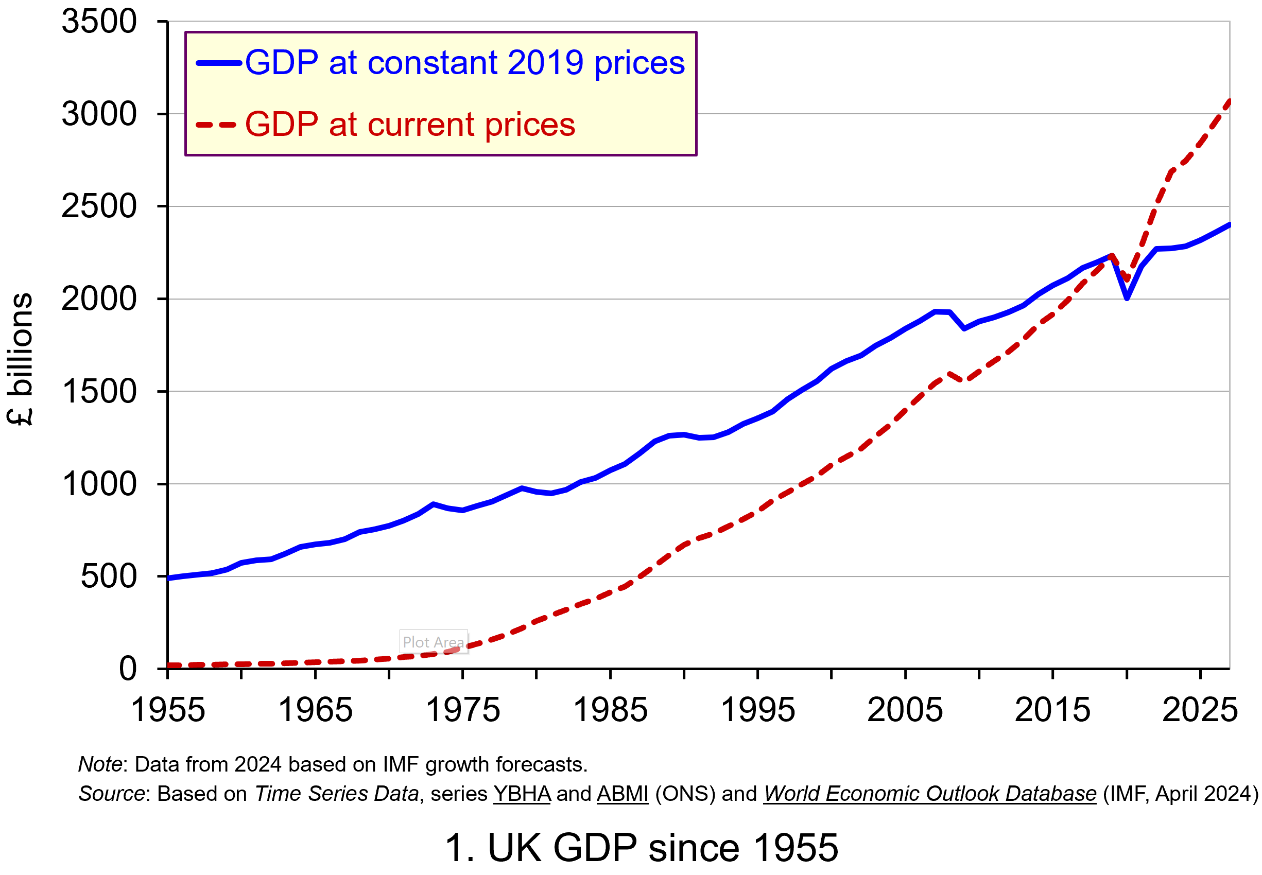 Chart 1 shows current-price estimates of GDP from 1955, when the value of GDP was estimated at £19.2 billion. The £2.687 trillion figure recorded for 2023 is an increase of over 140 times that in 1955, a figure that rises to 160 times if we compare the 1950 value with the latest IMF estimate for 2027. However, if we want to make a more meaningful comparison of the country’s national income we need to adjust for inflation. (Click here to download a PowerPoint of the chart.)
Long-term growth in real GDP
If we measure GDP at constant prices, we eliminate the effect of inflation. To construct a constant-price series for GDP, a process known as chain-linking is used. This involves taking consecutive pairs of years, e.g. 2022 and 2023, and estimating what GDP would be in the most recent year (in this case, 2023) if the previous year’s prices (i.e. 2022) had continued to prevail. By calculating the percentage change from the previous year’s GDP value we have an estimate of the volume change. If this is repeated for other pairs of years, we have a series of percentage changes that capture the volume changes from year-to-year. Finally, a reference year is chosen and the percentage volume changes are applied backwards and forwards from the nominal GDP value for the reference year.
In effect, a real GDP series creates a quantity measure in monetary terms. Chart 1 shows GDP at constant 2019 prices (real GDP) alongside GDP at current prices (nominal GDP). Consider first the real GDP numbers for 1955 and 2023. GDP in 1950 at 2019 prices was £491.2 billion. This is higher than the current-price value because prices in 2019 (the reference year) were higher than those in 1955. Meanwhile, GDP in 2023 when measured at 2019 prices was £2.273 trillion. This constant-price value is smaller than the corresponding current-price value because prices in 2019 where lower than those in 2023.
 Between 1955 and 2023 real GDP increased 4.6 times. If we extend the period to 2027, again using the latest IMF estimates, the increase is 4.9 times. Because we have removed the effect of inflation, the real growth figure is much lower than the nominal growth figure.
Crucially, what we are left with is an indicator of the long-term growth in the volume of the economy’s output and hence an increase in national income that is backed up by an increase in production. Whereas nominal growth rates are affected by changes in both volumes and prices, real growth rates reflect only changes in volumes.
The upward trajectory observed in constant-price GDP is therefore evidence of positive longer-term growth. This is one of the twin characteristics of growth.
Short-term fluctuations in the growth of real GDP
The second characteristic is fluctuations in the rate of growth from period to period. We can see this second characteristic more clearly by plotting the percentage change in real GDP from year to year.
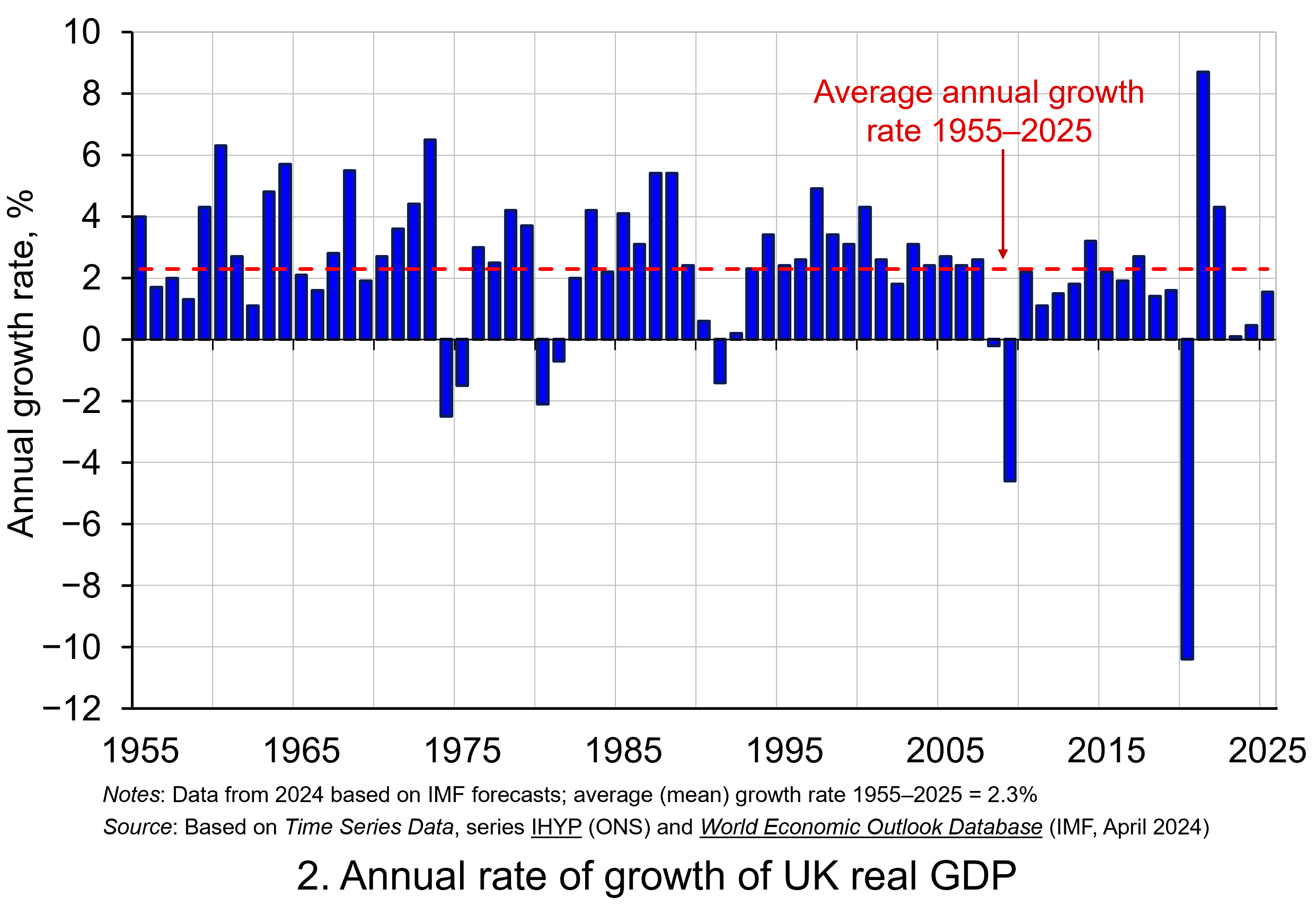 Chart 2 shows the annual rate of growth in real GDP each year from 1955 to 2025. From it, we see the inherent instability that is a key characteristic of the macroeconomic environment. This instability is, of course, mirrored in the output path of real GDP in Chart 1, but the annual rates of growth show the instability more clearly. We can readily see the impact on national output of the global financial crisis of 2007–8 and the global COVID pandemic.
In 2009, constant-price GDP in the UK fell by 4.6 per cent, whereas current-price GDP fell by 2.8 per cent. Then, in 2020, constant-price GDP and, hence, the volume of national output fell by 10.4 per cent, as compared to a 5.8 per cent fall in current-price GDP. These global, ‘once-in-a-generation’ shocks are stark examples of the instability that characterises economies and which generate the ‘ups and downs’ in an economy’s output path, known more simply as ‘the business cycle’. (Click here to download a PowerPoint copy of the chart.)
Determinants of long-and short-term growth
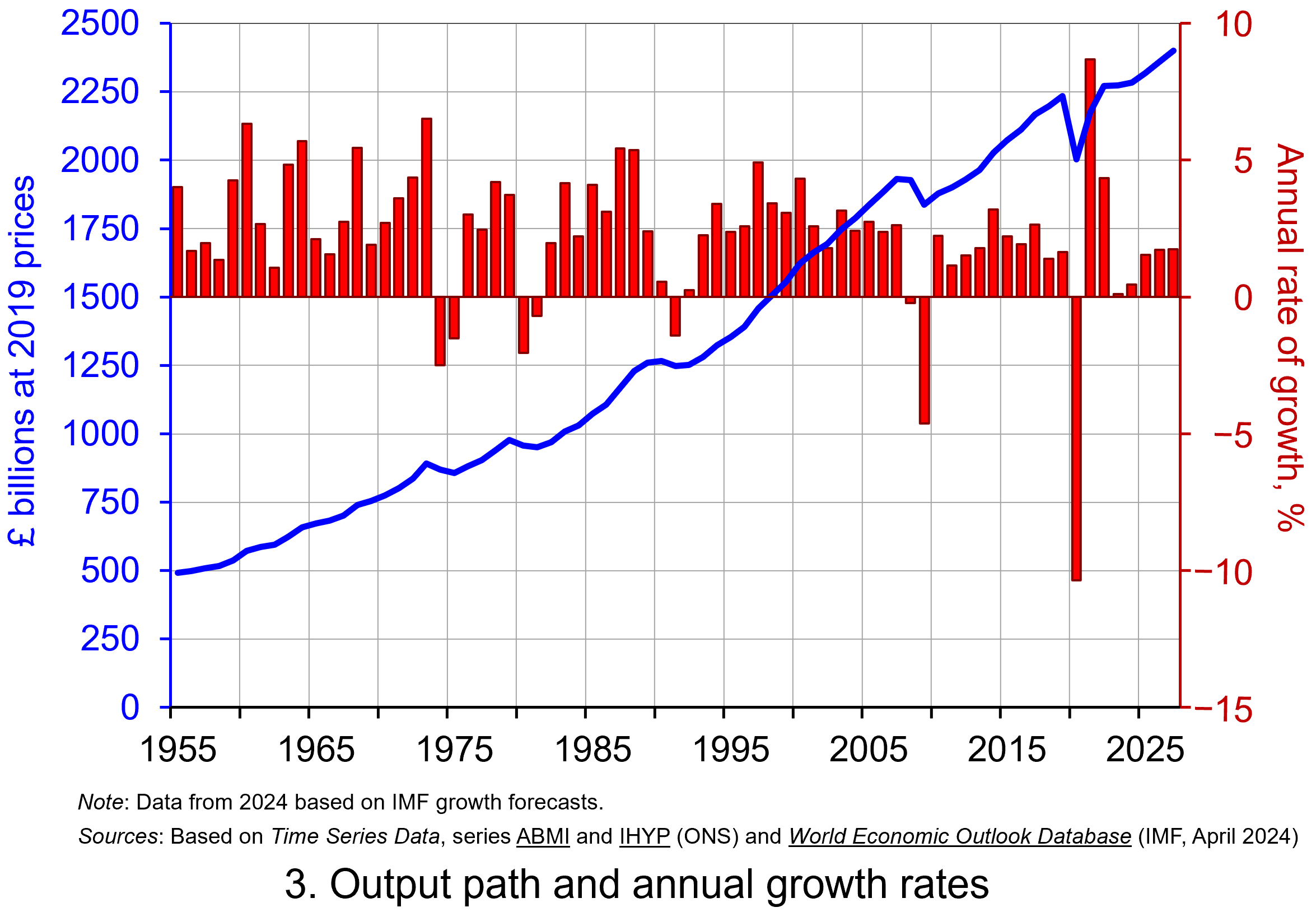 The twin characteristics of growth can be seen simultaneously by combining the output path (shown by the levels of real GDP) with the annual rates of growth. This is shown in Chart 3. The longer-term growth seen in the economy’s output path is generally argued to be driven by the quantity and quality of the economy’s resources, and their effectiveness when combined in production (i.e. their productivity). In other words, it is the supply side of the economy that determines the trajectory of the output path over the longer term. (Click here to download a PowerPoint copy of the chart.)
However, the fluctuations we observe in short-term growth rates tend to reflect shocks, also known as impulses, that originate either from the ability and or willingness of purchasers to consume (demand-side shocks) or producers to supply (supply-side shocks). These impulses are then amplified (or ‘propagated’) via the multiplier, expectations and other factors, and their effects, therefore, transmitted through the economy. Unusually in the case of the pandemic, the lockdown measures employed by governments around the world resulted in simultaneous negative aggregate demand and aggregate supply shocks.
Persistence effects
Explanations of the business cycle and of long-term growth are not mutually exclusive. The shocks and the propagation mechanisms that help to create and shape the business cycle can themselves have enduring or persistent effects on output. The global financial crisis, fuelled by unsustainable lending and the overstretch of private-sector balance sheets, which then spilt over to the public sector as governments attempted to stabilise the financial system and support aggregate demand, is argued by some to have created the conditions for low-growth persistence seen in many countries in the 2010s. This type of persistence is known as hysteresis as it originates from a negative demand shock.
Economists and policymakers were similarly concerned that the pandemic would also generate persistence in the form of scarring effects that might again affect the economy’s output path. Such concerns help to explain why many governments introduced furlough schemes to protect jobs and employment income, as well as provide grants or loans to business.
Per capita output
To finish, it is important to recognise that, when thinking about living standards, it is the growth in real GDP per capita that we need to consider. A rise in real GDP will only lead to a rise in overall living standards if it is faster than the rise in population.
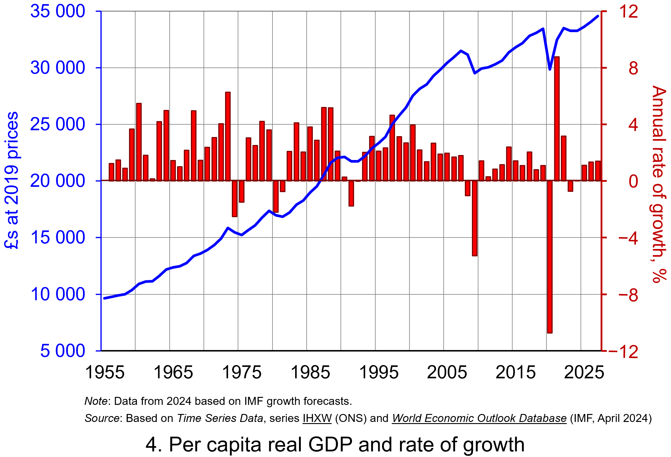 Our final chart therefore replicates Chart 3 but for real GDP per capita. Between 1955 and 2023 real GDP per capita grew by a factor of 3.45, which increases to 3.6 when we consider the period up to 2027. The average rate of growth of real GDP per capita up to 2023 was 1.87 per cent (lower than the 2.34 per cent increase in real GDP).
But the rate of increase in real GDP per capita was much higher before 2007 than it has been since. If we look at the period up to 2007 and, hence, before the global financial crisis, the figure is 2.32 per cent (2.7 per cent for real GDP), whereas from 2008 to 2023 the average rate of growth of real GDP per capita was a mere 0.42 per cent (1.1 per cent for real GDP). (Click here to download a PowerPoint copy of the chart.)
The final chart therefore reiterates the messages from recent blogs, such as Getting Real with Pay and The Productivity Puzzle, that long-term economic growth and the growth of real wages have slowed dramatically since the financial crisis. This has had important implications for the wellbeing of all sectors of the economy. The stagnation of living standards is therefore one of the most important economic issues of our time. It is one that the incoming Labour government will be keen to address.
Data and Reports
Articles
Questions
- What do you understand by the term ‘macroeconomic environment’? What data could be used to describe the macroeconomic environment?
- When a country experiences positive rates of inflation, which is higher: nominal economic growth or real economic growth?
- Does an increase in nominal GDP mean a country’s production has increased? Explain your answer.
- Does a decrease in nominal GDP mean a country’s production has decreased? Explain your answer.
- Why does a change in the growth of real GDP allow us to focus on what has happened to the volume of production?
- What does the concept of the ‘business cycle’ have to do with real rates of economic growth?
- When would falls in real GDP be classified as a recession?
- Distinguish between the concepts of ‘short-term growth’ and ‘longer-term growth’.
- What do you understand by the term ‘persistence’ in macroeconomics? Given examples of persistence effects and the means by which they can be generated?
- Discuss the proposition that the pandemic could have a positive effect on longer-term growth rates because of the ways that people and business have had to adapt.
 To make a sensible comparison of one year’s national income generated from the production of goods and services with another we need to take inflation into account. Changes in inflation-adjusted GDP represent changes in the volume of production of a country’s goods and services: in other words, the real value of goods and services. We revisit the blog written back in April 2019, prior the pandemic, to show how changes in real GDP evidence what we may refer to as the twin characteristics of economic growth: positive long-term growth but with fluctuating short-term rates of growth.
Real and nominal GDP
The nominal or current-price estimate for UK Gross Domestic Product in 2020 is £2.156 trillion. It is the value of output produced within the country in 2020. This was a fall of 4.4 per cent on the £2.255 trillion recorded in 2019. These values make no adjustment for inflation and therefore reflect the prices of output that were prevailing at the time.
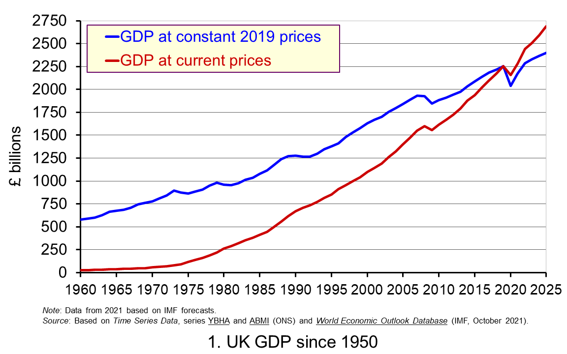 Chart 1 shows current-price estimates of GDP from 1950 when the value of GDP was estimated at £12.7 billion. The increase to £2.156 trillion in 2020 amounts to a proportionate increase of almost 170 times, a figure that rises to 211 times if we compare the 1950 value with the latest IMF estimate for 2025 of £2.689 trillion. However, if we want to make a more meaningful comparison of the country’s national income by looking at the longer-term increase in the volume of production, we need to adjust for inflation. (Click here to download a PowerPoint copy of the chart.)
Long-term growth in real GDP
If we measure GDP at constant prices, we eliminate the effect of inflation. To construct a constant-price series for GDP a process known as chain-linking is used. This involves taking consecutive pairs of years, e.g. 2020 and 2021, and estimating what GDP would be in the most recent year (in this case, 2021) if the previous year’s prices (i.e. 2020) had continued to prevail. By calculating the percentage change from the previous year’s GDP value we have an estimate of the volume change. If this is repeated for other pairs of years, we have a series of percentage changes that capture the volume changes from year-to-year. Finally, a reference year is chosen and the percentage changes are applied backwards and forwards from the nominal GDP value for the reference year – the volume changes forwards and backwards from this point.
In effect, a real GDP series creates a quantity measure in monetary terms. Chart 1 shows GDP at constant 2019 prices (real GDP) alongside GDP at current prices (nominal GDP). Consider first the real GDP numbers for 1950 and 2020. GDP in 1950 at 2019 prices was £410.1 billion. This is higher than the current-price value because prices in 2019 (the reference year) were higher than those in 1950. Meanwhile, GDP in 2020 when measured at 2019 prices was £2.037 trillion. This constant-price value is smaller than the corresponding current-price value because prices in 2019 where lower than those in 2020.
Between 1950 and 2020 real GDP increased 5.0 times. If we extend the period to 2025, again using the latest IMF estimates, the increase is 5.9 times. Because we have removed the effect of inflation, the real growth figure is much lower than the nominal growth figure. Crucially, what we are left with is an indicator of the long-term growth in the volume of the economy’s output and hence an increase in national income that is backed up by an increase in production. Whereas nominal growth rates are affected both by changes in volumes and prices, real growth rates reflect only changes in volumes.
The upward trajectory observed in constant-price GDP is therefore evidence of positive longer-term growth. This is one of the twin characteristics of growth.
Short-term fluctuations in the growth of real GDP
The second characteristic is fluctuations in the rate of growth from period to period. We can see this second characteristic more clearly by plotting the percentage change in real GDP from year to year.
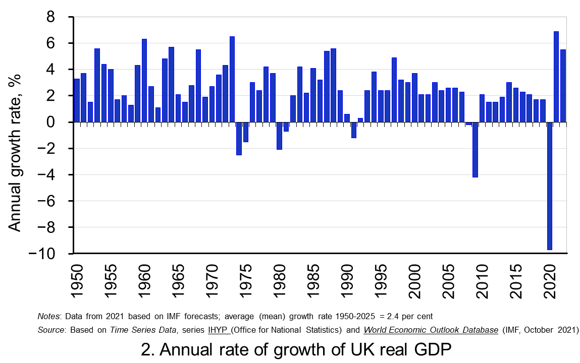 Chart 2 shows the annual rate of growth in real GDP each year since 1950. From it, we see the inherent instability that is a key characteristic of the macroeconomic environment. This instability is, of course, mirrored in the output path of real GDP in Chart 1, but the annual rates of growth show the instability more clearly. We can readily see the impact on national output of the global financial crisis and the global health emergency.
In 2009, constant-price GDP in the UK fell by 4.25 per cent. Then, in 2020, constant-price GDP and, hence, the volume of national output fell by 9.7 per cent, as compared to a 4.4 per cent fall in current-price GDP that we identified earlier. These global, ‘once-in-a-generation’ shocks are stark examples of the instability that characterises economies and which generate the ‘ups and downs’ in an economy’s output path, known more simply as ‘the business cycle’. (Click here to download a PowerPoint copy of the chart.)
Determinants of long-and short-term growth
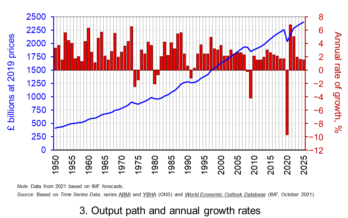 The twin characteristics of growth can be seen simultaneously by combining the output path captured by the levels of real GDP with the annual rates of growth. This is shown in Chart 3. The longer-term growth seen in the economy’s output path is generally argued to be driven by the quantity and quality of the economy’s resources, and their effectiveness when combined in production. In other words, it is the supply-side that determines the trajectory of the output path over the longer term. (Click here to download a PowerPoint copy of the chart.)
However, the fluctuations we observe in short-term growth rates tend to reflect impulses that affect the ability and or willingness of producers to supply (supply-side shocks) and purchasers to consume (demand-side shocks). These impulses are then propagated and their effects, therefore, transmitted through the economy.
Effects of the pandemic
The pandemic is unusual in that the health intervention measures employed by governments around the world resulted in simultaneous negative aggregate demand and aggregate supply shocks. Economists were particularly concerned that the magnitude of these impulses and their propagation had the potential to generate scarring effects and hence negative hysteresis effects. The concern was that these would affect the level of real GDP in the medium-to-longer term and, hence, the vertical position of the output path, as well as the longer-term rate of growth and, hence, the steepness of the output path.
The extent of these scarring effects continues to be debated. The ability of businesses and workers to adapt their practices, the extraordinary fiscal and monetary measures that were undertaken in many countries, and the roll-out of vaccines programmes, especially in advanced economies, have helped to mitigate some of these effects. For example, the latest IMF forecasts for output in the USA in 2024 are over 2 per cent higher than those made back in October 2019.
Scarring effects are, however, thought to be an ongoing issue in the UK. The IMF is now expecting output in the UK to be nearly 3 per cent lower than it originally forecast back in October 2019. Therefore, whilst UK output is set to recover, scarring effects on the UK economy will mean that the output path traced out by real GDP will remain, at least in the medium term, vertically lower than was expected before the pandemic.
Data and Reports
Articles
Questions
- What do you understand by the term ‘macroeconomic environment’? What data could be used to describe the macroeconomic environment?
- When a country experiences positive rates of inflation, which is higher: nominal economic growth or real economic growth?
- Does an increase in nominal GDP mean a country’s production has increased? Explain your answer.
- Does a decrease in nominal GDP mean a country’s production has decreased? Explain your answer.
- Why does a change in the growth of real GDP allow us to focus on what has happened to the volume of production?
- What does the concept of the ‘business cycle’ have to do with real rates of economic growth?
- When would falls in real GDP be classified as a recession?
- Distinguish between the concepts of ‘short-term growth rates’ and ‘longer-term growth’.
- What do you understand by the term hysteresis? By what means can hysteresis effects be generated?
- Discuss the proposition that the pandemic could have a positive effect on longer-term growth rates because of the ways that people and business have had to adapt.
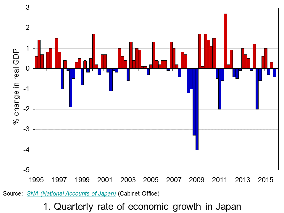
 Sustained economic growth in Japan remains elusive. Preliminary Quarterly Estimates of GDP point to the Japanese economy having contracted by 0.4 per cent in the final quarter of 2015. This follows on from growth of 0.3 per cent in the third quarter, a contraction of 0.3 per cent in the second and growth of 1 per cent in the first quarter. Taken as a whole output in 2015 rose by 0.4 per cent compared to zero growth in 2014. The fragility of growth means that over the past 20 years the average annual rate of growth in Japan is a mere 0.8 per cent.
 Chart 1 shows the quarter-to-quarter change in real GDP in Japan since the mid 1990s (Click here to download a PowerPoint of the chart). While economies are known to be inherently volatile the Japanese growth story over the past twenty or years so is one both of exceptional volatility and of repeated bouts of recession. Since the mid 1990s Japan has experienced 6 recessions, four since 2008.
Of the four recessions since 2008, the deepest was that from 2008 Q2 to 2009 Q1 which saw the economy shrink by 9.2 per cent. This was followed by a recession from 2010 Q4 to 2011 Q2 when the economy shrunk by 3.1 per cent, then from 2012 Q2 to 2012 Q4 when the economy shrunk by 0.9 per cent and from 2014 Q2 to 2014 Q3 when output fell another 2.7 per cent. As a result of these four recessionary periods the economy’s output in 2015 Q4 was actually 0.4 per cent less than in 2008 Q1.
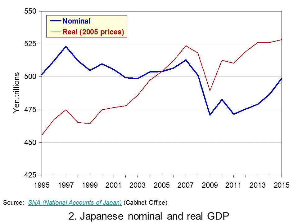
 Chart 2 shows the annual levels of nominal (actual) and real (constant-price) GDP in trillions of Yen (¥) since 1995. (Click here to download a PowerPoint of the chart). Over the period actual GDP has fallen from ¥502 trillion to ¥499 trillion (about £3 trillion at the current exchange rate) while GDP at constant 2005 prices has risen from ¥455 trillion to ¥528 trillion.
Chart 2 reveals an interesting phenomenon: the growth in real GDP at the same time as a fall in nominal GDP. So why has the actual value of GDP fallen slightly between 1995 and 2005? The answer is quite simple: deflation.
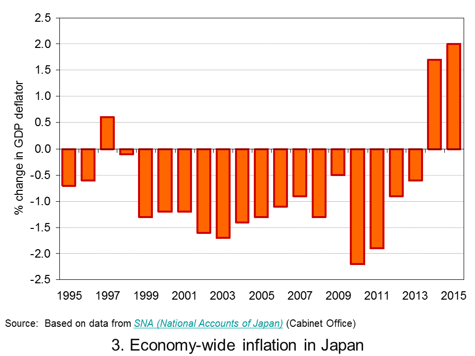
 Chart 3 shows a protracted period of economy-wide deflation from 1999 to 2013. (Click here to download a PowerPoint of the chart). Over this period the GDP deflator fell each year by an average of 1.0 per cent. 2014 and 2015 saw a pick up in economy-wide inflation. However, the quarterly profile through 2015 shows the pace of inflation falling quite markedly. As we saw in Japan’s interesting monetary stance as deflation fears grow, policymakers are again concerned about the possibility of deflation and the risks that poses for growth.
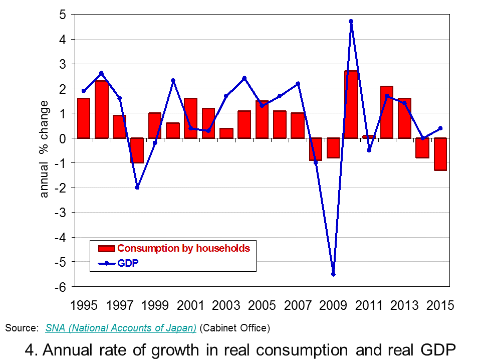
 As Chart 4 helps to demonstrate, a significant factor behind the latest slowdown in Japan’s growth is household spending. (Click here to download a PowerPoint of the chart). In 2015 household spending accounted for about 57 per cent by value of GDP in Japan. In the last quarter of 2015 real household spending fell by 0.9 per cent while across 2015 as a whole real household spending fell by 1.3 per cent. This follows on from a 0.8 per cent decrease in spending by households in 2014.
The recent marked weakening of household spending is a significant concern for the short term growth prospects of the Japanese economy. The roller coaster ride continues, unfortunately it appears that the ride is again downwards.
Data
Quarterly Estimates of GDP Japanese Cabinet Office
Japan and the IMF IMF Country Reports
Economic Outlook Annex Tables OECD
Articles
Japan’s economy contracts in fourth quarter BBC News, (15/2/16)
Japanese economy shrinks again, raising expectations of more stimulus Telegraph, Szu Ping Chan (15/2/16)
Japan’s economy shrinks again as Abenomics is blown off course Guardian, Justin McCurry (15/2/16)
Japan’s economy contracts in latest setback for Abe policies New Zealand Herald, (15/2/16)
Japan’s ‘Abenomics’ on the ropes as yen soars, markets plunge Daily Mail, (15/2/16)
Japan economy shrinks more than expected, highlights lack of policy options CNBC, Leika Kihara and Tetsushi Kajimoto (15/2/16)
Questions
- Why is the distinction between nominal and real important in analysing economic growth?
- How do we define a recession?
- Of what importance is aggregate demand to the volatility of economies?
- Why are Japanese policymakers concerned about the prospects of deflation?
- What policy options are available to policymakers trying to combat deflation?
- Why is the strength of household consumption important in affecting the path of an economy?
- Why has Japan experienced an increase in real GDP but a fall in nominal GDP between 1995 and 2015?
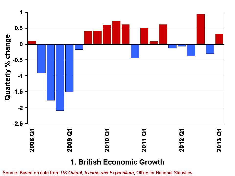
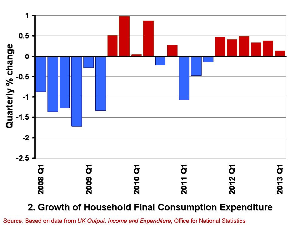
 When you are next in town shopping, just keep in mind that consumer spending accounts for a little over 60 per cent of GDP. Therefore, consumption is incredibly important to the economy. How consumers behave is crucial to our short-term economic growth. The second estimate of British growth from the Office for National Statistics shows that the economy expanded by 0.3 per cent in the first three months of 2013. This follows a 0.3 per cent decline in the final quarter of 2012. Real household expenditure rose by just 0.1 per cent in Q1 2013. However, this was the sixth consecutive quarter in which the volume of purchases by households has grown.
 The growth in the economy is measured by changes in real GDP. Chart 1 shows the quarter-to-quarter change in real GDP since Q1 2008. (Click here to download a PowerPoint of the chart). During this period the economy is thought to have contracted in 10 of the 21 quarters shown. Furthermore, they show a double-dip recession and so two periods in close proximity where output shrank for two or more quarters. While more recent output numbers are frequently revised, which could see the double-dip recession possibly ‘statistically wiped’ from history, the period since 2008 will always been one characterised by anemic growth. The average quarterly growth rate since Q1 2008 has been -0.12 per cent.
 Chart 2 shows from Q1 2008 the quarterly growth in household expenditure in real terms, i.e. after stripping the effect of consumer price inflation. (Click here for a PowerPoint of the chart). Over the period, the volume of household consumption has typically fallen by 0.18 per cent per quarter. Hence, consumption has feared a little worse than the economy has a whole.
While the annualised rate of growth for the economy since Q1 2008 has averaged -0.47 per cent that for consumer spending has averaged -0.73 per cent. However, these figures disguise a recent improvement in consumer spending growth. This is because the volume of consumption has in fact grown in each of the six quarters since Q4 2011. In contrast, the economy has grown in only 2 of these quarters. It is, of course, much too early to start trumpeting consumption growth has heralding better times, not least because the 0.1 per cent growth in Q1 2013 is the weakest number since positive consumption growth resumed at the back end of 2011. Nonetheless, the figures do deserve some analysis by economists to understand what is going on.
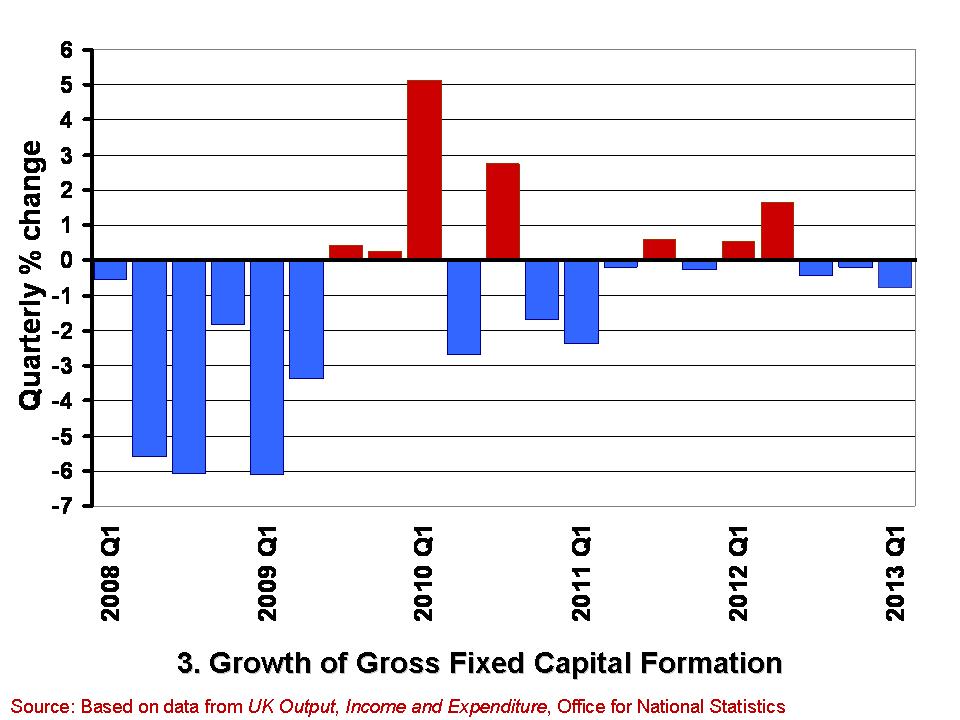
 A slightly less promising note is struck by the gross fixed capital formation (GFCF) numbers. These numbers relate to the volume of investment in non-financial fixed assets, such as machinery, buildings, office space and fixtures and fittings. Chart 3 shows the quarterly growth in the volume of GFCF since Q1 2008. (Click here for a PowerPoint of the chart). The average quarterly rate of growth over this period has been -0.77 per cent. This is equivalent to an annual rate of decline of 3.9 per cent. GFCF has risen in only 7 of these quarters, declining in the remaining 14 quarters.
Worryingly, gross fixed capital formation has decreased in each of the last three quarters. While these figures may reflect continuing difficulties encountered by businesses in obtaining finance, they may also point to lingering concerns within the business community about the prospects for sustained growth. Therefore, it is important for economists to try and understand the drivers of these disappointing investment numbers and, hence, whether it is these or the slightly better consumption numbers that best hint at our short-term economic prospects.
Data
Second estimate of GDP, Q1 2013 Office for National Statistics
Second Estimate of GDP, Q1 2013 Dataset Office for National Statistics
Articles
UK GDP: concerns about underlying economy as 0.3pc growth confirmed Telegraph, Philip Aldrick (23/5/13)
UK investment fall among worst in G8 Guardian, Phillip Inman (23/5/13)
UK first-quarter growth unchanged BBC News (28/5/13)
U.K. Economy Grows 0.3% on Inventories, Consumer Spending Bloomberg, Svenja O’Donnell (23/5/13)
Surge in consumer spending kept UK out of recession The Telegraph (28/5/13)
Boost in service sector activity The Herald, Greig Cameron (28/5/13)
Hopes dashed as household spending rises by just 0.1% The Herald, Ian McConnell (24/5/13)
Questions
- Why do we typically focus on real GDP rather than nominal GDP when analysing economic growth?
- What is meant by aggregate demand? Of what importance is consumer spending to aggregate demand?
- Why might the patterns we observe in consumer spending differ from those in other components of aggregate demand?
- What factors might influence the determination of consumer spending?
- What do you understand by gross fixed capital formation? What factors might help to explain how its level is determined?
- Of what significance is gross fixed capital formation for aggregate demand and for aggregate supply?
- What is a recession? What is a double-dip recession?
- What data would you need to collect to identify a recession?
 We know two things about economic growth in a developed economy like the UK: it is positive over the longer term, but highly volatile in the short term. We can refer to these two facts as the twin characteristics of growth. The volatility of growth sees occasional recessions, i.e. two or more consecutive quarters of declining output. Since 1973, the UK has experienced six recessions.
Here we consider in a little more detail the growth numbers for the UK from the latest Quarterly National Accounts, focusing on the depth and duration of these six recessions. How do they compare?
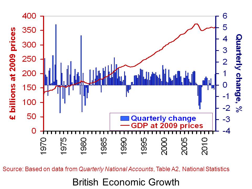
The latest figures on British economic growth show that the UK economy grew by 0.9 per cent in the third quarter of 2012. However, when compared with the third quarter of 2011, output was essentially unchanged. This means that the annual rate of growth was zero. Perhaps even more telling is that output (real GDP) in Q3 2012 was still 3.0 per cent below its Q1 2008 level.
 The chart helps to put the recent output numbers into an historical context. It shows both the quarter-to-quarter changes in real GDP (right-hand axis) and the level of output as measured by GDP at constant 2009 prices (left-hand axis). It captures nicely the twin characteristics of growth. Since 1970, the average rate of growth each quarter has been 0.6 per cent. This is equivalent to an average rate of growth of 2.35 per cent per year. The chart also allows us to pin-point periods of recessions.
One way of comparing recessions is to compare their ‘2 Ds’: depth and duration. The table shows the number of quarters each of the six recessions since 1973 lasted. It also shows how much smaller the economy was by the end of each recession. In other words, it shows the depth of each recession as measured by the percentage reduction in output (real GDP).
British recessions
|
Duration (quarters) |
Depth (output lost, %) |
| 1973Q3–74Q1 |
3 |
3.25 |
| 1975Q2–75Q3 |
2 |
1.76 |
| 1980Q1–81Q1 |
5 |
4.63 |
| 1990Q3–91Q3 |
5 |
2.93 |
| 2008Q2–09Q2 |
5 |
6.28 |
| 2011Q4–12Q2 |
3 |
0.90 |
 In the second of a series of blogs looking at applications of the distinction between nominal and real indicators, we revisit the blog Getting Real with Growth last updated in October 2021.
 Chart 1 shows current-price estimates of GDP from 1955, when the value of GDP was estimated at £19.2 billion. The £2.687 trillion figure recorded for 2023 is an increase of over 140 times that in 1955, a figure that rises to 160 times if we compare the 1950 value with the latest IMF estimate for 2027. However, if we want to make a more meaningful comparison of the country’s national income we need to adjust for inflation. (Click here to download a PowerPoint of the chart.)
 Between 1955 and 2023 real GDP increased 4.6 times. If we extend the period to 2027, again using the latest IMF estimates, the increase is 4.9 times. Because we have removed the effect of inflation, the real growth figure is much lower than the nominal growth figure.
 Chart 2 shows the annual rate of growth in real GDP each year from 1955 to 2025. From it, we see the inherent instability that is a key characteristic of the macroeconomic environment. This instability is, of course, mirrored in the output path of real GDP in Chart 1, but the annual rates of growth show the instability more clearly. We can readily see the impact on national output of the global financial crisis of 2007–8 and the global COVID pandemic.
 The twin characteristics of growth can be seen simultaneously by combining the output path (shown by the levels of real GDP) with the annual rates of growth. This is shown in Chart 3. The longer-term growth seen in the economy’s output path is generally argued to be driven by the quantity and quality of the economy’s resources, and their effectiveness when combined in production (i.e. their productivity). In other words, it is the supply side of the economy that determines the trajectory of the output path over the longer term. (Click here to download a PowerPoint copy of the chart.)
 Our final chart therefore replicates Chart 3 but for real GDP per capita. Between 1955 and 2023 real GDP per capita grew by a factor of 3.45, which increases to 3.6 when we consider the period up to 2027. The average rate of growth of real GDP per capita up to 2023 was 1.87 per cent (lower than the 2.34 per cent increase in real GDP).
  Chart 1 shows current-price estimates of GDP from 1950 when the value of GDP was estimated at £12.7 billion. The increase to £2.156 trillion in 2020 amounts to a proportionate increase of almost 170 times, a figure that rises to 211 times if we compare the 1950 value with the latest IMF estimate for 2025 of £2.689 trillion. However, if we want to make a more meaningful comparison of the country’s national income by looking at the longer-term increase in the volume of production, we need to adjust for inflation. (Click
  Chart 2 shows the annual rate of growth in real GDP each year since 1950. From it, we see the inherent instability that is a key characteristic of the macroeconomic environment. This instability is, of course, mirrored in the output path of real GDP in Chart 1, but the annual rates of growth show the instability more clearly. We can readily see the impact on national output of the global financial crisis and the global health emergency.
 The twin characteristics of growth can be seen simultaneously by combining the output path captured by the levels of real GDP with the annual rates of growth. This is shown in Chart 3. The longer-term growth seen in the economy’s output path is generally argued to be driven by the quantity and quality of the economy’s resources, and their effectiveness when combined in production. In other words, it is the supply-side that determines the trajectory of the output path over the longer term. (Click
