 The past decade or so has seen large-scale economic turbulence. As we saw in the blog Fiscal impulses, governments have responded with large fiscal interventions. The COVID-19 pandemic, for example, led to a positive fiscal impulse in the UK in 2020, as measured by the change in the structural primary balance, of over 12 per cent of national income.
The scale of these interventions has led to a significant increase in the public-sector debt-to-GDP ratio in many countries. The recent interest rates hikes arising from central banks responding to inflationary pressures have put additional pressure on the financial well-being of governments, not least on the financing of their debt. Here we discuss these pressures in the context of the ‘r – g’ rule of sustainable public debt.
Public-sector debt and borrowing
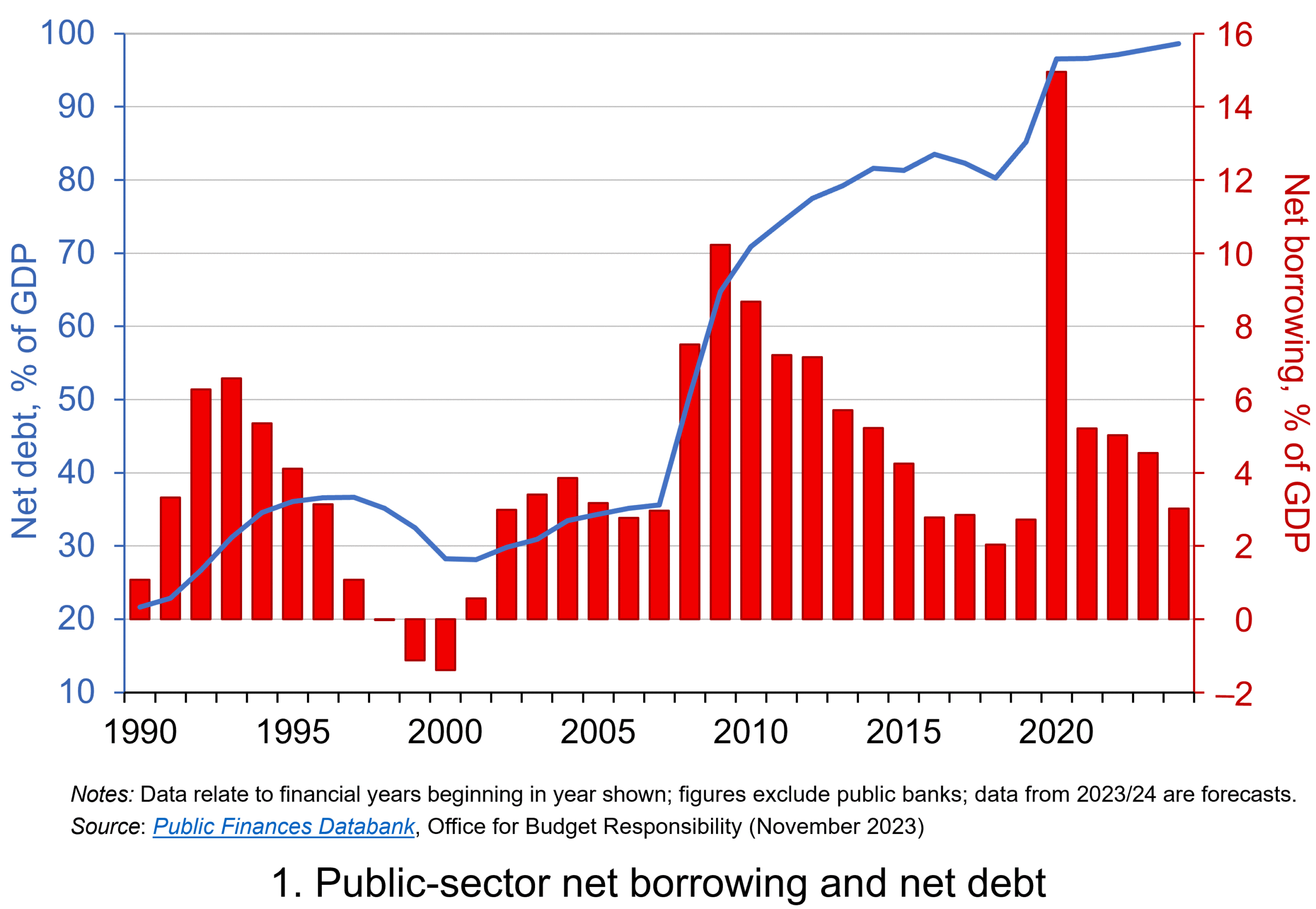 Chart 1 shows the path of UK public-sector net debt and net borrowing, as percentages of GDP, since 1990. Debt is a stock concept and is the result of accumulated flows of past borrowing. Net debt is simply gross debt less liquid financial assets, which mainly consist of foreign exchange reserves and cash deposits. Net borrowing is the headline measure of the sector’s deficit and is based on when expenditures and receipts (largely taxation) are recorded rather than when cash is actually paid or received. (Click here for a PowerPoint of Chart 1)
Chart 1 shows the impact of the fiscal interventions associated with the global financial crisis and the COVID-19 pandemic, when net borrowing rose to 10 per cent and 15 per cent of GDP respectively. The former contributed to the debt-to-GDP ratio rising from 35.6 per cent in 2007/8 to 81.6 per cent in 2014/15, while the pandemic and subsequent cost-of-living interventions contributed to the ratio rising from 85.2 per cent in 2019/20 to around 98 per cent in 2023/24.
Sustainability of the public finances
 The ratcheting up of debt levels affects debt servicing costs and hence the budgetary position of government. Yet the recent increases in interest rates also raise the costs faced by governments in financing future deficits or refinancing existing debts that are due to mature. In addition, a continuation of the low economic growth that has beset the UK economy since the global financial crisis also has implications for the burden imposed on the public sector by its debts, and hence the sustainability of the public finances. After all, low growth has implications for spending commitments, and, of course, the flow of receipts.
The analysis therefore implies that the sustainability of public-sector debt is dependent on at least three factors: existing debt levels, the implied average interest rate facing the public sector on its debts, and the rate of economic growth. These three factors turn out to underpin a well-known rule relating to the fiscal arithmetic of public-sector debt. The rule is sometimes known as the ‘r – g’ rule (i.e. the interest rate minus the growth rate).
Underpinning the fiscal arithmetic that determines the path of public-sector debt is the concept of the ‘primary balance’. This is the difference between the sector’s receipts and its expenditures less its debt interest payments. A primary surplus (a positive primary balance) means that receipts exceed expenditures less debt interest payments, whereas a primary deficit (a negative primary balance) means that receipts fall short. The fiscal arithmetic necessary to prevent the debt-to-GDP ratio rising produces the following stable debt equation or ‘r – g’ rule:
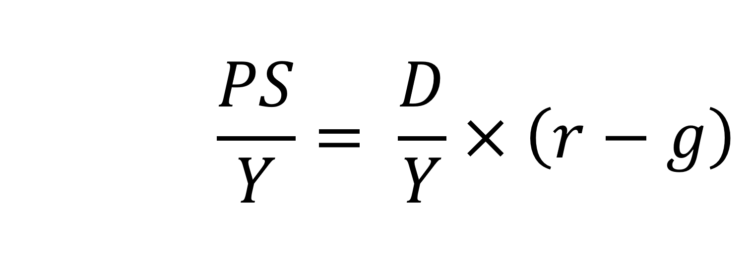
On the left-hand side of the stable debt equation is the required primary surplus (PS) to GDP (Y) ratio. Moving to the right-hand side, the first term is the existing debt-to-GDP ratio (D/Y). The second term ‘r – g’, is the differential between the average implied interest rate the government pays on its debt and the growth rate of the economy. These terms can be expressed in either nominal or real terms as this does not affect the differential.
To illustrate the rule consider a country whose existing debt-to-GDP ratio is 1 (i.e. 100 per cent) and the ‘r – g’ differential is 0.02 (2 percentage points). In this scenario they would need to run a primary surplus to GDP ratio of 0.02 (i.e. 2 percent of GDP).
The ‘r – g‘ differential
The ‘r – g’ differential reflects macroeconomic and financial conditions. The fiscal arithmetic shows that these are important for the dynamics of public-sector debt. The fiscal arithmetic is straightforward when r = g as any primary deficit will cause the debt-to-GDP ratio to rise, while a primary surplus will cause the ratio to fall. The larger is g relative to r the more favourable are the conditions for the path of debt. Importantly, if the differential is negative (r < g), it is possible for the public sector to run a primary deficit, up to the amount that the stable debt equation permits.
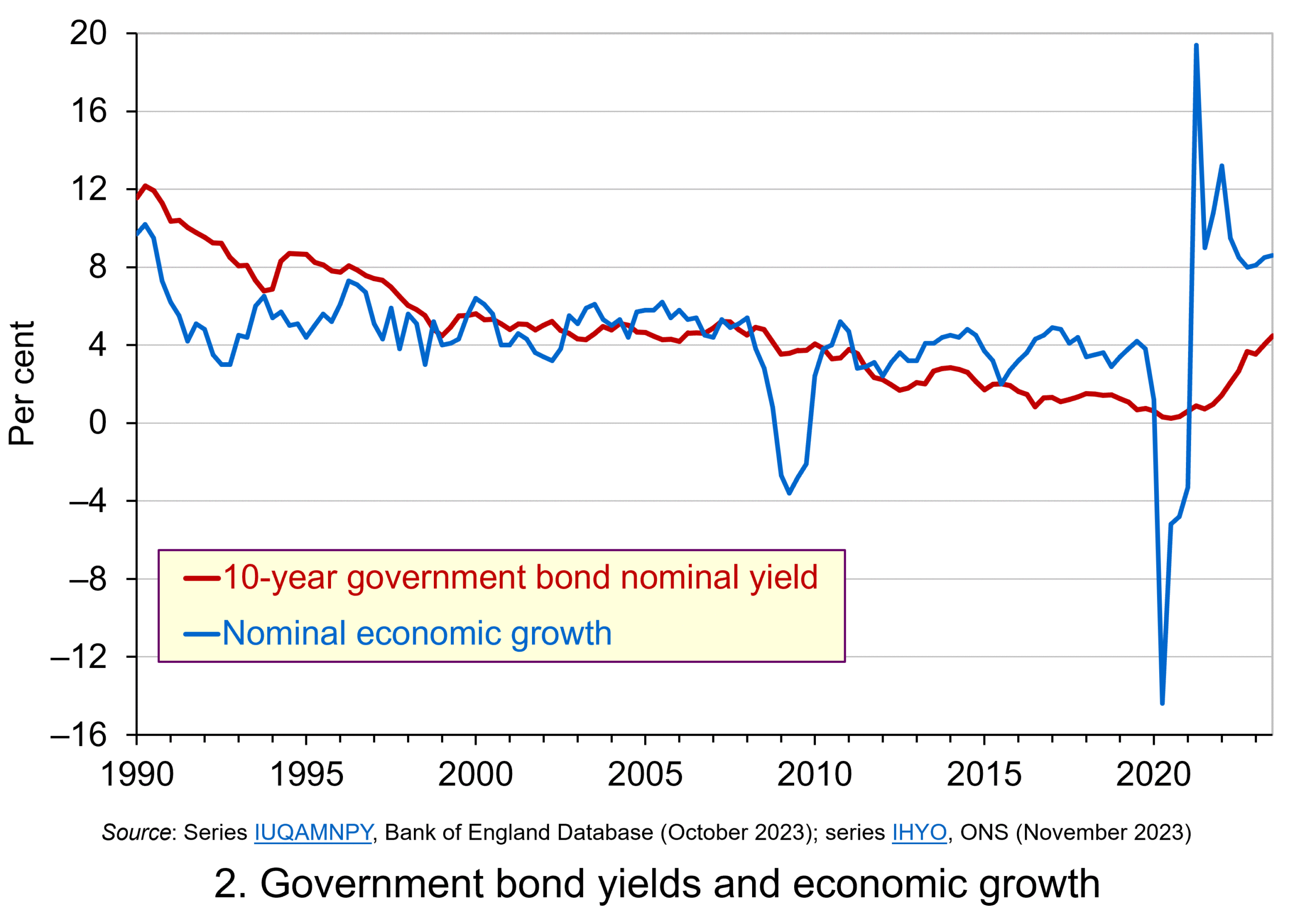 Consider Charts 2 and 3 to understand how the ‘r – g’ differential has affected debt sustainability in the UK since 1990. Chart 2 plots the implied yield on 10-year government bonds, alongside the annual rate of nominal growth (click here for a PowerPoint). As John explains in his blog The bond roller coaster, the yield is calculated as the coupon rate that would have to be paid for the market price of a bond to equal its face value. Over the period, the average annual nominal growth rate was 4.5 per cent, while the implied interest rate was almost identical at 4.6 per cent. The average annual rate of CPI inflation over this period was 2.8 per cent.
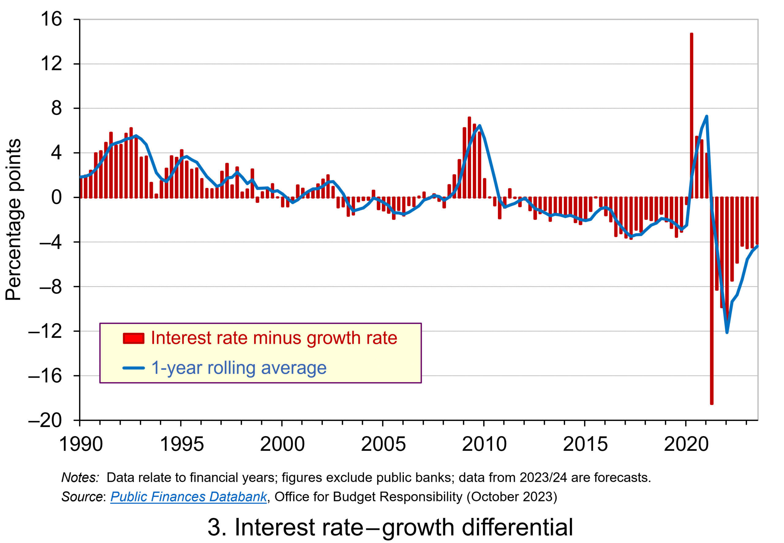 Chart 3 plots the ‘r – g’ differential which is simply the difference between the two series in Chart 2, along with a 12-month rolling average of the differential to help show better the direction of the differential by smoothing out some of the short-term volatility (click here for a PowerPoint). The differential across the period is a mere 0.1 percentage points implying that macroeconomic and financial conditions have typically been neutral in supporting debt sustainability. However, this does mask some significant changes across the period.
We observe a general downward trend in the ‘r – g’ differential from 1990 up to the time of the global financial crisis. Indeed between 2003 and 2007 we observe a favourable negative differential which helps to support the sustainability of public debt and therefore the well-being of the public finances. This downward trend of the ‘r – g’ differential was interrupted by the financial crisis, driven by a significant contraction in economic activity. This led to a positive spike in the differential of over 7 percentage points.
 Yet the negative differential resumed in 2010 and continued up to the pandemic. Again, this is indicative of the macroeconomic and financial environments being supportive of the public finances. It was, however, largely driven by low interest rates rather than by economic growth.
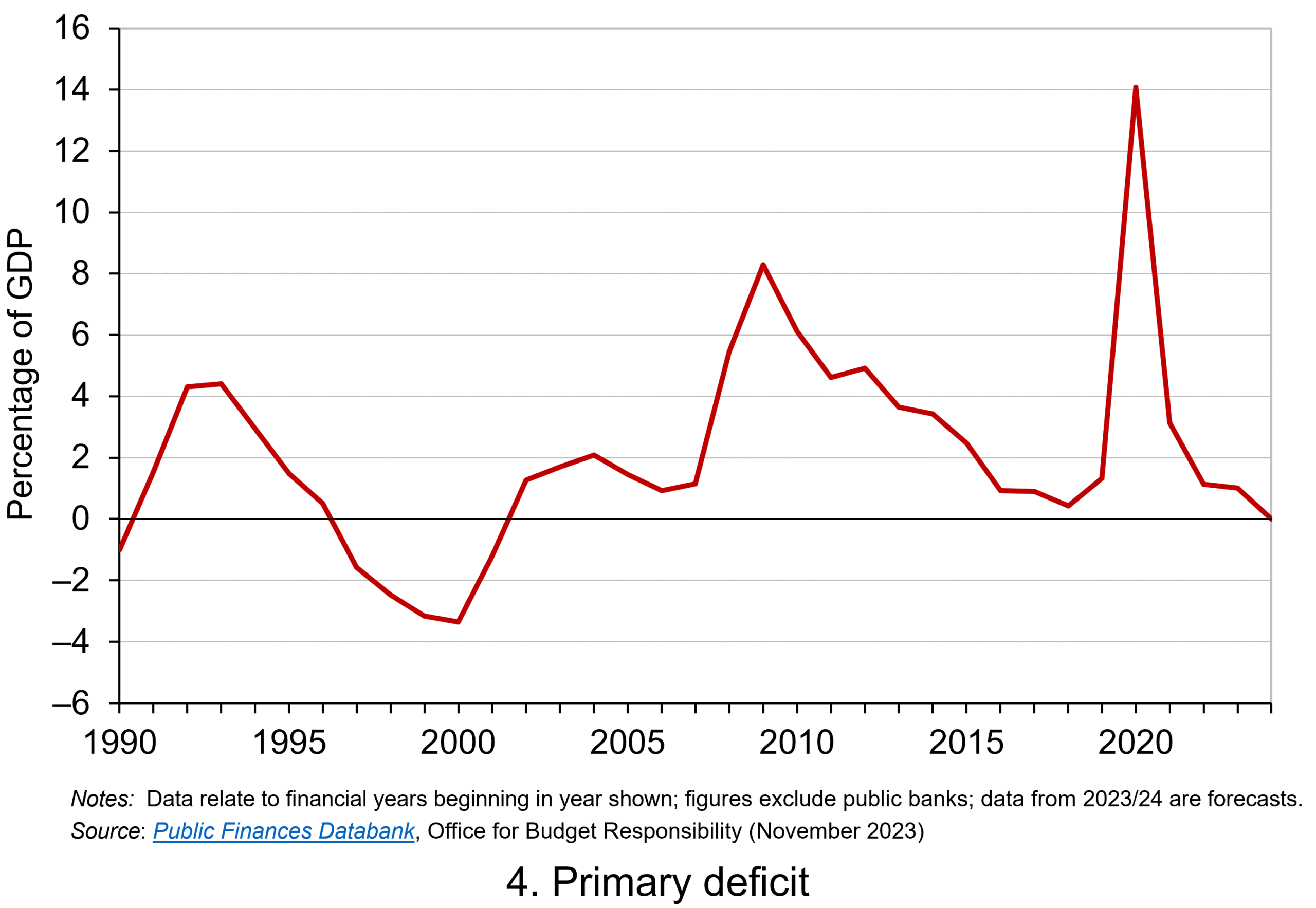
Consequently, the negative ‘r – g’ differential meant that the public sector could continue to run primary deficits during the 2010s, despite the now much higher debt-to-GDP ratio. Yet, weak growth was placing limits on this. Chart 4 indeed shows that primary deficits fell across the decade (click here for a PowerPoint).
The pandemic and beyond
 The pandemic saw the ‘r – g’ differential again turn markedly positive, averaging 7 percentage points in the four quarters from Q2 of 2020. While the differential again turned negative, the debt-to-GDP ratio had also increased substantially because of large-scale fiscal interventions. This made the negative differential even more important for the sustainability of the public finances. The question is how long the negative differential can last.
Looking forward, the fiscal arithmetic is indeed uncertain and worryingly is likely to be less favourable. Interest rates have risen and, although inflationary pressures may be easing somewhat, interest rates are likely to remain much higher than during the past decade. Geopolitical tensions and global fragmentation pose future inflationary concerns and a further drag on growth.
As well as the short-term concerns over growth, there remain long-standing issues of low productivity which must be tackled if the growth of the UK economy’s potential output is to be raised. These concerns all point to the important ‘r – g’ differential become increasingly less negative, if not positive. If so the fiscal arithmetic could mean increasingly hard maths for policymakers.
Articles
- The budget deficit: a short guide
House of Commons Library (8/6/23)
- If markets are right about long real rates, public debt ratios will increase for some time. We must make sure that they do not explode.
Peterson Institute for International Economics, Olivier Blanchard (6/11/23)
- The UK government’s debt nightmare
ITV News, Robert Peston (13/7/23)
- National debt could hit 300% of GDP by 2070s, independent watchdog the OBR warns
Sky News, James Sillars (13/7/23)
- How much money is the UK government borrowing, and does it matter?
BBC News (20/10/23)
- Cost of national debt hits 20-year high
BBC News, Vishala Sri-Pathma & Faisal Islam (4/10/23)
- Bond markets could see ‘mini boom-bust cycles’ as global government debt to soar by $5 trillion a yea
Markets Insider, Filip De Mott (16/11/23)
- The counterintuitive truth about deficits for bond investors
Financial Times, Matt King (17/11/23)
- UK government borrowing almost £20bn lower than expected
The Guardian, Richard Partington (20/10/23)
- Controlling debt is just a means — it is not a government’s end
Financial Times, Martin Wolf (13/11/23)
Data
Questions
- What is meant by each of the following terms: (a) net borrowing; (b) primary deficit; (c) net debt?
- Explain how the following affect the path of the public-sector debt-to-GDP ratio: (a) interest rates; (b) economic growth; (c) the existing debt-to-GDP ratio.
- Which factors during the 2010s were affecting the fiscal arithmetic of public debt positively, and which negatively?
- Discuss the prospects for the fiscal arithmetic of public debt in the coming years.
- Assume that a country has an existing public-sector debt-to-GDP ratio of 60 percent.
(a) Using the ‘rule of thumb’ for public debt dynamics, calculate the approximate primary balance it would need to run in the coming year if the expected average real interest rate on the debt were 3 per cent and real economic growth were 2 per cent?
(b) Repeat (a) but now assume that real economic growth is expected to be 4 per cent.
(c) Repeat (a) but now assume that the existing public-sector debt-to-GDP ratio is 120 per cent.
(d) Using your results from (a) to (c) discuss the factors that affect the fiscal arithmetic of the growth of public-sector debt.
 Three international agencies, the IMF, the European Commission and the OECD, all publish six-monthly forecasts for a range of countries. As each agency’s forecasts have been published this year, so the forecasts for economic growth and other macroeconomic indicators, such as unemployment, have got more dire.
The IMF was the first to report. Its World Economic Outlook, published on 14 April, forecast that in the UK real GDP would fall by 6.5% in 2020 and rise by 4% in 2021 (not enough to restore GDP to 2019 levels); in the USA it would fall by 5.9% this year and rise by 4.7% next year; in the eurozone it would fall by 7.5% this year and rise by 4.7% next.
The European Commission was next to report. Its AMECO database was published on 6 May. This forecast that UK real GDP would fall by 8.3% this year and rise by 6% next; in the USA it would fall by 6.5% this year and rise by 4.9% next; in the eurozone it would fall by 7.7% this year and rise by 6.3% next.
The latest to report was the OECD on 10 June. The OECD Economic Outlook was the most gloomy. In fact, it produced two sets of forecasts.
The first, more optimistic one (but still more gloomy than the forecasts of the other two agencies) was based on the assumption that lockdowns would continue to be lifted and that there would be no second outbreak later in the year. This ‘single-hit scenario’ forecast that UK real GDP would fall by 11.5% this year and rise by 9% next (a similar picture to France and Italy); in the USA it would fall by 7.3% this year and rise by 4.1% next; in the eurozone it would fall by 9.1% this year and rise by 6.5% next.
The second set of OECD forecasts was based on the assumption that there would be a second wave of the virus and that lockdowns would have to be reinstated. Under this ‘double-hit scenario’, the UK’s GDP is forecast to fall by 14.0% this year and rise by 5.0 per cent next; in the USA it would fall by 8.5% this year and rise by 1.9% next; in the eurozone it would fall by 11.5% this year and rise by 3.5% next.
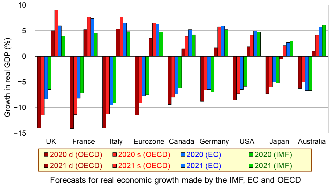
The first chart shows the four sets of forecasts (including two from the OECD) for a range of countries. The first four bars for each country are the forecasts for 2020; the other four bars for each country are for 2021. (Click here for a PowerPoint of the chart.)
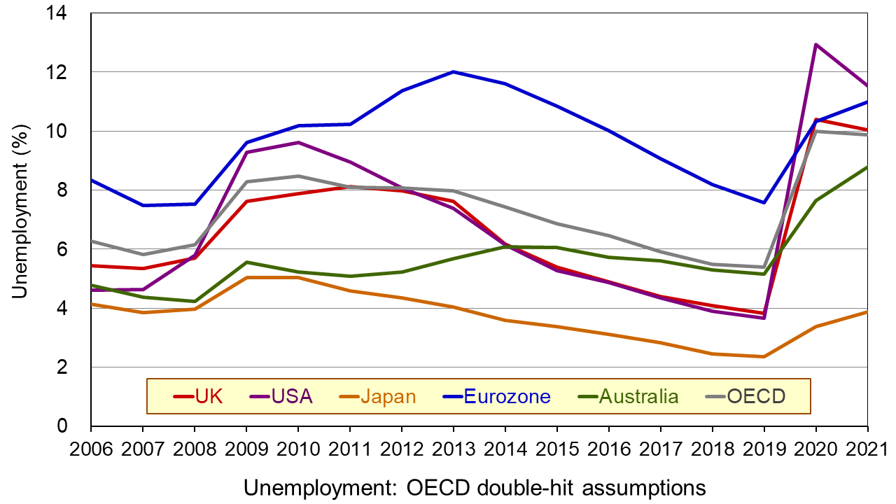
The second chart shows unemployment rates from 2006. The figures for 2020 and 2021 are OECD forecasts based on the double-hit assumption. You can clearly see the dramatic rise in unemployment in all the countries in 2020. In some cases it is forecast that there will be a further rise in 2021. (Click here for a PowerPoint of the chart.)
As the OECD states:
In both scenarios, the recovery, after an initial, rapid resumption of activity, will take a long time to bring output back to pre-pandemic levels, and the crisis will leave long-lasting scars – a fall in living standards, high unemployment and weak investment. Job losses in the most affected sectors, such as tourism, hospitality and entertainment, will particularly hit low-skilled, young, and informal workers.
But why have the forecasts got gloomier? There are both demand- and supply-side reasons.
Aggregate demand has fallen more dramatically than originally anticipated. Lockdowns have lasted longer in many countries than governments had initially thought, with partial lockdowns, which replace them, taking a long time to lift. With less opportunity for people to go out and spend, consumption has fallen and saving has risen. Businesses that have shut, some permanently, have laid off workers or they have been furloughed on reduced incomes. This too has reduced spending. Even when travel restrictions are lifted, many people are reluctant to take holidays at home and abroad and to use public transport for fear of catching the virus. This reluctance has been higher than originally anticipated. Again, spending is lower than before. Even when restaurants, bars and other public venues are reopened, most operate at less than full capacity to allow for social distancing. Uncertainty about the future has discouraged firms from investing, adding to the fall in demand.
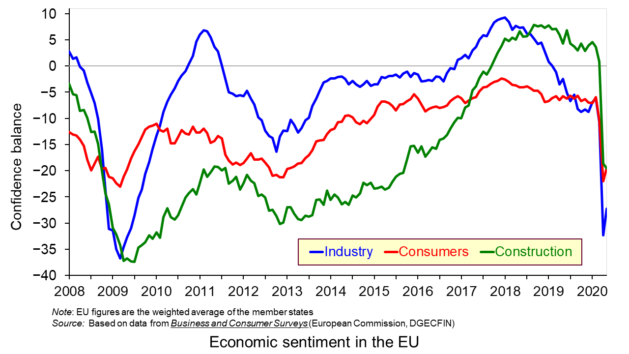
On the supply side, there has been considerable damage to capacity, with firms closing and both new and replacement investment being put on hold. Confidence in many sectors has plummeted as shown in the third chart which looks at business and consumer confidence in the EU. (Click here for a PowerPoint of the above chart.) Lack of confidence directly affects investment with both supply- and demand-side consequences.
Achieving a sustained recovery will require deft political and economic judgements by policymakers. What is more, people are increasingly calling for a different type of economy – one where growth is sustainable with less pollution and degradation of the environment and one where growth is more inclusive, where the benefits are shared more equally. As Angel Gurría, OECD Secretary-General, states in his speech launching the latest OECD Economic Outlook:
The aim should not be to go back to normal – normal was what got us where we are now.
Articles
OECD publications
Questions
- Why has the UK economy been particularly badly it by the Covid-19 pandemic?
- What will determine the size and timing of the ‘bounce back’?
- Why will the pandemic have “dire and long-lasting consequences for people, firms and governments”?
- Why have many people on low incomes faced harsher consequences than those on higher incomes?
- What are the likely environmental impacts of the pandemic and government measures to mitigate the effects?
 One of the most enduring characteristics of the macroeconomic environment since the financial crisis of the late 2000s has been its impact on people’s pay. We apply the distinction between nominal and real values to evidence the adverse impact on the typical purchasing power of workers. While we do not consider here the distributional impact on pay, the aggregate picture nonetheless paints a very stark picture of recent patterns in pay and, in turn, the consequences for living standards and wellbeing.
While the distinction between nominal and real values is perhaps best know in relation to GDP and economic growth (see the need to get real with GDP), the distinction is also applied frequently to analyse the movement of one price relative to prices in general. One example is that of movements in pay (earnings) relative to consumer prices.
Pay reflects the price of labour. The value of our actual pay is our nominal pay. If our pay rises more quickly than consumer prices, then our real pay increases. This means that our purchasing power rises and so the volume of goods and services we can afford increases. On the other hand, if our actual pay rises less quickly than consumer prices then our real pay falls. When real pay falls, purchasing power falls and the volume of goods and services we can afford falls.
Figures from the Office for National Statistics show that in January 2000 regular weekly pay (excluding bonuses and before taxes and other deductions from pay) was £293. By December 2018 this had risen to £495. This is an increase of 69 per cent. Over the same period the consumer prices index known as the CPIH, which, unlike the better-known CPI, includes owner-occupied housing costs and Council Tax, rose by 49 per cent. Therefore, the figures are consistent with a rise both in nominal and real pay between January 2000 to December 2018. However, this masks the fact that in recent times real earnings have fallen.
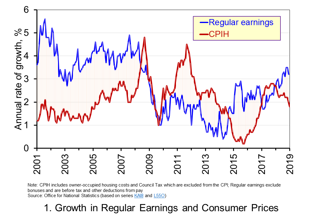 Chart 1 shows the annual percentage changes in actual (nominal) regular weekly pay and the CPIH since January 2001. Each value is simply the percentage change from 12 months earlier. The period up to June 2008 saw the annual growth of weekly pay outstrip the growth of consumer prices – the blue line in the chart is above the red line. Therefore, the real value of pay rose. However, from June 2008 to August 2014 pay growth consistently fell short of the rate of consumer price inflation – the blue line is below the red line. The result was that average real weekly pay fell. (Click here to download a PowerPoint copy of the chart.)
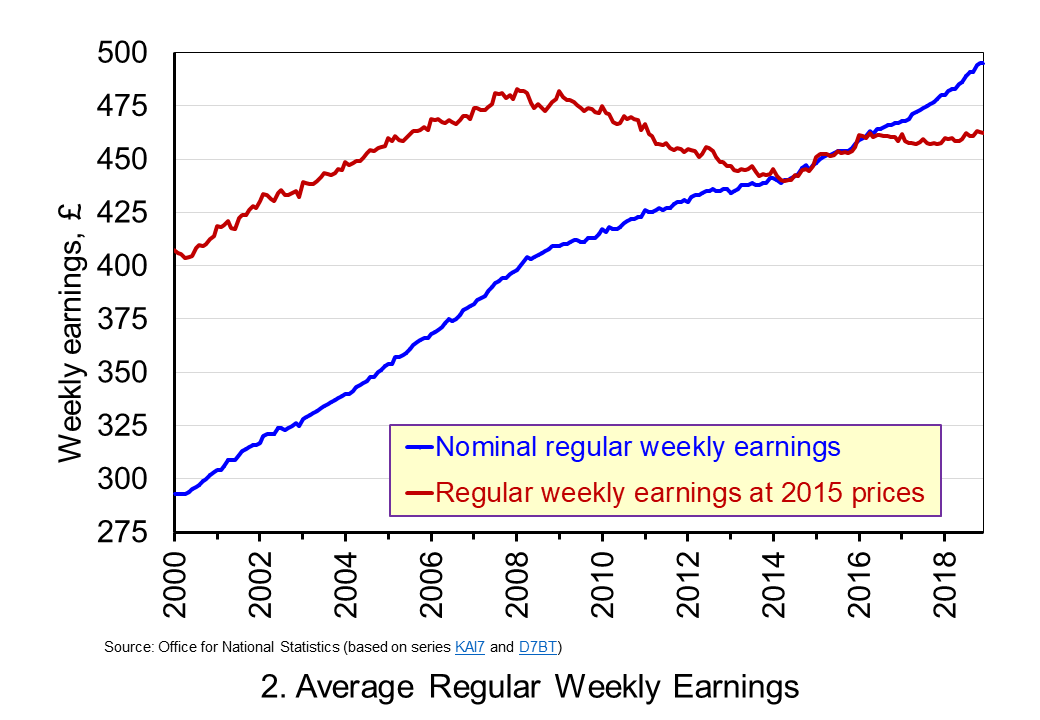 Chart 2 show the average levels of nominal and real weekly pay. The real series is adjusted for inflation. It is calculated by deflating the nominal pay values by the CPIH. Since the CPIH is a price index whose value averages 100 across 2015, the real pay values are at constant 2015 prices. From the chart, we can see that the real value of weekly pay peaked in March 2008 at £482.01 at 2015 prices. The subsequent period saw rates of pay inflation that were lower than rates of consumer price inflation. This meant that by March 2014 the real value of weekly pay had fallen by 8.8 per cent to £439.56 at 2015 prices. (Click here to download a PowerPoint copy of the chart.)
Although real (inflation-adjusted) pay recovered a little during 2015 and 2016, 2017 again saw consumer price inflation rates greater than those of pay inflation (see Chart 1). Consequently, the average level of real weekly pay fell by 1 per cent between January and November 2017. Since then, real regular pay has again increased. In December 2018, average real pay weekly pay was £462.18 at 2015 prices: an increase of 1.1 per cent from November 2017. Nonetheless, inflation-adjusted average weekly pay in December 2018 remained 4.1 per cent below its March 2008 level.
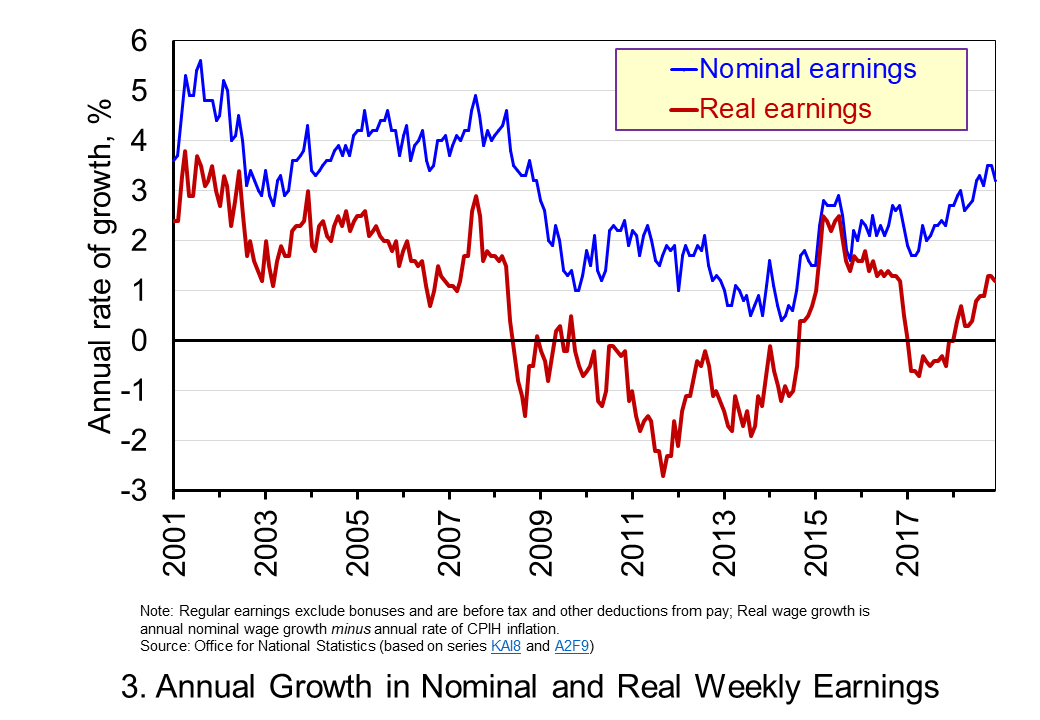 Chart 3 shows very clearly the importance of the distinction between real and nominal when analysing the growth of earnings. The sustained period of real pay deflation (negative rates of pay inflation) that followed the financial crisis can be seen much more clearly by plotting growth rates rather than their levels. Since June 2008 the average annual growth of real regular weekly pay has been −0.2 per cent, despite nominal pay increasing at an annual rate of 2 per cent. In the period from January 2001 to May 2008 real regular weekly pay had grown at an annual rate of 2.1 per cent with nominal pay growing at an annual rate of 4.0 per cent. (Click here to download a PowerPoint copy of the chart.)
The distinction between nominal and real helps us to understand better why some argue that patterns in pay, living standards and well-being have been fundamental in characterising the macroeconomic environment since the financial crisis. Indeed, it is not unreasonable to suggest that these patterns have helped to shape macroeconomic debates and broader conversations around the role of government and of public policy and its priorities.
Articles
Questions
- Using the example of GDP and earnings, explain how the distinction between nominal and real relates to the distinction between values and volumes.
- In what circumstances would an increase in actual pay translate into a reduction in real pay?
- In what circumstances would a decrease in actual pay translate into an increase in real pay?
- What factors might explain the reduction in real rates of pay seen in the UK following the financial crisis?
- Of what importance might the growth in real rates of pay be for consumption and aggregate demand?
- Why is the growth of real pay an indicator of financial well-being? What other indicators might be included in measuring financial well-being?
- Assume that you have been asked to undertake a distributional analysis of real earnings since the financial crisis. What might be the focus of your analysis? What information would you therefore need to collect?
 Each January, world political and business leaders gather at the ski resort of Davos in Switzerland for the World Economic Forum. They discuss a range of economic and political issues with the hope of guiding policy.
This year, leaders meet at a time when the global political context has and is changing rapidly. This year the focus is on ‘Creating a Shared Future in a Fractured World’. As the Forum’s website states:
The global context has changed dramatically: geostrategic fissures have re-emerged on multiple fronts with wide-ranging political, economic and social consequences. Realpolitik is no longer just a relic of the Cold War. Economic prosperity and social cohesion are not one and the same. The global commons cannot protect or heal itself.
 One of the main ‘fissures’ which threatens social cohesion is the widening gap between the very rich and the rest of the world. Indeed, inequality and poverty is one of the main agenda items at the Davos meeting and the Forum website includes an article titled, ‘We have built an unequal world. Here’s how we can change it’ (see second link in the Articles below). The article shows how the top 1% captured 27% of GDP growth between 1980 and 2016.
The first Guardian article below identifies seven different policy options to tackle the problem of inequality of income and wealth and asks you to say, using a drop-down menu, which one you think is most important. Perhaps it’s something you would like to do.
Articles
Project Davos: what’s the single best way to close the world’s wealth gap? The Guardian, Aidan Mac Guill (19/1/18)
We have built an unequal world. Here’s how we can change it World Economic Forum, Winnie Byanyima (22/1/18)
Oxfam highlights sharp inequality as Davos elite gathers ABC news, Pan Pylas (21/1/18)
Inequality gap widens as 42 people hold same wealth as 3.7bn poorest The Guardian, Larry Elliott (22/1/18)
There’s a huge gender component to income inequality that we’re ignoring Business Insider, Pedro Nicolaci da Costa (22/1/18)
Ahead of Davos, even the 1 percent worry about inequality Washington Post, Heather Long (22/1/18)
“Fractures, Fears and Failures:” World’s Ruling Elites Stare into the Abyss GlobalResearch, Bill Van Auken (18/1/18)
Why the world isn’t getting a pay raise CNN Money, Patrick Gillespie and Ivana Kottasová (1/11/17)
WEF archive
Articles on Inequality World Economic Forum
Questions
- Distinguish between income and wealth. In global terms, which is distributed more unequally?
- Why has global inequality of both income and wealth grown?
- Explain which of the seven policy options identified by the Guardian you would choose/did choose?
- Go through each one of the seven policy options and identify what costs would be associated with pursuing it.
- Identify any other policy options for tackling the problem.
 A key economic objective of governments around the world is economic growth, where economic growth is taken to mean growth in Gross Domestic Product (GDP). This can be refined as growth in GDP per head or growth in Net National Income (NNY or NNI) – this takes account of depreciation and net flows of income to and from abroad. But is GDP (or NNY) an appropriate measure? There continues to be much debate about this and there is a lot of support for adopting an alternative measure – the Genuine Progress Indicator (GPI) as a target for economic policy.
GDP measures the market value of production and is the value added at each stage of production. If the value of a nation’s production is what you want to measure or target, then GDP is quite a good indicator. Its main drawbacks are that it uses market prices, which may be distorted, and that much of production in the informal sector is not included.

But if GDP growth is taken to be a proxy for development or growth in wellbeing of the residents of a country, then it has serious shortcomings. This is not to say that GDP gives no indication of progress. Generally, countries with higher GDP per head have a better standard of living, but it is not necessarily the case that, if Country A has higher production in the formal sector than Country B, its residents will be happier, more fulfilled and have fewer economic or other problems.
GDP, by focusing on production, ignores many environmental and social costs of that production. Valuable but not tradable resources, such as clean air, rivers and oceans, may be sacrificed for the sake of extra production and this is recorded as a gain in GDP.
Similarly, unless GDP is specifically weighted by income groups, which virtually never happens, it does not take into account income distribution. Much of the growth in production in both rich and poor countries in recent decades has gone to the richest people. Take the case of the USA. In 1944 the share of income going to the top 1% share was 11.3%, while the bottom 90% were receiving 67.5%.  Such levels remained roughly constant for the next three decades. But then things began to change.
Starting in the mid- to late 1970s, the uppermost tier’s income share began rising dramatically, while that of the bottom 90% started to fall. The top 1% took heavy hits from the dot-com crash and the Great Recession but recovered fairly quickly: [preliminary estimates for 2012 by Emmanuel Saez] have that group receiving nearly 22.5% of all pre-tax income, while the bottom 90%’s share is below 50% for the first time ever (49.6%, to be precise).
So what does GPI measure and why may it be a better target for policy-makers than GDP or NNY? The answer is that it includes a number of important items that affect the well-being of a country, such as resource depletion, social activity and income distribution, that are not measured in GDP.  So what would cause GPI to rise? According to The Guardian article below, examples would include:
Getting more energy from renewables; increased energy efficiency; reducing the income gap; putting more reliable, durable products on the market (have you heard of planned obsolescence?); volunteering more for your community; preserving wetlands, forests, and farmland; shorter commutes and transport routes. In fact, there are 26 ways the GPI can go up, all measured in dollars that boil down to a single number.
GPI is being increasingly adopted as a measure of progress. In the USA, it is officially used in Vermont and Maryland and is being considered in other states, such as Hawaii, Washington and Oregon.
And there are other alternatives. For example, since 1990, the United Nations Development Programme (UNDP) has published an annual Human Development Index (HDI) As Box 27.1 in Economics, 8th edition states:
HDI is the average of three indices based on three sets of variables: (i) life expectancy at birth, (ii) education (a weighted average of (a) the mean years that a 25-year-old person or older has spent in school and (b) the number of years of schooling that a 5-year-old child is expected to have over their lifetime) and (iii) real GNY per capita, measured in US dollars at purchasing-power parity exchange rates.
The following articles look at the suitability of GDP and GPI and whether, by targeting growth in GDP, governments are guilty of downplaying the importance of other economic and social objectives.
Beyond GDP: US states have adopted genuine progress indicators The Guardian, Marta Ceroni (23/9/14)
Forget the GDP. Some States Have Found a Better Way to Measure Our Progress. New Republic, Lew Daly and Sean McElwee (3/2/14)
Gross domestic problem Aljazeera, Sean McElwee (6/6/14)
Creating the Circular Economy, Part II Environmental Leader, David Dornfeld (17/9/14)
Development: Time to leave GDP behind Nature, Robert Costanza, Ida Kubiszewski, Enrico Giovannini, Hunter Lovins, Jacqueline McGlade, Kate E. Pickett, Kristín Vala Ragnarsdóttir, Debra Roberts, Roberto De Vogli and Richard Wilkinson (15/1/14)
The Problems With Using GPI Rather Than GDP Forbes, Tim Worstall (5/6/14)
Questions
- What does GDP measure?
- Does GDP of a country equate to the turnover of a firm?
- If growth in NNY is superior to growth in GDP as a measure of economic growth, why are GDP figures more generally used than NNY figures when assessing a country’s economic performance?
- How suitable is using GDP as a measure of a nation’s production?
- What does GPI measure?
- Is GPI superior to GDP as a measure of a nation’s level of development? Explain why or why not.
- Give some examples of where a growth in GDP might correspond to a decline in economic well-being.
- For what reasons could GPI measures be described as subjective?
- Would it be a good idea for a country to target growth in GPI/GDP? Explain your answer.
- In addition to real GNY per capita, the Human Development Index includes measures of education and life expectancy. For what other social objectives might education and life expectancy be useful proxies?
 The past decade or so has seen large-scale economic turbulence. As we saw in the blog Fiscal impulses, governments have responded with large fiscal interventions. The COVID-19 pandemic, for example, led to a positive fiscal impulse in the UK in 2020, as measured by the change in the structural primary balance, of over 12 per cent of national income.
  Chart 1 shows the path of UK public-sector net debt and net borrowing, as percentages of GDP, since 1990. Debt is a stock concept and is the result of accumulated flows of past borrowing. Net debt is simply gross debt less liquid financial assets, which mainly consist of foreign exchange reserves and cash deposits. Net borrowing is the headline measure of the sector’s deficit and is based on when expenditures and receipts (largely taxation) are recorded rather than when cash is actually paid or received. (Click here for a PowerPoint of Chart 1)
 The ratcheting up of debt levels affects debt servicing costs and hence the budgetary position of government. Yet the recent increases in interest rates also raise the costs faced by governments in financing future deficits or refinancing existing debts that are due to mature. In addition, a continuation of the low economic growth that has beset the UK economy since the global financial crisis also has implications for the burden imposed on the public sector by its debts, and hence the sustainability of the public finances. After all, low growth has implications for spending commitments, and, of course, the flow of receipts.
 Consider Charts 2 and 3 to understand how the ‘r – g’ differential has affected debt sustainability in the UK since 1990. Chart 2 plots the implied yield on 10-year government bonds, alongside the annual rate of nominal growth (click here for a PowerPoint). As John explains in his blog The bond roller coaster, the yield is calculated as the coupon rate that would have to be paid for the market price of a bond to equal its face value. Over the period, the average annual nominal growth rate was 4.5 per cent, while the implied interest rate was almost identical at 4.6 per cent. The average annual rate of CPI inflation over this period was 2.8 per cent.
 Chart 3 plots the ‘r – g’ differential which is simply the difference between the two series in Chart 2, along with a 12-month rolling average of the differential to help show better the direction of the differential by smoothing out some of the short-term volatility (click here for a PowerPoint). The differential across the period is a mere 0.1 percentage points implying that macroeconomic and financial conditions have typically been neutral in supporting debt sustainability. However, this does mask some significant changes across the period.
  Yet the negative differential resumed in 2010 and continued up to the pandemic. Again, this is indicative of the macroeconomic and financial environments being supportive of the public finances. It was, however, largely driven by low interest rates rather than by economic growth.
  The pandemic saw the ‘r – g’ differential again turn markedly positive, averaging 7 percentage points in the four quarters from Q2 of 2020. While the differential again turned negative, the debt-to-GDP ratio had also increased substantially because of large-scale fiscal interventions. This made the negative differential even more important for the sustainability of the public finances. The question is how long the negative differential can last.
 Three international agencies, the IMF, the European Commission and the OECD, all publish six-monthly forecasts for a range of countries. As each agency’s forecasts have been published this year, so the forecasts for economic growth and other macroeconomic indicators, such as unemployment, have got more dire.


 One of the most enduring characteristics of the macroeconomic environment since the financial crisis of the late 2000s has been its impact on people’s pay. We apply the distinction between nominal and real values to evidence the adverse impact on the typical purchasing power of workers. While we do not consider here the distributional impact on pay, the aggregate picture nonetheless paints a very stark picture of recent patterns in pay and, in turn, the consequences for living standards and wellbeing.
 Chart 1 shows the annual percentage changes in actual (nominal) regular weekly pay and the CPIH since January 2001. Each value is simply the percentage change from 12 months earlier. The period up to June 2008 saw the annual growth of weekly pay outstrip the growth of consumer prices – the blue line in the chart is above the red line. Therefore, the real value of pay rose. However, from June 2008 to August 2014 pay growth consistently fell short of the rate of consumer price inflation – the blue line is below the red line. The result was that average real weekly pay fell. (Click
  Chart 2 show the average levels of nominal and real weekly pay. The real series is adjusted for inflation. It is calculated by deflating the nominal pay values by the CPIH. Since the CPIH is a price index whose value averages 100 across 2015, the real pay values are at constant 2015 prices. From the chart, we can see that the real value of weekly pay peaked in March 2008 at £482.01 at 2015 prices. The subsequent period saw rates of pay inflation that were lower than rates of consumer price inflation. This meant that by March 2014 the real value of weekly pay had fallen by 8.8 per cent to £439.56 at 2015 prices. (Click
  Chart 3 shows very clearly the importance of the distinction between real and nominal when analysing the growth of earnings. The sustained period of real pay deflation (negative rates of pay inflation) that followed the financial crisis can be seen much more clearly by plotting growth rates rather than their levels. Since June 2008 the average annual growth of real regular weekly pay has been −0.2 per cent, despite nominal pay increasing at an annual rate of 2 per cent. In the period from January 2001 to May 2008 real regular weekly pay had grown at an annual rate of 2.1 per cent with nominal pay growing at an annual rate of 4.0 per cent. (Click


