 This Christmas, more people are considering giving second-hand (or ‘pre-loved’) goods as presents. This allows them to afford better-quality presents and to save money at a time when a large proportion of the population are finding that their finances are stretched. This continues a trend towards buying second-hand products – a trend driven by the rise of various online retailers, such as Vinted and Preloved, and a growing online presence of charity shops, as well as extensive use of established platforms, such as Facebook Marketplace, eBay, Depop, Gumtree and Nextdoor.
Clearly, people gain from buying and selling second-hand items – part of the ‘circular economy’. But what are the implications for gross domestic product (GDP)? After all, GDP is one of the main indicators of the size of an economy, and growth in GDP is probably the most widely-used measure of economic progress. Are second-hand transactions captured in GDP?
If you directly sell your own second-hand items, this does not count towards GDP. There is no new product being made. The items are only counted when they are first produced. Any service you provide to the purchaser (and to yourself) is in a similar category to housework, childcare, DIY and other services that people provide to themselves, household members and friends. But like such services, there is a strong argument that they should be.
 Likewise, the environmental benefits (positive externalities) of recycling products, rather than throwing them away or hoarding them, are not counted. In fact, if reusing products causes fewer new products to be made, this would be counted as subtracting from GDP.
If, however, you set up a business by buying and selling second-hand items, the service you provide would contribute towards GDP. What would be counted would the value added to the product – captured through the difference in the purchase and selling prices. In fact, HMRC has warned people that buying and selling second-hand items is taxable, as it counts as self-employment for tax purposes. But it is only this value added that counts. If you buy an item on Vinted, only the value added by Vinted counts towards GDP.
As no production takes place, the purchase of second-hand items adds either nothing to GDP or just the service of a retailer. It is effectively just a transfer of goods and money. If buying second-hand items means that you buy fewer new ones, then that would cause GDP to fall if the response of firms is to produce fewer newer items. However, the person selling the second-hand items will gain revenue, which could be used to buy new items. If that increased production, that would boost GDP. The net effect on GDP of this transfer of goods and money in the second-hand market will be pretty small.
Yet, clearly, the second-hand market provides a welfare gain to both sellers and purchasers – a gain that is likely to grow as the use of second-hand markets increases. At Christmas time, it provides a timely warning of the limitations of using GDP to measure wellbeing.
Articles
- Giving toys another life with another child
Westmorland & Furness Council, News (18/11/25)
- ‘I make £1,000 a week with charity shop side hustle – I couldn’t afford Christmas without it’
Manchester Evening News, Lee Grimsditch and Hannah Cottrell (3/12/25)
- HMRC issues warning to anyone with money-making ‘side hustle’ ahead of Christmas
Manchester Evening News , Ryan Price (12/11/25)
- 12 tips for a low cost Christmas
Rest Less, Melanie Wright (14/11/25)
- I’ve saved over £100 on my girl’s Christmas gifts & got everything on her list including Disney dolls & Hey Dugee toys
The Sun, Becky Pemberton (25/11/25)
- Circular trade is growing, but will second-hand shopping be visible during the Christmas season?
Finnish Commerce Federation, Press Release (27/11/25)
- Shop secondhand, shred your veg and try ‘furoshiki’ wrapping: 14 easy ways to cut Christmas waste
The Guardian, Hannah Rochell (8/12/25)
- 13 Ways to Have a Sustainable Christmas This Year
Circular&Co., Adam Millett (1/12/23)
- The Role of Circular Economy in Driving Economic Growth: Evidence from EU Countries
Sage Open, Vladimir Radivojević, Tamara Rađenović and Jelena Dimovski (14/11/24)
- How to Have a Circular Economy Christmas: Deck the Halls, Sustainably
50 Shades Greener, Kiri Spanowicz (10/12/24)
- Twelve Economic Impacts of Christmas
City-REDI Blog, Birmingham University, Charlotte Hoole (22/12/16)
- Christmas 2025: Christmas Economics Explained
Plus500 (23/11/25)
Questions
- What other items or activities affecting human wellbeing are not counted in GDP?
- Name some goods and services that are produced, and hence are included in GDP, but which can be classed as ‘bads’.
- For what reasons might a country have a high GDP per capita but a poor average level of wellbeing?
- How might GDP figures be adjusted for international comparison purposes?
- Would it be possible to adjust GDP figures to take account of externalities in production (negative and positive)? If so, how?
- Production involves human costs. To what extent does GDP take this into account?
- What is meant by the circular economy? How might you have a ‘circular’ Christmas?
 Recently, a flurry of bankruptcies among non-bank financial intermediaries (NBFIs) in the USA has drawn attention to the risks associated with alternative credit channels in the shadow-banking sector – lending which is not financed with deposits. There is concern that this could be the start of a wave of bankruptcies among such NBFIs, especially given concerns about a potential downswing in the economic cycle – a time when defaults are more likely.
While providing alternative sources of funding, the opacity of lending in the shadow-banking sector means it is not clear what risks NBFIs face themselves and, more significantly, what risks they pose to the financial system as a whole. There is particular concern about the impact on regulated banks.
Already, JP Morgan Chase in its third quarter earnings report announced a $170m charge stemming from the bankruptcy of Tricolor, which specialised in sub-prime car financing. Mid-sized banks, Western Alliance and Zions Bancorp, have reported losses from loans to a group of distressed real estate funds. This has highlighted the interconnectedness between NBFIs and regulated banking, and the potential for problems in the shadow-banking sector to have a direct impact on mainstream banks.
In this blog, we will trace the secular trends in the financial systems of more advanced economies which have given rise to alternative credit channels and, in turn, to potential banking crises. We will explain the relationship between regulated banks and shadow banks, analysing the risks involved, the potential impact on the financial system and the policy implications.
What are the secular trends in banking?
The traditional model of commercial banking involved taking deposits and using them to finance loans to households and firms. However, cycles of banking crises, regulatory changes and financial innovation over the past 50 years produced new models.
First, banks diversified away from direct lending to providing other banking services – on-balance sheet activities, such as investing in financial securities, and off-balance sheet activities, such as acting as agents in the sale of financial securities.
Second, alternative credit channels based on financial markets have grown in significance.
 In the 1980s, international regulations around traditional banking activities – taking deposits and making loans – were being formalised by the Bank for International Settlements (BIS) under what became known as the Basel framework (see, for example, Economics section 18.2 or Economics for Business section 28.2). For the first time, this stipulated liquidity and capital requirements for international banks relating to their traditional lending activities. However, at the same time the deregulation of financial markets and financial innovation provided banks with opportunities to derive revenues from a range of other financial services.
After the financial crisis, liquidity and capital requirements for banks were tightened further through the Basel III regulations. Commercial banks had to have even higher levels of capital as a buffer for bad debts associated with direct lending. A higher level of capital to cover potential losses increases the marginal cost of lending, since each pound of additional loan requires additional capital. This reduced the marginal return, and consequently, the incentive to lend directly.
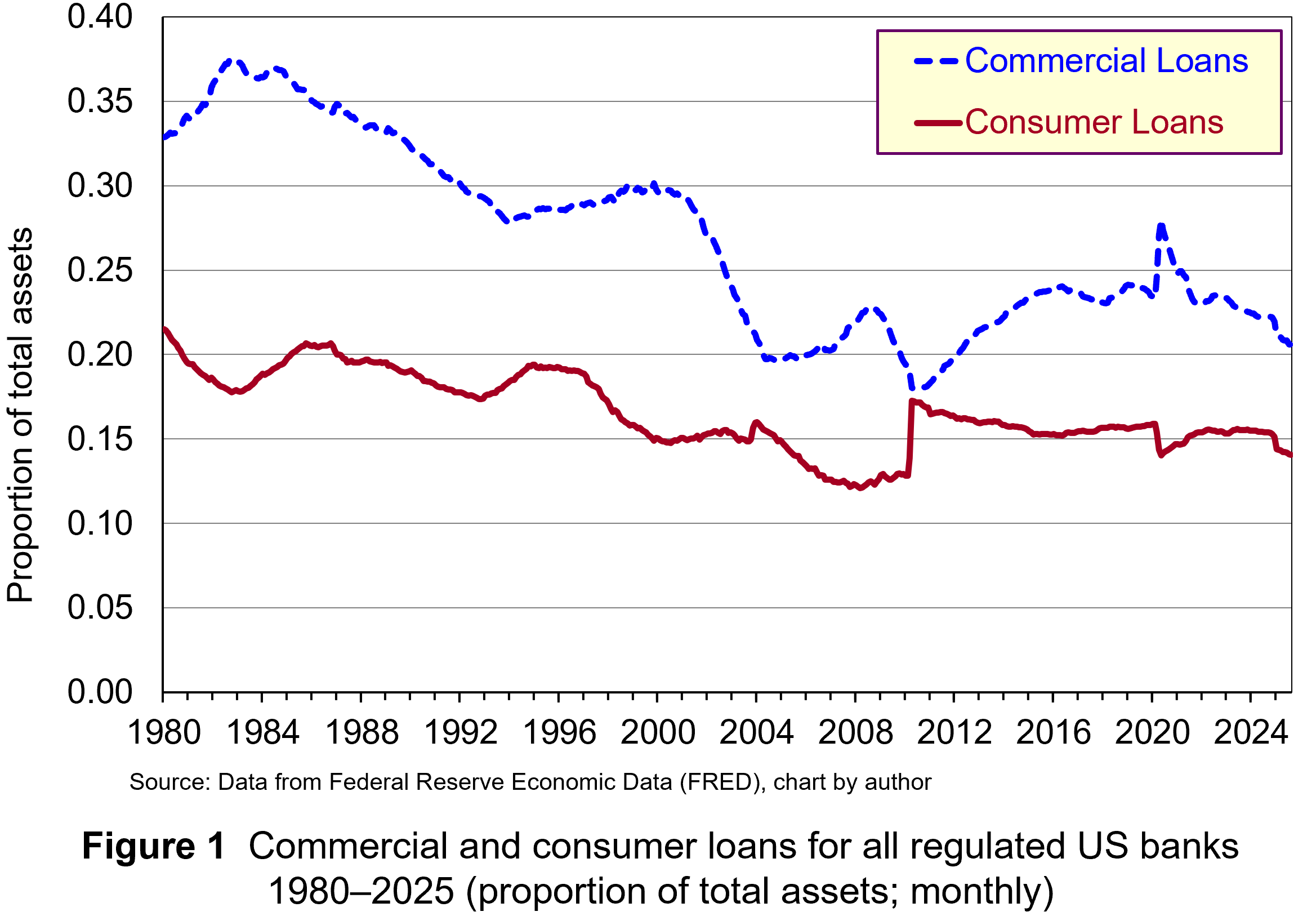 These regulatory developments created an incentive to pursue activities which do not require as much capital, since their marginal cost is lower and potential return is higher. Consequently, banks have placed less emphasis on lending and more on purchasing short-term and long-term financial securities and generating non-interest income from off-balance sheet activities. For instance, research by the Bank of England found that during the 1980s, interest income accounted for more than two-thirds of total income for large international banks. In contemporary times, non-interest income tends to be greater than interest income. Figure 1 illustrates the declining proportion of total assets represented by commercial and consumer loans for all regulated US banks. (Click here for a PowerPoint.)
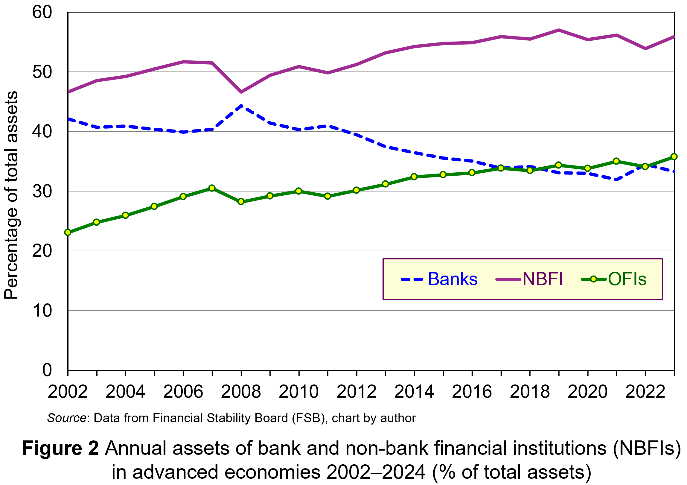 With banks originating less lending, activity has migrated to different avenues in the shadow-banking sector. This sector has always existed, but deregulation and financial innovation created opportunities for the growth of shadow banking – lending which is not financed with deposits. Traditionally, non-bank financial intermediaries (NBFIs), such as pension funds, hedge funds and insurance companies, use funds from investors to buy securities through financial markets. However, new types of NBFIs have emerged which originate loans themselves, notably private credit institutions. As Figure 2 illustrates, a lot of the expansion in the activities of NBFIs has been the due to increased lending by these institutions (defined as ‘other financial institutions (OFIs)). Note that the NBFI line includes OFIs. (Click here for a PowerPoint.)
Since, NBFIs operate outside conventional regulatory frameworks, their credit intermediation and maturity transformation are not subject to the same capital requirements or oversight that banks are. As a result, they do not need to have the same level of capital to insulate against loan losses. Therefore, lending in the shadow-banking sector has a lower marginal cost compared to equivalent lending in the banking sector. Consequently, it generates a higher rate of return. This can explain the large growth in the assets of OFIs illustrated in Figure 2.
Risks in shadow banking
 Banking involves trade-offs and this is the case whether the activities happen in the regulated or shadow-banking sector. Increasing lending increases profitability. But as lending continues to increase, at some point the risk-return profile becomes less favourable since institutions are lending to increasingly higher-risk borrowers and for higher-risk projects.
In downturns, when rates of defaults rise, such risks become apparent. Borrowers fail and default, causing significant loan losses for lenders. With lower levels of capital, NBFIs will have a lower buffer to insulate investors from these losses, increasing the likelihood of default.
Is this a problem? Well, for a long-time regulators thought not. It was thought that failures in the shadow-banking sector would have no implications for deposit-holders in regulated banks and the payments mechanism. Unfortunately, current developments in the USA have highlighted that this is unlikely to be the case.
The connections between regulated and shadow banking
 The financial system is highly interconnected, and each successive financial crisis has shown that systemic risks lurk in obscure places. On the face of it, NBFIs appear separate from regulated banks. But banks’ new business models have not removed them from the lending channel, merely changed their role. Short-term financing used to be conducted and funded by banks. Now, it is conducted by NBFIs, but still financed by banks. Long-term loan financing is no longer on banks’ balance sheets. However, while the lending is conducted by NBFIs, it is largely funded by banks.
NBFIs cannot be repositories of liquidity. Since they do not have deposits and are not part of the payments system, they have no access to official liquidity backstops. So, they do so indirectly by using deposit-taking banks as liquidity insurance. Banks provide this liquidity in a variety of ways:
- Investing in the securities issued by private capital funds;
- Providing bridge financing to credit managers to securitise credit card receivables;
- Providing prime broker financing to a hedge fund engaged in proprietary trading.
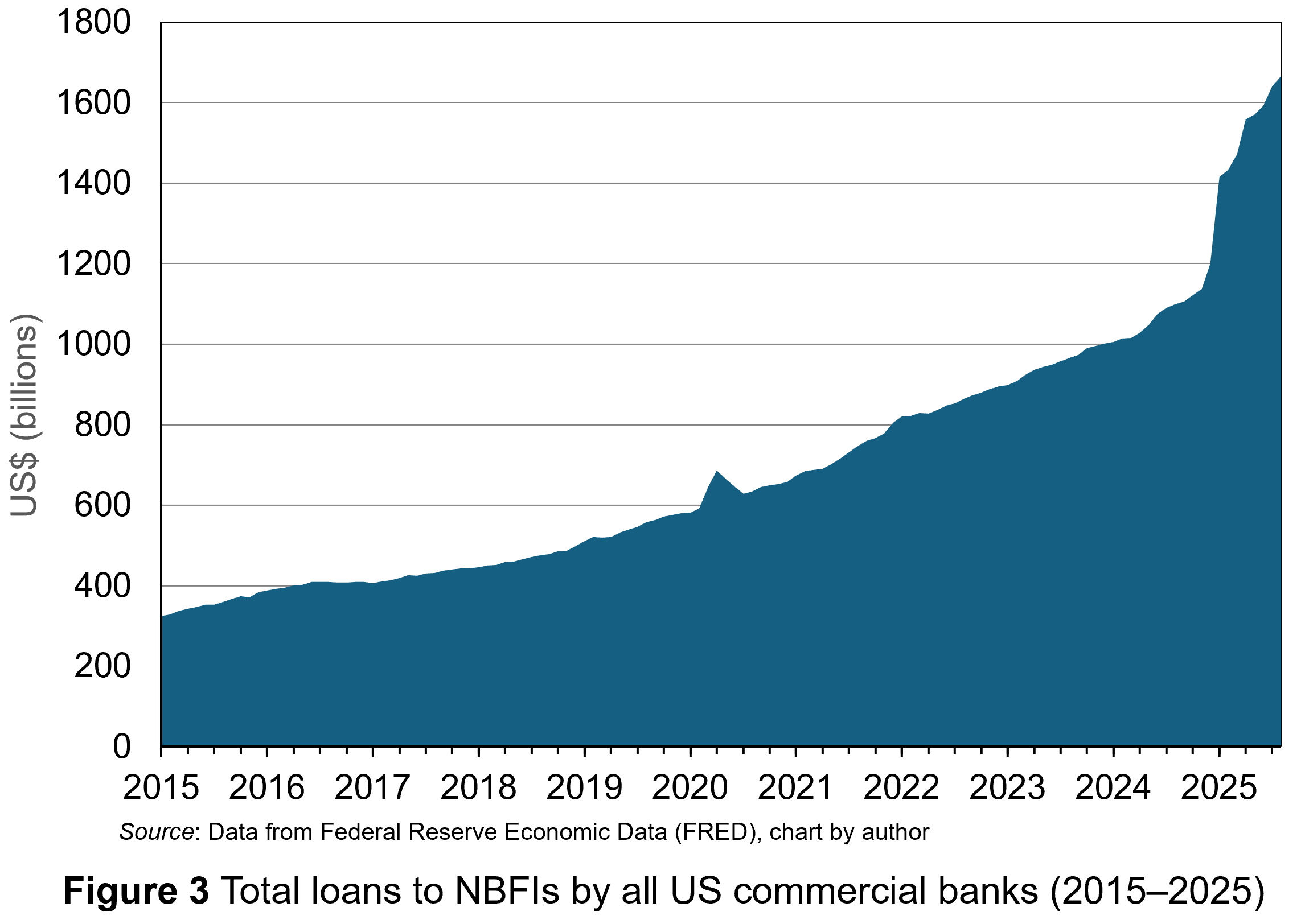 Furthermore, banks have increasingly made loans to NBFIs. Data for US commercial banks lending to the shadow-banking sector are publicly available only since 2015. But, as Figure 3 illustrates, it has seen a steady upward trend with a surge in activity in 2025. (Click here for a PowerPoint.)
Banks had an incentive to diversify into these activities since they are a source of revenue requiring less regulatory capital. The model requires risk and return to follow capital out of the banking system into the shadow-banking sector. However, while risky capital and its associated expected return have moved in the shadow-banking system, not all of the liquidity and credit default risk may have done so. Ultimately, some of that risk may be borne by the deposit-holders of the banks.
This is not an issue if banks are fully aware of the risks. However, problems arise when banks do not know the full risks they are taking.
There are reasons why this may be the case. Credit markets involve significant asymmetric information between lenders and borrowers. This creates conditions for the classic problems of moral hazard and adverse selection.
Moral hazard is a hidden action problem, whereby borrowers take greater risks because they share the possible downside losses with the lender. Adverse selection is the hidden information problem, whereby lenders do not have full information about the riskiness of borrowers or their activities.
The economics of information suggests that banks exploit scale, scope and learning economies to overcome the costs associated with asymmetric information in lending. However, that applies to direct lending when banks have full information about credit default risk on their loan book. When banks finance lending indirectly through NBFIs, there is an extension of the intermediation chain, and while banks may know the NBFIs, they will have much less information about the risks associated with the lending they are ‘underwriting’. This heightens their problems of asymmetric information associated with credit default risk.
What are the risks at present?
 The level of debt in the global economy is at unprecedented levels. Data from the International Monetary Fund (IMF) show that it rose to $351 trillion dollars in 2024, approximately 235% of weighted global gross domestic product (GDP). It is in this environment that private credit channels through NBFIs have been expanding. With this, it is more likely that NBFIs’ trade-off between credit risk and return has tilted greatly in favour of the former. Some point to the recent collapse of Tricolor and First Brands – both intermediary financing companies funded by private credit – as evidence of elevated levels of risk.
Many are pointing out that the failures observed in the USA so far have a whiff of fraud associated with them, with suggestions of multiple loans being secured against the same working capital. However, such behaviour is symptomatic of ‘late-cycle’ lending, where the incentive to squeeze more profit from lending in a more competitive environment leads to short-cuts – short-cuts that banks, at one stage removed along the intermediation chain, will have less information about.
It is in a downturn that such risks become apparent. Widening credit spreads and the reduced availability of credit causes financial stress for higher-risk borrowers. Inevitably, that higher risk will lead to higher defaults, more provision for loan losses and write-downs in the value of loan assets.
While investors in NBFIs are first in line to bear the losses, they are not the only ones exposed. At moments of stress, the credit lines that banks have provided get drawn and that increases the exposure of banks to the risks associated with NBFIs and whoever they have lent to. As NBFIs fail, the financing provided by banks will not be repaid and they will thus have to absorb losses associated with the lending of the NBFIs. So, while it appears that risk has left the banking system, it hasn’t. Ultimately, the liquidity and credit default risk of the non-bank sector is financed by bank deposits.
Furthermore, the opaqueness of the exposure of banks to risks in the shadow-banking sector may have issues for the wider financial system. In 2008, banks became wary of lending to each other during the financial crisis because they didn’t know the exposure of counterparty institutions to losses from securitised debt instruments. Now, as more and more banks reveal exposures to NBFIs, concerns about the unknown position of other banks may produce a repeat of the credit crunch which occurred then. A seizing up of credit markets will worsen any downturn. However, unlike 2008, the financial resources available to central banks and governments to deal with any consequences are severely limited.
Only time and the path of the US economy will reveal the extent of any contagion related to lending in the shadow-banking sector. However, central banks are already worried about the risks associated with the shadow-banking sector and have been taking steps to identify and ameliorate them. Events in the USA over the past few weeks may accelerate the process and bring more of that lending within the regulatory cordon.
Articles
- Bank chief says US firm collapses ring ‘alarm bells’
BBC News, Michael Sheils McNamee (21/10/25)
- BoE finds non-bank financial firms pose wider risks in crisis periods
Reuters, Lawrence White (2/12/24)
- Global Debt Remains Above 235% of World GDP
IMF Blogs, Vitor Gaspar, Carlos Eduardo Goncalves and Marcos Poplawski-Ribeiro (17/9/25)
- IMF sounds alarm about high global public debt, urges countries to build buffers
Reuters, Andrea Shalal (15/10/25)
- Major international banks performance 1980-91
Quarterly Bulletin 1992 Q3, Bank of England (1/9/92)
- Shadow Banking System: Definition, Examples, and How It Works
Investopedia, Michael Bromberg (18/10/24)
- What is private credit, and should we be worried by the collapse of US firms?
The Guardian, Kalyeena Makortoff (18/10/25)
Academic paper
Data
Questions
- Explain why the need to hold more capital raises its cost for banks.
- Why does this reduce the lending they undertake?
- What is the attraction of ‘off-balance sheet transactions’ for regulated banks?
- Analyse the asymmetric information that banks face when providing liquidity to non-bank financial institutions (NBFIs).
- Examine the dangers for the financial system associated with regulated banks’ exposure to NBFIs?
- Discuss some policy recommendations regarding bank lending to NBFIs.
Large European banks call for further integration, but is it in consumers’ interests?
 Those of a certain age may remember the fanfare which heralded the introduction of the Single European market (SEM) on 1 January 1993. It promised the removal of internal barriers to the movement of goods, services, capital and people. One sector that was noticeably absent from the single market, however, was banking.
Moves towards banking union only started after the global financial crisis in 2008. However, as a report published on the 2 September 2025 by the Association of Financial Markets in Europe (AFME) highlights, the institutional frameworks of banking in the EU are still deeply fragmented – the promised integration through the European Banking Union (EBU) is still incomplete. This has put European banks at a competitive disadvantage in global markets compared with rivals from the USA and Asia, thereby reducing their profitability and growth prospects. The report called on the European Central Bank (ECB) and national regulatory authorities to remove hurdles to cross-border banking services in the EU. This would enhance the strategic position of European banks.
In this blog we will trace the development of the EBU and analyse the current state of integration. We discuss the AFME proposals for achieving greater integration and highlight their benefits for large banks. We also analyse the barriers which limit full integration and examine the risks that retail customers might see few benefits from the proposed changes.
What is meant by European Banking Union (EBU)?
The 1993 Single European Market (SEM) in goods and services removed internal barriers to the movement of goods, services, capital and people within the EU. As part of this, there were harmonised standards and regulations for goods and services, no capital controls, mutual recognition of professional qualifications and common regulations on consumer protection, product safety, environmental protection and labour rights.
This integration of previously restricted domestic markets was designed to boost economic growth, employment and competitiveness by increasing trade and investment flows. Offering consumers greater choice would expose firms to greater competition. This would drive down prices and encourage greater efficiency and innovation. It has generally achieved these goals across many industries.
However, banking was excluded from integration. The 1985 White Paper, Completing the Internal Market, proposed the liberalisation of financial services, but banking remained regulated at the national level. This was influenced by interrelated economic, political and institutional forces, national sovereignty and political sensitivities, fragmented regulation and concerns about risk.
 Even as the EU moved towards economic and monetary union (EMU) during the 1990s, there was no discussion of integration for the banking industry. However, that changed following the 2008 financial crisis and 2011 eurozone crisis. Both episodes exposed vulnerabilities in the EU banking system which required taxpayer support. It was proposed that deeper integration of the banking sector would ensure its stability and resilience. This stimulated moves towards European Banking Union (EBU), starting with the European Council agreeing its creation in 2012. There are three institutional pillars to the Union:
- The Single Supervisory Mechanism (2014) for systemically important financial institutions (SIFIs) ensures consistent oversight. SIFIs are banks with over €30 billion of liabilities or 20% of national GDP.
- The Single Resolution Mechanism (2016) manages the orderly resolution of failing banks with minimal costs to taxpayers. There is a central board for resolution decisions and a fund financed by the banking industry to support resolution actions.
- A European Deposit Insurance Scheme (still under negotiation) is proposed to protect depositors uniformly across the banking union against bank default.
The Union is intended to operate under a harmonised set of EU laws, known as the ‘Single Rulebook’, which includes implementing the BASEL III capital requirements, regulating national deposit insurance and setting rules for managing failing banks.
What is the state of integration at present?
Moves towards European Banking Union (EBU) have contributed to enhancing the resilience of the European banking system. This was one of its major objectives. European banks are much more secure having increased capital and liquidity levels, reduced credit risks and become less reliant on state-aid. They are also less profitable.
The AFME report points to remaining gaps in Banking Union which raise the cost for banks offering cross-border retail banking within the EU and limit the incentive to do so. The report identifies four such gaps.
 1. Ring fencing. Although there is a single supervisory mechanism for large systemically important institutions, since the financial crisis national regulators have implemented ‘ring-fencing’. This aims to protect retail banking activities from riskier investment banking. Ring-fencing retains liquidity, dividends and other bank assets within national borders to protect their retail banking sectors from contagion. The ECB estimates €225 billion of capital and €250 billion of liquidity is trapped by such national restrictions. Further, unharmonized and unpredictable use of capital buffers adds complexity for capital management at a multinational level. This particularly impacts large institutions. Banks’ cross-border activities are impeded since they are restricted in the way they can use capital and liquidity across the bloc.
The report argues that the stringent requirements of the ECB and the multiple layers of macroprudential requirements imposed at national level have led to an unnecessarily high level of capital. This disadvantages large European banks compared to their international competitors.
2. Impediments to cross-border M&As in banking within the EU. This is due to cumbersome authorisation processes, involving multiple authorities at both national and supra-national level. Further, national authorities may interfere in the process of M&As in a bid to prevent domestic banks being acquired by ones from other parts of the EU. A recent example is UniCredit’s bid for Germany’s Commerzbank, which the German government opposes. These characteristics restrict opportunities for consolidation and efficiency gains for European banks.
The AFME report estimates that once eurozone banks grow beyond €450 billion in total assets, they suffer from negative synergies putting them at a competitive disadvantage to global competitors. Indeed, US banks are able to leverage scale economies from their domestic market to enter large EU markets. An example is JP Morgan’s entry into multiple EU markets through its Chase brand.
3. Contributions to the Single Resolution Fund (SRF) are complex and lack transparency. This makes it difficult for banks to predict future commitments. The fund itself and its target level were determined at a time when banks had low buffers. Since then, European banks have raised their loss absorbing capacity and the AFME report proposes that further increases in contributions to the fund need to be carefully considered and reviewed.
4. The Deposit Guarantee Scheme remains unimplemented and there are still differences in national schemes. This situation creates uncertainty for banks, which would like the European scheme for large systemically important institutions to be implemented fully.
These AFME proposals focus on the aspects of banking union which benefit large European institutions in their strategic competition with global rivals. These aspects would create ‘European’ banks as opposed to ‘national’ ones. This would give them the scale to be ‘champions’ in global competition. In particular, the large banks want lower capital requirements and the relaxation of national ring-fencing for retail banking to allow them greater freedom to achieve scale and scope economies across the bloc.
To what extent this will benefit retail customers, however, is debateable.
Will retail banking customers benefit?
Retail banking across Europe remains deeply fragmented, with significant price differentials from country to country. The following table illustrates pricing differentials for two retail products – loans and mortgages – across a sample of EU countries for July 2025.
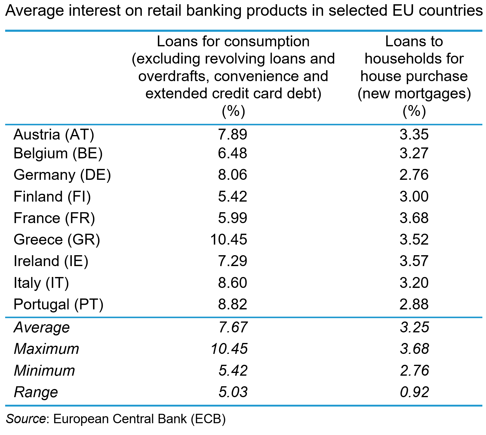
The data show a range of average interest rates offered across the countries with a range of 5.03% for loans to households and 0.92% for new mortgages. These price differentials reflect a broad array of factors, not least the different institutional legal and risk characteristics of the national markets. They also reflect varying degrees of competition and the lack of cross-border trade in retail banking products. Retail banking remains a largely domestic industry within the EU. Cross-border banking services remain a marginal activity with non-domestic retail deposits rising by just 0.5% and non-domestic retail loans rising by just 0.3% between 2016 and 2024.
There are both natural and policy-induced barriers, which means that retail banking will remain largely segmented by nation.
 On the demand-side, retail banking is largely a relational rather than a transactional service, with consumption taking place over a long time-period with significant financial risks attached. Even with deposit insurance and a lender of last resort (the central bank), consumers exhibit significant loss aversion in their use of retail banking services. Consequently, trust and confidence are important characteristics for consumers and that means they are likely to prefer to use familiar domestic institutions.
Further, perceptions about switching costs mean that consumers are reluctant to change suppliers. Such costs are exacerbated by language, cultural and legal differences between European countries, which can make the perceived costs of banking beyond national boundaries prohibitively expensive and create a preference for local institutions.
Consumer preferences can also create idiosyncratic market structures for retail banking services in particular countries. For instance, in several countries across the EU, notably Germany, mutualised credit unions account for significant shares of retail banking. This may limit the potential for foreign banks to penetrate Europe’s largest market.
There are also policy-induced obstacles to cross-border retail banking which operate on the demand-side. These include discriminatory tax treatment of foreign financial services which deters their purchase by consumers. Further, there are still eight different currencies used in the EU across the 27 member states (Denmark, Poland and Sweden are three significant examples). This creates costs and risks associated with currency exchange for consumers that may deter their use of cross-border deposits and loans. The full adoption of a single currency across the EU seems a long way off, which will limit the potential for a single banking market, particularly in the retail segment.
Retail banking as a public utility
 Some argue that retail banking is a public utility and should be regulated as such. It has a simple business model, taking deposits, making payments and making loans. Like other utilities, such as water and energy, retail banking is an essential service for the smooth functioning of the economy and society. Like other utilities, bank failures create severe problems for the economy and society.
Since the financial crisis, stability in retail banking has been much more highly valued. In the period preceding the crisis, banks had used retail deposits to cross-subsidise their risky investment banking. The bank failures that resulted from this had severe economic consequences. The danger today is that by relaxing capital and liquidity restrictions too much, large banks may once again engage in risky behaviour, subsidised by retail banking – for example, by engaging in cross-border M&As. These may benefit their shareholders but provide little benefit to retail customers.
Further, allowing these large banks freedom to move funds around the bloc may lead to capital being concentrated in the most profitable markets, leaving less profitable markets / countries underserved. Retail banking, as a public utility, should be required to provide services there.
Who ultimately benefits?
The integration of banking services in the EU has progressed since the financial crisis, producing a more resilient system. However, there are features of retail banking which mean that integration which benefits consumers may be difficult to achieve.
Addressing the policy gaps identified by the AFME report may benefit large European banks by facilitating the scale economies to make them competitive internationally. However, until consumers are prepared, or able, to source banking services beyond national borders, they will see little benefit from European Banking Union (EBU) through lower prices and/or better service. The nature of retail banking in the EU suggests that this is unlikely any time soon.
Furthermore, since retail banking exhibits features of a public utility, regulators need to be wary of permitting the type of behaviour by large institutions which creates dangerous systemic risk. The worry is that, in the drive to create ‘European Champions’ in banking, regulators ignore the potential impact on retail customers.
Articles
Book
Report
Data and Information
Questions
- Using an average cost (AC) schedule, illustrate the efficiency benefits for large European banks from banking union.
- Analyse the sources of efficiency gains that European banks can gain from cross-border M&As.
- Explain how European retail banking customers could gain from such efficiency.
- Analyse why they may not.
- Analyse whether retail banking in Europe needs to be regulated as a public utility.
 In a blog in October 2024, we looked at global uncertainty and how it can be captured in a World Uncertainty Index. The blog stated that ‘We continue to live through incredibly turbulent times. In the past decade or so we have experienced a global financial crisis, a global health emergency, seen the UK’s departure from the European Union, and witnessed increasing levels of geopolitical tension and conflict’.
Since then, Donald Trump has been elected for a second term and has introduced sweeping tariffs. What is more, the tariffs announced on so-called ‘Liberation Day‘ have not remained fixed, but have fluctuated with negotiations and threatened retaliation. The resulting uncertainty makes it very hard for businesses to plan and many have been unwilling to commit to investment decisions. The uncertainty has been compounded by geopolitical events, such as the continuing war in Ukraine, the war in Gaza and the June 13 Israeli attack on Iran.
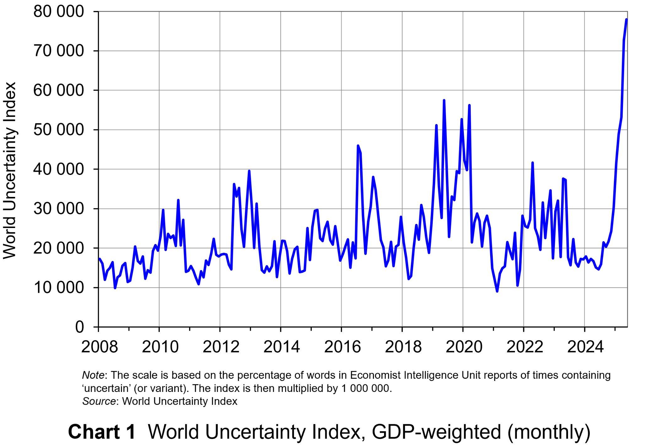 The World Uncertainty Index (WUI) tracks uncertainty around the world by applying a form of text mining known as ‘term frequency’ to the country reports produced by the Economist Intelligence Unit (EIU). The words searched for are ‘uncertain’, ‘uncertainty’ and ‘uncertainties’ and the number of times they occur as percentage of the total words is recorded. To produce the WUI this figure is then multiplied by 1m. A higher WUI number indicates a greater level of uncertainty.
The monthly global average WUI is shown in Chart 1 (click here for a PowerPoint). It is based on 71 countries. Since 2008 the WUI has averaged a little over 23 000: i.e. 2.3 per cent of the text in EIU reports contains the word ‘uncertainty’ or a close variant. In May 2025, it was almost 79 000 – the highest since the index was first complied in 2008. The previous highest was in March 2020, at the start of the COVID-19 outbreak, when the index rose to just over 56 000.
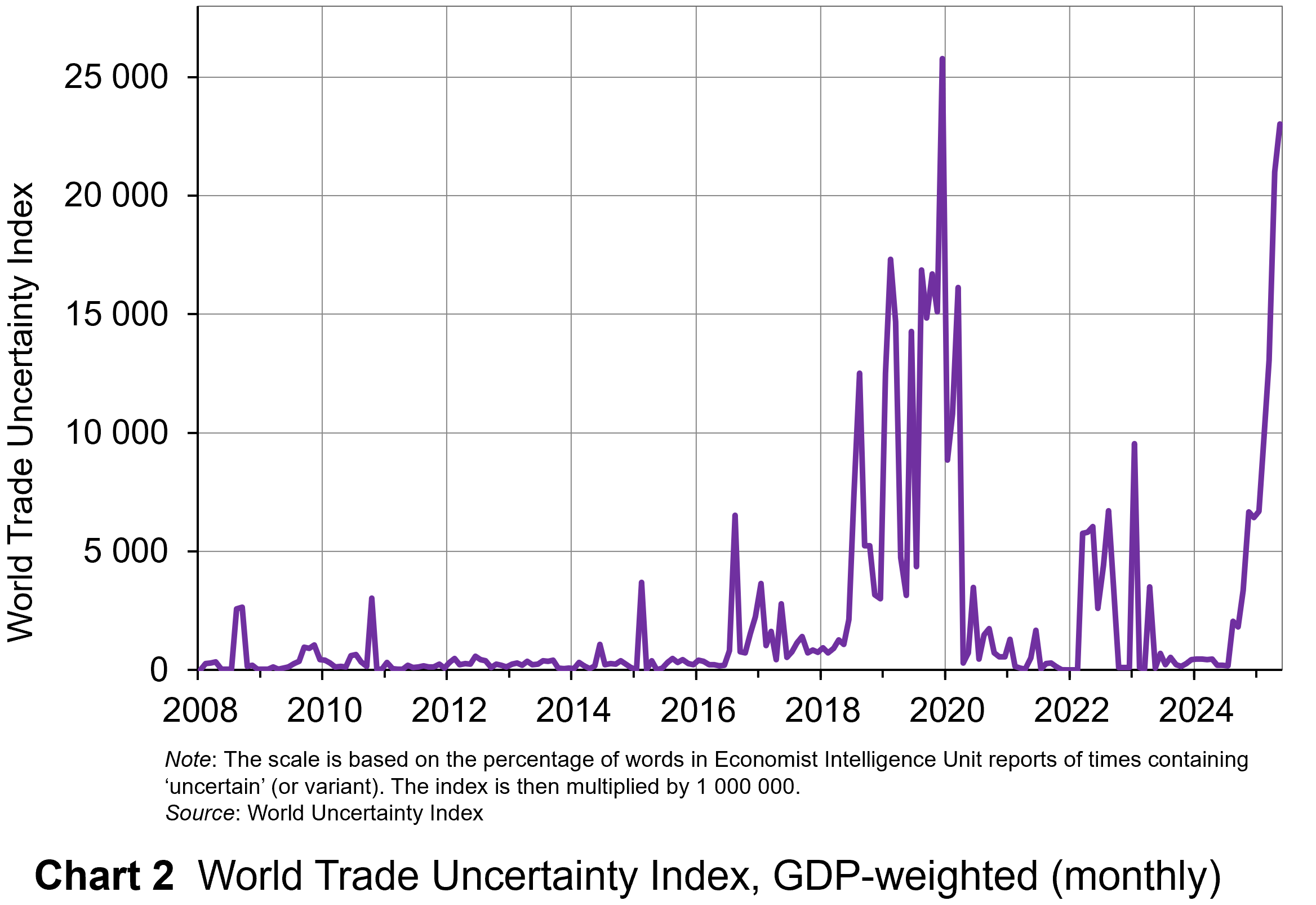 The second chart shows the World Trade Uncertainty Index (WTUI), published on the same site as the WUI (click here for a PowerPoint). The method adopted in its construction therefore mirrors that for the WUI but counts the number of times in EIU country reports ‘uncertainty’ is mentioned within proximity to a word related to trade, such as ‘protectionism’, ‘NAFTA’, ‘tariff’, ‘trade’, ‘UNCTAD’ or ‘WTO.’
The chart shows that in May 2025, the WTUI had risen to just over 23 000 – the second highest since December 2019, when President Trump imposed a new round of tariffs on Chinese imports and announced that he would restore steel tariffs on Brazil and Argentina. Since 2008, the WTUI has averaged just 2228.
It remains to be seen whether more stability in trade relations and geopolitics will allow WUI and WUTI to decline once more, or whether greater instability will simply lead to greater uncertainty, with damaging consequences for investment and also for consumption and employment.
Articles
- IMF World Economic Outlook: economic uncertainty is now higher than it ever was during COVID
The Conversation, Sergi Basco (23/4/25)
- Economic uncertainty hits new high
McKinsey, Sven Smit et al. (29/5/25)
- Trade tensions and rising uncertainty drag global economy towards recession
UNCTAD News (25/4/25)
- IMF Warns Global Economic Uncertainty Surpasses Pandemic Levels
The Global Treasurer (24/4/25)
- Britons ‘hoarding cash amid economic uncertainty and fear of outages’
The Guardian, Phillip Inman (10/6/25)
- America’s Brexit Phase
Foreign Affairs, Jonathan Haskel and Matthew J. Slaughter (10/6/25)
- Goldman Sachs’ CEO on the ‘Big, Beautiful Bill,’ Trump’s Tariffs and Economic Volatility
Politico, Sam Sutton (13/6/25)
- The Countries Where Economic Uncertainty Is Rising Fastest
24/7 Wall St., Evan Comen (9/6/25)
- Trump’s tariffs have finally kicked in, so what happens next?
The Conversation, Maha Rafi Atal (8/8/25)
Uncertainty Indices
Questions
- Explain what is meant by ‘text mining’. What are its strengths and weaknesses in assessing business, consumer and trade uncertainty?
- Explain how the UK Monthly EPU Index is derived.
- Why has uncertainty increased so dramatically since the start of 2025?
- Compare indices based on text mining with confidence indices.
- Plot consumer and business/industry confidence indicators for the past 24 months, using EC data. Do they correspond with the WUI?
- How may uncertainty affect consumers’ decisions?
For a while now, debate has raged over how to revive the fortunes of the London Stock Exchange (LSE). Since the 2008 financial crisis, the market has suffered a lack of investment, poor liquidity and low performance. This has produced a moribund financial market which has become unattractive to both investors and companies. Returns from the UK market lag international competitors, particularly the USA (see the chart).
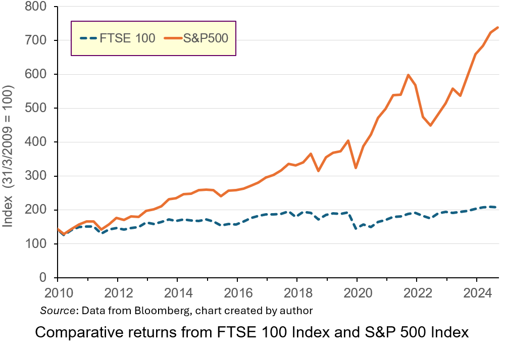
Investment in the S&P 500 Index over the period would have produced annualised rates of return of 14.35%, more than double that from the FTSE 100 Index. Part of this underperformance is due to the industrial mix of the listed companies: low-growth energy and mining compared to the high-growth technology sectors in the USA. This has led to the perception that London is not a place for firms to list, particularly those in high-growth sectors.
In 2024, 88 companies choose to delist or transfer their primary listing elsewhere. Only 18 took their place. Several big companies from a range of industries, including Ashtead, Flutter and CRH have transferred their primary listing to New York or have plans to do so.
 The new Labour government views stimulating higher levels of investment though the London market as an important element in its drive to boost productivity and growth in the UK. Recently, it has been reported that investment institutions have been lobbying the UK government to reduce significantly the tax-free allowance for Cash Individual Savings Accounts (ISAs) as a way to encourage more of UK households’ savings to be channelled through the UK stock market.
Currently, UK savers can save up to £20 000 annually into ISAs without paying tax on the interest earned. This can be held solely in Cash ISAs, or in a combination of Cash plus Stocks and Shares ISAs. The tax-free instruments which were introduced by a Labour government in 1999 to encourage higher savings have proved immensely popular. Data from Paragon Bank indicate that over £350 billion are held in these accounts. However, under the new proposals, the amount which would be allowed to be saved as cash has been rumoured to be cut to £4000 per year, with the hope that some of it will be invested in the UK stock market.
The proposals have proved controversial, with high-profile figures voicing opposition. In this blog, we’ll analyse the reasons behind the proposal and discuss whether it will have the desired effect of stimulating higher levels of investment. We’ll also discuss other proposed policies for making the LSE a more effective channel for investment flows to boost economic growth.
Stock markets and the saving and investment channel
 The main reason for the proposed ISA change is to encourage more investment in the UK stock market. By reducing the amount which can be saved in Cash ISAs, the government hopes to encourage savers to invest in Stocks and Shares ISAs instead, particularly ones linked to the UK market. This would increase the amount of finance capital in the market, thereby boosting its liquidity. This would then make it an attractive place for young, vibrant UK and foreign companies to list.
An active, liquid secondary market in shares is important to attract firms to list on stock exchanges by issuing shares to outside investors. Traditionally, this channel has been important to the growth and development of firms.
Existing savings in Cash ISAs are deposited with financial institutions such as banks and building societies. Through the credit-creation process such funds can be used to finance productive investment. In countries like the UK, lending by financial institutions is an important way that investment is financed, particularly for small and medium-sized enterprises. However, scale limits, regulatory restrictions and the need to diversify lending properly means that there are limits to the financing available for company investment through these institutions.
Capital markets like the LSE are intended to meet these larger-scale requirements. Financial claims, such as debt and equity, are divided into atomised instruments and sold to outside investors to fund investment and business growth.
 Further, the desire for a capital injection to finance growth is not the only reason that firms seek stock market listings. Founders of companies may have a lot of wealth invested in the equity of their firms. Selling some of their equity to outside investors through a stock market listing is a way of diversifying their wealth. However, if they are to maximise the potential sale price, there must be an active, liquid secondary market to encourage investors to buy shares in the primary market.
Proponents of reform want to encourage a greater appetite for risk among UK investors, which will produce more savings being channelled through the LSE.
One issue is whether savers will respond in the way anticipated and channel more funds through the UK stock market. Many savers like the security of Cash ISAs. Such vehicles offer a low-risk/low-return combination, which savers like because the tax benefits boost returns. A survey by the Nottingham Building Society found that a substantial number of Cash ISA savers are concerned that the proposed changes could affect their ability to save for important financial goals, such as buying a house or building an emergency fund. Higher-risk Stocks and Shares ISAs are not suitable for such savings because of the potential to lose the initial amount invested. Many may not be prepared to do so and one-third suggested they would save less overall.
According to the survey, only 38% of Cash ISA holders said they would consider investing in Stocks and Shares ISAs if the Cash ISA allowance were reduced. It may be difficult to alter such risk-averse preferences given the average amount saved through ISAs and demographics. In 2022/23, the average amount subscribed to ISAs was £5000. This does not suggest that average households have a significant surplus of cash that they may want to investment at a high risk through the stock market. Indeed, many may want to have access to the cash at short notice and so are not prepared to forgo liquidity for the time needed to accrue the benefits of compounding which stock market investing produces.
 Demographics may also play a role in this. Many of those who save more are now retired, or near retirement. They are less likely to see the appeal of compounding returns over long periods through investment in shares. Instead, with shorter investment horizons, they may only see the potential for losses associated with Stocks and Shares ISAs. Indeed, they will be starting to liquidate their long-term positions to draw income in retirement. Therefore, they may save less.
For others, who may be prepared to accept the additional risk, with the prospect of higher returns in the way that advocates of the reform hope for, the reduction in the Cash ISA allowance does not necessarily mean that they will invest in Stocks and Shares ISAs linked to the UK market. Since returns from the UK market have lagged international competitors, it may be that savers will channel their savings to those international markets, particularly in the USA, where the risk–return relationship has been more rewarding. Doing so has been made much easier and cheaper through a combination of economic forces including technological advances, regulatory changes and increased competition. This makes it much easier for UK savers to channel investment funds to wherever potential return is highest. At the moment, this is unlikely to be the UK, meaning that the anticipated boost to investment funds may not be as much as anticipated.
Critics of the proposal also question the motives of investment fund managers who have been lobbying government. They argue that the reforms will mean that many people who do now choose to save in Stocks and Shares ISAs will buy funds managed by fund managers who will receive fees for doing so. Critics argue that it is the prospect of higher fees which is the real motive behind the lobbying, not any desire to boost investment and growth.
What alternatives are available to boost the London Stock Exchange
 The low valuations of LSE-listed companies compared to their international counterparts, particularly those in the USA, has discouraged growing firms from listing in London. To address this, there have been calls to enhance corporate governance standards and reduce regulatory burdens for listed companies.
This has already been recognised by the authorities. In 2024, UK regulators approved the biggest overhaul of rules regulating London-listed companies. The new listing rules will hand more power to company bosses to make decisions without shareholder votes. They will give companies more flexibility to adopt dual-class share structures used by founders and venture capital firms to give themselves stronger voting rights than other investors. This is particularly popular for founders who want to diversify their wealth without sacrificing control and is used frequently by tech companies and venture capitalists when listing in the USA. Such reforms may attract more companies in high-growth sectors to list in London.
Tax policies which provide the right incentives to buy and sell shares could also encourage more investment in the LSE. For instance, the repeal in the mid-1990s of the preferential tax treatment of dividend income for UK pension funds and insurance companies is seen as a major factor in discouraging those institutions from investing more funds in the London market. Since tax on capital gains is only liable when they are realised, this reduces their present value versus the equivalent amount on dividends.
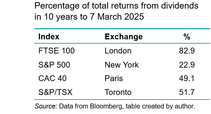
As the following table illustrates, given the significantly higher percentage of total returns derived from dividends in the LSE compared to other exchanges, the equal tax treatment of dividend and capital gains provides an incentive to seek jurisdictions where capital gains predominate. This is what UK pension funds have done. Data from the Office of National Statistics show that in 2024, 77% of UK occupational pensions equity investments were overseas.
Reinstating this tax benefit could stimulate greater demand for UK equity from this significant sector, boosting liquidity in the London market. Allied to this are proposals from the UK government to consolidate the fragmented UK pension industry to achieve greater scale economies in that channel for investment. This can reduce financing costs, boosting the marginal return from UK investments for these funds, encouraging greater investment in the UK market (ceteris paribus).
Further, the 2.5% stamp duty on share purchases has been viewed as another disincentive for both retail and institutional investors to engage in security trading on the London Stock Exchange. The duty, which is much higher than in peer economies, effectively raises the expected rate of return on UK equites which depresses perceptions of their values and prices. Its removal may raise trading volumes, improving the liquidity of the market and be offset by increased tax revenues in the future. However, the Treasury suggests that the removal of stamp duty is doubtful, since it would create a significant hole in the UK government’s budget.
 Ultimately, many of these reforms may have limited impact on investment. Efforts to boost confidence in the stock market will depend on improving the overall economic environment in the UK. Therefore, it will be the wider policies promoting growth in general which will increase the rates of return offered by London-listed firms and be more significant to attracting capital to London.
However, many of these are controversial themselves, such as relaxing laws around planning permissions and addressing business uncertainties around post-Brexit trading arrangements with the European Union. These broader economic measures could help make the UK generally, and the LSE specifically, more appealing to both domestic and international investors.
Conclusion
The UK government’s proposal to reduce the Cash ISA allowance is part of a broader strategy to boost investment in the stock market and stimulate economic growth. While this change could lead to more capital being directed towards productive investments, it also poses challenges for savers who like the security and simplicity of Cash ISAs.
The ultimate impact will depend on how savers respond to these changes. The potential reduction in overall savings rates could counteract some of the intended benefits. Further, the extent to which they are prepared to channel their savings into UK-listed companies will be important. If many seek higher returns elsewhere, the impact on the UK stock market may be limited. In any case, policies to address the problems of the UK stock market will only work if the wider issues associated with UK productivity and growth are addressed.
Articles
Data
Questions
- Explain how banks use cash ISAs to finance investment through credit creation.
- What do stock markets offer which may boost investment and economic growth?
- What are the issues with the London Stock Exchange which is making it unattractive for raising finance?
- How is the rumoured ISA reform intended to help address these issues?
- Analyse the extent to which it will do so.
- How might some of the broader reforms proposed by the UK government influence rate of return on UK equities and attract capital?
 This Christmas, more people are considering giving second-hand (or ‘pre-loved’) goods as presents. This allows them to afford better-quality presents and to save money at a time when a large proportion of the population are finding that their finances are stretched. This continues a trend towards buying second-hand products – a trend driven by the rise of various online retailers, such as Vinted and Preloved, and a growing online presence of charity shops, as well as extensive use of established platforms, such as Facebook Marketplace, eBay, Depop, Gumtree and Nextdoor.
 Likewise, the environmental benefits (positive externalities) of recycling products, rather than throwing them away or hoarding them, are not counted. In fact, if reusing products causes fewer new products to be made, this would be counted as subtracting from GDP.
 Recently, a flurry of bankruptcies among non-bank financial intermediaries (NBFIs) in the USA has drawn attention to the risks associated with alternative credit channels in the shadow-banking sector – lending which is not financed with deposits. There is concern that this could be the start of a wave of bankruptcies among such NBFIs, especially given concerns about a potential downswing in the economic cycle – a time when defaults are more likely.
  In the 1980s, international regulations around traditional banking activities – taking deposits and making loans – were being formalised by the Bank for International Settlements (BIS) under what became known as the Basel framework (see, for example, Economics section 18.2 or Economics for Business section 28.2). For the first time, this stipulated liquidity and capital requirements for international banks relating to their traditional lending activities. However, at the same time the deregulation of financial markets and financial innovation provided banks with opportunities to derive revenues from a range of other financial services.
  These regulatory developments created an incentive to pursue activities which do not require as much capital, since their marginal cost is lower and potential return is higher. Consequently, banks have placed less emphasis on lending and more on purchasing short-term and long-term financial securities and generating non-interest income from off-balance sheet activities. For instance, research by the Bank of England found that during the 1980s, interest income accounted for more than two-thirds of total income for large international banks. In contemporary times, non-interest income tends to be greater than interest income. Figure 1 illustrates the declining proportion of total assets represented by commercial and consumer loans for all regulated US banks. (Click
  With banks originating less lending, activity has migrated to different avenues in the shadow-banking sector. This sector has always existed, but deregulation and financial innovation created opportunities for the growth of shadow banking – lending which is not financed with deposits. Traditionally, non-bank financial intermediaries (NBFIs), such as pension funds, hedge funds and insurance companies, use funds from investors to buy securities through financial markets. However, new types of NBFIs have emerged which originate loans themselves, notably private credit institutions. As Figure 2 illustrates, a lot of the expansion in the activities of NBFIs has been the due to increased lending by these institutions (defined as ‘other financial institutions (OFIs)). Note that the NBFI line includes OFIs. (Click
  Banking involves trade-offs and this is the case whether the activities happen in the regulated or shadow-banking sector. Increasing lending increases profitability. But as lending continues to increase, at some point the risk-return profile becomes less favourable since institutions are lending to increasingly higher-risk borrowers and for higher-risk projects.
 The financial system is highly interconnected, and each successive financial crisis has shown that systemic risks lurk in obscure places. On the face of it, NBFIs appear separate from regulated banks. But banks’ new business models have not removed them from the lending channel, merely changed their role. Short-term financing used to be conducted and funded by banks. Now, it is conducted by NBFIs, but still financed by banks. Long-term loan financing is no longer on banks’ balance sheets. However, while the lending is conducted by NBFIs, it is largely funded by banks.
 Furthermore, banks have increasingly made loans to NBFIs. Data for US commercial banks lending to the shadow-banking sector are publicly available only since 2015. But, as Figure 3 illustrates, it has seen a steady upward trend with a surge in activity in 2025. (Click
  The level of debt in the global economy is at unprecedented levels. Data from the International Monetary Fund (IMF) show that it rose to $351 trillion dollars in 2024, approximately 235% of weighted global gross domestic product (GDP). It is in this environment that private credit channels through NBFIs have been expanding. With this, it is more likely that NBFIs’ trade-off between credit risk and return has tilted greatly in favour of the former. Some point to the recent collapse of Tricolor and First Brands – both intermediary financing companies funded by private credit – as evidence of elevated levels of risk.
 Even as the EU moved towards economic and monetary union (EMU) during the 1990s, there was no discussion of integration for the banking industry. However, that changed following the 2008 financial crisis and 2011 eurozone crisis. Both episodes exposed vulnerabilities in the EU banking system which required taxpayer support. It was proposed that deeper integration of the banking sector would ensure its stability and resilience. This stimulated moves towards European Banking Union (EBU), starting with the European Council agreeing its creation in 2012. There are three institutional pillars to the Union:
 On the demand-side, retail banking is largely a relational rather than a transactional service, with consumption taking place over a long time-period with significant financial risks attached. Even with deposit insurance and a lender of last resort (the central bank), consumers exhibit significant loss aversion in their use of retail banking services. Consequently, trust and confidence are important characteristics for consumers and that means they are likely to prefer to use familiar domestic institutions.
  Some argue that retail banking is a public utility and should be regulated as such. It has a simple business model, taking deposits, making payments and making loans. Like other utilities, such as water and energy, retail banking is an essential service for the smooth functioning of the economy and society. Like other utilities, bank failures create severe problems for the economy and society.
  In a
In a  The World Uncertainty Index (WUI) tracks uncertainty around the world by applying a form of text mining known as ‘term frequency’ to the
  The second chart shows the World Trade Uncertainty Index (WTUI), published on the
 The new Labour government views stimulating higher levels of investment though the London market as an important element in its drive to boost productivity and growth in the UK. Recently, it has been reported that investment institutions have been lobbying the UK government to reduce significantly the tax-free allowance for Cash Individual Savings Accounts (ISAs) as a way to encourage more of UK households’ savings to be channelled through the UK stock market.
 The main reason for the proposed ISA change is to encourage more investment in the UK stock market. By reducing the amount which can be saved in Cash ISAs, the government hopes to encourage savers to invest in Stocks and Shares ISAs instead, particularly ones linked to the UK market. This would increase the amount of finance capital in the market, thereby boosting its liquidity. This would then make it an attractive place for young, vibrant UK and foreign companies to list.
  Demographics may also play a role in this. Many of those who save more are now retired, or near retirement. They are less likely to see the appeal of compounding returns over long periods through investment in shares. Instead, with shorter investment horizons, they may only see the potential for losses associated with Stocks and Shares ISAs. Indeed, they will be starting to liquidate their long-term positions to draw income in retirement. Therefore, they may save less.
  The low valuations of LSE-listed companies compared to their international counterparts, particularly those in the USA, has discouraged growing firms from listing in London. To address this, there have been calls to enhance corporate governance standards and reduce regulatory burdens for listed companies.
 Ultimately, many of these reforms may have limited impact on investment. Efforts to boost confidence in the stock market will depend on improving the overall economic environment in the UK. Therefore, it will be the wider policies promoting growth in general which will increase the rates of return offered by London-listed firms and be more significant to attracting capital to London.