 When I worked as a professional economist at HM Treasury and later the Council of Mortgage Lenders (now part of UK Finance), I would regularly brief on the state of the affordability of housing, with a particular focus on the owner-occupied market. That was back in the late 1990s. Fast forward a quarter of a century and I recognise not only how much I have aged but also how deep-rooted and long-standing the affordability problem is.
It is perhaps not surprising that in her first speech as the new Chancellor of the Exchequer, Rachel Reeves, referenced directly the housing market and the need to address supply-side issues. She has set a target of one and a half million new homes built over the next five years.
It is therefore timely to revisit the trends in house prices across the UK. By applying the distinction between nominal and real values we get a very clear sense of the deteriorating affordability of housing.
Nominal house price patterns
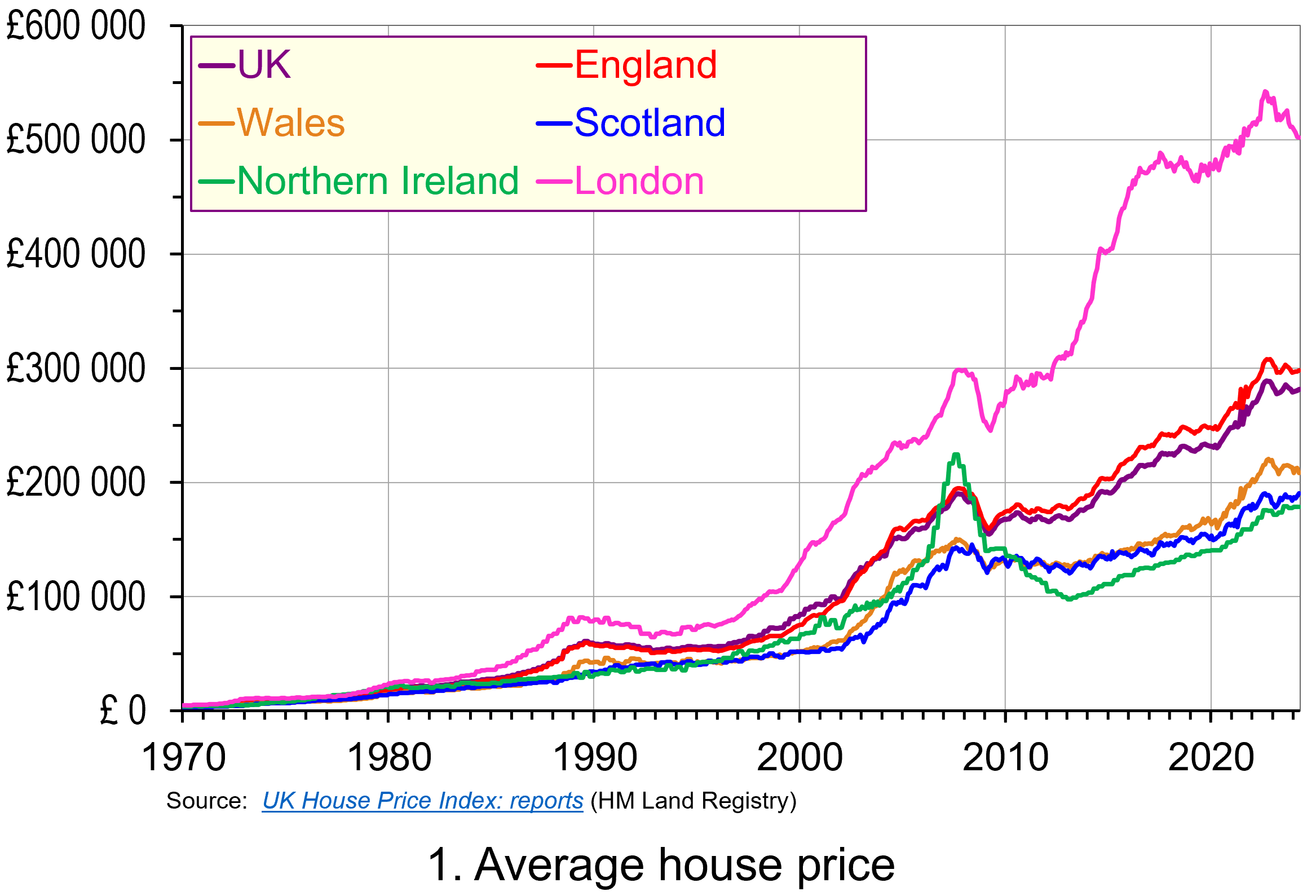 The average UK actual or nominal house price in April 2024 was £281 000. As Chart 1 shows, this masks considerable differences across the UK. In England the average price was £298 000 (105 per cent of the UK average), though this is heavily skewed by London where the average price was £502 000 (178 per cent of the UK average). Meanwhile, in Scotland it was £190 000 (68 per cent of the UK average), in Wales £208 000 (74 per cent of the UK average) and in Northern Ireland it was £178 000 (74 per cent of the UK average). (Click here to download a PowerPoint copy of the chart.)
A simple comparison of the average house price in April 2024 with January 1970 reveals a 72-fold increase in the UK, an 80-fold increase in England, including a 101-fold increase in London, a 65-fold increase in Wales, a 59-fold increase in Scotland and a 45-fold increase in Northern Ireland. Whilst these figures are sensitive to the particular period over which we choose to measure, there is little doubting that upward long-term trend in house prices.
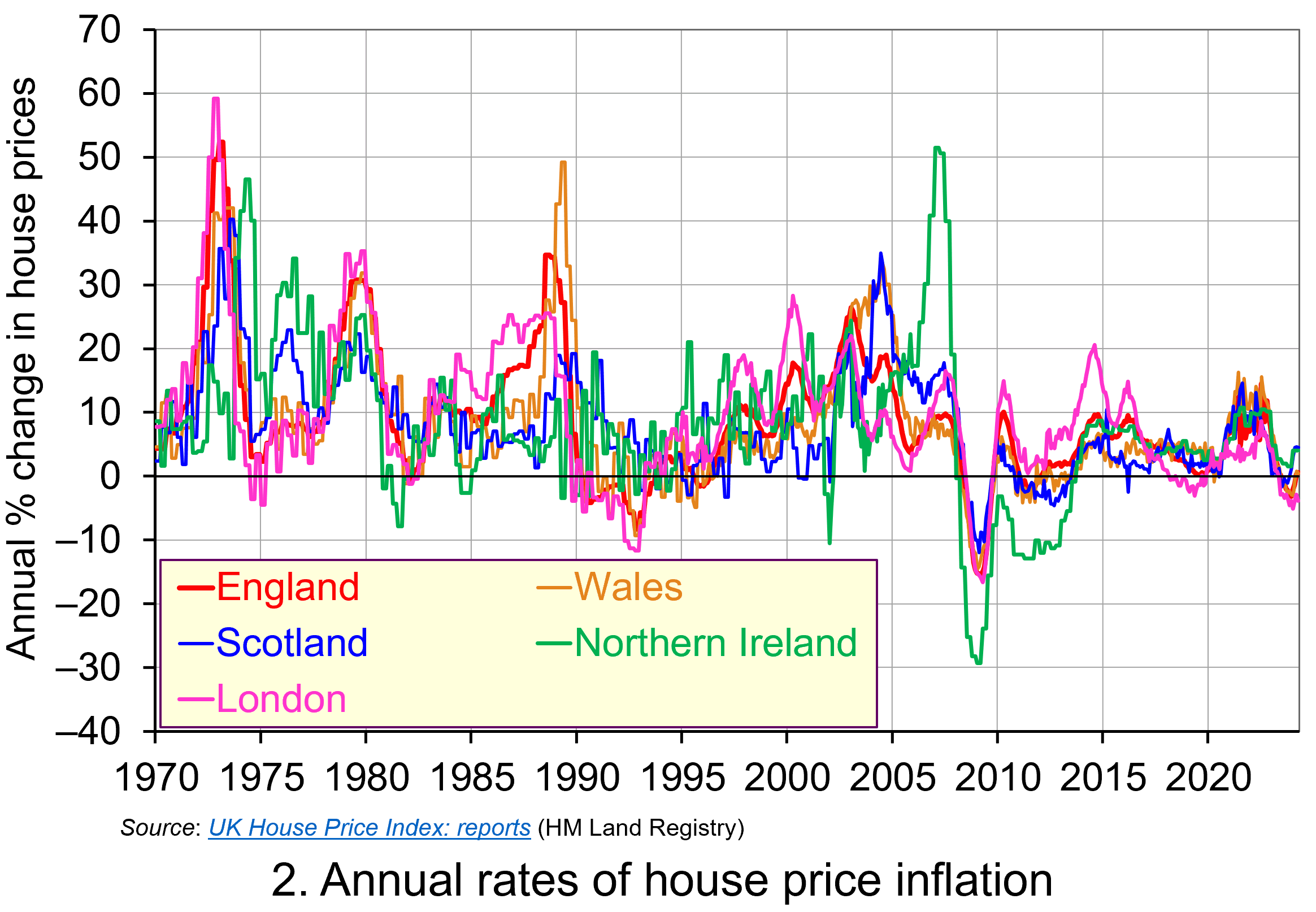 Whilst nominal prices trend upwards over time, the short-term rates of increase are highly volatile. This can be seen from an inspection of Chart 2, which shows the annual rates of increase across the four nations of the UK, as well as for London. This is evidence of frequent imbalances between the flows of property on to the market to sell (instructions to sell) and the number of people looking to buy (instructions to buy). An increase in instructions to buy (housing demand) relative to those to sell (housing supply) puts upward pressure on prices; an increase in the number of instructions to sell (housing supply) relative to those to buy (housing demand) puts downward pressure on prices. (Click here to download a PowerPoint copy of the chart.)
Chart 2 nicely captures the recent slowdown in the housing market. The inflationary shock that began to take hold in 2021 led the Bank of England to raise Bank Rate on 15 occasions – from 0.25 per cent in December 2021 to 5.25 per cent in August 2023 (which remains the rate at the time of writing, but could be cut at the next Bank of England meeting on 1 August 2024). Higher Bank Rate has pushed up mortgage rates, which has contributed to an easing of housing demand. Demand has also been dampened by weak growth in the economy, higher costs of living and fragile consumer confidence. The result has been a sharp fall in the rate of house price inflation, with many parts of the UK experiencing house price deflation. As the chart shows, the rate of deflation has been particularly pronounced and protracted in London, with house prices in January 2024 falling at an annual rate of 5.1 per cent.
Real house price patterns
Despite the volatility in house prices, such as those of recent times, the longer-term trend in house prices is nonetheless upwards. To understand just how rapidly UK house prices have grown over time, we now consider their growth relative to consumer prices. This allows us to analyse the degree to which there has been an increase in real house prices.
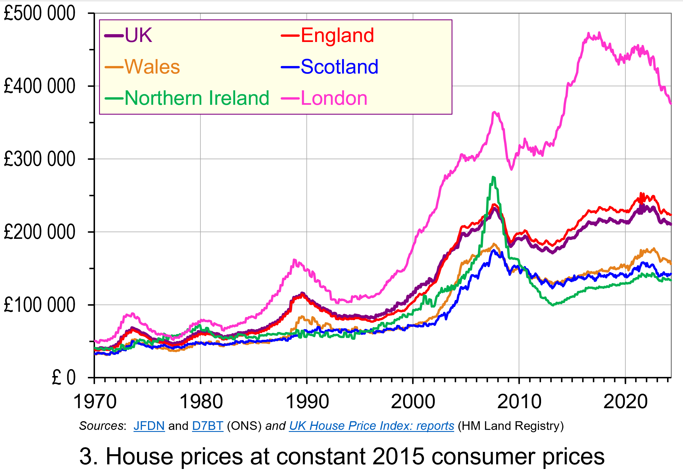 To calculate real or inflation-adjusted house prices, we deflate nominal house prices by the Consumer Prices Index (CPI). Chart 3 shows the resulting real house prices series across the UK as if consumer prices were fixed at 2015 levels.
The key message here is that over the longer-term we cannot fully explain the growth in actual (nominal) house prices by the growth in consumer prices. Rather, we see real increases in house prices. Inflation-adjusted UK house prices were 5.3 times higher in April 2024 compared to January 1970. For England the figure was 5.9 times, Wales 4.8 times, Scotland 4.3 times and for Northern Ireland 3.3 times. In London, inflation-adjusted house prices were 7.4 times higher. (Click here to download a PowerPoint copy of the chart.)
As we saw with nominal house prices, the estimated long-term increase in real house prices is naturally sensitive to the period over which we measure. For example, the average real UK house price in August 2022 was 5.8 times higher than in January 1970, while in London they were 8.7 times higher. But the message is clear – the long-term increase is not merely nominal, reflecting increasing prices generally, but is real, reflecting pressures that are increasing house prices relative to general price levels.
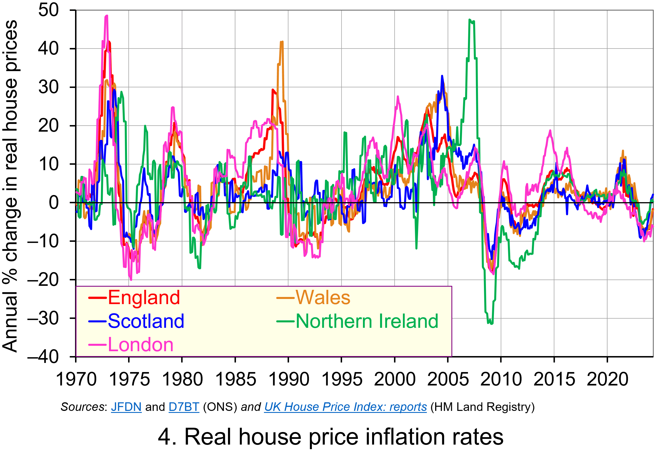 Chart 4 shows how the volatility in house prices continues to be evident when house prices are adjusted for changes in consumer prices. The UK’s annual rate of real house price inflation was as high as 40 per in January 1973; on the other hand, in June 1975 inflation-adjusted house prices were 15 per cent lower than a year earlier. (Click here to download a PowerPoint copy of the chart.)
Over the period from January 1970 to April 2024, the average annual rate of real house price inflation in the UK was 3.2 per cent. Hence house prices have, on average, grown at an annual rate of consumer price inflation plus 3.2 per cent. For the four nations, real house price inflation has averaged 3.8 per cent in England, 3.4 per cent in Wales, 3.0 per cent in Scotland and 2.9 per cent in Northern Ireland. Further, the average rate of real house price inflation in London since January 1970 has been 4.5 per cent. By contrast, that for the East and West Midlands has been 3.7 and 3.5 per cent respectively. The important point here is that the pace with which inflation-adjusted house prices have risen helps to contextualise the extent of the problem of housing affordability – a problem that only worsens over time when real incomes do not keep pace.
House building
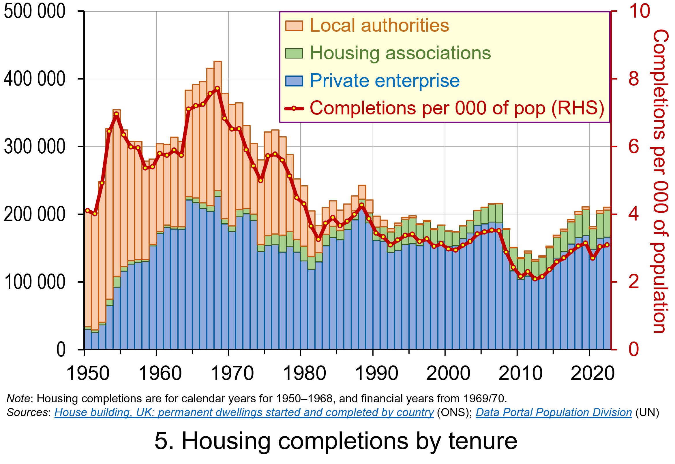 The newly elected Labour government has made the argument that it needs to prioritise planning reform as an engine for economic growth. While this ambition extends beyond housing, the scale of the supply-side problem facing the housing market can be seen in Chart 5. The chart shows the number of housing completions in the UK since 1950 by type of tenure. (Click here to download a PowerPoint copy of the chart.)
The chart shows the extent of the growth in house building in the UK that occurred from the 1950s and into the 1970s. Over these three decades the typical number of new properties completed each year was around 320 000 or 6 per thousand of the population. The peak of house building was in the late 1960s when completions exceeded 400 000 per year or over 7.5 per thousand of the population. It is also noticeable how new local authority housing (‘council houses’) played a much larger role in the overall housing mix.
Since 1980, the average number of housing completions each year has dropped to 191 000 or 3.2 per thousand of the population. If we consider the period since 2000, the number of completions has averaged only 181 000 per year or 2.9 per thousand of the population. While it is important to understand the pressures on housing demand in any assessment of the growth in real house prices, the lack of growth in supply is also a key factor. The fact that less than half the number of properties per thousand people are now being built compared with half a century or so ago is an incredibly stark statistic. It is a major determinant of the deterioration of housing affordability.
However, there are important considerations around the protection of the natural environment that need to be considered too. It will therefore be interesting to see how the reforms to planning develop and what their impact will be on house prices and their affordability.
Articles
- Rachel Reeves requests urgent assessment of spending inheritance
The Guardian, Larry Elliott (8/7/24)
- Reeves to bring back housebuilding targets
BBC News, Faisal Islam and Daniel Thomas (8/7/24)
- UK Chancellor Reeves Vows to Fix Broken Planning System for Housebuilding
Bloomberg UK, Tom Rees, Damian Shepherd, and Joe Mayes (8/7/24)
- What to expect for house prices for the rest of 2024
i News, Callum Mason (10/7/24)
- UK house prices still unaffordable for many people, says Nationwide
The Guardian, Richard Partington (1/7/24)
- House prices still unaffordable for the average earner despite wage rises – Nationwide
Sky News, Sarah Taaffe-Maguire (1/7/24)
- Labour cannot build 1.5m homes without cash for affordable housing, providers say
The Guardian, Jack Simpson (12/7/24)
Statistics
Questions
- Explain the difference between a rise in the rate of house price inflation a rise in the level of house prices.
- Explain the difference between nominal and real house prices.
- If nominal house prices rise can real house price fall? Explain your answer.
- What do you understand by the terms instructions to buy and instructions to sell?
- What factors are likely to affect the levels of instructions to buy and instructions to sell?
- How does the balance between instructions to buy and instructions to sell affect house prices?
- How can we differentiate between different housing markets? Illustrate your answer with examples.
- What metrics could be used to measure the affordability of housing?
- Discuss the argument that the deterioration of housing affordability is the result of market failure.
 In the first of a series of updated blogs focusing on the importance of the distinction between nominal and real values we look at the issue of earnings. Here we update the blog Getting Real with Pay written back in February 2019. Then, we noted how the macroeconomic environment since the financial crisis of the late 2000s had continued to affect people’s pay. Specifically, we observed that there had been no growth in real or inflation-adjusted pay. In other words, people were no better off in 2019 than in 2008.
In this updated blog, we consider to what extent the picture has changed five years down the line. While we do not consider the distributional impact on pay, the aggregate picture nonetheless continues to paint a very stark picture, with consequences for living standards and financial wellbeing.
While the distinction between nominal and real values is perhaps best known in relation to GDP and economic growth, the distinction is also applied frequently to analyse the movement of one price relative to prices in general. One example is that of movements in pay (earnings) relative to consumer prices.
Pay reflects the price of labour. The value of our actual pay is our nominal pay. If our pay rises more quickly than consumer prices, then our real pay increases. This means that our purchasing power rises and so the volume of goods and services we can afford increases. On the other hand, if our actual pay rises less quickly than consumer prices then our real pay falls. When real pay falls, purchasing power falls and the volume of goods and services we can afford falls.
Figures from the Office for National Statistics show that in January 2000 regular weekly pay (excluding bonuses and before taxes and other deductions from pay) was £293. By April 2024 this had risen to £640. This is an increase of 118 per cent. Over the same period, the consumer prices index known as the CPIH, which, unlike the better-known CPI, includes owner-occupied housing costs and council tax, rose by 82 per cent. Therefore, the figures are consistent with a rise both in nominal and real pay between January 2000 to April 2024. However, this masks a rather different picture that has emerged since the global financial crisis of the late 2000s.
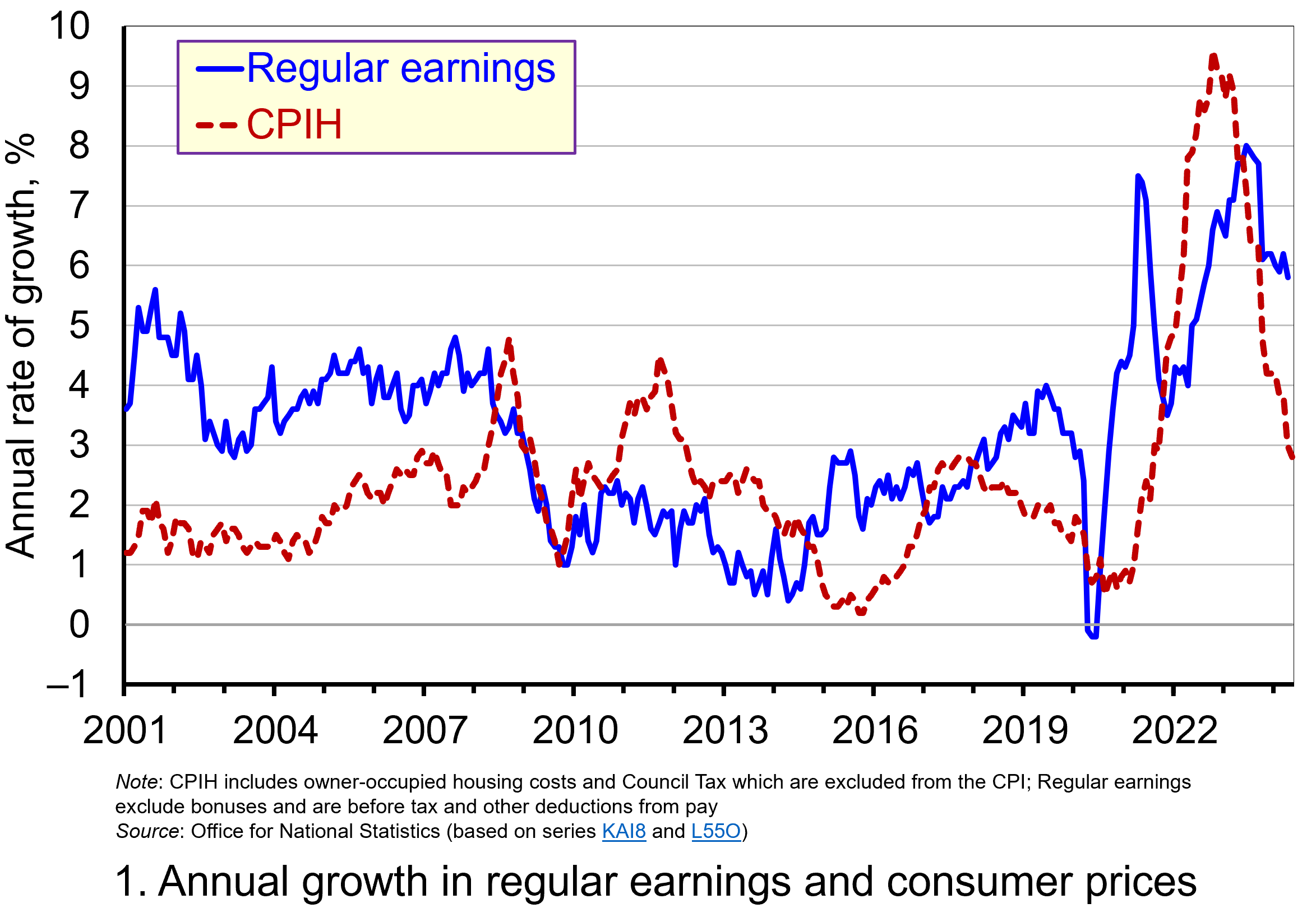 Chart 1 shows the annual percentage changes in actual (nominal) regular weekly pay and the CPIH since January 2001. Each value is simply the percentage change from 12 months earlier. The period up to June 2008 saw the annual growth of weekly pay outstrip the growth of consumer prices – the blue line in the chart is above the red dashed line. Therefore, the real value of pay rose. However, from June 2008 to August 2014 pay growth consistently fell short of the rate of consumer price inflation – the blue line is below the red dashed line. The result was that average real weekly pay fell. (Click here to download a PowerPoint copy of the chart.)
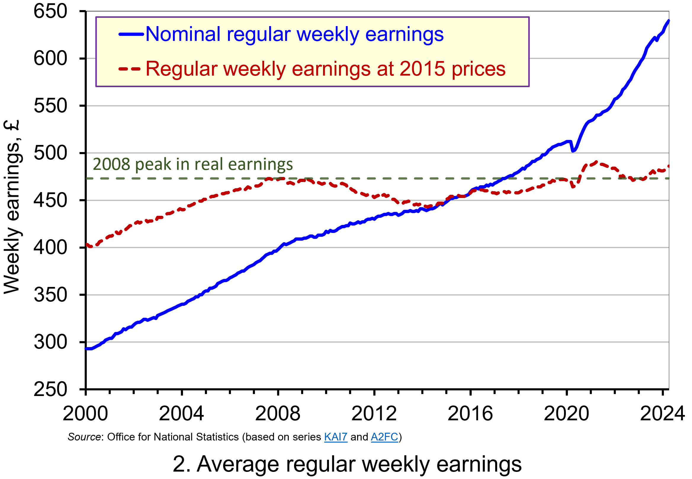 Chart 2 show the average levels of nominal and real weekly pay. The real series is adjusted for inflation. It is calculated by deflating the nominal pay values by the CPIH. Since the CPIH is a price index whose value averages 100 across 2015, the real pay values are at constant 2015 consumer prices. From the chart, we can see that the real value of weekly pay peaked in April 2008 at £473 at 2015 prices. The subsequent period saw rates of pay increases that were lower than rates of consumer price inflation. This meant that by March 2014 the real value of weekly pay had fallen by 6.3 per cent to £443 at 2015 prices. (Click here to download a PowerPoint copy of the chart.)
Although real (inflation-adjusted) pay recovered a little after 2014, 2017 again saw consumer price inflation rates greater than those of pay inflation (see Chart 1). This meant that at the start of 2018 real earnings were 3.2 per cent lower than their 2008-peak (see Chart 2). Real earnings then began to recover, buoyed by the economic rebound following the relaxation of COVID lockdown measures and increasing staffing pressures. Real earnings finally passed their 2008-peak in August 2020. By April 2021 regular weekly pay reached £491 at 2015 prices which was 3.8 per cent above the pre-global financial crisis peak.
However, the boost to real wages was to be short-lived as inflationary pressures rose markedly. While some of this was attributable to the same pressures that were driving up wages, inflationary pressures were fuelled further by the commodity price shock arising from Russia’s invasion of Ukraine and, in particular, its impact on energy prices. This saw the CPIH inflation rate rise to 9.6 per cent in October 2022 (while the CPI inflation rate peaked in the same month at 11.1 per cent). The result was that real weekly earnings fell by 2.7 per cent between January and October 2022 to stand at £471 at 2015 consumer prices. Consequently, average pay was once again below its pre-global financial crisis level.
Although inflationary pressures have recently weakened and real earnings have begun to recover, real regular weekly earnings in April 20024 (£486 at 2015 prices) were a mere 2.7 per cent higher than back in the first half of 2008. This compares to a nominal increase of around 58 per cent over the same period thereby demonstrating the importance of the distinction between nominal and real values in understanding what developments in pay mean for the purchasing power of households.
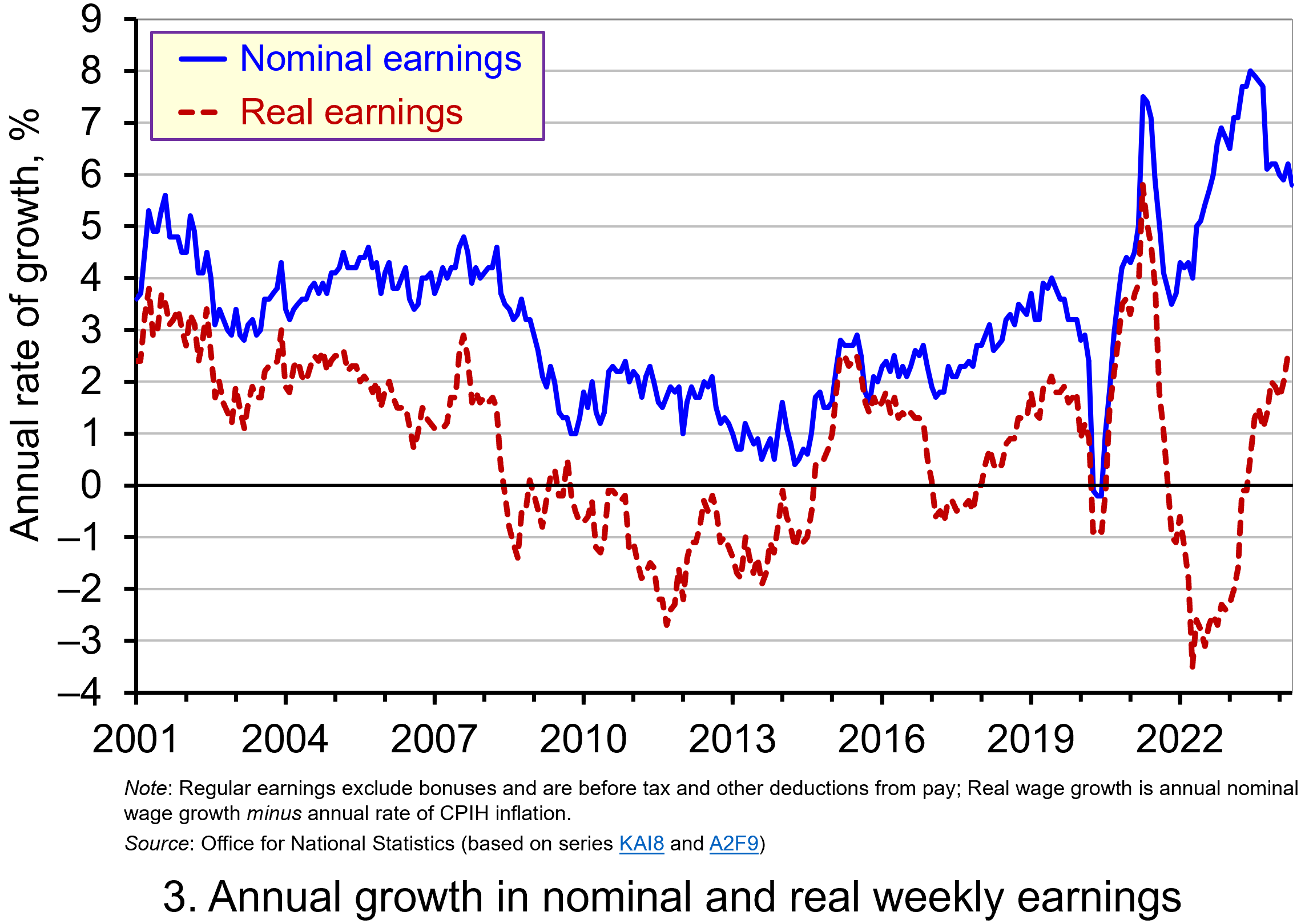 Chart 3 reinforces the importance of the nominal-real distinction. It shows nicely the sustained period of real pay deflation (negative rates of pay inflation) that followed the financial crisis, and the significant rates of real pay deflation associated with the recent inflation shock.
The result is that since June 2008 the average annual rate of growth of real regular weekly pay has been 0.1 per cent, despite nominal pay increasing at an annual rate of 2.9 per cent. In contrast, the period from January 2001 to May 2008 saw real regular weekly pay grow at an annual rate of 2.1 per cent with nominal pay growing at an annual rate of 4.0 per cent. (Click here to download a PowerPoint copy of the chart.)
If we think about the growth of nominal earnings, we can identify two important determinants.
The first is the expected rate of inflation. Workers will understandably want wage growth at least to match the growth in prices so as to maintain their purchasing power.
The second factor is the growth in labour productivity. Firms will be more willing to grant pay increases if workers are more productive, since productivity helps to offset pay increases and maintain firms’ profit margins. Consequently, since over time the actual rate of inflation will tend to mirror the expected rate, the growth of real pay is closely related to the growth of labour productivity. This is significant because, as John discusses in his blog The Productivity Puzzle (14 April 2024), labour productivity growth in the UK, as measured by national output per worker hour, has stalled since the global financial crisis.
Understanding the stagnation of real earnings therefore nicely highlights the interconnectedness of economic variables. In this case, it highlights the connections between productivity, levels of investment and people’s purchasing power. It is not surprising, therefore, that the stagnation of both real earnings and productivity growth since the global financial crisis have become two of the most keenly debated macroeconomic issues of recent times. Indeed, it is likely that their behaviour will continue to shape macroeconomic debates and broader conversations around government policy for some time.
Articles
Questions
- Using the examples of both GDP and earnings, explain how the distinction between nominal and real relates to the distinction between values and volumes.
- In what circumstances would an increase in actual pay translate into a reduction in real pay?
- In what circumstances would a decrease in actual pay translate into an increase in real pay?
- What factors might explain the reduction in real rates of pay seen in the UK following the financial crisis of 2007–8?
- Of what importance might the growth in real rates of pay be for consumption and aggregate demand?
- Why is the growth of real pay an indicator of financial well-being? What other indicators might be included in measuring financial well-being?
- Assume that you have been asked to undertake a distributional analysis of real earnings since the financial crisis. What might be the focus of your analysis? What information would you therefore need to collect?
 One of the most enduring characteristics of the macroeconomic environment since the financial crisis of the late 2000s has been its impact on people’s pay. We apply the distinction between nominal and real values to evidence the adverse impact on the typical purchasing power of workers. While we do not consider here the distributional impact on pay, the aggregate picture nonetheless paints a very stark picture of recent patterns in pay and, in turn, the consequences for living standards and wellbeing.
While the distinction between nominal and real values is perhaps best know in relation to GDP and economic growth (see the need to get real with GDP), the distinction is also applied frequently to analyse the movement of one price relative to prices in general. One example is that of movements in pay (earnings) relative to consumer prices.
Pay reflects the price of labour. The value of our actual pay is our nominal pay. If our pay rises more quickly than consumer prices, then our real pay increases. This means that our purchasing power rises and so the volume of goods and services we can afford increases. On the other hand, if our actual pay rises less quickly than consumer prices then our real pay falls. When real pay falls, purchasing power falls and the volume of goods and services we can afford falls.
Figures from the Office for National Statistics show that in January 2000 regular weekly pay (excluding bonuses and before taxes and other deductions from pay) was £293. By December 2018 this had risen to £495. This is an increase of 69 per cent. Over the same period the consumer prices index known as the CPIH, which, unlike the better-known CPI, includes owner-occupied housing costs and Council Tax, rose by 49 per cent. Therefore, the figures are consistent with a rise both in nominal and real pay between January 2000 to December 2018. However, this masks the fact that in recent times real earnings have fallen.
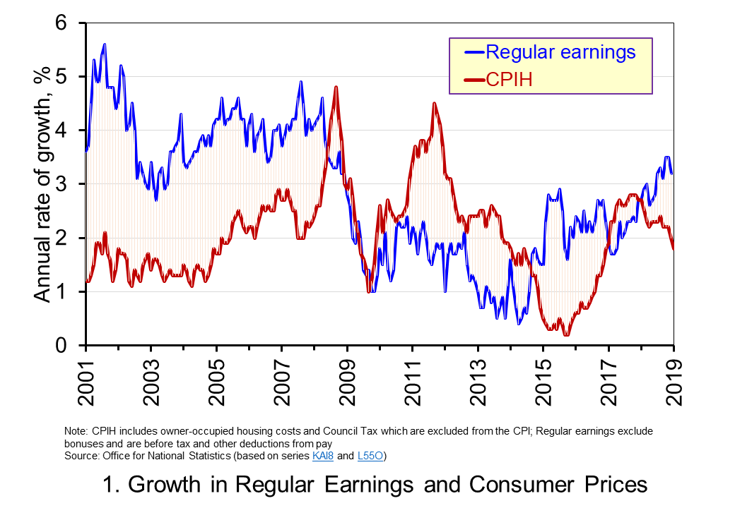 Chart 1 shows the annual percentage changes in actual (nominal) regular weekly pay and the CPIH since January 2001. Each value is simply the percentage change from 12 months earlier. The period up to June 2008 saw the annual growth of weekly pay outstrip the growth of consumer prices – the blue line in the chart is above the red line. Therefore, the real value of pay rose. However, from June 2008 to August 2014 pay growth consistently fell short of the rate of consumer price inflation – the blue line is below the red line. The result was that average real weekly pay fell. (Click here to download a PowerPoint copy of the chart.)
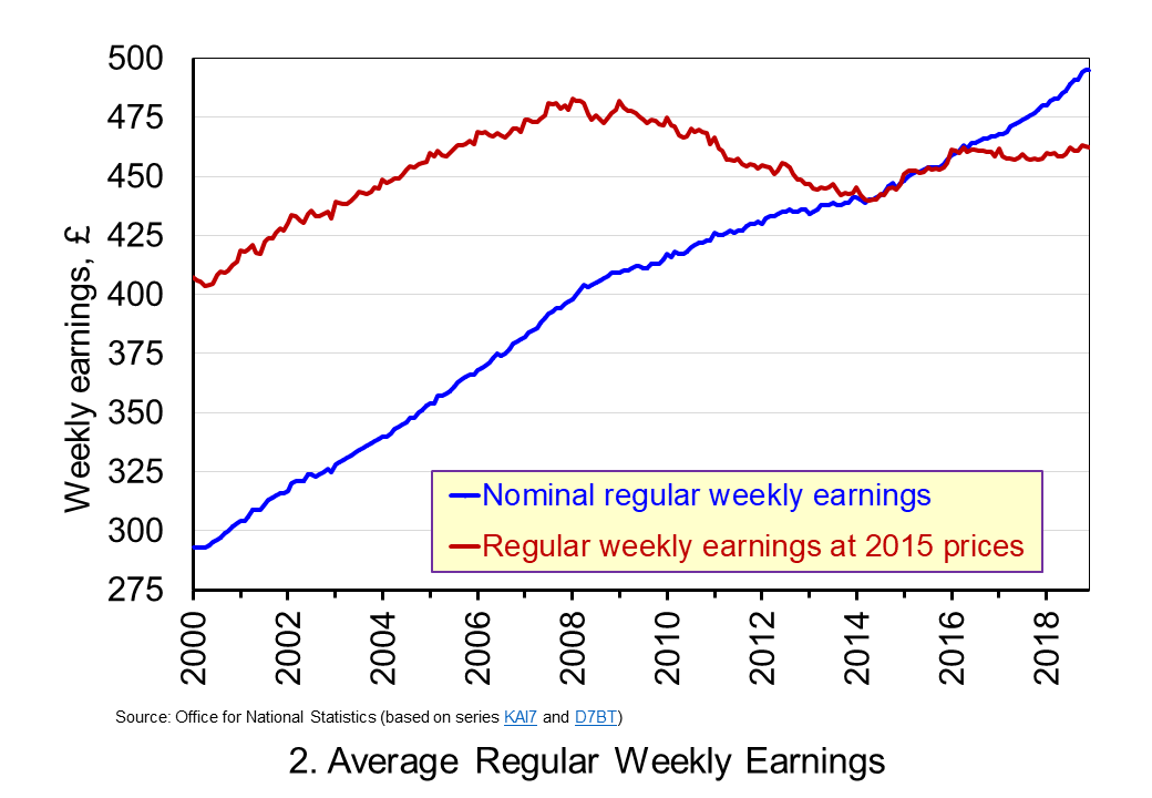 Chart 2 show the average levels of nominal and real weekly pay. The real series is adjusted for inflation. It is calculated by deflating the nominal pay values by the CPIH. Since the CPIH is a price index whose value averages 100 across 2015, the real pay values are at constant 2015 prices. From the chart, we can see that the real value of weekly pay peaked in March 2008 at £482.01 at 2015 prices. The subsequent period saw rates of pay inflation that were lower than rates of consumer price inflation. This meant that by March 2014 the real value of weekly pay had fallen by 8.8 per cent to £439.56 at 2015 prices. (Click here to download a PowerPoint copy of the chart.)
Although real (inflation-adjusted) pay recovered a little during 2015 and 2016, 2017 again saw consumer price inflation rates greater than those of pay inflation (see Chart 1). Consequently, the average level of real weekly pay fell by 1 per cent between January and November 2017. Since then, real regular pay has again increased. In December 2018, average real pay weekly pay was £462.18 at 2015 prices: an increase of 1.1 per cent from November 2017. Nonetheless, inflation-adjusted average weekly pay in December 2018 remained 4.1 per cent below its March 2008 level.
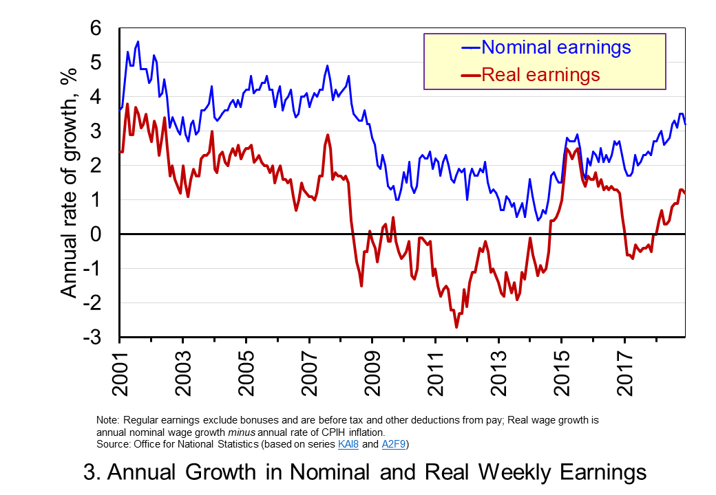 Chart 3 shows very clearly the importance of the distinction between real and nominal when analysing the growth of earnings. The sustained period of real pay deflation (negative rates of pay inflation) that followed the financial crisis can be seen much more clearly by plotting growth rates rather than their levels. Since June 2008 the average annual growth of real regular weekly pay has been −0.2 per cent, despite nominal pay increasing at an annual rate of 2 per cent. In the period from January 2001 to May 2008 real regular weekly pay had grown at an annual rate of 2.1 per cent with nominal pay growing at an annual rate of 4.0 per cent. (Click here to download a PowerPoint copy of the chart.)
The distinction between nominal and real helps us to understand better why some argue that patterns in pay, living standards and well-being have been fundamental in characterising the macroeconomic environment since the financial crisis. Indeed, it is not unreasonable to suggest that these patterns have helped to shape macroeconomic debates and broader conversations around the role of government and of public policy and its priorities.
Articles
Questions
- Using the example of GDP and earnings, explain how the distinction between nominal and real relates to the distinction between values and volumes.
- In what circumstances would an increase in actual pay translate into a reduction in real pay?
- In what circumstances would a decrease in actual pay translate into an increase in real pay?
- What factors might explain the reduction in real rates of pay seen in the UK following the financial crisis?
- Of what importance might the growth in real rates of pay be for consumption and aggregate demand?
- Why is the growth of real pay an indicator of financial well-being? What other indicators might be included in measuring financial well-being?
- Assume that you have been asked to undertake a distributional analysis of real earnings since the financial crisis. What might be the focus of your analysis? What information would you therefore need to collect?
 When I worked as a professional economist at HM Treasury and later the Council of Mortgage Lenders (now part of UK Finance), I would regularly brief on the state of the affordability of housing, with a particular focus on the owner-occupied market. That was back in the late 1990s. Fast forward a quarter of a century and I recognise not only how much I have aged but also how deep-rooted and long-standing the affordability problem is.
 The average UK actual or nominal house price in April 2024 was £281 000. As Chart 1 shows, this masks considerable differences across the UK. In England the average price was £298 000 (105 per cent of the UK average), though this is heavily skewed by London where the average price was £502 000 (178 per cent of the UK average). Meanwhile, in Scotland it was £190 000 (68 per cent of the UK average), in Wales £208 000 (74 per cent of the UK average) and in Northern Ireland it was £178 000 (74 per cent of the UK average). (Click here to download a PowerPoint copy of the chart.)
 Whilst nominal prices trend upwards over time, the short-term rates of increase are highly volatile. This can be seen from an inspection of Chart 2, which shows the annual rates of increase across the four nations of the UK, as well as for London. This is evidence of frequent imbalances between the flows of property on to the market to sell (instructions to sell) and the number of people looking to buy (instructions to buy). An increase in instructions to buy (housing demand) relative to those to sell (housing supply) puts upward pressure on prices; an increase in the number of instructions to sell (housing supply) relative to those to buy (housing demand) puts downward pressure on prices. (Click here to download a PowerPoint copy of the chart.)
 To calculate real or inflation-adjusted house prices, we deflate nominal house prices by the Consumer Prices Index (CPI). Chart 3 shows the resulting real house prices series across the UK as if consumer prices were fixed at 2015 levels.
 Chart 4 shows how the volatility in house prices continues to be evident when house prices are adjusted for changes in consumer prices. The UK’s annual rate of real house price inflation was as high as 40 per in January 1973; on the other hand, in June 1975 inflation-adjusted house prices were 15 per cent lower than a year earlier. (Click here to download a PowerPoint copy of the chart.)
 The newly elected Labour government has made the argument that it needs to prioritise planning reform as an engine for economic growth. While this ambition extends beyond housing, the scale of the supply-side problem facing the housing market can be seen in Chart 5. The chart shows the number of housing completions in the UK since 1950 by type of tenure. (Click here to download a PowerPoint copy of the chart.)
 In the first of a series of updated blogs focusing on the importance of the distinction between nominal and real values we look at the issue of earnings. Here we update the blog
  Chart 1 shows the annual percentage changes in actual (nominal) regular weekly pay and the CPIH since January 2001. Each value is simply the percentage change from 12 months earlier. The period up to June 2008 saw the annual growth of weekly pay outstrip the growth of consumer prices – the blue line in the chart is above the red dashed line. Therefore, the real value of pay rose. However, from June 2008 to August 2014 pay growth consistently fell short of the rate of consumer price inflation – the blue line is below the red dashed line. The result was that average real weekly pay fell. (Click
  Chart 2 show the average levels of nominal and real weekly pay. The real series is adjusted for inflation. It is calculated by deflating the nominal pay values by the CPIH. Since the CPIH is a price index whose value averages 100 across 2015, the real pay values are at constant 2015 consumer prices. From the chart, we can see that the real value of weekly pay peaked in April 2008 at £473 at 2015 prices. The subsequent period saw rates of pay increases that were lower than rates of consumer price inflation. This meant that by March 2014 the real value of weekly pay had fallen by 6.3 per cent to £443 at 2015 prices. (Click
  Chart 3 reinforces the importance of the nominal-real distinction. It shows nicely the sustained period of real pay deflation (negative rates of pay inflation) that followed the financial crisis, and the significant rates of real pay deflation associated with the recent inflation shock.
 Chart 1 shows the annual percentage changes in actual (nominal) regular weekly pay and the CPIH since January 2001. Each value is simply the percentage change from 12 months earlier. The period up to June 2008 saw the annual growth of weekly pay outstrip the growth of consumer prices – the blue line in the chart is above the red line. Therefore, the real value of pay rose. However, from June 2008 to August 2014 pay growth consistently fell short of the rate of consumer price inflation – the blue line is below the red line. The result was that average real weekly pay fell. (Click
  Chart 2 show the average levels of nominal and real weekly pay. The real series is adjusted for inflation. It is calculated by deflating the nominal pay values by the CPIH. Since the CPIH is a price index whose value averages 100 across 2015, the real pay values are at constant 2015 prices. From the chart, we can see that the real value of weekly pay peaked in March 2008 at £482.01 at 2015 prices. The subsequent period saw rates of pay inflation that were lower than rates of consumer price inflation. This meant that by March 2014 the real value of weekly pay had fallen by 8.8 per cent to £439.56 at 2015 prices. (Click
  Chart 3 shows very clearly the importance of the distinction between real and nominal when analysing the growth of earnings. The sustained period of real pay deflation (negative rates of pay inflation) that followed the financial crisis can be seen much more clearly by plotting growth rates rather than their levels. Since June 2008 the average annual growth of real regular weekly pay has been −0.2 per cent, despite nominal pay increasing at an annual rate of 2 per cent. In the period from January 2001 to May 2008 real regular weekly pay had grown at an annual rate of 2.1 per cent with nominal pay growing at an annual rate of 4.0 per cent. (Click