In recent months there has been growing uncertainty across the global economy as to whether the US economy was going to experience a ‘hard’ or ‘soft landing’ in the current business cycle – the repeated sequences of expansion and contraction in economic activity over time. Announcements of macroeconomic indicators have been keenly anticipated for signals about how quickly the US economy is slowing.
Such heightened uncertainty is a common feature of late-cycle slowing economies, but uncertainty now has been exacerbated because it has been a while since developed economies have experienced a business cycle like the current one. The 21st century has been characterised by low inflation, low interest rates and recessions caused by various types of crises – a stock market crisis (2001), a banking crisis (2008) and a global pandemic (2020). In contrast, the current cycle is a throwback to the 20th century. The high inflation and the ensuing increases in interest rates have produced a business cycle which echoes the 1970s. Therefore, few investors have experience of such economic conditions.
The focus for investors during this stage of the cycle is when the slowing economy will reach the minimum. They will also be concerned with the depth of the slowdown: will there still be some growth in income, albeit low; or will the trough be severe enough to produce a recession, and, if so, how deep? Given uncertainty around the length and magnitude of business cycles, this leads to greater risk aversion among investors. This affects reactions to announcements of leading and lagging macroeconomic indicators.
This blog examines what sort of economic conditions we should expect in a late-cycle economy. It analyses the impact this has had on investor behaviour and the ensuing dynamics observed in financial markets in the USA.
The Business Cycle

The business cycle refers to repeated sequences of expansion and contraction (or slowdown) in economic activity over time. Figure 1 illustrates a typical cycle. Typically, these sequences include four main stages. In each one there are different effects on consumer and business confidence:
- Expansion: During this stage, the economy experiences growth in GDP, with incomes and consumption spending rising. Business and consumer confidence are high. Unemployment is falling.
- Peak: This is the point at which the economy reaches its maximum output, but growth has ceased (or slowed). At this stage, inflationary pressures peak as the economy presses against potential output. This tends to result in tighter monetary policy (higher interest rates).
- Slowdown: The higher interest rates raise the cost of borrowing and reduce consumption and investment spending. Consumption and incomes both slow or fall. (Figure 1 illustrates the severe case of falling GDP (negative growth) in this stage.) Unemployment starts rising.
- Trough: This is the lowest point of the cycle, where economic activity bottoms out and the economy begins to recover. This can be associated with slow but still rising national income (a soft landing) or national income that has fallen (a hard landing, as shown in Figure 1).
While business cycles are common enough to enable such characterisation of their temporal pattern, their length and magnitude are variable and this produces great uncertainty, particularly when cycles approach peaks and troughs.
 As an economy’s cycle approaches a trough, such as US economy’s over the past few months, uncertainty is exacerbated. The high interest rates used to tackle inflation will have increased borrowing costs for businesses and consumers. Access to credit may have become more restricted. Profit margins are reduced, especially for industrial sectors sensitive to the business cycle, reducing expected cash flows.
The combination of these factors can increase the risk of a recession, producing greater volatility in financial markets. This manifests itself in increased risk aversion among investors.
Utility theory suggests that, in general, investors will exhibit loss aversion. This means that they do not like bearing risk, fearing that the return from an investment may be less than expected. In such circumstances, investors need to be compensated for bearing risk. This is normally expressed in terms of expected financial return. To bear more risk, investors require higher levels of return as compensation.
As perceptions of risk change through the business cycle, so this will change the return investors will require from the financial instruments they hold. Perceived higher risk raises the return investors will require as compensation. Conversely, lower perceived risk decreases the return investors expect as compensation.
Investors’ expected rate of return is manifested in the discount rate that they use to value the anticipated cash flows from financial instruments in discounted cash flow (DCF) analysis. Equation 1 is the algebraic expression of the present-value discounted series of cash flows for financial instruments:

Where:
V = present value
C = anticipated cash flows in each of time periods 1, 2, 3, etc.
r = expected rate of return
For fixed-income debt securities, the cash flow is constant, while for equity securities (shares), expectations regarding cash flows can change.
Slowing economies and risk aversion
 In a slowing economy, with great uncertainty about the scale and timing of the bottom of the cycle, investors become more risk averse about the prospects of firms. This this leads to higher risk premia for financial instruments sensitive to a slowdown in economic activity.
This translates into a higher expected return and higher discount rate used in the valuation of these instruments (r in equation 1). This produces decreases in perceived value, decreased demand and decreased prices for these financial instruments. This can be observed in the market dynamics for these instruments.
First, there may be a ‘flight to safety’. Investors attach a higher risk premium to risker financial instruments, such as equities, and seek a ‘safe-haven’ for their wealth. Therefore, we should observe a reorientation from more risky to less risky assets. Demand for equities falls, while demand for safer assets, such as government bonds and gold, rises.
There is some evidence for this behaviour as uncertainty about the US economic outlook has increased. Gold, long seen as a hedge against market decline, is at record highs. US Government bond prices have risen too.
To analyse whether this may be a flight to safety, I analysed the correlation between the daily US government bond price (5-year Treasury Bill) and share prices represented by the two more significant stock market indices in the USA: the S&P 500 and the Nasdaq Composite. I did this for two different time periods. Table 1 shows the results. Panel (a) shows the correlation coefficients for the period between 1 May 2024 and 31 July 2024; Panel (b) shows the correlation coefficients for the period between 1 August 2024 and 9 September 2024.

In the period between May and July 2024, the 5-year Treasury Bill and share price indices had significantly positive correlations. When share prices rose, the Treasury Bill’s price rose; when share prices fell, the bill’s price fell. During that period, expectations about falling interest rates dominated valuations and that effected the valuations of all financial instruments in the same way – lower expected interest rates reduce the opportunity cost of holding instruments and reduces the expected rates of return. Hence, the discount rate applied to cash flows is reduced, and present value rises. The opposite happens when macroeconomic indicators suggest that interest rates will stay high (ceteris paribus).
As the summer proceeded, worries about a ‘hard landing’ began to concern investors. A weak jobs report in early August particularly exercised markets, producing a ‘flight to safety’. Greater risk aversion among investors meant that they expect a higher return from equities. This reduced perceived value, reducing demand and price (ceteris paribus). To insulate themselves from higher risk, investors bought safer assets, like government bonds, thereby pushing up their prices. This behaviour was consistent with the significant negative correlation observed between US government debt prices and the S&P 500 and Nasdaq indices in Panel (b).
Another signal of increased risk aversion among investors is ‘sector rotation’ in their equity portfolios. Increased risk aversion among investors will lead them to divest from ‘cyclical’ companies. Such companies are in industrial sectors which are more sensitive to the changing economic conditions across the business cycle – consumer discretionary and communication services sectors, for example. To reduce their exposure to risk, investors will switch to ‘defensive’ sectors – those less sensitive to the business cycle. Examples include consumer staples and utility sectors.
Cyclical sectors will suffer a greater adverse impact on their cash flows and risk in a slowing economy. Consequently, investors expect higher return as compensation. This reduces the value of those shares. Demand for them falls, depressing their price. In contrast, defensive sectors will be valued more. They will see an increase in demand and price. This sector rotation seems to have happened in August (2024). Figure 2 shows the percentage change between 1 August and 9 September 2024 in the S&P 500 index and four sector indices, comprising companies from the communication services, consumer discretionary, consumer staples and utilities sectors.

Overall, the S&P 500 index was slightly higher, as shown by the first bar in the chart. However, while the cyclical sectors experienced decreases in their share prices, particularly communication services, the defensive companies experienced large price increases – nearly 3% for utilities and over 6% for consumer staples.
Conclusion
Economies experience repeated sequences of expansion and contraction in economic activity over time. At the moment, the US economy is approaching the end of its current slowing phase. Increased uncertainty is a common feature of late-cycle economies and this manifests itself in heightened risk aversion among investors. This produces certain dynamics which have been observable in US debt and equity markets. This includes a ‘flight to safety’, with investors divesting risky financial instruments in favour of safer ones, such as US government debt securities and gold. Also, investors have been reorientating their equity portfolios away from cyclicals and towards defensive securities.
Articles
- America’s recession signals are flashing red. Don’t believe them
The Economist (22/8/24)
- The most well-known recession indicator stopped flashing red, but now another one is going off
CNN, Elisabeth Buchwald (13/9/24)
- World’s largest economy will still achieve soft landing despite rising unemployment, most analysts believe
Financial Times, Claire Jones, Delphine Strauss and Martha Muir (6/8/24)
- We’re officially on slowdown watch
Financial Times, Robert Armstrong and Aiden Reiter (30/8/24)
- Anatomy of a rout
Financial Times, Robert Armstrong and Aiden Reiter (6/8/24)
- Reasons why investors need to prepare for a US recession
Financial Times, Peter Berezin (5/9/24)
- Business Cycle: What It Is, How to Measure It, and Its 4 Phases
Investopedia, Lakshman Achuthan (6/6/24)
- Risk Averse: What It Means, Investment Choices, and Strategies
Investopedia, James Chen (5/8/24)
Data
Questions
- What is risk aversion? Sketch an indifference curve for a risk-averse investor, treating expected return and risk as two-characteristics of a financial instrument.
- Show what happens to the slope of the indifference curve if the investor becomes more risk averse.
- Using demand and supply analysis, illustrate and explain the impact of a flight to safety on the market for (i) company shares and (ii) US government Treasury Bills.
- Use economic theory to explain why the consumer discretionary sector may be more sensitive than the consumer staples sector to varying incomes across the economic cycle.
- Research the point of the economic cycle that the US economy has reached as you read this blog. What is the relationship between bond and equity prices? Which sectors have performed best in the stock market?
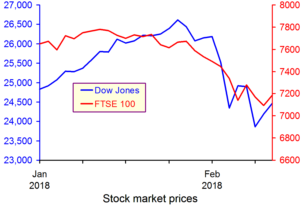
 On 8 February, the Bank of England issued a statement that was seen by many as a warning for earlier and speedier than previously anticipated increases in the UK base rate. Mark Carney, the governor of the Bank of England, referred in his statement to ‘recent forecasts’ which make it more likely that ‘monetary policy would need to be tightened somewhat earlier and by a somewhat greater extent over the forecast period than anticipated at the time of the November report’.
A similar picture emerges on the other side of the Atlantic. With labour markets continuing to deliver spectacularly high rates of employment (the highest in the last 17 years), there are also now signs that wages are on an upward trajectory. According to a recent report from the US Bureau of Labor Statistics, US wage growth has been stronger than expected, with average hourly earnings rising by 2.9 percent – the strongest growth since 2009.
 These statements have coincided with a week of sharp corrections and turbulence in the world’s largest capital markets, as investors become increasingly conscious of the threat of rising inflation – and the possibility of tighter monetary policy.
The Dow Jones plunged from an all-time high of 26,186 points on 1 February to 23,860 a week later – losing more than 10 per cent of its value in just five trading sessions (suffering a 4.62 percentag fall on 5 February alone – the worst one-day point fall since 2011). European and Asian markets followed suit, with the FTSE-100, DAX and NIKKEI all suffering heavy losses in excess of 5 per cent over the same period.
 But why should higher inflationary expectations fuel a sell-off in global capital markets? After all, what firm wouldn’t like to sell its commodities at a higher price? Well, that’s not entirely true. Investors know that further increases in inflation are likely to be met by central banks hiking interest rates. This is because central banks are unlikely to be willing or able to allow inflation rates to rise much above their target levels.
The Bank of England, for instance, sets itself an inflation target of 2%. The actual ongoing rate of inflation reported in the latest quarterly Inflation Report is 3% (50 per cent higher than the target rate).
Any increase in interest rates is likely to have a direct impact on both the demand and the supply side of the economy.
Consumers (the demand side) would see their cost of borrowing increase. This could put pressure on households that have accumulated large amounts of debt since the beginning of the recession and could result in lower consumer spending.
Firms (the supply side) are just as likely to suffer higher borrowing costs, but also higher operational costs due to rising wages – both of which could put pressure on profit margins.
It now seems more likely that we are coming towards the end of the post-2008 era – a period that saw the cost of money being driven down to unprecedentedly low rates as the world’s largest economies dealt with the aftermath of the Great Recession.
For some, this is not all bad news – as it takes us a step closer towards a more historically ‘normal’ equilibrium. It remains to be seen how smooth such a transition will be and to what extent the high-leveraged world economy will manage to keep its current pace, despite the increasingly hawkish stance in monetary policy by the world’s biggest central banks.
Video
 Dow plunges 1,175 – worst point decline in history CNN Money, Matt Egan (5/2/18)
Articles
Global Markets Shed $5.2 Trillion During the Dow’s Stock Market Correction Fortune, Lucinda Shen (9/2/18)
Bank of England warns of larger rises in interest rates Financial Times, Chris Giles and Gemma Tetlow (8/2/18)
Stocks are now in a correction — here’s what that means Business Insider, Andy Kiersz (8/2/18)
US economy adds 200,000 jobs in January and wages rise at fastest pace since recession Business Insider, Akin Oyedele (2/2/18)
Questions
- Using supply and demand diagrams, explain the likely effect of an increase in interest rates to equilibrium prices and output. Is it good news for investors and how do you expect them to react to such hikes? What other factors are likely to influence the direction of the effect?
- Do you believe that the current ultra-low interest rates could stay with us for much longer? Explain your reasoning.
- What is likely to happen to the exchange rate of the pound against the US dollar, if the Bank of England increases interest rates first?
- Why do stock markets often ‘overshoot’ in responding to expected changes in interest rates or other economic variables
 Sustained economic growth in Japan remains elusive. Preliminary Quarterly Estimates of GDP point to the Japanese economy having contracted by 0.4 per cent in the final quarter of 2015. This follows on from growth of 0.3 per cent in the third quarter, a contraction of 0.3 per cent in the second and growth of 1 per cent in the first quarter. Taken as a whole output in 2015 rose by 0.4 per cent compared to zero growth in 2014. The fragility of growth means that over the past 20 years the average annual rate of growth in Japan is a mere 0.8 per cent.
 Chart 1 shows the quarter-to-quarter change in real GDP in Japan since the mid 1990s (Click here to download a PowerPoint of the chart). While economies are known to be inherently volatile the Japanese growth story over the past twenty or years so is one both of exceptional volatility and of repeated bouts of recession. Since the mid 1990s Japan has experienced 6 recessions, four since 2008.
Of the four recessions since 2008, the deepest was that from 2008 Q2 to 2009 Q1 which saw the economy shrink by 9.2 per cent. This was followed by a recession from 2010 Q4 to 2011 Q2 when the economy shrunk by 3.1 per cent, then from 2012 Q2 to 2012 Q4 when the economy shrunk by 0.9 per cent and from 2014 Q2 to 2014 Q3 when output fell another 2.7 per cent. As a result of these four recessionary periods the economy’s output in 2015 Q4 was actually 0.4 per cent less than in 2008 Q1.
 Chart 2 shows the annual levels of nominal (actual) and real (constant-price) GDP in trillions of Yen (¥) since 1995. (Click here to download a PowerPoint of the chart). Over the period actual GDP has fallen from ¥502 trillion to ¥499 trillion (about £3 trillion at the current exchange rate) while GDP at constant 2005 prices has risen from ¥455 trillion to ¥528 trillion.
Chart 2 reveals an interesting phenomenon: the growth in real GDP at the same time as a fall in nominal GDP. So why has the actual value of GDP fallen slightly between 1995 and 2005? The answer is quite simple: deflation.
 Chart 3 shows a protracted period of economy-wide deflation from 1999 to 2013. (Click here to download a PowerPoint of the chart). Over this period the GDP deflator fell each year by an average of 1.0 per cent. 2014 and 2015 saw a pick up in economy-wide inflation. However, the quarterly profile through 2015 shows the pace of inflation falling quite markedly. As we saw in Japan’s interesting monetary stance as deflation fears grow, policymakers are again concerned about the possibility of deflation and the risks that poses for growth.
 As Chart 4 helps to demonstrate, a significant factor behind the latest slowdown in Japan’s growth is household spending. (Click here to download a PowerPoint of the chart). In 2015 household spending accounted for about 57 per cent by value of GDP in Japan. In the last quarter of 2015 real household spending fell by 0.9 per cent while across 2015 as a whole real household spending fell by 1.3 per cent. This follows on from a 0.8 per cent decrease in spending by households in 2014.
The recent marked weakening of household spending is a significant concern for the short term growth prospects of the Japanese economy. The roller coaster ride continues, unfortunately it appears that the ride is again downwards.
Data
Quarterly Estimates of GDP Japanese Cabinet Office
Japan and the IMF IMF Country Reports
Economic Outlook Annex Tables OECD
Articles
Japan’s economy contracts in fourth quarter BBC News, (15/2/16)
Japanese economy shrinks again, raising expectations of more stimulus Telegraph, Szu Ping Chan (15/2/16)
Japan’s economy shrinks again as Abenomics is blown off course Guardian, Justin McCurry (15/2/16)
Japan’s economy contracts in latest setback for Abe policies New Zealand Herald, (15/2/16)
Japan’s ‘Abenomics’ on the ropes as yen soars, markets plunge Daily Mail, (15/2/16)
Japan economy shrinks more than expected, highlights lack of policy options CNBC, Leika Kihara and Tetsushi Kajimoto (15/2/16)
Questions
- Why is the distinction between nominal and real important in analysing economic growth?
- How do we define a recession?
- Of what importance is aggregate demand to the volatility of economies?
- Why are Japanese policymakers concerned about the prospects of deflation?
- What policy options are available to policymakers trying to combat deflation?
- Why is the strength of household consumption important in affecting the path of an economy?
- Why has Japan experienced an increase in real GDP but a fall in nominal GDP between 1995 and 2015?
 In our recent blog constructing growth without production: The UK growth paradox we saw that the provisional estimate of economic growth in the UK in the final quarter of 2015 was 0.5 per cent. This was buoyed by service sector growth of 0.7 per cent. Meanwhile, construction sector output was estimated to have fallen by 0.1 per cent and production in the production industries by 0.2 per cent. The ONS Index of Production released on 11 February suggests the decline in production activity in the final quarter might have been has much as 0.5 per cent further pointing to unbalanced industrial growth.
 The production industries today account for about 15 per cent of UK output which is small in comparison to the roughly 79 per cent from service-sector industries. Chart 1 shows the quarterly rate of growth in UK industrial production since the 1980s. (Click here for a PowerPoint of the chart). Over this period the average quarterly rate of growth in industrial output has been a mere 0.1 per cent compared with 0.5 per cent for total economic output and 0.7 per cent for the service sector. As a result, the importance of the production industries as a driver of economic output has declined.
Across 2015 industrial production rose by 1 per cent while the total output of the economy grew by 2.2 per cent. Industrial output comprises four main components. Of these, output from mining and quarrying grew in 2015 by 6.6 per cent, water, sewerage and waste management by 3.1 per cent, electricity, gas, steam and air conditioning by 0.3 per cent, while manufacturing output contracted by 0.2 per cent.
 Chart 2 shows the path of industrial output since 2006. (Click here for a PowerPoint of the chart). In particular, it allows us to analyse the effect of the financial crisis and the global economic downturn. Whereas the total output of the economy surpassed its 2008 Q1 peak in 2013 Q2, driven by the service sector, total industrial output in 2015 Q4 remains 9.9 per cent below its 2008 Q1 level. Among its component parts, output in mining and quarrying is 31 per cent lower, electricity, gas, steam and air conditioning output is 12.2 per cent lower and manufacturing 6.5 per cent lower. Only the output of water, sewerage and waste management is greater – some 7.4 per cent higher.
The data point to the industrial composition of UK remaining heavily skewed towards the service sector and, hence, to service-sector industries driving economic growth. A key talking point is the extent to which this matters. On one hand we might point to the deindustrialisation captured by the data. This has had profound implications for certain regions of the United Kingdom and in particular for living standards in certain communities. Industrial change poses challenges for the UK labour force and for policymakers trying to affect the skills of workers needed in a changing economy. It has had a profound impact on the country’s balance of trade in goods: we consistently run a balance of trade deficit in goods. On the other hand we might argue that the UK does services well. We might be said to have a comparative advantage in this area. Whatever, your view point the latest industrial production data show the fragility of UK industrial output.
Data
Index of Production Dataset December 2015 Office for National StatisticsIndex of Production, December 2015 Office for National Statistics
Articles
UK industrial production shrank in 2015 Guardian, Phillip Inman (10/2/16)
December UK industrial output falls sharply BBC News, (10/2/16)
Manufacturing output fall dents UK growth hope Sky News, (10/2/16)
Industrial production’s worst monthly fall since 2012 Belfast Trelegraph, Holly Williams (11/2/16)
GDP growth picks up to 0.5% but only the services sector comes to the party Independent, Ben Chu (29/1/16)
Questions
- What is meant by industrial production? How does it differ from the economy’s total output?
- Would you expect the index of production to be less or more volatile than total output? Explain your answer.
- What factors might explain the volatility of industrial production?
- Do the different rates of growth across the industrial sectors of the UK matter?
- Discuss the economic issues that might arise as the industrial composition of a country changes.
- Why is the distinction between nominal and real important when analysing economic growth?
 In the blog the service sector continues to drive the UK business cycle written in October 2014 we observed how UK growth was being driven by the service sector while other industrial sectors struggled. The contrasting performance across UK industry appears now to be even more marked. The latest GDP numbers from the Office for National Statistics contained in Gross Domestic Product: Preliminary Estimate, Quarter 4 (Oct to Dec) 2015 show the economy’s output expanded by 0.5 per cent in the fourth quarter. Yet the construction sector is in recession following contractions of 1.9 per cent (Q3) and 0.1 per cent (Q4). Here we update our earlier blog to evidence the UK’s growth paradox.
Preliminary estimates suggest that the UK economy expanded by 0.5 per cent in the final quarter of 2015 following on from growth of of 0.4 per cent in the third quarter. 2015 as a whole saw output grow by 2.2 per cent, down from 2.9 per cent in 2014 and a little below the average over the past 60 years of around 2.6 per cent.
 Chart 1 shows quarterly economic growth since 1980s (Click here for a PowerPoint of the chart). It illustrates nicely the inherent volatility of economies – one of the threshold concepts in economics.The average quarterly rate of growth since 1980 has been 0.5 per cent so on the face of it, a quarterly growth number of 0.5 per cent might seem to paint a picture of sustainable growth. Yet, the industrial make up of growth is far from balanced.
 Consider now Chart 2 (Click here for a PowerPoint of the chart). It allows us to analyse more recent events by tracking how industrial output has evolved since 2006. It suggests an unbalanced recovery following the financial crisis. In 2015 Q4 the economy’s total output was 6.6 per cent higher than in 2008 Q1 with service-sector output 11.6 per cent higher. However, a very different picture emerges for the other principal industrial types.
The economy’s total output surpassed its 2008 Q1 peak in 2013 Q2, but output across the production industries in 2015 Q4 remains 9.4 per cent lower than in 2008 Q1 (and 6.4 per cent lower specifically within manufacturing) and 4.2 per cent lower in the construction sector. However, output in the agricultural sector has rebounded and is now 8.4 per cent higher than in 2008 Q1.
The growth data continue to show the British economy struggling to rebalance its industrial composition. With output in construction in 2015 Q4 2 per cent lower than it was in Q2 and manufacturing output 0.4 per cent lower, UK growth remains stubbornly dependent on the service sector.
Data
Preliminary Estimate of GDP – Time Series Dataset Quarter 4 (Oct to Dec) 2015 Office for National StatisticsGross Domestic Product: Preliminary Estimate, Quarter 4 (Oct to Dec) 2015 Office for National Statistics
Economy tracker: GDP BBC News
Articles
UK economic growth slows in 2015: what the economists are saying Guardian, Katie Allen (28/1/16)
UK economy grows 0.5% in fourth quarter BBC News, (28/1/16)
Bumpy times ahead’ for UK even as fourth quarter growth accelerates Telegraph, Szu Ping Chan (28/1/16)
UK economic growth rises to 0.5% in fourth quarter The Scotsman, Roger Baird (28/1/16)
GDP growth picks up to 0.5% but only the services sector comes to the party Independent, Ben Chu (29/1/16)
Questions
- What is the difference between nominal and real GDP? Which of these helps to track changes in economic output?
- Looking at Chart 1 above, summarise the key patterns in real GDP since the 1980s.
- What is a recession?
- What are some of the problems with the traditional definition of a recession?
- Can a recession occur if nominal GDP is actually rising? Explain your answer.
- What factors lead to economic growth being so variable?
- What factors might explain the very different patterns seen since the late 2000s in the volume of output of the four main industrial sectors?
- What different interpretations could there be of a ‘rebalancing’ of the UK economy?
- What other data might we look at to analyse whether the UK economy is ‘rebalancing’?.
- Do the different rates of growth across the industrial sectors of the UK matter?
- Produce a short briefing paper exploring the prospects for economic growth in the UK over the next 12 to 18 months.
- What is the difference between GVA and GDP?
- Explain the arguments for and against using GDP as a measure of a country’s economic well-being.