Large European banks call for further integration, but is it in consumers’ interests?
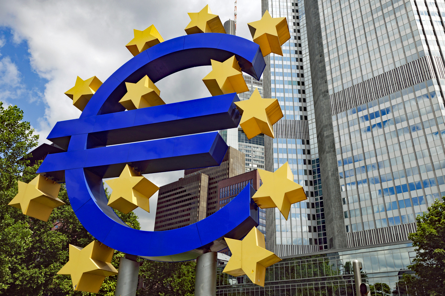 Those of a certain age may remember the fanfare which heralded the introduction of the Single European market (SEM) on 1 January 1993. It promised the removal of internal barriers to the movement of goods, services, capital and people. One sector that was noticeably absent from the single market, however, was banking.
Moves towards banking union only started after the global financial crisis in 2008. However, as a report published on the 2 September 2025 by the Association of Financial Markets in Europe (AFME) highlights, the institutional frameworks of banking in the EU are still deeply fragmented – the promised integration through the European Banking Union (EBU) is still incomplete. This has put European banks at a competitive disadvantage in global markets compared with rivals from the USA and Asia, thereby reducing their profitability and growth prospects. The report called on the European Central Bank (ECB) and national regulatory authorities to remove hurdles to cross-border banking services in the EU. This would enhance the strategic position of European banks.
In this blog we will trace the development of the EBU and analyse the current state of integration. We discuss the AFME proposals for achieving greater integration and highlight their benefits for large banks. We also analyse the barriers which limit full integration and examine the risks that retail customers might see few benefits from the proposed changes.
What is meant by European Banking Union (EBU)?
The 1993 Single European Market (SEM) in goods and services removed internal barriers to the movement of goods, services, capital and people within the EU. As part of this, there were harmonised standards and regulations for goods and services, no capital controls, mutual recognition of professional qualifications and common regulations on consumer protection, product safety, environmental protection and labour rights.
This integration of previously restricted domestic markets was designed to boost economic growth, employment and competitiveness by increasing trade and investment flows. Offering consumers greater choice would expose firms to greater competition. This would drive down prices and encourage greater efficiency and innovation. It has generally achieved these goals across many industries.
However, banking was excluded from integration. The 1985 White Paper, Completing the Internal Market, proposed the liberalisation of financial services, but banking remained regulated at the national level. This was influenced by interrelated economic, political and institutional forces, national sovereignty and political sensitivities, fragmented regulation and concerns about risk.
 Even as the EU moved towards economic and monetary union (EMU) during the 1990s, there was no discussion of integration for the banking industry. However, that changed following the 2008 financial crisis and 2011 eurozone crisis. Both episodes exposed vulnerabilities in the EU banking system which required taxpayer support. It was proposed that deeper integration of the banking sector would ensure its stability and resilience. This stimulated moves towards European Banking Union (EBU), starting with the European Council agreeing its creation in 2012. There are three institutional pillars to the Union:
- The Single Supervisory Mechanism (2014) for systemically important financial institutions (SIFIs) ensures consistent oversight. SIFIs are banks with over €30 billion of liabilities or 20% of national GDP.
- The Single Resolution Mechanism (2016) manages the orderly resolution of failing banks with minimal costs to taxpayers. There is a central board for resolution decisions and a fund financed by the banking industry to support resolution actions.
- A European Deposit Insurance Scheme (still under negotiation) is proposed to protect depositors uniformly across the banking union against bank default.
The Union is intended to operate under a harmonised set of EU laws, known as the ‘Single Rulebook’, which includes implementing the BASEL III capital requirements, regulating national deposit insurance and setting rules for managing failing banks.
What is the state of integration at present?
Moves towards European Banking Union (EBU) have contributed to enhancing the resilience of the European banking system. This was one of its major objectives. European banks are much more secure having increased capital and liquidity levels, reduced credit risks and become less reliant on state-aid. They are also less profitable.
The AFME report points to remaining gaps in Banking Union which raise the cost for banks offering cross-border retail banking within the EU and limit the incentive to do so. The report identifies four such gaps.
 1. Ring fencing. Although there is a single supervisory mechanism for large systemically important institutions, since the financial crisis national regulators have implemented ‘ring-fencing’. This aims to protect retail banking activities from riskier investment banking. Ring-fencing retains liquidity, dividends and other bank assets within national borders to protect their retail banking sectors from contagion. The ECB estimates €225 billion of capital and €250 billion of liquidity is trapped by such national restrictions. Further, unharmonized and unpredictable use of capital buffers adds complexity for capital management at a multinational level. This particularly impacts large institutions. Banks’ cross-border activities are impeded since they are restricted in the way they can use capital and liquidity across the bloc.
The report argues that the stringent requirements of the ECB and the multiple layers of macroprudential requirements imposed at national level have led to an unnecessarily high level of capital. This disadvantages large European banks compared to their international competitors.
2. Impediments to cross-border M&As in banking within the EU. This is due to cumbersome authorisation processes, involving multiple authorities at both national and supra-national level. Further, national authorities may interfere in the process of M&As in a bid to prevent domestic banks being acquired by ones from other parts of the EU. A recent example is UniCredit’s bid for Germany’s Commerzbank, which the German government opposes. These characteristics restrict opportunities for consolidation and efficiency gains for European banks.
The AFME report estimates that once eurozone banks grow beyond €450 billion in total assets, they suffer from negative synergies putting them at a competitive disadvantage to global competitors. Indeed, US banks are able to leverage scale economies from their domestic market to enter large EU markets. An example is JP Morgan’s entry into multiple EU markets through its Chase brand.
3. Contributions to the Single Resolution Fund (SRF) are complex and lack transparency. This makes it difficult for banks to predict future commitments. The fund itself and its target level were determined at a time when banks had low buffers. Since then, European banks have raised their loss absorbing capacity and the AFME report proposes that further increases in contributions to the fund need to be carefully considered and reviewed.
4. The Deposit Guarantee Scheme remains unimplemented and there are still differences in national schemes. This situation creates uncertainty for banks, which would like the European scheme for large systemically important institutions to be implemented fully.
These AFME proposals focus on the aspects of banking union which benefit large European institutions in their strategic competition with global rivals. These aspects would create ‘European’ banks as opposed to ‘national’ ones. This would give them the scale to be ‘champions’ in global competition. In particular, the large banks want lower capital requirements and the relaxation of national ring-fencing for retail banking to allow them greater freedom to achieve scale and scope economies across the bloc.
To what extent this will benefit retail customers, however, is debateable.
Will retail banking customers benefit?
Retail banking across Europe remains deeply fragmented, with significant price differentials from country to country. The following table illustrates pricing differentials for two retail products – loans and mortgages – across a sample of EU countries for July 2025.
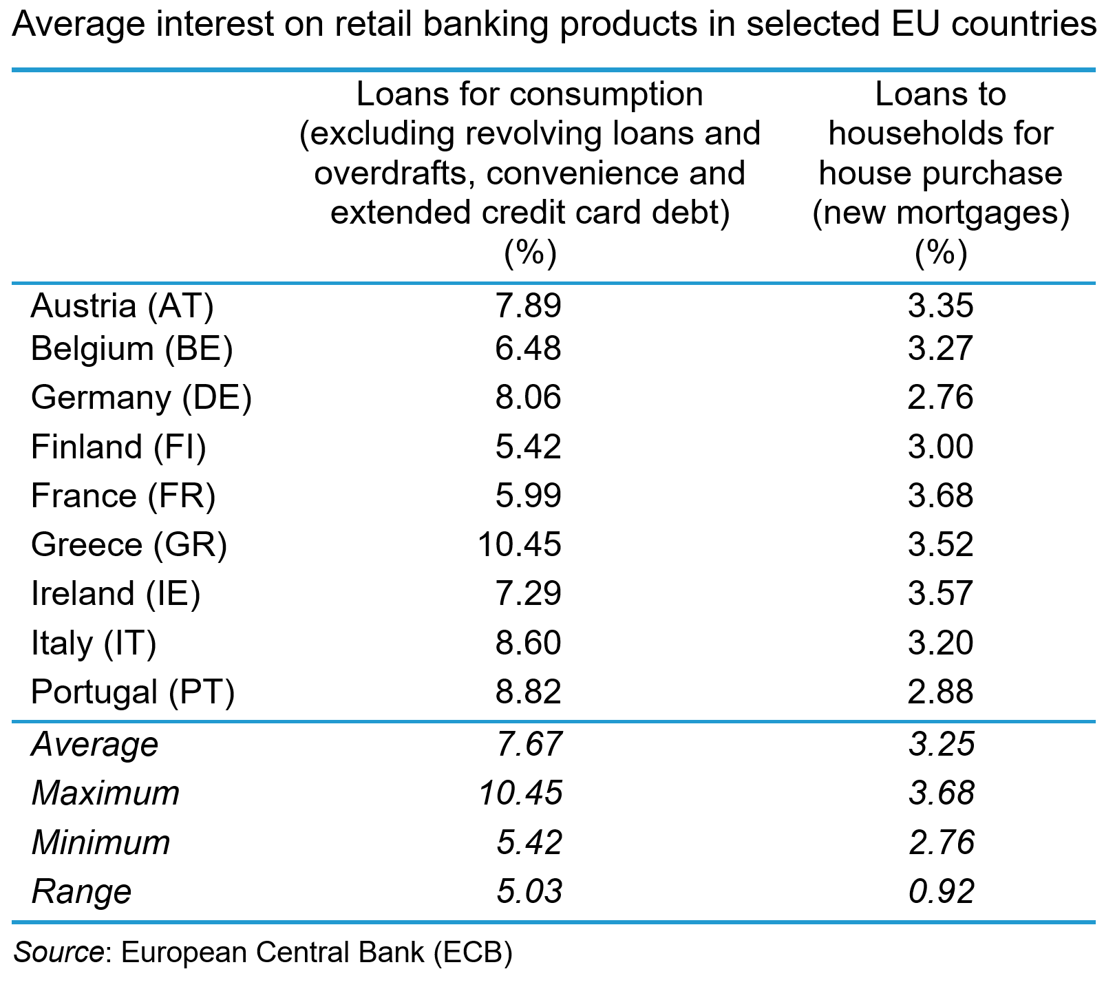
The data show a range of average interest rates offered across the countries with a range of 5.03% for loans to households and 0.92% for new mortgages. These price differentials reflect a broad array of factors, not least the different institutional legal and risk characteristics of the national markets. They also reflect varying degrees of competition and the lack of cross-border trade in retail banking products. Retail banking remains a largely domestic industry within the EU. Cross-border banking services remain a marginal activity with non-domestic retail deposits rising by just 0.5% and non-domestic retail loans rising by just 0.3% between 2016 and 2024.
There are both natural and policy-induced barriers, which means that retail banking will remain largely segmented by nation.
 On the demand-side, retail banking is largely a relational rather than a transactional service, with consumption taking place over a long time-period with significant financial risks attached. Even with deposit insurance and a lender of last resort (the central bank), consumers exhibit significant loss aversion in their use of retail banking services. Consequently, trust and confidence are important characteristics for consumers and that means they are likely to prefer to use familiar domestic institutions.
Further, perceptions about switching costs mean that consumers are reluctant to change suppliers. Such costs are exacerbated by language, cultural and legal differences between European countries, which can make the perceived costs of banking beyond national boundaries prohibitively expensive and create a preference for local institutions.
Consumer preferences can also create idiosyncratic market structures for retail banking services in particular countries. For instance, in several countries across the EU, notably Germany, mutualised credit unions account for significant shares of retail banking. This may limit the potential for foreign banks to penetrate Europe’s largest market.
There are also policy-induced obstacles to cross-border retail banking which operate on the demand-side. These include discriminatory tax treatment of foreign financial services which deters their purchase by consumers. Further, there are still eight different currencies used in the EU across the 27 member states (Denmark, Poland and Sweden are three significant examples). This creates costs and risks associated with currency exchange for consumers that may deter their use of cross-border deposits and loans. The full adoption of a single currency across the EU seems a long way off, which will limit the potential for a single banking market, particularly in the retail segment.
Retail banking as a public utility
 Some argue that retail banking is a public utility and should be regulated as such. It has a simple business model, taking deposits, making payments and making loans. Like other utilities, such as water and energy, retail banking is an essential service for the smooth functioning of the economy and society. Like other utilities, bank failures create severe problems for the economy and society.
Since the financial crisis, stability in retail banking has been much more highly valued. In the period preceding the crisis, banks had used retail deposits to cross-subsidise their risky investment banking. The bank failures that resulted from this had severe economic consequences. The danger today is that by relaxing capital and liquidity restrictions too much, large banks may once again engage in risky behaviour, subsidised by retail banking – for example, by engaging in cross-border M&As. These may benefit their shareholders but provide little benefit to retail customers.
Further, allowing these large banks freedom to move funds around the bloc may lead to capital being concentrated in the most profitable markets, leaving less profitable markets / countries underserved. Retail banking, as a public utility, should be required to provide services there.
Who ultimately benefits?
The integration of banking services in the EU has progressed since the financial crisis, producing a more resilient system. However, there are features of retail banking which mean that integration which benefits consumers may be difficult to achieve.
Addressing the policy gaps identified by the AFME report may benefit large European banks by facilitating the scale economies to make them competitive internationally. However, until consumers are prepared, or able, to source banking services beyond national borders, they will see little benefit from European Banking Union (EBU) through lower prices and/or better service. The nature of retail banking in the EU suggests that this is unlikely any time soon.
Furthermore, since retail banking exhibits features of a public utility, regulators need to be wary of permitting the type of behaviour by large institutions which creates dangerous systemic risk. The worry is that, in the drive to create ‘European Champions’ in banking, regulators ignore the potential impact on retail customers.
Articles
Book
Report
Data and Information
Questions
- Using an average cost (AC) schedule, illustrate the efficiency benefits for large European banks from banking union.
- Analyse the sources of efficiency gains that European banks can gain from cross-border M&As.
- Explain how European retail banking customers could gain from such efficiency.
- Analyse why they may not.
- Analyse whether retail banking in Europe needs to be regulated as a public utility.
 The gold market has become one of the most talked-about commodity markets in 2025, with prices reaching record highs. This is largely due to increased demand from investors, who see gold as a ‘safe haven’ during times of economic and political uncertainty. Central banks are also buying more gold as a way to reduce their reliance on currencies like the US dollar. With many analysts predicting prices could reach over $4000 per ounce in the next year, the gold market is showcasing how supply and demand, confidence, and global events can all influence a commodity market.
The commodities market is where basic agricultural products, raw materials and metals, such as gold, are bought and sold, often in large quantities and across global exchanges. Commodities are typically traded either in their physical form (like gold bars) at current market prices (spot prices) or through financial contracts, where investors buy or sell in futures markets. These are where a price is agreed today to buy or sell on a specific future date.
As with other commodities, the price of gold is determined by supply and demand. Demand for gold typically rises during times of economic uncertainty as investors want a safer store of value. This results in an increase in its price. Supply and demand, and hence price, also respond to other factors, including interest rates, currency movements, economic growth and growth prospects, and geopolitical events.
Record high prices
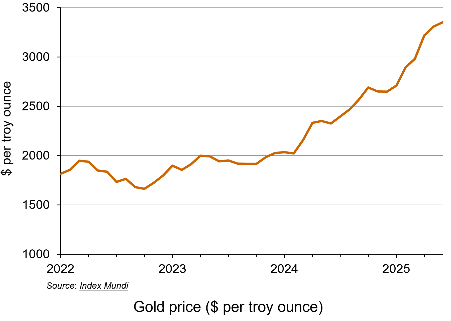 This year, the gold market has seen a remarkable rally, with the price of gold hitting a record high. Demand for the precious metal has resulted in spot prices surging over 35% to date (see the chart: click here for a PowerPoint). Rising prices earlier this year have been attributed to the US President, Donald Trump, announcing wide-ranging tariffs which have upset global trade. On 2 September, the spot gold price hit $3508.50 per ounce, continuing its upwards trend.
The price has also been lifted by expectations that the Federal Reserve (the US central bank) will cut its key interest rate, making gold an even more attractive prospect for investors. If the Federal Reserve cuts interest rates, the price of gold usually increases. This is because gold does not pay any interest or yield, so when interest rates are high, investors can earn better returns from alternatives, such as savings accounts or bonds. However, when interest rates fall, those returns become less attractive, making gold relatively more appealing.
Lower interest rates also tend to weaken the US dollar, which makes gold cheaper for foreign buyers, increasing global demand. Since gold is priced in dollars, a weaker dollar usually leads to higher gold prices.
Additionally, interest rate cuts are often a response to economic problems or uncertainty. As gold is viewed as a safer asset for investors during times of economic uncertainty, investors will typically increase their demand.
Unlike the market for currencies or shares, gold doesn’t rely on the performance of a government or company. This makes it attractive when people are worried about things like inflation, recession, war or stock market crashes. Gold is thus seen as a ‘safe haven’.
Gold and the Federal Reserve
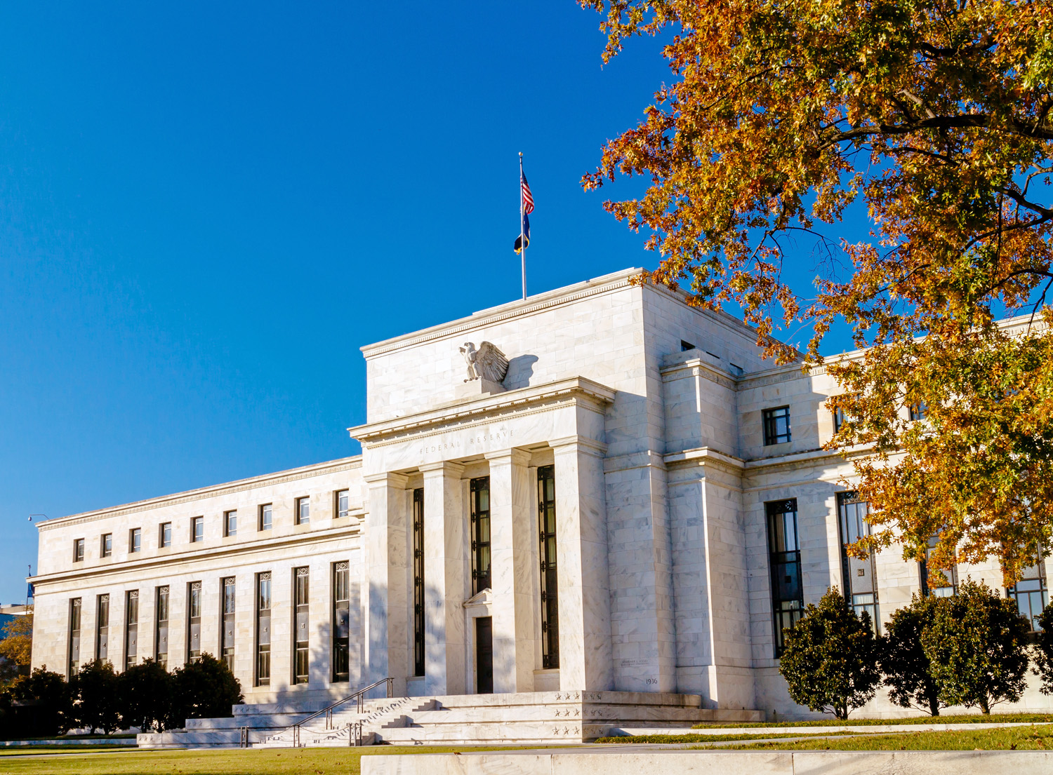 The rise in the price of gold by more than a third this year can be linked to the US election last year, according to the director of research at BullionVault (see the BBC article below). Attitudes of the Trump administration towards the Federal Reserve have created concerns among investors. Fears that the US administration could erode the independence of the world’s most important central bank have fuelled the latest flows into the metal, which is traditionally viewed as a hedge against inflation.
According to the BBC article, Derren Nathan from Hargreaves Lansdown claims that it is Trump’s ‘attempts to undermine the independence of the Federal Reserve Bank’ that were ‘driving renewed interest in safe haven assets, including gold’. Investors are concerned that a politicised Fed would be more inclined to cut interest rates than would otherwise be the case, sending long-term inflation expectations higher.
This could lead to fears that future interest rates would then be pushed higher. This would increase the yields on longer-term government bonds by pushing down their price, as investors demand higher compensation for the increased risk of higher future interest rates reducing the value of their fixed-rate investments. This would force the US Treasury to pay higher interest on new bonds, making it more expensive to service US government debt.
Expected price rises for 2026
As we saw above, it is predicted that the price of gold will rise to $4000 per ounce next year. However, if the market sees investors move away from dollar assets, such as US Treasuries, the price increases would be even higher. Daan Struyven, co-head of global commodities research at Goldman Sachs explains ‘If 1 per cent of the privately owned US Treasury market were to flow to gold, the gold price would rise to nearly $5000 per troy ounce’ (see Financial Times article below).
 If the Federal Reserve does come under political pressure, it could affect the stability of the US economy and beyond. When gold prices rise sharply, demand usually falls in countries like China and India, which are the world’s largest buyers of gold jewellery. However, in 2025, this trend has changed. Instead of reducing their gold purchases, people in these countries have started buying investment gold, such as bars and coins, showing a shift in consumer behaviour from jewellery to investment assets.
At the same time, global events are also influencing the gold market. Suki Cooper, a metals analyst at Standard Chartered, said that events like Russia’s invasion of Ukraine have added to political uncertainty, which tends to increase demand for gold as a safe-haven asset. She also highlighted how changes in international trade policies have disrupted supply chains and contributed to higher inflation, both of which have made gold more attractive to investors. Additionally, a weaker US dollar earlier in the year made gold cheaper for buyers using other currencies, which boosted global demand even further.
Conclusion
Although the gold market is expected to remain strong over the next six months, some uncertainty remains. Many analysts predict that gold prices will stay high or even increase further, especially if interest rates in the US are cut as expected. Continued global instability, is also likely to keep demand for gold as a safe haven high. At the same time, if inflation stays elevated or trade disruptions continue, more investors may turn to gold to protect their wealth.
However, if economic conditions stabilise or interest rates rise again, gold demand could fall slightly, leading to a potential dip in prices. Overall, the outlook for gold remains positive, but sensitive to changes in global economic and political events.
Articles
- Gold price hits record high as investors seek safety
BBC News, Faarea Masud (2/9/25)
- Safe-haven gold rally gains further momentum after soft US data
Reuters, Sherin Elizabeth Varghese and Ashitha Shivaprasad (3/9/25)
- Gold vaults $3,000 in rush for safety from market, political worry
Reuters, Sherin Elizabeth Varghese and Anmol Choubey (14/3/25)
 The foundation of gold’s rally to historic highs started back in 2022
CNBC, Suki Cooper (17/3/25)
- Gold could hit nearly $5,000 if Trump undermines Fed, says Goldman Sachs
Financial Times, Emily Herbert (4/9/25)
- London’s bullion market set to trial digital gold
City AM, Maisie Grice (3/8/25)
- Gold price hits record high as investors seek safe haven
The Guardian, Julia Kollewe (2/9/25)
Data
Questions
- What factors influence the price of a commodity such as gold on the global market?
- Use a demand and supply diagram to illustrate what has been happening to the gold price in recent months.
- Find out what has been happening to silver prices. Are the explanations for the price changes the same as for gold?
- Why might investors choose to buy gold during times of economic or political uncertainty?
- How will changes in interest rates affect both the demand for and the price of gold?
- What are the possible consequences of rising gold prices for countries like India and China, where there is a traditionally high demand for gold jewellery?
- How do global events impact commodity markets? Use gold as an example in your answer.
 Following the controversary over the sale of tickets for popular live events such as Taylor Swift’s Eras tour and the Oasis Live ’25 Tour, the government launched a consultation exercise in January 2025 on the resale of tickets. Titled, ‘putting fans first’, the exercise sought the views of individuals and organisations on a range of policy proposals. One of these was the implementation of a cap on the resale price of tickets.
The government is not only considering whether to implement a cap but also the level at which it might be set. The following question was included in the consultation exercise.
What is the maximum uplift that you think should be applied if ticket resales were to be subject to a price cap? Please state the reason for your selection.
• no uplift at all
• 10% or less
• between 10 and 20%
• between 20 and 30%
• other – please state
Some platforms such as Twickets and Ticketswap already cap resale prices on their platforms at between 5 and 10 per cent above the face value of the ticket. They are, therefore, less likely to be affected by any new price regulation unless the ‘no uplift at all’ option is chosen. On other platforms, such as Viagogo and Stubhub, resellers are free to list tickets at whatever price they choose. This is often referred to as the uncapped market, and tickets for the Oasis tour with a face value of £150 were listed on these websites for £14 000. The implementation of a price cap is likely to have a big impact on this part of the resale market. The chief executive of StubHub stated in June 2025 that the business would probably have to exit the UK if a cap was introduced.
 Although many fans dislike the uncapped secondary ticketing market, most economists take a more positive view. They see them as a way of facilitating mutually beneficial trade and helping to reallocate tickets to those with the highest willingness to pay. This reduces levels of allocative inefficiency/deadweight welfare loss in the market.
Economists also tend to argue against the use of price controls in competitive markets because of their negative impact on supply. If price controls reduce the available returns to sellers, they have an incentive to do something else with their time/resources i.e. switch to supplying other goods and services in markets not subject to price controls. This reduces supply in the regulated market and so could have a negative impact on consumer surplus.
What are the issues with the secondary market?
 Given the benefits outlined by economists of having an uncapped secondary ticketing, why is the government considering the implementation of a price cap? One potential issue of having an uncapped secondary ticketing market is that developments in technology make it easier for professional resellers to buy very large quantities of tickets. This makes it increasingly difficult for fans who want to attend the event from being able to purchase a ticket.
Reports also suggest that professional resellers use illegal methods to both mass purchase and resell tickets. For example, to overcome any limits on sales imposed by the sellers in the primary market, some use automated software, fake IDs and multiple credit cards. Two people convicted of fraudulent trading in 2024 were found to have bought 47 000 tickets over a 212-year period, using 127 names and 187 different e-mail addresses.
Some resellers have also acted in ways that do not comply with consumer law when advertising tickets for sale. For example, not providing information such as the ticket number and other details about where the seat is located i.e. the block/area and row.
These rent seeking activities by professional resellers could outweigh the positive impact of uncapped secondary market on allocative efficiency.
Implementing a resale price cap would reduce the incentives for professional resellers to purchase large quantities of tickets and engage in these rent-seeking activities. However, in the consultation document the government recognises that the implementation of a resale price cap would be a ‘significant and complex intervention’.
An important implementation issue
To calculate the resale price cap for any live event, the original price of the ticket in the primary market needs to be known. This raises an interesting question – should the cap apply to the initial face value of the ticket or the total price the customer pays?
The face value of the ticket may only represent a proportion of the actual cost of buying a ticket because of the widespread use of drip pricing. This is the practice of applying additional fees as the consumer proceeds through the online purchasing process. These fees can sometimes add around 25 per cent and more to the price of a ticket. In the consultation document, the government suggested that the cap should apply to the face value of the ticket plus all compulsory fees.
 One issue raised in the response to the consultation by the Competition and Markets Authority is that these fees are not always made clear by sellers in the primary market in a clear and transparent way. Therefore, for the policy to be effective, primary market sellers would have to make information on both ticket prices and any fees clearly and easily available. Recent changes to the law that prohibit drip pricing might help to address this issue.
The potential impact of a resale price cap on fraud
 To avoid the price cap, there is a danger that increasing numbers of buyers and sellers stop using capped secondary ticket platforms, where activity is easier to observe/regulate, and switch to other non-specialist platforms where detection of illegal behaviour and enforcement of consumer law is more difficult. Examples of non-specialist platforms where sales might increasingly take place include Facebook Marketplace, Instagram Shop, X (formerly Twitter) and internet forums. With lower levels of consumer protection and the greater difficulty of detecting illegal behaviour, sales via these non-specialist platforms are more vulnerable to scams and fraud.
When referring to the impact of a resale price cap, the chief executive of StubHub argued that:
It will have a massive negative impact on consumers. It’s not like the demand is going to go away, it’s just going to move somewhere else, and that somewhere else is going to be the black market [where] consumers aren’t protected.
To test the hypothesis that price controls lead to greater incidences of fraud, one study used polling data to compare ticket fraud rates in the UK with Victoria, Australia and Ireland. In 2009, the state government of Victoria made it illegal for tickets to be resold for more than 10 per cent of their face, while the Irish government introduced the Sale of Ticket Act in 2021 that prohibited the resale of tickets above their original price. The study found that the proportion of respondents who reported being victims of ticket fraud over the previous two years was around four times higher in Victoria and Ireland than the UK. The most common sales channel where consumers experienced ticket fraud in all three countries were social media platforms.
Another example of the potential impact of the price cap in Ireland on fraud relates to the first ever regular-season NFL game that is being played in Dublin on 28 September 2025 between the Pittsburgh Steelers and the Minnesota Vikings. The online bank, Revolut, reported an 80 per cent increase in the number of ticket scams when tickets for this game went on sale.
In response to the consultation exercise, the Competition and Markets Authority backed the implementation of a resale price. It will be interesting to see if the government goes through with the measure in the next few months.
Consultation
Articles
Blogs on this site
Questions
- Why might event organisers set ticket prices below the market clearing rate? Illustrate the impact of setting prices below market clearing rates on consumer, producer and total surplus in the primary market for tickets.
- Using a demand and supply diagram, explain how the uncapped secondary ticket market could reduce deadweight welfare loss. Discuss any assumptions you have made about the allocation of tickets among potential buyers in the primary market (i.e. sorting).
- Is it possible for professional resellers to continue making a profit if tickets are sold at market clearing rates in the primary market? Explain your answer.
- Under what circumstances would a maximum price set below the market clearing rate in a competitive market have a negative impact on consumer surplus? Draw a diagram to illustrate your answer.
- Using examples, explain what is meant by ‘rent seeking’ in economic theory.
Outline some of the recent updates to the law on pricing information that businesses must show customers.
- What policies, other than a resale price cap, could the government introduce to try to address some of the issues with the ticketing market for live events?
 The UK’s poor record on productivity since the 2008 financial crisis is well documented, not least in this blog series. Output per worker has flatlined over the 17 years since the crisis. As was noted in the blog, The UK’s poor productivity record, low UK productivity is caused by a number of factors, including the lack of investment in training, the poor motivation of many workers and the feeling of being overworked, short-termism among politicians and management, and generally poor management practices.
One of the most significant issues identified by analysts and commentators is the lack of investment in physical capital, both by private companies and by the government in infrastructure. Gross fixed capital formation (a measure of investment) has been much lower in the UK compared to international competitors.
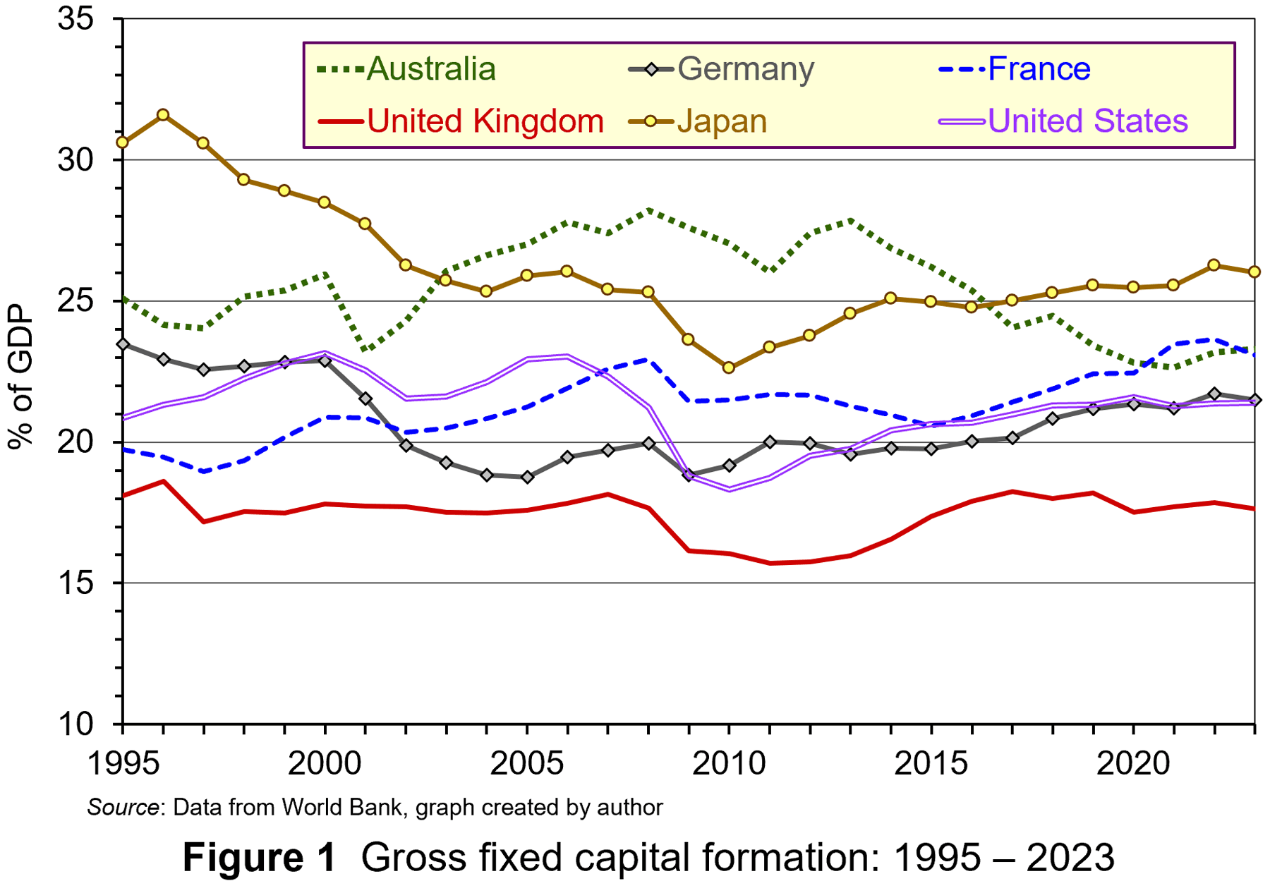 From Figure 1 it can be observed that, since the mid-1990s, the UK has consistently had lower investment as a percentage of GDP compared to other significant developed market economies. The cumulative effect of this gap has contributed to lower productivity and lower economic growth.
Interestingly, since the financial crisis, UK firms have had high profitability and associated high cash holdings. This suggests that firms have had a lot of financial resources to reinvest. However, data from the OECD suggests that reinvestment rates in the UK, typically 40–50% of profit, are much lower than in many other OECD countries. In the USA the rate is 50%, in Germany 60–70% and in Japan 70%+. There is much greater emphasis in the UK on returning funds to shareholders through dividends and share buybacks. However, the reinvestment of much of this cash within firms could have gone some way to addressing the UK’s investment gap – but, it hasn’t been done.
 Analysis by the OECD suggest that, while the cost of financing investment has declined since the financial crisis, the gap between this and the hurdle rate used to appraise investments has widened. Between 2010 and 2021 the difference nearly doubled to 4%. This increase in the hurdle rate can be related to increases in the expected rate of return by UK companies and their investors.
In this blog we will analyse (re)investment decisions by firms, discussing how increases in the expected rate of return in the UK raise the hurdle rate used to appraise investments. This reduces the incentive to engage in long-term investment. We also discuss policy prescriptions to improve reinvestment rates in the UK.
Investment and the expected rate of return
Investment involves the commitment of funds today to reap rewards in the future. This includes spending on tangible and intangible resources to improve the productive capacity of firms. Firms must decide whether the commitment of funds is worthwhile. To do so, economic theory suggests that they need to consider the compensation required by their provider of finance – namely, investors.
What rewards do investors require to keep their funds invested with the firm?
When conducting investment appraisal, firms compare the estimated rate of return from an investment with the minimum return investors are prepared to receive (termed the ‘expected return’). Normally this is expressed as a percentage of the initial outlay. Firms have to offer returns to investors which are equal to or greater than the minimum expected return – the return that is sufficient to keep funds invested in the firm. Therefore, returns above this minimum expected level are termed ‘excess returns’.
When firms conduct appraisals of potential investments, be it in tangible or intangible capital, they need to take into account the fact that net benefits, expressed as cash flows, will accrue over the life of the investment, not all at once. To do this, they use discounted cash flow (DCF) analysis. This converts future values of the net benefits to their present value. This is expressed as follows:

Where:
NPV = Net present value (discounted net cash flows);
K = Capital outlay (incurred at the present time);
C = Net cash flows (occur through the life of the investment project);
r = Minimum expected rate of return.
In this scenario, the investment involves an initial cash outlay (K), followed in subsequent periods by net cash inflows each period over the life of the investment, which in this case is 25 years. All the cash flows are discounted back to the present so that they can be compared at the same point in time.
The discount rate (r) used in appraisals to determine the present value of net cash flows is determined by the minimum expected return demanded by investors. If at that hurdle rate there are positive net cash flows (+NPV), the investment is worthwhile and should be pursued. Conversely, if at that hurdle rate there are negative net cash flows (–NPV), the investment is not worthwhile and should not be pursued.
According to economic theory, if a firm cannot find any investment projects that produce a positive NPV, and therefore satisfy the minimum expected return, it should return funds to shareholders through dividends or share buybacks so that they can invest the finance more productively.
Firm-level data from the OECD suggest that UK firms have had higher profits and this has been associated with increased cash holdings. But, due to the higher hurdle rate, less investment is perceived to be viable and thus firms distribute more of their profits through dividends and share buybacks. These payouts represent lost potential investment and cumulatively produce a significant dent in the potential output of the UK economy.
Why are expected rates of return higher in the UK?
This higher minimum rate of expected return can be explained by factors influencing its determinants; opportunity cost and risk/uncertainty.
Higher opportunity cost. Opportunity cost relates to the rate of return offered by alternatives. Investors and, by implication firms, will have to consider the rate of return offered by alternative investment opportunities. Typically, investors have focused on interest rates as a measure of opportunity cost. Higher interest rates raise the opportunity cost of an investment and increase the minimum expected rate of return (and vice versa with lower interest rates).
 However, it is not interest rates that have increased the opportunity cost, and hence the minimum expected rate of return associated with investment, in the UK since the financial crisis. For most of the period since 2008, interest rates have been extremely low, sitting at below 1%, only rising significantly during the post-pandemic inflationary surge in 2022. This indicates that this source of opportunity cost for the commitment of business investment has been extremely low.
However, there may be alternative sources of opportunity cost which are pushing up the expected rate of return. UK investors are not restricted to investing in the UK and can move their funds between international markets determined by the rate of return offered. The following table illustrates the returns (in terms of percentage stock market index gain) from investing in a sample of UK, US, French and German stock markets between August 2010 and August 2025.
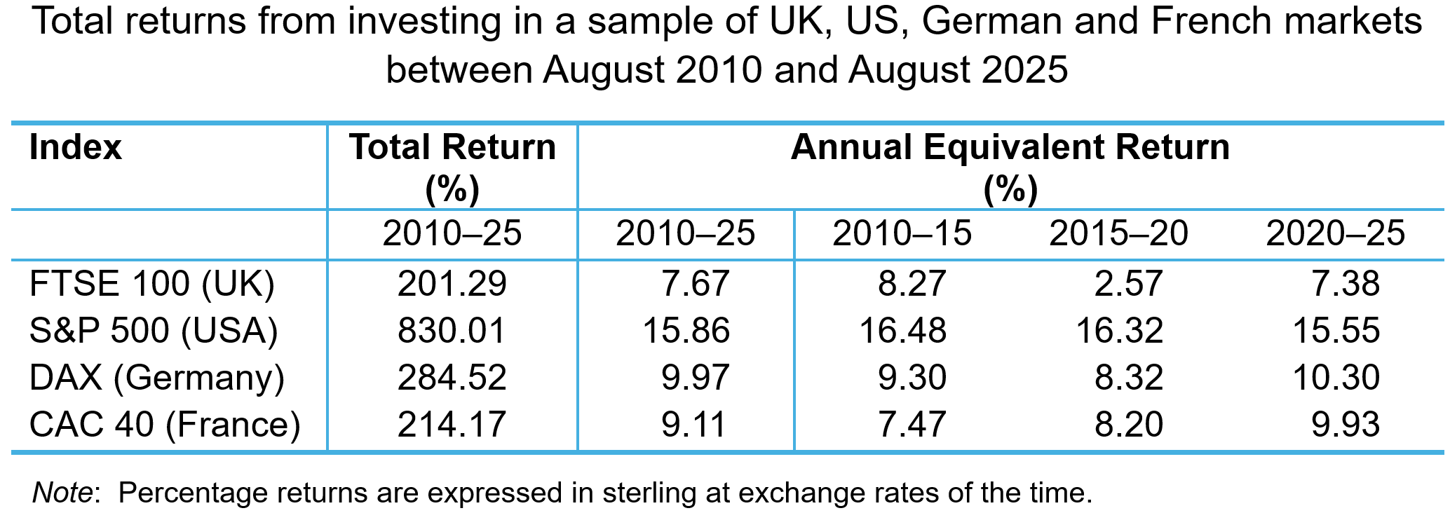
When expressed in sterling, returns offered by UK-listed companies are lower across the whole period and in most of the five-yearly sub-periods. Indeed, the annual equivalent rate of return (AER) for the FTSE 100 index across the whole period is less than half that of the S&P 500. The index offered a paltry annual return of 2.57% between 2015 and 2020, while the US index offered a return of 16.48%. Both the French and German indices offered higher rates of return, in the latter part of the period particularly. This represents a higher opportunity cost for UK investors and may have increased their expectations about the return they require for UK investments.
Greater perceived risk/uncertainty. Expected rates of return are also determined by perceptions of risk and uncertainty – the compensation investors need to bear the perceived risk associated with an investment. Investors are risk averse. They demand higher expected return as compensation for higher perceived risk. Higher levels of risk aversion increase the expected rate of return and related investment hurdle rates.
 There has been much discussion of increased uncertainty and risk aversion among global investors and firms (see the blogs Rising global uncertainty and its effects, World Uncertainty Index, The Chancellor’s fiscal dilemma and Investment set to fall as business is baffled by Trump). The COVID-19 pandemic, inflation shocks, the war in Ukraine, events across the Middle East and the trade policies adopted by the USA in 2025 have combined to produce a very uncertain business environment.
While these have been relatively recent factors influencing world-wide business uncertainty, perceptions of risk and uncertainty concerning the UK economy seem to be longer established. To measure policy-related economic uncertainty in the UK, Baker, Bloom and Davis at www.PolicyUncertainty.com construct an index based on the content analysis of newspaper articles mentioning terms reflecting policy uncertainty.
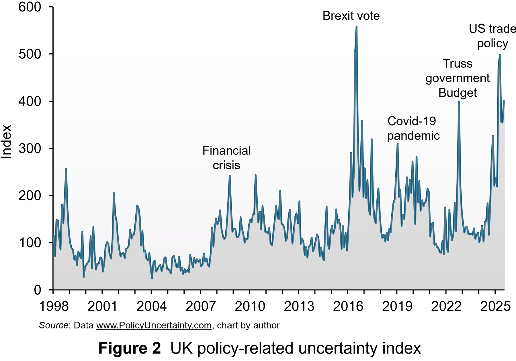 Figure 2 illustrates the monthly index from 1998 to July 2025. The series is normalised to standard deviation 1 prior to 2011 and then summed across papers, by month. Then, the series is normalised to mean 100 prior to 2011.
Some of the notable spikes in uncertainty in the UK since 2008 have been labelled. Beginning with the global financial crisis, investors and firms became much more uncertain. This was exacerbated by a series of economic shocks that hit the economy, one of which, the narrow vote to leave the European Union in 2016, was specific to the UK. This led to political turmoil and protracted negotiations over the terms of the trade deal after the UK left. This uncertainty has been exacerbated recently by the series of global shocks highlighted above and also the budget uncertainty of Liz Truss’s short-lived premiership and now the growing pressure to reduce government borrowing.
While spikes in uncertainty occurred before the financial crises, the average level of uncertainty, as measured by the index, has been much higher since the crisis. From 1998 to 2008, the average value was 89. Since 2008, the average value has been 163. Since the Brexit vote, the average value has been 185. This indicates a much higher perception of risk and uncertainty over the past 15 year and this translates into higher minimum expected return as compensation. Consequently, this makes many long-term investment projects less viable because of higher hurdle rates. This produces less productive investment in capital, contributing significantly to lower productivity.
Policy proposals
There has been much debate in the UK about promoting greater long-term investment. Reforms have been proposed to improve public participation in long-term investment through the stock market. To boost investment, this would require the investing public to be prepared to accept lower expected returns for a given level of risk or accept higher risk for a given level of returns.
Evidence suggests that the appetite for this may be very low. UK savers tend to favour less risky and more liquid cash deposits. It may be difficult to encourage them to accept higher levels of risk. In any case, even if they did, many may invest outside the UK where the risk-return trade-off is more favourable.
 Over the past 10 years, policy uncertainty has played a significant role in deterring investment. So, if there is greater continuity, this may then promote higher levels of investment.
The Labour government has proposed policies which aim to share or reduce the risk/uncertainty around long-term investment for UK businesses. For instance, a National Wealth Fund (NWF) has been established to finance strategic investment in areas such as clean energy, gigafactories and carbon capture. Unfortunately, the Fund is financed by borrowing through financial markets and the amount expected to be committed over the life of the current Parliament is only £29 billion, assuming that private capital matches public commitments in the ratio expected. It is questionable whether the Fund’s commitment will be sufficient to attract private capital.
Alternatively, Invest 2035 is a proposal to create a stable, long-term policy environment for business investment. It aims to establish an Industrial Strategy Council for policy continuity and to tackle issues like improving infrastructure, reducing energy costs and addressing skills gaps. Unfortunately, even if there is some attempt at domestic policy stability, the benefits may be more than offset by perceptions around global uncertainty, which may mean that UK investors’ minimum expected rates of return remain high and long-term investment low for the foreseeable future.
Articles
Data
Questions
- Use the marginal efficiency of capital framework to illustrate the ‘lost’ investment spending in the UK due to the investment hurdle rate being higher than the cost of capital.
- Explain the arbitrage process which produces the differences in valuations of UK securities and foreign ones due to differences in the expected rate of return.
- Sketch an indifference curve for a risk-averse investor, treating expected return and risk as two characteristics of a financial instrument.
- How does higher uncertainty affect the slope of an indifference curve for such an investor? How does this affect their investment hurdle rate?
- Analyse the extent to which the proposed polices can reduce the investment hurdle rate for UK companies and encourage greater levels of investment.
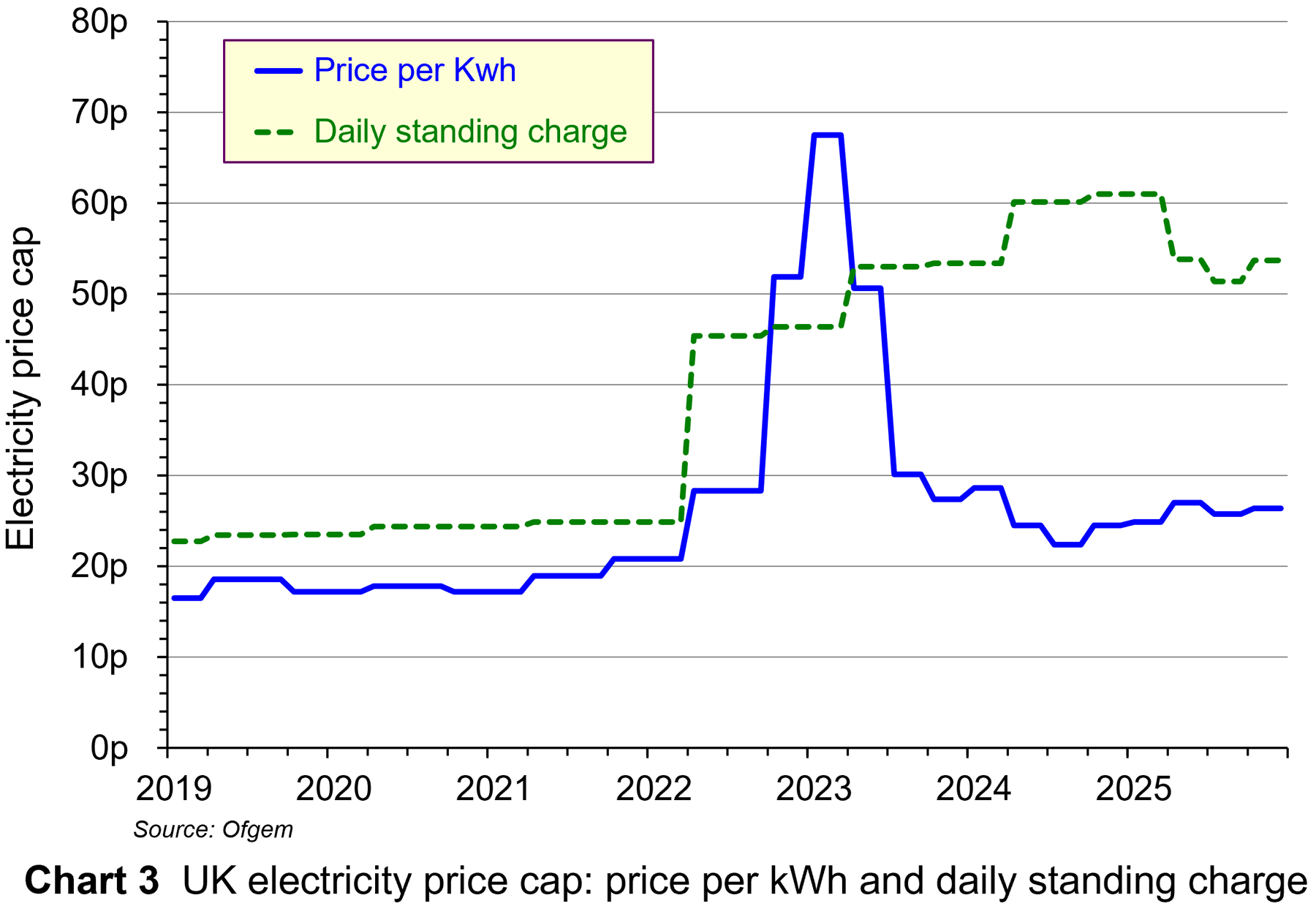
 The UK energy regulator, Ofgem, has announced that the UK energy price cap will rise in October by an average of 2%. The energy price cap sets the maximum prices for electricity and gas that can be charged by suppliers to households. For those paying by direct debit, the maximum electricity price per kilowatt-hour (kWh) will rise from 25.73p to 26.35p, with the maximum daily standing charge rising from 51.37p to 53.68p. As far as gas is concerned, the maximum price per kWh will fall slightly from 6.33p to 6.29p, with the maximum daily standing charge rising from 29.82p to 34.03p. Ofgem estimates that this will mean that the capped cost to the average household will rise from £1720 to £1755.
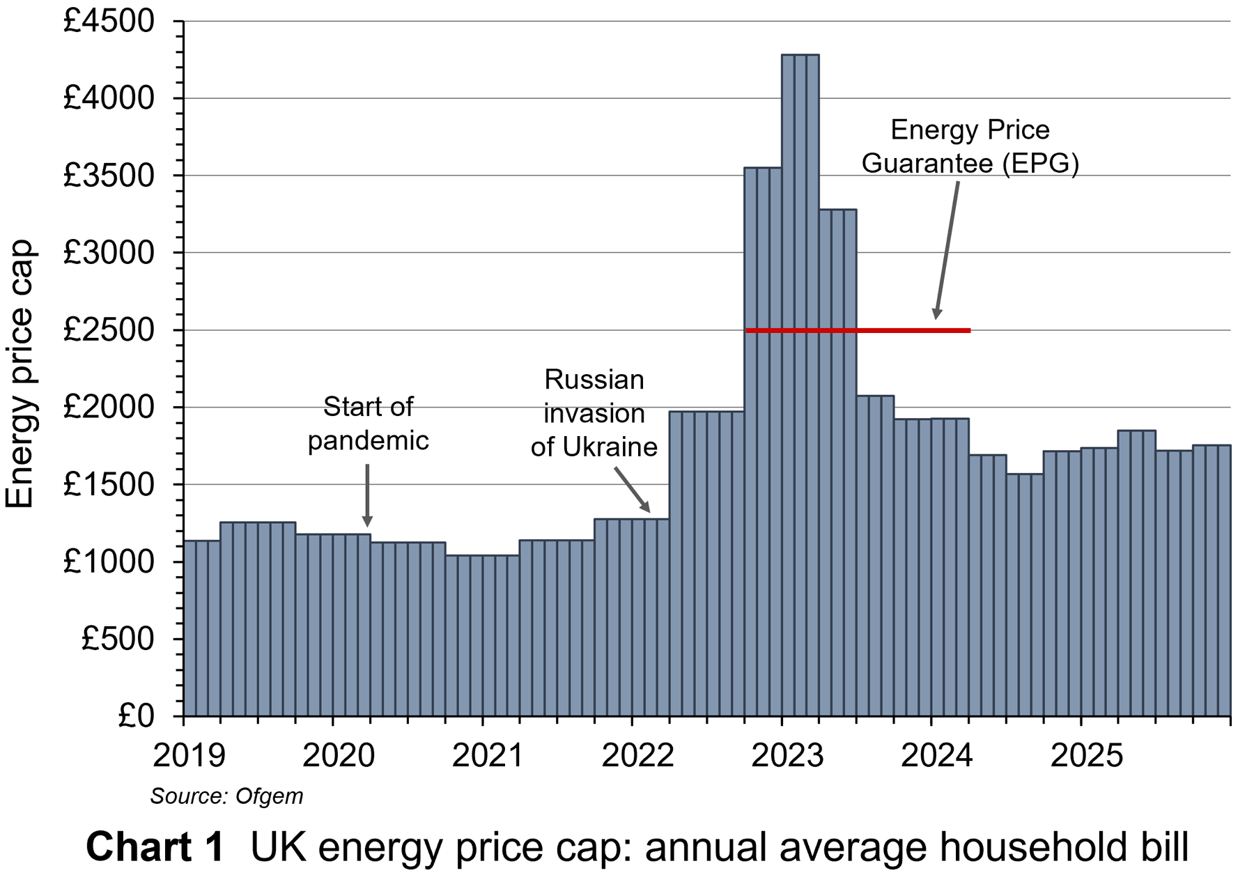 The average capped cost is now much lower than the peak of £4279 from January to March 2023. This followed the huge increase in international gas prices in the aftermath of the invasion of Ukraine and the cutting off of gas supplies from Russia. Note that although the suppliers received these capped prices, average consumers’ bills were limited to £2500 from October 2022 to March 2024 under the government’s Energy Price Guarantee scheme, with suppliers receiving a subsidy from the government to make up the shortfall. But despite today’s cap being much lower than at the peak, it is still much higher than the cap of £1277 prior to Russia’s invasion of Ukraine: see Chart 1 (click here for a PowerPoint).
So is the capped price purely a reflection of the international price of gas, or is it more complicated? The picture is slightly different for gas and electricity.
Gas prices
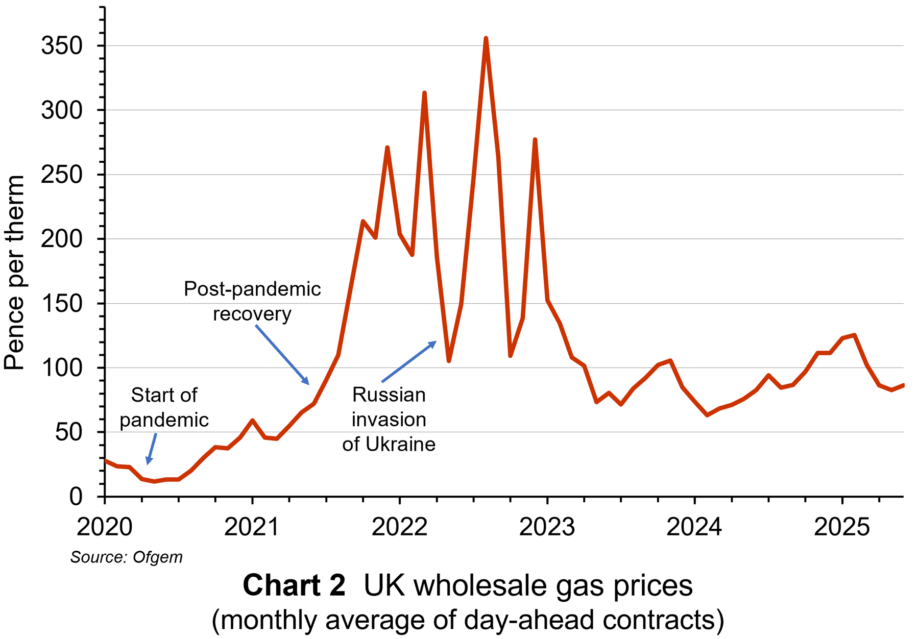 As far as gas prices are concerned, the price does largely reflect the international price: see Chart 2 (click here for a PowerPoint).
The UK is no longer self-sufficient in gas and relies in part on imported gas, with the price determined in volatile international markets. It also has low gas storage capacity compared with most other European countries. This leaves it highly reliant on volatile global markets in periods of prolonged high demand, like a cold winter. Is such cases, the UK often has to purchase more expensive liquefied natural gas (LNG) from global suppliers.
Additionally, taxes, environmental levies and the costs of the nationwide gas distribution network contribute to the overall price for consumers. Changes in these costs affect gas prices. These are itemised below in the case of electricity.
With electricity pricing, the picture is more complex.
Electricity prices
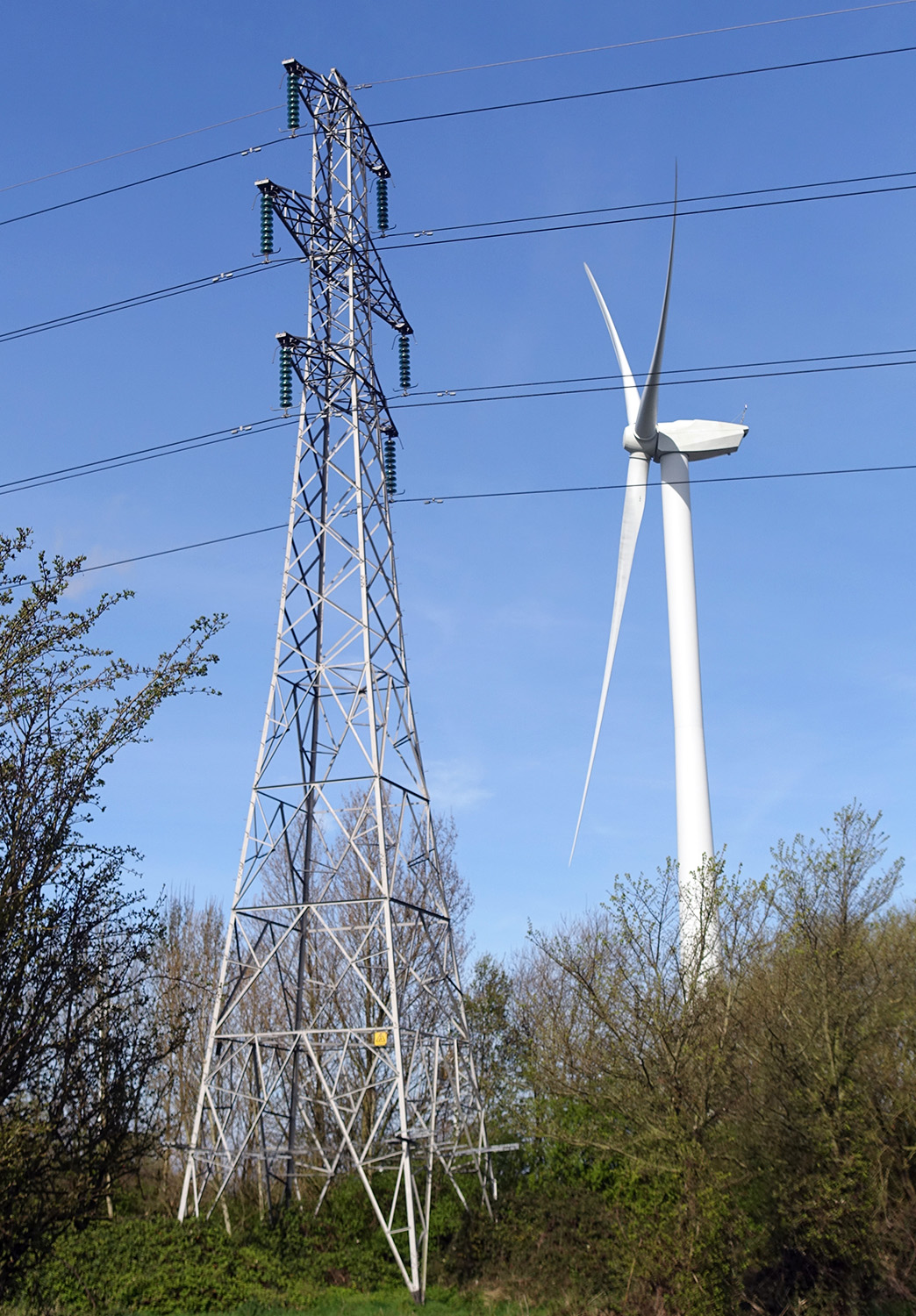
 Electricity generation costs vary considerably with the different methods. Renewable sources like wind and solar have the lowest marginal costs, while natural gas plants have the highest, although gas prices fluctuate considerably.
So how are consumer electricity prices determined? And how is the electricity price cap determined? The price cap for electricity per kWh and the daily standing charge for electricity are shown in Chart 3 (click here for a PowerPoint).
Marginal cost pricing. The wholesale price of electricity in the UK market is set by the most expensive power source needed to meet demand on a day-by-day basis. This is typically gas. This means that even when cheaper renewables (wind, solar, hydro) or nuclear power generate most of the electricity, high gas prices can increase the cost for all electricity. The wholesale price accounts for around 41% of the retail price paid by households.
 It also means that profits for low-marginal-cost producers could increase significantly when gas prices rise. To prevent such (low-carbon) suppliers making excess profits when the wholesale price is high and possibly making a loss when it is low, the actual prices that they receive is negotiated in advance and a contract is signed. These contracts are known as Contracts for Difference (CfDs). CfDs provide a fixed ‘strike price’ to low-carbon generators. The strike price is set so as to allow low-carbon generators to recoup capital costs and is thus set above the typical level of marginal cost. If the wholesale price is below the strike price, payments to generators to cover the difference are funded by amounts collected from electricity suppliers in advance using the CfD Supplier Obligation Levy. If the wholesale price is above the strike price, the difference is returned to consumers in terms of lower electricity bills.
Policy costs. Electricity bills include an element to fund various social and environmental objectives. This element is also included in the cap. From October to December 2025, this element of the cap will be 11.3%. The money helps to subsidise low-carbon energy generation and fund energy efficiency schemes. It also funds the Warm Home Discount (WHD). In the October to December 2025 price cap, this amounted to a discount for eligible low-income and vulnerable households of £150 per annum on their electricity bills. The WHD element is included in the standing charge in the price cap. From October 2025, more generous terms will mean that the number of households receiving WHD will increase from 3.4 million to 6.1 million households. This is the main reason for the £35 increase in the cap.
Network costs. These include the cost of building, maintaining and repairing the pipes and wires that deliver gas and electricity to homes. From October to December 2025, this element of the cap will be 22.6%.
Supplier business costs. These include operating costs (billing, metering, office costs, etc.) and servicing debt. From October to December 2025, this element of the cap will be 15.4%.
Profit Allowance. A small percentage is added to the price cap for energy suppliers’ profits. This is known as the Earnings Before Interest and Tax (EBIT) allowance and is around 2.4%. This has a fixed component that does not change when the overall price cap is updated and a variable component that rises or falls with changes in the cap.
Reliance on gas, low gas storage facilities, marginal cost pricing and the commitment to invest in low-carbon electricity and home heating all add to the costs of energy in the UK, making UK electricity prices among the highest in the world.
Articles
Information and Data
Questions
- Why are the UK’s energy prices among the highest in the world?
- What are the arguments for and against subsidising wind power?
- What is the Contracts for Difference scheme in low-carbon energy. What CfDs have been awarded? Assess the desirability of the scheme.
- Is the capping of gas and electricity prices the best way of providing support for low-income and vulnerable consumers?
- How are externalities relevant in determining the optimal pricing of electricity?
 Those of a certain age may remember the fanfare which heralded the introduction of the Single European market (SEM) on 1 January 1993. It promised the removal of internal barriers to the movement of goods, services, capital and people. One sector that was noticeably absent from the single market, however, was banking.
 Even as the EU moved towards economic and monetary union (EMU) during the 1990s, there was no discussion of integration for the banking industry. However, that changed following the 2008 financial crisis and 2011 eurozone crisis. Both episodes exposed vulnerabilities in the EU banking system which required taxpayer support. It was proposed that deeper integration of the banking sector would ensure its stability and resilience. This stimulated moves towards European Banking Union (EBU), starting with the European Council agreeing its creation in 2012. There are three institutional pillars to the Union:
 1. Ring fencing. Although there is a single supervisory mechanism for large systemically important institutions, since the financial crisis national regulators have implemented ‘ring-fencing’. This aims to protect retail banking activities from riskier investment banking. Ring-fencing retains liquidity, dividends and other bank assets within national borders to protect their retail banking sectors from contagion. The ECB estimates €225 billion of capital and €250 billion of liquidity is trapped by such national restrictions. Further, unharmonized and unpredictable use of capital buffers adds complexity for capital management at a multinational level. This particularly impacts large institutions. Banks’ cross-border activities are impeded since they are restricted in the way they can use capital and liquidity across the bloc.
 On the demand-side, retail banking is largely a relational rather than a transactional service, with consumption taking place over a long time-period with significant financial risks attached. Even with deposit insurance and a lender of last resort (the central bank), consumers exhibit significant loss aversion in their use of retail banking services. Consequently, trust and confidence are important characteristics for consumers and that means they are likely to prefer to use familiar domestic institutions.
  Some argue that retail banking is a public utility and should be regulated as such. It has a simple business model, taking deposits, making payments and making loans. Like other utilities, such as water and energy, retail banking is an essential service for the smooth functioning of the economy and society. Like other utilities, bank failures create severe problems for the economy and society.
  The gold market has become one of the most talked-about commodity markets in 2025, with prices reaching record highs. This is largely due to increased demand from investors, who see gold as a ‘safe haven’ during times of economic and political uncertainty. Central banks are also buying more gold as a way to reduce their reliance on currencies like the US dollar. With many analysts predicting prices could reach over $4000 per ounce in the next year, the gold market is showcasing how supply and demand, confidence, and global events can all influence a commodity market.
 This year, the gold market has seen a remarkable rally, with the price of gold hitting a record high. Demand for the precious metal has resulted in spot prices surging over 35% to date (see the chart: click
  The rise in the price of gold by more than a third this year can be linked to the US election last year, according to the director of research at BullionVault (see the BBC article below). Attitudes of the Trump administration towards the Federal Reserve have created concerns among investors. Fears that the US administration could erode the independence of the world’s most important central bank have fuelled the latest flows into the metal, which is traditionally viewed as a hedge against inflation.
  If the Federal Reserve does come under political pressure, it could affect the stability of the US economy and beyond. When gold prices rise sharply, demand usually falls in countries like China and India, which are the world’s largest buyers of gold jewellery. However, in 2025, this trend has changed. Instead of reducing their gold purchases, people in these countries have started buying investment gold, such as bars and coins, showing a shift in consumer behaviour from jewellery to investment assets.
 Following the controversary over the sale of tickets for popular live events such as Taylor Swift’s Eras tour and the Oasis Live ’25 Tour, the government launched a consultation exercise in January 2025 on the resale of tickets. Titled, ‘putting fans first’, the exercise sought the views of individuals and organisations on a range of policy proposals. One of these was the implementation of a cap on the resale price of tickets.
 Although many fans dislike the uncapped secondary ticketing market, most economists take a more positive view. They see them as a way of facilitating mutually beneficial trade and helping to reallocate tickets to those with the highest willingness to pay. This reduces levels of allocative inefficiency/deadweight welfare loss in the market.
 Given the benefits outlined by economists of having an uncapped secondary ticketing, why is the government considering the implementation of a price cap? One potential issue of having an uncapped secondary ticketing market is that developments in technology make it easier for professional resellers to buy very large quantities of tickets. This makes it increasingly difficult for fans who want to attend the event from being able to purchase a ticket.
 One issue raised in the response to the consultation by the Competition and Markets Authority is that these fees are not always made clear by sellers in the primary market in a clear and transparent way. Therefore, for the policy to be effective, primary market sellers would have to make information on both ticket prices and any fees clearly and easily available. Recent changes to the law that prohibit drip pricing might help to address this issue.
  To avoid the price cap, there is a danger that increasing numbers of buyers and sellers stop using capped secondary ticket platforms, where activity is easier to observe/regulate, and switch to other non-specialist platforms where detection of illegal behaviour and enforcement of consumer law is more difficult. Examples of non-specialist platforms where sales might increasingly take place include Facebook Marketplace, Instagram Shop, X (formerly Twitter) and internet forums. With lower levels of consumer protection and the greater difficulty of detecting illegal behaviour, sales via these non-specialist platforms are more vulnerable to scams and fraud.
 The UK’s poor record on productivity since the 2008 financial crisis is well documented, not least in this blog series. Output per worker has flatlined over the 17 years since the crisis. As was noted in the blog,
  From Figure 1 it can be observed that, since the mid-1990s, the UK has consistently had lower investment as a percentage of GDP compared to other significant developed market economies. The cumulative effect of this gap has contributed to lower productivity and lower economic growth.
 Analysis by the OECD suggest that, while the cost of financing investment has declined since the financial crisis, the gap between this and the hurdle rate used to appraise investments has widened. Between 2010 and 2021 the difference nearly doubled to 4%. This increase in the hurdle rate can be related to increases in the expected rate of return by UK companies and their investors.
 However, it is not interest rates that have increased the opportunity cost, and hence the minimum expected rate of return associated with investment, in the UK since the financial crisis. For most of the period since 2008, interest rates have been extremely low, sitting at below 1%, only rising significantly during the post-pandemic inflationary surge in 2022. This indicates that this source of opportunity cost for the commitment of business investment has been extremely low.
 There has been much discussion of increased uncertainty and risk aversion among global investors and firms (see the blogs
  Figure 2 illustrates the monthly index from 1998 to July 2025. The series is normalised to standard deviation 1 prior to 2011 and then summed across papers, by month. Then, the series is normalised to mean 100 prior to 2011.
 Over the past 10 years, policy uncertainty has played a significant role in deterring investment. So, if there is greater continuity, this may then promote higher levels of investment.
 The UK energy regulator, Ofgem, has announced that the UK energy price cap will rise in October by an average of 2%. The energy price cap sets the maximum prices for electricity and gas that can be charged by suppliers to households. For those paying by direct debit, the maximum electricity price per kilowatt-hour (kWh) will rise from 25.73p to 26.35p, with the maximum daily standing charge rising from 51.37p to 53.68p. As far as gas is concerned, the maximum price per kWh will fall slightly from 6.33p to 6.29p, with the maximum daily standing charge rising from 29.82p to 34.03p. Ofgem estimates that this will mean that the capped cost to the average household will rise from £1720 to £1755.
 The average capped cost is now much lower than the peak of £4279 from January to March 2023. This followed the huge increase in international gas prices in the aftermath of the invasion of Ukraine and the cutting off of gas supplies from Russia. Note that although the suppliers received these capped prices, average consumers’ bills were limited to £2500 from October 2022 to March 2024 under the government’s Energy Price Guarantee scheme, with suppliers receiving a subsidy from the government to make up the shortfall. But despite today’s cap being much lower than at the peak, it is still much higher than the cap of £1277 prior to Russia’s invasion of Ukraine: see Chart 1 (click
  As far as gas prices are concerned, the price does largely reflect the international price: see Chart 2 (click
  Electricity generation costs vary considerably with the different methods. Renewable sources like wind and solar have the lowest marginal costs, while natural gas plants have the highest, although gas prices fluctuate considerably.
  It also means that profits for low-marginal-cost producers could increase significantly when gas prices rise. To prevent such (low-carbon) suppliers making excess profits when the wholesale price is high and possibly making a loss when it is low, the actual prices that they receive is negotiated in advance and a contract is signed. These contracts are known as Contracts for Difference (CfDs). CfDs provide a fixed ‘strike price’ to low-carbon generators. The strike price is set so as to allow low-carbon generators to recoup capital costs and is thus set above the typical level of marginal cost. If the wholesale price is below the strike price, payments to generators to cover the difference are funded by amounts collected from electricity suppliers in advance using the CfD Supplier Obligation Levy. If the wholesale price is above the strike price, the difference is returned to consumers in terms of lower electricity bills.