 In my previous blog post on this site, I examined how AI-powered pricing tools can act as a ‘double-edged sword’: offering efficiency gains, while also creating opportunities for collusion. I referred to one of the early examples of this, which was the case involving Trod Ltd and GB Eye, where two online poster and frame sellers on Amazon used pricing algorithms to monitor and adjust their prices. However, in this instance there was also an explicit agreement between the firms. As some commentators put it, it was ‘old wine in new bottles‘, meaning a fairly conventional cartel that was simply facilitated through digital tools.
Since then, algorithms have increasingly become part of everyday life and are now embedded in routine business practice.
Some of the effects may have a positive effect on competition. For example, algorithms can help to lower barriers to entry. In some markets, incumbents benefit from long-standing experience, while new firms face significant learning costs and are at a disadvantage. By reducing these learning costs and supporting entry, algorithms could contribute to making collusion harder to sustain.
On the other hand, algorithms could increase the likelihood of collusion. For example, individual algorithms used by competing firms may respond to market conditions in predictable ways, making it easier for firms to collude tacitly over time.
Algorithms can also improve the ability of firms to monitor each other’s prices. This is particularly relevant for multi-product firms. Traditionally, we might expect these markets to be less prone to collusion because co-ordinating across many products is complex. AI can overcome this complexity. In the Sainsbury’s/Asda merger case, for example, the Competition and Markets Authority suggested that the main barrier to reaching and monitoring a pricing agreement was the complexity of pricing across such a wide range of products. However, the CMA also suggested that technological advances could increase its ability to do so in the future.
The ‘hub-and-spoke’ model
 One of the other growing concerns is the ability of AI pricing algorithms to facilitate collusion by acting as a ‘hub’ in a ‘hub-and-spoke’ arrangement. In this type of collusion, competing firms (the ‘spokes’) need not communicate directly with one another. Instead, the ‘hub’ helps them to co-ordinate their actions.
While there have been only limited examples of an AI pricing algorithm acting as a hub in practice, what once seemed to be a largely theoretical concern has now become a live enforcement issue.
A very recent example is the RealPage case in the United States. The Department of Justice (DOJ) filed an antitrust lawsuit against RealPage Inc. in August 2024, alleging that RealPage, acting as the ‘hub’, facilitated collusion between landlords (the ‘spokes’).
RealPage provided pricing software to numerous landlords, including the largest landlord in the USA, which manages around 950 000 rental units across the country. These landlords would normally compete independently in setting rental prices, discounts and lease terms to win consumers. However, by feeding competitively sensitive information that would not usually be shared between rivals into RealPage’s system, the software generated pricing recommendations that, according to the DOJ, led to co-ordinated rent increases across competing apartment complexes.
I n the RealPage case, the authorities reported that they had access to internal documents and statements from the parties involved, which helped support their allegations. These included references within RealPage to helping landlords ‘avoid the race to the bottom’ and comments from a landlord describing the software as ‘classic price fixing’.
Evidence in these cases really matters because the standard of proof required to establish a hub-and-spoke arrangement is much higher than for traditional cases of explicit collusion. This is because it can be difficult to distinguish between legitimate and anti-competitive communication between retailers and suppliers. Also, proving ‘anti-competitive intent’ is inherently challenging.
Other competition authorities around the world are also turning their attention to these issues. For example, the European Commission recently announced that a number of investigations into algorithmic pricing are underway, signalling a clear shift toward more active scrutiny. As technology continues to advance, it is clear that algorithmic pricing will remain an area where both firms and authorities must move and adapt quickly.
Articles
Questions
- In what ways does the RealPage case differ from the earlier Trod Ltd and GB Eye Ltd case? Consider the roles played by the firms, the nature of the alleged co-ordination, and the extent to which pricing algorithms were used to facilitate the conduct.
- How might the use of pricing algorithms affect the likelihood of firms colluding, either explicitly or tacitly? Consider ways that algorithms may make collusion easier to sustain but also ways in which they may reduce its likelihood.
- Should firms be held liable for anti-competitive outcomes produced by algorithms that ‘self-learn’, even if they did not intend those outcomes? Explain why or why not.
 Every year, world leaders gather to find ways of limiting global warming. The latest of these ‘COP’ meetings, COP30, is in Belém, Brazil from 10 to 20 November 2025. COP stands for ‘Conference of the Parties’, the decision-making body of the United Nations Framework Convention on Climate Change (UNFCCC).
Perhaps the best-known of these meetings was in Paris in 2015. This resulted in the Paris Agreement. This is a legally-binding international treaty to limit global warming to well below 2°C and preferably to 1.5°C above pre-industrial levels. This would involve reducing greenhouse gas emissions and/or taking carbon absorbing measures. All UN countries except for Iran, Libya and Yemen are signatories to the agreement.
However, on coming to office in January 2025, President Trump announced that the USA will withdraw from the agreement in January 2026. Instead, he would prioritise fossil fuel production, under the mantra, ‘drill, baby, drill’. Previously he had claimed that global warming is a hoax concocted by China designed to undermine the competitive power of the USA.
Progress in reducing emissions and mitigating climate change
 Since 2020, each country has been required to submit its own emissions-reduction targets, known as ‘nationally determined contributions’ (NDCs), and the actions it will take to meet them. Every five years each country must submit a new NDC more ambitious than the last. New NDCs are due this year. As of 12 November, 112 of the 197 countries had submitted a new NDC (including the USA, China, the EU and the UK). These 112 countries account for around 71 per cent of global emissions.
Implementing all new NDCs would reduce global CO2 emissions by between 15 and 25 per cent from current levels by 2035. But this would merely reduce global warming to around 2.6°C above pre-industrial levels. Approximately 35 per cent emissions reductions by 2035 would be required to restrict global warming to 2°C and 55 per cent to restrict it to 1.5°C.
But implementing the Paris Agreement has still had a high degree of success. Without the action taken and being taken over the past 10 years, it is predicted that global temperatures by 2050 would rise by 3–3.5°C.
Rich countries are expected to provide finance to low-income countries. This is required to help such countries adopt green technologies and to adapt to the harmful effects of climate change (e.g. through irrigation schemes and flood defences). At COP29 in Azerbaijan, the ‘Baku Finance Goal’ was agreed. This is an agreement to provide climate finance of $1.3 trillion per year by 2035 to developing countries from all public and private sources.
The subsequent ‘Baku to Belém Roadmap’ provides a set of suggested actions for governments, financial institutions and the private sector to bridge the gap between current climate finance flows and the $1.3 trillion agreed to meet global climate goals. The roadmap is a central focus of the COP30 conference in Belém, with discussions between countries on how to translate the Baku finance goal into concrete, tangible actions and integrate it into formal decisions.
The role of Donald Trump
 As well as announcing that the USA will withdraw from the Paris Agreement in January 2026, since coming to office in 2025, President Trump has given billions of dollars of tax cuts to fossil fuel firms and allowed drilling for oil and gas on federal lands. At the same time, he has described renewable energy as ‘a joke’ that will bankrupt countries and has slashed subsidies and tax breaks for solar and wind power, withdrawn permits for wind and solar farms, and cut funding for green energy research.
He wants the USA to be world leader in fossil fuel energy, calling on governments to buy US oil and gas, threatening some countries with tariffs if they do not. Already, Japan, South Korea and several European countries have agreed to buy huge quantities of US oil and liquefied natural gas (LNG). A worry is that other similarly inclined governments, such as Argentina, may roll back on their commitments to a green transition and instead boost their fossil fuel industries.
This gives added urgency to the Belém talks. It is crucial for the rest of the world to stick together in pushing ahead to combat global warming and in adopting and sticking to tough NDCs. It is also crucial for rich countries to support dlow-income countries in adopting climate-friendly investment and in measures to mitigate the effects of global warming.
The economics of climate change
 Climate change is directly caused by market failures. One of the most important of these is that the atmosphere is a common resource: it is not privately owned; it is a global ‘commons’. Individuals and firms use it at a zero price. If the price of any good or service to the user is zero, there is no incentive to economise on its use. Thus for the emitter there are no private costs of using the atmosphere in this way as a ‘dump’ for their emissions and, in a free market, no incentive to reduce the climate costs.
And yet when firms emit greenhouse gases into the atmosphere there are costs to other people. To the extent that they contribute to global warming, part of these costs will be borne by the residents of that country; but a large part will be borne by inhabitants of other countries.
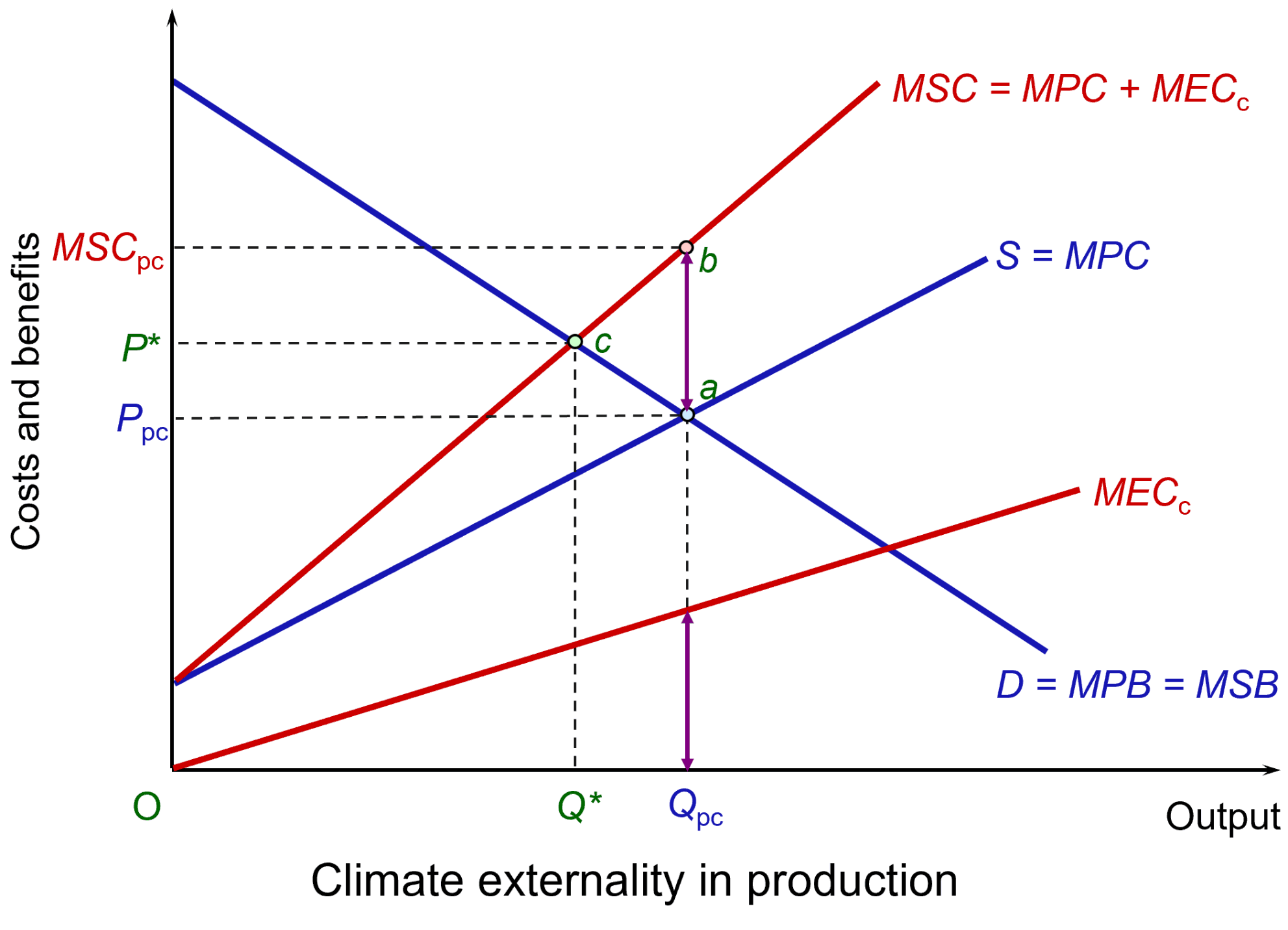 These climate costs are external costs to the firm and are illustrated in the figure. It shows an industry that emits CO2. To keep the analysis simple, assume that it is a perfectly competitive industry with demand and supply given by curves D and S, which are equal to the marginal private benefits (MPB) and marginal private costs (MPC), respectively. There are no externalities on the demand side and hence MPB equals the marginal social cost (MSB). Market equilibrium is at point a, with output at Qpc and price at Ppc. (Click here for a PowerPoint.)
Assume that the emissions create a marginal cost to society equal to MECc. Assume that the MEC increases as output and total emissions increase. The MECc line is thus upward sloping. At the market price of Qpc, these external climate costs are equal to the purple vertical line. When these external climate costs are added to private costs, this gives a marginal social cost given by MSC = MPC + MECc. The gives a socially optimal level of output of the product of Q* at a price of P*, with the optimum point of c.
 In other words, other things being equal, the free market overproduces products with climate externalities. If the output is to be reduced to the social optimum of Q*, then the government will need to take measures such as those advocated in the Paris Agreement. These could include imposing taxes on products, such as electricity generated by fossil fuels, or on the emissions themselves. Or green alternatives, such as wind power, could be subsidised.
Alternatively, regulations could be used to cap the production of products creating emissions, or caps on the emissions themselves could be imposed. Emissions permits could be issued or auctioned. Only firms in possession of the permits would be allowed to emit and the permits would cap emissions below free-market levels. These permits could be traded under a cap-and-trade scheme, such as the EU’s Emissions Trading Scheme. Again, such schemes are advocated under the Paris Agreement.
COP30 and progress in tackling climate change
 The USA is not attending COP30 in Brazil. Nor is the Chinese leader, Xi Jinping. However, there are growing opportunities for translating aims into practical policies for specific sectors, such as energy, transport and carbon-intensive industries. These policies may require some degree of government action – taxes, subsidies or regulation – to internalise climate externalities. But increasingly, green alternatives are becoming economically viable without subsidies or with just initial government funding to ‘crowd in’ private investment, which will then attract further private capital as external economies of scale kick in. Increasingly investors will find profitable opportunities in climate-friendly projects.
At the same time, while the USA is moving away from climate-friendly investment (as least for the term of the Trump Presidency), China is moving in the opposite direction, with massive investment in solar panels, wind turbines, EVs and batteries – investment that is bringing down their cost and thereby encouraging their adoption around the world. Such technologies create huge opportunities for low-income countries to provide affordable energy and to create local jobs, both skilled and unskilled. It also helps them achieve much greater energy security by reducing their reliance on fossil fuel imports
Chinese advances in green technology are also providing a stimulus to other countries to invest in renewable industries to prevent Chinese dominance. The danger, however, of Chinese dominance in the renewable sector in high-income countries is that it may encourage them to impose tariffs on Chinese imports of EVs, solar panels, etc. to protect their own industries.
But despite the growing opportunities for profitable adoption of green technologies without government support, there is still much that governments need to do to encourage the process. COP meetings are an important forum for discussing such policies and holding governments to account for meeting or not meeting their targets.
The agreement
The agreement reached at the end of the conference marked relatively small progress. There was agreement to increase finance from developed to developing countries to help them adapt to climate change. This would triple to $120bn per year, up from the previously agreed doubling, but the target date was pushed back to 2035 from the previously agreed 2030.
By the end of the conference, 122 of the 197 countries had submitted a new NDC – still 75 countries short, although others are expected.
The conference also agreed to establish a ‘just transition mechanism (JTM)’ to ‘enhance international cooperation, technical assistance, capacity-building and knowledge-sharing, and enable equitable, inclusive just transitions’. However, this is voluntary and no funding was attached, but it could act as the basis for future funding.
The biggest failure of the conference was probably the lack of agreement on phasing out of fossil fuels. This is not surprising given the opposition of the major oil producers. The hope is that the reduction in costs of renewable energy will drive the process anyway – a process that China is keen to accelerate with its investment in solar power and other renewable energy. One hopeful development, however, was the pledging of more than $9bn to halt deforestation, a major source of global warming. (See the Travers Smith article at the end of the Articles list below for a very useful summary of the outcome.)
Articles
- What is COP30 and why does it matter for the climate?
Chatham House, Anna Åberg (5/9/25)
- COP30 in Brazil: What is at stake for global collaboration on climate and nature?
World Economic Forum, Pim Valdre (5/11/25)
- What is COP30 and why does it matter?
CNN, Laura Paddison (11/11/25)
- Why COP 30 in Brazil Matters for a Thriving Economy and a Safe, Livable Planet
Union of Concerned Scientists (UCS),Rachel Cleetus (7/11/25)
- Nationally Determined Contributions: The Action Plans Behind Global Efforts To Fight the Climate Crisis
Center for American Progress (CAP, Kalina Gibson and Courtney Federico (22/9/25)
- New climate pledges only slightly lower dangerous global warming projections
UN Environment Programme, Press Release (4/11/25)
- COP30: Trump and many leaders are skipping it, so does the summit still have a point?
BBC News, Justin Rowlatt (10/11/25)
- Trump dismisses clean energy as ‘a joke.’ But Americans deserve facts, not fear
USA Today, Mark McNees (23/9/25)
- The surprising countries pulling off stunningly fast clean energy transitions
CNN, Ella Nilsen and Samuel Hart (7/11/25)
 Could the world’s biggest polluter be its savior against climate change?
CNN, Simone McCarthy (17/11/25)
- COP 2025: Outlook and Implications for Investors
RankiaPro, Joanna Piwko, Allegra Ianiri, Marie Lassegnore and Jean-Philippe Desmartin (10/11/25)
Post-agreement
- Belém: yet another cop out
Zero Hour, Allan Gray (25/11/25)
- Cop30’s watered-down agreements will do little for an ecosystem at tipping point
The Guardian, Fiona Harvey, Jonathan Watts, Damien Gayle and Damian Carrington (22/11/25)
- COP30: Five key takeaways from a deeply divisive climate summit
BBC News, Justin Rowlatt and Matt McGrath, (25/11/25)
- COP30: What were the key outcomes?
Travers Smith (1/12/25)
Information and Data
Questions
- Summarise the Paris Agreement.
- Summarise the Baku to Belém Roadmap to 1.3T.
- What incentives are there for countries to stick to their NCDs?
- Using a diagram similar to that above, illustrate how the free market will produce a sub-optimal amount of solar power because the marginal social benefit exceeds the marginal private benefit. How might the calculation be changing?
- How might game theory be used to analyse possible international decision making at COP conferences? How might this be affected by the attitudes of the Trump administration?
- Is it in America’s interests to cease investing in green energy and green production methods?
 The productivity gap between the UK and its main competitors is significant. In 2024, compared to the UK, output per hour worked was 10.0% higher in France, 19.8% higher in Germany and 41.1% higher in the USA. These percentages are in purchasing-power parity terms: in other words, they reflect the purchasing power of the respective currencies – the pound, the euro and the US dollar.
GDP per hour worked (in PPP terms) is normally regarded as the best measure of labour productivity. An alternative measure is GDP per worker, but this does not take into account the length of the working year. Using this measure, the gap with the USA is even higher as workers in the USA work longer hours and have fewer days holiday per year than in the UK.
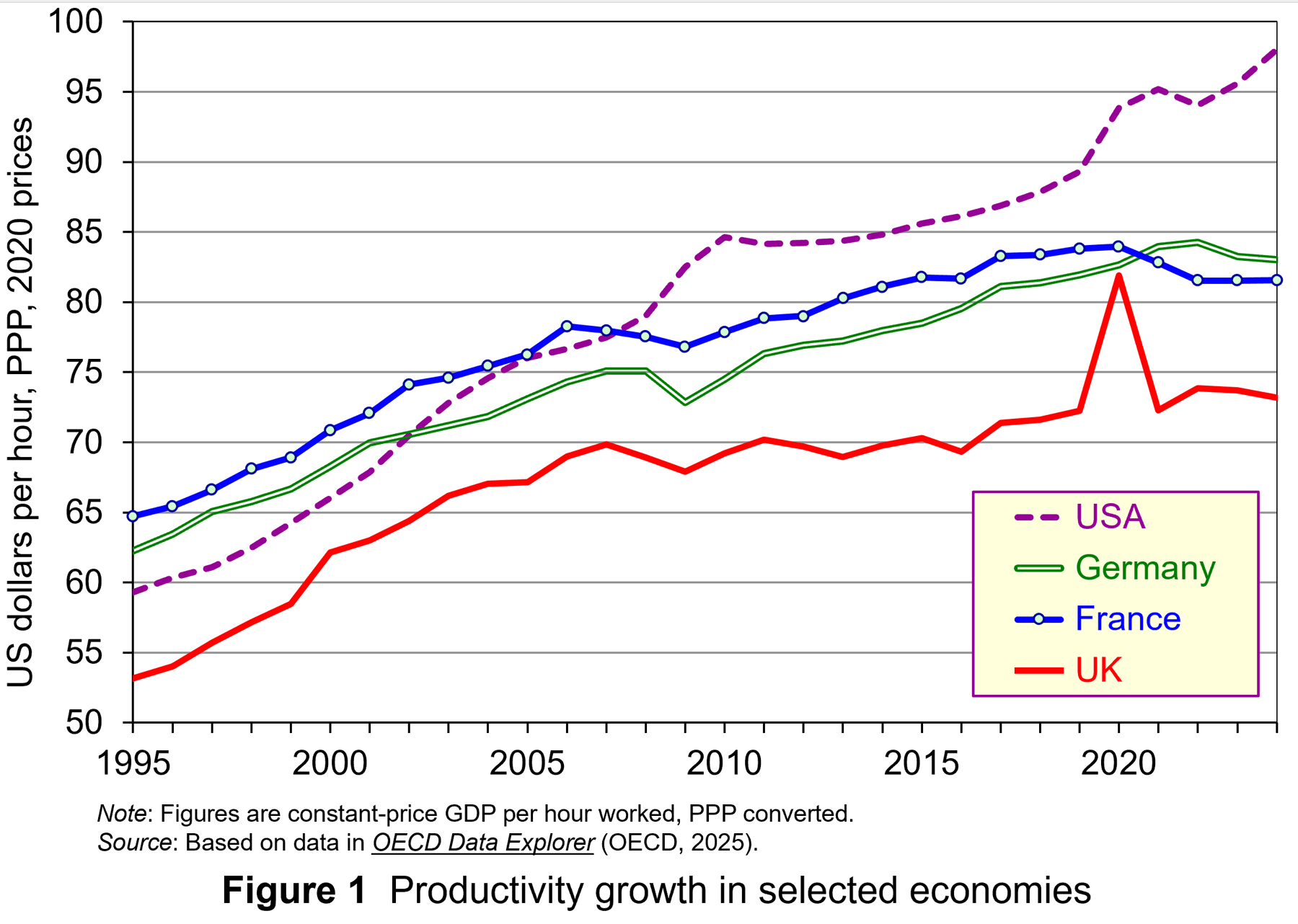 The productivity gap is not a new phenomenon. It has been substantial and growing over the past 20 years. (The exception was in 2020 during lockdowns when many of the least productive sectors, such as hospitality, were forced to close temporarily.)
The productivity gap is shown in the two figures. Both figures show labour productivity for the UK, France, Germany and the USA from 1995 to 2024.
Figure 1 shows output (GDP) per hour, measured in US dollars in PPP terms.
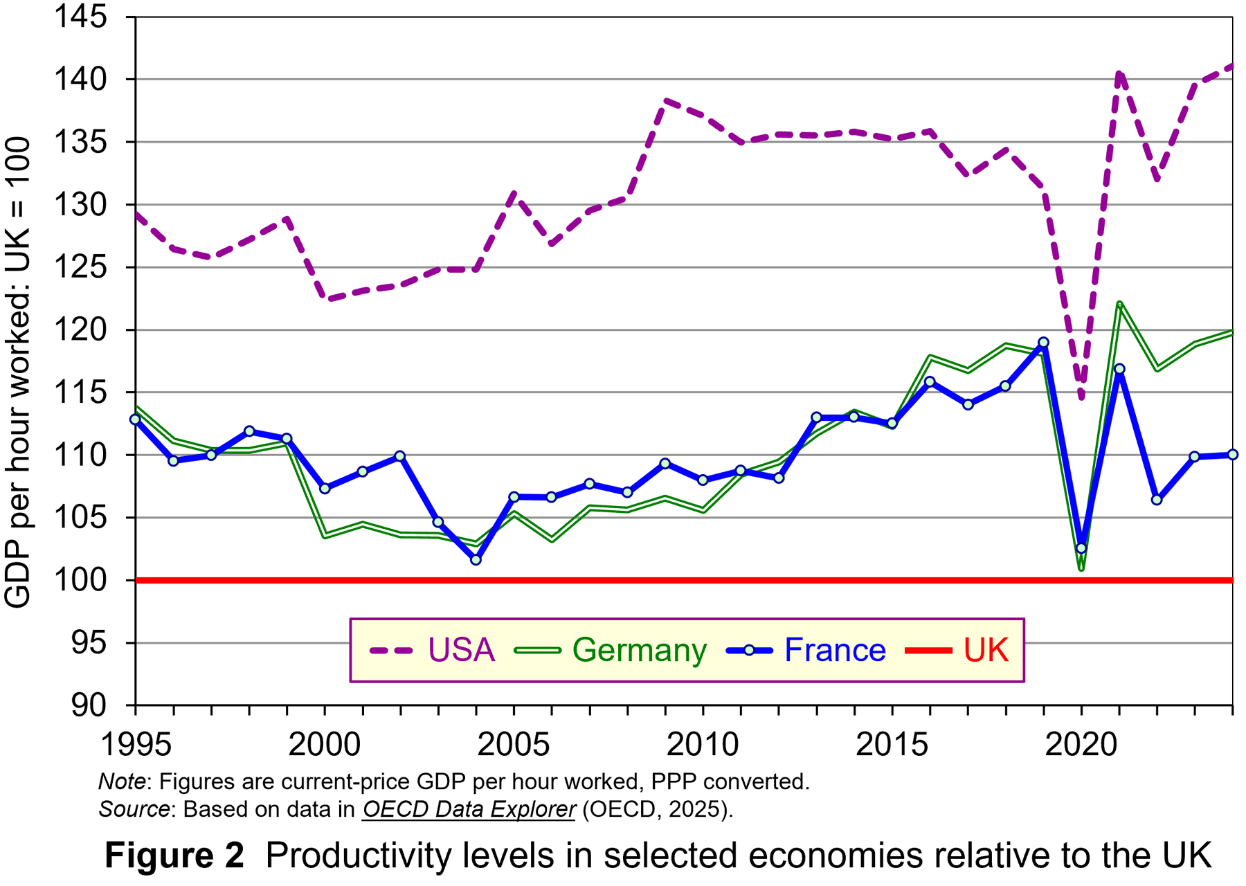 Figure 2 shows output (GDP) per hour relative to the UK, with the UK set at 100. The gap narrowed somewhat up to the early 2000s, but since then has widened.
Low UK productivity has been a source of concern for UK governments and business for many years. Not only does it constrain the growth in living standards, it also make the UK less attractive as a source of inward investment and less competitive internationally.
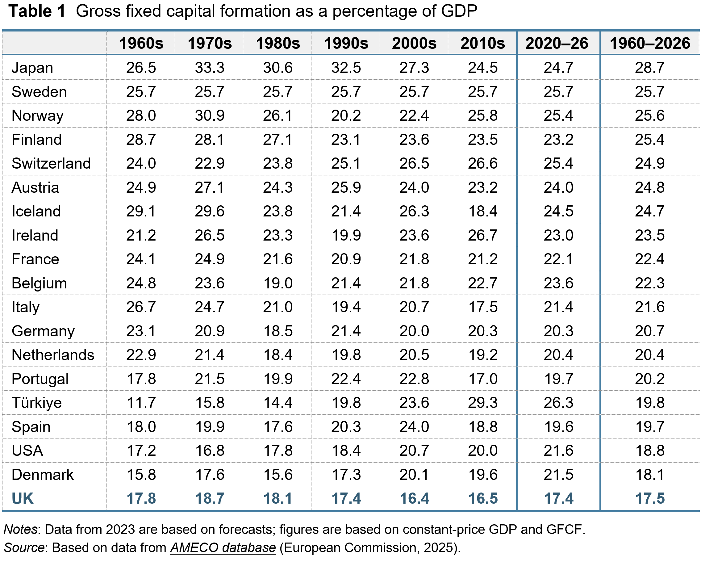
Part of the reason for low UK productivity compared to that in other countries is a low level of investment. As a proportion of GDP, the UK has persistently had the lowest, or almost the lowest, level of investment of its major competitors. This is illustrated in Table 1.
It is generally recognised by government, business and economists that if the economy is to be successful, the productivity gap must be closed. But there is no ‘quick fix’. The policies necessary to achieve increased productivity are long term. There is also a recognition that the productivity problem is a multi-faceted one and that to deal with it requires policy initiatives on a broad front: initiatives that encompass institutional changes as well as adjustments in policy.
So what can be done to improve productivity and how can this be achieved at the micro as well as the macro level?
Improving productivity: things that government can do
 Encouraging investment. Over the years, UK governments have increased investment allowances, enabling firms to offset the cost of investment against pre-tax profit, thereby reducing their tax liability. For example, in the UK, companies can offset a multiple of research and development costs against corporation tax. The rate of relief for small and medium-sized enterprises (SMEs) allows companies that work in science and technology to deduct an extra 86% of their qualifying expenditure from their trading profit in addition to the normal 100% deduction: i.e. a total of 186% deduction. Meanwhile, since April 2016, larger companies have been able to claim a R&D expenditure credit, initially worth 11 per cent of R&D expenditures, then 12 per cent from 2018 and 13 per cent from 2020. This was then raised to 20 per cent from 2023.
Strengthening competition. A number of studies have revealed that, with increasing market share, business productivity growth slows. As a result, government policy sought to strengthen competition policy. The Competition Act 1998, which came into force in March 2000, and the Enterprise Act of 2002, enhanced the powers of the Office of Fair Trading (OFT) (a predecessor to the Competition and Markets Authority) in respect to dealing with anti-competitive practices. It was given the ability to impose large fines on firms which had been found guilty of exploiting a dominant market position. Today, one of the strategic goals of the Competition and Markets Authority (CMA) is the aim of ‘extending competition frontiers’ in order to improve the way competition works.
Encouraging an enterprise culture. The creation of an enterprise culture is seen as a crucial factor not only to encourage innovation but also to stimulate technological progress. Innovation and technological progress are crucial to sustaining growth and raising living standards. The UK government launched the Small Business Service in April 2000, later renamed Business and Industry. Its role is to co-ordinate small-business policy within government and liaise with business, providing advice and information. However, according to the OECD, there remains considerable scope for increasing the level of government support for entrepreneurship in the UK.
Improving productivity: things that organisations can do
In the podcast from the BBC’s The Bottom Line series, titled ‘Productivity: How Can British Business Work Smarter’ (see link below), Evan Davis and guests discuss what productivity really looks like in practice – from offices and factories, to call centres and operating theatres.’ The episode identifies a number of ways in which labour productivity can be improved. These include:
- People could work harder;
- Workers could be better trained and more skilled and thus able to produce more per hour;
- Capital could be increased so that workers have more equipment or tools to enable them to produce more, or there could be greater automation, releasing labour to work on other tasks;
- Workplaces could be arranged more efficiently so that less time is spent moving from task to task;
- Systems could put in place to ensure that tasks are done correctly the first time and that time is not wasted having to repeat them or put them right;
- Workers could be better incentivised to work efficiently, whether through direct pay or promotion prospects, or by increasing job satisfaction or by management being better attuned to what motivates workers and makes them feel valued;
- Firms could move to higher-value products, so that workers produce a greater value of output per hour.
The three contributors to the programme discuss various initiatives in their organisations (an electronics manufacturer, NHS foundation trusts and a provider of office services to other organisations).
 They also discuss the role that AI plays, or could play, in doing otherwise time-consuming tasks, such as recording and paying invoices and record keeping in offices; writing grants or producing policy documents; analysing X-ray results in hospitals and performing preliminary diagnoses when patients present with various symptoms; recording conversations/consultations and then sorting, summarising and transcribing them; building AI capabilities into machines or robots to enable them to respond to different specifications or circumstances; software development where AI writes the code. Often, there is a shortage of time for workers to do more creative things. AI can help release more time by doing a lot of the mundane tasks or allowing people to do them much quicker.
There are huge possibilities for increasing labour productivity at an organisational level. The successful organisations will be those that can grasp these possibilities – and in many cases they will be incentivised to so so as it will improve their profitability or other outcomes.
Podcast
Articles
- Steeper UK productivity cut of more than £20bn makes tax rises more likely
The Guardian, Kalyeena Makortoff, Phillip Inman and Richard Partington (28/10/25)
- Reeves could face £20bn Budget hole as UK productivity downgraded
BBC News, Faisal Islam (27/10/25)
- To boost UK productivity, ordinary workers must bear more of the tax burden
Financial Times, Anatole Kaletsky (1/11/25)
- Neither China nor Japan – now it is the United States that adopts the brutal 9-9-6 model that redefines productivity and attrition
UnionRayo, Laura M. (1/11/25)
- ‘The money machine is misfiring’: City blames Brexit for UK’s £20bn productivity headache
The Guardian, Richard Partington (31/10/25)
- Organisations can achieve greater productivity and employee engagement with improved performance management, new research finds
WTW Press Release (29/10/25)
- Why does lower productivity mean tax rises are more likely?
BBC Verify, Ben Chu (4/11/25)
- Why is technology not making us more productive?
BBC News, Jonty Bloom (24/7/23)
Data
Questions
- In what different ways can productivity be measured? What is the most appropriate measure for assessing the effect of productivity on (a) GDP and (b) human welfare generally?
- Why has the UK had a lower level of labour productivity than France, Germany and the USA for many years? What can UK governments do to help close this gap?
- Find out how Japanese labour productivity has compared with that in the UK over the past 30 years and explain your findings.
- Research an organisation of your choice to find out ways in which labour productivity could be increased.
- Identify various ways in which AI can improve productivity. Will organisations be incentivised to adopt them?
- Has Brexit affected UK labour productivity and, if so, how and why?
 Recently, a flurry of bankruptcies among non-bank financial intermediaries (NBFIs) in the USA has drawn attention to the risks associated with alternative credit channels in the shadow-banking sector – lending which is not financed with deposits. There is concern that this could be the start of a wave of bankruptcies among such NBFIs, especially given concerns about a potential downswing in the economic cycle – a time when defaults are more likely.
While providing alternative sources of funding, the opacity of lending in the shadow-banking sector means it is not clear what risks NBFIs face themselves and, more significantly, what risks they pose to the financial system as a whole. There is particular concern about the impact on regulated banks.
Already, JP Morgan Chase in its third quarter earnings report announced a $170m charge stemming from the bankruptcy of Tricolor, which specialised in sub-prime car financing. Mid-sized banks, Western Alliance and Zions Bancorp, have reported losses from loans to a group of distressed real estate funds. This has highlighted the interconnectedness between NBFIs and regulated banking, and the potential for problems in the shadow-banking sector to have a direct impact on mainstream banks.
In this blog, we will trace the secular trends in the financial systems of more advanced economies which have given rise to alternative credit channels and, in turn, to potential banking crises. We will explain the relationship between regulated banks and shadow banks, analysing the risks involved, the potential impact on the financial system and the policy implications.
What are the secular trends in banking?
The traditional model of commercial banking involved taking deposits and using them to finance loans to households and firms. However, cycles of banking crises, regulatory changes and financial innovation over the past 50 years produced new models.
First, banks diversified away from direct lending to providing other banking services – on-balance sheet activities, such as investing in financial securities, and off-balance sheet activities, such as acting as agents in the sale of financial securities.
Second, alternative credit channels based on financial markets have grown in significance.
 In the 1980s, international regulations around traditional banking activities – taking deposits and making loans – were being formalised by the Bank for International Settlements (BIS) under what became known as the Basel framework (see, for example, Economics section 18.2 or Economics for Business section 28.2). For the first time, this stipulated liquidity and capital requirements for international banks relating to their traditional lending activities. However, at the same time the deregulation of financial markets and financial innovation provided banks with opportunities to derive revenues from a range of other financial services.
After the financial crisis, liquidity and capital requirements for banks were tightened further through the Basel III regulations. Commercial banks had to have even higher levels of capital as a buffer for bad debts associated with direct lending. A higher level of capital to cover potential losses increases the marginal cost of lending, since each pound of additional loan requires additional capital. This reduced the marginal return, and consequently, the incentive to lend directly.
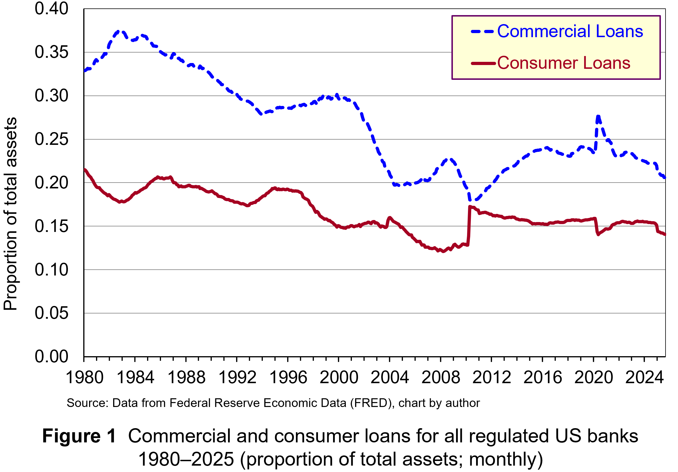 These regulatory developments created an incentive to pursue activities which do not require as much capital, since their marginal cost is lower and potential return is higher. Consequently, banks have placed less emphasis on lending and more on purchasing short-term and long-term financial securities and generating non-interest income from off-balance sheet activities. For instance, research by the Bank of England found that during the 1980s, interest income accounted for more than two-thirds of total income for large international banks. In contemporary times, non-interest income tends to be greater than interest income. Figure 1 illustrates the declining proportion of total assets represented by commercial and consumer loans for all regulated US banks. (Click here for a PowerPoint.)
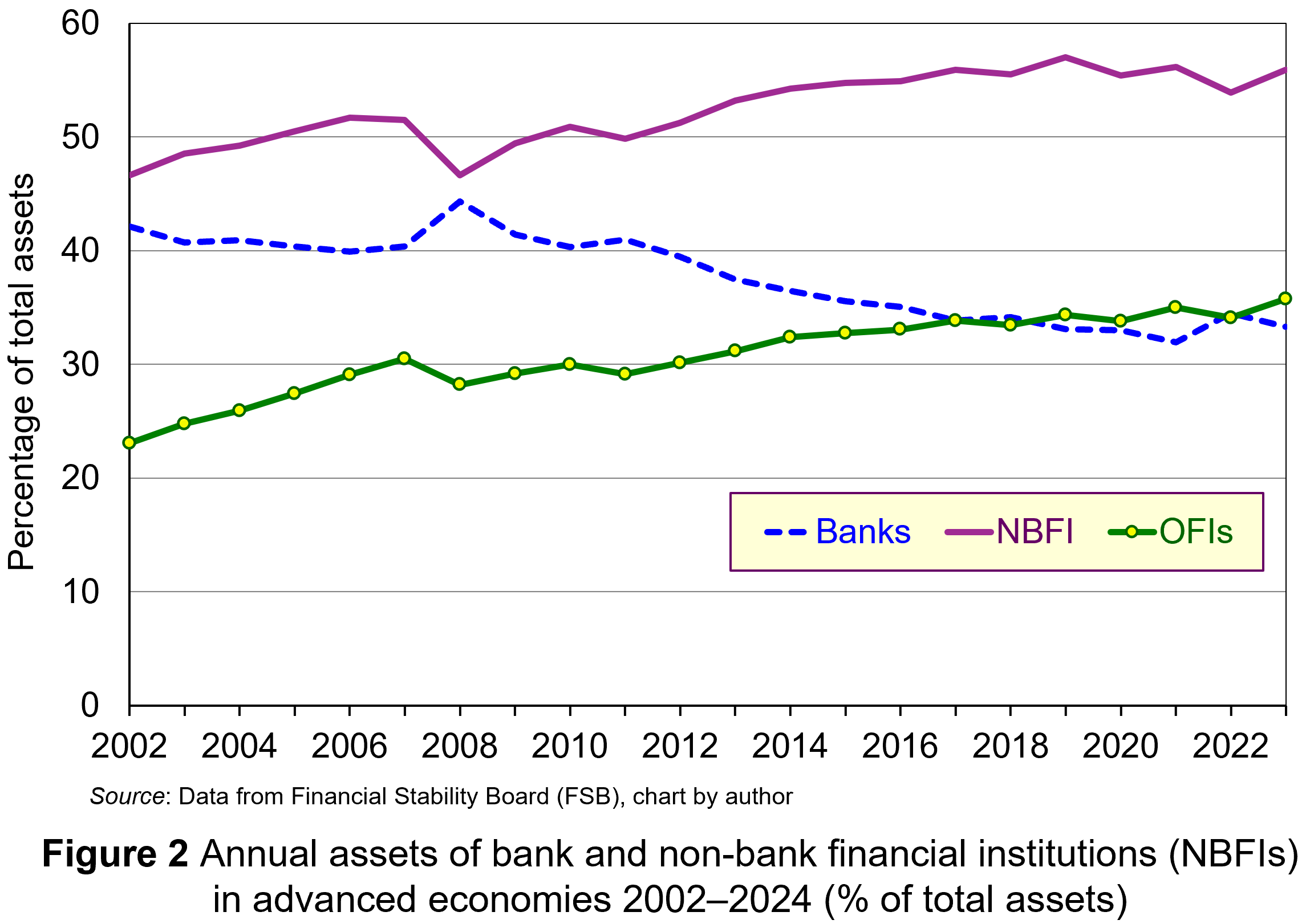 With banks originating less lending, activity has migrated to different avenues in the shadow-banking sector. This sector has always existed, but deregulation and financial innovation created opportunities for the growth of shadow banking – lending which is not financed with deposits. Traditionally, non-bank financial intermediaries (NBFIs), such as pension funds, hedge funds and insurance companies, use funds from investors to buy securities through financial markets. However, new types of NBFIs have emerged which originate loans themselves, notably private credit institutions. As Figure 2 illustrates, a lot of the expansion in the activities of NBFIs has been the due to increased lending by these institutions (defined as ‘other financial institutions (OFIs)). Note that the NBFI line includes OFIs. (Click here for a PowerPoint.)
Since, NBFIs operate outside conventional regulatory frameworks, their credit intermediation and maturity transformation are not subject to the same capital requirements or oversight that banks are. As a result, they do not need to have the same level of capital to insulate against loan losses. Therefore, lending in the shadow-banking sector has a lower marginal cost compared to equivalent lending in the banking sector. Consequently, it generates a higher rate of return. This can explain the large growth in the assets of OFIs illustrated in Figure 2.
Risks in shadow banking
 Banking involves trade-offs and this is the case whether the activities happen in the regulated or shadow-banking sector. Increasing lending increases profitability. But as lending continues to increase, at some point the risk-return profile becomes less favourable since institutions are lending to increasingly higher-risk borrowers and for higher-risk projects.
In downturns, when rates of defaults rise, such risks become apparent. Borrowers fail and default, causing significant loan losses for lenders. With lower levels of capital, NBFIs will have a lower buffer to insulate investors from these losses, increasing the likelihood of default.
Is this a problem? Well, for a long-time regulators thought not. It was thought that failures in the shadow-banking sector would have no implications for deposit-holders in regulated banks and the payments mechanism. Unfortunately, current developments in the USA have highlighted that this is unlikely to be the case.
The connections between regulated and shadow banking
 The financial system is highly interconnected, and each successive financial crisis has shown that systemic risks lurk in obscure places. On the face of it, NBFIs appear separate from regulated banks. But banks’ new business models have not removed them from the lending channel, merely changed their role. Short-term financing used to be conducted and funded by banks. Now, it is conducted by NBFIs, but still financed by banks. Long-term loan financing is no longer on banks’ balance sheets. However, while the lending is conducted by NBFIs, it is largely funded by banks.
NBFIs cannot be repositories of liquidity. Since they do not have deposits and are not part of the payments system, they have no access to official liquidity backstops. So, they do so indirectly by using deposit-taking banks as liquidity insurance. Banks provide this liquidity in a variety of ways:
- Investing in the securities issued by private capital funds;
- Providing bridge financing to credit managers to securitise credit card receivables;
- Providing prime broker financing to a hedge fund engaged in proprietary trading.
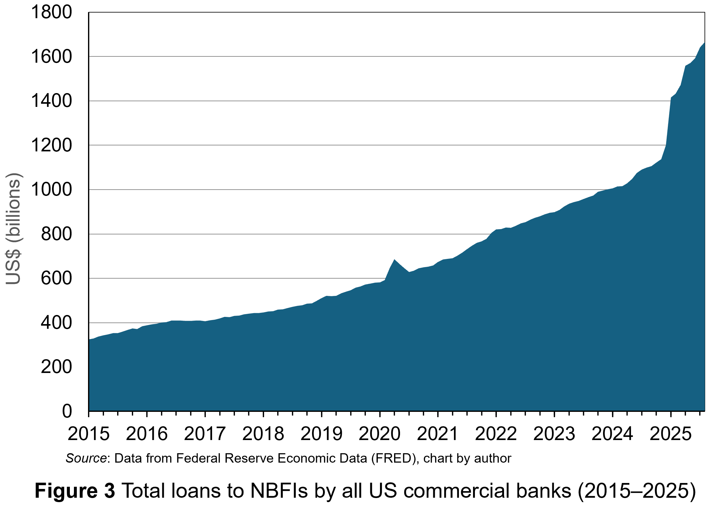 Furthermore, banks have increasingly made loans to NBFIs. Data for US commercial banks lending to the shadow-banking sector are publicly available only since 2015. But, as Figure 3 illustrates, it has seen a steady upward trend with a surge in activity in 2025. (Click here for a PowerPoint.)
Banks had an incentive to diversify into these activities since they are a source of revenue requiring less regulatory capital. The model requires risk and return to follow capital out of the banking system into the shadow-banking sector. However, while risky capital and its associated expected return have moved in the shadow-banking system, not all of the liquidity and credit default risk may have done so. Ultimately, some of that risk may be borne by the deposit-holders of the banks.
This is not an issue if banks are fully aware of the risks. However, problems arise when banks do not know the full risks they are taking.
There are reasons why this may be the case. Credit markets involve significant asymmetric information between lenders and borrowers. This creates conditions for the classic problems of moral hazard and adverse selection.
Moral hazard is a hidden action problem, whereby borrowers take greater risks because they share the possible downside losses with the lender. Adverse selection is the hidden information problem, whereby lenders do not have full information about the riskiness of borrowers or their activities.
The economics of information suggests that banks exploit scale, scope and learning economies to overcome the costs associated with asymmetric information in lending. However, that applies to direct lending when banks have full information about credit default risk on their loan book. When banks finance lending indirectly through NBFIs, there is an extension of the intermediation chain, and while banks may know the NBFIs, they will have much less information about the risks associated with the lending they are ‘underwriting’. This heightens their problems of asymmetric information associated with credit default risk.
What are the risks at present?
 The level of debt in the global economy is at unprecedented levels. Data from the International Monetary Fund (IMF) show that it rose to $351 trillion dollars in 2024, approximately 235% of weighted global gross domestic product (GDP). It is in this environment that private credit channels through NBFIs have been expanding. With this, it is more likely that NBFIs’ trade-off between credit risk and return has tilted greatly in favour of the former. Some point to the recent collapse of Tricolor and First Brands – both intermediary financing companies funded by private credit – as evidence of elevated levels of risk.
Many are pointing out that the failures observed in the USA so far have a whiff of fraud associated with them, with suggestions of multiple loans being secured against the same working capital. However, such behaviour is symptomatic of ‘late-cycle’ lending, where the incentive to squeeze more profit from lending in a more competitive environment leads to short-cuts – short-cuts that banks, at one stage removed along the intermediation chain, will have less information about.
It is in a downturn that such risks become apparent. Widening credit spreads and the reduced availability of credit causes financial stress for higher-risk borrowers. Inevitably, that higher risk will lead to higher defaults, more provision for loan losses and write-downs in the value of loan assets.
While investors in NBFIs are first in line to bear the losses, they are not the only ones exposed. At moments of stress, the credit lines that banks have provided get drawn and that increases the exposure of banks to the risks associated with NBFIs and whoever they have lent to. As NBFIs fail, the financing provided by banks will not be repaid and they will thus have to absorb losses associated with the lending of the NBFIs. So, while it appears that risk has left the banking system, it hasn’t. Ultimately, the liquidity and credit default risk of the non-bank sector is financed by bank deposits.
Furthermore, the opaqueness of the exposure of banks to risks in the shadow-banking sector may have issues for the wider financial system. In 2008, banks became wary of lending to each other during the financial crisis because they didn’t know the exposure of counterparty institutions to losses from securitised debt instruments. Now, as more and more banks reveal exposures to NBFIs, concerns about the unknown position of other banks may produce a repeat of the credit crunch which occurred then. A seizing up of credit markets will worsen any downturn. However, unlike 2008, the financial resources available to central banks and governments to deal with any consequences are severely limited.
Only time and the path of the US economy will reveal the extent of any contagion related to lending in the shadow-banking sector. However, central banks are already worried about the risks associated with the shadow-banking sector and have been taking steps to identify and ameliorate them. Events in the USA over the past few weeks may accelerate the process and bring more of that lending within the regulatory cordon.
Articles
- Bank chief says US firm collapses ring ‘alarm bells’
BBC News, Michael Sheils McNamee (21/10/25)
- BoE finds non-bank financial firms pose wider risks in crisis periods
Reuters, Lawrence White (2/12/24)
- Global Debt Remains Above 235% of World GDP
IMF Blogs, Vitor Gaspar, Carlos Eduardo Goncalves and Marcos Poplawski-Ribeiro (17/9/25)
- IMF sounds alarm about high global public debt, urges countries to build buffers
Reuters, Andrea Shalal (15/10/25)
- Major international banks performance 1980-91
Quarterly Bulletin 1992 Q3, Bank of England (1/9/92)
- Shadow Banking System: Definition, Examples, and How It Works
Investopedia, Michael Bromberg (18/10/24)
- What is private credit, and should we be worried by the collapse of US firms?
The Guardian, Kalyeena Makortoff (18/10/25)
Academic paper
Data
Questions
- Explain why the need to hold more capital raises its cost for banks.
- Why does this reduce the lending they undertake?
- What is the attraction of ‘off-balance sheet transactions’ for regulated banks?
- Analyse the asymmetric information that banks face when providing liquidity to non-bank financial institutions (NBFIs).
- Examine the dangers for the financial system associated with regulated banks’ exposure to NBFIs?
- Discuss some policy recommendations regarding bank lending to NBFIs.
Examples of rent seeking in economic theory
 In March 2024, two people were convicted of running a business that used dishonest and illegal methods to buy and sell tickets for popular live events such as Ed Sheeran, Lady Gaga and Little Mix concerts. Between June 2015 and December 2017, this business purchased 47 000 tickets using 127 names and 187 different e-mail addresses.
Economists refer to these actions as examples of rent seeking. However, many rent-seeking activities are not illegal.
What is rent seeking?
Rent seeking in economic theory refers to costly actions taken by people (i.e. they involve effort and expertise) to try to gain a greater share of a given level of profit /surplus. These actions do not generate any extra surplus or value for society and typically involve people trying to game or manipulate a situation or system for their own personal gain.
In many cases, the opportunity cost of these actions can be considerable. In this case, the opportunity cost is the surplus for society that could have been gained if this effort/expertise had been used to carry out more productive tasks.
A widely cited example of rent seeking is where firms exert time and effort to try to influence government policy through lobbying. Most lobbying activities in the UK are not illegal.
Non-price allocation
When prices are set below the market-clearing rate, by either the government or a private organisation, the quantity demanded of the good/service will exceed the quantity supplied. Therefore, non-price allocation must play a role. In other words, some method other than willingness to pay the price, must be used to determine which consumers receive the goods.
In some instances, such as visits to the GP or places at state schools, the good or service has a zero monetary price. In these cases. non-price allocation methods completely replace the role of the price in determining which consumers obtain the goods/services.
In other examples, a positive monetary price is set, but below the market-clearing rate. In these cases, the price partly determines who get the good/service (i.e. people must be willing to pay the non-market-clearing price), but non-price allocation also plays a role. The further below the market-clearing level the price is set, the greater the potential role for non-price methods.
Some common methods of non-price allocation include:
- First-come first served. This typically results in some type of queueing, either in person or online (a virtual queue).
- A random selection process. For example, some goods/services are allocated via a lottery, with names of consumers being randomly drawn.
- The government or other public bodies in charge of allocating the good develop a set of rules to determine which consumers/people get the good. For example, when allocating places at popular state schools, priority is often given to children who live close to the school (i.e. in the catchment area) or who live in families with certain religious beliefs.
Examples of rent seeking
When non-price methods of allocation are implemented, can consumers engage in activities that increase their chances of getting hold of the good/service? Can they manipulate the system for their own advantage and gain a greater share of any surplus? This is rent seeking.
 A survey carried out in January 2025 provides some interesting evidence of rent-seeking actions taken by parents to try to secure a place for their child at a popular school. Twenty-seven per cent of the respondents admitted they had tried to manipulate the system to get their child into their preferred school. Out of those who admitted attempting to manipulate the system:
- 30 per cent registered a child at either another family member’s or friend’s address that was closer to a popular school.
- 25 per cent exaggerated religious beliefs and attended church services to try to secure a school place.
- 9 per cent temporarily rented a second home inside the catchment area for the school.
- 7 per cent moved into the catchment area for the application, only to move out once their child’s place was secured.
Some of these actions may be dishonest but are not illegal.
Rent-seeking activities in the ticketing market for live events
In the primary market for tickets, prices for popular live events are often set below market-clearing levels. Therefore, non-price methods, such as first come, first served, are used to allocate the tickets. This typically results in some type of queueing. Rent-seeking activities include actions taken by consumers to increases their chances of getting nearer to the front of the queue.
 If the tickets are being sold from a physical outlet (i.e. a sales kiosk), then some consumers may start queueing many hours before the kiosk opens – in some cases camping overnight. An example is the ‘The Queue’ for Wimbledon tennis matches. Rather than queueing themselves, some people might pay others to queue on their behalf.
People who are paid to queue are sometimes referred to as a ‘line stander’, ‘queue stander’, ‘line sitter’ or ‘queue professional’. Line standers offer their services via market platforms, such as TaskRabbit.
When tickets are sold online, non-market allocation includes both queuing and random selection. Typically, people have to create an account with the primary market ticketing website (Ticketmaster, See Tickets, Eventbrite or AXS) before the sale begins. Then, using this account, they can enter an online waiting room around 15 minutes before the tickets are available to purchase. There is thus an element of first come, first served. When the sale starts, people in the waiting room are randomly allocated a place in the online queue. Once they reach the front of the online queue, the event organiser normally places limits on the number of tickets they can purchase.
 What can people do to manipulate this system and so increase their chances of purchasing tickets? In other words, what are the possible rent-seeking activities? One possibility is to create multiple accounts using the details of friends/family and then join the waiting room with each of these accounts using separate devices. Professional resellers often try to use specialist software, called bots, that can create thousands of fake accounts and so significantly increase the chances of getting to the front of the queue. Once they get to the front of the queue, an account created by a bot can proceed through the purchasing process much faster than a person can. The tickets can then be sold for a profit in the uncapped secondary market via websites such as Stubhub and Viagogo.
The UK government passed a law in 2017 that made the use of bots to circumvent ticket purchase limits an illegal activity. The use of ticket bots in the EU became illegal in 2022. Primary market ticketing websites have also invested in technology that tries to detect and block the use of this type of software.
Government policy in the resale of tickets
 Should the government prohibit the resale of tickets or implement a resale price cap to try to deter this rent-seeking activity?
Many economists would oppose this policy because of the benefits of the secondary market. For example, resale helps to reallocate tickets to those consumers with the highest willingness to pay. Therefore, the secondary-ticketing market can have a positive impact on allocative efficiency, but it comes at a cost – rent-seeking activities.
Research by economists published more than ten years ago found that the positive impact of the resale market on allocative efficiency outweighed the rent-seeking costs. However, developments in technology have increased the level of rent seeking in recent years, making it easier and less costly for professional resellers to purchase large amounts of tickets in the primary market. Therefore, it is possible that the rent-seeking cost of the secondary market now exceeds its positive impact on allocative efficiency. A case can thus be made for greater intervention by the government.
Recent accusations have also been made about possible rent-seeking activities by sellers in the primary ticketing market too, adding to concerns.
Some of the problems of implementing a resale price cap were discussed in a previous post: Ticket resales – is it time to introduce a price cap?
Articles
- Admission Impossible: Over a quarter of parents admit to ‘lying or bending’ rules to get their children into preferred schools
Zoopla (23/1/25)
- Diss ticket touts convicted in £6.5m reselling scheme
BBC News, Norfolk, Orla Moore & PA Media (13/3/24)
- These touts made millions – and claimed staff at big ticketing firms helped
BBC News, Chi Chi Izundu and James Stewart (12/6/25)
- Touts employ overseas workers to bulk-buy gig tickets
BBC News, Steffan Powell, Sian Vivian & Ben Summer (26/6/25)
- Online ticket touts jailed for fraud
National Trading Standards, News (17/5/24)
- Resale and Rent-Seeking: An Application to Ticket Markets
Review of Economic Studies, Phillip Leslie and Alan Sorensen (2014, 81, pp. 266–300)
- Ticketmaster, Live Nation face US suit over resale tactics
BBC News, Danielle Kaye (18/9/25)
Information
Questions
- Compare and contrast the meaning of the word ‘rent’ in everyday language with its use in economic theory.
- Give examples of some policies that a business might lobby the government to implement. What arguments might the business make to justify each of these policies?
- Outline some of the non-price methods that are used to allocate health care in the UK.
- Draw a demand and supply diagram to illustrate the incentives for rent-seeking activities when prices are set below market-clearing levels.
- Outline some potential rent-seeking activities by sellers in the primary ticketing market.
- Discuss some of the opportunity costs of rent-seeking activity in the market for tickets.
- Explain why the growing use of paid line standers might increase the demand for a good/service.
- Explain why the percentage of tickets for popular live events purchased by professional resellers has increased in the past 10 years.
 In my previous blog post on this site, I examined how AI-powered pricing tools can act as a ‘double-edged sword’: offering efficiency gains, while also creating opportunities for collusion. I referred to one of the early examples of this, which was the case involving Trod Ltd and GB Eye, where two online poster and frame sellers on Amazon used pricing algorithms to monitor and adjust their prices. However, in this instance there was also an explicit agreement between the firms. As some commentators put it, it was ‘old wine in new bottles‘, meaning a fairly conventional cartel that was simply facilitated through digital tools.
 One of the other growing concerns is the ability of AI pricing algorithms to facilitate collusion by acting as a ‘hub’ in a ‘hub-and-spoke’ arrangement. In this type of collusion, competing firms (the ‘spokes’) need not communicate directly with one another. Instead, the ‘hub’ helps them to co-ordinate their actions.
 n the RealPage case, the authorities reported that they had access to internal documents and statements from the parties involved, which helped support their allegations. These included references within RealPage to helping landlords ‘avoid the race to the bottom’ and comments from a landlord describing the software as ‘classic price fixing’.
  Every year, world leaders gather to find ways of limiting global warming. The latest of these ‘COP’ meetings, COP30, is in Belém, Brazil from 10 to 20 November 2025. COP stands for ‘Conference of the Parties’, the decision-making body of the United Nations Framework Convention on Climate Change (UNFCCC).
 Since 2020, each country has been required to submit its own emissions-reduction targets, known as ‘nationally determined contributions’ (NDCs), and the actions it will take to meet them. Every five years each country must submit a new NDC more ambitious than the last. New NDCs are due this year. As of 12 November, 112 of the 197 countries had submitted a new NDC (including the USA, China, the EU and the UK). These 112 countries account for around 71 per cent of global emissions.
 As well as announcing that the USA will withdraw from the Paris Agreement in January 2026, since coming to office in 2025, President Trump has given billions of dollars of tax cuts to fossil fuel firms and allowed drilling for oil and gas on federal lands. At the same time, he has described renewable energy as ‘a joke’ that will bankrupt countries and has slashed subsidies and tax breaks for solar and wind power, withdrawn permits for wind and solar farms, and cut funding for green energy research.
 Climate change is directly caused by market failures. One of the most important of these is that the atmosphere is a common resource: it is not privately owned; it is a global ‘commons’. Individuals and firms use it at a zero price. If the price of any good or service to the user is zero, there is no incentive to economise on its use. Thus for the emitter there are no private costs of using the atmosphere in this way as a ‘dump’ for their emissions and, in a free market, no incentive to reduce the climate costs.
 These climate costs are external costs to the firm and are illustrated in the figure. It shows an industry that emits CO2. To keep the analysis simple, assume that it is a perfectly competitive industry with demand and supply given by curves D and S, which are equal to the marginal private benefits (MPB) and marginal private costs (MPC), respectively. There are no externalities on the demand side and hence MPB equals the marginal social cost (MSB). Market equilibrium is at point a, with output at Qpc and price at Ppc. (Click
  In other words, other things being equal, the free market overproduces products with climate externalities. If the output is to be reduced to the social optimum of Q*, then the government will need to take measures such as those advocated in the Paris Agreement. These could include imposing taxes on products, such as electricity generated by fossil fuels, or on the emissions themselves. Or green alternatives, such as wind power, could be subsidised.
 The USA is not attending COP30 in Brazil. Nor is the Chinese leader, Xi Jinping. However, there are growing opportunities for translating aims into practical policies for specific sectors, such as energy, transport and carbon-intensive industries. These policies may require some degree of government action – taxes, subsidies or regulation – to internalise climate externalities. But increasingly, green alternatives are becoming economically viable without subsidies or with just initial government funding to ‘crowd in’ private investment, which will then attract further private capital as external economies of scale kick in. Increasingly investors will find profitable opportunities in climate-friendly projects.
 The productivity gap between the UK and its main competitors is significant. In 2024, compared to the UK, output per hour worked was 10.0% higher in France, 19.8% higher in Germany and 41.1% higher in the USA. These percentages are in purchasing-power parity terms: in other words, they reflect the purchasing power of the respective currencies – the pound, the euro and the US dollar.
 The productivity gap is not a new phenomenon. It has been substantial and growing over the past 20 years. (The exception was in 2020 during lockdowns when many of the least productive sectors, such as hospitality, were forced to close temporarily.)

 Encouraging investment. Over the years, UK governments have increased investment allowances, enabling firms to offset the cost of investment against pre-tax profit, thereby reducing their tax liability. For example, in the UK, companies can offset a multiple of research and development costs against corporation tax. The rate of relief for small and medium-sized enterprises (SMEs) allows companies that work in science and technology to deduct an extra 86% of their qualifying expenditure from their trading profit in addition to the normal 100% deduction: i.e. a total of 186% deduction. Meanwhile, since April 2016, larger companies have been able to claim a R&D expenditure credit, initially worth 11 per cent of R&D expenditures, then 12 per cent from 2018 and 13 per cent from 2020. This was then raised to 20 per cent from 2023.
 They also discuss the role that AI plays, or could play, in doing otherwise time-consuming tasks, such as recording and paying invoices and record keeping in offices; writing grants or producing policy documents; analysing X-ray results in hospitals and performing preliminary diagnoses when patients present with various symptoms; recording conversations/consultations and then sorting, summarising and transcribing them; building AI capabilities into machines or robots to enable them to respond to different specifications or circumstances; software development where AI writes the code. Often, there is a shortage of time for workers to do more creative things. AI can help release more time by doing a lot of the mundane tasks or allowing people to do them much quicker.
 Recently, a flurry of bankruptcies among non-bank financial intermediaries (NBFIs) in the USA has drawn attention to the risks associated with alternative credit channels in the shadow-banking sector – lending which is not financed with deposits. There is concern that this could be the start of a wave of bankruptcies among such NBFIs, especially given concerns about a potential downswing in the economic cycle – a time when defaults are more likely.
  In the 1980s, international regulations around traditional banking activities – taking deposits and making loans – were being formalised by the Bank for International Settlements (BIS) under what became known as the Basel framework (see, for example, Economics section 18.2 or Economics for Business section 28.2). For the first time, this stipulated liquidity and capital requirements for international banks relating to their traditional lending activities. However, at the same time the deregulation of financial markets and financial innovation provided banks with opportunities to derive revenues from a range of other financial services.
  These regulatory developments created an incentive to pursue activities which do not require as much capital, since their marginal cost is lower and potential return is higher. Consequently, banks have placed less emphasis on lending and more on purchasing short-term and long-term financial securities and generating non-interest income from off-balance sheet activities. For instance, research by the Bank of England found that during the 1980s, interest income accounted for more than two-thirds of total income for large international banks. In contemporary times, non-interest income tends to be greater than interest income. Figure 1 illustrates the declining proportion of total assets represented by commercial and consumer loans for all regulated US banks. (Click
  With banks originating less lending, activity has migrated to different avenues in the shadow-banking sector. This sector has always existed, but deregulation and financial innovation created opportunities for the growth of shadow banking – lending which is not financed with deposits. Traditionally, non-bank financial intermediaries (NBFIs), such as pension funds, hedge funds and insurance companies, use funds from investors to buy securities through financial markets. However, new types of NBFIs have emerged which originate loans themselves, notably private credit institutions. As Figure 2 illustrates, a lot of the expansion in the activities of NBFIs has been the due to increased lending by these institutions (defined as ‘other financial institutions (OFIs)). Note that the NBFI line includes OFIs. (Click
  Banking involves trade-offs and this is the case whether the activities happen in the regulated or shadow-banking sector. Increasing lending increases profitability. But as lending continues to increase, at some point the risk-return profile becomes less favourable since institutions are lending to increasingly higher-risk borrowers and for higher-risk projects.
 The financial system is highly interconnected, and each successive financial crisis has shown that systemic risks lurk in obscure places. On the face of it, NBFIs appear separate from regulated banks. But banks’ new business models have not removed them from the lending channel, merely changed their role. Short-term financing used to be conducted and funded by banks. Now, it is conducted by NBFIs, but still financed by banks. Long-term loan financing is no longer on banks’ balance sheets. However, while the lending is conducted by NBFIs, it is largely funded by banks.
 Furthermore, banks have increasingly made loans to NBFIs. Data for US commercial banks lending to the shadow-banking sector are publicly available only since 2015. But, as Figure 3 illustrates, it has seen a steady upward trend with a surge in activity in 2025. (Click
  The level of debt in the global economy is at unprecedented levels. Data from the International Monetary Fund (IMF) show that it rose to $351 trillion dollars in 2024, approximately 235% of weighted global gross domestic product (GDP). It is in this environment that private credit channels through NBFIs have been expanding. With this, it is more likely that NBFIs’ trade-off between credit risk and return has tilted greatly in favour of the former. Some point to the recent collapse of Tricolor and First Brands – both intermediary financing companies funded by private credit – as evidence of elevated levels of risk.
 A survey carried out in January 2025 provides some interesting evidence of rent-seeking actions taken by parents to try to secure a place for their child at a popular school. Twenty-seven per cent of the respondents admitted they had tried to manipulate the system to get their child into their preferred school. Out of those who admitted attempting to manipulate the system:
 If the tickets are being sold from a physical outlet (i.e. a sales kiosk), then some consumers may start queueing many hours before the kiosk opens – in some cases camping overnight. An example is the ‘The Queue’ for Wimbledon tennis matches. Rather than queueing themselves, some people might pay others to queue on their behalf.
  What can people do to manipulate this system and so increase their chances of purchasing tickets? In other words, what are the possible rent-seeking activities? One possibility is to create multiple accounts using the details of friends/family and then join the waiting room with each of these accounts using separate devices. Professional resellers often try to use specialist software, called bots, that can create thousands of fake accounts and so significantly increase the chances of getting to the front of the queue. Once they get to the front of the queue, an account created by a bot can proceed through the purchasing process much faster than a person can. The tickets can then be sold for a profit in the uncapped secondary market via websites such as Stubhub and Viagogo.
 Should the government prohibit the resale of tickets or implement a resale price cap to try to deter this rent-seeking activity?