 With the bounce-back from the pandemic, many countries have experienced supply-chain problems. For example, the shortage of lorry drivers in the UK and elsewhere (see the blog Why is there a driver shortage in the UK?) has led to empty shelves, fuel shortages and rising prices. The problem has been exacerbated by a lack of stock holding. Holding minimum stocks has been part of the modern system of ‘just-in-time’ (JIT) supply-chain management.
JIT involves involves highly integrated and sophisticated supply chains. Goods are delivered to factories, warehouses and shops as they are needed – just in time. Provided firms can be sure that they will get their deliveries on time, they can hold minimum stocks. This enables them to cut down on warehousing and its associated costs. The just-in-time approach to supply-chain management was developed in the 1950s in Japan and since the 1980s has been increasingly adopted around the world, helped more recently by sophisticated ordering and tracking software.
 If supply chains become unreliable, however, JIT can lead to serious disruptions. A hold-up in one part of the chain will have a ripple effect along the whole chain because there is little or no slack in the system. When the large container ship, the Ever Given, en route from Malaysia to Felixtowe, was wedged in the Suez canal for six days in March this year, the blockage caused shipping to be backed up. By day six, 367 container ships were waiting to transit the canal. The disruption to supply cost some £730m.
JIT works well when sources of supply and logistics are reliable and when demand is predictable. The pandemic is causing many logistics and warehousing managers to consider building a degree of slack into their systems. This might involve companies having alternative suppliers they can call on, building in more spare capacity and having their own fleet of lorries or warehousing facilities that can be hired out when not needed but can be relied on at times of high demand.
When the ‘bounce back’ subsides, so may the current supply chain bottlenecks. But the rethinking that has been generated by the current problems may see new patterns emerge that make supply chains more flexible without becoming more expensive.
Articles
- What Is a Just-in-Time Supply Chain?
The Balance Small Business, Martin Murray (12/10/20)
- Why it’s high time to move on from ‘just-in-time’ supply chains
The Guardian, Kim Moody (11/10/21)
- Logistics Study Reveals Three Potential Cures To Global Supply Chain Problems
Forbes, Garth Friesen (20/9/21)
- Just-in-Time Manufacturing Needs Better Data
Supply & Demand Chain Executive, Paul Lachance (8/10/21)
- Just-in-time supply chains after the Covid-19 crisis
VoxEU, Frank Pisch (30/6/20)
- Plastics industry moves away from just-in-time logistics amid increased volatility
S&P Global, Miguel Cambeiro, Baoying Ng and George Griffiths (8/10/21)
- Just-in-time supply chains have left us dependent and with just-not-enough
CityAM, Tom Tugendhat MP (1/10/21)
- Supply chain havoc is getting worse — just in time for holiday shopping
Vox, Rebecca Heilweil (7/10/21)
- Ever Given and the Suez Canal: A list of affected ships and what delays mean for shippers
Supply Chain Dive, Matt Leonard (25/3/21)
Questions
- What are the costs and benefits of a just-in-time approach to logistics?
- Are current supply chain problems likely to be temporary or are there issues that are likely to persist?
- How might the JIT approach be reformed to make it more adaptable to supply chain disruptions?
 The BBC podcast linked below looks at the use of quantitative easing since 2009 and especially the most recent round since the onset of the pandemic.
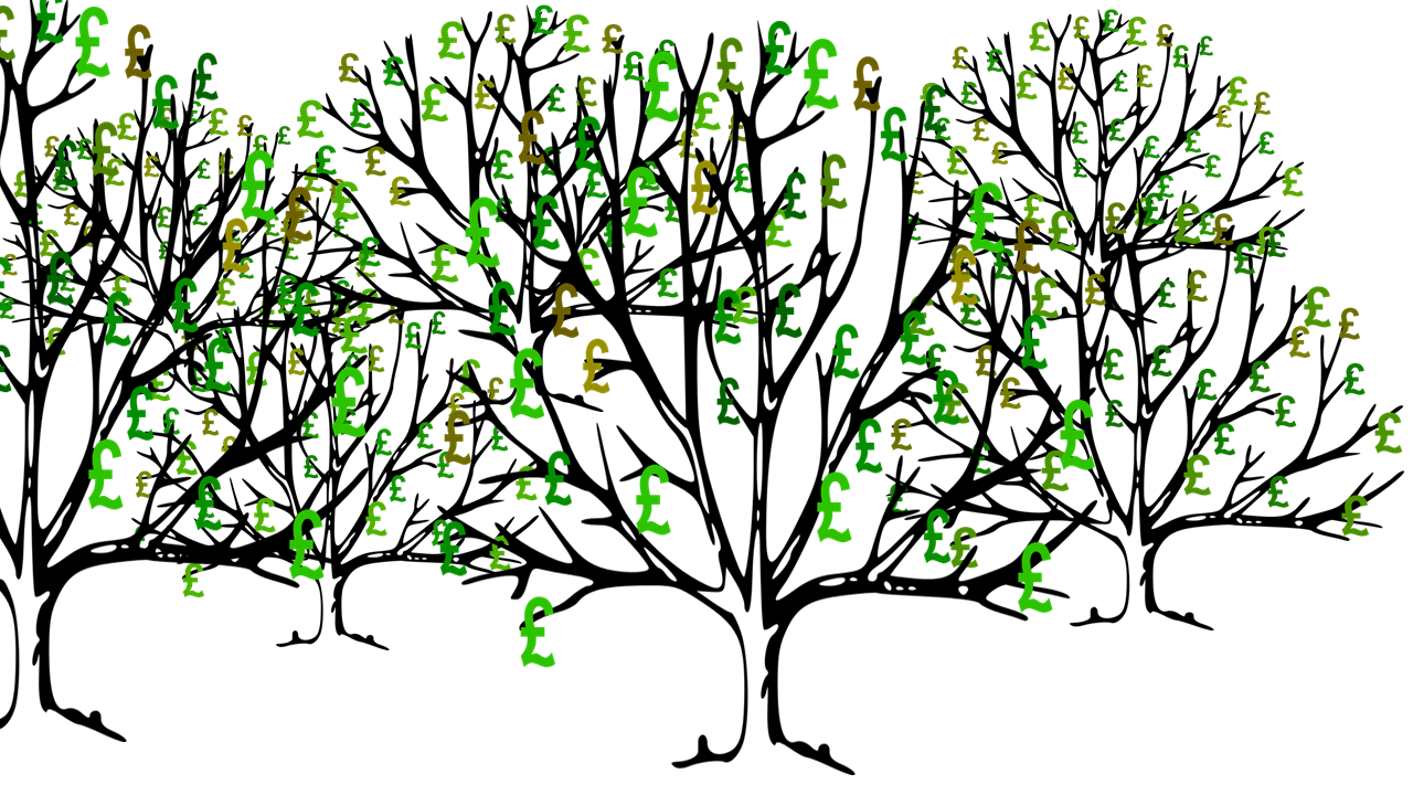
Although QE was a major contributor to reducing the depth of the recession in 2009–10, it was barely used from 2013 to 2020 (except for a short period in late 2016/early 2017). The Coalition and Conservative governments were keen to get the deficit down. In justifying pay restraint and curbing government expenditure, Prime Ministers David Cameron and Theresa May both argued that there ‘was no magic money tree’.
But with the severely dampening effect of the lockdown measures from March 2020, the government embarked on a large round of expenditure, including the furlough scheme and support for businesses.
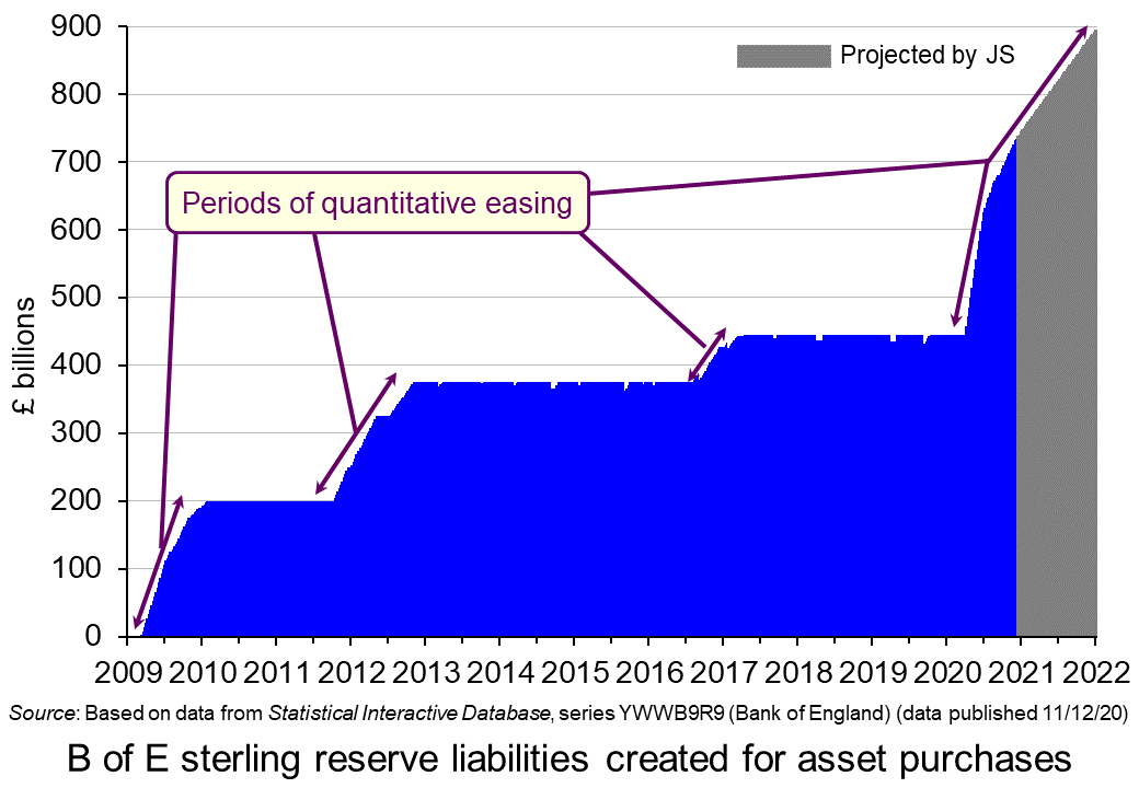 The resulting rise in the budget deficit was accompanied by a new round of QE from the beginning of April. The stock of assets purchased by the Bank of England rose from £445 billion (the approximate level it had been since March 2017) to £740 billion by December 2020 and is planned to reach £895 billion by the end of 2021.
So with the effective funding of the government’s deficits by the creation of new money, does this mean that there is indeed a ‘magic money tree’ or, indeed, a ‘magic money forest’? And if so, is it desirable? Is it simply stoking up problems for the future? Or will, as modern monetary theorists maintain, the extra money, if carefully spent, lead to faster growth and a reducing deficit, with low interest rates making it easy to service the debt?
The podcast explores these issues. There is then a longer list of questions than normal relating to the topics raised in the podcast.
Podcast
Questions
- Which of the following are stocks and which are flows?
(a) Money
(b) Income
(c) The total amount people save each month
(d) The money held in savings accounts
(e) Public-sector net debt
(f) Public-sector net borrowing
(g) National income
(h) Injections into the circular flow of income
(i) Aggregate demand
(j) Wealth
- How do banks create money?
- What is the role of the Debt Management Office in the sale of gilts?
- Describe the birth of QE.
- Is raising asset prices the best means of stimulating the economy? What are the disadvantages of this form of monetary expansion?
- What are the possible exit routes from QE and what problems could occur from reducing the central bank’s stock of assets?
- Is the use of QE in the current Covid-19 crisis directly related to fiscal policy? Or is this use of monetary policy simply a means of hitting the inflation target?
- What are the disadvantages of having interest rates at ultra-low levels?
- Does it matter if the stock of government debt rises substantially if the gilts are at ultra-low fixed interest rates?
- What are the intergenerational effects of substantial QE? Does it depend on how debt is financed?
- How do the policy recommendations of modern monetary theorists differ from those of more conventional macroeconomists?
- In an era of ultra-low interest rates, does fiscal policy have a greater role to play than monetary policy?
 In his 1971 book, Income Distribution, Jan Pen, a Dutch economist, gave a graphic illustration of inequality in the UK. He described a parade of people marching by. They represent the whole population and the parade takes exactly one hour to pass by. The height of each person represents his or her income. People of average height are the people with average incomes – the observer is of average height. The parade starts with the people on the lowest incomes (the dwarfs), and finishes with those on the highest incomes (the giants).
Because income distribution is unequal, there are many tiny people. Indeed, for the first few minutes of the parade, the marchers are so small they can barely be seen. Even after half an hour, when people on median income pass by, they are barely waist high to the observer.
The height is growing with tantalising slowness, and forty-five minutes have gone by before we see people of our own size arriving. To be somewhat more exact: about twelve minutes before the end the average income recipients pass by.
In the final minutes, giants march past and then in the final seconds:
the scene is dominated by colossal figures: people like tower flats. Most of them prove to be businessmen, managers of large firms and holders of many directorships and also film stars and a few members of the Royal Family.
The rear of the parade is brought up by a few participants who are measured in miles. Indeed they are figures whose height we cannot even estimate: their heads disappear into the clouds and probably they themselves do not even know how tall they are.
Pen’s description could be applied to most countries – some with even more dwarfs and even fewer but taller giants. Generally, over the 43 years since the book was published, countries have become less equal: the giants have become taller and the dwarfs have become smaller.
The 2011 Economist article, linked below, uses changes in Gini coefficients to illustrate the rise in income inequality. A Gini coefficient shows the area between the Lorenz curve and the 45° line. The figure will be between 0 and 1 (or 0% and 100%). a figure of 0 shows total equality; a figure of 1 shows a situation of total inequality, where one person earns all the nation’s income. The higher the figure, the greater the inequality.
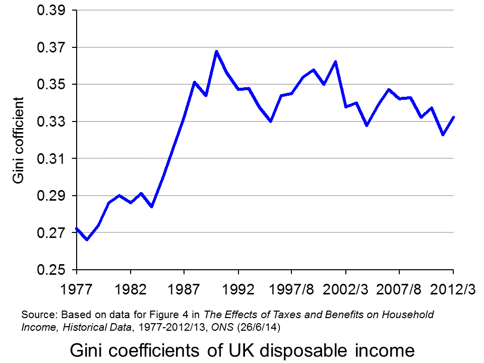
 The chart opposite shows changes in the Gini coefficient in the UK (see Table 27 in the ONS link below for an Excel file of the chart). As this chart and the blog post Rich and poor in the UK show, inequality rose rapidly during the years of the 1979–91 Thatcher government, and especially in the years 1982–90. This was associated with cuts in the top rate of income tax and business deregulation. It fell in the recession of the early 1990s as the rich were affected more than the poor, but rose with the recovery of the mid- to late 1990s. It fell again in the early 2000s as tax credits helped the poor. It fell again following the financial crisis as, once more, the rich were affected proportionately more than the poor.
 The most up-to-date international data for OECD countries can be found on the OECD’s StatExtracts site (see chart opposite: click here for a PowerPoint). The most unequal developed county is the USA, with a Gini coefficient of 0.389 in 2012 (see The end of the American dream?), and US inequality is rising. Today, the top 1% of the US population earns some 24% of national income. This compares with just 9% of national income in 1976.
Many developing countries are even less equal. Turkey has a Gini coefficient of 0.412 and Mexico of 0.482. The figure for South Africa is over 0.6.
When it comes to wealth, distribution is even less equal. The infographic, linked below, illustrates the position today in the USA. It divides the country into 100 equal-sized groups and shows that the top 1% of the population has over 40% of the nation’s wealth, whereas the bottom 80% has only 7%.
So is this inequality of income and wealth desirable? Differences in wages and salaries provide an incentive for people to work harder or more effectively and to gain better qualifications. The possibility of increased wealth provides an incentive for people to invest.
But are the extreme differences in wealth and income found in many countries today necessary to incentivise people to work, train and invest? Could sufficient incentives exist in more equal societies? Are inequalities in part, or even largely, the result of market imperfections and especially of economic power, where those with power and influence are able to use it to increase their own incomes and wealth?
Could it even be the case that excessive inequality actually reduces growth? Are the huge giants that exist today accumulating too much financial wealth and creating too little productive potential? Are they spending too little and thus dampening aggregate demand? These arguments are considered in some of the articles below. Perhaps, by paying a living wage to the ‘tiny’ people on low incomes, productivity could be improved and demand could be stimulated.
Infographic
 Wealth Inequality in America YouTube, Politizane (20/11/12)
Articles
The rise and rise of the cognitive elite The Economist (20/1/11)
Inequality in America: Gini in the bottle The Economist (26/11/13)
Pen’s Parade: do you realize we’re mostly dwarves? LVTFan’s Blog (21/2/11)
Here Are The Most Unequal Countries In The World Business Insider, Andy Kiersz (8/11/14)
Inequality in the World Dollars & Sense, Arthur MacEwan (Nov/Dec 14)
Britain is scared to face the real issue – it’s all about inequality The Observer, Will Hutton (19/1/14)
The tame inequality debate FundWeb, Daniel Ben-Ami (Nov 14)
Is inequality the enemy of growth? BBC News, Robert Peston (6/10/14)
Data
GINI index World Bank data
List of countries by income equality Wikipedia
The Effects of Taxes and Benefits on Household Income, 2012/13 ONS (see table 27)
Income Distribution and Poverty: Gini (disposale income) OECD StatExtract
Questions
- Distinguish between income and wealth. Is each one a stock or a flow?
- Explain how (a) a Lorenz curve and (b) a Gini coefficient are derived.
- What other means are there of measuring inequality of income and wealth other than using Gini coefficients (and giants and dwarfs!)?
- Why has inequality been rising in many countries over the years?
- How do (a) periods of rapid economic growth and (b) recessions affect income distribution?
- Define ‘efficiency wages’. How might an increase in wages to people on low incomes result in increased productivity?
- What is the relationship between the degree of inequality and household debt? What implications might this have for long-term economic growth and future financial crises? Is inequality the ‘enemy of growth’?
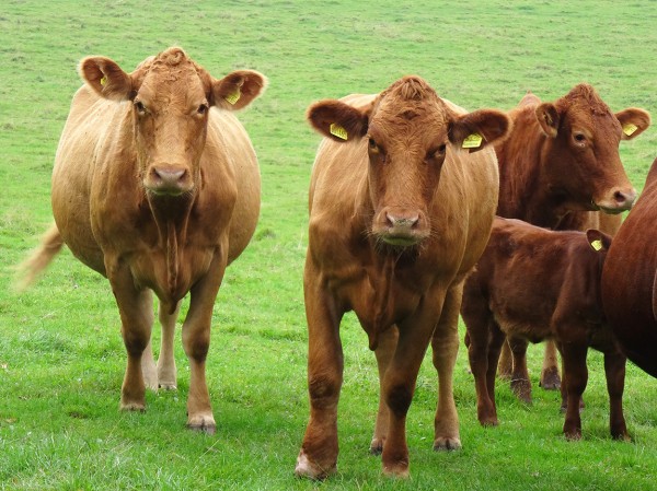
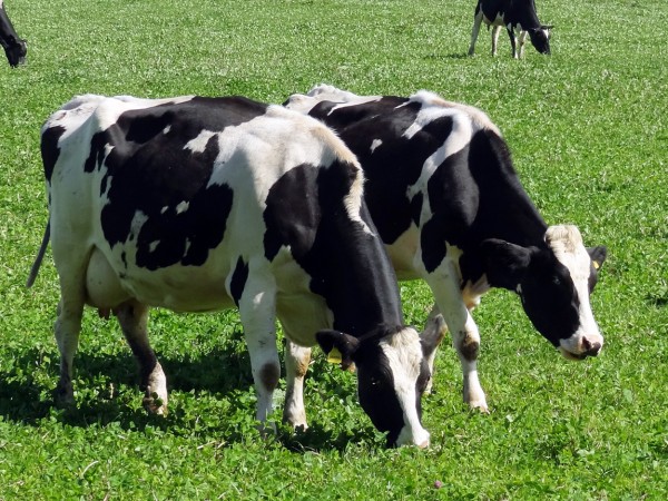
 ‘Farm-gate’ milk prices (the price paid to farmers) have been rising in the UK. In July they reached a record high of 31.4p per litre (ppl). This was 5.1ppl higher than in July 2012. There were further price rises this month (October). Sainsbury’s increased the price it pays farmers by nearly 2ppl to 34.15ppl and Arla Foods by 1.5ppl to 33.13ppl. Muller Wiseman is set to raise the price it pays to 32.5p per litre.
And yet many farmers are struggling to make a profit from milk production, claiming that their costs have risen faster than the prices they receive. Feed costs, for example, have risen by 2.12ppl. On average, farmers would need over 38p per litre just to cover their average variable costs. What is more, exceptional weather has reduced yields per cow by some 7%.
Meanwhile, in the USA, supply has risen by some 1.3% compared with a year ago. But despite this, the prices of dairy products are rising, thanks to strong demand. Cheese and butter prices, in particular, are rising rapidly, partly because of high demand from overseas. Demand for imported dairy products is particularly high in China, where supply has fallen by some 6% in the past couple of months.
 The problem for dairy farmers in the UK is partly one of the power balance in the industry. Farmers have little or no market power. Supermarkets, however, have considerable market power. As large oligopsonistic buyers, they can put downward pressure on the prices paid to their suppliers. These are mainly large processing firms, such as Robert Wiseman Dairies, Arla Foods and Dairy Crest. They, in turn, can use their market power to keep down the price they pay to farmers.
Articles
Dairy farmers renew protests over milk prices Farmers Weekly, Philip Case (5/9/13)
Dairy farmers ‘lost more than 1p/litre last year’ Farmers Weekly, Philip Case (2/10/13)
South West farming businesses and producers still making a loss on milk South West Business (3/10/13)
Q&A: Milk prices row and how the system works BBC News (23/7/12) (note date of this)
Positive Dairy Trend: Rising Milk Production and Strong Demand The Farmer’s Exchange, Lee Mielke (27/9/13)
Chinese supply crisis to delay dairy price adjustment Rabobank (25/9/13)
China milk ‘crisis’ fuels world dairy price rise Agrimoney (1/10/13)
Data
UK milk prices and composition of milk ONS
Combined IFCN world milk price indicator IFCN
Questions
- Give some examples of (a) variable costs and (b) fixed costs in milk production.
- Why may farmers continue in dairy production, at least for a time, even if they are not covering their average variable costs?
- What factors determine (a) the price of milk paid to farmers; (b) the retail price in supermarkets?
- Explain how dairy futures markets work.
- Could the milk processors use their market power in the interests of farmers? Is it in the interests of milk processors to do so?
- Why is there a Chinese “dairy supply crisis”? What is its impact on the rest of the world? What is the relevance of the price elasticity of demand for dairy products in China to this impact?
 In its report A Distorted Debate: the need for clarity on Debt, Deficit and Coalition Aims, the Centre for Policy Studies claims that the public is confused by economic terminology surrounding the government’s finances. We try and understand this confusion and offer a bath-time solution!
In a survey conducted for the Centre for Policy Studies only 10 per cent of Britons knew that despite cuts to parts of the government’s spending plans, the stock of public sector debt (also known as the national debt) is expected to rise by a further £60 billion by 2015. Rather, 47 per cent of respondents thought that debt would have fallen by this amount.
The confusion is not terribly surprising because there are two important core economic concepts that can confuse: stocks and flows. To try to help we will show how reference to a bath tub can hopefully eliminate the confusion. However, first, let us considerthe Coalition government’s principal fiscal objective. Its so-called fiscal mandate is for the cyclically-adjusted current budget to be in balance by 2015/16. In simple terms, the government wants to be able afford its day-to-day expenditures by this date, after taking into account where the economy is in the business cycle. In other words, if the economy’s output was at its sustainable or potential level in 2015-16 the government should be able to raise sufficient taxes to meet what it refers to as current expenditures. This would still allow the government to borrow to fund investment expenditure, e.g. infrastructural projects, which are enjoyed or consumed over a period of time.
An important thing to note about the fiscal mandate is that the government can expect to need to borrow money in order to afford its current expenditures up to 2015/16. Even beyond this date, assuming that the mandate can be met, it is likely to need money to afford capital expenditures. This is where we introduce the bath tub. Think of government spending as water coming through the bath taps while the taxes that government collect are water leaving through the plug hole. Therefore, spending and tax receipts are flows. If the water pouring into the bath (spending) is greater than the water leaving the bath (tax receipts), the level of water in the bath will rise. You can think of the water level in the bath as the stock of national debt. Therefore, if government is spending more than it receives it needs to borrow money. Borrowing is therefore a flow concept too. As it borrows, the stock of debt (the amount of water in our bath tub) rises.
So we know that government will continue to borrow in the near future. What it is hoping to be able to do, year by year, is begin to borrow less. It wants the deficit to fall. Then, if it can meet its target, it will at least be able to afford current expenditure (after adjustment for where the economy is in the cycle) by 2015/16. As the deficit begins to decline then the stock of debt will rise less quickly. But, the bath tub will continue to fill because more is flowing through the taps than is leaving through the plug hole. However, it will fill less quickly.
What our use of the bath tub analogy demonstrates is the confusion that can be caused when economic terminology is misused. It is important that the terms debt and deficit be used carefully and correctly. Therefore, the next time you are sitting in bath see if you can be the next Chancellor by understanding these key economic concepts.
Don’t know your debts from your deficit? You’re not alone Independent, Andrew Johnson (27/8/12)
Government unlikely to meet deficit targets, warns CPS Telegraph (27/8/12)
Coalition ‘most unlikely’ to meet key economic goals by next election Guardian, Andrew Sparrow (27/8/12)
Public ‘don’t know their debt from their deficit’ Public Finance, Vivienne Russell (28/8/12)
George Osborne ‘still failing to stop rising deficit’ Daily Express (28/8/12)
Questions
- Explain the difference between the concepts of government deficits and government debt?
- Explain what will happen to both the size of the government’s deficit and to its stock of debt if borrowing begins to decline.
- Can the stock of government debt fall if the government continues to borrow? Can the ratio of the stock of government debt fall relative to GDP (i.e. Debt/GDP), if government continues to borrow?
- With examples, explain the differences between the government’s current and investment (capital) expenditures.
- What are the economic arguments for trying to cut the deficit quickly or more slowly?
 With the bounce-back from the pandemic, many countries have experienced supply-chain problems. For example, the shortage of lorry drivers in the UK and elsewhere (see the blog Why is there a driver shortage in the UK?) has led to empty shelves, fuel shortages and rising prices. The problem has been exacerbated by a lack of stock holding. Holding minimum stocks has been part of the modern system of ‘just-in-time’ (JIT) supply-chain management.
 If supply chains become unreliable, however, JIT can lead to serious disruptions. A hold-up in one part of the chain will have a ripple effect along the whole chain because there is little or no slack in the system. When the large container ship, the Ever Given, en route from Malaysia to Felixtowe, was wedged in the Suez canal for six days in March this year, the blockage caused shipping to be backed up. By day six, 367 container ships were waiting to transit the canal. The disruption to supply cost some £730m.
  The BBC podcast linked below looks at the use of quantitative easing since 2009 and especially the most recent round since the onset of the pandemic.
  The resulting

