 In the second of a series of blogs looking at applications of the distinction between nominal and real indicators, we revisit the blog Getting Real with Growth last updated in October 2021.
In this blog, we discuss how, in making a meaningful comparison over time of a country’s national income and, therefore, the aggregate purchasing power of its people, we need to take inflation into account. Likewise, if we want to analyse changes in the volume of production, we need to eliminate the effects of price changes on GDP. This is important when analysing the business cycle and identifying periods of boom or bust. Hence, in this updated blog we take another look at what real GDP data reveal about both longer-term economic growth and the extent of economic volatility – or what we refer to as the twin characteristics of economic growth.
Real and nominal GDP
The nominal (or current-price) estimate for UK gross domestic product in 2023 was £2.687 trillion. The estimate of national output or national income is based primarily on the production of final goods and services and, hence, purchased by the final user. It therefore largely excludes intermediate goods and services: i.e. goods and services that are transformed or used up in the process of making something else, although data on imports and exports do include intermediate goods and services. The 2023 figure represents a nominal increase in national income of 7.2 per cent on the £2.51 trillion recorded in 2022. These values make no adjustment for inflation and therefore reflect the prices of output that were prevailing at the time.
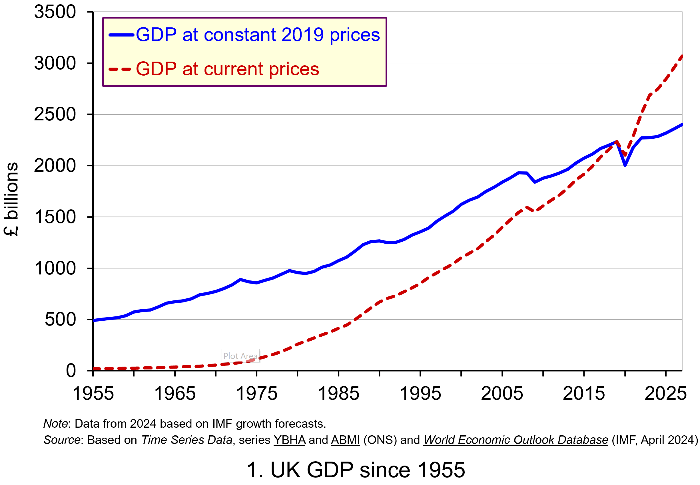 Chart 1 shows current-price estimates of GDP from 1955, when the value of GDP was estimated at £19.2 billion. The £2.687 trillion figure recorded for 2023 is an increase of over 140 times that in 1955, a figure that rises to 160 times if we compare the 1950 value with the latest IMF estimate for 2027. However, if we want to make a more meaningful comparison of the country’s national income we need to adjust for inflation. (Click here to download a PowerPoint of the chart.)
Long-term growth in real GDP
If we measure GDP at constant prices, we eliminate the effect of inflation. To construct a constant-price series for GDP, a process known as chain-linking is used. This involves taking consecutive pairs of years, e.g. 2022 and 2023, and estimating what GDP would be in the most recent year (in this case, 2023) if the previous year’s prices (i.e. 2022) had continued to prevail. By calculating the percentage change from the previous year’s GDP value we have an estimate of the volume change. If this is repeated for other pairs of years, we have a series of percentage changes that capture the volume changes from year-to-year. Finally, a reference year is chosen and the percentage volume changes are applied backwards and forwards from the nominal GDP value for the reference year.
In effect, a real GDP series creates a quantity measure in monetary terms. Chart 1 shows GDP at constant 2019 prices (real GDP) alongside GDP at current prices (nominal GDP). Consider first the real GDP numbers for 1955 and 2023. GDP in 1950 at 2019 prices was £491.2 billion. This is higher than the current-price value because prices in 2019 (the reference year) were higher than those in 1955. Meanwhile, GDP in 2023 when measured at 2019 prices was £2.273 trillion. This constant-price value is smaller than the corresponding current-price value because prices in 2019 where lower than those in 2023.
 Between 1955 and 2023 real GDP increased 4.6 times. If we extend the period to 2027, again using the latest IMF estimates, the increase is 4.9 times. Because we have removed the effect of inflation, the real growth figure is much lower than the nominal growth figure.
Crucially, what we are left with is an indicator of the long-term growth in the volume of the economy’s output and hence an increase in national income that is backed up by an increase in production. Whereas nominal growth rates are affected by changes in both volumes and prices, real growth rates reflect only changes in volumes.
The upward trajectory observed in constant-price GDP is therefore evidence of positive longer-term growth. This is one of the twin characteristics of growth.
Short-term fluctuations in the growth of real GDP
The second characteristic is fluctuations in the rate of growth from period to period. We can see this second characteristic more clearly by plotting the percentage change in real GDP from year to year.
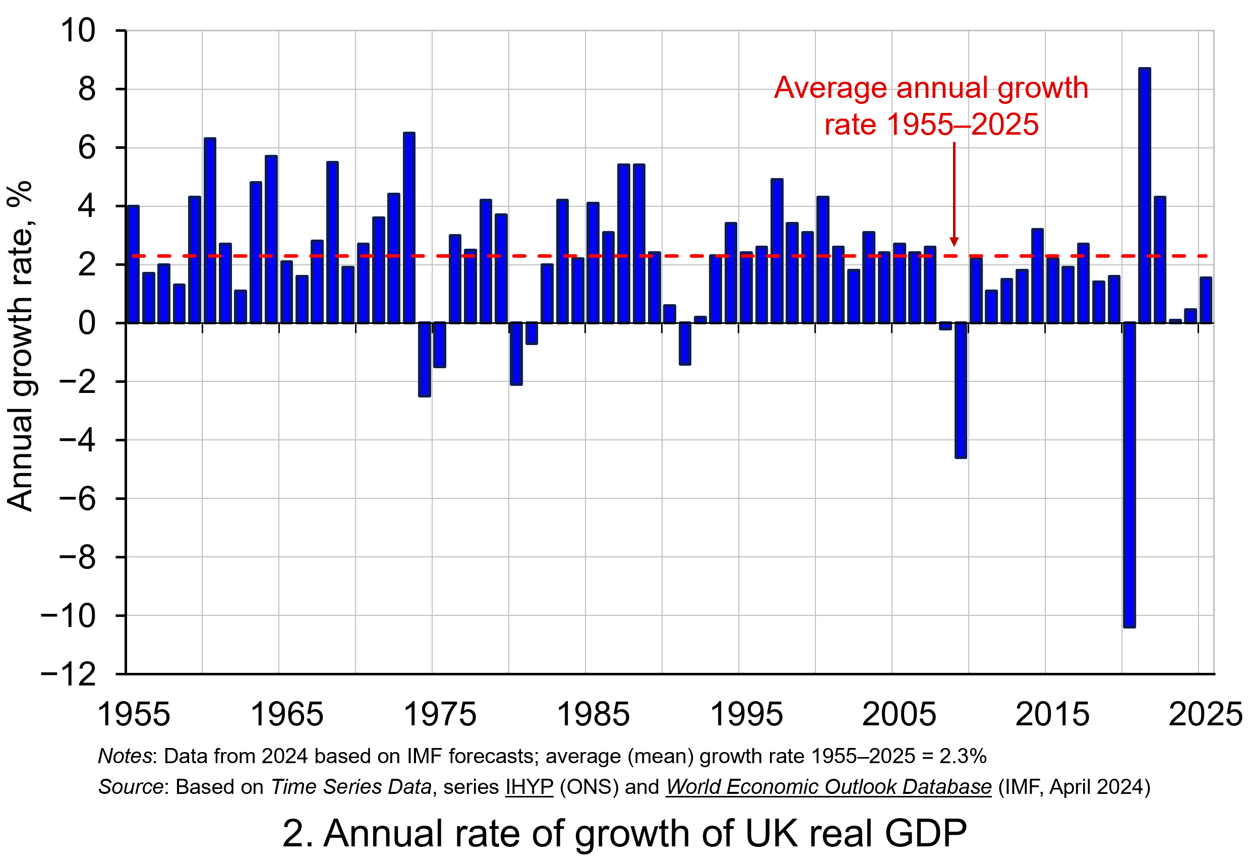 Chart 2 shows the annual rate of growth in real GDP each year from 1955 to 2025. From it, we see the inherent instability that is a key characteristic of the macroeconomic environment. This instability is, of course, mirrored in the output path of real GDP in Chart 1, but the annual rates of growth show the instability more clearly. We can readily see the impact on national output of the global financial crisis of 2007–8 and the global COVID pandemic.
In 2009, constant-price GDP in the UK fell by 4.6 per cent, whereas current-price GDP fell by 2.8 per cent. Then, in 2020, constant-price GDP and, hence, the volume of national output fell by 10.4 per cent, as compared to a 5.8 per cent fall in current-price GDP. These global, ‘once-in-a-generation’ shocks are stark examples of the instability that characterises economies and which generate the ‘ups and downs’ in an economy’s output path, known more simply as ‘the business cycle’. (Click here to download a PowerPoint copy of the chart.)
Determinants of long-and short-term growth
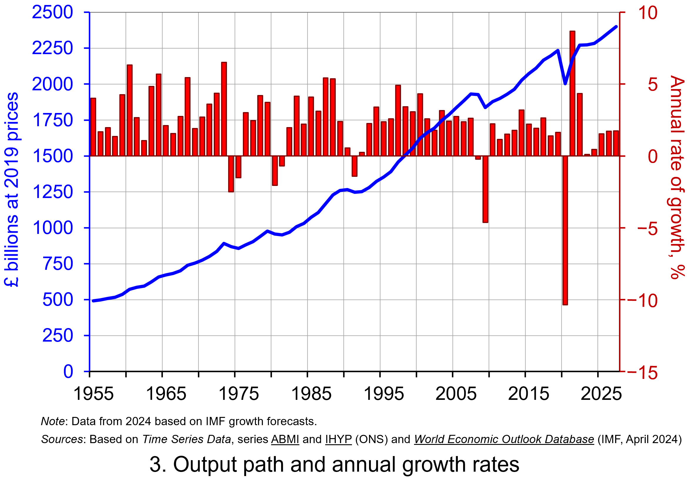 The twin characteristics of growth can be seen simultaneously by combining the output path (shown by the levels of real GDP) with the annual rates of growth. This is shown in Chart 3. The longer-term growth seen in the economy’s output path is generally argued to be driven by the quantity and quality of the economy’s resources, and their effectiveness when combined in production (i.e. their productivity). In other words, it is the supply side of the economy that determines the trajectory of the output path over the longer term. (Click here to download a PowerPoint copy of the chart.)
However, the fluctuations we observe in short-term growth rates tend to reflect shocks, also known as impulses, that originate either from the ability and or willingness of purchasers to consume (demand-side shocks) or producers to supply (supply-side shocks). These impulses are then amplified (or ‘propagated’) via the multiplier, expectations and other factors, and their effects, therefore, transmitted through the economy. Unusually in the case of the pandemic, the lockdown measures employed by governments around the world resulted in simultaneous negative aggregate demand and aggregate supply shocks.
Persistence effects
Explanations of the business cycle and of long-term growth are not mutually exclusive. The shocks and the propagation mechanisms that help to create and shape the business cycle can themselves have enduring or persistent effects on output. The global financial crisis, fuelled by unsustainable lending and the overstretch of private-sector balance sheets, which then spilt over to the public sector as governments attempted to stabilise the financial system and support aggregate demand, is argued by some to have created the conditions for low-growth persistence seen in many countries in the 2010s. This type of persistence is known as hysteresis as it originates from a negative demand shock.
Economists and policymakers were similarly concerned that the pandemic would also generate persistence in the form of scarring effects that might again affect the economy’s output path. Such concerns help to explain why many governments introduced furlough schemes to protect jobs and employment income, as well as provide grants or loans to business.
Per capita output
To finish, it is important to recognise that, when thinking about living standards, it is the growth in real GDP per capita that we need to consider. A rise in real GDP will only lead to a rise in overall living standards if it is faster than the rise in population.
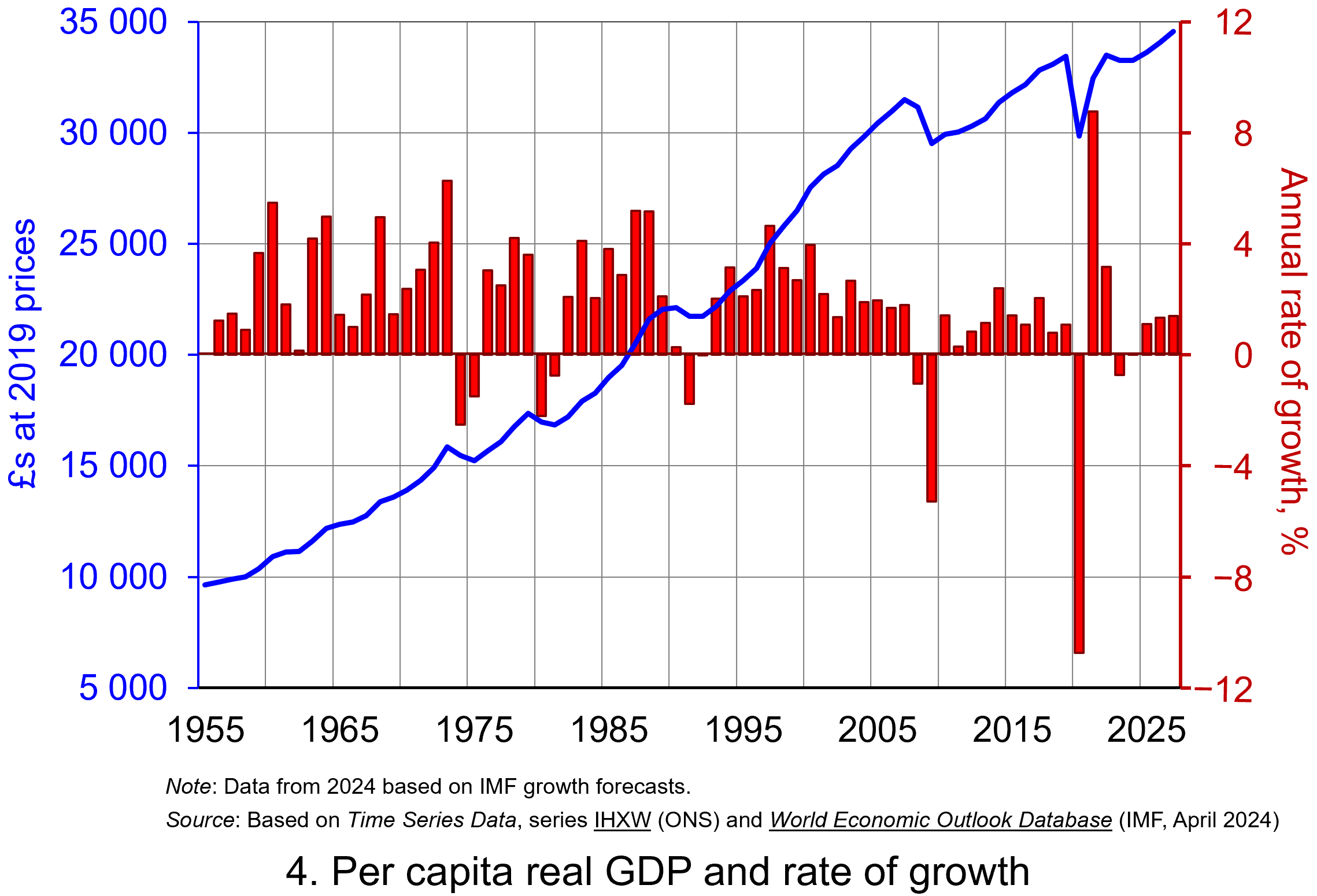 Our final chart therefore replicates Chart 3 but for real GDP per capita. Between 1955 and 2023 real GDP per capita grew by a factor of 3.45, which increases to 3.6 when we consider the period up to 2027. The average rate of growth of real GDP per capita up to 2023 was 1.87 per cent (lower than the 2.34 per cent increase in real GDP).
But the rate of increase in real GDP per capita was much higher before 2007 than it has been since. If we look at the period up to 2007 and, hence, before the global financial crisis, the figure is 2.32 per cent (2.7 per cent for real GDP), whereas from 2008 to 2023 the average rate of growth of real GDP per capita was a mere 0.42 per cent (1.1 per cent for real GDP). (Click here to download a PowerPoint copy of the chart.)
The final chart therefore reiterates the messages from recent blogs, such as Getting Real with Pay and The Productivity Puzzle, that long-term economic growth and the growth of real wages have slowed dramatically since the financial crisis. This has had important implications for the wellbeing of all sectors of the economy. The stagnation of living standards is therefore one of the most important economic issues of our time. It is one that the incoming Labour government will be keen to address.
Data and Reports
Articles
Questions
- What do you understand by the term ‘macroeconomic environment’? What data could be used to describe the macroeconomic environment?
- When a country experiences positive rates of inflation, which is higher: nominal economic growth or real economic growth?
- Does an increase in nominal GDP mean a country’s production has increased? Explain your answer.
- Does a decrease in nominal GDP mean a country’s production has decreased? Explain your answer.
- Why does a change in the growth of real GDP allow us to focus on what has happened to the volume of production?
- What does the concept of the ‘business cycle’ have to do with real rates of economic growth?
- When would falls in real GDP be classified as a recession?
- Distinguish between the concepts of ‘short-term growth’ and ‘longer-term growth’.
- What do you understand by the term ‘persistence’ in macroeconomics? Given examples of persistence effects and the means by which they can be generated?
- Discuss the proposition that the pandemic could have a positive effect on longer-term growth rates because of the ways that people and business have had to adapt.
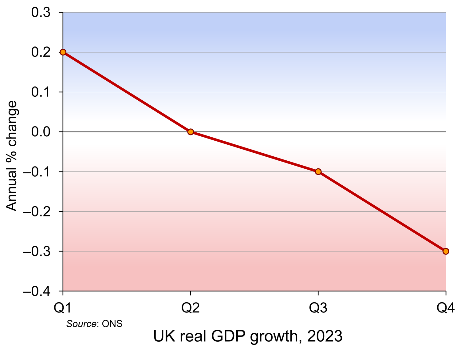 Latest figures from the Office for National Statistics show that the UK was in recession at the end of 2023. The normal definition of recession is two quarters of falling real GDP. This is what happened to the UK in the last two quarters of 2023, with GDP falling by 0.1% in Q3 and 0.3% in Q4. In Q4, output of the service industries fell by 0.2%, production industries by 1.0% and construction by 1.3%.
But how bad is this? What are the implications for living standards? In some respects, the news is not as bad as the term ‘recession’ might suggest. In other respects, it’s worse than the headline figures might imply.
The good news (or not such bad news)
The first thing to note is that other countries too experienced a recession or slowdown in the second half of 2023. So, relative to these countries, the UK is not performing that badly. Japan, for example, also experienced a mild recession; Germany just missed one. These poor economic growth rates were caused largely by higher global energy and food prices and by higher central bank interest rates in response. The good news is that such cost pressures are already easing.
The second piece of good news is that GDP is expected to start growing again (modestly) in 2024. This will be helped by the Bank of England cutting interest rates. The Monetary Policy Committee is expected to do this at its May, June or August meetings provided that inflation falls. Annual CPI inflation was 4% in January – the same as in December. But it is expected to fall quite rapidly over the coming months provided that there are no serious supply-side shocks (e.g. from world political factors).
The third is that the recession is relatively modest compared with ones in the past. In the recession following the financial crisis, real GDP fell by 5.3% in 2009; during the pandemic, GDP fell by 10.7% in 2020. For this reason, some commentators have said that the last two quarters of 2023 represent a mere ‘technical recession’, with the economy expected to grow again in 2024.
Why things may be worse than the headline figures suggest
Real GDP per head
So far we have considered real GDP (i.e. GDP adjusted for inflation). But if changes in GDP are to reflect changes in living standards, we need to consider real GDP per head. Population is rising. This means that the rate of growth in real GDP per head is lower than the rate of growth in real GDP
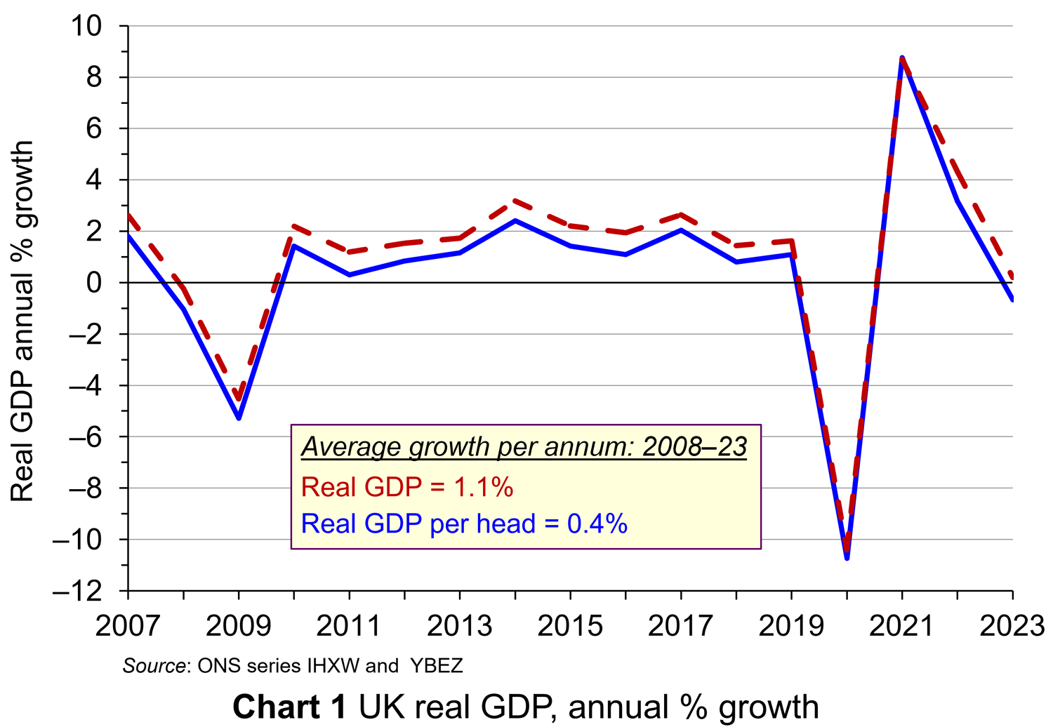 For 2023 as a whole, while real GDP rose by 0.20%, real GDP per head fell by 0.67%. In the last two quarters of 2023, while real GDP fell by 0.1% and 0.3% respectively, real GDP per head fell by 0.4% and 0.6%, respectively, having already fallen in each of the previous five quarters. Chart 1 shows real GDP growth and real GDP growth per head from 2007 to 2023 (click here for a PowerPoint). As you can see, given population growth, real GDP per head has consistently grown slower than real GDP.
Long-term trends.
If we are assessing the UK’s potential for growth in GDP, rather than the immediate past, it is useful to look at GDP growth over a longer period. Looking at past trend growth rates and explaining them can give us an indication of the likely future path of the growth in GDP – at least in the absence of a significant change in underlying economic factors. Since 2007, the average annual rate of growth of real GDP has been only 1.1% and that of real GDP per head a mere 0.4%.
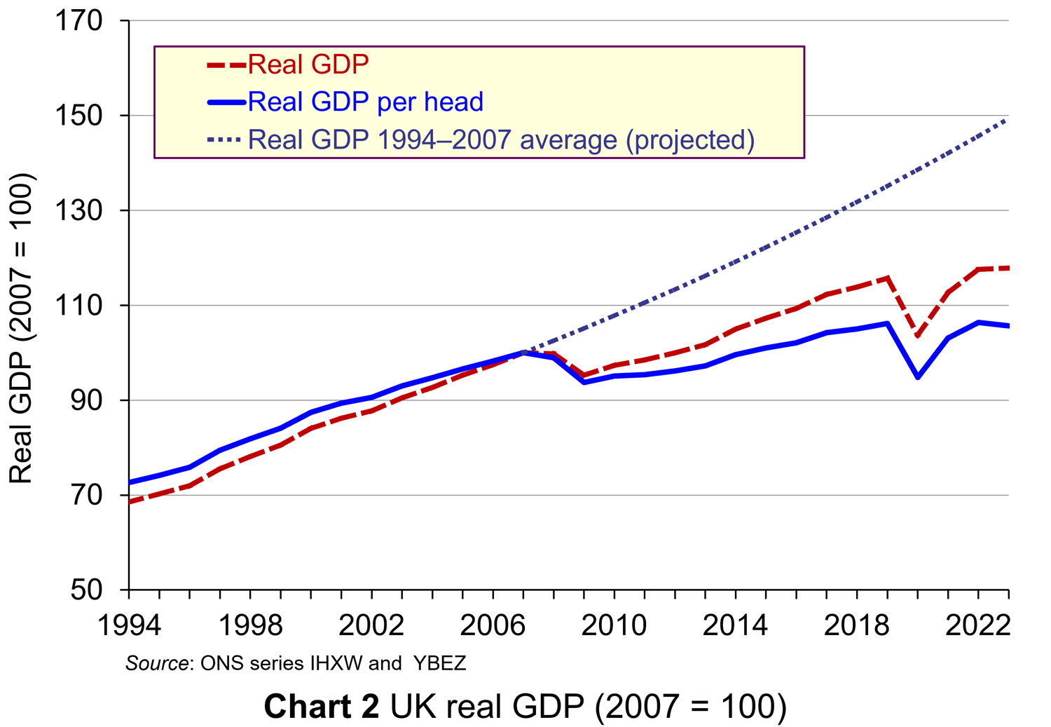 This compares unfavourably with the period from 1994 to 2007, when the average annual rate of growth of real GDP was 3.0% and that of real GDP per head was 2.5%.
This is illustrated in Chart 2 (click here for a PowerPoint). The chart also projects the growth rate in GDP per head of 2.5% forward from 2007 to 2023. Had this growth rate been achieved since 2007, GDP per head in 2023 would have been 41.4% higher than it actually was.
It is not only the UK that has seen low growth over the past 15 years compared to previous years. It has achieved a similar average annual growth rate over the period to Germany (1.1%), lower rates than the USA (1.8%) and Canada (1.6%), but higher than France (0.9%) and Japan (0.4%).
Low investment
A key determinant of economic growth is investment. Since 2008, the UK has invested an average of 17.3% of GDP. This is the lowest of the G7 countries and compares with 24.9% in Japan, 23.7% in Canada, 23.5% in France, 21.3% in Germany, 20.4% in the USA and 19.1% in Italy. If UK growth is to recover strongly over the longer term, the rate of investment needs to increase, both private and public. Of course, investment has to be productive, as the key underlying determinant of economic growth is the growth in productivity.
Low productivity growth
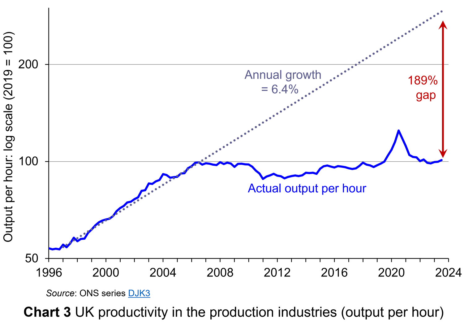 This is a key issue for the government – how to encourage a growth in productivity. The UK’s record of productivity growth has been poor since 2008. The period from 1996 to 2006 saw an average annual growth in labour productivity of 6.4%. Since then, however, labour productivity has grown by an average annual rate of only 0.3%. This is illustrated in Chart 3 (click here for a PowerPoint). If the pre-2007 rate had continued to the end of 2023, labour productivity would be 189% higher. This would have made GDP per head today substantially higher. If GDP per head is to grow faster, then the underlying issue of a poor growth in labour productivity will need to be addressed.
Inequality and poverty
Then there is the issue of the distribution of national income. The UK has a high level of income inequality. In 2022 (the latest data available), the disposable income of the poorest 20% of households was £13 218; that for the richest 20% was £83 687.  The top 1% of income earners’ share of disposable income is just under 9.0%. (Note that disposable income is after income taxes have been deducted and includes cash benefits and is thus more equally distributed than original income.)
The poorest 20% have been hit badly by the cost-of-living crisis, with many having to turn to food banks and not being able to afford to heat their homes adequately. They are also particularly badly affected by the housing crisis, with soaring and increasingly unaffordable rents. Many are facing eviction and others live in poor quality accommodation. Simple growth rates in real GDP do not capture such issues.
Limited scope for growth policies
Fiscal policy has an important role in stimulating growth. Conservatives stress tax cuts as a means of incentivising entrepreneurs and workers. Labour stresses the importance of public investment in infrastructure, health, education and training. Either way, such stimulus policy requires financing.
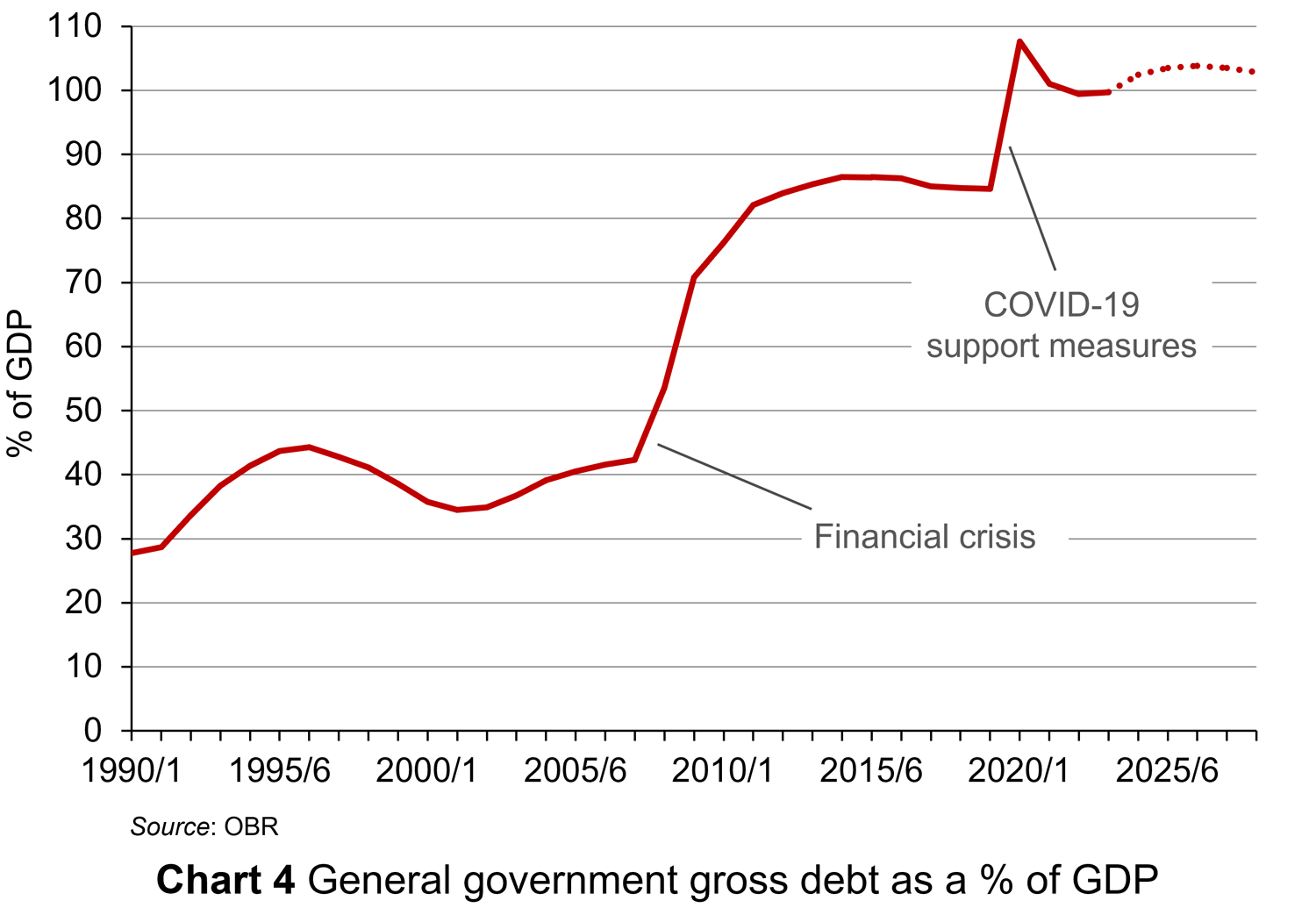 But, public finances have been under pressure in recent years, especially from COVID support measures. General government gross debt has risen from 27.7% of GDP in 1990/91 to 99.4% in 2022/23. This is illustrated in Chart 4 (click here for a PowerPoint). Although it has fallen from the peak of 107.6% of GDP in 2020/21 (during the COVID pandemic), according to the Office for Budget Responsibility it is set to rise again, peaking at 103.8% in 2026/27. There is thus pressure on the government to reduce public-sector borrowing, not increase it. This makes it difficult to finance public investment or tax cuts.
Measuring living standards
Questions about real GDP have huge political significance. Is the economy in recession? What will happen to growth in GDP over the coming months. Why has growth been sluggish in recent years? The implication is that if GDP rises, living standards will rise; if GDP falls, living standards will fall. But changes in GDP, even if expressed in terms of real GDP and even if the distribution of GDP is taken into account, are only a proxy for living standards. GDP measures the market value of the output of goods and services and, as such, may not necessarily be a good indicator of living standards, let alone well-being.
Produced goods and services that are not part of GDP
 The output of some goods and services goes unrecorded. As we note in Economics, 11e (section 15.2), “If you employ a decorator to paint your living room, this will be recorded in the GDP statistics. If, however, you paint the room yourself, it will not. Similarly, if a childminder is employed by parents to look after their children, this childcare will form part of GDP. If, however, a parent stays at home to look after the children, it will not.
The exclusion of these ‘do-it-yourself’ and other home-based activities means that the GDP statistics understate the true level of production in the economy. If over time there is an increase in the amount of do-it-yourself activities that people perform, the figures will also understate the rate of growth of national output.” With many people struggling with the cost of living, such a scenario is quite likely.
There are also activities that go unrecorded in the ‘underground’ or ‘shadow’ economy: unemployed people doing casual jobs for cash in hand that they do not declare to avoid losing benefits; people doing extra work outside their normal job and not declaring the income to evade taxes; builders doing work for cash to save the customer paying VAT.
Externalities
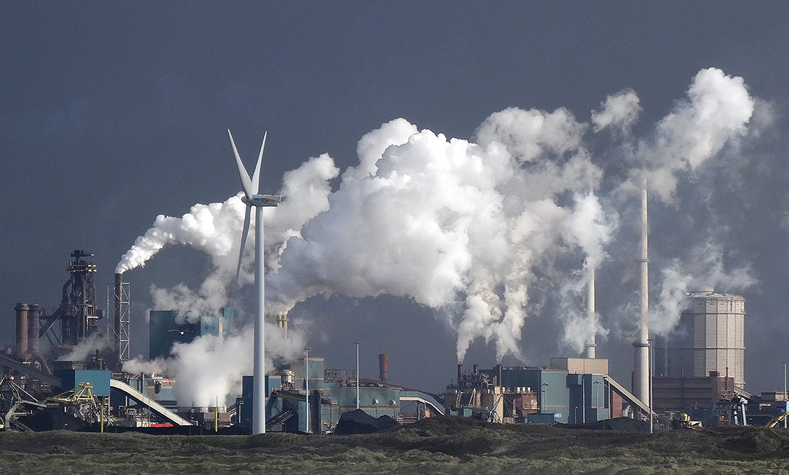 Large amounts of production and consumption involve external costs to the environment and to other people. These externalities are not included in the calculation of GDP.
If external costs increase faster than GDP, then GDP growth will overstate the rise in living standards. If external costs rise more slowly than GDP (or even fall), then GDP growth will understate the rise in living standards. We assume here that living standards include social and environmental benefits and are reduced by social and environmental costs.
Human costs of production
If production increases as a result of people having to work harder or longer hours, its net benefit will be less. Leisure is a desirable good, and so too are pleasant working conditions, but these items are not included in the GDP figures.
The production of certain ‘bads’ leads to an increase in GDP
 Some of the undesirable effects of growth may in fact increase GDP! Take the examples of crime, stress-related illness and environmental damage. Faster growth may lead to more of all three. But increased crime leads to more expenditure on security; increased stress leads to more expenditure on health care; and increased environmental damage leads to more expenditure on environmental clean-up. These expenditures add to GDP. Thus, rather than reducing GDP, crime, stress and environmental damage actually increase it.
Alternative approaches to measuring production and income
There have been various attempts to adjust GDP (actual or potential) to make it a better indicator of total production or income or, more generally, of living standards.
Index of Sustainable Economic Welfare (ISEW)
As Case Study 9.20 in the Essentials of Economics (9e) website explains, ISEW starts with consumption, as measured in GDP, and then makes various adjustments to account for factors that GDP ignores. These include:
- Inequality: the greater the inequality, the more the figure for consumption is reduced. This is based on the assumption of a diminishing marginal utility of income, such that an additional pound is worth less to a rich person than to a poor person.
- Household production (such as childcare, care for the elderly or infirm, housework and various do-it-yourself activities). These ‘services of household labour’ add to welfare and are thus entered as a positive figure.
- Defensive expenditures. This is spending to offset the adverse environmental effects of economic growth (e.g. asthma treatment for sufferers whose condition arises from air pollution). Such expenditures are taken out of the calculations.
- ‘Bads’ (such as commuting costs). The monetary expense entailed is entered as a negative figure (to cancel out its measurement in GDP as a positive figure) and then an additional negative element is included for the stress incurred.
- Environmental costs. Pollution is entered as a negative figure.
- Resource depletion and damage. This too is given a negative figure, in just the same way that depreciation of capital is given a negative figure when working out net national income.
Productive Capacities Index (PCI)
In 2023, the United Nations Conference on Trade and Development (UNCTAD) launched a new index to provide a better measure of countries’ economic potential. What the index focuses on is not actual GDP but potential output: in other words, ‘countries’ abilities to produce goods and deliver services’.
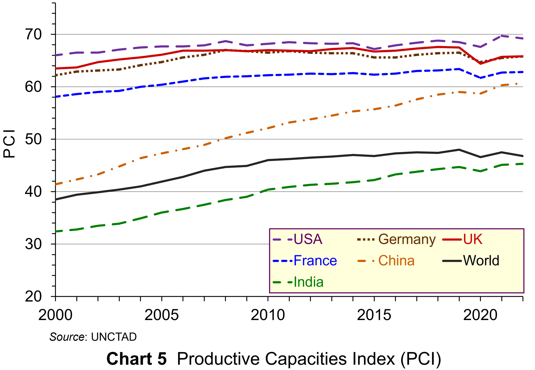 The PCI comprises 42 indicators under eight headings: human capital, natural capital, information and communication technology (ICT), structural change (the movement of labour and other productive resources from low-productivity to high-productivity economic activities), transport infrastructure, institutions (political, legal and financial) and the private sector (ease of starting businesses, availability of credit, ease of cross-border trade, etc.). It covers 194 economies since 2000 (currently to 2022). As UNCTAD states, ‘The PCI can help diagnose the areas where countries may be leading or falling behind, spotlighting where policies are working and where corrective efforts are needed.’ Chart 5 shows the PCI for various economies from 2000 to 2022 (click here for a PowerPoint).
The UK, with a PCI of 65.8 in 2022, compares relatively favourably with other developed countries. The USA’s PCI is somewhat higher (69.2), as is The Netherlands’ (69.8); Germany’s is the same (65.8); France’s is somewhat lower (62.8). The world average is 46.8. For developing countries, China is relatively high (60.7); India’s (45.3) is close to the developing country average of 43.4.
Looked at over a longer time period, the UK’s performance is relatively weak. The PCI in 2022 (65.8) was below that in 2006 (66.9) and below the peak of 67.6 in 2018.
GDP and well-being
GDP is often used as a proxy for well-being. If real GDP per head increases, then it is assumed that well-being will increase. In practice, people’s well-being depends on many factors, not just their income, although income is one important element.
The UK Measuring National Well-being (MNW) programme
 The MNW programme was established in 2010. This has resulted in Office for National Statistics developing new measures of national well-being. The ONS produces statistical bulletins and datasets with its latest results.
The aim of the programme is to provide a ‘fuller picture’ of how society is doing beyond traditional economic indicators. There are currently 44 indicators. These are designed to describe ‘how we are doing as individuals, as communities and as a nation, and how sustainable this is for the future’. The measures fall within a number of categories, including: personal well-being, relationships, health, what we do, where we live, personal finance, the economy, education and skills, governance and the natural environment.
Conclusions
In the light of the limitations of GDP as a measure of living standards, what can we make of the news that the UK entered recession in the last half of 2023? It does show that the economy is sluggish and that the production of goods and services that are included in the GDP measure declined.
But to get a fuller assessment of the economy, it is important to take a number of other factors into account. If we are to go further and ask what has happened to living standards or to well-being, then we have to look at a range of other factors. If we are to ask what the latest figures tell us about what is likely to happen in the future to production, living standards and well-being, then we will need to look further still.
Articles
- Britain falls into recession, with worst GDP performance in 2023 in years
CNN, Hanna Ziady (15/2/24)
- UK economy slipped into recession in 2023
Financial Times, Valentina Romei and George Parker (15/2/24)
- UK economy fell into recession after people cut spending
BBC News, Dearbail Jordan & Faisal Islam (15/2/24)
- Should we care that the UK is in recession?
BBC News, Faisal Islam (15/2/24)
- UK tips into recession in blow to Rishi Sunak
The Guardian, Richard Partington (15/2/24)
- Britain is in recession… and huge immigration has been masking how much poorer we’re getting
MSN, James Tapsfield (15/2/24)
- This isn’t a “mild” recession
The New Statesman, Duncan Weldon (15/2/24)
- UK middle classes ‘struggling despite incomes of up to £60,000 a year’
The Guardian, Larry Elliott (20/2/24)
- What is GDP and how is it measured?
BBC News (15/2/24)
 World at One (from 7’00” to 25’14”)
BBC Sounds, Torsten Bell and Norman Lamont (15/2/24)
- Does High GDP Mean Economic Prosperity?
Investopedia, Lisa Smith (29/9/23)
- A critical assessment of GDP as a measure of economic performance and social progress
Carnegie UK, Cressida Gaukroger (June 2023)
- When it comes to measuring economic welfare, GDP doesn’t cut it
Marketplace, Kai Ryssdal and Maria Hollenhorst (1/9/23)
- UNCTAD launches new index for countries to better measure economic potential
UNCTAD News (20/6/23)
- Redefining Economic Growth for a Climate-Conscious World
Forbes, Judah Taub (28/9/23)
- Bobby Kennedy on GDP: ‘measures everything except that which is worthwhile’
The Guardian, Simon Rogers (24/5/12)
- A guide to the UK National Accounts: Satellite Accounts
ONS (6/3/20)
Data and Analysis
- GDP first quarterly estimate, UK: October to December 2023
ONS (15/2/24)
- GDP (Average) per head, q-on-q4 growth rate CVM SA % (series N3Y8)
ONS
- Gross domestic product (Average) per head, CVM market prices: SA (series IHXW)
ONS
- GDP per capita, current prices (UK)
IMF
- Productive capacities index, annual, 2000-2022
UNCTAD
- The Scale of Economic Inequality in the UK
The Equality Trust (2023)
- Living standards, poverty and inequality in the UK: 2023
IFS, Sam Ray-Chaudhuri, Tom Waters, Thomas Wernham and Xiaowei Xu (July 2023)
- Quarterly personal well-being estimates – seasonally adjusted
ONS
Questions
- Using GDP and other data, summarise the outlook for the UK economy.
- Why is GDP so widely used as an indicator of living standards?
- Explain the three methods of measuring GDP?
- What key contributors to living standards are omitted from GDP?
- What are the ONS Satellite Accounts? Are they useful for measuring living standards?
- Assess the UK’s economic potential against each of the eight category indices in the Productive Capacities Index.
- What is the difference between ‘living standards’ and ‘well-being’?
 To make a sensible comparison of one year’s national income generated from the production of goods and services with another we need to take inflation into account. Changes in inflation-adjusted GDP represent changes in the volume of production of a country’s goods and services: in other words, the real value of goods and services. We revisit the blog written back in April 2019, prior the pandemic, to show how changes in real GDP evidence what we may refer to as the twin characteristics of economic growth: positive long-term growth but with fluctuating short-term rates of growth.
Real and nominal GDP
The nominal or current-price estimate for UK Gross Domestic Product in 2020 is £2.156 trillion. It is the value of output produced within the country in 2020. This was a fall of 4.4 per cent on the £2.255 trillion recorded in 2019. These values make no adjustment for inflation and therefore reflect the prices of output that were prevailing at the time.
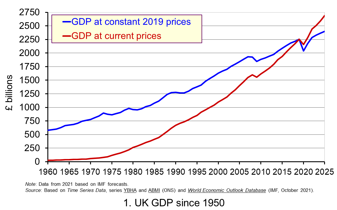 Chart 1 shows current-price estimates of GDP from 1950 when the value of GDP was estimated at £12.7 billion. The increase to £2.156 trillion in 2020 amounts to a proportionate increase of almost 170 times, a figure that rises to 211 times if we compare the 1950 value with the latest IMF estimate for 2025 of £2.689 trillion. However, if we want to make a more meaningful comparison of the country’s national income by looking at the longer-term increase in the volume of production, we need to adjust for inflation. (Click here to download a PowerPoint copy of the chart.)
Long-term growth in real GDP
If we measure GDP at constant prices, we eliminate the effect of inflation. To construct a constant-price series for GDP a process known as chain-linking is used. This involves taking consecutive pairs of years, e.g. 2020 and 2021, and estimating what GDP would be in the most recent year (in this case, 2021) if the previous year’s prices (i.e. 2020) had continued to prevail. By calculating the percentage change from the previous year’s GDP value we have an estimate of the volume change. If this is repeated for other pairs of years, we have a series of percentage changes that capture the volume changes from year-to-year. Finally, a reference year is chosen and the percentage changes are applied backwards and forwards from the nominal GDP value for the reference year – the volume changes forwards and backwards from this point.
In effect, a real GDP series creates a quantity measure in monetary terms. Chart 1 shows GDP at constant 2019 prices (real GDP) alongside GDP at current prices (nominal GDP). Consider first the real GDP numbers for 1950 and 2020. GDP in 1950 at 2019 prices was £410.1 billion. This is higher than the current-price value because prices in 2019 (the reference year) were higher than those in 1950. Meanwhile, GDP in 2020 when measured at 2019 prices was £2.037 trillion. This constant-price value is smaller than the corresponding current-price value because prices in 2019 where lower than those in 2020.
Between 1950 and 2020 real GDP increased 5.0 times. If we extend the period to 2025, again using the latest IMF estimates, the increase is 5.9 times. Because we have removed the effect of inflation, the real growth figure is much lower than the nominal growth figure. Crucially, what we are left with is an indicator of the long-term growth in the volume of the economy’s output and hence an increase in national income that is backed up by an increase in production. Whereas nominal growth rates are affected both by changes in volumes and prices, real growth rates reflect only changes in volumes.
The upward trajectory observed in constant-price GDP is therefore evidence of positive longer-term growth. This is one of the twin characteristics of growth.
Short-term fluctuations in the growth of real GDP
The second characteristic is fluctuations in the rate of growth from period to period. We can see this second characteristic more clearly by plotting the percentage change in real GDP from year to year.
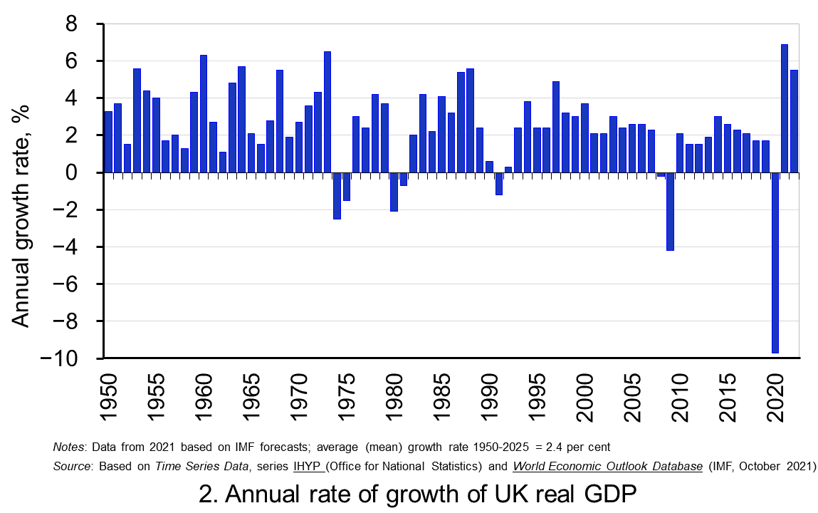 Chart 2 shows the annual rate of growth in real GDP each year since 1950. From it, we see the inherent instability that is a key characteristic of the macroeconomic environment. This instability is, of course, mirrored in the output path of real GDP in Chart 1, but the annual rates of growth show the instability more clearly. We can readily see the impact on national output of the global financial crisis and the global health emergency.
In 2009, constant-price GDP in the UK fell by 4.25 per cent. Then, in 2020, constant-price GDP and, hence, the volume of national output fell by 9.7 per cent, as compared to a 4.4 per cent fall in current-price GDP that we identified earlier. These global, ‘once-in-a-generation’ shocks are stark examples of the instability that characterises economies and which generate the ‘ups and downs’ in an economy’s output path, known more simply as ‘the business cycle’. (Click here to download a PowerPoint copy of the chart.)
Determinants of long-and short-term growth
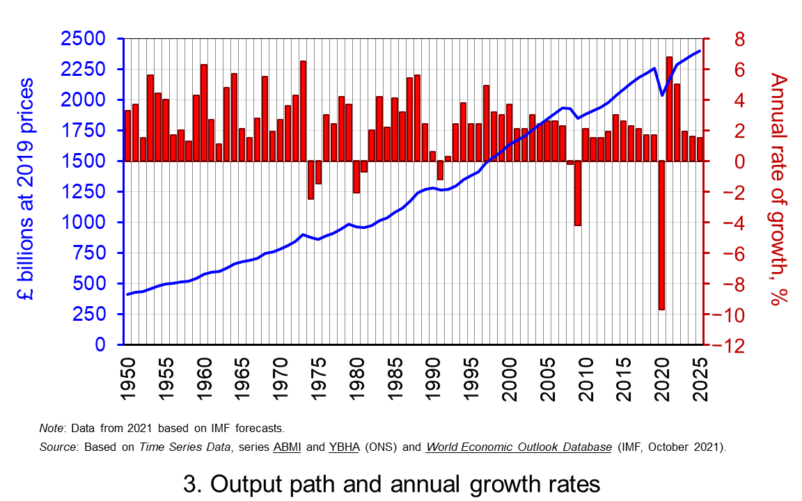 The twin characteristics of growth can be seen simultaneously by combining the output path captured by the levels of real GDP with the annual rates of growth. This is shown in Chart 3. The longer-term growth seen in the economy’s output path is generally argued to be driven by the quantity and quality of the economy’s resources, and their effectiveness when combined in production. In other words, it is the supply-side that determines the trajectory of the output path over the longer term. (Click here to download a PowerPoint copy of the chart.)
However, the fluctuations we observe in short-term growth rates tend to reflect impulses that affect the ability and or willingness of producers to supply (supply-side shocks) and purchasers to consume (demand-side shocks). These impulses are then propagated and their effects, therefore, transmitted through the economy.
Effects of the pandemic
The pandemic is unusual in that the health intervention measures employed by governments around the world resulted in simultaneous negative aggregate demand and aggregate supply shocks. Economists were particularly concerned that the magnitude of these impulses and their propagation had the potential to generate scarring effects and hence negative hysteresis effects. The concern was that these would affect the level of real GDP in the medium-to-longer term and, hence, the vertical position of the output path, as well as the longer-term rate of growth and, hence, the steepness of the output path.
The extent of these scarring effects continues to be debated. The ability of businesses and workers to adapt their practices, the extraordinary fiscal and monetary measures that were undertaken in many countries, and the roll-out of vaccines programmes, especially in advanced economies, have helped to mitigate some of these effects. For example, the latest IMF forecasts for output in the USA in 2024 are over 2 per cent higher than those made back in October 2019.
Scarring effects are, however, thought to be an ongoing issue in the UK. The IMF is now expecting output in the UK to be nearly 3 per cent lower than it originally forecast back in October 2019. Therefore, whilst UK output is set to recover, scarring effects on the UK economy will mean that the output path traced out by real GDP will remain, at least in the medium term, vertically lower than was expected before the pandemic.
Data and Reports
Articles
Questions
- What do you understand by the term ‘macroeconomic environment’? What data could be used to describe the macroeconomic environment?
- When a country experiences positive rates of inflation, which is higher: nominal economic growth or real economic growth?
- Does an increase in nominal GDP mean a country’s production has increased? Explain your answer.
- Does a decrease in nominal GDP mean a country’s production has decreased? Explain your answer.
- Why does a change in the growth of real GDP allow us to focus on what has happened to the volume of production?
- What does the concept of the ‘business cycle’ have to do with real rates of economic growth?
- When would falls in real GDP be classified as a recession?
- Distinguish between the concepts of ‘short-term growth rates’ and ‘longer-term growth’.
- What do you understand by the term hysteresis? By what means can hysteresis effects be generated?
- Discuss the proposition that the pandemic could have a positive effect on longer-term growth rates because of the ways that people and business have had to adapt.
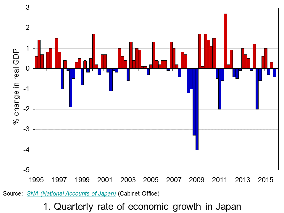
 Sustained economic growth in Japan remains elusive. Preliminary Quarterly Estimates of GDP point to the Japanese economy having contracted by 0.4 per cent in the final quarter of 2015. This follows on from growth of 0.3 per cent in the third quarter, a contraction of 0.3 per cent in the second and growth of 1 per cent in the first quarter. Taken as a whole output in 2015 rose by 0.4 per cent compared to zero growth in 2014. The fragility of growth means that over the past 20 years the average annual rate of growth in Japan is a mere 0.8 per cent.
 Chart 1 shows the quarter-to-quarter change in real GDP in Japan since the mid 1990s (Click here to download a PowerPoint of the chart). While economies are known to be inherently volatile the Japanese growth story over the past twenty or years so is one both of exceptional volatility and of repeated bouts of recession. Since the mid 1990s Japan has experienced 6 recessions, four since 2008.
Of the four recessions since 2008, the deepest was that from 2008 Q2 to 2009 Q1 which saw the economy shrink by 9.2 per cent. This was followed by a recession from 2010 Q4 to 2011 Q2 when the economy shrunk by 3.1 per cent, then from 2012 Q2 to 2012 Q4 when the economy shrunk by 0.9 per cent and from 2014 Q2 to 2014 Q3 when output fell another 2.7 per cent. As a result of these four recessionary periods the economy’s output in 2015 Q4 was actually 0.4 per cent less than in 2008 Q1.
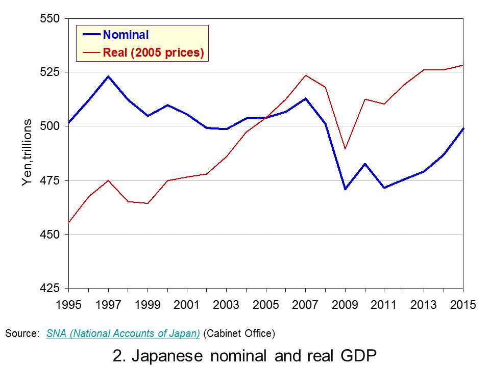
 Chart 2 shows the annual levels of nominal (actual) and real (constant-price) GDP in trillions of Yen (¥) since 1995. (Click here to download a PowerPoint of the chart). Over the period actual GDP has fallen from ¥502 trillion to ¥499 trillion (about £3 trillion at the current exchange rate) while GDP at constant 2005 prices has risen from ¥455 trillion to ¥528 trillion.
Chart 2 reveals an interesting phenomenon: the growth in real GDP at the same time as a fall in nominal GDP. So why has the actual value of GDP fallen slightly between 1995 and 2005? The answer is quite simple: deflation.
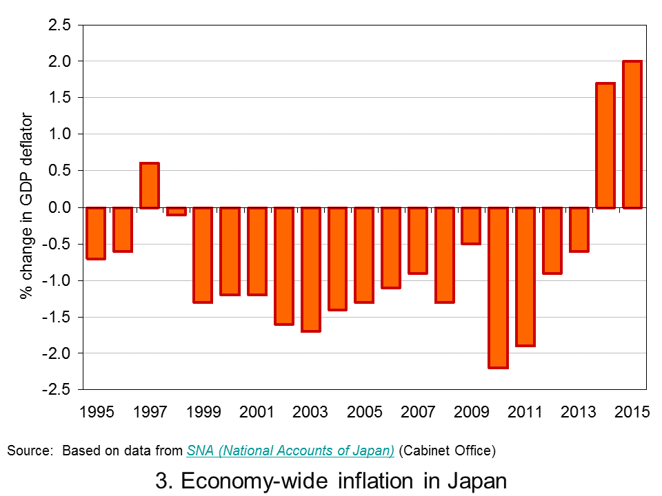
 Chart 3 shows a protracted period of economy-wide deflation from 1999 to 2013. (Click here to download a PowerPoint of the chart). Over this period the GDP deflator fell each year by an average of 1.0 per cent. 2014 and 2015 saw a pick up in economy-wide inflation. However, the quarterly profile through 2015 shows the pace of inflation falling quite markedly. As we saw in Japan’s interesting monetary stance as deflation fears grow, policymakers are again concerned about the possibility of deflation and the risks that poses for growth.
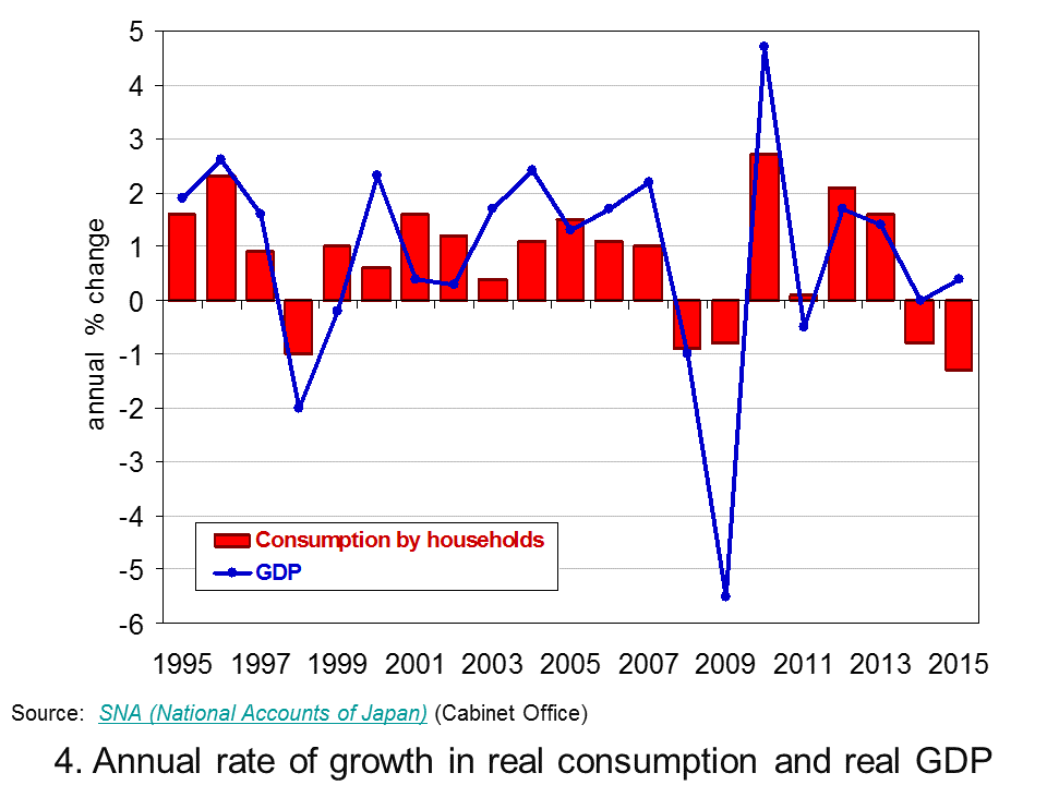
 As Chart 4 helps to demonstrate, a significant factor behind the latest slowdown in Japan’s growth is household spending. (Click here to download a PowerPoint of the chart). In 2015 household spending accounted for about 57 per cent by value of GDP in Japan. In the last quarter of 2015 real household spending fell by 0.9 per cent while across 2015 as a whole real household spending fell by 1.3 per cent. This follows on from a 0.8 per cent decrease in spending by households in 2014.
The recent marked weakening of household spending is a significant concern for the short term growth prospects of the Japanese economy. The roller coaster ride continues, unfortunately it appears that the ride is again downwards.
Data
Quarterly Estimates of GDP Japanese Cabinet Office
Japan and the IMF IMF Country Reports
Economic Outlook Annex Tables OECD
Articles
Japan’s economy contracts in fourth quarter BBC News, (15/2/16)
Japanese economy shrinks again, raising expectations of more stimulus Telegraph, Szu Ping Chan (15/2/16)
Japan’s economy shrinks again as Abenomics is blown off course Guardian, Justin McCurry (15/2/16)
Japan’s economy contracts in latest setback for Abe policies New Zealand Herald, (15/2/16)
Japan’s ‘Abenomics’ on the ropes as yen soars, markets plunge Daily Mail, (15/2/16)
Japan economy shrinks more than expected, highlights lack of policy options CNBC, Leika Kihara and Tetsushi Kajimoto (15/2/16)
Questions
- Why is the distinction between nominal and real important in analysing economic growth?
- How do we define a recession?
- Of what importance is aggregate demand to the volatility of economies?
- Why are Japanese policymakers concerned about the prospects of deflation?
- What policy options are available to policymakers trying to combat deflation?
- Why is the strength of household consumption important in affecting the path of an economy?
- Why has Japan experienced an increase in real GDP but a fall in nominal GDP between 1995 and 2015?
 In our recent blog constructing growth without production: The UK growth paradox we saw that the provisional estimate of economic growth in the UK in the final quarter of 2015 was 0.5 per cent. This was buoyed by service sector growth of 0.7 per cent. Meanwhile, construction sector output was estimated to have fallen by 0.1 per cent and production in the production industries by 0.2 per cent. The ONS Index of Production released on 11 February suggests the decline in production activity in the final quarter might have been has much as 0.5 per cent further pointing to unbalanced industrial growth.
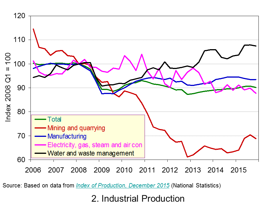
 The production industries today account for about 15 per cent of UK output which is small in comparison to the roughly 79 per cent from service-sector industries. Chart 1 shows the quarterly rate of growth in UK industrial production since the 1980s. (Click here for a PowerPoint of the chart). Over this period the average quarterly rate of growth in industrial output has been a mere 0.1 per cent compared with 0.5 per cent for total economic output and 0.7 per cent for the service sector. As a result, the importance of the production industries as a driver of economic output has declined.
Across 2015 industrial production rose by 1 per cent while the total output of the economy grew by 2.2 per cent. Industrial output comprises four main components. Of these, output from mining and quarrying grew in 2015 by 6.6 per cent, water, sewerage and waste management by 3.1 per cent, electricity, gas, steam and air conditioning by 0.3 per cent, while manufacturing output contracted by 0.2 per cent.
 Chart 2 shows the path of industrial output since 2006. (Click here for a PowerPoint of the chart). In particular, it allows us to analyse the effect of the financial crisis and the global economic downturn. Whereas the total output of the economy surpassed its 2008 Q1 peak in 2013 Q2, driven by the service sector, total industrial output in 2015 Q4 remains 9.9 per cent below its 2008 Q1 level. Among its component parts, output in mining and quarrying is 31 per cent lower, electricity, gas, steam and air conditioning output is 12.2 per cent lower and manufacturing 6.5 per cent lower. Only the output of water, sewerage and waste management is greater – some 7.4 per cent higher.
The data point to the industrial composition of UK remaining heavily skewed towards the service sector and, hence, to service-sector industries driving economic growth. A key talking point is the extent to which this matters. On one hand we might point to the deindustrialisation captured by the data. This has had profound implications for certain regions of the United Kingdom and in particular for living standards in certain communities. Industrial change poses challenges for the UK labour force and for policymakers trying to affect the skills of workers needed in a changing economy. It has had a profound impact on the country’s balance of trade in goods: we consistently run a balance of trade deficit in goods. On the other hand we might argue that the UK does services well. We might be said to have a comparative advantage in this area. Whatever, your view point the latest industrial production data show the fragility of UK industrial output.
Data
Index of Production Dataset December 2015 Office for National StatisticsIndex of Production, December 2015 Office for National Statistics
Articles
UK industrial production shrank in 2015 Guardian, Phillip Inman (10/2/16)
December UK industrial output falls sharply BBC News, (10/2/16)
Manufacturing output fall dents UK growth hope Sky News, (10/2/16)
Industrial production’s worst monthly fall since 2012 Belfast Trelegraph, Holly Williams (11/2/16)
GDP growth picks up to 0.5% but only the services sector comes to the party Independent, Ben Chu (29/1/16)
Questions
- What is meant by industrial production? How does it differ from the economy’s total output?
- Would you expect the index of production to be less or more volatile than total output? Explain your answer.
- What factors might explain the volatility of industrial production?
- Do the different rates of growth across the industrial sectors of the UK matter?
- Discuss the economic issues that might arise as the industrial composition of a country changes.
- Why is the distinction between nominal and real important when analysing economic growth?
 In the second of a series of blogs looking at applications of the distinction between nominal and real indicators, we revisit the blog Getting Real with Growth last updated in October 2021.
 Chart 1 shows current-price estimates of GDP from 1955, when the value of GDP was estimated at £19.2 billion. The £2.687 trillion figure recorded for 2023 is an increase of over 140 times that in 1955, a figure that rises to 160 times if we compare the 1950 value with the latest IMF estimate for 2027. However, if we want to make a more meaningful comparison of the country’s national income we need to adjust for inflation. (Click here to download a PowerPoint of the chart.)
 Between 1955 and 2023 real GDP increased 4.6 times. If we extend the period to 2027, again using the latest IMF estimates, the increase is 4.9 times. Because we have removed the effect of inflation, the real growth figure is much lower than the nominal growth figure.
 Chart 2 shows the annual rate of growth in real GDP each year from 1955 to 2025. From it, we see the inherent instability that is a key characteristic of the macroeconomic environment. This instability is, of course, mirrored in the output path of real GDP in Chart 1, but the annual rates of growth show the instability more clearly. We can readily see the impact on national output of the global financial crisis of 2007–8 and the global COVID pandemic.
 The twin characteristics of growth can be seen simultaneously by combining the output path (shown by the levels of real GDP) with the annual rates of growth. This is shown in Chart 3. The longer-term growth seen in the economy’s output path is generally argued to be driven by the quantity and quality of the economy’s resources, and their effectiveness when combined in production (i.e. their productivity). In other words, it is the supply side of the economy that determines the trajectory of the output path over the longer term. (Click here to download a PowerPoint copy of the chart.)
 Our final chart therefore replicates Chart 3 but for real GDP per capita. Between 1955 and 2023 real GDP per capita grew by a factor of 3.45, which increases to 3.6 when we consider the period up to 2027. The average rate of growth of real GDP per capita up to 2023 was 1.87 per cent (lower than the 2.34 per cent increase in real GDP).
 For 2023 as a whole, while real GDP rose by 0.20%, real GDP per head fell by 0.67%. In the last two quarters of 2023, while real GDP fell by 0.1% and 0.3% respectively, real GDP per head fell by 0.4% and 0.6%, respectively, having already fallen in each of the previous five quarters. Chart 1 shows real GDP growth and real GDP growth per head from 2007 to 2023 (click
  This compares unfavourably with the period from 1994 to 2007, when the average annual rate of growth of real GDP was 3.0% and that of real GDP per head was 2.5%.
 This is a key issue for the government – how to encourage a growth in productivity. The UK’s record of productivity growth has been poor since 2008. The period from 1996 to 2006 saw an average annual growth in labour productivity of 6.4%. Since then, however, labour productivity has grown by an average annual rate of only 0.3%. This is illustrated in Chart 3 (click
  The top 1% of income earners’ share of disposable income is just under 9.0%. (Note that disposable income is after income taxes have been deducted and includes cash benefits and is thus more equally distributed than original income.)
 But, public finances have been under pressure in recent years, especially from COVID support measures. General government gross debt has risen from 27.7% of GDP in 1990/91 to 99.4% in 2022/23. This is illustrated in Chart 4 (click
  The output of some goods and services goes unrecorded. As we note in Economics, 11e (section 15.2), “If you employ a decorator to paint your living room, this will be recorded in the GDP statistics. If, however, you paint the room yourself, it will not. Similarly, if a childminder is employed by parents to look after their children, this childcare will form part of GDP. If, however, a parent stays at home to look after the children, it will not.
 Large amounts of production and consumption involve external costs to the environment and to other people. These externalities are not included in the calculation of GDP.
 Some of the undesirable effects of growth may in fact increase GDP! Take the examples of crime, stress-related illness and environmental damage. Faster growth may lead to more of all three. But increased crime leads to more expenditure on security; increased stress leads to more expenditure on health care; and increased environmental damage leads to more expenditure on environmental clean-up. These expenditures add to GDP. Thus, rather than reducing GDP, crime, stress and environmental damage actually increase it.
 The MNW programme was established in 2010. This has resulted in Office for National Statistics developing new measures of national well-being. The ONS produces
 Chart 1 shows current-price estimates of GDP from 1950 when the value of GDP was estimated at £12.7 billion. The increase to £2.156 trillion in 2020 amounts to a proportionate increase of almost 170 times, a figure that rises to 211 times if we compare the 1950 value with the latest IMF estimate for 2025 of £2.689 trillion. However, if we want to make a more meaningful comparison of the country’s national income by looking at the longer-term increase in the volume of production, we need to adjust for inflation. (Click
  Chart 2 shows the annual rate of growth in real GDP each year since 1950. From it, we see the inherent instability that is a key characteristic of the macroeconomic environment. This instability is, of course, mirrored in the output path of real GDP in Chart 1, but the annual rates of growth show the instability more clearly. We can readily see the impact on national output of the global financial crisis and the global health emergency.
 The twin characteristics of growth can be seen simultaneously by combining the output path captured by the levels of real GDP with the annual rates of growth. This is shown in Chart 3. The longer-term growth seen in the economy’s output path is generally argued to be driven by the quantity and quality of the economy’s resources, and their effectiveness when combined in production. In other words, it is the supply-side that determines the trajectory of the output path over the longer term. (Click
