 At the annual World Economic Forum (WEF) in Davos, Switzerland, world political and business leaders are meeting to discuss pressing economic issues of the day. This year, one of the key themes is climate change and “how to save the planet”.
The approaches of leaders to the climate crisis, however, differ enormously. At the one extreme there are those who deny that emissions have caused climate change, or who reluctantly acknowledge climate change but think that governments need to do nothing and that technological advances in green energy and transport will be sufficient to curb global warming. This has been the approach of President Trump, President Bolsonaro of Brazil and Prime Minister Scott Morrison of Australia. They may claim to support the general goals of reducing greenhouse gases, but are keen to protect their coal and oil industries and, in the case of Brazil, to continue cutting down the Amazon rain forest to support mining, ranching and the growing of crops.
 At his speech at the WEF, President Trump said that he supported the initiative to plant one trillion trees worldwide to act as a carbon sink. However, he gave no details of just what the nature of the support would be. Would there be subsidies or tax breaks, for example, for landowners to plant trees? In the meantime, his administration has relaxed regulations to curb air and water pollution. And he has withdrawn the USA from the Paris climate agreement.
Other leaders, urged on by activists, such as Greta Thunberg, have talked about tougher action to tackle emissions. Countries such as Canada, Norway and the EU countries have adopted a number of initiatives. Policies range from taxing emissions, capping/regulating emissions with penalities for those breaching the limits, tradable permits, subsidising green alternatives, setting local emissions targets with incentives for meeting them, investing in green infrastructure such as roadside charging points for electric vehicles, making environmental education part of a national curriculum, investing in public transport, and so on. But, say, activists, only large-scale measures that truly recognise the scale of the climate emergency will be sufficient.
 The year starts with climate being addressed at Davos; it ends with the annual Conference of the Parties (COP26) to the United Nations Framework Convention on Climate Change (UNFCCC). This year it will be in Glasgow. There is much hope pinned on this conference, given the growing realisation of the effects of climate change, from bush fires in Australia, to floods in Indonesia and other parts of southeast Asia, to more extreme hurricanes/typhoons, to rapidly melting glaciers and retreating sea ice, to rising sea levels, to crop failures and the displacement of humans and the destruction of wildlife and habitat.
COP25 in Madrid made little progress; it is hoped that COP26 will be much more successful. Sir David Attenborough has warned that the world faces a ‘climate crisis moment’. He hopes that the world will be ready to take much stronger action at COP26.
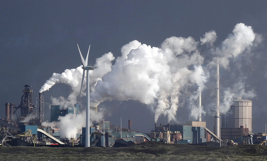 But there remains the fundamental economic problem of the tragedy of the commons. As long as the atmosphere and other parts of the environment are free to ‘use’ to pollute, and as long as the costs of doing so are borne largely by people other than the direct polluters, the market will fail to provide a solution. Australia’s bush fires can be directly attributed to climate change and climate change is exacerbated by coal-fired power stations. But Australia’s use of coal as a power source is only a tiny contributor to global climate change. Presumably, the Australian government would rather get a ‘free ride’ off other countries’ policies to cut emissions rather than bearing the economic cost of reducing coal-fired generation itself for little gain in terms of reduced global emissions.
However, people are not entirely selfish. Many are willing to make personal sacrifices to lead a more environmentally sustainable life. Many people, for example, are choosing electricity tariffs that are slightly higher but where the electricity is generated with zero carbon emissions. Firms have shown a readiness to respond to demands from their consumers for more sustainable products.
Articles
- Five essential steps to take right now to tackle climate change
World Economic Forum, Robin Pomeroy (17/1/20)
- Davos: Trump decries climate ‘prophets of doom’ with Thunberg in audience
BBC News (21/1/20)
- Greta Thunberg clashes with US treasury secretary in Davos
The Guardian, Graeme Wearden (23/1/20)
- Australia, your country is burning – dangerous climate change is here with you now
The Conversation, Michael E Mann (10/1/20)
- Climate change: What different countries are doing around the globe to tackle the crisis
Independent, Zoe Tidman (20/9/19)
- How we can combat climate change
Washington Post (2/1/19)
- Sir David Attenborough warns of climate ‘crisis moment’
BBC News, David Shukman (16/1/20)
- Climate change: Where we are in seven charts and what you can do to help
BBC News (14/1/20)
- Ten facts about the economics of climate change and climate policy
Brookings, Ryan Nunn, Jimmy O’Donnell, Jay Shambaugh, Lawrence H. Goulder, Charles D Kolstad and Xianling Long (23/10/19)
- The Federal Reserve Considers the Economics of Climate Change in 2020
Lawfare, Rachel Westrate (16/1/20)
- Bernie Sanders’ economic adviser says Australia’s bushfires are a climate change ‘wake-up call’
The Guardian, Ben Butler (7/1/20)
- Carbon pricing: What the research says
Journalist’s Resource, Harvard Kennedy School’s Shorenstein Center, Clark Merrefield (17/1/20)
- European Parliament backs Green Deal
Resource Media, Imogen Benson (17/1/20)
- Tackling climate change
Committee on Climate change
- Tragedy of the Commons: A Drama That Our Planet Is Not Enjoying
Felix, Xiuchen Xu (9/12/19)
Questions
- Draw a diagram to show how the external costs of carbon emissions cause a more than socially optimal output of products emitting CO2.
- What is meant by the ‘tragedy of the commons’? Give some environmental examples.
- Discuss possible solutions to the tragedy of the commons.
- Why was COP25 generally regarded as a failure?
- Identify four possible policies that governments could adopt to reduce carbon emissions and discuss their relative advantages and disadvantages.
- Are meetings such as the annual World Economic Forum meetings at Davos of any benefit other than to the politicians attending? Explain.
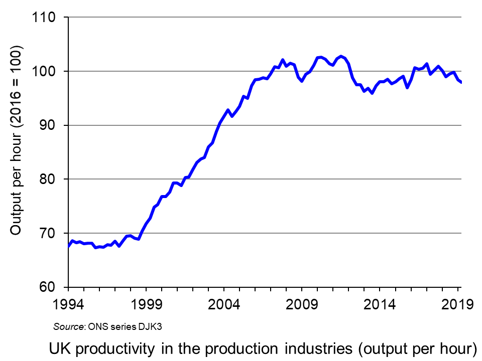 A lack of productivity growth has been a major problem for the UK economy over the past decade (click here for a PowerPoint of the chart). Is it possible that the new decade may see a pick-up in the growth in output per hour worked?
One possible solution to low productivity growth is to reduce working hours and even to move to a four-day week, but not to reduce total pay. If people work fewer hours, they may well be more productive in the hours they do work. In fact, not only may output per hour increase, but so too may output per worker, despite fewer hours being worked. What is more, the quality of output may increase with people being less tired and more motivated.
Several companies have experimented with a four-day week, including Microsoft in Japan, which employees 2300 workers. It found that, despite a 20% reduction in hours worked, output per hour worked increased by 40%, with total output thereby increasing. Workers were generally happier and more motivated and asked for fewer days off.
And it is not just a question of output: fewer hours can result in lower costs. The effect on costs will depend on the nature of new work patterns, including whether everyone has the same extra day off.
But a four-day week is only one way of cutting working hours for full-time employees. Another is to reduce the length of the working day. The argument is that people may work more efficiently if the standard working day is cut from eight to, say, five hours. As the first Thrive Global article article (linked below) states:
Just because you’re at your desk for eight hours doesn’t mean you’re being productive. Even the best employees probably only accomplish two to three hours of actual work. The five-hour day is about managing human energy more efficiently by working in bursts over a shorter period.
If people have more leisure time, this could provide a boost to the leisure and other industries. According to a Henley Business School study:
An extra day off could have a knock-on effect for the wider society. We found 54% of employees said they would spend their day shopping, meaning a potential boost for the high street, 43% would go to the cinema or theatre and 39% would eat out at restaurants.
What is more, many people would be likely to use the extra time productively, undertaking training, volunteering or other socially useful activities. Also family life is likely to improve, with people spending less time at work and commuting and having more time for their partners, children, other relatives and friends. In addition, people’s physical and mental health is likely to improve as they achieve a better work-life balance.
 So, should firms be encouraged to reduce hours for full-time workers with no loss of pay? Many firms may need no encouragement at all if they can see from the example of others that it is in their interests. But many firms may find it difficult, especially if their suppliers and/or customers are sticking with ‘normal’ working hours and want to do business during those hours. But, over time, as more firms move in this direction, so it will become increasingly in the interests of others to follow suit.
In the meantime, should the government introduce incentives (such as tax breaks) or regulations to limit the working week? Indeed, it was part of the Labour manifesto for the December 2019 election that the country should, over time, move to a four-day week. Although this was a long-term goal, it would probably have involved the use of some incentives to encourage employers to move in that direction or the gradual introduction of limits on the number of hours or days per week that people could work in a particular job. It is unlikely that the new Conservative government will introduce any specific measures, but would probably not want to discourage firms from reducing working hours, especially if it is accompanied by increased output per worker.
But despite the gains, there are some problems with reduced working hours. Many small businesses, such as shops, restaurants and firms offering technical support, may not have the flexibility to offer reduced hours, or may find it hard to increase productivity when there is a specific amount of work that needs doing, such as serving customers.
Another problem concerns businesses where the output of individuals is not easy to measure because they are part of a team. Reducing hours or the working week may not make such people work harder if they can ‘get way with it’. Not everyone is likely to be motivated by fewer hours to work harder.
Then there is the problem if reduced hours don’t work in boosting productivity. It may then be very difficult to reintroduce longer hours.
But, despite these problems, there are many firms where substantial gains in productivity could be made by restructuring work in a way that reduces hours worked. We may see more and more examples as the decade progresses.
Podcast
Articles
- Economics of a four-day working week: research shows it can save businesses mone
The Conversation, Miriam Marra (11/11/19)
- Less hours for work, more time on Earth: Why a four-day working week is good for you
Independent, Steve Taylor (16/12/19)
- Microsoft Japan Launched A Four-Day Workweek To Much Success: Is This The Key To Attracting Talent In The Tight U.S. Job Market?
Forbes, Jack Kelly (5/11/19)
- Will The Five-Hour Work Day Catch On In America?
Forbes, Jack Kelly (28/10/19)
- My Company Implemented a 5-Hour Workday — and the Results Have Been Astounding
Thrive Global, Stephan Aarstol (3/10/19)
- Why Does a Four-Day Work Week Achieve Better Results?
Thrive Global, Stephanie Lin (16/12/19)
- Four-Day Working Week Improves Staff’s Mental Health By 87%, Company Finds
Unilad, Niamh Shackleton (10/12/19)
- Hull business launches four-day working week as well as your birthday off and ‘Beer Fridays’
Hull Live, Phil Winter (5/12/19)
- A four-day work week? Sounds nice, but here’s the real deal
Sydney Morning Herald, Tony Featherstone (21/11/19)
- The four-day debate: Fantasy or feasible?
The Hindu, Business Live, Kamal Karanth (20/11/19)
- Finland’s ministry of transport floats tech-enabled four-day week
Computer Weekly, Gerard O’Dwyer (20/11/19)
- Should You Consider a 4 Day Work Week?
Small Business Trends, Rob Starr (5/12/19)
Report
Questions
- Distinguish between different ways of measuring labour productivity.
- Give some examples (from the linked references) of employers which have tried introducing a four-day week or reduced hours for full-time workers. What has been the outcome in each case?
- In what ways may reducing working hours reduce a firm’s total costs?
- What are the advantages and disadvantages of the government imposing (at some point in the future) a maximum working week or a four-day week?
- What types of firm might struggle in introducing a four-day week or a substantially reduced number of hours for full-time employees?
- What external benefits and costs might arise from a shorter working week?
 The online market for food delivery has grown rapidly grown in recent years. Deliveroo was founded in 2013 and has become one of the most recognised brands in this market. It now has a presence in around 100 towns and cities in the UK. In addition to offering customers restaurant cooked meals delivered straight to their homes, Deliveroo also provides a grocery store delivery service, for example in partnership with the Co-op.
Despite Deliveroo’s strong brand, the market leader in online restaurant delivery is actually Just Eat. Just Eat’s business model is built on it acting as an intermediary between restaurants and consumers who can use Just Eat’s website or app to order take-aways. This is in contrast to Deliveroo which also provides the delivery service. This means that Just Eat’s service is more viable in smaller towns. Deliveroo’s other main rival is Uber Eats.
Having been founded in the UK, Deliveroo has subsequently expanded its operations to around 10 other countries. However, this global expansion resulted in Deliveroo making losses of almost £200m in 2017. In part as a result of these losses, Deliveroo decided to look for new investment and by May 2019 had raised £450m. Deliveroo intends to use this money to fund its continued international expansion and to improve the service it provides. This includes growing its delivery-only kitchens business, which enables it to be less reliant on links with traditional restaurants.
Amazon was one of the big investors in Deliveroo, although the exact amount it invested is unknown. Interestingly, both Amazon and Uber have previously made approaches to buy Deliveroo outright. For Amazon this latest move may be a first step before looking to fully acquire Deliveroo.
 Despite this not being a full merger or acquisition, it was still investigated by the UK Competition and Markets Authority (CMA). Its remit allows it also to examine situations where an enterprise gains a ‘material influence over the policy of another’. This was the case with Amazon’s investment which, despite only allowing it to become a minority shareholder, enables it to participate in the management of the company.
Last week the CMA announced that it had completed its initial investigation and that it had concerns about the investment. Andrea Gomes de Silva, CMA Executive Director, stated that:
If the deal were to proceed in its current form, there’s a real risk that it could leave customers, restaurants and grocers facing higher prices and lower quality services as these markets develop. This is because the significant competition which could otherwise exist between Amazon and Deliveroo would be reduced.
The CMA has two specific concerns. Firstly, it is worried that competition in online restaurant delivery will be harmed. Amazon had started competing with Deliveroo in this market in 2016 when it launched Amazon Restaurants. However, it shut this down two years later. The CMA uncovered internal documents from Amazon suggesting that it continued to monitor closely this market. Therefore, the CMA believed that Amazon re-entering the market was a distinct possibility and argued that this would be a substantial boost for competition. The CMA’s concern was that its investment in Deliveroo would make this re-entry less likely.
On the other hand, there is a counterargument to the CMA’s which says that Amazon’s entry through investment, even if only at this time resulting in minority ownership of Deliveroo, could itself boost competition. This is an important trade-off the CMA should take into account.

Secondly, the CMA is worried that Amazon’s investment will also harm competition in online grocery store delivery. Here, Amazon and Deliveroo are two of the leading players in the market. The CMA believes that, as the market grows in the future, competition between the two could intensify. However, the investment in Deliveroo would put this in jeopardy.
At the time of writing, Amazon and Deliveroo have five working days to offer proposals to the CMA to address these competition concerns. It will be interesting to see how they respond to the CMA and whether a full-blown investigation follows. If it does, this may eventually lead to the CMA blocking Amazon’s investment.
POSTSCRIPT: Amazon and Deliveroo did not offer a proposal to address the competition concerns and so on 27th December the CMA referred the case for a full-blown investigation.
To be continued.
Articles
Questions
- What are the key features of competition in the online market for food delivery?
- What are the pros and cons of Just Eat’s business model in comparison with Deliveroo’s?
- What are the potential advantages Amazon has over the other players in the online market for food delivery?
 The monetary policy mandates of central banks have an impact on all our lives. While the terminology might not be familiar to many outside economics, their impact is, however, undeniably important. This is because they set out the objectives for the operation of monetary policy. Adjustments to interest rates or the growth of the money supply, which affect us all, reflect the mandate given to the central bank.
Since 1977 the mandate given to the Federal Reserve (the US central bank) by Congress has been to promote effectively the goals of maximum employment, stable prices, and moderate long-term interest rates. This mandate has become known as the dual mandate because it emphasises both employment and stable prices. Since 2012, the Federal Reserve’s Open Market Committee has issued an annual statemenent of its long-run goals. The latest was published in January 2019. Since this time, the Federal Reserve has explicitly set the ‘longer-run goal for inflation’ at 2 per cent. It has also emphasised that it would be ‘concerned’ if the inflation rate was persistently above or below this level.
In November 2018 the Federal Reserve began a review of its monetary policy strategy, its tools and how it communicates monetary policy. The review is being conducted within the guidelines that its statutory mandate gives and as well as the longer-term inflation goal of 2 per cent. However, one of the issues being addressed by the review is how the operation of monetary policy can avoid the rate of inflation frequently undershooting 2 per cent, as it has done since the financial crisis of the late 2000s and the introduction of the 2 per cent inflation rate target.
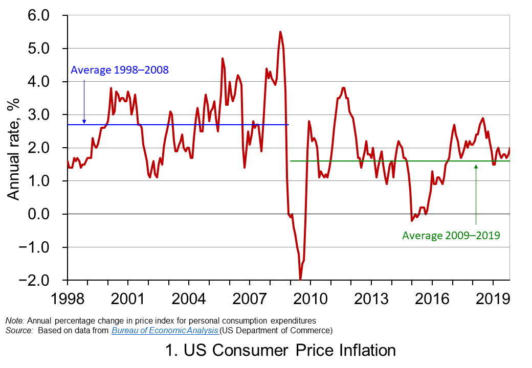 Chart 1 shows the annual rate of consumer price inflation in the US since 1998. It helps to illustrate the concern that low inflation rates can become entrenched. The chart shows that, while the average inflation rate from 1998 to 2008 was 2.7 per cent, from 2009 the average has been only 1.6 per cent. Interestingly, the average since 2012, when the explicit 2 per cent goal was introduced, to the present day is also 1.6 per cent. (Click here to download the PowerPoint chart.)
The concern going forward is that the natural or neutral rate of interest, which is the policy rate at which the rate of inflation is close to its target level and the level of output is close to its potential level, is now lower than in the recent past. Hence, when the next downturn occurs there is likely to be less room for cutting interest rates. Hence, the review is looking, in essence, to future-proof the conduct of monetary policy.
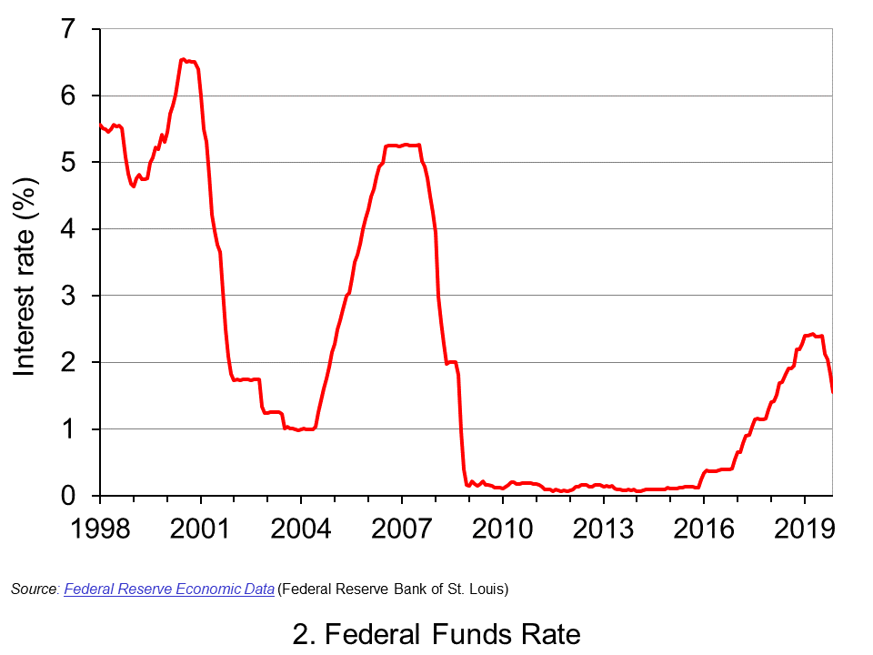 Chart 2 shows the Federal Fund rate since 1998. This is the rate at which commercial banks lend to each other the reserve balances they hold at the Federal Reserve in order to meet their reserve requirements. The Federal Reserve can affect this rate through buying or selling government securities. If it wants to drive up rates, it can sell holdings of government securities and reduce the money supply. If it wants to drive rates down, it can buy government securities and increase the money supply. The effects then ripple through to other interest rates and, in turn, aggregate demand and inflation. (Click here to download a copy of the PowerPoint chart.)
We can see from Chart 2 the dramatic cuts made by the Federal Reserve to interest rates as the financial crisis unfolded. The subsequent ‘normalisation’ of the Federal Funds rate in the 2010s saw the Federal Funds Rate rise to no higher than between 2.25 and 2.5 per cent. Then in 2019 the Federal Reserve began to cut rates again. This was despite historically-low unemployment rates. In November 2019 the unemployment rate fell to 3.5 per cent, its lowest since 1969. This has helped fuel the argument among some economists and financiers, which we saw earlier, that that the natural (or neutral) interest rate is now lower.
If the natural rate is lower, then this raises concerns about the effectiveness of monetary policy in future economic downturns. In this context, the review is considering ways in which the operation of monetary policy would be able to prevent the rate of inflation consistently undershooting its target. This includes a discussion of how the Fed can prevent inflationary expectations becoming anchored below 2 per cent. This is important because, should they do so, they help to anchor the actual rate of inflation below 2 per cent. One possibility being considered is an inflation make-up strategy. In other words, a period of below-target inflation rates would need to be matched by a period where inflation rates could exceed the 2 per cent target in order that the long-term average of 2 per cent is met.
An inflation make-up policy would work like forward guidance in that people and markets would know know that short-term interest rates would be kept lower for longer. This would then help to force longer-term interest rates lower as well as providing people and businesses with greater certainty that interest rates will be lower for longer. This could help to encourage spending, raise economic growth and prevent inflation from overshooting its target for any extensive period of time.
An inflation make-up strategy would, in part, help to cement the idea that the inflation target is effectively symmetrical and that 2 per cent is not an upper limit for the inflation rate. But, it would do more than that: it would allow the Fed to deliberately exceed the 2 per cent target.
An inflation make-up strategy does raise issues. For example, how would the Fed determine the magnitude of any inflation make-up and for how long would a looser monetary stance be allowed to operate? In other words, would an inflation make-up strategy be determined by a specific rule or formula? Or, would the principle be applied flexibly? Finally, could a simpler alternative be to raise the target rate itself, given the tendency to undershoot the 2 per cent target rate? If so, what should that the rate be?
We should know by the end of 2020 whether the Federal Reserve will adopt, when necessary, an inflation make-up monetary policy.
Articles
Questions
- What do you understand by the monetary policy mandate of a central bank?
- Explain the ways in which the monetary policy mandate of the central bank affects our everyday lives.
- Why are inflation-rate expectations important in determining actual inflation rates?
- Why is the Federal Reserve concerned about its ability to use monetary policy effectively during future economic downturns?
- Discuss the economic arguments for and against central banks operating strict inflation-rate targets.
- Does the case for adopting an inflation make-up monetary policy mandate show that the argument for inflation-rate targeting has been lost?
- What do you understand by the idea of a natural or neutral policy interest rate? Would the actual rate be expected to be above or below this if the rate of inflation was below its target level?
 Elections are times of peak deception. Political parties have several ways in which they can use data to persuade people to vote for them. At one extreme, they can simply make up ‘facts’ – in other words, they can lie. There have been various examples of such lies in the run-up to the UK general election of 12 December 2019. The linked article below gives some examples. But data can be used in other deceptive ways, short of downright lies.
Politicians can use data in two ways. First, statistics can be used to describe, explain and interpret the past. Second, they can be used as the basis of forecasts of the future effects of policies.
In terms of past data, one of the biggest means of deception is the selective use of data. If you are the party currently in power, you highlight the good news and ignore the bad. You do the reverse if you are currently in opposition. The data may be correct, but selective use of data can give a totally false impression of events.
In terms of forecast data, you highlight those forecasts, or elements of them, that are favourable to you and ignore those that are not.
 Politicians rely on people’s willingness to look selectively at data. People want to see ‘evidence’ that reinforces their political views and prejudices. News media know this and happily do the same as politicians, selectively using data favourable to their political leanings. And it’s not just newspapers that do this. There are many online news sites that feed their readers with data supportive of their position. And there are many social media platforms, where people can communicate with people in their political ‘bubble’.
Genuine fact-checking sites can help, as can independent forecasters, such as the Institute for Fiscal Studies. But too many voters would rather only look at evidence, genuine or not, that supports their political point of view.
This can make life hard for economists who seek to explain the world with an open mind, based on a non-biased use of evidence – and hard for economic forecasters, who want to use full and accurate data in their models and to make realistic assumptions, emphasising that their forecasts are only the most likely outcome, not a certainty. As the article states:
Economic forecasts are flawed and their limitations should be acknowledged. But they should not be blindly dismissed as fake facts. And as far as political debate and discourse is concerned, in the long run, the truth may will out.
Article
Questions
- Give some specific examples of ways in which politicians misuse data.
- Give some specific examples of ways in which politicians misuse the analysis of economists.
- Distinguish between positive and normative statements? Should economists make policy recommendations? If so, in what context?
- Why are economic forecasts flawed, but why should they not be dismissed as ‘fake facts’?
- Examine the manifestos of two political parties and provide a critique of their economic analysis.
 At the annual World Economic Forum (WEF) in Davos, Switzerland, world political and business leaders are meeting to discuss pressing economic issues of the day. This year, one of the key themes is climate change and “how to save the planet”.
  At his speech at the WEF, President Trump said that he supported the initiative to plant one trillion trees worldwide to act as a carbon sink. However, he gave no details of just what the nature of the support would be. Would there be subsidies or tax breaks, for example, for landowners to plant trees? In the meantime, his administration has relaxed regulations to curb air and water pollution. And he has withdrawn the USA from the Paris climate agreement.
 The year starts with climate being addressed at Davos; it ends with the annual Conference of the Parties (COP26) to the United Nations Framework Convention on Climate Change (UNFCCC). This year it will be in Glasgow. There is much hope pinned on this conference, given the growing realisation of the effects of climate change, from bush fires in Australia, to floods in Indonesia and other parts of southeast Asia, to more extreme hurricanes/typhoons, to rapidly melting glaciers and retreating sea ice, to rising sea levels, to crop failures and the displacement of humans and the destruction of wildlife and habitat.
  But there remains the fundamental economic problem of the tragedy of the commons. As long as the atmosphere and other parts of the environment are free to ‘use’ to pollute, and as long as the costs of doing so are borne largely by people other than the direct polluters, the market will fail to provide a solution. Australia’s bush fires can be directly attributed to climate change and climate change is exacerbated by coal-fired power stations. But Australia’s use of coal as a power source is only a tiny contributor to global climate change. Presumably, the Australian government would rather get a ‘free ride’ off other countries’ policies to cut emissions rather than bearing the economic cost of reducing coal-fired generation itself for little gain in terms of reduced global emissions.

 A lack of productivity growth has been a major problem for the UK economy over the past decade (click
  So, should firms be encouraged to reduce hours for full-time workers with no loss of pay? Many firms may need no encouragement at all if they can see from the example of others that it is in their interests. But many firms may find it difficult, especially if their suppliers and/or customers are sticking with ‘normal’ working hours and want to do business during those hours. But, over time, as more firms move in this direction, so it will become increasingly in the interests of others to follow suit.
 The online market for food delivery has grown rapidly grown in recent years. Deliveroo was founded in 2013 and has become one of the most recognised brands in this market. It now has a presence in around 100 towns and cities in the UK. In addition to offering customers restaurant cooked meals delivered straight to their homes, Deliveroo also provides a grocery store delivery service, for example in partnership with the Co-op.
 Despite this not being a full merger or acquisition, it was still investigated by the UK Competition and Markets Authority (CMA). Its
 The monetary policy mandates of central banks have an impact on all our lives. While the terminology might not be familiar to many outside economics, their impact is, however, undeniably important. This is because they set out the objectives for the operation of monetary policy. Adjustments to interest rates or the growth of the money supply, which affect us all, reflect the mandate given to the central bank.
 Chart 1 shows the annual rate of consumer price inflation in the US since 1998. It helps to illustrate the concern that low inflation rates can become entrenched. The chart shows that, while the average inflation rate from 1998 to 2008 was 2.7 per cent, from 2009 the average has been only 1.6 per cent. Interestingly, the average since 2012, when the explicit 2 per cent goal was introduced, to the present day is also 1.6 per cent. (Click
  Chart 2 shows the Federal Fund rate since 1998. This is the rate at which commercial banks lend to each other the reserve balances they hold at the Federal Reserve in order to meet their reserve requirements. The Federal Reserve can affect this rate through buying or selling government securities. If it wants to drive up rates, it can sell holdings of government securities and reduce the money supply. If it wants to drive rates down, it can buy government securities and increase the money supply. The effects then ripple through to other interest rates and, in turn, aggregate demand and inflation. (Click
  Elections are times of peak deception. Political parties have several ways in which they can use data to persuade people to vote for them. At one extreme, they can simply make up ‘facts’ – in other words, they can lie. There have been various examples of such lies in the run-up to the UK general election of 12 December 2019. The linked article below gives some examples. But data can be used in other deceptive ways, short of downright lies.
  Politicians rely on people’s willingness to look selectively at data. People want to see ‘evidence’ that reinforces their political views and prejudices. News media know this and happily do the same as politicians, selectively using data favourable to their political leanings. And it’s not just newspapers that do this. There are many online news sites that feed their readers with data supportive of their position. And there are many social media platforms, where people can communicate with people in their political ‘bubble’.