 On 15 March 2019, the ‘Organ Donation (Deemed Consent) Bill’ was passed into law. (See the blog, Organ donations – Changing the default option vs active choice.) The government has just announced that this will come into force on 20 May this year. Under the scheme, ‘adults in England will be considered potential donors unless they chose to opt out or are excluded. The act is known as Max and Keira’s law in honour of a boy who received a heart transplant and the girl who donated it.’
This change from an ‘opt-in’ to an ‘opt-out’ system follows a similar a move in Wales in 2015. Since then, Wales has seen a significant increase in potential donors, with the consent rate rising from 58% to 77%. A similar move in Scotland will come into force in the autumn of this year. The government expects there to be an additional 700 transplant operations per year available for transplant by 2023.
These moves from an opt-in to an opt-out system are consistent with ‘nudge theory’. This maintains that positive reinforcement or making a decision easy for people can persuade them to make a particular choice. They are ‘nudged’ into so doing.
Opting out and nudge theory
In the case of having to opt in to a scheme such as organ donation, people have to make the decision to take part. Many, as a result, do not, partly because they never seem to find the time to do so, even though they might quite like to. With the busy lives people lead, it’s too easy to think, ‘Yes, I’ll do that some time’, but never actually get round to doing it: i.e. they have present bias and hence behave in a time-inconsistent manner.
 With an opt-out system, people are automatically signed up to the scheme, but can freely choose to opt out. In the case of the new organ donor schemes in the UK, it is/will be assumed that organs from people killed in an accident who had not opted out could be used for transplants. If you do not want your organs to be used, you have to notify that you are opting out.
It could be the same with charitable giving. Some firms add a small charitable contribution to the price of their products (e.g. airline tickets or utility bills), unless people opt out.
Similarly, under UK pension arrangements introduced from 2012, firms automatically deduct pension contributions from employees’ wages unless they opt out of the scheme. Opt-out pension schemes like this retain between 90 and 95 per cent of employees. Opt-in pension schemes, by contrast, have much lower participation rates of around 60 per cent, even though they are otherwise identical.
This type of ‘nudging’ can improve the welfare of those who make systematic mistakes (i.e. operate in a time-inconsistent manner), while imposing very limited harm on those who act in a time-consistent manner. If it is in the interests of someone to opt out of the scheme, they can easily do so. Policies such as these are an example of what behavioural economists call ‘soft paternalism’.
Articles
- New opt-out model for organ donation to come into force in May
Pulse, Helen Quinn (25/2/20)
- Max and Keira’s law: New ‘opt-out’ organ donor system to be introduced on 20 May, government plans
Sky News, Greg Heffer (25/2/20)
- Adults to be automatically enrolled as organ donors under new law
Independent, Peter Stubley (26/2/20)
- Max and Keira’s law: New ‘opt-out’ organ donor system that presumes all adults agree to donate when they die will be introduced in May
Mail Online, Ben Spencer (25/2/20)
- Opt-out organ donation law: Your questions answered
New Scientist, Clare Wilson (27/2/20)
- Should organ donors be paid? The heavy toll of US kidney shortage
BBC News, US and Canada, Henri Astier (18/2/20)
- What Spain can teach Scotland about organ donation
BBC News, Scotland, Susie Forrest (18/10/19)
- A little nudge goes a long way in increasing organ donor registrations
The Conversation, Nicole Robitaille (2/5/19)
- How nudge theory is ageing well
Financial Times, Julian Baggini (19/4/19)
- Richard Thaler: ‘If you want people to do something, make it easy’
Financial Times, Tim Harford (2/8/19)
- Why a nudge from the state beats a slap
The Observer, Richard Reeves (30/7/08)
Official Information
Questions
- Why do opt-out schemes have a higher take up than opt-in ones? Would this apply if people behaved in a time-consistent manner?
- What is present bias? How does it differ from simple impatience? Explain how present bias might help to explain the impact of changing the default option.
- What are the arguments for and against nudging people to make decisions that benefit them or are in the social interest?
- Give some example of nudges that are used in public policy or would be a good idea to use. Consider how effective they are likely to be. (You might refer to the work of the Behavioural Insights Team.)
- What are the possible drawbacks of presumed consent in organ donation?
- What are the arguments for and against paying live people to donate organs, such as a kidney?
- How might people be encouraged to behave in the right way during an epidemic, such as corona virus?
- To what extent was nudge theory used during the Brexit referendum campaign and in the two subsequent general elections?
 The government has announced outlines of the new system of immigration controls from January 2021 when the Brexit transition period is scheduled to finish. It plans to introduce an Australian-style points-based system. This will apply to all EU and Non-EU citizens. The aim is to attract skilled workers, while preventing non-skilled or low-skilled workers from entering the UK for employment.
But even skilled workers will need to meet three criteria in order to obtain a work visa: (i) having the offer of a job paying a minimum of £25,600 per annum, except in designated jobs where there is a shortage of labour; (ii) being able to speak English; (iii) having qualifications equivalent to A levels.
To apply for a work visa, applicants must have at least 70 points according to the following table:
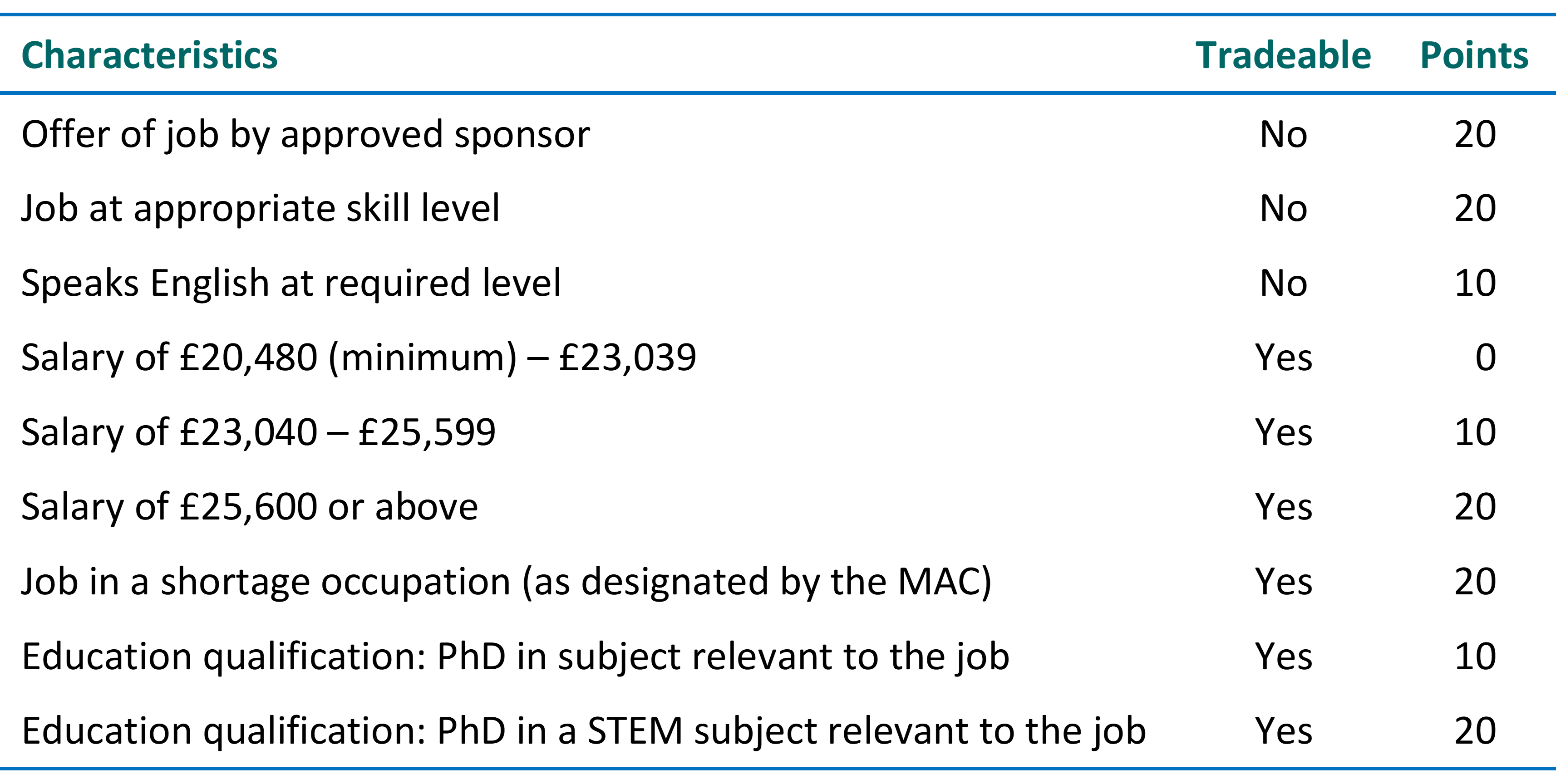
In certain jobs where there is a shortage of labour, designated by the Migration Advisory Committee (MAC), immigrants will be able to earn a lower income, provided it is above £20,480 per annum. They will earn 20 points for such jobs, which can offset not meeting the £25,600 threshold. Such jobs could include those in healthcare and farming. There will also be temporary visas for seasonal workers, such as fruit pickers.
The government argues that the new system will encourage employers to substitute technology for labour, with greater investment in equipment and computers. This would increase labour productivity and wages without reducing employment.
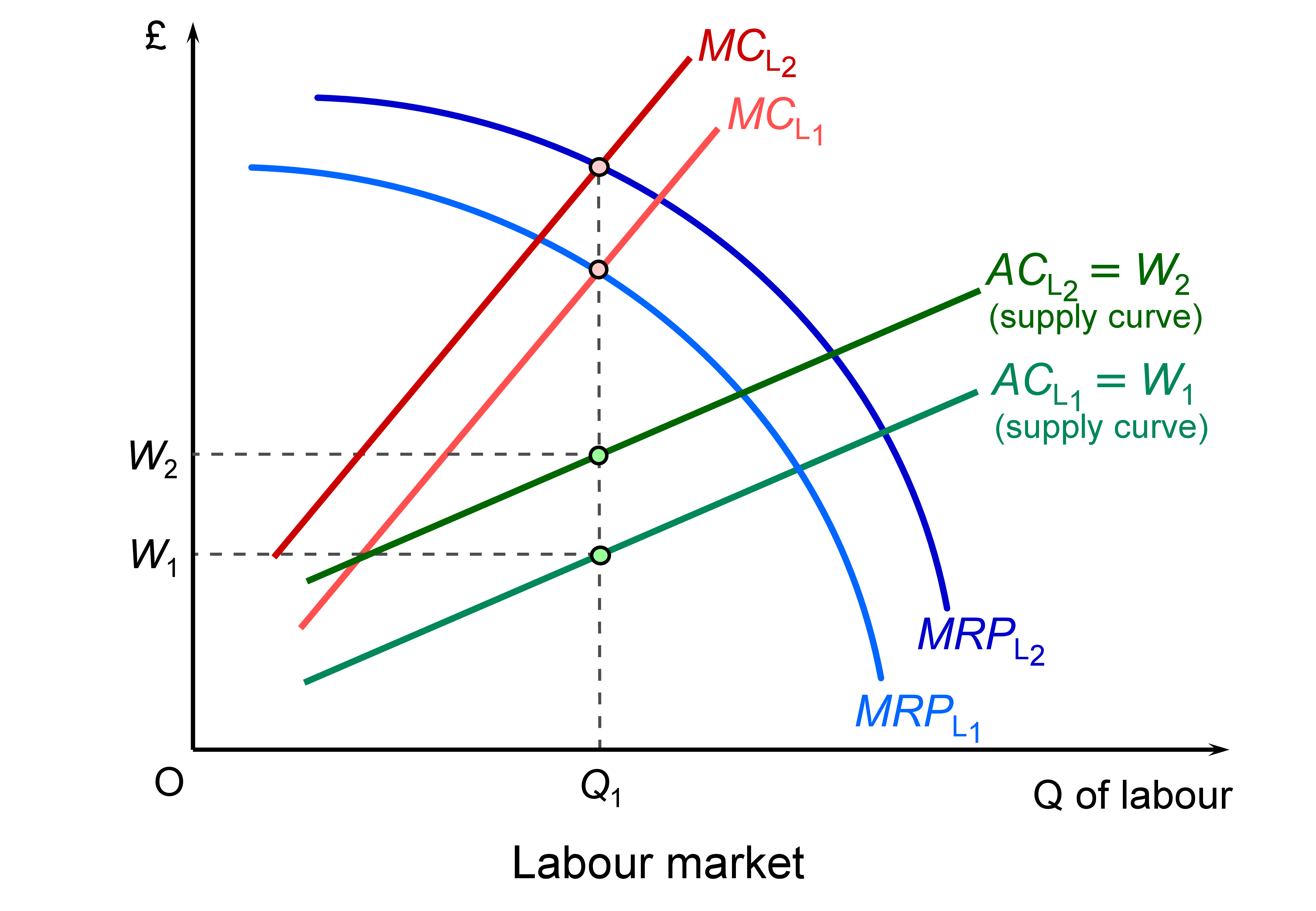 This is illustrated in the diagram, which illustrates a low-paid job which will be impacted by the restrictions. If there is a rise in productivity through technological change, the marginal revenue product of labour curve shifts upwards from MRPL1 to MRPL2 and offsets the leftward shift in labour supply (caused by the decline in immigration) from ACL1 to ACL2 and the marginal cost of labour from MCL1 to MCL2. Employment is where the marginal cost of labour equals the marginal revenue product of labour. This remains at Q1. Wages are given by the supply curve of labour and rise from W1 to W1. (Click here for a PowerPoint of the diagram.)
Even if the upward shift in the MRPL curve is not sufficient to offset the leftward shift in the labour supply curve, wages will still rise, but there will be a fall in employment.
In higher-paid skilled jobs where people meet the points requirement, there will be little effect on wages and employment, except where people are generally discouraged by a points system, even if they have the points themselves.
The government also argues that there is a large pool of UK residents who can take up jobs that would otherwise have been filled by immigrants. The Home Secretary referred to the 8.48 million people who are economically inactive who could fill jobs no longer filled by immigrants. However, as the data show, most  of these people are not available for work. Some 2.3 million are students, 1.9 million are carers at home looking after relatives, 2.1 million are long-term sick and 1.1 million are retired. Only 1.9 million (22.1% of the economically inactive) would like a job and not all these would be able to take up one (e.g. the long-term sick).
One the biggest problems concerns low-paid sectors where it is very difficult to substitute capital for labour through use of technology. Examples include social care, health care, the leisure and hospitality industry and certain jobs in farming. There could be severe shortages of labour in such industries. It remains to be seen whether such industries will be given exemptions or more relaxed conditions by the government in line with advice from the Migration Advisory Committee.
More details will emerge of the points system in the coming months. It will be interesting to see how responsive the government will be to the concerns of employers and workers.
Videos
Articles
Questions
- Find out how the proposed points-based system for immigration differs from the current system that applies to non-EU citizens.
- What will be the likely impact of reducing immigration of unskilled and low-skilled people?
- What barriers are there to substituting capital for labour in the caring and leisure sectors?
- What would be the macroeconomic effects of a substantial reduction in immigration?
 With many countries experiencing low growth some 12 years after the financial crisis and with new worries about the effects of the coronavirus on output in China and other countries, some are turning to a Keynesian fiscal stimulus (see Case Study 16.6 on the student website). This may be in the form of tax cuts, or increased government expenditure or a combination of the two. The stimulus would be financed by increased government borrowing (or a reduced surplus).
The hope is that there will also be a longer-term supply-side effect which will boost potential national income. This could be through tax reductions creating incentives to invest or work more efficiently; or it could be through increased capacity from infrastructure spending, whether on transport, energy, telecommunications, health or education.
In the UK, the former Chancellor, Sajid Javid, had adopted a fiscal rule similar to the Golden Rule adopted by the Labour government from 1997 to 2008. This stated that, over the course of the business cycle, the government should borrow only to invest and not to fund current expenditure. Javid’s rule was that the government would balance its current budget by the middle of this Parliament (i.e. in 2 to 3 years) but that it could borrow to invest, provided that this did not exceed 3% of GDP. Previously this limit had been set at 2% of GDP by the former Chancellor, Philip Hammond. Using his new rule, it was expected that Sajid Javid would increase infrastructure spending by some £20 billion per year. This would still be well below the extra promised by the Labour Party if they had won the election and below what many believe Boris Johnson Would like.
 Sajid Javid resigned at the time of the recent Cabinet reshuffle, citing the reason that he would have been required to sack all his advisors and use the advisors from the Prime Minister’s office. His successor, the former Chief Secretary to the Treasury, Rishi Sunak, is expected to adopt a looser fiscal rule in his Budget on March 11. This would result in bigger infrastructure spending and possibly some significant tax cuts, such as a large increase in the threshold for the 40% income tax rate.
A Keynesian stimulus would almost certainly increase the short-term economic growth rate as inflation is low. However, unemployment is also low, meaning that there is little slack in the labour market, and also the output gap is estimated to be positive (albeit only around 0.2%), meaning that national income is already slightly above the potential level.
 Whether a fiscal stimulus can increase long-term growth depends on whether it can increase capacity. The government hopes that infrastructure expenditure will do just that. However, there is a long time lag between committing the expenditure and the extra capacity coming on stream. For example, planning for HS2 began in 2009. Phase 1 from London to Birmingham is currently expected to be operation not until 2033 and Phase 2, to Leeds and Manchester, not until 2040, assuming no further delays.
Crossrail (the new Elizabeth line in London) has been delayed several times. Approved in 2007, with construction beginning in 2009, it was originally scheduled to open in December 2018. It is now expected to be towards the end of 2021 before it does finally open. Its cost has increased from £14.8 billion to £18.25 billion.
Of course, some infrastructure projects are much quicker, such as opening new bus routes, but most do take several years.
The first five articles look at UK policy. The rest look at Keynesian fiscal policies in other countries, including the EU, Russia, Malaysia, Singapore and the USA. Governments seem to be looking for a short-term boost to aggregate demand that will increase short-term GDP, but also have longer-term supply-side effects that will increase the growth in potential GDP.
Articles
Questions
- Illustrate the effect of an expansionary fiscal policy with a Keynesian Cross (income and expenditure) diagram or an injections and withdrawals diagram.
- What is meant by the term ‘output gap’? What are the implications of a positive output gap for expansionary Keynesian policy?
- Assess the benefits of having a fiscal rule that requires governments to balance the current budget but allows borrowing to invest.
- Would there be a problem following such a rule if there is currently quite a large positive output gap?
- To what extent are the policies being proposed in Russia, the EU, Malaysia and Singapore short-term demand management policies or long-term supply-side policies?
 Since the financial crisis of 2008–9, the UK has experienced the lowest growth in productivity for the past 250 years. This is the conclusion of a recent paper published in the National Institute Economics Review. Titled, Is the UK Productivity Slowdown Unprecedented, the authors, Nicholas Crafts of the University of Sussex and Terence C Mills of Loughborough University, argue that ‘the current productivity slowdown has resulted in productivity being 19.7 per cent below the pre-2008 trend path in 2018. This is nearly double the previous worst productivity shortfall ten years after the start of a downturn.’
According to ONS figures, productivity (output per hour worked) peaked in 2007 Q4. It did not regain this level until 2011 Q1 and by 2019 Q3 was still only 2.4% above the 2007 Q4 level. This represents an average annual growth rate over the period of just 0.28%. By contrast, the average annual growth rate of productivity for the 35 years prior to 2007 was 2.30%.
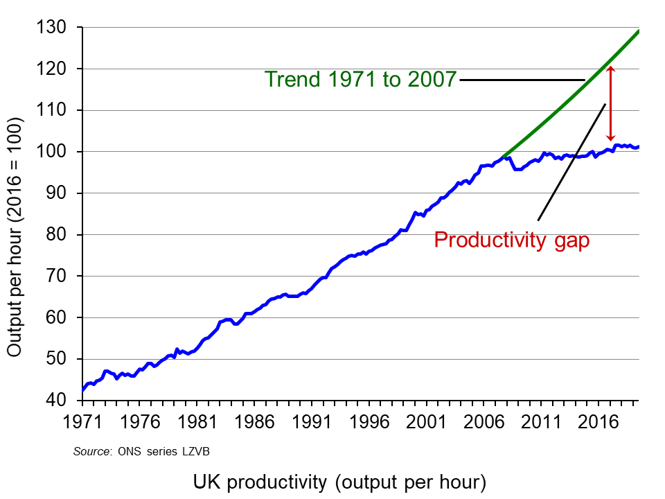 The chart illustrates this and shows the productivity gap, which is the amount by which output per hour is below trend output per hour from 1971 to 2007. By 2019 Q3 this gap was 27.5%. (Click here for a PowerPoint of the chart.) Clearly, this lack of growth in productivity over the past 12 years has severe implications for living standards. Labour productivity is a key determinant of potential GDP, which, in turn, is the major limiter of actual GDP.
Crafts and Mills explore the reasons for this dramatic slowdown in productivity. They identify three primary reasons.
 The first is a slowdown in the impact of developments in ICT on productivity. The office and production revolutions that developments in computing and its uses had brought about have now become universal. New developments in ICT are now largely in terms of greater speed of computing and greater sophistication of software. Perhaps with an acceleration in the development of artificial intelligence and robotics, productivity growth may well increase in the relatively near future (see third article below).
The second cause is the prolonged impact of the banking crisis, with banks more cautious about lending and firms more cautious about borrowing for investment. What is more, the decline in investment directly impacts on potential output, and layoffs or restructuring can leave people with redundant skills. There is a hysteresis effect.
The third cause identified by Crafts and Mills is Brexit. Brexit and the uncertainty surrounding it has resulted in a decline in investment and ‘a diversion of top-management time towards Brexit planning and a relative shrinking of highly-productive exporters compared with less productive domestically orientated firms’.
Articles
Paper
Questions
- How suitable is output (GDP) per hour as a measure of labour productivity?
- Compare this measure of productivity with other measures.
- According to Crafts and Mills, what is the size of the impact of each of their three explanations of the productivity slowdown?
- Would you expect the growth in productivity to return to pre-2007 levels over the coming years? Explain.
- Explain the underlying model for obtaining trend productivity growth rates used by Crafts and Mills.
- Explain and comment on each of the six figures in the Crafts and Mills paper.
- What policies should the government adopt to increase productivity growth?
 How to get the most from your money? This is the question posed by the linked article below. It’s a topic we’ve looked at in previous posts, such as Studies show that money can buy happiness (but only if you spend on experiences), Happiness economics and Peak stuff. This article takes the arguments further.
It suggests that, up to a certain level of income, there is a roughly linear relationship between money and life satisfaction. As poor people have more to spend, so they can begin to escape poverty and the negative features of financial insecurity and a lack of basic necessities, such as food and shelter. They also gain a greater freedom to choose what and when to buy. Beyond a certain level, however, the rate of increase in life satisfaction tends to decline, as does the specific pleasure from additional individual purchases. In economists’ language, the marginal utility of income diminishes.
But the article goes further than this. It suggests that satisfaction or happiness is of two broad types. The first is the general sense of well-being that people get from their life. This tends to be relatively stable for any given person, but will tend to increase as people have more money to spend or have more fulfilling jobs. Of course, there may well be a trade-off between income and job satisfaction. Some people may prefer to take a cut in pay for a more fulfilling job.
 The second is the satisfaction or happiness you get from specific experiences. This tends to fluctuate on a day-to-day basis, depending on what you are doing. Here, what you purchase and the use you make of the purchases is a key component.
So what lessons are there for earning and spending money wisely? To start with, it is important to get a good work-life balance. It may be worth trading income for job satisfaction. Here the focus should be on long-term fulfilment, rather than on the short-term happiness from more ‘stuff’. Then it is important to spend money wisely. Here the author identifies three lessons:
The first is to consider buying time. Time-saving purchases, such as dishwashers can help. So too can ‘outsourcing’ activities, such as cleaning, laundry, cooking, DIY or child care, if they give you more time to do other more fulfilling things (but not if you love doing them!).
 The second is to spend more money on experiences (as we saw in the post Studies show that money can buy happiness (but only if you spend on experiences). A better TV or car may seem like a wiser investment than more dinners out, holidays or going to concerts. But we quickly adapt to new upgraded ‘stuff’, thereby eliminating any additional satisfaction. Experiences, however, tend to linger in the memory. As Tom Gilovich, a psychology professor at Cornell University, is quoted by the article as saying:
Even though, in a material sense, they [experiences] come and go, they live on in the stories we tell, the relationships we cement, and ultimately in the sense of who we are.
Choosing a more fulfilling but less well-paid job is a form of spending money on experiences.
The third is to give some of your money away, whether to charity or to helping friends or relatives. As Gilovich says:
It’s hard to find a more charming finding than that by giving away money, you not only make someone else happier, you make yourself happier.
Article
Questions
- What is meant by ‘diminishing marginal utility of income’? Is the concept consistent with the arguments in the article?
- In what sense may it be rational to choose a lower-paid job?
- Is ‘happiness’ the same as ‘utility’ as the concept is used by economists?
- Does the concept of ‘peak stuff’ apply to all physical products? Explain your answer.
- If giving money away makes a person happy, is it truly altruistic for that person to do so? Explain.
 On 15 March 2019, the ‘Organ Donation (Deemed Consent) Bill’ was passed into law. (See the blog, Organ donations – Changing the default option vs active choice.) The government has just announced that this will come into force on 20 May this year. Under the scheme, ‘adults in England will be considered potential donors unless they chose to opt out or are excluded. The act is known as Max and Keira’s law in honour of a boy who received a heart transplant and the girl who donated it.’
  With an opt-out system, people are automatically signed up to the scheme, but can freely choose to opt out. In the case of the new organ donor schemes in the UK, it is/will be assumed that organs from people killed in an accident who had not opted out could be used for transplants. If you do not want your organs to be used, you have to notify that you are opting out.
 The government has announced outlines of the new system of immigration controls from January 2021 when the Brexit transition period is scheduled to finish. It plans to introduce an Australian-style
 This is illustrated in the diagram, which illustrates a low-paid job which will be impacted by the restrictions. If there is a rise in productivity through technological change, the marginal revenue product of labour curve shifts upwards from MRPL1 to MRPL2 and offsets the leftward shift in labour supply (caused by the decline in immigration) from ACL1 to ACL2 and the marginal cost of labour from MCL1 to MCL2. Employment is where the marginal cost of labour equals the marginal revenue product of labour. This remains at Q1. Wages are given by the supply curve of labour and rise from W1 to W1. (Click
  of these people are not available for work. Some 2.3 million are students, 1.9 million are carers at home looking after relatives, 2.1 million are long-term sick and 1.1 million are retired. Only 1.9 million (22.1% of the economically inactive) would like a job and not all these would be able to take up one (e.g. the long-term sick).
 With many countries experiencing low growth some 12 years after the financial crisis and with new worries about the effects of the
  Sajid Javid resigned at the time of the recent Cabinet reshuffle, citing the reason that he would have been required to sack all his advisors and use the advisors from the Prime Minister’s office. His successor, the former Chief Secretary to the Treasury, Rishi Sunak, is expected to adopt a looser fiscal rule in his Budget on March 11. This would result in bigger infrastructure spending and possibly some significant tax cuts, such as a large increase in the threshold for the 40% income tax rate.
 Whether a fiscal stimulus can increase long-term growth depends on whether it can increase capacity. The government hopes that infrastructure expenditure will do just that. However, there is a long time lag between committing the expenditure and the extra capacity coming on stream. For example,
  Since the financial crisis of 2008–9, the UK has experienced the lowest growth in productivity for the past 250 years. This is the conclusion of a recent paper published in the National Institute Economics Review. Titled,
  The chart illustrates this and shows the productivity gap, which is the amount by which output per hour is below trend output per hour from 1971 to 2007. By 2019 Q3 this gap was 27.5%. (Click
  The first is a slowdown in the impact of developments in ICT on productivity. The office and production revolutions that developments in computing and its uses had brought about have now become universal. New developments in ICT are now largely in terms of greater speed of computing and greater sophistication of software. Perhaps with an acceleration in the development of artificial intelligence and robotics, productivity growth may well increase in the relatively near future (see third article below).
 How to get the most from your money? This is the question posed by the linked article below. It’s a topic we’ve looked at in previous posts, such as
  The second is the satisfaction or happiness you get from specific experiences. This tends to fluctuate on a day-to-day basis, depending on what you are doing. Here, what you purchase and the use you make of the purchases is a key component.
 The second is to spend more money on experiences (as we saw in the post