 Adverts are increasingly diverse, ranging from families using various products and promoting their qualities, to a gorilla drumming, a horse dancing and a monkey drinking tea! But, how important is advertising to a product’s brand. Does it have a positive effect on sales and profitability?
The key role of advertising is to sell more products and many firms spend a huge amount on advertising campaigns. Indeed, over £16bn was spent on advertising in 2012. Given that the economy is still vulnerable and many firms have seen their sales and profits decline, this is a huge amount. Procter & Gamble spent over £200 million, British Sky Broadcasting spent £145 million and Tesco spent £114 million in 2011.
 Advertising increases consumer awareness of the product and its features, but also actively aims to persuade people to purchase the product. By differentiating the product through adverts a company aims to shift the demand curve to the right and also make it more inelastic, by persuading customers that there are no (or few) close substitutes.
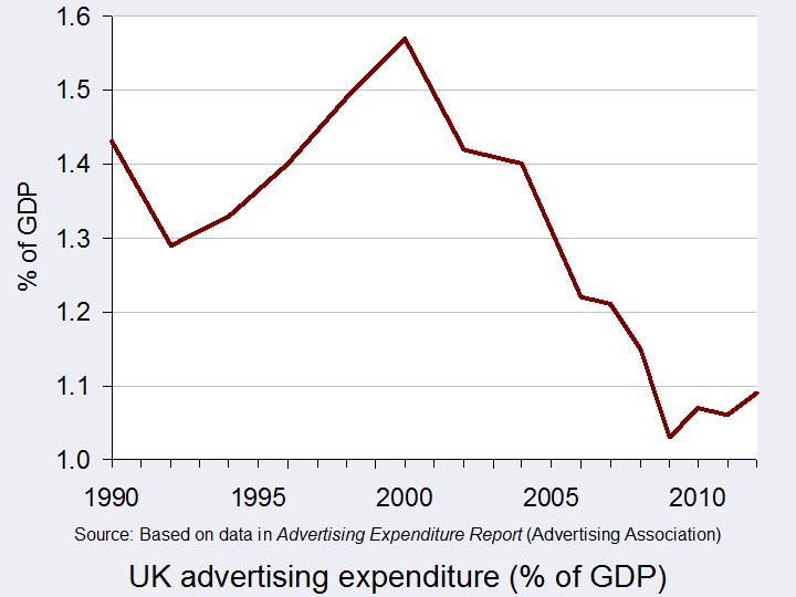 Since the start of the economic downturn in 2008, advertising expenditure has fallen, as companies have seen a decline in their budgets. From a high of £18.61 billion in 2004, the Advertising Association found that it fell to £14.20 billion in 2009 at constant 2008 prices. In the last few years, advertising expenditure has remained at around £14.5 billion. But, is cutting back on advertising a sensible strategy during a recession? Of course budgets are tight for both firms and consumers, but many suggest that media-savvy firms would actually benefit from maintaining their advertising. By doing so firms could take advantage of weaker competitors by increasing their market share and establishing their brand image in the long run.
 It’s also important to consider another link between economic growth and advertising. Research suggests that advertising can be an important factor for economic growth. A three-year study undertaken by the Advertising Association and Deloitte, commencing in January 2013 suggests that for every £1 spent on advertising in the UK, £6 is generated for the wider economy. Based on these predictions, the estimated £16bn that was spent on ad campaigns in 2011 added over £100 billion to the UK’s GDP.
 So, perhaps encouraging more advertising is the answer to the UK’s economic dilemma. This is certainly the opinion of Matt Barwell, the consumer marketing and innovation director of Diageo Western Europe, who said:
People fundamentally believe in advertising but a lot of the conversation focuses on negative elements. People rarely get the opportunity to talk about the positive role advertising plays in terms of wealth creation, exports and the social benefits that it provides. These are all things that many of us take for granted.
If private firms can therefore be encouraged to boost their marketing campaigns, jobs may be created, demand for products will rise and with the help of the multiplier, the economy may strengthen. Advertising has both pros and cons and opinions differ on what makes a good advert. But, whatever your opinion of the role of advertising, it is certainly an important aspect of any economy. The following articles take a view of advertising.
Articles
Could we advertise ourselves out of recession? Marketing Week, Lucy Tesseras (31/1/13)
Advertising in times of recession: A question of value The Open University, Tom Farrell (13/3/09)
Recession spending on advertising and R&D Penn State, Smeal College of Business
Nothing to shout about The Economist (30/7/09)
UK’s payday lenders face restrictions on advertising Reuters (6/3/13)
Value claims improve advertising effectiveness in recessionary times Com Score, Diane Wilson (17/9/13)
Advertising in a bad economy About Advertising, Apryl Duncan
Advertising worth £100bn to UK economy The Telegraph, Graham Ruddick (31/1/13)
Can advertising be the motor that gets the struggling UK economy out of first gear? More about advertising (26/2/13)
Adverts ‘worth £100bn to UK’ Independent, Giddeon Spanier (30/1/13)
Report
Advertising Pays – How advertising fuels the UK economy Advertising Association & Deloitte (30/1/13)
 Advertising Pays – How advertising fuels the UK economy: Accompanying video presentation Advertising Association & Deloitte: on YouTube (30/1/13)
Questions
- What is the role of advertising?
- Using a demand and supply diagram, illustrate and explain the role of advertising.
- During a recession, why would you expect advertising expenditure to fall? What impact would you expect this to have in your diagram from question 1?
- How might firms that sustain their advertising expenditure during a downturn benefit?
- Explain the link between advertising and the economy.
- Why could a higher level of advertising boost economic growth?
- Are there any negative externalities from advertising?
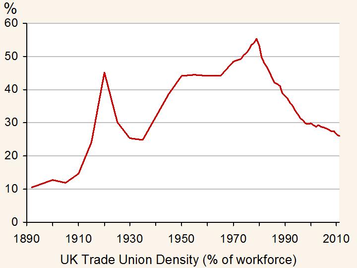
 The most common demands for trade unions are for higher wages and better working conditions. However, pensions have become an increasingly important issue that many public-sector workers in particular have raised concerns over. While actions by trade unions have been less frequent and public in recent months, the Public and Commercial Services Union (PCS) has voted to strike.
The labour market works like any other market – there is a demand for and supply of labour. The intersection of the demand and supply of labour give the equilibrium wage rate and equilibrium number of workers. Trade unions may aim to push up the wage rate above this equilibrium and the impact on the number of workers employed will depend on the type of labour market. If we have a competitive labour market, then the increase in wage will create an excess supply of labour: that is, unemployment. This is often a choice a trade union has to make. However, if the market is a monopsony, then it is possible for a trade union to force up wages and yet there may not be any fall in the number of workers employed.
Pay is just one of the issues being raised by the PCS. Public-sector pay was frozen for two years for those earning above £21,000. According to the Cabinet Office, this was necessary to ‘protect jobs in the public sector and support high quality public services.’ A 5% pay rise has been requested to counter an alleged 7% fall in earnings since 2008. 61% of those who voted in the ballot were in favour of strike action. Other concerns include job losses and pensions.
One concern of the PCS will be the low turn-out. Only 28% of the union’s members voted in this ballot and this is likely to weaken the union’s bargaining position. The government has monopsony power in employing civil servants and this is one of the reasons why a powerful trade union is likely to emerge: it acts to reduce the power of the monopsonist employer. Negotiations will typically take place between the employer and the trade union and with such a low turn-out, the power is certainly with the government. However, with the threat of strike action to occur around the time of the Budget, this does present something of a concern for the government, especially with growth remaining weak and the loss of the AAA rating.
Two separate pay offers have been made to 1.6 million public-sector workers, but Unison has suggested that members of PCS should reject them. If headway is not made in negotiations between PCS and the government, then strike action could be just around the corner. The following articles consider this looming industrial action.
Articles
Questions
- Use a diagram to illustrate a competitive market for labour and show how a trade union will aim to push up the wage rate. Show why a trade-off exists between the higher wage and the number of workers employed.
- Illustrate a diagram showing a monopsony and explain why the MC curve exceeds the AC curve. Why is it possible for a trade union to force up wages without creating a decline in the equilibrium number of workers employed?
- What other actions, besides striking, are available for trade union members? What are the costs and benefits of each relative to striking?
- Which factors, besides a low turn-out in the ballot, will reduce the trade union’s negotiating power?
- Public-sector pay was frozen for two years. If the government accepted the trade union’s pay demands, what would be the impact on the budget deficit? Could the higher pay help boost economic growth by creating a multiplier effect?
 In light of the recent sharp decline in the British pound, this blog is an updated version of Appreciating a depreciating pound which was published in early December 2012. The significance of the depreciation should be seen in the context of the UK as an island-economy which makes trade an important determinant of our economic performance.
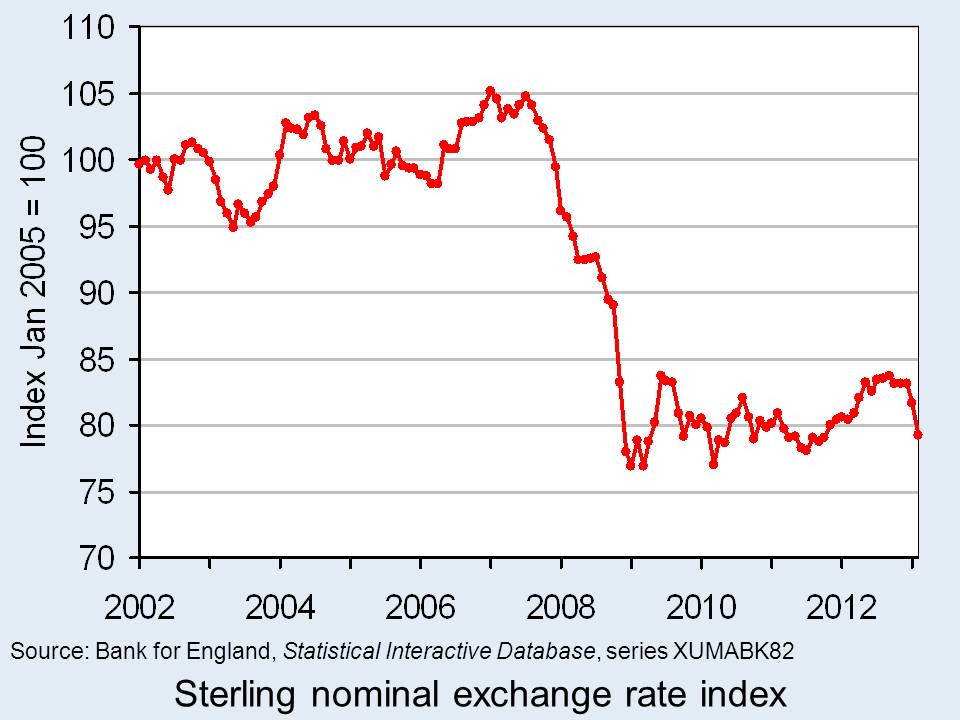
The competitiveness of our exports is, in part, affected by the exchange rate. Floating exchange rates are notoriously volatile. However, since the autumn of 2007 we have observed a significant depreciation of the UK exchange rate – a depreciation that seems to have found new momentum of late. A depreciation helps to make our exports more competitive abroad which might help to compensate for weak demand here in the UK.
Rather than look at the British pound (or any currency) against the many foreign currencies separately we can look at the average exchange rate against a whole bundle of currencies. The average rate is calculated by weighting the individual exchange rates by the amount of trade between Britain and the other countries. This trade-weighted exchange rate is known as the effective exchange rate.

The chart shows the nominal (actual) effective exchange rate for the British pound since 2002. The chart shows clearly how from the autumn of 2007 the effective exchange rate began to fall sharply. Over the period from September 2007 to January 2009, figures from the Bank of England show that the nominal effective exchange rate fell by 25.3 per cent. In simple terms, the British pound depreciated by close to one-quarter. (Click here for a PowerPoint of the chart.)
If we move the clock forward, we observe an appreciation of the British pound between July 2011 (when its value was only 1.6 per cent higher than in January 2009) and September 2012. Over this period, the British pound appreciated by 7.2 per cent. Its value remained relatively stable through much of the remainder of last year. However, we appear to be on another downward path. If we compare the average value in February 2013 with the ‘high’ back in September 2012 we observe a depreciation of 5.4 per cent.
The British pound continues on its roller-coaster ride. Most commentators expect the British pound to fall further. Some see this as an important ingredient for a revival in British economic fortunes. If we compare September 2007 with February 2013, we find that the nominal effective exchange rate for the British pound is 23 per cent lower. This constitutes a major competitive boost for our exporters. However, an important question is whether there is a demand for these goods and services abroad however more attractive the depreciation makes them.
Data
Statistical Interactive Database – interest and exchange rate rates data Bank of England
BIS effective exchange rate indices Bank for International Settlements
Articles
Pound depreciates Vs dollar to lowest level since Aug 16 Bloomberg, Emma Charlton (5/2/13)
Pound advances against euro on Italy speculation; Gilts decline Bloomberg, Lucy Meakin and David Goodman (4/3/13)
Pounding of sterling risks a currency war Scotland on Sunday, Bill Jamieson (17/2/13)
Credit ratings, the pound, currency movements and you BBC News, Kevin Peachey (25/2/13)
The Bank of England can’t just go on doing down the pound Telegraph, Jeremy Warner (21/2/13)
 Sterling will continue to go down BBC News, Jim Rogers (25/2/13)
Questions
- Explain how the foreign demand for goods and assets generates a demand for British pounds. How will this demand be affected by the foreign currency price of the British pound, i.e. the number of foreign currency units per £1?
- Explain how the demand by British residents for foreign goods and assets generates a supply of British pounds. How will this supply be affected by the foreign currency price of the British pound, i.e. the number of foreign currency units per £1?
- What factors are likely to shift the demand and supply curves for British pounds on the foreign exchange markets?
- Illustrate the effect of a decrease in the demand for British goods and assets on the exchange rate (i.e. the foreign currency price of the British pound) using a demand-supply diagram.
- What is the difference between a nominal and a real effective exchange rate? Which of these is a better indicator of the competitiveness of our country’s exports
- What factors are likely to have caused the depreciation of the British pound in 2013?
 As part of the Basel III round of banking regulations, representatives of the EU Parliament and member governments have agreed with the European Commission that bankers’ bonuses should be capped. The proposal is to cap them at 100% of annual salary, or 200% with the agreement of shareholders. The full Parliament will vote in May and then it will go to officials from the 27 Member States. Under a system of qualified majority voting, it is expected to be accepted, despite UK resistance.
The main arguments in favour of a cap are that it will reduce the focus of bankers on short-term gains and reduce the incentive to take excessive risks. It will also appease the anger of electorates throughout the EU over bankers getting huge bonuses, especially in the light of the recession, caused in major part by the excesses of bankers.
 The main argument against is that it will drive talented top bankers to countries outside the EU. This is a particular worry of the UK government, fearful of the effect on the City of London. There is also the criticism that it will simply drive banks into increasing basic salaries of senior executives to compensate for lower bonuses.
But it is not just the EU considering curbing bankers’ pay. The Swiss have just voted in a referendum to give shareholders the right to veto salaries and bonuses of executives of major companies. Many of these companies are banks or other financial sector organisations.
So just what will be the effect on incentives, banks’ performance and the movement of top bankers to countries without such caps? The following videos and articles explore these issues. As you will see, the topic is highly controversial and politically charged.
 Meanwhile, HSBC has revealed its 2012 results. It paid out $1.9bn in fines for money laundering and set aside a further $2.3bn for mis-selling financial products in the UK. But its underlying profits were up 18%. Bonuses were up too. The 16 top executives received an average of $4.9m each. The Chief Executive, Stuart Gulliver, received $14.1m in 2012, 33% up on 2011 (see final article below).
Webcasts and podcasts
 EU moves to cap bankers bonuses Euronews on Yahoo News (1/3/13)
 EU to Curb Bank Bonuses WSJ Live (28/2/13)
 Inside Story – Curbing Europe’s bank bonuses AlJazeera on YouTube (1/3/13)
 Will EU bonus cap ‘damage economy’? BBC Radio 4 Today Programme (28/2/13)
 Swiss back curbs on executive pay in referendum BBC News (3/3/13)
 Has the HSBC scandal impacted on business? BBC News, Jeremy Howell (4/3/13)
Articles
Bonuses: the essential guide The Guardian, Simon Bowers, Jill Treanor, Fiona Walsh, Julia Finch, Patrick Collinson and Ian Traynor (28/2/13)
Q&A: EU banker bonus cap plan BBC News (28/2/13)
Outcry, and a Little Cunning, From Euro Bankers The New York Times, Landon Thomas Jr. (28/2/13)
Bank bonuses may shrink – but watch as the salaries rise The Observer, Rob Taylor (3/3/13)
Don’t cap bank bonuses, scrap them The Guardian, Deborah Hargreaves (28/2/13)
Capping banker bonuses simply avoids facing real bank problems The Telegraph, Mats Persson (2/3/13)
Pro bonus The Economist, Schumpeter column (28/2/13)
‘The most deluded measure to come from Europe since fixing the price of groceries in the Roman Empire’: Boris Johnson attacks EU banker bonus cap Independent, Gavin Cordon , Geoff Meade (28/2/13)
EU agrees to cap bankers’ bonuses BBC News (28/2/13)
Viewpoints: EU banker bonus cap BBC News (28/2/13)
Voters crack down on corporate pay packages swissinfo.ch , Urs Geiser (3/3/13)
Swiss voters seen backing executive pay curbs Reuters, Emma Thomasson (3/3/13)
Swiss referendum backs executive pay curbs BBC News (3/3/13)
Voters in Swiss referendum back curbs on executives’ pay and bonuses The Guardian, Kim Willsher and Phillip Inman (3/3/13)
Swiss vote for corporate pay curbs Financial Times, James Shotter and Alex Barker (3/3/13)
HSBC pays $4.2bn for fines and mis-selling in 2012 BBC News (4/3/13)
Questions
- How does competition, or a lack of it, in the banking industry affect senior bankers’ remuneration?
- What incentives are created by the bonus structure as it is now? Do these incentives result in desirable outcomes?
- How would you redesign the bonus system so that the incentives resulted in beneficial outcomes?
- If bonuses are capped as proposed by the EU, how would you assess the balance of advantages and disadvantages? What additional information would you need to know to make such an assessment?
- How has the relationship between banks and central banks over the past few years created a moral hazard? How could such a moral hazard be eliminated?
 Australia is a rich country. It is one of the few to have avoided a recession. This has been the result partly of successful macroeconomic policies, but largely of the huge mining boom, with Australia exporting minerals to China and other fast growing Asian economies.
But has this growth brought happiness? Are Australians having to work harder and harder to pay for their high standard of living? Indeed, do higher incomes generally result in greater happiness? The following articles explore this issue, both in an Australian context and more broadly. They look at some recent evidence.
 For example, in one study, Canadian, Chinese, Indian, and Japanese university students were asked what they held to be most important for assessing the worth of their lives. The crucial finding was that although higher incomes may be a contributing factor to increased happiness and well-being, especially for poorer people, other factors are more important. These include developing fulfilling personal relationships, whether with partners, family members or friends; gaining knowledge and wisdom; having enjoyable hobbies; having financial security (as opposed to higher incomes); having a worthwhile career; living a moral life; helping other people.
The question then arises whether our economic systems and incentives are geared towards achieving these outcomes. Or are we encouraged to consume more and more and to seek higher and higher incomes to feed our addiction to consumption?
Is there an information problem here? Do many individuals perceive that money will buy them happiness, whereas, in reality, money can’t buy them love?
Articles
Australia: Where the good life comes at a price BBC News Magazine, Madeleine Morris (24/2/13)
Australia has the know-how to boost wellbeing Sydney Morning Herald, Matt Wade (8/9/12)
Money can’t buy you the good life Independent, Roger Dobson (24/2/13)
The 10 Things Economics Can Tell Us About Happiness The Atlantic, Derek Thompson (31/5/12)
Yes, Money Does Buy Happiness: 6 Lessons from the Newest Research on Income and Well-Being The Atlantic, Derek Thompson (10/1/13)
The fact is, the richer you are, the happier you are The Telegraph, Allister Heath (5/2/13)
Money buys happiness? I wouldn’t bank on it The Telegraph, Christopher Howse (6/2/13)
Who Says Wealth Doesn’t Buy Happiness? The Wealthy Do CNBC, Robert Frank (4/2/13)
More Proof That Money Can’t Buy Happiness Business Insider, Aimee Groth (28/1/13)
Money Changes Everything The New York Times, Adam Davidson (5/2/13)
Why are the Chinese so sad? Maclean’s (Canada), Mitch Moxley (4/2/13)
Reports
First World Happiness Report Launched at the United Nations The Earth Institute, Columbia University (2/4/12)
World Happiness Report The Earth Institute, Columbia University, John Helliwell, Richard Layard and Jeffrey Sachs (eds.) (2/4/12)
Well-being evidence for policy: A review New Economics Foundation, Laura Stoll, Juliet Michaelson and Charles Seaford (3/4/12)
Questions
- Distinguish between necessary and sufficient conditions. Is higher income a necessary or sufficient condition (or both or neither) for an increase in happiness? Does a person’s circumstances affect the answer to this question?
- Explain what is meant by ‘rational behaviour’ at the margin in the traditional economic sense?
- If a person always behaved rationally, would they be happier than if they did not? Explain.
- Explain how information asymmetry between the two or more parties involved in a transaction may make people worse off, rather than better off, even though they were behaving rationally.
- Explain what is meant by diminishing returns to income.Do richer countries get happier as they get richer?
- How would you set about measuring happiness?
- What do you understand by the term ‘hedonic elevation and decline’? Does this provide an accurate description of you own purchasing behaviour? If so, explain whether or not you would like to change this behaviour.
- When people make economic decisions, these are normally made with bounded rationality. How may this affect the desirability of the outcomes of the decisions?
- In explaining bankers’ behaviour, Christopher Howse (author of the second Telegraph article above) states: ‘It’s the power game that keeps them happy, not the money itself. When I say “keeps them happy” I mean “feeds their addiction”. It is a negative kind of satisfaction. A morning spent without the distraction of making big bucks is a morning left exposed to the empty horror of being a little rational animal on the bare surface of the Earth lost in space.’ Do you agree? Explain why or why not.
- When people are addicted to something, would doing more of it be classed as irrational? Explain.
- Why are the Chinese so sad?
 Adverts are increasingly diverse, ranging from families using various products and promoting their qualities, to a gorilla drumming, a horse dancing and a monkey drinking tea! But, how important is advertising to a product’s brand. Does it have a positive effect on sales and profitability?
 Advertising increases consumer awareness of the product and its features, but also actively aims to persuade people to purchase the product. By differentiating the product through adverts a company aims to shift the demand curve to the right and also make it more inelastic, by persuading customers that there are no (or few) close substitutes.
 Since the start of the economic downturn in 2008, advertising expenditure has fallen, as companies have seen a decline in their budgets. From a high of £18.61 billion in 2004, the Advertising Association found that it fell to £14.20 billion in 2009 at constant 2008 prices. In the last few years, advertising expenditure has remained at around £14.5 billion. But, is cutting back on advertising a sensible strategy during a recession? Of course budgets are tight for both firms and consumers, but many suggest that media-savvy firms would actually benefit from maintaining their advertising. By doing so firms could take advantage of weaker competitors by increasing their market share and establishing their brand image in the long run.
 It’s also important to consider another link between economic growth and advertising. Research suggests that advertising can be an important factor for economic growth. A three-year study undertaken by the Advertising Association and Deloitte, commencing in January 2013 suggests that for every £1 spent on advertising in the UK, £6 is generated for the wider economy. Based on these predictions, the estimated £16bn that was spent on ad campaigns in 2011 added over £100 billion to the UK’s GDP.
 So, perhaps encouraging more advertising is the answer to the UK’s economic dilemma. This is certainly the opinion of Matt Barwell, the consumer marketing and innovation director of Diageo Western Europe, who said:
 Advertising Pays – How advertising fuels the UK economy: Accompanying video presentation Advertising Association & Deloitte: on YouTube (30/1/13)


