 One of the most enduring characteristics of the macroeconomic environment since the financial crisis of the late 2000s has been its impact on people’s pay. We apply the distinction between nominal and real values to evidence the adverse impact on the typical purchasing power of workers. While we do not consider here the distributional impact on pay, the aggregate picture nonetheless paints a very stark picture of recent patterns in pay and, in turn, the consequences for living standards and wellbeing.
While the distinction between nominal and real values is perhaps best know in relation to GDP and economic growth (see the need to get real with GDP), the distinction is also applied frequently to analyse the movement of one price relative to prices in general. One example is that of movements in pay (earnings) relative to consumer prices.
Pay reflects the price of labour. The value of our actual pay is our nominal pay. If our pay rises more quickly than consumer prices, then our real pay increases. This means that our purchasing power rises and so the volume of goods and services we can afford increases. On the other hand, if our actual pay rises less quickly than consumer prices then our real pay falls. When real pay falls, purchasing power falls and the volume of goods and services we can afford falls.
Figures from the Office for National Statistics show that in January 2000 regular weekly pay (excluding bonuses and before taxes and other deductions from pay) was £293. By December 2018 this had risen to £495. This is an increase of 69 per cent. Over the same period the consumer prices index known as the CPIH, which, unlike the better-known CPI, includes owner-occupied housing costs and Council Tax, rose by 49 per cent. Therefore, the figures are consistent with a rise both in nominal and real pay between January 2000 to December 2018. However, this masks the fact that in recent times real earnings have fallen.
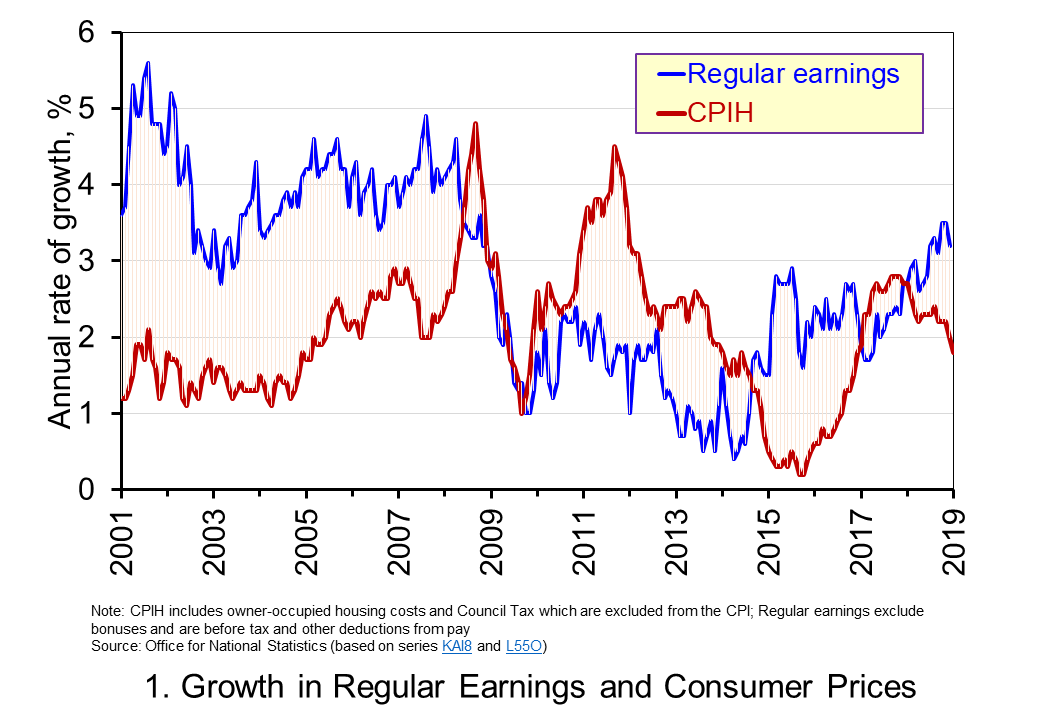 Chart 1 shows the annual percentage changes in actual (nominal) regular weekly pay and the CPIH since January 2001. Each value is simply the percentage change from 12 months earlier. The period up to June 2008 saw the annual growth of weekly pay outstrip the growth of consumer prices – the blue line in the chart is above the red line. Therefore, the real value of pay rose. However, from June 2008 to August 2014 pay growth consistently fell short of the rate of consumer price inflation – the blue line is below the red line. The result was that average real weekly pay fell. (Click here to download a PowerPoint copy of the chart.)
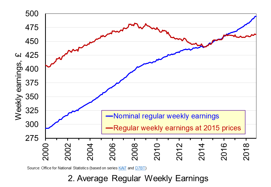 Chart 2 show the average levels of nominal and real weekly pay. The real series is adjusted for inflation. It is calculated by deflating the nominal pay values by the CPIH. Since the CPIH is a price index whose value averages 100 across 2015, the real pay values are at constant 2015 prices. From the chart, we can see that the real value of weekly pay peaked in March 2008 at £482.01 at 2015 prices. The subsequent period saw rates of pay inflation that were lower than rates of consumer price inflation. This meant that by March 2014 the real value of weekly pay had fallen by 8.8 per cent to £439.56 at 2015 prices. (Click here to download a PowerPoint copy of the chart.)
Although real (inflation-adjusted) pay recovered a little during 2015 and 2016, 2017 again saw consumer price inflation rates greater than those of pay inflation (see Chart 1). Consequently, the average level of real weekly pay fell by 1 per cent between January and November 2017. Since then, real regular pay has again increased. In December 2018, average real pay weekly pay was £462.18 at 2015 prices: an increase of 1.1 per cent from November 2017. Nonetheless, inflation-adjusted average weekly pay in December 2018 remained 4.1 per cent below its March 2008 level.
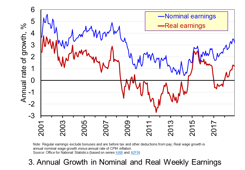 Chart 3 shows very clearly the importance of the distinction between real and nominal when analysing the growth of earnings. The sustained period of real pay deflation (negative rates of pay inflation) that followed the financial crisis can be seen much more clearly by plotting growth rates rather than their levels. Since June 2008 the average annual growth of real regular weekly pay has been −0.2 per cent, despite nominal pay increasing at an annual rate of 2 per cent. In the period from January 2001 to May 2008 real regular weekly pay had grown at an annual rate of 2.1 per cent with nominal pay growing at an annual rate of 4.0 per cent. (Click here to download a PowerPoint copy of the chart.)
The distinction between nominal and real helps us to understand better why some argue that patterns in pay, living standards and well-being have been fundamental in characterising the macroeconomic environment since the financial crisis. Indeed, it is not unreasonable to suggest that these patterns have helped to shape macroeconomic debates and broader conversations around the role of government and of public policy and its priorities.
Articles
Questions
- Using the example of GDP and earnings, explain how the distinction between nominal and real relates to the distinction between values and volumes.
- In what circumstances would an increase in actual pay translate into a reduction in real pay?
- In what circumstances would a decrease in actual pay translate into an increase in real pay?
- What factors might explain the reduction in real rates of pay seen in the UK following the financial crisis?
- Of what importance might the growth in real rates of pay be for consumption and aggregate demand?
- Why is the growth of real pay an indicator of financial well-being? What other indicators might be included in measuring financial well-being?
- Assume that you have been asked to undertake a distributional analysis of real earnings since the financial crisis. What might be the focus of your analysis? What information would you therefore need to collect?
 The distinction between nominal and real values is an incredibly important one in economics. We apply the latest GDP numbers from the ONS to show how the inflation-adjusted numbers help to convey the twin characteristics of growth: positive longer-term growth but variable short-term rates of growth. It is real GDP numbers that help us to understand better the macroeconomic environment and, not least, its inherent volatility. To use nominal GDP numbers means painting a less than clear, if not inaccurate, picture of the macroeconomic environment.
The provisional estimate for GDP (the value of output) in the UK in 2018 is £2.115 trillion, up 3.2 per cent from £2.050 trillion in 2017. These are the actual numbers, or what are referred to as nominal values. They make no adjustment for inflation and reflect the prices of output that were prevailing at the time. Hence, the figures are also referred to as GDP at current prices.
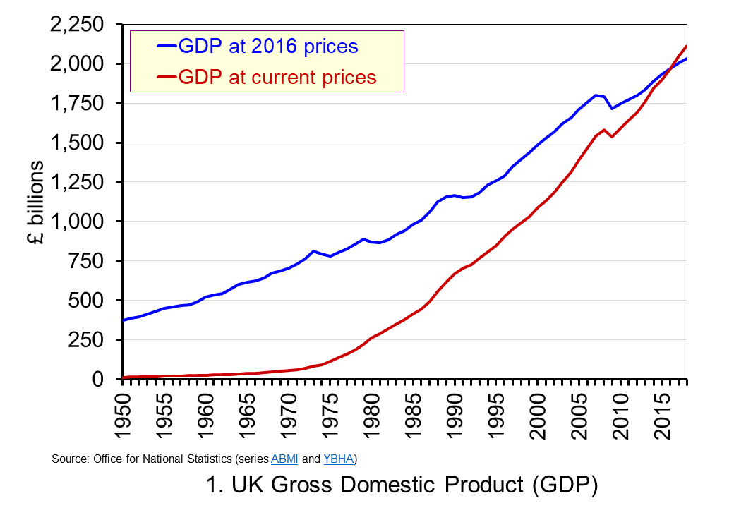 The use of nominal GDP data can be something of a problem when we compare historical values. In 1950, for example, as we can see from Chart 1, nominal GDP in 1950 was a mere £12.926 billion. In other words, the nominal figures show that the value of the country’s output was 163.595 times greater in 2018 (or an increase of 162,595 per cent). However, if we want to make a more meaningful comparison of the country’s national income we need to adjust for inflation. (Click here to download a PowerPoint copy of the chart.)
If we measure GDP at constant prices we eliminate the effect of inflation. This allow us to make a more meaningful comparison of national income. Consider first the real GDP numbers for 1950 and 2018. GDP in 1950 at 2016 prices was £373.9 billion. This is higher than the nominal (current-price) value because prices in 2016 were higher than those in 1950. Meanwhile, GDP in 2018 when measured at 2016 prices was £2.034 trillion. This real value is smaller than the corresponding nominal value because prices in 2016 where lower than those in 2018.
Between 1950 and 2018 there was a proportionate increase in real GDP of 5.439 (or a 443.9 per cent increase). Because we have removed the effect of inflation the real growth figure is much lower than the nominal growth figure. Crucially, what we are left with is an indicator of the growth in the volume of output. Whereas nominal growth rates are affected both by changes in volumes and prices, real growth rates reflect only changes in volumes.
Consider now output growth between 2017 and 2018. As we saw earlier, the nominal figures suggest growth of 3.2 per cent. In fact, GDP at constant 2016 prices increased from £2005.4 trillion in 2017 to £2,033.6 trillion in 2018: an increase of 1.4 per cent. This was the lowest rate of growth in national output since 2012 when output also grew by 1.4 per cent. In 2017 national output had increased by 1.8 per cent, the same increase as in 2016.
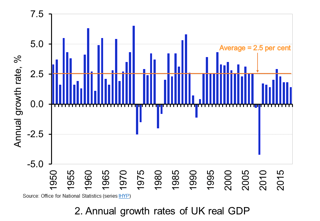 To put the recent growth in national output into context, Chart 2 shows the annual rate of growth in real GDP each year since 1950. Across the period, the average annual rate of growth in real GDP and, hence, in the volume of national output was 2.5 per cent. In the current decade growth has averaged only 1.9 per cent. This followed falls of 0.3 per cent and 4.2 per cent in 2008 and 2009 respectively as the effects of the financial crisis on the economy were felt. (Click here to download a PowerPoint copy of the chart.)
By plotting the percentage changes in real GDP from year to year, we get a much clearer sense of the inherent instability that we identified at the outset as a characteristic of growth. This is true not only for the UK, but economies more generally. This instability is the key characteristic of the macroeconomic environment. It influences and informs much of what we study in economics.
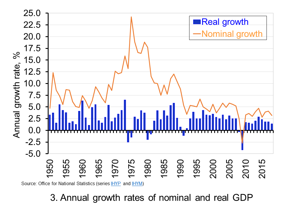 The variability of growth rates that create the instability of economies again requires an understanding of the distinction between nominal and real GDP. Chart 3 illustrates the growth in GDP both in nominal and real terms. The average annual rate of growth of nominal GDP is 7.8 per cent, considerably higher than the average real growth rate of 2.5 per cent per year. The difference again reflects the effect of rising prices. (Click here to download a PowerPoint copy of the chart.
Chart 3 clearly shows the wrong conclusions that can be drawn if one was to focus on the growth in nominal GDP from year to year. Perhaps the best example is 1975. In this year nominal GDP grew by 24.2 per cent. However, the volume of national output contracted: real GDP fell by 1.5 per cent. The growth in nominal GDP reflects the rapid growth in prices seen in that year. The economy’s average price level (the GDP deflator) rose by 26.1 per cent. Hence, the growth in nominal GDP reflected not an increase in the volume of output – that fell – but instead a large increase in prices.
The importance of the distinction between nominal and real GDP is further demonstrated by the fact that since 1950 nominal GDP has fallen in only one year. In 2009 nominal GDP fell by 2.7 per cent. The 1.6 per cent rise in the economy’s average price level was not enough to offset the fall in the volume of output of just over 4.2 per cent. In other years when the volume of output (real GDP) fell, the effect of rising prices meant that the value of output (nominal GDP) nonetheless rose.
So to conclude, the distinction between nominal and real GDP is crucial when analysing economic growth. To understand the distinction gives you a truly real advantage in making sense of the macroeconomic environment.
Articles
Questions
- What do you understand by the term ‘macroeconomic environment’? What data could be used to describe the macroeconomic environment?
- When a country experiences positive rates of inflation, which is higher: nominal economic growth or real economic growth?
- Does an increase in nominal GDP mean a country’s production has increased? Explain your answer.
- Does a decrease in nominal GDP mean a country’s production has decreased? Explain your answer.
- Why does a change in the growth of real GDP allow us to focus on what has happened to the volume of production?
- What does the concept of the ‘business cycle’ have to do with real rates of economic growth?
- When would falls in real GDP be classified as a recession?
- Distinguish between the concepts of ‘short-term growth rates’ and ‘longer-term growth’.
- Why might the distinction between nominal and real be important when analysing changes in people’s pay? What would be the significance of an increase in real pay?
 Consumer and business confidence reflect the sentiment, emotion, or anxiety of consumers and businesses. Confidence surveys therefore try to capture these feelings of optimism or pessimism. They aim to shed light on spending intentions and hence the short-term prospects for private-sector spending. For example, a fall in confidence would be expected to lead to a fall in consumption and investment spending. This is particularly relevant in the UK with the ongoing uncertainty around Brexit. We briefly summarise here current patterns in confidence.
Through the use of surveys attempts are made to measure confidence. One long-standing survey is that conducted for the European Commission. Each month consumers and firms across the European Union are asked a series of questions, the answers to which are used to compile indicators of consumer and business confidence. For instance, consumers are asked about how they expect their financial position to change. They are offered various options such as ‘get a lot better, ‘get a lot worse’ and balances are then calculated on the basis of positive and negative replies.
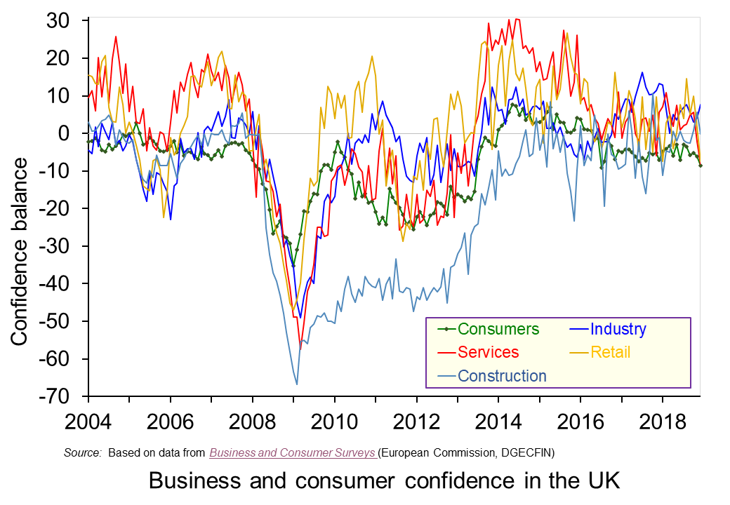 The chart plots confidence in the UK for consumers and different sectors of business since the mid 1990s. The chart captures the volatility of confidence. This volatility is generally greater amongst businesses than consumers, and especially so in the construction sector. (Click here to download a PowerPoint copy of the chart.)
The chart nicely captures the collapse in confidence during the global financial crisis in the late 2000s. The significant tightening of credit conditions contributed to a significant dampening of aggregate demand which was further propagated (amplified) by the collapse in confidence. Consequently, the economy slid in to recession with national output contracting by 6.3 per cent during the 5 consecutive quarters during which output fell.
To this point, the current weakening of confidence is not of the same magnitude as that of the late 2000s. In January 2009 consumer confidence had fallen to an historic low of -35. Nonetheless, the December 2018 figure for consumer confidence was -9, the lowest figure since July 2016 the month following the EU referendum, and markedly lower than the +8 seen as recently as 2014. The long-term (median) average for the consumer confidence balance is -6.
The weakening in consumer confidence is mirrored by a weakening in confidence in the retail and service sectors. The confidence balances in December 2018 in these two sector both stood at -8 which compares to their longer-term averages of around +5. In contrast, confidence in industry and construction has so far held fairly steady with confidence levels in December 2018 at +8 in industry and at 0 in construction compared to their long-term averages of -4 and -10 respectively.
It will be interesting to see how confidence has been affected by recent events. The glut of stories suggesting that trading conditions were especially difficult for retailers over the Christmas and New Year period is consistent with the weakening confidence already observed amongst consumers and retailers. However, it is unlikely that recent events will have done anything other than to exacerbate the trend for a weakening of confidence of domestic consumers and retailers. Hence, the likelihood is an intensification of caution and prudence.
Articles
Questions
- Draw up a series of factors that you think might affect both consumer and business confidence. How similar are both these lists?
- Which of the following statements is likely to be more accurate: (a) Confidence drives economic activity or (b) Economic activity drives confidence?
- What macroeconomic indicators would those compiling the consumer and business confidence indicators expect each indicator to predict?
- What is meant by the concept of ‘prudence’ in the context of spending? What factors might determine the level of prudence
- How might prudence be expected to affect spending behaviour?
- How might we distinguish between confidence ‘shocks’ and confidence as a ‘propagator’ of shocks?
 The Christmas and new year period often draws attention to the financial well-being of households. An important determinant of this is the extent of their indebtedness. Rising levels of debt mean that increasing amounts of households’ incomes becomes prey to servicing debt through repayments and interest charges. They can also result in more people becoming credit constrained, unable to access further credit. Rising debt levels can therefore lead to a deterioration of financial well-being and to financial distress. This was illustrated starkly by events at the end of the 2000s.
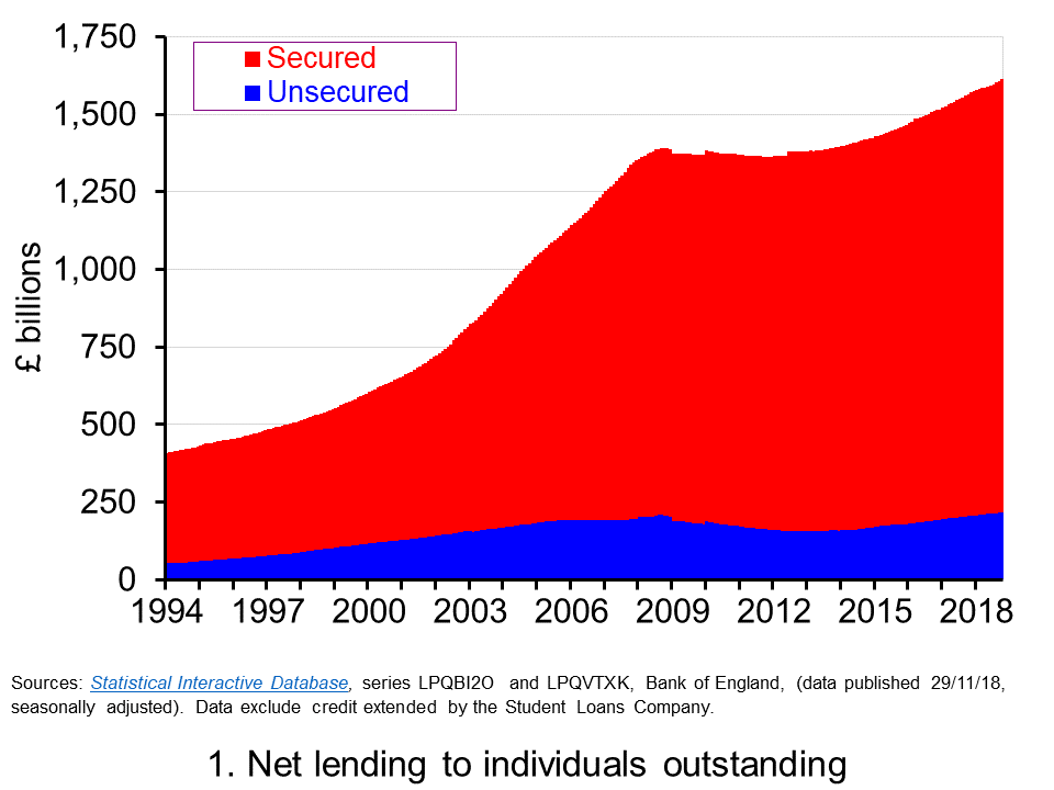 The total amount of lending by monetary financial institutions to individuals outstanding at the end of October 2018 was estimated at £1.61 trillion. As Chart 1 shows, this has grown from £408 billion in 1994. Hence, indivduals in the UK have experience a four-fold increase in the levels of debt. (Click here to download a PowerPoint of the chart.)
The debt of individuals is either secured or unsecured. Secured debt is debt secured by property, which for individuals is more commonly referred to as mortgage debt. Unsecured debt, which is also known as consumer credit, includes outstanding debt on credit cards, overdrafts on current accounts and loans for luxury items such as cars and electrical goods. The composition of debt in 2018 is unchanged from that in 1994: 87 per cent is secured debt and 13 per cent unsecured debt.
The fourfold increase in debt is taken by some economists as evidence of financialisation. While this term is frequently defined in distinctive ways depending upon the content in which it is applied, when viewed in very general terms it describes a process by which financial institutions and markets become increasingly important in everyday lives and so in the production and consumption choices that economists study. An implication of this is that in understanding economic decisions, behaviour and outcomes it becomes increasingly important to think about the potential impact of the financial system. The financial crisis is testimony to this.
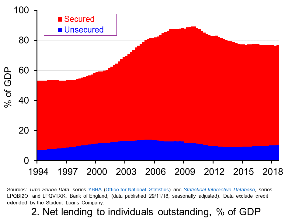 In thinking about financial well-being, at least at an aggregate level, we can look at the relative size of indebtedness. One way of doing this is to measure the stock of individual debt relative to the annual flow of GDP (national income). This is illustrated in Chart 2. (Click hereto download a PowerPoint of the chart.)
The growth in debt among individuals owed to financial institutions during the 2000s was significant. By the end of 2007, the debt-to-GDP ratio had reached 88 per cent. Decomposing this, the secured debt-to-GDP ratio had reached 75 per cent and the unsecured debt-to-GDP ratio 13 per cent. Compare this with the end of 1994 when secured debt was 46 per cent of GDP, unsecured debt 7 per cent and total debt 53 per cent. In other words, the period between 1994 and 2007 the UK saw a 25 percentage point increase in the debt-to-GDP ratio of individuals.
The early 2010s saw a consolidation in the size of the debt (see Chart 1) which meant that it was not until 2014 that debt levels rose above those of 2008. This led to the size of debt relative to GDP falling back by close to 10 percentage points (see Chart 2). Between 2014 and 2018 the stock of debt has increased from around £1.4 trillion to the current level of £1.61 trillion. This increase has been matched by a similar increase in (nominal) GDP so that the relative stock of debt remains little changed at present at around 76 per cent of GDP.
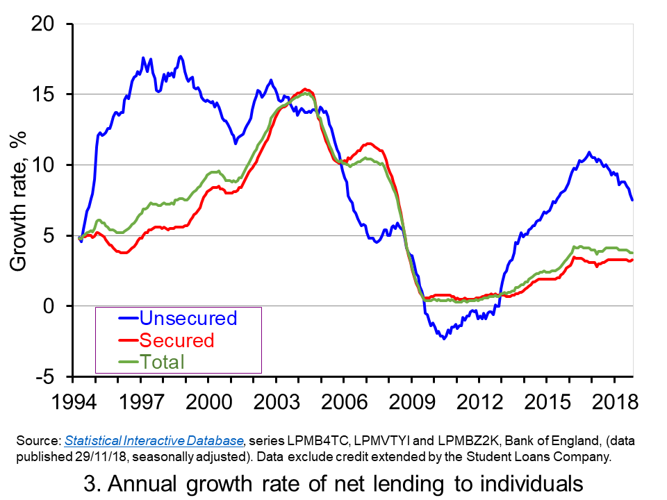 Chart 3 shows the annual growth rate of net lending (lending net of repayments) by monetary financial institutions to individuals. This essentially captures the growth rate in the stocks of debt, though changes in the actual stock of debt are also be affected by the writing-off of debts. (Click here to download a PowerPoint of the chart.)
We can see quite readily the pick up in lending from 2014. The average annual rate of growth in total net lending since 2014 has been just a little under 3½ per cent. This has been driven by unsecured lending whose growth rate has been close to 8½ per cent per annum, compared to just 2.7 per cent for secured lending. In 2016 the annual growth rate of unsecured lending was just shy of 11 per cent. This helped to fuel concerns about possible future financial distress. These concerns remain despite the annual rate of growth in unsecured debt having eased slightly to 7.5 per cent.
Despite the aggregate debt-to-GDP ratio having been relatively stable of late, the recent growth in debt levels is clearly not without concern. It has to be viewed in the context of two important developments. First, there remains a ‘debt hangover’ from the financial distress experienced by the private sector at the end of the 2000s, which itself contributed to a significant decline in economic activity (real GDP fell by 4 per cent in 2009). This subequently affected the financial well-being of the public sector following its interventions to cushion the economy from the full effects of the economic downturn as well as to help stabilise the financial system. Second, there is considerable uncertainty surrounding the UK’s exit from the European Union.
The financial resilience of all sectors of the economy is therefore of acute concern given the unprecedented uncertainty we are currently facing while, at the same time, we are still feeling the effects of the financial distress from the financial crisis of the late 2000s. It therefore seems timely indeed for individuals to take stock of their stocks of debt.
Articles
Questions
- How might we measure the financial distress of individuals?
- If individuals are financially distressed how might this affect their consumption behaviour?
- How might credit constraints affect the relationship between consumption and income?
- What do you understand by the concept of ‘cash flow effects’ that arise from interest rate changes?
- How might the accumulation of secured and unsecured debt have different effects on consumer spending?
- What factors might explain the rate of accumulation of debt by individuals?
- What is meant by ‘financial resilience’ and why might this currently be of particular concern?
 The latest consumer confidence figures from the European Commission point to consumer confidence in the UK remaining at around its long-term average. Despite this, confidence is markedly weaker than before the outcome of the EU referendum. Yet, the saving ratio, which captures the proportion of disposable income saved by the household sector, is close to its historic low. We consider this apparent puzzle and whether we can expect the saving ratio to rise.
The European Commission’s consumer confidence measure is a composite indicator based on the balance of responses to 4 forward-looking questions relating to the financial situation of households, the general economic situation, unemployment expectations and savings.
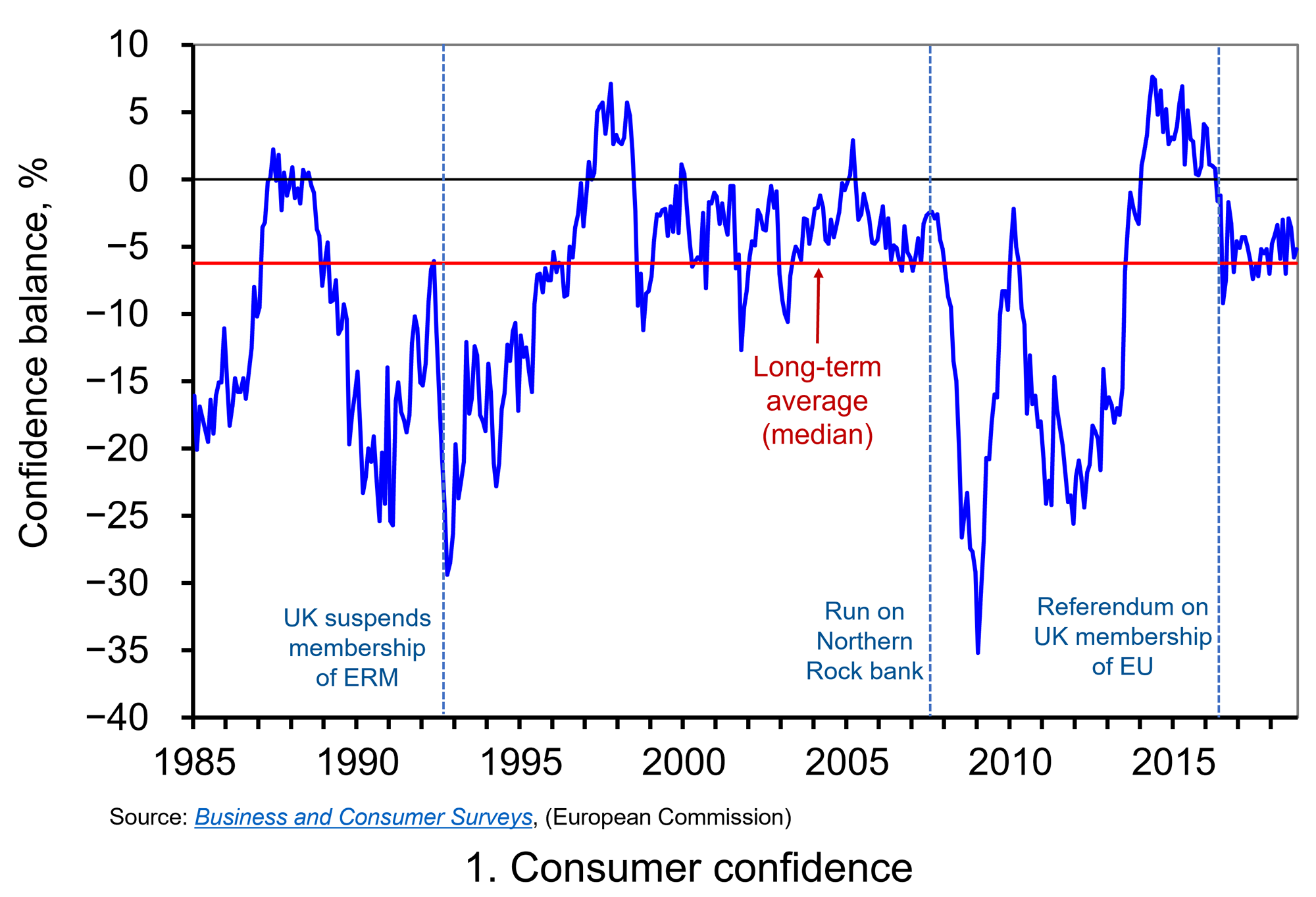 Chart 1 shows the consumer confidence indicator for the UK. The long-term average (median) of –6.25 shows that negative responses across the four questions typically outweigh positive responses. In October 2018 the confidence balance stood at –5.2, essentially unchanged from its September value of –5.8. While above the long-term average, recent values mark a weakening in confidence from levels before the EU referendum. At the beginning of 2016 the aggregate confidence score was running at around +4. (Click here to download a PowerPoint of the chart.)
Chart 1 shows two periods where consumer confidence fell markedly. The first was in the early 1990s. In 1990 the UK joined the Exchange Rate Mechanism (ERM). This was a semi-fixed exchange rate system whereby participating EU countries allowed fluctuations against each other’s currencies, but only within agreed bands, while being able to collectively float freely against all other currencies. In attempting to staying in the ERM, the UK was obliged to raise interest rates in order to protect the pound. The hikes to rates contributed to a significant dampening of aggregate demand and the economy slid into recession. Britain crashed out of the ERM in September 1992.
The second period of declining confidence was during the global financial crisis in the late 2000s. The retrenchment among financial institutions meant a significant tightening of credit conditions. This too contributed to a significant dampening of aggregate demand and the economy slid into recession. Whereas the 1992 recession saw the UK national output contract by 2.0 percent, this time national output fell by 6.3 per cent.
The collapses in confidence from 1992 and from 2007/08 are likely to have helped propagate the effects of the fall in aggregate demand that were already underway. The weakening of confidence in 2016 is perhaps a better example of a ‘confidence shock’, i.e. a change in aggregate demand originating from a change in confidence. Nonetheless, a fall in confidence, whether it amplifies existing shocks or is the source of the shock, is often taken as a signal of greater economic uncertainty. If we take this greater uncertainty to reflect a greater range of future income outcomes, including potential income losses, then households may look to insure themselves by increasing current saving.
It is usual to assume that people suffer from diminishing marginal utility of total consumption. This means that while total satisfaction increases as we consume more, the additional utility from consuming more (marginal utility) decreases. An implication of this is that a given loss of consumption reduces utility by more than an equivalent increase in consumption increases utility. This explains why people prefer more consistent consumption levels over time and so engage in consumption smoothing. The utility, for example, from an ‘average’ consumption level across two time periods, is higher, than the expected utility from a ‘low’ level of consumption in period 1 and a ‘high’ level of consumption in period 2. This is because the loss of utility from a ‘low’ level of consumption relative to the ‘average’ level is greater than the additional utility from the ‘high’ level relative to the ‘average’ level.
If greater uncertainty, such as that following the EU referendum, increases the range of possible ‘lower’ consumption values in the future even when matched by an increase in the equivalent range of possible ‘higher’ consumption values, then expected future utility falls. The incentive therefore is for people to build up a larger buffer stock of saving to minimise utility losses if the ‘bad state’ occurs. Hence, saving which acts as a from of self-insurance in the presence of uncertainty is known as buffer-stock saving or precautionary saving.
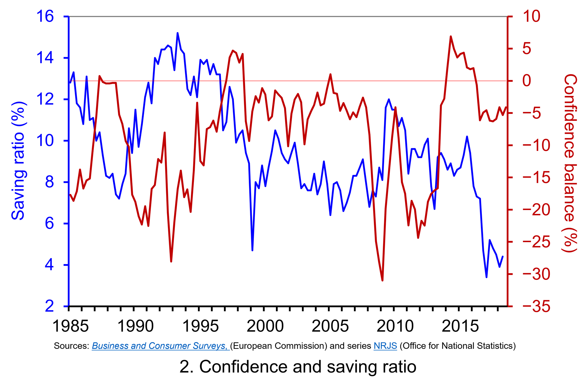 Chart 2 plots the paths of the UK household-sector saving ratio and consumer confidence. The saving ratio approximates the proportion of disposable income saved by the household sector. What we might expect to see if more uncertainty induces buffer-stock saving is for falls in confidence to lead to a rise in the saving ratio. Conversely, less uncertainty as proxied by a rise in confidence would lead to a fall in the saving ratio. (Click here to download a PowerPoint of the chart.)
The chart provides some evidence that of this. The early 1990s and late 2000s certainly coincided with both waning confidence and a rising saving ratio. The saving ratio rose to as high as 15.2 per cent in 1993 and 12.0 per cent in 2009. Meanwhile the rising confidence seen in the late 1990s coincided with a fall in the saving ratio to 4.7 per cent in 1999.
As Chart 2 shows, the easing of confidence since 2016 has coincided with a period where the saving ratio has been historically low. Across 2017 the saving ratio stood at just 4.5 per cent. In the first half of 2018 the ratio averaged just 4.2 per cent. While the release of the official figures for the saving ratio are less timely than those for confidence, the recent very low saving ratio may be seen to raise concerns. Can softer confidence data continue to co-exist with such a low saving ratio?
There are a series of possible explanations for the recent lows in the saving ratio. On one hand, the rate of price inflation has frequently exceeded wage inflation in recent years so eroding the real value of earnings. This has stretched household budgets and limited the amount of discretionary income available for saving. On the other hand, unemployment rates have fallen to historic lows. The rate of unemployment in the three months to August stood at 4 per cent, the lowest since 1975. Unemployment expectations are important in determining levels of buffer stock saving because of the impact of unemployment on household budgets.
Another factor that has fuelled the growth of spending relative to income, has been the growth of consumer credit. In the period since July 2016, the annual rate of growth of consumer credit, net of repayments, has averaged 9.7 per cent. Behavioural economists argue that foregoing spending can be emotionally painful. Hence, spending has the potential to exhibit more stickiness than might otherwise be predicted in a more uncertain environment or in the anticipation of income losses. Therefore, the reluctance or inability to wean ourselves off credit and spending might be a reason for the continuing low saving ratio.
We wait to see whether the saving ratio increases over the coming months. However, for now, the UK household sector appears to be characterised by low saving and fragile confidence. Whether or not this is a puzzle, is open to question. Nonetheless, it does appear to carry obvious risks should weaker income growth materialise.
Articles
Questions
- Draw up a series of factors that you think might affect consumer confidence.
- Which of the following statements is likely to be more accurate: (a) Consumer confidence drives economic activity or (b) Economic activity drives consumer confidence?
- What macroeconomic indicators would those compiling the consumer confidence indicator expect the indicator to predict?
- How does the diminishing marginal utility of consumption (or income) help explain why people engage in buffer stock saving (precautionary saving)?
- How might uncertainty affect consumer confidence?
- How does greater income uncertainty affect expected utility? What affect might this have on buffer stock saving?
 One of the most enduring characteristics of the macroeconomic environment since the financial crisis of the late 2000s has been its impact on people’s pay. We apply the distinction between nominal and real values to evidence the adverse impact on the typical purchasing power of workers. While we do not consider here the distributional impact on pay, the aggregate picture nonetheless paints a very stark picture of recent patterns in pay and, in turn, the consequences for living standards and wellbeing.
 Chart 1 shows the annual percentage changes in actual (nominal) regular weekly pay and the CPIH since January 2001. Each value is simply the percentage change from 12 months earlier. The period up to June 2008 saw the annual growth of weekly pay outstrip the growth of consumer prices – the blue line in the chart is above the red line. Therefore, the real value of pay rose. However, from June 2008 to August 2014 pay growth consistently fell short of the rate of consumer price inflation – the blue line is below the red line. The result was that average real weekly pay fell. (Click here to download a PowerPoint copy of the chart.)
 Chart 2 show the average levels of nominal and real weekly pay. The real series is adjusted for inflation. It is calculated by deflating the nominal pay values by the CPIH. Since the CPIH is a price index whose value averages 100 across 2015, the real pay values are at constant 2015 prices. From the chart, we can see that the real value of weekly pay peaked in March 2008 at £482.01 at 2015 prices. The subsequent period saw rates of pay inflation that were lower than rates of consumer price inflation. This meant that by March 2014 the real value of weekly pay had fallen by 8.8 per cent to £439.56 at 2015 prices. (Click here to download a PowerPoint copy of the chart.)
 Chart 3 shows very clearly the importance of the distinction between real and nominal when analysing the growth of earnings. The sustained period of real pay deflation (negative rates of pay inflation) that followed the financial crisis can be seen much more clearly by plotting growth rates rather than their levels. Since June 2008 the average annual growth of real regular weekly pay has been −0.2 per cent, despite nominal pay increasing at an annual rate of 2 per cent. In the period from January 2001 to May 2008 real regular weekly pay had grown at an annual rate of 2.1 per cent with nominal pay growing at an annual rate of 4.0 per cent. (Click here to download a PowerPoint copy of the chart.)
 The distinction between nominal and real values is an incredibly important one in economics. We apply the latest GDP numbers from the ONS to show how the inflation-adjusted numbers help to convey the twin characteristics of growth: positive longer-term growth but variable short-term rates of growth. It is real GDP numbers that help us to understand better the macroeconomic environment and, not least, its inherent volatility. To use nominal GDP numbers means painting a less than clear, if not inaccurate, picture of the macroeconomic environment.
 The use of nominal GDP data can be something of a problem when we compare historical values. In 1950, for example, as we can see from Chart 1, nominal GDP in 1950 was a mere £12.926 billion. In other words, the nominal figures show that the value of the country’s output was 163.595 times greater in 2018 (or an increase of 162,595 per cent). However, if we want to make a more meaningful comparison of the country’s national income we need to adjust for inflation. (Click
  To put the recent growth in national output into context, Chart 2 shows the annual rate of growth in real GDP each year since 1950. Across the period, the average annual rate of growth in real GDP and, hence, in the volume of national output was 2.5 per cent. In the current decade growth has averaged only 1.9 per cent. This followed falls of 0.3 per cent and 4.2 per cent in 2008 and 2009 respectively as the effects of the financial crisis on the economy were felt. (Click
  The variability of growth rates that create the instability of economies again requires an understanding of the distinction between nominal and real GDP. Chart 3 illustrates the growth in GDP both in nominal and real terms. The average annual rate of growth of nominal GDP is 7.8 per cent, considerably higher than the average real growth rate of 2.5 per cent per year. The difference again reflects the effect of rising prices. (Click
  Consumer and business confidence reflect the sentiment, emotion, or anxiety of consumers and businesses. Confidence surveys therefore try to capture these feelings of optimism or pessimism. They aim to shed light on spending intentions and hence the short-term prospects for private-sector spending. For example, a fall in confidence would be expected to lead to a fall in consumption and investment spending. This is particularly relevant in the UK with the ongoing uncertainty around Brexit. We briefly summarise here current patterns in confidence.
  The chart plots confidence in the UK for consumers and different sectors of business since the mid 1990s. The chart captures the volatility of confidence. This volatility is generally greater amongst businesses than consumers, and especially so in the construction sector. (Click
  The Christmas and new year period often draws attention to the financial well-being of households. An important determinant of this is the extent of their indebtedness. Rising levels of debt mean that increasing amounts of households’ incomes becomes prey to servicing debt through repayments and interest charges. They can also result in more people becoming credit constrained, unable to access further credit. Rising debt levels can therefore lead to a deterioration of financial well-being and to financial distress. This was illustrated starkly by events at the end of the 2000s.
  The total amount of lending by monetary financial institutions to individuals outstanding at the end of October 2018 was estimated at £1.61 trillion. As Chart 1 shows, this has grown from £408 billion in 1994. Hence, indivduals in the UK have experience a four-fold increase in the levels of debt. (Click
  In thinking about financial well-being, at least at an aggregate level, we can look at the relative size of indebtedness. One way of doing this is to measure the stock of individual debt relative to the annual flow of GDP (national income). This is illustrated in Chart 2. (Click
  Chart 3 shows the annual growth rate of net lending (lending net of repayments) by monetary financial institutions to individuals. This essentially captures the growth rate in the stocks of debt, though changes in the actual stock of debt are also be affected by the writing-off of debts. (Click
 Chart 1 shows the consumer confidence indicator for the UK. The long-term average (median) of –6.25 shows that negative responses across the four questions typically outweigh positive responses. In October 2018 the confidence balance stood at –5.2, essentially unchanged from its September value of –5.8. While above the long-term average, recent values mark a weakening in confidence from levels before the EU referendum. At the beginning of 2016 the aggregate confidence score was running at around +4. (Click
  Chart 2 plots the paths of the UK household-sector saving ratio and consumer confidence. The saving ratio approximates the proportion of disposable income saved by the household sector. What we might expect to see if more uncertainty induces buffer-stock saving is for falls in confidence to lead to a rise in the saving ratio. Conversely, less uncertainty as proxied by a rise in confidence would lead to a fall in the saving ratio. (Click