 The COVID-19 pandemic had a stark effect on countries’ public finances. Governments had to make difficult fiscal choices around spending and taxation to safeguard public health, and the protection of jobs and incomes both in the present and in the future. The fiscal choices were to have historically large effects on the size of public spending and on the size of public borrowing.
Here we briefly summarise the magnitude of these effects on public spending, receipts and borrowing in the UK.
The public sector comprises both national government and local or regional government. In financial year 2019/20 public spending in the UK was £886 billion. This would rise to £1.045 trillion in 2020/21. To understand better the magnitude of these figures we can express them as a share of national income (Gross Domestic Product). In 2019/20 public spending was 39.8 per cent of national income. This rose to 52.1 per cent in 2020/21. Meanwhile, public-sector receipts, largely taxation, fell from £829.1 billion in 2019/20 to £796.5 billion in 2020/21, though, because of the fall in national income, the share of receipts in national income rose very slightly from 37.3 to 37.9 per cent of national income.
The chart shows both public spending and public receipts as a share of national income since 1900. (Click here for a PowerPoint of the chart.) What this chart shows is the extraordinary impact of the two World Wars on the relative size of public spending. We can also see an uptick in public spending following the global financial crisis and, of course, the COVID-19 pandemic. The chart also shows that spending is typically larger than receipts meaning that the public sector typically runs a budget deficit. 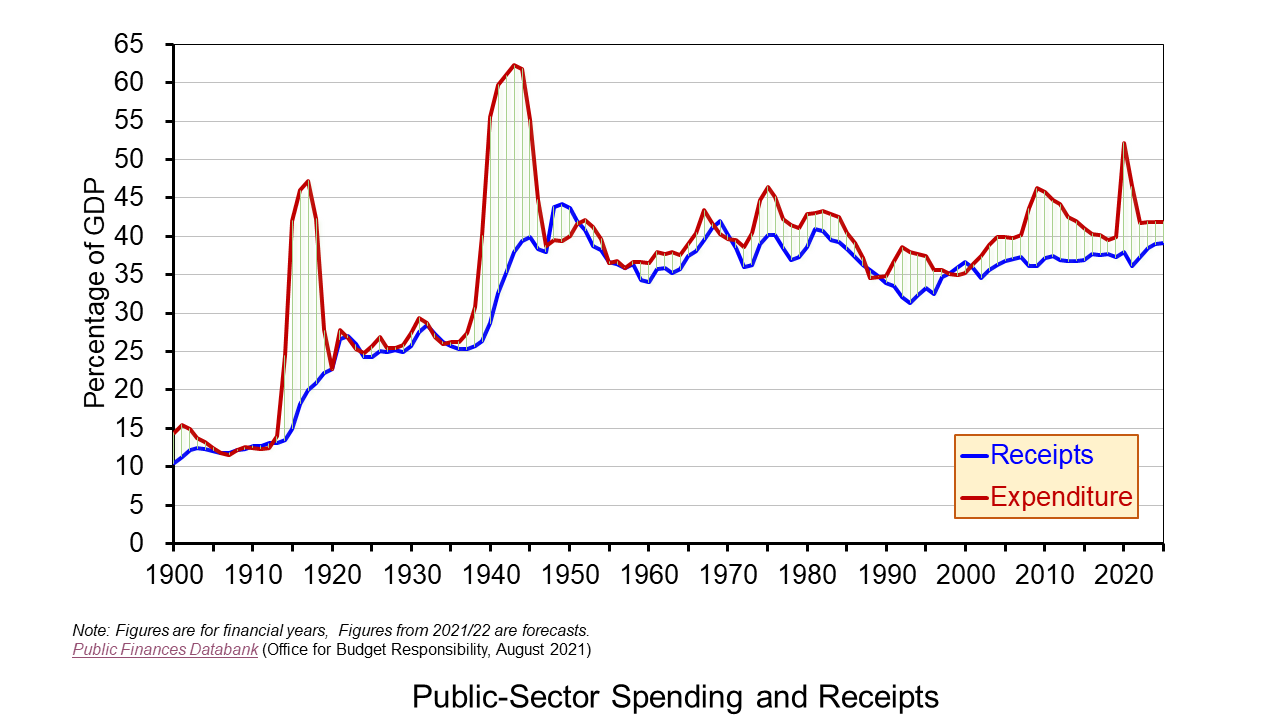 .
.
If we focus on public spending as a share of national income and its level following the two world wars, we can see that it did not fall back to pre-war levels. This is what Peacock and Wiseman (1961) famously referred to as a displacement effect. They attributed this to, among other things, an increase in the public’s tolerance to pay higher taxation because of the higher taxes levied during the war as well as to a desire for greater public intervention. The latter arose from an inspection effect. This can be thought of as a public consciousness effect, with the war helping to shine a light on a range of economic and social issues, such as health, housing and social security. These two effects, it is argued, reinforced each other, allowing the burden of taxation to rise and, hence, public spending to increase relative to national income.
If we forward to the global financial crisis, we can again see public spending rise as a share of national income. However, this time the ratio did not remain above pre-crisis levels. Rather, the UK government was fearful of unsustainable borrowing levels and the crowding out of private-sector activity by the public sector, with higher interest rates making public debt an attractive proposition for investors. It thus sought to reduce the public-sector deficit by engaging in what became known as ‘austerity’ measures.
 If we move forward further to the COVID-19 pandemic, we see an even more significant spike in public spending as a share of national income. It is of course rather early to make predictions about whether the pandemic will have enduring effects on public spending and taxation. Nonetheless the pandemic, in a similar way to the two world wars, has sparked public debates on many economic and social issues. Whilst debates around the funding of health and social care are longstanding, it could be argued that the pandemic has provided the government with the opportunity to introduce the 1.25 percentage point levy from April 2022 on the earned incomes of workers (both employees and the self-employed) and on employers. (See John’s blog Fair care? for a fuller discussion on the tax changes to pay for increased health and social care expenditure).
The extent to which there may be a pandemic displacement effect will depend on the fiscal choices made in the months and years ahead. The key question is how powerful will be the effect of social issues like income and wealth inequality, regional and inter-generational disparities, discrimination, poor infrastructure and educational opportunities in shaping these fiscal choices? Will these considerations carry more weight than the push to consolidate the public finances and tighten the public purse? These fiscal choices will determine the extent of any displacement effect in public spending and taxation.
Reference
Alan Peacock and Jack Wiseman, The Growth in Public Expenditure in the United Kingdom, Princeton University Press (1961).
Articles
Questions
- What do you understand by the term ‘public finances’?
- Why might you wish to express the size of public spending relative to national income rather than simply as an absolute amount?
- Undertake research to identify key pieces of social policy in the UK that were enacted at or around the times of the two World Wars.
- What do you understand by the terms ‘tolerable tax burden’ and ‘inspection effect’?
- Identify those social issues that you think have come into the spotlight as a result of the pandemic. Undertake research on any one of these and write a briefing note exploring the issue and the possible policy choices available to government.
- What is the concept of crowding out? How might it affect fiscal choices?
- How would you explain the distinction between public-sector borrowing and public-sector debt? Why could the former fall and the latter rise at the same time?
 In a little over a decade economies around the world have experienced two ‘once-in-a-lifetime’ shocks. First, there was the global financial crisis of the late 2000s, which saw an unsustainable expansion of banks’ balance sheets that resulted in a global economic slowdown. Now in 2020, a global health emergency has meant unprecedented falls in economic activity. In both cases, the public sector has been the economy’s shock absorber but this has had dramatic effects on its financial wellbeing. We consider here the effect on the UK public finances and reflect on their sustainability in light of the recent Fiscal Sustainability Report published by the Office of Budget Responsibility (OBR).
The COVID-19 pandemic saw the government initiate a range of fiscal interventions to support people and businesses. Interventions directly affecting public-sector spending included a series of employment support measures. These included the Coronavirus Job Retention Scheme, commonly referred to as the furlough scheme, the Self-employed Income Support scheme, a ‘Kickstart Scheme’ of work placements for universal credit recipients aged between 16 and 24 and a ‘Job Retention Bonus’ whereby employers can receive a one-off payment of £1,000 for every furloughed employee continuously employed from the cessation of the Job Retention Scheme on 31 October through to 31 January 2021.
Further spending interventions have included small business grant schemes, such as the Coronavirus Small Business Grant Fund, the coronavirus Retail, Hospitality and Leisure Grant Fund and the Coronavirus Local Authority Discretionary Grants Fund.
Meanwhile, taxation relief measures have included a business rates holiday for retail, hospitality and leisure businesses and a reduced rate of VAT of 5 per cent for hospitality, accommodation and attractions until 12 January 2021.
OBR’s central scenario
The OBR in its Fiscal Stability Report in July 2020 attempts to assess the wellbeing of the public finances not just in the short term but in the medium and longer term too. This longer-term perspective allows it to assess the sustainability of the public finances.
 Its analysis is based on some key assumptions, including population growth and future demands on public services, but, understandably, the timing of this report has necessitated some key assumptions around path of the economy, including the extent to which the economy will experience scarring effects, also known as hysteresis effects. While the analysis does not incorporate the Chancellor’s measures announced in its summer statement on the 8 July, including the kickstart scheme, job retention bonus and the reduced rate of VAT, which would have a material effect on this year’s numbers, the OBR concludes that there would be less significant impact on its medium-term analysis.
In what it describes as its ‘central scenario’ the OBR forecasts that national output (real GDP) will fall by 12 per cent in 2020 before growing by 9 per cent in 2021 and 4 per cent in 2022. National output therefore reaches its pre-virus peak at the end of 2022. However, 20 quarters on from the pandemic shock in Q1 2020 output is estimated to be 3.2 per cent less than it would otherwise have been, while the cumulative loss of output is expected to be 6.4 per cent over the period. The cumulative loss of output in the 20 quarters following the financial crisis (Q2 2008) is estimated to have been 9.3 per cent of actual cumulative output.
While national output is expected to be permanently lower because of the pandemic, consistent with hysteresis, the forecast assumes that the longer-term growth rate is unaffected. In other words, there is not expected to be what some now refer to as ‘super hysteresis’, whereby the scarring effects have persistent effects on rates of capital accumulation, innovation and productivity, which therefore depress structural economic growth rates.
Meanwhile, the unemployment rate is expected to peak at 11.9 per cent in the final quarter of this year, before falling to 8.8 per cent in Q4 2021 and 6.3 per cent in Q4 2022. By Q4 2025 the unemployment rate is forecast to be 5.1 per cent, one percentage point higher than the OBR was forecasting at the time of the Budget in March.
Spending and receipts
Chart 1 shows shows the predicted paths of (nominal) public-sector receipts and expenditures as a percentage of (nominal) GDP. Receipts are expected come in at £740 billion this financial year (excluding the impact of the summer statement measures), some £133 billion lower than was forecast at the time of the March budget. This will amount to a 10 per cent fall in receipts in the financial year, driven by a much-shrunken economy. However, the fact that nominal GDP falls somewhat more means that the receipts-to-GDP ratio ticks up slightly. (Click here for a PowerPoint of the chart.)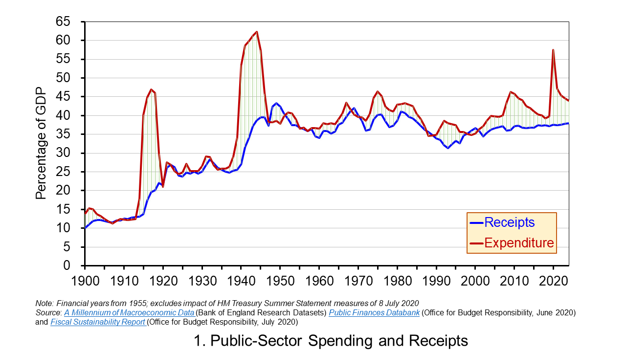
Public-sector spending is expected to be higher in 2020/21 than was forecast in the March by £135 million (excluding the summer statement measures) reflecting the COVID-19 interventions. This would result in spending rising to £1.06 trillion, a 20 per cent rise in the financial year. It would also mean that public-sector spending as a share of GDP rises to 54 per cent – its highest since 1945/46.
Going forward, in cash terms receipts are permanently lower than forecast because GDP is lower, though as a share of GDP cash receipts increase very slightly, but remain below what was expected at the time of the March budget. Spending in cash terms is expected to fall back by close to 8 per cent next financial year before increasing by 3 per cent per year up to 2024/25. This means that the spending-to-GDP ratio falls back to around 43 per cent by 2024/25, a couple of percentage points higher than was forecast back in March.
Deficits and debt
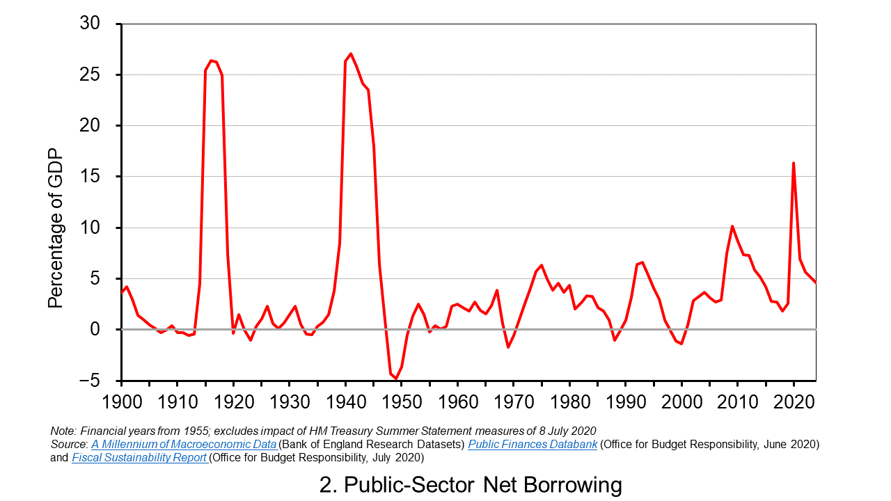
The difference between spending and receipts is known as public-sector net borrowing. While the extent of borrowing can be inferred by inspection of Chart 1, it can be seen more readily in Chart 2 which plots the path of public-sector net borrowing as a share of GDP.
The OBR is now forecasting a budget deficit of £322 billion (excluding the summer statement measures) in 2020/21 compared to £55 billion at the time of the March Budget. This would be equivalent to over 16 per cent of GDP, the highest since the Second World War. In a follow-up presentation on the Fiscal Stability Report on the 14 July the OBR suggested that the inclusion of summer statement measures could mean the deficit being as high as £375 billion, implying a deficit-to-GDP ratio of just shy of 19 per cent. (Click here for a PowerPoint of the chart.)
Deficits represent borrowing and are therefore a flow concept. The accumulated deficits over the years (minus any surpluses) gives total debt, which is a stock concept. The public-sector’s net debt is its gross debt less its liquid assets, principally deposits held with financial institutions and holdings of international reserves. This is also affected by Bank of England interventions, such as the Term Funding Scheme which enables banks and building societies to borrow funds at close to Bank Rate for up to four years. Nonetheless, the key driver of net debt-to-GDP ratio going forward is the persistence of deficits.
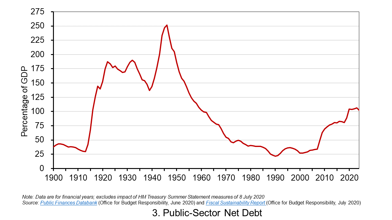
Chart 3 shows the expected path of the net debt-to-GDP ratio. The OBR expects this to exceed 100 per cent in 2020/21 for the first time since 1960/61. This reflects an increase in cash terms of the stock of net debt to £2.2 trillion, up from £1.8 trillion at the end of 2019/20, as well as a fall in GDP. By 2024/25 the net debt stock is expected to have risen to £2.6 trillion, £600 billion more than expected at the time of the March budget, with the net debt-to-GDP ratio still above 100 per cent at 102.1 per cent. (Click herefor a PowerPoint of the chart.)
Sustainability
The higher debt-to-GDP ratio raises longer-term questions about the sustainability of the public finances. The government is currently reviewing its fiscal rules and is expected to report back in time for the autumn budget. A key question is what debt-stabilising level might be considered appropriate. Is it the 102 per cent that the OBR is predicting at the end of 2024/25 (the medium-term horizon)? Or is it the 75 per cent that was being forecast for this point back in the March budget? This has profound implications for the fiscal arithmetic and, specifically, for the primary balance (the difference between non-interest spending and receipts) that the public sector needs to run.
If the government accepts a higher debt-to-GDP ratio as a ‘new norm’ that eases the fiscal arithmetic somewhat. However, some economists would be concerned about the economic consequences of larger public-sector debts, most notably so-called potential crowding-out effects on private-sector investment if upward pressure on interest rates was to materialise (see the news item MMT – a Magic Money Tree or Modern Monetary Theory?).
Even if the higher stabilising debt level was deemed appropriate, the OBR’s report analysis suggests problems in the government meeting this because it could still be running a primary deficit of 3.7 per cent of GDP by 2024/25. Therefore, even with interest rates expected to be lower than economic growth rates in 2024/25 (a negative growth-corrected interest rate) that enable governments to run primary deficits and yet maintain debt-to-GDP ratios, the debt-stabilising primary deficit for 2024/25 is estimated at only 3.2 per cent. All in all, this points to difficult fiscal choices ahead.
Articles
Questions
- What do you understand by the term financial wellbeing? What might this mean in respect of the government?
- What is meant by the fiscal arithmetic of government debt? Explain the factors that determine the fiscal arithmetic and the path of government debt?
- What is the difference between an increase in the size of a government deficit and an increase in the stock of government debt?
- Discuss the economic argument that, following the COVID-19 pandemic, government should avoid a return to an agenda of fiscal austerity ?
- What is the difference between the budget deficit, the primary deficit and the structural deficit?
- What are hysteresis effects? Discuss their relevancy in the design of the UK’s COVID-19 interventions.
 The issue of inequality has come into increasing focus over recent years. The impact of the COVID-19 pandemic raises further concerns that these inequalities may be exacerbated further. Here we provide an overview of some of the key patterns in current levels of wealth and income inequality in Britain. They show, for example, the markedly higher degree of inequality in wealth relative to income, the importance of property wealth and private pension wealth in determining levels of wealth, and the considerable variation in average wealth levels of households by age and location.
According to the 6th round of the Wealth and Assets Survey the aggregate wealth of British households was £14.63 trillion in April 2016 to March 2018. This compares with £12.57 trillion in the previous survey which ran from April 2014 to March 2016. This amounts to a 16.3 per cent nominal increase. In real terms, after adjusting for consumer price inflation, the increase was 13.1 per cent. Furthermore, when compared with the first round of the survey in July 2006 to June 2008, there has been a nominal increase in the aggregate wealth of British households of 74 per cent and a real increase of 41 per cent.
What is wealth?
An important question to ask when reflecting on the growth and distribution of wealth across households is what wealth comprises. In fact, it comprises one of four components:
- Net Financial wealth – the value of financial assets (savings and financial investments) less any financial liabilities (loans and arrears)
- Physical wealth – the value of household contents, possessions, valuables and vehicles
- Private pension wealth – the value of private pensions, such as occupational pensions and personal pensions
- Net property wealth – the value of any property owned (including other land/properties owned abroad) less the value of any loans or mortgages secured on these properties.
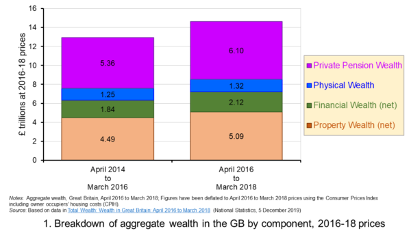 Figure 1 shows the evolution of aggregate wealth over the last two surveys (at constant 2016-18 prices) by the four component parts. Two components dominate the aggregate wealth of British households: property wealth (35 per cent) and private pension wealth (41-42 per cent). Financial wealth is the third largest component (14 per cent), while property wealth is the smallest component (9 to 10 per cent). (Click here for a PowerPoint of the chart.)
Trends in the average wealth of households
To help contextualise the size of wealth and begin to think about its distribution, rather than look at aggregate household wealth we can instead look at the average wealth of British households.
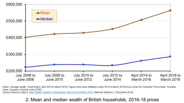 Figure 2 shows the average wealth (at constant 2016-18 prices) as measured by the mean (aggregate divided by the number of households) and the median (the middle household). The mean wealth of households is seen to be greater than their median wealth. In April 2016 to March 2018, average wealth as measured by the mean was £564,300 (an increase of 40.3 per cent over July 2006 to June 2008), whilst the average wealth of each household as measured by the median was £286,600 (an increase of 28.5 per cent over July 2006 to June 2008). (Click here for a PowerPoint of the chart.)
The higher mean value of wealth relative to the median value shows that the distribution of wealth is unequal. Therefore, the mean-to-median ratio is an indicator of inequality. In April 2016 to March 2018 the mean-to-median ratio was 1.97, up from 1.94 in April 2014 to March 2016 and 1.77 in July 2008 to June 2010, and 1.8 in the first survey in July 2006 to June 2008. This metric is therefore consistent with a more unequal distribution of wealth having arisen since the second survey in July 2008 to June 2010, a period during which the UK and global economy was been buffeted by the effects of the financial crisis and the associated economic downturn.
Trends in the average income of households
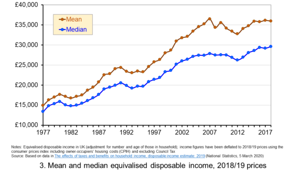 Figure 3 shows the mean and median values of disposable income (adjusted for the number and age of individuals comprising each household). Mean disposable income of UK households in financial year ending (FYE) 2018 was £35,928, a 0.5 per cent real decrease over FYE 2017, whilst median wealth (middle household) was £29,598 in FYE 2018, a 1.5 per cent real increase over FYE 2017. (Click here for a PowerPoint of the chart.)
The higher mean value of disposable income relative to the median value is indicative of inequality in disposable income. In FYE 2018 the mean-to-median ratio for disposable income was 1.21, down from 1.24 in FYE 2017 and a peak of 1.27 in FYE 2014, but higher than the 1.10 in 1978. The longer-term growth in the inequality of income helps to exacerbate existing wealth inequalities.
Comparing the inequality of income and wealth
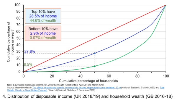 Figure 4 shows starkly the current inequality in wealth as compared to that in income. It does so by plotting their respective Lorenz curves. The curves show the proportion of overall wealth or income attributable to a given proportion of households. For example, 50 per cent of households have close to 28 per cent of total disposable income and a mere 8.5 per cent of aggregate wealth. (Click here for a PowerPoint of the chart.)
The inequality shown by the Lorenz curves is especially startling when we look at the top and bottom deciles. The bottom decile has just 2.9 per cent of income and only 0.07 per cent of wealth. Meanwhile the top 10 per cent of households have 28.5 per cent of income, almost the same as the first 50 percent of households, and some 44.6 per cent of wealth, with the previous 90 per cent of households having 55.4 per cent of wealth.
The Lorenz curves allow for the calculation of the Gini coefficient. It measures the area between the Lorenz curve and the 45 degree line consistent with zero inequality relative to the total area below the 45 degree line. Therefore, the Gini coefficient can take a value of between 0% (no inequality) and 100% (total inequality – where one person has all the wealth). Unsurprisingly whilst the Gini coefficient for disposable income in the UK in FYE 2018 was 34.7 per cent, that for aggregate wealth in Great Britain in April 2016 to March 2018 was significantly higher at 63.3 per cent.
The Gini coefficient for disposable income has risen from 25.5 per cent in 1977 to a peak in FYE 2008 of 38.6 per cent. It has therefore eased during the 2010s, but is nonetheless 13 percentage points higher today than it was four decades ago. Meanwhile, the Gini coefficient for wealth at the time of the first survey from July 2006 to June 2008 was 61 per cent. It has been unchanged at 63 percent over the last three surveys.
Inequality in wealth by component, location and age
It is important to recognise the inequalities in the components of wealth. This has particular importance when we are trying to understand how wealth varies by household characteristics, such as age and location.
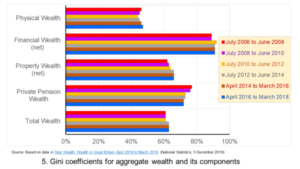 Figure 5 shows that the highest Gini coefficient is for net financial wealth. This stood at 91 per cent in April 2016 to March 2018. This extremely high figure shows the very high levels of inequatity in net financial wealth. This reflects the fact that some households find themselves with negative net financial wealth, such that their debts exceed their assets, whilst, on the other hand, some households can have large sums in financial investments. (Click here for a PowerPoint of the chart.)
We saw at the outset that the largest two components of wealth are property wealth and private pension wealth. The Gini coefficients of these two have in recent times moved in opposite directions by roughly similar magnitudes. This means that their effects on the overall Gini coefficient have offset one another. Perhaps for many people the rise in Gini coeffcient for property from 62 per cent in July 2006 to June 2008 to 66 per cent in April 2016 to March 2018 is the inequality measure that resonates most. This is reflected in regional disparities in wealth.
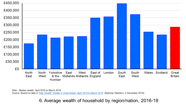 Figure 6 shows the geographical disparity of median household wealth across Britain. The regions with the highest median wealth are the South East, South West, London and the East of England. They have the highest contributions from net property wealth (40.4 per cent, 35.6 per cent, 41.7 per cent and 37.2 per cent respectively). The region with the lowest median total wealth, the North East, has the least total wealth in net property wealth (24.8 per cent). (Click here for a PowerPoint of the chart.)
Property wealth and private pension wealth also contribute to disparities in wealth by the age of the head of the household, also known as the household reference person or HRP. In April 2016 to March 2018 the mean wealth where the HRP is 25-34 was £125,700, rising to £859,200 where the HRP is 55-64 and then falling to £692,300 when the HRP is 65 or over. This is consistent with households accruing wealth over time and the using wealth to help fund retirement.
Where the age of the HRP is 55-64, mean property wealth in April 2016 to March 2018 was £255,800 compared to £53,700 where the HRP is 25-34. Meanwhile, where the age of the HRP is 55-64, mean private pension wealth was £449,100 compared to just £32,300 where the HRP is 25-34. In respect of property wealth, the deterioration in the affordability of owner-occupied housing over many years will impact especially hard on younger households. This will therefore tend to exacerbate inter-generational wealth inequality.
Whilst this briefing provides an overview of recent patterns in income and wealth inequality in Britain, the articles and press releases below consider the impact that the COVID-19 pandemic may have on inequalities.
Articles and Press Releases
- Many better-off households may increase savings as spending on ‘banned’ activities falls. Poorer households spend much more of their income on necessities and will be less resilient to any falls in income
IFS Press Release, Rowena Crawford, Alex Davenport, Robert Joyce and Peter Levell (08/04/20)
- Sector shut-downs during the coronavirus crisis affect the youngest and lowest paid workers, and women, the most
IFS Press Release, Robert Joyce and Xiaowei Xu (06/04/20)
- Coronavirus downturn ‘will exacerbate UK health inequality’
City A.M., James Warrington (09/04/20)
- Coronavirus pandemic exacerbates inequalities for women, UN warns
Guardian, Alexandra Villarreal (11/04/20)
- Inequality doesn’t just make pandemics worse – it could cause them
Guardian, Laura Spinney (12/04/20)
- The Coronavirus Will Be a Catastrophe for the Poor
The Atlantic, Derek Thompson (20/03/20)
- EU-wide inequality is back to pre-crisis levels
Social Europe, Michael Dauderstädt (15/04/20)
- Coronavirus makes inequality a public health issue
World Economic Forum, Alexandre Kalache (President, International Longevity Centre-Brazil) (13/04/20)
- Economist Joseph Stiglitz says coronavirus is ‘exposing’ health inequality in US
- CNBC, Jesse Pound (14/04/20)
ONS Bulletins
Questions
- In what ways can we use statistics to help measure and inform our analysis of inequality?
- In what ways can income inequality impact on wealth inequality?
- How can wealth inequality impact on income inequality?
- What might explain why wealth inequality is greater than income inequality?
- Explain how Lorenz curves help to generate Gini coefficients.
- Why would we expect the wealth of households with a younger household reference person (HRP) to be lower than that of a household with an older HRP? Would we expect this average to rise over all age ranges?
- If you were advising a government on policies to reduce income and wealth inequalities what sort of measures might you suggest?
- What is the difference between original income and disposable income?
- What is the difference between disposable income and equivalised disposable income?
- What role does the housing market play in affecting wealth inequality?
- Why is net financial wealth so unequally distributed?
- What is meant by health inequality? Of what significance is this for income and wealth inequality?
- What is meant by social mobility? Of what significance is this for income and wealth inequality?
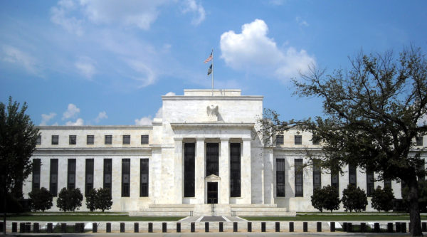 The monetary policy mandates of central banks have an impact on all our lives. While the terminology might not be familiar to many outside economics, their impact is, however, undeniably important. This is because they set out the objectives for the operation of monetary policy. Adjustments to interest rates or the growth of the money supply, which affect us all, reflect the mandate given to the central bank.
Since 1977 the mandate given to the Federal Reserve (the US central bank) by Congress has been to promote effectively the goals of maximum employment, stable prices, and moderate long-term interest rates. This mandate has become known as the dual mandate because it emphasises both employment and stable prices. Since 2012, the Federal Reserve’s Open Market Committee has issued an annual statemenent of its long-run goals. The latest was published in January 2019. Since this time, the Federal Reserve has explicitly set the ‘longer-run goal for inflation’ at 2 per cent. It has also emphasised that it would be ‘concerned’ if the inflation rate was persistently above or below this level.
In November 2018 the Federal Reserve began a review of its monetary policy strategy, its tools and how it communicates monetary policy. The review is being conducted within the guidelines that its statutory mandate gives and as well as the longer-term inflation goal of 2 per cent. However, one of the issues being addressed by the review is how the operation of monetary policy can avoid the rate of inflation frequently undershooting 2 per cent, as it has done since the financial crisis of the late 2000s and the introduction of the 2 per cent inflation rate target.
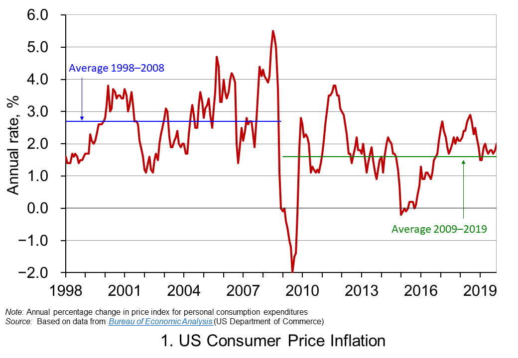 Chart 1 shows the annual rate of consumer price inflation in the US since 1998. It helps to illustrate the concern that low inflation rates can become entrenched. The chart shows that, while the average inflation rate from 1998 to 2008 was 2.7 per cent, from 2009 the average has been only 1.6 per cent. Interestingly, the average since 2012, when the explicit 2 per cent goal was introduced, to the present day is also 1.6 per cent. (Click here to download the PowerPoint chart.)
The concern going forward is that the natural or neutral rate of interest, which is the policy rate at which the rate of inflation is close to its target level and the level of output is close to its potential level, is now lower than in the recent past. Hence, when the next downturn occurs there is likely to be less room for cutting interest rates. Hence, the review is looking, in essence, to future-proof the conduct of monetary policy.
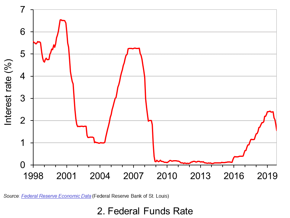 Chart 2 shows the Federal Fund rate since 1998. This is the rate at which commercial banks lend to each other the reserve balances they hold at the Federal Reserve in order to meet their reserve requirements. The Federal Reserve can affect this rate through buying or selling government securities. If it wants to drive up rates, it can sell holdings of government securities and reduce the money supply. If it wants to drive rates down, it can buy government securities and increase the money supply. The effects then ripple through to other interest rates and, in turn, aggregate demand and inflation. (Click here to download a copy of the PowerPoint chart.)
We can see from Chart 2 the dramatic cuts made by the Federal Reserve to interest rates as the financial crisis unfolded. The subsequent ‘normalisation’ of the Federal Funds rate in the 2010s saw the Federal Funds Rate rise to no higher than between 2.25 and 2.5 per cent. Then in 2019 the Federal Reserve began to cut rates again. This was despite historically-low unemployment rates. In November 2019 the unemployment rate fell to 3.5 per cent, its lowest since 1969. This has helped fuel the argument among some economists and financiers, which we saw earlier, that that the natural (or neutral) interest rate is now lower.
If the natural rate is lower, then this raises concerns about the effectiveness of monetary policy in future economic downturns. In this context, the review is considering ways in which the operation of monetary policy would be able to prevent the rate of inflation consistently undershooting its target. This includes a discussion of how the Fed can prevent inflationary expectations becoming anchored below 2 per cent. This is important because, should they do so, they help to anchor the actual rate of inflation below 2 per cent. One possibility being considered is an inflation make-up strategy. In other words, a period of below-target inflation rates would need to be matched by a period where inflation rates could exceed the 2 per cent target in order that the long-term average of 2 per cent is met.
An inflation make-up policy would work like forward guidance in that people and markets would know know that short-term interest rates would be kept lower for longer. This would then help to force longer-term interest rates lower as well as providing people and businesses with greater certainty that interest rates will be lower for longer. This could help to encourage spending, raise economic growth and prevent inflation from overshooting its target for any extensive period of time.
An inflation make-up strategy would, in part, help to cement the idea that the inflation target is effectively symmetrical and that 2 per cent is not an upper limit for the inflation rate. But, it would do more than that: it would allow the Fed to deliberately exceed the 2 per cent target.
An inflation make-up strategy does raise issues. For example, how would the Fed determine the magnitude of any inflation make-up and for how long would a looser monetary stance be allowed to operate? In other words, would an inflation make-up strategy be determined by a specific rule or formula? Or, would the principle be applied flexibly? Finally, could a simpler alternative be to raise the target rate itself, given the tendency to undershoot the 2 per cent target rate? If so, what should that the rate be?
We should know by the end of 2020 whether the Federal Reserve will adopt, when necessary, an inflation make-up monetary policy.
Articles
Questions
- What do you understand by the monetary policy mandate of a central bank?
- Explain the ways in which the monetary policy mandate of the central bank affects our everyday lives.
- Why are inflation-rate expectations important in determining actual inflation rates?
- Why is the Federal Reserve concerned about its ability to use monetary policy effectively during future economic downturns?
- Discuss the economic arguments for and against central banks operating strict inflation-rate targets.
- Does the case for adopting an inflation make-up monetary policy mandate show that the argument for inflation-rate targeting has been lost?
- What do you understand by the idea of a natural or neutral policy interest rate? Would the actual rate be expected to be above or below this if the rate of inflation was below its target level?
 The latest UK house price index reveals that annual house price growth in the UK slowed to just 1.2 per cent in May. This is the lowest rate of growth since January 2013. This is being driven, in part, by the London market where annual house price inflation rates have now been negative for 15 consecutive months. In May the annual rate of house price inflation in London fell to -4.4 per cent, it lowest since August 2009 as the financial crisis was unfolding. However, closer inspection of the figures show that while many other parts of the country continue to experience positive rates of annual house price inflation, once general inflation is accounted for, there is widespread evidence of widespread real house price deflation.
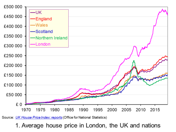 The average UK house price in May 2019 was £229,000. As Chart 1 shows, this masks considerable differences across the UK. In England the average price was £246,000 (an annual increase of 1.0 per cent), in Scotland it was £153,000 (an increase of 2.8 per cent), in Wales £159,000 (an increase of 3.0 per cent) and in Northern Ireland it was £137,000 (an increase of 2.1 per cent). (Click here to download a PowerPoint copy of the chart.)
The London market distorts considerably the English house price figures. In London the average house price in May 2019 was £457,000 (an annual decrease of 4.4 per cent). House prices were lowest in the North East region of England at £128,000. The North East was the only other English region alongside London to witness a negative rate of annual house price inflation, with house prices falling in the year to May 2019 by 0.7 per cent.
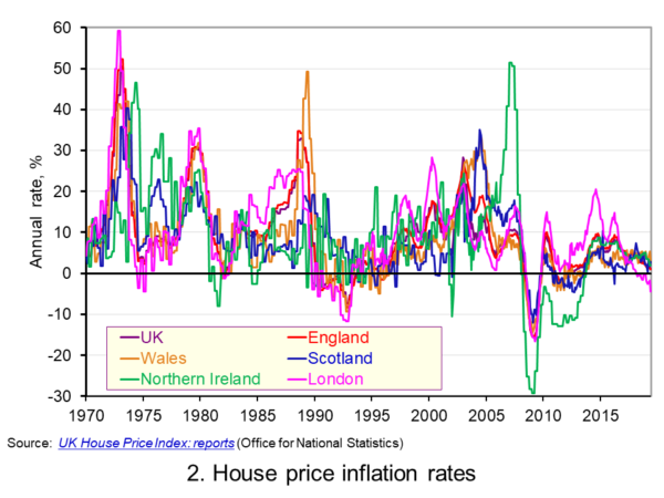 Chart 2 allows us to see more readily the rates of house price growth. It plots the annual rates of house price inflation across London, the UK and its nations. What is readily apparent is the volatility of house price growth. This is evidence of frequent imbalances between the flows of property on to the market to sell (instructions to sell) and the number of people looking to buy (instructions to buy). An increase in instructions to buy relative to those to sell puts upwards pressure on prices whereas an increase in the relative number of instructions to sell puts downward pressure on prices. (Click here to download a PowerPoint copy of the chart.)
Despite the volatility in house prices, the longer-term trend in house prices is positive. The average annual rate of growth in house prices between January 1970 and May 2019 in the UK is 9.1 per cent. For England the figure is 9.4 per cent, for Wales 8.8 per cent, for Scotland 8.5 per cent and for Northern Ireland 8.3 per cent. In London the average rate of growth is 10.4 per cent per annum.
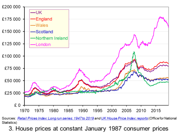 As Chart 3 illustrates, the longer-term growth in actual house prices cannot be fully explained by the growth in consumer prices. It shows house price values as if consumer prices, as measured by the Retail Prices Index (RPI), were fixed at their January 1987 levels. We see real increases in house prices or, expressed differently, in house prices relative to consumer prices. In real terms, UK house prices were 3.6 times higher in May 2019 compared to January 1970. For England the figure is 4.1 times, for Wales 3.1 times, for Scotland 2.9 times and for Northern Ireland 2.1 times. In London inflation-adjusted house prices were 5.7 times higher. (Click here to download a PowerPoint copy of the chart.)
The volatility in house prices continues to be evident when adjusted for changes in consumer prices. The UK’s annual rate of real house price inflation was as high as 40 per in January 1973, yet, on the other hand, in June 1975 inflation-adjusted house prices were 16 per cent lower than a year earlier. Over the period from January 1970 to May 2019, the average annual rate of real house price inflation was 3.2 per cent. Hence house prices have, on average, grown at an annual rate of consumer price inflation plus 3.2 per cent.
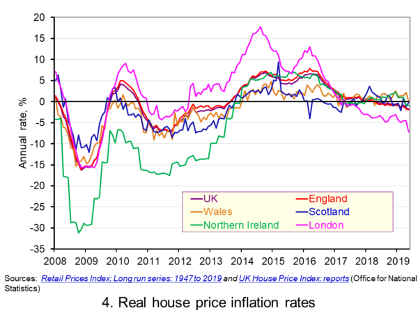 Chart 4 shows annual rates of real house price inflation since 2008 and, hence, from around the time the financial crisis began to unfold. The period is characterised by acute volatility and with real house prices across the UK falling at an annual rate of 16 per cent in 2009 and by as much 29 per cent in Northern Ireland. (Click here to download a PowerPoint copy of the chart.)
The UK saw a rebound in nominal and real house price growth in the period from 2013, driven by a strong surge in prices in London and the South East, and supported by government initiatives such as Help to Buy designed to help people afford to buy property. But house price growth then began to ease from early/mid 2016. Some of the easing may be partly due to any excessive fizz ebbing from the market, especially in London, and the impact on the demand for buy-to-let investments resulting from reductions in tax relief on interest payments on buy-to-let mortgages.
However, the housing market is notoriously sensitive to uncertainty, which is not surprising when you think of the size of the investment people are making when they enter the market. The uncertainty surrounding Brexit and the UK’s future trading relationships will have been a drag on demand and hence on house prices.
Chart 4 shows that by May 2019 all the UK nations were experiencing negative rates of real house price inflation, despite still experiencing positive rates of nominal house price inflation. In Wales the real annual house price inflation rate was -0.1 per cent, in Scotland -0.2 per cent, in Northern Ireland -0.9 per cent and in England -2.0 per cent. Meanwhile in London, where annual house price deflation has been evident for 15 consecutive months, real house prices in May 2019 were falling at an annual rate of 7.2 per cent.
Going forward the OBR’s Fiscal Risks Report predicts that, in the event of a no-deal, no-transition exit of the UK from the European Union, nominal UK house prices would fall by almost 10 per cent between the start of 2019 and mid-2021. This forecast is driven by the assumption that the UK would enter a year-long recession from the final quarter of 2019. It argues that property transactions and prices ‘move disproportionately’ during recessions. (See John’s blog The costs of a no-deal Brexit for a fuller discussion of the economics of a no-deal Brexit). The danger therefore is that the housing market becomes characterised by both nominal and real house price falls.
Articles
Questions
- Explain the difference between a rise in the rate of house price inflation a rise in the level of house prices.
- Explain the difference between nominal and real house prices.
- If nominal house prices rise can real house price fall? Explain your answer.
- What do you understand by the terms instructions to buy and instructions to sell?
- What factors are likely to affect the levels of instructions to buy and instructions to sell?
- How does the balance between instructions to buy and instructions to sell affect house prices?
- How can we differentiate between different housing markets? Illustrate your answer with examples.
 The COVID-19 pandemic had a stark effect on countries’ public finances. Governments had to make difficult fiscal choices around spending and taxation to safeguard public health, and the protection of jobs and incomes both in the present and in the future. The fiscal choices were to have historically large effects on the size of public spending and on the size of public borrowing.
 .
. If we move forward further to the COVID-19 pandemic, we see an even more significant spike in public spending as a share of national income. It is of course rather early to make predictions about whether the pandemic will have enduring effects on public spending and taxation. Nonetheless the pandemic, in a similar way to the two world wars, has sparked public debates on many economic and social issues. Whilst debates around the funding of health and social care are longstanding, it could be argued that the pandemic has provided the government with the opportunity to introduce the 1.25 percentage point levy from April 2022 on the earned incomes of workers (both employees and the self-employed) and on employers. (See John’s blog Fair care? for a fuller discussion on the tax changes to pay for increased health and social care expenditure).
  In a little over a decade economies around the world have experienced two ‘once-in-a-lifetime’ shocks. First, there was the global financial crisis of the late 2000s, which saw an unsustainable expansion of banks’ balance sheets that resulted in a global economic slowdown. Now in 2020, a global health emergency has meant unprecedented falls in economic activity. In both cases, the public sector has been the economy’s shock absorber but this has had dramatic effects on its financial wellbeing. We consider here the effect on the UK public finances and reflect on their sustainability in light of the recent
  Its analysis is based on some key assumptions, including population growth and future demands on public services, but, understandably, the timing of this report has necessitated some key assumptions around path of the economy, including the extent to which the economy will experience scarring effects, also known as hysteresis effects. While the analysis does not incorporate the Chancellor’s measures announced in its summer statement on the 8 July, including the kickstart scheme, job retention bonus and the reduced rate of VAT, which would have a material effect on this year’s numbers, the OBR concludes that there would be less significant impact on its medium-term analysis.


 The issue of inequality has come into increasing focus over recent years. The impact of the COVID-19 pandemic raises further concerns that these inequalities may be exacerbated further. Here we provide an overview of some of the key patterns in current levels of wealth and income inequality in Britain. They show, for example, the markedly higher degree of inequality in wealth relative to income, the importance of property wealth and private pension wealth in determining levels of wealth, and the considerable variation in average wealth levels of households by age and location.
 Figure 1 shows the evolution of aggregate wealth over the last two surveys (at constant 2016-18 prices) by the four component parts. Two components dominate the aggregate wealth of British households: property wealth (35 per cent) and private pension wealth (41-42 per cent). Financial wealth is the third largest component (14 per cent), while property wealth is the smallest component (9 to 10 per cent). (Click
  Figure 2 shows the average wealth (at constant 2016-18 prices) as measured by the mean (aggregate divided by the number of households) and the median (the middle household). The mean wealth of households is seen to be greater than their median wealth. In April 2016 to March 2018, average wealth as measured by the mean was £564,300 (an increase of 40.3 per cent over July 2006 to June 2008), whilst the average wealth of each household as measured by the median was £286,600 (an increase of 28.5 per cent over July 2006 to June 2008). (Click
  Figure 3 shows the mean and median values of disposable income (adjusted for the number and age of individuals comprising each household). Mean disposable income of UK households in financial year ending (FYE) 2018 was £35,928, a 0.5 per cent real decrease over FYE 2017, whilst median wealth (middle household) was £29,598 in FYE 2018, a 1.5 per cent real increase over FYE 2017. (Click
  Figure 4 shows starkly the current inequality in wealth as compared to that in income. It does so by plotting their respective Lorenz curves. The curves show the proportion of overall wealth or income attributable to a given proportion of households. For example, 50 per cent of households have close to 28 per cent of total disposable income and a mere 8.5 per cent of aggregate wealth. (Click
  Figure 5 shows that the highest Gini coefficient is for net financial wealth. This stood at 91 per cent in April 2016 to March 2018. This extremely high figure shows the very high levels of inequatity in net financial wealth. This reflects the fact that some households find themselves with negative net financial wealth, such that their debts exceed their assets, whilst, on the other hand, some households can have large sums in financial investments. (Click
  Figure 6 shows the geographical disparity of median household wealth across Britain. The regions with the highest median wealth are the South East, South West, London and the East of England. They have the highest contributions from net property wealth (40.4 per cent, 35.6 per cent, 41.7 per cent and 37.2 per cent respectively). The region with the lowest median total wealth, the North East, has the least total wealth in net property wealth (24.8 per cent). (Click
  The monetary policy mandates of central banks have an impact on all our lives. While the terminology might not be familiar to many outside economics, their impact is, however, undeniably important. This is because they set out the objectives for the operation of monetary policy. Adjustments to interest rates or the growth of the money supply, which affect us all, reflect the mandate given to the central bank.
 Chart 1 shows the annual rate of consumer price inflation in the US since 1998. It helps to illustrate the concern that low inflation rates can become entrenched. The chart shows that, while the average inflation rate from 1998 to 2008 was 2.7 per cent, from 2009 the average has been only 1.6 per cent. Interestingly, the average since 2012, when the explicit 2 per cent goal was introduced, to the present day is also 1.6 per cent. (Click
  Chart 2 shows the Federal Fund rate since 1998. This is the rate at which commercial banks lend to each other the reserve balances they hold at the Federal Reserve in order to meet their reserve requirements. The Federal Reserve can affect this rate through buying or selling government securities. If it wants to drive up rates, it can sell holdings of government securities and reduce the money supply. If it wants to drive rates down, it can buy government securities and increase the money supply. The effects then ripple through to other interest rates and, in turn, aggregate demand and inflation. (Click
  The latest
  The average UK house price in May 2019 was £229,000. As Chart 1 shows, this masks considerable differences across the UK. In England the average price was £246,000 (an annual increase of 1.0 per cent), in Scotland it was £153,000 (an increase of 2.8 per cent), in Wales £159,000 (an increase of 3.0 per cent) and in Northern Ireland it was £137,000 (an increase of 2.1 per cent). (Click
  Chart 2 allows us to see more readily the rates of house price growth. It plots the annual rates of house price inflation across London, the UK and its nations. What is readily apparent is the volatility of house price growth. This is evidence of frequent imbalances between the flows of property on to the market to sell (instructions to sell) and the number of people looking to buy (instructions to buy). An increase in instructions to buy relative to those to sell puts upwards pressure on prices whereas an increase in the relative number of instructions to sell puts downward pressure on prices. (Click
  As Chart 3 illustrates, the longer-term growth in actual house prices cannot be fully explained by the growth in consumer prices. It shows house price values as if consumer prices, as measured by the Retail Prices Index (RPI), were fixed at their January 1987 levels. We see real increases in house prices or, expressed differently, in house prices relative to consumer prices. In real terms, UK house prices were 3.6 times higher in May 2019 compared to January 1970. For England the figure is 4.1 times, for Wales 3.1 times, for Scotland 2.9 times and for Northern Ireland 2.1 times. In London inflation-adjusted house prices were 5.7 times higher. (Click
  Chart 4 shows annual rates of real house price inflation since 2008 and, hence, from around the time the financial crisis began to unfold. The period is characterised by acute volatility and with real house prices across the UK falling at an annual rate of 16 per cent in 2009 and by as much 29 per cent in Northern Ireland. (Click