 In a previous blog, Anyone got a crystal ball?, we reported on the Bank of England’s and other agencies’ difficulty in making forecasts. As the Governor, Mervyn King, said, “There is just enormous uncertainty out there.”
The Bank of England has just published its November Inflation Report. This quarterly publication gives forecasts of inflation, GDP and other indicators. It is clear that forecasting hasn’t become any easier. In his opening remarks, Dr. King says:
Continuing the recent zig-zag pattern, output growth is likely to fall back sharply in Q4 as the boost from the Olympics in the summer is reversed – indeed output may shrink a little this quarter. It is difficult to discern the underlying picture. It is probably neither as good as the zigs suggest nor as bad as the zags imply.

The Inflation Report looks at the various factors affecting aggregate demand, inflation, unemployment and aggregate supply. It is quite clear on reading the report why there is so much uncertainty.

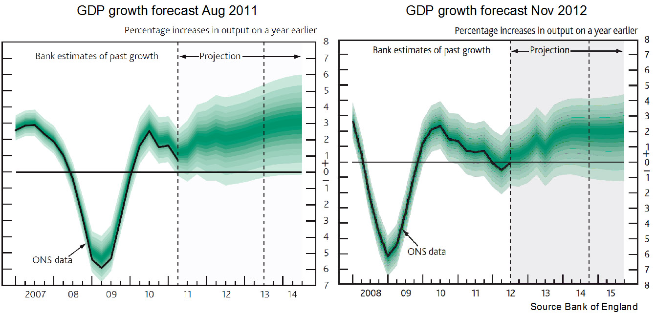
A salutary lesson is to look back at previous forecasts and see just how wrong they have been. The chart above shows the forecasts for GDP made in the Inflation Reports of Nov 2012 and Aug 2011. You can see that they are significantly different and yet just 15 months apart. You might also like to compare the forecasts made a year ago (or even two!) about 2012 with the actual situation today. A good source for this is the Treasury’s Forecasts for the UK economy. This collates the forecasts from a range of independent forecasters.
The inaccuracy of forecasting is an inevitable consequence of a highly interdependent world economy that is subject to a range of economic shocks and where confidence (or lack of it) is a major determinant of aggregate demand. But when firms, governments, individuals and central banks have to make plans, it is still necessary to project into the future and try to forecast as accurately as possible – even though it might mean keeping your fingers firmly crossed.
Articles
Bank of England downgrades growth forecast for 2013 Daily Record (14/11/12)
A gloomy picture from the Old Lady Financial Times (14/11/12)
Will Britain’s post-recession economy be resurgent, stagnant or greener? The Guardian, Larry Elliott (11/11/12)
Economics must heed political risk Financial Times, Sebastian Mallaby (6/11/12)
European Commission autumn forecast: overoptimistic and in denial Social Europe Journal, Andrew Watt (7/11/12)
Bank of England gets long to-do list for overhaul Reuters, Sven Egenter (2/11/12)
Data
Inflation Report, November 2012 Bank of England
Index of economic forecasts European Commission DGECFIN
Economic Outlook Annex Tables OECD
World Economic Outlook Reports IMF
Forecasts for the UK economy HM Treasury
Questions
- What was being forecast for economic growth and inflation for 2012 (a) one year ago; (b) two years ago?
- What are the main reasons for the inaccuracy of forecasts?
- How might forecasting be made more reliable?
- If sentiment is a key determinant of economic activity, how might politicians increase the confidence of firms and consumers? What are the political constraints on doing this?
- Explain the following statement from the Guardian article: “The problem … is that last decade’s tailwind has become this decade’s headwind.” Why is it difficult to forecast the strength of this ‘headwind’?
- How useful is it to use past trends as a guide to the future course of the economy?
What’s going to happen to stock market prices? If we knew that, we could be very rich! Nevertheless, financial analysts constantly try to predict the movements of shares in order to decide when to buy and when to sell. One thing they do is to look at charts of price movements and look for patterns. These ‘chartists’, as they are sometimes called, refer to something known as the ‘death cross’ or ‘dark cross’.
So what is the death cross? Imagine a chart of the movements of share prices, such as the FTSE 100 in the UK or the Dow Jones Industrial Average and S&P 500 in the USA. These movements can be shown as a moving average. In other words, for each day you plot the average of the past so many days. Typically, 200-day (sometimes 100-day) and 50-day moving averages are plotted. The 200-day (or 100-day) is taken as the long-term moving average and the 50-day as the short-term moving average. In a falling market, if the short-term moving average crosses below the long-term moving average, this is called the ‘death cross‘ as it signifies growing downward pressure in the market. The fall in the long-term average in these circumstances will indeed lag behind the fall in the short-term moving average.
Markets around the world are experiencing the death cross. So should be be worried? Or is this like looking for patterns in tea leaves, or the stars, and using them to make bogus predictions? So: science or mumbo jumbo?
First the science: the death cross indicates a fall in confidence. And at present, there is much for investors to worry about. Burgeoning debts, austerity measures and fears of a double-dip recession are spooking markets.
Now the mumbo jumbo. Just because markets are falling at the moment, this does not prove that they will go on falling. Markets are often spooked, only to recover when ‘sanity’ returns. People may soon start to believe that a second credit crunch will not return, given all the regulatory and support measures put in place, the huge amount of liquidity waiting to be invested and the support packages from the ECB and IMF for Greece and, potentially, for other eurozone countries having difficulties servicing their debts. In other words, patterns may repeat themselves, but not necessarily. It depends on circumstances.
Articles
Market’s Swoon Prompts Fears Of the Dreaded ‘Death Cross’ CNBC, Jeff Cox (1/7/10)
Death Cross in S&P 500 May Not Lead to Rout: Technical Analysis Bloomberg Businessweek, Alexis Xydias (30/6/10)
Are the markets about to encounter the”Death Cross”? BBC News, Jamie Robertson (1/7/10)
MarketBeat Q&A: Debunking the ‘Death Cross’ Wall Street Journal blogs, Matt Phillips (30/6/10)
Technical analysis and market data
Moving Average Crossovers TradingDay.com, Alan Farley
Death Cross Investopedia
FTSE 100 historical prices Yahoo Finance
S&P 500 historical prices Yahoo Finance
Dow Jones historical prices Yahoo Finance
Questions
- Explain what is meant by the death cross and use a diagram to illustrate it. What is menat by the golden cross. Again, use a diagram to illustrate it.
- Under what circumstances would speculation against stock market price movements be (a) stabilising and (b) destabilising?
- What is the implication for stock market prices of a ‘wall of money’?
- How much faith should be put in chartist explanations of stock market prices? Do criticisms of chartism apply to all time-series analysis that is used for forecasting?
- Look back at newspaper articles from a year ago and see what they were predicting about stock market prices. Have their preductions been borne out? If so, why? If not, why not?
 In a previous blog, Anyone got a crystal ball?, we reported on the Bank of England’s and other agencies’ difficulty in making forecasts. As the Governor, Mervyn King, said, “There is just enormous uncertainty out there.”