 Boris Johnson gave a speech on 30 June outlining his government’s approach to recovery from the sharpest recession on record. With the slogan ‘Build, build, build’, he said that infrastructure projects were the key to stimulating the economy. Infrastructure spending is a classic Keynesian response to recession as it stimulates aggregate demand allowing slack to be taken up, while also boosting aggregate supply, thereby allowing recovery in output while increasing potential national income.
A new ‘New deal’
He likened his approach to that of President Franklin D Roosevelt’s New Deal. This was a huge stimulus between 1933 and 1939 in an attempt to lift the US economy out of the Great Depression. There was a massive programme of government spending on construction projects, such as hospitals, schools, roads, bridges and dams, including the Hoover Dam and completing the 113-mile Overseas Highway connecting mainland Florida to the Florida Keys. Altogether, there were 34 599 projects, many large-scale. In addition, support was provided for people on low incomes, the unemployed, the elderly and farmers. Money supply was expanded, made possible by leaving the Gold Standard in 1934.
 There was some debate as to whether the New Deal could be classed as ‘Keynesian’. Officially, the administration was concerned to achieve a balanced budget. However, it had a separate ’emergency budget’, from which New Deal spending was financed. According to estimates by the Federal Reserve Bank of St Louis, the total extra spending amounted to nearly 40% of US GDP as it was in 1929.
By comparison with the New Deal, the proposals of the Johnson government are extremely modest. Mostly it amounts to bringing forward spending already committed. The total of £5 billion is just 0.2% of current UK GDP.
Focusing on jobs
A recent report published by the Resolution Foundation, titled ‘The Full Monty‘, argues that as the Job Retention Scheme, under which people have been furloughed on 80% pay, is withdrawn, so unemployment is set to rise dramatically. The claimant count has already risen from 1.2m to 2.8m between March and May with the furlough scheme in place.
 Policy should thus focus on job creation, especially in those sectors likely to experience the largest rise in unemployment. Such sectors include non-food retail, hospitality (pubs, restaurants, hotels, etc.), public transport, the arts, entertainment and leisure and a range of industries servicing these sectors. What is more, many of the people working in these sectors are young and low paid. Many will find it difficult to move to jobs elsewhere – partly because of a lack of qualifications and partly because of a lack of alternative jobs. The rising unemployment will raise inequality.
The Resolution Foundation report argues that policy should be focused specifically on job creation.
Policy makers should act now to minimise outflows from the hard-hit sectors – a wage subsidy scheme or a National Insurance cut in those sectors would reduce labour costs and discourage redundancies. Alongside this, the Government must pursue radical action to create jobs across the country, such as in social care and housing retrofitting, and ramp up support for the unemployed.
Dealing with hyteresis
The economy is set to recover somewhat as the lockdown is eased, but it is not expected to return to the situation before the pandemic. Many jobs will be lost permanently unless government support continues.
Even then, many firms will have closed and others will have reassessed how many workers they need to employ and whether less labour-intensive methods would be more profitable. They may take the opportunity to consider whether technology, such as AI, can replace labour; or they may prefer to employ cheap telecommuters from India or the Philippines rather than workers coming into the office.
Policies to stimulate recovery will need to take these hysteresis effects into account if unemployment is to fall back to pre-Covid rates.
Videos
Articles
- Coronavirus: Boris Johnson pledges ‘new deal’ to build post-virus
BBC News (30/6/20)
- Boris Johnson hails his economic plan as a new ‘New Deal.’ Try ‘small deal’ instead
MarketWatch, Pierre Briançon (30/6/20)
- Boris Johnson announces state-led post-coronavirus relaunch
Financial Times, George Parker, Jim Pickard and Chris Giles (30/6/20)
- How does Boris Johnson’s ‘new deal’ compare with Franklin D Roosevelt’s?
The Guardian, Richard Partington (30/6/20)
- Coronavirus: Ministers urged to stave off ‘second wave’ of unemployment with major job creation plan
PoliticsHome, Matt Honeycombe-Foster (29/6/20)
- Biggest job creation package in peacetime needed to deflect increase in UK unemployment, think tank reports
Independent, Alan Jones (29/6/20)
- UK needs ‘biggest-ever peacetime job creation plan’ to stop mass unemployment
The Guardian, Richard Partington (29/6/20)
- The International Labour Organization was founded after the Spanish flu – its past lights the path to a better future of work
The Conversation, Huw Thomas, Frederick Harry Pitts and Peter Turnbull (17/6/20)
- Seven charts on the coronavirus jobs market
BBC News, By Lora Jones and Daniele Palumbo (16/6/20)
- Covid, hysteresis, and the future of work
Vox, Richard Baldwin (29/5/20)
- The economy won’t snap back after Covid-19
Financial Times, Tim Harford (5/6/20)
- Addressing The Covid-19 Shock -Keeping People In Work And Businesses Afloat
Forbes, Linda Yueh (20/3/20)
- Cutting labour taxes brings back the jobs lost to COVID-19
Vox, Christian Bredemeier, Falko Juessen and Roland Winkler (28/6/20)
Report
Questions
- What are the arguments for and against substantial increased government expenditure on infrastructure projects?
- Should the UK government spend more or less on such projects than the amount already pledged? Justify your answer.
- What are the arguments for and against directing all extra government expenditure towards green projects?
- Look through the Resolution Foundation report and summarise the findings of each of its sections.
- What are the arguments for and against directing all extra government expenditure towards those sectors where there is the highest rate of job losses?
- What form could policies to protect employment take?
- How should the success of policies to generate employment be measured?
- What form does hysteresis play on the post-Covid-19 labour market? What four shocks mean that employment will not simply return to the pre-Covid situation?
 Three international agencies, the IMF, the European Commission and the OECD, all publish six-monthly forecasts for a range of countries. As each agency’s forecasts have been published this year, so the forecasts for economic growth and other macroeconomic indicators, such as unemployment, have got more dire.
The IMF was the first to report. Its World Economic Outlook, published on 14 April, forecast that in the UK real GDP would fall by 6.5% in 2020 and rise by 4% in 2021 (not enough to restore GDP to 2019 levels); in the USA it would fall by 5.9% this year and rise by 4.7% next year; in the eurozone it would fall by 7.5% this year and rise by 4.7% next.
The European Commission was next to report. Its AMECO database was published on 6 May. This forecast that UK real GDP would fall by 8.3% this year and rise by 6% next; in the USA it would fall by 6.5% this year and rise by 4.9% next; in the eurozone it would fall by 7.7% this year and rise by 6.3% next.
The latest to report was the OECD on 10 June. The OECD Economic Outlook was the most gloomy. In fact, it produced two sets of forecasts.
The first, more optimistic one (but still more gloomy than the forecasts of the other two agencies) was based on the assumption that lockdowns would continue to be lifted and that there would be no second outbreak later in the year. This ‘single-hit scenario’ forecast that UK real GDP would fall by 11.5% this year and rise by 9% next (a similar picture to France and Italy); in the USA it would fall by 7.3% this year and rise by 4.1% next; in the eurozone it would fall by 9.1% this year and rise by 6.5% next.
The second set of OECD forecasts was based on the assumption that there would be a second wave of the virus and that lockdowns would have to be reinstated. Under this ‘double-hit scenario’, the UK’s GDP is forecast to fall by 14.0% this year and rise by 5.0 per cent next; in the USA it would fall by 8.5% this year and rise by 1.9% next; in the eurozone it would fall by 11.5% this year and rise by 3.5% next.
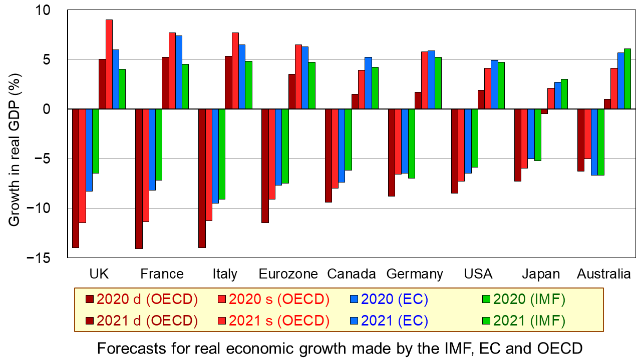
The first chart shows the four sets of forecasts (including two from the OECD) for a range of countries. The first four bars for each country are the forecasts for 2020; the other four bars for each country are for 2021. (Click here for a PowerPoint of the chart.)
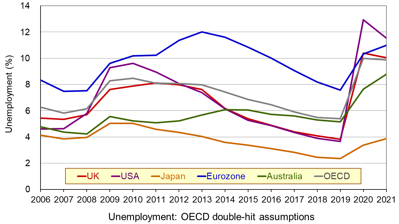
The second chart shows unemployment rates from 2006. The figures for 2020 and 2021 are OECD forecasts based on the double-hit assumption. You can clearly see the dramatic rise in unemployment in all the countries in 2020. In some cases it is forecast that there will be a further rise in 2021. (Click here for a PowerPoint of the chart.)
As the OECD states:
In both scenarios, the recovery, after an initial, rapid resumption of activity, will take a long time to bring output back to pre-pandemic levels, and the crisis will leave long-lasting scars – a fall in living standards, high unemployment and weak investment. Job losses in the most affected sectors, such as tourism, hospitality and entertainment, will particularly hit low-skilled, young, and informal workers.
But why have the forecasts got gloomier? There are both demand- and supply-side reasons.
Aggregate demand has fallen more dramatically than originally anticipated. Lockdowns have lasted longer in many countries than governments had initially thought, with partial lockdowns, which replace them, taking a long time to lift. With less opportunity for people to go out and spend, consumption has fallen and saving has risen. Businesses that have shut, some permanently, have laid off workers or they have been furloughed on reduced incomes. This too has reduced spending. Even when travel restrictions are lifted, many people are reluctant to take holidays at home and abroad and to use public transport for fear of catching the virus. This reluctance has been higher than originally anticipated. Again, spending is lower than before. Even when restaurants, bars and other public venues are reopened, most operate at less than full capacity to allow for social distancing. Uncertainty about the future has discouraged firms from investing, adding to the fall in demand.
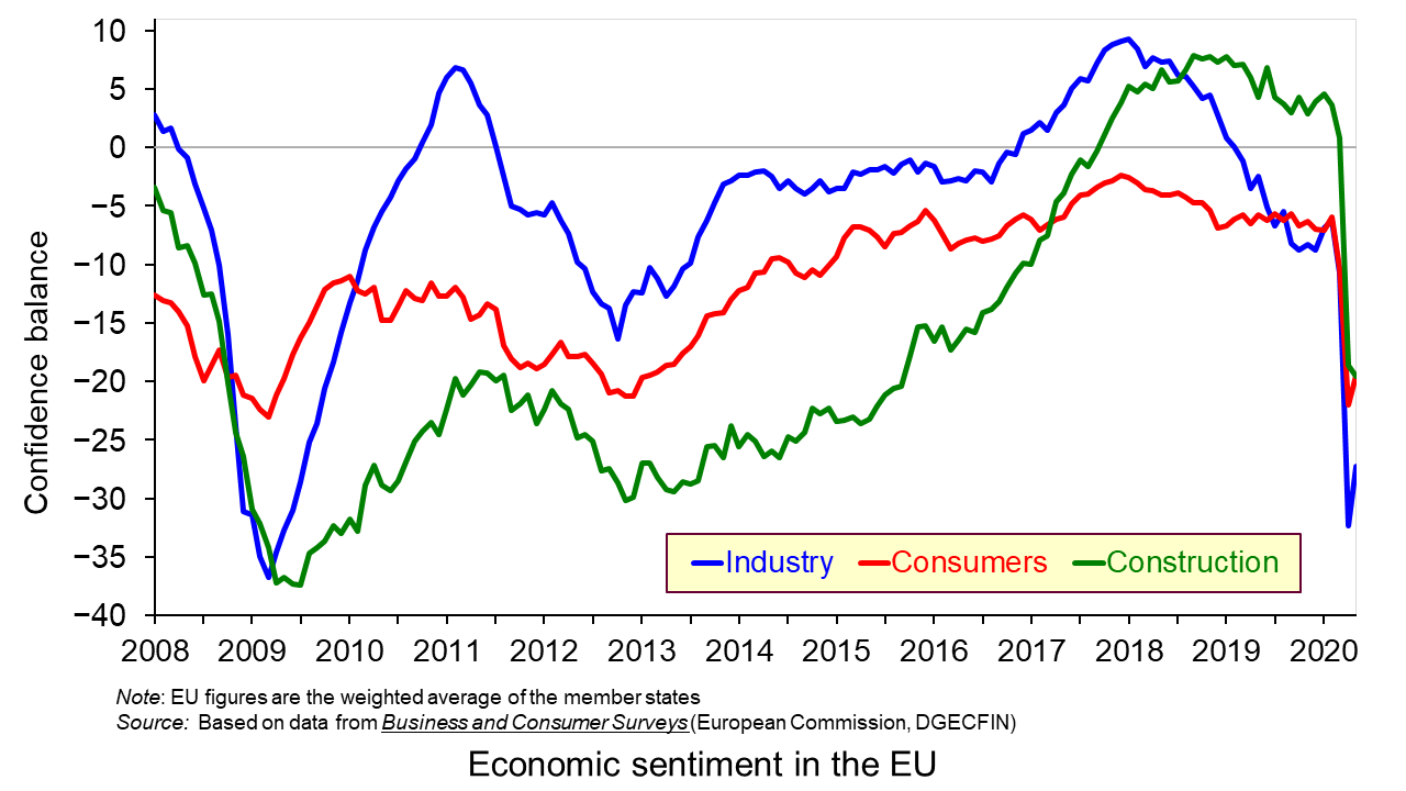
On the supply side, there has been considerable damage to capacity, with firms closing and both new and replacement investment being put on hold. Confidence in many sectors has plummeted as shown in the third chart which looks at business and consumer confidence in the EU. (Click here for a PowerPoint of the above chart.) Lack of confidence directly affects investment with both supply- and demand-side consequences.
Achieving a sustained recovery will require deft political and economic judgements by policymakers. What is more, people are increasingly calling for a different type of economy – one where growth is sustainable with less pollution and degradation of the environment and one where growth is more inclusive, where the benefits are shared more equally. As Angel Gurría, OECD Secretary-General, states in his speech launching the latest OECD Economic Outlook:
The aim should not be to go back to normal – normal was what got us where we are now.
Articles
OECD publications
Questions
- Why has the UK economy been particularly badly it by the Covid-19 pandemic?
- What will determine the size and timing of the ‘bounce back’?
- Why will the pandemic have “dire and long-lasting consequences for people, firms and governments”?
- Why have many people on low incomes faced harsher consequences than those on higher incomes?
- What are the likely environmental impacts of the pandemic and government measures to mitigate the effects?
 With promises by the newly elected Conservative government to increase investment expenditure on health, education, innovation and infrastructure, it was expected that Rishi Sunak’s first Budget would be strongly expansionary. In fact, it turned out to be two Budgets in one – both giving a massive fiscal boost.
An emergency Budget
The first part of the Budget was a short-term emergency response to the explosive spread of the coronavirus. An extra £12 billion is to be spent on the NHS and other public services. Whether this will be anything like enough to cope with the effects of the pandemic as businesses fail and people lose their jobs remains to be seen. (See the blog A global supply-side shock: the impact of the coronavirus (COVID-19) outbreak.)
A key issue is just how quickly the money can be spent. How quickly can you train health professionals or produce more ventilators or provide extra hospital beds?
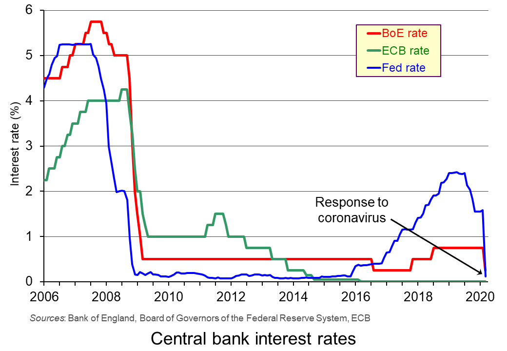 This emergency part of the Budget was co-ordinated with the Bank of England’s decision to cut Bank Rate from 0.75% to 0.25%.
This combined fiscal and monetary response to the crisis was further enhanced by the agreement of central banks on 15 March to boost world liquidity by increasing the supply of US dollars through large-scale quantitative easing. The US central bank, the Federal Reserve, also cut its main federal funds rate by one percentage point from 1–1.25% to 0–0.25%.
The planned Budget
 The second part of the Budget is to raise government investment by 9% in real terms over the next four years, bringing overall government expenditure to 41% of GDP, financed largely by extra borrowing. As the IFS observes, “That is above its pre-crisis level and bigger than at any point between the mid 1980s and the start of the financial crisis.”
But despite this rise in the proportion of government spending to GDP, in other respects the spending plans are less expansionary than they may appear. Increases in current spending on health, education and defence had already been promised. This leaves other departments, such as social security, facing cuts, or at least no increase. And when compared with 2010/11 levels, if you exclude health, government current spending per head of the population will around 14% lower, or 19% lower once you account for spending that replaces EU funding.
The Chancellor’s hope is that, by focusing on investment, there will be a supply-side effect as well as a demand-side boost. If increases in aggregate demand are balanced by increases in aggregate supply, such a policy would not be inflationary in the long run. But in the light of the considerable uncertainty of the effects of the coronavirus, the plans may well require significant adjustment in the Autumn Budget – or earlier.
Articles
Podcasts and Videos
Official documentation
Questions
- To what extent is this Budget ‘Keynesian’?
- Is the extra government expenditure likely to crowd out private expenditure? Explain.
- Demonstrate the desired long-term economic effect of the infrastructure policy using either an AD/AS diagram or a DAD/DAS diagram.
- How is the coronavirus pandemic likely to affect potential GDP in (a) the short run (b) the long run?
- Why is public-sector debt likely to soar over the next four years while annual government debt interest payments are likely to continue their gentle decline?
- What is missing from the Budget that you feel ought to have been included? Explain why.
 The global economic impact of the coronavirus outbreak is uncertain but potentially very large. There has already been a massive effect on China, with large parts of the Chinese economy shut down. As the disease spreads to other countries, they too will experience supply shocks as schools and workplaces close down and travel restrictions are imposed. This has already happened in South Korea, Japan and Italy. The size of these effects is still unknown and will depend on the effectiveness of the containment measures that countries are putting in place and on the behaviour of people in self isolating if they have any symptoms or even possible exposure.
The OECD in its March 2020 interim Economic Assessment: Coronavirus: The world economy at risk estimates that global economic growth will be around half a percentage point lower than previously forecast – down from 2.9% to 2.4%. But this is based on the assumption that ‘the epidemic peaks in China in the first quarter of 2020 and outbreaks in other countries prove mild and contained.’ If the disease develops into a pandemic, as many health officials are predicting, the global economic effect could be much larger. In such cases, the OECD predicts a halving of global economic growth to 1.5%. But even this may be overoptimistic, with growing talk of a global recession.
Governments and central banks around the world are already planning measures to boost aggregate demand. The Federal Reserve, as an emergency measure on 3 March, reduced the Federal Funds rate by half a percentage point from the range of 1.5–1.75% to 1.0–1.25%. This was the first emergency rate cut since 2008.
Economic uncertainty
With considerable uncertainty about the spread of the disease and how effective containment measures will be, stock markets have fallen dramatically. The FTSE 100 fell by nearly 14% in the second half of February, before recovering slightly at the beginning of March.  It then fell by a further 7.7% on 9 March – the biggest one-day fall since the 2008 financial crisis. This was specifically in response to a plunge in oil prices as Russia and Saudi Arabia engaged in a price war. But it also reflected growing pessimism about the economic impact of the coronavirus as the global spread of the epidemic accelerated and countries were contemplating more draconian lock-down measures.
Firms have been drawing up contingency plans to respond to panic buying of essential items and falling demand for other goods. Supply-chain managers are working out how to respond to these changes and to disruptions to supplies from China and other affected countries.
Firms are also having to plan for disruptions to labour supply. Large numbers of employees may fall sick or be advised/required to stay at home. Or they may have to stay at home to look after children whose schools are closed.  For some firms, having their staff working from home will be easy; for others it will be impossible.
Some industries will be particularly badly hit, such as airlines, cruise lines and travel companies. Budget airlines have cancelled several flights and travel companies are beginning to offer substantial discounts. Manufacturing firms which are dependent on supplies from affected countries have also been badly hit. This is reflected in their share prices, which have seen large falls.
Longer-term effects
Uncertainty could have longer-term impacts on aggregate supply if firms decide to put investment on hold. This would also impact on the capital goods industries which supply machinery and equipment to investing firms. For the UK, already having suffered from Brexit uncertainty, this further uncertainty could prove very damaging for economic growth.
 While aggregate supply is likely to fall, or at least to grow less quickly, what will happen to the balance of aggregate demand and supply is less clear. A temporary rise in demand, as people stock up, could see a surge in prices, unless supermarkets and other firms are keen to demonstrate that they are not profiting from the disease. In the longer term, if aggregate demand continues to grow at past rates, it will probably outstrip the growth in aggregate supply and result in rising inflation. If, however, demand is subdued, as uncertainty about their own economic situation leads people to cut back on spending, inflation and even the price level may fall.
How quickly the global economy will ‘bounce back’ depends on how long the outbreak lasts and whether it becomes a serious pandemic and on how much investment has been affected. At the current time, it is impossible to predict with any accuracy the timing and scale of any such bounce back.
Articles
- Coronavirus: Global growth ‘could halve’ if outbreak intensifies
BBC News (2/3/20)
- Coronavirus: Eight charts on how it has shaken economies
BBC News, Lora Jones, David Brown & Daniele Palumbo (4/3/20)
- The economic ravages of coronavirus
BBC News, Douglas Fraser (7/3/20)
- What Coronavirus Could Mean for the Global Economy
Harvard Business Review, Philipp Carlsson-Szlezak, Martin Reeves and Paul Swartz (3/3/20)
- Coronavirus escalation could cut global economic growth in half – OECD
The Guardian, Richard Partington and Phillip Inman (2/3/20)
- U.S. Fed Cuts Rates, There Are Still Strategies The ECB Can Follow
Forbes, Stephen Pope (3/3/20)
- A coronavirus recession could be supply-side with a 1970s flavour
The Guardian, Kenneth Rogoff (3/3/20)
- Coronavirus will wreak havoc on the US economy
CNN, Mark Zandi (3/3/20)
- UK factories feel the effects of coronavirus spread – PMI
Reuters, William Schomberg (2/3/20)
- The first economic modelling of coronavirus scenarios is grim for Australia, the world
The Conversation, Australia, Warwick McKibbin and Roshen Fernando (3/3/20)
- Extraordinary complacency: the coronavirus and emerging markets
Financial Times, Geoff Dennis (2/3/20)
- Coronavirus Economic Impact On Global Economy
Seeking Alpha, Mark Bern (1/3/20)
- OECD warns coronavirus could halve global growth
Financial Times, Chris Giles, Martin Arnold and Brendan Greeley (2/3/20)
- BoE’s Carney sees ‘powerful and timely’ global response to coronavirus
Reuters, David Milliken, Elizabeth Howcroft (3/3/20)
eBook
Questions
- Using a supply and demand diagram, illustrate the fall in stock market prices caused by concerns over the effects of the coronavirus.
- Using either (i) an aggregate demand and supply diagram or (ii) a DAD/DAS diagram, illustrate how a fall in aggregate supply as a result of the economic effects of the coronavirus would lead to (a) a fall in real income and (i) a fall in the price level or (ii) a fall in inflation; (b) a fall in real income and (i) a rise in the price level or (ii) a rise in inflation.
- What would be the likely effects of central banks (a) cutting interest rates; (b) engaging in further quantitative easing?
- What would be the likely effects of governments running a larger budget deficit as a means of boosting the economy?
- Distinguish between stabilising and destabilising speculation. How would you characterise the speculation that has taken place on stock markets in response to the coronavirus?
- What are the implications of people being paid on zero-hour contracts of the government requiring workplaces to close?
- What long-term changes to working practices and government policy could result from short-term adjustments to the epidemic?
- Is the long-term macroeconomic impact of the coronavirus likely to be zero, as economies bounce back? Explain.
 The government has announced outlines of the new system of immigration controls from January 2021 when the Brexit transition period is scheduled to finish. It plans to introduce an Australian-style points-based system. This will apply to all EU and Non-EU citizens. The aim is to attract skilled workers, while preventing non-skilled or low-skilled workers from entering the UK for employment.
But even skilled workers will need to meet three criteria in order to obtain a work visa: (i) having the offer of a job paying a minimum of £25,600 per annum, except in designated jobs where there is a shortage of labour; (ii) being able to speak English; (iii) having qualifications equivalent to A levels.
To apply for a work visa, applicants must have at least 70 points according to the following table:
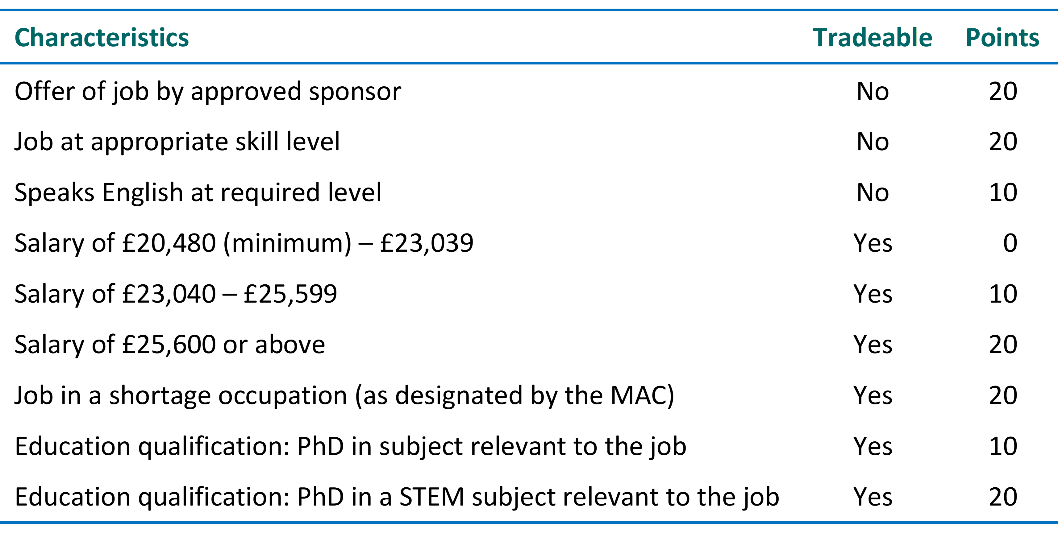
In certain jobs where there is a shortage of labour, designated by the Migration Advisory Committee (MAC), immigrants will be able to earn a lower income, provided it is above £20,480 per annum. They will earn 20 points for such jobs, which can offset not meeting the £25,600 threshold. Such jobs could include those in healthcare and farming. There will also be temporary visas for seasonal workers, such as fruit pickers.
The government argues that the new system will encourage employers to substitute technology for labour, with greater investment in equipment and computers. This would increase labour productivity and wages without reducing employment.
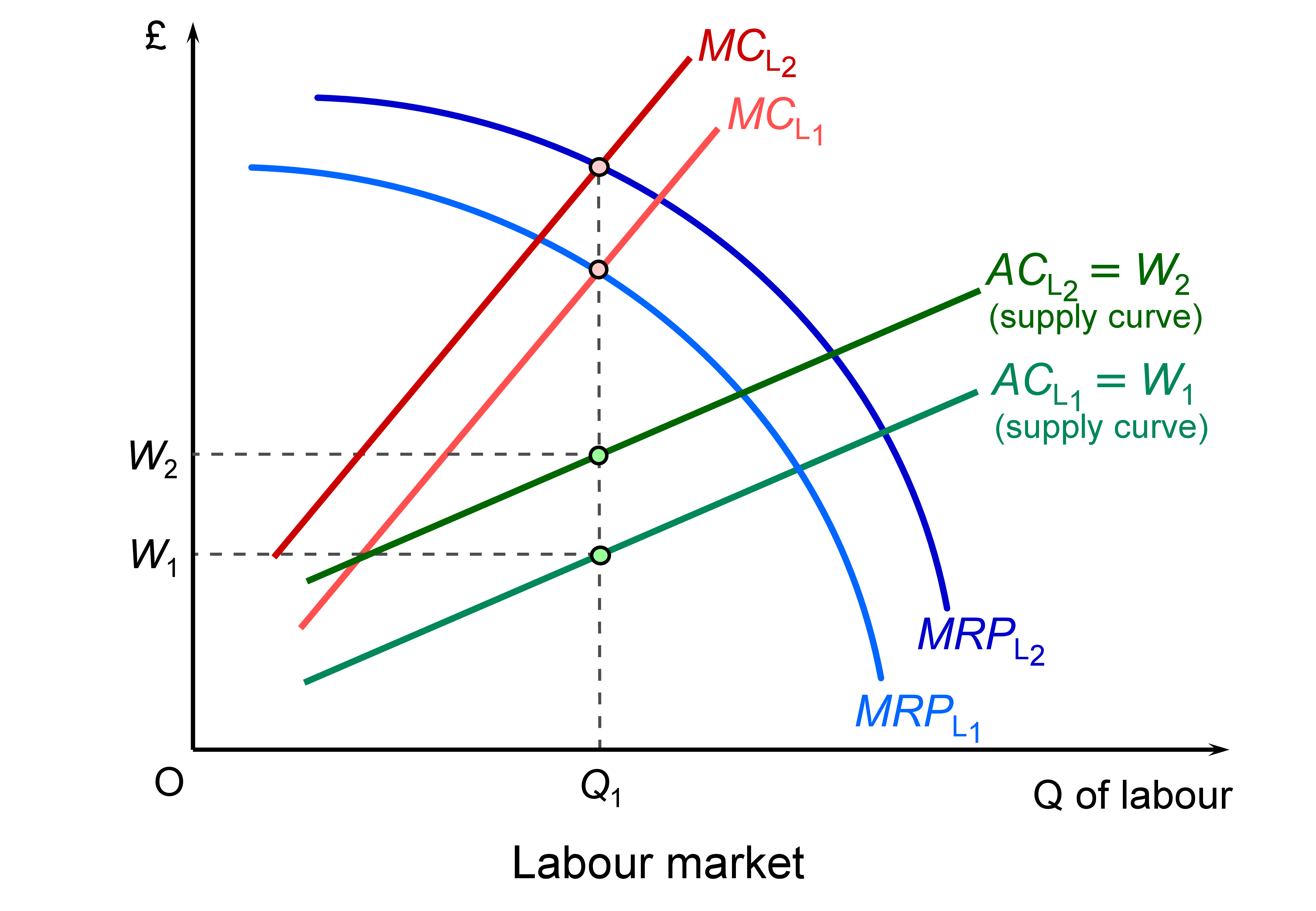 This is illustrated in the diagram, which illustrates a low-paid job which will be impacted by the restrictions. If there is a rise in productivity through technological change, the marginal revenue product of labour curve shifts upwards from MRPL1 to MRPL2 and offsets the leftward shift in labour supply (caused by the decline in immigration) from ACL1 to ACL2 and the marginal cost of labour from MCL1 to MCL2. Employment is where the marginal cost of labour equals the marginal revenue product of labour. This remains at Q1. Wages are given by the supply curve of labour and rise from W1 to W1. (Click here for a PowerPoint of the diagram.)
Even if the upward shift in the MRPL curve is not sufficient to offset the leftward shift in the labour supply curve, wages will still rise, but there will be a fall in employment.
In higher-paid skilled jobs where people meet the points requirement, there will be little effect on wages and employment, except where people are generally discouraged by a points system, even if they have the points themselves.
The government also argues that there is a large pool of UK residents who can take up jobs that would otherwise have been filled by immigrants. The Home Secretary referred to the 8.48 million people who are economically inactive who could fill jobs no longer filled by immigrants. However, as the data show, most  of these people are not available for work. Some 2.3 million are students, 1.9 million are carers at home looking after relatives, 2.1 million are long-term sick and 1.1 million are retired. Only 1.9 million (22.1% of the economically inactive) would like a job and not all these would be able to take up one (e.g. the long-term sick).
One the biggest problems concerns low-paid sectors where it is very difficult to substitute capital for labour through use of technology. Examples include social care, health care, the leisure and hospitality industry and certain jobs in farming. There could be severe shortages of labour in such industries. It remains to be seen whether such industries will be given exemptions or more relaxed conditions by the government in line with advice from the Migration Advisory Committee.
More details will emerge of the points system in the coming months. It will be interesting to see how responsive the government will be to the concerns of employers and workers.
Videos
Articles
Questions
- Find out how the proposed points-based system for immigration differs from the current system that applies to non-EU citizens.
- What will be the likely impact of reducing immigration of unskilled and low-skilled people?
- What barriers are there to substituting capital for labour in the caring and leisure sectors?
- What would be the macroeconomic effects of a substantial reduction in immigration?
 Boris Johnson gave a speech on 30 June outlining his government’s approach to recovery from the sharpest recession on record. With the slogan ‘Build, build, build’, he said that infrastructure projects were the key to stimulating the economy. Infrastructure spending is a classic Keynesian response to recession as it stimulates aggregate demand allowing slack to be taken up, while also boosting aggregate supply, thereby allowing recovery in output while increasing potential national income.
 There was some debate as to whether the New Deal could be classed as ‘Keynesian’. Officially, the administration was concerned to achieve a balanced budget. However, it had a separate ’emergency budget’, from which New Deal spending was financed. According to estimates by the Federal Reserve Bank of St Louis, the total extra spending amounted to nearly 40% of US GDP as it was in 1929.
 Policy should thus focus on job creation, especially in those sectors likely to experience the largest rise in unemployment. Such sectors include non-food retail, hospitality (pubs, restaurants, hotels, etc.), public transport, the arts, entertainment and leisure and a range of industries servicing these sectors. What is more, many of the people working in these sectors are young and low paid. Many will find it difficult to move to jobs elsewhere – partly because of a lack of qualifications and partly because of a lack of alternative jobs. The rising unemployment will raise inequality.
 Johnson pledges to ‘build, build, build’, but is the money pledged as lofty as his ambitions?
 Is Boris Johnson’s ‘New Deal’ the big deal it sounds?
 Boris Johnson’s ‘new deal’
 The full monty: Facing up to the scale of the COVID-19 jobs crisis
 Three international agencies, the IMF, the European Commission and the OECD, all publish six-monthly forecasts for a range of countries. As each agency’s forecasts have been published this year, so the forecasts for economic growth and other macroeconomic indicators, such as unemployment, have got more dire.


 With promises by the newly elected Conservative government to increase investment expenditure on health, education, innovation and infrastructure, it was expected that Rishi Sunak’s first Budget would be strongly expansionary. In fact, it turned out to be two Budgets in one – both giving a massive fiscal boost.
 This emergency part of the Budget was co-ordinated with the Bank of England’s decision to cut Bank Rate from 0.75% to 0.25%.
  The second part of the Budget is to raise government investment by 9% in real terms over the next four years, bringing overall government expenditure to 41% of GDP, financed largely by extra borrowing. As the IFS observes, “That is above its pre-crisis level and bigger than at any point between the mid 1980s and the start of the financial crisis.”
 The global economic impact of the coronavirus outbreak is uncertain but potentially very large. There has already been a massive effect on China, with large parts of the Chinese economy shut down. As the disease spreads to other countries, they too will experience supply shocks as schools and workplaces close down and travel restrictions are imposed. This has already happened in South Korea, Japan and Italy. The size of these effects is still unknown and will depend on the effectiveness of the containment measures that countries are putting in place and on the behaviour of people in self isolating if they have any symptoms or even possible exposure.
 It then fell by a further 7.7% on 9 March – the biggest one-day fall since the 2008 financial crisis. This was specifically in response to a plunge in oil prices as Russia and Saudi Arabia
  For some firms, having their staff working from home will be easy; for others it will be impossible.
 While aggregate supply is likely to fall, or at least to grow less quickly, what will happen to the balance of aggregate demand and supply is less clear. A temporary rise in demand, as people stock up, could see a surge in prices, unless supermarkets and other firms are keen to demonstrate that they are not profiting from the disease. In the longer term, if aggregate demand continues to grow at past rates, it will probably outstrip the growth in aggregate supply and result in rising inflation. If, however, demand is subdued, as uncertainty about their own economic situation leads people to cut back on spending, inflation and even the price level may fall.
 The government has announced outlines of the new system of immigration controls from January 2021 when the Brexit transition period is scheduled to finish. It plans to introduce an Australian-style
 This is illustrated in the diagram, which illustrates a low-paid job which will be impacted by the restrictions. If there is a rise in productivity through technological change, the marginal revenue product of labour curve shifts upwards from MRPL1 to MRPL2 and offsets the leftward shift in labour supply (caused by the decline in immigration) from ACL1 to ACL2 and the marginal cost of labour from MCL1 to MCL2. Employment is where the marginal cost of labour equals the marginal revenue product of labour. This remains at Q1. Wages are given by the supply curve of labour and rise from W1 to W1. (Click
  of these people are not available for work. Some 2.3 million are students, 1.9 million are carers at home looking after relatives, 2.1 million are long-term sick and 1.1 million are retired. Only 1.9 million (22.1% of the economically inactive) would like a job and not all these would be able to take up one (e.g. the long-term sick).