 The latest UK house price index reveals that annual house price growth in the UK slowed to just 1.2 per cent in May. This is the lowest rate of growth since January 2013. This is being driven, in part, by the London market where annual house price inflation rates have now been negative for 15 consecutive months. In May the annual rate of house price inflation in London fell to -4.4 per cent, it lowest since August 2009 as the financial crisis was unfolding. However, closer inspection of the figures show that while many other parts of the country continue to experience positive rates of annual house price inflation, once general inflation is accounted for, there is widespread evidence of widespread real house price deflation.
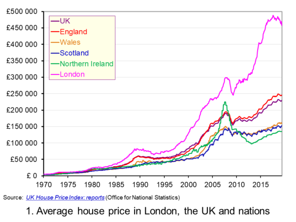 The average UK house price in May 2019 was £229,000. As Chart 1 shows, this masks considerable differences across the UK. In England the average price was £246,000 (an annual increase of 1.0 per cent), in Scotland it was £153,000 (an increase of 2.8 per cent), in Wales £159,000 (an increase of 3.0 per cent) and in Northern Ireland it was £137,000 (an increase of 2.1 per cent). (Click here to download a PowerPoint copy of the chart.)
The London market distorts considerably the English house price figures. In London the average house price in May 2019 was £457,000 (an annual decrease of 4.4 per cent). House prices were lowest in the North East region of England at £128,000. The North East was the only other English region alongside London to witness a negative rate of annual house price inflation, with house prices falling in the year to May 2019 by 0.7 per cent.
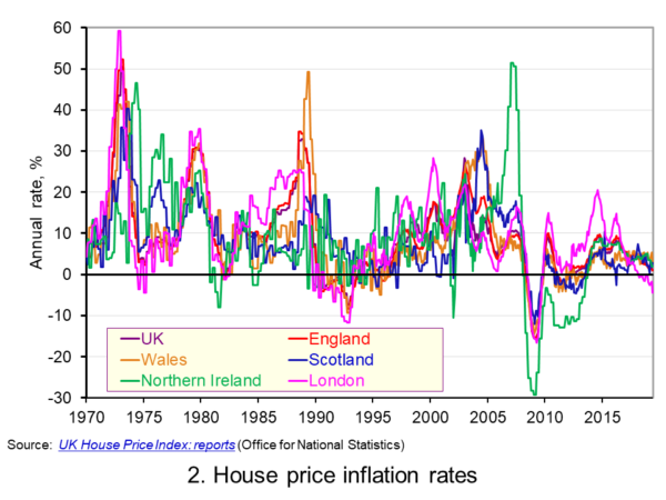 Chart 2 allows us to see more readily the rates of house price growth. It plots the annual rates of house price inflation across London, the UK and its nations. What is readily apparent is the volatility of house price growth. This is evidence of frequent imbalances between the flows of property on to the market to sell (instructions to sell) and the number of people looking to buy (instructions to buy). An increase in instructions to buy relative to those to sell puts upwards pressure on prices whereas an increase in the relative number of instructions to sell puts downward pressure on prices. (Click here to download a PowerPoint copy of the chart.)
Despite the volatility in house prices, the longer-term trend in house prices is positive. The average annual rate of growth in house prices between January 1970 and May 2019 in the UK is 9.1 per cent. For England the figure is 9.4 per cent, for Wales 8.8 per cent, for Scotland 8.5 per cent and for Northern Ireland 8.3 per cent. In London the average rate of growth is 10.4 per cent per annum.
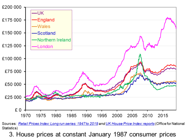 As Chart 3 illustrates, the longer-term growth in actual house prices cannot be fully explained by the growth in consumer prices. It shows house price values as if consumer prices, as measured by the Retail Prices Index (RPI), were fixed at their January 1987 levels. We see real increases in house prices or, expressed differently, in house prices relative to consumer prices. In real terms, UK house prices were 3.6 times higher in May 2019 compared to January 1970. For England the figure is 4.1 times, for Wales 3.1 times, for Scotland 2.9 times and for Northern Ireland 2.1 times. In London inflation-adjusted house prices were 5.7 times higher. (Click here to download a PowerPoint copy of the chart.)
The volatility in house prices continues to be evident when adjusted for changes in consumer prices. The UK’s annual rate of real house price inflation was as high as 40 per in January 1973, yet, on the other hand, in June 1975 inflation-adjusted house prices were 16 per cent lower than a year earlier. Over the period from January 1970 to May 2019, the average annual rate of real house price inflation was 3.2 per cent. Hence house prices have, on average, grown at an annual rate of consumer price inflation plus 3.2 per cent.
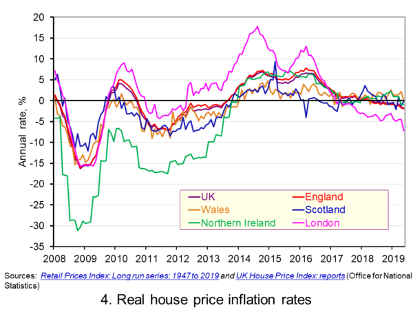 Chart 4 shows annual rates of real house price inflation since 2008 and, hence, from around the time the financial crisis began to unfold. The period is characterised by acute volatility and with real house prices across the UK falling at an annual rate of 16 per cent in 2009 and by as much 29 per cent in Northern Ireland. (Click here to download a PowerPoint copy of the chart.)
The UK saw a rebound in nominal and real house price growth in the period from 2013, driven by a strong surge in prices in London and the South East, and supported by government initiatives such as Help to Buy designed to help people afford to buy property. But house price growth then began to ease from early/mid 2016. Some of the easing may be partly due to any excessive fizz ebbing from the market, especially in London, and the impact on the demand for buy-to-let investments resulting from reductions in tax relief on interest payments on buy-to-let mortgages.
However, the housing market is notoriously sensitive to uncertainty, which is not surprising when you think of the size of the investment people are making when they enter the market. The uncertainty surrounding Brexit and the UK’s future trading relationships will have been a drag on demand and hence on house prices.
Chart 4 shows that by May 2019 all the UK nations were experiencing negative rates of real house price inflation, despite still experiencing positive rates of nominal house price inflation. In Wales the real annual house price inflation rate was -0.1 per cent, in Scotland -0.2 per cent, in Northern Ireland -0.9 per cent and in England -2.0 per cent. Meanwhile in London, where annual house price deflation has been evident for 15 consecutive months, real house prices in May 2019 were falling at an annual rate of 7.2 per cent.
Going forward the OBR’s Fiscal Risks Report predicts that, in the event of a no-deal, no-transition exit of the UK from the European Union, nominal UK house prices would fall by almost 10 per cent between the start of 2019 and mid-2021. This forecast is driven by the assumption that the UK would enter a year-long recession from the final quarter of 2019. It argues that property transactions and prices ‘move disproportionately’ during recessions. (See John’s blog The costs of a no-deal Brexit for a fuller discussion of the economics of a no-deal Brexit). The danger therefore is that the housing market becomes characterised by both nominal and real house price falls.
Articles
Questions
- Explain the difference between a rise in the rate of house price inflation a rise in the level of house prices.
- Explain the difference between nominal and real house prices.
- If nominal house prices rise can real house price fall? Explain your answer.
- What do you understand by the terms instructions to buy and instructions to sell?
- What factors are likely to affect the levels of instructions to buy and instructions to sell?
- How does the balance between instructions to buy and instructions to sell affect house prices?
- How can we differentiate between different housing markets? Illustrate your answer with examples.
 Confidence figures suggest that sentiment weakened across several sectors in June with significant falls recorded in retail and construction. This is consistent with the monthly GDP estimates from the ONS which suggest that output declined in March and April by 0.1 per cent and 0.4 per cent respectively. The confidence data point to further weakness in growth down the line. Furthermore, it poses the risk of fuelling a snowball effect with low growth being amplified and sustained by low confidence.
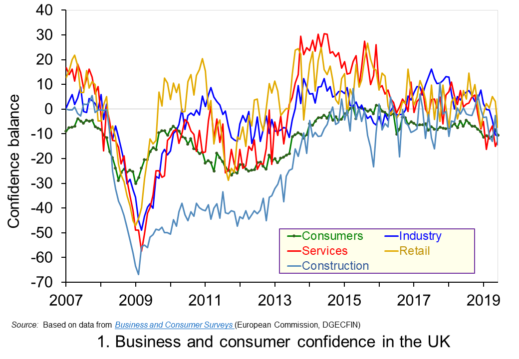 Chart 1 shows the confidence balances reported by the European Commission each month since 2007. It highlights the collapse in confidence across all sectors around the time of the financial crisis before a strong and sustained recovery in the 2010s. However, in recent months confidence indicators have eased significantly, undoubtedly reflecting the heightened uncertainty around Brexit. (Click here to download a PowerPoint copy of the chart.)
Between June 2016 and June 2019, the confidence balances have fallen by at least 8 percentage points. In the case of the construction the fall is 14 points while in the important service sector, which contributes about 80 per cent of the economy’s national income, the fall is as much as 15 points.
Changes in confidence are thought, in part, to reflect levels of economic uncertainty. In particular, they may reflect the confidence around future income streams with greater uncertainty pulling confidence down. This is pertinent because of the uncertainty around the UK’s future trading relationships following the 2016 referendum which saw the UK vote to leave the EU. In simple terms, uncertainty reduces the confidence people and businesses have when forming expectations of what they can expect to earn in the future.
Greater uncertainty and, hence, lower confidence tend to make people and businesses more prudent. The caution that comes from prudence counteracts the inherent tendency of many of us to be impatient. This impatience generates an impulse to spend now. On the other hand, prudence encourages us to take actions to increase net worth, i.e. wealth. This may be through reducing our exposure to debt, perhaps by looking to repay debts or choosing to borrow smaller sums than we may have otherwise done. Another option may be to increase levels of saving. In either case, the effect of greater prudence is the postponement of spending. Therefore, in times of high uncertainty, like those of present, people and businesses would be expected to want to have greater financial resilience because they are less confident about what the future holds.
To this point, the saving ratio – the proportion of disposable income saved by households – has remained historically low. In Q1 2019 the saving ratio was 4.4 per cent, well below its 60-year average of 8.5 per cent. This appears to contradict the idea that households respond to uncertainty by increasing saving. However, at least in part, the squeeze seen over many years following the financial crisis on real earnings, i.e. inflation-adjusted earnings, restricted the ability of many to increase saving. With real earnings having risen again over the past year or so, though still below pre-crisis levels, households may have taken this opportunity to use earnings growth to support spending levels rather than, as we shall see shortly, looking to borrow.
Another way in which the desire for greater financial resilience can affect behaviour is through the appetite to borrow. In the case of consumers, it could reduce borrowing for consumption, while in the case of firms it could reduce borrowing for investment, i.e. spending on capital, such as that on buildings and machinery. The reduced appetite for borrowing may also be mirrored by a tightening of credit conditions by financial institutions if they perceive lending to be riskier or want to increase their own financial capacity to absorb future shocks.
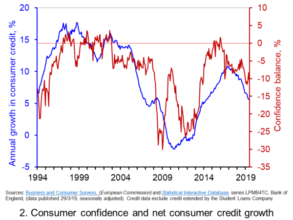 Chart 2 shows consumer confidence alongside the annual rate of growth of consumer credit (net of repayments) to individuals by banks and building societies. Consumer credit is borrowing by individuals to finance current expenditure on goods and services and it comprises borrowing through credit cards, overdraft facilities and other loans and advances, for example those financing the purchase of cars or other large ticket items. (Click here to download a PowerPoint copy of the chart.)
The chart allows us to view the confidence-borrowing relationship for the past 25 years or so. It suggests a fairly close association between consumer confidence and consumer credit growth. Whether changes in confidence occur ahead of changes in borrowing is debatable. However, the easing of confidence following the outcome of the EU referendum vote in June 2016 does appear to have led subsequently to an easing in the annual growth of consumer credit. From its peak of 10.9 per cent in the autumn of 2016, the annual growth rate of consumer credit dropped to 5.6 per cent in May 2019.
The easing of credit growth helps put something of a brake on consumer spending. It is, however, unlikely to affect all categories of spending equally. Indeed, the ONS figures for May on retail sales shows a mixed picture for the retail sector. Across the sector as a whole, the 3 month-on-3 month growth rate for the volume of purchases stood at 1.6 per cent, having fallen as low as 0.1 percent in December of last year. However, the 3 month-on-3 month growth rate for spending volumes in department stores, which might be especially vulnerable to a slowdown in credit, fell for the ninth consecutive month.
Going forward, the falls in confidence might be expected to lead to further efforts by the household sector, as well as by businesses, to ensure their financial resilience. The vulnerability of households, despite the slowdown in credit growth, so soon after the financial crisis poses a risk for a hard landing for the sector. After falls in national output in March and April, the next monthly GDP figures to be released on 10 July will be eagerly anticipated.
Articles
Questions
- Which of the following statements is likely to be more accurate: (a) Confidence drives economic activity or (b) Economic activity drives confidence?
- Explain the difference between confidence as a source of economic volatility as compared to an amplifier of volatility?
- Discuss the links between confidence, economic uncertainty and financial resilience.
- Discuss the ways in which people and businesses could improve their financial resilience to adverse shocks.
- What are the potential dangers to the economy of various sectors being financially distressed or exposed?
 Latest resesarch from the independent American think tank The Conference Board paints a worrying picture about the growth of UK labour productivity. While global growth in labour productivity has weakened following the financial crisis, its weakness in the UK is singled out in the Board’s 2019 Productivity Brief. It finds that amongst large mature economies the decline in labour productivity growth rates has been greatest in the UK. This has important implications for the country’s longer-term well-being and, specifically, it peoples’ living standards.
The UK saw the growth in real GDP (national output) fall from 1.8 per cent in 2017 to 1.4 per cent in 2018. The Conference Board predicts that this will fall further to 0.8 per cent in 2019. In the context of living standards, the growth in real GDP per capita is particularly important. An increase in the population will, other things being equal, lower living standards because more people will be sharing a given amount of real national income. The growth in real GDP per capita fell from 1.1 per cent in 2017 to 0.7 per cent in 2018 and is predicted to fall to just 0.1 per cent in 2019.
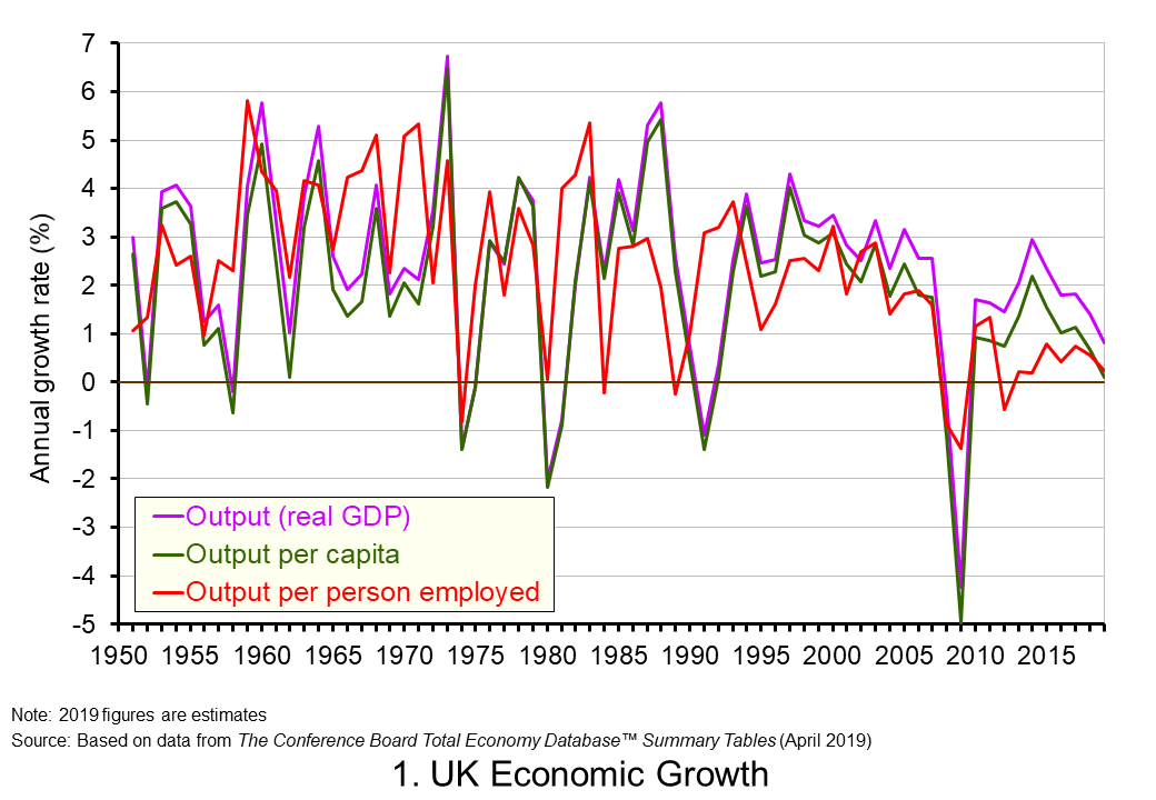 Chart 1 shows the annual rates of growth in real GDP and real GDP per capita from the 1950s. The average growth rates are 2.4 and 1.9 per cent respectively. The other series shown is the annual growth in real GDP per person employed. This is a measure of the growth in labour productivity. Its average annual growth rate is also 1.9 per cent. This illustrates the intrinsic long-run relationship between labour productivity growth and the growth rate of GDP per capita and hence in general living stanadards. (Click here to download a PowerPoint copy of the chart.)
In the short term, rates of growth in output per worker (labour productivity) and GDP per capita (general living standards) can be less similar. For example, when unemployment rates rise labour productivity rates may be little affected despite GDP per capita falling. Nonetheless, the important point here is the close long-run relationship between the growth in labour productivity and GDP per capita. This then raises an important question: what factors contribute to the growth in output and labour productivity?
An approach known as growth accounting helps to identify four key contributors to the growth of total output. The first is the quantity of labour, commonly measured in labour hours. The second is the quality of labour, also known as labour composition. Third is capital services which are physical inputs into production and include machinery, structures and IT capital. Capital services are affected by quantity and quality, but, unlike labour, it is practically more difficult to separate out these dimensions. Fourth, is Total Factor Productivity (TFP).
TFP it is essentially the residual contribution to output growth that cannot be explained by changes in the quantity and quality of the individual inputs. Hence, in principle, it is capturing changes in how effectively the labour and capital inputs are being employed and combined in production. The Conference Board’s Productivity Brief describes the growth in TFP as providing ‘a more accurate picture of the overall efficiency by which capital, labour and skills are combined in the production process’.
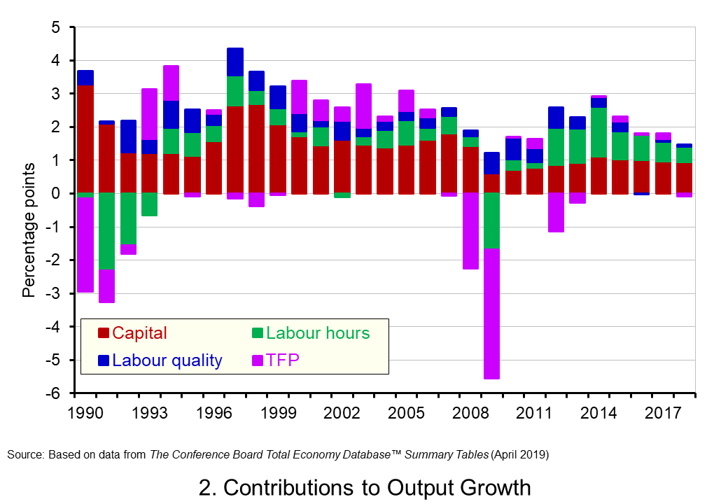 Chart 2 shows Conference Board estimates of the percentage point contribution of these four sources of growth since 1990. Over this period, output growth averaged 2 per cent per year. The contribution of capital services and, hence, what is known as capital accumulation is particularly significant at 1.5 percentage points per year. This has been significantly larger than the contribution of labour hours which averaged only 0.3 percentage points per year since 1990. This evidences the importance played by capital deepening for output growth in the UK. (Click here to download a PowerPoint copy of the chart.)
Capital deepening captures the growth in capital services relative to the growth in the labour input. It takes on even greater significance when we think about the growth in labour productivity since, after all, this is the growth in output relative to the quantity of labour. It is significant though that since 2015 the growth of capital services has contributed only 1 percentage point to output growth while the growth of labour hours has contributed an average of 0.7 percentage points. This points to a slowdown in capital deepening and hence in the growth of labour productivity.
Chart 2 also illustrates the importance of TFP growth to overall output growth. It is also important (along with capital deepening and the growth in labour quality) for the growth in labour productivity. Interestingly, we observe significant fluctuations in the growth of TFP. This is thought to reflect fluctuations in the utilisation of inputs. For example, if the utilisation of inputs falls (rises) when output falls (increases) this will be mirrored by a disproportionately large fall (increase) in TFP. In the longer-term, however, changes in TFP capture aspects of technological progress and advancement that enable more effective production methods and techniques to be deployed. In other words, the growth of TFP captures the ability of production to benefit from the advancement in ideas, products, processes and know-how.
A decline in the growth in TFP growth following the financial crisis is found quite widely in mature economies. The annual rate of growth of TFP across mature economies fell from 0.5 per cent year in 2000-2007 to 0.2 per cent in 2010-2017. In the UK this fall was from 0.5 per cent to -0.1 per cent. Hence, the decline in TFP growth of 0.6 percentage points between 2010 and 2017 was double the 0.3 percentage point fall across all mature economies. In 2018 the Conference Board estimate that TFP in the UK fell by 0.1 percent further exacerbating the downward pressure on labour productivity.
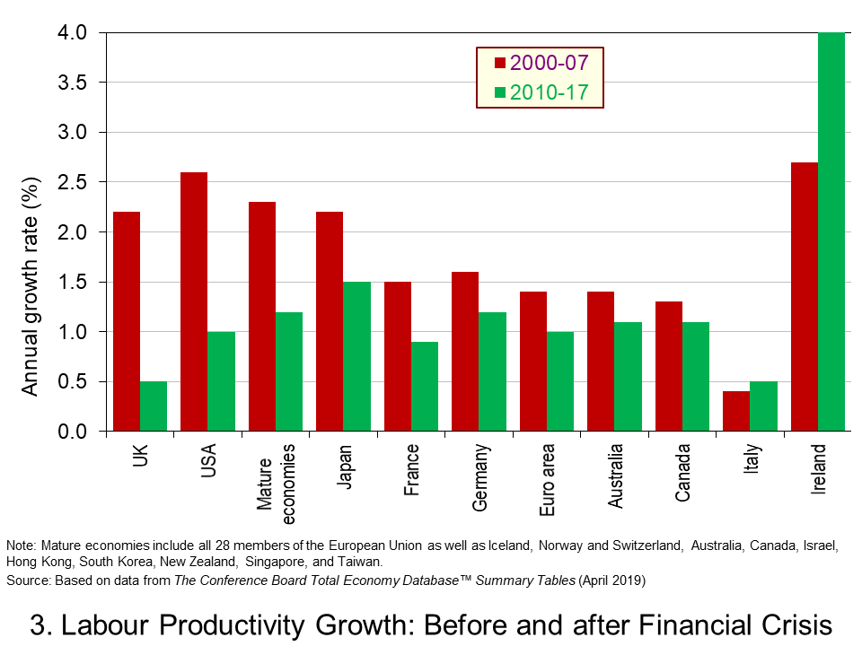 As our final chart shows, it is the magnitude to which labour productivity has eased following the financial crisis that sets the UK apart. While across all mature economies the growth of output per labour hour (another measure of labour productivity growth) fell from an average of 2.3 per cent per year in 2000-2007 to 1.2 per cent in 2010-2017, in the UK the fall was from 2.2 per cent to 0.5 per cent per year. (Click here to download a PowerPoint copy of the chart.)
While the productivity problem facing the UK is not new, the latest figures comes as a very timely reminder of the extent of the problem. To some extent the uncertainty around Brexit and the negative impact on capital accumulation has only helped to exacerbate the problem. But, this may mask a more systemic problem facing the UK. Getting to the root of this problem matters. It matters most significantly for our long-term wellbeing and prosperity. The productivity gap with our major industrial competitors is a gap that policymakers need not only to be mindful of but one that needs closing.
Articles
Questions
- What do you understand by the term labour productivity. How could we measure it?
- Why is it important to look at the growth of output per capita when assessing the benefits of long-term growth?
- Why is labour productivity important for the long-term well-being of a country?
- What do you understand by the method of growth accounting?
- What is the distinction between capital accumulation and capital deepening?
- What might explain why the growth of labour productivity has been lower in the years following the post-financial crisis?
- What do you understand by Total Factor Productivity (TFP)?
- What does the long-term growth of TFP attempt to capture?
- If you were an economic advisor to the government, what types of policy initiatives might you recommend for a government concerned about low rates of growth of labour productivity?
 It is perhaps timely given the ongoing uncertainty around Brexit to revisit and update our blog Desperately seeking confidence written back in January. Consumer and business confidence reflects the sentiment, emotion, or anxiety of consumers and businesses. Confidence surveys therefore try to capture these feelings of optimism or pessimism. They may then provide us with timely information for the short-term prospects for private-sector spending. For example, declining levels of confidence might be expected to play a part in weakening the growth of consumption and investment spending.
Attempts are made to measure confidence through the use of surveys. One long-standing survey is that conducted for the European Commission. Each month consumers and firms across the European Union are asked a series of questions, the answers to which are used to compile indicators of consumer and business confidence. For instance, consumers are asked about how they expect their financial position to change. They are offered various options such as ‘get a lot better, ‘get a lot worse’ and balances are then calculated on the basis of positive and negative replies.
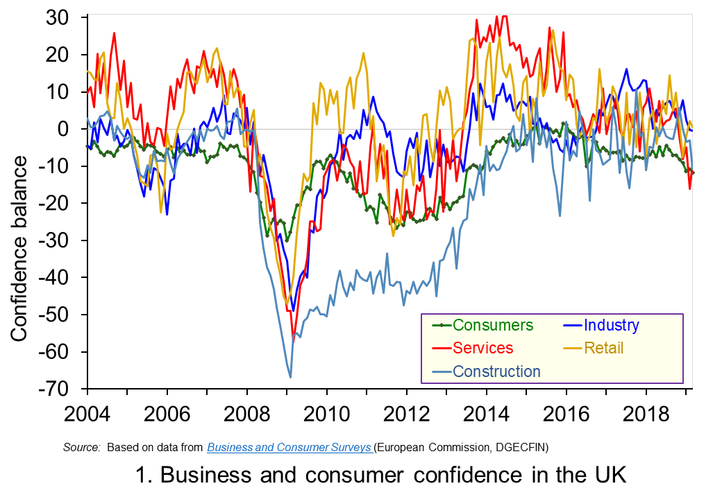 The chart plots confidence in the UK for consumers and different sectors of business since the mid 1990s. The chart captures the volatility of confidence. This volatility is generally greater amongst businesses than consumers, and especially so in the construction sector. (Click here to download a PowerPoint copy of the chart.)
Confidence measures rebounded across all sectors during the 2010s, with positive balances being recorded consistently from 2013 to 2016 in services, retail and industry. Subsequently, confidence indicators became more erratic though often remaining at above-average levels. However, confidence indicators have eased across the board in recent months. In some cases the easing has been stark. For example, the confidence balance in the service sector, which contributes about 80 per cent of the economy’s national income, fell from +10.9 in February 2018 to -16.2 in February 2019, though recovering slightly to -9.2 in March 2019.
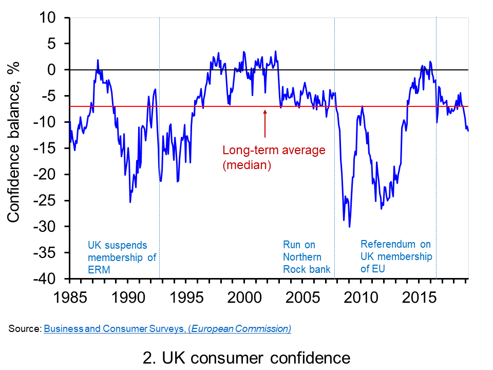 Chart 2 shows how the recent easing of consumer confidence has seen the confidence balance fall below its long-term (median) average of -7. In March 2019 the balance stood at -11.7 the lowest figure since November 2013. To put the easing into further perspective, the consumer confidence balance had been as high as +8.2 in September 2015. (Click here to download a PowerPoint copy of the chart.)
Changes in confidence are used frequently as an example of a demand shock. In reality changes in consumer confidence are often likely to be an amplifier of shocks rather than the source. For example, the collapse in aggregate demand in 2007/8 that followed the ‘credit crunch’, the severe tightening of credit conditions and financial distress of many sectors of the economy is likely to have been amplified by the collapse in consumer confidence. The weakening of confidence since 2016 is perhaps a purer example of a ‘confidence shock’. Nonetheless, falls in confidence, whether they amplify existing shocks or are the source of shocks, are often a signal of greater economic uncertainty.
Greater uncertainty is likely to go and hand in hand with lower confidence and is likely to reflect greater uncertainty about future income streams. The result is that people and businesses become more prudent. In the context of households this implies a greater willingness to engage in self-insurance through increased saving. This is known as buffer stock or precautionary saving. Alternatively, people may reducing levels of borrowing. In uncertain times prudence can dominate our impatience that encourages us to spend.
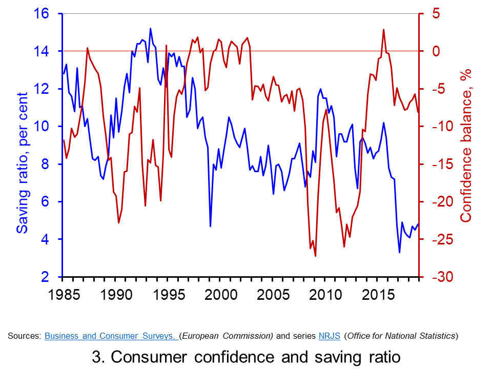 Chart 3 plots the paths of the UK household-sector saving ratio and consumer confidence. The saving ratio approximates the proportion of disposable income saved by the household sector. What we might expect to see, if greater uncertainty induces buffer-stock saving, is for falls in confidence to lead to a rise in the saving ratio. Conversely, less uncertainty as proxied by a rise in confidence would lead to a fall in the saving ratio. (Click here to download a PowerPoint of the chart.)
The chart provides some evidence of this. The early 1990s and late 2000s coincided with both waning confidence and a rising saving ratio, whilst the rising confidence seen in the late 1990s coincided with a fall in the saving ratio. However, the easing of confidence since 2016 has coincided with a period where the saving ratio has been historically low. In the first quarter of 2017 the saving ratio was just 3.3 per cent. Although the saving ratio has ticked up a little, in the final quarter of 2018 it remained historically low at just 4.9 per cent. Hence, the available data on the saving ratio does not provide clear evidence of the more cautious behaviour we might expect with waning confidence.
Consider now patterns in the consumer confidence balance alongside the annual rate of growth of consumer credit (net of repayments) to individuals by banks and building societies. Consumer credit is borrowing by individuals to finance current expenditure on goods and services.
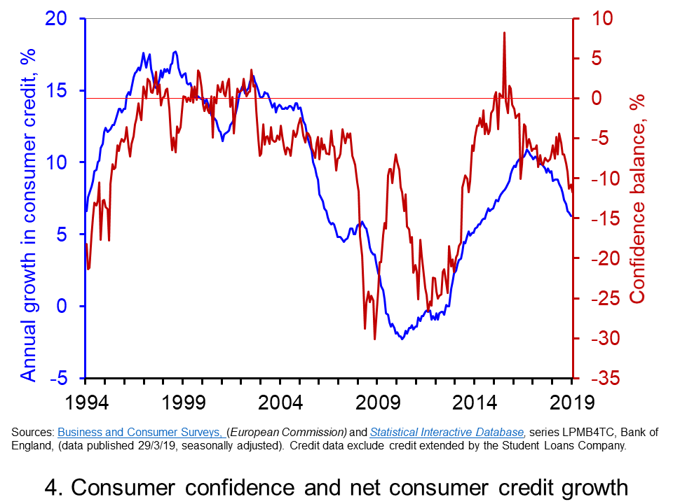 Data on consumer credit is more timely than that for the saving ratio. Therefore, Chart 4 shows the relationship between consumer confidence and consumer credit into 2019. We observe a reasonably close association consumer credit growth and consumer confidence. Certainty, the recent easing in confidence is mirrored by an easing in the annual growth of net consumer credit. (Click here to download a PowerPoint of the chart.)
The year-to-year growth in net consumer credit has eased considerably since the peak of 10.9 per cent in November 2016. In February 2019 the annual growth rate of net consumer credit had fallen back to 6.3 per cent, its lowest rate since September 2014. As we noted in our recent blog Riding the consumer credit cycle (again) it is hard to look much past the effect of Brexit in acting as a lid on the growth in consumer credit. Therefore, while the recent falls in consumer confidence have yet to markedly affect the saving ratio they may instead be driving the slowdown in consumer credit. The effect will be to weaken the growth of consumer spending.
Articles
Questions
- Draw up a series of factors that you think might affect both consumer and business confidence. How similar are both these lists?
- Which of the following statements is likely to be more accurate: (a) Confidence drives economic activity or (b) Economic activity drives confidence?
- What macroeconomic indicators would those compiling the consumer and business confidence indicators expect each indicator to predict?
- What is meant by the concept of ‘prudence’ in the context of spending? What factors might determine the level of prudence
- How might prudence be expected to affect spending behaviour?
- How might we distinguish between confidence ‘shocks’ and confidence as a ‘propagator’ of shocks?
- What is meant by buffer stock or precautionary saving? Draw up a list of factors that are likely to affect levels of buffer stock saving.
- If economic uncertainty is perceived to have increased how could this affect the consumption, saving and borrowing decisions of people?
 The latest UK house price index continues to show an easing in the rate of house price inflation. In the year to January 2019 the average UK house price rose by 1.7 per cent, the lowest rate since June 2013 when it was 1.5 per cent. This is significantly below the recent peak in house price inflation when in May 2016 house prices were growing at 8.2 per cent year-on-year. In this blog we consider how recent patterns in UK house prices compare with those over the past 50 years and also how the growth of house prices compares to that in consumer prices.
The UK and its nations
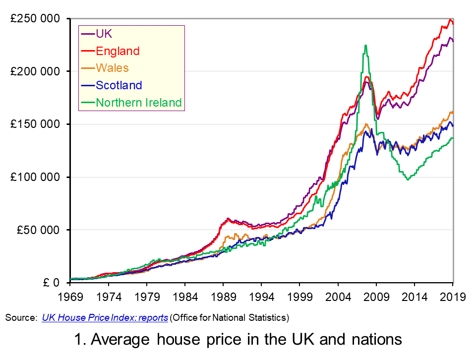 The average UK house price in January 2019 was £228,000. As Chart 1 shows, this masks considerable differences across the UK. In England the average price was £245,000 (an annual increase of 1.5 per cent), while in Scotland it was £149,000 (an increase of 1.3 per cent), Wales £160,000 (an increase of 4.6 per cent) and £137,000 in Northern Ireland (an increase of 5.5 per cent). (Click here to download a PowerPoint copy of the chart.)
Within England there too are considerable differences in house prices, with London massively distorting the English average. In January 2019 the average house price in inner London was recorded at £568,000, a fall of 1.9 per cent on January 2018. In Outer London the average price was £426,000, a fall of 0.2 per cent. Across London as a whole the average price was £472,000, a fall of 1.6 per cent. House prices were lowest in the North East at £125,000, having experienced an annual increase of 0.9 per cent.
The Midlands can be used as a reference point for English house prices outside of the capital. In January 2019 the average house price in the West Midlands was £195,000 while in the East Midlands it was £193,000. While the annual rate of house price inflation in London is now negative, the annual rate of increase in the Midlands was the highest in England. In the West Midlands the annual increase was 4 per cent while in the East Midlands it was 4.4 per cent. These rates of increase are currently on par with those across Wales.
Long-term UK house price trends
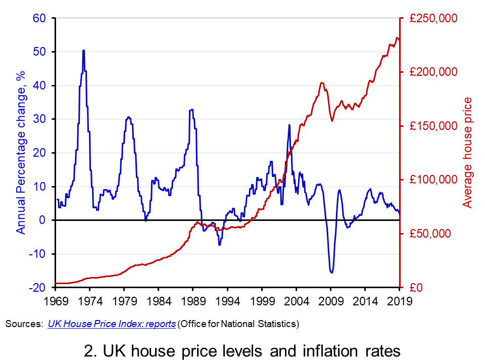 Chart 2 shows the average house price for the UK since 1969 alongside the annual rate of house price inflation, i.e. the annual percentage change in the level of house prices. The average UK house price in January 1969 was £3,750. By January 2019, as we have seen, it had risen to around £228,000. This is an increase of nearly 6,000 per cent. Over this period, the average annual rate of house price inflation was 9 per cent. However, if we measure it to the end of 2007 it was 11 per cent. (Click here to download a PowerPoint copy of the chart.)
The significant effect of the financial crisis on UK house prices is evident from Charts 1 and 2. In February 2009 house prices nationally were 16 per cent lower than a year earlier. Furthermore, it was not until August 2014 that the average UK house rose above the level of September 2007. Indeed, some parts of the UK, such as Northern Ireland and the North East of England, remain below their pre-financial crisis level even today.
Nominal and real UK house prices
But how do house price patterns compare to those in consumer prices? In other words, what has happened to inflation-adjusted or real house prices? One index of general prices is the Retail Prices Index (RPI). This index measures the cost of a representative basket of consumer goods and services. Since January 1969 the RPI has increased by nearly 1,600 per cent. While substantial in its own right, it does mean that house prices have increased considerably more rapidly than consumer prices.
If we eliminate the increase in consumer prices from the actual (nominal) house price figures what is left is the increase in house prices relative to consumer prices. To do this we estimate house prices as if consumer prices had remained at their January 1987 level. This creates a series of average UK house prices at constant January 1987 consumer prices.
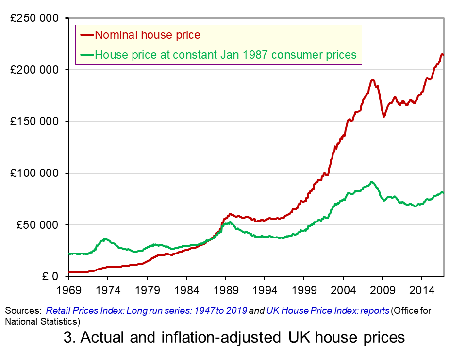 Chart 3 shows the average nominal and real UK house price since 1969. It shows that in real terms the average UK house price increased by around 266 per cent between January 1969 and January 2019. Therefore, the average real UK house price was 3.7 times more expensive in 2019 compared with 1969. This is important because it means that general price inflation cannot explain all the long-term growth seen in average house prices. (Click here to download a PowerPoint copy of the chart.)
Real UK house price cycles
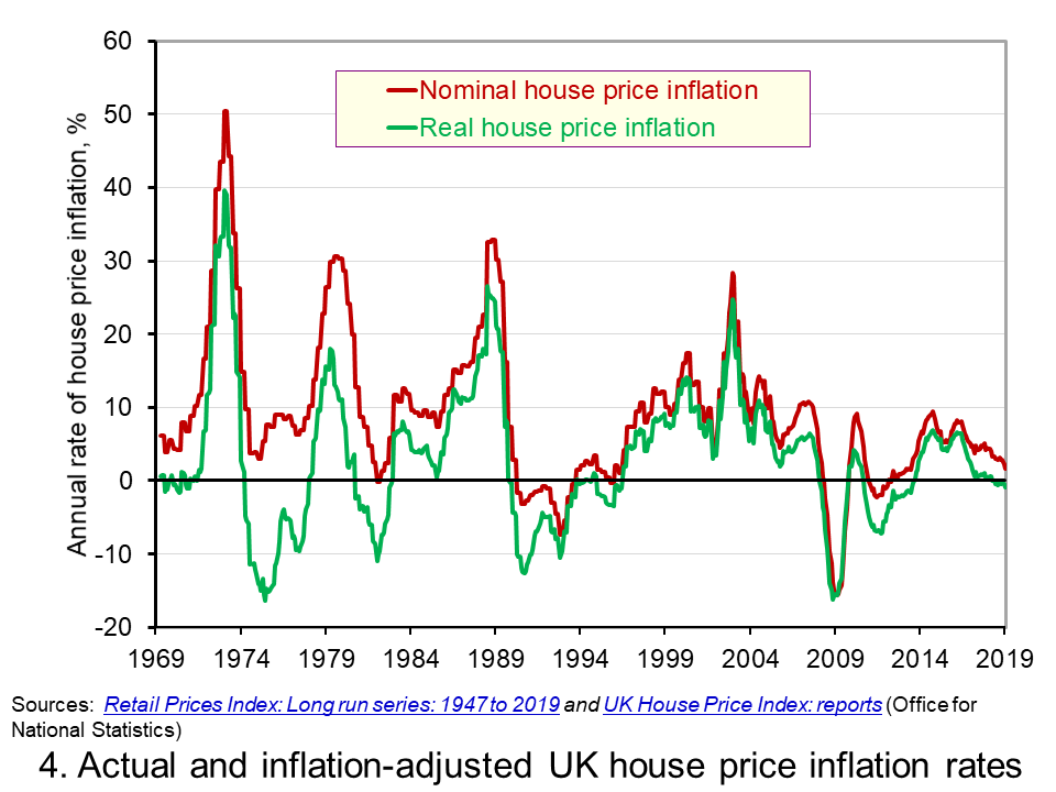 Chart 4 shows that annual rates of nominal and real house price inflation. As we saw earlier, the average nominal house price inflation rate since 1969 has been 9 per cent. The average real rate of increase in house prices has been 3.1 per cent per annum. In other words, house prices have on average each each year increased by the annual rate of RPI inflation plus 3.1 percentage points. (Click here to download a PowerPoint copy of the chart.)
Chart 4 shows how, in addition to the long-term relative increase in house prices, there are also cycles in the relative price of houses. This is evidence of a volatility in house prices that cannot be explained by general prices. This volatility reflects frequent imbalances between the demand and supply of housing, i.e. between instructions to buy and sell property. Increasing levels of housing demand (instructions to buy) relative to housing supply (instructions to supply) will put upward pressure on house prices and vice versa.
In January 2019 the annual real house price inflation across the UK was -0.9 per cent. While the rate was slightly lower in Scotland at -1.2 per cent, the biggest drag on UK house price inflation was the London market where the real house price inflation rate was -4.0 per cent. In contrast, January saw annual real house price inflation rates of 2 per cent in Wales, 2.3 per cent in Northern Ireland and 1.8 per cent in the East Midlands.
Inflation-adjusted inflation rates in London have been negative consistently since June 2017. From their July 2016 peak, following the result of the referendum on UK membership of the EU, to January 2019 inflation-adjusted house prices fell by 7.6 per cent. This reflects, in part, the fact that the London housing market, like that of other European capitals, is a more international market than other parts of the country. Therefore, the current patterns in UK house prices are rather distinctive in that the easing is being led by London and southern England.
Articles
Questions
- What is meant by the annual rate of house price inflation?
- How is a rise in the rate of house price inflation different from a rise in the level of house prices?
- What factors are likely to determine housing demand (instructions to buy)?
- What factors are likely to affect housing supply (instructions to sell)?
- Explain the difference between nominal and real house prices.
- What does a decrease in real house prices mean? Can this occur even if actual house prices have risen?
- How might we explain the recent differences between house price inflation rates in London relative to other parts of the UK, like the Midlands and Wales?
- Why were house prices so affected by the financial crisis?
- Assume that you asked to measure the affordability of housing. What data might you collect?
 The latest UK house price index reveals that annual house price growth in the UK slowed to just 1.2 per cent in May. This is the lowest rate of growth since January 2013. This is being driven, in part, by the London market where annual house price inflation rates have now been negative for 15 consecutive months. In May the annual rate of house price inflation in London fell to -4.4 per cent, it lowest since August 2009 as the financial crisis was unfolding. However, closer inspection of the figures show that while many other parts of the country continue to experience positive rates of annual house price inflation, once general inflation is accounted for, there is widespread evidence of widespread real house price deflation.
 The average UK house price in May 2019 was £229,000. As Chart 1 shows, this masks considerable differences across the UK. In England the average price was £246,000 (an annual increase of 1.0 per cent), in Scotland it was £153,000 (an increase of 2.8 per cent), in Wales £159,000 (an increase of 3.0 per cent) and in Northern Ireland it was £137,000 (an increase of 2.1 per cent). (Click here to download a PowerPoint copy of the chart.)
 Chart 2 allows us to see more readily the rates of house price growth. It plots the annual rates of house price inflation across London, the UK and its nations. What is readily apparent is the volatility of house price growth. This is evidence of frequent imbalances between the flows of property on to the market to sell (instructions to sell) and the number of people looking to buy (instructions to buy). An increase in instructions to buy relative to those to sell puts upwards pressure on prices whereas an increase in the relative number of instructions to sell puts downward pressure on prices. (Click here to download a PowerPoint copy of the chart.)
 As Chart 3 illustrates, the longer-term growth in actual house prices cannot be fully explained by the growth in consumer prices. It shows house price values as if consumer prices, as measured by the Retail Prices Index (RPI), were fixed at their January 1987 levels. We see real increases in house prices or, expressed differently, in house prices relative to consumer prices. In real terms, UK house prices were 3.6 times higher in May 2019 compared to January 1970. For England the figure is 4.1 times, for Wales 3.1 times, for Scotland 2.9 times and for Northern Ireland 2.1 times. In London inflation-adjusted house prices were 5.7 times higher. (Click here to download a PowerPoint copy of the chart.)
 Chart 4 shows annual rates of real house price inflation since 2008 and, hence, from around the time the financial crisis began to unfold. The period is characterised by acute volatility and with real house prices across the UK falling at an annual rate of 16 per cent in 2009 and by as much 29 per cent in Northern Ireland. (Click here to download a PowerPoint copy of the chart.)
 Confidence figures suggest that sentiment weakened across several sectors in June with significant falls recorded in retail and construction. This is consistent with the
  Chart 1 shows the confidence balances reported by the
  Chart 2 shows consumer confidence alongside the annual rate of growth of consumer credit (net of repayments) to individuals by banks and building societies. Consumer credit is borrowing by individuals to finance current expenditure on goods and services and it comprises borrowing through credit cards, overdraft facilities and other loans and advances, for example those financing the purchase of cars or other large ticket items. (Click
 Chart 1 shows the annual rates of growth in real GDP and real GDP per capita from the 1950s. The average growth rates are 2.4 and 1.9 per cent respectively. The other series shown is the annual growth in real GDP per person employed. This is a measure of the growth in labour productivity. Its average annual growth rate is also 1.9 per cent. This illustrates the intrinsic long-run relationship between labour productivity growth and the growth rate of GDP per capita and hence in general living stanadards. (Click
  Chart 2 shows Conference Board estimates of the percentage point contribution of these four sources of growth since 1990. Over this period, output growth averaged 2 per cent per year. The contribution of capital services and, hence, what is known as capital accumulation is particularly significant at 1.5 percentage points per year. This has been significantly larger than the contribution of labour hours which averaged only 0.3 percentage points per year since 1990. This evidences the importance played by capital deepening for output growth in the UK. (Click
  As our final chart shows, it is the magnitude to which labour productivity has eased following the financial crisis that sets the UK apart. While across all mature economies the growth of output per labour hour (another measure of labour productivity growth) fell from an average of 2.3 per cent per year in 2000-2007 to 1.2 per cent in 2010-2017, in the UK the fall was from 2.2 per cent to 0.5 per cent per year. (Click
  It is perhaps timely given the ongoing uncertainty around Brexit to revisit and update our blog
  The chart plots confidence in the UK for consumers and different sectors of business since the mid 1990s. The chart captures the volatility of confidence. This volatility is generally greater amongst businesses than consumers, and especially so in the construction sector. (Click
  Chart 2 shows how the recent easing of consumer confidence has seen the confidence balance fall below its long-term (median) average of -7. In March 2019 the balance stood at -11.7 the lowest figure since November 2013. To put the easing into further perspective, the consumer confidence balance had been as high as +8.2 in September 2015. (Click
  Chart 3 plots the paths of the UK household-sector saving ratio and consumer confidence. The saving ratio approximates the proportion of disposable income saved by the household sector. What we might expect to see, if greater uncertainty induces buffer-stock saving, is for falls in confidence to lead to a rise in the saving ratio. Conversely, less uncertainty as proxied by a rise in confidence would lead to a fall in the saving ratio. (Click
  Data on consumer credit is more timely than that for the saving ratio. Therefore, Chart 4 shows the relationship between consumer confidence and consumer credit into 2019. We observe a reasonably close association consumer credit growth and consumer confidence. Certainty, the recent easing in confidence is mirrored by an easing in the annual growth of net consumer credit. (Click
  The average UK house price in January 2019 was £228,000. As Chart 1 shows, this masks considerable differences across the UK. In England the average price was £245,000 (an annual increase of 1.5 per cent), while in Scotland it was £149,000 (an increase of 1.3 per cent), Wales £160,000 (an increase of 4.6 per cent) and £137,000 in Northern Ireland (an increase of 5.5 per cent). (Click
  Chart 2 shows the average house price for the UK since 1969 alongside the annual rate of house price inflation, i.e. the annual percentage change in the level of house prices. The average UK house price in January 1969 was £3,750. By January 2019, as we have seen, it had risen to around £228,000. This is an increase of nearly 6,000 per cent. Over this period, the average annual rate of house price inflation was 9 per cent. However, if we measure it to the end of 2007 it was 11 per cent. (Click
  Chart 3 shows the average nominal and real UK house price since 1969. It shows that in real terms the average UK house price increased by around 266 per cent between January 1969 and January 2019. Therefore, the average real UK house price was 3.7 times more expensive in 2019 compared with 1969. This is important because it means that general price inflation cannot explain all the long-term growth seen in average house prices. (Click
  Chart 4 shows that annual rates of nominal and real house price inflation. As we saw earlier, the average nominal house price inflation rate since 1969 has been 9 per cent. The average real rate of increase in house prices has been 3.1 per cent per annum. In other words, house prices have on average each each year increased by the annual rate of RPI inflation plus 3.1 percentage points. (Click