 Virtually all manual toothbrushes sold in the UK are made by Oral B (Procter & Gamble), Colgate (Colgate-Palmolive) or Listerene Reach (Johnson & Johnson). This is a powerful oligopoly.
The manufacturers distribute toothbrushes primarily through large powerful retailers, such as supermarkets and Boots. It is difficult for new entrants to persuade these retailers to stock their product. What is more, with large advertising and marketing budgets, existing toothbrush manufacturers make it difficult for new brands to attract customers.
But one company has successfully entered the children’s section of the market when Boots  agreed to stock its product. The Rockabilly Kids toothbrush has a feature likely to appeal to both children and their parents. It wobbles! With a weight in the bottom, the brush rights itself, with a wobble, when dropped or simply placed on the basin or shelf.
This clearly appeals to small kids. It also appeals to their parents who can do away with unhygienic toothbrush holders. What is more, the self-righting wobbly toothbrush, by making the whole process of teeth cleaning fun for young kids, can help them gain good habits of oral hygiene.
So just how did the manufacturer overcome the barriers to entry into this well-established oligopoly? The following article examines how.
Can ‘wobbly’ kids toothbrushes shake the Oral B/Colgate oligopoly? The Telegraph, Rebecca Burn-Callander (10/1/15)
Questions
- What barriers to entry exist in the manual toothbrush market?
- How did Hamish Khayat overcome these barriers?
- Why did he decide against a toothbrush subscription service?
- How would you decide whether £6.99 is the right price?
- Is it a good idea for him to diversify into electric kids toothbrushes?
- How are the big toothbrush manufacturers likely to respond to the expansion of Rockabilly Kids?
 The first link below is to an excellent article by Noriel Roubini, Professor of Economics at New York University’s Stern School of Business. Roubini was one of the few economists to predict the 2008 financial crisis and subsequent recession. In this article he looks at the current problem of substantial deficiency of demand: in other words, where actual output is well below potential output (a negative output gap). It is no wonder, he argues, that in these circumstances central banks around the world are using unconventional monetary policies, such as virtually zero interest rates and quantitative easing (QE).
He analyses the causes of deficiency of demand, citing banks having to repair their balance sheets, governments seeking to reduce their deficits, attempts by firms to cut costs, effects of previous investment in commodity production and rising inequality.
 The second link is to an article about the prediction by the eminent fund manager, Crispin Odey, that central banks are running out of options and that the problem of over-supply will lead to a global slump and a stock market crash that will be ‘remembered in a hundred years’. Odey, like Roubini, successfully predicted the 2008 financial crisis. Today he argues that the looming ‘down cycle will cause a great deal of damage, precisely because it will happen despite the efforts of central banks to thwart it.’
I’m sorry to post this pessimistic blog and you can find other forecasters who argue that QE by the ECB will be just what is needed to stimulate economic growth in the eurozone and allow it to follow the USA and the UK into recovery. That’s the trouble with economic forecasting. Forecasts can vary enormously depending on assumptions about variables, such as future policy measures, consumer and business confidence, and political events that themselves are extremely hard to predict.
Will central banks continue to deploy QE if the global economy does falter? Will governments heed the advice of the IMF and others to ease up on deficit reduction and engage in a substantial programme of infrastructure investment? Who knows?
An Unconventional Truth Project Syndicate, Nouriel Roubini (1/2/15)
UK fund manager predicts stock market plunge during next recession The Guardian, Julia Kollewe (30/1/15)
Questions
- Explain each of the types of unconventional monetary policy identified by Roubini.
- How has a policy of deleveraging by banks affected the impact of quantitative easing on aggregate demand?
- Assume you predict that global economic growth will increase over the next two years. What reasons might you give for your prediction?
- Why have most commodity prices fallen in recent months? (In the second half of 2014, the IMF all-commodity price index fell by 28%.)
- What is likely to be the impact of falling commodity prices on global demand?
- Some neo-liberal economists had predicted that central bank policies ‘would lead to hyperinflation, the US dollar’s collapse, sky-high gold prices, and the eventual demise of fiat currencies at the hands of digital krypto-currency counterparts’. Why, according to Roubini, did the ‘root of their error lie in their confusion of cause and effect’?
 An article in the February 2015 issue of the Economic Journal, ‘Intergenerational Wealth Mobility in England, 1858–2012: Surnames and Social Mobility’ by Gregory Clark and Neil Cummins, looks at the persistence of wealth within British families across the generations. The article shows, ‘using rare surnames to track families, that wealth is much more persistent than standard one-generation estimates would suggest. There is still a significant correlation between the wealth of families five generations apart’.
It concludes that down the generations the main determinant of wealth is inheritance, despite all efforts to improve social mobility. The intergenerational elasticity of wealth inheritance is found to be 0.70–0.75 throughout the years 1858–2012. In other words, people’s wealth on average will be between 70% and 75% of that of their parents. Thus a large proportion of each person’s wealth depends on the wealth of their parents and a relatively small amount depends on other factors. As Clark and Cummins conclude:
The implications of this model are that wealth will be surprisingly persistent in families across multiple generations. This is what allows rich rare surnames to still remain rich on average even four generations later. It also implies that wealth differences between racial, religious and ethnic groups will also be highly persistent across generations.
So it is just inherited wealth in terms of money or property that gets passed from generation to generation? Or are their other factors, such as education, social class and social contacts, that cause  people’s wealth to depend heavily on that of their parents? Clark and Cummins consider this question.
What is the latent variable that underlies the inheritance of wealth? Evidence in other work we have done on the inheritance of education status in England suggests that families can be conceived of as having an underlying social competence, which is highly persistent across generations. This social competence generates their outcomes on all dimensions of social status but with random components on each one. In this case, social mobility between generations measured on any single aspect of status will be much greater than mobility on a more general ranking of families’ overall social status, that averages earnings, wealth, occupation, education, health and longevity.
So does this mean that attempts to create greater social mobility and greater equality are futile? The authors maintain that although it is difficult to achieve greater social mobility, income and wealth can nevertheless be redistributed through the tax and benefits system.
News articles
Inheritance: how Britain’s wealthy still keep it in the family The Observer, Jamie Doward (1/2/15)
How the rich stay rich: social status is more inheritable than height ZME Science (25/11/14)
This is the proof that the 1% have been running the show for 800 years Quartz (23/11/14)
Journal article
Intergenerational Wealth Mobility in England, 1858–2012: Surnames and Social Mobility The Economic Journal, Gregory Clark and Neil Cummins (February 2015) (To read this article you will need to log in via Shibboleth using your university username and password.)
Questions
- What would be the implication of an intergenerational wealth elasticity (a) of 1; (b) of 0; (c) >1; (d) <0?
- For what reasons might there be a high intergenerational wealth elasticity?
- What is the likely relationship between the intergenerational distribution of wealth and the intergenerational distribution of income?
- What difficulties are there is using rare surnames as a means of establishing the intergenerational distribution of wealth?
- Discuss the advantages and disadvantages of (a) a much higher rate of inheritance tax (in the UK it’s currently 40% on the value of a person’s estate above £325,000 when they die); (b) capping the amount that can be left to any individual from an estate, with anything above this taxed at 100%; (c) capping the total amount that can be left (other than to charity), with the rest taxed at 100%.
- What measures could be adopted to increase social mobility?
- What problems would arise from using the tax and benefit system to reduce inequality? (In 2012/13 the gini coefficient of original income was 0.52 and that of both gross income (i.e. income after benefits but before tax) and post-tax-and-benefit income in the UK was 0.37: see Table 27 of The Effects of Taxes and Benefits on Household Income, 2012/13.)
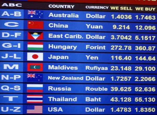
 One effect of an expansionary monetary policy is a depreciation of the exchange rate. Take the case of countries using a combination of a reduction in central bank interest rates and quantitative easing (QE). A fall in interest rates will encourage an outflow of finance; and part of the money created through quantitative easing will be used to purchase foreign assets. Both create an increased demand for foreign currencies and drive down the exchange rate.
The latest case of expansionary monetary policy is that employed by the ECB. After months of promising to ‘do whatever it takes’ and taking various steps towards full QE, the ECB finally announced a large-scale QE programme on 22 January 2015.
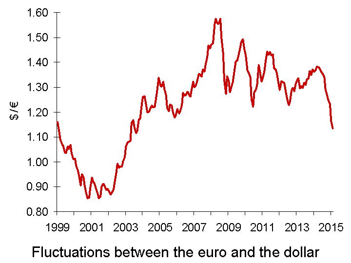
 With people increasingly predicting QE and with the ECB reducing interest rates, so the euro depreciated. Between March 2014 and 21 January 2015, the euro depreciated by 20.2% against the dollar and the euro exchange rate index depreciated by 9.7%. With the announced programme of QE being somewhat larger than markets expected, in the week following the announcement the euro fell a further 2.3% against the dollar, and the euro exchange rate index also fell by 2.3%. The euro is now at its lowest level against the US dollar since April 2003 (see chart).
The depreciation of the euro will be welcome news for eurozone exporters. It makes their exports cheaper in foreign currency terms and thus makes their exports more competitive.  Similarly Japanese exporters were helped by the depreciation of the yen following the announcement on 31 October 2014 by the Bank of Japan of an increase in its own QE programme. The yen has depreciated by 7.7% against the dollar since then.
But every currency cannot depreciate against other currencies simultaneously. With any bilateral exchange rate, the depreciation of one currency represents an appreciation of the other. So just as the euro and yen have depreciated against the dollar, the dollar has appreciated against the euro and yen. This has made US goods less competitive relative to eurozone and Japanese goods.
The danger is that currency wars will result, with monetary policy being used in various countries to achieve competitive depreciations. Already, the Swiss have been forced, on 15 January, to remove the cap with the euro at SF1 – €0.833. Since then the Swiss franc has appreciated by some 15% to around SF1 – €0.96. Will the Swiss now be forced to relax their monetary policy?
The Danish and Canadian central banks have cut their interest rates, hoping to stem an appreciation of their currencies. On 28 January, the Monetary Authority of Singapore sold Singapore dollars to engineer a depreciation. The Singapore dollar duly fell by the most in over four years.
But are these policies simply beggar-my-neighbour policies? Is it a zero-sum game, where the gains to the countries with depreciating currencies are exactly offset by losses to the those with appreciating ones? Or is there a net gain from overall looser monetary policy at a time of sluggish growth? Or is there a net loss from greater currency volatility, which will create greater uncertainty and dampen cross-border investment? The following article explore the issues.
Articles
Massive Devaluation of the Euro Seeking Alpha, Sagar Joshi (26/1/15)
Devaluation and discord as the world’s currencies quietly go to war The Observer (25/1/15)
Why is dollar strong vs. 18 trillion of USA’s debt? Pravda, Lyuba Lulko (26/1/15)
Central Bankers Ramp Up Currency Wars Wall Street Journal, Anjani Trivedi, Josie Cox and Carolyn Cui (28/1/15)
The Raging Currency Wars Across Europe The Market Oracle, Gary_Dorsch (29/1/15)
Why ECB action is likely to stoke global currency wars Financial Times, Ralph Atkins (22/1/15)
Euro slides as ECB launches QE Financial Times (22/1/15)
Will Australia join the Currency Wars? The Daily Reckoning, Australia, Greg Canavan (23/1/15)
Australia’s central bank cuts rates to record low; currency plunges and stocks spike The Telegraph (3/2/15)
Singapore loosens monetary policy Financial Times, Jeremy Grant (28/1/15)
Currency Wars Have a Nuclear Option Bloomberg, Mark Gilbert (12/2/15)
Questions
- Explain how quantitative easing results in depreciation. What determines the size of the depreciation?
- How is the USA likely to react to an appreciation of the dollar?
- In the UK, who will benefit and who will lose from the depreciation of the euro?
- What are the global benefits and costs of a round of competitive depreciations?
- How does the size of the financial account of the balance of payments affect the size of a depreciation resulting from QE?
- What determines a country’s exchange-rate elasticity of demand for exports? How does this elasticity of demand affect the size of changes in the current account of the balance of payments following a depreciation?
- Might depreciation of their currencies reduce countries’ commitment to achieving structural reforms? Or might it ‘buy them time’ to allow them to introduce such reforms in a more carefully planned way and for such reforms to take effect? Discuss.
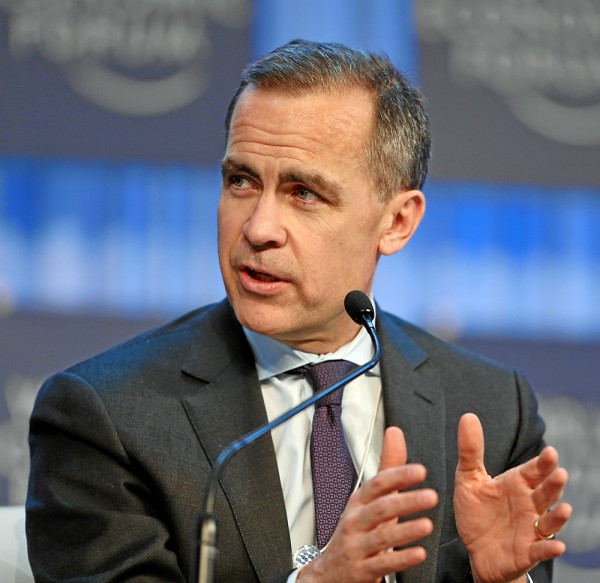
 In a speech in Dublin on 28 January 2015, titled ‘Fortune favours the bold‘, Mark Carney, the Governor of the Bank of England, compared the UK economy to that of the 19-nation eurozone. While he welcomed the ECB’s recently announced quantitative easing programme, he argued that the current construction of the eurozone is unfinished and still has two fundamental weaknesses that have not been addressed.
The first is the fragmented nature of banking:
With limited cross-border banking in the euro area, savings don’t flow to potential investments. Euro-area corporates’ cash balances have risen to the tune of €420 billion, or 3% of GDP, since the crisis, for example. Modest cross-border equity flows mean inadequate risk sharing.
The second is the lack of an integrated fiscal policy.
For complete solutions to both current and potential future problems, the sharing of fiscal risks is required.
It is no coincidence that effective currency unions tend to have centralised fiscal authorities whose spending is a sizeable share of GDP – averaging over a quarter of GDP for advanced countries outside the euro area.
… If the eurozone were a country, fiscal policy would be substantially more supportive. However, it is tighter than in the UK, even though Europe still lacks other effective risk sharing mechanisms and is relatively inflexible. A more constructive fiscal policy would help recycle surplus private savings and mitigate the tail risk of stagnation. It would also bridge the drag from structural reforms on nominal spending and would be consistent with the longer term direction of travel towards greater integration.
But fiscal integration requires a political will to transfer fiscal surpluses from the stronger countries, such as Germany, to the weaker countries, such as those in southern Europe.
Overall, the financial and fiscal position in the eurozone is strong:
Gross general government debt in the euro area is roughly the same as in the UK and below the average of advanced economies. The weighted average yield on 10-year euro area sovereign debt is around 1%, compared to 1½% in the UK. And yet, the euro area’s fiscal deficit is half that in the UK. Its structural deficit, according to the IMF, is less than one third as large.
But, unlike the UK, where, despite the rhetoric of austerity, automatic fiscal stabilisers have been allowed to work and the government has accepted a much slower than planned reduction in the deficit, in the eurozone fiscal policy remains tight. Yet unemployment, at 11½%, is twice the rate in the UK and economic growth, at around 0.7% is only one-quarter of that in the UK.
Without a eurozone-wide fiscal policy the problem of slow growth is likely to persist for some time. Monetary policy in the form of QE will help and structural reforms will help to stimulate potential output and long-term growth, but these policies could be much more effective if backed up by fiscal policy.
Whether they will be any time soon is a political question.
Speech
Fortune favours the bold Bank of England. Mark Carney (29/1/15)
Articles
Bank of England’s Carney urges Europe to take plunge on fiscal union Reuters, Padraic Halpin (28/1/15)
Bank Of England’s Mark Carney Attacks ‘Timid’ Eurozone Recovery Attempts Huffington Post, Jack Sommers (29/1/15)
BoE’s Mark Carney calls for common eurozone fiscal policies Financial Times, Ferdinando Giugliano (28/1/15)
Carney attacks German austerity BBC News, Robert Peston (28/1/15)
Bank of England governor attacks eurozone austerity The Guardian, Larry Elliott (28/1/15)
Questions
- Compare the financial and fiscal positions of the UK and the eurozone.
- In what way is there a ‘debt trap’ in the eurozone?
- What did Mark Carney mean when he said, ‘Cross-border risk-sharing through the financial system has slid backwards.’?
- What options are there for the eurozone sharing fiscal risks?
- What would a ‘more constructive’ fiscal policy, as advocated by Mark Carney, look like?
- How do the fiscal policies of other currency unions, such as the UK (union of the four nations of the UK) or the USA (union of the 50 states) or Canada (union of the 10 provinces and three territories), differ from that of the eurozone?
 Virtually all manual toothbrushes sold in the UK are made by Oral B (Procter & Gamble), Colgate (Colgate-Palmolive) or Listerene Reach (Johnson & Johnson). This is a powerful oligopoly.
 agreed to stock its product. The Rockabilly Kids toothbrush has a feature likely to appeal to both children and their parents. It wobbles! With a weight in the bottom, the brush rights itself, with a wobble, when dropped or simply placed on the basin or shelf.
