 One very important characteristic of economic growth is its short-term volatility. Economic activity is notoriously volatile. It is such a fundamental idea that economists refer to it as one of their threshold concepts. The volatility of growth sees occasional recessions. The traditional definition is where real GDP (output) declines for 2 or more consecutive quarters. The latest figures from the Quarterly National Accounts call into question whether the UK technically experienced a recession at the start of 2012 with output broadly flat in 2012 Q1 following a contraction of 0.1 per cent in 2011 Q4.
The ONS’s latest output numbers raise some interesting questions around our understanding of what constitutes a recession. These figures show that the 2008/9 recession was deeper than first thought with output declining by 7.2 per cent. They show that UK output peaked in 2008Q1 (£392.786 billion at 2010 prices). There then followed 6 quarters where output declined.
Output declined again in 2010 Q4 (–0.2% growth) and again in 2011 Q4 (–0.1% growth). But then interpretations of the data become more controversial. Not least, we get in the debates concerning the accuracy with which we can expect to measure the size of the economy and so to how many decimal places one should realistically measure a rise or fall. In terms of the raw real GDP numbers output fell in 2012 Q1. In 2011 Q4 GDP is estimated at £376,462 billion (at 2010 prices) ‘falling’ to £376,436 billion (at 2010 prices) in 2012 Q1. But, this is a percentage fall only when measured to the third decimal place (–0.007% growth).
In its publication Impact of changes in the National Accounts and economic commentary for Q1 2013 the ONS argue that:
While some commentators may attempt to read some significance into this revision, particularly in the context of whether the UK experienced a “double-dip” recession, it is clearly absurd to imagine that it is possible to measure the size of the economy to this degree of accuracy. The best interpretation of the Blue Book figures is that the economy was flat in the first quarter of 2012, and 0.6% larger than in the same quarter of 2011.
It is however understandable that those with vested interests – including economists, policy-makers and politicians – will take a slightly different view and will read more into the figures than perhaps an objective, sober view might demand. What appears more certain is that output did again fall in 2012 Q2 (–0.5 per cent growth) and in 2012 Q4 (–0.2 per cent growth). Despite estimated growth of 0.3 per cent in 2013 Q1, output remains 3.9 per cent lower than at its 2008 Q1 peak.
Perhaps the ‘absurdity’ or not around the debate of a double-dip recessions strengthens the argument for a more holistic and considered view of what constitutes a recession. In the USA the wonderfully-named Business Cycle Dating Committee takes a less fixed view of economic activity and, hence, of recessions. Its website argues:
It (the Committee) examines and compares the behavior of various measures of broad activity: real GDP measured on the product and income sides, economy-wide employment, and real income. The Committee also may consider indicators that do not cover the entire economy, such as real sales and the Federal Reserve’s index of industrial production (IP).
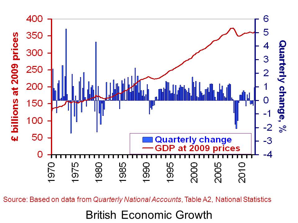
Of course, the advantage of focusing on real GDP alone in measuring activity and in determining recessions is that it is usually very straightforward to interpret. Regardless of whether the UK has experienced or not two recessions in close proximity, our chart helps to put the recent growth numbers into an historical context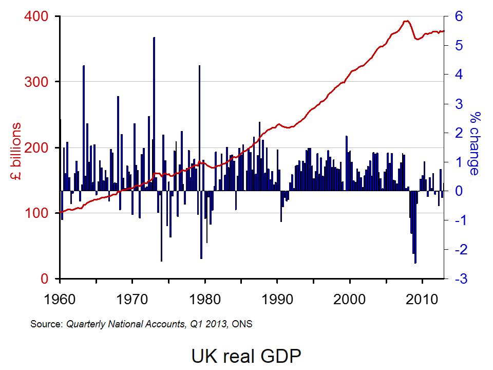 . It shows both the quarter-to-quarter changes in real GDP (left-hand axis) and the level of output as measured by GDP at constant 2010 prices (right-hand axis). Click here to download the chart to PowerPoint.
The chart captures nicely the twin characteristics of growth. Since 1960, the average rate of growth per quarter has been 0.63 per cent. This is equivalent to an average rate of growth of 2.55 per cent per year. Since 2008 Q2, quarterly growth has averaged –0.19 per cent which is equivalent to an annual rate of growth of –0.78 per cent! In any language these are extraordinary numbers. Indeed, one could argue that focusing any policy debate around whether or not the UK experienced a double-dip recession rather misses the more general point concerning the absense of any sustained economic growth since 2008.
Data
Quarterly National Accounts Time Series Dataset Q1 2013 Office for National StatisticsStatistical Bulletin: Quarterly National Accounts Q1 2013 Office for National Statistics
Articles
UK avoided double-dip recession in 2011, revised official data shows Guardian, Phillip Inman (27/6/13)
Britain’s double dip recession revised away, but picture still grim Reuters, David Milliken and William Schomberg (27/6/13)
UK double-dip recession revised away BBC News (27/6/13)
IMF raises UK economic growth forecast BBC News (9/7/13)
IMF raises UK economic growth forecast to 0.9% but cuts prediction for global growth Independent, Holly Williams (9/7/13)
IMF Upgrades UK Growth Forecast For 2013 Sky News (9/7/13)
Questions
- What is the difference between nominal and real GDP? Which of these helps to track changes in economic output?
- Looking at the chart above, summarise the key patterns in real GDP since the 1960s.
- What is a recession? What is a double-dip recession?
- What are some of the problems with the traditional definition of a recession?
- Explain the arguments for and against the proposition that the UK has recently experienced a double-dip recession.
- Can a recession occur if nominal GDP is actually rising? Explain your answer.
- What factors might result in economic growth being so variable?
- Produce a short briefing paper exploring the prospects for economic growth in the UK over the next 12 to 18 months.
 When you are next in town shopping, just keep in mind that consumer spending accounts for a little over 60 per cent of GDP. Therefore, consumption is incredibly important to the economy. How consumers behave is crucial to our short-term economic growth. The second estimate of British growth from the Office for National Statistics shows that the economy expanded by 0.3 per cent in the first three months of 2013. This follows a 0.3 per cent decline in the final quarter of 2012. Real household expenditure rose by just 0.1 per cent in Q1 2013. However, this was the sixth consecutive quarter in which the volume of purchases by households has grown.
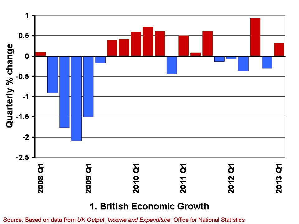
 The growth in the economy is measured by changes in real GDP. Chart 1 shows the quarter-to-quarter change in real GDP since Q1 2008. (Click here to download a PowerPoint of the chart). During this period the economy is thought to have contracted in 10 of the 21 quarters shown. Furthermore, they show a double-dip recession and so two periods in close proximity where output shrank for two or more quarters. While more recent output numbers are frequently revised, which could see the double-dip recession possibly ‘statistically wiped’ from history, the period since 2008 will always been one characterised by anemic growth. The average quarterly growth rate since Q1 2008 has been -0.12 per cent.
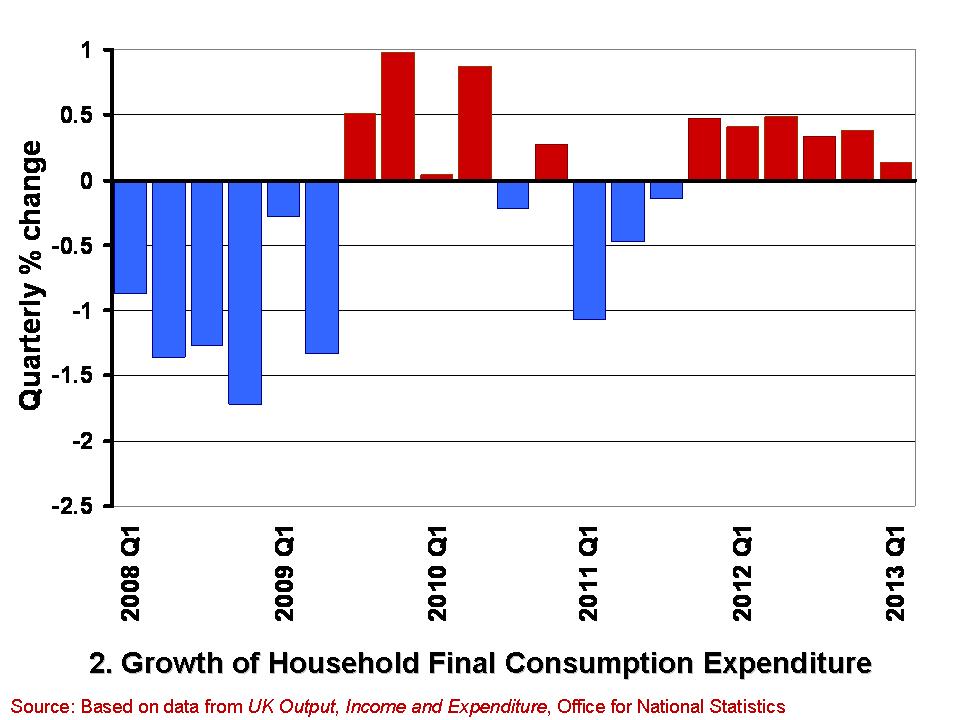
 Chart 2 shows from Q1 2008 the quarterly growth in household expenditure in real terms, i.e. after stripping the effect of consumer price inflation. (Click here for a PowerPoint of the chart). Over the period, the volume of household consumption has typically fallen by 0.18 per cent per quarter. Hence, consumption has feared a little worse than the economy has a whole.
While the annualised rate of growth for the economy since Q1 2008 has averaged -0.47 per cent that for consumer spending has averaged -0.73 per cent. However, these figures disguise a recent improvement in consumer spending growth. This is because the volume of consumption has in fact grown in each of the six quarters since Q4 2011. In contrast, the economy has grown in only 2 of these quarters. It is, of course, much too early to start trumpeting consumption growth has heralding better times, not least because the 0.1 per cent growth in Q1 2013 is the weakest number since positive consumption growth resumed at the back end of 2011. Nonetheless, the figures do deserve some analysis by economists to understand what is going on.
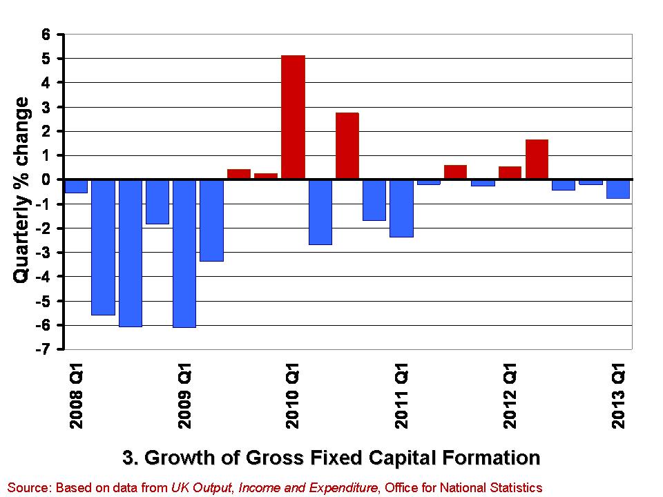
 A slightly less promising note is struck by the gross fixed capital formation (GFCF) numbers. These numbers relate to the volume of investment in non-financial fixed assets, such as machinery, buildings, office space and fixtures and fittings. Chart 3 shows the quarterly growth in the volume of GFCF since Q1 2008. (Click here for a PowerPoint of the chart). The average quarterly rate of growth over this period has been -0.77 per cent. This is equivalent to an annual rate of decline of 3.9 per cent. GFCF has risen in only 7 of these quarters, declining in the remaining 14 quarters.
Worryingly, gross fixed capital formation has decreased in each of the last three quarters. While these figures may reflect continuing difficulties encountered by businesses in obtaining finance, they may also point to lingering concerns within the business community about the prospects for sustained growth. Therefore, it is important for economists to try and understand the drivers of these disappointing investment numbers and, hence, whether it is these or the slightly better consumption numbers that best hint at our short-term economic prospects.
Data
Second estimate of GDP, Q1 2013 Office for National Statistics
Second Estimate of GDP, Q1 2013 Dataset Office for National Statistics
Articles
UK GDP: concerns about underlying economy as 0.3pc growth confirmed Telegraph, Philip Aldrick (23/5/13)
UK investment fall among worst in G8 Guardian, Phillip Inman (23/5/13)
UK first-quarter growth unchanged BBC News (28/5/13)
U.K. Economy Grows 0.3% on Inventories, Consumer Spending Bloomberg, Svenja O’Donnell (23/5/13)
Surge in consumer spending kept UK out of recession The Telegraph (28/5/13)
Boost in service sector activity The Herald, Greig Cameron (28/5/13)
Hopes dashed as household spending rises by just 0.1% The Herald, Ian McConnell (24/5/13)
Questions
- Why do we typically focus on real GDP rather than nominal GDP when analysing economic growth?
- What is meant by aggregate demand? Of what importance is consumer spending to aggregate demand?
- Why might the patterns we observe in consumer spending differ from those in other components of aggregate demand?
- What factors might influence the determination of consumer spending?
- What do you understand by gross fixed capital formation? What factors might help to explain how its level is determined?
- Of what significance is gross fixed capital formation for aggregate demand and for aggregate supply?
- What is a recession? What is a double-dip recession?
- What data would you need to collect to identify a recession?
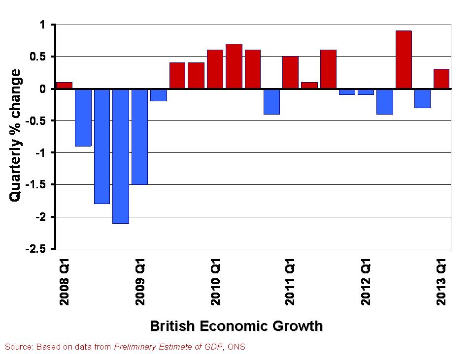
 In The global economy we note the mixed picture contained within the latest British growth numbers. With the first estimate of growth for Q1 of 2013 pointing to an increase in real GDP of 0.3 per cent, the UK economy appears to have missed the ignominy of a triple dip recession. However, the overall economy remains fragile with different sectors of the economy performing quite differently.
A patchy picture is perhaps the fairest assessment. This helps to explain the quite different perceptions amongst economists, business people, journalists and the wider public about the current state of the economy. Here we consider in a little more detail the growth numbers for the UK from the latest preliminary GDP estimates. (Click here for a PowerPoint of the chart).
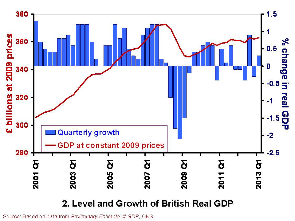
 The British economy is thought to have grown by 0.3 per cent in the first quarter of 2013. This follows a contraction of 0.3 per cent in the final quarter of 2012. Compared with the first quarter of 2012, the output of the British economy was 0.6 per cent higher. However, as Chart 2 helps to show, the British economy has some way to go before it returns to the levels seen prior to the financial crisis. Real GDP peaked in the first quarter of 2008 when GDP at 2009 prices was estimated at £372.7 billion. In the first quarter of 2013, GDP at constant 2009 prices is estimated at £362.9 billion. This means that the economy is still 2.6 per cent smaller than its 2008-peak. Click here for a PowerPoint of the chart.
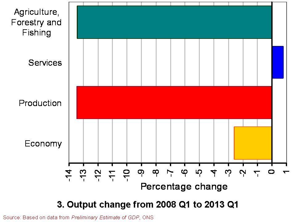
The patchy nature of British growth is illustrated nicely by the contrasting rates of growth across the different industrial sectors in the first quarter of the year. While service sector output rose by 0.6 per cent, output across the production industries rose by only 0.2 per cent and agricultural output declined by 3.7 per cent. Within the production industries, mining and quarrying output rose by 3.2 per cent, but manufacturing output shrunk by 0.3 per cent and construction output shrunk by 2.5 per cent.
 Chart 3 compares the output of agriculture, the production industries and the service sector between the first quarter of 2008 and the first quarter of 2013. (Click here for a PowerPoint of the Chart). It shows the dramatically different experience of the service sector compared with agriculture and the production industries. While output in the service sector is now 0.8 per cent higher, output across agriculture and the production industries is almost 13.5 per cent lower. Within the production industries, output in mining and quarrying is 38 per cent lower, in the construction sector 19 per cent lower and 10 per cent lower in manufacturing. It is perhaps not surprising then that we get such different messages about the state of the economy. The devil really is in the detail.
Data
Preliminary Estimate of GDP – Time Series Dataset Q1 2013 Office for National Statistics
Statistical Bulletin: Gross Domestic Product Preliminary Estimate Q1 2013 Office for National Statistics
Articles
UK avoids triple-dip recession with better-than-expected 0.3% GDP growth Guardian, Heather Stewart (25/4/13)
UK economy shows 0.3% growth Financial Times, Claire Jones (25/4/13)
UK avoids triple-dip recession with 0.3pc GDP growth Telegraph, Szu Ping Chan (25/4/13)
Osborne claims UK economy is ‘healing’ Financial Times, George Parker and Claire Jones (25/4/13)
UK narrowly escapes triple-dip recession as GDP figures show 0.3% growth in first three months of year Independent, Ben Chu (25/4/13)
UK economy avoids triple-dip recession BBC News (25/4/13)
Questions
- What is the difference between nominal and real GDP? Which of these helps to track changes in economic output?
- How would we identify a recession in either of the first two charts?
- What is a double-dip recession? What is a triple-dip recession?
- The UK economy in Q1 2013 was 2.6 per cent smaller than in Q1 2008. What factors do you think help explain why after 5 years UK real GDP is still lower?
- Why if output in the production and agricultural sectors is 13.5 per cent lower in Q1 2013 compared to Q1 2008 is the economy’s total output only 2.6 per cent lower?
- Economic growth rates fluctuate quite significantly. Can economic theory help to explain why this is the case?
 We know two things about economic growth in a developed economy like the UK: it is positive over the longer term, but highly volatile in the short term. We can refer to these two facts as the twin characteristics of growth. The volatility of growth sees occasional recessions, i.e. two or more consecutive quarters of declining output. Since 1973, the UK has experienced six recessions.
Here we consider in a little more detail the growth numbers for the UK from the latest Quarterly National Accounts, focusing on the depth and duration of these six recessions. How do they compare?
The latest figures on British economic growth show that the UK economy grew by 0.9 per cent in the third quarter of 2012. However, when compared with the third quarter of 2011, output was essentially unchanged. This means that the annual rate of growth was zero. Perhaps even more telling is that output (real GDP) in Q3 2012 was still 3.0 per cent below its Q1 2008 level.
 The chart helps to put the recent output numbers into an historical context. It shows both the quarter-to-quarter changes in real GDP (right-hand axis) and the level of output as measured by GDP at constant 2009 prices (left-hand axis). It captures nicely the twin characteristics of growth. Since 1970, the average rate of growth each quarter has been 0.6 per cent. This is equivalent to an average rate of growth of 2.35 per cent per year. The chart also allows us to pin-point periods of recessions.
One way of comparing recessions is to compare their ‘2 Ds’: depth and duration. The table shows the number of quarters each of the six recessions since 1973 lasted. It also shows how much smaller the economy was by the end of each recession. In other words, it shows the depth of each recession as measured by the percentage reduction in output (real GDP).
British recessions
|
Duration (quarters) |
Depth (output lost, %) |
| 1973Q3–74Q1 |
3 |
3.25 |
| 1975Q2–75Q3 |
2 |
1.76 |
| 1980Q1–81Q1 |
5 |
4.63 |
| 1990Q3–91Q3 |
5 |
2.93 |
| 2008Q2–09Q2 |
5 |
6.28 |
| 2011Q4–12Q2 |
3 |
0.90 |
 One very important characteristic of economic growth is its short-term volatility. Economic activity is notoriously volatile. It is such a fundamental idea that economists refer to it as one of their threshold concepts. The volatility of growth sees occasional recessions. The traditional definition is where real GDP (output) declines for 2 or more consecutive quarters. The latest figures from the Quarterly National Accounts call into question whether the UK technically experienced a recession at the start of 2012 with output broadly flat in 2012 Q1 following a contraction of 0.1 per cent in 2011 Q4.
 . It shows both the quarter-to-quarter changes in real GDP (left-hand axis) and the level of output as measured by GDP at constant 2010 prices (right-hand axis). Click here to download the chart to PowerPoint.
