 Three international agencies, the IMF, the European Commission and the OECD, all publish six-monthly forecasts for a range of countries. As each agency’s forecasts have been published this year, so the forecasts for economic growth and other macroeconomic indicators, such as unemployment, have got more dire.
The IMF was the first to report. Its World Economic Outlook, published on 14 April, forecast that in the UK real GDP would fall by 6.5% in 2020 and rise by 4% in 2021 (not enough to restore GDP to 2019 levels); in the USA it would fall by 5.9% this year and rise by 4.7% next year; in the eurozone it would fall by 7.5% this year and rise by 4.7% next.
The European Commission was next to report. Its AMECO database was published on 6 May. This forecast that UK real GDP would fall by 8.3% this year and rise by 6% next; in the USA it would fall by 6.5% this year and rise by 4.9% next; in the eurozone it would fall by 7.7% this year and rise by 6.3% next.
The latest to report was the OECD on 10 June. The OECD Economic Outlook was the most gloomy. In fact, it produced two sets of forecasts.
The first, more optimistic one (but still more gloomy than the forecasts of the other two agencies) was based on the assumption that lockdowns would continue to be lifted and that there would be no second outbreak later in the year. This ‘single-hit scenario’ forecast that UK real GDP would fall by 11.5% this year and rise by 9% next (a similar picture to France and Italy); in the USA it would fall by 7.3% this year and rise by 4.1% next; in the eurozone it would fall by 9.1% this year and rise by 6.5% next.
The second set of OECD forecasts was based on the assumption that there would be a second wave of the virus and that lockdowns would have to be reinstated. Under this ‘double-hit scenario’, the UK’s GDP is forecast to fall by 14.0% this year and rise by 5.0 per cent next; in the USA it would fall by 8.5% this year and rise by 1.9% next; in the eurozone it would fall by 11.5% this year and rise by 3.5% next.
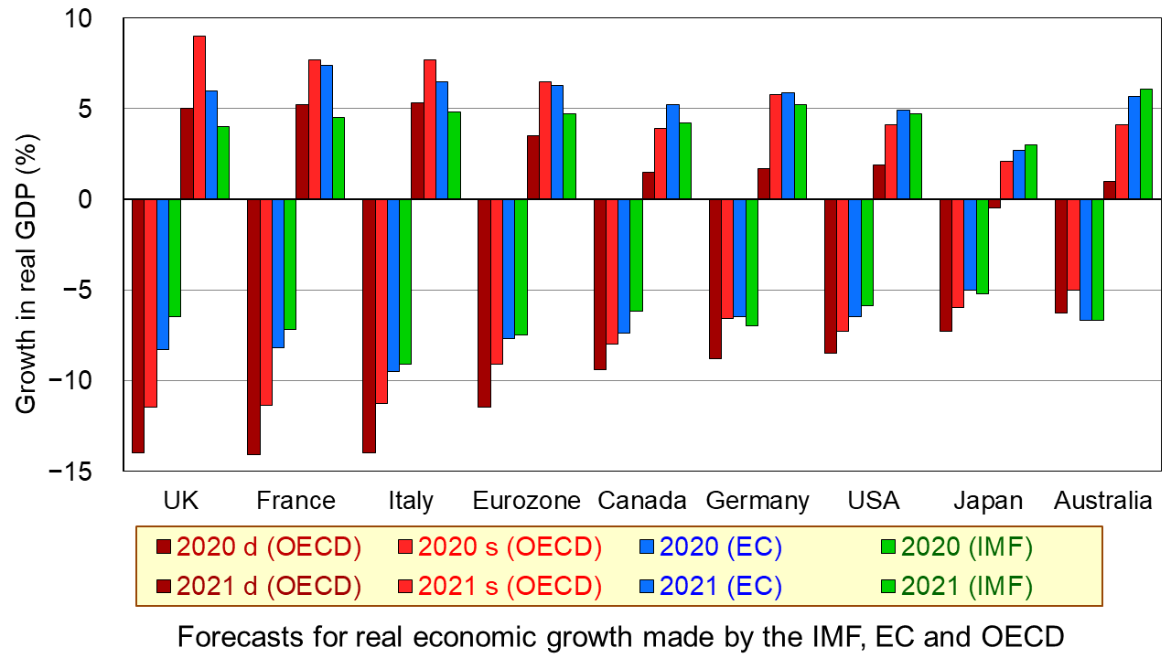
The first chart shows the four sets of forecasts (including two from the OECD) for a range of countries. The first four bars for each country are the forecasts for 2020; the other four bars for each country are for 2021. (Click here for a PowerPoint of the chart.)
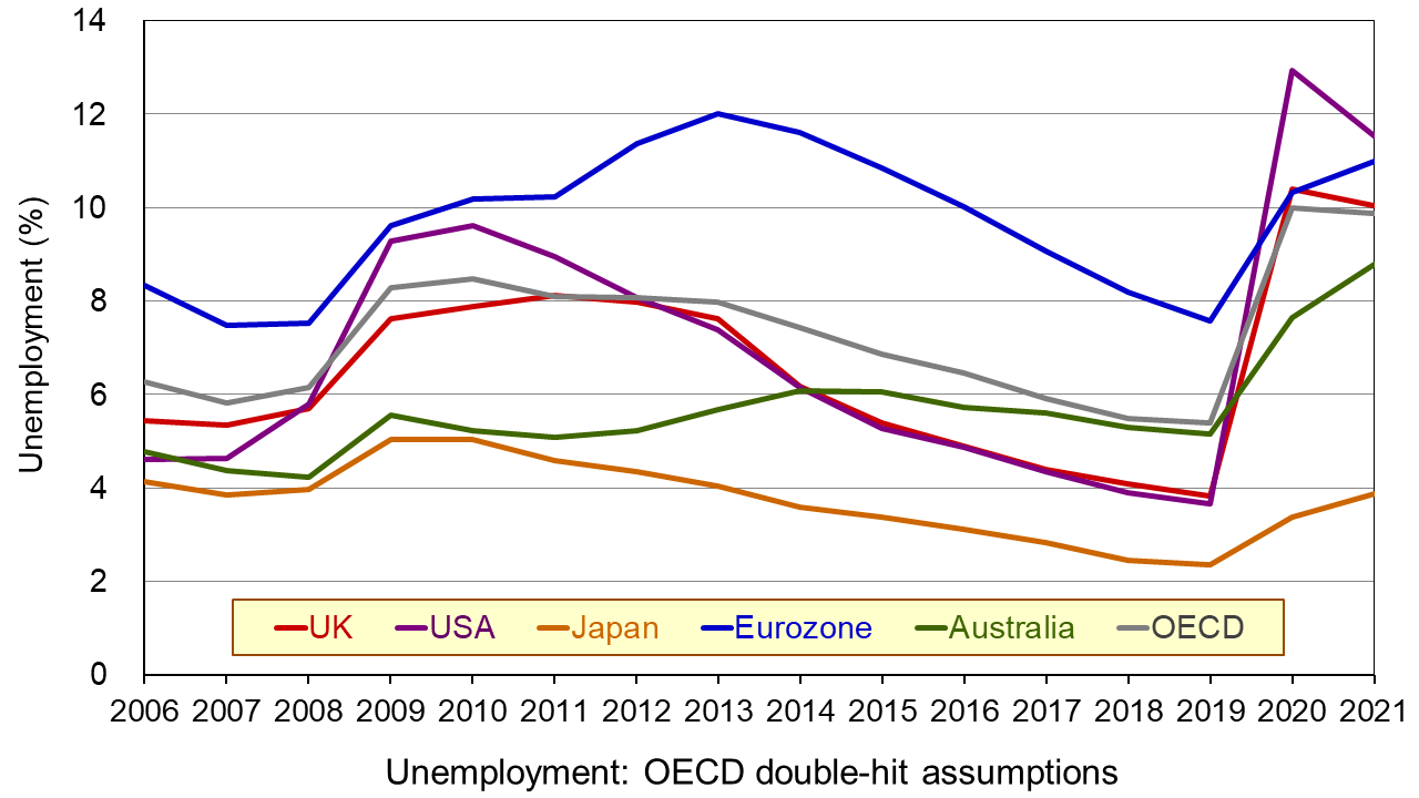
The second chart shows unemployment rates from 2006. The figures for 2020 and 2021 are OECD forecasts based on the double-hit assumption. You can clearly see the dramatic rise in unemployment in all the countries in 2020. In some cases it is forecast that there will be a further rise in 2021. (Click here for a PowerPoint of the chart.)
As the OECD states:
In both scenarios, the recovery, after an initial, rapid resumption of activity, will take a long time to bring output back to pre-pandemic levels, and the crisis will leave long-lasting scars – a fall in living standards, high unemployment and weak investment. Job losses in the most affected sectors, such as tourism, hospitality and entertainment, will particularly hit low-skilled, young, and informal workers.
But why have the forecasts got gloomier? There are both demand- and supply-side reasons.
Aggregate demand has fallen more dramatically than originally anticipated. Lockdowns have lasted longer in many countries than governments had initially thought, with partial lockdowns, which replace them, taking a long time to lift. With less opportunity for people to go out and spend, consumption has fallen and saving has risen. Businesses that have shut, some permanently, have laid off workers or they have been furloughed on reduced incomes. This too has reduced spending. Even when travel restrictions are lifted, many people are reluctant to take holidays at home and abroad and to use public transport for fear of catching the virus. This reluctance has been higher than originally anticipated. Again, spending is lower than before. Even when restaurants, bars and other public venues are reopened, most operate at less than full capacity to allow for social distancing. Uncertainty about the future has discouraged firms from investing, adding to the fall in demand.
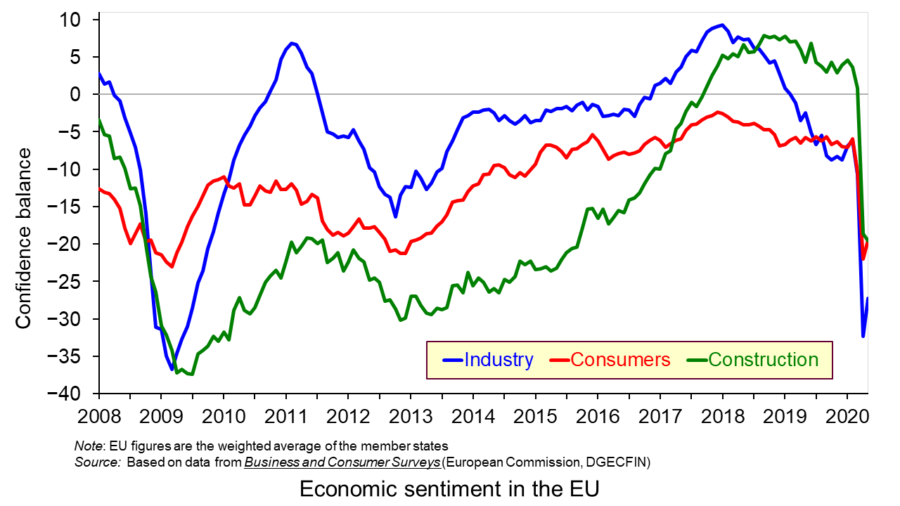
On the supply side, there has been considerable damage to capacity, with firms closing and both new and replacement investment being put on hold. Confidence in many sectors has plummeted as shown in the third chart which looks at business and consumer confidence in the EU. (Click here for a PowerPoint of the above chart.) Lack of confidence directly affects investment with both supply- and demand-side consequences.
Achieving a sustained recovery will require deft political and economic judgements by policymakers. What is more, people are increasingly calling for a different type of economy – one where growth is sustainable with less pollution and degradation of the environment and one where growth is more inclusive, where the benefits are shared more equally. As Angel Gurría, OECD Secretary-General, states in his speech launching the latest OECD Economic Outlook:
The aim should not be to go back to normal – normal was what got us where we are now.
Articles
OECD publications
Questions
- Why has the UK economy been particularly badly it by the Covid-19 pandemic?
- What will determine the size and timing of the ‘bounce back’?
- Why will the pandemic have “dire and long-lasting consequences for people, firms and governments”?
- Why have many people on low incomes faced harsher consequences than those on higher incomes?
- What are the likely environmental impacts of the pandemic and government measures to mitigate the effects?
 The issue of inequality has come into increasing focus over recent years. The impact of the COVID-19 pandemic raises further concerns that these inequalities may be exacerbated further. Here we provide an overview of some of the key patterns in current levels of wealth and income inequality in Britain. They show, for example, the markedly higher degree of inequality in wealth relative to income, the importance of property wealth and private pension wealth in determining levels of wealth, and the considerable variation in average wealth levels of households by age and location.
According to the 6th round of the Wealth and Assets Survey the aggregate wealth of British households was £14.63 trillion in April 2016 to March 2018. This compares with £12.57 trillion in the previous survey which ran from April 2014 to March 2016. This amounts to a 16.3 per cent nominal increase. In real terms, after adjusting for consumer price inflation, the increase was 13.1 per cent. Furthermore, when compared with the first round of the survey in July 2006 to June 2008, there has been a nominal increase in the aggregate wealth of British households of 74 per cent and a real increase of 41 per cent.
What is wealth?
An important question to ask when reflecting on the growth and distribution of wealth across households is what wealth comprises. In fact, it comprises one of four components:
- Net Financial wealth – the value of financial assets (savings and financial investments) less any financial liabilities (loans and arrears)
- Physical wealth – the value of household contents, possessions, valuables and vehicles
- Private pension wealth – the value of private pensions, such as occupational pensions and personal pensions
- Net property wealth – the value of any property owned (including other land/properties owned abroad) less the value of any loans or mortgages secured on these properties.
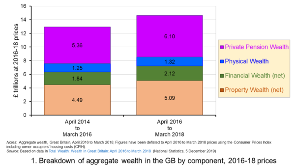 Figure 1 shows the evolution of aggregate wealth over the last two surveys (at constant 2016-18 prices) by the four component parts. Two components dominate the aggregate wealth of British households: property wealth (35 per cent) and private pension wealth (41-42 per cent). Financial wealth is the third largest component (14 per cent), while property wealth is the smallest component (9 to 10 per cent). (Click here for a PowerPoint of the chart.)
Trends in the average wealth of households
To help contextualise the size of wealth and begin to think about its distribution, rather than look at aggregate household wealth we can instead look at the average wealth of British households.
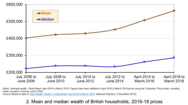 Figure 2 shows the average wealth (at constant 2016-18 prices) as measured by the mean (aggregate divided by the number of households) and the median (the middle household). The mean wealth of households is seen to be greater than their median wealth. In April 2016 to March 2018, average wealth as measured by the mean was £564,300 (an increase of 40.3 per cent over July 2006 to June 2008), whilst the average wealth of each household as measured by the median was £286,600 (an increase of 28.5 per cent over July 2006 to June 2008). (Click here for a PowerPoint of the chart.)
The higher mean value of wealth relative to the median value shows that the distribution of wealth is unequal. Therefore, the mean-to-median ratio is an indicator of inequality. In April 2016 to March 2018 the mean-to-median ratio was 1.97, up from 1.94 in April 2014 to March 2016 and 1.77 in July 2008 to June 2010, and 1.8 in the first survey in July 2006 to June 2008. This metric is therefore consistent with a more unequal distribution of wealth having arisen since the second survey in July 2008 to June 2010, a period during which the UK and global economy was been buffeted by the effects of the financial crisis and the associated economic downturn.
Trends in the average income of households
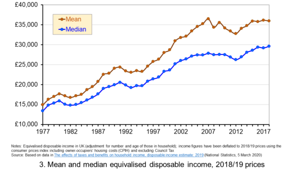 Figure 3 shows the mean and median values of disposable income (adjusted for the number and age of individuals comprising each household). Mean disposable income of UK households in financial year ending (FYE) 2018 was £35,928, a 0.5 per cent real decrease over FYE 2017, whilst median wealth (middle household) was £29,598 in FYE 2018, a 1.5 per cent real increase over FYE 2017. (Click here for a PowerPoint of the chart.)
The higher mean value of disposable income relative to the median value is indicative of inequality in disposable income. In FYE 2018 the mean-to-median ratio for disposable income was 1.21, down from 1.24 in FYE 2017 and a peak of 1.27 in FYE 2014, but higher than the 1.10 in 1978. The longer-term growth in the inequality of income helps to exacerbate existing wealth inequalities.
Comparing the inequality of income and wealth
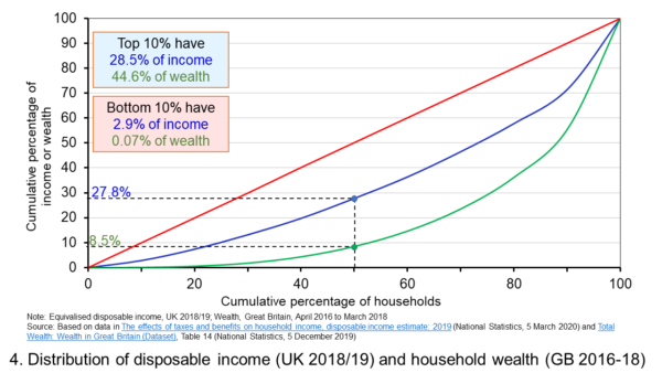 Figure 4 shows starkly the current inequality in wealth as compared to that in income. It does so by plotting their respective Lorenz curves. The curves show the proportion of overall wealth or income attributable to a given proportion of households. For example, 50 per cent of households have close to 28 per cent of total disposable income and a mere 8.5 per cent of aggregate wealth. (Click here for a PowerPoint of the chart.)
The inequality shown by the Lorenz curves is especially startling when we look at the top and bottom deciles. The bottom decile has just 2.9 per cent of income and only 0.07 per cent of wealth. Meanwhile the top 10 per cent of households have 28.5 per cent of income, almost the same as the first 50 percent of households, and some 44.6 per cent of wealth, with the previous 90 per cent of households having 55.4 per cent of wealth.
The Lorenz curves allow for the calculation of the Gini coefficient. It measures the area between the Lorenz curve and the 45 degree line consistent with zero inequality relative to the total area below the 45 degree line. Therefore, the Gini coefficient can take a value of between 0% (no inequality) and 100% (total inequality – where one person has all the wealth). Unsurprisingly whilst the Gini coefficient for disposable income in the UK in FYE 2018 was 34.7 per cent, that for aggregate wealth in Great Britain in April 2016 to March 2018 was significantly higher at 63.3 per cent.
The Gini coefficient for disposable income has risen from 25.5 per cent in 1977 to a peak in FYE 2008 of 38.6 per cent. It has therefore eased during the 2010s, but is nonetheless 13 percentage points higher today than it was four decades ago. Meanwhile, the Gini coefficient for wealth at the time of the first survey from July 2006 to June 2008 was 61 per cent. It has been unchanged at 63 percent over the last three surveys.
Inequality in wealth by component, location and age
It is important to recognise the inequalities in the components of wealth. This has particular importance when we are trying to understand how wealth varies by household characteristics, such as age and location.
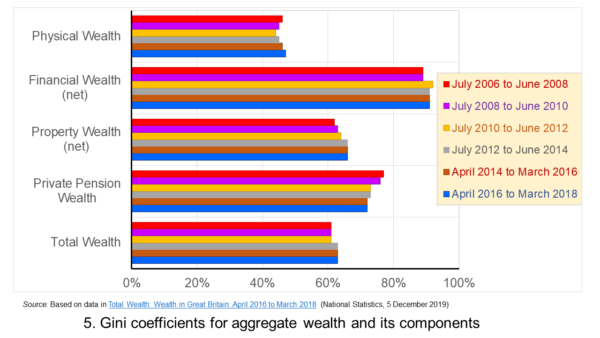 Figure 5 shows that the highest Gini coefficient is for net financial wealth. This stood at 91 per cent in April 2016 to March 2018. This extremely high figure shows the very high levels of inequatity in net financial wealth. This reflects the fact that some households find themselves with negative net financial wealth, such that their debts exceed their assets, whilst, on the other hand, some households can have large sums in financial investments. (Click here for a PowerPoint of the chart.)
We saw at the outset that the largest two components of wealth are property wealth and private pension wealth. The Gini coefficients of these two have in recent times moved in opposite directions by roughly similar magnitudes. This means that their effects on the overall Gini coefficient have offset one another. Perhaps for many people the rise in Gini coeffcient for property from 62 per cent in July 2006 to June 2008 to 66 per cent in April 2016 to March 2018 is the inequality measure that resonates most. This is reflected in regional disparities in wealth.
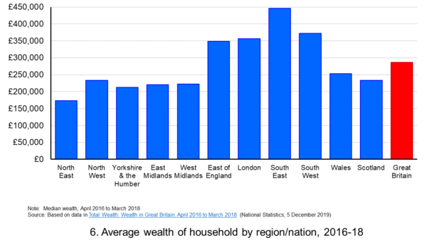 Figure 6 shows the geographical disparity of median household wealth across Britain. The regions with the highest median wealth are the South East, South West, London and the East of England. They have the highest contributions from net property wealth (40.4 per cent, 35.6 per cent, 41.7 per cent and 37.2 per cent respectively). The region with the lowest median total wealth, the North East, has the least total wealth in net property wealth (24.8 per cent). (Click here for a PowerPoint of the chart.)
Property wealth and private pension wealth also contribute to disparities in wealth by the age of the head of the household, also known as the household reference person or HRP. In April 2016 to March 2018 the mean wealth where the HRP is 25-34 was £125,700, rising to £859,200 where the HRP is 55-64 and then falling to £692,300 when the HRP is 65 or over. This is consistent with households accruing wealth over time and the using wealth to help fund retirement.
Where the age of the HRP is 55-64, mean property wealth in April 2016 to March 2018 was £255,800 compared to £53,700 where the HRP is 25-34. Meanwhile, where the age of the HRP is 55-64, mean private pension wealth was £449,100 compared to just £32,300 where the HRP is 25-34. In respect of property wealth, the deterioration in the affordability of owner-occupied housing over many years will impact especially hard on younger households. This will therefore tend to exacerbate inter-generational wealth inequality.
Whilst this briefing provides an overview of recent patterns in income and wealth inequality in Britain, the articles and press releases below consider the impact that the COVID-19 pandemic may have on inequalities.
Articles and Press Releases
- Many better-off households may increase savings as spending on ‘banned’ activities falls. Poorer households spend much more of their income on necessities and will be less resilient to any falls in income
IFS Press Release, Rowena Crawford, Alex Davenport, Robert Joyce and Peter Levell (08/04/20)
- Sector shut-downs during the coronavirus crisis affect the youngest and lowest paid workers, and women, the most
IFS Press Release, Robert Joyce and Xiaowei Xu (06/04/20)
- Coronavirus downturn ‘will exacerbate UK health inequality’
City A.M., James Warrington (09/04/20)
- Coronavirus pandemic exacerbates inequalities for women, UN warns
Guardian, Alexandra Villarreal (11/04/20)
- Inequality doesn’t just make pandemics worse – it could cause them
Guardian, Laura Spinney (12/04/20)
- The Coronavirus Will Be a Catastrophe for the Poor
The Atlantic, Derek Thompson (20/03/20)
- EU-wide inequality is back to pre-crisis levels
Social Europe, Michael Dauderstädt (15/04/20)
- Coronavirus makes inequality a public health issue
World Economic Forum, Alexandre Kalache (President, International Longevity Centre-Brazil) (13/04/20)
- Economist Joseph Stiglitz says coronavirus is ‘exposing’ health inequality in US
- CNBC, Jesse Pound (14/04/20)
ONS Bulletins
Questions
- In what ways can we use statistics to help measure and inform our analysis of inequality?
- In what ways can income inequality impact on wealth inequality?
- How can wealth inequality impact on income inequality?
- What might explain why wealth inequality is greater than income inequality?
- Explain how Lorenz curves help to generate Gini coefficients.
- Why would we expect the wealth of households with a younger household reference person (HRP) to be lower than that of a household with an older HRP? Would we expect this average to rise over all age ranges?
- If you were advising a government on policies to reduce income and wealth inequalities what sort of measures might you suggest?
- What is the difference between original income and disposable income?
- What is the difference between disposable income and equivalised disposable income?
- What role does the housing market play in affecting wealth inequality?
- Why is net financial wealth so unequally distributed?
- What is meant by health inequality? Of what significance is this for income and wealth inequality?
- What is meant by social mobility? Of what significance is this for income and wealth inequality?
 The IFS has launched a major five-year review into all aspects of inequality. The review is led by Sir Angus Deaton, the Scottish-born Professor of Economics and International Affairs at Princeton University. In 2015, he was awarded the Nobel Prize in Economic Sciences for his analysis of consumption, poverty, and welfare. The review will cover all aspects of inequality, including inequality of income, wealth, health, life-span, education, social mobility, housing, opportunity and political access, and by gender, age, ethnicity, family and geography. It will look at trends in and causes of inequality, the impacts of globalisation and political change, barriers to tackling inequality and poverty, and at various policy measures.
Although the published Gini coefficient in England and Wales has not changed much over the past 15 years, largely because of support given to the poor by tax credits, it did rise from 31.7 to 33.2 from 2015/16 to 2017/18 (the latest year for which figures are available). Other measures of inequality, however, have changed more dramatically. There is huge geographical inequality in income in the UK, reflected in inequality in health.  Average weekly earnings in London are 66% higher than in the north east of England. And, according to the IFS, ‘Men in the most affluent areas can expect to live nearly 10 years longer than those in the most deprived areas, and this gap is widening’.
The UK has the greatest inequality of income of developed countries, with the exception of the USA. The IFS warns that the UK could follow the USA:
…where wages for non-college-educated men have not risen for five decades, and where rising mortality for less-educated white men and women in middle age has caused average life expectancy in America to fall for the last three years – something that has not happened for a century. We have not experienced anything similar in the UK but we have now had a decade of stagnant wages and there is recent evidence that ‘deaths of despair’ – deaths from suicide and drug and alcohol abuse – are now rising among middle-aged Britons. Sir Angus will go on to say:
‘I think that people getting rich is a good thing, especially when it brings prosperity to others. But the other kind of getting rich, “taking” rather than “making”, rent-seeking rather than creating, enriching the few at the expense of the many, taking the free out of free markets, is making a mockery of democracy. In that world, inequality and misery are intimate companions.’
The initial report, which introduces the IFS Deaton Review, points to some possible causes of growing inequality, including the dramatic decline in union membership, which now stands at just 13% of private-sector employees, with more flexible labour markets with growing numbers of workers on temporary or zero-hour contracts. Other causes include growing globalisation, rapid technological change making some skills redundant, the power of large companies and their shareholders, large pay rises given to senior executives, growing inequality of access to education and changing family environments with more single parents.
About one in six children in the UK are born to single parents – a phenomenon that is heavily concentrated in low-income and low-educated families, and is significantly less prevalent in continental Europe.
Then there is the huge growth in housing inequality as house prices and rents have risen faster than incomes. Home ownership has increasingly become beyond the reach of many young people, while many older people live in relative housing wealth. Generational inequality is another major factor that the Deaton Review will consider.
Inequalities in different dimensions – income, work, mental and physical health, families and relationships – are likely to reinforce one another. They may result in, and stem from, other inequalities in wealth, cultural capital, social networks and political voice. Inequality cannot be reduced to any one dimension: it is the culmination of myriad forms of privilege and disadvantage.
The review will consider policy alternatives to tackle the various aspects of inequality, from changes to the tax and benefit system, to legislation on corporate behaviour, to investment in various structural resources, such as health and education. As the summary to the initial report states:
The Deaton Review will identify policy responses to the inequalities we face today. It will assess the relative merits of available policy options – taxes and benefits, labour market policies, education, competition policy, ownership structures and regulations – and consider how policies in different spheres can be designed to complement each other and minimise adverse effects. We aim not just to further our understanding of inequalities in the twenty-first century, but to equip policymakers with the knowledge and tools to tackle those inequalities.
Articles
IFS Deaton Review
Questions
- Identify different aspects of inequality. Choose two or three aspects and examine how they are related.
- Why has inequality widened in most developed countries over the past 20 years?
- What is meant by ‘rent seeking’? Why may it be seen as undesirable? Can it be justified and, if so, on what grounds?
- What policies could be adopted to tackle poverty?
- What trade-offs might there be between greater equality and faster economic growth?
- What policies could be adopted that would both reduce inequality and boost long-term economic growth?
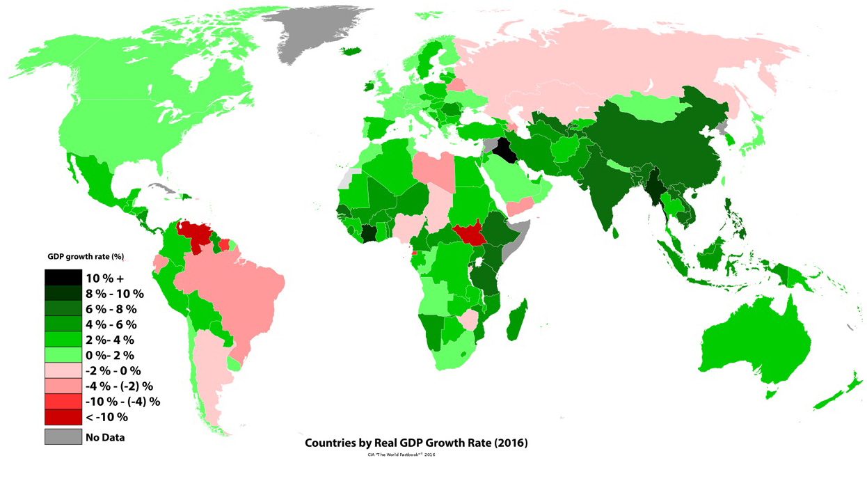 Policymakers around the world have used Gross Domestic Product as the main gauge of economic performance – and have often adopted policies that aim to maximise its rate of growth. Generation after generation of economists have committed significant time and effort to thinking about the factors that influence GDP growth, on the premise that an expanding and healthy economy is one that sees its GDP increasing every year at a sufficient rate.
But is economic output a good enough indicator of national economic wellbeing? Costanza et al (2014) (see link below) argue that, despite its merits, GDP can be a ‘misleading measure of national success’:
GDP measures mainly market transactions. It ignores social costs, environmental impacts and income inequality. If a business used GDP-style accounting, it would aim to maximize gross revenue — even at the expense of profitability, efficiency, sustainability or flexibility. That is hardly smart or sustainable (think Enron). Yet since the end of the Second World War, promoting GDP growth has remained the primary national policy goal in almost every country. Meanwhile, researchers have become much better at measuring what actually does make life worthwhile. The environmental and social effects of GDP growth is a misleading measure of national success. Countries should act now to embrace new metrics.
 The limitations of GDP growth as a measure of economic wellbeing and national strength are becoming increasingly clear in today’s world. Some of the world’s wealthiest countries are plagued by discontent, with a growth in populism and social discontent – attitudes which are often fuelled by high rates of poverty and economic hardship. In a recent report titled ‘The Living Standards Audit 2018’ published by the Resolution Foundation, a UK economic thinktank (see link below), the authors found that child poverty rose in 2016–17 as a result of declining incomes of the poorest third of UK households:
While the economic profile of UK households has changed, living standards – with the exception of pensioner households – have mostly stagnated since the mid-2000s. Typical household incomes are not much higher than they were in 2003–04. This stagnation in living standards for many has brought with it a rise in poverty rates for low to middle income families. Over a third of low to middle income families with children are in poverty, up from a quarter in the mid-2000s, and nearly two-fifths say that they can’t afford a holiday away for their children once a year. On the other hand, the share of non-working families in poverty has fallen, though not by enough to prevent an overall rise in poverty since 2010.
Their projections also show that this rise in poverty was likely to have continued in 2017–18:
Although the increase in broad measures of inequality were relatively muted last year, our nowcast suggests that there was a pronounced rise in poverty (measured after housing costs[…]. The increase in overall poverty (from 22.1 to 23.2 per cent) was the largest since 1988. But this was dwarfed by the increase in child poverty, which rose from 30.3 per cent to 33.4 per cent. […]The fortunes of middle-income households diverged from those towards the bottom of the distribution and so a greater share of households, and children, found themselves below the poverty threshold.
A simple literature search on Scope (or even Google Scholar) shows that there has been a significant increase in the number of journal articles and reports in the last 10 years on this topic. We do talk more about the limitations of GDP, but we are still using it as the main measure of national economic performance.
Is it then time to stop focusing our attention on GDP growth exclusively and start considering broader metrics of social development? And what would such metrics look like? Both interesting questions that we will try to address in coming blogs.
Articles
Report
Data
Hearing
Questions
- What are the main strengths and weakness of using GDP as measure of economic performance?
- Is high GDP growth alone enough to foster economic and social wellbeing? Explain your answer using examples.
- Write a list of alternative measures that could be used alongside GDP-based metrics to measure economic and social progress. Explain your answer.
 The median pay of chief executives of the FTSE 100 companies rose 11% in 2017 to £3.93 million per year, according to figures released by the High Pay Centre. By contrast, the median pay of full-time workers rose by just 2%. Given two huge pay increases for the CEOs of Persimmon and Melrose Industries of £47.1 million and £42.8 million respectively, the mean CEO pay rose even more – by 23%, from £4.58 million in 2016 to £5.66 million in 2017. This brings the ratio of the mean pay of FTSE 100 CEOs to that of their employees to 145:1. In 2000, the ratio was around 45:1.
These huge pay increases are despite criticisms from shareholders and the government over excessive boardroom pay awards and the desire for more transparency. In fact, under new legislation, companies with more than 250 employees must publish the ratio of the CEO’s total remuneration to the full-time equivalent pay of their UK employees on the 25th, 50th (median) and 75th percentiles. The annual figures will be for pay starting from the financial year beginning in 2019, which for most companies would mean the year from April 2019 to April 2020. Such a system has been introduced in the USA this year.
So why has the gap in pay widened so much? One reason is that there is no formal mechanism whereby workers can apply downward pressure on such awards. Although Theresa May, in her campaign to become Prime Minister in 2016, promised to put workers on company boards, the government has since abandoned the idea.
 Executive pay is awarded by remuneration committees. Membership of such committees consists of independent non-executive directors, but their degree of independence has frequently been called into question and there has been much criticism of such committees being influenced by their highest paying competitors or peers. This has had the effect of ratcheting up executive pay.
Then there is the question of the non-salary element in executive pay. The incentive and bonus payments are often linked to the short-term performance of the company, as reflected in, for example, the company’s share price. In a period when share prices in general rise rapidly – as we have seen over the past two years – executive pay tends to rise rapidly too. A frequent criticism of large UK businesses is that they have been too short-termist. What is more, bonuses are often paid despite poor performance.
There has been some move in recent years to make incentive pay linked more to long-term performance, but this has still led to many CEOs getting large pay increases despite lack-lustre long-term performance.
Then there is the question of shareholders and their influence on executive pay. Despite protests by many smaller shareholders, a large proportion of shares are owned by investment funds and their managers are often only too happy to vote through large executive pay increases at shareholder meetings.
So, while the pressures for containing the rise in executive pay remain small, the pay gap is likely to continue to widen. This raises the whole question of a society becoming increasingly divided between the few at the top and a large number of people ‘just getting by’ – or not even that. Will this make society even more fractured and ill at ease with itself?
Articles
Information and data
Questions
- How would you set about establishing whether CEOs’ pay is related to their marginal revenue product?
- To what extent is executive pay a reflection of oligopolistic/oligopsonistic behaviour?
- In what ways can game theory shed light on the process of setting the remuneration packages of CEOs? Is there a Nash equilibrium?
- What are the advantages and disadvantages of linking senior executives’ remuneration to (a) short-term company performance; (b) long-term company performance?
- What is/are the best indicator(s) of long-term company performance for determining the worth of senior executives?
- Consider the arguments for and against capping the ratio of CEOs’ remuneration to a particular ratio of either the mean or median pay of employees. What particular ratio might be worth considering for such a cap?
 Three international agencies, the IMF, the European Commission and the OECD, all publish six-monthly forecasts for a range of countries. As each agency’s forecasts have been published this year, so the forecasts for economic growth and other macroeconomic indicators, such as unemployment, have got more dire.


 OECD Economic Outlook, June 2020: the World Economy on a Tightrope
 Global economy faces a tightrope walk to recovery
 The issue of inequality has come into increasing focus over recent years. The impact of the COVID-19 pandemic raises further concerns that these inequalities may be exacerbated further. Here we provide an overview of some of the key patterns in current levels of wealth and income inequality in Britain. They show, for example, the markedly higher degree of inequality in wealth relative to income, the importance of property wealth and private pension wealth in determining levels of wealth, and the considerable variation in average wealth levels of households by age and location.
 Figure 1 shows the evolution of aggregate wealth over the last two surveys (at constant 2016-18 prices) by the four component parts. Two components dominate the aggregate wealth of British households: property wealth (35 per cent) and private pension wealth (41-42 per cent). Financial wealth is the third largest component (14 per cent), while property wealth is the smallest component (9 to 10 per cent). (Click
  Figure 2 shows the average wealth (at constant 2016-18 prices) as measured by the mean (aggregate divided by the number of households) and the median (the middle household). The mean wealth of households is seen to be greater than their median wealth. In April 2016 to March 2018, average wealth as measured by the mean was £564,300 (an increase of 40.3 per cent over July 2006 to June 2008), whilst the average wealth of each household as measured by the median was £286,600 (an increase of 28.5 per cent over July 2006 to June 2008). (Click
  Figure 3 shows the mean and median values of disposable income (adjusted for the number and age of individuals comprising each household). Mean disposable income of UK households in financial year ending (FYE) 2018 was £35,928, a 0.5 per cent real decrease over FYE 2017, whilst median wealth (middle household) was £29,598 in FYE 2018, a 1.5 per cent real increase over FYE 2017. (Click
  Figure 4 shows starkly the current inequality in wealth as compared to that in income. It does so by plotting their respective Lorenz curves. The curves show the proportion of overall wealth or income attributable to a given proportion of households. For example, 50 per cent of households have close to 28 per cent of total disposable income and a mere 8.5 per cent of aggregate wealth. (Click
  Figure 5 shows that the highest Gini coefficient is for net financial wealth. This stood at 91 per cent in April 2016 to March 2018. This extremely high figure shows the very high levels of inequatity in net financial wealth. This reflects the fact that some households find themselves with negative net financial wealth, such that their debts exceed their assets, whilst, on the other hand, some households can have large sums in financial investments. (Click
  Figure 6 shows the geographical disparity of median household wealth across Britain. The regions with the highest median wealth are the South East, South West, London and the East of England. They have the highest contributions from net property wealth (40.4 per cent, 35.6 per cent, 41.7 per cent and 37.2 per cent respectively). The region with the lowest median total wealth, the North East, has the least total wealth in net property wealth (24.8 per cent). (Click
  The IFS has launched a major
 Policymakers around the world have used Gross Domestic Product as the main gauge of economic performance – and have often adopted policies that aim to maximise its rate of growth. Generation after generation of economists have committed significant time and effort to thinking about the factors that influence GDP growth, on the premise that an expanding and healthy economy is one that sees its GDP increasing every year at a sufficient rate.
  The limitations of GDP growth as a measure of economic wellbeing and national strength are becoming increasingly clear in today’s world. Some of the world’s wealthiest countries are plagued by discontent, with a growth in populism and social discontent – attitudes which are often fuelled by high rates of poverty and economic hardship. In a recent report titled ‘The Living Standards Audit 2018’ published by the
  The median pay of chief executives of the FTSE 100 companies rose 11% in 2017 to £3.93 million per year, according to figures released by the
  Executive pay is awarded by remuneration committees. Membership of such committees consists of independent non-executive directors, but their degree of independence has frequently been called into question and there has been much criticism of such committees being influenced by their highest paying competitors or peers. This has had the effect of ratcheting up executive pay.