 There have been many analyses of the economic effects of Brexit, both before the referendum and at various times since, including analyses of the effects of the deal negotiated by Theresa May’s government and the EU. But with the prospect of a no-deal Brexit on 31 October under the new Boris Johnson government, attention has turned to the effects of leaving the EU without a deal.
There have been two major analyses recently of the likely effects of a no-deal Brexit – one by the International Monetary Fund (IMF) and one by the Office for Budget Responsibility (OBR).
IMF analysis
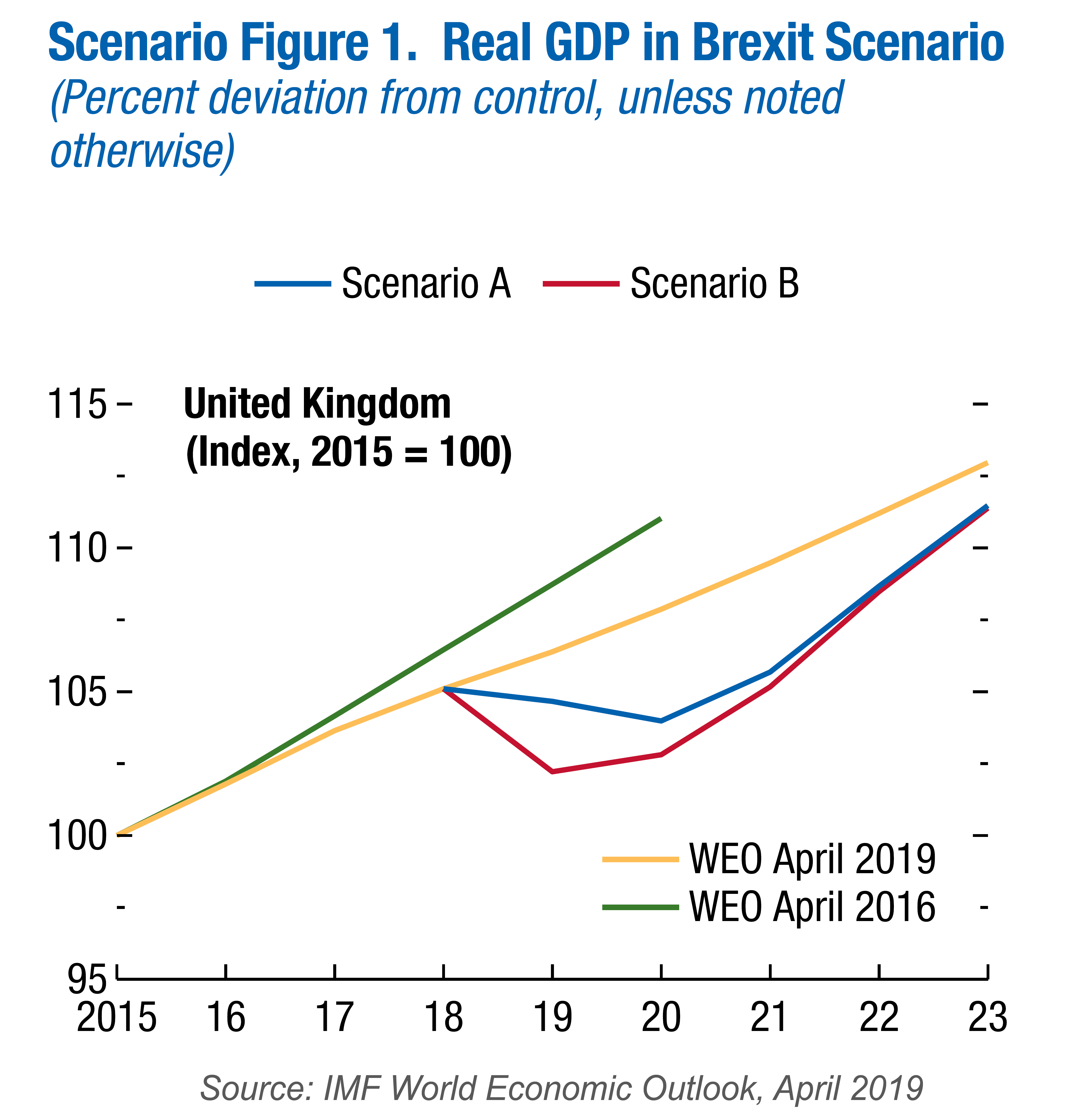
The first was in April by the IMF as part of its 6-monthly World Economic Outlook. In Scenario Box 1.1. ‘A No-Deal Brexit’ on page 28 of Chapter 1, the IMF looked at two possible scenarios.
Scenario A assumes no border disruptions and a relatively small increase in UK sovereign and corporate spreads. Scenario B incorporates significant border disruptions that increase import costs for UK firms and households (and to a lesser extent for the European Union) and a more severe tightening in financial conditions.
 Under both scenarios, UK exports to the EU and UK imports from the EU revert to WTO rules. As a result, tariffs are imposed by mid-2020 or earlier. Non-tariff barriers rise at first but are gradually reduced over time. Most free-trade arrangements between the EU and other countries are initially unavailable to the UK (see the blog EU strikes major trade deals) but both scenarios assume that ‘new trade agreements are secured after two years, and on terms similar to those currently in place.’
Both scenarios also assume a reduction in net immigration from the EU of 25 000 per year until 2030. Both assume a rise in corporate and government bond rates, reflecting greater uncertainty, with the effect being greater in Scenario B. Both assume a relaxing of monetary and fiscal policy in response to downward pressures on the economy.
The IMF analysis shows a negative impact on UK GDP, with the economy falling into recession in late 2019 and in 2020. This is the result of higher trade costs and reduced business investment caused by a poorer economic outlook and increased uncertainty. By 2021, even under Scenario A, GDP is approximately 3.5% lower than it would have been if the UK had left the EU with the negotiated deal. For the rest of the EU, GDP is around 0.5% lower, although the effect varies considerably from country to country.
The IMF analysis makes optimistic assumptions, such as the UK being able to negotiate new trade deals with non-EU countries to replace those lost by leaving. More pessimistic assumptions would lead to greater costs.
OBR analysis
Building on the analysis of the IMF, the Office for Budget Responsibility considered the effect of a no-deal Brexit on the public finances in its biennial Fiscal risks report, published on 17 July 2019. This argues that, under the relatively benign Scenario A assumptions of the IMF, the lower GDP would result in annual public-sector net borrowing (PSNB) rising. By 2021/22, if the UK had left with the deal negotiated with the EU, PSNB would have been around £18bn. A no-deal Brexit would push this up to around £51bn.
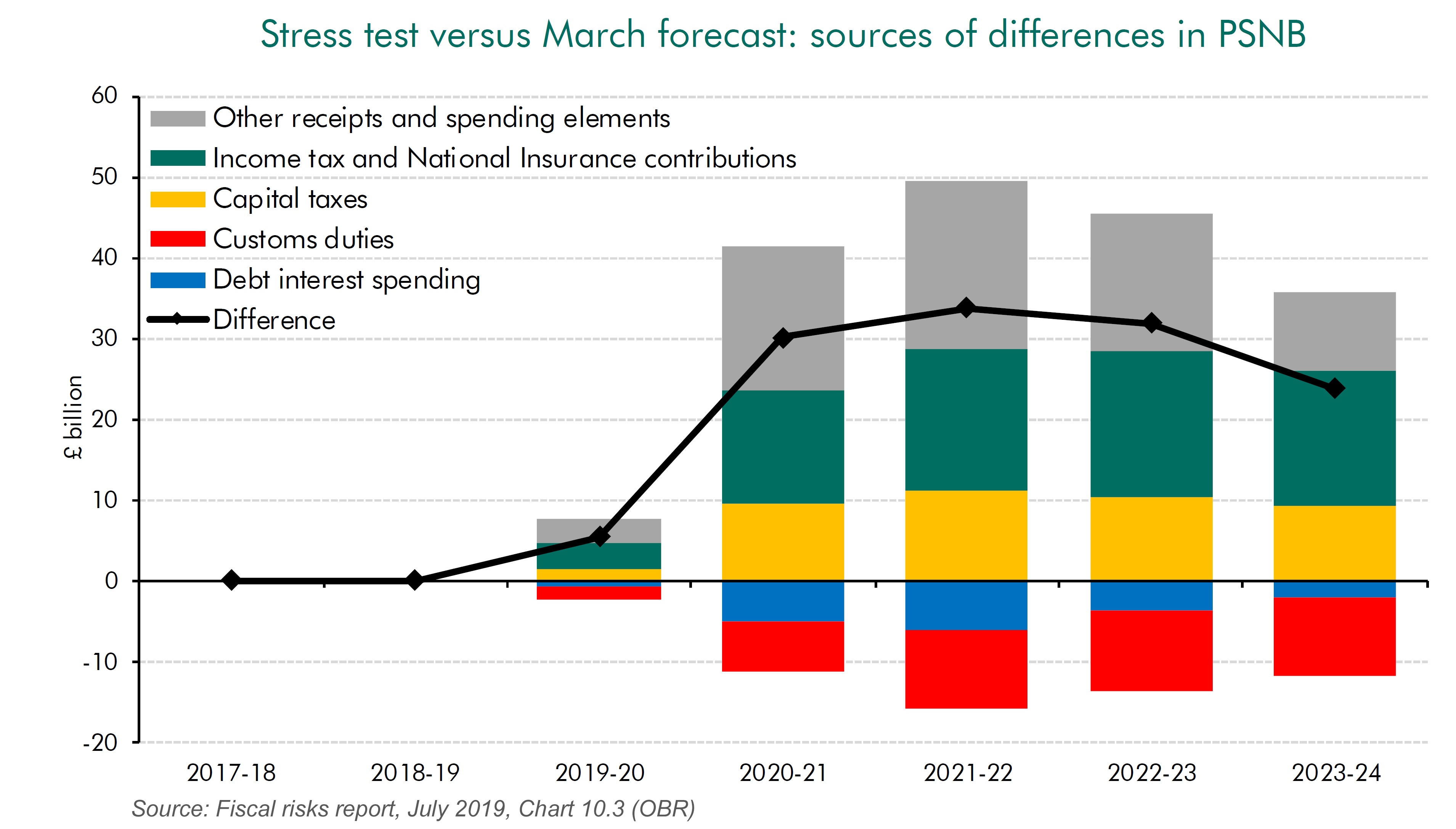
According to the OBR, the contributors to this rise in public-sector net borrowing of around £33bn are:
- A fall in income tax and national insurance receipts of around £16.5bn per year because of lower incomes.
- A fall in corporation tax and expenditure taxes, such as VAT, excise duties and stamp duty of around £22.5bn per year because of lower expenditure.
- A fall in capital taxes, such as inheritance tax and capital gains tax of around £10bn per year because of a fall in asset prices.
- These are offset to a small degree by a rise in customs duties (around £10bn) because of the imposition of tariffs and by lower debt repayments (of around £6bn) because of the Bank of England having to reduce interest rates.
The rise in PSNB would constrain the government’s ability to use fiscal policy to boost the economy and to engage in the large-scale capital projects advocated by Boris Johnson while making the substantial tax cuts he is proposing. A less optimistic set of assumptions would, of course, lead to a bigger rise in PSNB, which would further constrain fiscal policy.
Articles
Video
Reports
Questions
- What are the assumptions of the IMF World Economic Outlook forecasts for the effects of a no-deal Brexit? Do you agree with these assumptions? Explain.
- What are the assumptions of the analysis of a no-deal Brexit on the public finances in the OBR’s Fiscal risks report? Do you agree with these assumptions? Explain.
- What is the difference between forecasts and analyses of outcomes?
- For what reasons might growth over the next few years be higher than in the IMF forecasts under either scenario?
- For what reasons might growth over the next few years be lower than in the IMF forecasts under either scenario?
- For what reasons might public-sector net borrowing (PSNB) over the next few years be lower than in the OBR forecast?
- For what reasons might PSNB over the next few years be higher than in the OBR forecast?
 Today’s title is inspired from the British Special Air Service (SAS) famous catchphrase, ‘Who Dares Wins’ – similar variations of which have been adopted by several elite army units around the world. The motto is often credited to the founder of the SAS, Sir David Stirling (although similar phrases can be traced back to ancient Rome – including ‘qui audet adipiscitur’, which is Latin for ‘who dares wins’). The motto was used to inspire and remind soldiers that to successfully accomplish difficult missions, one has to take risks (Geraghty, 1980).
In the world of economics and finance, the concept of risk is endemic to investments and to making decisions in an uncertain world. The ‘no free lunch’ principle in finance, for instance, asserts that it is not possible to achieve exceptional returns over the long term without accepting substantial risk (Schachermayer, 2008).
 Undoubtedly, one of the riskiest investment instruments you can currently get your hands on is cryptocurrencies. The most well-known of them is Bitcoin (BTC), and its price has varied spectacularly over the past ten years – more than any other asset I have laid my eyes on in my lifetime.
The first published exchange rate of BTC against the US dollar dates back to 5 October 2009 and it shows $1 to be exchangeable for 1309.03 BTC. On 15 December 2017, 1 BTC was traded for $17,900. But then, a year later the exchange rate was down to just over $1 = $3,500. Now, if this is not volatility I don’t know what is!
In such a market, wouldn’t it be wonderful if you could somehow predict changes in market sentiment and volatility trends? In a hot-off-the press article, Shen et al (2019) assert that it may be possible to predict changes in trading volumes and realised volatility of BTC by using the number of BTC-related tweets as a measure of attention. The authors source Twitter data on Bitcoin from BitInfoCharts.com and tick data from Bitstamp, one of the most popular and liquid BTC exchanges, over the period 4/9/2014 to 31/8/2018.
According to the authors:
This measure of investor attention should be more informed than that of Google Trends and therefore may reflect the attention Bitcoin is receiving from more informed investors. We find that the volume of tweets are significant drivers of realised [price] volatility (RV) and trading volume, which is supported by linear and nonlinear Granger causality tests.
They find that, according to Granger causality tests, for the period from 4/9/2014 to 8/10/2017, past days’ tweeting activity influences (or at least forecasts) trading volume. While from 9/10/2017 to 31/8/2018, previous tweets are significant drivers/forecasters of not only trading volume but also realised price volatility.
And before you reach out for your smartphone, let me clarify that, although previous days’ tweets are found in this paper to be good predictors of realised price volatility and trading volume, they have no significant effect on the returns of Bitcoin.
Article
References
Questions
- Explain how the number of tweets can be used to gauge investors’ intentions and how it can be linked to changes in trading volume.
- Using Google Scholar, make a list of articles that have used Twitter and Google Trends to predict returns, volatility and trading volume in financial markets. Present and discuss your findings.
- Would you invest in Bitcoin? Why yes? Why no?
 It is impossible to make both precise and accurate forecasts of a country’s rate of economic growth, even a year ahead. And the same goes for other macroeconomic variables, such as the rate of unemployment or the balance of trade. The reason is that there are so many determinants of these variables, such as political decisions or events, which themselves are unpredictable. Economics examines the effects of human interactions – it is a social science, not a natural science. And human behaviour is hard to forecast.
Leading indicators
Nevertheless, economists do make forecasts. These are best estimates, taking into account a number of determinants that can be currently measured, such as tax or interest rate changes. These determinants, or ‘leading indicators’, have been found to be related to future outcomes. For example, surveys of consumer and business confidence give a good indication of future consumer expenditure and investment – key components of GDP.
Leading indicators do not have to be directly causal. They could, instead, be a symptom of underlying changes that are themselves likely to affect the economy in the future. For example, changes in stock market prices may reflect changes in confidence or changes in liquidity. It is these changes that are likely to have a direct or indirect causal effect on future output, employment, prices, etc.
Macroeconomic models show the relationships between variables. They show how changes in one variable (e.g. increased investment) affect other variables (e.g. real GDP or productivity). So when an indicator changes, such as a rise in interest rates, economists use these models to estimate the likely effect, assuming other things remain constant (ceteris paribus). The problem is that other things don’t remain constant. The economy is buffeted around by a huge range of events that can affect the outcome of the change in the indicator or the variable(s) it reflects.
Forecasting can never therefore be 100% accurate (except by chance). Nevertheless, by carefully studying leading indicators, economists can get a good idea of the likely course of the economy.
Leading indicators of the US economy
At the start of 2019, several leading indicators are suggesting the US economy is likely to slow and might even go into recession. The following are some of the main examples.
Political events. This is the most obvious leading indicator. If decisions are made that are likely to have an adverse effect on growth, a recession may follow. For example, decisions in the UK Parliament over Brexit will directly impact on UK growth.
 As far as the USA is concerned, President Trump’s decision to put tariffs on steel and aluminium imports from a range of countries, including China, the EU and Canada, led these countries to retaliate with tariffs on US imports. A tariff war has a negative effect on growth. It is a negative sum game. Of course, there may be a settlement, with countries agreeing to reduce or eliminate these new tariffs, but the danger is that the trade war may continue long enough to do serious damage to global economic growth.
But just how damaging it is likely to be is impossible to predict. That depends on future political decisions, not just those of the recent past. Will there be a global rise in protectionism or will countries pull back from such a destructive scenario? On 29 December, President Trump tweeted, ‘Just had a long and very good call with President Xi of China. Deal is moving along very well. If made, it will be very comprehensive, covering all subjects, areas and points of dispute. Big progress being made!’ China said that it was willing to work with the USA over reaching a consensus on trade.
Rises in interest rates. If these are in response to a situation of excess demand, they can be seen as a means of bringing inflation down to the target level or of closing a positive output gap, where real national income is above its potential level. They would not signify an impending recession. But many commentators have interpreted rises in interest rates in the USA as being different from this.
The Fed is keen to raise interest rates above the historic low rates that were seen as an ’emergency’ response to the financial crisis of 2007–8. It is also keen to reverse the policy of quantitative easing and has begun what might be described as ‘quantitative tightening’: not buying new bonds when existing ones that it purchased during rounds of QE mature. It refers to this interest rate and money supply policy as ‘policy normalization‘. The Fed maintains that such policy is ‘consistent with sustained expansion of economic activity, strong labor market conditions, and inflation near the Committee’s symmetric 2 percent objective over the medium term’.
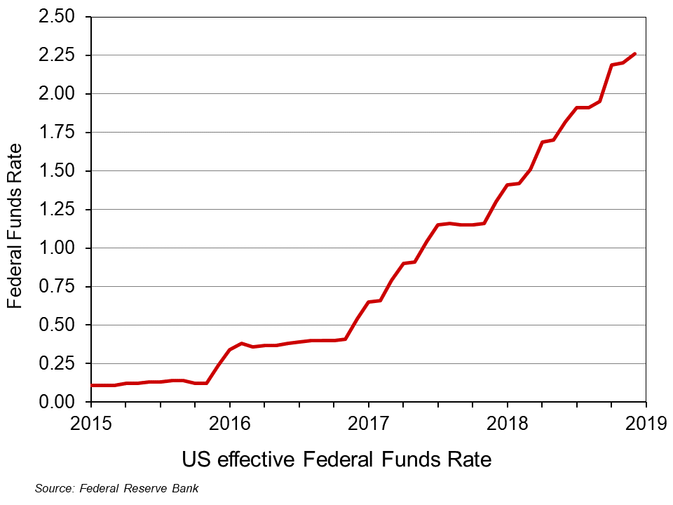 However, many commentators, including President Trump, have accused the Fed of going too fast in this process and of excessively dampening the economy. It has already raised the Federal Funds Rate nine times by 0.25 percentage points each time since December 2015 (click here for a PowerPoint file of the chart). What is more, announcing that the policy will continue makes such announcements themselves a leading indicator of future rises in interest rates, which are a leading indicator of subsequent effects on aggregate demand. The Fed has stated that it expects to make two more 0.25 percentage point rises during 2019.
 Surveys of consumer and business confidence. These are some of the most significant leading indicators as consumer confidence affects consumer spending and business confidence affects investment. According to the Duke CFO Global Business Outlook, an influential survey of Chief Financial Officers, ‘Nearly half (48.6 per cent) of US CFOs believe that the US will be in recession by the end of 2019, and 82 per cent believe that a recession will have begun by the end of 2020’. Such surveys can become self-fulfilling, as a reported decline in confidence can itself undermine confidence as both firms and consumers ‘catch’ the mood of pessimism.
Stock market volatility. When stock markets exhibit large falls and rises, this is often a symptom of uncertainty; and uncertainty can undermine investment. Stock market volatility can thus be a leading indicator of an impending recession. One indicator of such volatility is the VIX index. This is a measure of ’30-day expected volatility of the US stock market, derived from real-time, mid-quote prices of S&P 500® Index (SPXSM) call and put options. On a global basis, it is one of the most recognized measures of volatility – widely reported by financial media and closely followed by a variety of market participants as a daily market indicator.’ The higher the index, the greater the volatility. Since 2004, it has averaged 18.4; from 17 to 28 December 2018, it averaged 28.8. From 13 to 24 December, the DOW Jones Industrial Average share index fell by 11.4 per cent, only to rise by 6.2 per cent by 27 December. On 26 December, the S&P 500 index rallied 5 per cent, its best gain since March 2009.
Not all cases of market volatility, however, signify an impending recession, but high levels of volatility are one more sign of investor nervousness.
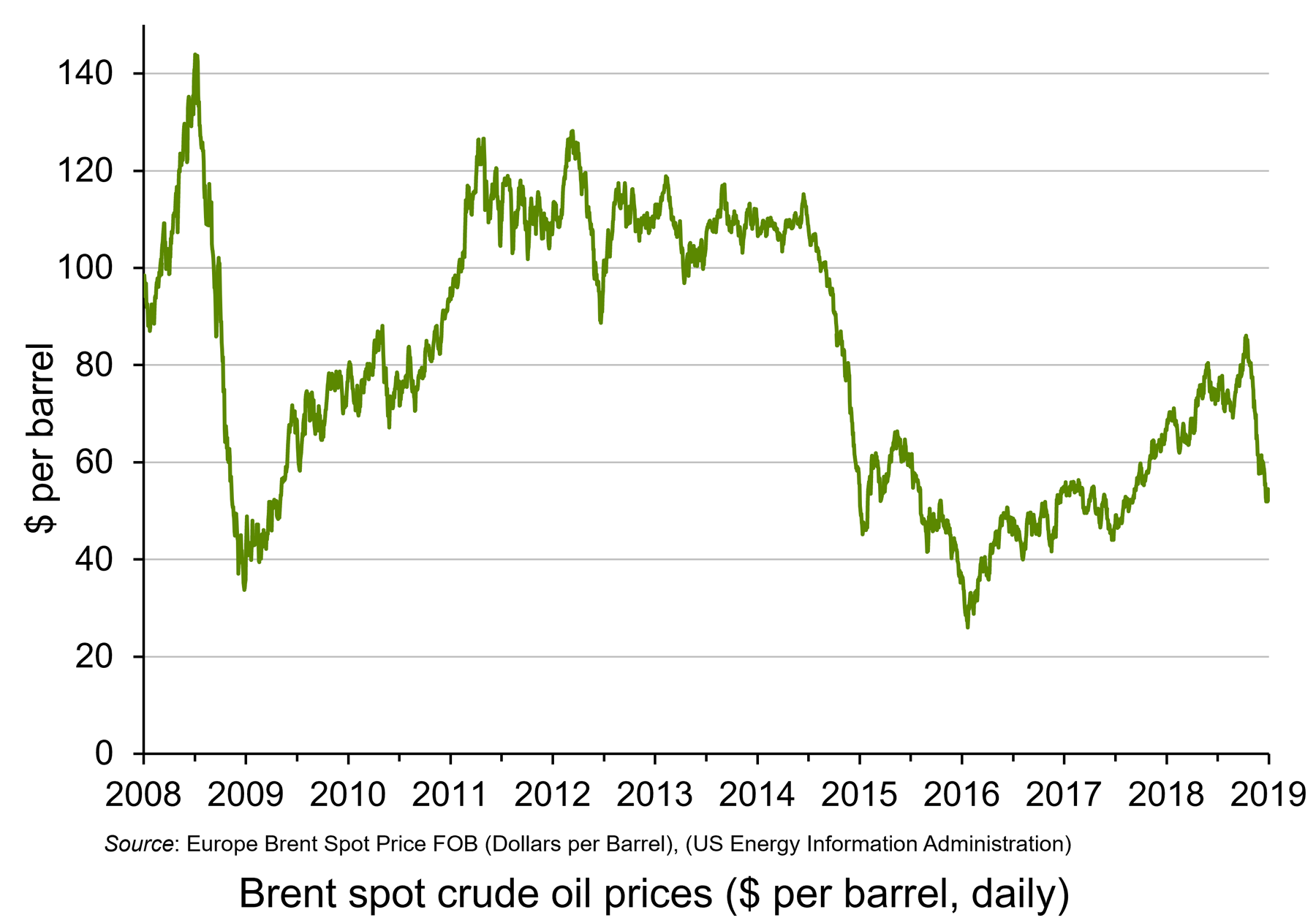 Oil prices. When oil prices fall, this can be explained by changes on the demand and/or supply side of the oil market. Oil prices have fallen significantly over the past two months. Until October 2018, oil prices had been rising, with Brent Crude reaching $86 per barrel by early October. By the end of the year the price had fallen to just over $50 per barrel – a fall of 41 per cent. (Click here for a PowerPoint file of the chart.) Part of the explanation is a rise in supply, with shale oil production increasing and also increased output from Russia and Saudi Arabia, despite a commitment by the two countries to reduce supply. But the main reason is a fall in demand. This reflects both a fall in current demand and in anticipated future demand, with fears of oversupply causing oil companies to run down stocks.
Falling oil prices resulting from falling demand are thus an indicator of lack of confidence in the growth of future demand – a leading indicator of a slowing economy.
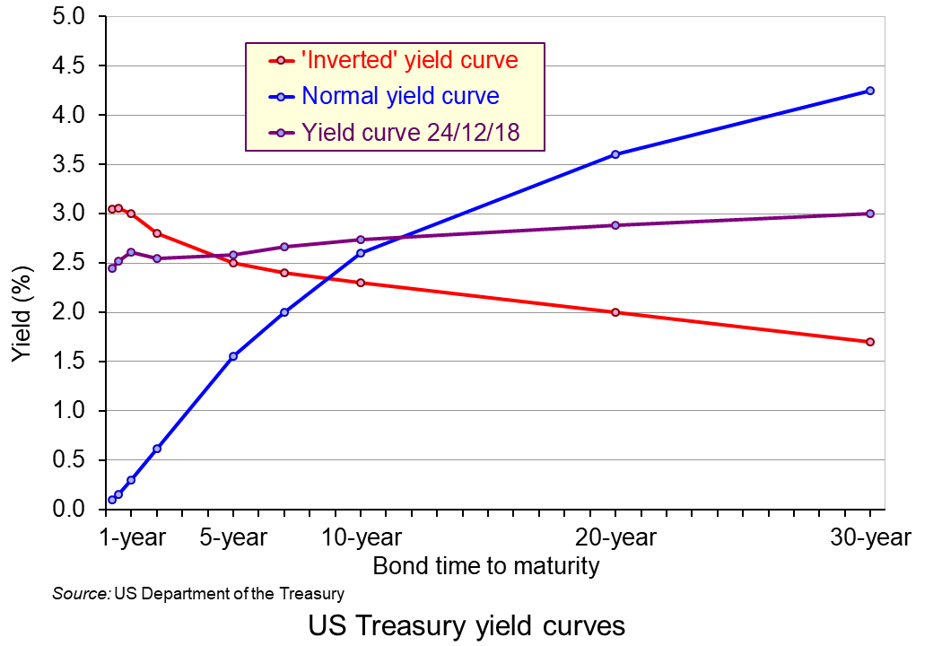 The yield curve. This depicts the yields on government debt with different lengths to maturity at a given point in time. Generally, the curve slopes upwards, showing higher rates of return on bonds with longer to maturity. This is illustrated by the blue line in the chart. (Click here for a PowerPoint file of the chart.) This is as you would expect, with people requiring a higher rate of return on long-term lending, where there is normally greater uncertainty. But, as the Bloomberg article, ‘Don’t take your eyes off the yield curve‘ states:
Occasionally, the curve flips, with yields on short-term debt exceeding those on longer bonds. That’s normally a sign investors believe economic growth will slow and interest rates will eventually fall. Research by the Federal Reserve Bank of San Francisco has shown that an inversion has preceded every US recession for the past 60 years.
The US economy is 37 quarters into what may prove to be its longest expansion on record. Analysts surveyed by Bloomberg expect gross domestic product growth to come in at 2.9 percent this year, up from 2.2 percent last year. Wages are rising as unfilled vacancies hover near all-time highs.
With times this good, the biggest betting game on Wall Street is when they’ll go bad. Barclays Plc, Goldman Sachs Group Inc., and other banks are predicting inversion will happen sometime in 2019. The conventional wisdom: Afterward it’s only a matter of time – anywhere from 6 to 24 months – before a recession starts.
As you can see from the chart, the yield curve on 24 December 2018 was still slightly upward sloping (expect between 6-month and 1-year bonds) – but possibly ready to ‘flip’.
However, despite the power of an ‘inverted’ yield in predicting previous recessions, it may be less reliable now. The Fed, as we saw above, has already signalled that it expects to increase short-term rates in 2019, probably at least twice. That alone could make the yield curve flatter or even downward sloping. Nevertheless, it is still generally thought that a downward sloping yield curve would signal belief in a likely slowdown, if not outright recession.
So, is the USA heading for recession?
The trouble with indicators is that they suggest what is likely – not what will definitely happen. Governments and central banks are powerful agents. If they believed that a recession was likely, then fiscal and monetary policy could be adjusted. For example, the Fed could halt its interest rate rises and quantitative tightening, or even reverse them. Also, worries about protectionism may subside if the USA strikes new trade deals with various countries, as it did with Canada and Mexico in USMCA.
Articles
- A jarring new survey shows CEOs think a recession could strike as soon as year-end 2019
Business Insider, Joe Ciolli (17/12/18)
- 4 Recession Indicators to Watch Now
Barron’s, Campbell Harvey (20/12/18)
- 9 Reasons the US Will Have a Recession Next Year
24/7 Wall St, Douglas A. McIntyre (26/12/18)
- The global economy is living dangerously – but don’t expect superpowers to follow the 2008 script
Independent, Ben Chu (3/1/19)
- Could a recession be just around the corner?
The Conversation, Amitrajeet A Batabyal (6/12/18)
- The US is on the edge of the economic precipice – Trump may push it over
The Guardian, Robert Reich (23/12/18)
- US prepares to hit the wall as reckless Trump undoes years of hard work
The Guardian, (Business Leader) (23/12/18)
- The first signs of the next recession
New Statesman, Helen Thompson (23/11/18)
- Is a Recession Coming? CFOs Predict 2019 Recession, Majority Expect Pre-2020 Market Crash
Newsweek, Benjamin Fearnow (12/12/18)
- Trade slowdown coming at worst time for world economy, markets
Reuters, Jamie McGeever (19/12/18)
- How to spot the next recession
The Week, Jeff Spross (27/11/18)
- What Is a Recession, and Why Are People Talking About the Next One?
New York Times, Niraj Chokshi (17/12/180
- For the American Economy, Storm Clouds on the Horizon
New York Times, Binyamin Appelbaum (28/11/18)
- Don’t Take Your Eyes Off the Yield Curve
Bloomberg Businessweek, Liz McCormick and Jeanna Smialek (16/11/18)
- What to expect from 2019’s ‘post-peak’ economy
CNN, Larry Hatheway (19/12/18)
- Worried about the next recession? Here’s what to watch instead of the yield curve
Quartz, Gwynn Guilford (17/12/18)
- Leading Economic Indicators and How to Use Them
The Balance, Kimberly Amadeo (10/9/18)
Surveys and Data
Questions
- Define the term ‘recession’.
- Are periods of above-trend expansion necessarily followed by a recession?
- Give some examples of leading indicators other than those given above and discuss their likely reliability in predicting a recession.
- Find out what has been happening to confidence levels in the EU over the past 12 months. Does this provide evidence of an impending recession in the EU?
- For what reasons may there be lags between a change in an indicator and a change in the variables for which it is an indicator?
- Why has the shape of the yield curve previously been a good predictor of the future course of the economy? Is it likely to be at present?
- What is the relationship between interest rates, government bond prices (‘Treasuries’ in the USA) and the yield on such bonds?
 The Winter Olympics are full on as athletes from all over the world compete against each other, hoping to set new world records, win medals and be known as Olympians. Pyeongchang, the South Korean county that hosts the 2018 Winter games, enjoys a large influx of tourists – estimated at 80,000 people a day. This is certainly an unusually large number of tourists for a region that has a regular winter-time population of no more than 45,000 people.
Having such a high number of visitors to the Winter Olympics, and even more to the larger Summer Olympics, is not an unusual occurrence, however, and it is often mentioned as one of the benefits of being a host to the Olympic Games.
Baade and Matheson (see link below) distinguish between three key benefits of hosting the Olympic Games: “the short-run benefits of tourist spending during the Games; the long-run benefits or the ‘Olympic legacy’, which might include improvements in infrastructure and increased trade, foreign investment, or tourism after the Games; and intangible benefits such as the ‘feel-good effect’ or civic pride”.
On these grounds, a number of studies have been authored, attempting to analyse some or all of these benefits, distinguishing between short-term and long-term effects. Müller (see link below), uses data from the 2014 Oympic Games in Sochi, Russia, to assess the net economic outcome for the host region. He concludes that any short-term economic benefits caused by the investment influx (before and during the games) could not offset the long-term costs, leading to an estimated net loss of $1.2 billion per year.
Zimbalist (2015) and Szymanski (2011) report similar results when analysing data from the London Games (2012) and past major sporting events (Games and FIFA World Cup). Kasimati (2003) points out the significant economic benefits that host regions tend to enjoy for years after hosting the games, but argues that the overall effect depends on a number of factors (including pre-existing infrastructure and location).
The jury is, therefore, still out on what is the overall economic effect of being host to this ancient institution. But I must now dash as women’s hockey is soon to start. “Let everyone shine”.
Articles
For the sake of the games, South Korea needs to show hosting an Olympics can be economically viable CNBC, Yen Nee Lee (15/2/18)
South Korea’s Olympic bet is unlikely to pay off, economics professor says CNBC, Andrew Wong and Andrew Zimbalist (12/2/18)
Going for the Gold: The Economics of the Olympics Journal of Economic Perspectives, Robert A. Baade and Victor A. Matheson (Spring 2016)
After Sochi 2014: Costs and Impacts of Russia’s Olympic Games Eurasian Geography and Economics, Martin Müller (9/4/15)
Circus Maximus: The Economic Gamble Behind Hosting the Olympics and the World Cup The Brookings Institution, Andrew Zimbalist (14/1/15)
About Winning: The Political Economy of Awarding the World Cup and the Olympic Games SAIS Review of International Affairs, Stefan Szymanski (Winter/Spring 2011)
Economic aspects and the Summer Olympics: a review of related research International Journal of Tourism Research, Evangelia Kasimati (4/11/03)
“Let Everyone Shine”: the song for the PyeongChang 2018 Torch Relay unveiled with 200 days to go Olympic Committee (24/7/17)
Video
 The Olympic Winter Games PyeongChang 2018 Torch Relay Official Song PyeongChang 2018
Questions
- Using supply and demand diagrams, explain whether you would expect hotel room prices to change during the hosting of a major sports event, such as the Winter Olympics.
- List three economic (or economics-related) arguments in favour of and against the hosting of the Olympic games. Relate your answer to the empirical evidence presented in the literature.
- Why is it so difficult to estimate with accuracy the net economic effect of the Olympic Games?
 In various blogs, we’ve looked at the UK’s low productivity growth, both relative to other countries and relative to the pre-1998 financial crisis (see, for example, The UK productivity puzzle and Productivity should we be optimistic?). Productivity is what drives long-term economic growth as it determines potential GDP. If long-term growth is seen as desirable, then a fall in productivity represents a serious economic problem.
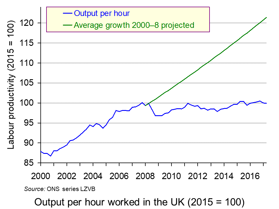
Recent data suggest that the problem, if anything, is worse than previously thought and does not seem to be getting better. Productivity is now some 21% below what it would have been had productivity growth continued at the rate experienced in the years before the financial crisis (see second chart below).
In its latest productivity statistics, the ONS reports that labour productivity (in terms of output per hour worked) fell by 0.1% in the second quarter of 2017. This follows a fall of 0.5% in quarter 1. Over the whole year to 2017 Q2, productivity fell by 0.3%.
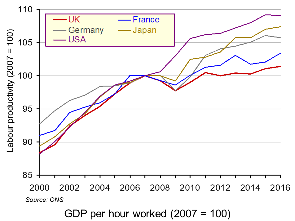
 Most other major developed countries have much higher productivity than the UK. In 2016, Italy’s productivity was 9.9% higher than the UK’s; the USA’s was 27.9%, France’s was 28.7% and Germany’s was 34.5% higher. What is more, their productivity has grown faster (see chart).
But what of the future? The Office for Budget responsibility publishes forecasts for productivity growth, but has consistently overestimated it. After predicting several times in the past that UK productivity growth would rise towards its pre-financial crisis trend of around 2% per year, in its October 2017 Forecast evaluation Report it recognises that this was too optimisitic and revises downwards its forecasts for productivity growth for 2017 and beyond.
As the period of historically weak productivity growth lengthens, it seems less plausible to assume that potential and actual productivity growth will recover over the medium term to the extent assumed in our most recent forecasts. Over the past five years, growth in output per hour has averaged 0.2 per cent. This looks set to be a better guide to productivity growth in 2017 than our March forecast of 1.6 per cent.
Looking further ahead, it no longer seems central to assume that productivity growth will recover to the 1.8 per cent we assumed in March 2017 within five years.
 But why has productivity growth not returned to pre-crisis levels? There are five possible explanations.
The first is that there has been labour hoarding. But with companies hiring more workers, this is unlikely still to be true for most employers.
The second is that very low interest rates have allowed some low-productivity companies to survive, which might otherwise have been driven out of business.
The third is a reluctance of banks to lend for investment. After the financial crisis this was driven by the need for them to repair their balance sheets. Today, it may simply be greater risk aversion than before the financial crisis, especially with the uncertainties surrounding Brexit.
The fourth is a fall in firms’ desire to invest. Although investment has recovered somewhat from the years directly following the financial crisis, it is still lower than might be expected in an economy that is no longer is recession. Indeed, there has been a much slower investment recovery than occurred after previous recessions.
The fifth is greater flexibility in the labour market, which has subdued wages and has allowed firms to respond to higher demand by taking on more relatively low-productivity workers rather than having to invest in human capital or technology.
Whatever the explanation, the solution is for more investment in both technology and in physical and human capital, whether by the private or the public sector. The question is how to stimulate such investment.
Articles
UK productivity lagging well behind G7 peers – ONS Financial Times, Katie Martin (6/10/17)
UK productivity sees further fall BBC News (6/10/17)
UK resigned to endless productivity gloom The Telegraph, Tim Wallace (10/10/17)
UK productivity estimates must be ‘significantly’ lowered, admits OBR The Guardian, Richard Partington and Phillip Inman (10/10/17)
UK productivity growth to remain sluggish, says OBR BBC News (10/10/17)
Official Treasury forecaster slashes UK productivity growth forecast, signalling hole in public finances for November Budget Independent, Ben Chu (10/10/17)
The Guardian view on Britain’s productive forces: they are not working The Guardian, Editorial (10/10/17)
Mind the productivity gap: the story behind sluggish earnings The Telegraph, Anna Isaac (26/10/17)
Data and statistical analysis
Labour productivity: April to June 2017 ONS Statistical Bulletin (6/10/17)
International comparisons of productivity ONS Dataset (6/10/17)
Forecast evaluation report OBR (October 2017)
Questions
- Explain the relationship between labour productivity and potential GDP.
- What is the relationship between actual growth in GDP and labour productivity?
- Why does the UK lag France and Germany more in output per hour than in output per worker, but the USA more in output per worker than in output per hour?
- Is there anything about the UK system of financing investment that results in lower investment than in other developed countries?
- Why are firms reluctant to invest?
- In what ways could public investment increase productivity?
- What measures would you recommend to encourage greater investment and why?
- How do expectations affect the growth in labour productivity?
 There have been many analyses of the economic effects of Brexit, both before the referendum and at various times since, including analyses of the effects of the deal negotiated by Theresa May’s government and the EU. But with the prospect of a no-deal Brexit on 31 October under the new Boris Johnson government, attention has turned to the effects of leaving the EU without a deal.
 Under both scenarios, UK exports to the EU and UK imports from the EU revert to WTO rules. As a result, tariffs are imposed by mid-2020 or earlier. Non-tariff barriers rise at first but are gradually reduced over time. Most free-trade arrangements between the EU and other countries are initially unavailable to the UK (see the blog EU strikes major trade deals) but both scenarios assume that ‘new trade agreements are secured after two years, and on terms similar to those currently in place.’
 No-deal Brexit would plunge UK into recession, OBR watchdog warns
 FT analysis of Brexit forecasts
 OBR Fiscal risks report – live stream
 Today’s title is inspired from the British Special Air Service (SAS) famous catchphrase, ‘Who Dares Wins’ – similar variations of which have been adopted by several elite army units around the world. The motto is often credited to the founder of the SAS, Sir David Stirling (although similar phrases can be traced back to ancient Rome – including ‘qui audet adipiscitur’, which is Latin for ‘who dares wins’). The motto was used to inspire and remind soldiers that to successfully accomplish difficult missions, one has to take risks (Geraghty, 1980).
 Undoubtedly, one of the riskiest investment instruments you can currently get your hands on is cryptocurrencies. The most well-known of them is Bitcoin (BTC), and its price has varied spectacularly over the past ten years – more than any other asset I have laid my eyes on in my lifetime.
  It is impossible to make both precise and accurate forecasts of a country’s rate of economic growth, even a year ahead. And the same goes for other macroeconomic variables, such as the rate of unemployment or the balance of trade. The reason is that there are so many determinants of these variables, such as political decisions or events, which themselves are unpredictable. Economics examines the effects of human interactions – it is a social science, not a natural science. And human behaviour is hard to forecast.
 As far as the USA is concerned, President Trump’s
  However, many commentators, including President Trump, have accused the Fed of going too fast in this process and of excessively dampening the economy. It has already raised the Federal Funds Rate nine times by 0.25 percentage points each time since December 2015 (click
  Surveys of consumer and business confidence. These are some of the most significant leading indicators as consumer confidence affects consumer spending and business confidence affects investment. According to the
  Oil prices. When oil prices fall, this can be explained by changes on the demand and/or supply side of the oil market. Oil prices have fallen significantly over the past two months. Until October 2018, oil prices had been rising, with Brent Crude reaching $86 per barrel by early October. By the end of the year the price had fallen to just over $50 per barrel – a fall of 41 per cent. (Click
  The yield curve. This depicts the yields on government debt with different lengths to maturity at a given point in time. Generally, the curve slopes upwards, showing higher rates of return on bonds with longer to maturity. This is illustrated by the blue line in the chart. (Click

