According to Ofcom’s November 2024 Online Nation report (see report linked below), UK adults are falling out of love with dating apps. Use of the top three platforms in the UK (Tinder, Hinge, and Bumble) is declining, even though most users are juggling multiple apps at once. So, what’s going on? Economics may have some valuable insights to help explain the decline.
Too much choice
 First, dating platforms don’t function like typical commodity markets, where prices adjust until supply and demand balance. Instead, dating can be seen as what economists call a ‘matching market’, where success depends on mutual interest, not on a specific price. So even with thousands of potential matches, forming actual connections remains difficult, and more choice doesn’t necessarily translate into better outcomes.
In fact, more choice can backfire. The paradox of choice, a behavioural economics concept, suggests that too many options can lead to choice paralysis. Instead of feeling empowered by an abundance of potential partners, users can feel overwhelmed, unsure, and often less satisfied with whatever choice they end up making (if they make one at all).
So, while we often think of dating apps, like many other platforms, benefiting from positive network effects, where more users increase the platform’s value by offering more potential matches, this can also have negative effects. Swiping through endless profiles and repeating the same small talk, can turn dating into a chore rather than an exciting opportunity.
Adverse selection
 What makes this even harder is that users can’t easily distinguish between who’s genuinely looking for the same thing you are, and who’s just there to pass the time. This information asymmetry leads to the adverse selection problem – a concept famously explored by economist George Akerlof in his 1970 paper ‘The Market for Lemons’ (see link below). He showed how lack of information about product quality can cause high-quality sellers to exit, resulting in market failure where the market becomes dominated by low-quality goods (i.e. ‘lemons’).
A similar dynamic can play out on dating apps. If users believe most profiles are unserious or not genuine, they become less willing to engage, or even stay on the platform. Meanwhile, the most genuine users may give up altogether, worsening the quality of the pool and discouraging others.
In economics, there are some well-known ways in which the problem of adverse selection could be overcome. One such possibility is through signalling, where the more informed person tries to reveal important information to the uninformed person. Indeed, platforms have experimented with signalling mechanisms, like verification tools for example. Paid subscriptions have also been implemented, which could help to some extent (assuming that those who are willing to pay are those who are genuine and serious about finding a match). But these solutions only go so far, and with fewer users paying to signal intent, the problem persists.
Lack of innovation
 This ties into the wider revenue model of dating apps. Unlike many apps that rely on revenue from advertising on one side of the market to offer the app free to consumers on the other side, dating platforms often rely more on revenue through monthly subscriptions and paid upgrades. But with fewer users willing to pay, these platforms may be under pressure. This financial pressure may also affect their ability to innovate or improve the service.
In fact, in the dating app world, there is another reason why platforms may not be innovating as much as they should, aside from simply trying to convince their users to pay for a better service. While it seems like there’s endless choice in the dating app world, much of the market is controlled by a single company, InterActiveCorp (IAC), which owns Tinder, Hinge, Match.com and more. With limited competition, there’s less incentive to compete on quality.
Worse still, dating apps face a unique business problem: if their service works too well, users leave and delete the app. So, there may be a built-in tension between helping users succeed and keeping them swiping.
The outlook for dating apps
So, is the decline in dating app use just temporary, or the start of something bigger? Time will tell. However, from an economics perspective, there is a noticeable shift in demand towards substitutes, such as organised in-person social events and activities, which encourages more and more of these opportunities to emerge. This shift may reflect changing preferences and the costs (in terms of time and emotional energy) that users are willing to invest in online dating.
At the same time, AI already plays a key role in dating apps, and new possibilities seem to be emerging. For example, we could see a bigger rollout of AI-driven chatbots that facilitate conversations or even interact on behalf of users. This could make it easier to connect with potential matches and might help in addressing some of the other issues discussed above.
Articles
Video
Report
Questions
- How might ‘signalling’ and ‘screening’ be used to create new features or services that could help overcome the adverse selection problem in this market?
- Can you think of any other ways in which the adverse selection problem could be overcome in this context?
- Draw a diagram to illustrate the two-sided nature of the dating app market, making clear where there may be positive or negative network effects.
- How else might dating app platforms be making revenue that allows them to offer the app to users at no charge?
- Is the dating app market competitive? You might consider factors such as the availability of substitutes, barriers to entry and innovation.
 On April 2nd, Donald Trump announced sweeping new ‘reciprocal’ tariffs. These would be in addition to 25% tariffs on imports of cars, steel and aluminium already announced and any other tariffs in place on individual countries, such as China. The new tariffs would apply to US imports from every country, except for Canada and Mexico where tariffs had already been imposed.
The new tariffs would depend on the size of the country’s trade in goods surplus with the USA (i.e. the USA’s trade in goods deficit with that country). The bigger the percentage surplus, the bigger the tariff. But, no matter how small a country’s surplus or even if it runs a deficit (i.e. imports more goods from the USA than it sells), it would still face a minimum 10% ‘baseline’ tariff.
President Trump stated that these tariffs are to counter what he claims as unfair trade practices inflicted on the USA. People had been expecting that these tariffs would reflect the tariffs applied by other countries on US goods and possibly also non-tariff barriers, such as the ban on chlorine-washed chicken or hormone-injected beef in the EU and UK. But, by basing them on the size of a country’s trade surplus, this meant imposing them on many countries with which the USA has a free-trade deal with no tariffs at all.
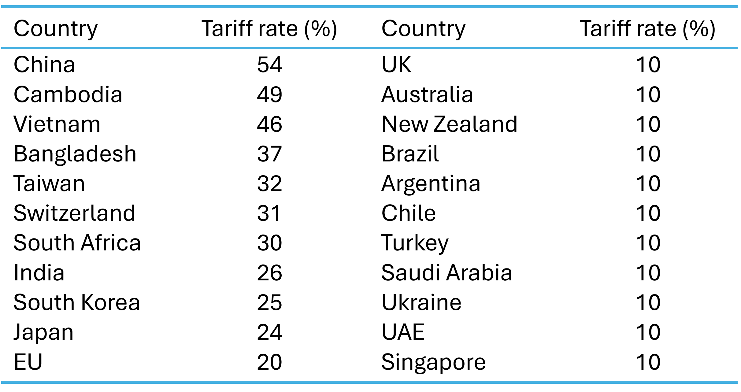 The table gives some examples of the new tariff rates. The largest rates would apply to China and south-east Asian countries, which supply low-priced products, such as clothing, footwear and electronics to the US market. In China’s case, it would a reciprocal tariff rate of 34% plus the previously imposed tariff rate of 20%, giving a massive 54%.
What is more, the ‘de minimis’ exemption will be scrapped for packages sent by private couriers. This had exempted goods of $800 or less sent direct to consumers from China and other countries from companies such as Temu and Alibaba. It is also intended to cut back on packages of synthetic opioids sent from these countries.
Since ‘liberation day’, President Trump has made several changes to these tariff rates. On 9 April he ‘paused’ the implementation of the tariffs above the 10% rate pending trade discussions with individual countries. However, in the case of China, there have been tit-for-tat tariff increases, so that by the end of April, the US tariff rate on Chinese imports was a massive 145% and the Chinese rate on US imports was 125%. The two countries seemed locked in a high-stakes game of chicken.
The US formula for reciprocal tariffs
As we have seen, the proposed (and then paused) reciprocal tariffs do not reflect countries’ tariff rates on the USA. Instead, rates for countries running a trade in goods surplus with the USA (a US trade deficit with these countries) are designed to reflect the size of that surplus as a percentage of their total imports from the USA. The White House has published the following formula.
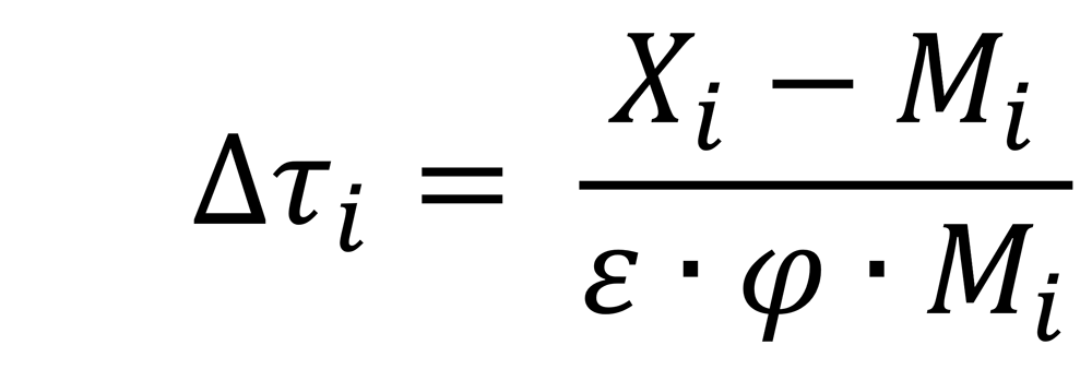
where:

When the two elasticities are multiplied together this gives 1 and so can be ignored. As there was no previous ‘reciprocal’ tariff, the rise in the reciprocal tariff rate is the actual reciprocal tariff rate. The formula for the reciprocal tariff rate thus becomes the percentage trade surplus of that country with the USA: (exports – imports) / imports, expressed as a percentage. This is then rounded up to the nearest whole number.
President Trump also stated that countries would be given a discount to show US goodwill. This involves halving the rate from the above formula and then rounding up to the nearest whole number.
Take the case of China. China’s exports of goods to the USA in 2024 were $439bn, while its imports of goods from the USA were $144bn, giving China a trade surplus with the USA of $295bn. Expressing this as a percentage of exports gives ($295/$439 × 100)/2 = 33.6%, rounded up to 34%. For the EU, the formula gives ($227bn/$584bn × 100)/2 = 19.4%, rounded up to 20%.
Questioning the value of φ. Even if you accept the formula itself as the basis for imposing tariffs, the value of the second term in the denominator, φ, is likely to be seriously undervalued. The term represents the elasticity of import prices with respect to tariff changes. It shows the proportion of a tariff rise that is passed on to consumers, which is assumed to be just one quarter, with producers bearing the remaining three quarters. In reality, it is highly likely that most of the tariff will get passed on, as it was with the tariffs applied in Donald Trump’s first presidency.
If the value for φ were 1 (i.e. all the tariff passed on to the consumer), the formula would give a ‘reciprocal tariff’ of just one quarter of that with a value of φ of 0.25. The figures in the table above would look very different. If the rates were then still halved, all countries with a tariff below 40% (such as the EU, Japan or India) would instead face just the baseline tariff of 10%. What is more, China’s rate would be reduced from 54% to 30% (the original 20% plus the baseline of 10%). Cambodia’s would be reduced to 13%. Even if the halving discount were no longer applied, the rates would still be only half of those shown in the table (and 37% for China).
Are the tariffs justified?
 Even if a correct value of φ were used, a percentage trade surplus is a poor way of measuring the protection used by a country. Many countries running a trade surplus with the USA are low-income countries with low labour costs. They have a comparative advantage in labour-intensive goods. That allows such goods to be purchased at low cost by Americans. Their trade surplus may not be a reflection of protection at all.
Also, if protection is to be used to reflect the trade imbalance with each country, then why impose a 10% baseline on countries, like the UK, with which the USA has a trade surplus? By the Trump administration’s logic, it ought to be subsidising UK imports or accepting of UK tariffs on imports of US goods.
But President Trump also wants to address the USA’s overall trade deficit. The US balance of trade in goods deficit was $1063bn in 2023 (the latest year for a full set of figures). But the overall balance of payments must balance. There were thus surpluses elsewhere on the balance of payments account (and some other deficits). There was a surplus on the services account of $278bn and on the financial account of $924bn. In other words, inward investment to the USA (both direct and portfolio) and the acquisition of dollars by other countries as a reserve asset were very large and helped to drive up the exchange rate. This made US goods less competitive and imports relatively cheaper.
The USA has a large national debt of some $36 trillion of which some $9 trillion is owed to foreign investors (people, institutions or countries). Servicing the debt pushes up US interest rates. This helps to maintain a high exchange rate, thereby making imports cheaper and worsening the trade deficit. The fiscal burden of servicing the debt also crowds out US government expenditure on items such as defence, education, law and order and infrastructure. President Trump hopes that tariffs will bring in additional revenue to help finance the deficit.
Effects on the USA
If the tariffs reduce spending on imports and if other countries do not retaliate, then the US balance of trade should improve. However, a tariff is effectively a tax on imported goods. It is charged to the importing company not to the manufacturer abroad. As we saw in the context of the false value for φ, most of the tariff will be passed on to American consumers. Theoretically the incidence of the tariff is shared between the supplier and the purchaser, but in practice, most of the higher cost to the importer will be passed on to the consumer. As with other taxes, the effect is to transfer money from the consumer to the government, making people poorer but giving the government extra revenue. This revenue will be dollars, not foreign currency.
As some of the biggest price rises will be for cheap manufactured products, such as imports from China, and various staple foodstuffs, the effects could be felt disproportionately by the poor. Higher import prices will allow domestic producers competing with these imports to raise their prices too. The tariffs are thus likely to be inflationary. But because the inflation would be the result of higher costs, not higher demand, this could lead to recession as real incomes fell.
American resources will be diverted by the tariffs from sectors in which the USA has a comparative advantage, such as advanced manufactured goods and services, to more basic products. Tariffs on cheap imports will make domestic versions of these products more profitable: even though they are more costly to produce, they will be sold at a higher price.
The tariffs will also directly affect goods produced by US companies. The reason is that many use complex supply chains involving parts produced abroad. Take the case of Apple. Even though it is an American company which designs its products in California, the company sources parts from several Asian countries and has factories in Vietnam, China, India, and Thailand. These components will face tariffs and thus directly affect the price of iPhones, iPads, MacBooks, etc. Similarly affected are other US tech hardware manufacturers, US car manufactures, clothing and footwear producers, such as The Gap and Nike, and home goods producers.
 Monetary policy response. How the Fed would respond is not clear. Higher inflation and lower growth, or even a recession, produces what is known as ‘stagflation’: inflation combined with stagnation. Many countries experienced stagflation following the Russian invasion of Ukraine, when higher commodity prices led to soaring inflation and economic slowdown. There was a cost-of-living crisis.
If a central bank has a simple mandate of keeping inflation to a target, higher inflation would be likely to lead to higher interest rates, making recession even more likely. It is the inflation of the two elements of stagflation (inflation and stagnation) that is addressed. The recession is thus likely to be deepened by monetary policy. But as the Fed has a dual mandate of controlling inflation but also of maximising employment, it may choose not to raise interest rates, or even to lower them, to get the optimum balance between these two targets.
If other countries retaliate by themselves raising tariffs on US exports and/or if consumers boycott American goods and services, this will further reduce incomes in the USA. Just two days after ‘liberation day’, China retaliated against America’s 34% additional tariff on Chinese imports by imposing its own 34% tariff on US imports to China.
A trade war will make the world poorer, especially the USA. Investors know this. In the two days following ‘liberation day’, stock markets around the world fell sharply and especially in the USA. The Dow Jones was down 9.3% and the tech-heavy Nasdaq Composite was down 11.4%.
Effects on the rest of the world
The effects of the tariffs on other countries will obviously depend on the tariff rate. The countries facing the largest tariffs are some of the poorest countries which supply the USA with simple labour-intensive products, such as garments, footwear, food and minerals. This could have a severe effect on their economies and cause rapidly increasing poverty and hardship.
 If countries retaliate, then this will raise prices of their imports from the USA and hurt their own domestic consumers. This will fuel inflation and push the more seriously affected countries into recession.
If the USA retaliates to this retaliation, thereby further escalating the trade war, the effects could be very serious. The world could be pushed into a deep recession. The benefits of trade, where all countries can gain by specialising in producing goods with low opportunity costs and importing those with high domestic opportunity costs, would be seriously eroded.
What President Trump hopes is that the tariffs will put him in a strong negotiating position. He could offer to reduce or scrap the tariffs on a particular country in exchange for something he wants. An example would be the offer to scrap or reduce the baseline 10% tariff on UK exports and/or the 25% tariff on UK exports of cars, steel and aluminium. This could be in exchange for the UK allowing the importation of US chlorinated chicken or abolishing the digital services tax. This was introduced in 2020 and is a 2% levy on tech firms, including big US firms such as Amazon, Alphabet (Google), Meta and X.
It will be fascinating but worrying to see how the politics of the trade war play out.
Videos
 Trump’s tariffs on China, EU and more, at a glance
BBC News, Michelle Fleury and Kayla Epstein (2/4/25)
 Why Trump’s tariffs aren’t really reciprocal
BBC News, Ben Chu (3/4/25)
 Trump Tariff calculations are “unreliable”
New Statesman on YouTube, Andrew Marr & Duncan Weldon (3/4/25)
 Here’s a look at Trump’s math for ‘reciprocal’ tariffs
Reuters on YouTube, Daniel Burns (3/4/25)
 The U.S. is the loser in Trump’s tariff war
MSNBC on YouTube, Steve Rattner (4/4/25)
 “American Empire Is in Decline”: Trump’s Trade War & Tariffs
Democracy Now on YouTube, Richard Wolff (3/4/25)
 ‘Our unity is our strength’ – EU responds to Trump’s tariffs
BBC News, Ursula von der Leyen, President of the European Commission (3/4/25)
Articles
- How were Donald Trump’s tariffs calculated?
BBC News, Ben Chu and Tom Edgington (3/4/25)
- How to read the White House’s tariff formula
Axios, Felix Salmon and Neil Irwin (3/4/25)
- Trump’s ‘idiotic’ and flawed tariff calculations stun economists
The Guardian, Richard Partington (3/4/25)
- Perilous and chaotic, Trump’s ‘liberation day’ endangers the world’s broken economy – and him
The Guardian, Martin Kettle (2/4/25)
- ‘In economic terms, Trump’s tariffs make no sense at all’
The Guardian, Heather Stewart and Richard Partington (4/3/25)
- Trump’s chaos-inducing global tariffs, explained in charts
The Guardian, Lauren Aratani, Lucy Swan, Ana Lucía González Paz and Aliya Uteuova (3/4/25)
- Trump’s trade war will hurt everyone – from Cambodian factories to US online shoppers
The Conversation, Lisa Toohey (3/4/25)
- Consumers are boycotting US goods around the world. Should Trump be worried?
The Conversation, Alan Bradshaw and Dannie Kjeldgaard (4/4/25)
- How the UK and Europe could respond to Trump’s ‘liberation day’ tariffs
The Conversation, Renaud Foucart (3/4/25)
- Trump just massively escalated his trade war. Here’s what he announced
CNN, Elisabeth Buchwald (2/4/25)
- EU plans countermeasures to new US tariffs, says EU chief
Reuters, Philip Blenkinsop and Benoit Van Overstraeten (3/4/25)
- Wall Street analysts anguish over ‘Liberation Day’
FT Alphaville, Robin Wigglesworth (3/4/25)
- Reciprocal tariffs: you won’t believe how they came up with the numbers
Financial Times, Alexandra Scaggs (3/4/25)
- Donald Trump baffles economists with tariff formula
Financial Times, Peter Foster and Sam Fleming (3/4/25)
 Five key takeaways from Trump’s ‘Liberation Day’ reciprocal tariffs
Aljazeera (3/4/25)
- These American companies are in big trouble from Trump tariffs
Axios, Nathan Bomey (3/4/25)
White House publications
Questions
- What is the law of comparative advantage? Does this imply that free trade is always the best alternative for countries?
- From a US perspective, what are the arguments for and against the tariffs announced by President Trump on 2 April 2025?
- What response to the tariffs is in the UK’s best interests and why?
- Should the UK align with the EU in responding to the tariffs?
- What is meant by a negative sum game? Explain whether a trade war is a negative sum game. Can a specific ‘player’ gain in a negative sum game?
- What happened to stock markets directly following President Trump’s announcement and what has happened since? Explain you findings.
For a while now, debate has raged over how to revive the fortunes of the London Stock Exchange (LSE). Since the 2008 financial crisis, the market has suffered a lack of investment, poor liquidity and low performance. This has produced a moribund financial market which has become unattractive to both investors and companies. Returns from the UK market lag international competitors, particularly the USA (see the chart).
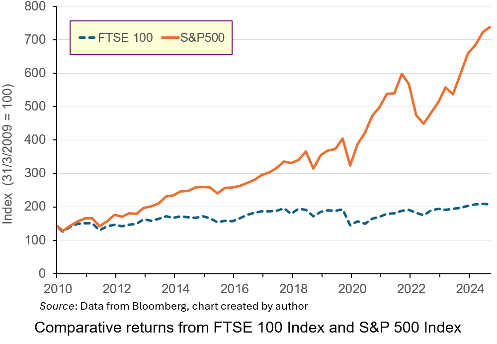
Investment in the S&P 500 Index over the period would have produced annualised rates of return of 14.35%, more than double that from the FTSE 100 Index. Part of this underperformance is due to the industrial mix of the listed companies: low-growth energy and mining compared to the high-growth technology sectors in the USA. This has led to the perception that London is not a place for firms to list, particularly those in high-growth sectors.
In 2024, 88 companies choose to delist or transfer their primary listing elsewhere. Only 18 took their place. Several big companies from a range of industries, including Ashtead, Flutter and CRH have transferred their primary listing to New York or have plans to do so.
 The new Labour government views stimulating higher levels of investment though the London market as an important element in its drive to boost productivity and growth in the UK. Recently, it has been reported that investment institutions have been lobbying the UK government to reduce significantly the tax-free allowance for Cash Individual Savings Accounts (ISAs) as a way to encourage more of UK households’ savings to be channelled through the UK stock market.
Currently, UK savers can save up to £20 000 annually into ISAs without paying tax on the interest earned. This can be held solely in Cash ISAs, or in a combination of Cash plus Stocks and Shares ISAs. The tax-free instruments which were introduced by a Labour government in 1999 to encourage higher savings have proved immensely popular. Data from Paragon Bank indicate that over £350 billion are held in these accounts. However, under the new proposals, the amount which would be allowed to be saved as cash has been rumoured to be cut to £4000 per year, with the hope that some of it will be invested in the UK stock market.
The proposals have proved controversial, with high-profile figures voicing opposition. In this blog, we’ll analyse the reasons behind the proposal and discuss whether it will have the desired effect of stimulating higher levels of investment. We’ll also discuss other proposed policies for making the LSE a more effective channel for investment flows to boost economic growth.
Stock markets and the saving and investment channel
 The main reason for the proposed ISA change is to encourage more investment in the UK stock market. By reducing the amount which can be saved in Cash ISAs, the government hopes to encourage savers to invest in Stocks and Shares ISAs instead, particularly ones linked to the UK market. This would increase the amount of finance capital in the market, thereby boosting its liquidity. This would then make it an attractive place for young, vibrant UK and foreign companies to list.
An active, liquid secondary market in shares is important to attract firms to list on stock exchanges by issuing shares to outside investors. Traditionally, this channel has been important to the growth and development of firms.
Existing savings in Cash ISAs are deposited with financial institutions such as banks and building societies. Through the credit-creation process such funds can be used to finance productive investment. In countries like the UK, lending by financial institutions is an important way that investment is financed, particularly for small and medium-sized enterprises. However, scale limits, regulatory restrictions and the need to diversify lending properly means that there are limits to the financing available for company investment through these institutions.
Capital markets like the LSE are intended to meet these larger-scale requirements. Financial claims, such as debt and equity, are divided into atomised instruments and sold to outside investors to fund investment and business growth.
 Further, the desire for a capital injection to finance growth is not the only reason that firms seek stock market listings. Founders of companies may have a lot of wealth invested in the equity of their firms. Selling some of their equity to outside investors through a stock market listing is a way of diversifying their wealth. However, if they are to maximise the potential sale price, there must be an active, liquid secondary market to encourage investors to buy shares in the primary market.
Proponents of reform want to encourage a greater appetite for risk among UK investors, which will produce more savings being channelled through the LSE.
One issue is whether savers will respond in the way anticipated and channel more funds through the UK stock market. Many savers like the security of Cash ISAs. Such vehicles offer a low-risk/low-return combination, which savers like because the tax benefits boost returns. A survey by the Nottingham Building Society found that a substantial number of Cash ISA savers are concerned that the proposed changes could affect their ability to save for important financial goals, such as buying a house or building an emergency fund. Higher-risk Stocks and Shares ISAs are not suitable for such savings because of the potential to lose the initial amount invested. Many may not be prepared to do so and one-third suggested they would save less overall.
According to the survey, only 38% of Cash ISA holders said they would consider investing in Stocks and Shares ISAs if the Cash ISA allowance were reduced. It may be difficult to alter such risk-averse preferences given the average amount saved through ISAs and demographics. In 2022/23, the average amount subscribed to ISAs was £5000. This does not suggest that average households have a significant surplus of cash that they may want to investment at a high risk through the stock market. Indeed, many may want to have access to the cash at short notice and so are not prepared to forgo liquidity for the time needed to accrue the benefits of compounding which stock market investing produces.
 Demographics may also play a role in this. Many of those who save more are now retired, or near retirement. They are less likely to see the appeal of compounding returns over long periods through investment in shares. Instead, with shorter investment horizons, they may only see the potential for losses associated with Stocks and Shares ISAs. Indeed, they will be starting to liquidate their long-term positions to draw income in retirement. Therefore, they may save less.
For others, who may be prepared to accept the additional risk, with the prospect of higher returns in the way that advocates of the reform hope for, the reduction in the Cash ISA allowance does not necessarily mean that they will invest in Stocks and Shares ISAs linked to the UK market. Since returns from the UK market have lagged international competitors, it may be that savers will channel their savings to those international markets, particularly in the USA, where the risk–return relationship has been more rewarding. Doing so has been made much easier and cheaper through a combination of economic forces including technological advances, regulatory changes and increased competition. This makes it much easier for UK savers to channel investment funds to wherever potential return is highest. At the moment, this is unlikely to be the UK, meaning that the anticipated boost to investment funds may not be as much as anticipated.
Critics of the proposal also question the motives of investment fund managers who have been lobbying government. They argue that the reforms will mean that many people who do now choose to save in Stocks and Shares ISAs will buy funds managed by fund managers who will receive fees for doing so. Critics argue that it is the prospect of higher fees which is the real motive behind the lobbying, not any desire to boost investment and growth.
What alternatives are available to boost the London Stock Exchange
 The low valuations of LSE-listed companies compared to their international counterparts, particularly those in the USA, has discouraged growing firms from listing in London. To address this, there have been calls to enhance corporate governance standards and reduce regulatory burdens for listed companies.
This has already been recognised by the authorities. In 2024, UK regulators approved the biggest overhaul of rules regulating London-listed companies. The new listing rules will hand more power to company bosses to make decisions without shareholder votes. They will give companies more flexibility to adopt dual-class share structures used by founders and venture capital firms to give themselves stronger voting rights than other investors. This is particularly popular for founders who want to diversify their wealth without sacrificing control and is used frequently by tech companies and venture capitalists when listing in the USA. Such reforms may attract more companies in high-growth sectors to list in London.
Tax policies which provide the right incentives to buy and sell shares could also encourage more investment in the LSE. For instance, the repeal in the mid-1990s of the preferential tax treatment of dividend income for UK pension funds and insurance companies is seen as a major factor in discouraging those institutions from investing more funds in the London market. Since tax on capital gains is only liable when they are realised, this reduces their present value versus the equivalent amount on dividends.
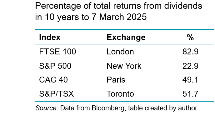
As the following table illustrates, given the significantly higher percentage of total returns derived from dividends in the LSE compared to other exchanges, the equal tax treatment of dividend and capital gains provides an incentive to seek jurisdictions where capital gains predominate. This is what UK pension funds have done. Data from the Office of National Statistics show that in 2024, 77% of UK occupational pensions equity investments were overseas.
Reinstating this tax benefit could stimulate greater demand for UK equity from this significant sector, boosting liquidity in the London market. Allied to this are proposals from the UK government to consolidate the fragmented UK pension industry to achieve greater scale economies in that channel for investment. This can reduce financing costs, boosting the marginal return from UK investments for these funds, encouraging greater investment in the UK market (ceteris paribus).
Further, the 2.5% stamp duty on share purchases has been viewed as another disincentive for both retail and institutional investors to engage in security trading on the London Stock Exchange. The duty, which is much higher than in peer economies, effectively raises the expected rate of return on UK equites which depresses perceptions of their values and prices. Its removal may raise trading volumes, improving the liquidity of the market and be offset by increased tax revenues in the future. However, the Treasury suggests that the removal of stamp duty is doubtful, since it would create a significant hole in the UK government’s budget.
 Ultimately, many of these reforms may have limited impact on investment. Efforts to boost confidence in the stock market will depend on improving the overall economic environment in the UK. Therefore, it will be the wider policies promoting growth in general which will increase the rates of return offered by London-listed firms and be more significant to attracting capital to London.
However, many of these are controversial themselves, such as relaxing laws around planning permissions and addressing business uncertainties around post-Brexit trading arrangements with the European Union. These broader economic measures could help make the UK generally, and the LSE specifically, more appealing to both domestic and international investors.
Conclusion
The UK government’s proposal to reduce the Cash ISA allowance is part of a broader strategy to boost investment in the stock market and stimulate economic growth. While this change could lead to more capital being directed towards productive investments, it also poses challenges for savers who like the security and simplicity of Cash ISAs.
The ultimate impact will depend on how savers respond to these changes. The potential reduction in overall savings rates could counteract some of the intended benefits. Further, the extent to which they are prepared to channel their savings into UK-listed companies will be important. If many seek higher returns elsewhere, the impact on the UK stock market may be limited. In any case, policies to address the problems of the UK stock market will only work if the wider issues associated with UK productivity and growth are addressed.
Articles
Data
Questions
- Explain how banks use cash ISAs to finance investment through credit creation.
- What do stock markets offer which may boost investment and economic growth?
- What are the issues with the London Stock Exchange which is making it unattractive for raising finance?
- How is the rumoured ISA reform intended to help address these issues?
- Analyse the extent to which it will do so.
- How might some of the broader reforms proposed by the UK government influence rate of return on UK equities and attract capital?
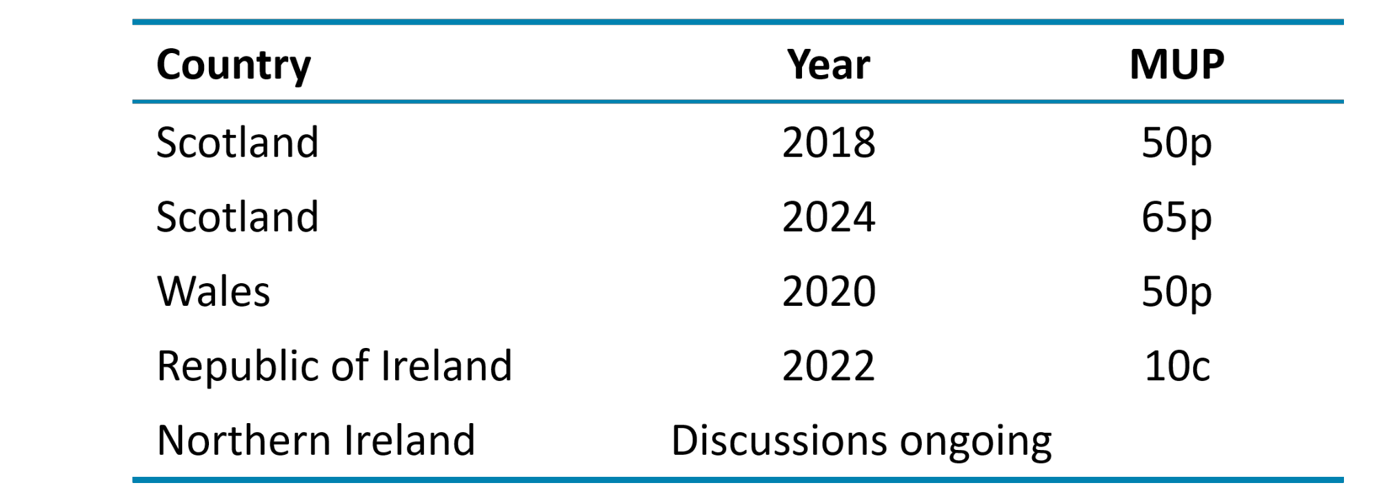
 The debate about a minimum price for alcohol continues to be prompted by concerns over high levels of drinking, its effect on public health and public order, and a widespread belief that most of the alcohol that contributes to drunken behaviour is irresponsibly priced and sold. Minimum pricing for alcohol, although considered a radical intervention, is not a new policy. A minimum unit price (MUP) for alcohol was introduced in Scotland in 2018, in Wales in 2020, in the Republic of Ireland in 2022 and looks likely to be introduced in Northern Ireland.
Despite more countries following Scotland’s lead, there are no current plans to consider an application of an MUP in England. However, with recent increases in the MUP in Scotland and the findings of a five-year review in Wales, it would suggest that this policy will continue to be at the forefront of discussions of how to tackle impacts of alcohol consumption.
Reasons and options for intervention
The main goal of introducing a minimum unit price for alcohol is to tackle unwanted consequences from the consumption of alcohol. While many people consume alcoholic drinks safely without any problems, some patterns of alcohol use are associated with significant physical, mental and social harm.
It costs UK society more than £27 billion a year through a combination of health, crime, workplace and social welfare costs. Therefore, some governments in the British Isles have deemed it necessary to intervene in this market to reduce alcohol-related harm and protect the health of those regularly drinking more than the recommended 14 units per week.
 Research has shown that making alcohol less affordable can reduce consumption and hence related harms. The World Health Organization considers minimum pricing one of its ‘best buys’ for tackling harmful alcohol use.
There are three main policy options that aim to reduce the consumption of alcohol by making alcohol less affordable. One is to tax alcoholic drinks; the second is to set a minimum price per unit of alcohol; the third is to ban the sale of alcohol drinks below cost price (the level of alcohol duty plus VAT).
The policy option of an MUP has been adopted by Scotland, Wales and the Republic of Ireland; England has opted to use a ban on selling alcohol below the level of alcohol duty plus VAT (since 28 May 2014).
What is a minimum price?
The introduction by the government of a minimum price for a product means that it cannot legally be sold below that price. It can be set in order to achieve certain economic or social objectives that are not currently being achieved at equilibrium in the market. In order for the policy to have an effect, the minimum price must be set above the equilibrium price. This price floor then prevents prices from falling too low and settling back at equilibrium below the MUP.
A common misconception is that introducing a minimum price for alcohol is a form of taxation. However, this is not the case. Implementing an MUP means that any extra money from higher prices goes to the retailers and producers, not to the government.
Why choose a minimum price floor?
The policy has two main objectives. The first is to protect the interests of drinkers who may make poor decisions on their own behalf. This may be from lack of information, social pressures or a disregard for their own long-term health or welfare.
The second objective is to reduce the external costs placed on health services, the police, the criminal justice system, on fellow citizens or employers. There are also longer-term external costs when alcohol abuse impacts on productivity or leads to repeated absences from work.
It is argued that MUP intervention can encourage positive changes in behaviour of both consumers and producers. It can target harmful excessive drinking, while leaving the more moderate drinker relatively unaffected.
 A positive impact on consumers is the possible changes in demand. People who previously consumed cheap, and often strong, drinks, such as cheap cider, will find that their marginal private cost of consuming alcohol has increased. Depending on the price elasticity of demand, their consumption will decrease and there will be a reduction in alcohol-related violence and other external costs. A positive impact on producers is that it can encourage drinks manufacturers themselves to reduce the alcohol content of their products and, therefore, limit any increase in price passed on to the consumer.
How it differs in the different parts of the British Isles
While minimum alcohol pricing is in place in several countries, policies differ. In terms of the British Isles, in 2018 Scotland became the first country to introduce a national minimum price for all types of alcohol. Two years later, Wales followed suit. The Republic of Ireland introduced minimum pricing in January 2022, while Northern Ireland has been engaged in consultation on the policy for several years. The following table shows when MUP was introduced and at what rates.
Has the MUP been effective?
Wales has reached the five-year review point since the MUP was introduced. Many of the findings within the Welsh evaluation have strong resonance with those elsewhere, particularly those of the final Scottish evaluation. There have been five main findings:
- Implementation has been smooth. Retailers have largely complied with the law, and enforcement has been effective.
- Certain cheap alcohol products have disappeared. Large bottles of strong cider, for example, are now rare. There have also been shifts in promotions and product availability.
- There are indications that overall alcohol consumption in Wales has declined. While it is difficult to measure directly, purchasing data suggests a reduction.
- Concerns about unintended consequences have not materialised significantly. Predictions of a rise in home brewing, substance switching, shoplifting and cross-border purchasing have not been widely observed.
- Some drinkers have changed their purchasing habits. A minority have switched from cider to wine or spirits as price differences narrowed. Others, particularly those on low incomes, experienced further struggles in financially maintaining their drinking habits.
There was also a study published last year (2024) in the journal Economic Inquiry, looking at the impacts of the policy during lockdown restrictions. The study showed that the introduction of MUP in Wales resulted in a 15% increase in transaction prices and a sharp reduction in the amount of alcohol bought, around 20%, with an overall drop in expenditure per customer compared to England over the same period.
However, it should be noted that the COVID pandemic disrupted drinking habits and the availability of alcohol. In addition, evaluating the overall effects of the policy has been complex with other economic factors, including the cost-of-living crisis, also influencing affordability.
Is it a fair policy?
A counter argument to applying a price intervention on alcohol is that it may have unintended private and external costs. One argument claims that young people could decide to switch to cheaper non-alcoholic drugs instead. Alternatively, they may seek to purchase alcohol on illegal shadow markets.
 Critics of the policy argue that it negatively impacts those who consume alcohol responsibly, especially families on average or below-average incomes. The wine and spirits industry tried to lobby against the Scottish government, arguing that it is inconsistent with the operation of the free market and that the intervention creates a barrier to trade. They claim that lower sales of alcoholic drinks will cost jobs in the UK, both in manufacturing and from reduced revenues of corner shops, pubs and other retailers.
There is also an argument that relying solely on an MUP targets the affordability of drinking rather than addressing all aspects of alcohol harm. Therefore, this policy is not necessarily effective in achieving all the government’s goals. Critics argue that this policy should be one component of a more comprehensive strategy delivery, which might include education, restricting the availability of alcohol, banning advertising, increasing alcohol duty, etc.
Conclusion
Although there are currently no plans to implement an MUP in England, there is ongoing pressure for the Government to consider adopting one. In the Autumn of 2024, Lord Darzi carried out an independent investigation of the NHS in England. This investigation into the NHS highlighted the ‘alarming’ death toll in England caused by cheap drink (see link below). This led public health leaders to call for action to increase the price of cheap alcohol in supermarkets and off-licences.
 However, the policy itself is not without its critics, especially those citing continued trends in actual numbers of alcohol-related deaths. Therefore, it is suggested that the policy needs to be accompanied by well-funded treatment and support services for people experiencing alcohol-related difficulties. If combined with other policy measures and social support, it has the potential to contribute significantly to reductions in alcohol-related harm.
Despite reservations, overall a minimum price per unit of alcohol is viewed by many as a justified intervention and is well supported by evidence. It has been accepted that a minimum price is required to reduce consumption closer towards the social optimum and in order to bring about change in consumer and producer behaviour. Given the evidence provided from current MUP countries and ongoing discussions of alcohol-related deaths in England, health officials believe a review is almost certain, even though the current government reportedly ruled out minimum unit pricing shortly after winning power.
Articles
Reports
Questions
- Using a supply and demand diagram, discuss the effect of introducing a minimum price per unit of alcohol.
- How is the price elasticity of demand for alcoholic drinks relevant to determining the success of minimum pricing?
- Compare the effects on alcohol consumption of imposing a minimum unit price of alcohol with a ban the sale of alcohol below cost price. What are the revenue implications of the two policies for the government?
- What negative externalities occur as a result in the over consumption of alcohol? How could a socially efficient price for alcohol be determined?
- Could alcohol consumption be described as a ‘de-merit good’? Explain.
- Rather than targeting the price of alcohol, what other policies could the government introduce to tackle over consumption of alcohol?
- What will determine the number of people travelling across borders within the UK (i.e. from Scotland or Wales to England) to buy cheaper alcoholic drinks?
 Economic growth is closely linked to investment. In the short term, there is a demand-side effect: higher investment, by increasing aggregate demand, creates a multiplier effect. GDP rises and unemployment falls. Over the longer term, higher net investment causes a supply-side effect: industrial capacity and potential output rise. This will be from both the greater quantity of capital and, if new investment incorporates superior technology, from a greater productivity of capital.
One of the biggest determinants of investment is certainty about the future: certainty allows businesses to plan investment. Uncertainty, by contrast, is likely to dampen investment. Investment is for future output and if the future is unknown, why undertake costly investment? After all, the cost of investment is generally recouped over several months or year, not immediately. Uncertainty thus increases the risks of investment.
 There is currently great uncertainty in the USA and its trading partners. The frequent changes in policy by President Trump are causing a fall in confidence and consequently a fall in investment. The past few weeks have seen large cuts in US government expenditure as his administration seeks to dismantle the current structure of government. The businesses supplying federal agencies thus face great uncertainty about future contracts. Laid-off workers will be forced to cut their spending, which will have knock-on effect on business, who will cut employment and investment as the multiplier and accelerator work through.
There are also worries that the economic chaos caused by President Trump’s frequent policy changes will cause inflation to rise. Higher inflation will prompt the Federal Reserve to raise interest rates. This, in turn, will increase the cost of borrowing for investment.
Tariff uncertainty
 Perhaps the biggest uncertainty for business concerns the imposition of tariffs. Many US businesses rely on imports of raw materials, components, equipment, etc. Imposing tariffs on imports raises business costs. But this will vary from firm to firm, depending on the proportion of their inputs that are imported. And even when the inputs are from other US companies, those companies may rely on imports and thus be forced to raise prices to their customers. And if, in retaliation, other countries impose tariffs on US goods, this will affect US exporters and discourage them from investing.
For many multinational companies, whether based in the USA or elsewhere, supply chains involve many countries. New tariffs will force them to rethink which suppliers to use and where to locate production. The resulting uncertainty can cause them to delay or cancel investments.
Uncertainty has also been caused by the frequent changes in the planned level of tariffs. With the Trump administration using tariffs as a threat to get trading partners to change policy, the threatened tariff rates have varied depending on how trading partners have responded. There has also been uncertainty on just how the tariff policy will be implemented, making it more difficult for businesses to estimate the effect on them.
Then there are serious issues for the longer term. Other countries will be less willing to sign trade deals with the USA if they will not be honoured. Countries may increasingly look to diverting trade from the USA to other countries.
Video
Articles
- Trump’s erratic trade policies are baffling businesses, threatening investment and economic growth
Associated Press, Paul Wiseman, Anne D’innocenzio and Mae Anderson (6/3/25)
- The world is beginning to tire of Trump’s whiplash leadership
CNN, Stephen Collinson (6/3/25)
- US stocks slide and Nasdaq enters correction as chaos over Trump’s tariffs intensifies
CNN, John Towfighi (6/3/25)
- Trump’s Tariffs And Trade: Uncertainty, Chaos Or Brilliance?
Forbes, Mike Patton (6/3/25)
- How Trump’s second term might affect the market and your finances
The Conversation, Art Durnev (4/3/25)
- US corporate bond investors cautiously navigate trade war uncertainty
Reuters, Matt Tracy (6/3/25)
 This week in Trumponomics: Playing chicken with markets
Yahoo Finance, Rick Newman (8/3/25)
- Measuring fear: What the VIX reveals about market uncertainty
The FRED Blog, Aakash Kalyani (13/2/25)
- Trump shrugs off stock market slump, but economic warning signs loom
The Conversation, Conor O’Kane (17/3/25)
Data
Questions
- Find out what tariffs have been proposed, imposed and changed since Donald Trump came to office on 20 January 2025.
- In what scenario might US investment be stimulated by Donald Trump’s policies?
- What countries’ economies have gained or are set to gain from Donald Trump’s policies?
- What is the USMCA agreement? Do Donald Trump’s policies break this agreement?
- Find out and explain what has happened to the US stock market since January 2025. How do share prices affect business investment?
- Which sector’s shares have risen and which have fallen?
- Using the Data link above, find out what has been happening to the US Policy Uncertainty Index since Donald Trump was elected and explain particular spikes in the index. Is this mirrored in the global Policy Uncertainty Index?
- Are changes in the Policy Uncertainty Index mirrored in the World Uncertainty Index (WUI) and the CBOE Volatility Index: VIX?
 First, dating platforms don’t function like typical commodity markets, where prices adjust until supply and demand balance. Instead, dating can be seen as what economists call a ‘matching market’, where success depends on mutual interest, not on a specific price. So even with thousands of potential matches, forming actual connections remains difficult, and more choice doesn’t necessarily translate into better outcomes.
 What makes this even harder is that users can’t easily distinguish between who’s genuinely looking for the same thing you are, and who’s just there to pass the time. This information asymmetry leads to the adverse selection problem – a concept famously explored by economist George Akerlof in his 1970 paper ‘The Market for Lemons’ (see link below). He showed how lack of information about product quality can cause high-quality sellers to exit, resulting in market failure where the market becomes dominated by low-quality goods (i.e. ‘lemons’).
  This ties into the wider revenue model of dating apps. Unlike many apps that rely on revenue from advertising on one side of the market to offer the app free to consumers on the other side, dating platforms often rely more on revenue through monthly subscriptions and paid upgrades. But with fewer users willing to pay, these platforms may be under pressure. This financial pressure may also affect their ability to innovate or improve the service.
  How Dating Apps Make Money and Why It’s Changing

 On April 2nd, Donald Trump announced sweeping new ‘reciprocal’ tariffs. These would be in addition to 25% tariffs on imports of cars, steel and aluminium already announced and any other tariffs in place on individual countries, such as China. The new tariffs would apply to US imports from every country, except for Canada and Mexico where tariffs had already been imposed.
 The table gives some examples of the new tariff rates. The largest rates would apply to China and south-east Asian countries, which supply low-priced products, such as clothing, footwear and electronics to the US market. In China’s case, it would a reciprocal tariff rate of 34% plus the previously imposed tariff rate of 20%, giving a massive 54%.

 Even if a correct value of φ were used, a percentage trade surplus is a poor way of measuring the protection used by a country. Many countries running a trade surplus with the USA are low-income countries with low labour costs. They have a comparative advantage in labour-intensive goods. That allows such goods to be purchased at low cost by Americans. Their trade surplus may not be a reflection of protection at all.
 Monetary policy response. How the Fed would respond is not clear. Higher inflation and lower growth, or even a recession, produces what is known as ‘stagflation’: inflation combined with stagnation. Many countries experienced stagflation following the Russian invasion of Ukraine, when higher commodity prices led to soaring inflation and economic slowdown. There was a cost-of-living crisis.
  If countries retaliate, then this will raise prices of their imports from the USA and hurt their own domestic consumers. This will fuel inflation and push the more seriously affected countries into recession.
 The new Labour government views stimulating higher levels of investment though the London market as an important element in its drive to boost productivity and growth in the UK. Recently, it has been reported that investment institutions have been lobbying the UK government to reduce significantly the tax-free allowance for Cash Individual Savings Accounts (ISAs) as a way to encourage more of UK households’ savings to be channelled through the UK stock market.
 The main reason for the proposed ISA change is to encourage more investment in the UK stock market. By reducing the amount which can be saved in Cash ISAs, the government hopes to encourage savers to invest in Stocks and Shares ISAs instead, particularly ones linked to the UK market. This would increase the amount of finance capital in the market, thereby boosting its liquidity. This would then make it an attractive place for young, vibrant UK and foreign companies to list.
  Further, the desire for a capital injection to finance growth is not the only reason that firms seek stock market listings. Founders of companies may have a lot of wealth invested in the equity of their firms. Selling some of their equity to outside investors through a stock market listing is a way of diversifying their wealth. However, if they are to maximise the potential sale price, there must be an active, liquid secondary market to encourage investors to buy shares in the primary market.
  Demographics may also play a role in this. Many of those who save more are now retired, or near retirement. They are less likely to see the appeal of compounding returns over long periods through investment in shares. Instead, with shorter investment horizons, they may only see the potential for losses associated with Stocks and Shares ISAs. Indeed, they will be starting to liquidate their long-term positions to draw income in retirement. Therefore, they may save less.
  The low valuations of LSE-listed companies compared to their international counterparts, particularly those in the USA, has discouraged growing firms from listing in London. To address this, there have been calls to enhance corporate governance standards and reduce regulatory burdens for listed companies.
 Ultimately, many of these reforms may have limited impact on investment. Efforts to boost confidence in the stock market will depend on improving the overall economic environment in the UK. Therefore, it will be the wider policies promoting growth in general which will increase the rates of return offered by London-listed firms and be more significant to attracting capital to London.
  The debate about a minimum price for alcohol continues to be prompted by concerns over high levels of drinking, its effect on public health and public order, and a widespread belief that most of the alcohol that contributes to drunken behaviour is irresponsibly priced and sold. Minimum pricing for alcohol, although considered a radical intervention, is not a new policy. A minimum unit price (MUP) for alcohol was introduced in Scotland in 2018, in Wales in 2020, in the Republic of Ireland in 2022 and looks likely to be introduced in Northern Ireland.
 Research has shown that making alcohol less affordable can reduce consumption and hence related harms. The World Health Organization considers minimum pricing one of its ‘best buys’ for tackling harmful alcohol use.
  A positive impact on consumers is the possible changes in demand. People who previously consumed cheap, and often strong, drinks, such as cheap cider, will find that their marginal private cost of consuming alcohol has increased. Depending on the price elasticity of demand, their consumption will decrease and there will be a reduction in alcohol-related violence and other external costs. A positive impact on producers is that it can encourage drinks manufacturers themselves to reduce the alcohol content of their products and, therefore, limit any increase in price passed on to the consumer.
 Critics of the policy argue that it negatively impacts those who consume alcohol responsibly, especially families on average or below-average incomes. The wine and spirits industry tried to lobby against the Scottish government, arguing that it is inconsistent with the operation of the free market and that the intervention creates a barrier to trade. They claim that lower sales of alcoholic drinks will cost jobs in the UK, both in manufacturing and from reduced revenues of corner shops, pubs and other retailers.
 However, the policy itself is not without its critics, especially those citing continued trends in actual numbers of alcohol-related deaths. Therefore, it is suggested that the policy needs to be accompanied by well-funded treatment and support services for people experiencing alcohol-related difficulties. If combined with other policy measures and social support, it has the potential to contribute significantly to reductions in alcohol-related harm.
 There is currently great uncertainty in the USA and its trading partners. The frequent changes in policy by President Trump are causing a fall in confidence and consequently a fall in investment. The past few weeks have seen large cuts in US government expenditure as his administration seeks to dismantle the current structure of government. The businesses supplying federal agencies thus face great uncertainty about future contracts. Laid-off workers will be forced to cut their spending, which will have knock-on effect on business, who will cut employment and investment as the multiplier and accelerator work through.
 Perhaps the biggest uncertainty for business concerns the imposition of tariffs. Many US businesses rely on imports of raw materials, components, equipment, etc. Imposing tariffs on imports raises business costs. But this will vary from firm to firm, depending on the proportion of their inputs that are imported. And even when the inputs are from other US companies, those companies may rely on imports and thus be forced to raise prices to their customers. And if, in retaliation, other countries impose tariffs on US goods, this will affect US exporters and discourage them from investing.