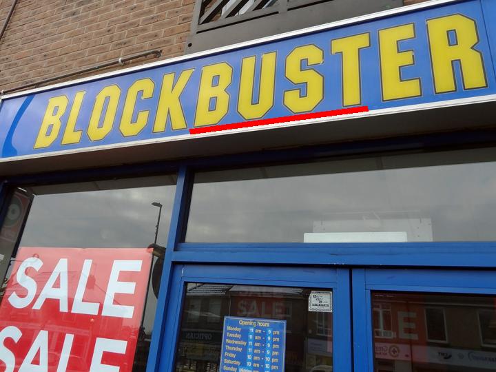
 The typical UK high street is changing. Some analysts have been arguing for some time that high streets are dying, with shops unable to face the competition from large supermarkets and out-of-town malls. But it’s not all bad news for the high street: while some types of shop are disappearing, others are growing in number.
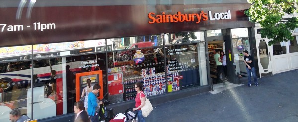
Part of the reason for this is the rise in online shopping; part is the longer-term effects of the recession. One consequence of this has been a shift in demand from large supermarkets (see the blog, Supermarket wars: a pricing race to the bottom). Many people are using local shops more, especially the deep discounters, but also the convenience stores of the big supermarket chains, such as Tesco Express and Sainsbury’s Local. Increasingly such stores are opening in shops and pubs that have closed down. As The Guardian article states:
The major supermarket chains are racing to open high street outlets as shoppers move away from the big weekly trek to out-of-town supermarkets to buying little, local and often.

Some types of shop are disappearing, such as video rental stores, photographic stores and travel agents. But other types of businesses are on the increase. In addition to convenience stores, these include cafés, coffee shops, bars, restaurants and takeaways; betting shops, gyms, hairdressers, phone shops and tattoo parlours. It seems that people are increasingly seeing their high streets as social places.
Then, reflecting the widening gap between rich and poor and the general desire of people to make their money go further, there has been a phenomenal rise in charity shops and discount stores, such as Poundland and Poundworld.

So what is the explanation? Part of it is a change in tastes and fashions, often reflecting changes in technology, such as the rise in the Internet, digital media, digital photography and smart phones. Part of it is a reflection of changes in incomes and income distribution. Part of it is a rise in highly competitive businesses, which challenge the previous incumbents.
But despite the health of some high streets, many others continue to struggle and the total number of high street stores across the UK is still declining.
What is clear is that the high street is likely to see many more changes. Some may die altogether, but others are likely to thrive if new businesses are sufficiently attracted to them or existing ones adapt to the changing market.
How the rise of tattoo parlours shows changing face of Britain’s high streets The Guardian, Zoe Wood and Sarah Butler (7/10/14)
The changing face of the British High Street: Tattoo parlours and convenience stores up, but video rental shops and travel agents down Mail Online, Dan Bloom (8/10/14)
High Street footfall struggles in August Fresh Business Thinking, Jonathan Davies (15/9/14)
Ghost town Britain: Internet shopping boom sees 16 high street stores close every day Mail Online, Sean Poulter (8/10/14)
Questions
- Which of the types of high street store are likely to have a high income elasticity of demand? How will this affect their future?
- What factors other than the types of shops and other businesses affect the viability of high streets?
- What advice would you give your local council if it was keen for high streets in its area to thrive?
- Why are many large superstores suffering a decline in sales? Are these causes likely to be temporary or long term?
- How are technological developments affecting high street sales?
- What significant changes in tastes/fashions are affecting the high street?
- Are you optimistic or pessimistic about the future of high streets? Explain.
 In two posts recently, we considered the pessimistic views of Robert Peston about the prospects for the global economy (see Cloudy skies ahead? and The end of growth in the West?). In this post we consider the views of Christine Lagarde, Managing Director of the International Monetary Fund, and Lord Adair Turner, the former head of the Financial Services Authority (FSA) (which was replaced in 2013 by the Financial Conduct Authority and the Prudential Regulation Authority).
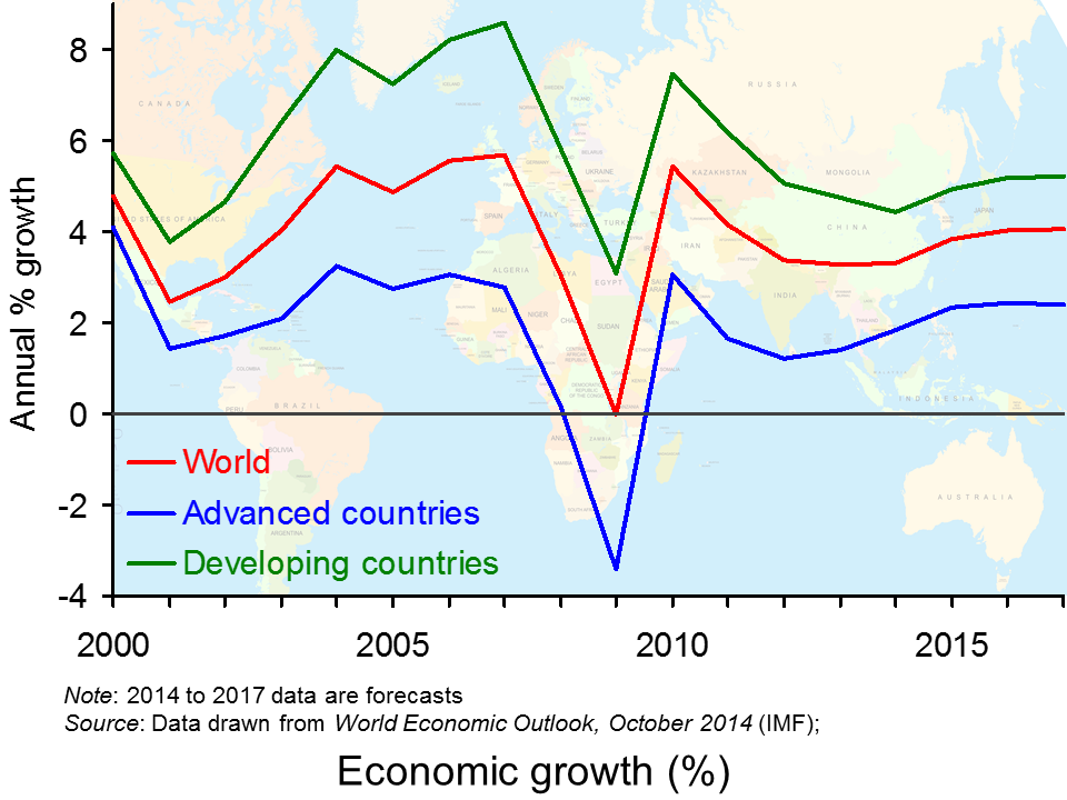
Christine Lagarde was addressing an audience at Georgetown University in Washington DC. The first four links below are to webcasts of the full speech and subsequent interviews about the speech.  She gives a more gloomy assessment of the global economy than six months ago, especially the eurozone economy and several emerging economies, such as China. There are short- to medium-term dangers for the world economy from political conflicts, such as that between Russia and the West over Ukraine. But there are long-term dangers too. These come from the effects of subdued private investment and low infrastructure spending by governments.
Her views are backed up by the six-monthly World Economic Outlook, published by the IMF on 7 October. There are links below to two webcasts from the IMF discussing the report and the accompanying datasets.
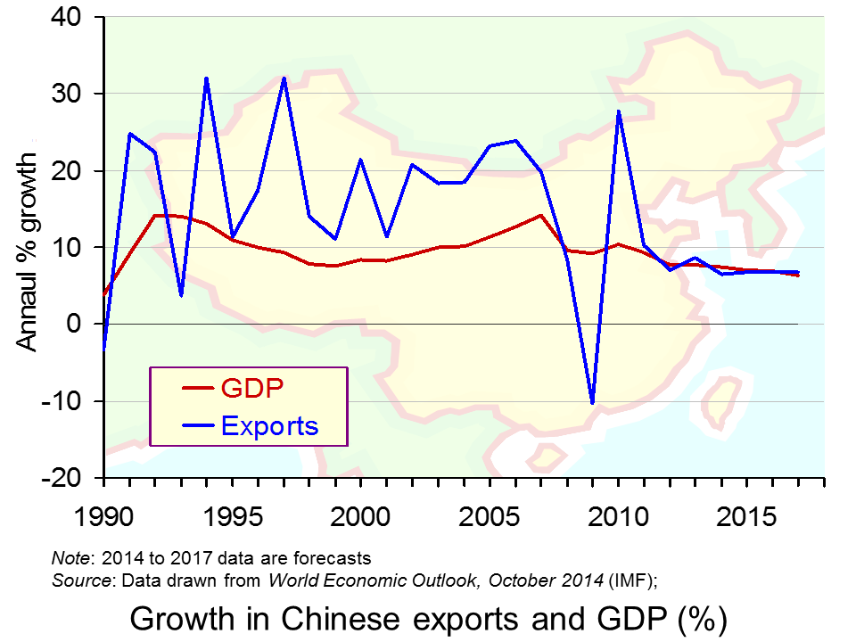
 In the final webcast link below, Lord Turner argues that there is a “real danger of a simultaneous slowdown producing a big setback to growth expectations.” He is particularly worried about China, which is experiencing an asset price bubble and slowing economic growth. Other emerging economies too are suffering from slowing growth. This poses real problems for developed countries, such as Germany, which are heavily reliant on their export sector.
Webcasts
 The Challenges Facing the Global Economy: New Momentum to Overcome a New Mediocre IMF Videos, Christine Lagarde (full speech) (2/10/14)
 Christine Lagarde downbeat on global economy BBC News Canada, Christine Lagarde interviewed by Katy Kay (2/10/14)
 IMF’s Lagarde on Global Economy, Central Banks Bloomberg TV, Christine Lagarde interviewed by Tom Keene (2/10/14)
 Lagarde: Global economy weaker than envisioned 6 months ago, IMF to cut growth outlook CNBC (2/10/14)
 IMF Says Uneven Global Growth Disappoints IMF Videos, Olivier Blanchard (7/10/14)
 Time Is Right for an Infrastructure Push IMF Videos, Abdul Ablad (30/9/14)
 China slowdown poses ‘biggest risk to global economy’ The Telegraph, Adair Turner (4/10/14)
Articles
Global Growth Disappoints, Pace of Recovery Uneven and Country-Specific IMF Survey Magazine (7/10/14)
Global economy risks becoming stuck in low growth trap The Telegraph, Szu Ping Chan (2/10/14)
American Exceptionalism Thrives Amid Struggling Global Economy Bloomberg, Rich Miller and Simon Kennedy (4/10/14)
World Bank cuts China growth forecast for next three years BBC News (6/10/14)
Beware a Chinese slowdown The Guardian, Kenneth Rogoff (6/10/14)
IMF says economic growth may never return to pre-crisis levels The Guardian, Larry Elliott (7/10/14)
IMF goes back to the future with gloomy talk of secular stagnation The Guardian, Larry Elliott (7/10/14)
Data
World Economic Outlook Database IMF (7/10/14)
World Economic Outlook IMF (October 2014)
Questions
- What are the particular ‘headwinds’ facing the global economy?
- Why is the outlook for the global economy more pessimistic now than six months ago?
- Why are increasing levels of debt and asset price rises a threat to Chinese economic growth?
- Why may China be more able to deal with high levels of debt than many other countries?
- In what ways are commodity prices an indicator of the confidence of investors about future economic growth?
- What are the determinants of long-term economic growth? Why are potential economic growth rates lower today than in the 2000s?
- How might governments today boost long-term economic growth?
- What are the arguments for and against governments engaging in large-scale public investment in infrastructure projects? What would be the supply-side and demand-side effects of such policies?
- If confidence is a major determinant of investment, how might bodies such as the IMF boost confidence?
- Why does the IMF caution against over-aggressive attempts to reduce budget deficits?
 On my commute to work on the 6th October, I happened to listen to a programme on BBC radio 4, which provided some fascinating discussion on climate change, growth, capitalism and the need for co-operation. With more countries emerging as leading economic powers, pollution and emissions continue to grow. Is it time for a green revolution?
The programme considers some ‘typical’ policies and also discusses some radical solutions. There is discussion on developing and developed nations and how these countries should be looked at in terms of compensation, entitlement and aid. Carrots and sticks are analysed as means of saving the planet and how environmental damage can be reduced, without adversely affecting the growth rate of the world economy. I won’t say any more, but it’s certainly worth listening to, for an interesting discussion on one of the biggest problems that governments across the world are facing and it is not going to go away any time soon.
 Naomi Klein on climate change and growth BBC Radio 4, Start the Week (6/10/14)
Questions
- What are the market failures with the environment?
- Why is global co-operation so important for tackling the problem of climate change?
- Which policies are discussed as potential solutions to the problem of climate change?
- What has been the problem with the European carbon trading scheme?
- Why may there be a trade-off between capitalism, growth and the problem of carbon emissions?
- To what extent do you think that countries such as Bangladesh should be ‘compensated’?
 The latest GDP numbers from the Office for National Statistics contained in Quarterly National Accounts, Q2 2014 show the economy’s output expanded by 0.9 per cent in the second quarter. This follows on the back of a 0.7 per cent increase in output in Q1 2014. The economy’s output is now thought to be 0.7 per cent above its Q1 2008 peak. Yet, the data show very different profiles for the four principal industrial sectors. The service sector appears to be ploughing ahead while the rest (production, construction and agriculture) lag behind.
 Chart 1 shows quarterly economic growth since 1980s (click here for a PowerPoint of the chart). It illustrates nicely the inherent volatility of economies – one of the threshold concepts in economics. The average quarterly rate of growth since 1980 has been 0.5 per cent. On the face of it, a quarterly growth number of 0.9 per cent would appear very robust. Of course, this has to been set in the context of the 2008/9 recession. UK output peaked in Q1 2008 (£414.424 billion at 2011 prices). The revised data now show that there followed 5 quarters of declining output (previously, data suggested the duration of the recession was 6 quarters). During this period output shrank 6 per cent (GDP at 2011 prices had fallen by Q2 2009 to £389.388 billion ).
Chart 1 highlights two earlier downturns. First, there is the recession of the early 1980s. We can see the 5-quarter recession that commenced in Q1 1980. By the end of this recession output had shrunk by 4.5 per cent. Second, there is the recession of the early 1990s which commenced in Q3 1990. Again, this recession lasted five quarters. By the time the economy had come out of recession it had shrunk 2.2 per cent.
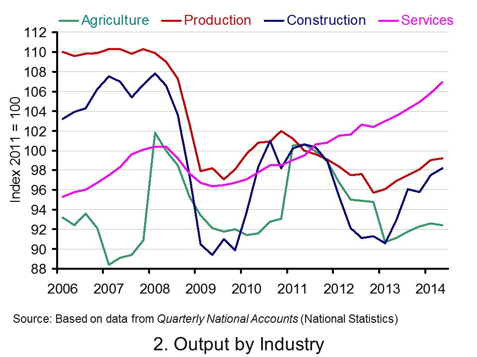
 Consider now Chart 2 (click here for a PowerPoint of the chart). It allows us to analyse more recent events by tracking how industrial output has evolved since 2006. It suggests an unbalanced recovery. From it, we observe that in Q2 2014 service-sector output was 6.5 per cent higher than in Q1 2008. However, a very different picture emerges for the other principal industrial types. Output across the production industries remains 9.7 per cent lower, 9.2 per cent lower in agriculture and 8.9 per cent lower in the construction sector.
In short, the British economy continues to struggle to rebalance its industrial base. The business cycle remains heavily dependent on the service sector.
Articles
UK GDP revised up: what the economists say Guardian, Katie Allen (30/9/14)
UK economy grew 0.9% in second quarter, says ONS BBC News, Katie Allen (9/5/14)
UK GDP: Did the UK economy do well after all? Independent, Ben Chu (30/9/14)
UK economy grew 0.9% Herald, Ian McConnell (1/10/14)
Economy tracker: GDP BBC News (30/9/14).
Data
Quarterly National Accounts, Q2 2014 Dataset Office for National StatisticsQuarterly National Accounts, Q2 2014, Statistical Release Office for National Statistics
Questions
- What is the difference between nominal and real GDP? Which of these helps to track changes in economic output?
- Looking at Chart 1 above, summarise the key patterns in real GDP since the 1980s.
- What is a recession?
- What are some of the problems with the traditional definition of a recession?
- Can a recession occur if nominal GDP is actually rising? Explain your answer.
- What factors lead to economic growth being so variable?
- What factors might explain the very different patterns seen since the late 2000s in the volume of output of the four main industrial sectors?
- What different interpretations could there be of a ‘rebalancing’ of the UK economy?
- What other data might we look at to analyse whether the UK economy is ‘rebalancing’?.
- Produce a short briefing paper exploring the prospects for economic growth in the UK over the next 12 to 18 months.
- What is the difference between GVA and GDP?
- Explain the arguments for and against using GDP as a measure of a country’s economic well-being.
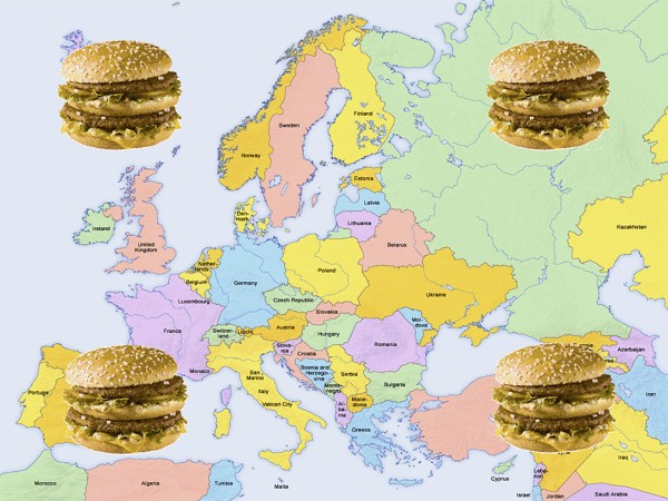
 At least once a year The Economist publishes its ‘hamburger standard’ exchange rates for currencies. It is a light-hearted attempt to see if currencies are exchanging at their purchasing-power parity rates. The test is the price at which a ‘Big Mac’ McDonald’s hamburger sells in different countries!
According to this simplified version of the purchasing-power parity theory, exchange rates should adjust so that a Big Mac costs the same in dollars everywhere (see Economics 8th edition Box 25.4).
These Big Mac exchange rates can be used to compare various prices and incomes between countries. The article linked below from The Guardian compares minimum wages between European countries in Big Mac terms.
There are 25 countries across Europe which have minimum wages. A clear pattern of minimum wage rates can be seen: although actual exchange rates understate the purchasing power of incomes in poorer European countries compared to richer ones, minimum wages, even in purchasing-power standard terms, are still higher in the richer countries.
Luxembourg’s minimum wage buys you just about three Big Macs in an hour, while most of northern Europe (and France) between 2–2.5 Big Macs. Moving south, the minimum wage nets about one Big Mac an hour. As we progress east, it begins to cost more than an hour of work on the minimum wage in order to afford a Big Mac.
Of course, there are other factors determining the dollar price of a Big Mac other than the failure of exchange rates to reflect purchasing-power parities. Nevertheless, using the Big Mac index in this way does give a useful preliminary snap shot of differences in what minimum wages can buy in different countries.
Articles
Comparing the minimum wage across Europe using the price of a Big Mac The Guardian datablog, Alberto Nardelli (25/9/14)
Minimum wage statistics Eurostat (Sept/14)
Data
Earnings Database Eurostat
Questions
- What is meant by ‘purchasing-power parity exchange rates’?
- Why may actual exchange rates not accurately reflect the purchasing power of currencies within countries?
- Using the link to Eurostat article above, compare Big Mac minimum wages with (a) actual minimum wages and (b) minimum wages expressed in purchasing-power standard terms.
- Using the links to the Eurostat article and Eurostat data, describe how the proportion of employees earning minimum wages varies across European countries. What factors determine this proportion?
- Using the same links, describe how the monthly minimum wage as a proportion of average monthly earnings varies across European countries. Explain these differences.
 The typical UK high street is changing. Some analysts have been arguing for some time that high streets are dying, with shops unable to face the competition from large supermarkets and out-of-town malls. But it’s not all bad news for the high street: while some types of shop are disappearing, others are growing in number.