 It is perhaps timely given the ongoing uncertainty around Brexit to revisit and update our blog Desperately seeking confidence written back in January. Consumer and business confidence reflects the sentiment, emotion, or anxiety of consumers and businesses. Confidence surveys therefore try to capture these feelings of optimism or pessimism. They may then provide us with timely information for the short-term prospects for private-sector spending. For example, declining levels of confidence might be expected to play a part in weakening the growth of consumption and investment spending.
Attempts are made to measure confidence through the use of surveys. One long-standing survey is that conducted for the European Commission. Each month consumers and firms across the European Union are asked a series of questions, the answers to which are used to compile indicators of consumer and business confidence. For instance, consumers are asked about how they expect their financial position to change. They are offered various options such as ‘get a lot better, ‘get a lot worse’ and balances are then calculated on the basis of positive and negative replies.
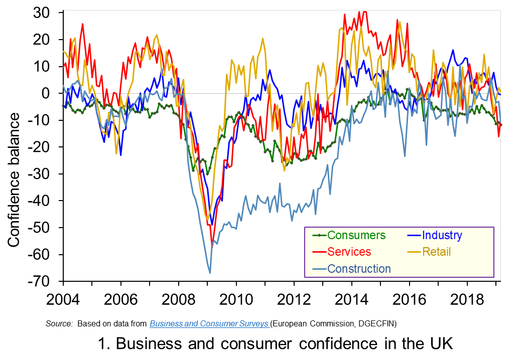 The chart plots confidence in the UK for consumers and different sectors of business since the mid 1990s. The chart captures the volatility of confidence. This volatility is generally greater amongst businesses than consumers, and especially so in the construction sector. (Click here to download a PowerPoint copy of the chart.)
Confidence measures rebounded across all sectors during the 2010s, with positive balances being recorded consistently from 2013 to 2016 in services, retail and industry. Subsequently, confidence indicators became more erratic though often remaining at above-average levels. However, confidence indicators have eased across the board in recent months. In some cases the easing has been stark. For example, the confidence balance in the service sector, which contributes about 80 per cent of the economy’s national income, fell from +10.9 in February 2018 to -16.2 in February 2019, though recovering slightly to -9.2 in March 2019.
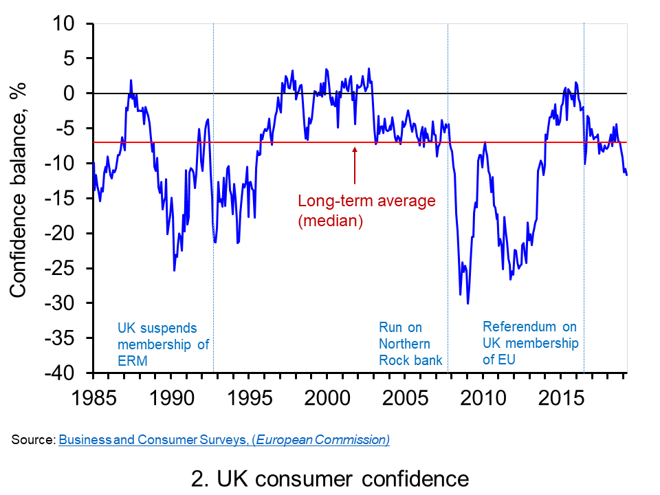 Chart 2 shows how the recent easing of consumer confidence has seen the confidence balance fall below its long-term (median) average of -7. In March 2019 the balance stood at -11.7 the lowest figure since November 2013. To put the easing into further perspective, the consumer confidence balance had been as high as +8.2 in September 2015. (Click here to download a PowerPoint copy of the chart.)
Changes in confidence are used frequently as an example of a demand shock. In reality changes in consumer confidence are often likely to be an amplifier of shocks rather than the source. For example, the collapse in aggregate demand in 2007/8 that followed the ‘credit crunch’, the severe tightening of credit conditions and financial distress of many sectors of the economy is likely to have been amplified by the collapse in consumer confidence. The weakening of confidence since 2016 is perhaps a purer example of a ‘confidence shock’. Nonetheless, falls in confidence, whether they amplify existing shocks or are the source of shocks, are often a signal of greater economic uncertainty.
Greater uncertainty is likely to go and hand in hand with lower confidence and is likely to reflect greater uncertainty about future income streams. The result is that people and businesses become more prudent. In the context of households this implies a greater willingness to engage in self-insurance through increased saving. This is known as buffer stock or precautionary saving. Alternatively, people may reducing levels of borrowing. In uncertain times prudence can dominate our impatience that encourages us to spend.
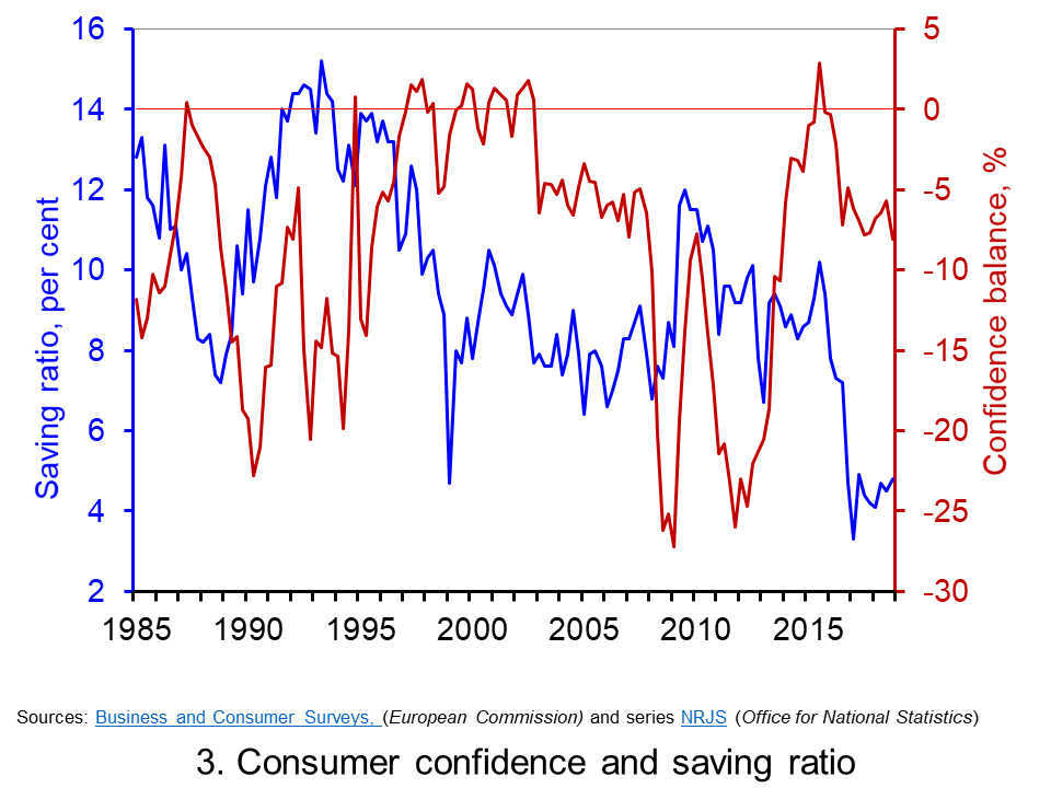 Chart 3 plots the paths of the UK household-sector saving ratio and consumer confidence. The saving ratio approximates the proportion of disposable income saved by the household sector. What we might expect to see, if greater uncertainty induces buffer-stock saving, is for falls in confidence to lead to a rise in the saving ratio. Conversely, less uncertainty as proxied by a rise in confidence would lead to a fall in the saving ratio. (Click here to download a PowerPoint of the chart.)
The chart provides some evidence of this. The early 1990s and late 2000s coincided with both waning confidence and a rising saving ratio, whilst the rising confidence seen in the late 1990s coincided with a fall in the saving ratio. However, the easing of confidence since 2016 has coincided with a period where the saving ratio has been historically low. In the first quarter of 2017 the saving ratio was just 3.3 per cent. Although the saving ratio has ticked up a little, in the final quarter of 2018 it remained historically low at just 4.9 per cent. Hence, the available data on the saving ratio does not provide clear evidence of the more cautious behaviour we might expect with waning confidence.
Consider now patterns in the consumer confidence balance alongside the annual rate of growth of consumer credit (net of repayments) to individuals by banks and building societies. Consumer credit is borrowing by individuals to finance current expenditure on goods and services.
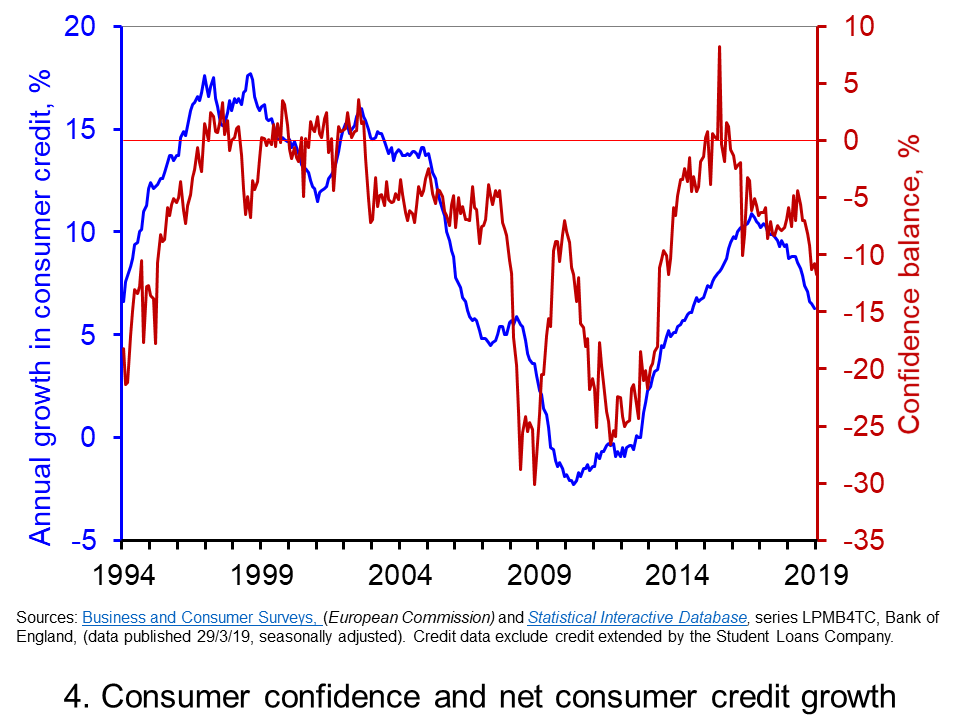 Data on consumer credit is more timely than that for the saving ratio. Therefore, Chart 4 shows the relationship between consumer confidence and consumer credit into 2019. We observe a reasonably close association consumer credit growth and consumer confidence. Certainty, the recent easing in confidence is mirrored by an easing in the annual growth of net consumer credit. (Click here to download a PowerPoint of the chart.)
The year-to-year growth in net consumer credit has eased considerably since the peak of 10.9 per cent in November 2016. In February 2019 the annual growth rate of net consumer credit had fallen back to 6.3 per cent, its lowest rate since September 2014. As we noted in our recent blog Riding the consumer credit cycle (again) it is hard to look much past the effect of Brexit in acting as a lid on the growth in consumer credit. Therefore, while the recent falls in consumer confidence have yet to markedly affect the saving ratio they may instead be driving the slowdown in consumer credit. The effect will be to weaken the growth of consumer spending.
Articles
Questions
- Draw up a series of factors that you think might affect both consumer and business confidence. How similar are both these lists?
- Which of the following statements is likely to be more accurate: (a) Confidence drives economic activity or (b) Economic activity drives confidence?
- What macroeconomic indicators would those compiling the consumer and business confidence indicators expect each indicator to predict?
- What is meant by the concept of ‘prudence’ in the context of spending? What factors might determine the level of prudence
- How might prudence be expected to affect spending behaviour?
- How might we distinguish between confidence ‘shocks’ and confidence as a ‘propagator’ of shocks?
- What is meant by buffer stock or precautionary saving? Draw up a list of factors that are likely to affect levels of buffer stock saving.
- If economic uncertainty is perceived to have increased how could this affect the consumption, saving and borrowing decisions of people?
 Consumer credit is borrowing by individuals to finance current expenditure on goods and services. Consumer credit is distinct from lending secured on dwellings (referred to more simply as ‘secured lending’). Consumer credit comprises lending on credit cards, lending through overdraft facilities and other loans and advances, for example those financing the purchase of cars. We consider here recent trends in the flows of consumer credit in the UK and discuss their implications.
Analysing consumer credit data is important because the growth of consumer credit has implications for the financial wellbeing or financial health of individuals and, of course, for financial institutions. As we shall see shortly, the data on consumer credit is consistent with the existence of credit cycles. Cycles in consumer credit have the potential to be not only financially harmful but economically destabilising. After all, consumer credit is lending to finance spending and therefore the amount of lending can have significant effects on aggregate demand and economic activity.
Data on consumer credit are available monthly and so provide an early indication of movements in economic activity. Furthermore, because lending flows are likely to be sensitive to changes in the confidence of both borrowers and lenders, changes in the growth of consumer credit can indicate turning points in the economy and, hence, in the macroeconomic environment.
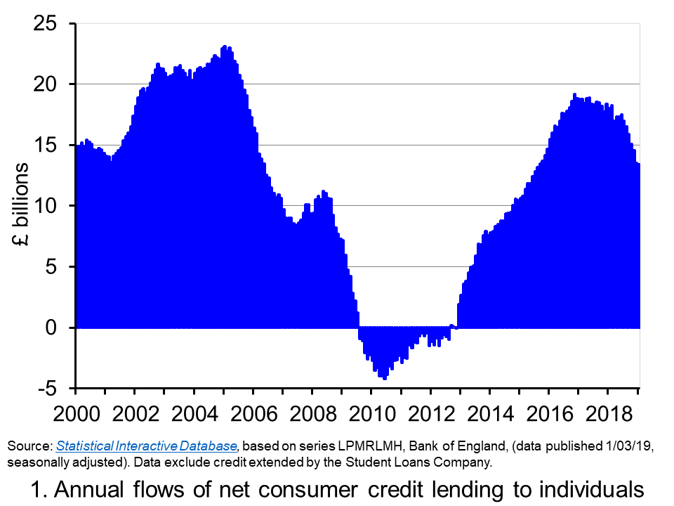 Chart 1 shows the annual flows of net consumer credit since 2000 – the figures are in £ billions. Net flows are gross flows less repayments. (Click here to download a PowerPoint copy of the chart.) In January 2005 the annual flow of net consumer credit peaked at £23 billion, the equivalent of just over 2.5 per cent of annual disposable income. This helped to fuel spending and by the final quarter of the year, the economy’s annual growth rate had reached 4.8 per cent, significantly about its long-run average of 2.5 per cent.
By 2009 net consumer credit flows had become negative. This meant that repayments were greater than additional flows of credit. It was not until 2012 that the annual flow of net consumer credit was again positive. Yet by November 2016, the annual flow of net consumer credit had rebounded to over £19 billion, the equivalent of just shy of 1.5 per cent of annual disposable income. This was the largest annual flow of consumer credit since September 2005.
Although the strength of consumer credit in 2016 was providing the economy with a timely boost to growth in the immediate aftermath of the referendum on the UK’s membership of the EU, it nonetheless raised concerns about its sustainability. Specifically, given the short amount of time that had elapsed since the financial crisis and the extreme levels of financial distress that had been experienced by many sectors of the economy, how susceptible would people and organisations be to a future economic slowdown and/or rise in interest rates?
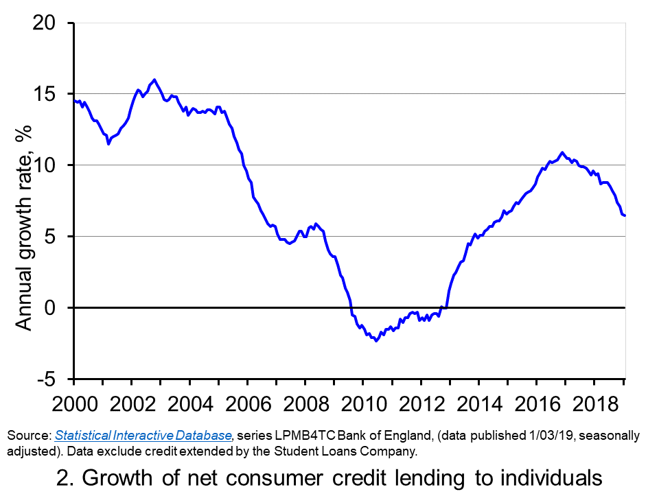 The extent to which the economy experiences consumer credit cycles can be seen even more readily by looking at the 12-month growth rate in the net consumer credit. In essence, this mirrors the growth rate in the stock of consumer credit. Chart 2 evidences the double-digit growth rates in net consumer credit lending experienced during the first half of the 2000s. Growth rates then eased but, as the financial crisis unfolded, they plunged sharply. (Click here to download a PowerPoint copy of the chart.)
Yet, as Chart 2 shows, consumer credit growth began to recover quickly from 2013 so that by 2016 the annual growth rate of net consumer credit was again in double figures. In November 2016 the 12-month growth rate of net consumer credit peaked at 10.9 per cent. Thereafter, the growth rate has continually eased. In January 2019 the annual growth rate of net consumer credit had fallen back to 6.5 per cent, the lowest rate since October 2014.
The easing of consumer credit is likely to have been influenced, in part, by the resumption in the growth of real earnings from 2018 (see Getting real with pay). Yet, it is hard to look past the economic uncertainties around Brexit.
Uncertainty tends to cause people to be more cautious. With the heightened uncertainty that has has characterised recent times, it is likely that for many people and businesses prudence has dominated impatience. Therefore, in summary, it appears that prudence is helping to steer borrowing along a downswing in the credit cycle. As it does, it helps to put a further brake on spending and economic growth.
Articles
Questions
- What is the difference between gross and net lending?
- Consider the argument that we should be worried more by excessive growth in consumer credit than on lending secured on dwellings?
- How could we measure whether different sectors of the economy had become financially distressed?
- What might explain why an economy experiences credit cycles?
- Explain how the growth in net consumer credit can affect economic activity?
- If people are consumption smoothers, how can credit cycles arise?
- What are the potential policy implications of credit cycles?
- It is said that when making financial decisions people face an inter-temporal choice. Explain what you understand this by this concept.
- If economic uncertainty is perceived to have increased how could this affect the consumption, saving and borrowing decisions of people?
 The distinction between nominal and real values is an incredibly important one in economics. We apply the latest GDP numbers from the ONS to show how the inflation-adjusted numbers help to convey the twin characteristics of growth: positive longer-term growth but variable short-term rates of growth. It is real GDP numbers that help us to understand better the macroeconomic environment and, not least, its inherent volatility. To use nominal GDP numbers means painting a less than clear, if not inaccurate, picture of the macroeconomic environment.
The provisional estimate for GDP (the value of output) in the UK in 2018 is £2.115 trillion, up 3.2 per cent from £2.050 trillion in 2017. These are the actual numbers, or what are referred to as nominal values. They make no adjustment for inflation and reflect the prices of output that were prevailing at the time. Hence, the figures are also referred to as GDP at current prices.
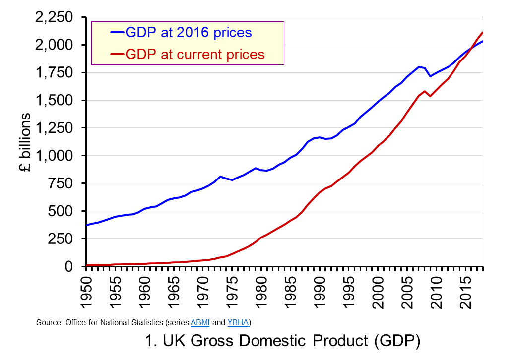 The use of nominal GDP data can be something of a problem when we compare historical values. In 1950, for example, as we can see from Chart 1, nominal GDP in 1950 was a mere £12.926 billion. In other words, the nominal figures show that the value of the country’s output was 163.595 times greater in 2018 (or an increase of 162,595 per cent). However, if we want to make a more meaningful comparison of the country’s national income we need to adjust for inflation. (Click here to download a PowerPoint copy of the chart.)
If we measure GDP at constant prices we eliminate the effect of inflation. This allow us to make a more meaningful comparison of national income. Consider first the real GDP numbers for 1950 and 2018. GDP in 1950 at 2016 prices was £373.9 billion. This is higher than the nominal (current-price) value because prices in 2016 were higher than those in 1950. Meanwhile, GDP in 2018 when measured at 2016 prices was £2.034 trillion. This real value is smaller than the corresponding nominal value because prices in 2016 where lower than those in 2018.
Between 1950 and 2018 there was a proportionate increase in real GDP of 5.439 (or a 443.9 per cent increase). Because we have removed the effect of inflation the real growth figure is much lower than the nominal growth figure. Crucially, what we are left with is an indicator of the growth in the volume of output. Whereas nominal growth rates are affected both by changes in volumes and prices, real growth rates reflect only changes in volumes.
Consider now output growth between 2017 and 2018. As we saw earlier, the nominal figures suggest growth of 3.2 per cent. In fact, GDP at constant 2016 prices increased from £2005.4 trillion in 2017 to £2,033.6 trillion in 2018: an increase of 1.4 per cent. This was the lowest rate of growth in national output since 2012 when output also grew by 1.4 per cent. In 2017 national output had increased by 1.8 per cent, the same increase as in 2016.
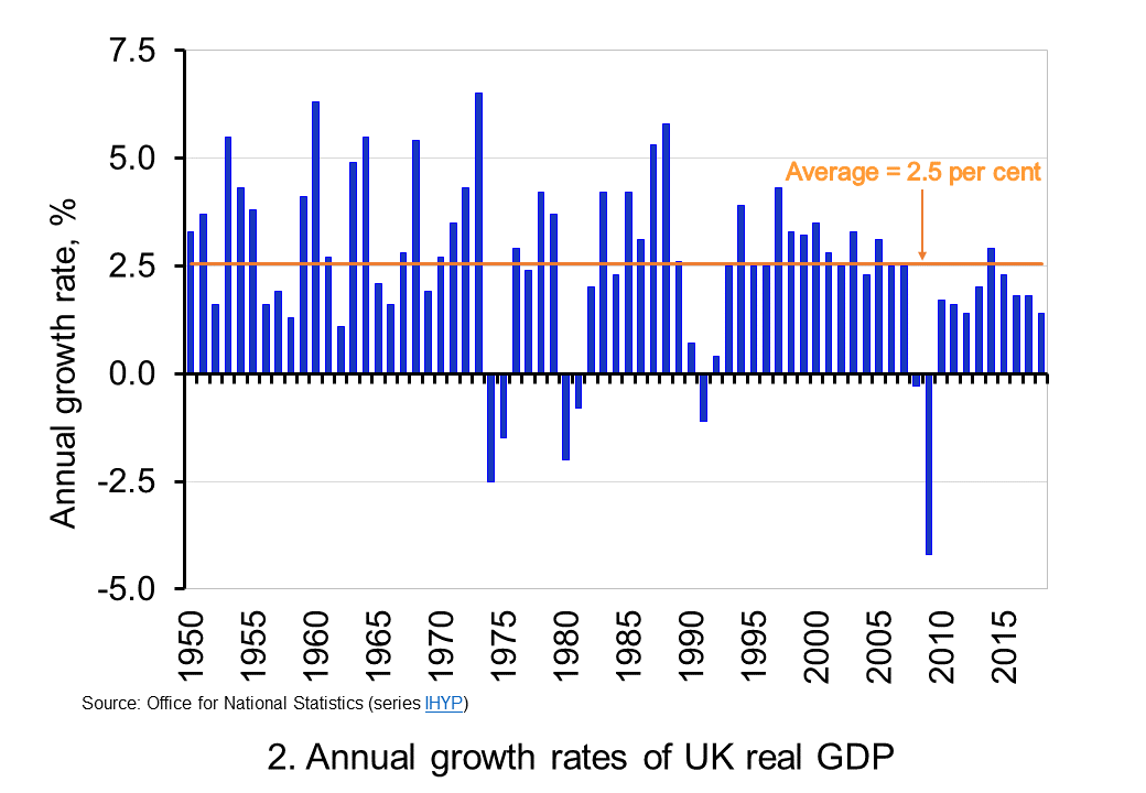 To put the recent growth in national output into context, Chart 2 shows the annual rate of growth in real GDP each year since 1950. Across the period, the average annual rate of growth in real GDP and, hence, in the volume of national output was 2.5 per cent. In the current decade growth has averaged only 1.9 per cent. This followed falls of 0.3 per cent and 4.2 per cent in 2008 and 2009 respectively as the effects of the financial crisis on the economy were felt. (Click here to download a PowerPoint copy of the chart.)
By plotting the percentage changes in real GDP from year to year, we get a much clearer sense of the inherent instability that we identified at the outset as a characteristic of growth. This is true not only for the UK, but economies more generally. This instability is the key characteristic of the macroeconomic environment. It influences and informs much of what we study in economics.
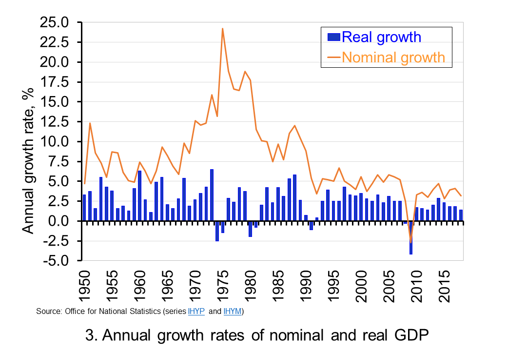 The variability of growth rates that create the instability of economies again requires an understanding of the distinction between nominal and real GDP. Chart 3 illustrates the growth in GDP both in nominal and real terms. The average annual rate of growth of nominal GDP is 7.8 per cent, considerably higher than the average real growth rate of 2.5 per cent per year. The difference again reflects the effect of rising prices. (Click here to download a PowerPoint copy of the chart.
Chart 3 clearly shows the wrong conclusions that can be drawn if one was to focus on the growth in nominal GDP from year to year. Perhaps the best example is 1975. In this year nominal GDP grew by 24.2 per cent. However, the volume of national output contracted: real GDP fell by 1.5 per cent. The growth in nominal GDP reflects the rapid growth in prices seen in that year. The economy’s average price level (the GDP deflator) rose by 26.1 per cent. Hence, the growth in nominal GDP reflected not an increase in the volume of output – that fell – but instead a large increase in prices.
The importance of the distinction between nominal and real GDP is further demonstrated by the fact that since 1950 nominal GDP has fallen in only one year. In 2009 nominal GDP fell by 2.7 per cent. The 1.6 per cent rise in the economy’s average price level was not enough to offset the fall in the volume of output of just over 4.2 per cent. In other years when the volume of output (real GDP) fell, the effect of rising prices meant that the value of output (nominal GDP) nonetheless rose.
So to conclude, the distinction between nominal and real GDP is crucial when analysing economic growth. To understand the distinction gives you a truly real advantage in making sense of the macroeconomic environment.
Articles
Questions
- What do you understand by the term ‘macroeconomic environment’? What data could be used to describe the macroeconomic environment?
- When a country experiences positive rates of inflation, which is higher: nominal economic growth or real economic growth?
- Does an increase in nominal GDP mean a country’s production has increased? Explain your answer.
- Does a decrease in nominal GDP mean a country’s production has decreased? Explain your answer.
- Why does a change in the growth of real GDP allow us to focus on what has happened to the volume of production?
- What does the concept of the ‘business cycle’ have to do with real rates of economic growth?
- When would falls in real GDP be classified as a recession?
- Distinguish between the concepts of ‘short-term growth rates’ and ‘longer-term growth’.
- Why might the distinction between nominal and real be important when analysing changes in people’s pay? What would be the significance of an increase in real pay?
 How would your life be without the internet? For many of you, this is a question that may be difficult to answer – as the internet has probably been an integral part of your life, probably since a very young age. We use internet infrastructure (broadband, 4G, 5G) to communicate, to shop, to educate ourselves, to keep in touch with each other, to buy and sell goods and services. We use it to seek and find new information, to learn how to cook, to download music, to watch movies. We also use the internet to make fast payments, transfer money between accounts, manage our ISA or our pension fund, set up direct debits and pay our credit-card bills.
I could spend hours writing about all the things that we do over the internet these days, and I would probably never manage to come up with a complete list. Just think about how many hours you spend online every day. Most likely, much of your waking time is spent using internet-based services one way or another (including apps on your phone, streaming on your phone, tablet or your smart TV and similar). If your access to the internet was disrupted, you would certainly feel the difference. What if you just couldn’t afford to have computer or internet access? What effect would that have on your education, your ability to find a job, and your income?
Martin Jenkins, a former homeless man, now entrepreneur, thinks that the magnitude of this effect is rather significant. In fact, he is so convinced about the importance of bringing the internet to poorer households, that he recently founded a company, Neptune, offering low-income households in the Bronx district of New York free access to online education, healthcare and finance portals. His venture was mentioned in a recent (and very interesting) BBC article – a link to which can be found at the end of this blog. But is internet connectivity really that important when it comes to economic and labour market outcomes? And is there a systematic link between economic growth and internet penetration rates?
These are all questions that have been the subject of intensive debate over the last few years, in the context of both developed and developing economies. Indeed, the ‘digital divide’ as it is known (the economic gap between the internet haves and have nots) is not something that concerns only developing countries. According to a recent policy brief published by the New York City Comptroller:
More than one-third (34 percent) of households in the Bronx lack broadband at home, compared to 30 percent in Brooklyn, 26 percent in Queens, 22 percent in Staten Island, and 21 percent in Manhattan.
The report goes on to present data on the percentage of households with internet connection at home by NYC district, and it does not take advanced econometric skills for one to notice that there is a clear link between median district income and broadband access. Wealthier districts (e.g. Manhattan Community District 1 & 2 – Battery Park City, Greenwich Village & Soho PUMA), tend to have a significantly higher share of households with broadband access, than less affluent ones (e.g. NYC-Brooklyn Community District 13 – Brighton Beach & Coney Island PUMA) – 88% of total households compared with 58%.
But, do these large variations in internet connectivity matter? The evidence is mixed. On the one hand, there are several studies that find a clear, strong link between internet penetration and economic growth. Czernich et al (2011), for instance, using data on OECD countries over the period 1996–2007, find that “a 10 percentage point increase in broadband penetration raised annual per capita growth by 0.9–1.5 percentage points”.
Another study by Koutroumpis (2018) examined the effect of rolling out broadband in the UK.
For the UK, the speed increase contributed 1.71% to GDP in total and 0.12% annually. Combining the effect of the adoption and speed changes increased UK GDP by 6.99% cumulatively and 0.49% annually on average”. (pp.10–11)
The evidence is less clear, however, when one tries to estimate the benefits between different types of workers – low and high skilled. In a recent paper, Atasoy (2013) finds that:
gaining access to broadband services in a county is associated with approximately a 1.8 percentage point increase in the employment rate, with larger effects in rural and isolated areas.
But then he adds:
most of the employment gains result from existing firms increasing the scale of their labor demand and from growth in the labor force. These results are consistent with a theoretical model in which broadband technology is complementary to skilled workers, with larger effects among college-educated workers and in industries and occupations that employ more college-educated workers.
Similarly, Forman et al (2009) analyse the effect of business use of advanced internet technology and local variation in US wage growth, over the period 1995–2000. Their findings show that:
Advanced internet technology is associated with larger wage growth in places that were already well off. These are places with highly educated and large urban populations, and concentration of IT-intensive industry. Overall, advanced internet explains over half of the difference in wage growth between these counties and all others.
How important then is internet access as a determinant of growth and economic activity and what role does it have in bridging economic disparities between communities? The answer to this question is most likely ‘very important’ – but less straightforward than one might have assumed.
Article
References
- Comptroller, New York City, Internet Inequality
- Czernich, N., Falck, O., Kretschmer, T. and Woessmann, L., 2011, Broadband infrastructure and economic growth, The Economic Journal, 121(552), pp.505–32
- Koutroumpis, P., 2018, The economic impact of broadband: evidence from OECD countries, Ofcom
- Atasoy, H., 2013, The effects of broadband internet expansion on labor market outcomes, ILR Review, 66(2), pp.315–45
- Forman, C., Goldfarb, A. and Greenstein, S., 2009, The Internet and Local Wages: Convergence or Divergence? (No. w14750), National Bureau of Economic Research
Questions
- Is there a link between economic growth and internet access? Discuss, using examples.
- Explain the arguments for and against government intervention to subsidise internet access of poorer households.
- How important is the internet to you and your day to day life? Take a day offline (yes, really – a whole day). Then come back and write about it.
 Consumer and business confidence reflect the sentiment, emotion, or anxiety of consumers and businesses. Confidence surveys therefore try to capture these feelings of optimism or pessimism. They aim to shed light on spending intentions and hence the short-term prospects for private-sector spending. For example, a fall in confidence would be expected to lead to a fall in consumption and investment spending. This is particularly relevant in the UK with the ongoing uncertainty around Brexit. We briefly summarise here current patterns in confidence.
Through the use of surveys attempts are made to measure confidence. One long-standing survey is that conducted for the European Commission. Each month consumers and firms across the European Union are asked a series of questions, the answers to which are used to compile indicators of consumer and business confidence. For instance, consumers are asked about how they expect their financial position to change. They are offered various options such as ‘get a lot better, ‘get a lot worse’ and balances are then calculated on the basis of positive and negative replies.
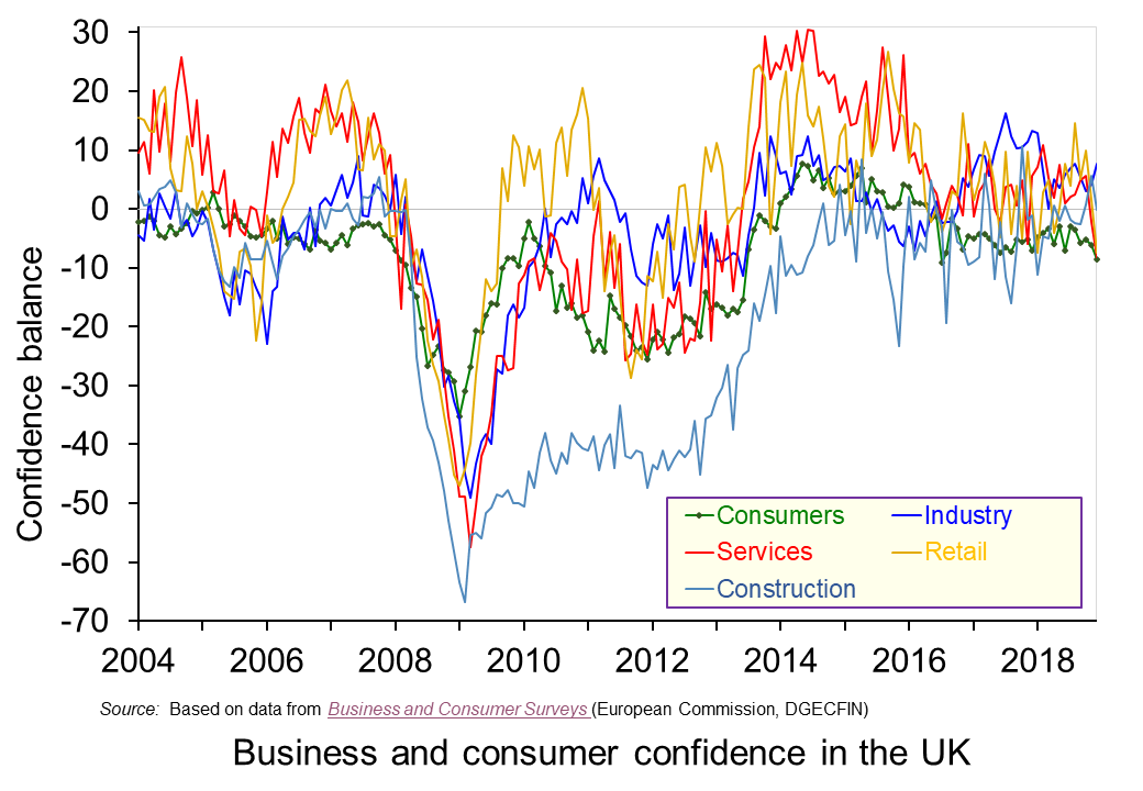 The chart plots confidence in the UK for consumers and different sectors of business since the mid 1990s. The chart captures the volatility of confidence. This volatility is generally greater amongst businesses than consumers, and especially so in the construction sector. (Click here to download a PowerPoint copy of the chart.)
The chart nicely captures the collapse in confidence during the global financial crisis in the late 2000s. The significant tightening of credit conditions contributed to a significant dampening of aggregate demand which was further propagated (amplified) by the collapse in confidence. Consequently, the economy slid in to recession with national output contracting by 6.3 per cent during the 5 consecutive quarters during which output fell.
To this point, the current weakening of confidence is not of the same magnitude as that of the late 2000s. In January 2009 consumer confidence had fallen to an historic low of -35. Nonetheless, the December 2018 figure for consumer confidence was -9, the lowest figure since July 2016 the month following the EU referendum, and markedly lower than the +8 seen as recently as 2014. The long-term (median) average for the consumer confidence balance is -6.
The weakening in consumer confidence is mirrored by a weakening in confidence in the retail and service sectors. The confidence balances in December 2018 in these two sector both stood at -8 which compares to their longer-term averages of around +5. In contrast, confidence in industry and construction has so far held fairly steady with confidence levels in December 2018 at +8 in industry and at 0 in construction compared to their long-term averages of -4 and -10 respectively.
It will be interesting to see how confidence has been affected by recent events. The glut of stories suggesting that trading conditions were especially difficult for retailers over the Christmas and New Year period is consistent with the weakening confidence already observed amongst consumers and retailers. However, it is unlikely that recent events will have done anything other than to exacerbate the trend for a weakening of confidence of domestic consumers and retailers. Hence, the likelihood is an intensification of caution and prudence.
Articles
Questions
- Draw up a series of factors that you think might affect both consumer and business confidence. How similar are both these lists?
- Which of the following statements is likely to be more accurate: (a) Confidence drives economic activity or (b) Economic activity drives confidence?
- What macroeconomic indicators would those compiling the consumer and business confidence indicators expect each indicator to predict?
- What is meant by the concept of ‘prudence’ in the context of spending? What factors might determine the level of prudence
- How might prudence be expected to affect spending behaviour?
- How might we distinguish between confidence ‘shocks’ and confidence as a ‘propagator’ of shocks?
 It is perhaps timely given the ongoing uncertainty around Brexit to revisit and update our blog Desperately seeking confidence written back in January. Consumer and business confidence reflects the sentiment, emotion, or anxiety of consumers and businesses. Confidence surveys therefore try to capture these feelings of optimism or pessimism. They may then provide us with timely information for the short-term prospects for private-sector spending. For example, declining levels of confidence might be expected to play a part in weakening the growth of consumption and investment spending.
  The chart plots confidence in the UK for consumers and different sectors of business since the mid 1990s. The chart captures the volatility of confidence. This volatility is generally greater amongst businesses than consumers, and especially so in the construction sector. (Click here to download a PowerPoint copy of the chart.)
  Chart 2 shows how the recent easing of consumer confidence has seen the confidence balance fall below its long-term (median) average of -7. In March 2019 the balance stood at -11.7 the lowest figure since November 2013. To put the easing into further perspective, the consumer confidence balance had been as high as +8.2 in September 2015. (Click here to download a PowerPoint copy of the chart.)
  Chart 3 plots the paths of the UK household-sector saving ratio and consumer confidence. The saving ratio approximates the proportion of disposable income saved by the household sector. What we might expect to see, if greater uncertainty induces buffer-stock saving, is for falls in confidence to lead to a rise in the saving ratio. Conversely, less uncertainty as proxied by a rise in confidence would lead to a fall in the saving ratio. (Click here to download a PowerPoint of the chart.)
 Data on consumer credit is more timely than that for the saving ratio. Therefore, Chart 4 shows the relationship between consumer confidence and consumer credit into 2019. We observe a reasonably close association consumer credit growth and consumer confidence. Certainty, the recent easing in confidence is mirrored by an easing in the annual growth of net consumer credit. (Click here to download a PowerPoint of the chart.)
 Consumer credit is borrowing by individuals to finance current expenditure on goods and services. Consumer credit is distinct from lending secured on dwellings (referred to more simply as ‘secured lending’). Consumer credit comprises lending on credit cards, lending through overdraft facilities and other loans and advances, for example those financing the purchase of cars. We consider here recent trends in the flows of consumer credit in the UK and discuss their implications.
 Chart 1 shows the annual flows of net consumer credit since 2000 – the figures are in £ billions. Net flows are gross flows less repayments. (Click
  The extent to which the economy experiences consumer credit cycles can be seen even more readily by looking at the 12-month growth rate in the net consumer credit. In essence, this mirrors the growth rate in the stock of consumer credit. Chart 2 evidences the double-digit growth rates in net consumer credit lending experienced during the first half of the 2000s. Growth rates then eased but, as the financial crisis unfolded, they plunged sharply. (Click
  The distinction between nominal and real values is an incredibly important one in economics. We apply the latest GDP numbers from the ONS to show how the inflation-adjusted numbers help to convey the twin characteristics of growth: positive longer-term growth but variable short-term rates of growth. It is real GDP numbers that help us to understand better the macroeconomic environment and, not least, its inherent volatility. To use nominal GDP numbers means painting a less than clear, if not inaccurate, picture of the macroeconomic environment.
 The use of nominal GDP data can be something of a problem when we compare historical values. In 1950, for example, as we can see from Chart 1, nominal GDP in 1950 was a mere £12.926 billion. In other words, the nominal figures show that the value of the country’s output was 163.595 times greater in 2018 (or an increase of 162,595 per cent). However, if we want to make a more meaningful comparison of the country’s national income we need to adjust for inflation. (Click
  To put the recent growth in national output into context, Chart 2 shows the annual rate of growth in real GDP each year since 1950. Across the period, the average annual rate of growth in real GDP and, hence, in the volume of national output was 2.5 per cent. In the current decade growth has averaged only 1.9 per cent. This followed falls of 0.3 per cent and 4.2 per cent in 2008 and 2009 respectively as the effects of the financial crisis on the economy were felt. (Click
  The variability of growth rates that create the instability of economies again requires an understanding of the distinction between nominal and real GDP. Chart 3 illustrates the growth in GDP both in nominal and real terms. The average annual rate of growth of nominal GDP is 7.8 per cent, considerably higher than the average real growth rate of 2.5 per cent per year. The difference again reflects the effect of rising prices. (Click
  How would your life be without the internet? For many of you, this is a question that may be difficult to answer – as the internet has probably been an integral part of your life, probably since a very young age. We use internet infrastructure (broadband, 4G, 5G) to communicate, to shop, to educate ourselves, to keep in touch with each other, to buy and sell goods and services. We use it to seek and find new information, to learn how to cook, to download music, to watch movies. We also use the internet to make fast payments, transfer money between accounts, manage our ISA or our pension fund, set up direct debits and pay our credit-card bills.
 The chart plots confidence in the UK for consumers and different sectors of business since the mid 1990s. The chart captures the volatility of confidence. This volatility is generally greater amongst businesses than consumers, and especially so in the construction sector. (Click