 Moody’s, one of the three main international credit rating agencies, has just downgraded the UK’s credit rating from the top Aaa rating to Aa1. The other two agencies, Standard & Poor’s and Fitch may follow suit as they have the UK’s triple A rating on ‘negative outlook’.
The reason for Moody’s decision can be see in its press statement:
The key interrelated drivers of today’s action are:
1. The continuing weakness in the UK’s medium-term growth outlook, with a period of sluggish growth which Moody’s now expects will extend into the second half of the decade;
2. The challenges that subdued medium-term growth prospects pose to the government’s fiscal consolidation programme, which will now extend well into the next parliament;
3. And, as a consequence of the UK’s high and rising debt burden, a deterioration in the shock-absorption capacity of the government’s balance sheet, which is unlikely to reverse before 2016.
The direct economic consequences of Moody’s action are likely to be minimal. People were excpecting a downgrade sooner or later for the reasons Moody’s quotes. Thus stock markets, bond markets and foreign exchange markets already reflect this. Indeed, in the first seven weeks of 2013, the sterling exchange rate index has depreciated by over 6%.
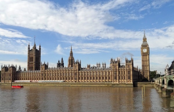 The political consequences, however, are likely to be significant. The Chancellor of the Exchequer, George Orborne, has put considerable emphasis on the importance of maintaining a triple A rating. He has seen it as a sign of the confidence of investors in the government’s policy of focusing on cutting the public-sector deficit and, ultimately, of cutting the public-sector debt as a proportion of GDP. His response, therefore, has been that the government will redouble its efforts to reduce the deficit.
Not surprisingly the Labour opposition claims the downgrading is evidence that the government’s austerity policies are not working. If the aim is to cut the deficit/GDP ratio, this is difficult if GDP is falling or just ‘flat lining’. A less aggressive austerity policy, it is argued, would allow growth to recover and this rise in the denominator would allow the deficit/GDP ratio to fall.
Latest forecasts are that government borrowing is set to rise. The average of 24 independent forecasts of the UK economy, published by the Treasury on 13/2/13, is that public-sector net borrowing will rise from £90.7bn in 2012/13 to £107bn in 2013/14. And the European Commission forecast of the UK economy is that the general government deficit will rise from 5.9% of GDP in 2012/13 to 7.0% of GDP in 2013/14.
So what will be the economic and political consequences of the loss of the triple A rating? What policy options are open to the government? The following articles explore these questions. Not surprisingly, they don’t all agree!
Downgrading Britain: The Friday night drop The Economist, Buttonwood’s notebook (23/2/13)
Rating downgrade: Q&A The Observer, Josephine Moulds (24/2/13)
Downgrade is Osborne’s punishment for deficit-first policy The Guardian, Phillip Inman (23/2/13)
Britain’s downgraded credit rating: Moody’s wake-up call must trigger a change of course The Observer (24/2/13)
Editorial: AAA loss is a sign of failure Independent (24/2/13)
It’s not the end of the world – but it’s the end of any false complacency Independent, Hamish McRae (24/2/13)
Moody’s downgrade will stiffen George Osborne’s resolve The Telegraph, Kamal Ahmed (23/2/13)
UK AAA downgrade: Budget is now George Osborne’s make or break moment The Telegraph, Philip Aldrick (23/2/13)
Britain’s credit downgrade is a call to live within our means The Telegraph, Liam Halligan (23/2/13)
Britain will take years to earn back AAA rating, says Ken Clarke The Telegraph, Rowena Mason (24/2/13)
Questions
- How important are credit agencies’ sovereign credit ratings to a country (a) economically; (b) politically? Why may the political effects have subsequent economic effects?
- Explain the meaning of the terms ‘exogenous’ and ‘endogenous’ variables. In terms of the determination of economic growth, are government expenditure and tax revenue exogenous or endogenous variables? What are the implications for a policy of cutting the government deficit?
- Identify the reasons for the predicted rise in the public-sector deficit as a proportion of GDP. Which of these, if any, are ‘of the government’s own making’?
- In the absence of a change in its fiscal stance, what policies could the government adopt to increase business confidence?
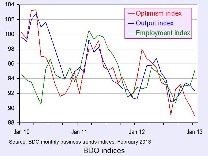
 Each month the accountancy firm BDO publishes its Business Trends Indices. These indices “are ‘polls of polls’ that pull together the results of all the main UK business surveys”. The latest report shows that the January 2013 Optimism Index was its lowest since the report began 21 years ago.
The Optimism Index predicts business performance two quarters ahead. In January 2013 it was 88.9. The way the index is constructed, a reading of 95 or more suggests that firms are optimistic about business performance. Clearly, they were pessimistic.
 Although there was an increase in hiring intentions, firms were still predicting a fall in output. The indices for optimism, employment and output are shown in the chart. (Click here for a PowerPoint.)
As Peter Hemington, Partner, BDO LLP, commented:
In spite of a strengthening Labour Market, business confidence continues to weaken, and improved hiring intentions are not translating into growth plans. It seems the damaging effects on businesses of five years’ zigzagging economic growth, has left them wary of making concrete plans for expansion and resigned to the ‘new normal’ of economic stagnation.
To end this cycle, it is imperative that the Government implements plans to expedite growth. Without growth incentives, we will continue to see UK businesses reluctant to invest and expand, which poses a grave threat to the UK’s economic recovery.
The following articles comment on the gloomy mood of business and on its implications for output and investment. They also look at the implications for government policy.
Articles
Confidence slumps despite optimism from manufacturers Insider News (11/2/13)
Fears of a triple-dip recession return as survey puts business confidence at a 21-year low This is Money (11/2/13)
Pressure grows on ministers for growth strategy Yorkshire Post (11/2/13)
Triple-dip jitters as business confidence hits 21-yr low Management Today, Michael Northcott (11/2/13)
Report and data
Business Trends: Business confidence hits 21-year low signalling economic contraction BDO Press Release (11/2/13)
BDO Monthly Business Trends Indices, February 2013 – Full Report BDO (11/2/13)
Business and Consumer Surveys European Commission: Economic and Financial Affairs
Questions
- What reasons are given by the report for a decline in business optimism?
- Explain how an accelerator/multiplier interaction could compound the recession or help to cause a bounce back from recession.
- How does business sentiment in one country affect business sentiment in others?
- In the absence of a change in its fiscal stance, what policies could the government adopt to increase business confidence?
- Why might firms’ hiring intentions increase even though they are predicting a fall in output?
 Events on the high street continue to grab the headlines. These are incredibly difficult times for retailers as households’ spending power continues to be squeezed and, in conjunction with technological change, households’ spending habits continue to evolve. In this blog we examine what the latest data from Consumer Trends tells us about the composition of household spending.
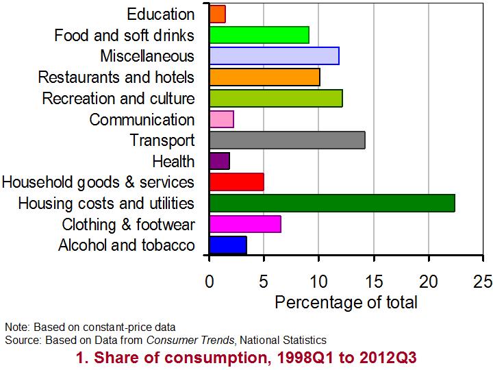
There are 12 broad categories of household spending. Each tells us something about the amount of expenditure in the UK by both UK and foreign households. In 2012 Q3, the value of household consumption taking place within the UK was £242 billion. During the whole of 2011, spending amounted to £929 billion. In real terms (after adjusting for price changes) spending in the UK fell by 1 per cent in 2011. Evidence of a rebound is limited. In the year to 2012 Q3, the volume of spending was just 0.8 per cent higher. In contrast, from 1998 to 2007 the average real rate of growth was 3.5 per cent.
 As Chart 1 shows, the largest component of household spending in the UK is on spending associated with running a home. This component includes rents, expenditures incurred in undertaking routine maintenance and the payments for electricity, gas and water. Since 1997 this component has typically accounted for (after adjusting for price changes) 24 per cent of household consumption in the UK (22 per cent in 2012 Q3). The second largest consumption category is transport. This includes expenditure on purchasing vehicles, fuels, maintenance of vehicles and the costs of rail and air transport. It has typically accounted for about 15 per cent of expenditure (14 per cent in 2012 Q3).
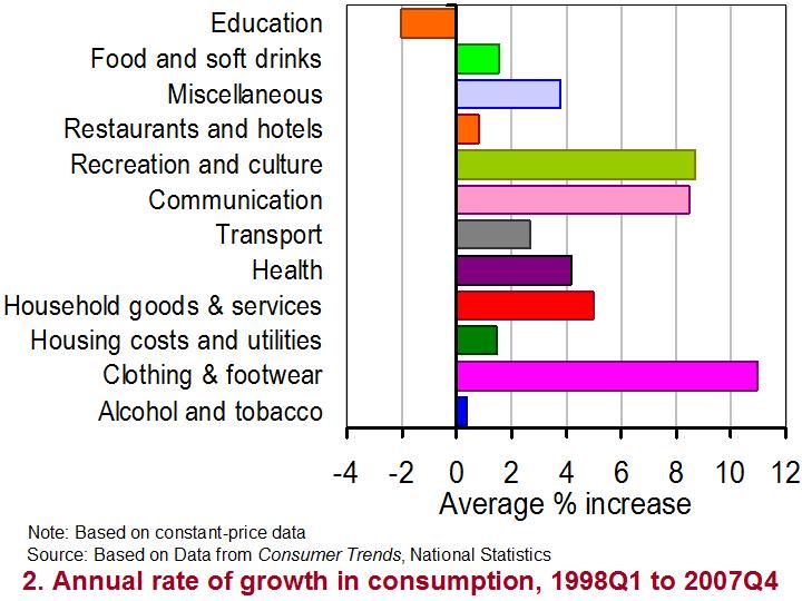
 Chart 2 shows the real annual rate of growth in expenditure of our 12 consumption categories from 1998 Q1 to 2007 Q4 and so before the financial crisis really took hold. It enables us to measure how the volume of purchases changes over a 12-month period. From it, we can see that all categories, except education, contributed to the positive real growth of household spending in the UK. The fastest growing component was clothing and footwear recording real growth of almost 11 per cent per year. The second most rapidly growing component was recreation and culture, which includes items ranging from package holidays, garden plants and musical instruments to sports equipment, cameras and books. This component grew, after adjusting for inflation, by nearly 9 per cent per year.
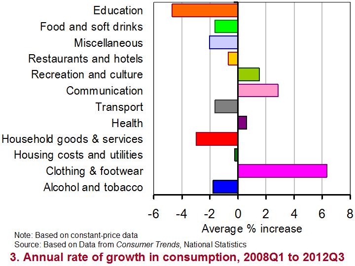
 Chart 3 focuses on the real annual rate of growth since 2008 Q1. It paints a very different picture. Now only four categories have on average recorded positive annual rates of growth. Again, the volume of purchases of clothing and footwear has grown most rapidly by 6.3 per cent per year. While purchases on items associated with recreation and culture continue to grow, the annual rate of growth since 2008 is only 1.5 per cent compared with 9 per cent prior in the previous 10 years or so.
(Click here for a PowerPoint of all three charts.)
One category of spending that has been especially badly affected by events since 2008 has been household goods and services. This includes items such as furniture, major and small household appliances (including electrical appliances), carpets and tools. While the volume of purchases grew by 5 per cent per year from 1998 to 2007, since 2008 they have typically contracted at a rate of 3 per cent per year. This category helps to illustrate the difficult trading environment currently faced by many businesses in the UK.
Data
Consumer Trends, Q3 2012 Statistical Bulletin National Statistics
Consumer Trends Time Series Dataset, Q3 2012 National Statistics
Articles
Surprise UK retail sales drop fuels trip-dip recession fears The Guardian, Larry Elliott (15/2/13)
UK retail sales fall unexpectedly in January BBC News, (15/2/13)
Retail sales: What the economists say The Guardian, Phillip Inman (15/2/13)
Another dark day for the high street as John Lewis cuts jobs The Guardian, Sarah Butler (13/2/13)
Republic chains enters administration BBC News, (15/2/13)
High Street retailers: Who has been hit the hardest? BBC News, (13/2/13)
Questions
- Using Charts 2 and Chart 3 construct a short briefing paper comparing the fortunes of difficult components of consumption before and after 2008.
- What economic factors could explain the contrasting impact of the economic slowdown since 2008 on the components of consumption?
- Can economic factors alone explain the success of failure of businesses? Explain your answer drawing on real-world examples.
- What factors do you think are likely to be important for the growth in consumer spending in the months ahead?
 When you look at the linked articles below, I’m sure many of you will be thinking that this is an odd choice for an economics blog! However, part of the economic relevance of ‘cyber-crime fighters’ relates to the relative skills of workers and the gap that exists between the most and least skilled workers in the UK.
Crime has always existed, but as technology has developed the types of crime committed have grown along with the complexity of them. For certain crimes, a very skilled individual is needed. With this emergence of technologically advanced crimes, those fighting crimes have also had to improve their skills and techniques. Thus crime-fighters have become more technologically advanced as well.
The problem is that the number of skilled workers able to deal with things like cyber crime has not kept pace with the demand for them and thus we have a skills gap. Usage of the Internet has continued to grow, creating more and more opportunities for cyber crime. However, the UK supply of IT and cyber-security professionals has not been able to keep pace. Therefore, we have a shortage of skilled labour in this area.
 More investment into research and education is occurring, with the aim of addressing this shortage, but it is expected to take many years before supply catches up to demand. In particular, more investment is needed in the sciences and technology subjects at school to create the supply at university level. The NAO said that:
‘The current pipeline of graduates and practitioners are unable to meet demand.’
A second area of relevance to economics is the cost of cyber crime. The NAO estimated that the cost is somewhere between £18bn and £27bn per annum. However, on the other side, is there a case that crime actually benefits the macroeconomy by requiring government investment. As cyber crime has grown, so has the demand for cyber-crime fighters and this has created more jobs. With more jobs comes increased spending and the benefits of the multiplier. The following articles consider cyber crime and the impact it is having.
National Audit Office warns UK needs more skilled cyber crime fighters BBC News (12/2/13)
IT staff shortages raise cyber crime risk Sky News (12/2/13)
UK planning ‘Cyber Reserve’ defence force BBC News (3/12/12)
Britain vulnerable from cyber attacks for at least 20 years The Telegraph, Tom Whitehead (12/2/13)
Britain targeted by 120,000 every DAY with cost to country thought to total £27billion Mail Online, Jack Doyle (12/2/13)
Questions
- Illustrate the demand for and supply of labour curves in the market for cyber crime fighters. How is the equilibrium wage determined?
- If there is increased investment in education, how would this affect the shape and position of the MRP curve and what impact would this have on your diagram?
- If there is a shortage of cyber crime fighters, what does that suggest about the position of the two curves? Illustrate this situation and explain why it is a problem.
- Which factors would be considered by NAO in estimating the costs of cyber crime?
- Explain why crime can pay.
- How does the macroeconomy benefit from increased crime? Illustrate this on a diagram.
- Does your answer to question 5 above suggest anything about the effectiveness of using GDP as a measure of welfare?
- How is the multiplier effect relevant?
 According to the first estimate by the Office for National Statistics, the UK economy shrank by 0.3% in the final three months of 2012. This means that over the whole year growth was flat.
The biggest contributor to the fall in GDP in Q4 was the production industries, which include manufacturing. Output of the production sector fell by 1.8% in Q4. Construction sector output, by contrast, was estimated to have increased by 0.3%. Service sector output was flat. The chart below shows quarterly and annual growth in the UK from 2007 to 2012. (Click here for a PowerPoint.)
Latest estimates by the IMF are that the UK economy will grow by 1.0% in 2013 – well below the long-term growth in potential output (see also the last blog, High hopes in the Alps). But some forecasters are predicting that real GDP will continue to fall for at least one more quarter, which means that the economy would then be in a ‘triple-dip recession’.
 Not surprisingly politicians have interpreted the statistics very differently, as have economists. The government, while recognising that the UK faces a ‘very difficult economic situation’, argues that now is not the time to change course and that by continuing with policies to reduce the deficit the economy will be placed on a firmer footing for sustained long-term growth
The opposition claims that the latest figures prove that the government’s policies are not working and that continuing attempts to bear down on the deficit are depressing aggregate demand and thereby keeping the economy depressed.
The following webcasts, podcasts and articles expand on these arguments. Try to be dispassionate in using economic analysis and evidence to assess the arguments.
Webcasts and podcasts
 Video Summary: Gross Domestic Product Preliminary Estimate, Q4 2012 Media Briefing (Click here for the following Q&A) ONS (25/1/13)
 Triple dip on the menu? Channel 4 News, Siobhan Kennedy and Faisal Islam (25/1/13)
 Getting and spending – the key to recovery Channel 4 News, Cathy Newman (25/1/13)
 UK economy shrinks by 0.3% in the last three months of 2012 BBC News, Hugh Pym (25/1/13)
 Danny Alexander on GDP figures and economic plans BBC Daily Politics (25/1/13)
 Osborne defends government’s deficit reduction plan BBC News (25/1/13)
 Ed Balls: UK economy urgently needs a ‘Plan B’ BBC News (25/1/13)
 UK heads for triple dip as GDP contracts 0.3pc The Telegraph, Philip Aldrick (25/1/13)
 Economist: Government may need to rethink its fiscal policy The Telegraph, Jim O’Neill (25/1/13)
 Has austerity really been tried in Britain? BBC Today Programme, Jonathan Portes and Andrew Lilico (29/1/13)
Articles
UK GDP: Economy shrank at end of 2012 BBC News (25/1/13)
UK GDP shrinks by 0.3% in fourth quarter: what the economists say The Guardian (25/1/13)
New Bank of England head Mark Carney hints at big shift in policy The Guardian (26/1/13)
The Bank of England, the chancellor, and the target BBC News. Stephanie Flanders (29/1/13)
The Entire World Of Economics Is Secretly Thankful To The UK Right Now Business Insider, Joe Weisenthal (26/1/13)
Data
Gross Domestic Product: Preliminary Estimate, Q4 2012 ONS (25/1/13)
 Video Summary: Gross Domestic Product Preliminary Estimate, Q4 2012 ONS (25/1/13)
Preliminary Estimate of GDP – Time Series Dataset 2012 Q4 ONS (25/1/13)
Business and Consumer Surveys DG ECFIN
Questions
- What are the reasons for the decline in GDP in 2012 Q4??
- Examine how likely it is that the UK will experience a triple-dip recession.
- What measures could be adopted to increase consumer and business confidence?
- If there is substantial spare capacity, is expansionary fiscal policy the best means of achieving economic growth?
- What additional monetary policy measures could be adopted to stimulate economic growth?
- Find out what has happened to the UK’s public-sector deficit and debt over the past three years. Explain what has happened.
 Moody’s, one of the three main international credit rating agencies, has just downgraded the UK’s credit rating from the top Aaa rating to Aa1. The other two agencies, Standard & Poor’s and Fitch may follow suit as they have the UK’s triple A rating on ‘negative outlook’.
 The political consequences, however, are likely to be significant. The Chancellor of the Exchequer, George Orborne, has put considerable emphasis on the importance of maintaining a triple A rating. He has seen it as a sign of the confidence of investors in the government’s policy of focusing on cutting the public-sector deficit and, ultimately, of cutting the public-sector debt as a proportion of GDP. His response, therefore, has been that the government will redouble its efforts to reduce the deficit.
