 With relentless bombing of Iran by Israel and the USA, and with Iranian counterattacks on Gulf states, the costs of the war are mounting. The most obvious are in terms of human lives, injuries and suffering. But there are significant economic costs too. Some of these are immediate, such as the rising price of oil and hence the costs of fuel, or the fall in stock market prices. Some will be longer term, depending on how the war develops. For example, prices could rise more generally as supply chains are disrupted.
 The impacts will vary across the world and across markets. The most obvious markets to be affected are those where significant supply comes from the Persian Gulf. Approximately 20% of total global oil consumption passes through the Strait of Hormuz, which connects the Persian Gulf with the Arabian Sea and the Indian Ocean.
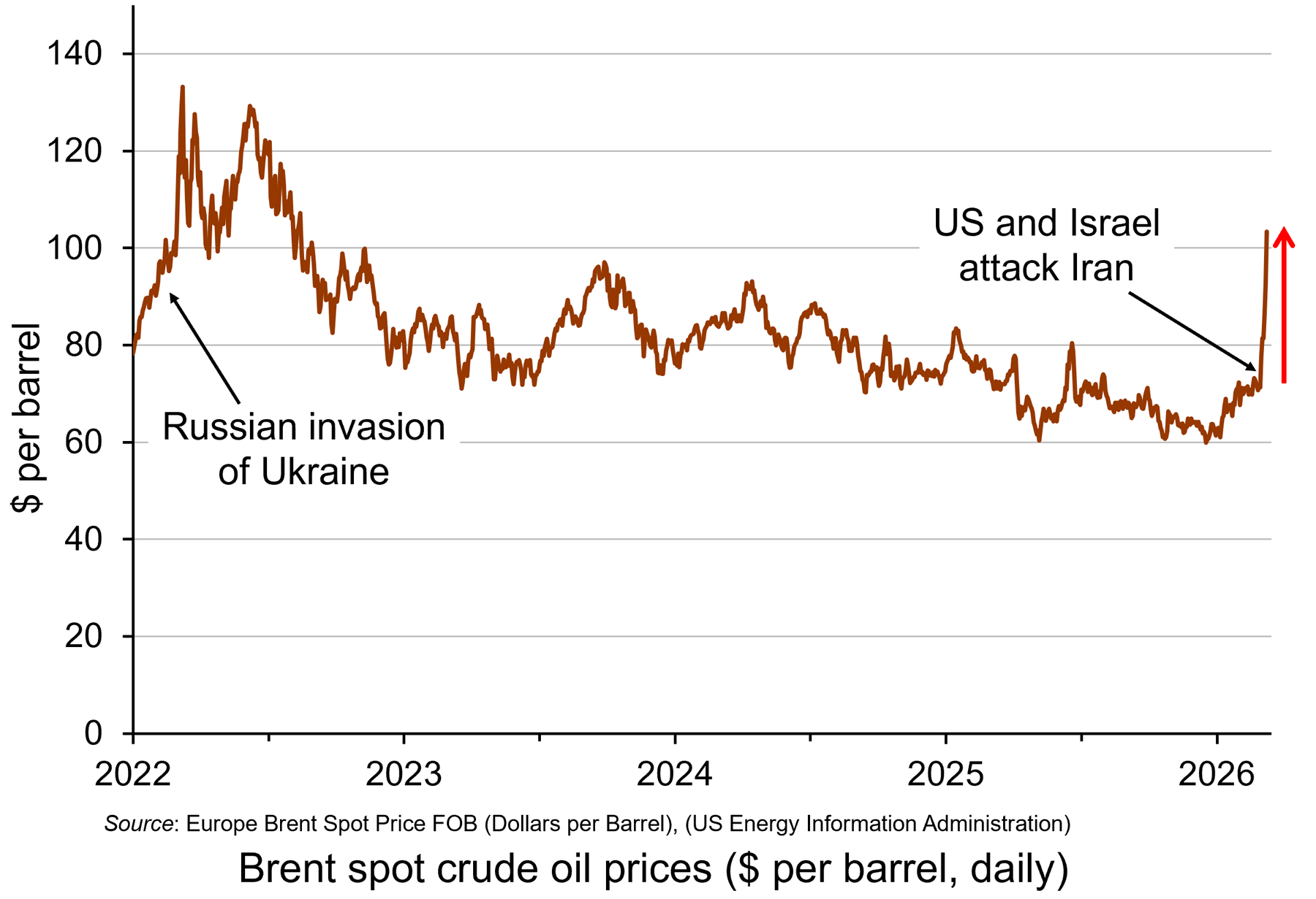
Oil prices rose considerably in the days following the start of the war on 28 February, with Brent crude, a key measure of international oil prices, rising from $71.3 on 27 February to a peak of $121.4 per barrel by the morning of 9 March – a rise of 70%. It was possible that they would rise even further in the short term. However, prices eased later on 9 March after G7 finance ministers declared that the group ‘stands ready’ to release oil from strategic reserves if needed. (Click here for a PowerPoint of the chart.)
 Rising oil prices will drive up inflation. For those countries with a heavy dependence on Gulf oil, particularly countries in Asia, there could be significant supply problems. For oil exporters in the Persian Gulf, with tankers unable to traverse the Strait of Hormuz, the economic impact is huge. Oil exporters outside the Gulf, such as Russia, Norway and Canada, however, will gain from the higher prices. Clearly the size of these effects will depend on how long the conflict continues and how long the Strait of Hormuz remains closed.
And it is not just oil that is affected. Other products, such as liquified natural gas (LNG), petrochemicals, industrial materials, fertilizers, metals and minerals are transported through the Strait of Hormuz. Gulf countries import much of their food through the Strait.
Cuts in supplies of oil and other products represent an adverse supply shock. Such shocks push up prices (cost-push inflation), while adversely affecting aggregate output. This can lead to stagflation – a combination of higher inflation and stagnation or even falling output. Central banks with a simple mandate to keep inflation to a target are likely to raise interest rates, or at least delay in reducing them. In the USA, with a dual mandate of controlling inflation but also maximising employment, the response may be less deflationary, depending on the judgement of the Federal Reserve.
Uncertainty
 There is great uncertainty about how long the conflict will last. There is also a lack of clarity and consistency from the US administration about its war aims. This uncertainty has affected financial markets, which have seen considerable volatility. Stock markets have seen widespread falls, with airline, travel and AI-heavy stocks being particularly vulnerable.
If the war is concluded relatively swiftly, the economic effects could be relatively small. If the war continues, and especially if the Gulf countries are drawn further into the conflict and if the conflict spreads to other countries, the economic effects could be much more substantial. A prolonged conflict could see oil prices remaining above $100 per barrel, potentially increasing global inflation by 1 percentage point or more. This would slow or halt the move by central banks to cut rates and thereby reduce global economic growth – potentially, as we have seen, leading to stagflation.
Then there is the issue of a potential new international refugee crisis. If the economic and political system in Iran deteriorates rapidly, this could trigger a wave of migration to neighbouring countries, such as Turkey, already hosting large numbers of refugees. Many could seek sanctuary further afield in Europe, with several countries already facing a backlash against immigration. The political and economic effects of this on host countries could be significant – but as yet, highly uncertain.
Articles
- Assessing the global economic impact of the Middle East war
ING, Carsten Brzeski, Warren Patterson, James Knightley and Deepali Bhargava (5/3/26)
- How will the Iran war affect the global economy?
Chatham House, Neil Shearing (6/3/26)
- Iran war is latest threat to a global economy rattled by Trump
Aljazeera, John Power (7/3/26)
- Why an Iran war inflation shock could wreck global economic recovery
The Guardian, Phillip Inman and Kalyeena Makortoff (8/3/26)
- Why has the Iran war sparked fears of stagflation for the global economy?
The Guardian, Luca Ittimani (9/2/26)
- Why surging oil prices are a shock for the global economy – but not yet a crisis
The Conversation, Stella Huangfu (3/3/26)
- Strait of Hormuz: Factsheet
IEA (February 2026)
- Faisal Islam: Oil price spiral may be slowed but not stopped by G7 emergency move
BBC News, Faisal Islam (9/3/26)
- How the Iran Conflict May Fuel a New International Refugee Crisis
Forbes, Andy J Semotiuk (5/3/26)
Questions
- Who are the biggest gainers and losers from disruption to oil supplies from the Persian Gulf?
- Illustrate the effect of the current oil price shock on an aggregate demand and supply diagram (either static or dynamic).
- Why is the Iranian war likely to be less damaging to the European economy than the Ukrainian war has been?
- Why have AI-related stock prices been vulnerable to the uncertainty caused by the Iranian war?
- How are the Bank of England and the Federal Reserve Bank likely to respond to the rising price of oil and the broader economic effects of the war? Why might their responses be different?
- What is the likely impact of the Iranian war on global economic recovery?
- How might the Iranian war affect global economic alliances?
- How is the current oil price shock likely to affect the eurozone? Will it be different from the oil price shock that followed the Russian invasion of Ukraine?
- What are the likely economic effects of large-scale migration caused by the war?
 Precious metals, such as gold, silver and platinum, are seen as safe havens by investors in uncertain times. With the on-off nature of Donald Trump’s tariffs, with ongoing wars, such as the war in Ukraine, and with threats of US action in Iran, with inflation slow to fall and pressure by the Trump administration on the Federal Reserve to make precipitant cuts in interest rates, investors have flocked to precious metals.
Precious metals peaked in late January 2026. Compared with just four months earlier, gold was up by 48%, platinum by 76% and silver by a massive 162%. Silver and platinum were also boosted by their industrial uses. Silver has excellent conductive properties and is used for electronics, AI, solar energy (photovoltaic cells), chemical catalysts and medical equipment. Over 50% of its consumption is for industrial purposes. Platinum is used as a catalyst in catalytic converters to reduce exhaust emissions, in medical devices, chemical processing, oil refining, electronics and glass manufacturing.
The rise was fuelled by speculation, which gathered momentum in December and January. But then the prices of all three metals fell dramatically on Friday 30 January and a bit more on 2 February. Despite a moderate bounce back on 3 February, the prices then fell again and by the end of 5 February, gold had fallen by 15%, platinum by 30% and silver by a massive 42% from the peak.
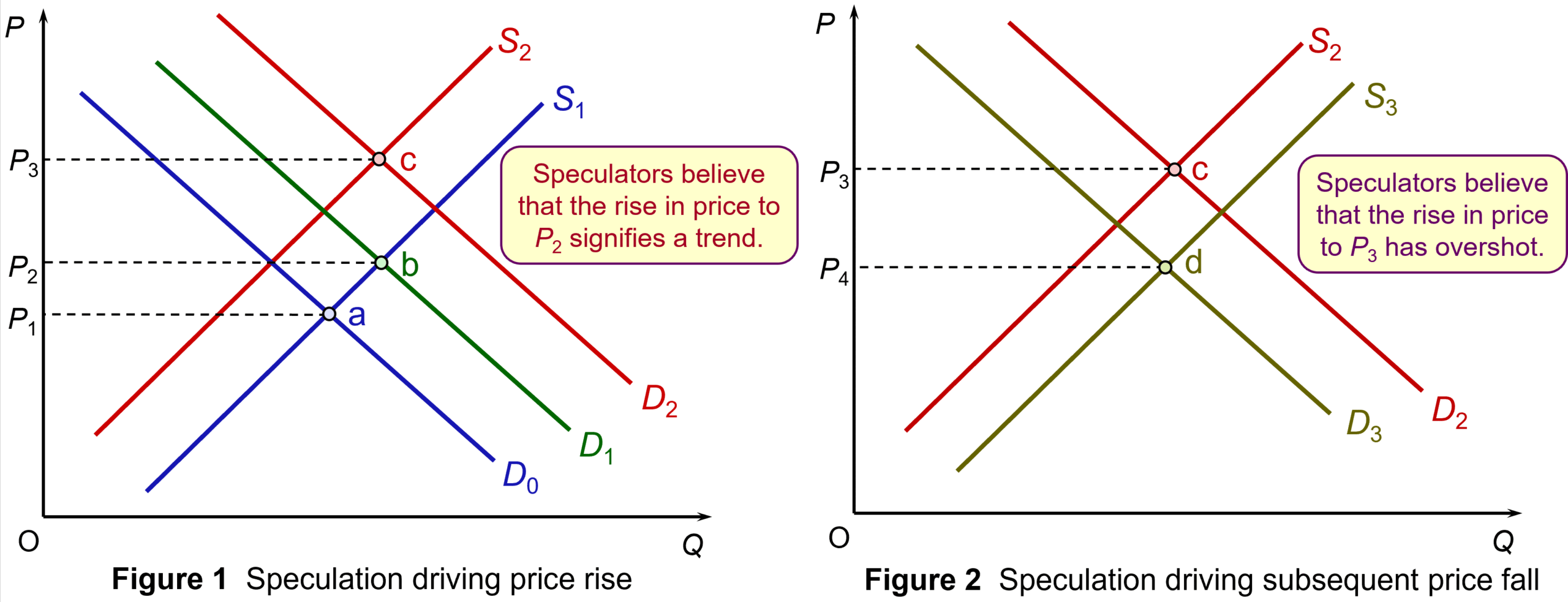
Figure 1 illustrates the effect of speculation on the rise in price of a precious metal, such as silver. Assume that demand rises from D0 to D1 for the reasons given above. Equilibrium moves from point a to point b and the price rises from P1 to P2. Seeing the price rising, holders of the metal wait until the price rises further before selling. Supply shifts from S1 to S2. Potential purchasers of the metal, anticipating a further rise in price, buy now before the price does rise. Demand shifts from D1 to D2. As a result, equilibrium moves from point b to point c and price rises to P3.
Figure 2 illustrates the effect of speculation on the subsequent fall in prices triggered by a belief that price will fall. Speculative selling shifts the supply curve from S2 to S3. Potential demanders hold back and the demand curve shifts from D2 to D3. Equilibrium moves to point d and price falls from P3 to P4. (Click here for a PowerPoint of the two figures.)
But why did prices fall so dramatically? The first reason was that analysts were beginning to argue that the exuberance of investors had led the price of all three metals to overshoot the fundamental balance of supply and demand. Once a tipping point arrived, people sold quickly to lock in the gains they had made over previous weeks. This profit taking caused prices to plummet as speculation of further falls drove prices lower.
 So what was the tipping point? This was the appointment by Donald Trump of Kevin Warsh as the new Chair of the Federal Reserve to take over from Jerome Powell when his tenure comes to an end in May this year.
It was expected that Trump would appoint someone much more willing to cut interest rates and this worried investors, who feared that inflation would rise again. This uncertainty drove demand for precious metals, which are seen as a safe haven. But Kevin Walsh is viewed as hawkish on monetary policy and less likely to slash interest rates than other possible choices for Chair. This triggered the fall in precious metal prices.
But the main factors that drove the demand for the metals still exist. There is still uncertainty, still an increased demand from central banks for gold, still a growing demand for silver and platinum for industrial uses. The next day, 3 February, it seemed that the prices of all three metals had over-corrected. Investors started buying again at the lower prices and consequently prices rose again – once more fuelled by speculation. Gold rose by 6.1%, platinum by 7.9% and silver by 11.6%.
Articles
Data
Questions
- What has happened to the price of silver since this blog was written? Use a demand and supply diagram to illustrate this.
- Identify the factors that affect the demand for and supply of (a) silver; (b) gold.
- What determines the elasticity of supply of silver (a) in total; (b) to the market?
- Choose another commodity other than the three metals considered in this blog. Find out what has happened to their prices over the past 12 months and explain why these price movements have occurred.
 The share prices of various AI-related companies have soared in this past year. Recently, however, they have fallen – in some cases dramatically. Is this a classic case of a bubble that is bursting, or at least deflating?
Take the case of NVIDIA, the world’s most valuable company, with a market capitalisation of around $4.2 trillion (at current share prices). It designs and produces graphics cards and is a major player in AI. From a low of $86.62 April this year, its share price rose to a peak of $212.19 on 29 October. But then began falling as talk grew of an AI bubble. Despite news on 19 November that its 2025 Q3 earnings were up 62% to $57.0bn, beating estimates by 4%, its share price, after a temporary rise, began falling again. By 21 November, it was trading at around $180.
Other AI-related stocks have seen much bigger rises and falls. One of the biggest requirements for an AI revolution is data processing, which uses huge amounts of electricity. Massive data centres are being set up around the world. Several AI-related companies have been building such data centres. Some were initially focused largely on ‘mining’ bitcoin and other cryptocurrencies (see the blog, Trump and the market for crypto). But many are now changing focus to providing processing power for AI.
 Take the case of the Canadian company, Bitfarms Ltd. As it says on its site: ‘With access to multiple energy sources and strategic locations, our U.S. data centers support both mining and high-performance computing growth opportunities’. Bitfarms’ share price was around CAD1.78 in early August this year. By 15 October, it had reached CAD9.27 – a 421% increase. It then began falling and by 24 November was CAD3.42 – a decline of over 63%.
Data centres do have huge profit potential as the demand for AI increases. Many analysts are arguing that the current share price of data centres undervalues their potential. But current profits of such companies are still relatively low, or they are currently loss making. This then raises the question of how much the demand for shares, and hence their price, depends on current profits or future potential. And a lot here depends on sentiment.
If people are optimistic, they will buy and this will lead to speculation that drives up the share price. If sentiment then turns and people believe that the share price is overvalued, with future profits too uncertain or less than previously thought, or if they simply believe that the share price has overshot the value that reflects a realistic profit potential, they will sell and this will lead to speculation that drives down the share price
 The dot.com bubble of the late 1990s/early 2000s is a case in point. There was a stock market bubble from roughly 1995 to 2001, where speculative investment in internet-based companies caused their stock values to surge, peaking in late 1999/early 2000. There was then a dramatic crash. But then years later, many of these companies’ share prices had risen well above their peak in 2000.
Take the case of Amazon. In June 1997, its share price was $0.08. By mid-December 1999, it had reached $5.65. It then fell, bottoming out at $0.30 in September 2001. The dot-com bubble had burst.
But the potential foreseen in many of these new internet companies was not wrong. After 2001, Amazon’s share price began rising once more. Today, Amazon’s shares are trading at over $200 – the precise value again being driven largely by the company’s performance and potential and by sentiment.
So is the boom in AI-related stock a bubble? Given that the demand for AI is likely to continue growing rapidly, it is likely that the share price of companies providing components and infrastructure for AI is likely to continue growing in the long term. But just how far their share prices will fall in the short term is hard to call. Sentiment is a fickle thing.
Articles
Questions
- Using a supply and demand diagram, illustrate how speculation can drive up the share price of a company and then result in it falling.
- What is meant by overshooting in a market? What is the role of speculation in this process?
- Does a rapid rise in the price of an asset always indicate a bubble? Explain.
- What are the arguments for suggesting that markets are/are not experiencing an AI share price bubble? Does it depend of what part of the AI market is being considered?
- What is meant by the market capitalisation of a company? Is it a good basis for deciding whether or not a company’s share price is a true reflection of the company’s worth? What other information would you require?
- Find out what has been happening to the price of Bitcoin. What factors determine the price of Bitcoin? Do these factors make the price inherently unstable?
 The gold market has become one of the most talked-about commodity markets in 2025, with prices reaching record highs. This is largely due to increased demand from investors, who see gold as a ‘safe haven’ during times of economic and political uncertainty. Central banks are also buying more gold as a way to reduce their reliance on currencies like the US dollar. With many analysts predicting prices could reach over $4000 per ounce in the next year, the gold market is showcasing how supply and demand, confidence, and global events can all influence a commodity market.
The commodities market is where basic agricultural products, raw materials and metals, such as gold, are bought and sold, often in large quantities and across global exchanges. Commodities are typically traded either in their physical form (like gold bars) at current market prices (spot prices) or through financial contracts, where investors buy or sell in futures markets. These are where a price is agreed today to buy or sell on a specific future date.
As with other commodities, the price of gold is determined by supply and demand. Demand for gold typically rises during times of economic uncertainty as investors want a safer store of value. This results in an increase in its price. Supply and demand, and hence price, also respond to other factors, including interest rates, currency movements, economic growth and growth prospects, and geopolitical events.
Record high prices
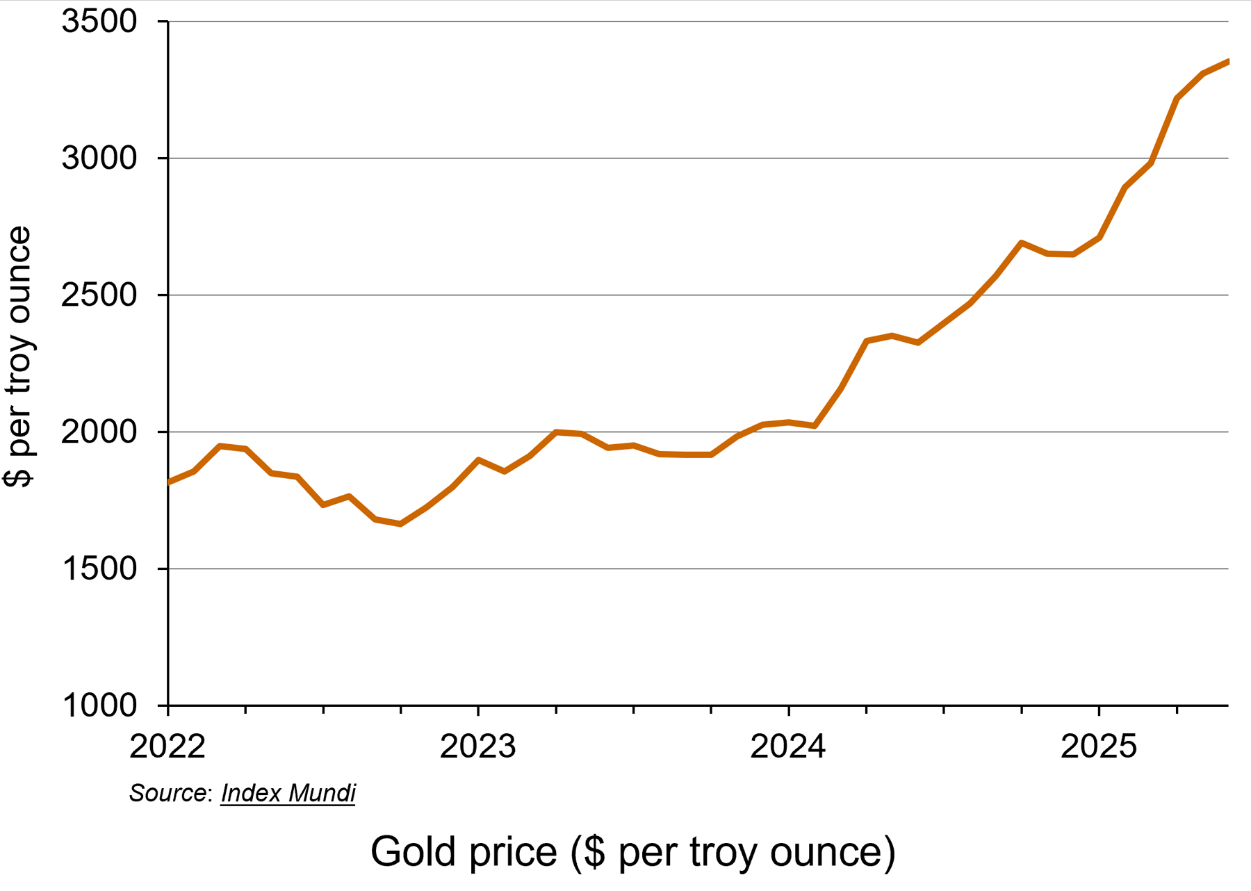 This year, the gold market has seen a remarkable rally, with the price of gold hitting a record high. Demand for the precious metal has resulted in spot prices surging over 35% to date (see the chart: click here for a PowerPoint). Rising prices earlier this year have been attributed to the US President, Donald Trump, announcing wide-ranging tariffs which have upset global trade. On 2 September, the spot gold price hit $3508.50 per ounce, continuing its upwards trend.
The price has also been lifted by expectations that the Federal Reserve (the US central bank) will cut its key interest rate, making gold an even more attractive prospect for investors. If the Federal Reserve cuts interest rates, the price of gold usually increases. This is because gold does not pay any interest or yield, so when interest rates are high, investors can earn better returns from alternatives, such as savings accounts or bonds. However, when interest rates fall, those returns become less attractive, making gold relatively more appealing.
Lower interest rates also tend to weaken the US dollar, which makes gold cheaper for foreign buyers, increasing global demand. Since gold is priced in dollars, a weaker dollar usually leads to higher gold prices.
Additionally, interest rate cuts are often a response to economic problems or uncertainty. As gold is viewed as a safer asset for investors during times of economic uncertainty, investors will typically increase their demand.
Unlike the market for currencies or shares, gold doesn’t rely on the performance of a government or company. This makes it attractive when people are worried about things like inflation, recession, war or stock market crashes. Gold is thus seen as a ‘safe haven’.
Gold and the Federal Reserve
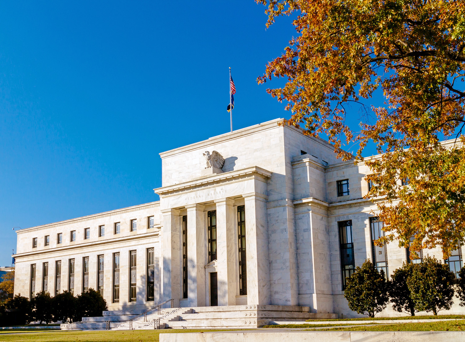 The rise in the price of gold by more than a third this year can be linked to the US election last year, according to the director of research at BullionVault (see the BBC article below). Attitudes of the Trump administration towards the Federal Reserve have created concerns among investors. Fears that the US administration could erode the independence of the world’s most important central bank have fuelled the latest flows into the metal, which is traditionally viewed as a hedge against inflation.
According to the BBC article, Derren Nathan from Hargreaves Lansdown claims that it is Trump’s ‘attempts to undermine the independence of the Federal Reserve Bank’ that were ‘driving renewed interest in safe haven assets, including gold’. Investors are concerned that a politicised Fed would be more inclined to cut interest rates than would otherwise be the case, sending long-term inflation expectations higher.
This could lead to fears that future interest rates would then be pushed higher. This would increase the yields on longer-term government bonds by pushing down their price, as investors demand higher compensation for the increased risk of higher future interest rates reducing the value of their fixed-rate investments. This would force the US Treasury to pay higher interest on new bonds, making it more expensive to service US government debt.
Expected price rises for 2026
As we saw above, it is predicted that the price of gold will rise to $4000 per ounce next year. However, if the market sees investors move away from dollar assets, such as US Treasuries, the price increases would be even higher. Daan Struyven, co-head of global commodities research at Goldman Sachs explains ‘If 1 per cent of the privately owned US Treasury market were to flow to gold, the gold price would rise to nearly $5000 per troy ounce’ (see Financial Times article below).
 If the Federal Reserve does come under political pressure, it could affect the stability of the US economy and beyond. When gold prices rise sharply, demand usually falls in countries like China and India, which are the world’s largest buyers of gold jewellery. However, in 2025, this trend has changed. Instead of reducing their gold purchases, people in these countries have started buying investment gold, such as bars and coins, showing a shift in consumer behaviour from jewellery to investment assets.
At the same time, global events are also influencing the gold market. Suki Cooper, a metals analyst at Standard Chartered, said that events like Russia’s invasion of Ukraine have added to political uncertainty, which tends to increase demand for gold as a safe-haven asset. She also highlighted how changes in international trade policies have disrupted supply chains and contributed to higher inflation, both of which have made gold more attractive to investors. Additionally, a weaker US dollar earlier in the year made gold cheaper for buyers using other currencies, which boosted global demand even further.
Conclusion
Although the gold market is expected to remain strong over the next six months, some uncertainty remains. Many analysts predict that gold prices will stay high or even increase further, especially if interest rates in the US are cut as expected. Continued global instability, is also likely to keep demand for gold as a safe haven high. At the same time, if inflation stays elevated or trade disruptions continue, more investors may turn to gold to protect their wealth.
However, if economic conditions stabilise or interest rates rise again, gold demand could fall slightly, leading to a potential dip in prices. Overall, the outlook for gold remains positive, but sensitive to changes in global economic and political events.
Articles
- Gold price hits record high as investors seek safety
BBC News, Faarea Masud (2/9/25)
- Safe-haven gold rally gains further momentum after soft US data
Reuters, Sherin Elizabeth Varghese and Ashitha Shivaprasad (3/9/25)
- Gold vaults $3,000 in rush for safety from market, political worry
Reuters, Sherin Elizabeth Varghese and Anmol Choubey (14/3/25)
 The foundation of gold’s rally to historic highs started back in 2022
CNBC, Suki Cooper (17/3/25)
- Gold could hit nearly $5,000 if Trump undermines Fed, says Goldman Sachs
Financial Times, Emily Herbert (4/9/25)
- London’s bullion market set to trial digital gold
City AM, Maisie Grice (3/8/25)
- Gold price hits record high as investors seek safe haven
The Guardian, Julia Kollewe (2/9/25)
Data
Questions
- What factors influence the price of a commodity such as gold on the global market?
- Use a demand and supply diagram to illustrate what has been happening to the gold price in recent months.
- Find out what has been happening to silver prices. Are the explanations for the price changes the same as for gold?
- Why might investors choose to buy gold during times of economic or political uncertainty?
- How will changes in interest rates affect both the demand for and the price of gold?
- What are the possible consequences of rising gold prices for countries like India and China, where there is a traditionally high demand for gold jewellery?
- How do global events impact commodity markets? Use gold as an example in your answer.
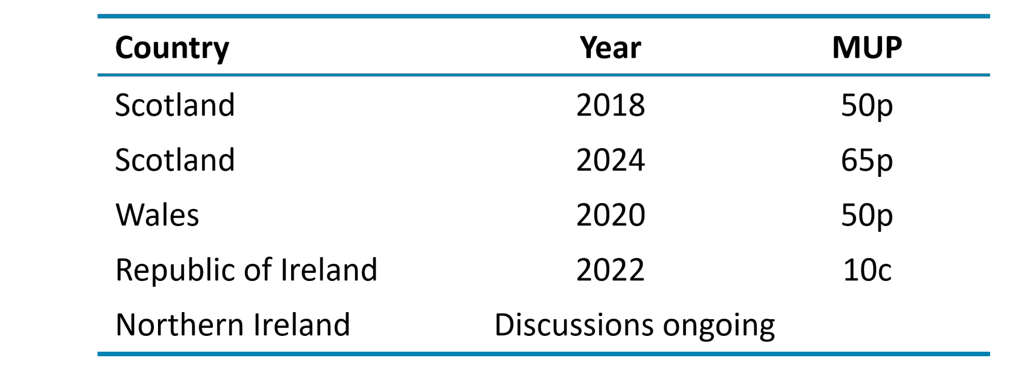
 The debate about a minimum price for alcohol continues to be prompted by concerns over high levels of drinking, its effect on public health and public order, and a widespread belief that most of the alcohol that contributes to drunken behaviour is irresponsibly priced and sold. Minimum pricing for alcohol, although considered a radical intervention, is not a new policy. A minimum unit price (MUP) for alcohol was introduced in Scotland in 2018, in Wales in 2020, in the Republic of Ireland in 2022 and looks likely to be introduced in Northern Ireland.
Despite more countries following Scotland’s lead, there are no current plans to consider an application of an MUP in England. However, with recent increases in the MUP in Scotland and the findings of a five-year review in Wales, it would suggest that this policy will continue to be at the forefront of discussions of how to tackle impacts of alcohol consumption.
Reasons and options for intervention
The main goal of introducing a minimum unit price for alcohol is to tackle unwanted consequences from the consumption of alcohol. While many people consume alcoholic drinks safely without any problems, some patterns of alcohol use are associated with significant physical, mental and social harm.
It costs UK society more than £27 billion a year through a combination of health, crime, workplace and social welfare costs. Therefore, some governments in the British Isles have deemed it necessary to intervene in this market to reduce alcohol-related harm and protect the health of those regularly drinking more than the recommended 14 units per week.
 Research has shown that making alcohol less affordable can reduce consumption and hence related harms. The World Health Organization considers minimum pricing one of its ‘best buys’ for tackling harmful alcohol use.
There are three main policy options that aim to reduce the consumption of alcohol by making alcohol less affordable. One is to tax alcoholic drinks; the second is to set a minimum price per unit of alcohol; the third is to ban the sale of alcohol drinks below cost price (the level of alcohol duty plus VAT).
The policy option of an MUP has been adopted by Scotland, Wales and the Republic of Ireland; England has opted to use a ban on selling alcohol below the level of alcohol duty plus VAT (since 28 May 2014).
What is a minimum price?
The introduction by the government of a minimum price for a product means that it cannot legally be sold below that price. It can be set in order to achieve certain economic or social objectives that are not currently being achieved at equilibrium in the market. In order for the policy to have an effect, the minimum price must be set above the equilibrium price. This price floor then prevents prices from falling too low and settling back at equilibrium below the MUP.
A common misconception is that introducing a minimum price for alcohol is a form of taxation. However, this is not the case. Implementing an MUP means that any extra money from higher prices goes to the retailers and producers, not to the government.
Why choose a minimum price floor?
The policy has two main objectives. The first is to protect the interests of drinkers who may make poor decisions on their own behalf. This may be from lack of information, social pressures or a disregard for their own long-term health or welfare.
The second objective is to reduce the external costs placed on health services, the police, the criminal justice system, on fellow citizens or employers. There are also longer-term external costs when alcohol abuse impacts on productivity or leads to repeated absences from work.
It is argued that MUP intervention can encourage positive changes in behaviour of both consumers and producers. It can target harmful excessive drinking, while leaving the more moderate drinker relatively unaffected.
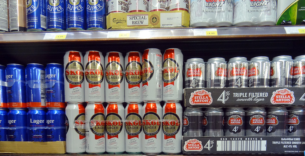 A positive impact on consumers is the possible changes in demand. People who previously consumed cheap, and often strong, drinks, such as cheap cider, will find that their marginal private cost of consuming alcohol has increased. Depending on the price elasticity of demand, their consumption will decrease and there will be a reduction in alcohol-related violence and other external costs. A positive impact on producers is that it can encourage drinks manufacturers themselves to reduce the alcohol content of their products and, therefore, limit any increase in price passed on to the consumer.
How it differs in the different parts of the British Isles
While minimum alcohol pricing is in place in several countries, policies differ. In terms of the British Isles, in 2018 Scotland became the first country to introduce a national minimum price for all types of alcohol. Two years later, Wales followed suit. The Republic of Ireland introduced minimum pricing in January 2022, while Northern Ireland has been engaged in consultation on the policy for several years. The following table shows when MUP was introduced and at what rates.
Has the MUP been effective?
Wales has reached the five-year review point since the MUP was introduced. Many of the findings within the Welsh evaluation have strong resonance with those elsewhere, particularly those of the final Scottish evaluation. There have been five main findings:
- Implementation has been smooth. Retailers have largely complied with the law, and enforcement has been effective.
- Certain cheap alcohol products have disappeared. Large bottles of strong cider, for example, are now rare. There have also been shifts in promotions and product availability.
- There are indications that overall alcohol consumption in Wales has declined. While it is difficult to measure directly, purchasing data suggests a reduction.
- Concerns about unintended consequences have not materialised significantly. Predictions of a rise in home brewing, substance switching, shoplifting and cross-border purchasing have not been widely observed.
- Some drinkers have changed their purchasing habits. A minority have switched from cider to wine or spirits as price differences narrowed. Others, particularly those on low incomes, experienced further struggles in financially maintaining their drinking habits.
There was also a study published last year (2024) in the journal Economic Inquiry, looking at the impacts of the policy during lockdown restrictions. The study showed that the introduction of MUP in Wales resulted in a 15% increase in transaction prices and a sharp reduction in the amount of alcohol bought, around 20%, with an overall drop in expenditure per customer compared to England over the same period.
However, it should be noted that the COVID pandemic disrupted drinking habits and the availability of alcohol. In addition, evaluating the overall effects of the policy has been complex with other economic factors, including the cost-of-living crisis, also influencing affordability.
Is it a fair policy?
A counter argument to applying a price intervention on alcohol is that it may have unintended private and external costs. One argument claims that young people could decide to switch to cheaper non-alcoholic drugs instead. Alternatively, they may seek to purchase alcohol on illegal shadow markets.
 Critics of the policy argue that it negatively impacts those who consume alcohol responsibly, especially families on average or below-average incomes. The wine and spirits industry tried to lobby against the Scottish government, arguing that it is inconsistent with the operation of the free market and that the intervention creates a barrier to trade. They claim that lower sales of alcoholic drinks will cost jobs in the UK, both in manufacturing and from reduced revenues of corner shops, pubs and other retailers.
There is also an argument that relying solely on an MUP targets the affordability of drinking rather than addressing all aspects of alcohol harm. Therefore, this policy is not necessarily effective in achieving all the government’s goals. Critics argue that this policy should be one component of a more comprehensive strategy delivery, which might include education, restricting the availability of alcohol, banning advertising, increasing alcohol duty, etc.
Conclusion
Although there are currently no plans to implement an MUP in England, there is ongoing pressure for the Government to consider adopting one. In the Autumn of 2024, Lord Darzi carried out an independent investigation of the NHS in England. This investigation into the NHS highlighted the ‘alarming’ death toll in England caused by cheap drink (see link below). This led public health leaders to call for action to increase the price of cheap alcohol in supermarkets and off-licences.
 However, the policy itself is not without its critics, especially those citing continued trends in actual numbers of alcohol-related deaths. Therefore, it is suggested that the policy needs to be accompanied by well-funded treatment and support services for people experiencing alcohol-related difficulties. If combined with other policy measures and social support, it has the potential to contribute significantly to reductions in alcohol-related harm.
Despite reservations, overall a minimum price per unit of alcohol is viewed by many as a justified intervention and is well supported by evidence. It has been accepted that a minimum price is required to reduce consumption closer towards the social optimum and in order to bring about change in consumer and producer behaviour. Given the evidence provided from current MUP countries and ongoing discussions of alcohol-related deaths in England, health officials believe a review is almost certain, even though the current government reportedly ruled out minimum unit pricing shortly after winning power.
Articles
Reports
Questions
- Using a supply and demand diagram, discuss the effect of introducing a minimum price per unit of alcohol.
- How is the price elasticity of demand for alcoholic drinks relevant to determining the success of minimum pricing?
- Compare the effects on alcohol consumption of imposing a minimum unit price of alcohol with a ban the sale of alcohol below cost price. What are the revenue implications of the two policies for the government?
- What negative externalities occur as a result in the over consumption of alcohol? How could a socially efficient price for alcohol be determined?
- Could alcohol consumption be described as a ‘de-merit good’? Explain.
- Rather than targeting the price of alcohol, what other policies could the government introduce to tackle over consumption of alcohol?
- What will determine the number of people travelling across borders within the UK (i.e. from Scotland or Wales to England) to buy cheaper alcoholic drinks?
 With relentless bombing of Iran by Israel and the USA, and with Iranian counterattacks on Gulf states, the costs of the war are mounting. The most obvious are in terms of human lives, injuries and suffering. But there are significant economic costs too. Some of these are immediate, such as the rising price of oil and hence the costs of fuel, or the fall in stock market prices. Some will be longer term, depending on how the war develops. For example, prices could rise more generally as supply chains are disrupted.
 The impacts will vary across the world and across markets. The most obvious markets to be affected are those where significant supply comes from the Persian Gulf. Approximately 20% of total global oil consumption passes through the Strait of Hormuz, which connects the Persian Gulf with the Arabian Sea and the Indian Ocean.
 Rising oil prices will drive up inflation. For those countries with a heavy dependence on Gulf oil, particularly countries in Asia, there could be significant supply problems. For oil exporters in the Persian Gulf, with tankers unable to traverse the Strait of Hormuz, the economic impact is huge. Oil exporters outside the Gulf, such as Russia, Norway and Canada, however, will gain from the higher prices. Clearly the size of these effects will depend on how long the conflict continues and how long the Strait of Hormuz remains closed.
 There is great uncertainty about how long the conflict will last. There is also a lack of clarity and consistency from the US administration about its war aims. This uncertainty has affected financial markets, which have seen considerable volatility. Stock markets have seen widespread falls, with airline, travel and AI-heavy stocks being particularly vulnerable.
 Precious metals, such as gold, silver and platinum, are seen as safe havens by investors in uncertain times. With the on-off nature of Donald Trump’s tariffs, with ongoing wars, such as the war in Ukraine, and with threats of US action in Iran, with inflation slow to fall and pressure by the Trump administration on the Federal Reserve to make precipitant cuts in interest rates, investors have flocked to precious metals.
 So what was the tipping point? This was the appointment by Donald Trump of Kevin Warsh as the new Chair of the Federal Reserve to take over from Jerome Powell when his tenure comes to an end in May this year.
 The share prices of various AI-related companies have soared in this past year. Recently, however, they have fallen – in some cases dramatically. Is this a classic case of a bubble that is bursting, or at least deflating?
 Take the case of the Canadian company,
  The dot.com bubble of the late 1990s/early 2000s is a case in point. There was a stock market bubble from roughly 1995 to 2001, where speculative investment in internet-based companies caused their stock values to surge, peaking in late 1999/early 2000. There was then a dramatic crash. But then years later, many of these companies’ share prices had risen well above their peak in 2000.
 This year, the gold market has seen a remarkable rally, with the price of gold hitting a record high. Demand for the precious metal has resulted in spot prices surging over 35% to date (see the chart: click
  The rise in the price of gold by more than a third this year can be linked to the US election last year, according to the director of research at BullionVault (see the BBC article below). Attitudes of the Trump administration towards the Federal Reserve have created concerns among investors. Fears that the US administration could erode the independence of the world’s most important central bank have fuelled the latest flows into the metal, which is traditionally viewed as a hedge against inflation.
  If the Federal Reserve does come under political pressure, it could affect the stability of the US economy and beyond. When gold prices rise sharply, demand usually falls in countries like China and India, which are the world’s largest buyers of gold jewellery. However, in 2025, this trend has changed. Instead of reducing their gold purchases, people in these countries have started buying investment gold, such as bars and coins, showing a shift in consumer behaviour from jewellery to investment assets.
 The debate about a minimum price for alcohol continues to be prompted by concerns over high levels of drinking, its effect on public health and public order, and a widespread belief that most of the alcohol that contributes to drunken behaviour is irresponsibly priced and sold. Minimum pricing for alcohol, although considered a radical intervention, is not a new policy. A minimum unit price (MUP) for alcohol was introduced in Scotland in 2018, in Wales in 2020, in the Republic of Ireland in 2022 and looks likely to be introduced in Northern Ireland.
 Research has shown that making alcohol less affordable can reduce consumption and hence related harms. The World Health Organization considers minimum pricing one of its ‘best buys’ for tackling harmful alcohol use.
  A positive impact on consumers is the possible changes in demand. People who previously consumed cheap, and often strong, drinks, such as cheap cider, will find that their marginal private cost of consuming alcohol has increased. Depending on the price elasticity of demand, their consumption will decrease and there will be a reduction in alcohol-related violence and other external costs. A positive impact on producers is that it can encourage drinks manufacturers themselves to reduce the alcohol content of their products and, therefore, limit any increase in price passed on to the consumer.
 Critics of the policy argue that it negatively impacts those who consume alcohol responsibly, especially families on average or below-average incomes. The wine and spirits industry tried to lobby against the Scottish government, arguing that it is inconsistent with the operation of the free market and that the intervention creates a barrier to trade. They claim that lower sales of alcoholic drinks will cost jobs in the UK, both in manufacturing and from reduced revenues of corner shops, pubs and other retailers.
 However, the policy itself is not without its critics, especially those citing continued trends in actual numbers of alcohol-related deaths. Therefore, it is suggested that the policy needs to be accompanied by well-funded treatment and support services for people experiencing alcohol-related difficulties. If combined with other policy measures and social support, it has the potential to contribute significantly to reductions in alcohol-related harm.