 UK unemployment fell by 4000 to 2.51 million in second quarter of this year. But this was too small to have any significant effect on the unemployment rate, which remained at 7.8%.
According to the forward guidance issued by the Bank of England, Bank Rate will stay at 0.5%, barring serious unforeseen circumstances, until unemployment reaches 7%. So will this be soon?
There are good reasons to suggest that the answer is no. Reasons include the following:
(a) Many firms may choose to employ their part-time workers for more hours, rather than taking on extra staff, if the economy picks up.
 (b) The recovery is being fuelled by a rise in consumption, which, in turn, is being financed by people drawing on savings or borrowing more. The household saving ratio fell from 7.4% in 2012 Q1 to 4.2% in 2013 Q1. This trend will be unsustainable over the long run, especially as the Bank of England may see a rapid rise in borrowing/decline in saving as serious enough to raise interest rates before the unemployment rate has fallen to 7%.
(c) Despite the modest recovery, people’s average real incomes are well below the levels prior to the deep recession of 2008/9.
The articles consider the outlook for the economy and unemployment
Articles
UK unemployment holds steady at 7.8pc The Telegraph, Rebecca Clancy (14/8/13)
Unemployment rate is unlikely to fall sharply The Guardian, Larry Elliott (14/8/13)
UK unemployment falls by 4,000 to 2.51 million BBC News (14/8/13)
UK wages decline among worst in Europe BBC News (11/8/13)
Squeezing the hourglass The Economist (10/8/13)
 More people in work than ever before as unemployment falls Channel 4 News, Faisal Islam (14/8/13)
Data
Labour Market Statistics, August 2013 ONS
United Kingdom National Accounts, The Blue Book, 2013: Chapter 06: Households and Non-profit Institutions Serving Households (NPISH) ONS
Questions
- What factors determine the rate of unemployment?
- With reference to the ONS data in Labour Market Statistics, August 2013 above, what has happened to (a) the long-term unemployment rate; (b) the unemployment rate for 18–24 year olds?
- How would you define ‘living standards’?
- How is labour productivity relevant to the question of whether unemployment is likely to fall?
- How much have living standards fallen since 2008?
- Under what circumstances might the Bank of England raise interest rates before the rate of unemployment has fallen to 7%?
- Property prices are beginning to rise. Consider the effects of this and whether, on balance, a rise in property prices is beneficial.
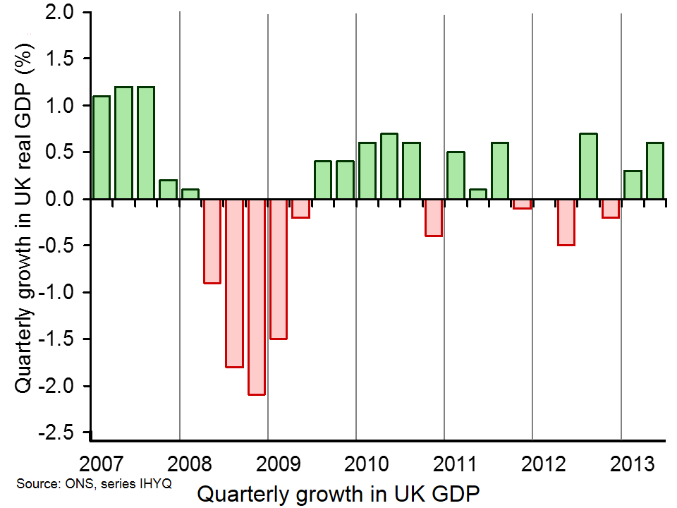
 The Preliminary Estimate of the UK Q2 GDP figures by the Office for National Statistics show that the UK economy grew by 0.6% in the second quarter of 2013: double the growth rate of the first quarter and almost back to the long-run average growth rate prior to 2008.
At first sight, this would seem to be good news – certainly from the government’s point of view. What is more, unlike the previous quarter, growth is spread relatively evenly across the three main sectors: the production (manufacturing, mining, water supply, etc.) and services sectors both grew by 0.6% and the construction sector by 0.9% (this sector fell by 1.8% in the previous quarter). (Click here for a PowerPoint of the chart below.)
 But while growth in the latest quarter may be balanced between the broad sectors, the rise in aggregate demand is not balanced between its components. As an earlier news item (A balancing act) showed, the rise in aggregate demand has been driven largely by a rise in consumption, and a corresponding fall in saving. Exports are rising only slowly and investment is some 25% lower than in the boom years prior to 2008.
So will the latest growth be sustainable? Will investment now begin to pick up and what constraints are there on investment? The following articles consider some of the issues.
Articles
Economy firing on all cylinders as growth hits 0.6pc The Telegraph, Philip Aldrick (25/7/13)
The good, the bad or the ugly? How the UK economy stands up. The Telegraph, Philip Aldrick (25/7/13)
George Osborne’s 0.6% growth is good but unspectacular The Guardian, Larry Elliott (25/7/13)
The (not-so) green shoots of recovery The Economist, John Van Reenen (23/7/13)
Economic recovery slow to take root for some in UK Reuters, William Schomberg and Max De Haldevang (25/7/13)
 GDP figures offer hard evidence for political narrative BBC News, Paul Mason (25/7/13)
Ignore the hype: Britain’s ‘recovery’ is a fantasy that hides our weakness The Observer, Will Hutton (21/7/13)
UK economy: Half-speed ahead BBC News, Stephanie Flanders (25/7/13)
BoE guidance can help sustain the UK recovery The Economist, Kevin Daly (22/7/13)
George Osborne’s description of the economy is near-Orwellian The Guardian, Ha-Joon Chang (26/7/13)
Economic growth: more must be done to encourage investment The Guardian, Phillip Inman (1/8/13)
Data
Gross Domestic Product: Preliminary Estimate, Q2 2013 ONS (25/7/13)
Questions
- Compare the macroeconomic situation today with that prior to the financial crisis of 2007/8 and subsequent recession.
- What factors will determine the sustainability of the UK economic recovery?
- What is meant by the ‘accelerator’ and what will determine the size of any accelerator effect from the latest rise in UK GDP?
- What supply-side constraints are likely to limit the rate and extent of recovery?
- Why do economies that are in recession ‘naturally bounce back’ without any government intervention? Have the macroeconomic policies of the UK government helped or hindered this bounce back? Explain.
- What monetary measures by the Bank of England are most appropriate in the current circumstances?
 Each day many investors anxiously watch the stock market to see if their shares have gone up or down. They may also speculate: buying if they think share prices are likely to go up; selling if they think their shares will fall. But what drives these expectations?
To some extent, people will look at real factors, such as company sales and profits or macroeconomic indicators, such as the rate of economic growth or changes in public-sector borrowing. But to a large extent people are trying to predict what other people will do: how other people will react to changes in various indicators.
 John Maynard Keynes observed this phenomenon in Chapter 12 of his General Theory of Employment, Interest and Money of 1936. He likened this process of anticipating what other people will do to a newspaper beauty contest, popular at the time. In fact, behaviour of this kind has become known as a Keynesian beauty contest (see also).
Keynes wrote that:
professional investment may be likened to those newspaper competitions in which the competitors have to pick out the six prettiest faces from a hundred photographs, the prize being awarded to the competitor whose choice most nearly corresponds to the average preferences of the competitors as a whole; so that each competitor has to pick, not those faces which he himself finds prettiest, but those which he thinks likeliest to catch the fancy of the other competitors, all of whom are looking at the problem from the same point of view. It is not a case of choosing those which, to the best of one’s judgement, are really the prettiest, nor even those which average opinion genuinely thinks the prettiest. We have reached the third degree where we devote our intelligences to anticipating what average opinion expects the average opinion to be. And there are some, I believe, who practise the fourth, fifth and higher degrees.
When investors focus on people’s likely reactions, it can make markets very unstable. A relatively minor piece of news can cause people to buy or sell in anticipation that others will do the same and that others will realise this and do the same themselves. Markets can overshoot, until, when prices have got out of line with fundamentals, buying can turn into selling, or vice versa. Prices can then move rapidly in the other direction, again driven by what people think other people will do. Sometimes, markets can react to very trivial news indeed. As the New York Times article below states:
On days without much news, the market is simply reacting to itself. And because anxiety is running high, investors make quick, sometimes impulsive, responses to relatively minor events.
The rise of the machine
 In recent years there is a new factor to account for growing stock market volatility. The Keynesian beauty contest is increasingly being played by computers. They are programmed to buy and sell when certain conditions are met. The hundreds of human traders of the past who packed trading floors of stock markets, have been largely replaced by just a few programmers, trained to adjust the algorithms of the computers their finance companies use as trading conditions change.
And these computers react in milliseconds to what other computers are doing, which in turn react to what others are doing. Markets can, as a result, suddenly soar or plummet, until the algorithms kick the market into reverse as computers sell over-priced stock or buy under-priced stock, which triggers other computers to do the same.
Robot trading is here to stay. The articles and podcast consider the implications of the ‘games’ they are playing – for savers, companies and the economy.
Articles
Questions
- Give some other examples of human behaviour which is in the form of a Keynesian beauty contest.
- Why may playing a Keynesian beauty contest lead to an undesirable Nash equilibrium?
- Does robot trading do anything other than simply increase the speed at which markets adjust?
- Can destabilising speculation continue indefinitely? Explain.
- Explain what is meant by ‘overshooting’? Why is overshooting likely to occur in stock markets and foreign exchange markets?
- In what ways does robot trading (a) benefit and (b) damage the interests of savers?
 One very important characteristic of economic growth is its short-term volatility. Economic activity is notoriously volatile. It is such a fundamental idea that economists refer to it as one of their threshold concepts. The volatility of growth sees occasional recessions. The traditional definition is where real GDP (output) declines for 2 or more consecutive quarters. The latest figures from the Quarterly National Accounts call into question whether the UK technically experienced a recession at the start of 2012 with output broadly flat in 2012 Q1 following a contraction of 0.1 per cent in 2011 Q4.
The ONS’s latest output numbers raise some interesting questions around our understanding of what constitutes a recession. These figures show that the 2008/9 recession was deeper than first thought with output declining by 7.2 per cent. They show that UK output peaked in 2008Q1 (£392.786 billion at 2010 prices). There then followed 6 quarters where output declined.
Output declined again in 2010 Q4 (–0.2% growth) and again in 2011 Q4 (–0.1% growth). But then interpretations of the data become more controversial. Not least, we get in the debates concerning the accuracy with which we can expect to measure the size of the economy and so to how many decimal places one should realistically measure a rise or fall. In terms of the raw real GDP numbers output fell in 2012 Q1. In 2011 Q4 GDP is estimated at £376,462 billion (at 2010 prices) ‘falling’ to £376,436 billion (at 2010 prices) in 2012 Q1. But, this is a percentage fall only when measured to the third decimal place (–0.007% growth).
In its publication Impact of changes in the National Accounts and economic commentary for Q1 2013 the ONS argue that:
While some commentators may attempt to read some significance into this revision, particularly in the context of whether the UK experienced a “double-dip” recession, it is clearly absurd to imagine that it is possible to measure the size of the economy to this degree of accuracy. The best interpretation of the Blue Book figures is that the economy was flat in the first quarter of 2012, and 0.6% larger than in the same quarter of 2011.
It is however understandable that those with vested interests – including economists, policy-makers and politicians – will take a slightly different view and will read more into the figures than perhaps an objective, sober view might demand. What appears more certain is that output did again fall in 2012 Q2 (–0.5 per cent growth) and in 2012 Q4 (–0.2 per cent growth). Despite estimated growth of 0.3 per cent in 2013 Q1, output remains 3.9 per cent lower than at its 2008 Q1 peak.
Perhaps the ‘absurdity’ or not around the debate of a double-dip recessions strengthens the argument for a more holistic and considered view of what constitutes a recession. In the USA the wonderfully-named Business Cycle Dating Committee takes a less fixed view of economic activity and, hence, of recessions. Its website argues:
It (the Committee) examines and compares the behavior of various measures of broad activity: real GDP measured on the product and income sides, economy-wide employment, and real income. The Committee also may consider indicators that do not cover the entire economy, such as real sales and the Federal Reserve’s index of industrial production (IP).
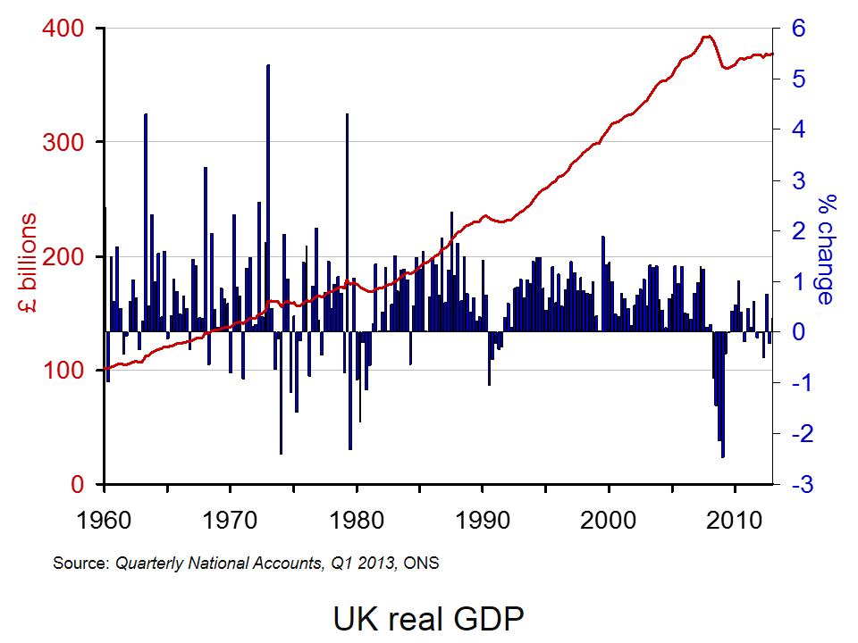
Of course, the advantage of focusing on real GDP alone in measuring activity and in determining recessions is that it is usually very straightforward to interpret. Regardless of whether the UK has experienced or not two recessions in close proximity, our chart helps to put the recent growth numbers into an historical context . It shows both the quarter-to-quarter changes in real GDP (left-hand axis) and the level of output as measured by GDP at constant 2010 prices (right-hand axis). Click here to download the chart to PowerPoint.
The chart captures nicely the twin characteristics of growth. Since 1960, the average rate of growth per quarter has been 0.63 per cent. This is equivalent to an average rate of growth of 2.55 per cent per year. Since 2008 Q2, quarterly growth has averaged –0.19 per cent which is equivalent to an annual rate of growth of –0.78 per cent! In any language these are extraordinary numbers. Indeed, one could argue that focusing any policy debate around whether or not the UK experienced a double-dip recession rather misses the more general point concerning the absense of any sustained economic growth since 2008.
Data
Quarterly National Accounts Time Series Dataset Q1 2013 Office for National StatisticsStatistical Bulletin: Quarterly National Accounts Q1 2013 Office for National Statistics
Articles
UK avoided double-dip recession in 2011, revised official data shows Guardian, Phillip Inman (27/6/13)
Britain’s double dip recession revised away, but picture still grim Reuters, David Milliken and William Schomberg (27/6/13)
UK double-dip recession revised away BBC News (27/6/13)
IMF raises UK economic growth forecast BBC News (9/7/13)
IMF raises UK economic growth forecast to 0.9% but cuts prediction for global growth Independent, Holly Williams (9/7/13)
IMF Upgrades UK Growth Forecast For 2013 Sky News (9/7/13)
Questions
- What is the difference between nominal and real GDP? Which of these helps to track changes in economic output?
- Looking at the chart above, summarise the key patterns in real GDP since the 1960s.
- What is a recession? What is a double-dip recession?
- What are some of the problems with the traditional definition of a recession?
- Explain the arguments for and against the proposition that the UK has recently experienced a double-dip recession.
- Can a recession occur if nominal GDP is actually rising? Explain your answer.
- What factors might result in economic growth being so variable?
- Produce a short briefing paper exploring the prospects for economic growth in the UK over the next 12 to 18 months.
 There’s some good news and some bad news about the UK economy. The good news is that there are signs that the recovery is gathering momentum; the ‘green shoots’ are growing bigger. The bad news is that it’s the ‘wrong type of growth’!
One of the main underlying problems of the 2008 financial crisis was that household debt had been increasing to unsustainable levels, egged on by banks only too willing to lend, whether as personal loans, on credit cards or through mortgages. When the recession hit, many people sought to reduce their debts by cutting back on spending. This further fuelled the recession.
What the government and most economists hoped was that there would be some rebalancing of the economy, with less reliance on consumer spending to drive economic growth. Instead it was hoped that growth would be driven by a rise in investment and exports. Indeed, the 25% depreciation of sterling exchange between 2007 and 2009 was seen as a major advantage as this would boost the demand for exports and encourage firms to invest in the export sector.
But things haven’t turned out the way people hoped. The recession (or lack of growth) has been much deeper and more prolonged than previous downturns in the economy. Today, real GDP per head is more than 7% below the level in 2007 and many people have seen much bigger declines in their living standards.
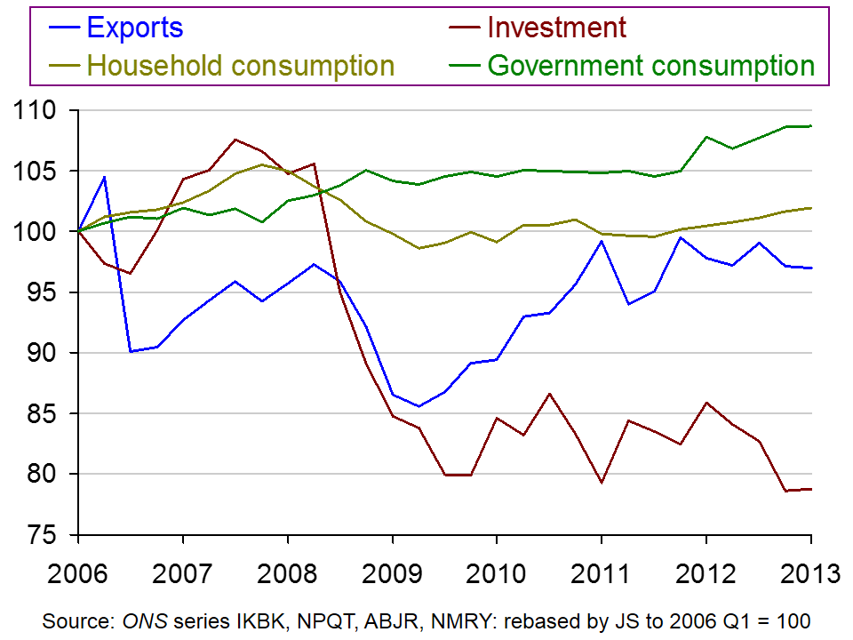
 But also, despite the austerity policies, the economy has not been ‘rebalanced’ towards exports and investment. Exports are 3% lower than in 2006 (although they did grow between 2009 Q2 and 2011 Q1, but have since stagnated). And investment is 27% lower than in 2006. Household consumption, however, has grown by about 2% and general government consumption by around 9% since 2006. The chart shows the figures, based on 2006 Q1 = 100.
(Click here for a PowerPoint of the chart.)
And recent evidence is that consumption is beginning to grow faster – not because of rising household incomes, but because of falling saving rates. In 2008, the household saving ratio had fallen to nearly 0% (i.e. households were on average saving about the same as they were borrowing). Then the saving ratio rose dramatically as people reined in their spending. Between 2009 and 2012, the ratio hovered around 7%. But in the first quarter of 2013, it had fallen to 4.2%
So the good news is that aggregate demand is rising, boosting economic growth. But the bad news is that, at least for the time being, this growth is being driven by a rise in household borrowing and a fall in household saving. The videos and articles consider whether this is, however, still good news on balance.
Webcasts
 Britain’s imbalanced economy The Economist, Zanny Minton Beddoes and Richard Davies (4/7/13)
 Britain’s Export Drought: an enduring disappointment The Economist, Andrew Palmer and Richard Davies (9/2/13)
 ‘Green shoots’ of economic recovery in Rugby BBC News, Paul Mason (12/6/13)
Articles
Is the UK economy seeing the ‘wrong kind’ of green shoots? BBC News, Stephanie Flanders (3/7/13)
The export drought: Better out than in The Economist (9/2/13)
Exports and the economy: Made in Britain The Economist (21/1/12)
The economy: On a wing and a credit card The Economist (6/7/13)
Unbalanced and unsustainable – this is the wrong kind of growth The Telegraph, Jeremy Warner (8/7/13)
The UK economy’s looking up – but no one’s told manufacturers The Guardian, Heather Stewart (10/7/13)
Data
Quarterly National Accounts, Q1 2013 (27/6/13)
Forecasts for the UK economy: a comparison of independent forecasts HM Treasury (June 2013)
ISM Manufacturing Report on Business® PMI History Institute for Supply Management
Questions
- What are forecasters expecting to happen to economic growth in the coming months? Why?
- What factors determine investment? Why has it fallen so substantially in the UK?
- Explain what is meant by the ‘accelerator’. Is the rise in consumption likely to lead to an accelerator effect and, if so, what will determine the size of this effect?
- Why have exports not grown more rapidly despite the depreciation of sterling after 2007?
- What will determine the rate of potential economic growth in the UK economy? How will a rise in real GDP driven by a rise in consumption impact on potential GDP and potential economic growth?
- What supply-side policies would you recommend, and why, in order to increase potential economic growth?
 UK unemployment fell by 4000 to 2.51 million in second quarter of this year. But this was too small to have any significant effect on the unemployment rate, which remained at 7.8%.
 (b) The recovery is being fuelled by a rise in consumption, which, in turn, is being financed by people drawing on savings or borrowing more. The household saving ratio fell from 7.4% in 2012 Q1 to 4.2% in 2013 Q1. This trend will be unsustainable over the long run, especially as the Bank of England may see a rapid rise in borrowing/decline in saving as serious enough to raise interest rates before the unemployment rate has fallen to 7%.
 More people in work than ever before as unemployment falls Channel 4 News, Faisal Islam (14/8/13)
