 Following the financial crisis, all sectors of the economy continue to repair their balance sheets. As well as households, non-financial corporations and government, this is true of the banking sector. In part, the repairing and rebalancing of their balance sheets is being brought about by regulatory pressures. The objective is to make banks more resilient to shocks and less susceptible to financial distress.
The need for banks to repair and rebalance their balance sheets is significant because of their systemic importance to the modern-day economy. Financial institutions that are systemically important to national economies are know as SIFIs (systemically important financial institutions) while those of systemic importance to the global economy are know as G-SIFIs or G-SIBs (global systemically important banks). The increasing importance of financial institutions to economic activity is known as financialisation.
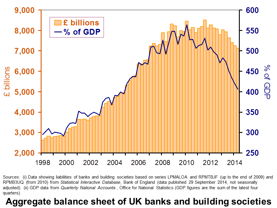 One way of measuring the degree of financialisation here in the UK is to consider the aggregate size of the balance sheet of resident UK banks and building societies (including foreign subsidiaries operating here). The chart shows that the balance sheet grew from £2.6 trillion in 1998 Q1 to £8.5 trillion in 2010 Q1. Another way of looking at this is to consider this growth relative to GDP. This reveals that the aggregate balance sheet of banks and building societies grew over this period from 3 times annual GDP to a staggering 5.6 times GDP. (Click here for a PowerPoint of the chart.)
But, now consider the aggregate banking balance sheet in the 2010s. This reveals a shrinking balance sheet. At the end of the second quarter of this year (2014 Q2) it had fallen back to £7.1 trillion or 4 times GDP. As a share of GDP, this was the smallest the aggregate balance sheet had been since 2005 Q1.
Does a shrinking balance sheet matter? This is where the analysis becomes tricky and open to debate. If the smaller size is consistent with a more stable financial system then undoubtedly that is a good thing. But, size is not that all matters. The composition of the balance sheet matters too. This requires an analysis of, among other things, the liquidity of assets (i.e. assets that can be readily turned in a given amount of cash), the reliability of the income flow from assets and the resources available to withstand periods of slow economic growth, including recessions, or periods of financial difficulty.
As we have identified before (see Financialisation: Banks and the economy after the crisis), the financial crisis could herald new norms for the banking system with important implications for the economy. If so, we may need to become accustomed to consistently lower flows of credit and not to the levels that we saw prior to the financial crisis of the late 2000s. However, an alternative view is that we are merely experiencing a pause before the next expansionary phase of the credit cycle. This is consistent with the financial instability hypothesis (see Keeping a Minsky-eye on credit) which argues that credit cycles are an integral part of modern financialised economies. Only time will tell which view will turn out to be right.
Articles
‘Cleaning up bank balance sheets is key’ Irish Examiner, John Walsh (10/10/14)
More action needed at European banks: Fitch Courier Mail, (17/10/14)
Bank lending to small businesses falls by £400m The Telegraph, Rebecca Burn-Callander (20/10/14)
Bank lending to SMEs falls by £400m SME insider, Lindsey Kennedy (21/10/14)
Record world debt could trigger new financial crisis, Geneva report warns The Guardian, Phillip Inman (29/10/14)
RBS shares jump as bank’s bad debts improve The Guardian, Jill Treanor (30/10/14)
Data
Statistical Interactive Database Bank of England
Questions
- Using examples, demonstrate your understanding of financialisation.
- Draw up a list of the alternative ways in which we might measure financialisation.
- What factors are likely to explain the recent reduction in the aggregate balance sheet of resident banks and building societies in the UK?
- How might we go about assessing whether the aggregate level of lending by financial institutions is sustainable?
- How might we go about assessing whether the level of lending by individual financial institutions is sustainable?
- How would reduced flows of credit be expected to impact on the economy both in the short term and in the longer term?
- Are credit cycles inevitable?
- Of what significance are credit cycles in explaining the business cycle?
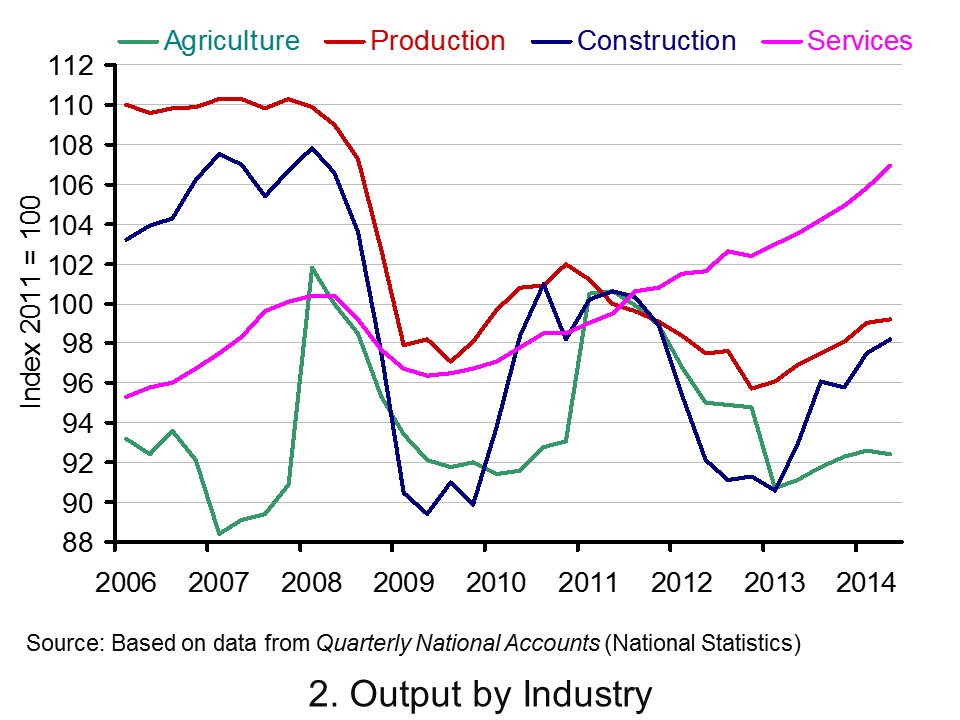
 The latest GDP numbers from the Office for National Statistics contained in Quarterly National Accounts, Q2 2014 show the economy’s output expanded by 0.9 per cent in the second quarter. This follows on the back of a 0.7 per cent increase in output in Q1 2014. The economy’s output is now thought to be 0.7 per cent above its Q1 2008 peak. Yet, the data show very different profiles for the four principal industrial sectors. The service sector appears to be ploughing ahead while the rest (production, construction and agriculture) lag behind.
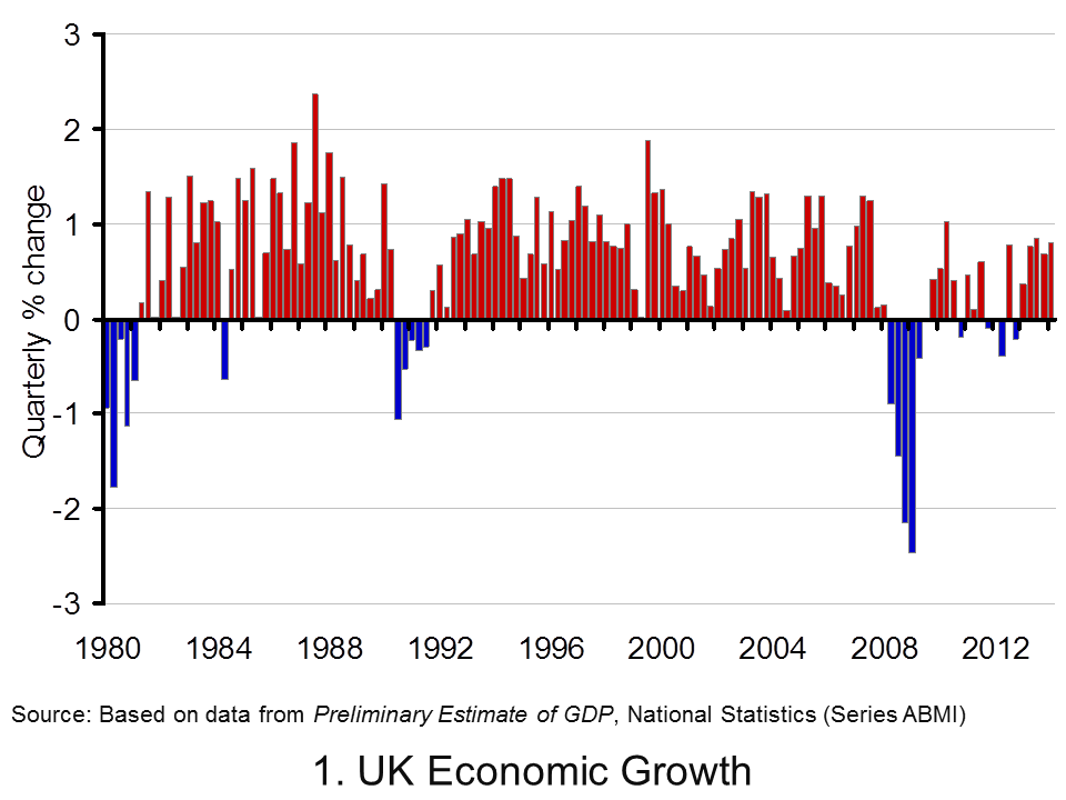
 Chart 1 shows quarterly economic growth since 1980s (click here for a PowerPoint of the chart). It illustrates nicely the inherent volatility of economies – one of the threshold concepts in economics. The average quarterly rate of growth since 1980 has been 0.5 per cent. On the face of it, a quarterly growth number of 0.9 per cent would appear very robust. Of course, this has to been set in the context of the 2008/9 recession. UK output peaked in Q1 2008 (£414.424 billion at 2011 prices). The revised data now show that there followed 5 quarters of declining output (previously, data suggested the duration of the recession was 6 quarters). During this period output shrank 6 per cent (GDP at 2011 prices had fallen by Q2 2009 to £389.388 billion ).
Chart 1 highlights two earlier downturns. First, there is the recession of the early 1980s. We can see the 5-quarter recession that commenced in Q1 1980. By the end of this recession output had shrunk by 4.5 per cent. Second, there is the recession of the early 1990s which commenced in Q3 1990. Again, this recession lasted five quarters. By the time the economy had come out of recession it had shrunk 2.2 per cent.
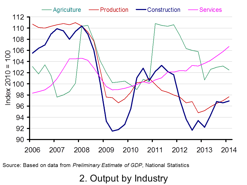
 Consider now Chart 2 (click here for a PowerPoint of the chart). It allows us to analyse more recent events by tracking how industrial output has evolved since 2006. It suggests an unbalanced recovery. From it, we observe that in Q2 2014 service-sector output was 6.5 per cent higher than in Q1 2008. However, a very different picture emerges for the other principal industrial types. Output across the production industries remains 9.7 per cent lower, 9.2 per cent lower in agriculture and 8.9 per cent lower in the construction sector.
In short, the British economy continues to struggle to rebalance its industrial base. The business cycle remains heavily dependent on the service sector.
Articles
UK GDP revised up: what the economists say Guardian, Katie Allen (30/9/14)
UK economy grew 0.9% in second quarter, says ONS BBC News, Katie Allen (9/5/14)
UK GDP: Did the UK economy do well after all? Independent, Ben Chu (30/9/14)
UK economy grew 0.9% Herald, Ian McConnell (1/10/14)
Economy tracker: GDP BBC News (30/9/14).
Data
Quarterly National Accounts, Q2 2014 Dataset Office for National StatisticsQuarterly National Accounts, Q2 2014, Statistical Release Office for National Statistics
Questions
- What is the difference between nominal and real GDP? Which of these helps to track changes in economic output?
- Looking at Chart 1 above, summarise the key patterns in real GDP since the 1980s.
- What is a recession?
- What are some of the problems with the traditional definition of a recession?
- Can a recession occur if nominal GDP is actually rising? Explain your answer.
- What factors lead to economic growth being so variable?
- What factors might explain the very different patterns seen since the late 2000s in the volume of output of the four main industrial sectors?
- What different interpretations could there be of a ‘rebalancing’ of the UK economy?
- What other data might we look at to analyse whether the UK economy is ‘rebalancing’?.
- Produce a short briefing paper exploring the prospects for economic growth in the UK over the next 12 to 18 months.
- What is the difference between GVA and GDP?
- Explain the arguments for and against using GDP as a measure of a country’s economic well-being.
 The instability of the economy was clearly demonstrated by the events of the late 2000s. Economists have devoted considerable energies to understanding the determinants of the business cycle. Increasing attention is focused on the role that credit cycles play in contributing to or exacerbating cycles. Therefore, data on lending by banks is followed keenly by policymakers who wish to avoid the repeat of the pace of growth in credit seen in the period preceding the financial crisis. Interestingly, the latest data from the Bank of England show that lending by financial institutions to households (net of repayments) rose in July to its highest level since November 2009.
The idea of credit cycles is not new. But, the financial crisis of the late 2000s has helped to reignite analysis and interest. Many economists have revisited the work of Hyman Minsky (1919–1996), an American economist, who argued that financial cycles are an inherent part of the economic cycle and contribute to fluctuations in real GDP. Notably, he argued that credit extended to households and businesses is pro-cyclical so that flows of credit extended by banks are larger when the growth of the economy’s output is stronger. Since credit flows are dependent on the phase of the business cycle, they are said to be endogenous to the path of output. The key point here is that there is an inherent mechanism within the economy which is potentially destabilising.
Banks, it is argued, may use the growth of the economy’s output as an indicator of the riskiness of its lending. Households and businesses may undertake a similar assessment. After a period of sustained growth banks and investors become more confident about the future path of the economy and, consequently, in the returns of assets. This means that there is a role for psychology in understanding the business cycle.
 If we look at the chart, this period of heightened confidence may correspond with the period starting from the late 1990s. Between 1998 and 2007 the average monthly net flow of credit to private non-financial corporations and households was £9.4 billion. In other words, households and businesses were acquiring a staggering £9.4 billion of additional debt from banks each month. But, this was as high as £14.0 billion per month in 2007. (Click here for a PowerPoint of the chart.)
What helped to fuel the impact of heightened confidence on credit provision was financial innovation. In particular, the bundling of assets, such as mortgages, to form financial instruments which could then be purchased by investors helped to provide financial institutions with further funds for lending. This is the process of securitisation. The result was that during the 2000s as households and businesses began to acquire larger debts their financial well-being became increasingly stretched. This was hastened by central banks raising interest rates. The intention was to dampen the rising rate of inflation, partly attributable to rising global commodity prices, such as oil. Suddenly, euphoria was replaced with pessimism.
Some argue that a Minsky moment had occurred. Many countries then witnessed a balance sheet recession. As individual households and businesses try and improve their own financial well-being they collectively contribute to its worsening. For instance, large-scale attempts to sell assets, such as shares or property, only help to cause their value to decline.
A global response to the events of the financial crisis has been for policy-makers to pay more attention to the aggregate level of credit provision. The chart shows that lending in 2014 is more robust than it has been form some time. Across the first seven months of 2014 the average monthly net flow of credit extended by banks to households and businesses (private non-financial corporations) has been £2.2 billion.
However, the 2014-rebound of credit is wholly attributable to lending to households. Net lending to households has averaged £2.7 billion per month while businesses have been repaying credit to banks to the tune of £437 million per month – something that businesses have collectively done in each year from 2009. While net lending to households remains considerably lower than pre-financial crisis levels, it will be something that policymakers will be watching very closely. This, in turn, means that they will be paying particular interest to the housing and mortgage markets.
Articles
Appetite for loans picks up again, say major banks BBC News (23/9/14)
Business lending by UK banks is down by £941m Herald Scotland, Ian McConnell (27/8/14)
How bank lending fell by £365 BILLION in five years… much to the delight of controversial payday loan firms Mail, Louise Eccles (7/09/14)
U.K.’s Big Banks Cut Lending by $595 Billion, KPMG Says Bloomberg, Richard Partington (8/9/14)
UK banks’ home loan approvals fall to 12-month low – BBA Reuters, Andy Bruce and Tom Heneghan (23/9/14)
Data
Bankstats (Monetary and Financial Statistics) – Latest Tables Bank of England
Statistical Interactive Database Bank of England
Questions
- What is meant by the term the business cycle?
- What does it mean for the determinants of the business cycle to be endogenous? What about if they are exogenous?
- Outline the ways in which the financial system can impact on the spending behaviour of households. Repeat the exercise for businesses.
- How might uncertainty affect spending and saving by households and businesses?
- What does it mean if bank lending is pro-cyclical?
- Why might lending be pro-cyclical?
- How might the differential between borrowing and saving interest rates vary over the business cycle?
- Explain what you understand by net lending to households or firms. How does net lending affect their stock of debt?
 The British love to talk about house prices. Stories about the latest patterns in prices regularly adorn the front pages of newspapers. We take this opportunity to update an earlier blog looking not only at house prices in the UK, but in other countries too (see the (not so) cool British housing market). This follows the latest data release from the ONS which shows the UK’s annual house price inflation rate ticking up from 10.2 per cent in June to 11.7 per cent in July and which contrasts markedly with the annual rate in July 2013 of 3.3 per cent.
The July annual house price inflation figure of 11.7 per cent for the UK is heavily influenced by the rates in London and the South East. In London house price inflation is running at 19.1 per cent while in the South East it is 12.2 per cent. Across the rest of the UK the average rate is 7.9 per cent, though this has to be seen in the context of the July 2013 rate of 0.8 per cent.
 Chart 1 shows house price inflation rates across the home nations since the financial crisis of the late 2000s. It shows a rebound in house price inflation over the second half of 2013 and across 2014. In July 2014 house price inflation was running at 12.0 per cent in England, 7.6 per cent in Scotland, 7.4 per cent in Wales and 4.5 per cent in Northern Ireland. If we use the East Midlands as a more accurate barometer of England, annual house price inflation in July was 7.6 per cent – the same as across Scotland. (Click here for a PowerPoint of the chart.)
Consider a more historical perspective. The average annual rate of growth since 1970 is 9.7 per cent in the UK, 9.7 per cent in England (9.6 per cent in the East Midlands), 9.6 per cent in Wales, 8.8 per cent in Scotland and 8.7 per cent in Northern Ireland. Therefore, house prices in the home nations have typically grown by 9 to 10 per cent per annum. But, as recent experience shows, this has been accompanied by considerable volatility. An interest question is the extent to which these two characteristics of British house prices are unique to Britain. To address this question, let’s go international.
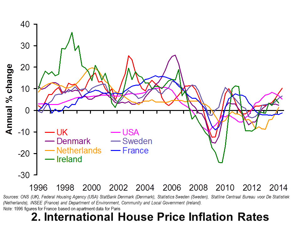
 Chart 2 shows annual house price inflation rates for the UK and six other countries since 1996. Interestingly, it shows that house price volatility is a common feature of housing markets. It is not a uniquely British thing. It too shows shows something of a recovery in global house prices. However, the rebound in the UK and the USA does appear particularly strong compared with core eurozone economies, like the Netherlands and France, where the recovery is considerably more subdued. (Click here for a PowerPoint of the chart.)
The chart captures very nicely the effect of the financial crisis and subsequent economic downturn on global house prices. Ireland saw annual rates of house price deflation exceed 24 per cent in 2009 compared with rates of deflation of 12 per cent in the UK. Denmark too suffered significant house price deflation with prices falling at an annual rate of 15 per cent in 2009.
House price volatility appears to be an inherent characteristic of housing markets worldwide. Consider now the extent to which house prices rise over the longer term. In doing so, we analyse real house price growth after having stripped out the effect of consumer price inflation. Real house price growth measures the growth of house prices relative to consumer prices.
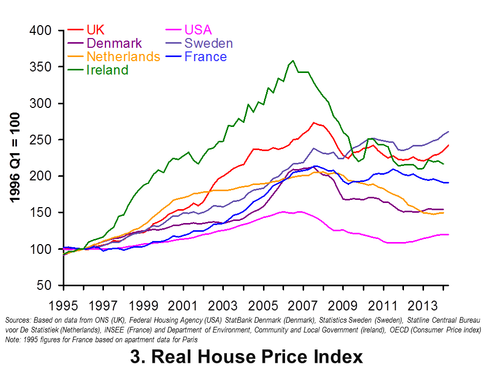
 Chart 3 shows real house prices since 1995 Q1. (Click here for a PowerPoint of the chart.) It shows that up to 2014 Q2, real house prices in the UK have risen by a factor of 2.4 This is a little less than in Sweden where prices are 2.6 times higher. Nonetheless, the increase in real house prices in the UK and Sweden is significantly higher than in the other countries in the sample. In particular, in the USA real house prices in 2014 Q2 were only 1.2 times higher than in 1995 Q1. Therefore, in America actual house prices, when viewed over the past 19 years or so, have grown only a little more quickly than consumer prices.
The latest data on house prices suggest that house price volatility is not unique to the UK. The house price roller coaster is an international phenomenon. However, the rate of growth in UK house prices over the longer term, relative to consumer prices, is markedly quicker than in many other countries. It is this which helps to explain the amount of attention paid to the UK housing market. The ride continues.
Data
House Price Indices: Data Tables Office for National Statistics
Articles
Property prices in all regions of the UK grow at the fastest annual pace seen in seven years Independent, Gideon Spanier (16/9/14)
UK House Prices Have Not Soared This Fast In Seven Years The Huffington Post UK, Asa Bennett (16/9/14)
UK house prices hit new record as London average breaks £500,000 Guardian, Phillip Inman (6/12/14)
Six regions hit new house price peak, says ONS BBC News, (16/9/14)
Welsh house prices nearing pre-crisis peak BBC News, (16/9/14)
Questions
- What is meant by the annual rate of house price inflation? What about the annual rate of house price deflation?
- What factors are likely to affect housing demand?
- What factors are likely to affect housing supply?
- Explain the difference between nominal and real house prices. What does a real increase in house prices mean?
- How might we explain the recent differences between house price inflation rates in London and the South East relative to the rest of the UK?
- What might explain the very different long-term growth rates in real house prices in the USA and the UK?
- Why were house prices so affected by the financial crisis?
- What factors help explain the volatility in house prices?
- How might we go about measuring the affordability of housing?
- In what ways might house price patterns impact on the macroeconomy?
 The latest preliminary GDP estimates for 2014 Q1 suggest that the economy’s output (real GDP) expanded by 0.8 per cent following on the back of a 0.7 per cent increase in 2013 Q4. Growth was observed in three of the four main industrial sectors: 0.9% in services, 0.8% in production and 0.3% in construction. In contrast, output decreased by 0.7% in agriculture. The total output of the economy is now just 0.6 per cent below its 2008 Q1 peak with the output of the service sector now 2.0 per cent higher.
Data on growth need to be set in the context of the inherent volatility of economies and in this case in the context of 2008/9 recession. Then, output fall by some 7.2 per cent. UK output peaked in 2008 Q1 (£392.786 billion at 2010 prices). There then followed 6 quarters during which output declined.
Output declined again in 2010 Q4 (-0.2% growth), in 2011 Q4 (-0.1% growth), in 2012 Q2 (-0.4%) and in 2012 Q4 (-0.2%). A double-dip recession was only narrowly avoided with growth recorded at zero on 2012 Q1. The latest ONS numbers show the economy grew by 0.8 per cent in 2013 Q2 (to £381.318 billion at 2010 prices), by 0.8 per cent in 2013 Q3 (to £384.533 billion at 2010 prices), by 0.7 per cent in 2013 Q4 (to £387.138 billion at 2010 prices) and by 0.8 per cent in 2014 Q1 (to £390.235 billion at 2010 prices). Compared with 2013 Q1, the output of the UK economy in 2014 Q1 is 3.1 per cent higher.
 Chart 1 helps to put the recent growth numbers into an historical context. It shows the quarterly change in real GDP since the 1980s. We can see the 5-quarter recession that commenced in 1980 Q1 when output shrunk by 4.6 per cent, the 5-quarter recession that commenced in 1990 Q3 when output shrank by 2.4 per cent and the 6-quarter recession that commenced in 2008 Q2 when output shrank by 7.2 per cent. (Click here to download the chart to PowerPoint.)
 Chart 2 scratches a little below the surface by looking at output by the 4 principal industrial types. The interesting finding is that the output of the service sector has now risen above its 2008 Q1 peak. In 2014 Q1, service sector output was 2.0 per cent higher than 2008 Q1. The fact that total output remains 0.6 per cent lower can be explained by the lop-sided industrial recovery. Output in agriculture, forestry and fisheries remains 7.1 per cent lower, production (including manufacturing) 11.5 per cent lower and construction 12.2 per cent lower. (Click here to dowload the chart to Powerpoint.)
Data
Preliminary Estimate of GDP – Time Series Dataset Q1 2014 Office for National StatisticsGross Domestic Product Preliminary Estimate, Q1 2014 Office for National Statistics
Articles
UK GDP ‘close to pre-crisis level’ says NIESR BBC News (9/5/14)
UK ‘great recession’ almost over, says thinktank Guardian, Katie Allen (9/5/14)
UK economy tops its pre-crash high point, says NIESR Telegraph, Szu Ping Chan (9/5/14)
UK economy grew by 0.8% in first three months of 2014 Guardian, Katie Allen and Angela Monaghan (29/4/14)
Manufacturing is GDP star performer BBC News, Robert Peston (29/4/14).
Questions
- What is the difference between nominal and real GDP? Which of these helps to track changes in economic output?
- Looking at Chart 1 above, summarise the key patterns in real GDP since the 1980s.
- What is a recession? What is a double-dip recession?
- What are some of the problems with the traditional definition of a recession?
- Can a recession occur if nominal GDP is actually rising? Explain your answer.
- What factors lead to economic growth being so variable?
- What factors might explain the very different patterns seen since the late 2000s in the volume of output of the 4 main industrial sectors?
- Produce a short briefing paper exploring the prospects for economic growth in the UK over the next 12 to 18 months.
- Explain the arguments for and against using GDP as a measure of a country’s economic well-being.
- Analyse the role that the financial system might play in contributing to or alleviating the business cycle.
 Following the financial crisis, all sectors of the economy continue to repair their balance sheets. As well as households, non-financial corporations and government, this is true of the banking sector. In part, the repairing and rebalancing of their balance sheets is being brought about by regulatory pressures. The objective is to make banks more resilient to shocks and less susceptible to financial distress.
 One way of measuring the degree of financialisation here in the UK is to consider the aggregate size of the balance sheet of resident UK banks and building societies (including foreign subsidiaries operating here). The chart shows that the balance sheet grew from £2.6 trillion in 1998 Q1 to £8.5 trillion in 2010 Q1. Another way of looking at this is to consider this growth relative to GDP. This reveals that the aggregate balance sheet of banks and building societies grew over this period from 3 times annual GDP to a staggering 5.6 times GDP. (Click here for a PowerPoint of the chart.)

