 In her bid to become Conservative party leader, Liz Truss promised to make achieving faster economic growth her number-one policy objective. This would involve pursuing market-orientated supply-side policies.
These policies would include lower taxes on individuals to encourage people to work harder and more efficiently, and lower taxes on business to encourage investment. The policy would also involve deregulation, which would again encourage investment, both domestic and inward investment from overseas. These proposals echoed the policies pursued in the 1980s by President Ronald Reagan in the USA and Margaret Thatcher in the UK.
On September 23, the new Chancellor, Kwasi Kwarteng, presented a ‘mini-Budget’ – although the size of the changes made it far from ‘mini’. This, as anticipated, included policies intended to boost growth, including scrapping the 45% top rate of income tax, which is currently paid by people earning over £150 000 (a policy withdrawn on 3 October after massive objections), cutting the basic rate of income tax from 20% to 19%, scrapping the planned rise in corporation tax from 19% to 25%, scrapping the planned rise in national insurance by 1.25 percentage points, a cut in the stamp duty on house purchase and scrapping the limit placed on bankers’ bonuses. In addition, he announced the introduction of an unlimited number of ‘investment zones’ which would have lower business taxes, streamlined planning rules and lower regulation. The policies would be funded largely from extra government borrowing.
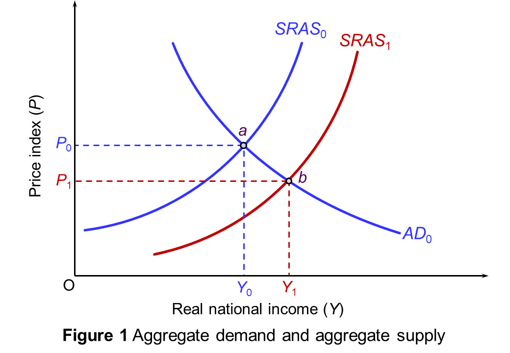 Theoretically, the argument is simple. If people do work harder and firms do invest more, then potential GDP will rise – a rise in aggregate supply. This can be shown on an aggregate demand and supply diagram. If the policy works, the aggregate supply curve will shift to the right. Real GDP will rise and there will be downward pressure on prices. In Figure 1, real GDP will rise from Y0 to Y1 and the price level will fall from P0 to P1. However, things are not as simple as this. Indeed, there are two major problems.
The first concerns whether tax cuts will incentivise people to work harder. The second concerns what happens to aggregate demand. I addition to this, the policies are likely to have a profound effect on income distribution.
Tax cuts and incentives
Cutting the top rate of income tax would have immediately given people at the top of the income scale a rise in post-tax income. This would have created a substitution effect and an income effect. Each extra pound that such people earn would be worth more in post-tax income – 60p rather than 55p. This would provide an incentive for people to substitute work for leisure as work is now more rewarding. This is the substitution effect. On the other hand, with the windfall of extra income, they now would have needed to work less in order to maintain their post-tax income at its previous level. They may well indeed, therefore, have decided to work less and enjoy more leisure. This is the income effect.
With the diminishing marginal utility of income, generally the richer people are, the bigger will be the income effect and the smaller the substitution effect. Thus, cutting the top rate of income tax may well have led to richer people working less. There is no evidence that the substitution effect would be bigger.
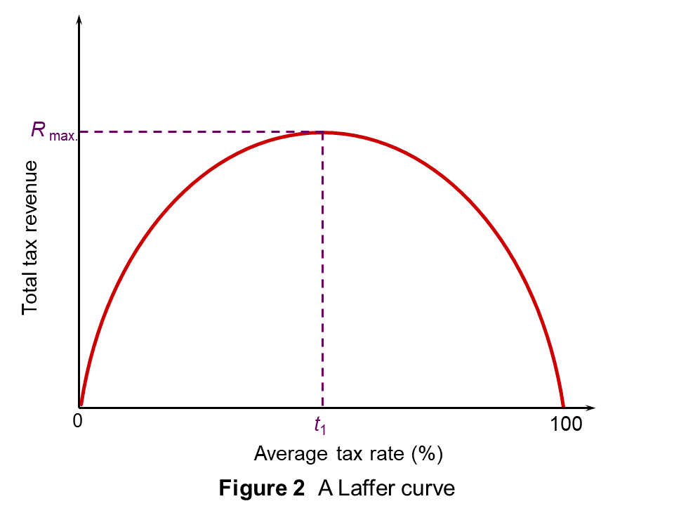 If top rates of income tax are already at a very high level, then cutting then may well encourage more work. After all, there is little incentive to work more if the current rate of tax is over 90%, say. Cutting them to 80% could have a big effect. This was the point made by Art Laffer, one of Ronald Reagan’s advisors. He presented his arguments in terms of the now famous ‘Laffer curve’, shown in Figure 2. This shows the total tax revenue raised at different tax rates.
If the average tax rate were zero, no revenue would be raised. As the tax rate is raised above zero, tax revenues will increase. The curve will be upward sloping. Eventually, however, the curve will peak (at tax rate t1). Thereafter, tax rates become so high that the resulting fall in output more than offsets the rise in tax rate. When the tax rate reaches 100 per cent, the revenue will once more fall to zero, since no one will bother to work.
If the economy were currently to the right of t1, then cutting taxes would increase revenue as there would be a major substitution effect. However, most commentators argue that the UK economy is to the left of t1 and that cutting the top rate would reduce tax revenues. Analysis by the Office for Budget Responsibility in 2012 suggested that t1 for the top rate of income tax was at around 48% and that cutting the rate below that would reduce tax revenue. Clearly according to this analysis, 40% is considerably below t1.
As far as corporation tax is concerned, the 19% rate is the lowest in the G20 and yet the UK suffers from low rates of both domestic investment and inward direct investment. There is no evidence that raising it somewhat, as previously planned, will cut investment. And as far as individual entrepreneurs are concerned, cutting taxes is likely to have little effect on the desire to invest and expand businesses. The motivation of entrepreneurs is only partly to do with the money. A major motivation is the sense of achievement in building a successful business.
Creating investment zones with lower taxes, no business rates and lower regulations may encourage firms to set up there. But much of this could simply be diverted investment from elsewhere in the country, leaving overall investment little changed.
To assess these questions, the government needs to model the outcomes and draw on evidence from elsewhere. So far this does not seem to have happened. They government did not even present a forecast of the effects of its policies on the public finances, something that the OBR normally presents at Budget time. This was one of the reasons for the collapse in confidence of sterling and gilts (government bonds) in the days following the mini-Budget.
Effects on aggregate demand
 Cutting taxes and financing them from borrowing will expand aggregate demand. In Figure 1, the AD curve will also shift to the right and this will push up prices. Inflation is already a serious problem in the economy and unfunded tax cuts will make it worse. Higher inflation will result in the Bank of England raising interest rates further to curb aggregate demand. But higher interest rates, by raising borrowing costs, are likely to reduce investment, which will have a negative supply-side effect.
The problem here is one of timing. Market-orientated supply-side policies, if they work to increase potential GDP, will take time – measured in years rather than months. The rise in aggregate demand will be much quicker and will thus precede the rise in supply. This could therefore effectively kill off the rise in supply as interest rates rise, the exchange rate falls and the economy is pushed towards recession. Indeed, the mini-Budget immediately sparked a run on the pound and the exchange rate fell.
The rising government debt may force the government to make cuts in public expenditure. Rather than cutting current expenditure on things such as nurses, teachers and benefits, it is easier to cut capital expenditure on things such as roads and other infrastructure. But this will have adverse supply-side effects.
Effects on income distribution
 Those advocating market-orientated supply-side policies argue that, by making GDP bigger, everyone can gain. They prefer to focus on the size of the national ‘pie’ rather than its distribution. If the rich initially gain, the benefits will trickle down to the poorest in society. This trickle-down theory was popular in the 1980s with politicians such as Margaret Thatcher and Ronald Reagan and, more recently, with Republican presidents, such as Goerge W Bush and Donald Trump. There are two problems with this, however.
The first, which we have already seen, is whether such policies actually do increase the size of the ‘pie’.
The second is how much does trickle down. During the Thatcher years, income inequality in the UK grew, as it did in the USA under Ronald Reagan. According to an IMF study in 2015 (see the link to the IMF analysis below), policies that increase the income share of the poor and the middle class do increase growth, while those that raise the income share of the top 20 per cent result in lower growth.
After the mini-Budget was presented, the IMF criticised it for giving large untargeted tax cuts that would heighten inequality. The poor would gain little from the tax cuts. The changes to income tax and national insurance mean that someone earning £20 000 per year will gain just £167 per year, while someone earning £200 000 will gain £5220. What is more, the higher interest rates and higher prices resulting from the lower exchange rate are likely to wipe out the modest gains to the poor.
Podcast
Articles
- At a glance: What’s in the mini-budget?
BBC News (23/9/22)
- Mini-budget: What it means for you and your finances
BBC News, Kevin Peachey (23/8/22)
- Will this huge tax cutting gamble pay off?
BBC News, Faisal Islam (23/9/22)
- Kwasi Kwarteng faces U-turn on tax or spending cuts
BBC News, Faisal Islam (28/9/22)
- Nearly 300 UK mortgage deals pulled in a day as pound’s fall heralds rate rise
The Guardian, Zoe Wood (27/9/23)
- Rationale behind abolition of 45p tax rate reflects failed ideology
The Guardian, Arun Advani, David Burgherr and Andy Summers (29/9/23)
- The UK’s ‘Trussonomics’ crashes the pound and leaves investors shaking their heads
CNN, Allison Morrow (26/9/23)
- Mini budget: will Kwasi Kwarteng’s plan deliver growth?
The Conversation, Steve Schifferes (23/9/23)
- Only a U-turn by the government or the Bank of England will calm UK financial markets
The Conversation, Campbell Leith (28/9/22)
- IMF gives damning verdict on Britain’s tax cuts
CNBC, Hannah Ward-Glenton (28/9/23)
- Lasting effects of ‘mini’ Budget will be felt far beyond the trading floors
Today News, Torsten Bell (1/10/23)
Analysis
- Causes and Consequences of Income Inequality: A Global Perspective
IMF Staff Discussion Notes, Era Dabla-Norris, Kalpana Kochhar, Nujin Suphaphiphat, Franto Ricka and Evridiki Tsounta (15/6/15)
- Mini-Budget response
Institute for Fiscal Studies, Stuart Adam, Isaac Delestre, Carl Emmerson, Paul Johnson, Robert Joyce, Isabel Stockton, Tom Waters, Xiaowei Xu and Ben Zaranko (23/9/22)
Questions
- Distinguish between market-orientated supply-side policies and interventionist ones. Consider the advantages and disadvantages of each.
- Explain why bond prices fell after the mini-Budget. What was the Bank of England’s response and why did this run counter to its plan for quantitative tightening?
- How might a tax-cutting Budget be designed to help the poor rather than the rich? Would this have beneficial supply-side effects?
- Find out about the 1972 tax-cutting Budget of Anthony Barber, the Chancellor in Ted Heath’s government, that led to the ‘Barber boom’ and then rampant inflation. Are there any similarities between the 1972 Budget and the recent mini-Budget?
 Workers in the UK and USA work much longer hours per year than those in France and Germany. This has partly to do with the number of days paid holiday per year, partly with the number of hours worked per day and partly with the number of days worked per week.
According to the latest OECD figures, in 2017 average hours worked per year ranged from 2257 in Mexico (the OECD’s highest) to 1780 in the USA, 1710 in Japan, 1681 in the UK, 1514 in France, 1408 in Denmark and 1356 in Germany (the OECD’s lowest). 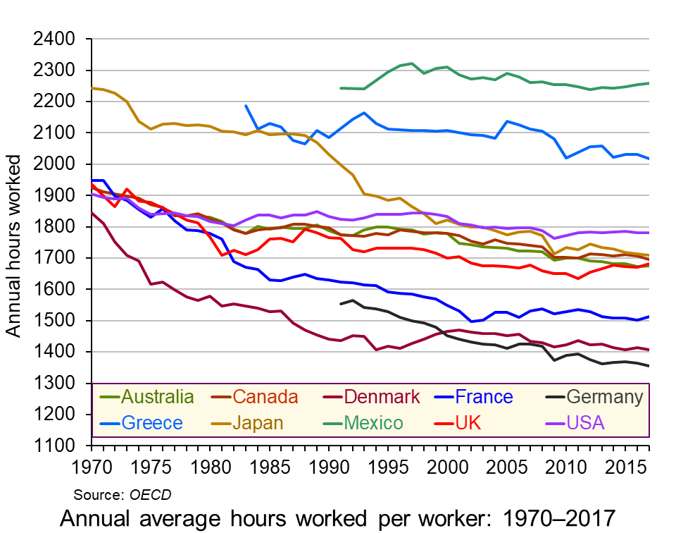 Annual working hours have been falling in most countries across the decades, as the chart shows. However, in most countries the process has slowed in recent years and in the UK, the USA and France working hours have begun to rise. (Click here for a PowerPoint of the chart.)
But why do working hours differ so much from country to country? How do they relate to productivity? How do they relate to human happiness and welfare more generally?
Causes of the differences
There are various reasons for the differences in hours worked between countries.
In a situation where individual workers can choose how many hours to work, they have to decide the best trade off for them between income and leisure. As wages rise over time, there will be substitution and income effects of these extra hourly wages. Higher wages make work more valuable in terms of what people can buy from an extra hour’s work. There is thus an incentive to substitute work for leisure and hence work longer. This is the substitution effect. On the other hand, higher wages allow people to work fewer hours for a given income. This is the income effect.
As incomes rise, generally the substitution effect will tend to decline relative to the income effect. This is because of the diminishing marginal utility of income. Richer people will tend to value a given rise in income less than poorer people and therefore will value the income from extra work less than poorer people. Richer people will prefer to work fewer hours than poorer people. Generally workers in richer OECD countries work fewer hours than those in poorer OECD countries.
But this does not explain why people in the USA, Canada, Japan and the UK work longer hours than people in Germany, Denmark, Norway, The Netherlands and France.
One possible explanation for these differences is the role of trade unions. These tend to be stronger in countries with lower working hours. Reducing the working week or obtaining longer holidays is one of the key objectives of unions.
Another is income distribution. The USA, despite its high average (mean) income, has a relatively unequal distribution of income compared with Germany or France. The post-tax-and-benefits Gini coefficient in the USA is around 0.39, whereas in Germany it is 0.29, meaning that Germany has a more equal distribution of disposable income than the USA. In fact, rises in real incomes in the USA over the past 10 years have gone almost exclusively to the top 10 per cent of earners, leaving the median income little changed. In fact median household income only rose above its 2007 (pre-recession) level in 2016.
 Social and cultural explanations may also be important. People in countries with higher working hours relative to hourly wages may put a greater store on consumption relative to leisure. The desire to shop may be very strong. The ‘Anglo-Saxon’ economic model pursued by right-of-centre governments in English-speaking countries, such as the USA, Canada, Australia and the UK puts emphasis on low taxes, low regulation, low public expenditure and self-advancement. Such a model encourages a more individualistic approach to work, with more emphasis on earning money.
Then there is the attitude to hours worked generally. There is a saying that in the UK the last one to leave the office is seen as the hardest working, whereas in Germany the last one to leave is seen as the least efficient. Social pressures, from colleagues, family, friends and society more generally can have a major effect on people’s choices between work and leisure.
Productivity
Productivity, in terms of output per hour worked, tends to decline as workers work longer hours. People get tired and possibly bored and demotivated towards the end of a long day or week. If workers are paid by the output they produce and if productivity declines towards the end of the day, then the hourly wage would fall as the day progresses. This would act as a disincentive to work long hours. In practice, most workers are normally paid a constant rate per hour for normal-time working. For overtime, they may even be paid a higher rate, despite their likely lower productivity. This encourages them to work longer hours than if they were paid according to their marginal productivity.
Linking pay more closely to productivity could encourage people to opt for fewer hours (if they had the choice). Indeed some companies are now encouraging workers to choose their hours – which may mean fewer hours as people seek a better work–life balance. (See the BBC article below about PwC’s employment strategy.) 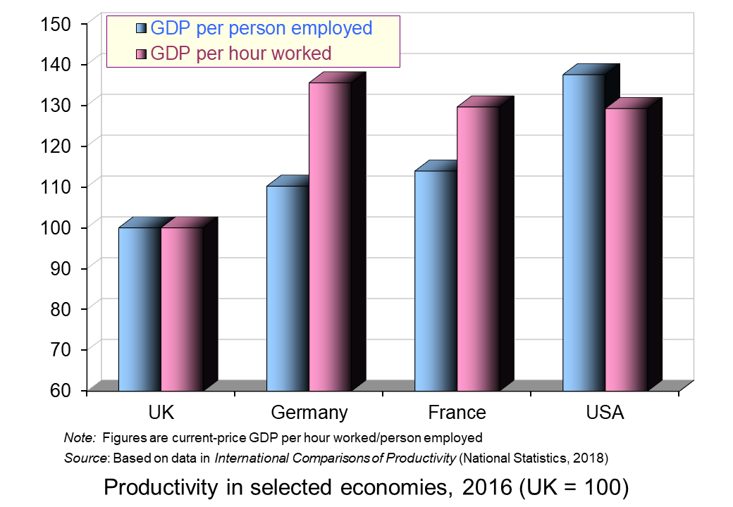 Alternatively, some other employers adopt the system of giving workers a set amount of work to do and then they can leave work when it is finished. This acts as an incentive to work more efficiently.
It is interesting that countries where workers work more hours per year tend to have a lower output per hour worked relative to output per worker than countries where workers work fewer hours. This is illustrated in the chart opposite. The USA, with its longer working hours, has higher output per person employed than France and Germany but very similar output per hour worked.
Hours and happiness
So are people who choose to work longer hours and take home more money likely to be happier than those who choose to work fewer hours and take home less money? If people were rational and had perfect knowledge, then they would choose the balance between work and leisure that best suited them.
In practice, labour markets are highly imperfect. People often do not have choices about the amount they work; they work the hours they are told. Even if they do have a choice, they are unlikely to have perfect knowledge about the impact of long hours on their health and happiness over their lifetime. They may not even be good judges of the shorter-term effects of more work and more pay. They may believe that more money will buy them more happiness only to find soon afterwards that they are wrong.
Articles
Data
Questions
- What factors are likely to encourage workers to work longer hours?
- Give some examples of jobs where workers have flexibility in the amount of hours they work per week and jobs where the working week is of a fixed length.
- For what reasons are annual working hours longer in the USA than in Germany?
- Would it be in employers’ interests if the government legislated so as to reduce the maximum permitted working week? Explain.
- What is meant by ‘efficiency wages’? How relevant is the concept to the issue of the average number of hours worked per year from country to country?
- Explain why people in poorer countries tend to work more hours per year than people in richer countries.
- If workers’ wages equalled their marginal revenue product, why might some workers choose to work more and others choose to work less (assuming they had a choice)?
- Are jobs in the gig economy and zero-hour contract jobs in the interests of workers?
- Is South Korea wise to cut its work limit from 68 hours a week to 52?
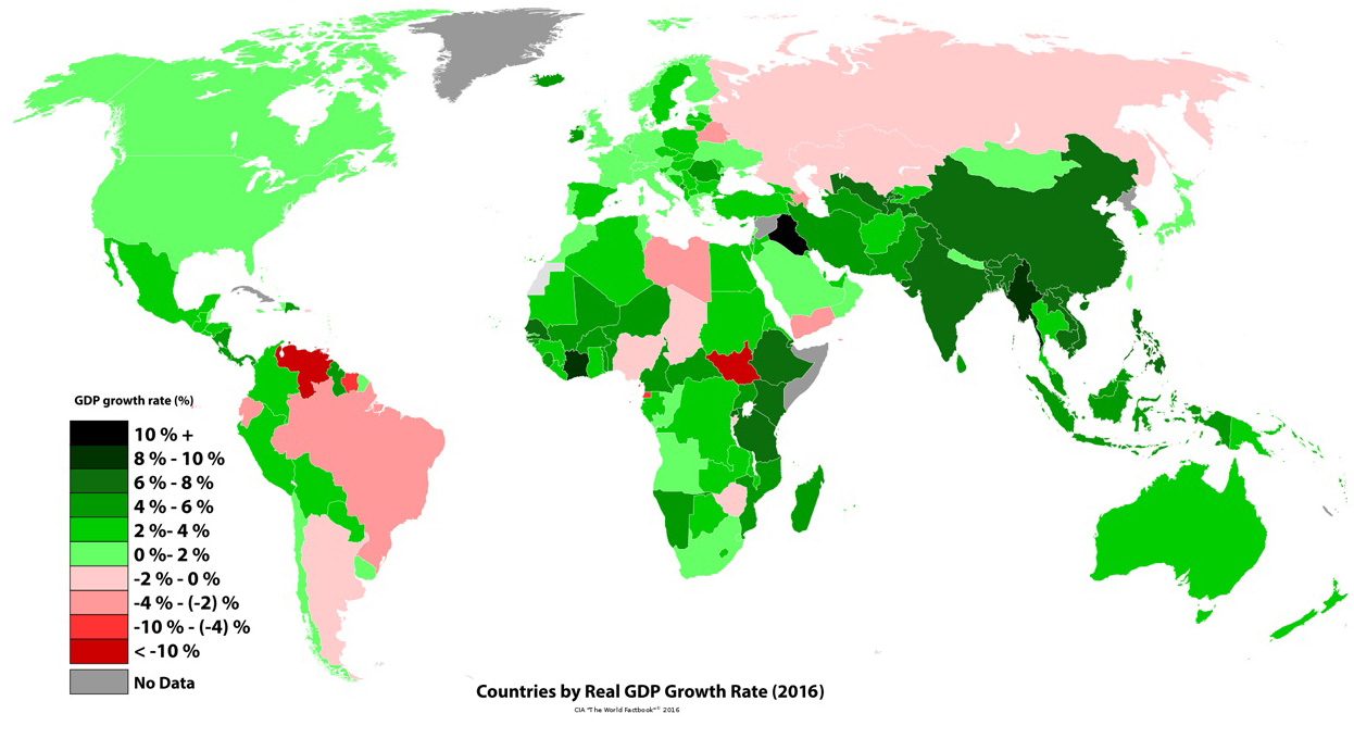 Policymakers around the world have used Gross Domestic Product as the main gauge of economic performance – and have often adopted policies that aim to maximise its rate of growth. Generation after generation of economists have committed significant time and effort to thinking about the factors that influence GDP growth, on the premise that an expanding and healthy economy is one that sees its GDP increasing every year at a sufficient rate.
But is economic output a good enough indicator of national economic wellbeing? Costanza et al (2014) (see link below) argue that, despite its merits, GDP can be a ‘misleading measure of national success’:
GDP measures mainly market transactions. It ignores social costs, environmental impacts and income inequality. If a business used GDP-style accounting, it would aim to maximize gross revenue — even at the expense of profitability, efficiency, sustainability or flexibility. That is hardly smart or sustainable (think Enron). Yet since the end of the Second World War, promoting GDP growth has remained the primary national policy goal in almost every country. Meanwhile, researchers have become much better at measuring what actually does make life worthwhile. The environmental and social effects of GDP growth is a misleading measure of national success. Countries should act now to embrace new metrics.
 The limitations of GDP growth as a measure of economic wellbeing and national strength are becoming increasingly clear in today’s world. Some of the world’s wealthiest countries are plagued by discontent, with a growth in populism and social discontent – attitudes which are often fuelled by high rates of poverty and economic hardship. In a recent report titled ‘The Living Standards Audit 2018’ published by the Resolution Foundation, a UK economic thinktank (see link below), the authors found that child poverty rose in 2016–17 as a result of declining incomes of the poorest third of UK households:
While the economic profile of UK households has changed, living standards – with the exception of pensioner households – have mostly stagnated since the mid-2000s. Typical household incomes are not much higher than they were in 2003–04. This stagnation in living standards for many has brought with it a rise in poverty rates for low to middle income families. Over a third of low to middle income families with children are in poverty, up from a quarter in the mid-2000s, and nearly two-fifths say that they can’t afford a holiday away for their children once a year. On the other hand, the share of non-working families in poverty has fallen, though not by enough to prevent an overall rise in poverty since 2010.
Their projections also show that this rise in poverty was likely to have continued in 2017–18:
Although the increase in broad measures of inequality were relatively muted last year, our nowcast suggests that there was a pronounced rise in poverty (measured after housing costs[…]. The increase in overall poverty (from 22.1 to 23.2 per cent) was the largest since 1988. But this was dwarfed by the increase in child poverty, which rose from 30.3 per cent to 33.4 per cent. […]The fortunes of middle-income households diverged from those towards the bottom of the distribution and so a greater share of households, and children, found themselves below the poverty threshold.
A simple literature search on Scope (or even Google Scholar) shows that there has been a significant increase in the number of journal articles and reports in the last 10 years on this topic. We do talk more about the limitations of GDP, but we are still using it as the main measure of national economic performance.
Is it then time to stop focusing our attention on GDP growth exclusively and start considering broader metrics of social development? And what would such metrics look like? Both interesting questions that we will try to address in coming blogs.
Articles
Report
Data
Hearing
Questions
- What are the main strengths and weakness of using GDP as measure of economic performance?
- Is high GDP growth alone enough to foster economic and social wellbeing? Explain your answer using examples.
- Write a list of alternative measures that could be used alongside GDP-based metrics to measure economic and social progress. Explain your answer.
 The Economist is probably not the kind of newspaper that you will read more than once per issue – certainly not two years after its publication date. That is because, by definition, financial news articles are ephemeral: they have greater value, the more recent they are – especially in the modern financial world, where change can be strikingly fast. To my surprise, however, I found myself reading again an article on inequality that I had first read two years ago – and it is (of course) still relevant today.
The title of the article was ‘You may be higher in the global wealth pyramid than you think’ and it discusses exactly that: how much wealth does it take for someone to be considered ‘rich’? The answer to this question is of course, ‘it depends’. And it does depend on which group you compare yourself against. Although this may feel obvious, some of the statistics that are presented in this article may surprise you.
According to the article
If you had $2200 to your name (adding together your bank deposits, financial investments and property holdings, and subtracting your debts) you might not think yourself terribly fortunate. But you would be wealthier than half the world’s population, according to this year’s Global Wealth Report by the Crédit Suisse Research Institute. If you had $71 560 or more, you would be in the top tenth. If you were lucky enough to own over $744 400 you could count yourself a member of the global 1% that voters everywhere are rebelling against.
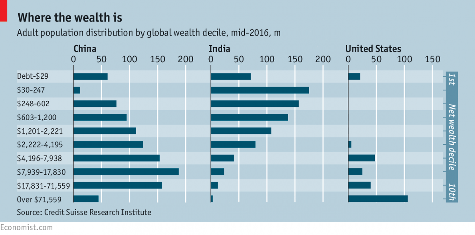
For many (including yours truly) these numbers may come as a surprise when you first see them. $2200 in today’s exchange rate is about £1640. And this is wealth, not income – including all earthly possessions (net of debt). £1640 of wealth is enough to put you ahead of half of the planet’s population. Have a $774 400 (£556 174 – about the average price of a two-bedroom flat in London) and – congratulations! You are part of the global richest 1% everyone is complaining about…
Such comparisons are certainly thought provoking. They show how unevenly wealth is distributed across countries. They also show that countries which are more open to trade are more likely to have benefited the most from it. Take a closer look at the statistics and you will realise that you are more likely to be rich (compared to the global average) if you live in one of these countries.
 Of course, wealth inequality does not happen only across countries – it happens also within countries. You can own a two-bedroom flat in London (and be, therefore, part of the 1% global elite), but having to live on a very modest budget because your income (which is a flow variable, as opposed to wealth, which is a stock variable) has not grown fast enough in relation to other parts of the national population.
Would you be better off if there were less trade? Certainly not – you would probably be even poorer, as trade theories (and most of the empirical evidence I am aware of) assert. Why do we then talk so much about trade wars and trade restrictions recently? Why do we elect politicians who advocate such restrictions? It is probably easier to answer these questions using political than economic theory (although game theory may have some interesting insights to offer – have you heard of the ‘Chicken game‘?). But as I am neither political scientists nor a game theorist, I will just continue to wonder about it.
Articles and information
Questions
- Were you surprised by the statistics mentioned in this report? Explain why.
- Do you think that income inequality is a natural consequence of economic growth? Are there pro-growth policies that can be used to tackle it?
- Identify three ways in which widening income inequality can hurt economies (and societies).
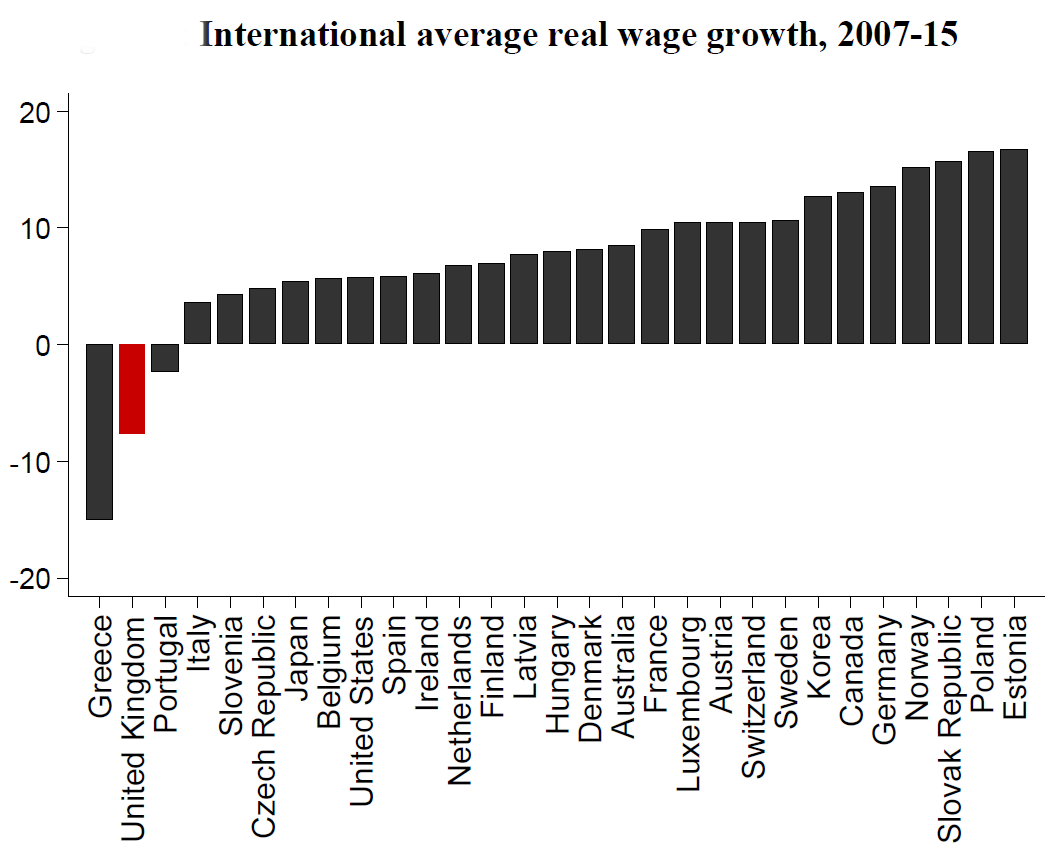
 In the last blog post, As UK inflation rises, so real wages begin to fall, we showed how the rise in inflation following the Brexit vote is causing real wages in the UK to fall once more, after a few months of modest rises, which were largely due to very low price inflation. But how does this compare with other OECD countries?
In an article by Rui Costa and Stephen Machin from the LSE, the authors show how, from the start of the financial crisis in 2007 to 2015 (the latest year for which figures are available), real hourly wages fell further in the UK than in all the other 27 OECD countries, except Greece (see the chart below, which is Figure 5 from their article).  Indeed, only in Greece, the UK and Portugal were real wages lower in 2015 than in 2007.
The authors examine a number of aspects of real wages in the UK, including the rise in self employment, differences by age and sex, and for different percentiles in the income distribution. They also look at how family incomes have suffered less than real wages, thanks to the tax and benefit system.
The authors also look at what the different political parties have been saying about the issues during their election campaigns and what they plan to do to address the problem of falling, or only slowly rising, real wages.
Articles
Real Wages and Living Standards in the UK LSE – Centre for Economic Performance, Rui Costa and Stephen Machin (May 2017)
The Return of Falling Real Wages LSE – Centre for Economic Performance, David Blanchflower, Rui Costa and Stephen Machin (May 2017)
The chart that shows UK workers have had the worst wage performance in the OECD except Greece Independent, Ben Chu (5/6/17)
Data
Earnings and working hours ONS
OECD.Stat OECD
International comparisons of productivity ONS
Questions
- Why have real wages fallen more in the UK than in all OECD countries except Greece?
- Which groups have seen the biggest fall in real wages? Explain why.
- What policies are proposed by the different parties for raising real wages (a) generally; (b) for the poorest workers?
- How has UK productivity growth compared with that in other developed countries? What explanations can you offer?
- What is the relationship between productivity growth and the growth in real wages?
 In her bid to become Conservative party leader, Liz Truss promised to make achieving faster economic growth her number-one policy objective. This would involve pursuing market-orientated supply-side policies.
 Theoretically, the argument is simple. If people do work harder and firms do invest more, then potential GDP will rise – a rise in aggregate supply. This can be shown on an aggregate demand and supply diagram. If the policy works, the aggregate supply curve will shift to the right. Real GDP will rise and there will be downward pressure on prices. In Figure 1, real GDP will rise from Y0 to Y1 and the price level will fall from P0 to P1. However, things are not as simple as this. Indeed, there are two major problems.
 If top rates of income tax are already at a very high level, then cutting then may well encourage more work. After all, there is little incentive to work more if the current rate of tax is over 90%, say. Cutting them to 80% could have a big effect. This was the point made by Art Laffer, one of Ronald Reagan’s advisors. He presented his arguments in terms of the now famous ‘Laffer curve’, shown in Figure 2. This shows the total tax revenue raised at different tax rates.
 Cutting taxes and financing them from borrowing will expand aggregate demand. In Figure 1, the AD curve will also shift to the right and this will push up prices. Inflation is already a serious problem in the economy and unfunded tax cuts will make it worse. Higher inflation will result in the Bank of England raising interest rates further to curb aggregate demand. But higher interest rates, by raising borrowing costs, are likely to reduce investment, which will have a negative supply-side effect.
 Those advocating market-orientated supply-side policies argue that, by making GDP bigger, everyone can gain. They prefer to focus on the size of the national ‘pie’ rather than its distribution. If the rich initially gain, the benefits will trickle down to the poorest in society. This trickle-down theory was popular in the 1980s with politicians such as Margaret Thatcher and Ronald Reagan and, more recently, with Republican presidents, such as Goerge W Bush and Donald Trump. There are two problems with this, however.
 A Walk on the Supply Side
 Workers in the UK and USA work much longer hours per year than those in France and Germany. This has partly to do with the number of days paid holiday per year, partly with the number of hours worked per day and partly with the number of days worked per week.
 Annual working hours have been falling in most countries across the decades, as the chart shows. However, in most countries the process has slowed in recent years and in the UK, the USA and France working hours have begun to rise. (Click
  Social and cultural explanations may also be important. People in countries with higher working hours relative to hourly wages may put a greater store on consumption relative to leisure. The desire to shop may be very strong. The
  Alternatively, some other employers adopt the system of giving workers a set amount of work to do and then they can leave work when it is finished. This acts as an incentive to work more efficiently.
 Policymakers around the world have used Gross Domestic Product as the main gauge of economic performance – and have often adopted policies that aim to maximise its rate of growth. Generation after generation of economists have committed significant time and effort to thinking about the factors that influence GDP growth, on the premise that an expanding and healthy economy is one that sees its GDP increasing every year at a sufficient rate.
  The limitations of GDP growth as a measure of economic wellbeing and national strength are becoming increasingly clear in today’s world. Some of the world’s wealthiest countries are plagued by discontent, with a growth in populism and social discontent – attitudes which are often fuelled by high rates of poverty and economic hardship. In a recent report titled ‘The Living Standards Audit 2018’ published by the
  The Economist is probably not the kind of newspaper that you will read more than once per issue – certainly not two years after its publication date. That is because, by definition, financial news articles are ephemeral: they have greater value, the more recent they are – especially in the modern financial world, where change can be strikingly fast. To my surprise, however, I found myself reading again an article on inequality that I had first read two years ago – and it is (of course) still relevant today.
 Of course, wealth inequality does not happen only across countries – it happens also within countries. You can own a two-bedroom flat in London (and be, therefore, part of the 1% global elite), but having to live on a very modest budget because your income (which is a flow variable, as opposed to wealth, which is a stock variable) has not grown fast enough in relation to other parts of the national population.
