 An article in the February 2015 issue of the Economic Journal, ‘Intergenerational Wealth Mobility in England, 1858–2012: Surnames and Social Mobility’ by Gregory Clark and Neil Cummins, looks at the persistence of wealth within British families across the generations. The article shows, ‘using rare surnames to track families, that wealth is much more persistent than standard one-generation estimates would suggest. There is still a significant correlation between the wealth of families five generations apart’.
It concludes that down the generations the main determinant of wealth is inheritance, despite all efforts to improve social mobility. The intergenerational elasticity of wealth inheritance is found to be 0.70–0.75 throughout the years 1858–2012. In other words, people’s wealth on average will be between 70% and 75% of that of their parents. Thus a large proportion of each person’s wealth depends on the wealth of their parents and a relatively small amount depends on other factors. As Clark and Cummins conclude:
The implications of this model are that wealth will be surprisingly persistent in families across multiple generations. This is what allows rich rare surnames to still remain rich on average even four generations later. It also implies that wealth differences between racial, religious and ethnic groups will also be highly persistent across generations.
So it is just inherited wealth in terms of money or property that gets passed from generation to generation? Or are their other factors, such as education, social class and social contacts, that cause  people’s wealth to depend heavily on that of their parents? Clark and Cummins consider this question.
What is the latent variable that underlies the inheritance of wealth? Evidence in other work we have done on the inheritance of education status in England suggests that families can be conceived of as having an underlying social competence, which is highly persistent across generations. This social competence generates their outcomes on all dimensions of social status but with random components on each one. In this case, social mobility between generations measured on any single aspect of status will be much greater than mobility on a more general ranking of families’ overall social status, that averages earnings, wealth, occupation, education, health and longevity.
So does this mean that attempts to create greater social mobility and greater equality are futile? The authors maintain that although it is difficult to achieve greater social mobility, income and wealth can nevertheless be redistributed through the tax and benefits system.
News articles
Inheritance: how Britain’s wealthy still keep it in the family The Observer, Jamie Doward (1/2/15)
How the rich stay rich: social status is more inheritable than height ZME Science (25/11/14)
This is the proof that the 1% have been running the show for 800 years Quartz (23/11/14)
Journal article
Intergenerational Wealth Mobility in England, 1858–2012: Surnames and Social Mobility The Economic Journal, Gregory Clark and Neil Cummins (February 2015) (To read this article you will need to log in via Shibboleth using your university username and password.)
Questions
- What would be the implication of an intergenerational wealth elasticity (a) of 1; (b) of 0; (c) >1; (d) <0?
- For what reasons might there be a high intergenerational wealth elasticity?
- What is the likely relationship between the intergenerational distribution of wealth and the intergenerational distribution of income?
- What difficulties are there is using rare surnames as a means of establishing the intergenerational distribution of wealth?
- Discuss the advantages and disadvantages of (a) a much higher rate of inheritance tax (in the UK it’s currently 40% on the value of a person’s estate above £325,000 when they die); (b) capping the amount that can be left to any individual from an estate, with anything above this taxed at 100%; (c) capping the total amount that can be left (other than to charity), with the rest taxed at 100%.
- What measures could be adopted to increase social mobility?
- What problems would arise from using the tax and benefit system to reduce inequality? (In 2012/13 the gini coefficient of original income was 0.52 and that of both gross income (i.e. income after benefits but before tax) and post-tax-and-benefit income in the UK was 0.37: see Table 27 of The Effects of Taxes and Benefits on Household Income, 2012/13.)
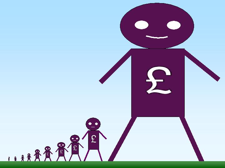
 In his 1971 book, Income Distribution, Jan Pen, a Dutch economist, gave a graphic illustration of inequality in the UK. He described a parade of people marching by. They represent the whole population and the parade takes exactly one hour to pass by. The height of each person represents his or her income. People of average height are the people with average incomes – the observer is of average height. The parade starts with the people on the lowest incomes (the dwarfs), and finishes with those on the highest incomes (the giants).
Because income distribution is unequal, there are many tiny people. Indeed, for the first few minutes of the parade, the marchers are so small they can barely be seen. Even after half an hour, when people on median income pass by, they are barely waist high to the observer.
The height is growing with tantalising slowness, and forty-five minutes have gone by before we see people of our own size arriving. To be somewhat more exact: about twelve minutes before the end the average income recipients pass by.
In the final minutes, giants march past and then in the final seconds:
the scene is dominated by colossal figures: people like tower flats. Most of them prove to be businessmen, managers of large firms and holders of many directorships and also film stars and a few members of the Royal Family.
The rear of the parade is brought up by a few participants who are measured in miles. Indeed they are figures whose height we cannot even estimate: their heads disappear into the clouds and probably they themselves do not even know how tall they are.
Pen’s description could be applied to most countries – some with even more dwarfs and even fewer but taller giants. Generally, over the 43 years since the book was published, countries have become less equal: the giants have become taller and the dwarfs have become smaller.
The 2011 Economist article, linked below, uses changes in Gini coefficients to illustrate the rise in income inequality. A Gini coefficient shows the area between the Lorenz curve and the 45° line. The figure will be between 0 and 1 (or 0% and 100%). a figure of 0 shows total equality; a figure of 1 shows a situation of total inequality, where one person earns all the nation’s income. The higher the figure, the greater the inequality.
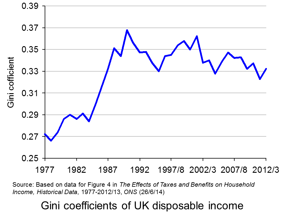
 The chart opposite shows changes in the Gini coefficient in the UK (see Table 27 in the ONS link below for an Excel file of the chart). As this chart and the blog post Rich and poor in the UK show, inequality rose rapidly during the years of the 1979–91 Thatcher government, and especially in the years 1982–90. This was associated with cuts in the top rate of income tax and business deregulation. It fell in the recession of the early 1990s as the rich were affected more than the poor, but rose with the recovery of the mid- to late 1990s. It fell again in the early 2000s as tax credits helped the poor. It fell again following the financial crisis as, once more, the rich were affected proportionately more than the poor.
 The most up-to-date international data for OECD countries can be found on the OECD’s StatExtracts site (see chart opposite: click here for a PowerPoint). The most unequal developed county is the USA, with a Gini coefficient of 0.389 in 2012 (see The end of the American dream?), and US inequality is rising. Today, the top 1% of the US population earns some 24% of national income. This compares with just 9% of national income in 1976.
Many developing countries are even less equal. Turkey has a Gini coefficient of 0.412 and Mexico of 0.482. The figure for South Africa is over 0.6.
When it comes to wealth, distribution is even less equal. The infographic, linked below, illustrates the position today in the USA. It divides the country into 100 equal-sized groups and shows that the top 1% of the population has over 40% of the nation’s wealth, whereas the bottom 80% has only 7%.
So is this inequality of income and wealth desirable? Differences in wages and salaries provide an incentive for people to work harder or more effectively and to gain better qualifications. The possibility of increased wealth provides an incentive for people to invest.
But are the extreme differences in wealth and income found in many countries today necessary to incentivise people to work, train and invest? Could sufficient incentives exist in more equal societies? Are inequalities in part, or even largely, the result of market imperfections and especially of economic power, where those with power and influence are able to use it to increase their own incomes and wealth?
Could it even be the case that excessive inequality actually reduces growth? Are the huge giants that exist today accumulating too much financial wealth and creating too little productive potential? Are they spending too little and thus dampening aggregate demand? These arguments are considered in some of the articles below. Perhaps, by paying a living wage to the ‘tiny’ people on low incomes, productivity could be improved and demand could be stimulated.
Infographic
 Wealth Inequality in America YouTube, Politizane (20/11/12)
Articles
The rise and rise of the cognitive elite The Economist (20/1/11)
Inequality in America: Gini in the bottle The Economist (26/11/13)
Pen’s Parade: do you realize we’re mostly dwarves? LVTFan’s Blog (21/2/11)
Here Are The Most Unequal Countries In The World Business Insider, Andy Kiersz (8/11/14)
Inequality in the World Dollars & Sense, Arthur MacEwan (Nov/Dec 14)
Britain is scared to face the real issue – it’s all about inequality The Observer, Will Hutton (19/1/14)
The tame inequality debate FundWeb, Daniel Ben-Ami (Nov 14)
Is inequality the enemy of growth? BBC News, Robert Peston (6/10/14)
Data
GINI index World Bank data
List of countries by income equality Wikipedia
The Effects of Taxes and Benefits on Household Income, 2012/13 ONS (see table 27)
Income Distribution and Poverty: Gini (disposale income) OECD StatExtract
Questions
- Distinguish between income and wealth. Is each one a stock or a flow?
- Explain how (a) a Lorenz curve and (b) a Gini coefficient are derived.
- What other means are there of measuring inequality of income and wealth other than using Gini coefficients (and giants and dwarfs!)?
- Why has inequality been rising in many countries over the years?
- How do (a) periods of rapid economic growth and (b) recessions affect income distribution?
- Define ‘efficiency wages’. How might an increase in wages to people on low incomes result in increased productivity?
- What is the relationship between the degree of inequality and household debt? What implications might this have for long-term economic growth and future financial crises? Is inequality the ‘enemy of growth’?
 The housing market and what to do about bubbles, second homes and first time buyers is likely to be one of many battle grounds at the next election. For many years, the idea of a mansion tax has been debated and the Shadow Chancellor, Ed Balls, has outlined plans for a mansion tax under a Labour government.
The policy would see houses valued at between £2 and £3 million pay £250 a month as a mansion tax. Those owning a home worth tens of millions and those with second homes would pay more under the mansion tax, which would be based on a progressive system. Concerns have been raised about the impact of this tax on home-owners in areas like London, where average house prices are considerably higher than the UK average. Ed Balls has sought to reassure homeowners that payment of the mansion tax could be deferred if earnings do not reach the £42,000 threshold. However, critics have suggested that this policy will only make things worse for middle income households who will not be able to defer such a payment if their income is £43,000. Labour’s MP for Greenwich, Nick Raynsford said, ‘What it does is create a cliff edge. It will still hit people who are asset rich but cash poor.” Writing in the Evening Standard, Ed Balls said:
“Long-standing residents who now find themselves living in high-value homes but do not have an income high enough to pay the higher or top rate of income tax — in other words earn less than £42,000 a year — will be guaranteed the right to defer the charge until the property changes hands.
So a tax on the highest value properties will be done fairly and carefully to help fund our NHS for the future.
Ordinary Londoners should be protected and wealthy foreign investors must finally make a proper tax contribution in this country.”
Although similar in its objective to the Liberal Democrat’s mansion tax, the amount of the tax as a percentage of the value of the home under Labour is significantly lower. It is likely to be between 0.1% and 0.15% of the home’s valued, compared to the 1% levy proposed by the Liberal Democrats.
 One debate now surrounds the amount that this tax is expected to raise, especially given the revenue has been ear-marked to finance the NHS. The number of homes whose value is estimated to fall between £2m and £3m varies considerably and hence so would the revenues raised from such a tax. However, the income generated by even the most generous estimates will not come close to raising the ear-marked figure of £1.2bn. As such, there are suggestions that the tax levied on houses worth more than £3m; on foreign owners of residences in the UK and second homes will need to be significant to make up the short fall. A spokesperson for the Conservatives said:
“Serious questions have now been raised about how much revenue Labour would be able to raise from the tax …This is a further unravelling of the policy, which faced fierce criticism after it was revealed that no money would be raised until halfway through the next parliament, and the proposals for mass valuations of family homes was widely slammed as unworkable.”
The UK residential research director of Savills estate agency, Lucian Cook, added:
“Given Labour’s stated ambition to raise £1.2bn, that would leave at least £1.08bn to be raised from the remaining 57,000 properties, possibly more to account for tax leakage elsewhere in the system.”
The impact of the mansion tax will depend on exactly how it is imposed and the thresholds, together with how the threshold changes with the housing market. In the UK, we have seen some houses increase in value by huge amounts in just a few months and with a mansion tax, any such increase in price could move more home-owners into the new progressive tax system. Some argue that it is a tax on Londoners. The following articles consider the proposed policy by Labour.
Ed Balls seeks to reassure London home owners over mansion tax plans The Guardian, Patrick Wintour (20/10/14)
Ed Balls: Mansion tax would start at £250 a month BBC News (20/10/14)
‘Mansion tax’ will mean bill of £250 a month, says Ed Balls Financial Times, Emily Cadman, Kate Allen, Vanessa Houlder and George Parker (20/10/14)
Mansion tax can be deferred in you earn less than £42,000, Ed Balls insists as he reveals details of levy on £2million homes Mail Online, Matt Chorley (20/10/14)
Ed Balls: Mansion tax will cost homeowners £250 a month London Evening Standard (20/10/14)
Middle-class families hit by Labour’s mansion tax The Telegraph, Steven Swinford (20/10/14)
Balls says mansion-tax threshold to rise with home values Bloomberg, Svenja O’Donnell (20/10/14)
Questions
- How does a progressive tax system work?/li>
- Why are some critics arguing that this mansion tax would just be a tax on Londoners?
- What objective is the £42,000 income threshold trying to achieve? Do you think that critics are correct in their assertion that it penalises middle income households?
- Fiscal drag is mentioned in the BBC News article as a potential problem with the mansion tax proposed by Labour and that houses may move into the taxable threshold. What is fiscal drag and why is it a potential concern?
- How might such a policy affect the incentives of foreigners to invest in the UK housing market? Would this be a good or a bad thing and for who?
- The revenues generated from houses between £2 and £3m will not be sufficient to generate £1.2bn. What are the implications for how progressive the mansion tax would need to be and how this might affect homeowners?
 A key economic objective of governments around the world is economic growth, where economic growth is taken to mean growth in Gross Domestic Product (GDP). This can be refined as growth in GDP per head or growth in Net National Income (NNY or NNI) – this takes account of depreciation and net flows of income to and from abroad. But is GDP (or NNY) an appropriate measure? There continues to be much debate about this and there is a lot of support for adopting an alternative measure – the Genuine Progress Indicator (GPI) as a target for economic policy.
GDP measures the market value of production and is the value added at each stage of production. If the value of a nation’s production is what you want to measure or target, then GDP is quite a good indicator. Its main drawbacks are that it uses market prices, which may be distorted, and that much of production in the informal sector is not included.

But if GDP growth is taken to be a proxy for development or growth in wellbeing of the residents of a country, then it has serious shortcomings. This is not to say that GDP gives no indication of progress. Generally, countries with higher GDP per head have a better standard of living, but it is not necessarily the case that, if Country A has higher production in the formal sector than Country B, its residents will be happier, more fulfilled and have fewer economic or other problems.
GDP, by focusing on production, ignores many environmental and social costs of that production. Valuable but not tradable resources, such as clean air, rivers and oceans, may be sacrificed for the sake of extra production and this is recorded as a gain in GDP.
Similarly, unless GDP is specifically weighted by income groups, which virtually never happens, it does not take into account income distribution. Much of the growth in production in both rich and poor countries in recent decades has gone to the richest people. Take the case of the USA. In 1944 the share of income going to the top 1% share was 11.3%, while the bottom 90% were receiving 67.5%.  Such levels remained roughly constant for the next three decades. But then things began to change.
Starting in the mid- to late 1970s, the uppermost tier’s income share began rising dramatically, while that of the bottom 90% started to fall. The top 1% took heavy hits from the dot-com crash and the Great Recession but recovered fairly quickly: [preliminary estimates for 2012 by Emmanuel Saez] have that group receiving nearly 22.5% of all pre-tax income, while the bottom 90%’s share is below 50% for the first time ever (49.6%, to be precise).
So what does GPI measure and why may it be a better target for policy-makers than GDP or NNY? The answer is that it includes a number of important items that affect the well-being of a country, such as resource depletion, social activity and income distribution, that are not measured in GDP.  So what would cause GPI to rise? According to The Guardian article below, examples would include:
Getting more energy from renewables; increased energy efficiency; reducing the income gap; putting more reliable, durable products on the market (have you heard of planned obsolescence?); volunteering more for your community; preserving wetlands, forests, and farmland; shorter commutes and transport routes. In fact, there are 26 ways the GPI can go up, all measured in dollars that boil down to a single number.
GPI is being increasingly adopted as a measure of progress. In the USA, it is officially used in Vermont and Maryland and is being considered in other states, such as Hawaii, Washington and Oregon.
And there are other alternatives. For example, since 1990, the United Nations Development Programme (UNDP) has published an annual Human Development Index (HDI) As Box 27.1 in Economics, 8th edition states:
HDI is the average of three indices based on three sets of variables: (i) life expectancy at birth, (ii) education (a weighted average of (a) the mean years that a 25-year-old person or older has spent in school and (b) the number of years of schooling that a 5-year-old child is expected to have over their lifetime) and (iii) real GNY per capita, measured in US dollars at purchasing-power parity exchange rates.
The following articles look at the suitability of GDP and GPI and whether, by targeting growth in GDP, governments are guilty of downplaying the importance of other economic and social objectives.
Beyond GDP: US states have adopted genuine progress indicators The Guardian, Marta Ceroni (23/9/14)
Forget the GDP. Some States Have Found a Better Way to Measure Our Progress. New Republic, Lew Daly and Sean McElwee (3/2/14)
Gross domestic problem Aljazeera, Sean McElwee (6/6/14)
Creating the Circular Economy, Part II Environmental Leader, David Dornfeld (17/9/14)
Development: Time to leave GDP behind Nature, Robert Costanza, Ida Kubiszewski, Enrico Giovannini, Hunter Lovins, Jacqueline McGlade, Kate E. Pickett, Kristín Vala Ragnarsdóttir, Debra Roberts, Roberto De Vogli and Richard Wilkinson (15/1/14)
The Problems With Using GPI Rather Than GDP Forbes, Tim Worstall (5/6/14)
Questions
- What does GDP measure?
- Does GDP of a country equate to the turnover of a firm?
- If growth in NNY is superior to growth in GDP as a measure of economic growth, why are GDP figures more generally used than NNY figures when assessing a country’s economic performance?
- How suitable is using GDP as a measure of a nation’s production?
- What does GPI measure?
- Is GPI superior to GDP as a measure of a nation’s level of development? Explain why or why not.
- Give some examples of where a growth in GDP might correspond to a decline in economic well-being.
- For what reasons could GPI measures be described as subjective?
- Would it be a good idea for a country to target growth in GPI/GDP? Explain your answer.
- In addition to real GNY per capita, the Human Development Index includes measures of education and life expectancy. For what other social objectives might education and life expectancy be useful proxies?
 The ONS has just released its annual publication, The Effects of Taxes and Benefits on Household Income. The report gives data for the financial year 2012/13 and historical data from 1977 to 2012/13.
The publication looks at the distribution of income both before and after taxes and benefits. It divides the population into five and ten equal-sized groups by household income (quintiles and deciles) and shows the distribution of income between these groups. It also looks at distribution within specific categories of the population, such as non-retired and retired households and different types of household composition.
The data show that the richest fifth of households had an average pre-tax-and-benefit income of £81,284 in 2012/13, 14.7 times greater than average of £5536 for the poorest fifth. The richest tenth had an average pre-tax-and-benefit income of £104,940, 27.1 times greater than the average of £3875 for the poorest tenth.
 After the receipt of cash benefits, these gaps narrow to 6.6 and 11.0 times respectively. When the effect of direct taxes are included (giving ‘disposable income’), the gaps narrow further to 5.6 and 9.3 times respectively. However, when indirect taxes are also included, the gaps widen again to 6.9 and 13.6 times.
This shows that although direct taxes are progressive between bottom and top quintiles and deciles, indirect taxes are so regressive that the overall effect of taxes is regressive. In fact, the richest fifth paid 35.1% of their income in tax, whereas the poorest fifth paid 37.4%.
 Taking the period from 1977 to 2012/13, inequality of disposable income (i.e. income after direct taxes and cash benefits) increased from 1977 to 1988, especially during the second two Thatcher governments (1983 to 1990) (see chart opposite). But then in the first part of the 1990s inequality fell, only to rise again in the late 1990s and early 2000s. However, with the Labour government giving greater cash benefits for the poor, inequality reduced once more, only to widen again in the boom running up to the banking crisis of 2007/8. But then, with recession taking hold, the incomes of many top earners fell and automatic stabilisers helped protect the incomes of the poor. Inequality consequently fell. But with the capping of benefit increases and a rise in incomes of many top earners as the economy recovers, so inequality is beginning to rise once more – in 2012/13, the Gini coefficient rose to 0.332 from 0.323 the previous year.
As far as income after cash benefits and both direct and indirect taxes is concerned, the average income of the richest quintile relative to that of the poorest quintile rose from 7.2 in 2002/3 to 7.6 in 2007/8 and then fell to 6.9 in 2012/13.
Other headlines in the report include:
Since the start of the economic downturn in 2007/08, the average disposable income has decreased for the richest fifth of households but increased for the poorest fifth.
Cash benefits made up over half (56.4%) of the gross income of the poorest fifth of households, compared with 3.2% of the richest fifth, in 2012/13.
The average disposable income in 2012/13 was unchanged from 2011/12, but it remains lower than at the start of the economic downturn, with equivalised disposable income falling by £1200 since 2007/08 in real terms. The fall in income has been largest for the richest fifth of households (5.2%). In contrast, after accounting for inflation and household composition, the average income for the poorest fifth has grown over this period (3.5%).
This is clearly a mixed picture in terms of whether the UK is becoming more or less equal. Politicians will, no doubt, ‘cherry pick’ the data that suit their political position. In general, the government will present a good news story and the opposition a bad news one. As economists, it is hoped that you can take a dispassionate look at the data and attempt to relate the figures to policies and events.
Report
The Effects of Taxes and Benefits on Household Income, 2012/13 ONS (26/6/14)
Data
Reference tables in The Effects of Taxes and Benefits on Household Income, 2012/13 ONS (26/6/14)
The Effects of Taxes and Benefits on Household Income, Historical Data, 1977-2012/13 ONS (26/6/14)
Rates of Income Tax: 1990-91 to 2014-15 HMRC
Articles
Inequality is on the up again – Osborne’s boast is over New Statesman, George Eaton (26/6/14)
Disposable incomes rise for richest fifth households only Money.com, Lucinda Beeman (26/6/14)
Half of families receive more from the state than they pay in taxes but income equality widens as rich get richer Mail Online, Matt Chorley (26/6/14)
Rich getting richer as everyone else is getting poorer, Government’s own figures reveal Mirror, Mark Ellis (26/6/14)
The Richest Households Got Richer Last Year, While Everyone Else Got Poorer The Economic Voice (27/6/14)
Questions
- Define the following terms: original income, gross income, disposable income, post-tax income, final income.
- How does the receipt of benefits in kind vary across the quintile groups? Explain.
- What are meant by the Lorenz curve and the Gini coefficient and how is the Gini coefficient measured? Is it a good way of measuring inequality?
- Paint a picture of how income distribution has changed over the past 35 years.
- Can changes in tax be a means of helping the poorest in society?
- What types of income tax cuts are progressive and what are regressive?
- Why are taxes in the UK regressive?
- Why has the fall in income been largest for the richest fifth of households since 2007/8? Does this mean that, as the economy recovers, the richest fifth of households are likely to experience the fastest increase in disposable incomes?
 An article in the February 2015 issue of the Economic Journal, ‘Intergenerational Wealth Mobility in England, 1858–2012: Surnames and Social Mobility’ by Gregory Clark and Neil Cummins, looks at the persistence of wealth within British families across the generations. The article shows, ‘using rare surnames to track families, that wealth is much more persistent than standard one-generation estimates would suggest. There is still a significant correlation between the wealth of families five generations apart’.
 people’s wealth to depend heavily on that of their parents? Clark and Cummins consider this question.