 The Governor of California, Jerry Brown, has issued an executive order to cut greenhouse gas emissions 40% from 1990 levels by 2030 (a 44% cut on 2012 levels). This matches the target set by the EU. It is tougher than that of the US administration, which has set a target of reducing emissions in the range of 26 to 28 percent below 2005 levels by 2025.
The former Governor of California, Arnold Schwarzenegger, had previously set a target of reducing emissions 80% below 1990 levels by 2050. Brown’s new target can be seen as an interim step toward meeting that longer-term goal.
There are several means by which it is planned to meet the Californian targets. These include:
a focus on zero- and near-zero technologies for moving freight, continued investment in renewables including solar roofs and distributed generation, greater use of low-carbon fuels including electricity and hydrogen, stronger efforts to reduce emissions of short-lived climate pollutants (methane, black carbon and fluorinated gases), and further efforts to create liveable, walkable communities and expansion of mass transit and other alternatives to travelling by car.
 Some of these will be achieved through legislation, after consultations with various stakeholders. But a crucial element in driving down emissions is the California’s carbon trading scheme. This is a cap-and-trade system, similar to the EU’s Emissions Trading Scheme.
The cap-and-trade rules came into effect on January 1, 2013 and apply to large electric power plants and large industrial plants. In 2015, they will extend to fuel distributors (including distributors of heating and transportation fuels). At that stage, the program will encompass around 360 businesses throughout California and nearly 85 percent of the state’s total greenhouse gas emissions.
Under a cap-and-trade system, companies must hold enough emission allowances to cover their emissions, and are free to buy and sell allowances on the open market. California held its first auction of greenhouse gas allowances on November 14, 2012. This marked the beginning of the first greenhouse gas cap-and-trade program in the United States since the group of nine Northeastern states in the Regional Greenhouse Gas Initiative (RGGI), a greenhouse gas cap-and-trade program for power plants, held its first auction in 2008.
Since January 2014, the Californian cap-and-trade scheme has been linked to that of Quebec in Canada and discussions are under way to link it with Ontario too. Also California is working with other west-coast states/provinces, Oregon, Washington and British Columbia, to develop a co-ordinated approach to greenhouse gas reductions
 To achieve sufficient reductions in emissions, it is not enough merely to have a cap-and-trade system which, through trading, encourages an efficient reduction in emissions. It is important to set the cap tight enough to achieve the targeted reductions and to ensure that the cap is enforced.
In California, emissions allowances are distributed by a mix of free allocation and quarterly auctions. Free allocations account for around 90% of the allocations, but this percentage will decrease over time. The total allowances will decline (i.e. the cap will be tightened) by 3% per year from 2015 to 2020.
 At present the system applies to electric power plants, industrial plants and fuel distributors that emit, or are responsible for emissions of, 25,000 metric tons of carbon dioxide equivalent (CO2e) per year or more. The greenhouse gases covered are the six covered by the Kyoto Protocol ((CO2, CH4, N2O, HFCs, PFCs, SF6), plus NF3 and other fluoridated greenhouse gases.
Articles
California governor orders aggressive greenhouse gas cuts by 2030 Reuters. Rory Carroll (29/4/15)
California’s greenhouse gas emission targets are getting tougher Los Angeles Times, Chris Megerian and Michael Finnegan (29/4/15)
Jerry Brown sets aggressive California climate goal The Desert Sun, Sammy Roth (29/4/15)
California’s Brown Seeks Nation-Leading Greenhouse Gas Cuts Bloomberg, Michael B Marois (29/4/15)
California sets tough new targets to cut emissions BBC News, (29/4/15)
California’s New Greenhouse Gas Emissions Target Puts Obama’s To Shame New Republic, Rebecca Leber (29/4/15)
Governor Brown Announces New Statewide Climate Pollution Limit in 2030 Switchboard, Alex Jackson (29/4/15)
Cap-and-trade comes to Orego Watchdog, Chana Cox (29/4/15)
Cap and trade explained: What Ontario’s shift on emissions will mean The Globe and Mail, Adrian Morrow (13/4/15)
California’s Forests Have Become Climate Polluters Climate Central, John Upton (29/4/15)
States Can Learn from Each Other On Carbon Pricing The Energy Collective, Kyle Aarons (28/4/15)
Executive Order
Governor Brown Establishes Most Ambitious Greenhouse Gas Reduction Target in North America Office of Edmund G. Brown Jr. (29/4/15)
Frequently Asked Questions about Executive Order B-30-15: 2030 Carbon Target and Adaptation California Environmental Protection Agency: Air Resources Board (29/4/15)
Californian cap-and-trade scheme
Cap-and-Trade Program California Environmental Protection Agency: Air Resources Board (29/4/15)
California Cap and Trade Center for Climate and Energy Solutions (January 2014)
Questions
- Explain how a system of cap-and-trade, such as the Californian system and the ETS in the EU, works.
- Why does a cap-and-trade system lead to an efficient level of emissions reduction?
- How can a joint system, such as that between California and Quebec, work? Is it important to achieve the same percentage pollution reduction in both countries?
- What are countries coming to the United Nations Climate Change conference in Paris in November 2015 required to have communicated in advance?
- How might game theory be relevant to the negotiations in Paris? Are the pre-requirements on countries a good idea to tackle some of the ‘gaming’ problems that could occur?
- Why is a cap-and-trade system insufficient to tackle climate change? What other measures are required?
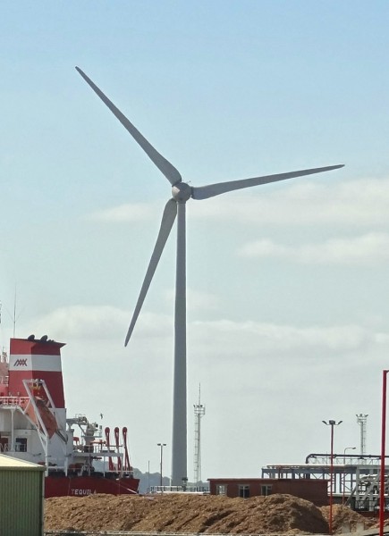
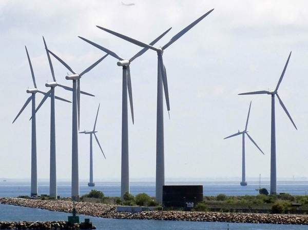
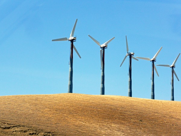
 When an industry produces positive externalities, there is an argument for granting subsidies. To achieve the socially efficient output in an otherwise competitive market, the marginal subsidy should be equal to the marginal externality. This is the main argument for subsidising wind power. It helps in the switch to renewable energy away from fossil fuels. There is also the secondary argument that subsidies help encourage the development of technologies that would be too uncertain to fund at market rates.
If subsidies are to be granted, it is important that they are carefully designed. Not only does their rate need to reflect the size of the positive externalities, but also they should not entail any perverse incentive effects. But this is the claim about subsidies given to wind turbines: that they create an undesirable side effect.
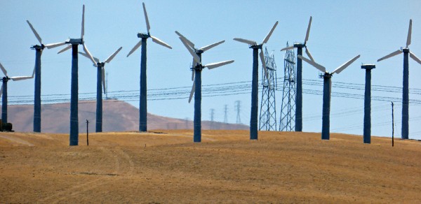
Small-scale operators are encouraged to build small turbines by offering them a higher subsidy per kilowatt generated (through higher ‘feed-in’ tariffs). But according to a report by the Institute for Public Policy Research (IPPR), this is encouraging builders and operators of large turbines to ‘derate’ them. This involves operating them below capacity in order to get the higher tariff. As the IPPR overview states:
The scheme is designed to support small-scale providers, but the practice of under-reporting or ‘derating’ turbines’ generating capacity to earn a higher subsidy is costing the taxpayer dearly and undermining the competitiveness of Britain’s clean energy sector.
The loophole sees developers installing ‘derated’ turbines – that is, turbines which are ‘capped’ so that they generate less energy. Turbines are derated in this way so that developers and investors are able to qualify for the more generous subsidy offered to lower-capacity turbines, generating 100–500kW.  By installing derated turbines, developers are making larger profits off a feature of the scheme that was designed to support small-scale projects. Currently, the rating of a turbine is declared by the manufacturer and installer, resulting in a lack of external scrutiny of the system.
The subsidies are funded by consumers through higher electricity prices. As much as £400 million could be paid in excess subsidies. The lack of scrutiny means that operators could be receiving as much as £100 000 per year per turbine in excess subsidies.
However, as the articles below make clear, the facts are disputed by the wind industry body, RenewableUK. Nevertheless, the report is likely to stimulate debate and hopefully a closing of the loophole.
Video
 Turbine power: the cost of wind power to taxpayers Channel 4 News, Tom Clarke (10/2/15)
Articles
Wind subsidy loophole boosts spread of bigger turbines Financial Times, Pilita Clark (10/2/15)
Call to Close Wind Power ‘Loophole’ Herald Scotland, Emily Beament (10/2/15)
Wind farm developers hit back at ‘excessive subsidy’ claims Business Green, Will Nichols (10/2/15)
The £400million feed-in frenzy: Green energy firms accused of making wind turbines LESS efficient so they appear weak enough to win small business fund Mail Online, Ben Spencer (10/2/15)
Wind power subsidy ‘loophole’ identified by new report Engineering Technology Magazine, Jonathan Wilson (11/2/15)
Report
Feed-in Frenzy Institute for Public Policy Research, Joss Garman and Charles Ogilvie (February 2015)
Questions
- Draw a diagram to demonstrate the optimum marginal rate of a subsidy and the effect of the subsidy on output.
- Who should pay for subsidies: consumers, the government (i.e. taxpayers generally), electricity companies through taxes on profits made from electricity generation using fossil fuels, some other source? Explain your thinking.
- What is the argument for giving a higher subsidy to operators of small wind turbines?
- If wind power is to be subsidised, is it better to subsidise each unit of output of electricity, or the construction of wind turbines or both? Explain.
- What could Ofgem do (or the government require Ofgem to do) to improve the regulation of the wind turbine industry?
 Economics is about choices. But how can people be persuaded to make healthy choices, or socially responsible or environmentally friendly choices? Behavioural economists have studied how people can be ‘nudged’ into changing their behaviour. One version of nudge theory is ‘fun theory’. This studies how people can be persuaded into doing desirable things by making it fun to do so.
I came across the first video below a couple of days ago. It looks at a highly successful experiment at the Odenplan underground station in Stockholm to persuade people to make the healthy choice of using the stairs rather than the escalator. It made doing so fun. The stairs were turned into a musical keyboard, complete with sound. Each stair plays a piano note corresponding to its piano key each time someone treads on it. As you go up the stairs you play an ascending scale.
After installing the musical staircase, 66% more people than normal chose the stairs over the escalator.
 The fun theory initiative is sponsored by Volkswagen. The Fun Theory website is ‘dedicated to the thought that something as simple as fun is the easiest way to change people’s behaviour for the better. Be it for yourself, for the environment, or for something entirely different, the only thing that matters is that it’s change for the better.’
VW held a competition in 2009 to encourage people to invent fun products designed to change people’s behaviour. There were over 700 entries and you can see them listed on the site. The 13 finalists included the musical staircase, traffic lights with quiz questions on the red, a Connect Four beer crate, fun tram tickets (giving entry to an instant-win lottery), a pinball exercise machine, a speed camera lottery where a winner is chosen from those abiding by the speed limit, a jukebox rubbish bin (which plays when people add rubbish), a one-armed vending machine, a fun doormat, car safety belts linked to a car’s entertainment system, car safety belt with a gaming screen which turns on when buckled, a bottle bank arcade system and the world’s deepest bin (or at least one which sounds as if it is). The winner was the speed camera lottery.
The fun theory site
Thefuntheory.com
Fun theory videos
 Piano Staircase – Odenplan, Stockholm (on Vimeo)
 The Speed Camera Lottery (on VIMP.com, Kevin Richardson)
 Garbage Jukebox (on YouTube)
 The World’s Deepest Bin (on Vimeo)
 Bottle Bank Arcade (on YouTube)
Questions
- Does fun theory rely on rational choices?
- Other than through having fun, how else may people be nudged into changing their behaviour?
- Go through some of the entries to the Fun Theory Award and choose three that you particularly like. Explain why.
- Invent your own fun theory product. You might do this by discussing it groups and perhaps having a group competition.
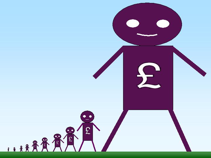
 In his 1971 book, Income Distribution, Jan Pen, a Dutch economist, gave a graphic illustration of inequality in the UK. He described a parade of people marching by. They represent the whole population and the parade takes exactly one hour to pass by. The height of each person represents his or her income. People of average height are the people with average incomes – the observer is of average height. The parade starts with the people on the lowest incomes (the dwarfs), and finishes with those on the highest incomes (the giants).
Because income distribution is unequal, there are many tiny people. Indeed, for the first few minutes of the parade, the marchers are so small they can barely be seen. Even after half an hour, when people on median income pass by, they are barely waist high to the observer.
The height is growing with tantalising slowness, and forty-five minutes have gone by before we see people of our own size arriving. To be somewhat more exact: about twelve minutes before the end the average income recipients pass by.
In the final minutes, giants march past and then in the final seconds:
the scene is dominated by colossal figures: people like tower flats. Most of them prove to be businessmen, managers of large firms and holders of many directorships and also film stars and a few members of the Royal Family.
The rear of the parade is brought up by a few participants who are measured in miles. Indeed they are figures whose height we cannot even estimate: their heads disappear into the clouds and probably they themselves do not even know how tall they are.
Pen’s description could be applied to most countries – some with even more dwarfs and even fewer but taller giants. Generally, over the 43 years since the book was published, countries have become less equal: the giants have become taller and the dwarfs have become smaller.
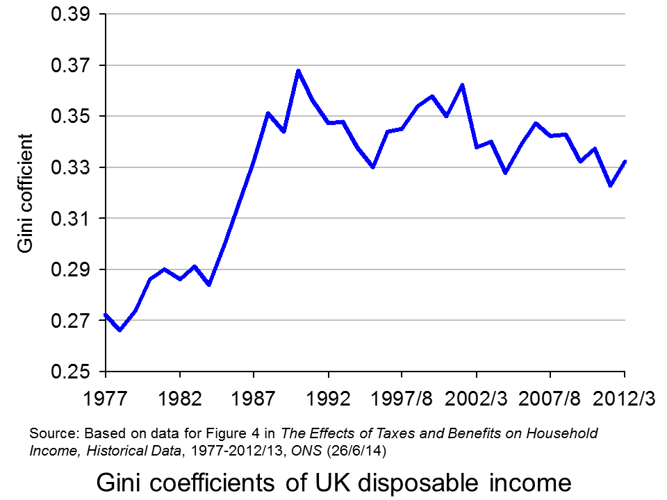
The 2011 Economist article, linked below, uses changes in Gini coefficients to illustrate the rise in income inequality. A Gini coefficient shows the area between the Lorenz curve and the 45° line. The figure will be between 0 and 1 (or 0% and 100%). a figure of 0 shows total equality; a figure of 1 shows a situation of total inequality, where one person earns all the nation’s income. The higher the figure, the greater the inequality.
 The chart opposite shows changes in the Gini coefficient in the UK (see Table 27 in the ONS link below for an Excel file of the chart). As this chart and the blog post Rich and poor in the UK show, inequality rose rapidly during the years of the 1979–91 Thatcher government, and especially in the years 1982–90. This was associated with cuts in the top rate of income tax and business deregulation. It fell in the recession of the early 1990s as the rich were affected more than the poor, but rose with the recovery of the mid- to late 1990s. It fell again in the early 2000s as tax credits helped the poor. It fell again following the financial crisis as, once more, the rich were affected proportionately more than the poor.
 The most up-to-date international data for OECD countries can be found on the OECD’s StatExtracts site (see chart opposite: click here for a PowerPoint). The most unequal developed county is the USA, with a Gini coefficient of 0.389 in 2012 (see The end of the American dream?), and US inequality is rising. Today, the top 1% of the US population earns some 24% of national income. This compares with just 9% of national income in 1976.
Many developing countries are even less equal. Turkey has a Gini coefficient of 0.412 and Mexico of 0.482. The figure for South Africa is over 0.6.
When it comes to wealth, distribution is even less equal. The infographic, linked below, illustrates the position today in the USA. It divides the country into 100 equal-sized groups and shows that the top 1% of the population has over 40% of the nation’s wealth, whereas the bottom 80% has only 7%.
So is this inequality of income and wealth desirable? Differences in wages and salaries provide an incentive for people to work harder or more effectively and to gain better qualifications. The possibility of increased wealth provides an incentive for people to invest.
But are the extreme differences in wealth and income found in many countries today necessary to incentivise people to work, train and invest? Could sufficient incentives exist in more equal societies? Are inequalities in part, or even largely, the result of market imperfections and especially of economic power, where those with power and influence are able to use it to increase their own incomes and wealth?
Could it even be the case that excessive inequality actually reduces growth? Are the huge giants that exist today accumulating too much financial wealth and creating too little productive potential? Are they spending too little and thus dampening aggregate demand? These arguments are considered in some of the articles below. Perhaps, by paying a living wage to the ‘tiny’ people on low incomes, productivity could be improved and demand could be stimulated.
Infographic
 Wealth Inequality in America YouTube, Politizane (20/11/12)
Articles
The rise and rise of the cognitive elite The Economist (20/1/11)
Inequality in America: Gini in the bottle The Economist (26/11/13)
Pen’s Parade: do you realize we’re mostly dwarves? LVTFan’s Blog (21/2/11)
Here Are The Most Unequal Countries In The World Business Insider, Andy Kiersz (8/11/14)
Inequality in the World Dollars & Sense, Arthur MacEwan (Nov/Dec 14)
Britain is scared to face the real issue – it’s all about inequality The Observer, Will Hutton (19/1/14)
The tame inequality debate FundWeb, Daniel Ben-Ami (Nov 14)
Is inequality the enemy of growth? BBC News, Robert Peston (6/10/14)
Data
GINI index World Bank data
List of countries by income equality Wikipedia
The Effects of Taxes and Benefits on Household Income, 2012/13 ONS (see table 27)
Income Distribution and Poverty: Gini (disposale income) OECD StatExtract
Questions
- Distinguish between income and wealth. Is each one a stock or a flow?
- Explain how (a) a Lorenz curve and (b) a Gini coefficient are derived.
- What other means are there of measuring inequality of income and wealth other than using Gini coefficients (and giants and dwarfs!)?
- Why has inequality been rising in many countries over the years?
- How do (a) periods of rapid economic growth and (b) recessions affect income distribution?
- Define ‘efficiency wages’. How might an increase in wages to people on low incomes result in increased productivity?
- What is the relationship between the degree of inequality and household debt? What implications might this have for long-term economic growth and future financial crises? Is inequality the ‘enemy of growth’?
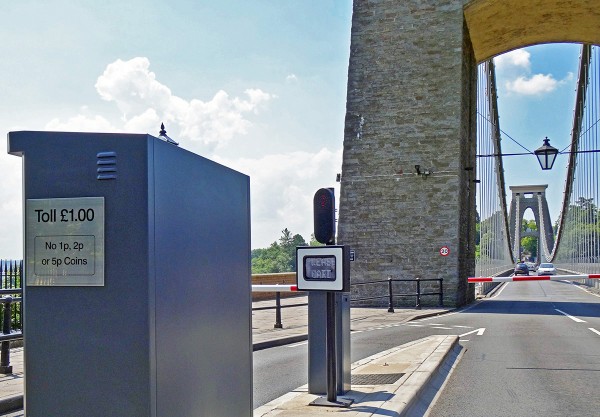
 There have been two significant changes in prices for travel in Bristol. At the end of April, the toll on Brunel’s iconic Clifton Suspension Bridge doubled from 50p to £1 for a single crossing by car. The bridge over the Avon Gorge links North Somerset with the Clifton area of Bristol and is a major access route to the north west of the city. Avoiding the bridge could add around 2 miles or 8 minutes to a journey from North Somerset to Clifton.
The justification given by the Clifton Suspension Bridge Trust for the increase was that extra revenue was needed for maintenance and repair. As Trust Chairman Chris Booy said, ‘The higher toll will enable the Trust to continue its £9 million 10-year vital repair and maintenance programme which aims to secure the bridge’s long-term future as a key traffic route, one of Bristol’s major tourist destinations and the icon of the city’.
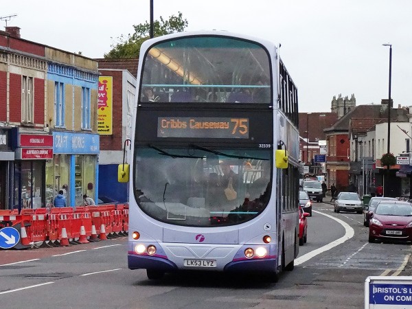
 The other price change has been downwards. In November 2013, the First Group cut bus fares in Bristol and surrounding areas. Single fares for up to three miles were cut from £2.90 to £1.50; 30% discounts were introduced for those aged 16 to 21; half-price tickets were introduced for children from 5 to 15; and the two fare zones for £4 and £6 day tickets were substantially increased in size.
First hoped that the anticipated increase in passengers would lead to an increase in revenue. Evidence so far is that passenger numbers have increased, with journeys rising by some 15%. Part of this is due to other factors, such as extra bus services, new buses, free wifi and refurbished bus stops with larger shelters and seats. But the company attributes a 9% rise in passengers to the fare reductions. As far as revenue is concerned, indications from the company are that, after an initial fall, revenue has risen back to levels earned before the fare reduction.
What are the longer-term implications for revenue and profit of these two decisions? This depends on the price elasticity of demand and on changes in costs. Read the articles and then consider the implications by having a go at answering the questions.
Clifton Suspension Bridge toll to rise from 50p to £1 BBC News (9/4/14)
Regular Users of Clifton Suspension Bridge will be Protected from the Increase in the Bridge Toll Clifton Suspension Bridge (9/4/14)
Clifton Suspension Bridge Review Decision Letter Department of Transport (24/3/14)
Clifton Suspension Bridge Trust: bridge toll review inspector’s report Department of Transport (8/4/14)
Clifton Suspension Bridge Toll Increase – Account of the May 2013 Public Inquiry The National Alliance Against Tolls (NAAT)
First Bus Bristol fare cuts sees passenger growth BBC News (6/6/14)
First gamble over cheaper bus fares pays off as passengers increase in Bristol The Bristol Post (6/6/14)
Bristol bus fares deal to extend to South Gloucestershire and North Somerset The Bristol Post, Gavin Thompson (12/6/14)
Questions
- What assumptions is the Clifton Suspension Bridge Trust making about the price elasticity of demand for bridge crossings?
- What determines the price elasticity for bridge crossings in general? Why is this likely to differ from one bridge to another?
- How is the long-term price elasticity of demand likely to differ from the short-term elasticity for Clifton Suspension Bridge crossings and what implications will this have for revenues, costs and profit?
- How is the price elasticity of demand for the bridge likely to vary from one user to another?
- How is offering substantial price reductions for multiple-crossing cards likely to affect revenue?
- What determines the price elasticity of demand for bus travel?
- What could a local council do to encourage people to use buses?
- How is the long-term price elasticity of demand for bus travel likely to differ from the short-term elasticity?
- In the long run, is First likely to see profits increase from its fare reduction policy? Explain what will determine this likelihood.
 The Governor of California, Jerry Brown, has issued an executive order to cut greenhouse gas emissions 40% from 1990 levels by 2030 (a 44% cut on 2012 levels). This matches the target set by the EU. It is tougher than that of the US administration, which has set a target of reducing emissions in the range of 26 to 28 percent below 2005 levels by 2025.
 Some of these will be achieved through legislation, after consultations with various stakeholders. But a crucial element in driving down emissions is the California’s carbon trading scheme. This is a cap-and-trade system, similar to the EU’s Emissions Trading Scheme.
 To achieve sufficient reductions in emissions, it is not enough merely to have a cap-and-trade system which, through trading, encourages an efficient reduction in emissions. It is important to set the cap tight enough to achieve the targeted reductions and to ensure that the cap is enforced.
 At present the system applies to electric power plants, industrial plants and fuel distributors that emit, or are responsible for emissions of, 25,000 metric tons of carbon dioxide equivalent (CO2e) per year or more. The greenhouse gases covered are the six covered by the Kyoto Protocol ((CO2, CH4, N2O, HFCs, PFCs, SF6), plus NF3 and other fluoridated greenhouse gases.