 The Treasury has published a paper analysing the costs of Britain leaving the EU. Its central assumption is that the UK would negotiate a bilateral trade deal with the EU similar to that between Canada and the EU. Under this assumption the Treasury estimates that, by 2030, GDP would be 6.2% lower than if the UK had remained in the EU, meaning that the average household would be £4300 per year worse off than it would otherwise have been. The analysis also finds that there would be a total reduction in tax receipts of £36 billion per year – far greater than any savings from lower contributions to the EU budget.
Not surprisingly the ‘Vote Remain’ campaign for the UK to stay in the EU has welcomed the analysis, seeing it as strong evidence in support of their case. Also, not surprisingly, the Vote Leave campaign has questioned both the analysis and the assumptions on which it is based.
 The Treasury analysis looks at three possible scenarios: (a) a Canada-style bilateral arrangement (the central estimate); (b) the UK becoming a member or the European Economic Area – the ‘Norwegian model’ (according to the Treasury, this would reduce GDP by 3.8%); (c) no specific deal with the EU, with the UK simply having the same access to the EU as any other country that is a mamber of the WTO (this would reduce GDP by 7.5%). Thus the Norwegian model would probably result in a smaller reduction in growth, but the UK would still continue to make contributions to the EU budget and have to allow free movement of labour. Only in option (c) would it have total control over migration. Each of the estimates has a margin of error, giving a range for the reduction in GDP across the three scenarios from 3.4% to 9.5%.
The Treasury used a three-stage process to arrive at its conclusions, as explained in the FT article below:
First, it uses gravity models to estimate the effect of different trade relationships on the quantity of trade and foreign direct investment. Gravity models take into account how close countries are to each other geographically, as well as their historical links, rather than assuming that trade flows to wherever the lowest tariffs are.
Second, it uses external academic results to estimate the consequences for productivity – the efficiency of the UK economy – from different levels of trade and foreign direct investment.
Third, it plugs the productivity numbers unto a global economic model run by the National Institute of Economic and Social Research to estimate the long-run differences in national income and prosperity.
Clearly there is large-scale uncertainty over any forecasts 14 years ahead, especially when the relationship with the EU and other countries post-EU exit can only be roughly estimated. The question is whether the assumptions are reasonable and whether there would be substantial costs from Brexit, but not necessarily of £4300 per household.
The following articles look at the analysis and its assumptions. Unlike many newspaper articles, which clearly have an agenda, these articles are relatively unbiased and try to assess the arguments. Of course, it would be difficult to be totally unbiased and it would be a good idea to try to spot any biases in each of the articles.
Articles
Treasury’s Brexit analysis: what it says — and what it doesn’t Financial Times, Chris Giles (18/4/16)
A Treasury analysis suggests the costs of Brexit would be high The Economist (18/4/16)
George Osborne says UK would lose £36bn in tax receipts if it left EU The Guardian, Anushka Asthana and Tom Clark (18/4/16)
Will each UK household be £4,300 worse off if the UK leaves the EU? The Guardian, Larry Elliott (18/4/16)
FactCheck Q&A: can we trust the Treasury on Brexit? Channel 4 News, Patrick Worrall (18/4/16)
Reality Check: Would Brexit cost your family £4,300? BBC News, Anthony Reuben (18/4/16)
Brexit sparks outbreak of agreement among economists Financial Times, Chris Giles (27/4/16)
Treasury analysis
EU referendum: HM Treasury analysis key facts HM Treasury (18/4/16)
HM Treasury analysis: the long-term economic impact of EU membership and the alternatives HM Treasury (18/4/16)
Questions
- Would households actually be poorer if the Treasury’s forecasts are correct?
- What alternative trade arrangements with the EU would be possible if the UK left the EU?
- What are the Treasury model’s main weaknesses?
- What considerations are UK voters likely to take into account in the referendum which are not included in the Treasury analysis?
- Make out the case for supporting the analysis of the Treasury.
- Make out the case for rejecting the analysis of the Treasury.
 In a recent post, Global Warning, we looked at concerns about the global economy. One of these was about the ineffectiveness of monetary policy to stimulate aggregate demand and to restore growth rates. Despite the use of unconventional monetary policies, such as quantitative easing and negative interest rates, and despite the fact that these policies have become the new convention, they have failed to do enough to bring sustained recovery.
The two articles below argue that the failure has been due to a flawed model of monetary policy: one that takes too little account of the behaviour of banks and the drivers of consumption and of physical investment. Negative interest rates on banks’ holdings of reserves in central banks are hardly likely to push down lending rates to businesses sufficiently to stimulate investment in new plant and machinery if firms already have overcapacity. And consumers are unlikely to borrow more for consumption if their wages are barely rising and they already have debts that they fear will be difficulty to pay off.
As Joseph Stiglitz points out:
As real interest rates have fallen, business investment has stagnated. According to the OECD, the percentage of GDP invested in a category that is mostly plant and equipment has fallen in both Europe and the US in recent years. (In the US, it fell from 8.4% in 2000 to 6.8% in 2014; in the EU, it fell from 7.5% to 5.7% over the same period.) Other data provide a similar picture.
And the unwillingness of many firms and individuals to borrow is matched by banks’ caution about lending in an uncertain economic environment. Many are more concerned about building their capital and liquidity ratios to protect themselves. In these circumstances, negative interest rates have little effect on stimulating bank lending and, by hurting their balance sheets through lower earnings on the money markets, may even encourage them to lend less
What central banks should be doing, argue both Stiglitz and Elliott, is finding ways of directly stimulating consumption and investment. Perhaps this will involve central banks “focusing on the flow of credit, which means restoring and maintaining local banks’ ability and willingness to lend to SMEs.” Perhaps it will mean using helicopter money, as we examined in the previous blog. As Larry Elliott points out:
The fact that economists at Deutsche Bank published a helpful cut-out-and-keep guide to helicopter  money last week is a straw in the wind.
As the Deutsche research makes clear, the most basic variant of helicopter money involves a central bank creating money so that it can be handed to the finance ministry to spend on tax cuts or higher public spending. There are two differences with QE. The cash goes directly to firms and individuals rather than being channelled through banks, and there is no intention of the central bank ever getting it back.
So if the model of monetary policy is indeed flawed, prepare for more unconventional measures
Articles
What’s Wrong With Negative Rates?, Project Syndicate, Joseph Stiglitz (13/4/16)
The bad smell hovering over the global economy The Guardian, Larry Elliott (17/4/16)
Questions
- What arguments does Stiglitz use to support his claim that the model of monetary policy currently being used is flawed?
- In what ways has monetary policy hurt older people and what has been the effect on their spending and on aggregate demand in general?
- Why has monetary policy encouraged investors to shift their portfolios toward riskier assets?
- Examine the argument that ultra-low interest rates may result in a rise in unemployment in the long term by affecting the relative prices of capital and labour.
- What forms might helicopter money take?
- Would the use of helicopter money necessarily result in an increase in aggregate demand? What would determine the size of any such increase?
 In a recent blog Accelerating interest in the interesting case of UK interest rates we compared the level of the official Bank Rate, which has now been at 0.5 per cent for over seven years, with a representative unsecured borrowing rate. In doing so, we found some evidence that credit conditions might be easing following the credit market disturbance of the late 2000s. Here we take the opportunity not only to review that data again one month on, but also to see whether a similar picture is true for the mortgage market.
Theories of the financial accelerator argue that the macroeconomic environment can affect commercial banks’ lending practices. One way in which this can operate is through the difference between banks’ lending rates and the official Bank Rate. We can think of such interest-rate differentials – or spreads – as a credit premium. The size of the premium may be thought to reflect lenders’ perceived risk of default by borrowers. It is argued by some economists that interest-rate differentials will fall when the economy is doing well and increase when the economy is doing less well. This is because the probability of default by borrowers is seen as smaller when the macroeconomic environment improves.
The effect of interest-rate differentials that are contingent on the macroeconomic environment is to amplify the business cycle. For example, a positive demand-side shock, such as a rise in consumer confidence, which causes the economy’s aggregate demand to rise will, in turn, lead to lower borrowing rates relative to the official Bank Rate. This financial effect further stimulates the demand for credit and, as a consequence, aggregate demand and economic activity. It is an example of what economists called the financial accelerator.
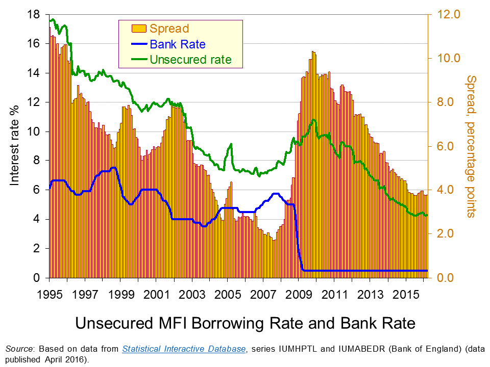
 The chart shows the Bank Rate along with the average unsecured borrowing rate on loans by Monetary Financial Institutions (MFIs) of £10 000. Unlike secured borrowing, which we consider shortly, unsecured borrowing is not secured against property.
As expected, we can see that the unsecured borrowing rate is greater than the Bank Rate. In other words, there is a positive interest-rate differential. However, this differential is seen to vary. It falls sharply in the period up to the financial crisis. In early 2002 it was running at 8 percentage points. By summer 2007 the differential had fallen to only 1.7 percentage points. (Click here to download a PowerPoint of the chart.)
The period from 2002 to 2007 was characterised by consistently robust growth with the UK economy growing by about 2.7 per cent per annum over this period. This may point to economic growth can contributing to an easing of credit conditions as implied by the financial accelerator.
The story from 2008 changes very quickly as the interest-rate differential increases very sharply. In 2009, as the official Bank Rate was cut to 0.5 per cent, the unsecured borrowing rate climbed to close to 10.5 per cent. Consequently, the interest-rate differential rose to 10 percentage points. Inter-bank lending had dried up with banks concerned that banks would default on loans. The increase in interest rates on lending to the non-bank private sector was stark and evidence of a credit market disruption.
The interest-rate differential for unsecured borrowing has steadily declined since its peak at the end of 2009 as the unsecured borrowing rate has fallen. This implies that credit conditions have eased. In March 2016 our interest-rate differential for unsecured borrowing stood at 3.8 percentage points, not dissimilar to levels over the past 12 months. Interestingly, today’s differential on unsecured borrowing is lower than the 6.5 percentage point average over the period from 1997 to 2003, before the differential then went on its pre-crisis fall.
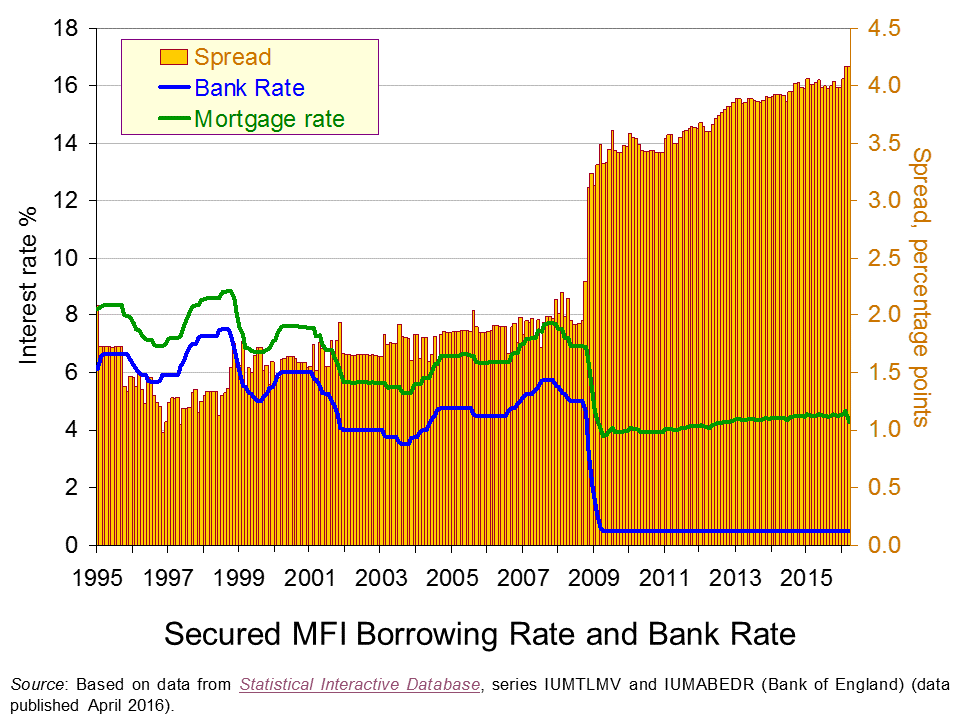
 Our second chart repeats the analysis but this time for mortgages. The representative mortgage rate is the average standard variable mortgage rate.
Unlike that for unsecured borrowing, the interest-rate differential for mortgages is fairly constant up to the financial crisis. The widely report credit easing in the mortgage market appears to have operated more through amounts lent rather than through price, as evidenced by rising mortgage advance-to-income ratios. (Click here to download a PowerPoint of the chart.)
The second chart shows clear evidence of a credit market disruption from 2009. Hence, the markets for secured and unsecured lending saw credit conditions tighten with interest-rate differentials rising markedly. However, it shows that the higher interest-rate differential for secured lending following the credit market disruption remains. So while the differential has fallen sharply for unsecured lending the situation is quite different in the mortgage market. In fact, February and March 2016 saw the mortgage rate spread at 4.17 percentage points which is an historic high.

Our interest rate data show that interest-rate differentials can vary significantly over time. This is important to understand when we are thinking about the relationships between the macroeconomy and the financial system. Significantly, the data suggest that interest rates on different financial instruments can behave differently such that differences emerge in the patterns of spreads over the official Bank Rate.
The evidence on UK mortgage rates suggests that the market remains affected by the financial crisis and the credit market disruption that arose. Although the level of mortgage rates is historically low – which tends to capture many of the headlines – this masks an historically high premium over the official Bank Rate.
Articles
Bank warns EU vote may hit growth as it holds rates BBC News, (14/4/16)
Carney issues a warning as interest rates are held Belfast Telegraph, (15/4/16)
Bank Of England Leaves Interest Rates On Hold Sky News, (14/4/16)
UK banks plan to boost lending to households but not firms – BoE Reuters, (13/4/16)
Mortgage rates reach record lows as threat of Bank Rate rise evaporates Telegraph, Tara Evans (1/4/16)
Data
Bankstats (Monetary and Financial Statistics) – Latest Tables Bank of England
Statistical Interactive Database – interest and exchange rates data Bank of England
Questions
- Why would we expect banks’ borrowing rates to be higher than the official Bank Rate?
- How might banks’ credit criteria change as the macroeconomic environment changes? Explain your answer.
- As well as the macroeconomic environment, what other factors might lead to a change in the interest-rate differential between banks’ borrowing rates and the official Bank Rate?
- How would we expect a credit market disruption to affect the interest-rate differential?
- Explain how the financial accelerator affects the change in the size of the economy following a positive demand shock.
- Explain how the financial accelerator affects the change in the size of the economy following a negative demand shock.
- What is the impact of the financial accelerator of the amplitude of the business cycle?
- How might regulators intervene to minimise the effect of the financial accelerator?
- Why might explain the high interest-rate differential on mortgages that continues to persist following the financial crisis?
- Analyse the ways in which the financial system can stabilise or destabilise economies.
 Evidence of widespread tax avoidance has featured heavily in the news recently. Furthermore, recent developments also suggest that avoiding taxes has become an important motivation for merger and acquisition (M&A) activity. For example, Pfizer, the US pharmaceutical giant that producers Viagra, has for a while been looking to expand through M&A. Following a failed
  attempt to merge with the British pharmaceutical company AstraZeneca in 2014, it instead agreed late last year to merge with a company called Allergan. This was set to be the largest healthcare merger ever, worth over £100bn.
What is key about Allergan is that, whilst it is run from the USA, it is legally registered as being based in Ireland. It has been strongly argued that the key motivation for the merger was tax avoidance with Pfizer’s strategy described in this way:
They look for a likely partner based in a country with a lower corporate tax regime and suggest a merger. When the merger goes through, the company based in the US moves its HQ – but not the bulk of its operations – to the low-tax jurisdiction, where it books the bulk of its profits. At a stroke, the company’s tax bill is cut.
This practice is sometimes referred to as an inversion. It has been suggested that over the past five years around 40 completed mergers have been motivated by similar objectives.
However, policy makers, in particular in the USA, where corporation tax is high, have increasingly become aware of the practice. President Obama recently made clear that:
If corporations are paying less tax, only one of two things can happen. The US will have less to spend on schools, roads and public health, or taxes will have to be raised on the country’s middle class.
In 2014 some tightening of the tax rules took place, but with limited effect. Then, earlier this month President Obama implemented a series of new rules to attempt to prevent the practice. He stressed that these new rules would help to deter companies from taking advantage of:
one of the most insidious tax loopholes out there, fleeing the country just to get out of paying their taxes.
Almost immediately the Pfizer-Allegan merger was abandoned and Pfizer was required to pay a break-up fee of $150m to Allegran. The parties involved were far from happy and the chief executive of Allegran stated that:
For the rules to be changed after the game has been played is a bit un-American.
However, a spokesman for the White House responded that:
I think it is difficult to have a lot of patience for an American C.E.O. trying to execute a complicated financial transaction to avoid paying taxes in America, talking about what it means to be a good citizen of the United States.
 As has been highlighted, the decision to immediately abandon the merger provides a clear indication that the business case and potential synergies arising from combining the two companies were far less important than the benefits from tax avoidance.
Where does the abandoned merger leave Pfizer? One option will be to consider alternative mergers. Perhaps reflecting this possibility, the share prices of foreign rivals such as AstraZeneca and GlaxoSmithKline increased following the announcement that the Allegran deal had been abandoned. However, an alternative under serious consideration appears to be the opposite strategy of shrinking Pfizer’s operations. It has been argued that this would allow the company to be become more focused.
It remains to be seen in which direction Pfizer will go. However, what this example clearly illustrates is the impact changes in regulatory policy can have on firms’ strategic decisions.
Articles
Collapse of $160bn Pfizer and Allergan merger shocks corporate US Financial Times, Barney Jopson, David Crow, James Fontanella-Khan and Arash Massoudi (6/4/16)
It’s off: the end of Pfizer’s $160 billion Allergan merger The Atlantic, Krishnadev Calamur (6/4/16)
Pfizer and Allergan terminate $160bn merger following US tax crack-down The Telegraph, Julia Bradshaw (6/4/16)
Questions
- Who do you think will be the big winners and losers from the merger being abandoned?
- Why do you think break-up fees are used in merger deals?
- What are the pros and cons for Pfizer of continuing to pursue M&As rather than downsizing?
- Are there any alternative strategies it might consider?
 Research published by the Institute for Fiscal Studies shows that graduates from wealthier family backgrounds earn significantly more than those from poorer backgrounds. If you compare the 20% of graduates from the richest backgrounds with the remaining 80%, the average earnings gap in 2012/13, 10 years after graduation, was £8000 per year for men and £5300 for women. Even when you take graduates in similar degrees from similar universities, there is still a gap of around 10% between those from richer and those from poorer backgrounds.
 The research also shows that in 2012/13, 10 years after graduation, the median earnings for economics graduates was the second highest of any subject (just behind graduates in medicine) and that at the 90th percentile economics graduates had the highest earnings (£93 900 for women and £121 400 for men) of any subject. In fact, graduates in economics were the only males at this percentile earning over £100 000. (Click here for a PowerPoint of the chart.) As the Press Release to the IFS working paper states:
For males, it is estimated that approximately 12% of economics graduates earned above £100 000 some ten years after graduation; by contrast, 6% of those studying medicine or law earned more than £100 000.
For females, it is estimated that approximately 9% of economics graduates earned above £100 000 some ten years after graduation; by contrast, just 1% of those studying medicine and 3% of those studying law did so.
For some subjects, graduates earned little more than non-graduates.
Those studying the creative arts had the lowest earnings, and indeed earned no more on average than non-graduates.
The research also shows that earnings vary substantially by gender and university. For those earning £8000 or more, the median earnings for male graduates 10 years after graduation was £30 000 (compared with £21 000 for non-graduates), whereas for women it was £27 000 (compared with £18 000 for non-graduates).
Earnings are substantially higher for graduates from some universities, such as Oxford, Cambridge and the LSE. “At the other end of the spectrum, there were some institutions (23 for men and 9 for women) where the median graduate earnings were less than those of the median non-graduate ten years on.” Differences in graduate earnings by university tend to compound the difference by students’ family background as those from poorer backgrounds disproportionately attend universities with lower average graduate earnings by discipline.
The following articles consider the findings and their implications for higher education policy
Articles
Graduates from wealthy backgrounds reap earnings benefits Times Higher Education, John Morgan (13/4/16)
Graduate Earnings Guided By Parents’ Wealth, Institute For Fiscal Studies Report Finds Huffington Post, George Bowden (13/4/16)
Graduates from poorer backgrounds earn less than richer peers on same course, major international study finds Independent. Oliver Wright (13/4/16)
Richer students have higher graduate income, study finds The Guardian (13/4/16)
Want a Higher Salary? It Helps If You’re a Man With Rich Parents Bloomberg, Robert Hutton (13/4/16)
Economics graduates are in the money Why Study Economics? Economics in Action blog (15/4/16)
IFS paper
What and where you study matter for graduate earnings – but so does parents’ income IFS Press Release (13/4/16)
How English domiciled graduate earnings vary with gender, institution attended, subject and socio-economic background IFS Working Paper W16/06, Jack Britton, Lorraine Dearden, Neil Shephard and Anna Vignoles (13/4/16)
Data
Free Online Statistics – Students & qualifiers Higher Education Statistics Agency (HESA)
Applications and acceptances for types of higher education course – 2015 UCAS
What do graduates do? Higher Education Careers Services Unit
Questions
- For what reasons are graduates from rich backgrounds likely to earn substantially more than graduates from poor backgrounds?
- Why are graduates in economics likely to earn more than graduates in other subjects, especially those in the top percentile of earners from any given subject?
- How might marginal productivity help to explain the differences in earnings of different graduates?
- What are meant by ‘soft skills’. Why may students from richer backgrounds have better soft skills in the context of (a) university admission and (b) getting a job on graduation?
- Why are female graduates likely to earn less than male graduates with the same class of degree in the same subject?
- What could be done by (a) universities and (b) the government to increase social mobility?
- Do you think that the findings of the research have implications for the way students’ study is funded? Explain.
 The Treasury has published a paper analysing the costs of Britain leaving the EU. Its central assumption is that the UK would negotiate a bilateral trade deal with the EU similar to that between Canada and the EU. Under this assumption the Treasury estimates that, by 2030, GDP would be 6.2% lower than if the UK had remained in the EU, meaning that the average household would be £4300 per year worse off than it would otherwise have been. The analysis also finds that there would be a total reduction in tax receipts of £36 billion per year – far greater than any savings from lower contributions to the EU budget.
 The Treasury analysis looks at three possible scenarios: (a) a Canada-style bilateral arrangement (the central estimate); (b) the UK becoming a member or the European Economic Area – the ‘Norwegian model’ (according to the Treasury, this would reduce GDP by 3.8%); (c) no specific deal with the EU, with the UK simply having the same access to the EU as any other country that is a mamber of the WTO (this would reduce GDP by 7.5%). Thus the Norwegian model would probably result in a smaller reduction in growth, but the UK would still continue to make contributions to the EU budget and have to allow free movement of labour. Only in option (c) would it have total control over migration. Each of the estimates has a margin of error, giving a range for the reduction in GDP across the three scenarios from 3.4% to 9.5%.