 In April 2015 the European Commission (EC) opened a formal investigation into the behaviour of Google in the market for smartphones and tablets. On the 20th April Google was sent a preliminary judgment (referred to formally as a Statement of Objections) in which it was accused of abusing its dominant market position. The European Commissioner argued that the case was similar to the famous and protracted investigation into the conduct of Microsoft.
In the early 2000s Microsoft had a dominant position in the market for desktop operating systems. It has been estimated that 97% of all computing devices at the time used Microsoft Windows. This market power attracted the attention of the EC who accused the company of using its dominance in the operating systems market to restrict competition in complementary markets for software such internet browsers and media players. This led to a complex legal battle between the two parties.
Windows is proprietory software and computer manufacturers have to pay Microsoft a licence fee to install it on their machines. Before the rulings by the EC, Microsoft could make a licence for Windows conditional on other Microsoft software such as Internet Explorer and Media Player being pre-installed. This is known as bundling and in this case the EC came to the conclusion that it restricted competition. The European Commissioner, Margrethe Vestager recently stated that
“If Microsoft’s media player was already there when you bought a PC, it would be hard to persuade people to even try an alternative, so innovators would be at a big disadvantage”
Microsoft lost most of its competition battles with the EC and had to pay a total of €2.2 billion in various fines. It was also forced to change its conduct. For example, the EC instructed Microsoft to provide its users with a choice of internet browsers.
The marketplace for operating systems has gone through some significant changes since the early 2000s. By 2016 Microsoft’s market share had fallen to 26 per cent. One of the major reasons for this decline has been the increasing popularity of smartphones and tablets.
Google’s Android operating system dominates the mobile market with a market share of over 80 per cent. However, the economics of the Android operating system are very different from those of Windows. Unlike Windows, Android is an example of ‘open-source software’. This means that, rather than having to obtain a licence fee, mobile handset or tablet manufacturers can freely install Android on their devices and are not obliged to pre-install other Google software – both Amazon and Nokia have done this. ,
Another major difference is that it is relatively straightforward for rival firms to develop software that can run on Android. Microsoft was accused of making it very difficult for rival software companies to develop products that would run smoothly on the Windows operating system.
It would appear far easier for rival firms to compete with Google than it ever was with Microsoft when it had a dominant market position. It might therefore seem surprising that the EC has accused Google of abusing its dominant market position.
Rather than any restrictions surrounding the licencing conditions for the operating system the EC’s objections to Google’s behaviour focus on its licencing conditions for other proprietary software products it provides. In particular, the EC has focused on the Google Play Store.

The pre-installation of the Google Play Store is seen as vital to the commercial success of any Android phone. Google Play Store was launched in 2012 and brought three previously separate services together – Android Market, Google Music and Google eBookstore. It is the official app store for all users of a device with an Android operating system. It has been argued that a mobile phone store would not stock an Android phone unless it had Google Play Store pre-installed because it is so highly valued by customers.
Therefore it is vital for Android smartphone and tablet manufacturers to obtain a licence for the Play Store. The conditions for obtaining a licence are outlined in the Mobile Application Distribution Agreement. This specifies that a number of other Google apps must also be pre-installed on the device in order for a licence to be granted for the Play Store. These apps include Gmail, Google Chrome, Google Drive, Google Hangouts, Google Maps, Google Search and YouTube. The manufacturer is free to install any other non-google apps.
The EC has specifically objected to the condition that Google Search has to be installed and set as the default search engine. It is concerned that this that will make it very difficult for other search services to compete with Google because (1) manufacturers will have limited incentives to pre-install any competing search engines and (2) consumers will have less incentive to download competing search engines.
The EC has also expressed concerns that the pre-installation of Google Chrome as the mobile browser will also have a negative impact on competition and innovation in this market.
Companies are given 12 weeks to respond after they have received a preliminary judgment. If they do not accept the objections, then the EC will take several months to come to a final ruling and suggest some appropriate remedies. In this case, the most likely remedy is the removal of the licence conditions for the Google Play Store. If Google appeals the ECs decision to the General Court of the EU, it could take years until a final judgment is made.
Murad Ahmed, the European Technology Correspondent at the Financial Times commented that
“One lesson Google might want to learn from Microsoft’s example is while it fights the EU watchdog it is not overtaken by a less distracted competitor.”
Articles
Europe v Google: how Android became a battleground The Guardian (20/4/16)
EU accuses Google of using Android to skew market against rivals The Guardian (20/4/16)
Google faces EU charge over Android ‘abuse of dominance’ BBC News (20/4/16)
Google hit with EU competition charges for ‘abusing’ dominant position with Android Independent (20/4/16)
Everything you need to know about Google and its EU battle The Telegraph (20/4/16)
Questions
- Draw a diagram to compare and contrast the price and quantity in a competitive market with a situation where a firm has market dominance. Clearly state any assumptions you have made in the analysis.
- What factors does the EC consider when judging if a firm has a dominant position in the market?
- This blog has focused on one aspect of Google’s behaviour/conduct that has raised concerns with the EC. What other elements of Google’s conduct has the European Commission objected to?
- Explain the difference between pure and mixed bundling.
- What impact does bundling have on consumer welfare?
 On 13th October 2015 the management team of SABMiller (the second largest brewing business in the world) agreed in principle to a $108 billion takeover offer from AB-InBev (the largest brewing business in the world). When the announcement was made it was clear that the global nature of the businesses involved meant that the deal would have to be cleared by numerous competition authorities from all over the world. This blog focuses on the latest developments in the European Union.
The relevant legislation in Europe that addresses Mergers and Acquisitions (M&As) is the Merger Regulation that came into force on the 1st May 2004. This legislation gives the European Commission (EC) the power to investigate M&As that are said to have an ‘EU dimension’ as they exceed certain turnover thresholds.
Businesses involved in an M&A that meet the ‘EU dimension’ are obliged to pre-notify the EC and obtain clearance before going ahead with the deal. AB-InBev formally notified the European Authorities of its intention to acquire SABMiller on 30th March 2016.
Once official notification has been received, the EC launches a Phase 1 investigation which usually has to be completed in 25 working days. The investigation focuses on whether the M&A would:
“significantly impede effective competition, in the internal market or in a substantial part of it, in particular as a result of the creation or strengthening of a dominant market position” (Article 2(2) and (3))
This is often referred to as the ‘SIEC’ test. In addition to worries that an M&A may create or strengthen ‘single-firm dominance’, the ‘SIEC’ test is also used to test for ‘collective dominance’. Collective dominance is the possibility that the M&A might make either formal or tacit collusion more likely.
The European Competition has expressed concerns that the acquisition of SABMiller by AB-InBev might significantly impede effective competition in the premium lager market. Unconditional clearance of the deal would result in the same business owning many of the best-selling premium lager brands in Europe, including Stella Artois, Beck’s, Budweiser, Corona, Peroni and Grolsh.
As part of the Phase 1 investigation, the management of the businesses involved with the M&A can have ‘State of Play meetings’ with officials from the EC. At these meetings EC staff can raise any competition concerns they have with the deal and the businesses can respond by offering to take specific actions that they hope will address any issues. The most common action is a commitment to sell of some of the assets of the newly merged business.
Any commitments must be made no later than 20 days following the formal notification of the merger and they result in the time frame for the Phase 1 investigation being extended from 25 to 35 working days.

On the 8th April, AB-InBev made a commitment to the EC to sell the SABMiller brands Peroni, Grolsch and Meantime as a potential remedy for their competition concerns. A price of €2.55 billion for the deal was agreed with Asahi – the largest Japanese brewery. The sale of the brands is subject to the acquisition of SABMiller by AB-InBev being completed. Following this commitment, the EC extended the deadline for the Phase 1 investigation to May 24th.
It appears that at subsequent State of Play meetings EC officials expressed concerns that this commitment was not enough to address fully their worries over the impact of the acquisition on competition.
On April 27th (just inside the 20-working-day deadline) AB-InBev made an extended package of commitments to the European Union authorities to try to remedy their continued concerns. The commitments now include the sale of the SABMiller breweries in Eastern Europe (Poland, Hungary, Romania, the Czech Republic and Slovakia). Part of this sale would also include the Pilsner Urquell brand – a best-selling beer in the Czech Republic – and the Drecher brand – a best-selling beer in Hungary.
If the EC decides that the deal still raises concerns and could significantly impede effective competition in the single market, then the acquisition will be referred for a Phase 2 investigation. Phase 2 investigations are far more detailed than at Phase 1 and place far greater burdens on the parties involved. They also take much longer. The initial deadline for completion is 90 working days, but this can be extended to 125 working days in certain circumstances. Taking holidays into account they could last for 6 to 7 months before coming to a final decision.
This may help to explain why AB-InBev is willing to sell off nearly all of SABMiller’s European assets in the hope of obtaining clearance for a deal at the end of the Phase 1 investigation. The company aims to finalise the takeover in autumn of this year and is therefore very keen to avoid any regulatory delay created by a more detailed Phase 2 investigation.
Its willingness to sell off the European assets also confirms AB InBev’s main motive for its acquisition of SABMiller – to gain access to new and growing markets in Africa and Latin America.
It will be interesting to see the outcome of the Phase 1 investigation on May 24th.
Articles
AB InBev accepts Asahi offer for Peroni and Grolsch Independent (19/4/16)
Asahi laps up Peroni and Grolsch to smoothe AB InBev’s SABMiller deal The Telegraph (19/4/16)
Peroni and Grolsch sold as AB Inbev and SABMiller deal nears The Guardian (19/4/16)
AB InBev offers more SAB Europe assets to win EU deal approval Reuters (29/4/16)
Peroni and Grolsch brands sold by AB InBev to Asahi BBC News (19/4/16)
Questions
- What threshold criteria have to be met in order for a merger to be classed as having a European dimension?
- Discuss the different types of decision that can be made by the European Commission at the end of a Phase 1 investigation.
- Compare the notification system used by the European Commission with the one used by the UK competition authorities.
- Discuss some of the market conditions that would make either formal or tacit collusion more likely.
- Discuss some factors that might make it in the interests of society for an M&A to go ahead?
- To what extent does the evidence suggest that M&As have delivered the benefits predicted by the managers of the businesses involved?
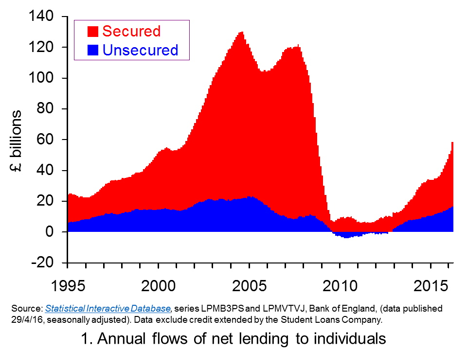
 In April we asked how sustainable is the UK’s appetite for credit? Data in the latest Bank of England’s Money and Credit publication suggest that such concerns are likely grow. It shows net lending (lending net of repayments) by monetary financial institutions (MFIs) to individuals in March 2016 was £9.3 billion, the highest monthly total since August 2007. This took net borrowing over the previous 12 months to £58.6 billion, the highest 12-month figure since September 2008.
The latest credit data raise fears about the impact on the financial well-being of individuals. The financial well-being of people, companies, banks and governments can have dramatic effects on economic activity. These were demonstrated vividly in the late 2000s when a downturn resulted from attempts by economic agents to improve their financial well-being. Retrenchment led to recession. Given the understandable concerns about financial distress we revisit our April blog.
 Chart 1 shows the annual flow of lending extended to individuals, net of repayments. (Click here to download a PowerPoint of Chart 1.) The chart provides evidence of cycles both in secured lending and in consumer credit (unsecured lending).
The growth in net lending during the 2000s was stark as was the subsequent squeeze on lending that followed. During 2004, for example, annual net flows of lending from MFIs to individuals exceeded £130 billion, the equivalent of close on 10.5 per cent of annual GDP. Secured lending was buoyed by strong house price growth with UK house price inflation rising above 14 per cent. Nonetheless, consumer credit was very strong too equivalent to 1.8 per cent of GDP.
Net lending collapsed following the financial crisis. In the 12 months to March 2011 the flow of net lending amounted to just £3.56 billion, a mere 0.2 per cent of annual GDP. Furthermore, net consumer credit was now negative. In other words, repayments were exceeding new sums being extended by MFIs.

Clearly, as Chart 1 shows, net lending to individuals is again on the rise. This partly reflects a rebound in sections of the UK housing market. Net secured lending in March was £7.435 billion, the highest monthly figure since November 2007. Over the past 12 months net secured lending has amounted to £42.1 billion, the highest 12-month figure since October 2008.
Yet the growth of unsecured credit has been even more spectacular. In March net consumer credit was £1.88 billion (excluding debt extended by the Student Loans Company). This is the highest month figure since March 2005. It has taken the amount of net consumer credit extended to individuals over the past 12 months to £16.435 billion, the highest figure since December 2005.
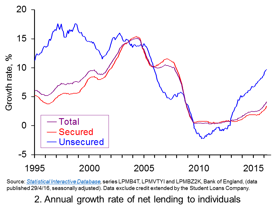
 Chart 2 shows the annual growth rate of both forms of net lending by MFIs. In essence, this mirrors the growth rate in the stocks of debt – though changes in debt stocks can also be affected by the writing off of debts. The chart captures the very strong rates of growth in net unsecured lending from MFIs. We are now witnessing the strongest annual rate of growth in consumer credit since November 2005. (Click here to download a PowerPoint of the chart.)
The growth in household borrowing, especially that in consumer credit, evidences the need for individuals to be mindful of their financial well-being. Given that these patterns are now becoming well-established you can expect to see considerable comment in the months ahead about our appetite for credit. Can such an appetite for borrowing be sustained without triggering a further balance sheet recession as experienced at the end of the 2000s?
Articles
Consumer credit rises at fastest pace for 11 years The Guardian, Hilary Osborne (29/4/16)
Debt bubble fears increase as consumer credit soars to 11-year high The Telegraph, Szu Ping Chan (29/4/16)
Fears of households over-stretching on borrowing as consumer credit grows The Scotsman, (29/4/16)
History repeating? Fears of another financial crisis as borrowing reaches 11-year high Sunday Express, Lana Clements (29/4/16)
The chart that shows we put more on our credit cards in March than in any month in 11 years Independent, Ben Chu (1/4/16)
Britain’s free market economy isn’t working The Guardian (13/1/16)
Data
Money and Credit – March 2016 Bank of England
Bankstats (Monetary and Financial Statistics) – Latest Tables Bank of England
Statistical Interactive Database Bank of England
Questions
- What does it mean if individuals are financially distressed?
- How would we measure the financial well-being of individuals and households?
- What actions might individuals take it they are financially distressed? What might the economic consequences be?
- How might uncertainty affect spending and saving by households?
- What measures can policymakers take to reduce the likelihood that flows of credit become too excessive?
- What is meant by a balance sheet recession?
- Explain the difference between secured debt and unsecured debt.
- Should we be more concerned about the growth of consumer credit than secured debt?
 In the blog post, Global warning, we looked at the use of unconventional macroeconomic policies to deal with the slow pace of economic growth around the world. One of the articles was by Nouriel Roubini. In the linked article below, he argues that slow economic growth may be the new global norm.
At the centre of the problem is a fall in the rate of potential economic growth. This has been caused by a lack of investment, which has slowed the pace of innovation and the growth in labour productivity.
The lack of investment, in turn, has been caused by a lack of spending by both households and governments. What is the point in investing in new capacity, argue firms, if they already have spare capacity?
Low consumer spending is partly the result of a redistribution of income from low- and middle-income households (who have a high marginal propensity to consume) to high-income households and corporations (who have a low mpc). Low spending is also the result of both consumers and governments attempting to reduce their levels of debt by cutting back spending.
Low growth leads to hysteresis – the process whereby low actual growth leads to low potential growth. The reason is that the unemployed become deskilled and the lack of investment by firms reduces the innovation that is necessary to embed new technologies.
Read Roubini’s analysis and consider the policy implications.
Article
Has the global economic growth malaise become the ‘new normal’? The Guardian, Nouriel Roubini (2/5/16)
Questions
- Explain what is meant by ‘hysteresis’ and how the concept is relevant in explaining low global economic growth.
- Why has there been a reduction in the marginal propensity to consume in recent years? What is the implication of this for the multiplier and economic recovery?
- Explain what Roubini means by ‘a painful de-leveraging process’. What are the implications of this process?
- How important are structural reforms and what forms could these take? Why has there been a reluctance for governments to institute such reforms?
- ‘Asymmetric adjustment between debtor and creditor economies has also undermined growth.’ Explain what Roubini means by this.
- Why are governments reluctant to use fiscal policy to boost both actual and potential economic growth?
- What feasible policy measures could be taken to boost actual and potential economic growth?
 According to the BBC’s Joe Lynam, “Britain has the most competitive and dynamic retail environment in the world, which attracts shoppers globally.” It is perhaps this fact which may save BHS, with new owners being attracted by such an opportunity. BHS is soon expected to file for administration, with debts of more than £1.3 billion and having failed to secure the loan needed to keep it afloat. If this company collapses, it will bring an end to the life of an 88 year old giant.
The British retail scene has certainly changed over the past decade, with names such as Woolworths and Comet disappearing – could BHS be the next casualty of the changing retail climate? In the world of retail, tastes change quickly and those stores who fail to change with the times are the ones that suffer. One of the factors behind the downfall of BHS is the ‘dated’ nature of its stores and fashions. As clothing outlets such as Zara, Oasis and Next have continued to change with the times, commentators suggest that BHS continues with a trading offer from the 1980s. With the online shopping trend, many household names adapted their strategy, but BHS failed to do so and the second chance that BHS asked the public for when Sir Philip Green, its former owner, sold BHS in 2015 hasn’t materialised.
With administrators ready to be brought in and thousands of jobs hanging in the balance, the administrators will be looking at methods to attract funding, new owners or so-called ‘cherry pickers’ who may be interested in buying up the more profitable stores. Some of their stores remain in prime locations and deliver a tidy profit and it is perhaps these gems, together with the tradition that British Home Stores brings that may yet see the company saved. The outcome for BHS will not only affect the jobs of its employees, but will affect the pensions of thousands of workers. The BHS pension fund currently has a deficit of £576 million and so the Pension Protection Fund will have to look closely at the situation before thinking about issues a contribution notice to those connected with the fund.
A deal was on the cards last week, with BHS owner Dominic Chappell in talks with Mike Ashley’s Sports Direct, but the high debts and pensions deficit appears to have deterred this deal. The failing fortunes of BHS have now come back to haunt former owner, Sir Philip Green, who in March 2015, sold the business for just £1. Sir Philip may return to save the day, but the options for this once giant of the British high street are rather limited. The following articles consider the fortunes of BHS.
BHS seeks Sports Direct lifeline as it heads for collapse The Guardian, Graham Ruddick (24/04/16)
BHS expected to file for administration on Monday BBC News (25/04/16)
Thousands of BHS workers face anxious wait amid administration fears The Telegraph (25/04/16)
BHS administration: ‘Imminent bankruptcy’ puts 11,000 jobs at risk Independent, Peter Yeung (25/04/16)
Up to 11,000 jobs face the axe as BHS is expected to announce collapse of chain after efforts to find rescuer failed Mail Online, Neil Craven (24/04/16)
BHS nears collapse putting 11,000 jobs at risk Sky News (25/04/16)
BHS set to file for administration after sales talks fail Financial Times, Murad Ahmed (25/04/16)
Questions
- Using a demand and supply diagram, can you explain some of the factors that have contributed to the difficult position that BHS finds itself in?
- Now, can you use a diagram showing revenues and profits and explain the current position of BHS?
- What type of market structure does BHS operate in? Can this be used to explain why it is in its current position?
- How has the company failed in adapting its business strategy to the changing times?
- Looking back at the history of BHS, can you apply the product life cycle to this store?
- If another company is considering purchasing BHS, or at least some of its stores, what key information will it need and what might make it likely to go ahead with such a purchase?
 In April 2015 the European Commission (EC) opened a formal investigation into the behaviour of Google in the market for smartphones and tablets. On the 20th April Google was sent a preliminary judgment (referred to formally as a Statement of Objections) in which it was accused of abusing its dominant market position. The European Commissioner argued that the case was similar to the famous and protracted investigation into the conduct of Microsoft.
