 The latest balance of payments data for the UK show that in the final two quarters of 2013 the current account deficit as a percentage of GDP was the highest ever recorded. In quarter 3 it was 5.6% of GDP and in quarter 4 it was 5.4% of GDP. The previous highest quarterly figures were 5.3% in 1988 Q4 and 5.2% in 1989 Q3. The average current account deficit from 1960 to 2013 has been 1.1% of GDP and from 1980 to 2013 has been 1.6% of GDP.
The current account has four major components: the balance on goods, the balance on services, the balance on current transfers and the balance on income flows (e.g. investment income). The chart below shows the annual balances of each of these components, plus the overall current account balance, from 1960 to 2013.
There are large differences in the balances of these four and the differences seem to be widening. (Click here for a PowerPoint of the chart.)
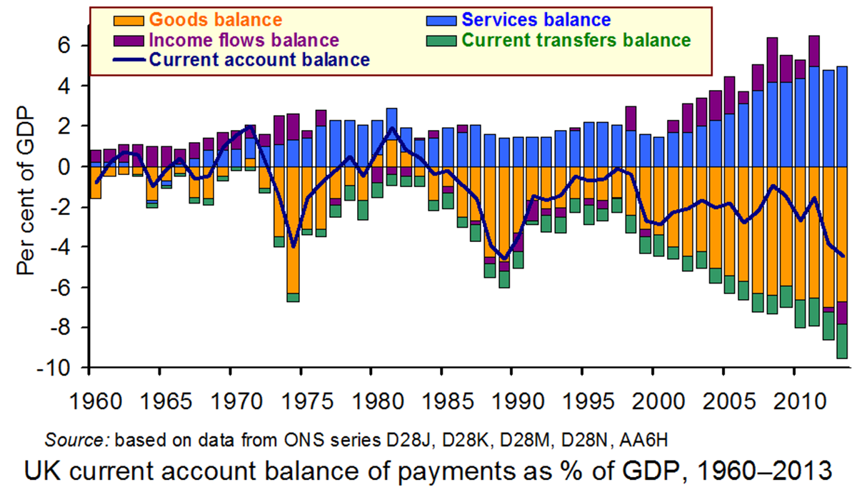
Traditionally the balance on goods has been negative. In 2013 Q3 the deficit on goods reached a record 7.3% of GDP. It fell back somewhat in Q4 to 6.5%, still significantly above the average since 2000 of 5.5%. With the economy still recovering slowly, it would normally be expected that the trade deficit would be low. However, the high exchange rate has made it difficult for UK exporters to compete. Also with consumer confidence returning, imports are rising, again boosted by the high exchange rate, which makes imports cheaper.
The services balance, by contrast, is typically in surplus. In the final two quarters of 2013, the surpluses were 4.9% and 5.1% of GDP respectively. These compare with an average of 3.3% since 2000. It seems that the service sector, which includes banking, insurance, consultancy, advertising, accountancy, law, etc., is much more able to compete in a global environment.
The balance of current transfers to and from such bodies as the EU and UN have traditionally been negative, although as a proportion of GDP this has gradually widened in recent years. In 2013 the deficit was 1.7% compared with an average of 1.0% since 2000.
 The most dramatic change has been in income flows and particularly those from investment. Before the crash in late 2008, the returns to many of the risky investments abroad made by UK financial institutions were very high. Income flows in the 12 months 2007 Q4 to 2008 Q3 averaged a surplus of 2.8% of GDP. They stayed positive, albeit at lower levels, until 2012 Q1, but then became negative as UK institutions reduced their exposure to overseas investments and as earnings in the UK by overseas investors increased. In the last two quarters of 2013, the deficits on income flows were 1.4% and 2.5% of GDP respectively.
How do these figures accord with the Chancellor’s desire to rebalance the economy towards exports? In terms of services, the export performance is good. In terms of goods, however, exports actually fell in the last two quarters from £78.4bn to £74.8bn. Although imports fell too in the final quarter, there is a danger that, with recovery and a high pound, these could begin to rise rapidly
 So should the Bank of England attempt to bring the sterling exchange rate down? After all, the exchange rate index has risen from 79.1 in March 2013 to 85.9 in February 2014 (an appreciation of 8.6%). But if it did want to do so, what could it do? The traditional methods of reducing Bank rate and increasing the money supply are not open to it at the present time: Bank rate, at 0.5%, is already about as low as it could go and the Bank has ruled out any further quantitative easing.
The articles consider the latest balance of payments figures and their implications for the economy and for economic policy
Articles
UK current account deficit far bigger than forecast The Guardian, Katie Allen (28/3/14)
UK current account deficit near record high at £22.4bn BBC News (28/3/14)
UK current account gap second widest on record The Telegraph, Szu Ping Chan (28/3/14)
When will the UK pay its way? BBC News, Robert Peston (28/3/14)
Current account deficit crisis creeping up on UK can no longer be ignored The Guardian, Larry Elliott (30/3/14)
Data
Balance of Payments, Q4 and annual 2013 ONS (28/3/14)
Statistical Interactive Database – interest & exchange rates data Bank of England
Questions
- If the current account is in deficit, how is the overall balance of payments in balance (i.e. is in neither deficit nor surplus)?
- If the current account is in record deficit, why has sterling appreciated over recent months? What effect is this appreciation likely to have on the balance on trade in goods and services?
- Why has the balance on investment income deteriorated? In what ways could this be seen as a ‘good thing’?
- To what extent do the balance of payments figures show a rebalancing of the economy in the way the Chancellor would like?
- What could the Bank of England do to bring about a depreciation of sterling?
- What would be the benefits and costs of a depreciation of sterling?
- Why do investors overseas seem so willing to lend to the UK, thereby producing a large surplus on the financial account?
 A previous article on this website (Why buy a football club?) focused on the issue of why people buy football clubs. This blog refers to the somewhat strange situation where people who have made large amounts of money from a very successful business career always seem to lose money when they invest in a football team.
The Deloitte’s report into football finance found that in the 2012/13 season only half the clubs in the English Premier League (EPL) made an operating profit – profits excluding net transfer expenditure. When the impact of transfer expenditure is included, even fewer clubs make any money. For example, the three teams battling it out for the EPL title this year, Chelsea, Liverpool and Manchester City, reported losses for 2012/13 of £49.4 million, £49.8 million and £51.6m respectively.
What makes the size of these losses even more astonishing is that they have occurred in a period when the revenues earned by the top clubs have increased rapidly. In 2004/05 the combined revenue of the 20 EPL clubs was £1.3billion. By 2011/12 this figure had increased to £2.36 billion.
Given these rapidly rising revenue streams, the main explanation for this poor profit performance is the growth in players’ salaries. It has been estimated that approximately 80% of the increase in revenues generated by the team in the EPL since it began in 1992 have gone to the players in higher wages. In 2011/12 the total wage bill in the EPL was a staggering £1.658 billion, with an average wage bill of £83 million per club. The average weekly wage of a player has doubled over the past six years and is now estimated to be between £25,000 and £30,000 per week.
One deal which recently hit the headlines was that of Wayne Rooney who signed a five-year contract with earnings of up to £300,000 a week or £15.6m annually. However, Mr Rooney is still a long way short of the highest paid sports star. When based on wages and win bonuses, Forbes reported this to be American footballer, Aaron Rodgers, who was paid £25.75m in 2012-13!!!
One major factor that can partly explain this rapid increase in players’ pay is the increased competition for their skills. The potential impact of the transfer system on players’ mobility and wages was discussed in an article on the website in December (Recent challenges to the football transfer system). The career of Tom Finney provides an interesting case study of the impact of the monopsony power that the transfer system and maximum wage used to give the clubs.
Finney was one of the most talented footballers of the 1940s/50s but he played at a time when there was still a maximum wage and a transfer system that was far more restrictive that it is today. He first played in the youth team for Preston North End in 1936 aged 14. Apart for a three-year period between 1942 and 1945 when he served in the army during the Second World War, he remained with Preston for his whole career. He finally retired in 1959 at the age of 38 having scored 210 goals in 473 appearances. He also played in three World Cup final tournaments and scored 30 goals in his 76 international appearances for England.
When he died in February of this year many people talked of his loyalty to Preston and the fact that he only earned £20/week when he retired (the maximum wage at the time) and had to supplement his income by working as a plumber. However, interestingly in 1952 an Italian club – Palermo – tried to sign Finney from Preston on a deal which would have paid him a basic weekly wage of £32.25, a bonus of up to £100 per week and a signing on fee of £10,000. At the time he earned the maximum wage of £14 per week with Preston and received a win bonus of up to £2 per week. Palermo also offered him a luxury Mediterranean villa, a brand new sports car and unlimited travel between England and Italy funded by the club. Unsurprisingly, Finney was tempted by the deal and commented that:
There was a genuine appeal about the prospect of trying my luck abroad, not to mention the money and the standard of living.
However, because of the transfer system in place at the time, Preston could block the move. The chairman explained to Finney:
Tom, I’m sorry, but the whole thing is out of the question, absolutely out of the question. We are not interested in selling you and that’s that. Listen to me, if tha’ doesn’t play for Preston then tha’ doesn’t play for anybody.
The club also announced that they would not consider selling Finney for any transfer fee below £50,000. Palermo had offered £30,000 and the transfer record at the time was less that £20,000.
It is highly unlikely that football will ever return to a type of transfer system and maximum wage that gives the clubs the sort of monopsony power they had in Finney’s days. However a new set of policies have been recently agreed and introduced to try to slow down the increase in players’ pay. Financial Fair Play rules set limits on the size of financial losses that clubs can incur over a three-year period. If these rules are broken, then UEFA could prevent the guilty team from entering lucrative competitions such as the Champions League. The EPL also has the power to award points deductions.
With the combined revenues of the 20 EPL clubs forecast to increase by 24% to £3.080 billion in the 2013/14 season, it will be interesting to see how much of this money improves the financial performance of the clubs and how much goes into players’ wages.
Articles
Questions
- Draw a diagram to illustrate the impact of a maximum wage on a perfectly competitive labour market and explain your answer.
- Analyse the impact of the maximum wage on worker surplus, firm surplus and deadweight welfare loss. Draw a diagram to illustrate your answer. Comment on the impact of the maximum price on economic efficiency.
- Draw a diagram to illustrate the impact of a maximum wage on a monopsonistic labour market. Assess its impact on economic efficiency.
- Some authors have argued that the Financial Fair Play regulations are a form of vertical restraint/agreement. What is a vertical restraint?
- Find an example of a vertical restraint in a different industry. What impact will it have on economic welfare?
 In his Budget on March 19, the Chancellor of the Exchequer, George Osborne, announced fundamental changes to the way people access their pensions. Previously, many people with pension savings were forced to buy an annuity. These pay a set amount of income per month from retirement for the remainder of a person’s life.
But, with annuity rates (along with other interest rates) being at historically low levels, many pensioners have struggled to make ends meet. Even those whose pension pots did not require them to buy an annuity were limited in the amount they could withdraw each year unless they had other guaranteed income of over £20,000.
Now pensioners will no longer be required to buy an annuity and they will have much greater flexibility in accessing their pensions. As the Treasury website states:
This means that people can choose how they access their defined contribution pension savings; for example they could take all their pension savings as a lump sum, draw them down over time, or buy an annuity.
While many have greeted the news as a liberation of the pensions market, there is also the worry that this has created a moral hazard.  When people retire, will they be tempted to blow their savings on foreign travel, a new car or other luxuries? And then, when their pension pot has dwindled and their health is failing, will they then be forced to rely on the state to fund their care?
But even if pensioners resist the urge to go on an immediate spending spree, there are still large risks in giving people the freedom to spend their pension savings as they choose. As the Scotsman article below states:
The risks are all too obvious. Behaviour will change. People who no longer have to buy an annuity will not do so but will then be left with a pile of cash. What to do with it? Spend it? Invest it? There are many new risky choices. But the biggest of all can be summed up in one fact: when we retire our life expectancy continues to grow. For every day we live after 65 it increases by six and a half hours. That’s right – an extra two-and-a-half years every decade.
The glory of an annuity is it pays you an income for every year you live – no matter how long. The problem with cash is that it runs out. Already the respected Institute for Fiscal Studies (IFS) has said that the reform ‘depends on highly uncertain behavioural assumptions about when people take the money’. And that ‘there is a market failure here. There will be losers from this policy’.
We do not have perfect knowledge about how long we will live or even how long we can be expected to live given our circumstances. Many people are likely to suffer from a form of myopia that makes them blind to the future: “We’re likely to be dead before the money has run out”; or “Let’s enjoy ourselves now while we still can”; or “We’ll worry about the future when it comes”.
The point is that there are various market failings in the market for pensions and savings. Will the decisions of the Chancellor have made them better or worse?
Articles
Pension shakeup in budget leaves £14bn annuities industry reeling The Guardian, Patrick Collinson (20/3/14)
Chancellor vows to scrap compulsory annuities in pensions overhaul The Guardian, Patrick Collinson and Harriet Meyer (19/3/14)
Labour backs principle of George Osborne’s pension shakeup The Guardian, Rowena Mason (23/3/14)
Osborne’s pensions overhaul may mean there is little left for future rainy days The Guardian, Phillip Inman (24/3/14)
Let’s celebrate the Chancellor’s bravery on pensions – now perhaps the Government can tackle other mighty vested interests Independent on Sunday, Mary Dejevsky (23/3/14)
A vote-buying Budget The Scotsman, John McTernan (21/3/14)
L&G warns on mis-selling risks of pension changes The Telegraph, Alistair Osborne (26/3/14)
Budget 2014: Pension firms stabilise after £5 billion sell off Interactive Investor, Ceri Jones (20/3/14)
Budget publications
Budget 2014: pensions and saving policies Institute for Fiscal Studies, Carl Emmerson (20/3/14)
Budget 2014: documents HM Treasury (March 2014)
Freedom and choice in pensions HM Treasury (March 2014)
Questions
- What market failures are there in the market for pensions?
- To what extent will the new measures help to tackle the existing market failures in the pension industry?
- Explain the concept of moral hazard. To what extent will the new pension arrangements create a moral hazard?
- Who will be the losers from the new arrangements?
- Assume that you have a choice of how much to pay into a pension scheme. What is likely to determine how much you will choose to pay?
 The supermarket industry is a classic example of an oligopoly. A market dominated by a few large companies, which is highly competitive and requires the companies to think about the reactions of the other competitors whenever a decision is made. Throughout the credit crunch, price cutting was the order of the day, as the big four tried to maintain market share and not lose customers to the low cost Aldi and Lidl. Morrisons, however, has found itself in exactly that position and is now looking to restructure to return to profitability.
Morrisons is well known for its fresh food, but it seems that with incomes still being squeezed, even this is insufficient to keep its customers from looking for cheaper alternatives. Morrisons’ market share has been in decline and its profits or the last financial year have been non-existent. It’s been losing ground to its big competitor, Tesco and part of this is due to the fact that Morrisons was late to enter the ‘Tesco metro’ market. It remained dependent on its large supermarkets, whereas Tesco saw the opportunity to expand onto the highstreets, with smaller stores. It was also late arriving to the online shopping business and while it has now developed more sophisticated IT systems, it did lose significant ground to Tesco and its other key competitors.

Another problem is that Morrisons has found itself unable to compete with the low cost supermarkets. The prices on offer at Morrisons are certainly not low enough to compete with prices at Aldi and Lidl and Morrisons has seen many of its customers switch to these cheaper alternatives. But Morrisons is fighting back and has announced plans to cut prices on a huge range of products across its stores. The fresh food aspect of the business will still remain and the hope is that the fresh food combined with cheaper price tags will allow Morrisons to re-gain lost ground to Tesco and take back some of its lost customers from the low-cost alternatives. However, it’s not just Morrisons that has been losing customers to the budget retailers. Tesco, Sainsbury’s and Asda have all lost market share to Aldi and Lidl, but it is Morrisons that has fared the worst.
The latest news on Morrisons’ profits and overall performance, together with its promise of restructuring and price cuts worth £1 billion has caused uncertainty for shareholders and this has reduced the value of shares. However, Morrisons’ Directors have tried to restore confidence by purchasing shares themselves. With expectations of price wars breaking out, the other supermarkets have also seen significant declines in their share values, with a total of £2 billion being wiped off the value of their shares collectively. The consequences of Morrisons’ performance will certainly continue: customers are likely to benefit from lower prices in all of the big four supermarkets, but investors may lose out – at least in the short run. The impact on jobs is uncertain and will certainly depend on how investors and customers react in the coming weeks. The following articles consider this sector.
UK grocer Morrison warns on profit, threatens price war Reuters, James Davey (13/3/14)
Morrisons and the threat to mainstream supermarkets BBC News, Robert Peston (13/3/14)
Morrisons expected to sell property in response to profit drop The Guardian (9/3/14)
Morrisons restructuring sparks fears of new price war BBC News (13/3/14)
Morrisons’ dividend up while profit falls? It’s hard to believe The Guardian, Nils Pratley (13/3/14)
Morrisons boss talks tough as group slides into red The Scotsman, Scott Reid (13/3/14)
Morrisons plots price cuts after annual loss Sky News (13/3/14)
Morrisons’ declaration of £1bn price war with budget stores hammers Sainsbury and Tesco shares This is Money, Rupert Steiner (14/3/14)
Ocado on track for first profit in wake of Morrisons deal Independent, Simon Neville (14/4/14)
Questions
- What are the key characteristics of an oligopoly?
- To what extent do you think the supermarket sector is a good example of an oligopoly?
- Why is the characteristic of interdependence a key cause of the potential price war between the supermarkets?
- Why has Morrisons been affected so badly with the emergence of the budget retailers?
- By using the income an substitution effect, explain how the big four supermarkets have been affected by retailers, such as Aldi and Lidl.
- Using a demand and supply diagram, explain how the share prices of companies like Morrisons are determined. Which factors affect (a) the demand for and (b) the supply of shares?
- What do you think will happen to the number of jobs in Morrisons given the performance of the company and its future plans?
 In August 2012, the ECB president, Mario Draghi, said that the ECB would ‘do whatever it takes‘ to hold the single currency together and support the weaker economies, such as Greece, Portugal and Spain. At the same time, he announced the introduction of outright monetary purchases (OMTs), which would involve purchasing eurozone countries’ bonds in the secondary markets. There were no limits specified to such purchases, but they would be sterilised by the sale of other assets. In other words, they would not increase the eurozone money supply. But despite the fanfare when OMTs were announced, they have never been used.
Today, the eurozone economy is struggling to grow. The average annual growth rate across the eurozone is a mere 0.5%, albeit up from the negative rates up to 2013 Q3. GDP is still over 2% below the peak in 2008. Inflation is currently standing at 0.8%, well below the 2% target. The ECB’s interest rate (‘main refinancing operations rate’) is 0.25%.

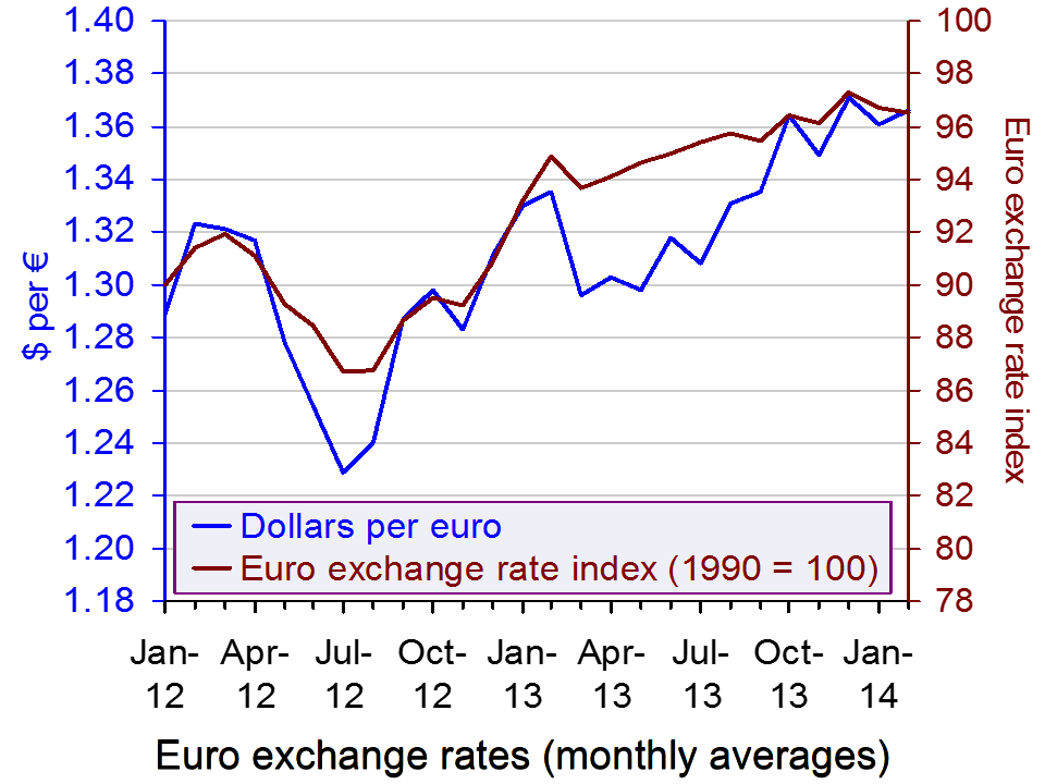
The recovery is hindered by a strong euro. As the chart shows, the euro has been appreciating against the dollar. The euro exchange rate index has also been rising. This has made it harder for the eurozone countries to export.
So what can the ECB do to stimulate the eurozone economy? Other central banks, such as the Bank of England, the US Federal Reserve and the Bank of Japan have all had substantial programmes of quantitative easing. The ECB has not. Perhaps OMTs could be used without sterilisation. The problem here is that there are no eurozone bonds issued by the ECB and hence none that could be purchased, only the bonds of individual member countries. Buying bonds of weaker countries in the eurozone would be seen as favouring these countries and might create a moral hazard.
Reducing interest rates is hardly an option given that they are at virtually zero already. And expansionary fiscal policy in the weaker countries has been ruled out by having to stick to the bailout conditions for these countries, which require the pursuit of austerity policies.
One possibility would be to intervene in the foreign currency market by buying US and other countries’ bonds. This would drive down the euro and provide a stimulus to exports. This option is considered in the Jeffrey Frankel article.
Articles
Why the European Central Bank should buy American The Guardian, Jeffrey Frankel (13/3/14)
Draghi holds course in face of deflation threat Reuters, Paul Carrel and Leika Kihara (13/3/14)
ECB’s Draghi: Strong Euro Pulling Down Euro Zone Inflation Wall Street Journal, Christopher Lawton and Todd Buell (13/3/14)
Draghi Bolstering Guidance Seen as Convincing on Rates Bloomberg, Jeff Black and Andre Tartar (13/3/14)
ECB president Mario Draghi counters euro upswing Financial Times, Claire Jones (13/3/14)
Turning Japanese? Euro zone exporters must hope not Reuters, Neal Kimberley (14/3/14)
Prospect of ECB QE drives eurozone bond rally Financial Times, Laurence Mutkin (12/3/14)
Data
Statistical Data Warehouse ECB
Winter forecast 2014 – EU economy: recovery gaining ground European Commission: Economic and Financial Affairs DG
AMECO online European Commission: Economic and Financial Affairs DG
Questions
- Why is the ECB generally opposed to quantitative easing of the type used by other central banks?
- What is meant by ‘sterilisation’? Why does sterilisation prevent OMTs being classed as a form of quantitative easing?
- Would it be possible for OMTs to be used without sterilisation in such as way as to avoid a moral hazard for the highly indebted eurozone countries?
- Is the eurozone in danger of experiencing deflation?
- What are the dangers of deflation?
- Why does the ECB not cut its main refinancing rate below zero?
- If the ECB buys US bonds, what effect would this have on the euro/dollar exchange rate?
- Would purchasing US bonds affect the eurozone money supply? Explain.
- What other means are there of the ECB stimulating the eurozone economy? How effective would they be likely to be?
 The latest balance of payments data for the UK show that in the final two quarters of 2013 the current account deficit as a percentage of GDP was the highest ever recorded. In quarter 3 it was 5.6% of GDP and in quarter 4 it was 5.4% of GDP. The previous highest quarterly figures were 5.3% in 1988 Q4 and 5.2% in 1989 Q3. The average current account deficit from 1960 to 2013 has been 1.1% of GDP and from 1980 to 2013 has been 1.6% of GDP.
 The most dramatic change has been in income flows and particularly those from investment. Before the crash in late 2008, the returns to many of the risky investments abroad made by UK financial institutions were very high. Income flows in the 12 months 2007 Q4 to 2008 Q3 averaged a surplus of 2.8% of GDP. They stayed positive, albeit at lower levels, until 2012 Q1, but then became negative as UK institutions reduced their exposure to overseas investments and as earnings in the UK by overseas investors increased. In the last two quarters of 2013, the deficits on income flows were 1.4% and 2.5% of GDP respectively.
 So should the Bank of England attempt to bring the sterling exchange rate down? After all, the exchange rate index has risen from 79.1 in March 2013 to 85.9 in February 2014 (an appreciation of 8.6%). But if it did want to do so, what could it do? The traditional methods of reducing Bank rate and increasing the money supply are not open to it at the present time: Bank rate, at 0.5%, is already about as low as it could go and the Bank has ruled out any further quantitative easing.
