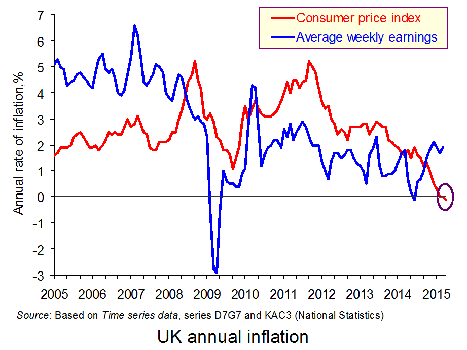
 The CPI index fell by 0.1% in the 12 months to April 2015. This is partly the result of lower air and sea fares, as the upward ‘blip’ in these fares at Easter last year was not present in mid-April this year as Easter fell outside the period when the statistics are collected. What is more significant is that fuel, commodity and retail food prices have fallen over the past 12 months, and the exchange rate has risen, especially against the euro.
But how do we define what’s happened and how significant is it? It might seem highly significant as it’s the first time in 55 years that the CPI has fallen over a 12-month period. In fact, the effect is likely to be temporary, as fuel prices are now rising again and commodity prices generally are beginning to rise too. What is more, the pound seems to have peaked against the euro. Thus although aggregate demand remains relatively dampened, the main causes of falling prices and potential rises in the coming months are largely to be found on the cost side. This then brings us on to the definition of a falling CPI.
 A falling CPI over a 12-month period can be defined as negative inflation. This is unambiguous. But is this ‘deflation’? The problem with the term ‘deflation’ is that it is ambiguous. On the one hand it can be defined simply as negative inflation. In that case, by definition, the UK has experienced deflation. But on the other, it is used to describe a situation of persistent falling prices as a result of declining aggregate demand.
If an economy suffers from deflation in this second sense, the problem can be very serious. Persistent falling prices are likely to discourage consumers from spending on durables (such as fridges, TVs, cars and furniture) and firms from buying capital equipment. After all, why buy an item now if, by waiting, you can get it cheaper later on? This mentality of waiting to spend leads to falling aggregate demand and hence falling output. It also leads to even lower prices. In other words deflation can get worse: a deflationary spiral.
If we define deflation in this second, much more serious sense, then the UK is not suffering deflation – merely temporary negative inflation. In fact, with prices now falling (slightly) and wages rising at around 2% per year, there should be an increase in aggregate demand, which will help to drive the recovery.
Videos
 Should Britain Panic Over Negative Inflation? Sky News, Ed Conway (20/5/15)
 UK inflation negative for first time since 1960; BoE says temporary Reuters, Andy Bruce and William Schomberg (19/5/15)
 UK inflation negative for the first time since 1960 CNBC, Dhara Ranasinghe (19/5/15)
Articles
UK inflation rate turns negative BBC News (19/5/15)
Why there’s little to fear as the spectre of deflation descends on UK The Telegraph, Szu Ping Chan (19/5/15)
UK inflation turns negative The Guardian, Katie Allen (19/5/15)
Is the UK in the early stages of deflation? The Guardian, Larry Elliott (19/5/15)
Is the UK in deflation or negative inflation? Q&A The Guardian, Katie Allen and Patrick Collinson (19/5/15)
Market View: Economists unconcerned on temporary deflation FT Adviser, Peter Walker (19/5/15)
Questions
- Is negative inflation ever a ‘bad thing’?
- Explain the movement in UK inflation rates over the past five years.
- How do changes in exchange rates impact on (a) inflation; (b) aggregate demand? Does it depend on what caused the changes in exchange rates in the first place?
- Why is the current period of negative inflation likely to be short-lived?
- Would you describe the negative inflation as negative cost-push inflation?
- What factors could change that might make negative inflation more persistent and raise the spectre of deflation (in its bad sense)?
- If inflation remains persistently below 2%, what can the Bank of England do, given current interest rates, to bring inflation back to the 2% target?
- What is meant by ‘core inflation’ and what has been happening to it in recent months?
- What global factors are likely to have (a) an upward; (b) a downward effect on UK inflation?
 New Look was founded in 1969 and is an iconic budget retailer found on most British high streets. In its history, it has been a family business; it has been listed on the London stock exchange; returned to a private company and then had the potential to be re-listed. Now, it is moving into South African ownership for £780 million.
90% of New Look will now be owned by Christo Wiese who controls Brait and who has been linked with other take-overs of British retailers in recent years. The remaining 10% will remain in the hands of the founding family. The company has been struggling for some time and in 2010 did have plans to relist the company on the London Stock Exchange. However, volatile market conditions meant that this never occurred and the two private equity firms, Apax and Permira, appeared very eager to sell. New Look’s Chairman, Paul Mason, said:
“This is an ideal outcome for New Look. The Brait team demonstrated to us that they have the long-term vision to help Anders and the team grow this brand.”
It is not yet clear what this move will mean for the retailer, New Look, but with an estimated £1 billion debt, it is expected that changes will have to be made.  It is certainly an attractive investment opportunity and New Look does have a history of high rates of growth, despite its current debt. Furthermore, the debt levels are likely to have helped Mr. Wiese obtain a deal for New Look. Fashion retailing is a highly competitive market, but demand always appears to be growing. It is still relatively ‘new’ news, so we will have to wait to see what this means for the number of stores we see on the high streets and the number of jobs lost or created. The following articles consider this new New Look.
South African tycoon buys New Look fashion retailer BBC News (15/5/15)
South African tycoon enters UK retail fray with New Look purchase Financial Times, Andrea Felsted, Clare Barrett and Joseph Cotterill (15/5/15)
New Look snapped up by South African tycoon The Guardian, Sean Farrell (15/5/15)
New Look sold to South African billionaire for £780m The Telegraph, Elizabeth Anderson and Andrew Trotman (15/5/15)
Questions
- Why might a company become listed on the London stock exchange?
- How would volatile economic circumstances affect a company’s decision to become listed on the stock market?
- What do you think this purchase will mean for the number of New Look stores on British high streets? Do you think there will be job losses or jobs created by this purchase?
- How do you think the level of New Look’s debt affected Christo Wiese’s decision to purchase New Look?
- Which factors are likely to affect a firm’s decision to take-over or purchase another firm?
 Interest rates are the main tool of monetary policy and crucially affect investment. There has been much discussion since the end of the financial crisis concerning when UK interest rates would eventually rise. Uncertainty over just when, and by how much, interest rates will rise affects business confidence and hence investment. Businesses therefore listen carefully to what the Bank of England says about future movements in Bank Rate. But Mark Carney has now spoken about another cause of uncertainty and its impct on investment. This is the uncertainty over the outcome of the referendum on whether the UK should leave the EU.
By 2017, the Prime Minister has promised a referendum on staying in the EU, but Mark Carney has urged for this to be held ‘as soon as possible’. Whether or not the UK remains in the EU will have a big effect on businesses and with the uncertainty surrounding the UK’s future, this may soon turn to a lack of investment.  As yet, businesses have not responded to this uncertainty, but the longer the delay for the referendum, the more inclined firms will be to postpone investment. As Mark Carney said:
“We talk to a lot of bosses and there has been an awareness of some of this political uncertainty – whether because of the election or because of the referendum … What they’ve been telling us, and we see it in the statistics, is they have not yet acted on that uncertainty – or to put it another way, they are continuing to invest, they are continuing to hire.”
Leaving the EU will have big effects on consumers and businesses, given that the EU is the UK’s largest market, trading partner and investor. With a referendum sooner rather than later, uncertainty will be more limited and any reaction by businesses will take place over a shorter time period. There are many other factors that affect business investment, some of which are related to the UK’s relationship with the EU and the following articles consider these issues.
EU referendum should be held ‘as soon as necessary’, says Mark Carney BBC News (14/5/15)
Business want an early EU referendum, Mark Carney indicates The Telegraph, Ben Riley-Smith (14/5/15)
EU poll should take place ‘as soon as necessary’, says Bank of England Chief The Guardian, Angela Monaghan (14/5/15)
Threat of business leaving the EU is fuelling business ‘uncertainty’, says Bank of England governor Mark Carney Mail Online, Matt Chorley (14/5/15)
Bank of England’s Mark Carney urges speedy EU referendum Financial Times, George Parker (14/5/15)
Questions
- Why is the EU important to the UK’s economic performance?
- If the UK were to leave the EU, what impact would this have on UK consumers?
- What would be the impact on UK firms if the UK were to leave the EU?
- Consider an AD/AS diagram and use this to explain the potential impact on the macroeconomic variables if the UK were to leave the EU.
- Why is uncertainty over the UK’s referendum likely to have an adverse effect on investment?
 As was discussed on this blog, the rights to broadcast live Premier League football matches in the UK were recently auctioned off for a staggering £1.7bn per season. In the Premier League all of the clubs join forces to sell the rights collectively.
On the face of it, this collective selling would appear to be a potential breach of competition laws that prevents agreements between firms. However, despite some concerns and complaints, collective selling of football TV rights has been allowed, firstly because it is argued that it results in a more equal distribution of income amongst clubs, thus enhancing competitive balance and resulting in a more attractive product for the fans; secondly, because some of the revenue raised is redistributed down the football pyramid to lower league clubs.
In contrast to the Premier League, in Spain the clubs have traditionally sold their rights individually. This has been regarded as a significant advantage for the Spanish giants, Barcelona and Real Madrid.
 For the 2013–14 season in total clubs in the top division in Spain earned substantially less than their counterparts in England. However, Barcelona and Real Madrid earned around 1/3 of the total and more than any club in England, whereas the league winners that year, Atletico Madrid, earned only around half that of Cardiff City which finished bottom of the Premier League. Despite this, it is interesting to note that, at least in terms of league winners, the Spanish league has been more competitive than the German league despite the rights being sold collectively in the latter.
However, the way in which the rights are sold in Spain may be about to change. A few weeks ago, following pressure from the majority of clubs, the Spanish government approved a law that will introduce collective selling. The sport ministry spokesman described this change as allowing Spanish football to ‘adopt to modern times’.
It has been reported that there is a clause in the legislation that guarantees all clubs an increase in revenues above what they currently earn from selling their TV rights individually. This may have been essential to persuade the larger clubs, in particular Barcelona and Real Madrid, to support the new legislation.
The change in legislation still needs to be cleared by the Spanish parliament and there has been a threat of strike action. It is also unclear how the clause described above might affect the standing of the collective agreement under competition law.
Assuming the change does go ahead, it will be interesting to see how much the subsequent collective sale of TV rights raises. One estimate suggests a significant increase, but still much less than in the Premier League. Even more fascinating will be in the longer term to see what knock-on effect this has on the degree of competitive balance in the league.
Barcelona back collective TV rights in La Liga City a.m., Joe Hall (04/08/14)
Is the balance of power in Spain’s La Liga set to change after historic TV rights change Sport.co.uk, Jason King (02/05/15)
Court suspends Spanish football strike Financial Times, Tobias Buck (14/05/15)
Questions
- Why does competition policy typically prohibit agreements between firms?
- Do you think collective selling will always have a significant effect on the degree of competitive balance in a sports league? What other factors are likely to be important?
- Assuming the new legislation goes ahead, how do you think Spanish football will change?
- Can you think of any other situations where agreements between firms may be beneficial?
 Insolvencies in England and Wales have fallen to their lowest level since 2005, official records show. The Insolvency Service indicates that bankruptcy, individual voluntary arrangements and debt relief orders have fallen, with the largest and worst form of bankruptcy falling by 22.5 per cent compared to the same period in 2014. There has also been a fall in corporate insolvencies back to pre-crisis levels.
The British economy is recovering and despite an increase in consumer borrowing of £1.2 billion from February to March, which is the biggest since the onset of the credit crunch, the number of people in financial difficulty and living beyond their means has fallen. However, there are also suggestions that the number could begin to creep up in the future and we are still seeing a divide between the north and south of England in terms of the number of insolvencies.
There are many factors that could explain such a decline in insolvencies. Perhaps it is the growth in wages, in part due the recovery of the economy, which has enabled more people to forgo borrowing or enabled them to repay any loan more comfortably. Lower inflation has helped to reduce the cost of living, thereby increasing the available income to repay any loans. Interest rates have also remained low, thus cutting the cost of borrowing and the repayments due.
But, another factor may simply be that lending is now more closely regulated. Prior to the financial crisis, huge amounts of money were being lent out, often to those who had no chance of making the repayments. More stringent affordability checks by lenders may have a large part to play in reducing the number of insolvencies. President of R3, the insolvency practitioner body, Phillip Sykes said:
“It may be too early to draw conclusions but demand could be falling as a result of low interest rates, low inflation and tighter regulation. This trend is worth watching.”
Mark Sands, from Baker Tilly added to this, noting that fewer people were now in financial difficulty.
“As well as this, we are seeing lower levels of personal debt and fewer people borrowing outside of their means due to more stringent affordability checks by creditors.”
Whatever the main reason behind the data, it is certainly a positive indicator, perhaps of economic recovery, or that at least some have learned the lessons of the financial crisis. The following articles consider this topic.
Personal insolvencies fall to 10-year low Financial Times, James Pickford (1/5/15)
Personal insolvencies at lowest level since 2005 BBC News (29/4/15)
Personal insolvencies drop to lowest level in a decade The Guardian, Press Association (29/4/15)
Corporate insolvencies at lowest level since 2007 The Telegraph, Elizabeth Anderson (30/4/15)
Interview: R3 President Phillip Sykes Accountancy Age, Richard Crump (1/5/15)
North-South gap widens in personal insolvencies Independent, Ben Chu (27/4/15)
Insolvency rates show ‘stark’ north-south divide Financial Times, James Pickford (27/4/15)
Questions
- What is meant by insolvency?
- There are many factors that might explain why the number of insolvencies has fallen. Explain the economic theory behind a lower inflation rate and why this might have contributed to fewer insolvencies.
- How might lower interest rates affect both the number of personal and corporate insolvencies?
- Why has there been a growth in the north-south divide in terms of the number of insolvencies?
- Do you think this data does suggest that lessons have been learned from the Credit Crunch?
 The CPI index fell by 0.1% in the 12 months to April 2015. This is partly the result of lower air and sea fares, as the upward ‘blip’ in these fares at Easter last year was not present in mid-April this year as Easter fell outside the period when the statistics are collected. What is more significant is that fuel, commodity and retail food prices have fallen over the past 12 months, and the exchange rate has risen, especially against the euro.
 A falling CPI over a 12-month period can be defined as negative inflation. This is unambiguous. But is this ‘deflation’? The problem with the term ‘deflation’ is that it is ambiguous. On the one hand it can be defined simply as negative inflation. In that case, by definition, the UK has experienced deflation. But on the other, it is used to describe a situation of persistent falling prices as a result of declining aggregate demand.
 Should Britain Panic Over Negative Inflation? Sky News, Ed Conway (20/5/15)
 UK inflation negative for first time since 1960; BoE says temporary Reuters, Andy Bruce and William Schomberg (19/5/15)
 UK inflation negative for the first time since 1960 CNBC, Dhara Ranasinghe (19/5/15)


