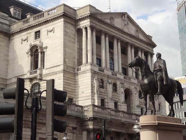
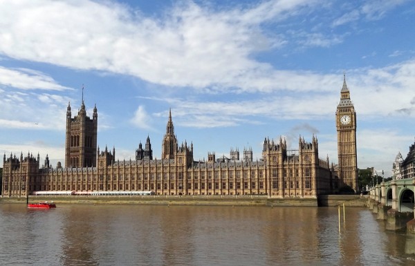
 In his annual Mansion House speech to business leaders on 10 June 2015, George Osborne announced a new fiscal framework. This would require governments in ‘normal times’ to run a budget surplus. Details of the new framework would be spelt out in the extraordinary Budget, due on 8 July.
If by ‘normal times’ is meant years when the economy is growing, then this new fiscal rule would mean that in most years governments would be require to run a surplus. This would reduce general government debt.
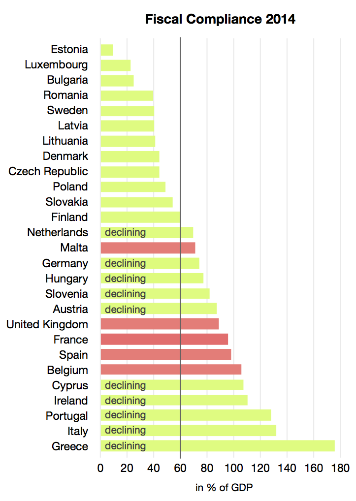
And it would eventually reduce the debt from the forecast ratio of 89% of GDP for 2015 to the target of no more than 60% set for member states under the EU’s Stability and Growth Pact. Currently, many countries are in breach of this target, although the Pact permits countries to have a ratio above 60% provided it is falling towards 60% at an acceptable rate. The chart shows in pink those countries that were in breach in 2014. They include the UK.
 Sweden and Canada have similar rules to that proposed by George Osborne, and he sees them as having been more able to use expansionary fiscal policy in emergency times, such as in the aftermath of the financial crisis of 2007/8, without running excessive deficits.
Critics have argued, however, that running a surplus whenever there is economic growth would dampen recovery if growth is sluggish. This makes the rule very different from merely requiring that, over the course of the business cycle, there is a budget balance. Under that rule, years of deficit are counterbalanced by years of surplus, making fiscal policy neutral over the cycle. With a requirement for a surplus in most years, however, fiscal policy would have a net dampening effect over the cycle. The chancellor hopes that this would be countered by increased demand in the private sector and from exports.
The rule is even more different from the Coalition government’s previous ‘fiscal mandate‘, which was for a ‘a forward-looking target to achieve cyclically-adjusted current balance by the end of the rolling, five-year forecast period’. The current budget excludes investment expenditure on items such as transport infrastructure, hospitals and schools. The fiscal mandate was very similar to the former Labour government’s ‘Golden rule’, which was to achieve a current budget balance over the course of the cycle.
 By excluding public-sector investment from the target, as was previously done, it can allow borrowing to continue for such investment, even when there is a substantial deficit. This, in turn, can help to increase aggregate supply by improving infrastructure and has less of a dampening effect on aggregate demand. A worry about the new rule is that it could lead to further erosion of public-sector investment, which can be seen as vital to long-term growth and development of the economy. Indeed, Sweden decided in March this year to abandon its surplus rule to allow government borrowing to fund investment.
The podcasts and articles below consider the implications of the new rule for both aggregate demand and aggregate supply and whether adherence to the rule will help to increase or decrease economic growth over the longer term.
Video and audio podcasts
 George Osborne confirms budget surplus law Channel 4 News, Gary Gibbon (10/6/15)
 Osborne To Push Through Budget Surplus Rules Sky News (10/6/15)
 OECD On Osborne’s Fiscal Plans Sky News, Catherine Mann (10/6/15)
 ‘Outright fiscal madness’ Osborne’s Mansion House Speech RT UK on YouTube, Harry Fear (11/6/15)
 A “straightjacket” [sic] on future government spending? BBC Today Programme, Robert Peston; Nigel Lawson (11/6/15)
 Thursday’s business with Simon Jack BBC Today Programme, Gerard Lyons (12/6/15)
Articles
Osborne seeks to bind successors to budget surplus goal Reuters, David Milliken (10/6/15)
George Osborne to push ahead with budget surplus law The Telegraph, Peter Dominiczak (10/6/15)
Osborne Wants U.K. to Build Treasure Chest During Good Times Bloomberg, Svenja O’Donnell (10/6/15)
Questions over Osborne’s Victorian-era budget plans BBC News (10/6/15)
Years more spending cuts to come, says OBR BBC News (11/6/15)
Is Chancellor right to want surplus in normal times? BBC News, Robert Peston (10/6/15)
George Osborne Unveils New Budget Surplus Law, But Critics Warn It Means Needless Cuts Huffington Post, Paul Waugh (10/6/15)
George Osborne’s fiscal handcuffs are political, but he does have a point Independent, Hamish McRae (11/6/15)
Osborne’s budget surplus law follows UK tradition of moving goalposts Financial Times, Chris Giles (10/6/15)
George Osborne’s budget surplus rule is nonsense and it could haunt Britain for decades Business Insider, Malaysia, Mike Bird (10/6/15)
To cut a way out of recession we need growth, not austerity economics Herald Scotland, Iain Macwhirter (11/6/15)
George Osborne moves to peg public finances to Victorian values The Guardian, Larry Elliott and Frances Perraudin (10/6/15)
The Guardian view on George Osborne’s fiscal surplus law: the Micawber delusion The Guardian, Editorial (10/6/15)
Academics attack George Osborne budget surplus proposal The Guardian, Phillip Inman (12/6/15)
Osborne plan has no basis in economics Guardian letters, multiple signatories (12/6/15)
Is there an optimal debt-to-GDP ratio? Vox EU, Anis Chowdhury and Iyanatul Islam
No basis in economics Mainly Macro, Simon Wren-Lewis (16/6/15)
Questions
- Explain what is meant by a ‘cyclically adjusted current budget balance’.
- How does the speed with which the government reduces the public-sector debt affect aggregate demand and aggregate supply?
- What are the arguments for and against running a budget surplus: (a) when there is currently a large budget deficit; (b) when there is already a budget surplus? How do the arguments depend on the stage of the business cycle?
- Do you agree with the statement that ‘the biggest issue with the UK economy right now is not the government deficit’. If so, what bigger issues are there?
- How could public-sector debt as a proportion of GDP decline without the government running a budget surplus?
- How might the term ‘normal times’ be defined? How does the definition used by the Chancellor affect the rate at which the public-sector debt is reduced?
- How sustainable is the current level of public-sector debt? How does its sustainability relate to the interest rate on long-term government bonds?
- If there is a budget surplus, such that G – T is negative, what can we say about the balance betwen (I + X) and (S + M)? What good and adverse consequences could follow?
- Why do George Osborne’s plans for budget surpluses ‘risk a liquidity crisis that could also trigger banking problems, a fall in GDP, a crash, or all three’?
 A deal has just been signed between 26 African nations to form a new free trade area, the Tripartite Free Trade Area (TFTA). The countries have a population of 625 million (56% of Africa’s total) and a GDP of $1.6 trillion (63% of Africa’s total). The deal effectively combines three existing free trade areas: the Common Market for Eastern and Southern Africa, the Southern African Development Community and the East African Community.
Although the deal has been signed by the nations’ leaders, it still needs parliamentary approval from each of the countries. It is hoped that this will be achieved by 2017. If it is, it will mark a major step forward in encouraging intra-African trade.
The deal will involve the removal of trade barriers on most goods and lead to a reduction in overall tariffs by more than 50%. The expectation of the leaders is that this will generate $1 trillion worth of economic activity across the 26 countries through a process of trade creation, investment, increased competition and the encouragement of infrastructure development.  But given the current poor state of infrastructure and the lack of manufacturing capacity in many of the countries, the agreement will also encourage co-operation to promote co-ordinated industrial and infrastructure development.
Up to now, the development of intra-African trade has been relatively slow because of poor road and rail networks and a high average protection rate – 8.7% on exports to other African countries compared with 2.5% on exports to non-African countries. As a result, intra-African trade currently accounts for just 12% of total African trade. It is hoped that the development of TFTA will result in this rising to over 30%.
Much of the gains will come from economies of scale. As Kenyan academic Calestous Juma says:
“By having larger markets, it signals the possibility of being able to manufacture products at a scale that is cost-effective. For example, where you need large-scale investments like $200m to create a pharmaceutical factory, you couldn’t do that if you were only selling the products in one country.”
The question is whether the agreement signed on the 10 June will lead to the member countries fully taking advantage of the opportunities for trade creation. Agreeing on a deal is one thing; having genuinely free trade and investing in infrastructure and new efficient industries is another.
Videos and audio
 African leaders ink trade deal Deutsche Welle (11/6/15)
 African leaders sign pact to create ‘Cape to Cairo’ free trade bloc euronews (10/6/15)
 Africa Free Trade Analysis BBC Africa, Calestous Juma (9/6/15)
Articles
African Leaders To Sign Free Trade Agreement To Create Common Market International Business Times, Aditya Tejas (10.6.15)
EAC, COMESA and SADC Blocs Ink ‘Historic’ Trade Deal allAfrica, James Karuhanga (11/6/15)
Tripartite Free Trade Area an Opportunity Not a Threat allAfrica, Sindiso Ngwenya (9/6/15)
Africa a step closer to free trade area Business Report (South Africa), Rob Davies (11/6/15)
The Cape to Cairo trade ‘super bloc’ is here; 15 surprising – and shocking – facts on trade within Africa Mail & Guardian (Kenya), Christine Mungai (8/6/15)
The tripartite free trade area agreement in Africa is bound to disappoint Quartz Africa, Hilary Matfess (10/6/15)
Africa creates TFTA – Cape to Cairo free-trade zone BBC News Africa (10/6/15)
Will the Cape to Cairo free-trade zone work? BBC News Africa, Lerato Mbele (10/6/15)
African free trade still some way off BBC News, Matthew Davies (10/6/15)
Zambia not to benefit from Africa’s TFTA Medafrica, Geraldine Boechat (10/6/15)
Questions
- Distinguish between a free trade area, a customs union and a common market.
- What does the law of comparative advantage imply about the gains from forming a free trade area?
- Distinguish between trade creation and trade diversion.
- Why is it likely that there will be considerable trade creation from TFTA? Would there be any trade diversion?
- Why are small countries with a relatively low level of economic development likely to experience more trade creation than larger, richer ones?
- What barriers might remain in trade between the TFTA countries?
- Why might smaller, less developed members of TFTA be worried about the removal of trade barriers?
- Why might concentrating on developing local capacity, rather than just lowering tariffs, be a more effective way of developing intra-African trade
- What ‘informal’ barriers to trade exist in many African countries?
- Why is it that ‘Ordinary Africans are most probably not holding their breath’ about the gains from TFTA?
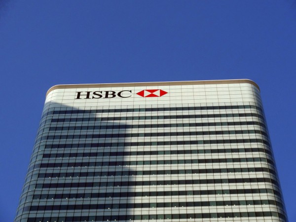
 HSBC is a familiar feature of many high streets in the UK and this is hardly surprising, given that it is the largest bank in Europe. But could this be about to change? With uncertainty surrounding the UK’s in-out vote on the EU, the future of the banking levy and HSBC’s desire to reduce the size of its operations, the UK high street might start to look quite different.
In the UK, 26,000 staff are employed in its retail banking sector, with 48,000 workers across the whole of its UK banking operations. HSBC has plans to downsize its business globally, with expected job losses in the UK of 8000 workers and a total of 25,000 jobs across the world. This would reduce its workforce by around 10%. This could have big implications for the UK economy. Although many of the job losses would not be enforced, given that HSBC does have a relatively high staff turnover, it is likely to mean some forced redundancies. With job creation being one of the big drivers of the UK economy in the last couple of years, this could put a dampner on the UK’s economic progress.
A further change we are likely to see will be the renaming of high street branches of HSBC, as new government rules are requiring HSBC to separate its investment and retail banking operations. Much of this stems from the aftermath of the financial crisis and governments trying to reign in the actions of the largest banks. Ring fencing has aimed to do this as a means of protecting the retail banking sector, should the investment banking part of the bank become problematic.
 However, perhaps the biggest potential shock could be the possibility of HSBC leaving the UK and moving to a new base in Hong Kong. A list of 11 criteria has been released by HSBC, outlining the factors that will influence its decision on whether to stay or go.
The UK’s decision on Europe is likely to be a key determinant, but other key factors against remaining in the UK are ‘the tax system and government policy in support of [the] growth and development of [the] financial services sector’. HSBC pays a large banking levy, as it is based not just on UK operations, but on its whole balance sheet.
HSBC’s Chief Executive, Stuart Gulliver, has said that the discussion on the potential move to Hong Kong is based on the changing world.
“We recognise that the world has changed and we need to change with it. That is why we are outlining the following… strategic actions that will further transform our organisation… Asia [is] expected to show high growth and become the centre of global trade over the next decade… Our actions will allow us to capture expected future growth opportunities.”
 Leaving the EU will have big effects on consumers and businesses, given that it is the UK’s largest market, trading partner and investor. Whether or not decisions of key businesses such as HSBC will have an impact on the referendum’s outcome will only be known as we get closer to the day of the vote (which is still some way off!). It will, however, be interesting to see if other companies raise similar issues in the coming year, as the referendum on the EU draws nearer. We should also look out for any potential change in the UK’s banking levy and what impact, if any, this has on HSBC’s decision to stay or go and on the future of any other banks.
Has HSBC already decided to leave the UK? The Telegraph, Ben Wright (10/6/15)
HSBC plans to cut 8,000 jobs in the UK in savings drive BBC News (9/6/15)
The Guaridan view on HSBC: a bank beyond shame The Guardian (10/6/15)
HSBC brand to vanish from UK high streets Financial Times, Emma Dunkley (9/6/15)
HSBC job cuts should come as little surprise Sky News, Ian King (9/6/15)
HSBC in charts: Where the bank plans to generate growth Financial Times, Jeremy Grant (9/6/15)
HSBC’s local rethink can’t shore up global act Wall Street Journal, Paul Davies (9/6/15)
Can George Osborne persuade HSBC to stay in the UK? BBC News, Kamal Ahmed (9/6/15)
Questions
- What is the UK’s banking levy and why does it affect a company like HSBC disproportionately?
- Look at the list of 11 criteria that HSBC have produced about staying in the UK or moving to Hong Kong. With each criterion, would you place it in favour of the UK or Hong Kong?
- Why is the banking sector ‘not a fan’ of the government policy of ring fencing?
- What impact would the loss of 8000 UK jobs have on the UK economy?
- Why does it matter to a bank such as HSBC if the UK is a member of the EU?
 With talks ongoing about resolving the Greek debt crisis, it is clear that there is no agreement that will satisfy both sides – the Greek government and the troika of lenders (the IMF, the ECB and the European Commission). Their current negotiating positions are irreconcilable. What is needed is something more fundamental to provide a long-term solution. What is needed is a ‘deus ex machina‘.
A deus ex machina, which is Latin for ‘god from a machine’, was a device used in Greek tragedy to solve an impossible situation. A god would appear from above, lowered by a crane, or from below through a trap door, and would put everything right. The tragedy would then be given a happy ending.
So what possible happy ending could be brought to the current Greek tragedy and who could be the deus ex machina?
 The negotiations between Greece and the troika currently centre on extending credit by €7.2bn when existing debts come up for repayment. There are repayments currently due to the IMF, or by the end of June, of €1.5bn and more in July, September and December (another €3.2bn). There are also €6.7bn of Greek bonds held by the ECB, as part of the 2010 bailout programme, that are due for repayment in July and August. Without the €7.2 billion bailout, Greece will be unable to meet these debt repayments, which also include Treasury bills.
But the troika will only release the funds in return for harsh austerity measures, which involve further cuts to pensions and public expenditure. Greece would be required to run a substantial budget surplus for many years.
Greece could refuse, but then it would end up defaulting on debt and be forced out of the euro. The result would probably be a substantial depreciation of a newly restored drachma, rising inflation and many Greeks suffering even greater hardship – at least for a period of time.
 So what is the possible deus ex machina? If you’re looking for a ‘god’ then it is best, perhaps, to look beyond the current actors. Perhaps the Americans could play the role in finding a solution to the impasse. Perhaps a small group of independent experts or politicians, or both, could find one. In either case, the politics of the situation would have to be addressed as well as the economics and finance.
And what would be the ‘fix’ to satisfy both sides? Ultimately, this has to allow Greek debt to be sustainable without further depressing demand and undermining the fabric of Greek society.  This would almost certainly have to involve a large measure of debt forgiveness (i.e. debts being written off). It also has to avoid creating a moral hazard, whereby if the Greeks are seen as being ‘let off lightly’, this might encourage other indebted eurozone countries to be less willing to reduce their debts and make demands for forgiveness too.
Ultimately, the issue is a political one, not an economic one. This will require clever negotiation and, if there is a deus ex machina, clever mediation too.
Videos
 Greek PM Tsipras warns lenders bailout plans ‘not realistic’ BBC News, Jim Reynolds (5/6/25)
 Greece defers IMF payment until end of June BBC News, Chris Morris (5/6/15)
 Greek debt talks: Empty shops and divided societies BBC News, Chris Morris (10/6/15)
 Potential Grexit effects Deutsche Welle (13/6/15)
Articles
It’s time to end the pretence: Greece will never fully repay its bailout loan The Guardian, Andrew Farlow (9/6/15)
Greek exit would trigger eurozone collapse, says Alexis Tsipras The Guardian, Phillip Inman, Helena Smith and Graeme Wearden (9/6/15)
The eurozone was a dream of unity. Now Europe has turned upon itself The Guardian, Business leader (14/6/15)
Greece bailout talks: an intractable crisis with three possible outcomes The Guardian, Larry Elliott (2/6/15)
Greece needs an economic defibrillator and a debt write-off Financial Times letters, Ray Kinsella (25/3/15)
Greece’s new debt restructuring plan Times of Change, Peter Spiegel (5/6/15)
Eurozone still in denial about Greece BBC News, Robert Peston (3/6/15)
Greece bailout talks – the main actors in a modern-day epic The Guardian, Phillip Inman, Ian Traynor and Helena Smith (9/6/15)
Greece isn’t any old troubled debtor BBC News, Robert Peston (15/6/15)
Greece in default if debt deadline missed, says Lagarde BBC News (18/6/15)
Burden of debt to IMF and European neighbours proves too much for Greece The Guardian, Heather Stewart (17/6/15)
Paper
Ending the Greek Crisis: Debt Management and Investment led Growth Greek government
Questions
- To which organisations is Greece indebted? What form to the debts take?
- To what extent is Greece’s current debt burden the result of design faults of the euro?
- Would it be possible to restructure debts in ways that make it easier for Greece to service them?
- Should Greece be treated by the IMF the same way it treated the highly indebted poor countries (HIPCs) and granted substantial debt relief?
- What would be the effects of Greek exit from the euro (a) for Greece; (b) for other eurozone countries?
- What bargaining chips can Greece deploy in the negotiations?
- Explain what is meant by ‘moral hazard’. Where in possible outcomes to the negotiations may there be moral hazard?
- What has been the impact of Greek austerity measures on the distribution of income and wealth in Greece?
- What are the practicalities of pursuing supply-side policies in Greece without further dampening aggregate demand?
 Let’s say that the world slides back into recession, or at least, the eurozone, the USA and other major economies. This is not unthinkable, given the determination of many countries to reduce public-sector deficits and debt, concerns about slowing growth in China and other major developing countries, and worries about various geo-political developments, such as conflict in the Middle East and the possible exit of Greece from the euro and the shock waves this might send. If it happened, what could governments and central banks do to stimulate aggregate demand? The problem is, according to the linked articles below, the world has largely run out of policy instruments.
In normal times, the main policy instruments for stimulating aggregate demand are cuts in interest rates (monetary policy) and increases in government expenditure and/or tax cuts (fiscal policy). But with interest rates currently at virtually zero, there is little scope for further cuts. And with governments attempting to ‘repair’ their balance sheets by cutting deficits, there is little appetite for increasing deficits again.
 It is possible that central banks could engage in further quantitative easing. Indeed, the ECB is only just starting its large QE programme, involving monthly bond purchases of €60bn until at least September 2016 (totalling €1.14tr at that point). But QE leads to market distortions, such as increased asset prices (e.g. share and house prices), made higher and more unstable by speculation. By providing ‘cheap money’, it also encourages potentially risky investments.
The articles below considers the dilemma and looks at six possible options for policy makers suggested by Stephen King, chief economist at HSBC. But are they realistic? Read the articles and then consider the questions.
Financial crisis fixes leave policymakers short of ammo for next recession The Guardian, Larry Elliott (31/5/15)
How to get the economy working for us Guardian Letters, Mary Mellor; Colin Hines; Martin London; William Dixon and David Wilson (2/6/15)
HSBC’s Stephen King Outlines “Economic Nightmare” ValueWalk (14/5/15)
HSBC: Central Banks Are Running Low on Ammunition Bloomberg, Julie Verhage (13/5/15)
If the US economy is signalling an iceberg, bad news: we’re out of lifeboats The Guardian, Nils Pratley (13/5/15)
Policy makers lack the firepower to fight another US recession Financial Times, Stephen King (18/5/15)
 The new surrealism Global Economics Quarterly, Stephen King (Q2, 2015)
Questions
- What are the risks to global recovery?
- Why has recovery from the 2008/9 recession been slower than that from previous recessions?
- What are the traditional instruments for combatting a recession?
- Why might central banks be wary of engaging in further rounds of quantitative easing?
- What is meant by ‘helicopter money’? Would this be a better solution to a recession than quantitative easing?
- Go through the other five policy options identified by Stephen King and discuss the suitability of each one.
 In his annual Mansion House speech to business leaders on 10 June 2015, George Osborne announced a new fiscal framework. This would require governments in ‘normal times’ to run a budget surplus. Details of the new framework would be spelt out in the extraordinary Budget, due on 8 July.
 Sweden and Canada have similar rules to that proposed by George Osborne, and he sees them as having been more able to use expansionary fiscal policy in emergency times, such as in the aftermath of the financial crisis of 2007/8, without running excessive deficits.
 By excluding public-sector investment from the target, as was previously done, it can allow borrowing to continue for such investment, even when there is a substantial deficit. This, in turn, can help to increase aggregate supply by improving infrastructure and has less of a dampening effect on aggregate demand. A worry about the new rule is that it could lead to further erosion of public-sector investment, which can be seen as vital to long-term growth and development of the economy. Indeed, Sweden decided in March this year to abandon its surplus rule to allow government borrowing to fund investment.
 George Osborne confirms budget surplus law Channel 4 News, Gary Gibbon (10/6/15)
 Osborne To Push Through Budget Surplus Rules Sky News (10/6/15)
 OECD On Osborne’s Fiscal Plans Sky News, Catherine Mann (10/6/15)
 ‘Outright fiscal madness’ Osborne’s Mansion House Speech RT UK on YouTube, Harry Fear (11/6/15)
 A “straightjacket” [sic] on future government spending? BBC Today Programme, Robert Peston; Nigel Lawson (11/6/15)
 Thursday’s business with Simon Jack BBC Today Programme, Gerard Lyons (12/6/15)
