 Consumer credit is borrowing by individuals to finance current expenditure on goods and services. Consumer credit is distinct from lending secured on dwellings (referred to more simply as ‘secured lending’). Consumer credit comprises lending on credit cards, lending through overdraft facilities and other loans and advances, for example those financing the purchase of cars. We consider here recent trends in the flows of consumer credit in the UK and discuss their implications.
Analysing consumer credit data is important because the growth of consumer credit has implications for the financial wellbeing or financial health of individuals and, of course, for financial institutions. As we shall see shortly, the data on consumer credit is consistent with the existence of credit cycles. Cycles in consumer credit have the potential to be not only financially harmful but economically destabilising. After all, consumer credit is lending to finance spending and therefore the amount of lending can have significant effects on aggregate demand and economic activity.
Data on consumer credit are available monthly and so provide an early indication of movements in economic activity. Furthermore, because lending flows are likely to be sensitive to changes in the confidence of both borrowers and lenders, changes in the growth of consumer credit can indicate turning points in the economy and, hence, in the macroeconomic environment.
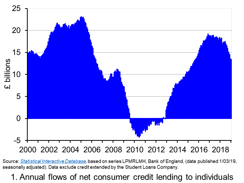 Chart 1 shows the annual flows of net consumer credit since 2000 – the figures are in £ billions. Net flows are gross flows less repayments. (Click here to download a PowerPoint copy of the chart.) In January 2005 the annual flow of net consumer credit peaked at £23 billion, the equivalent of just over 2.5 per cent of annual disposable income. This helped to fuel spending and by the final quarter of the year, the economy’s annual growth rate had reached 4.8 per cent, significantly about its long-run average of 2.5 per cent.
By 2009 net consumer credit flows had become negative. This meant that repayments were greater than additional flows of credit. It was not until 2012 that the annual flow of net consumer credit was again positive. Yet by November 2016, the annual flow of net consumer credit had rebounded to over £19 billion, the equivalent of just shy of 1.5 per cent of annual disposable income. This was the largest annual flow of consumer credit since September 2005.
Although the strength of consumer credit in 2016 was providing the economy with a timely boost to growth in the immediate aftermath of the referendum on the UK’s membership of the EU, it nonetheless raised concerns about its sustainability. Specifically, given the short amount of time that had elapsed since the financial crisis and the extreme levels of financial distress that had been experienced by many sectors of the economy, how susceptible would people and organisations be to a future economic slowdown and/or rise in interest rates?
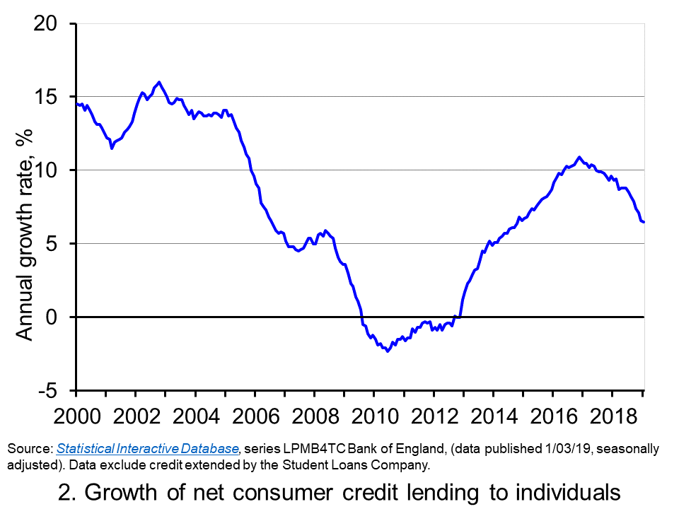 The extent to which the economy experiences consumer credit cycles can be seen even more readily by looking at the 12-month growth rate in the net consumer credit. In essence, this mirrors the growth rate in the stock of consumer credit. Chart 2 evidences the double-digit growth rates in net consumer credit lending experienced during the first half of the 2000s. Growth rates then eased but, as the financial crisis unfolded, they plunged sharply. (Click here to download a PowerPoint copy of the chart.)
Yet, as Chart 2 shows, consumer credit growth began to recover quickly from 2013 so that by 2016 the annual growth rate of net consumer credit was again in double figures. In November 2016 the 12-month growth rate of net consumer credit peaked at 10.9 per cent. Thereafter, the growth rate has continually eased. In January 2019 the annual growth rate of net consumer credit had fallen back to 6.5 per cent, the lowest rate since October 2014.
The easing of consumer credit is likely to have been influenced, in part, by the resumption in the growth of real earnings from 2018 (see Getting real with pay). Yet, it is hard to look past the economic uncertainties around Brexit.
Uncertainty tends to cause people to be more cautious. With the heightened uncertainty that has has characterised recent times, it is likely that for many people and businesses prudence has dominated impatience. Therefore, in summary, it appears that prudence is helping to steer borrowing along a downswing in the credit cycle. As it does, it helps to put a further brake on spending and economic growth.
Articles
Questions
- What is the difference between gross and net lending?
- Consider the argument that we should be worried more by excessive growth in consumer credit than on lending secured on dwellings?
- How could we measure whether different sectors of the economy had become financially distressed?
- What might explain why an economy experiences credit cycles?
- Explain how the growth in net consumer credit can affect economic activity?
- If people are consumption smoothers, how can credit cycles arise?
- What are the potential policy implications of credit cycles?
- It is said that when making financial decisions people face an inter-temporal choice. Explain what you understand this by this concept.
- If economic uncertainty is perceived to have increased how could this affect the consumption, saving and borrowing decisions of people?
 One of the most enduring characteristics of the macroeconomic environment since the financial crisis of the late 2000s has been its impact on people’s pay. We apply the distinction between nominal and real values to evidence the adverse impact on the typical purchasing power of workers. While we do not consider here the distributional impact on pay, the aggregate picture nonetheless paints a very stark picture of recent patterns in pay and, in turn, the consequences for living standards and wellbeing.
While the distinction between nominal and real values is perhaps best know in relation to GDP and economic growth (see the need to get real with GDP), the distinction is also applied frequently to analyse the movement of one price relative to prices in general. One example is that of movements in pay (earnings) relative to consumer prices.
Pay reflects the price of labour. The value of our actual pay is our nominal pay. If our pay rises more quickly than consumer prices, then our real pay increases. This means that our purchasing power rises and so the volume of goods and services we can afford increases. On the other hand, if our actual pay rises less quickly than consumer prices then our real pay falls. When real pay falls, purchasing power falls and the volume of goods and services we can afford falls.
Figures from the Office for National Statistics show that in January 2000 regular weekly pay (excluding bonuses and before taxes and other deductions from pay) was £293. By December 2018 this had risen to £495. This is an increase of 69 per cent. Over the same period the consumer prices index known as the CPIH, which, unlike the better-known CPI, includes owner-occupied housing costs and Council Tax, rose by 49 per cent. Therefore, the figures are consistent with a rise both in nominal and real pay between January 2000 to December 2018. However, this masks the fact that in recent times real earnings have fallen.
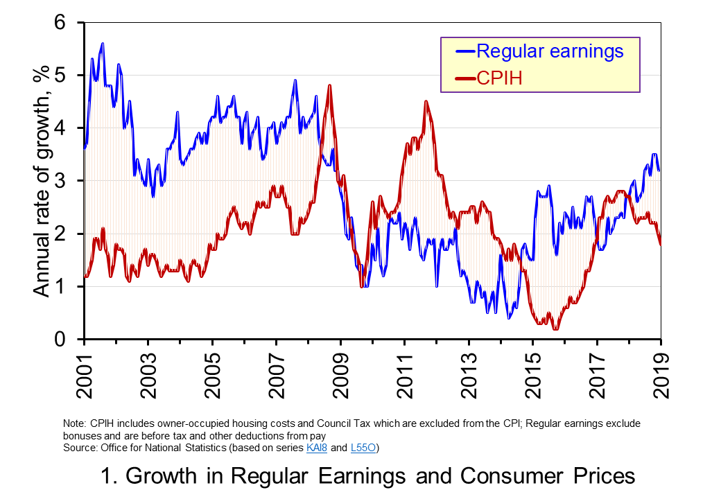 Chart 1 shows the annual percentage changes in actual (nominal) regular weekly pay and the CPIH since January 2001. Each value is simply the percentage change from 12 months earlier. The period up to June 2008 saw the annual growth of weekly pay outstrip the growth of consumer prices – the blue line in the chart is above the red line. Therefore, the real value of pay rose. However, from June 2008 to August 2014 pay growth consistently fell short of the rate of consumer price inflation – the blue line is below the red line. The result was that average real weekly pay fell. (Click here to download a PowerPoint copy of the chart.)
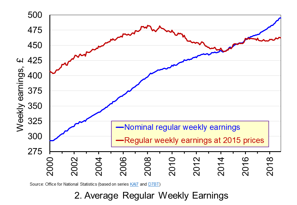 Chart 2 show the average levels of nominal and real weekly pay. The real series is adjusted for inflation. It is calculated by deflating the nominal pay values by the CPIH. Since the CPIH is a price index whose value averages 100 across 2015, the real pay values are at constant 2015 prices. From the chart, we can see that the real value of weekly pay peaked in March 2008 at £482.01 at 2015 prices. The subsequent period saw rates of pay inflation that were lower than rates of consumer price inflation. This meant that by March 2014 the real value of weekly pay had fallen by 8.8 per cent to £439.56 at 2015 prices. (Click here to download a PowerPoint copy of the chart.)
Although real (inflation-adjusted) pay recovered a little during 2015 and 2016, 2017 again saw consumer price inflation rates greater than those of pay inflation (see Chart 1). Consequently, the average level of real weekly pay fell by 1 per cent between January and November 2017. Since then, real regular pay has again increased. In December 2018, average real pay weekly pay was £462.18 at 2015 prices: an increase of 1.1 per cent from November 2017. Nonetheless, inflation-adjusted average weekly pay in December 2018 remained 4.1 per cent below its March 2008 level.
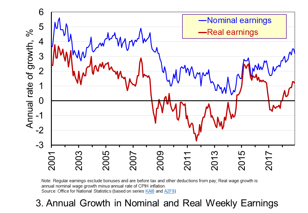 Chart 3 shows very clearly the importance of the distinction between real and nominal when analysing the growth of earnings. The sustained period of real pay deflation (negative rates of pay inflation) that followed the financial crisis can be seen much more clearly by plotting growth rates rather than their levels. Since June 2008 the average annual growth of real regular weekly pay has been −0.2 per cent, despite nominal pay increasing at an annual rate of 2 per cent. In the period from January 2001 to May 2008 real regular weekly pay had grown at an annual rate of 2.1 per cent with nominal pay growing at an annual rate of 4.0 per cent. (Click here to download a PowerPoint copy of the chart.)
The distinction between nominal and real helps us to understand better why some argue that patterns in pay, living standards and well-being have been fundamental in characterising the macroeconomic environment since the financial crisis. Indeed, it is not unreasonable to suggest that these patterns have helped to shape macroeconomic debates and broader conversations around the role of government and of public policy and its priorities.
Articles
Questions
- Using the example of GDP and earnings, explain how the distinction between nominal and real relates to the distinction between values and volumes.
- In what circumstances would an increase in actual pay translate into a reduction in real pay?
- In what circumstances would a decrease in actual pay translate into an increase in real pay?
- What factors might explain the reduction in real rates of pay seen in the UK following the financial crisis?
- Of what importance might the growth in real rates of pay be for consumption and aggregate demand?
- Why is the growth of real pay an indicator of financial well-being? What other indicators might be included in measuring financial well-being?
- Assume that you have been asked to undertake a distributional analysis of real earnings since the financial crisis. What might be the focus of your analysis? What information would you therefore need to collect?
 The distinction between nominal and real values is an incredibly important one in economics. We apply the latest GDP numbers from the ONS to show how the inflation-adjusted numbers help to convey the twin characteristics of growth: positive longer-term growth but variable short-term rates of growth. It is real GDP numbers that help us to understand better the macroeconomic environment and, not least, its inherent volatility. To use nominal GDP numbers means painting a less than clear, if not inaccurate, picture of the macroeconomic environment.
The provisional estimate for GDP (the value of output) in the UK in 2018 is £2.115 trillion, up 3.2 per cent from £2.050 trillion in 2017. These are the actual numbers, or what are referred to as nominal values. They make no adjustment for inflation and reflect the prices of output that were prevailing at the time. Hence, the figures are also referred to as GDP at current prices.
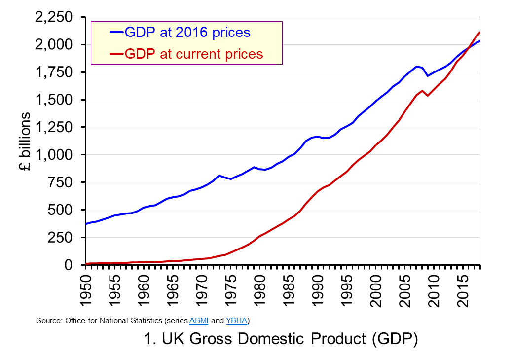 The use of nominal GDP data can be something of a problem when we compare historical values. In 1950, for example, as we can see from Chart 1, nominal GDP in 1950 was a mere £12.926 billion. In other words, the nominal figures show that the value of the country’s output was 163.595 times greater in 2018 (or an increase of 162,595 per cent). However, if we want to make a more meaningful comparison of the country’s national income we need to adjust for inflation. (Click here to download a PowerPoint copy of the chart.)
If we measure GDP at constant prices we eliminate the effect of inflation. This allow us to make a more meaningful comparison of national income. Consider first the real GDP numbers for 1950 and 2018. GDP in 1950 at 2016 prices was £373.9 billion. This is higher than the nominal (current-price) value because prices in 2016 were higher than those in 1950. Meanwhile, GDP in 2018 when measured at 2016 prices was £2.034 trillion. This real value is smaller than the corresponding nominal value because prices in 2016 where lower than those in 2018.
Between 1950 and 2018 there was a proportionate increase in real GDP of 5.439 (or a 443.9 per cent increase). Because we have removed the effect of inflation the real growth figure is much lower than the nominal growth figure. Crucially, what we are left with is an indicator of the growth in the volume of output. Whereas nominal growth rates are affected both by changes in volumes and prices, real growth rates reflect only changes in volumes.
Consider now output growth between 2017 and 2018. As we saw earlier, the nominal figures suggest growth of 3.2 per cent. In fact, GDP at constant 2016 prices increased from £2005.4 trillion in 2017 to £2,033.6 trillion in 2018: an increase of 1.4 per cent. This was the lowest rate of growth in national output since 2012 when output also grew by 1.4 per cent. In 2017 national output had increased by 1.8 per cent, the same increase as in 2016.
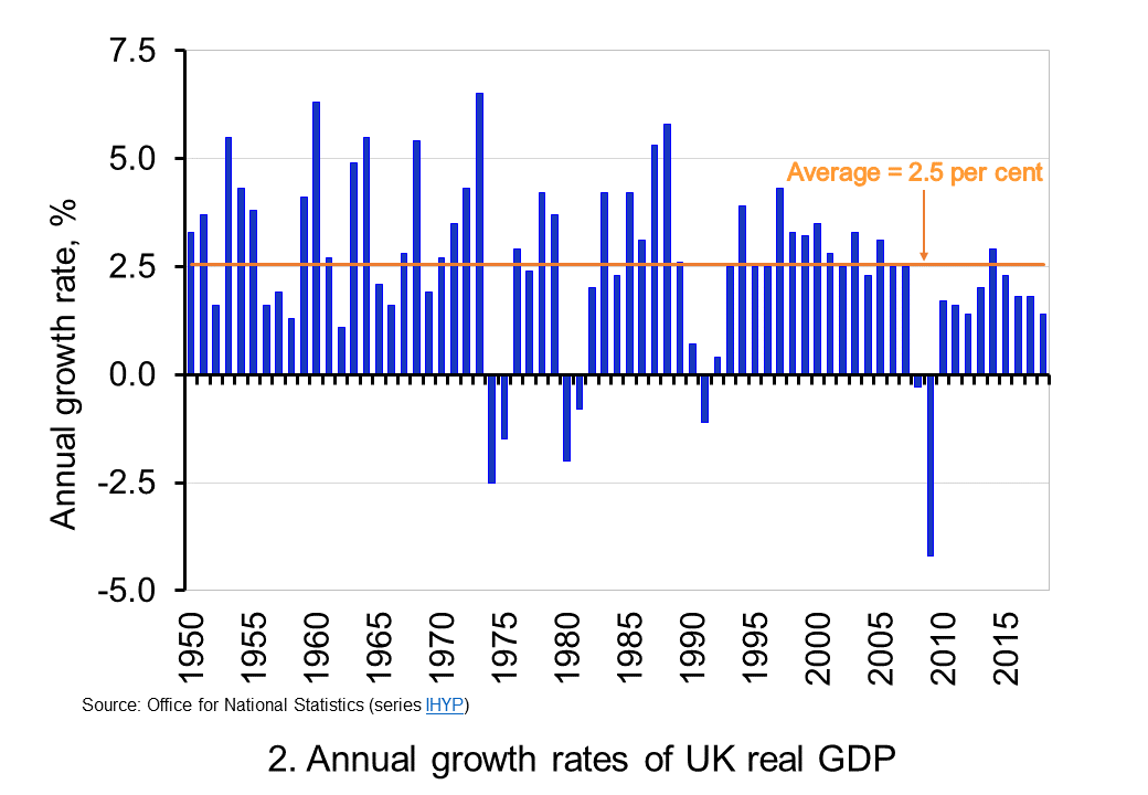 To put the recent growth in national output into context, Chart 2 shows the annual rate of growth in real GDP each year since 1950. Across the period, the average annual rate of growth in real GDP and, hence, in the volume of national output was 2.5 per cent. In the current decade growth has averaged only 1.9 per cent. This followed falls of 0.3 per cent and 4.2 per cent in 2008 and 2009 respectively as the effects of the financial crisis on the economy were felt. (Click here to download a PowerPoint copy of the chart.)
By plotting the percentage changes in real GDP from year to year, we get a much clearer sense of the inherent instability that we identified at the outset as a characteristic of growth. This is true not only for the UK, but economies more generally. This instability is the key characteristic of the macroeconomic environment. It influences and informs much of what we study in economics.
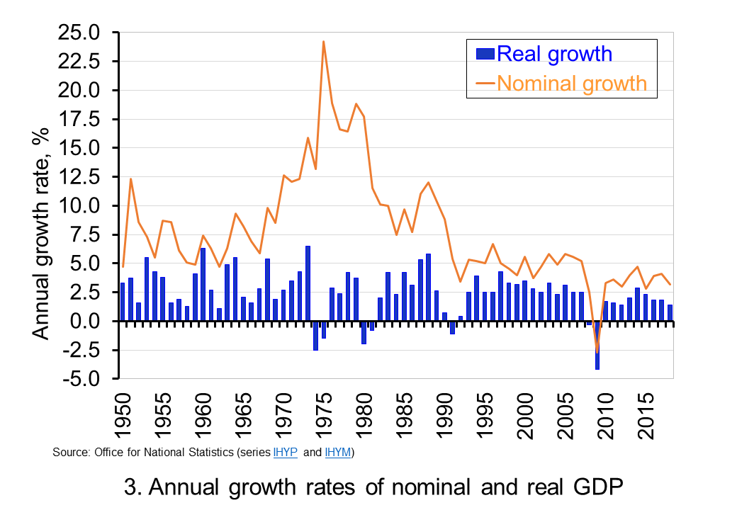 The variability of growth rates that create the instability of economies again requires an understanding of the distinction between nominal and real GDP. Chart 3 illustrates the growth in GDP both in nominal and real terms. The average annual rate of growth of nominal GDP is 7.8 per cent, considerably higher than the average real growth rate of 2.5 per cent per year. The difference again reflects the effect of rising prices. (Click here to download a PowerPoint copy of the chart.
Chart 3 clearly shows the wrong conclusions that can be drawn if one was to focus on the growth in nominal GDP from year to year. Perhaps the best example is 1975. In this year nominal GDP grew by 24.2 per cent. However, the volume of national output contracted: real GDP fell by 1.5 per cent. The growth in nominal GDP reflects the rapid growth in prices seen in that year. The economy’s average price level (the GDP deflator) rose by 26.1 per cent. Hence, the growth in nominal GDP reflected not an increase in the volume of output – that fell – but instead a large increase in prices.
The importance of the distinction between nominal and real GDP is further demonstrated by the fact that since 1950 nominal GDP has fallen in only one year. In 2009 nominal GDP fell by 2.7 per cent. The 1.6 per cent rise in the economy’s average price level was not enough to offset the fall in the volume of output of just over 4.2 per cent. In other years when the volume of output (real GDP) fell, the effect of rising prices meant that the value of output (nominal GDP) nonetheless rose.
So to conclude, the distinction between nominal and real GDP is crucial when analysing economic growth. To understand the distinction gives you a truly real advantage in making sense of the macroeconomic environment.
Articles
Questions
- What do you understand by the term ‘macroeconomic environment’? What data could be used to describe the macroeconomic environment?
- When a country experiences positive rates of inflation, which is higher: nominal economic growth or real economic growth?
- Does an increase in nominal GDP mean a country’s production has increased? Explain your answer.
- Does a decrease in nominal GDP mean a country’s production has decreased? Explain your answer.
- Why does a change in the growth of real GDP allow us to focus on what has happened to the volume of production?
- What does the concept of the ‘business cycle’ have to do with real rates of economic growth?
- When would falls in real GDP be classified as a recession?
- Distinguish between the concepts of ‘short-term growth rates’ and ‘longer-term growth’.
- Why might the distinction between nominal and real be important when analysing changes in people’s pay? What would be the significance of an increase in real pay?
 Consumer and business confidence reflect the sentiment, emotion, or anxiety of consumers and businesses. Confidence surveys therefore try to capture these feelings of optimism or pessimism. They aim to shed light on spending intentions and hence the short-term prospects for private-sector spending. For example, a fall in confidence would be expected to lead to a fall in consumption and investment spending. This is particularly relevant in the UK with the ongoing uncertainty around Brexit. We briefly summarise here current patterns in confidence.
Through the use of surveys attempts are made to measure confidence. One long-standing survey is that conducted for the European Commission. Each month consumers and firms across the European Union are asked a series of questions, the answers to which are used to compile indicators of consumer and business confidence. For instance, consumers are asked about how they expect their financial position to change. They are offered various options such as ‘get a lot better, ‘get a lot worse’ and balances are then calculated on the basis of positive and negative replies.
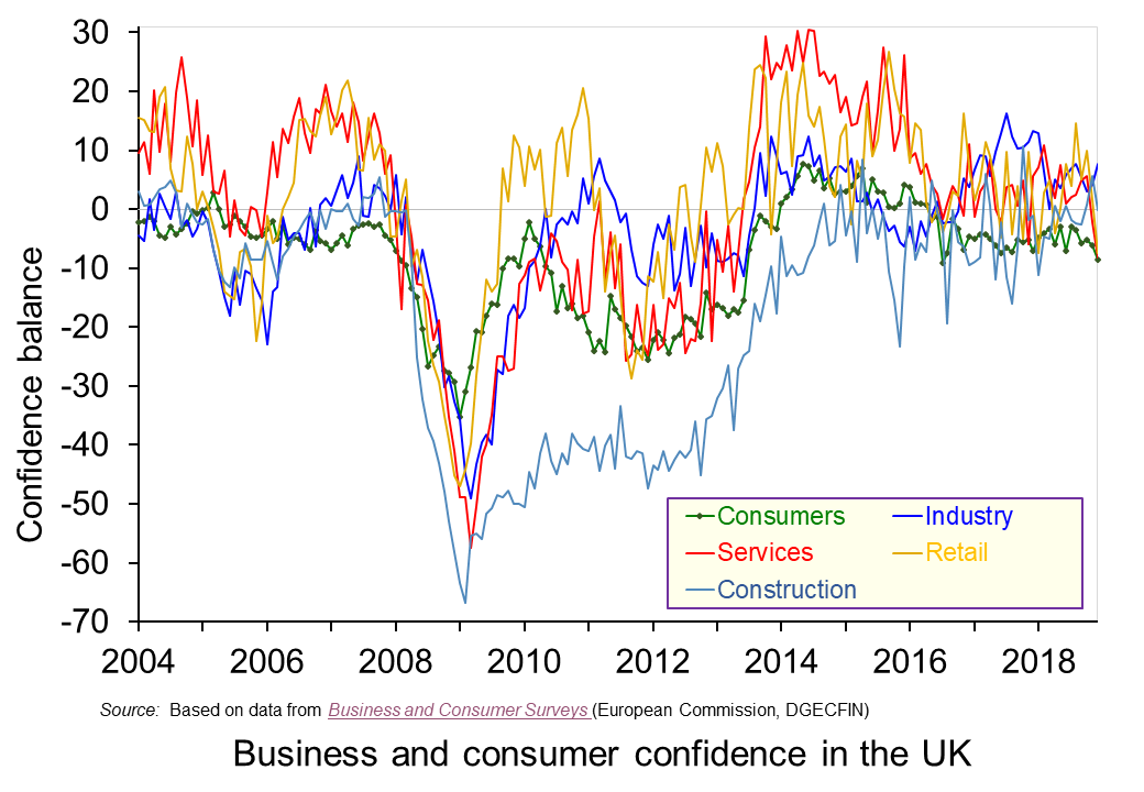 The chart plots confidence in the UK for consumers and different sectors of business since the mid 1990s. The chart captures the volatility of confidence. This volatility is generally greater amongst businesses than consumers, and especially so in the construction sector. (Click here to download a PowerPoint copy of the chart.)
The chart nicely captures the collapse in confidence during the global financial crisis in the late 2000s. The significant tightening of credit conditions contributed to a significant dampening of aggregate demand which was further propagated (amplified) by the collapse in confidence. Consequently, the economy slid in to recession with national output contracting by 6.3 per cent during the 5 consecutive quarters during which output fell.
To this point, the current weakening of confidence is not of the same magnitude as that of the late 2000s. In January 2009 consumer confidence had fallen to an historic low of -35. Nonetheless, the December 2018 figure for consumer confidence was -9, the lowest figure since July 2016 the month following the EU referendum, and markedly lower than the +8 seen as recently as 2014. The long-term (median) average for the consumer confidence balance is -6.
The weakening in consumer confidence is mirrored by a weakening in confidence in the retail and service sectors. The confidence balances in December 2018 in these two sector both stood at -8 which compares to their longer-term averages of around +5. In contrast, confidence in industry and construction has so far held fairly steady with confidence levels in December 2018 at +8 in industry and at 0 in construction compared to their long-term averages of -4 and -10 respectively.
It will be interesting to see how confidence has been affected by recent events. The glut of stories suggesting that trading conditions were especially difficult for retailers over the Christmas and New Year period is consistent with the weakening confidence already observed amongst consumers and retailers. However, it is unlikely that recent events will have done anything other than to exacerbate the trend for a weakening of confidence of domestic consumers and retailers. Hence, the likelihood is an intensification of caution and prudence.
Articles
Questions
- Draw up a series of factors that you think might affect both consumer and business confidence. How similar are both these lists?
- Which of the following statements is likely to be more accurate: (a) Confidence drives economic activity or (b) Economic activity drives confidence?
- What macroeconomic indicators would those compiling the consumer and business confidence indicators expect each indicator to predict?
- What is meant by the concept of ‘prudence’ in the context of spending? What factors might determine the level of prudence
- How might prudence be expected to affect spending behaviour?
- How might we distinguish between confidence ‘shocks’ and confidence as a ‘propagator’ of shocks?
 It is impossible to make both precise and accurate forecasts of a country’s rate of economic growth, even a year ahead. And the same goes for other macroeconomic variables, such as the rate of unemployment or the balance of trade. The reason is that there are so many determinants of these variables, such as political decisions or events, which themselves are unpredictable. Economics examines the effects of human interactions – it is a social science, not a natural science. And human behaviour is hard to forecast.
Leading indicators
Nevertheless, economists do make forecasts. These are best estimates, taking into account a number of determinants that can be currently measured, such as tax or interest rate changes. These determinants, or ‘leading indicators’, have been found to be related to future outcomes. For example, surveys of consumer and business confidence give a good indication of future consumer expenditure and investment – key components of GDP.
Leading indicators do not have to be directly causal. They could, instead, be a symptom of underlying changes that are themselves likely to affect the economy in the future. For example, changes in stock market prices may reflect changes in confidence or changes in liquidity. It is these changes that are likely to have a direct or indirect causal effect on future output, employment, prices, etc.
Macroeconomic models show the relationships between variables. They show how changes in one variable (e.g. increased investment) affect other variables (e.g. real GDP or productivity). So when an indicator changes, such as a rise in interest rates, economists use these models to estimate the likely effect, assuming other things remain constant (ceteris paribus). The problem is that other things don’t remain constant. The economy is buffeted around by a huge range of events that can affect the outcome of the change in the indicator or the variable(s) it reflects.
Forecasting can never therefore be 100% accurate (except by chance). Nevertheless, by carefully studying leading indicators, economists can get a good idea of the likely course of the economy.
Leading indicators of the US economy
At the start of 2019, several leading indicators are suggesting the US economy is likely to slow and might even go into recession. The following are some of the main examples.
Political events. This is the most obvious leading indicator. If decisions are made that are likely to have an adverse effect on growth, a recession may follow. For example, decisions in the UK Parliament over Brexit will directly impact on UK growth.
 As far as the USA is concerned, President Trump’s decision to put tariffs on steel and aluminium imports from a range of countries, including China, the EU and Canada, led these countries to retaliate with tariffs on US imports. A tariff war has a negative effect on growth. It is a negative sum game. Of course, there may be a settlement, with countries agreeing to reduce or eliminate these new tariffs, but the danger is that the trade war may continue long enough to do serious damage to global economic growth.
But just how damaging it is likely to be is impossible to predict. That depends on future political decisions, not just those of the recent past. Will there be a global rise in protectionism or will countries pull back from such a destructive scenario? On 29 December, President Trump tweeted, ‘Just had a long and very good call with President Xi of China. Deal is moving along very well. If made, it will be very comprehensive, covering all subjects, areas and points of dispute. Big progress being made!’ China said that it was willing to work with the USA over reaching a consensus on trade.
Rises in interest rates. If these are in response to a situation of excess demand, they can be seen as a means of bringing inflation down to the target level or of closing a positive output gap, where real national income is above its potential level. They would not signify an impending recession. But many commentators have interpreted rises in interest rates in the USA as being different from this.
The Fed is keen to raise interest rates above the historic low rates that were seen as an ’emergency’ response to the financial crisis of 2007–8. It is also keen to reverse the policy of quantitative easing and has begun what might be described as ‘quantitative tightening’: not buying new bonds when existing ones that it purchased during rounds of QE mature. It refers to this interest rate and money supply policy as ‘policy normalization‘. The Fed maintains that such policy is ‘consistent with sustained expansion of economic activity, strong labor market conditions, and inflation near the Committee’s symmetric 2 percent objective over the medium term’.
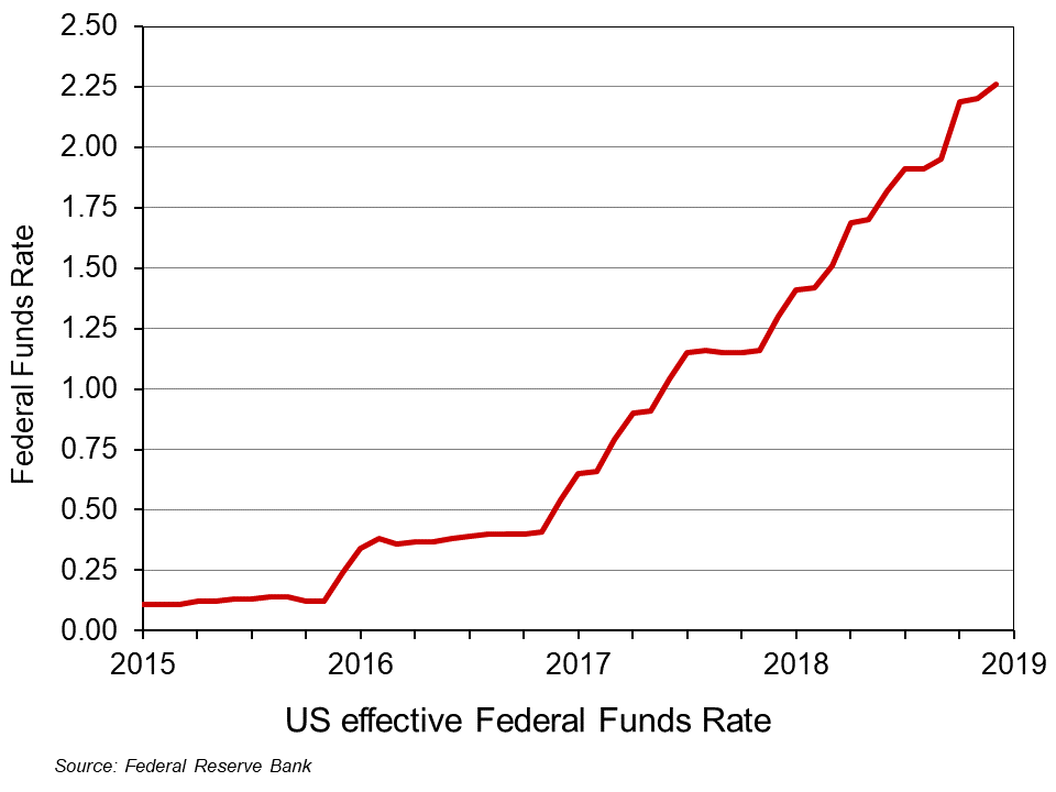 However, many commentators, including President Trump, have accused the Fed of going too fast in this process and of excessively dampening the economy. It has already raised the Federal Funds Rate nine times by 0.25 percentage points each time since December 2015 (click here for a PowerPoint file of the chart). What is more, announcing that the policy will continue makes such announcements themselves a leading indicator of future rises in interest rates, which are a leading indicator of subsequent effects on aggregate demand. The Fed has stated that it expects to make two more 0.25 percentage point rises during 2019.
 Surveys of consumer and business confidence. These are some of the most significant leading indicators as consumer confidence affects consumer spending and business confidence affects investment. According to the Duke CFO Global Business Outlook, an influential survey of Chief Financial Officers, ‘Nearly half (48.6 per cent) of US CFOs believe that the US will be in recession by the end of 2019, and 82 per cent believe that a recession will have begun by the end of 2020’. Such surveys can become self-fulfilling, as a reported decline in confidence can itself undermine confidence as both firms and consumers ‘catch’ the mood of pessimism.
Stock market volatility. When stock markets exhibit large falls and rises, this is often a symptom of uncertainty; and uncertainty can undermine investment. Stock market volatility can thus be a leading indicator of an impending recession. One indicator of such volatility is the VIX index. This is a measure of ’30-day expected volatility of the US stock market, derived from real-time, mid-quote prices of S&P 500® Index (SPXSM) call and put options. On a global basis, it is one of the most recognized measures of volatility – widely reported by financial media and closely followed by a variety of market participants as a daily market indicator.’ The higher the index, the greater the volatility. Since 2004, it has averaged 18.4; from 17 to 28 December 2018, it averaged 28.8. From 13 to 24 December, the DOW Jones Industrial Average share index fell by 11.4 per cent, only to rise by 6.2 per cent by 27 December. On 26 December, the S&P 500 index rallied 5 per cent, its best gain since March 2009.
Not all cases of market volatility, however, signify an impending recession, but high levels of volatility are one more sign of investor nervousness.
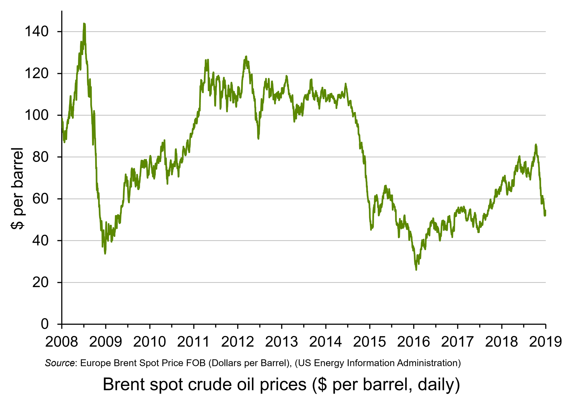 Oil prices. When oil prices fall, this can be explained by changes on the demand and/or supply side of the oil market. Oil prices have fallen significantly over the past two months. Until October 2018, oil prices had been rising, with Brent Crude reaching $86 per barrel by early October. By the end of the year the price had fallen to just over $50 per barrel – a fall of 41 per cent. (Click here for a PowerPoint file of the chart.) Part of the explanation is a rise in supply, with shale oil production increasing and also increased output from Russia and Saudi Arabia, despite a commitment by the two countries to reduce supply. But the main reason is a fall in demand. This reflects both a fall in current demand and in anticipated future demand, with fears of oversupply causing oil companies to run down stocks.
Falling oil prices resulting from falling demand are thus an indicator of lack of confidence in the growth of future demand – a leading indicator of a slowing economy.
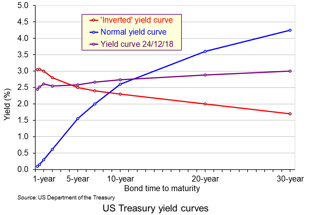 The yield curve. This depicts the yields on government debt with different lengths to maturity at a given point in time. Generally, the curve slopes upwards, showing higher rates of return on bonds with longer to maturity. This is illustrated by the blue line in the chart. (Click here for a PowerPoint file of the chart.) This is as you would expect, with people requiring a higher rate of return on long-term lending, where there is normally greater uncertainty. But, as the Bloomberg article, ‘Don’t take your eyes off the yield curve‘ states:
Occasionally, the curve flips, with yields on short-term debt exceeding those on longer bonds. That’s normally a sign investors believe economic growth will slow and interest rates will eventually fall. Research by the Federal Reserve Bank of San Francisco has shown that an inversion has preceded every US recession for the past 60 years.
The US economy is 37 quarters into what may prove to be its longest expansion on record. Analysts surveyed by Bloomberg expect gross domestic product growth to come in at 2.9 percent this year, up from 2.2 percent last year. Wages are rising as unfilled vacancies hover near all-time highs.
With times this good, the biggest betting game on Wall Street is when they’ll go bad. Barclays Plc, Goldman Sachs Group Inc., and other banks are predicting inversion will happen sometime in 2019. The conventional wisdom: Afterward it’s only a matter of time – anywhere from 6 to 24 months – before a recession starts.
As you can see from the chart, the yield curve on 24 December 2018 was still slightly upward sloping (expect between 6-month and 1-year bonds) – but possibly ready to ‘flip’.
However, despite the power of an ‘inverted’ yield in predicting previous recessions, it may be less reliable now. The Fed, as we saw above, has already signalled that it expects to increase short-term rates in 2019, probably at least twice. That alone could make the yield curve flatter or even downward sloping. Nevertheless, it is still generally thought that a downward sloping yield curve would signal belief in a likely slowdown, if not outright recession.
So, is the USA heading for recession?
The trouble with indicators is that they suggest what is likely – not what will definitely happen. Governments and central banks are powerful agents. If they believed that a recession was likely, then fiscal and monetary policy could be adjusted. For example, the Fed could halt its interest rate rises and quantitative tightening, or even reverse them. Also, worries about protectionism may subside if the USA strikes new trade deals with various countries, as it did with Canada and Mexico in USMCA.
Articles
- A jarring new survey shows CEOs think a recession could strike as soon as year-end 2019
Business Insider, Joe Ciolli (17/12/18)
- 4 Recession Indicators to Watch Now
Barron’s, Campbell Harvey (20/12/18)
- 9 Reasons the US Will Have a Recession Next Year
24/7 Wall St, Douglas A. McIntyre (26/12/18)
- The global economy is living dangerously – but don’t expect superpowers to follow the 2008 script
Independent, Ben Chu (3/1/19)
- Could a recession be just around the corner?
The Conversation, Amitrajeet A Batabyal (6/12/18)
- The US is on the edge of the economic precipice – Trump may push it over
The Guardian, Robert Reich (23/12/18)
- US prepares to hit the wall as reckless Trump undoes years of hard work
The Guardian, (Business Leader) (23/12/18)
- The first signs of the next recession
New Statesman, Helen Thompson (23/11/18)
- Is a Recession Coming? CFOs Predict 2019 Recession, Majority Expect Pre-2020 Market Crash
Newsweek, Benjamin Fearnow (12/12/18)
- Trade slowdown coming at worst time for world economy, markets
Reuters, Jamie McGeever (19/12/18)
- How to spot the next recession
The Week, Jeff Spross (27/11/18)
- What Is a Recession, and Why Are People Talking About the Next One?
New York Times, Niraj Chokshi (17/12/180
- For the American Economy, Storm Clouds on the Horizon
New York Times, Binyamin Appelbaum (28/11/18)
- Don’t Take Your Eyes Off the Yield Curve
Bloomberg Businessweek, Liz McCormick and Jeanna Smialek (16/11/18)
- What to expect from 2019’s ‘post-peak’ economy
CNN, Larry Hatheway (19/12/18)
- Worried about the next recession? Here’s what to watch instead of the yield curve
Quartz, Gwynn Guilford (17/12/18)
- Leading Economic Indicators and How to Use Them
The Balance, Kimberly Amadeo (10/9/18)
Surveys and Data
Questions
- Define the term ‘recession’.
- Are periods of above-trend expansion necessarily followed by a recession?
- Give some examples of leading indicators other than those given above and discuss their likely reliability in predicting a recession.
- Find out what has been happening to confidence levels in the EU over the past 12 months. Does this provide evidence of an impending recession in the EU?
- For what reasons may there be lags between a change in an indicator and a change in the variables for which it is an indicator?
- Why has the shape of the yield curve previously been a good predictor of the future course of the economy? Is it likely to be at present?
- What is the relationship between interest rates, government bond prices (‘Treasuries’ in the USA) and the yield on such bonds?
 Consumer credit is borrowing by individuals to finance current expenditure on goods and services. Consumer credit is distinct from lending secured on dwellings (referred to more simply as ‘secured lending’). Consumer credit comprises lending on credit cards, lending through overdraft facilities and other loans and advances, for example those financing the purchase of cars. We consider here recent trends in the flows of consumer credit in the UK and discuss their implications.
 Chart 1 shows the annual flows of net consumer credit since 2000 – the figures are in £ billions. Net flows are gross flows less repayments. (Click here to download a PowerPoint copy of the chart.) In January 2005 the annual flow of net consumer credit peaked at £23 billion, the equivalent of just over 2.5 per cent of annual disposable income. This helped to fuel spending and by the final quarter of the year, the economy’s annual growth rate had reached 4.8 per cent, significantly about its long-run average of 2.5 per cent.
 The extent to which the economy experiences consumer credit cycles can be seen even more readily by looking at the 12-month growth rate in the net consumer credit. In essence, this mirrors the growth rate in the stock of consumer credit. Chart 2 evidences the double-digit growth rates in net consumer credit lending experienced during the first half of the 2000s. Growth rates then eased but, as the financial crisis unfolded, they plunged sharply. (Click here to download a PowerPoint copy of the chart.)
 One of the most enduring characteristics of the macroeconomic environment since the financial crisis of the late 2000s has been its impact on people’s pay. We apply the distinction between nominal and real values to evidence the adverse impact on the typical purchasing power of workers. While we do not consider here the distributional impact on pay, the aggregate picture nonetheless paints a very stark picture of recent patterns in pay and, in turn, the consequences for living standards and wellbeing.
 Chart 1 shows the annual percentage changes in actual (nominal) regular weekly pay and the CPIH since January 2001. Each value is simply the percentage change from 12 months earlier. The period up to June 2008 saw the annual growth of weekly pay outstrip the growth of consumer prices – the blue line in the chart is above the red line. Therefore, the real value of pay rose. However, from June 2008 to August 2014 pay growth consistently fell short of the rate of consumer price inflation – the blue line is below the red line. The result was that average real weekly pay fell. (Click
  Chart 2 show the average levels of nominal and real weekly pay. The real series is adjusted for inflation. It is calculated by deflating the nominal pay values by the CPIH. Since the CPIH is a price index whose value averages 100 across 2015, the real pay values are at constant 2015 prices. From the chart, we can see that the real value of weekly pay peaked in March 2008 at £482.01 at 2015 prices. The subsequent period saw rates of pay inflation that were lower than rates of consumer price inflation. This meant that by March 2014 the real value of weekly pay had fallen by 8.8 per cent to £439.56 at 2015 prices. (Click
  Chart 3 shows very clearly the importance of the distinction between real and nominal when analysing the growth of earnings. The sustained period of real pay deflation (negative rates of pay inflation) that followed the financial crisis can be seen much more clearly by plotting growth rates rather than their levels. Since June 2008 the average annual growth of real regular weekly pay has been −0.2 per cent, despite nominal pay increasing at an annual rate of 2 per cent. In the period from January 2001 to May 2008 real regular weekly pay had grown at an annual rate of 2.1 per cent with nominal pay growing at an annual rate of 4.0 per cent. (Click
  The distinction between nominal and real values is an incredibly important one in economics. We apply the latest GDP numbers from the ONS to show how the inflation-adjusted numbers help to convey the twin characteristics of growth: positive longer-term growth but variable short-term rates of growth. It is real GDP numbers that help us to understand better the macroeconomic environment and, not least, its inherent volatility. To use nominal GDP numbers means painting a less than clear, if not inaccurate, picture of the macroeconomic environment.
 The use of nominal GDP data can be something of a problem when we compare historical values. In 1950, for example, as we can see from Chart 1, nominal GDP in 1950 was a mere £12.926 billion. In other words, the nominal figures show that the value of the country’s output was 163.595 times greater in 2018 (or an increase of 162,595 per cent). However, if we want to make a more meaningful comparison of the country’s national income we need to adjust for inflation. (Click
  To put the recent growth in national output into context, Chart 2 shows the annual rate of growth in real GDP each year since 1950. Across the period, the average annual rate of growth in real GDP and, hence, in the volume of national output was 2.5 per cent. In the current decade growth has averaged only 1.9 per cent. This followed falls of 0.3 per cent and 4.2 per cent in 2008 and 2009 respectively as the effects of the financial crisis on the economy were felt. (Click
  The variability of growth rates that create the instability of economies again requires an understanding of the distinction between nominal and real GDP. Chart 3 illustrates the growth in GDP both in nominal and real terms. The average annual rate of growth of nominal GDP is 7.8 per cent, considerably higher than the average real growth rate of 2.5 per cent per year. The difference again reflects the effect of rising prices. (Click
  Consumer and business confidence reflect the sentiment, emotion, or anxiety of consumers and businesses. Confidence surveys therefore try to capture these feelings of optimism or pessimism. They aim to shed light on spending intentions and hence the short-term prospects for private-sector spending. For example, a fall in confidence would be expected to lead to a fall in consumption and investment spending. This is particularly relevant in the UK with the ongoing uncertainty around Brexit. We briefly summarise here current patterns in confidence.
  The chart plots confidence in the UK for consumers and different sectors of business since the mid 1990s. The chart captures the volatility of confidence. This volatility is generally greater amongst businesses than consumers, and especially so in the construction sector. (Click
  It is impossible to make both precise and accurate forecasts of a country’s rate of economic growth, even a year ahead. And the same goes for other macroeconomic variables, such as the rate of unemployment or the balance of trade. The reason is that there are so many determinants of these variables, such as political decisions or events, which themselves are unpredictable. Economics examines the effects of human interactions – it is a social science, not a natural science. And human behaviour is hard to forecast.
 As far as the USA is concerned, President Trump’s
  However, many commentators, including President Trump, have accused the Fed of going too fast in this process and of excessively dampening the economy. It has already raised the Federal Funds Rate nine times by 0.25 percentage points each time since December 2015 (click
  Surveys of consumer and business confidence. These are some of the most significant leading indicators as consumer confidence affects consumer spending and business confidence affects investment. According to the
  Oil prices. When oil prices fall, this can be explained by changes on the demand and/or supply side of the oil market. Oil prices have fallen significantly over the past two months. Until October 2018, oil prices had been rising, with Brent Crude reaching $86 per barrel by early October. By the end of the year the price had fallen to just over $50 per barrel – a fall of 41 per cent. (Click
  The yield curve. This depicts the yields on government debt with different lengths to maturity at a given point in time. Generally, the curve slopes upwards, showing higher rates of return on bonds with longer to maturity. This is illustrated by the blue line in the chart. (Click