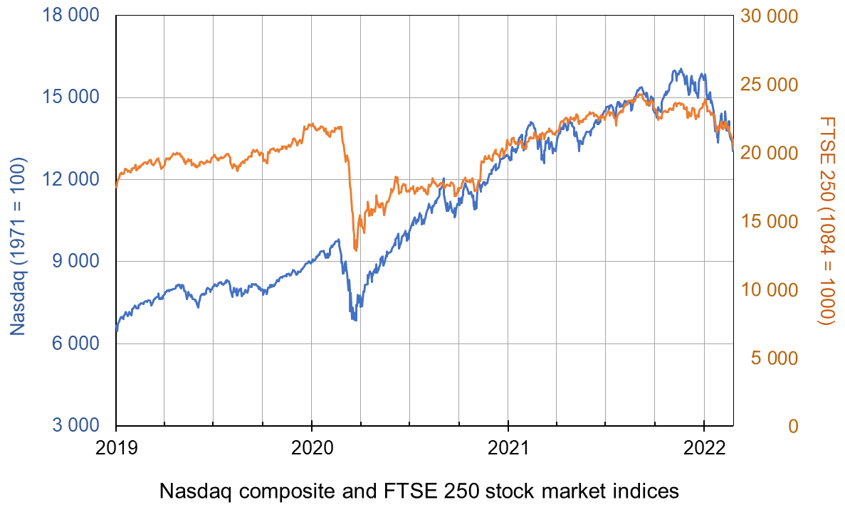
 With the onset of the pandemic in early 2020, stock markets around the world fell dramatically, with many indices falling by 30% or more. In the USA, the Dow Jones fell by 37% and the Nasdaq fell by 30%. In the UK, the FTSE 100 fell by 33% and the FTSE 250 by 41%.
But with a combination of large-scale government support for their economies, quantitative easing by central banks and returning confidence of investors, stock markets then made a sustained recovery and have continued to grow strongly since – until recently, that is.
With inflation well above target levels, central banks have ended quantitative easing (QE) or have indicated that they soon will. Interest rates are set to rise, if only slowly. The Bank of England raised Bank Rate from its historic low of 0.1% to 0.25% on 16 December 2021 and ceased QE, having reached its target of £895 billion of asset purchases. On 4 February 2022, it raised Bank Rate to 0.5%. The Fed has announced that it will gradually raise interest rates and will end QE in March 2022, and later in the year could begin selling some of the assets it has purchased (quantitative tightening). The ECB is not ending QE or raising interest rates for the time being, but is likely to do so later in the year.
At the same time economic growth is slowing, leading to fears of stagflation. Governments are likely to dampen growth further by tightening fiscal policy. In the UK, national insurance is set to rise by 1.25 percentage points in April.
The slowdown in growth may discourage central banks from tightening monetary policy more than very slightly. Indeed, in the light of its slowing economy, the Chinese central bank cut interest rates on 20 January 2022. Nevertheless, it is likely that the global trend will be towards tighter monetary policy.
The fears of slowing growth and tighter monetary and fiscal policy have led many stock market investors to predict an end to the rise in stock market prices – an end to the ‘bull run’. This belief was reinforced by growing tensions between Russia and NATO countries and fears (later proved right) that Russia might invade Ukraine with all the turmoil in the global economy that this would entail. Stock market prices have thus fallen.
 The key question is what will investors believe. If they believe that share prices will continue to fall they are likely to sell. This has happened since early January, especially in the USA and especially with stocks in the high-tech sector – such stocks being heavily represented in the Nasdaq composite, a broad-based index that includes over 2500 of the equities listed on the Nasdaq stock exchange. From 3 January to 18 February the index fell from 15 833 to 13 548, a fall of 14.4%. But will this fall be seen as enough to reflect the current economic and financial climate. If so, it could fluctuate around this sort of level.
However, some may speculate that the fall has further to go – that indices are still too high to reflect the earning potential of companies – that the price–earnings ratio is still too high for most shares. If this is the majority view, share prices will indeed fall.
Others may feel that 14.4% is an overcorrection and that the economic climate is not as bleak as first thought and that the Omicron coronavirus variant, being relatively mild for most people, especially if ‘triple jabbed’, may do less economic damage than first feared. In this scenario, especially if the tensions over Ukraine are diffused, people are likely to buy shares while they are temporarily low.
 But a lot of this is second-guessing what other people will do – known as a Keynesian beauty contest situation. If people believe others will buy, they will too and this will push share prices up. If they think others will sell, they will too and this will push share prices down. They will all desperately wish they had a crystal ball as they speculate how people will interpret what central banks, governments and other investors will do.
Articles
Questions
- What changes in real-world factors would drive investors to (a) buy (b) sell shares at the current time?
- How does quantitative easing affect share prices?
- What is meant by the price-earnings ratio of a share? Is it a good indicator as to the likely movement of that share’s price? Explain.
- What is meant by a Keynesian beauty contest? How is it relevant to the stock market?
- Distinguish between stabilising and destabilising speculation and illustrate each with a demand and supply diagram. Explain the concept of overshooting in this context.
- Which is more volatile, the FTSE 100 or the FTSE 250? Explain.
- Read the final article linked above. Were the article’s predictions about the Fed meeting on 26 January borne out? Comment.
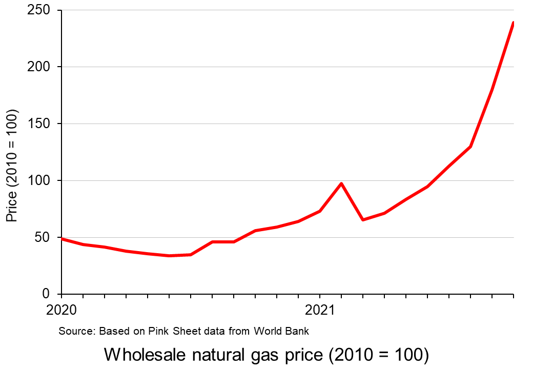
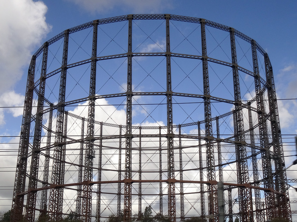 The global battle for fuel is expected to peak this winter. The combination of rising demand and a tightening of supply has sparked concerns of shortages in the market. Some people are worried about another ‘winter of discontent’. Gas prices have risen fivefold in Europe as a whole.
In the UK, consumers are likely to find that the natural gas needed to heat their homes this October will cost at least five times more than it did a year ago. This surge in wholesale gas prices has seen several UK energy suppliers stop trading as they are unable to make a profit. This is because of an energy price cap for some consumers and various fixed price deals they had signed with their customers.
There are thus fears of an energy crisis in the UK, especially if there is a cold winter. There are even warnings that during a cold snap, gas supply to various energy-intensive firms may be cut off. This comes at a time when some of these industries are struggling to make a profit.
Demand and supply
The current situation is a combination of long- and short-term factors. In spring 2020, the demand for gas actually decreased due to the pandemic. This resulted in low gas prices, reduced UK production and delayed maintenance work and investment along global supply chains. However, since early 2021, consumer demand for gas has soared. First, there was an increased demand due to the Artic weather conditions last winter. This was then followed by heatwaves in the USA and Europe over the summer, which saw an increase in the use of air conditioning units. With the increased demand combined with calm weather conditions, wind turbines couldn’t supply enough power to meet demand.
 There has also been a longer-term impact on demand throughout the industry due to the move to cleaner energy. The transitioning to wind and solar has seen a medium-term increase in the demand for gas. There is also a long-term impact of the target for net zero economies in the UK and Europe. This has hindered investors’ willingness to invest in developing supplies of fossil fuels due the fact they could become obsolete over the next few decades.
Nations have also been unable to build up enough supplies for winter. This is partly due to Europe’s domestic gas stocks having declined by 30% per cent in the past decade. This heightened situation is leading to concerns that there will be black-outs or cut-offs in gas this winter.
Importation of gas
 A concern for the UK is that it has scant storage facilities with no long-term storage. The UK currently has very modest amounts of storage – less than 6% of annual demand and some five times less than the average in the rest of Europe. It has been increasingly operating a ‘just-in-time model’, which is more affected by short-term price fluctuations in the wholesale gas market. With wind power generation remaining lower than average during summer 2021, more gas than usual has been used to generate electricity, leaving less gas to go into storage.
However, some argue that the problem is not just the UK’s physical supply of gas but demand for gas from elsewhere. Around half of the UK’s supply comes from its own production sites, while the rest is piped in from Europe or shipped in as liquefied natural gas (LNG) from the USA, Qatar and Russia. In 2019, the UK imported almost 20% of its gas through LNG shipments. However, Asian gas demand has grown rapidly, expanding by 50% over the past decade. This has meant that LNG has now become much harder to secure.
The issue is the price the UK has to pay to continue receiving these supplies. Some in the gas industry believe the price surge is only temporary, caused by economic disruptions, while many others say it highlights a structural weakness in a continent that has become too reliant on imported gas. It can be argued that the gas crisis has highlighted the lack of a coherent strategy to manage the gas industry as the UK transitions to a net zero economy. The lack of any industry investment in new capacity suggests that there is currently no business case for new long-term storage in the UK, especially as gas demand is expected to continue falling over the longer term.
Impact on consumers and industry
 Gas prices for suppliers have increased fivefold over the past year. Therefore, many companies face a considerable rise in their bills. MSome may need to reduce or pause production – or even cease trading – which could cause job losses. Alternatively, they could pass on their increased costs to customers by charging them higher prices. Although energy-intensive industries are particularly exposed, every company that has to pay energy bills will be affected. Due to the growing concerns about the security of winter gas supplies those industries reliant on gas, such as the fertiliser industry, are restricting production, threatening various supply chains.
Most big domestic gas suppliers buy their gas months in advance, meaning they will most likely pass on the higher price rises they have experienced in the past few months. The increased demand and decreased supply has already meant meant that customers have faced higher prices for their energy. The UK has been badly hit because it’s one of Europe’s biggest users of natural gas – 85% of homes use gas central heating – and it also generates a third of the country’s electricity.
The rising bills are particularly an issue for those customers on a variable tariff. About 15 million households have seen their energy bills rise by 12% since the beginning of October due to the rise in the government’s energy price cap calculated by the regulator, Ofgem. A major concern is that this increase in bills comes at a time when the need to use more heating and lighting is approaching. It also coincides with other price rises hitting family budgets and the withdrawal of COVID support schemes.
Government intervention – maximum pricing
If the government feels that the equilibrium price in a particular market is too high, it can intervene in the market and set a maximum price. When the government intervenes in this way, it sets a price ceiling on certain basic goods or services and does not permit the price to go above that set limit. A maximum price is normally set for reasons of fairness and to benefit consumers on low incomes. Examples include energy price caps to order to control fuel bills, rent controls in order to improve affordability of housing, a cap on mobile roaming charges within the EU and price capping for regional monopoly water companies.
The energy price cap
 Even without the prospect of a colder than normal winter, bills are still increasing. October’s increase in the fuel cap means that many annual household fuel bills will rise by £135 or more. The price cap sets the maximum price that suppliers in England, Wales and Scotland can charge domestic customers on a standard, or default tariff. The cap has come under the spotlight owing to the crisis among suppliers, which has seen eleven firms fold, with more expected.
The regulator Ofgem sets a price cap for domestic energy twice a year. The latest level came into place on 1 October. It is a cap on the price of energy that suppliers can charge. The price cap is based on a broad estimate of how much it costs a supplier to provide gas and electricity services to a customer. The calculation is mainly made up of wholesale energy costs, network costs such as maintaining pipes and wires, policy costs including Government social and environmental schemes, operating costs such as billing and metering services and VAT. Therefore, suppliers can only pass on legitimate costs of supplying energy and cannot charge more than the level of the price cap, although they can charge less. A household’s total bill is still determined by how much gas and electricity is used.
- Those on standard tariffs, with typical household levels of energy use, will see an increase of £139.
- People with prepayment meters, with average energy use, will see an annual increase of £153.
- Households on fixed tariffs will be unaffected. However, those coming to the end of a contract are automatically moved to a default tariff set at the new level.
Ordinarily, customers are able to shop around for cheaper deals, but currently, the high wholesale prices of gas means that cheaper deals are not available.
Despite the cap limiting how much providers can raise prices, the current increase is the biggest (and to the highest amount) since the cap was introduced in January 2019. As providers are scarcely making a profit on gas, there are concerns that a further increase in wholesale prices will cause more suppliers to be forced out of business. Ofgem said that the cap is likely to go up again in April, the next time it is reviewed.
Conclusion
 The record prices being paid by suppliers and deficits in gas supply across the world have stoked fears that the energy crisis will get worse. It comes at a time when households are already facing rising bills, while some energy-intensive industries have started to slow production. This has started to dent optimism around the post-pandemic economic recovery.
Historically, UK governments have trusted market mechanisms to deliver UK gas security. However, consumers are having to pay the cost of such an approach. The price cap has meant the UK’s gas bills have until now been typically lower than the EU average. However, the rise in prices comes on top of other economic problems such as labour shortages and increasing food prices, adding up to an unwelcome rise in the cost of living.
Video
Articles
UK government/Ofgem
Questions
- Using a supply and demand diagram, illustrate what has happened in the energy market over the past year.
- What are the advantages and disadvantages of government intervention in a free market?
- Explain why it is necessary for the regulator to intervene in the energy market.
- Using the concept of maximum pricing, illustrate how the price cap works.
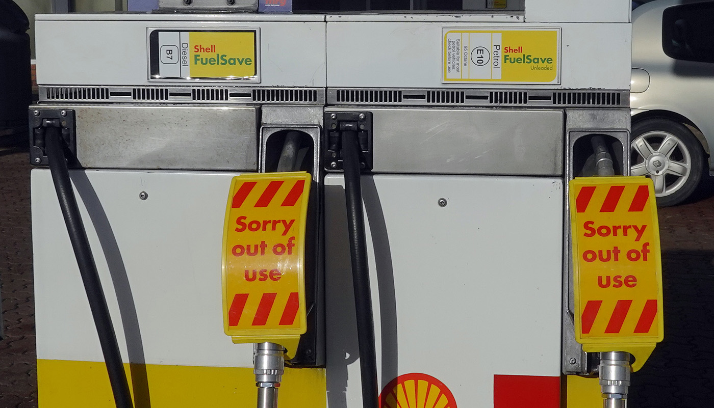 Long queues at petrol pumps, with many filling stations running out of fuel; fears of shortages of food and various other items in supermarkets; orders by shops and warehouses unfilled or delayed. These have been some of the headlines in the UK in recent days.
The immediate problem is a shortage of over 100 000 lorry drivers, with thousands of drivers from EU countries, who were previously living and working in the UK, having returned to their home countries. Their numbers have not been replaced by British drivers, a problem exacerbated by a decline in HGV tests during the pandemic. Thus the supply of lorry drivers has fallen.
At the same time, as the economy recovers from the COVID-19 pandemic, aggregate demand has risen and with it the demand for lorry drivers.
The shortage is pushing up wages somewhat, but not enough to eliminate the shortage. What is more, the supply of lorry drivers is relatively wage inelastic: a higher wage does not attract many more drivers into the market. Also the demand is also relatively wage inelastic: a higher wage does not do much to dampen the demand for drivers.
But why has this happened? Why has the supply of drivers fallen and why is it inelastic? And what will happen in the coming months? The three main causes are Brexit, COVID-19 and working conditions.
Brexit
 With Brexit, many EU workers left the UK, finding life and working conditions more conducive in the EU. Many EU drivers had faced discrimination and felt that they were not welcome in the UK. It has been difficult finding replacement drivers from the EU as the UK’s immigration system, which now applies to the EU as well as other countries, prioritises workers who are classified as high-skilled, and these do not include lorry drivers.
Those EU drivers who do want to stay as UK residents are finding that settled status or visas are not easy to achieve and involve filling in various documents, which can be an onerous and time-consuming process. As the writer of the first linked bog below, who is a Polish worker in the transport industry, states, ‘Would you rather come to Britain and jump through all the hoops, or choose any of the well-paying EU countries, for example, Germany that, if you live in Western Poland, is just a short drive across (virtually non-existent thanks to Schengen) border?’ Another problem is that with EU driving licences: it is harder for potential employers to check on their status and thus they may prefer to employ UK drivers. This, again, puts off EU drivers from seeking to stay in the UK.
Even in the case of EU drivers living in the EU but delivering to the UK there are problems. First there are the dangers for drivers of boarding ferries in France, where people from migrant camps seek to board lorries to get passage to the UK, often threatening drivers. If illegal migrants do succeed in boarding a trailer unseen by the driver, the driver can then be arrested in the UK. According to the Polish blogger, it’s ‘no surprise that I hear more and more drivers who, when taking on new jobs, demand guarantees from their employers that they won’t be sent to the UK’.
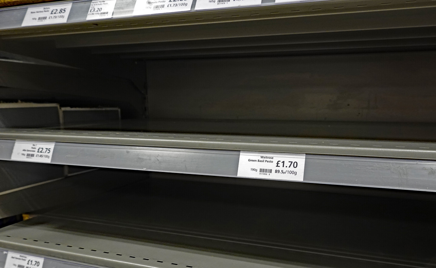 Then there is a decline in the system known as ‘cabotage’. This is where an EU driver delivers from the EU to destination A in the UK and takes back a load to the EU from destination B in the UK. To avoid having to travel empty between the two UK destinations, the driver could pick up a load to take from A to B. With a fall in imports and exports from and to the EU following Brexit, there are fewer EU lorries on UK roads. This means that there is now less capacity for transporting loads within the UK.
There has also been a large rise in ‘red tape’ associated with post-Brexit customs checks and border controls. This means that lorries can be held up at ports. This makes it much less attractive for EU haulage companies to export to the UK rather than to other EU countries, where paperwork is minimal. In addition, m many drivers are paid by the length of the journey rather than by the time spent, so delays result in them earning less per hour. Full checks have not been introduced yet. When they are, in January and July next year, the problem will be worse.
Tax changes make it more difficult for drivers to avoid taxes by claiming that they are self employed when they are in reality employees. This too is discouraging drivers from the EU from moving to or staying in the UK since many would now (since April 2021) be paying more tax.
COVID-19
Another contributing factor to the shortage of drivers has been COVID-19 and the government’s response to it. COVID rates are considerably higher in the UK than in most EU countries and, not surprisingly, many EU drivers are afraid to come to the UK.
 The pandemic led to fewer HGV driver tests, with 25 000 fewer candidates passing their test in 2020 than in 2019. It takes time to train new drivers and then to test them. However, even if there had been no reduction in HGV drivers passing their tests, there would still be a significant shortage of qualified drivers.
A further problem with the effects of COVID-19 on the economy has been the initial recession and then the bounce back. The sheer size of the bounce back has exacerbated the problem of driver shortages, which otherwise would have been slower to develop, giving the market more time to respond. Real GDP grew by 5.5% from 2021 Q1 to 2021 Q2, giving an annual growth rate of 23.6%. Nevertheless, GDP was still some 3.3% below its 2019 Q3 level.
Pay and working conditions
Working conditions are very poor for many drivers. The following are common complaints:
 Driving jobs are often very tightly controlled, with computer monitoring and little freedom for the driver. Some cabs have cameras aimed at the drivers so that they can be constantly monitored.
- Drivers are subject to very stringent health and safety regulations, such as not being allowed to drive longer than a certain time, even when they are queuing in congested traffic. Whilst many of these regulations are desirable to protect both the public’s and the driver’s safety, they can discourage drivers from entering or staying in the industry. And some regulations are hard to justify on safety grounds (see second linked article below, point 13).
- Just-in-time deliveries at supermarkets, regional distribution centres (warehouses) or factories make timing very important and add considerable stress to drivers who may face abuse if they are late, even though it was not their fault, with their employer perhaps facing a fine. And yet on other occasions they might have to wait a long time to offload if drivers before them have been delayed, and often the conditions in waiting areas are poor with few if any facilities.
- Drivers often feel a lack of respect from employers, trainers and the general public.
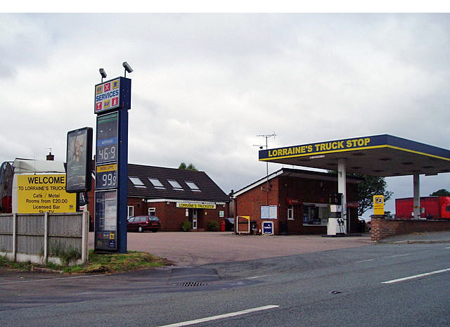 Rest and refreshment facilities are often very poor in the UK and generally much worse than in the EU. In the EU, motorway service areas have better parking, toilets, showers and shops. Restaurants are better and cheaper. Dedicated truck stops have supermarkets, laundrettes, showers or even open-air gyms dedicated to making drivers’ lives easier and more pleasant. The UK by contrast often has very poor facilities. Unlike in most EU motorway services, drivers have to pay to park and are faced with poor toilet and eating facilities. ‘Meanwhile, a typical British truck stop is some dusty yard full of potholes on the side of some industrial estate with a portaloo and a “greasy spoon” burger van parked next to it.’
- Hours are long. Even though driving hours are restricted to 10 hours per day (recently extended to 11 hours), the average working day may be much longer as drivers have to wait at distribution centres, fill in increasing amounts of paperwork and help load or unload their vehicle. Also drivers may have to work variable shifts, which leads to disturbed sleeping patterns.
 The work is often physically demanding, especially when a large part of the job involves loading and unloading and moving items from the lorry to where the customer wants them.
- Many vehicles are hard and unpleasant to drive, with leased vehicles often low-spec, dirty, uncomfortable and poorly maintained.
- Many of the jobs are agency jobs that do not offer stable employment.
Although pay is higher than in some parts of the labour market where there are shortages, such as social care and hospitality, pay per hour is still relatively poor when compared with many industries which have better conditions of employment.
The future
 The government is allowing more foreign workers into the UK from this month (October); more training places will be offered for potential drivers and the number of driving tests will increase; the government is also encouraging retired drivers or those who have left driving for other jobs to return to the industry.
However, there are shortages of drivers in other EU countries and so it will be difficult to attract additional drivers to the UK from the EU. What is more, with wages and working conditions remaining poor and the labour market remaining tight in other sectors, it might be hard to fill new training places and encourage workers to return to driving. Also, with the average age of drivers being 55, it is likely that the outflow of workers from driving jobs could be large in the coming years.
Articles
- Twenty reasons why there is an HGV driver shortage – part one: 1-10
West Country Bylines, Tomasz Oryński (21/9/21)
- Twenty reasons why there is an HGV driver shortage – part 2: reasons 11-20
West Country Bylines, Tomasz Oryński (23/9/21)
- Gas Shortages Awaken Britain to Some Crucial Workers: Truck Drivers
New York Times, Eshe Nelson and Megan Specia (29/9/21)
- Time running out to save UK industry from worker shortages, say business leaders
CNN, Walé Azeez (1/10/21)
- Boris Johnson’s Brexit choices are making Britain’s fuel and food shortages worse
CNN, Hanna Ziady (29/9/21)
- How serious is the shortage of lorry drivers?
BBC News, Reality Check Team (28/9/21)
- Petrol shortage: Is the fuel crisis improving?
BBC News (1/10/21)
- UK visa plan will not fix lorry driver shortage, says boss
BBC News (28/9/21)
- The empty shelves crisis isn’t just down to Covid and Brexit – it’s been decades in the making
The Guardian, Felicity Lawrence (17/9/21)
- Emergency visa scheme extended in major U-turn by Boris Johnson
The Guardian, Rajeev Syal (1/10/21)
- Truck driver shortage won’t be solved by quick fix visas – here are three ways forward
The Conversation, Temidayo Akenroye (27/9/21)
- UK lorry driver shortage a stark example of a wider European problem
Euronews, Luke Hurst and Shona Murray (29/9/21)
- Emergency visas won’t tempt European lorry drivers to UK, say haulage chiefs
The Observer, Jon Henley, Michael Savage and James Tapper (25/9/21)
- Labour shortage threatens to cancel out any Brexit dividend
British Meat Processors Association, Industry News, Peter Hardwick (28/9/21)
- How to control a consumer panic
BBC News. Faisal Islam (28/9/21)
Questions
- Why are the supply of and demand for lorry drivers relatively wage inelastic?
- Use a marginal productivity diagram to explain the current situation in the market for lorry drivers.
- What policy measures could be adopted to increase the supply of lorry drivers? How successful would these be?
- Is it ‘rational’ for consumers to ‘panic buy’ fuel and other products in short supply?
- Find out why there is a shortage of lorry drivers in the EU. Are any of the explanations similar to those in the UK?
- What are the macroeconomic implications of a shortage of lorry drivers and other key workers?

The transition towards clean energy in combination with a shortfall in supply has seen the price of raw uranium, also known as ‘yellowcake’, rise almost 60 per cent in recent weeks. It is now trading at over $50 a pound – a nine-year high. The market has been described as being at a ‘tipping point’. Given the recent boom in the market, the current conditions could tip the balance towards an era of rising uranium prices.
What is uranium?
Uranium is a heavy metal which has been used as a source of concentrated energy for over 60 years. Uranium ore can be mined from underground, milled, and then sold. It is then used in a nuclear reactor for electricity generation. About 10% of the world’s electricity is generated from uranium in nuclear reactors. There are some 445 nuclear reactors operating in 32 countries. It is the most energy-dense and efficient fuel source we have, with just ten uranium pellets able to power the average household for an entire year.
In March 2011, Japan’s most powerful earthquake on record triggered a tsunami, which then caused a meltdown at a nuclear power plant in Fukushima. It forced residents from their homes as radiation leaked from the plant. Since the Fukushima accident, uranium prices had been on a downtrend trend – enough to force several miners to suspend or scale back operations.
However, there has been a 42 per cent increase in the price of the metal in the first nine months of 2021 alone.
Demand for uranium
Since launching in July, a new investment trust, run by Canadian asset manager Sprott, has snapped up about 6m pounds of physical uranium, worth about $240m. This aggressive buying has helped push prices of uranium to more than $40 per pound, up from $30 at the start of the year. In the first part of September alone, prices surged by around 40%, outperforming all other major commodities. In just a few weeks, millions of pounds of supply were scooped up by the Sprott Physical Uranium Trust. This puts pressure on utilities that need to secure supplies of the commodity for electricity generation.
This increased demand is occurring at precisely the same time as countries and companies around the world are committing to net-zero carbon targets. As a result, nuclear power companies are now facing competition for supplies of uranium from financial investors, who are betting on sharply higher prices and demand for the radioactive material used to fuel reactors. This boost in demand is said to be due to uranium being used as a low-carbon energy source, despite the radioactive waste problem that comes with it. Investors are betting that nuclear power will be a key part of the move away from fossil fuels.
Production from world uranium mines has in recent years supplied 90% of the requirements of power utilities for uranium, with the current global mine supply expected to be about 125m pounds for 2021. In addition, there are secondary sources such as commercial and military stockpiles. However, according to the World Nuclear Association, demand for uranium is expected to climb from about 162m pounds this year to 206m pounds in 2030, and to 292m pounds by 2040. This is largely driven by increased power generation in China. China is planning a big increase in its nuclear power capacity over the next decade as the country seeks to cut its emissions.
Supply of uranium
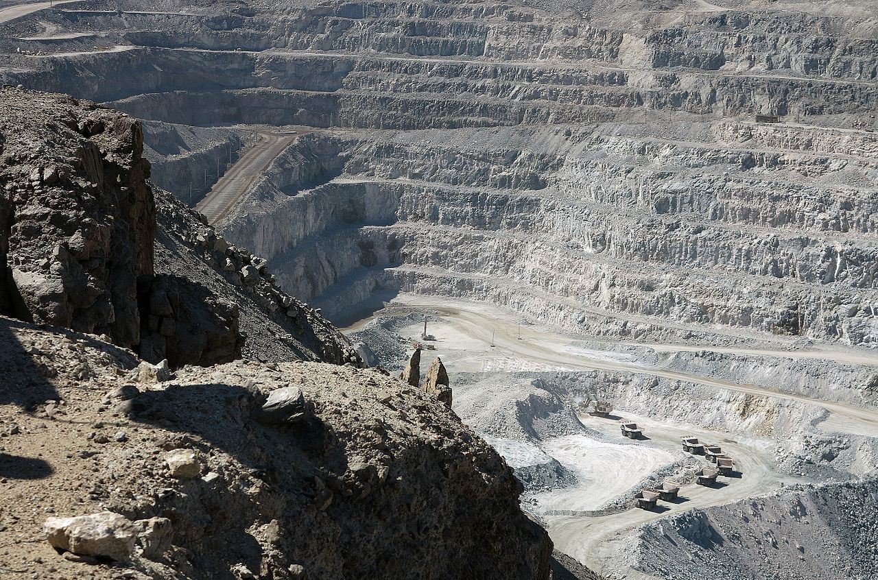 Although uranium is relatively abundant in the Earth’s crust, not all uranium deposits are economically recoverable. While some countries have uranium resources that can be mined profitably when prices are low, others do not. Kazakhstan is the largest producer of uranium and in 2019 produced more uranium than the second, third, and fourth-largest producers combined.
The big issue is that supply to the market is falling significantly. For deliveries that would start in 2022, Kazakh producer, Kazatomprom, is now discussing the possibility of supplying the metal directly to Sprott. However, it also warned of the risk that its mines would not reach their output target for 2021, and it said earlier this year that it would keep its production at reduced levels through 2023. In addition to this, the recent surge in buying is also reducing the inventories that accumulated after the Fukushima accident.
The supply of uranium is set to fall 15 per cent by 2025 and by 50 per cent by 2030. This is mainly due to a lack of investment in new mines. The lack of new uranium mines will mean the price has to move higher. Namibian mines, accounting for 8 per cent of world supply, are approaching the end of their lives. Cameco of Canada, another important source, has shut one large pit because of uneconomic prices. According to BMO Capital, a mine supply deficit since 2019 will continue.
Supply has also been affected by the pandemic. The boom in demand has coincided with historically low prices and pandemic-driven mine disruptions, prompting uranium producers to buy from the spot market to fulfil long-term contracts with consumers. Some of the largest mining operations in Canada and Kazakhstan had to suspend production temporarily due to a shortage of workers.
Adding to the security of supply concerns is the role of commercial and state-owned entities in the uranium market. Uranium is a highly trade-dependent commodity with international trade policies highlighting the disconnect between where uranium is produced and where it is consumed. About 80% of primary production comes from countries that consume little-to-no uranium, and nearly 90% of uranium consumption occurs in countries that have little-to-no primary production. As a result, government-driven trade policies can be particularly disruptive for the uranium market. It is argued that the risk to uranium supply may create a renewed focus on ensuring availability of long-term supply to fuel nuclear reactors.
The role of financial players
Financial players have been accelerating the recent recovery in the price of uranium, with large-scale speculative buying and withholding of supply. But it can be argued that this would not have occurred if there were not a fundamental and substantial shortage.
 If investors keep buying uranium, analysts expect utility companies will come under pressure to replace long-term supply agreements before they expire. At the moment, long-term contracts cover 98 per cent of the uranium needed by US utility companies. But that figure drops to 84 per cent next year, and 55 per cent by 2025, according to uranium investment company, Yellow Cake.
As annual supply declines, demand for uranium from producers and financial players increases, and with trade policy potentially restricting access to some markets, it is believed the pounds available in the spot market will not be adequate to satisfy the growing backlog of long-term demand. As a result, companies expect there will be increased competition to secure uranium under long-term contracts on terms that will ensure the availability of reliable primary supply to meet growing demand.
What will the future look like?
Many countries are turning their attention to nuclear power in order to become net-zero economies. Even in Japan, nuclear generation has slowly been returning. It is argued that nuclear power is needed to some degree for the country to achieve its pollution-curbing goals. However, not all nations are re-embracing nuclear. Germany, for example, is set to shut its last reactor next year.
The concern is whether the recent gains in investor demand is enough to underpin the market. It can be argued that even before the recent price rally started, demand for uranium from the investment sector was already growing. However, observers of the market have suggested that just as quickly as uranium skyrocketed, prices may now be hitting the brakes. Producer stocks that got swept up in the frenzy seem to have peaked. In addition, the world’s top uranium miner Kazatomprom has warned that the recent price action was being fuelled by financial investors rather than the utilities that use the radioactive metal as fuel in their reactors. On the other hand, it is argued that this pickup in the spot market will be the catalyst to push more utilities to get involved in term contracting.
Despite the impact of the pandemic on global energy demand, it is now growing again. Gas and other energy shortages are being seen and the price of gas has been rising rapidly. This rise in energy prices plus a focus on carbon-free generation is likely to continue driving demand for nuclear power and hence for uranium. In addition, producers have warned of supply shortages in the long term as investors scoop up physical inventory and new mines are not starting quickly enough. Thus nuclear’s growing role in the clean energy transition, in addition to a supply shortfall, could turn the tide for the uranium industry.
Articles
Data
Questions
- Using the uranium market as an example, describe the relationship between an increase in demand and the market price.
- Explain whether the supply of uranium would be price elastic or inelastic in (a) the short run; (b) the long run.
- What is the role of speculation in determining the recent movements in the price of uranium and likely future price movements?
- Given your answers to the above questions, draw supply and demand diagrams to illustrate (a) the recent increase in the market price of uranium; (b) the likely price of uranium in five years from now.
 House prices are soaring throughout the world, making them unaffordable for many first-time buyers. In the UK, for example, according to the Nationwide, the annual house price increase was 13.4% in 2021 Q2. In the USA, house prices are rising by over 23% per annum.
The reason for this rampant house price inflation is that demand is rising much faster than supply. What is more, with inelastic supply in the short term, a given percentage rise in demand leads to a larger percentage increase in prices.
Reasons for rapidly rising house prices
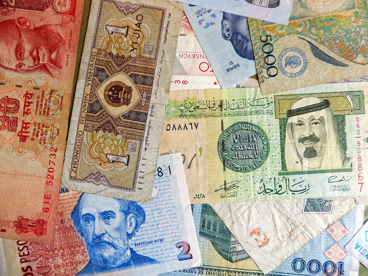 But why has demand risen so rapidly? One major reason is that central banks have engaged in massive quantitative easing. This has driven down interest rates to historic lows and has led to huge asset purchases. Mortgage lenders, awash with money, have been able to increase the ratio of lending to income. Borrowing by house purchasers, encouraged by low interest rates and easy access to mortgages, has thus increased rapidly.
Another reason for the increased demand is that economies are beginning to recover from the COVID-induced recessions. This makes people more confident about their future financial positions and more willing to take on increased mortgage debt. Another reason is that, with increased working from home, people are looking for larger houses where rooms can be used as studies. Another is that, with less spending during the lockdowns, people have built up savings, which can be used to buy larger homes.
Some countries have deliberately boosted demand by fiscal measures. In the UK, the government introduced a stamp duty ‘holiday’. Previously a 3% ‘stamp duty’ tax was applied to purchases over £125 000. Under the holiday scheme, the rate would only apply to purchases over £500 000 until 30 June 2021 and then to purchases over £250 000 until 30 September 2021. This massively boosted demand, especially as the deadlines approached. In the USA, there are various schemes at federal and state level to support first-time buyers, including low-interest loans and vouchers. Supporting demand is counterproductive if it merely leads to higher prices and thus does not make it easier for people to buy.
Speculation has played a major part too, with many potential purchasers keen to buy before prices rise further. On the supply side, some vendors have held back hoping to get a higher price by waiting. Gazumping has returned. This is where vendors accept a new higher offer even though they have already accepted a previous lower one.
Effects of higher house prices
Higher house prices have had a knock-on effect on rents, which have also soared. This has encouraged house purchases for rent both by individuals and by property investment companies. The effect of rapidly rising house prices and rents has been to increase the divide in society between property owners and those unable to afford to buy and forced to rent.
Increased housing wealth is likely to lead to greater housing equity withdrawal. This is where people draw on some of their equity in order to finance increased consumer spending, thereby boosting aggregate demand and possibly inflation.
Will the house price boom end soon?
 One scenario is that there will be a gradual slowdown in house price increases as quantitative easing is tapered off and as support measures, such as the UK’s stamp duty holiday, are unwound.
There is a real possibility, however, that there will be a more severe correction, with house prices actually falling. This could be triggered by central banks raising interest rates in response to higher inflation caused by the recovery and by higher commodity prices. In the UK, labour shortages brought about by Brexit could make the inflationary problem worse. With high levels of mortgage debt, even a half percentage point rise in mortgage interest rates could have a severe effect on demand. Falling house prices will then be compounded by speculation, with buyers holding off and sellers rushing to sell.
Articles
- “UK Boom the Biggest in 50 years” thanks to House Prices, but Oxford Economics Warn of Risks
PoundSterling Live, Gary Howes (18/6/21)
- US house prices see biggest rise in 30 YEARS and are outstripping Britain’s pandemic-fuelled boom: Is a global housing market bubble emerging?
This is Money, Helen Crane (1/7/21)
- House prices: urban exodus of upsizers shifts property demand
Business Telegraph (18/4/21)
- House prices rise at fastest pace in 17 years
BBC News (30/6/21)
- Runaway house prices: the ‘winners and losers’ from the pandemic
Financial Times, Delphine Strauss and Colby Smith (25/6/21)
- World’s Bubbliest Housing Markets Flash 2008 Style Warnings
Bloomberg, Enda Curran (15/6/21)
- House prices climb to record levels in US and Europe
Financial Times, Martin Arnold, Colby Smith and Matthew Rocco (22/6/21)
- With house prices through the roof, young buyers’ hopes go out the window
The Observer, Phillip Inman (3/7/21)
- Is the UK housing bubble about to burst? These are the best and worst scenarios
The Guardian, Josh Ryan-Collins (2/7/21)
- House prices: the risks of a fall are higher than most people think
The Conversation, Geoff Meen (28/6/21)
Data
Questions
- Use a supply and demand diagram to illustrate what has been happening to house prices. Illustrate the importance of the price elasticity of supply in the process.
- Under what circumstances might tax relief help or not help first-time buyers?
- Use a supply and demand diagram to illustrate the effect of speculation on house prices? Under what circumstances might speculation (a) make the market less stable; (b) help to stabilise the market?
- Explain what is meant by housing equity withdrawal. Using the Bank of England website, find out what has happened to housing equity withdrawal in the UK over the past 15 years. Explain.
- Under what circumstances would a sudden house price correction be more likely?
- Write a critique of housing policy in the light of growing inter-generational inequality of wealth.
 With the onset of the pandemic in early 2020, stock markets around the world fell dramatically, with many indices falling by 30% or more. In the USA, the Dow Jones fell by 37% and the Nasdaq fell by 30%. In the UK, the FTSE 100 fell by 33% and the FTSE 250 by 41%.
 The key question is what will investors believe. If they believe that share prices will continue to fall they are likely to sell. This has happened since early January, especially in the USA and especially with stocks in the high-tech sector – such stocks being heavily represented in the Nasdaq composite, a broad-based index that includes over 2500 of the equities listed on the Nasdaq stock exchange. From 3 January to 18 February the index fell from 15 833 to 13 548, a fall of 14.4%. But will this fall be seen as enough to reflect the current economic and financial climate. If so, it could fluctuate around this sort of level.
 But a lot of this is second-guessing what other people will do – known as a Keynesian beauty contest situation. If people believe others will buy, they will too and this will push share prices up. If they think others will sell, they will too and this will push share prices down. They will all desperately wish they had a crystal ball as they speculate how people will interpret what central banks, governments and other investors will do.
 Jeremy Grantham Doubles Down on Crash Call, Says Selloff Has Started
 The global battle for fuel is expected to peak this winter. The combination of rising demand and a tightening of supply has sparked concerns of shortages in the market. Some people are worried about another ‘winter of discontent’. Gas prices have risen fivefold in Europe as a whole.
  There has also been a longer-term impact on demand throughout the industry due to the move to cleaner energy. The transitioning to wind and solar has seen a medium-term increase in the demand for gas. There is also a long-term impact of the target for net zero economies in the UK and Europe. This has hindered investors’ willingness to invest in developing supplies of fossil fuels due the fact they could become obsolete over the next few decades.
  A concern for the UK is that it has scant storage facilities with no long-term storage. The UK currently has very modest amounts of storage – less than 6% of annual demand and some five times less than the average in the rest of Europe. It has been increasingly operating a ‘
 Gas prices for suppliers have increased fivefold over the past year. Therefore, many companies face a considerable rise in their bills. MSome may need to reduce or pause production – or even cease trading – which could cause job losses. Alternatively, they could pass on their increased costs to customers by charging them higher prices. Although energy-intensive industries are particularly exposed, every company that has to pay energy bills will be affected. Due to the growing concerns about the security of winter gas supplies those industries reliant on gas, such as the fertiliser industry, are restricting production, threatening various supply chains.
  Even without the prospect of a colder than normal winter, bills are still increasing. October’s increase in the fuel cap means that many annual household fuel bills will rise by £135 or more. The price cap sets the maximum price that suppliers in England, Wales and Scotland can charge domestic customers on a standard, or default tariff. The cap has come under the spotlight owing to the crisis among suppliers, which has seen eleven firms fold, with more expected.
 The record prices being paid by suppliers and deficits in gas supply across the world have stoked fears that the energy crisis will get worse. It comes at a time when households are already facing rising bills, while some energy-intensive industries have started to slow production. This has started to dent optimism around the post-pandemic economic recovery.
  Long queues at petrol pumps, with many filling stations running out of fuel; fears of shortages of food and various other items in supermarkets; orders by shops and warehouses unfilled or delayed. These have been some of the headlines in the UK in recent days.
  With Brexit, many EU workers left the UK, finding life and working conditions more conducive in the EU. Many EU drivers had faced discrimination and felt that they were not welcome in the UK. It has been difficult finding replacement drivers from the EU as the UK’s immigration system, which now applies to the EU as well as other countries, prioritises workers who are classified as high-skilled, and these do not include lorry drivers.
 Then there is a decline in the system known as ‘cabotage’. This is where an EU driver delivers from the EU to destination A in the UK and takes back a load to the EU from destination B in the UK. To avoid having to travel empty between the two UK destinations, the driver could pick up a load to take from A to B. With a fall in imports and exports from and to the EU following Brexit, there are fewer EU lorries on UK roads. This means that there is now less capacity for transporting loads within the UK.
 The pandemic led to fewer HGV driver tests, with 25 000 fewer candidates passing their test in 2020 than in 2019. It takes time to train new drivers and then to test them. However, even if there had been no reduction in HGV drivers passing their tests, there would still be a significant shortage of qualified drivers.
 Driving jobs are often very tightly controlled, with computer monitoring and little freedom for the driver. Some cabs have cameras aimed at the drivers so that they can be constantly monitored.
 Rest and refreshment facilities are often very poor in the UK and generally much worse than in the EU. In the EU, motorway service areas have better parking, toilets, showers and shops. Restaurants are better and cheaper. Dedicated truck stops have supermarkets, laundrettes, showers or even open-air gyms dedicated to making drivers’ lives easier and more pleasant. The UK by contrast often has very poor facilities. Unlike in most EU motorway services, drivers have to pay to park and are faced with poor toilet and eating facilities. ‘Meanwhile, a typical British truck stop is some dusty yard full of potholes on the side of some industrial estate with a portaloo and a “greasy spoon” burger van parked next to it.’
 The work is often physically demanding, especially when a large part of the job involves loading and unloading and moving items from the lorry to where the customer wants them.
 The government is allowing more foreign workers into the UK from this month (October); more training places will be offered for potential drivers and the number of driving tests will increase; the government is also encouraging retired drivers or those who have left driving for other jobs to return to the industry.
 Although uranium is relatively abundant in the Earth’s crust, not all uranium deposits are economically recoverable. While some countries have uranium resources that can be mined profitably when prices are low, others do not. Kazakhstan is the largest producer of uranium and in 2019 produced more uranium than the second, third, and fourth-largest producers combined.
 If investors keep buying uranium, analysts expect utility companies will come under pressure to replace long-term supply agreements before they expire. At the moment, long-term contracts cover 98 per cent of the uranium needed by US utility companies. But that figure drops to 84 per cent next year, and 55 per cent by 2025, according to uranium investment company, Yellow Cake.
  House prices are soaring throughout the world, making them unaffordable for many first-time buyers. In the UK, for example,
  But why has demand risen so rapidly? One major reason is that central banks have engaged in massive quantitative easing. This has driven down interest rates to historic lows and has led to huge asset purchases. Mortgage lenders, awash with money, have been able to increase the ratio of lending to income. Borrowing by house purchasers, encouraged by low interest rates and easy access to mortgages, has thus increased rapidly.
  One scenario is that there will be a gradual slowdown in house price increases as quantitative easing is tapered off and as support measures, such as the UK’s stamp duty holiday, are unwound.