 The OECD has recently published its six-monthly Economic Outlook. This assesses the global economic situation and the prospects for the 38 members of the OECD.
It forecasts that the UK economy will bounce back strongly from the deep recession of 2020, when the economy contracted by 9.8 per cent. This contraction was deeper than in most countries, with the USA contracting by 3.5 per cent, Germany by 5.1 per cent, France by 8.2 per cent, Japan by 4.7 per cent and the OECD as a whole by 4.8 per cent. But, with the success of the vaccine roll-out, UK growth in 2021 is forecast by the OECD to be 7.2 per cent, which is higher than in most other countries. The USA is forecast to grow by 6.8 per cent, Germany by 3.3 per cent, France by 5.8 per cent, Japan by 2.6 per cent and the OECD as a whole by 5.3 per cent. Table 1 in the Statistical Annex gives the figures.
This good news for the UK, however, is tempered by some worrying features.
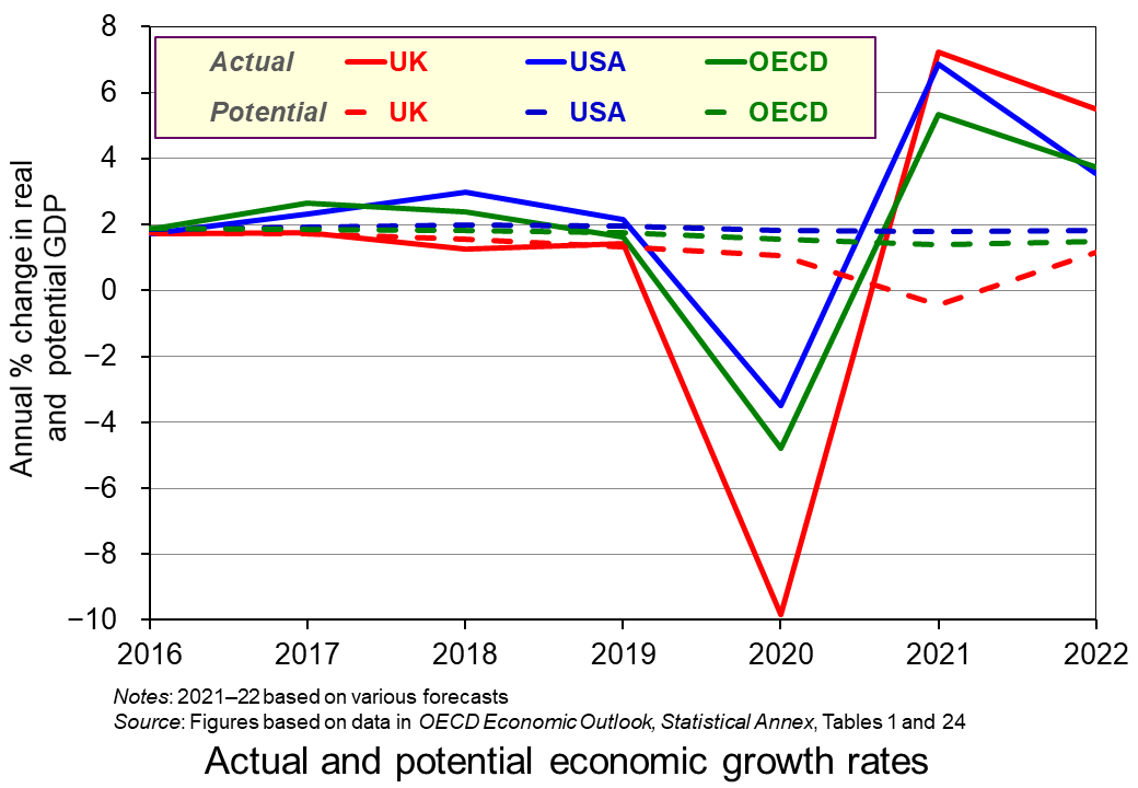 The OECD forecasts that potential economic growth will be negative in 2021, with capacity declining by 0.4 per cent. Only two other OECD countries, Italy and Greece, are forecast to have negative potential economic growth (see Table 24 in the Statistical Annex). A rapid increase in aggregate demand, accompanied by a decline in aggregate supply, could result in inflationary pressures, even if initially there is considerable slack in some parts of the economy.
Part of the reason for the supply constraints are the additional barriers to trade with the EU resulting from Brexit. The extra paperwork for exporters has added to export costs, and rules-of-origin regulations add tariffs to many exports to the EU (see the blog A free-trade deal? Not really). Another supply constraint linked to Brexit is the shortage of labour in certain sectors, such as hospitality, construction and transport. With many EU citizens having left the UK and not being replaced by equivalent numbers of new immigrants, the problem is likely to persist.
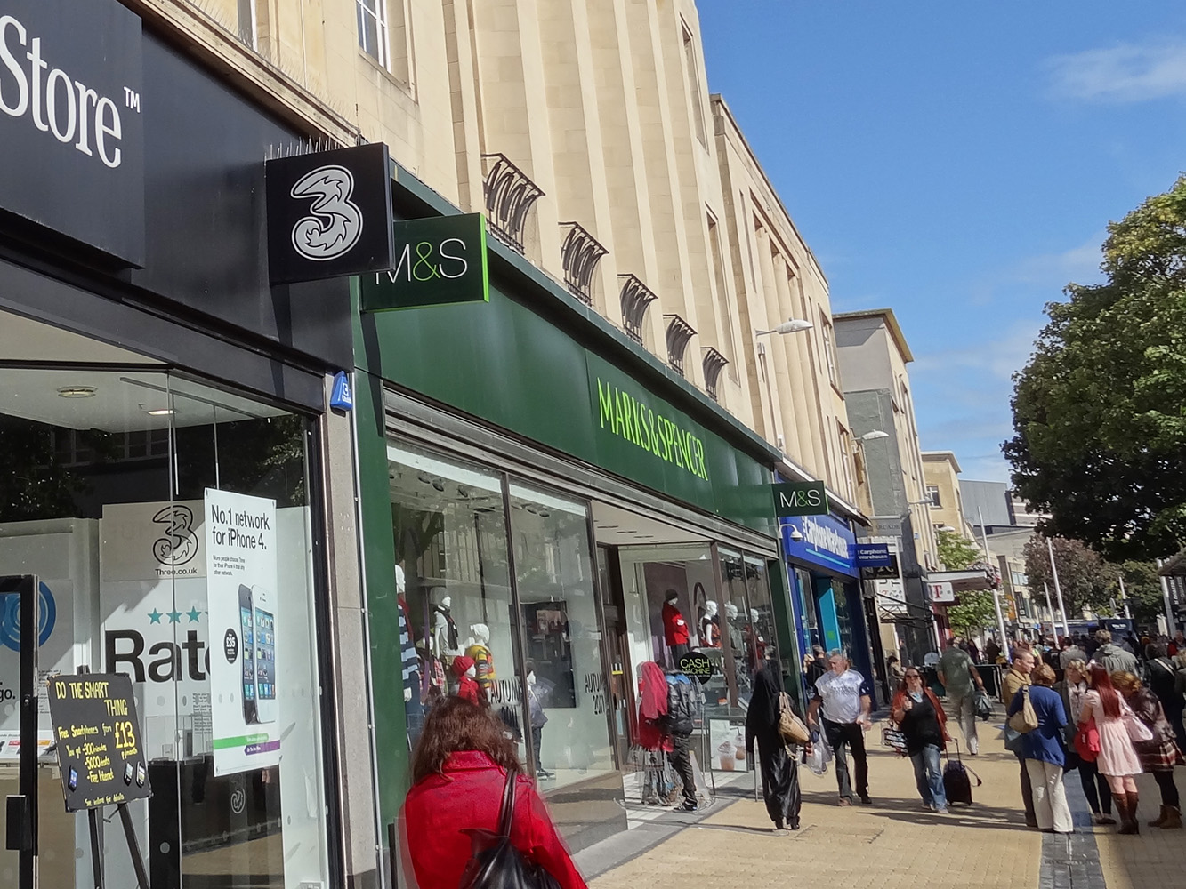 The scarring effects of the pandemic present another problem. There has been a decline in investment. Even if this is only temporary, it will have a long-term impact on capacity, unless there is a compensating rise in investment in the future. Many businesses have closed and will not re-open, including many High Street stores. Moves to working from home, even if partially reversed as the economy unlocks, will have effects on the public transport industry. Also, people may have found new patterns of consumption, such as making more things for themselves rather than buying them, which could affect many industries. It is too early to predict the extent of these scarring effects and how permanent they will be, but they could have a dampening effect on certain sectors.
Inflation
So will inflation take off, or will it remain subdued? At first sight it would seem that inflation is set to rise significantly. Annual CPI inflation rose from 0.7 per cent in March 2021 to 1.5 per cent in April, with the CPI rising by 0.6 per cent in April alone. What is more, the housing market has seen a large rise in demand, with annual house price inflation reaching 10.2 per cent in March.
But these rises have been driven by some one-off events. As the economy began unlocking, so spending rose dramatically. While this may continue for a few months, it may not persist, as an initial rise in household spending may reflect pent-up demand and as the furlough scheme comes to an end in September.
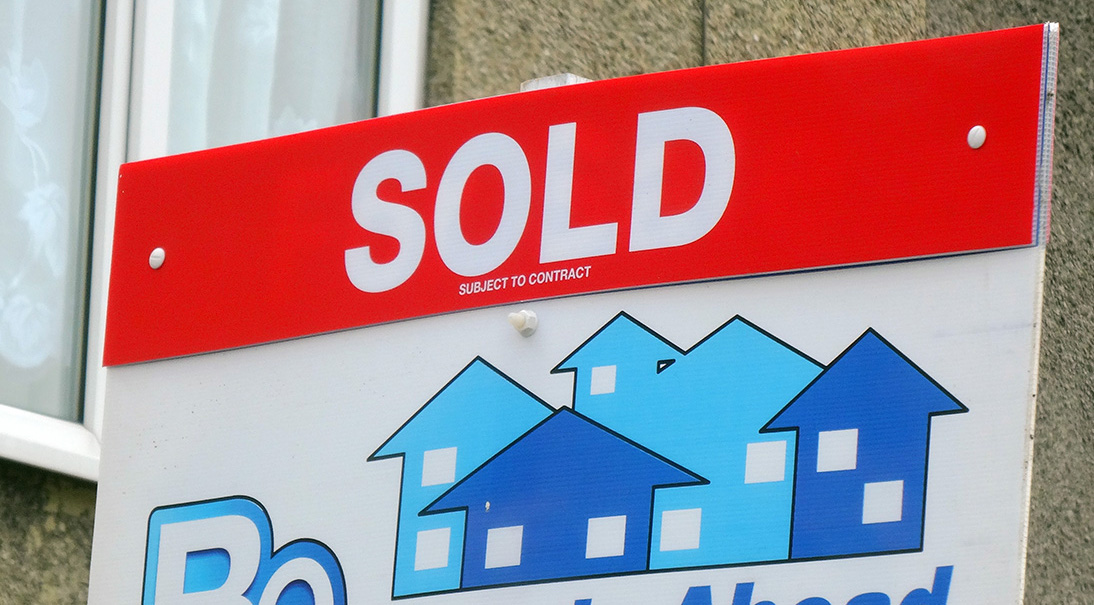 As far as as the housing market is concerned, the rise in demand has been fuelled by the stamp duty ‘holiday’ which exempts residential property purchase from Stamp Duty Land Tax for properties under £500 000 in England and Northern Ireland and £250 000 in Scotland and Wales (rather than the original £125 000 in England and Northern Ireland, £145 000 in Scotland and £180 000 in Wales). In England and Northern Ireland, this limit is due to reduce to £250 000 on 30 June and back to £125 000 on 30 September. In Scotland the holiday ended on 31 March and in Wales is due to end on 30 June. As these deadlines are passed, this should see a significant cooling of demand.
Finally, although the gap between potential and actual output is narrowing, there is still a gap. According to the OECD (Table 12) the output gap in 2021 is forecast to be −4.6 per cent. Although it was −11.4 per cent in 2020, a gap of −4.6 per cent still represents a significant degree of slack in the economy.
At the current point in time, therefore, the Bank of England does not expect to have to raise interest rates in the immediate future. But it stands ready to do so if inflation does show signs of taking off.
Articles
- United Kingdom Economic Snapshot
OECD Economic Outlook (May 2021)
- UK growth forecast upgraded but pandemic economic ‘scar’ will be worst of all G7 nations, says OECD
Sky News, Ed Conway (31/5/21)
- OECD Predicts UK Economic Growth Amid Vaccine Success And Lockdown Easing
Minutehack Emma Bowden (1/6/21)
- UK growth upgraded, but OECD warns of deepest economic scar in G7
The Guardian, Graeme Wearden (31/5/21)
- UK set for stronger post-Covid recovery, says OECD
BBC News (31/5/21)
- British exports worth billions have faced EU tariffs since Brexit
BBC News, Faisal Islam (28/5/21)
 Post-Brexit: Businesses hit by labour shortages call for Brexit rules to be relaxed
Channel 4 News, Paul McNamara (2/6/21)
- Bank of England monitors UK housing boom as it weighs inflation risk
The Guardian, Larry Elliott (1/6/21)
- House prices jump 10.9% as ‘race for space’ intensifies
BBC News (1/6/21)
- Global food prices post biggest jump in decade
Financial Times, Emiko Terazono and Judith Evans (3/6/21)
- Why house prices are rising so fast in a pandemic
BBC News, Kevin Peachey and Daniele Palumbo (2/6/21)
- Inflation: why it could surge after the pandemic
The Conversation, Ian Crowther (23/4/21)
- Inflation might well keep rising in 2021 – but what happens after that?
The Conversation, Brigitte Granville (31/5/21)
- Slack in the Economy, Not Inflation, Should Be Bigger Worry
Institute for New Economic Thinking, Claudia Fontanari, Antonella Palumbo, and Chiara Salvatori (19/5/21)
Data, Forecasts and Analysis
Questions
- What determines the rate of (a) actual economic growth; (b) potential economic growth?
- What is meant by an output gap? What would be the implications of a positive output gap?
- Why are scarring effects of the pandemic likely to be greater in the UK than in most other countries?
- If people believed that inflation was likely to continue rising, how would this affect their behaviour and how would it affect the economy?
- What are the arguments for and against having a stamp duty holiday when the economy is in recession?
 Throughout the pandemic, the fight against COVID-19 has often been framed in terms of striking a balance between the health of the public and the health of the economy. This leads to the assumption that a trade-off must exist between these two objectives. Countries, therefore, have to decide between lives and livelihoods. However, one year on since lockdowns swept the globe the evidence suggests that the trade-off between sacrificing lives and sacrificing the economy is not necessarily clear cut.
Controlling the virus
Restrictions such as social distancing and lockdowns were introduced in order to minimise the spread of the virus, prevent hospitals from being overwhelmed, and ultimately save lives. However, as these measures are put in place, schools were closed, businesses and factories stopped operating, and economic activity shrank. This would suggest therefore, that society inevitably faces a trade-off between lost lives versus lost livelihoods.
 It could be argued, therefore, that in the short run these interventions create a ‘health–wealth trade-off’. The lockdown restrictions save lives by preventing transmission, but they came at the cost of lost output, income and therefore GDP. This would also imply that the trade-off works in reverse when the lockdown restrictions are eased. As measures are relaxed, the economy can begin to recover but at the cost of an increased threat of the virus spreading again.
What are the costs?
In order to work out if a trade-off exists and what costs are involved, there must be a monetary value placed on human life. While this may seem unethical, governments, civil courts, regulatory bodies and companies do it all the time. The very existence of the life insurance industry is testament to the fact that human lives can be measured in monetary terms. One approach to measuring valuing life, commonly used by economists who conduct cost-benefit analyses, is the ‘value of statistical life’. It measures the loss or gain that arises from changes in the incidence of death, by eliciting people’s willingness to pay for small reductions in the probability of death, or their willingness to accept compensation in exchange for tolerating a small increase in the chance of death. (see the blog Lockdown – again. Is it worth it?)
Take the example of a complete lockdown. The potential number of lives saved can be estimated based on infection and fatality rates estimated from epidemiological models. This can then be multiplied by value of statistical life to compute the monetary value of saved lives. If this number exceeds the economic costs of a complete lockdown, then we know that it is desirable.
The trade-off between lost lives versus the economy is often erroneously viewed as an all-or-nothing choice between complete lockdown versus zero restrictions. However, in reality, there is a continuum in stringency of restrictions and it is not an all-or-nothing comparison.
Death rates vs downturns
In order to explore the existence of this trade-off, we can compare the health and economic impacts of the pandemic in different countries. If such a trade-off exists, then countries with lower death rates should have experienced larger economic downturns. However, when comparing the COVID-19 death rates with GDP data, the result is the opposite: countries that have managed to protect their population’s health in the pandemic have generally also protected their economy too. This suggests that there was never a simple binary trade-off between the two factors. Those countries that experienced the biggest first wave of excess deaths, also had the biggest hits to the economy.
 The UK was the hardest hit of similar countries on both measures within the G7 group of industrialised countries. The shape of the recession in the UK from the pandemic and lockdowns was extraordinary and historic. However, it was also unique as there was a very sharp fall followed by a rapid rebound. Over 2020, GDP saw the largest hit in three centuries; larger than any single year of the Great Wars or the 1920s Depression.
Studies of the declines in GDP contradict the idea of a trade-off, showing that countries that suffered the most severe economic downturns, such as Peru, Spain and the UK, were generally among the countries with the highest COVID-19 death rates. There are countries that have experienced the reverse too; Taiwan, South Korea, and Lithuania all experienced modest declines in economic output but have also managed to keep the death rate low.
It should also be noted that some countries that had similar falls in GDP experienced very different death rates from each other. When comparing the USA and Sweden with Denmark and Poland, they all saw similar declines in the economy with contractions of around 8–9%. However, the USA and Sweden recorded 5–10 times more deaths per million. This therefore suggests that there is no clear trade-off between the health of the population and the health of the economy.
There will be many different factors that impact on the death rate for each individual country and by how much the economy has been affected. Such factors will even go beyond the policy decisions that have been made throughout the pandemic about how best to suppress the transmission of the virus. However, from the data available, there is no clear evidence to suggest that a trade-off between the health and the economy exists. If anything, it suggests that the relationship works in the opposite direction.
Save the economy by saving lives
 Given the arguments against the existence of the trade-off, it could be argued that in order to limit the economic damage caused by the pandemic, the focus needs to start and end with controlling the spread of the virus. Experiments that have been conducted across the world definitively show that no country can prevent the economic damage without first addressing the pandemic that causes it. Those countries that acted swiftly in implementing harsh measures to control the virus, are now reopening in stages and their economies are growing. Countries such as China, Australia, New Zealand, Iceland, and Singapore, which all invested primarily in swift coronavirus suppression, have effectively eliminated the virus and are seeing their economies begin to grow again.
China, in particular, stands out amongst this group of countries. The Chinese authorities acted very quickly, and firmly, but also the levels of compliance of the population have been very high. However, it could be argued that few countries possess the infrastructure that exists in China to facilitate such high compliance. The fact that the lockdown in China was so effective reduced both losses to the economy and the need for stimulus measures. China is also one of the few countries that have achieved a “V-shaped” recovery. Countries such as Korea, Norway and Finland also appear to have responded relatively well.
Most of the countries that prioritised supporting their economies and resisted, limited, or prematurely curtailed interventions to control the pandemic faced runaway rates of infection and further national lockdowns. The examples of the UK, the USA and Brazil are often quoted, with many arguing that these countries responded too late and too haphazardly. Both have experienced high numbers of deaths.
Conclusion
Discussions around the responses to the pandemic and what appropriate action should be taken have predominately been about how countries can strike the balance between protecting people’s health and protecting the economy. However, from observing the GDP data available there is no clear evidence of a definitive trade-off; rather the relationship between the health and economic impacts of the pandemic goes in the opposite direction. As well as saving lives, countries controlling the outbreak effectively may have adopted the best economic strategy too. It is important to recognise that many factors have affected the death rate and the impact on the economy, and the full impacts of the pandemic are yet to be seen. However, it is by no means clear that the trade-off between greater emphasis on sacrificing lives or sacrificing the economy is as real as has been suggested. If such a trade-off does exist, it is, at best, a weak one.
Articles
- In a pandemic it isn’t a case of health v wealth
BBC News, Faisal Islam (17/3/21)
- To Save the Economy, Save People First
Institute for New Economics Thinking, Phillip Alvelda, Thomas Ferguson, and John C. Mallery (18/11/20)
- Covid-19: Is there a trade-off between economic damage and loss of life?
LSE Blogs, Bernard H Casey (18/12/20)
- The COVID-19 dilemma: Public health versus the economy
Asian Development Bank Blogs, Euston Quah, Eik Leong Swee and Donghyun Park (24/11/20)
- Valuating health vs wealth: The effect of information and how this matters for COVID-19 policymaking
VOXEU, Shaun P. Hargreaves Heap, Christel Koop, Konstantinos Matakos, Asli Unan, Nina Weber (6/6/20)
- Which countries have protected both health and the economy in the pandemic?
Our World in Data, Joe Hasell (1/9/20)
Questions
- Define and explain the difference between a substitute and complementary good.
- Using your answer to question 1, describe the existence of a trade-off.
- Discuss the reasons why the trade-off between health and the economy would work in the opposite direction.
Bubbles
 Speculation in markets can lead to wild swings in prices as exuberance drives up prices and
pessimism leads to price crashes. When the rise in price exceeds underlying fundamentals, such as profit, the result is a bubble. And bubbles burst.
There have been many examples of bubbles throughout history. One of the most famous is that of tulips in the 17th century. As Box 2.4 in Essential Economics for Business (6th edition) explains:
Between November 1636 and February 1637, there was a 20-fold increase in the price of tulip bulbs, such that a skilled worker’s annual salary would not even cover the price of one bulb. Some were even worth more than a luxury home! But, only three months later, their price had fallen by 99 per cent. Some traders refused to pay the high price and others began to sell their tulips. Prices began falling. This dampened demand (as tulips were seen to be a poor investment) and encouraged more people to sell their tulips. Soon the price was in freefall, with everyone selling. The bubble had burst .
Another example was the South Sea Bubble of 1720. Here, shares in the South Sea Company, given a monopoly by the British government to trade with South America, increased by 900% before collapsing through a lack of trade.
Another, more recent, example is that of Poseidon. This was an Australian nickel mining company which announced in September 1969 that it had discovered a large seam of nickel at Mount Windarra, WA. What followed was a bubble. The share price rose from $0.80 in mid-1969 to a peak of $280 in February 1970 and then crashed to just a few dollars.
Other examples are the Dotcom bubble of the 1990s, the US housing bubble of the mid-2000s and BitCoin, which has seen more than one bubble.
Bubbles always burst eventually. If you buy at a low price and sell at the peak, you can make a lot of money. But many will get their fingers burnt. Those who come late into the market may pay a high price and, if they are slow to sell, can then make a large loss.
GameStop shares – an unlikely candidate for a bubble
 The most recent example of a bubble is GameStop. This is a chain of shops in the USA selling games, consoles and other electronic items. During the pandemic it has struggled, as games consumers have turned to online sellers of consoles and online games. It has been forced to close a number of stores. In July 2020, its share price was around $4. With the general recovery in stock markets, this drifted upwards to just under $20 by 12 January 2021.
Then the bubble began.
Hedge fund shorting
Believing that the GameStop shares were now overvalued and likely to fall, many hedge funds started shorting the shares. Shorting (or ‘short selling’) is where investors borrow shares for a fee and immediately sell them on at the current price, agreeing to return them to the lender on a specified day in the near future (the ‘expiration date’). But as the investors have sold the shares they borrowed, they must now buy them at the current price on or before the expiration date so they can return them to the lenders. If the price falls between the two dates, the investors will gain. For example, if you borrow shares and immediately sell them at a current price of £5 and then by the expiration date the price has fallen to $2 and you buy them back at that price to return them to the lender, you make a £3 profit.
But this is a risky strategy. If the price rises between the two dates, investors will lose – as events were to prove.
The swarm of small investors
 Enter the ‘armchair investor’. During lockdown, small-scale amateur investing in shares has become a popular activity, with people seeking to make easy gains from the comfort of their own homes. This has been facilitated by online trading platforms such as Robinhood and Trading212. These are easy and cheap, or even free, to use.
What is more, many users of these sites were also collaborating on social media platforms, such as Reddit. They were encouraging each other to buy shares in GameStop and some other companies. In fact, many of these small investors were seeing it as a battle with large-scale institutional investors, such as hedge funds – a David vs. Goliath battle.
With swarms of small investors buying GameStop, its share price surged. From $20 on 12 January, it doubled in price within two days and had reached $77 by 25 January. The frenzy on Reddit then really gathered pace. The share price peaked at $468 early on 28 January. It then fell to $126 less than two hours later, only to rise again to $354 at the beginning of the next day.
Many large investors who had shorted GameStop shares made big losses. Analytics firm Ortex estimated that hedge funds lost a total of $12.5 billion in January. Many small investors, however, who bought early and sold at the peak made huge gains. Other small investors who got the timing wrong made large losses.
And it was not just GameStop. Social media were buzzing with suggestions about buying shares in other poorly performing companies that large-scale institutional investors were shorting. Another target was silver and silver mines. At one point, silver prices rose by more than 10% on 1 February. However, money invested in silver is huge relative to GameStop and hence small investors were unlikely to shift prices by anything like as much as GameStop shares.
Amidst this turmoil, the US Securities and Exchange Commission (SEC) issued a statement on 29 January. It warned that it was working closely with other regulators and the US stock exchange ‘to ensure that regulated entities uphold their obligations to protect investors and to identify and pursue potential wrongdoing’. It remains to be seen, however, what it can do to curb the concerted activities of small investors. Perhaps, only the experience of bubbles bursting and the severe losses that can result will make small investors think twice about backing failing companies. Some Davids may beat Goliath; others will be defeated.
Articles
- GameStop: The competing forces trading blows over lowly gaming retaile
Sky News (30/1/21)
- Tempted to join the GameStop ‘angry mob’? Lessons on bubbles, market abuse and stock picking from the investment experts… including perma-bear Albert Edwards
This is Money, Tanya Jefferies (29/1/21)
- A year ago on Reddit I suggested investing in GameStop. But I never expected this
The Guardian, Desmund Delaney (29/1/21)
- The real lesson of the GameStop story is the power of the swarm
The Guardian, Brett Scott (30/1/21)
- GameStop: What is it and why is it trending?
BBC News, Kirsty Grant (29/1/21)
- GameStop: Global watchdogs sound alarm as shares frenzy grows
BBC News (30/1/21)
- The GameStop affair is like tulip mania on steroids
The Guardian, Dan Davies (29/1/21)
- GameStop news: Short sellers lose $19bn as Omar says billionaires who pressured apps should go to jail
Independent, Andy Gregory, Graig Graziosi and Justin Vallejo (30/1/21)
- Robinhood tightens GameStop trading curbs again as SEC weighs in
Financial Times, Michael Mackenzie, Colby Smith, Kiran Stacey and Miles Kruppa (29/1/21)
- SEC Issues Vague Threats Against Everyone Involved in the GameStop Stock Saga
Gizmodo, Andrew Couts (29/1/21)
- SEC warns it is monitoring trade after GameStop surge
RTE News (29/1/21)
- GameStop short-squeeze losses at $12.5 billion YTD – Ortex data
Reuters (1/2/21)
- GameStop: I’m one of the WallStreetBets ‘degenerates’ – here’s why retail trading craze is just getting started
The Conversation, Mohammad Rajjaque (3/2/21)
- What the GameStop games really mean
Shares Magazine, Russ Mould (4/2/21)
Data
Questions
- Distinguish between stabilising and destabilising speculation.
- Use a demand and supply diagram to illustrate destabilising speculation.
- Explain how short selling contributed to the financial crisis of 2007/8 (see Box 2.7 in Economics (10th edition) or Box 3.4 in Essentials of Economics (8th edition)).
- Why won’t shares such as GameStop go on rising rapidly in price for ever? What limits the rise?
- Find out some other shares that have been trending among small investors. Why were these specific shares targeted?
- How has quantitative easing impacted on stock markets? What might be the effect of a winding down of QE or even the use of quantitative tightening?
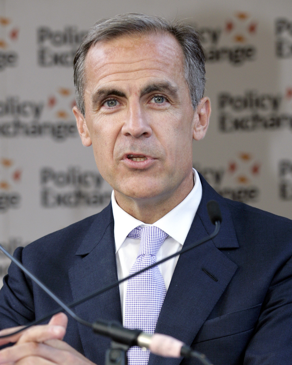 Each year the BBC hosts the Reith Lectures – a series of talks given by an eminent person in their field. This year’s lecturer is Mark Carney, former Governor of the Bank of England. His series of four weekly lectures began on 2 December 2020. Their topic is ‘How we get what we value’. As the BBC site states, the lectures:
chart how we have come to esteem financial value over human value and how we have gone from market economies to market societies. He argues that this has contributed to a trio of crises: of credit, Covid and climate. And the former Bank of England governor will outline how we can turn this around.
 In lectures 2, 3 and 4, he looks at three crises and how they have shaped and are shaping what we value. The crises are the financial crisis of 2007–9, the coronavirus pandemic and the climate crisis. They have challenged how we value money, health and the environment respectively and, more broadly, have prompted people to question what is valuable for individuals and society, both today and into the future.
The questions posed by Carney are how can we establish what is valuable to individuals and society, how well are such values met by economies and how can mechanisms be improved to ensure that we make the best use of resources in meeting those values.
Value and the market
In the first lecture he probes the concept of value. He explores how economists and philosophers have tried to value the goods, services and human interactions that we desire.
First there is ‘objective value’ propounded by classical economists, such as Adam smith, David Ricardo and Karl Marx. Here the value of goods and services depends on the amount of resources used to make them and fundamentally on the amount of labour. In other words, value is a supply-side concept.
This he contrasts with ‘subjective value’. Here the value of goods and services depends on how well they satisfy wants – how much utility they give the consumer. For these neoclassical economists, value is in the eye of the beholder; it is a demand-side concept.
The two are reconciled in the market, with market prices reflecting the balance of demand and supply. Market prices provided a solution to the famous diamonds/water paradox (see Box 4.2 in Economics (10th edition) or Case Study 4.3 in Essentials of Economics (8th edition) – the paradox of ‘why water, which is essential for life, is virtually free, but diamonds, which have limited utility beyond their beauty, are so expensive.’ The answer is to do with scarcity and marginal utility. Because diamonds are rare, the marginal utility is high, even though the total utility is low.  And because water is abundant, even though its total utility is high, for most people its marginal utility is low. In other words, the value at the margin depends on the balance of demand and supply. Diamonds are much scarcer than water.
But is the market balance the right balance? Are the values implied by the market the same as those of society? ‘Why do financial markets rate Amazon as one of the world’s most valuable companies, but the value of the vast region of the Amazon appears on no ledger until it’s stripped of its foliage and converted into farmland?’ – another paradox highlighted by Carney.
It has long been recognised that markets fail in a number of ways. They are not perfect, with large firms able to make supernormal profits by charging more and producing less, and consumers often being ill-informed and behaving impulsively or being swayed by clever marketing. And many valuable things that we experience, such as human interaction and the beauty of nature, are not bought and sold and thus do not appear in measures of GDP – one of the main ways of valuing a country.
 What is more, many of things that are produced in the market have side-effects which are not reflected in prices. These externalities, whether good or bad, can be substantial: for example, the global warming caused by CO2 emissions from industry, transport and electricity production from fossil fuels.
And markets reflect people’s biases towards the present and hence lead to too little investment for the future, whether in healthcare, the environment or physical and social infrastructure. Markets reflect the scant regard many give to the damage we might be doing to the lives of future generations.
What is particularly corrosive, according to Carney, is the
drift from moral to market sentiments. …Increasingly, the value of something, some act or someone is equated with its monetary value, a monetary value that is determined by the market. The logic of buying and selling no longer applies only to material goods, but increasingly it governs the whole of life from the allocation of healthcare, education, public safety and environmental protection. …Market value is taken to represent intrinsic value, and if a good or activity is not in the market, it is not valued.
The drift from moral to market sentiments accelerated in the Thatcher/Regan era, when governments were portrayed as inefficient allocators, which stifled competition, innovation and the movement of capital. Deregulation and privatisation were the order of the day. This, according to Carney, ‘unleashed a new dynamism’ and ‘with the fall of communism at the end of the 1980s, the spread of the market grew unchecked.’
But this drift failed to recognise market failures. It has taken three crises, the financial crisis, Covid and the climate crisis to bring these failures to the top of the public agenda. They are examined in the other three lectures.
The Reith Lectures
Questions
- Distinguish between objective and subjective value.
- If your income rises, will you necessarily be happier? Explain.
- How is the concept of diminishing marginal utility of income relevant to explaining why ‘A Christmas bonus of £1000 means less to Mark Zuckerberg then £500 does to someone on a minimum wage.’
- Does the use of social cost–benefit analysis enable us to use adjusted prices as a measure of value?
- Listen to lectures 2, 3 and 4 and provide a 500-word summary of each.
- Assess the arguments Mark Carney uses in one of these three lectures.
 In its latest Commodity Special Feature (pages 43 to 53 of the October 2020 World Economic Outlook), the IMF examines the future of oil and other commodity prices. With the collapse in oil demand during the early stages of the coronavirus pandemic, oil prices plummeted. Brent crude fell from around $60 per barrel in late January to below $20 in April.
However, oil prices then rose somewhat and have typically been between $40 and $45 per barrel since June 2020 – still more than 35% lower than at the beginning of the year (see chart below: click here for a PowerPoint). This rise was caused by a slight recovery in demand but largely by supply reductions. These were the result partly of limits agreed by OPEC+ (OPEC, Russia and some other non-OPEC oil producing countries) and partly of reduced drilling in the USA and the closure of many shale oil wells which the lower prices had made unprofitable.
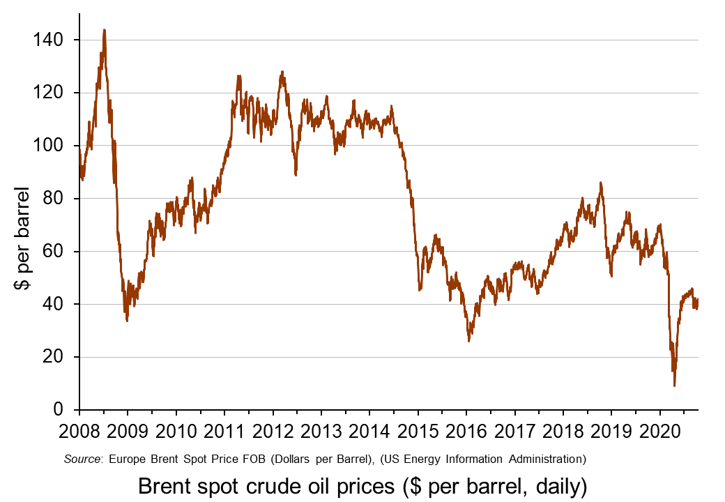 The IMF considers the future for oil prices and concludes that prices will remain subdued. It forecasts that petroleum spot prices will average $47 per barrel in 2021, up only slightly from the $42 average it predicts for 2020.
On the supply side it predicts that ‘stronger oil production growth in several non-OPEC+ countries, a faster normalization of Libya’s oil production, and a breakdown of the OPEC+ agreement’ will push up supply and push down prices. Even if the OPEC+ agreement holds, the members are set to ease their production cut by nearly 25% at the start of 2021. This rise in supply will be offset to some extent by possibly ‘excessive cuts in oil and gas upstream investments and further bankruptcies in the energy sector’.
On the demand side, the speed of the recovery from the pandemic will be a major determinant. If the second wave is long-lasting and deep, with a vaccine available to all still some way off, oil demand could remain subdued for many months. This will be compounded by the accelerating shift to renewable energy and electric vehicles and by government policies to reduce CO2 emissions.
Report
Articles
Oil price data
Questions
- Describe a scenario in which oil prices rebound significantly over the coming months. Illustrate your answer with a supply and demand diagram.
- Describe a scenario in which oil prices fall over the coming months. Again, illustrate your answer with a supply and demand diagram.
- How are the price elasticities of demand and supply relevant to the size of any oil price change?
- Project forward 10 years and predict whether oil prices will be higher or lower than now. What are the major determinants of supply and demand in your prediction?
- What are oil futures? What determines oil future prices?
- How does speculation affect oil prices?
 The OECD has recently published its six-monthly Economic Outlook. This assesses the global economic situation and the prospects for the 38 members of the OECD.
  The OECD forecasts that potential economic growth will be negative in 2021, with capacity declining by 0.4 per cent. Only two other OECD countries, Italy and Greece, are forecast to have negative potential economic growth (see Table 24 in the Statistical Annex). A rapid increase in aggregate demand, accompanied by a decline in aggregate supply, could result in inflationary pressures, even if initially there is considerable slack in some parts of the economy.
 The scarring effects of the pandemic present another problem. There has been a decline in investment. Even if this is only temporary, it will have a long-term impact on capacity, unless there is a compensating rise in investment in the future. Many businesses have closed and will not re-open, including many High Street stores. Moves to working from home, even if partially reversed as the economy unlocks, will have effects on the public transport industry. Also, people may have found new patterns of consumption, such as making more things for themselves rather than buying them, which could affect many industries. It is too early to predict the extent of these scarring effects and how permanent they will be, but they could have a dampening effect on certain sectors.
 As far as as the housing market is concerned, the rise in demand has been fuelled by the stamp duty ‘holiday’ which exempts residential property purchase from Stamp Duty Land Tax for properties under £500 000 in England and Northern Ireland and £250 000 in Scotland and Wales (rather than the original £125 000 in England and Northern Ireland, £145 000 in Scotland and £180 000 in Wales). In England and Northern Ireland, this limit is due to reduce to £250 000 on 30 June and back to £125 000 on 30 September. In Scotland the holiday ended on 31 March and in Wales is due to end on 30 June. As these deadlines are passed, this should see a significant cooling of demand.
 Post-Brexit: Businesses hit by labour shortages call for Brexit rules to be relaxed
 Throughout the pandemic, the fight against COVID-19 has often been framed in terms of striking a balance between the health of the public and the health of the economy. This leads to the assumption that a trade-off must exist between these two objectives. Countries, therefore, have to decide between lives and livelihoods. However, one year on since lockdowns swept the globe the evidence suggests that the trade-off between sacrificing lives and sacrificing the economy is not necessarily clear cut.
 It could be argued, therefore, that in the short run these interventions create a ‘health–wealth trade-off’. The lockdown restrictions save lives by preventing transmission, but they came at the cost of lost output, income and therefore GDP. This would also imply that the trade-off works in reverse when the lockdown restrictions are eased. As measures are relaxed, the economy can begin to recover but at the cost of an increased threat of the virus spreading again.
  The UK was the hardest hit of similar countries on both measures within the G7 group of industrialised countries. The shape of the recession in the UK from the pandemic and lockdowns was extraordinary and historic. However, it was also unique as there was a very sharp fall followed by a rapid rebound. Over 2020, GDP saw the largest hit in three centuries; larger than any single year of the Great Wars or the 1920s Depression.
 Given the arguments against the existence of the trade-off, it could be argued that in order to limit the economic damage caused by the pandemic, the focus needs to start and end with controlling the spread of the virus. Experiments that have been conducted across the world definitively show that no country can prevent the economic damage without first addressing the pandemic that causes it. Those countries that acted swiftly in implementing harsh measures to control the virus, are now reopening in stages and their economies are growing. Countries such as China, Australia, New Zealand, Iceland, and Singapore, which all invested primarily in swift coronavirus suppression, have effectively eliminated the virus and are seeing their economies begin to grow again.
  Speculation in markets can lead to wild swings in prices as exuberance drives up prices and
 The most recent example of a bubble is GameStop. This is a chain of shops in the USA selling games, consoles and other electronic items. During the pandemic it has struggled, as games consumers have turned to online sellers of consoles and online games. It has been forced to close a number of stores. In July 2020, its
  Enter the ‘armchair investor’. During lockdown, small-scale amateur investing in shares has become a popular activity, with people seeking to make easy gains from the comfort of their own homes. This has been facilitated by online trading platforms such as
  Each year the BBC hosts the
  In lectures 2, 3 and 4, he looks at three crises and how they have shaped and are shaping what we value. The crises are the financial crisis of 2007–9, the coronavirus pandemic and the climate crisis. They have challenged how we value money, health and the environment respectively and, more broadly, have prompted people to question what is valuable for individuals and society, both today and into the future.
 And because water is abundant, even though its total utility is high, for most people its marginal utility is low. In other words, the value at the margin depends on the balance of demand and supply. Diamonds are much scarcer than water.
 What is more, many of things that are produced in the market have side-effects which are not reflected in prices. These externalities, whether good or bad, can be substantial: for example, the global warming caused by CO2 emissions from industry, transport and electricity production from fossil fuels.
  In its latest
  The IMF considers the future for oil prices and concludes that prices will remain subdued. It forecasts that petroleum spot prices will average $47 per barrel in 2021, up only slightly from the $42 average it predicts for 2020.