 The issue of inequality has come into increasing focus over recent years. The impact of the COVID-19 pandemic raises further concerns that these inequalities may be exacerbated further. Here we provide an overview of some of the key patterns in current levels of wealth and income inequality in Britain. They show, for example, the markedly higher degree of inequality in wealth relative to income, the importance of property wealth and private pension wealth in determining levels of wealth, and the considerable variation in average wealth levels of households by age and location.
According to the 6th round of the Wealth and Assets Survey the aggregate wealth of British households was £14.63 trillion in April 2016 to March 2018. This compares with £12.57 trillion in the previous survey which ran from April 2014 to March 2016. This amounts to a 16.3 per cent nominal increase. In real terms, after adjusting for consumer price inflation, the increase was 13.1 per cent. Furthermore, when compared with the first round of the survey in July 2006 to June 2008, there has been a nominal increase in the aggregate wealth of British households of 74 per cent and a real increase of 41 per cent.
What is wealth?
An important question to ask when reflecting on the growth and distribution of wealth across households is what wealth comprises. In fact, it comprises one of four components:
- Net Financial wealth – the value of financial assets (savings and financial investments) less any financial liabilities (loans and arrears)
- Physical wealth – the value of household contents, possessions, valuables and vehicles
- Private pension wealth – the value of private pensions, such as occupational pensions and personal pensions
- Net property wealth – the value of any property owned (including other land/properties owned abroad) less the value of any loans or mortgages secured on these properties.
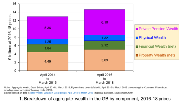 Figure 1 shows the evolution of aggregate wealth over the last two surveys (at constant 2016-18 prices) by the four component parts. Two components dominate the aggregate wealth of British households: property wealth (35 per cent) and private pension wealth (41-42 per cent). Financial wealth is the third largest component (14 per cent), while property wealth is the smallest component (9 to 10 per cent). (Click here for a PowerPoint of the chart.)
Trends in the average wealth of households
To help contextualise the size of wealth and begin to think about its distribution, rather than look at aggregate household wealth we can instead look at the average wealth of British households.
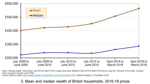 Figure 2 shows the average wealth (at constant 2016-18 prices) as measured by the mean (aggregate divided by the number of households) and the median (the middle household). The mean wealth of households is seen to be greater than their median wealth. In April 2016 to March 2018, average wealth as measured by the mean was £564,300 (an increase of 40.3 per cent over July 2006 to June 2008), whilst the average wealth of each household as measured by the median was £286,600 (an increase of 28.5 per cent over July 2006 to June 2008). (Click here for a PowerPoint of the chart.)
The higher mean value of wealth relative to the median value shows that the distribution of wealth is unequal. Therefore, the mean-to-median ratio is an indicator of inequality. In April 2016 to March 2018 the mean-to-median ratio was 1.97, up from 1.94 in April 2014 to March 2016 and 1.77 in July 2008 to June 2010, and 1.8 in the first survey in July 2006 to June 2008. This metric is therefore consistent with a more unequal distribution of wealth having arisen since the second survey in July 2008 to June 2010, a period during which the UK and global economy was been buffeted by the effects of the financial crisis and the associated economic downturn.
Trends in the average income of households
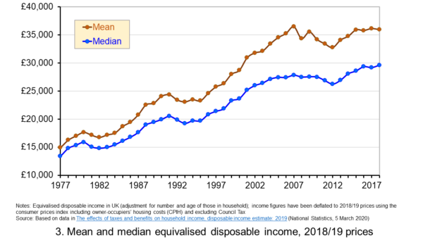 Figure 3 shows the mean and median values of disposable income (adjusted for the number and age of individuals comprising each household). Mean disposable income of UK households in financial year ending (FYE) 2018 was £35,928, a 0.5 per cent real decrease over FYE 2017, whilst median wealth (middle household) was £29,598 in FYE 2018, a 1.5 per cent real increase over FYE 2017. (Click here for a PowerPoint of the chart.)
The higher mean value of disposable income relative to the median value is indicative of inequality in disposable income. In FYE 2018 the mean-to-median ratio for disposable income was 1.21, down from 1.24 in FYE 2017 and a peak of 1.27 in FYE 2014, but higher than the 1.10 in 1978. The longer-term growth in the inequality of income helps to exacerbate existing wealth inequalities.
Comparing the inequality of income and wealth
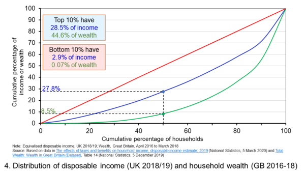 Figure 4 shows starkly the current inequality in wealth as compared to that in income. It does so by plotting their respective Lorenz curves. The curves show the proportion of overall wealth or income attributable to a given proportion of households. For example, 50 per cent of households have close to 28 per cent of total disposable income and a mere 8.5 per cent of aggregate wealth. (Click here for a PowerPoint of the chart.)
The inequality shown by the Lorenz curves is especially startling when we look at the top and bottom deciles. The bottom decile has just 2.9 per cent of income and only 0.07 per cent of wealth. Meanwhile the top 10 per cent of households have 28.5 per cent of income, almost the same as the first 50 percent of households, and some 44.6 per cent of wealth, with the previous 90 per cent of households having 55.4 per cent of wealth.
The Lorenz curves allow for the calculation of the Gini coefficient. It measures the area between the Lorenz curve and the 45 degree line consistent with zero inequality relative to the total area below the 45 degree line. Therefore, the Gini coefficient can take a value of between 0% (no inequality) and 100% (total inequality – where one person has all the wealth). Unsurprisingly whilst the Gini coefficient for disposable income in the UK in FYE 2018 was 34.7 per cent, that for aggregate wealth in Great Britain in April 2016 to March 2018 was significantly higher at 63.3 per cent.
The Gini coefficient for disposable income has risen from 25.5 per cent in 1977 to a peak in FYE 2008 of 38.6 per cent. It has therefore eased during the 2010s, but is nonetheless 13 percentage points higher today than it was four decades ago. Meanwhile, the Gini coefficient for wealth at the time of the first survey from July 2006 to June 2008 was 61 per cent. It has been unchanged at 63 percent over the last three surveys.
Inequality in wealth by component, location and age
It is important to recognise the inequalities in the components of wealth. This has particular importance when we are trying to understand how wealth varies by household characteristics, such as age and location.
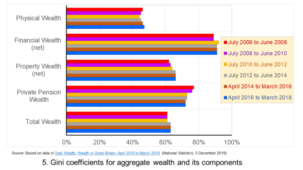 Figure 5 shows that the highest Gini coefficient is for net financial wealth. This stood at 91 per cent in April 2016 to March 2018. This extremely high figure shows the very high levels of inequatity in net financial wealth. This reflects the fact that some households find themselves with negative net financial wealth, such that their debts exceed their assets, whilst, on the other hand, some households can have large sums in financial investments. (Click here for a PowerPoint of the chart.)
We saw at the outset that the largest two components of wealth are property wealth and private pension wealth. The Gini coefficients of these two have in recent times moved in opposite directions by roughly similar magnitudes. This means that their effects on the overall Gini coefficient have offset one another. Perhaps for many people the rise in Gini coeffcient for property from 62 per cent in July 2006 to June 2008 to 66 per cent in April 2016 to March 2018 is the inequality measure that resonates most. This is reflected in regional disparities in wealth.
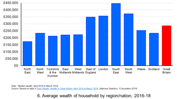 Figure 6 shows the geographical disparity of median household wealth across Britain. The regions with the highest median wealth are the South East, South West, London and the East of England. They have the highest contributions from net property wealth (40.4 per cent, 35.6 per cent, 41.7 per cent and 37.2 per cent respectively). The region with the lowest median total wealth, the North East, has the least total wealth in net property wealth (24.8 per cent). (Click here for a PowerPoint of the chart.)
Property wealth and private pension wealth also contribute to disparities in wealth by the age of the head of the household, also known as the household reference person or HRP. In April 2016 to March 2018 the mean wealth where the HRP is 25-34 was £125,700, rising to £859,200 where the HRP is 55-64 and then falling to £692,300 when the HRP is 65 or over. This is consistent with households accruing wealth over time and the using wealth to help fund retirement.
Where the age of the HRP is 55-64, mean property wealth in April 2016 to March 2018 was £255,800 compared to £53,700 where the HRP is 25-34. Meanwhile, where the age of the HRP is 55-64, mean private pension wealth was £449,100 compared to just £32,300 where the HRP is 25-34. In respect of property wealth, the deterioration in the affordability of owner-occupied housing over many years will impact especially hard on younger households. This will therefore tend to exacerbate inter-generational wealth inequality.
Whilst this briefing provides an overview of recent patterns in income and wealth inequality in Britain, the articles and press releases below consider the impact that the COVID-19 pandemic may have on inequalities.
Articles and Press Releases
- Many better-off households may increase savings as spending on ‘banned’ activities falls. Poorer households spend much more of their income on necessities and will be less resilient to any falls in income
IFS Press Release, Rowena Crawford, Alex Davenport, Robert Joyce and Peter Levell (08/04/20)
- Sector shut-downs during the coronavirus crisis affect the youngest and lowest paid workers, and women, the most
IFS Press Release, Robert Joyce and Xiaowei Xu (06/04/20)
- Coronavirus downturn ‘will exacerbate UK health inequality’
City A.M., James Warrington (09/04/20)
- Coronavirus pandemic exacerbates inequalities for women, UN warns
Guardian, Alexandra Villarreal (11/04/20)
- Inequality doesn’t just make pandemics worse – it could cause them
Guardian, Laura Spinney (12/04/20)
- The Coronavirus Will Be a Catastrophe for the Poor
The Atlantic, Derek Thompson (20/03/20)
- EU-wide inequality is back to pre-crisis levels
Social Europe, Michael Dauderstädt (15/04/20)
- Coronavirus makes inequality a public health issue
World Economic Forum, Alexandre Kalache (President, International Longevity Centre-Brazil) (13/04/20)
- Economist Joseph Stiglitz says coronavirus is ‘exposing’ health inequality in US
- CNBC, Jesse Pound (14/04/20)
ONS Bulletins
Questions
- In what ways can we use statistics to help measure and inform our analysis of inequality?
- In what ways can income inequality impact on wealth inequality?
- How can wealth inequality impact on income inequality?
- What might explain why wealth inequality is greater than income inequality?
- Explain how Lorenz curves help to generate Gini coefficients.
- Why would we expect the wealth of households with a younger household reference person (HRP) to be lower than that of a household with an older HRP? Would we expect this average to rise over all age ranges?
- If you were advising a government on policies to reduce income and wealth inequalities what sort of measures might you suggest?
- What is the difference between original income and disposable income?
- What is the difference between disposable income and equivalised disposable income?
- What role does the housing market play in affecting wealth inequality?
- Why is net financial wealth so unequally distributed?
- What is meant by health inequality? Of what significance is this for income and wealth inequality?
- What is meant by social mobility? Of what significance is this for income and wealth inequality?
 As the Coronavirus pandemic continues to escalate in the UK, the government has been forced to introduce a range of drastic measures, including severe restrictions on movement of people to ensure social distancing. Supermarkets have also been forced to act as they experienced panic buying and struggled to keep up with supply. They responded by starting to impose limits on the number of certain items an individual consumer could purchase and by reducing the range of products they made available. In addition, supermarkets contacted the government to suggest that competition law should be relaxed to allow the rival chains to coordinate their response to the ongoing situation.

WM Morrison, the forth largest supermarket retailer in the UK, was one of the key players lobbying for this change. Their chief executive, David Potts, argued that “There will be legislation that works perfectly in peacetime and not so well in wartime.”
The supermarket industry is in fact a market where the UK competition authorities have expressed considerable concerns in the past regarding a lack of competition (see for example the 2008 market investigation and the recent decision to block the merger between Sainsbury’s and Asda). The supermarkets also previously made similar demands for a relaxation of competition law in the event of a no-deal Brexit.
Despite this, the government has agreed to temporarily relax elements of competition law to help supermarkets respond to the Coronavirus crisis with the Environment Secretary, George Eustice, stating that:
By relaxing elements of competition laws temporarily, our retailers can work together on their contingency plans and share the resources they need with each other during these unprecedented circumstances.
In moves supported by the Competition and Markets Authority, laws enabling them to do so will soon be passed through Parliament. Supermarkets will be allowed to:
- share data with each other on stock levels
- cooperate to keep shops open
- share distribution depots and delivery vans
- pool staff with one another to help meet demand.
It is also expected that the Groceries Code Adjudicator will take a pragmatic approach to rules previously in place to prevent the big supermarket chains abusing their power over suppliers. These rules previously prevented supermarkets from stopping orders from a given supplier without reasonable warning. However, it is now accepted that they may need to do so in order to focus on supplying a restricted range of essential products.
Such relaxation of competition laws has been rare, with previous examples being measures taken in 2006 for the maintenance and repair of warships and in 2012 during the fuel crisis. In contrast, typically competition law is extremely hot on preventing agreements between firms. This is due to the fact that they distort competition and prevent the considerable benefits that can arise for consumers when firms compete to offer the best deals.
In the extreme situation the UK is currently in, the government’s stance appears to be that there are sufficient other benefits from restricting competition between supermarkets and allowing some degree of cooperation. It is then important that the form of cooperation between the supermarkets is restricted to narrow areas that will help to ensure the continuity of supply. In particular, it would be worrying if the supermarkets started discussing the prices they charge. Already food prices may rise due to increased demand and a potential shortage of supply. Furthermore, many consumers will see their income reduced. Therefore, it is important that coordination between supermarkets doesn’t result in further increases in prices.
It is therefore reassuring that the Government made clear that the relaxation of competition law:
will be a specific, temporary relaxation to enable retailers to work together for the sole purpose of feeding the nation during these unprecedented circumstances. It will not allow any activity that does not meet this requirement.
The Competition and Markets Authority has also stressed that they will not:
tolerate unscrupulous businesses exploiting the crisis as a ‘cover’ for non-essential collusion. This includes exchanging information on longer-term pricing or business strategies, where this is not necessary to meet the needs of the current situation.
Once the current crisis is over, it will also be important that the competition authority closely monitors the supermarket sector to ensure that cooperation between the supermarkets ends and normal competitive conduct is resumed.
Articles
Questions
- Outline the effects agreements between firms to raiser prices have on economic welfare.
- What are the pros and cons of allowing cooperation between the supermarkets in response to the Coronavirus crisis?
 With promises by the newly elected Conservative government to increase investment expenditure on health, education, innovation and infrastructure, it was expected that Rishi Sunak’s first Budget would be strongly expansionary. In fact, it turned out to be two Budgets in one – both giving a massive fiscal boost.
An emergency Budget
The first part of the Budget was a short-term emergency response to the explosive spread of the coronavirus. An extra £12 billion is to be spent on the NHS and other public services. Whether this will be anything like enough to cope with the effects of the pandemic as businesses fail and people lose their jobs remains to be seen. (See the blog A global supply-side shock: the impact of the coronavirus (COVID-19) outbreak.)
A key issue is just how quickly the money can be spent. How quickly can you train health professionals or produce more ventilators or provide extra hospital beds?
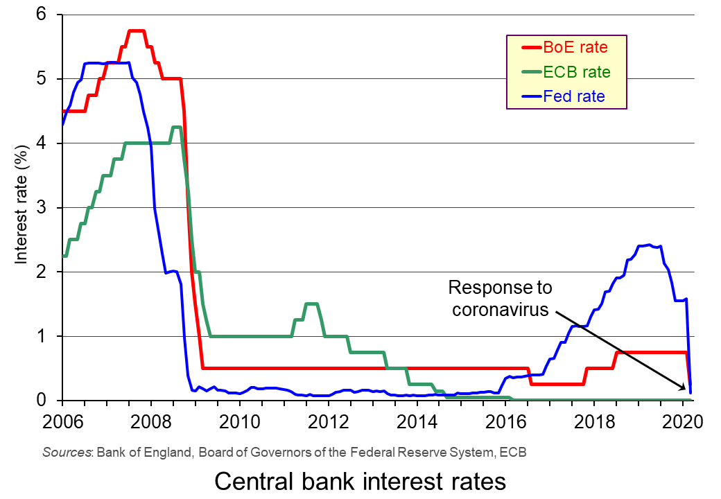 This emergency part of the Budget was co-ordinated with the Bank of England’s decision to cut Bank Rate from 0.75% to 0.25%.
This combined fiscal and monetary response to the crisis was further enhanced by the agreement of central banks on 15 March to boost world liquidity by increasing the supply of US dollars through large-scale quantitative easing. The US central bank, the Federal Reserve, also cut its main federal funds rate by one percentage point from 1–1.25% to 0–0.25%.
The planned Budget
 The second part of the Budget is to raise government investment by 9% in real terms over the next four years, bringing overall government expenditure to 41% of GDP, financed largely by extra borrowing. As the IFS observes, “That is above its pre-crisis level and bigger than at any point between the mid 1980s and the start of the financial crisis.”
But despite this rise in the proportion of government spending to GDP, in other respects the spending plans are less expansionary than they may appear. Increases in current spending on health, education and defence had already been promised. This leaves other departments, such as social security, facing cuts, or at least no increase. And when compared with 2010/11 levels, if you exclude health, government current spending per head of the population will around 14% lower, or 19% lower once you account for spending that replaces EU funding.
The Chancellor’s hope is that, by focusing on investment, there will be a supply-side effect as well as a demand-side boost. If increases in aggregate demand are balanced by increases in aggregate supply, such a policy would not be inflationary in the long run. But in the light of the considerable uncertainty of the effects of the coronavirus, the plans may well require significant adjustment in the Autumn Budget – or earlier.
Articles
Podcasts and Videos
Official documentation
Questions
- To what extent is this Budget ‘Keynesian’?
- Is the extra government expenditure likely to crowd out private expenditure? Explain.
- Demonstrate the desired long-term economic effect of the infrastructure policy using either an AD/AS diagram or a DAD/DAS diagram.
- How is the coronavirus pandemic likely to affect potential GDP in (a) the short run (b) the long run?
- Why is public-sector debt likely to soar over the next four years while annual government debt interest payments are likely to continue their gentle decline?
- What is missing from the Budget that you feel ought to have been included? Explain why.
 The global economic impact of the coronavirus outbreak is uncertain but potentially very large. There has already been a massive effect on China, with large parts of the Chinese economy shut down. As the disease spreads to other countries, they too will experience supply shocks as schools and workplaces close down and travel restrictions are imposed. This has already happened in South Korea, Japan and Italy. The size of these effects is still unknown and will depend on the effectiveness of the containment measures that countries are putting in place and on the behaviour of people in self isolating if they have any symptoms or even possible exposure.
The OECD in its March 2020 interim Economic Assessment: Coronavirus: The world economy at risk estimates that global economic growth will be around half a percentage point lower than previously forecast – down from 2.9% to 2.4%. But this is based on the assumption that ‘the epidemic peaks in China in the first quarter of 2020 and outbreaks in other countries prove mild and contained.’ If the disease develops into a pandemic, as many health officials are predicting, the global economic effect could be much larger. In such cases, the OECD predicts a halving of global economic growth to 1.5%. But even this may be overoptimistic, with growing talk of a global recession.
Governments and central banks around the world are already planning measures to boost aggregate demand. The Federal Reserve, as an emergency measure on 3 March, reduced the Federal Funds rate by half a percentage point from the range of 1.5–1.75% to 1.0–1.25%. This was the first emergency rate cut since 2008.
Economic uncertainty
With considerable uncertainty about the spread of the disease and how effective containment measures will be, stock markets have fallen dramatically. The FTSE 100 fell by nearly 14% in the second half of February, before recovering slightly at the beginning of March.  It then fell by a further 7.7% on 9 March – the biggest one-day fall since the 2008 financial crisis. This was specifically in response to a plunge in oil prices as Russia and Saudi Arabia engaged in a price war. But it also reflected growing pessimism about the economic impact of the coronavirus as the global spread of the epidemic accelerated and countries were contemplating more draconian lock-down measures.
Firms have been drawing up contingency plans to respond to panic buying of essential items and falling demand for other goods. Supply-chain managers are working out how to respond to these changes and to disruptions to supplies from China and other affected countries.
Firms are also having to plan for disruptions to labour supply. Large numbers of employees may fall sick or be advised/required to stay at home. Or they may have to stay at home to look after children whose schools are closed.  For some firms, having their staff working from home will be easy; for others it will be impossible.
Some industries will be particularly badly hit, such as airlines, cruise lines and travel companies. Budget airlines have cancelled several flights and travel companies are beginning to offer substantial discounts. Manufacturing firms which are dependent on supplies from affected countries have also been badly hit. This is reflected in their share prices, which have seen large falls.
Longer-term effects
Uncertainty could have longer-term impacts on aggregate supply if firms decide to put investment on hold. This would also impact on the capital goods industries which supply machinery and equipment to investing firms. For the UK, already having suffered from Brexit uncertainty, this further uncertainty could prove very damaging for economic growth.
 While aggregate supply is likely to fall, or at least to grow less quickly, what will happen to the balance of aggregate demand and supply is less clear. A temporary rise in demand, as people stock up, could see a surge in prices, unless supermarkets and other firms are keen to demonstrate that they are not profiting from the disease. In the longer term, if aggregate demand continues to grow at past rates, it will probably outstrip the growth in aggregate supply and result in rising inflation. If, however, demand is subdued, as uncertainty about their own economic situation leads people to cut back on spending, inflation and even the price level may fall.
How quickly the global economy will ‘bounce back’ depends on how long the outbreak lasts and whether it becomes a serious pandemic and on how much investment has been affected. At the current time, it is impossible to predict with any accuracy the timing and scale of any such bounce back.
Articles
- Coronavirus: Global growth ‘could halve’ if outbreak intensifies
BBC News (2/3/20)
- Coronavirus: Eight charts on how it has shaken economies
BBC News, Lora Jones, David Brown & Daniele Palumbo (4/3/20)
- The economic ravages of coronavirus
BBC News, Douglas Fraser (7/3/20)
- What Coronavirus Could Mean for the Global Economy
Harvard Business Review, Philipp Carlsson-Szlezak, Martin Reeves and Paul Swartz (3/3/20)
- Coronavirus escalation could cut global economic growth in half – OECD
The Guardian, Richard Partington and Phillip Inman (2/3/20)
- U.S. Fed Cuts Rates, There Are Still Strategies The ECB Can Follow
Forbes, Stephen Pope (3/3/20)
- A coronavirus recession could be supply-side with a 1970s flavour
The Guardian, Kenneth Rogoff (3/3/20)
- Coronavirus will wreak havoc on the US economy
CNN, Mark Zandi (3/3/20)
- UK factories feel the effects of coronavirus spread – PMI
Reuters, William Schomberg (2/3/20)
- The first economic modelling of coronavirus scenarios is grim for Australia, the world
The Conversation, Australia, Warwick McKibbin and Roshen Fernando (3/3/20)
- Extraordinary complacency: the coronavirus and emerging markets
Financial Times, Geoff Dennis (2/3/20)
- Coronavirus Economic Impact On Global Economy
Seeking Alpha, Mark Bern (1/3/20)
- OECD warns coronavirus could halve global growth
Financial Times, Chris Giles, Martin Arnold and Brendan Greeley (2/3/20)
- BoE’s Carney sees ‘powerful and timely’ global response to coronavirus
Reuters, David Milliken, Elizabeth Howcroft (3/3/20)
eBook
Questions
- Using a supply and demand diagram, illustrate the fall in stock market prices caused by concerns over the effects of the coronavirus.
- Using either (i) an aggregate demand and supply diagram or (ii) a DAD/DAS diagram, illustrate how a fall in aggregate supply as a result of the economic effects of the coronavirus would lead to (a) a fall in real income and (i) a fall in the price level or (ii) a fall in inflation; (b) a fall in real income and (i) a rise in the price level or (ii) a rise in inflation.
- What would be the likely effects of central banks (a) cutting interest rates; (b) engaging in further quantitative easing?
- What would be the likely effects of governments running a larger budget deficit as a means of boosting the economy?
- Distinguish between stabilising and destabilising speculation. How would you characterise the speculation that has taken place on stock markets in response to the coronavirus?
- What are the implications of people being paid on zero-hour contracts of the government requiring workplaces to close?
- What long-term changes to working practices and government policy could result from short-term adjustments to the epidemic?
- Is the long-term macroeconomic impact of the coronavirus likely to be zero, as economies bounce back? Explain.
 On 15 March 2019, the ‘Organ Donation (Deemed Consent) Bill’ was passed into law. (See the blog, Organ donations – Changing the default option vs active choice.) The government has just announced that this will come into force on 20 May this year. Under the scheme, ‘adults in England will be considered potential donors unless they chose to opt out or are excluded. The act is known as Max and Keira’s law in honour of a boy who received a heart transplant and the girl who donated it.’
This change from an ‘opt-in’ to an ‘opt-out’ system follows a similar a move in Wales in 2015. Since then, Wales has seen a significant increase in potential donors, with the consent rate rising from 58% to 77%. A similar move in Scotland will come into force in the autumn of this year. The government expects there to be an additional 700 transplant operations per year available for transplant by 2023.
These moves from an opt-in to an opt-out system are consistent with ‘nudge theory’. This maintains that positive reinforcement or making a decision easy for people can persuade them to make a particular choice. They are ‘nudged’ into so doing.
Opting out and nudge theory
In the case of having to opt in to a scheme such as organ donation, people have to make the decision to take part. Many, as a result, do not, partly because they never seem to find the time to do so, even though they might quite like to. With the busy lives people lead, it’s too easy to think, ‘Yes, I’ll do that some time’, but never actually get round to doing it: i.e. they have present bias and hence behave in a time-inconsistent manner.
 With an opt-out system, people are automatically signed up to the scheme, but can freely choose to opt out. In the case of the new organ donor schemes in the UK, it is/will be assumed that organs from people killed in an accident who had not opted out could be used for transplants. If you do not want your organs to be used, you have to notify that you are opting out.
It could be the same with charitable giving. Some firms add a small charitable contribution to the price of their products (e.g. airline tickets or utility bills), unless people opt out.
Similarly, under UK pension arrangements introduced from 2012, firms automatically deduct pension contributions from employees’ wages unless they opt out of the scheme. Opt-out pension schemes like this retain between 90 and 95 per cent of employees. Opt-in pension schemes, by contrast, have much lower participation rates of around 60 per cent, even though they are otherwise identical.
This type of ‘nudging’ can improve the welfare of those who make systematic mistakes (i.e. operate in a time-inconsistent manner), while imposing very limited harm on those who act in a time-consistent manner. If it is in the interests of someone to opt out of the scheme, they can easily do so. Policies such as these are an example of what behavioural economists call ‘soft paternalism’.
Articles
- New opt-out model for organ donation to come into force in May
Pulse, Helen Quinn (25/2/20)
- Max and Keira’s law: New ‘opt-out’ organ donor system to be introduced on 20 May, government plans
Sky News, Greg Heffer (25/2/20)
- Adults to be automatically enrolled as organ donors under new law
Independent, Peter Stubley (26/2/20)
- Max and Keira’s law: New ‘opt-out’ organ donor system that presumes all adults agree to donate when they die will be introduced in May
Mail Online, Ben Spencer (25/2/20)
- Opt-out organ donation law: Your questions answered
New Scientist, Clare Wilson (27/2/20)
- Should organ donors be paid? The heavy toll of US kidney shortage
BBC News, US and Canada, Henri Astier (18/2/20)
- What Spain can teach Scotland about organ donation
BBC News, Scotland, Susie Forrest (18/10/19)
- A little nudge goes a long way in increasing organ donor registrations
The Conversation, Nicole Robitaille (2/5/19)
- How nudge theory is ageing well
Financial Times, Julian Baggini (19/4/19)
- Richard Thaler: ‘If you want people to do something, make it easy’
Financial Times, Tim Harford (2/8/19)
- Why a nudge from the state beats a slap
The Observer, Richard Reeves (30/7/08)
Official Information
Questions
- Why do opt-out schemes have a higher take up than opt-in ones? Would this apply if people behaved in a time-consistent manner?
- What is present bias? How does it differ from simple impatience? Explain how present bias might help to explain the impact of changing the default option.
- What are the arguments for and against nudging people to make decisions that benefit them or are in the social interest?
- Give some example of nudges that are used in public policy or would be a good idea to use. Consider how effective they are likely to be. (You might refer to the work of the Behavioural Insights Team.)
- What are the possible drawbacks of presumed consent in organ donation?
- What are the arguments for and against paying live people to donate organs, such as a kidney?
- How might people be encouraged to behave in the right way during an epidemic, such as corona virus?
- To what extent was nudge theory used during the Brexit referendum campaign and in the two subsequent general elections?
 The issue of inequality has come into increasing focus over recent years. The impact of the COVID-19 pandemic raises further concerns that these inequalities may be exacerbated further. Here we provide an overview of some of the key patterns in current levels of wealth and income inequality in Britain. They show, for example, the markedly higher degree of inequality in wealth relative to income, the importance of property wealth and private pension wealth in determining levels of wealth, and the considerable variation in average wealth levels of households by age and location.
 Figure 1 shows the evolution of aggregate wealth over the last two surveys (at constant 2016-18 prices) by the four component parts. Two components dominate the aggregate wealth of British households: property wealth (35 per cent) and private pension wealth (41-42 per cent). Financial wealth is the third largest component (14 per cent), while property wealth is the smallest component (9 to 10 per cent). (Click here for a PowerPoint of the chart.)
 Figure 2 shows the average wealth (at constant 2016-18 prices) as measured by the mean (aggregate divided by the number of households) and the median (the middle household). The mean wealth of households is seen to be greater than their median wealth. In April 2016 to March 2018, average wealth as measured by the mean was £564,300 (an increase of 40.3 per cent over July 2006 to June 2008), whilst the average wealth of each household as measured by the median was £286,600 (an increase of 28.5 per cent over July 2006 to June 2008). (Click here for a PowerPoint of the chart.)
 Figure 3 shows the mean and median values of disposable income (adjusted for the number and age of individuals comprising each household). Mean disposable income of UK households in financial year ending (FYE) 2018 was £35,928, a 0.5 per cent real decrease over FYE 2017, whilst median wealth (middle household) was £29,598 in FYE 2018, a 1.5 per cent real increase over FYE 2017. (Click here for a PowerPoint of the chart.)
 Figure 4 shows starkly the current inequality in wealth as compared to that in income. It does so by plotting their respective Lorenz curves. The curves show the proportion of overall wealth or income attributable to a given proportion of households. For example, 50 per cent of households have close to 28 per cent of total disposable income and a mere 8.5 per cent of aggregate wealth. (Click here for a PowerPoint of the chart.)
 Figure 5 shows that the highest Gini coefficient is for net financial wealth. This stood at 91 per cent in April 2016 to March 2018. This extremely high figure shows the very high levels of inequatity in net financial wealth. This reflects the fact that some households find themselves with negative net financial wealth, such that their debts exceed their assets, whilst, on the other hand, some households can have large sums in financial investments. (Click here for a PowerPoint of the chart.)
  Figure 6 shows the geographical disparity of median household wealth across Britain. The regions with the highest median wealth are the South East, South West, London and the East of England. They have the highest contributions from net property wealth (40.4 per cent, 35.6 per cent, 41.7 per cent and 37.2 per cent respectively). The region with the lowest median total wealth, the North East, has the least total wealth in net property wealth (24.8 per cent). (Click here for a PowerPoint of the chart.)
  As the Coronavirus pandemic continues to escalate in the UK, the government has been forced to introduce a range of drastic measures, including severe restrictions on movement of people to ensure social distancing. Supermarkets have also been forced to act as they experienced panic buying and struggled to keep up with supply. They responded by starting to impose limits on the number of certain items an individual consumer could purchase and by reducing the range of products they made available. In addition, supermarkets contacted the government to suggest that competition law should be relaxed to allow the rival chains to coordinate their response to the ongoing situation.
 With promises by the newly elected Conservative government to increase investment expenditure on health, education, innovation and infrastructure, it was expected that Rishi Sunak’s first Budget would be strongly expansionary. In fact, it turned out to be two Budgets in one – both giving a massive fiscal boost.
 This emergency part of the Budget was co-ordinated with the Bank of England’s decision to cut Bank Rate from 0.75% to 0.25%.
  The second part of the Budget is to raise government investment by 9% in real terms over the next four years, bringing overall government expenditure to 41% of GDP, financed largely by extra borrowing. As the IFS observes, “That is above its pre-crisis level and bigger than at any point between the mid 1980s and the start of the financial crisis.”
 The global economic impact of the coronavirus outbreak is uncertain but potentially very large. There has already been a massive effect on China, with large parts of the Chinese economy shut down. As the disease spreads to other countries, they too will experience supply shocks as schools and workplaces close down and travel restrictions are imposed. This has already happened in South Korea, Japan and Italy. The size of these effects is still unknown and will depend on the effectiveness of the containment measures that countries are putting in place and on the behaviour of people in self isolating if they have any symptoms or even possible exposure.
 It then fell by a further 7.7% on 9 March – the biggest one-day fall since the 2008 financial crisis. This was specifically in response to a plunge in oil prices as Russia and Saudi Arabia
  For some firms, having their staff working from home will be easy; for others it will be impossible.
 While aggregate supply is likely to fall, or at least to grow less quickly, what will happen to the balance of aggregate demand and supply is less clear. A temporary rise in demand, as people stock up, could see a surge in prices, unless supermarkets and other firms are keen to demonstrate that they are not profiting from the disease. In the longer term, if aggregate demand continues to grow at past rates, it will probably outstrip the growth in aggregate supply and result in rising inflation. If, however, demand is subdued, as uncertainty about their own economic situation leads people to cut back on spending, inflation and even the price level may fall.
 On 15 March 2019, the ‘Organ Donation (Deemed Consent) Bill’ was passed into law. (See the blog,
  With an opt-out system, people are automatically signed up to the scheme, but can freely choose to opt out. In the case of the new organ donor schemes in the UK, it is/will be assumed that organs from people killed in an accident who had not opted out could be used for transplants. If you do not want your organs to be used, you have to notify that you are opting out.