 Inflation is measured as the percentage increase in the Consumer Prices Index (CPI) over the previous 12 months. The index is constructed from a basket of goods that is supposed to represent the buying habits of an average UK household. This basket is updated each year as tastes change and as technology moves forward. The basket contains approximately 700 items, with 180,000 individual prices collected each month.
As certain goods become more popular and trends change, the ONS have the responsibility of identifying these changes and updating the basket of goods. The CPI then looks at how the weighted average price of this basket of goods changes from one month to the next. As the CPI gives us the main measure of UK inflation, it is essential that the basket of goods used does represent current consumer demands. If the basket of goods used 20 years ago was still in place, we wouldn’t see thing like mobile phones and ipads being included. This is one sector that has seen significant growth in recent years and the basket of goods has been adapted in response. A new addition to the measure is e-books, which have seen a significant growth in popularity.
 However, just as new products have been added to the CPI measure, other goods have been removed. In the most recent update, we’ve seen the removal of champagne and Freeview boxes from the basket of goods. With rapid changes in technological products, such as the ipad, kindle and e-books, products that were new additions only a few years ago are now old news, being replaced by the latest gadgets. Other changes to the basket of goods are less about reflecting consumer trends and more about making certain categories more representative, such as fruits and hot drinks.
So, can the changes in the basket of goods tell us anything about the impact of the recession on buying habits? One notable exclusion from the basket of goods is champagne sold in restaurants and bars. In an economic downturn, you’d expect luxury products to see a decline in consumption and the trend in champagne consumption certainly seems to support the theory. The trends suggest that consumers have instead switched to cheaper alternatives, with things like white rum bought from shops increasing.
Many people may look at the basket of goods and think that it doesn’t reflect what you buy in your average shop. But, the purpose of the CPI is to try to reflect the average consumer and the different items in the basket are given different weightings to give some indication of the amount spent on each good. The articles below look at the changes in the CPI basket of goods and what, if anything, we can take from it.
Inflation basket: E-books added by ONS BBC News (12/3/13)
Inflation basket – what does it say about you? Channel 4 News (12/3/13)
The fizz has fallen flat – champagne cut from inflation basket Independent, Martin Hickman (13/3/13)
E-books added to inflation basket, as champagne dropped The Telegraph, Philip Aldrick (13/3/13)
UK inflation basket: e-books in, champagne out The Guardian, Marking King (13/3/13)
Champagne tipped out of inflation basket Financial Times, Hannah Kuchler (13/3/13)
Champagne out, ebooks in as inflation basket updated Reuters (13/3/13)
Questions
- What is inflation and why is it such an important variable?
- How is the CPI calculated? Is it different from the RPI?
- What impact has technological change had on the basket of goods used to calculate the CPI?
- Can you identify any other economic or business trends from the products that are in and out of the CPI basket of goods?
- Given the importance of technology and the speed of change, do you think the review of the basket of goods should become more or less frequent?
- Has the economic downturn had any effect on the basket of goods used to calculate the CPI?
 The UK economy is suffering from a lack of aggregate demand. Low spending in real terms is preventing the economy from growing. A simple solution would seem to be to stimulate aggregate demand through fiscal policy, backed up by even looser monetary policy. But this is easier said than done and could result in undesirable consequences in the medium term.
If increased borrowing were to be used to fund increased government expenditure and/or cuts in taxes, would any resulting growth be sufficient in the medium term to reduce the public-sector deficit below the initial level through automatic fiscal stabilisers? And would the growth be sustainable? The answer to this second question depends on what happens to the supply side of the economy. Would there be an increase in aggregate supply to match the increase in aggregate demand?
 This second question has led many economists to argue that we need to see a rebalancing of the economy. What is needed is an increase in investment and exports, rather than an increase in just consumer expenditure funded by private borrowing and government current expenditure funded by public borrowing.
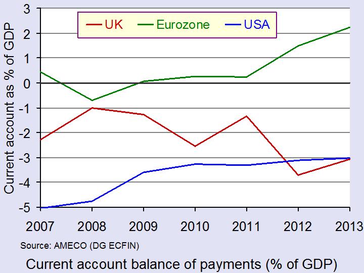
But how will exports and investment be stimulated? As far as exports are concerned, it was hoped that the depreciation of the pound since 2008 would give UK exporters a competitive advantage. Also domestic producers would gain a competitive advantage in the UK from imports becoming more expensive. But the current account deficit has actually deteriorated. According to the EU’s AMECO database, in 2008 the current account deficit was 1% of GDP; in 2012 it was 3.7%. It would seem that UK producers are not taking sufficient advantage of the pound’s depreciation, whether for exports or import substitutes.
 As far as investment is concerned, there are two major problems. The first is the ability to invest. This depends on financing and things such as available land and planning regulations. The second is the confidence to invest. With not little or no growth in consumer demand, there is little opportunity for the accelerator to work. And with forecasts of sluggish growth and austerity measures continuing for some years, there is little confidence in a resurgence in consumer demand in the future. (Click here for a PowerPoint of the above chart. Note that the 2013 plots are based on AMECO forecasts.)
So hope of a rebalancing is faint at the current time. Hence the arguments for an increase in government capital expenditure that we looked at in the last blog post (The political dynamite of calm economic reflection). The problem and the options for government are considered in the following articles.
Articles
Budget 2013: Chancellor’s rebalancing act BBC News, Stephanie Flanders (11/3/13)
Why George Osborne is failing to rebalance the economy The Guardian, Larry Elliott (17/3/13)
Economy fails to ‘rebalance’ Financial Times, Sarah O’Connor (27/2/13)
Analysis – Long haul ahead for Britain’s struggling economy Reuters, William Schomberg (3/3/13)
Can banks be forced to lend more? BBC News, Robert Peston (12/3/13)
Budget 2013: What the commentators are saying BBC News (13/3/13)
Data
UK Trade, January 2013 (ONS) (12/3/13)
Business investment, Q4 2012 ONS (27/2/13)
Questions
- Draw a diagram to illustrate the effects of a successful policy to increase both aggregate demand and aggregate supply. What will determine the effect on the output gap?
- For what reasons has the UK’s current account deteriorated over the past few years while those of the USA and the eurozone have not?
- Using ONS data, find out what has happened to the UK’s balance of trade in (a) goods and (b) services over the past few years and explain your findings.
- Why are firms reluctant to invest at the moment? What policy measures could the government adopt to increase investment?
- With interest rates so low, why don’t consumers borrow and spend more, thereby aiding the recovery?
 In a carefully argued article in the New Statesman, the UK Business Secretary, Vince Cable, considers the slow recovery in the economy and whether additional measures should be adopted. He sums up the current state of the economy as follows:
The British economy is still operating at levels around or below those before the 2008 financial crisis and roughly 15 per cent below an albeit unsustainable pre-crisis trend. There was next to no growth during 2012 and the prospect for 2013 is of very modest recovery.
Unsurprisingly there is vigorous debate as to what has gone wrong. And also what has gone right; unemployment has fallen as a result of a million (net) new jobs in the private sector and there is vigorous growth of new enterprises. Optimistic official growth forecasts and prophets of mass unemployment have both been confounded.
He argues that supply-side policies involving “a major and sustained commitment to skills, innovation and infrastructure investment” are essential if more rapid long-term growth is to be achieved. This is relatively uncontroversial.
 But he also considers the claim that austerity has kept the economy from recovering and whether policies to tackle the negative output gap should be adopted, even if this means a short-term increase in government borrowing.
But crude Keynesian policies of expanding aggregate demand are both difficult to implement and may not take into account the particular circumstance of the current extended recession – or depression – in the UK and in many eurozone countries. World aggregate demand, however, is not deficient. In fact it is expanding quite rapidly, and with the sterling exchange rate index some 20% lower than before the financial crisis, this should give plenty of opportunity for UK exporters.
Yet expanding UK aggregate demand is proving difficult to achieve. Consumers, worried about falling real wages and large debts accumulated in the years of expansion, are reluctant to increase consumption and take on more debts, despite low interest rates. In the light of dampened consumer demand, firms are reluctant to invest. This makes monetary policy particularly ineffective, especially when banks have become more risk averse and wish to hold higher reserves, and indeed are under pressure to do so.
 So what can be done? He argues that there is “some scope for more demand to boost output, particularly if the stimulus is targeted on supply bottlenecks such as infrastructure and skills.” In other words, he advocates policies that will simultaneously increase both aggregate demand and aggregate supply. Monetary policy, involving negative real interest rates and quantitative easing, has helped to prevent a larger fall in real aggregate demand and a deeper dive into recession, but the dampened demand for money and the desire by banks to build their reserves has meant a massive fall in the money multiplier. Perhaps monetary policy needs to be more aggressive still (see the blog post, Doves from above), but this may not be sufficient.
Which brings Dr Cable to the political dynamite! He advocates an increase in public investment on infrastructure (schools and colleges, hospitals, road and rail projects and housing, and considers whether this should be financed, not by switching government expenditure away from current spending, but by borrowing more.
Such a strategy does not undermine the central objective of reducing the structural deficit, and may assist it by reviving growth. It may complicate the secondary objective of reducing government debt relative to GDP because it entails more state borrowing; but in a weak economy, more public investment increases the numerator and the denominator.
 He raises the question of whether the balance of risks has changed: away from the risk of increased short-term borrowing causing a collapse of confidence to the risk of lack of growth causing a deterioration in public finances and this causing a fall in confidence. As we saw in the blog post Moody Blues, the lack of growth has already caused one ratings agency (Moody’s) to downgrade the UK’s credit rating. The other two major agencies, Standard & Poor’s and Fitch may well follow suit.
The day after Dr Cable’s article was published, David Cameron gave a speech saying that the government would stick to its plan of deficit reduction. Not surprisingly commentators interpreted this as a split in the Coalition. Carefully argued economics from Dr Cable it might have been, but political analysts have seen it as a hand grenade, as you will see from some of the articles below.
When the facts change, should I change my mind? New Statesman, Vince Cable (6/3/13)
Keynes would be on our side New Statesman, Vince Cable (12/1/11)
Exclusive: Vince Cable calls on Osborne to change direction New Statesman, George Eaton (67/3/13)
Vince Cable: Borrowing may not be as bad as slow growth BBC News (7/3/13)
Vince Cable makes direct challenge to Cameron over economic programme The Guardian, Nicholas Watt (7/3/13)
Vince Cable Says George Osborne Must Change Course And Borrow More To Revive Growth Huffington Post, Ned Simons (6/3/13)
David Cameron and Vince Cable at war over route to recovery Independent, Andrew Grice (6/3/13)
 Vince Cable: Borrowing may not be as bad as slow growth BBC News, James Landale (6/3/13)
David Cameron: We will hold firm on economy BBC News (7/3/13)
 David Cameron: We will hold firm on economy BBC News (7/3/13)
 Clegg Backs Cable Over Controversial Economy Comments LBC Radio, Nick Clegg (7/3/13)
It’s plain what George Osborne needs to do – so just get on and do it The Telegraph, Jeremy Warner (6/3/13)
Vince Cable’s plan B: a “matter of judgement” BBC News, Stephanie Flanders (7/3/13)
George Osborne needs to turn on the spending taps The Guardian, Phillip Inman (12/3/13)
Questions
- Why has monetary policy proved ineffective in achieving a rapid recovery from recession?
- Distinguish between discretionary fiscal policy and automatic fiscal stabilisers.
- Why has the existence of automatic fiscal stabilisers meant that the public-sector deficit has been difficult to bring down?
- In what ways has the balance of risks in using discretionary fiscal policy changed over the past three years?
- In what ways is the depression of the late 2000s/early 2010s (a) similar to and (b) different from the Great Depression of the early 1930s?
- In what ways is the structure of public-sector debt in the UK different from that in many countries in the eurozone? Why does this give the government more scope for expansionary fiscal policy?
- Why does the Office of Budget Responsibility’s estimates of the tax and government expenditure multipliers suggest that “if fiscal policy is to work in a Keynesian manner, it needs to be targeted carefully, concentrating on capital projects”?
- Why did Keynes argue that monetary policy is ineffective at the zero bound (to use Dr Cable’s terminology)? Are we currently at the zero bound? If so what can be done?
- Has fiscal tightening more than offset loose monetary policy?
 Adverts are increasingly diverse, ranging from families using various products and promoting their qualities, to a gorilla drumming, a horse dancing and a monkey drinking tea! But, how important is advertising to a product’s brand. Does it have a positive effect on sales and profitability?
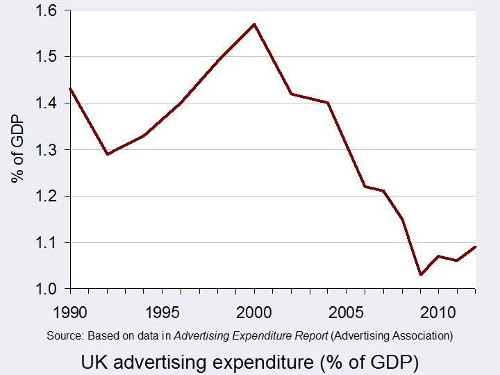
The key role of advertising is to sell more products and many firms spend a huge amount on advertising campaigns. Indeed, over £16bn was spent on advertising in 2012. Given that the economy is still vulnerable and many firms have seen their sales and profits decline, this is a huge amount. Procter & Gamble spent over £200 million, British Sky Broadcasting spent £145 million and Tesco spent £114 million in 2011.
 Advertising increases consumer awareness of the product and its features, but also actively aims to persuade people to purchase the product. By differentiating the product through adverts a company aims to shift the demand curve to the right and also make it more inelastic, by persuading customers that there are no (or few) close substitutes.
 Since the start of the economic downturn in 2008, advertising expenditure has fallen, as companies have seen a decline in their budgets. From a high of £18.61 billion in 2004, the Advertising Association found that it fell to £14.20 billion in 2009 at constant 2008 prices. In the last few years, advertising expenditure has remained at around £14.5 billion. But, is cutting back on advertising a sensible strategy during a recession? Of course budgets are tight for both firms and consumers, but many suggest that media-savvy firms would actually benefit from maintaining their advertising. By doing so firms could take advantage of weaker competitors by increasing their market share and establishing their brand image in the long run.
 It’s also important to consider another link between economic growth and advertising. Research suggests that advertising can be an important factor for economic growth. A three-year study undertaken by the Advertising Association and Deloitte, commencing in January 2013 suggests that for every £1 spent on advertising in the UK, £6 is generated for the wider economy. Based on these predictions, the estimated £16bn that was spent on ad campaigns in 2011 added over £100 billion to the UK’s GDP.
 So, perhaps encouraging more advertising is the answer to the UK’s economic dilemma. This is certainly the opinion of Matt Barwell, the consumer marketing and innovation director of Diageo Western Europe, who said:
People fundamentally believe in advertising but a lot of the conversation focuses on negative elements. People rarely get the opportunity to talk about the positive role advertising plays in terms of wealth creation, exports and the social benefits that it provides. These are all things that many of us take for granted.
If private firms can therefore be encouraged to boost their marketing campaigns, jobs may be created, demand for products will rise and with the help of the multiplier, the economy may strengthen. Advertising has both pros and cons and opinions differ on what makes a good advert. But, whatever your opinion of the role of advertising, it is certainly an important aspect of any economy. The following articles take a view of advertising.
Articles
Could we advertise ourselves out of recession? Marketing Week, Lucy Tesseras (31/1/13)
Advertising in times of recession: A question of value The Open University, Tom Farrell (13/3/09)
Recession spending on advertising and R&D Penn State, Smeal College of Business
Nothing to shout about The Economist (30/7/09)
UK’s payday lenders face restrictions on advertising Reuters (6/3/13)
Value claims improve advertising effectiveness in recessionary times Com Score, Diane Wilson (17/9/13)
Advertising in a bad economy About Advertising, Apryl Duncan
Advertising worth £100bn to UK economy The Telegraph, Graham Ruddick (31/1/13)
Can advertising be the motor that gets the struggling UK economy out of first gear? More about advertising (26/2/13)
Adverts ‘worth £100bn to UK’ Independent, Giddeon Spanier (30/1/13)
Report
Advertising Pays – How advertising fuels the UK economy Advertising Association & Deloitte (30/1/13)
 Advertising Pays – How advertising fuels the UK economy: Accompanying video presentation Advertising Association & Deloitte: on YouTube (30/1/13)
Questions
- What is the role of advertising?
- Using a demand and supply diagram, illustrate and explain the role of advertising.
- During a recession, why would you expect advertising expenditure to fall? What impact would you expect this to have in your diagram from question 1?
- How might firms that sustain their advertising expenditure during a downturn benefit?
- Explain the link between advertising and the economy.
- Why could a higher level of advertising boost economic growth?
- Are there any negative externalities from advertising?
 As part of the Basel III round of banking regulations, representatives of the EU Parliament and member governments have agreed with the European Commission that bankers’ bonuses should be capped. The proposal is to cap them at 100% of annual salary, or 200% with the agreement of shareholders. The full Parliament will vote in May and then it will go to officials from the 27 Member States. Under a system of qualified majority voting, it is expected to be accepted, despite UK resistance.
The main arguments in favour of a cap are that it will reduce the focus of bankers on short-term gains and reduce the incentive to take excessive risks. It will also appease the anger of electorates throughout the EU over bankers getting huge bonuses, especially in the light of the recession, caused in major part by the excesses of bankers.
 The main argument against is that it will drive talented top bankers to countries outside the EU. This is a particular worry of the UK government, fearful of the effect on the City of London. There is also the criticism that it will simply drive banks into increasing basic salaries of senior executives to compensate for lower bonuses.
But it is not just the EU considering curbing bankers’ pay. The Swiss have just voted in a referendum to give shareholders the right to veto salaries and bonuses of executives of major companies. Many of these companies are banks or other financial sector organisations.
So just what will be the effect on incentives, banks’ performance and the movement of top bankers to countries without such caps? The following videos and articles explore these issues. As you will see, the topic is highly controversial and politically charged.
 Meanwhile, HSBC has revealed its 2012 results. It paid out $1.9bn in fines for money laundering and set aside a further $2.3bn for mis-selling financial products in the UK. But its underlying profits were up 18%. Bonuses were up too. The 16 top executives received an average of $4.9m each. The Chief Executive, Stuart Gulliver, received $14.1m in 2012, 33% up on 2011 (see final article below).
Webcasts and podcasts
 EU moves to cap bankers bonuses Euronews on Yahoo News (1/3/13)
 EU to Curb Bank Bonuses WSJ Live (28/2/13)
 Inside Story – Curbing Europe’s bank bonuses AlJazeera on YouTube (1/3/13)
 Will EU bonus cap ‘damage economy’? BBC Radio 4 Today Programme (28/2/13)
 Swiss back curbs on executive pay in referendum BBC News (3/3/13)
 Has the HSBC scandal impacted on business? BBC News, Jeremy Howell (4/3/13)
Articles
Bonuses: the essential guide The Guardian, Simon Bowers, Jill Treanor, Fiona Walsh, Julia Finch, Patrick Collinson and Ian Traynor (28/2/13)
Q&A: EU banker bonus cap plan BBC News (28/2/13)
Outcry, and a Little Cunning, From Euro Bankers The New York Times, Landon Thomas Jr. (28/2/13)
Bank bonuses may shrink – but watch as the salaries rise The Observer, Rob Taylor (3/3/13)
Don’t cap bank bonuses, scrap them The Guardian, Deborah Hargreaves (28/2/13)
Capping banker bonuses simply avoids facing real bank problems The Telegraph, Mats Persson (2/3/13)
Pro bonus The Economist, Schumpeter column (28/2/13)
‘The most deluded measure to come from Europe since fixing the price of groceries in the Roman Empire’: Boris Johnson attacks EU banker bonus cap Independent, Gavin Cordon , Geoff Meade (28/2/13)
EU agrees to cap bankers’ bonuses BBC News (28/2/13)
Viewpoints: EU banker bonus cap BBC News (28/2/13)
Voters crack down on corporate pay packages swissinfo.ch , Urs Geiser (3/3/13)
Swiss voters seen backing executive pay curbs Reuters, Emma Thomasson (3/3/13)
Swiss referendum backs executive pay curbs BBC News (3/3/13)
Voters in Swiss referendum back curbs on executives’ pay and bonuses The Guardian, Kim Willsher and Phillip Inman (3/3/13)
Swiss vote for corporate pay curbs Financial Times, James Shotter and Alex Barker (3/3/13)
HSBC pays $4.2bn for fines and mis-selling in 2012 BBC News (4/3/13)
Questions
- How does competition, or a lack of it, in the banking industry affect senior bankers’ remuneration?
- What incentives are created by the bonus structure as it is now? Do these incentives result in desirable outcomes?
- How would you redesign the bonus system so that the incentives resulted in beneficial outcomes?
- If bonuses are capped as proposed by the EU, how would you assess the balance of advantages and disadvantages? What additional information would you need to know to make such an assessment?
- How has the relationship between banks and central banks over the past few years created a moral hazard? How could such a moral hazard be eliminated?
 Inflation is measured as the percentage increase in the Consumer Prices Index (CPI) over the previous 12 months. The index is constructed from a basket of goods that is supposed to represent the buying habits of an average UK household. This basket is updated each year as tastes change and as technology moves forward. The basket contains approximately 700 items, with 180,000 individual prices collected each month.
 However, just as new products have been added to the CPI measure, other goods have been removed. In the most recent update, we’ve seen the removal of champagne and Freeview boxes from the basket of goods. With rapid changes in technological products, such as the ipad, kindle and e-books, products that were new additions only a few years ago are now old news, being replaced by the latest gadgets. Other changes to the basket of goods are less about reflecting consumer trends and more about making certain categories more representative, such as fruits and hot drinks.

