 With many countries experiencing low growth some 12 years after the financial crisis and with new worries about the effects of the coronavirus on output in China and other countries, some are turning to a Keynesian fiscal stimulus (see Case Study 16.6 on the student website). This may be in the form of tax cuts, or increased government expenditure or a combination of the two. The stimulus would be financed by increased government borrowing (or a reduced surplus).
The hope is that there will also be a longer-term supply-side effect which will boost potential national income. This could be through tax reductions creating incentives to invest or work more efficiently; or it could be through increased capacity from infrastructure spending, whether on transport, energy, telecommunications, health or education.
In the UK, the former Chancellor, Sajid Javid, had adopted a fiscal rule similar to the Golden Rule adopted by the Labour government from 1997 to 2008. This stated that, over the course of the business cycle, the government should borrow only to invest and not to fund current expenditure. Javid’s rule was that the government would balance its current budget by the middle of this Parliament (i.e. in 2 to 3 years) but that it could borrow to invest, provided that this did not exceed 3% of GDP. Previously this limit had been set at 2% of GDP by the former Chancellor, Philip Hammond. Using his new rule, it was expected that Sajid Javid would increase infrastructure spending by some £20 billion per year. This would still be well below the extra promised by the Labour Party if they had won the election and below what many believe Boris Johnson Would like.
 Sajid Javid resigned at the time of the recent Cabinet reshuffle, citing the reason that he would have been required to sack all his advisors and use the advisors from the Prime Minister’s office. His successor, the former Chief Secretary to the Treasury, Rishi Sunak, is expected to adopt a looser fiscal rule in his Budget on March 11. This would result in bigger infrastructure spending and possibly some significant tax cuts, such as a large increase in the threshold for the 40% income tax rate.
A Keynesian stimulus would almost certainly increase the short-term economic growth rate as inflation is low. However, unemployment is also low, meaning that there is little slack in the labour market, and also the output gap is estimated to be positive (albeit only around 0.2%), meaning that national income is already slightly above the potential level.
 Whether a fiscal stimulus can increase long-term growth depends on whether it can increase capacity. The government hopes that infrastructure expenditure will do just that. However, there is a long time lag between committing the expenditure and the extra capacity coming on stream. For example, planning for HS2 began in 2009. Phase 1 from London to Birmingham is currently expected to be operation not until 2033 and Phase 2, to Leeds and Manchester, not until 2040, assuming no further delays.
Crossrail (the new Elizabeth line in London) has been delayed several times. Approved in 2007, with construction beginning in 2009, it was originally scheduled to open in December 2018. It is now expected to be towards the end of 2021 before it does finally open. Its cost has increased from £14.8 billion to £18.25 billion.
Of course, some infrastructure projects are much quicker, such as opening new bus routes, but most do take several years.
The first five articles look at UK policy. The rest look at Keynesian fiscal policies in other countries, including the EU, Russia, Malaysia, Singapore and the USA. Governments seem to be looking for a short-term boost to aggregate demand that will increase short-term GDP, but also have longer-term supply-side effects that will increase the growth in potential GDP.
Articles
Questions
- Illustrate the effect of an expansionary fiscal policy with a Keynesian Cross (income and expenditure) diagram or an injections and withdrawals diagram.
- What is meant by the term ‘output gap’? What are the implications of a positive output gap for expansionary Keynesian policy?
- Assess the benefits of having a fiscal rule that requires governments to balance the current budget but allows borrowing to invest.
- Would there be a problem following such a rule if there is currently quite a large positive output gap?
- To what extent are the policies being proposed in Russia, the EU, Malaysia and Singapore short-term demand management policies or long-term supply-side policies?
 Since the financial crisis of 2008–9, the UK has experienced the lowest growth in productivity for the past 250 years. This is the conclusion of a recent paper published in the National Institute Economics Review. Titled, Is the UK Productivity Slowdown Unprecedented, the authors, Nicholas Crafts of the University of Sussex and Terence C Mills of Loughborough University, argue that ‘the current productivity slowdown has resulted in productivity being 19.7 per cent below the pre-2008 trend path in 2018. This is nearly double the previous worst productivity shortfall ten years after the start of a downturn.’
According to ONS figures, productivity (output per hour worked) peaked in 2007 Q4. It did not regain this level until 2011 Q1 and by 2019 Q3 was still only 2.4% above the 2007 Q4 level. This represents an average annual growth rate over the period of just 0.28%. By contrast, the average annual growth rate of productivity for the 35 years prior to 2007 was 2.30%.
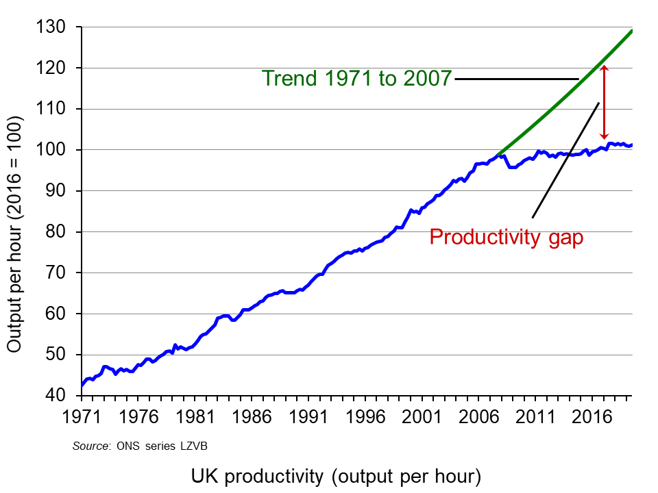 The chart illustrates this and shows the productivity gap, which is the amount by which output per hour is below trend output per hour from 1971 to 2007. By 2019 Q3 this gap was 27.5%. (Click here for a PowerPoint of the chart.) Clearly, this lack of growth in productivity over the past 12 years has severe implications for living standards. Labour productivity is a key determinant of potential GDP, which, in turn, is the major limiter of actual GDP.
Crafts and Mills explore the reasons for this dramatic slowdown in productivity. They identify three primary reasons.
 The first is a slowdown in the impact of developments in ICT on productivity. The office and production revolutions that developments in computing and its uses had brought about have now become universal. New developments in ICT are now largely in terms of greater speed of computing and greater sophistication of software. Perhaps with an acceleration in the development of artificial intelligence and robotics, productivity growth may well increase in the relatively near future (see third article below).
The second cause is the prolonged impact of the banking crisis, with banks more cautious about lending and firms more cautious about borrowing for investment. What is more, the decline in investment directly impacts on potential output, and layoffs or restructuring can leave people with redundant skills. There is a hysteresis effect.
The third cause identified by Crafts and Mills is Brexit. Brexit and the uncertainty surrounding it has resulted in a decline in investment and ‘a diversion of top-management time towards Brexit planning and a relative shrinking of highly-productive exporters compared with less productive domestically orientated firms’.
Articles
Paper
Questions
- How suitable is output (GDP) per hour as a measure of labour productivity?
- Compare this measure of productivity with other measures.
- According to Crafts and Mills, what is the size of the impact of each of their three explanations of the productivity slowdown?
- Would you expect the growth in productivity to return to pre-2007 levels over the coming years? Explain.
- Explain the underlying model for obtaining trend productivity growth rates used by Crafts and Mills.
- Explain and comment on each of the six figures in the Crafts and Mills paper.
- What policies should the government adopt to increase productivity growth?
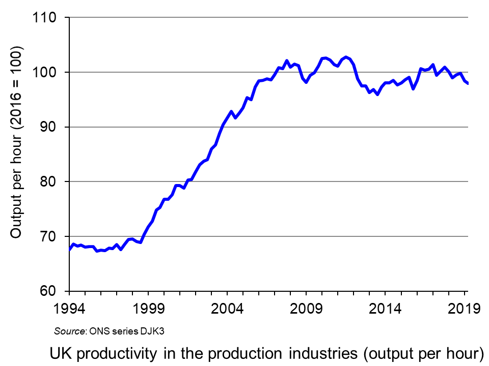 A lack of productivity growth has been a major problem for the UK economy over the past decade (click here for a PowerPoint of the chart). Is it possible that the new decade may see a pick-up in the growth in output per hour worked?
One possible solution to low productivity growth is to reduce working hours and even to move to a four-day week, but not to reduce total pay. If people work fewer hours, they may well be more productive in the hours they do work. In fact, not only may output per hour increase, but so too may output per worker, despite fewer hours being worked. What is more, the quality of output may increase with people being less tired and more motivated.
Several companies have experimented with a four-day week, including Microsoft in Japan, which employees 2300 workers. It found that, despite a 20% reduction in hours worked, output per hour worked increased by 40%, with total output thereby increasing. Workers were generally happier and more motivated and asked for fewer days off.
And it is not just a question of output: fewer hours can result in lower costs. The effect on costs will depend on the nature of new work patterns, including whether everyone has the same extra day off.
But a four-day week is only one way of cutting working hours for full-time employees. Another is to reduce the length of the working day. The argument is that people may work more efficiently if the standard working day is cut from eight to, say, five hours. As the first Thrive Global article article (linked below) states:
Just because you’re at your desk for eight hours doesn’t mean you’re being productive. Even the best employees probably only accomplish two to three hours of actual work. The five-hour day is about managing human energy more efficiently by working in bursts over a shorter period.
If people have more leisure time, this could provide a boost to the leisure and other industries. According to a Henley Business School study:
An extra day off could have a knock-on effect for the wider society. We found 54% of employees said they would spend their day shopping, meaning a potential boost for the high street, 43% would go to the cinema or theatre and 39% would eat out at restaurants.
What is more, many people would be likely to use the extra time productively, undertaking training, volunteering or other socially useful activities. Also family life is likely to improve, with people spending less time at work and commuting and having more time for their partners, children, other relatives and friends. In addition, people’s physical and mental health is likely to improve as they achieve a better work-life balance.
 So, should firms be encouraged to reduce hours for full-time workers with no loss of pay? Many firms may need no encouragement at all if they can see from the example of others that it is in their interests. But many firms may find it difficult, especially if their suppliers and/or customers are sticking with ‘normal’ working hours and want to do business during those hours. But, over time, as more firms move in this direction, so it will become increasingly in the interests of others to follow suit.
In the meantime, should the government introduce incentives (such as tax breaks) or regulations to limit the working week? Indeed, it was part of the Labour manifesto for the December 2019 election that the country should, over time, move to a four-day week. Although this was a long-term goal, it would probably have involved the use of some incentives to encourage employers to move in that direction or the gradual introduction of limits on the number of hours or days per week that people could work in a particular job. It is unlikely that the new Conservative government will introduce any specific measures, but would probably not want to discourage firms from reducing working hours, especially if it is accompanied by increased output per worker.
But despite the gains, there are some problems with reduced working hours. Many small businesses, such as shops, restaurants and firms offering technical support, may not have the flexibility to offer reduced hours, or may find it hard to increase productivity when there is a specific amount of work that needs doing, such as serving customers.
Another problem concerns businesses where the output of individuals is not easy to measure because they are part of a team. Reducing hours or the working week may not make such people work harder if they can ‘get way with it’. Not everyone is likely to be motivated by fewer hours to work harder.
Then there is the problem if reduced hours don’t work in boosting productivity. It may then be very difficult to reintroduce longer hours.
But, despite these problems, there are many firms where substantial gains in productivity could be made by restructuring work in a way that reduces hours worked. We may see more and more examples as the decade progresses.
Podcast
Articles
- Economics of a four-day working week: research shows it can save businesses mone
The Conversation, Miriam Marra (11/11/19)
- Less hours for work, more time on Earth: Why a four-day working week is good for you
Independent, Steve Taylor (16/12/19)
- Microsoft Japan Launched A Four-Day Workweek To Much Success: Is This The Key To Attracting Talent In The Tight U.S. Job Market?
Forbes, Jack Kelly (5/11/19)
- Will The Five-Hour Work Day Catch On In America?
Forbes, Jack Kelly (28/10/19)
- My Company Implemented a 5-Hour Workday — and the Results Have Been Astounding
Thrive Global, Stephan Aarstol (3/10/19)
- Why Does a Four-Day Work Week Achieve Better Results?
Thrive Global, Stephanie Lin (16/12/19)
- Four-Day Working Week Improves Staff’s Mental Health By 87%, Company Finds
Unilad, Niamh Shackleton (10/12/19)
- Hull business launches four-day working week as well as your birthday off and ‘Beer Fridays’
Hull Live, Phil Winter (5/12/19)
- A four-day work week? Sounds nice, but here’s the real deal
Sydney Morning Herald, Tony Featherstone (21/11/19)
- The four-day debate: Fantasy or feasible?
The Hindu, Business Live, Kamal Karanth (20/11/19)
- Finland’s ministry of transport floats tech-enabled four-day week
Computer Weekly, Gerard O’Dwyer (20/11/19)
- Should You Consider a 4 Day Work Week?
Small Business Trends, Rob Starr (5/12/19)
Report
Questions
- Distinguish between different ways of measuring labour productivity.
- Give some examples (from the linked references) of employers which have tried introducing a four-day week or reduced hours for full-time workers. What has been the outcome in each case?
- In what ways may reducing working hours reduce a firm’s total costs?
- What are the advantages and disadvantages of the government imposing (at some point in the future) a maximum working week or a four-day week?
- What types of firm might struggle in introducing a four-day week or a substantially reduced number of hours for full-time employees?
- What external benefits and costs might arise from a shorter working week?
 The monetary policy mandates of central banks have an impact on all our lives. While the terminology might not be familiar to many outside economics, their impact is, however, undeniably important. This is because they set out the objectives for the operation of monetary policy. Adjustments to interest rates or the growth of the money supply, which affect us all, reflect the mandate given to the central bank.
Since 1977 the mandate given to the Federal Reserve (the US central bank) by Congress has been to promote effectively the goals of maximum employment, stable prices, and moderate long-term interest rates. This mandate has become known as the dual mandate because it emphasises both employment and stable prices. Since 2012, the Federal Reserve’s Open Market Committee has issued an annual statemenent of its long-run goals. The latest was published in January 2019. Since this time, the Federal Reserve has explicitly set the ‘longer-run goal for inflation’ at 2 per cent. It has also emphasised that it would be ‘concerned’ if the inflation rate was persistently above or below this level.
In November 2018 the Federal Reserve began a review of its monetary policy strategy, its tools and how it communicates monetary policy. The review is being conducted within the guidelines that its statutory mandate gives and as well as the longer-term inflation goal of 2 per cent. However, one of the issues being addressed by the review is how the operation of monetary policy can avoid the rate of inflation frequently undershooting 2 per cent, as it has done since the financial crisis of the late 2000s and the introduction of the 2 per cent inflation rate target.
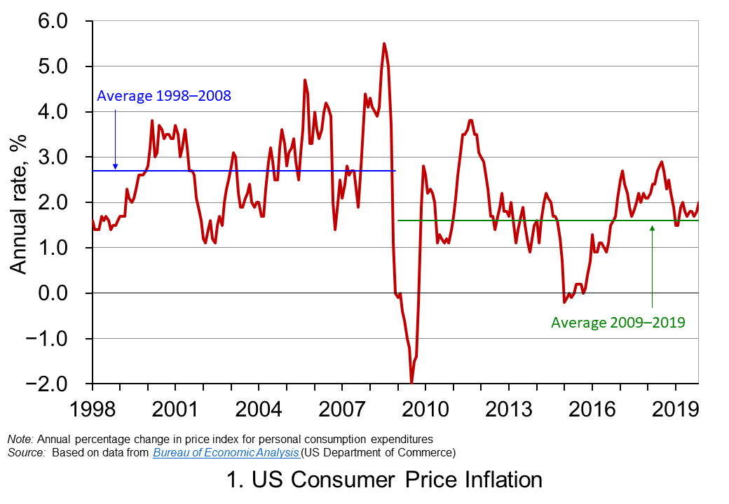 Chart 1 shows the annual rate of consumer price inflation in the US since 1998. It helps to illustrate the concern that low inflation rates can become entrenched. The chart shows that, while the average inflation rate from 1998 to 2008 was 2.7 per cent, from 2009 the average has been only 1.6 per cent. Interestingly, the average since 2012, when the explicit 2 per cent goal was introduced, to the present day is also 1.6 per cent. (Click here to download the PowerPoint chart.)
The concern going forward is that the natural or neutral rate of interest, which is the policy rate at which the rate of inflation is close to its target level and the level of output is close to its potential level, is now lower than in the recent past. Hence, when the next downturn occurs there is likely to be less room for cutting interest rates. Hence, the review is looking, in essence, to future-proof the conduct of monetary policy.
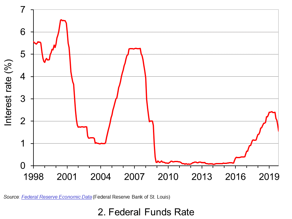 Chart 2 shows the Federal Fund rate since 1998. This is the rate at which commercial banks lend to each other the reserve balances they hold at the Federal Reserve in order to meet their reserve requirements. The Federal Reserve can affect this rate through buying or selling government securities. If it wants to drive up rates, it can sell holdings of government securities and reduce the money supply. If it wants to drive rates down, it can buy government securities and increase the money supply. The effects then ripple through to other interest rates and, in turn, aggregate demand and inflation. (Click here to download a copy of the PowerPoint chart.)
We can see from Chart 2 the dramatic cuts made by the Federal Reserve to interest rates as the financial crisis unfolded. The subsequent ‘normalisation’ of the Federal Funds rate in the 2010s saw the Federal Funds Rate rise to no higher than between 2.25 and 2.5 per cent. Then in 2019 the Federal Reserve began to cut rates again. This was despite historically-low unemployment rates. In November 2019 the unemployment rate fell to 3.5 per cent, its lowest since 1969. This has helped fuel the argument among some economists and financiers, which we saw earlier, that that the natural (or neutral) interest rate is now lower.
If the natural rate is lower, then this raises concerns about the effectiveness of monetary policy in future economic downturns. In this context, the review is considering ways in which the operation of monetary policy would be able to prevent the rate of inflation consistently undershooting its target. This includes a discussion of how the Fed can prevent inflationary expectations becoming anchored below 2 per cent. This is important because, should they do so, they help to anchor the actual rate of inflation below 2 per cent. One possibility being considered is an inflation make-up strategy. In other words, a period of below-target inflation rates would need to be matched by a period where inflation rates could exceed the 2 per cent target in order that the long-term average of 2 per cent is met.
An inflation make-up policy would work like forward guidance in that people and markets would know know that short-term interest rates would be kept lower for longer. This would then help to force longer-term interest rates lower as well as providing people and businesses with greater certainty that interest rates will be lower for longer. This could help to encourage spending, raise economic growth and prevent inflation from overshooting its target for any extensive period of time.
An inflation make-up strategy would, in part, help to cement the idea that the inflation target is effectively symmetrical and that 2 per cent is not an upper limit for the inflation rate. But, it would do more than that: it would allow the Fed to deliberately exceed the 2 per cent target.
An inflation make-up strategy does raise issues. For example, how would the Fed determine the magnitude of any inflation make-up and for how long would a looser monetary stance be allowed to operate? In other words, would an inflation make-up strategy be determined by a specific rule or formula? Or, would the principle be applied flexibly? Finally, could a simpler alternative be to raise the target rate itself, given the tendency to undershoot the 2 per cent target rate? If so, what should that the rate be?
We should know by the end of 2020 whether the Federal Reserve will adopt, when necessary, an inflation make-up monetary policy.
Articles
Questions
- What do you understand by the monetary policy mandate of a central bank?
- Explain the ways in which the monetary policy mandate of the central bank affects our everyday lives.
- Why are inflation-rate expectations important in determining actual inflation rates?
- Why is the Federal Reserve concerned about its ability to use monetary policy effectively during future economic downturns?
- Discuss the economic arguments for and against central banks operating strict inflation-rate targets.
- Does the case for adopting an inflation make-up monetary policy mandate show that the argument for inflation-rate targeting has been lost?
- What do you understand by the idea of a natural or neutral policy interest rate? Would the actual rate be expected to be above or below this if the rate of inflation was below its target level?
 Elections are times of peak deception. Political parties have several ways in which they can use data to persuade people to vote for them. At one extreme, they can simply make up ‘facts’ – in other words, they can lie. There have been various examples of such lies in the run-up to the UK general election of 12 December 2019. The linked article below gives some examples. But data can be used in other deceptive ways, short of downright lies.
Politicians can use data in two ways. First, statistics can be used to describe, explain and interpret the past. Second, they can be used as the basis of forecasts of the future effects of policies.
In terms of past data, one of the biggest means of deception is the selective use of data. If you are the party currently in power, you highlight the good news and ignore the bad. You do the reverse if you are currently in opposition. The data may be correct, but selective use of data can give a totally false impression of events.
In terms of forecast data, you highlight those forecasts, or elements of them, that are favourable to you and ignore those that are not.
 Politicians rely on people’s willingness to look selectively at data. People want to see ‘evidence’ that reinforces their political views and prejudices. News media know this and happily do the same as politicians, selectively using data favourable to their political leanings. And it’s not just newspapers that do this. There are many online news sites that feed their readers with data supportive of their position. And there are many social media platforms, where people can communicate with people in their political ‘bubble’.
Genuine fact-checking sites can help, as can independent forecasters, such as the Institute for Fiscal Studies. But too many voters would rather only look at evidence, genuine or not, that supports their political point of view.
This can make life hard for economists who seek to explain the world with an open mind, based on a non-biased use of evidence – and hard for economic forecasters, who want to use full and accurate data in their models and to make realistic assumptions, emphasising that their forecasts are only the most likely outcome, not a certainty. As the article states:
Economic forecasts are flawed and their limitations should be acknowledged. But they should not be blindly dismissed as fake facts. And as far as political debate and discourse is concerned, in the long run, the truth may will out.
Article
Questions
- Give some specific examples of ways in which politicians misuse data.
- Give some specific examples of ways in which politicians misuse the analysis of economists.
- Distinguish between positive and normative statements? Should economists make policy recommendations? If so, in what context?
- Why are economic forecasts flawed, but why should they not be dismissed as ‘fake facts’?
- Examine the manifestos of two political parties and provide a critique of their economic analysis.
 With many countries experiencing low growth some 12 years after the financial crisis and with new worries about the effects of the coronavirus on output in China and other countries, some are turning to a Keynesian fiscal stimulus (see Case Study 16.6 on the student website). This may be in the form of tax cuts, or increased government expenditure or a combination of the two. The stimulus would be financed by increased government borrowing (or a reduced surplus).
  Sajid Javid resigned at the time of the recent Cabinet reshuffle, citing the reason that he would have been required to sack all his advisors and use the advisors from the Prime Minister’s office. His successor, the former Chief Secretary to the Treasury, Rishi Sunak, is expected to adopt a looser fiscal rule in his Budget on March 11. This would result in bigger infrastructure spending and possibly some significant tax cuts, such as a large increase in the threshold for the 40% income tax rate.
 Whether a fiscal stimulus can increase long-term growth depends on whether it can increase capacity. The government hopes that infrastructure expenditure will do just that. However, there is a long time lag between committing the expenditure and the extra capacity coming on stream. For example, planning for HS2 began in 2009. Phase 1 from London to Birmingham is currently expected to be operation not until 2033 and Phase 2, to Leeds and Manchester, not until 2040, assuming no further delays.
  Since the financial crisis of 2008–9, the UK has experienced the lowest growth in productivity for the past 250 years. This is the conclusion of a recent paper published in the National Institute Economics Review. Titled,
  The chart illustrates this and shows the productivity gap, which is the amount by which output per hour is below trend output per hour from 1971 to 2007. By 2019 Q3 this gap was 27.5%. (Click
  The first is a slowdown in the impact of developments in ICT on productivity. The office and production revolutions that developments in computing and its uses had brought about have now become universal. New developments in ICT are now largely in terms of greater speed of computing and greater sophistication of software. Perhaps with an acceleration in the development of artificial intelligence and robotics, productivity growth may well increase in the relatively near future (see third article below).
 A lack of productivity growth has been a major problem for the UK economy over the past decade (click
 The monetary policy mandates of central banks have an impact on all our lives. While the terminology might not be familiar to many outside economics, their impact is, however, undeniably important. This is because they set out the objectives for the operation of monetary policy. Adjustments to interest rates or the growth of the money supply, which affect us all, reflect the mandate given to the central bank.
 Chart 1 shows the annual rate of consumer price inflation in the US since 1998. It helps to illustrate the concern that low inflation rates can become entrenched. The chart shows that, while the average inflation rate from 1998 to 2008 was 2.7 per cent, from 2009 the average has been only 1.6 per cent. Interestingly, the average since 2012, when the explicit 2 per cent goal was introduced, to the present day is also 1.6 per cent. (Click
  Chart 2 shows the Federal Fund rate since 1998. This is the rate at which commercial banks lend to each other the reserve balances they hold at the Federal Reserve in order to meet their reserve requirements. The Federal Reserve can affect this rate through buying or selling government securities. If it wants to drive up rates, it can sell holdings of government securities and reduce the money supply. If it wants to drive rates down, it can buy government securities and increase the money supply. The effects then ripple through to other interest rates and, in turn, aggregate demand and inflation. (Click
  Elections are times of peak deception. Political parties have several ways in which they can use data to persuade people to vote for them. At one extreme, they can simply make up ‘facts’ – in other words, they can lie. There have been various examples of such lies in the run-up to the UK general election of 12 December 2019. The linked article below gives some examples. But data can be used in other deceptive ways, short of downright lies.
  Politicians rely on people’s willingness to look selectively at data. People want to see ‘evidence’ that reinforces their political views and prejudices. News media know this and happily do the same as politicians, selectively using data favourable to their political leanings. And it’s not just newspapers that do this. There are many online news sites that feed their readers with data supportive of their position. And there are many social media platforms, where people can communicate with people in their political ‘bubble’.