 The government has announced outlines of the new system of immigration controls from January 2021 when the Brexit transition period is scheduled to finish. It plans to introduce an Australian-style points-based system. This will apply to all EU and Non-EU citizens. The aim is to attract skilled workers, while preventing non-skilled or low-skilled workers from entering the UK for employment.
But even skilled workers will need to meet three criteria in order to obtain a work visa: (i) having the offer of a job paying a minimum of £25,600 per annum, except in designated jobs where there is a shortage of labour; (ii) being able to speak English; (iii) having qualifications equivalent to A levels.
To apply for a work visa, applicants must have at least 70 points according to the following table:
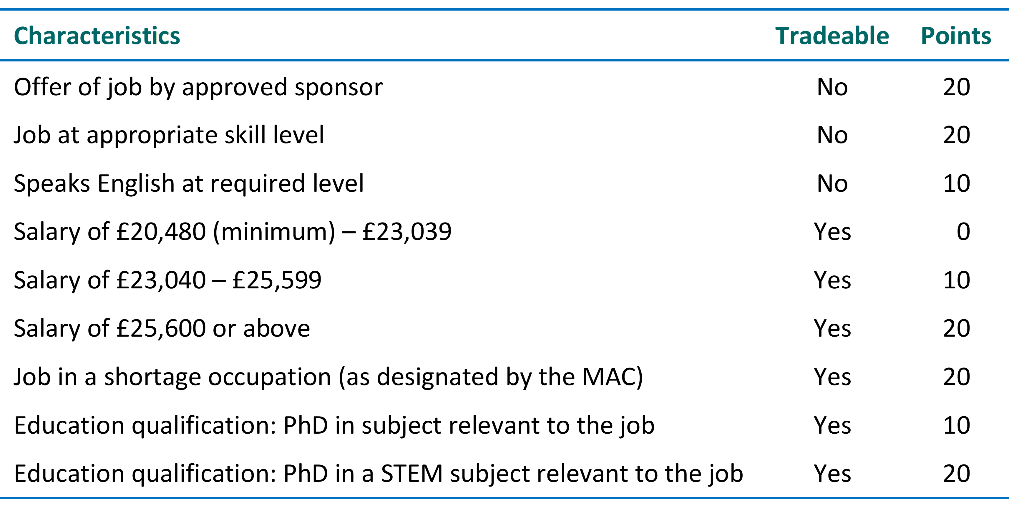
In certain jobs where there is a shortage of labour, designated by the Migration Advisory Committee (MAC), immigrants will be able to earn a lower income, provided it is above £20,480 per annum. They will earn 20 points for such jobs, which can offset not meeting the £25,600 threshold. Such jobs could include those in healthcare and farming. There will also be temporary visas for seasonal workers, such as fruit pickers.
The government argues that the new system will encourage employers to substitute technology for labour, with greater investment in equipment and computers. This would increase labour productivity and wages without reducing employment.
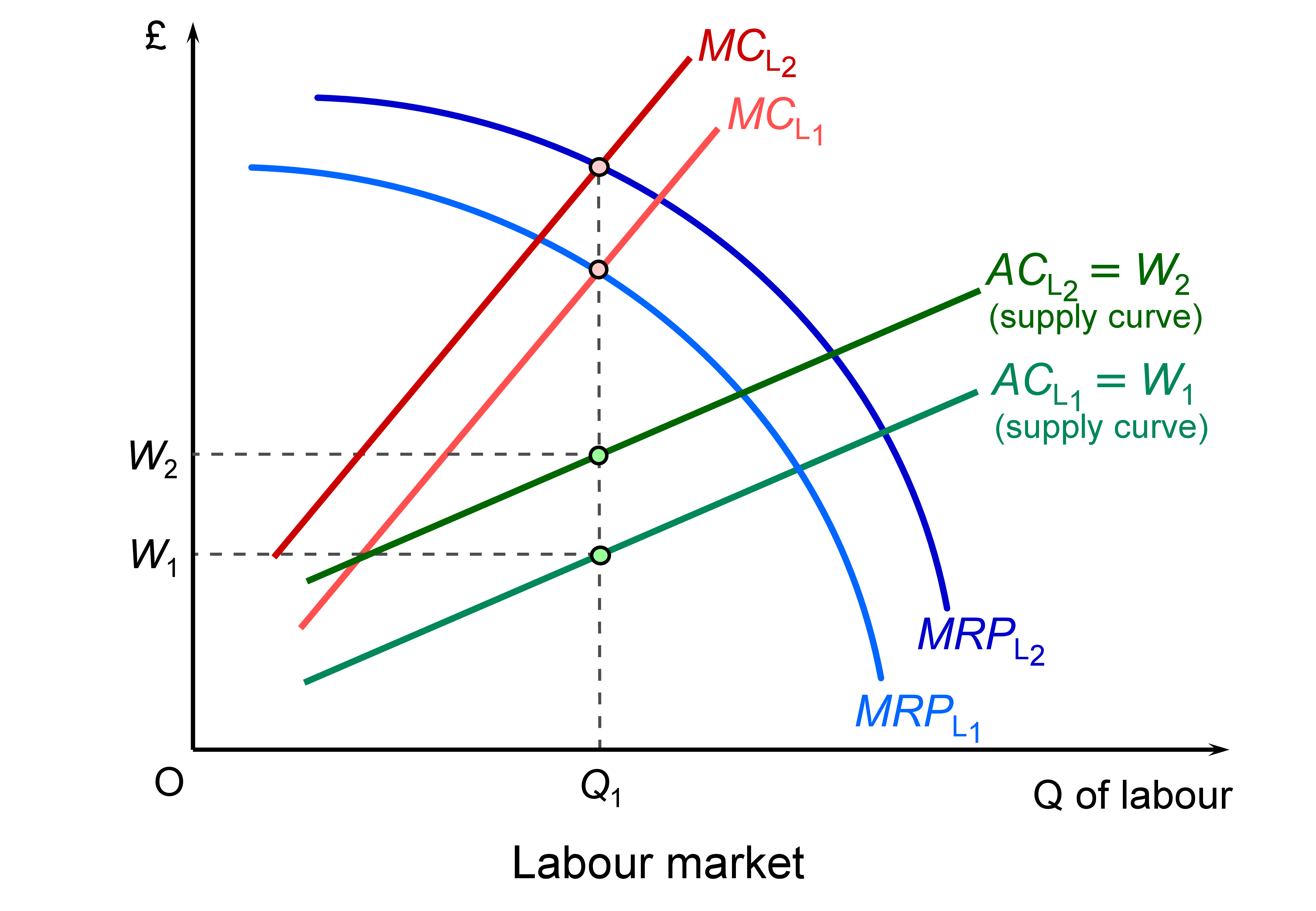 This is illustrated in the diagram, which illustrates a low-paid job which will be impacted by the restrictions. If there is a rise in productivity through technological change, the marginal revenue product of labour curve shifts upwards from MRPL1 to MRPL2 and offsets the leftward shift in labour supply (caused by the decline in immigration) from ACL1 to ACL2 and the marginal cost of labour from MCL1 to MCL2. Employment is where the marginal cost of labour equals the marginal revenue product of labour. This remains at Q1. Wages are given by the supply curve of labour and rise from W1 to W1. (Click here for a PowerPoint of the diagram.)
Even if the upward shift in the MRPL curve is not sufficient to offset the leftward shift in the labour supply curve, wages will still rise, but there will be a fall in employment.
In higher-paid skilled jobs where people meet the points requirement, there will be little effect on wages and employment, except where people are generally discouraged by a points system, even if they have the points themselves.
The government also argues that there is a large pool of UK residents who can take up jobs that would otherwise have been filled by immigrants. The Home Secretary referred to the 8.48 million people who are economically inactive who could fill jobs no longer filled by immigrants. However, as the data show, most  of these people are not available for work. Some 2.3 million are students, 1.9 million are carers at home looking after relatives, 2.1 million are long-term sick and 1.1 million are retired. Only 1.9 million (22.1% of the economically inactive) would like a job and not all these would be able to take up one (e.g. the long-term sick).
One the biggest problems concerns low-paid sectors where it is very difficult to substitute capital for labour through use of technology. Examples include social care, health care, the leisure and hospitality industry and certain jobs in farming. There could be severe shortages of labour in such industries. It remains to be seen whether such industries will be given exemptions or more relaxed conditions by the government in line with advice from the Migration Advisory Committee.
More details will emerge of the points system in the coming months. It will be interesting to see how responsive the government will be to the concerns of employers and workers.
Videos
Articles
Questions
- Find out how the proposed points-based system for immigration differs from the current system that applies to non-EU citizens.
- What will be the likely impact of reducing immigration of unskilled and low-skilled people?
- What barriers are there to substituting capital for labour in the caring and leisure sectors?
- What would be the macroeconomic effects of a substantial reduction in immigration?
 Confidence figures suggest that sentiment weakened across several sectors in June with significant falls recorded in retail and construction. This is consistent with the monthly GDP estimates from the ONS which suggest that output declined in March and April by 0.1 per cent and 0.4 per cent respectively. The confidence data point to further weakness in growth down the line. Furthermore, it poses the risk of fuelling a snowball effect with low growth being amplified and sustained by low confidence.
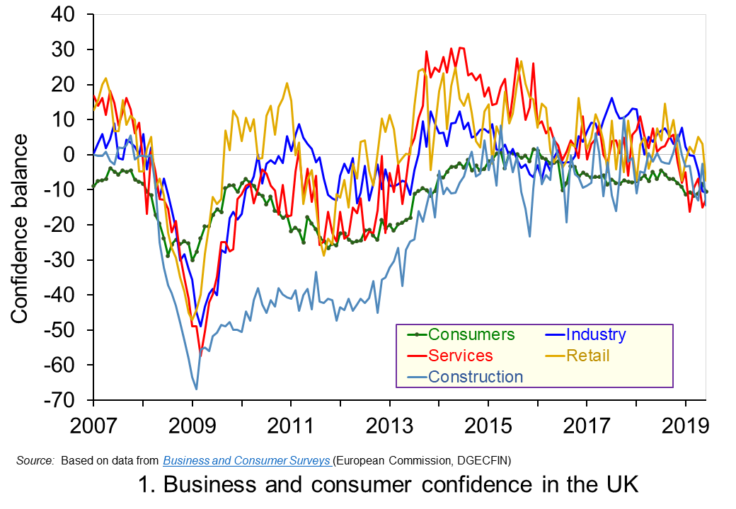 Chart 1 shows the confidence balances reported by the European Commission each month since 2007. It highlights the collapse in confidence across all sectors around the time of the financial crisis before a strong and sustained recovery in the 2010s. However, in recent months confidence indicators have eased significantly, undoubtedly reflecting the heightened uncertainty around Brexit. (Click here to download a PowerPoint copy of the chart.)
Between June 2016 and June 2019, the confidence balances have fallen by at least 8 percentage points. In the case of the construction the fall is 14 points while in the important service sector, which contributes about 80 per cent of the economy’s national income, the fall is as much as 15 points.
Changes in confidence are thought, in part, to reflect levels of economic uncertainty. In particular, they may reflect the confidence around future income streams with greater uncertainty pulling confidence down. This is pertinent because of the uncertainty around the UK’s future trading relationships following the 2016 referendum which saw the UK vote to leave the EU. In simple terms, uncertainty reduces the confidence people and businesses have when forming expectations of what they can expect to earn in the future.
Greater uncertainty and, hence, lower confidence tend to make people and businesses more prudent. The caution that comes from prudence counteracts the inherent tendency of many of us to be impatient. This impatience generates an impulse to spend now. On the other hand, prudence encourages us to take actions to increase net worth, i.e. wealth. This may be through reducing our exposure to debt, perhaps by looking to repay debts or choosing to borrow smaller sums than we may have otherwise done. Another option may be to increase levels of saving. In either case, the effect of greater prudence is the postponement of spending. Therefore, in times of high uncertainty, like those of present, people and businesses would be expected to want to have greater financial resilience because they are less confident about what the future holds.
To this point, the saving ratio – the proportion of disposable income saved by households – has remained historically low. In Q1 2019 the saving ratio was 4.4 per cent, well below its 60-year average of 8.5 per cent. This appears to contradict the idea that households respond to uncertainty by increasing saving. However, at least in part, the squeeze seen over many years following the financial crisis on real earnings, i.e. inflation-adjusted earnings, restricted the ability of many to increase saving. With real earnings having risen again over the past year or so, though still below pre-crisis levels, households may have taken this opportunity to use earnings growth to support spending levels rather than, as we shall see shortly, looking to borrow.
Another way in which the desire for greater financial resilience can affect behaviour is through the appetite to borrow. In the case of consumers, it could reduce borrowing for consumption, while in the case of firms it could reduce borrowing for investment, i.e. spending on capital, such as that on buildings and machinery. The reduced appetite for borrowing may also be mirrored by a tightening of credit conditions by financial institutions if they perceive lending to be riskier or want to increase their own financial capacity to absorb future shocks.
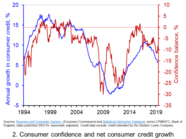 Chart 2 shows consumer confidence alongside the annual rate of growth of consumer credit (net of repayments) to individuals by banks and building societies. Consumer credit is borrowing by individuals to finance current expenditure on goods and services and it comprises borrowing through credit cards, overdraft facilities and other loans and advances, for example those financing the purchase of cars or other large ticket items. (Click here to download a PowerPoint copy of the chart.)
The chart allows us to view the confidence-borrowing relationship for the past 25 years or so. It suggests a fairly close association between consumer confidence and consumer credit growth. Whether changes in confidence occur ahead of changes in borrowing is debatable. However, the easing of confidence following the outcome of the EU referendum vote in June 2016 does appear to have led subsequently to an easing in the annual growth of consumer credit. From its peak of 10.9 per cent in the autumn of 2016, the annual growth rate of consumer credit dropped to 5.6 per cent in May 2019.
The easing of credit growth helps put something of a brake on consumer spending. It is, however, unlikely to affect all categories of spending equally. Indeed, the ONS figures for May on retail sales shows a mixed picture for the retail sector. Across the sector as a whole, the 3 month-on-3 month growth rate for the volume of purchases stood at 1.6 per cent, having fallen as low as 0.1 percent in December of last year. However, the 3 month-on-3 month growth rate for spending volumes in department stores, which might be especially vulnerable to a slowdown in credit, fell for the ninth consecutive month.
Going forward, the falls in confidence might be expected to lead to further efforts by the household sector, as well as by businesses, to ensure their financial resilience. The vulnerability of households, despite the slowdown in credit growth, so soon after the financial crisis poses a risk for a hard landing for the sector. After falls in national output in March and April, the next monthly GDP figures to be released on 10 July will be eagerly anticipated.
Articles
Questions
- Which of the following statements is likely to be more accurate: (a) Confidence drives economic activity or (b) Economic activity drives confidence?
- Explain the difference between confidence as a source of economic volatility as compared to an amplifier of volatility?
- Discuss the links between confidence, economic uncertainty and financial resilience.
- Discuss the ways in which people and businesses could improve their financial resilience to adverse shocks.
- What are the potential dangers to the economy of various sectors being financially distressed or exposed?
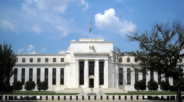 Donald Trump has suggested that the Fed should cut interest rates by 1 percentage point and engage in a further round of quantitative easing. He wants to see monetary policy used to give a substantial boost to US economic growth at a time when inflation is below target. In a pair of tweets just before the meeting of the Fed to decide on interest rates, he said:
China is adding great stimulus to its economy while at the same time keeping interest rates low. Our Federal Reserve has incessantly lifted interest rates, even though inflation is very low, and instituted a very big dose of quantitative tightening. We have the potential to go up like a rocket if we did some lowering of rates, like one point, and some quantitative easing. Yes, we are doing very well at 3.2% GDP, but with our wonderfully low inflation, we could be setting major records &, at the same time, make our National Debt start to look small!
But would this be an appropriate policy? The first issue concerns the independence of the Fed.
It is supposed to take decisions removed from the political arena. This means sticking to its inflation target of 2 per cent over the medium term – the target it has officially had since January 2012. To do this, it adjusts the federal funds interest rate and the magnitude of any bond buying programme (quantitative easing) or bond selling programme (quantitative tightening).
The Fed is supposed to assess the evidence concerning the pressures on inflation (e.g. changes in aggregate demand) and what inflation is likely to be over the medium term in the absence of any changes in monetary policy. If the Federal Open Market Committee (FOMC) expects inflation to exceed 2 per cent over the medium term, it will probably raise the federal funds rate; if it expects inflation to be below the target it will probably lower the federal funds rate.
In the case of the economy being in recession, and thus probably considerably undershooting the target, it may also engage in quantitative easing (QE). If the economy is growing strongly, it may sell some of its portfolio of bonds and thus engage in quantitative tightening (QT).
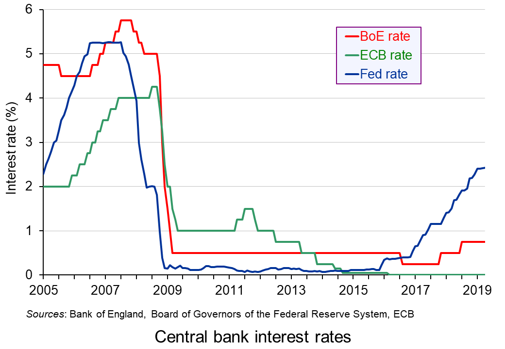 Since December 2015 the Fed has been raising interest rates by 0.25 percentage points at a time in a series of steps, so that the federal funds rate stands at between 2.25% and 2.5% (see chart). And since October 2017, it has also been engaged in quantitative tightening. In recent months it has been selling up to $50 billion of assets per month from its holdings of around $4000 billion and so far has reduced them by around £500 billion. It has, however, announced that the programme of QT will end in the second half of 2019.
This does raise the question of whether the FOMC is succumbing to political pressure to cease QT and put interest rate rises on hold. If so, it is going against its remit to base its policy purely on evidence. The Fed, however, maintains that its caution reflects uncertainty about the global economy.
 The second issue is whether Trump’s proposed policy is a wise one.
Caution about further rises in interest rates and further QT is very different from the strongly expansionary monetary policy that President Trump proposes. The economy is already growing at 3.2%, which is above the rate of growth in potential output, of around 1.8% to 2.0%. The output gap (the percentage amount that actual GDP exceeds potential GDP) is positive. The IMF forecasts that the gap will be 1.4% in 2019 and 1.3% in 2020 and 2021. This means that the economy is operating at above normal capacity working and this will eventually start to drive up inflation. Any further stimulus will exacerbate the problem of excess demand. And a large stimulus, as proposed by Donald Trump, will cause serious overheating in the medium term, even if it does stimulate growth in the short term.
 For these reasons, the Fed resisted calls for a large cut in interest rates and a return to quantitative easing. Instead it chose to keep interest rates on hold at its meeting on 1 May 2019.
But if the Fed had done as Donald Trump would have liked, the economy would probably be growing very strongly at the time of the next US election in November next year. It would be a good example of the start of a political business cycle – something that is rarer nowadays with the independence of central banks.
Articles
FOMC meeting
Questions
- What are the arguments for central bank independence?
- Are there any arguments against central bank independence?
- Explain what is meant by an ‘output gap’? Why is it important to be clear on what is meant by ‘potential output’?
- Would there be any supply-side effects of a strong monetary stimulus to the US economy at the current time? If so, what are they?
- Explain what is meant by the ‘political business’ cycle? Are governments in the UK, USA or the eurozone using macroeconomic policy to take advantage of the electoral cycle?
- The Fed seems to be ending its programme of quantitative tightening (QT). Why might that be so and is it a good idea?
- If inflation is caused by cost-push pressures, should central banks stick rigidly to inflation targets? Explain.
- How are expectations likely to affect the success of a monetary stimulus?
 It is perhaps timely given the ongoing uncertainty around Brexit to revisit and update our blog Desperately seeking confidence written back in January. Consumer and business confidence reflects the sentiment, emotion, or anxiety of consumers and businesses. Confidence surveys therefore try to capture these feelings of optimism or pessimism. They may then provide us with timely information for the short-term prospects for private-sector spending. For example, declining levels of confidence might be expected to play a part in weakening the growth of consumption and investment spending.
Attempts are made to measure confidence through the use of surveys. One long-standing survey is that conducted for the European Commission. Each month consumers and firms across the European Union are asked a series of questions, the answers to which are used to compile indicators of consumer and business confidence. For instance, consumers are asked about how they expect their financial position to change. They are offered various options such as ‘get a lot better, ‘get a lot worse’ and balances are then calculated on the basis of positive and negative replies.
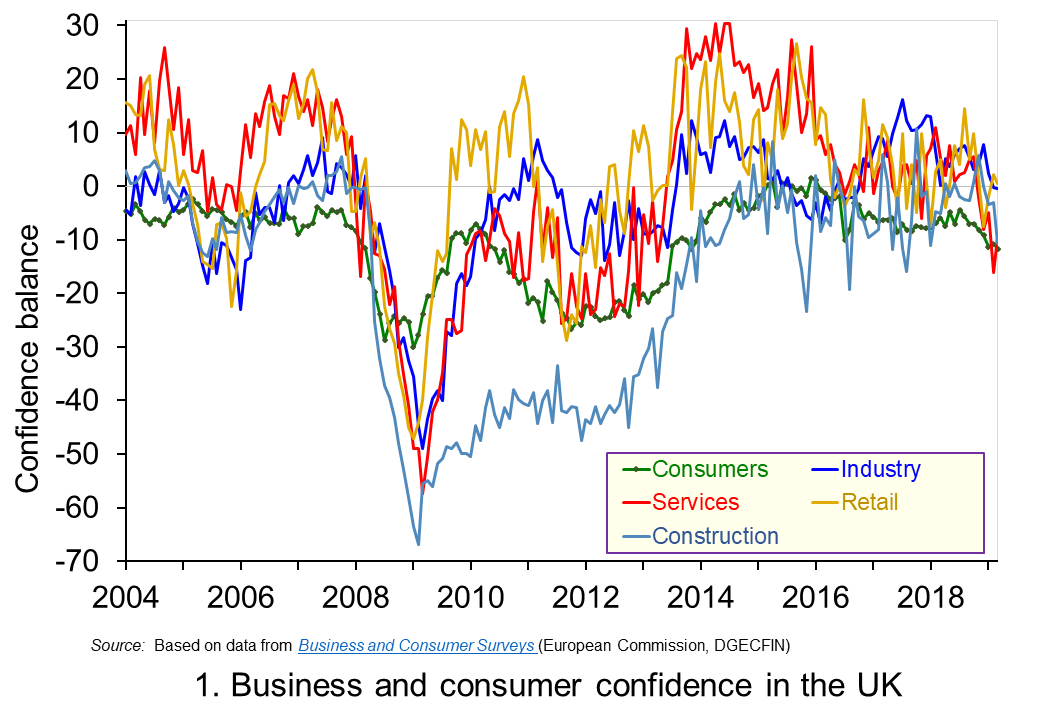 The chart plots confidence in the UK for consumers and different sectors of business since the mid 1990s. The chart captures the volatility of confidence. This volatility is generally greater amongst businesses than consumers, and especially so in the construction sector. (Click here to download a PowerPoint copy of the chart.)
Confidence measures rebounded across all sectors during the 2010s, with positive balances being recorded consistently from 2013 to 2016 in services, retail and industry. Subsequently, confidence indicators became more erratic though often remaining at above-average levels. However, confidence indicators have eased across the board in recent months. In some cases the easing has been stark. For example, the confidence balance in the service sector, which contributes about 80 per cent of the economy’s national income, fell from +10.9 in February 2018 to -16.2 in February 2019, though recovering slightly to -9.2 in March 2019.
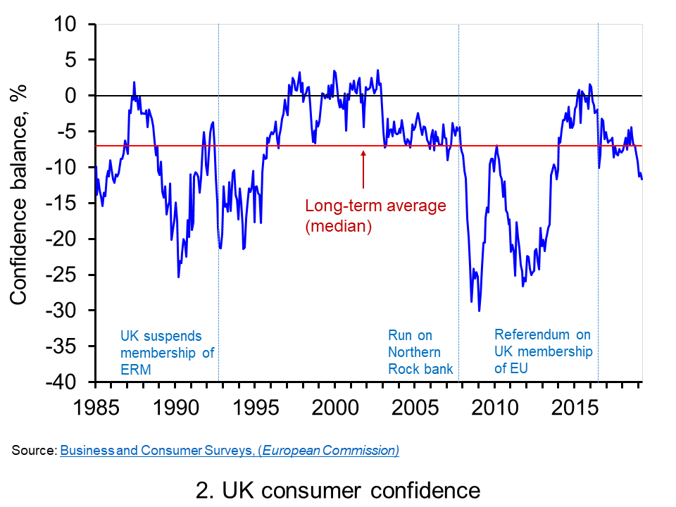 Chart 2 shows how the recent easing of consumer confidence has seen the confidence balance fall below its long-term (median) average of -7. In March 2019 the balance stood at -11.7 the lowest figure since November 2013. To put the easing into further perspective, the consumer confidence balance had been as high as +8.2 in September 2015. (Click here to download a PowerPoint copy of the chart.)
Changes in confidence are used frequently as an example of a demand shock. In reality changes in consumer confidence are often likely to be an amplifier of shocks rather than the source. For example, the collapse in aggregate demand in 2007/8 that followed the ‘credit crunch’, the severe tightening of credit conditions and financial distress of many sectors of the economy is likely to have been amplified by the collapse in consumer confidence. The weakening of confidence since 2016 is perhaps a purer example of a ‘confidence shock’. Nonetheless, falls in confidence, whether they amplify existing shocks or are the source of shocks, are often a signal of greater economic uncertainty.
Greater uncertainty is likely to go and hand in hand with lower confidence and is likely to reflect greater uncertainty about future income streams. The result is that people and businesses become more prudent. In the context of households this implies a greater willingness to engage in self-insurance through increased saving. This is known as buffer stock or precautionary saving. Alternatively, people may reducing levels of borrowing. In uncertain times prudence can dominate our impatience that encourages us to spend.
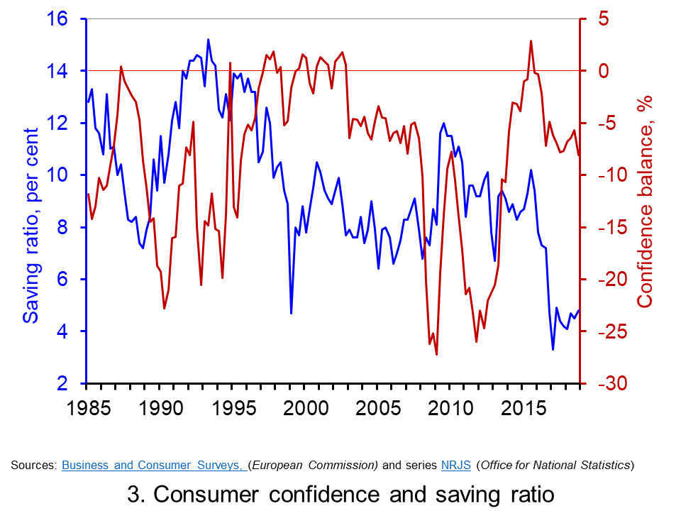 Chart 3 plots the paths of the UK household-sector saving ratio and consumer confidence. The saving ratio approximates the proportion of disposable income saved by the household sector. What we might expect to see, if greater uncertainty induces buffer-stock saving, is for falls in confidence to lead to a rise in the saving ratio. Conversely, less uncertainty as proxied by a rise in confidence would lead to a fall in the saving ratio. (Click here to download a PowerPoint of the chart.)
The chart provides some evidence of this. The early 1990s and late 2000s coincided with both waning confidence and a rising saving ratio, whilst the rising confidence seen in the late 1990s coincided with a fall in the saving ratio. However, the easing of confidence since 2016 has coincided with a period where the saving ratio has been historically low. In the first quarter of 2017 the saving ratio was just 3.3 per cent. Although the saving ratio has ticked up a little, in the final quarter of 2018 it remained historically low at just 4.9 per cent. Hence, the available data on the saving ratio does not provide clear evidence of the more cautious behaviour we might expect with waning confidence.
Consider now patterns in the consumer confidence balance alongside the annual rate of growth of consumer credit (net of repayments) to individuals by banks and building societies. Consumer credit is borrowing by individuals to finance current expenditure on goods and services.
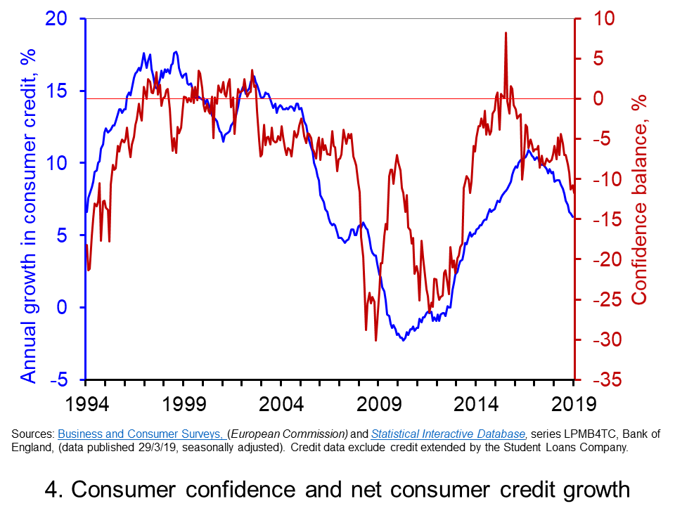 Data on consumer credit is more timely than that for the saving ratio. Therefore, Chart 4 shows the relationship between consumer confidence and consumer credit into 2019. We observe a reasonably close association consumer credit growth and consumer confidence. Certainty, the recent easing in confidence is mirrored by an easing in the annual growth of net consumer credit. (Click here to download a PowerPoint of the chart.)
The year-to-year growth in net consumer credit has eased considerably since the peak of 10.9 per cent in November 2016. In February 2019 the annual growth rate of net consumer credit had fallen back to 6.3 per cent, its lowest rate since September 2014. As we noted in our recent blog Riding the consumer credit cycle (again) it is hard to look much past the effect of Brexit in acting as a lid on the growth in consumer credit. Therefore, while the recent falls in consumer confidence have yet to markedly affect the saving ratio they may instead be driving the slowdown in consumer credit. The effect will be to weaken the growth of consumer spending.
Articles
Questions
- Draw up a series of factors that you think might affect both consumer and business confidence. How similar are both these lists?
- Which of the following statements is likely to be more accurate: (a) Confidence drives economic activity or (b) Economic activity drives confidence?
- What macroeconomic indicators would those compiling the consumer and business confidence indicators expect each indicator to predict?
- What is meant by the concept of ‘prudence’ in the context of spending? What factors might determine the level of prudence
- How might prudence be expected to affect spending behaviour?
- How might we distinguish between confidence ‘shocks’ and confidence as a ‘propagator’ of shocks?
- What is meant by buffer stock or precautionary saving? Draw up a list of factors that are likely to affect levels of buffer stock saving.
- If economic uncertainty is perceived to have increased how could this affect the consumption, saving and borrowing decisions of people?
 One of the most enduring characteristics of the macroeconomic environment since the financial crisis of the late 2000s has been its impact on people’s pay. We apply the distinction between nominal and real values to evidence the adverse impact on the typical purchasing power of workers. While we do not consider here the distributional impact on pay, the aggregate picture nonetheless paints a very stark picture of recent patterns in pay and, in turn, the consequences for living standards and wellbeing.
While the distinction between nominal and real values is perhaps best know in relation to GDP and economic growth (see the need to get real with GDP), the distinction is also applied frequently to analyse the movement of one price relative to prices in general. One example is that of movements in pay (earnings) relative to consumer prices.
Pay reflects the price of labour. The value of our actual pay is our nominal pay. If our pay rises more quickly than consumer prices, then our real pay increases. This means that our purchasing power rises and so the volume of goods and services we can afford increases. On the other hand, if our actual pay rises less quickly than consumer prices then our real pay falls. When real pay falls, purchasing power falls and the volume of goods and services we can afford falls.
Figures from the Office for National Statistics show that in January 2000 regular weekly pay (excluding bonuses and before taxes and other deductions from pay) was £293. By December 2018 this had risen to £495. This is an increase of 69 per cent. Over the same period the consumer prices index known as the CPIH, which, unlike the better-known CPI, includes owner-occupied housing costs and Council Tax, rose by 49 per cent. Therefore, the figures are consistent with a rise both in nominal and real pay between January 2000 to December 2018. However, this masks the fact that in recent times real earnings have fallen.
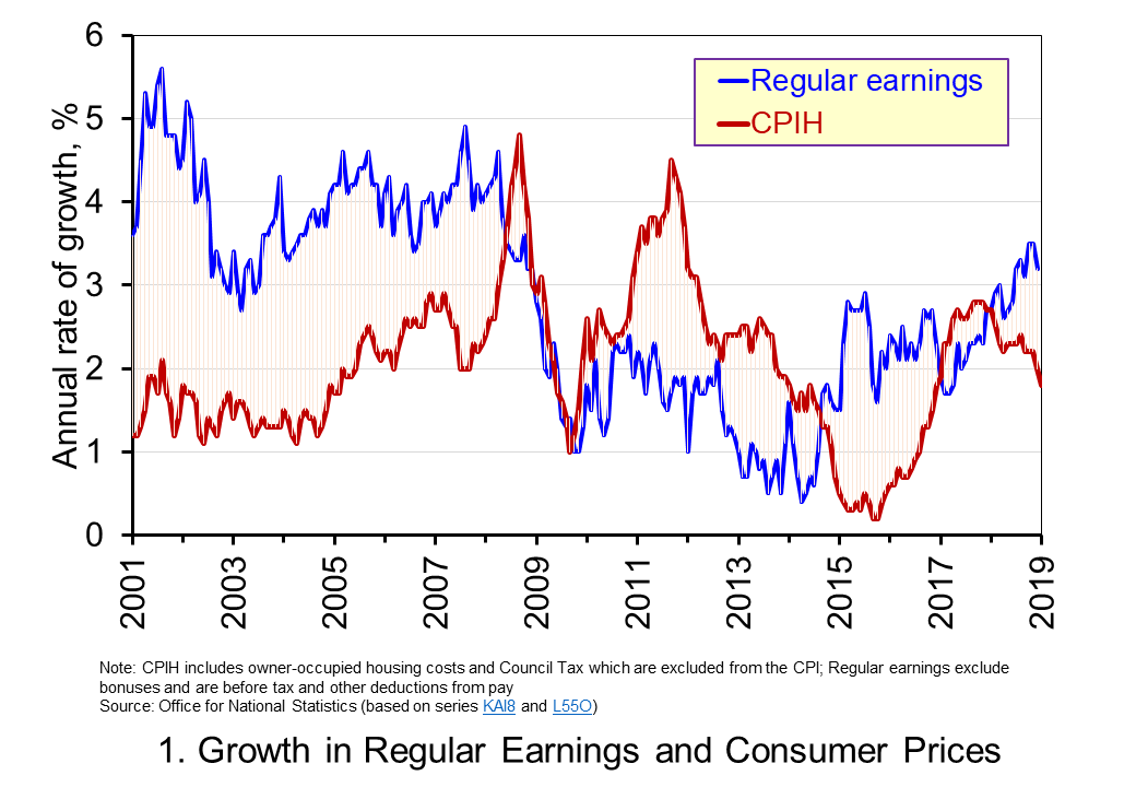 Chart 1 shows the annual percentage changes in actual (nominal) regular weekly pay and the CPIH since January 2001. Each value is simply the percentage change from 12 months earlier. The period up to June 2008 saw the annual growth of weekly pay outstrip the growth of consumer prices – the blue line in the chart is above the red line. Therefore, the real value of pay rose. However, from June 2008 to August 2014 pay growth consistently fell short of the rate of consumer price inflation – the blue line is below the red line. The result was that average real weekly pay fell. (Click here to download a PowerPoint copy of the chart.)
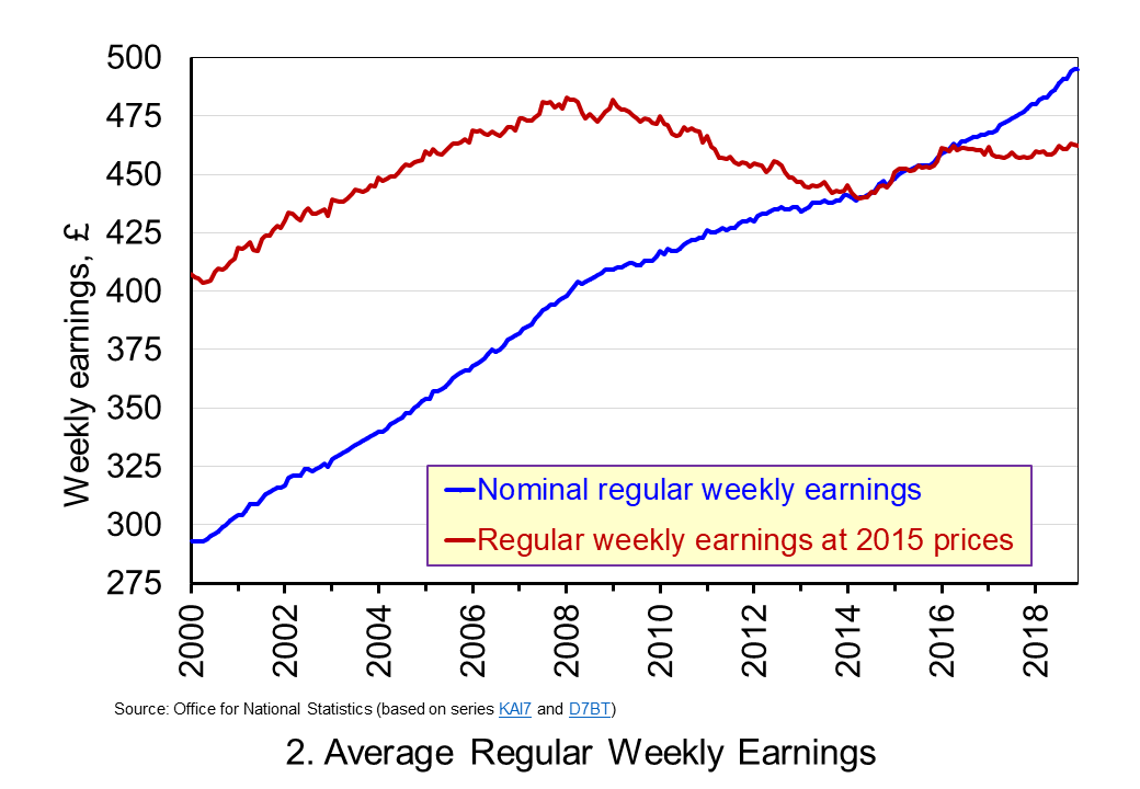 Chart 2 show the average levels of nominal and real weekly pay. The real series is adjusted for inflation. It is calculated by deflating the nominal pay values by the CPIH. Since the CPIH is a price index whose value averages 100 across 2015, the real pay values are at constant 2015 prices. From the chart, we can see that the real value of weekly pay peaked in March 2008 at £482.01 at 2015 prices. The subsequent period saw rates of pay inflation that were lower than rates of consumer price inflation. This meant that by March 2014 the real value of weekly pay had fallen by 8.8 per cent to £439.56 at 2015 prices. (Click here to download a PowerPoint copy of the chart.)
Although real (inflation-adjusted) pay recovered a little during 2015 and 2016, 2017 again saw consumer price inflation rates greater than those of pay inflation (see Chart 1). Consequently, the average level of real weekly pay fell by 1 per cent between January and November 2017. Since then, real regular pay has again increased. In December 2018, average real pay weekly pay was £462.18 at 2015 prices: an increase of 1.1 per cent from November 2017. Nonetheless, inflation-adjusted average weekly pay in December 2018 remained 4.1 per cent below its March 2008 level.
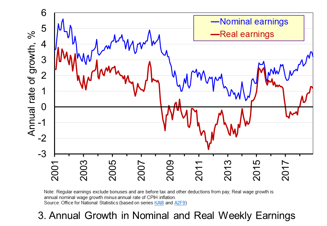 Chart 3 shows very clearly the importance of the distinction between real and nominal when analysing the growth of earnings. The sustained period of real pay deflation (negative rates of pay inflation) that followed the financial crisis can be seen much more clearly by plotting growth rates rather than their levels. Since June 2008 the average annual growth of real regular weekly pay has been −0.2 per cent, despite nominal pay increasing at an annual rate of 2 per cent. In the period from January 2001 to May 2008 real regular weekly pay had grown at an annual rate of 2.1 per cent with nominal pay growing at an annual rate of 4.0 per cent. (Click here to download a PowerPoint copy of the chart.)
The distinction between nominal and real helps us to understand better why some argue that patterns in pay, living standards and well-being have been fundamental in characterising the macroeconomic environment since the financial crisis. Indeed, it is not unreasonable to suggest that these patterns have helped to shape macroeconomic debates and broader conversations around the role of government and of public policy and its priorities.
Articles
Questions
- Using the example of GDP and earnings, explain how the distinction between nominal and real relates to the distinction between values and volumes.
- In what circumstances would an increase in actual pay translate into a reduction in real pay?
- In what circumstances would a decrease in actual pay translate into an increase in real pay?
- What factors might explain the reduction in real rates of pay seen in the UK following the financial crisis?
- Of what importance might the growth in real rates of pay be for consumption and aggregate demand?
- Why is the growth of real pay an indicator of financial well-being? What other indicators might be included in measuring financial well-being?
- Assume that you have been asked to undertake a distributional analysis of real earnings since the financial crisis. What might be the focus of your analysis? What information would you therefore need to collect?
 The government has announced outlines of the new system of immigration controls from January 2021 when the Brexit transition period is scheduled to finish. It plans to introduce an Australian-style points-based system. This will apply to all EU and Non-EU citizens. The aim is to attract skilled workers, while preventing non-skilled or low-skilled workers from entering the UK for employment.
 This is illustrated in the diagram, which illustrates a low-paid job which will be impacted by the restrictions. If there is a rise in productivity through technological change, the marginal revenue product of labour curve shifts upwards from MRPL1 to MRPL2 and offsets the leftward shift in labour supply (caused by the decline in immigration) from ACL1 to ACL2 and the marginal cost of labour from MCL1 to MCL2. Employment is where the marginal cost of labour equals the marginal revenue product of labour. This remains at Q1. Wages are given by the supply curve of labour and rise from W1 to W1. (Click here for a PowerPoint of the diagram.)
 of these people are not available for work. Some 2.3 million are students, 1.9 million are carers at home looking after relatives, 2.1 million are long-term sick and 1.1 million are retired. Only 1.9 million (22.1% of the economically inactive) would like a job and not all these would be able to take up one (e.g. the long-term sick).
 Post-Brexit Immigration System Explained
 ‘Low-skilled’ migrant workers to be denied visas after Brexit
 Immigration: No visas for low-skilled workers, government says
 Confidence figures suggest that sentiment weakened across several sectors in June with significant falls recorded in retail and construction. This is consistent with the
  Chart 1 shows the confidence balances reported by the
  Chart 2 shows consumer confidence alongside the annual rate of growth of consumer credit (net of repayments) to individuals by banks and building societies. Consumer credit is borrowing by individuals to finance current expenditure on goods and services and it comprises borrowing through credit cards, overdraft facilities and other loans and advances, for example those financing the purchase of cars or other large ticket items. (Click
  Donald Trump has suggested that the Fed should cut interest rates by 1 percentage point and engage in a further round of quantitative easing. He wants to see monetary policy used to give a substantial boost to US economic growth at a time when inflation is below target. In a pair of tweets just before the meeting of the Fed to decide on interest rates, he said:
 Since December 2015 the Fed has been raising interest rates by 0.25 percentage points at a time in a series of steps, so that the federal funds rate stands at between 2.25% and 2.5% (see chart). And since October 2017, it has also been engaged in
  The second issue is whether Trump’s proposed policy is a wise one.
 For these reasons, the Fed resisted calls for a large cut in interest rates and a return to quantitative easing. Instead it chose to keep interest rates on hold at its meeting on 1 May 2019.
 It is perhaps timely given the ongoing uncertainty around Brexit to revisit and update our blog
  The chart plots confidence in the UK for consumers and different sectors of business since the mid 1990s. The chart captures the volatility of confidence. This volatility is generally greater amongst businesses than consumers, and especially so in the construction sector. (Click
  Chart 2 shows how the recent easing of consumer confidence has seen the confidence balance fall below its long-term (median) average of -7. In March 2019 the balance stood at -11.7 the lowest figure since November 2013. To put the easing into further perspective, the consumer confidence balance had been as high as +8.2 in September 2015. (Click
  Chart 3 plots the paths of the UK household-sector saving ratio and consumer confidence. The saving ratio approximates the proportion of disposable income saved by the household sector. What we might expect to see, if greater uncertainty induces buffer-stock saving, is for falls in confidence to lead to a rise in the saving ratio. Conversely, less uncertainty as proxied by a rise in confidence would lead to a fall in the saving ratio. (Click
  Data on consumer credit is more timely than that for the saving ratio. Therefore, Chart 4 shows the relationship between consumer confidence and consumer credit into 2019. We observe a reasonably close association consumer credit growth and consumer confidence. Certainty, the recent easing in confidence is mirrored by an easing in the annual growth of net consumer credit. (Click
  One of the most enduring characteristics of the macroeconomic environment since the financial crisis of the late 2000s has been its impact on people’s pay. We apply the distinction between nominal and real values to evidence the adverse impact on the typical purchasing power of workers. While we do not consider here the distributional impact on pay, the aggregate picture nonetheless paints a very stark picture of recent patterns in pay and, in turn, the consequences for living standards and wellbeing.
 Chart 1 shows the annual percentage changes in actual (nominal) regular weekly pay and the CPIH since January 2001. Each value is simply the percentage change from 12 months earlier. The period up to June 2008 saw the annual growth of weekly pay outstrip the growth of consumer prices – the blue line in the chart is above the red line. Therefore, the real value of pay rose. However, from June 2008 to August 2014 pay growth consistently fell short of the rate of consumer price inflation – the blue line is below the red line. The result was that average real weekly pay fell. (Click
  Chart 2 show the average levels of nominal and real weekly pay. The real series is adjusted for inflation. It is calculated by deflating the nominal pay values by the CPIH. Since the CPIH is a price index whose value averages 100 across 2015, the real pay values are at constant 2015 prices. From the chart, we can see that the real value of weekly pay peaked in March 2008 at £482.01 at 2015 prices. The subsequent period saw rates of pay inflation that were lower than rates of consumer price inflation. This meant that by March 2014 the real value of weekly pay had fallen by 8.8 per cent to £439.56 at 2015 prices. (Click
  Chart 3 shows very clearly the importance of the distinction between real and nominal when analysing the growth of earnings. The sustained period of real pay deflation (negative rates of pay inflation) that followed the financial crisis can be seen much more clearly by plotting growth rates rather than their levels. Since June 2008 the average annual growth of real regular weekly pay has been −0.2 per cent, despite nominal pay increasing at an annual rate of 2 per cent. In the period from January 2001 to May 2008 real regular weekly pay had grown at an annual rate of 2.1 per cent with nominal pay growing at an annual rate of 4.0 per cent. (Click