 The development of open-source software and blockchain technology has enabled people to ‘hack’ capitalism – to present and provide alternatives to traditional modes of production, consumption and exchange. This has enabled more effective markets in second-hand products, new environmentally-friendly technologies and by-products that otherwise would have been negative externalities. Cryptocurrencies are increasingly providing the medium of exchange in such markets.
In a BBC podcast, Hacking Capitalism, Leo Johnson, head of PwC’s Disruption Practice and younger brother of Boris Johnson, argues that various changes to the way capitalism operates can make it much more effective in improving the lives of everyone, including those left behind in the current world. The changes can help address the failings of capitalism, such as climate change, environmental destruction, poverty and inequality, corruption, a reinforcement of economic and political power and the lack of general access to capital. And these changes are already taking place around the world and could lead to a new ‘golden age’ for capitalism.
 The changes are built on new attitudes and new technologies. New attitudes include regarding nature and the land as living resources that need respect. This would involve moving away from monocultures and deforestation and, with appropriate technologies (old and new), could lead to greater output, greater equality within agriculture and increased carbon absorption. The podcast gives examples from the developing and developed world of successful moves towards smaller-scale and more diversified agriculture that are much more sustainable. The rise in farmers’ markets provides an important mechanism to drive both demand and supply.
In the current model of capitalism there are many barriers to prevent the poor from benefiting from the system. As the podcast states, there are some 2 billion people across the world with no access to finance, 2.6 billion without access to sanitation, 1.2 billion without access to power – a set of barriers that stops capitalism from unlocking the skills and productivity of the many.
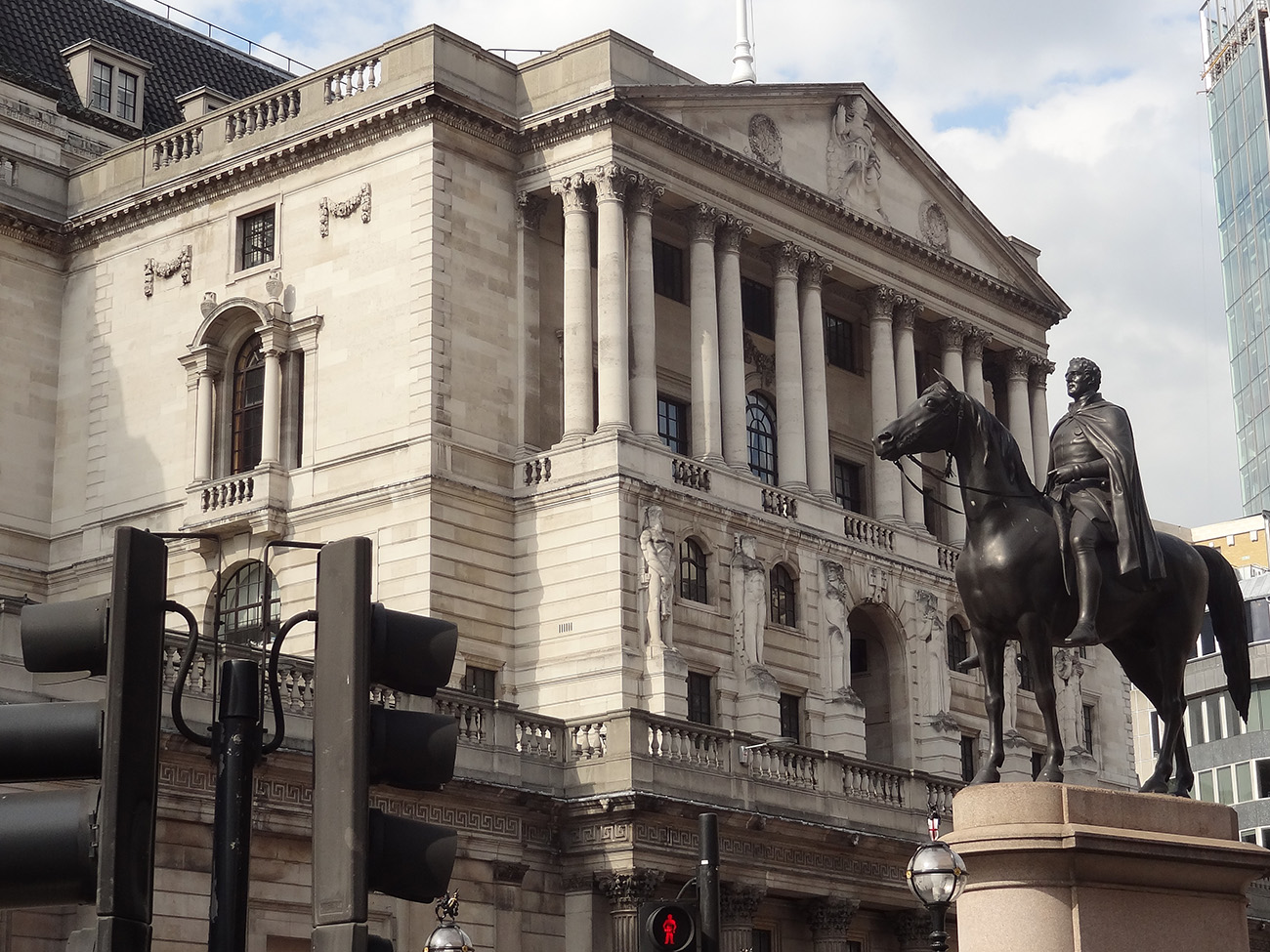 These problems were made worse by the response to the financial crisis of 2007–8, when governments chose to save the existing model of capitalism by propping up financial markets through quantitative easing, which massively inflated asset prices and aggravated the problem of inequality. They missed the opportunity of creating money to invest in alternative technologies and infrastructure.
New technology is the key to developing this new fairer, more sustainable model of capitalism. Such technologies could be developed (and are being in many cases) by co-operative, open-source methods. Many people, through these methods, could contribute to the development of products and their adaptation to meet different needs. The barriers of intellectual property rights are by-passed.
New technologies that allow easy rental or sharing of equipment (such as tractors) by poor farmers can transform lives and massively increase productivity. So too can the development of cryptocurrencies to allow access to finance for small farmers and businesses. This is particularly important in countries where access to traditional finance is restricted and/or where the currency is not stable with high inflation rates.
Blockchain technology can also help to drive second-hand markets by providing greater transparency and thereby cut waste. Manufacturers could take a stake in such markets through a process of certification or transfer.
 A final hack is one that can directly tackle the problem of externalities – one of the greatest weaknesses of conventional capitalism. New technologies can support ways of rewarding people for reducing external costs, such as paying indigenous people for protecting the land or forests. Carbon markets have been developed in recent years. Perhaps the best example is the European Emissions Trading Scheme (EMS). But so far they have been developed in isolation. If the revenues generated could go directly to those involved in environmental protection, this would help further to internalise the externalities. The podcasts gives an example of a technology used in the Amazon to identify the environmental benefits of protecting rain forests that can then be used to allow reliable payments to the indigenous people though blockchain currencies.
Podcast
Questions
- What are the main reasons why capitalism has led to such great inequality?
- What do you understand by ‘hacking’ capitalism?
- How is open-source software relevant to the development of technology that can have broad benefits across society?
- Does the current model of capitalism encourage a self-centred approach to life?
- How might blockchain technology help in the development of a more inclusive and fairer form of capitalism?
- How might farmers’ co-operatives encourage rural development?
- What are the political obstacles to the developments considered in the podcast?
 The global battle for fuel is expected to peak this winter. The combination of rising demand and a tightening of supply has sparked concerns of shortages in the market. Some people are worried about another ‘winter of discontent’. Gas prices have risen fivefold in Europe as a whole.
In the UK, consumers are likely to find that the natural gas needed to heat their homes this October will cost at least five times more than it did a year ago. This surge in wholesale gas prices has seen several UK energy suppliers stop trading as they are unable to make a profit. This is because of an energy price cap for some consumers and various fixed price deals they had signed with their customers.
There are thus fears of an energy crisis in the UK, especially if there is a cold winter. There are even warnings that during a cold snap, gas supply to various energy-intensive firms may be cut off. This comes at a time when some of these industries are struggling to make a profit.
Demand and supply
The current situation is a combination of long- and short-term factors. In spring 2020, the demand for gas actually decreased due to the pandemic. This resulted in low gas prices, reduced UK production and delayed maintenance work and investment along global supply chains. However, since early 2021, consumer demand for gas has soared. First, there was an increased demand due to the Artic weather conditions last winter. This was then followed by heatwaves in the USA and Europe over the summer, which saw an increase in the use of air conditioning units. With the increased demand combined with calm weather conditions, wind turbines couldn’t supply enough power to meet demand.
 There has also been a longer-term impact on demand throughout the industry due to the move to cleaner energy. The transitioning to wind and solar has seen a medium-term increase in the demand for gas. There is also a long-term impact of the target for net zero economies in the UK and Europe. This has hindered investors’ willingness to invest in developing supplies of fossil fuels due the fact they could become obsolete over the next few decades.
Nations have also been unable to build up enough supplies for winter. This is partly due to Europe’s domestic gas stocks having declined by 30% per cent in the past decade. This heightened situation is leading to concerns that there will be black-outs or cut-offs in gas this winter.
Importation of gas
 A concern for the UK is that it has scant storage facilities with no long-term storage. The UK currently has very modest amounts of storage – less than 6% of annual demand and some five times less than the average in the rest of Europe. It has been increasingly operating a ‘just-in-time model’, which is more affected by short-term price fluctuations in the wholesale gas market. With wind power generation remaining lower than average during summer 2021, more gas than usual has been used to generate electricity, leaving less gas to go into storage.
However, some argue that the problem is not just the UK’s physical supply of gas but demand for gas from elsewhere. Around half of the UK’s supply comes from its own production sites, while the rest is piped in from Europe or shipped in as liquefied natural gas (LNG) from the USA, Qatar and Russia. In 2019, the UK imported almost 20% of its gas through LNG shipments. However, Asian gas demand has grown rapidly, expanding by 50% over the past decade. This has meant that LNG has now become much harder to secure.
The issue is the price the UK has to pay to continue receiving these supplies. Some in the gas industry believe the price surge is only temporary, caused by economic disruptions, while many others say it highlights a structural weakness in a continent that has become too reliant on imported gas. It can be argued that the gas crisis has highlighted the lack of a coherent strategy to manage the gas industry as the UK transitions to a net zero economy. The lack of any industry investment in new capacity suggests that there is currently no business case for new long-term storage in the UK, especially as gas demand is expected to continue falling over the longer term.
Impact on consumers and industry
 Gas prices for suppliers have increased fivefold over the past year. Therefore, many companies face a considerable rise in their bills. MSome may need to reduce or pause production – or even cease trading – which could cause job losses. Alternatively, they could pass on their increased costs to customers by charging them higher prices. Although energy-intensive industries are particularly exposed, every company that has to pay energy bills will be affected. Due to the growing concerns about the security of winter gas supplies those industries reliant on gas, such as the fertiliser industry, are restricting production, threatening various supply chains.
Most big domestic gas suppliers buy their gas months in advance, meaning they will most likely pass on the higher price rises they have experienced in the past few months. The increased demand and decreased supply has already meant meant that customers have faced higher prices for their energy. The UK has been badly hit because it’s one of Europe’s biggest users of natural gas – 85% of homes use gas central heating – and it also generates a third of the country’s electricity.
The rising bills are particularly an issue for those customers on a variable tariff. About 15 million households have seen their energy bills rise by 12% since the beginning of October due to the rise in the government’s energy price cap calculated by the regulator, Ofgem. A major concern is that this increase in bills comes at a time when the need to use more heating and lighting is approaching. It also coincides with other price rises hitting family budgets and the withdrawal of COVID support schemes.
Government intervention – maximum pricing
If the government feels that the equilibrium price in a particular market is too high, it can intervene in the market and set a maximum price. When the government intervenes in this way, it sets a price ceiling on certain basic goods or services and does not permit the price to go above that set limit. A maximum price is normally set for reasons of fairness and to benefit consumers on low incomes. Examples include energy price caps to order to control fuel bills, rent controls in order to improve affordability of housing, a cap on mobile roaming charges within the EU and price capping for regional monopoly water companies.
The energy price cap
 Even without the prospect of a colder than normal winter, bills are still increasing. October’s increase in the fuel cap means that many annual household fuel bills will rise by £135 or more. The price cap sets the maximum price that suppliers in England, Wales and Scotland can charge domestic customers on a standard, or default tariff. The cap has come under the spotlight owing to the crisis among suppliers, which has seen eleven firms fold, with more expected.
The regulator Ofgem sets a price cap for domestic energy twice a year. The latest level came into place on 1 October. It is a cap on the price of energy that suppliers can charge. The price cap is based on a broad estimate of how much it costs a supplier to provide gas and electricity services to a customer. The calculation is mainly made up of wholesale energy costs, network costs such as maintaining pipes and wires, policy costs including Government social and environmental schemes, operating costs such as billing and metering services and VAT. Therefore, suppliers can only pass on legitimate costs of supplying energy and cannot charge more than the level of the price cap, although they can charge less. A household’s total bill is still determined by how much gas and electricity is used.
- Those on standard tariffs, with typical household levels of energy use, will see an increase of £139.
- People with prepayment meters, with average energy use, will see an annual increase of £153.
- Households on fixed tariffs will be unaffected. However, those coming to the end of a contract are automatically moved to a default tariff set at the new level.
Ordinarily, customers are able to shop around for cheaper deals, but currently, the high wholesale prices of gas means that cheaper deals are not available.
Despite the cap limiting how much providers can raise prices, the current increase is the biggest (and to the highest amount) since the cap was introduced in January 2019. As providers are scarcely making a profit on gas, there are concerns that a further increase in wholesale prices will cause more suppliers to be forced out of business. Ofgem said that the cap is likely to go up again in April, the next time it is reviewed.
Conclusion
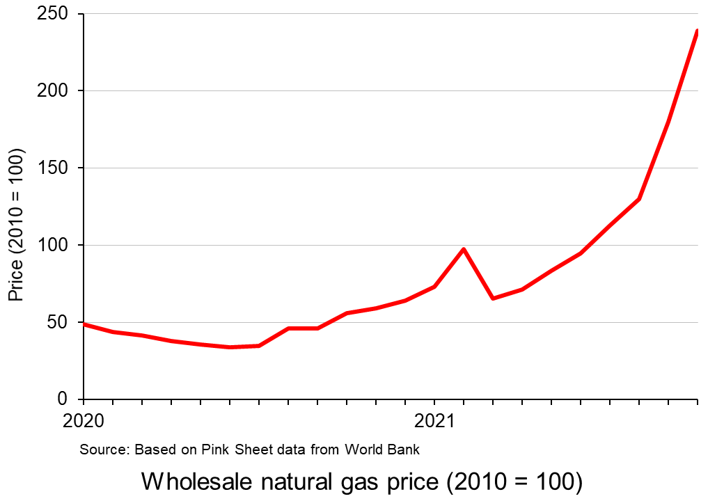 The record prices being paid by suppliers and deficits in gas supply across the world have stoked fears that the energy crisis will get worse. It comes at a time when households are already facing rising bills, while some energy-intensive industries have started to slow production. This has started to dent optimism around the post-pandemic economic recovery.
Historically, UK governments have trusted market mechanisms to deliver UK gas security. However, consumers are having to pay the cost of such an approach. The price cap has meant the UK’s gas bills have until now been typically lower than the EU average. However, the rise in prices comes on top of other economic problems such as labour shortages and increasing food prices, adding up to an unwelcome rise in the cost of living.
Video
Articles
UK government/Ofgem
Questions
- Using a supply and demand diagram, illustrate what has happened in the energy market over the past year.
- What are the advantages and disadvantages of government intervention in a free market?
- Explain why it is necessary for the regulator to intervene in the energy market.
- Using the concept of maximum pricing, illustrate how the price cap works.
 The coronavirus pandemic and the climate emergency have highlighted the weaknesses of free-market capitalism.
Governments around the world have intervened massively to provide economic support to people and businesses affected by the pandemic through grants and furlough schemes. They have also stressed the importance of collective responsibility in abiding by lockdowns, social distancing and receiving vaccinations.
The pandemic has also highlighted the huge inequalities around the world. The rich countries have been able to offer much more support to their people than poor countries and they have had much greater access to vaccines. Inequality has also been growing within many countries as rich people have gained from rising asset prices, while many people find themselves stuck in low-paid jobs, suffering from poor educational opportunities and low economic and social mobility.
The increased use of working from home and online shopping has accelerated the rise of big tech companies, such as Amazon and Google. Their command of the market makes it difficult for small companies to compete – and competition is vital if capitalism is to benefit societies. There have been growing calls for increased regulation of powerful companies and measures to stimulate competition. The problem has been recognised by governments, central banks and international agencies, such as the IMF and the OECD.
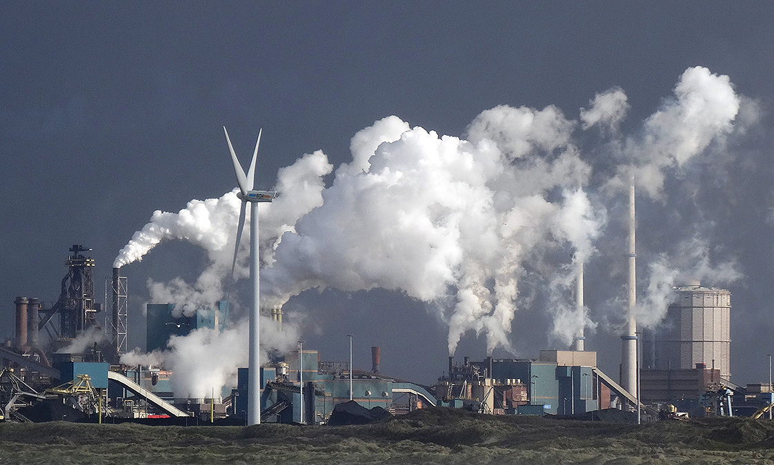 At the same time as the world has been grappling with the pandemic, global warming has contributed to extreme heat and wildfires in various parts of the world, such as western North America, the eastern Mediterranean and Siberia, and major flooding in areas such as western Europe and China. Governments again have intervened by providing support to people whose property and livelihoods have been affected. Also there is a growing urgency to tackle global warming, with some movement, albeit often limited, in implementing policies to achieve net zero carbon emissions by some specified point in the future. Expectations are rising for concerted action to be agreed at the international COP26 climate meeting in Glasgow in November this year.
An evolving capitalism
So are we seeing a new variant of capitalism, with a greater recognition of social responsibility and greater government intervention?
 Western governments seem more committed to spending on socially desirable projects, such as transport, communications and green energy infrastructure, education, science and health. They are beginning to pursue more active industrial and regional policies. They are also taking measures to tax multinationals (see the blog The G7 agrees on measures to stop corporate tax avoidance). Many governments are publicly recognising the need to tackle inequality and to ‘level up’ society. Active fiscal policy, a central plank of Keynesian economics, has now come back into fashion, with a greater willingness to fund expenditure by borrowing and, over the longer term, to use higher taxes to fund increased government expenditure.
But there is also a growing movement among capitalists themselves to move away from profits being their sole objective. A more inclusive ‘stakeholder capitalism’ is being advocated by many companies, where they take into account the interests of a range of stakeholders, from customers, to workers, to local communities, to society in general and to the environment. For example, the Council for Inclusive Capitalism, which is a joint initiative of the Vatican and several world business and public-sector leaders, seeks to make ‘the world fairer, more inclusive, and sustainable’.
If there is to be a true transformation of capitalism from the low-tax free-market capitalism of neoclassical economists and libertarian policymakers to a more interventionist mixed market capitalism, where capitalists pursue a broader set of objectives, then words have to be matched by action. Talk is easy; long-term plans are easy; taking action now is what matters.
Articles and videos
- Why the next stage of capitalism is coming
BBC Future, Matthew Wilburn King (27/5/21)
- During the pandemic, a new variant of capitalism has emerged
The Guardian, Larry Elliott (30/7/21)
- When it comes to social and environmental justice, words don’t cut it
GreenBiz, C J Clouse (28/4/21)
 Introducing the Council for Inclusive Capitalism with the Vatican
Inclusive Capitalism (7/12/20)
- The State and Direction of Inclusive Capitalism
Saïd Business School, Ford Foundation and Deloitte Social Impact practice, Richard Barker, Mary Johnstone-Louis, Colin Mayer, Pradeep Prabhala, Noah Rimland Flower, Theodore Roosevelt Malloch, Tony Siesfeld and Peter Tufano (2018)
- Rising Market Power—A Threat to the Recovery?
IMF Blog, Kristalina Georgieva, Federico J Díez, Romain Duval and Daniel Schwarz (15/3/21)
- The Pandemic Alone Can’t Transform Capitalism
Jacobin, Ramaa Vasudevan (30/7/21)
- Down to earth: How entrepreneurs can collaborate to rejuvenate capitalism
EU-Startups, Luca Sabia (4/8/21)
Questions
- How similar is the economic response of Western governments to the pandemic to their response to the financial crisis of 2007–8?
- What do you understand by ‘inclusive capitalism’? How can stakeholders hold companies to account?
- What indicators are there of market power? Why have these been on the rise?
- How can entrepreneurs contribute to ‘closing the inequality gap for a more sustainable and inclusive form of society’?
- What can be done to hold governments to account for meeting various social and environmental objectives? How successful is this likely to be?
- Can inequality be tackled without redistributing income and wealth from the rich to the poor?
 At a meeting of the G7 finance ministers in London from 4–5 June, it was agreed to adopt a minimum corporate tax rate of 15% and to take measures to prevent multinational companies using tax havens to avoid paying taxes. It was also agreed that part of the taxes paid should go to the countries where sales are made and not just to those where the companies are based.
This agreement is the first step on the road to a comprehensive global agreement. The next step is a meeting of the finance ministers and central bank governors of the G20 countries in Venice from 9 to 10 July. The G7 ministers hope that their agreement will be adopted by this larger group, which includes other major economies such as Russia, China, India, Brazil, Australia, South Korea and South Africa.
Later in July, the proposals will be put to a group of 139 countries and jurisdictions at a meeting co-ordinated by the OECD. It is hoped that this meeting will finalise an international agreement with precise details on corporate tax rules. It follows work by the OECD on reforming international taxation under its Framework on Base Erosion and Profit Shifting (BEPS).
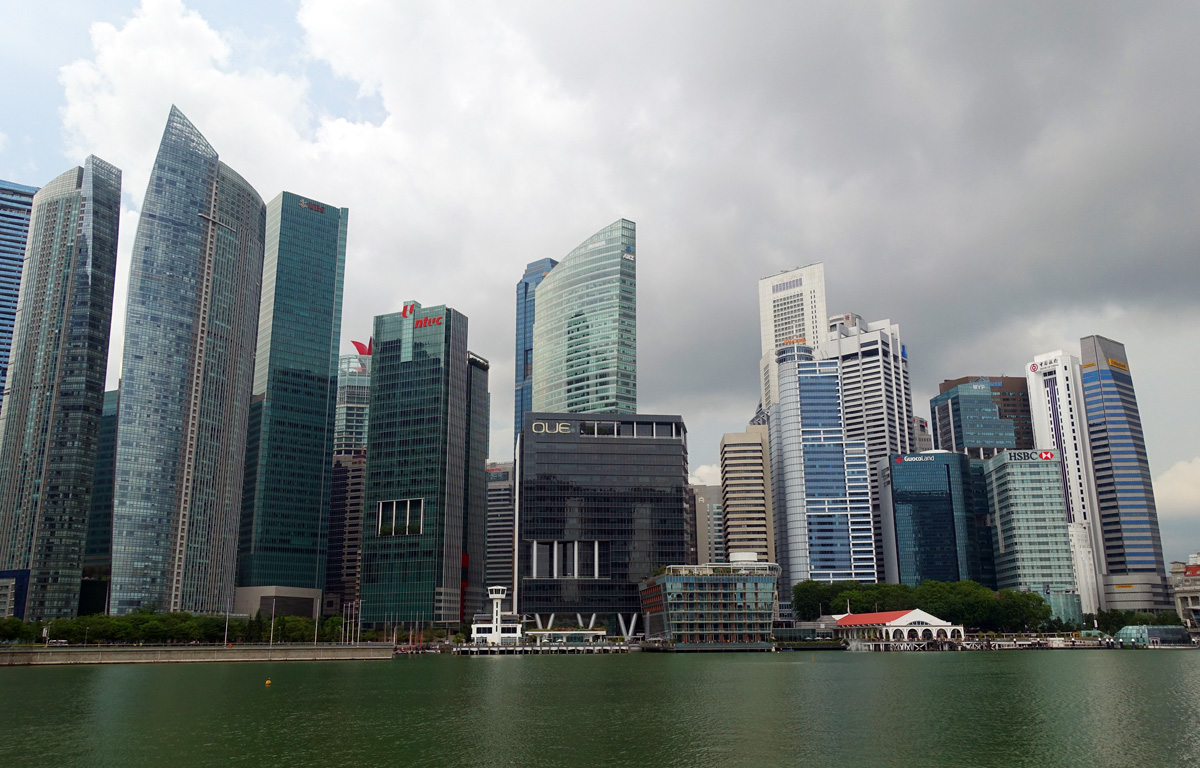 These meetings follow growing concerns about the ability of multinational companies to avoid taxes by basing regional headquarters in low-tax countries, such as Luxembourg or Singapore, and declaring their profits there, despite having only a tiny proportion of their sales in these countries.
The desire to attract multinational profits has led to a prisoners’ dilemma situation, whereby countries have been competing against each other to offer lower taxes, even though it reduces global corporate tax revenues.
With many countries having seen a significant rise in government deficits as result of the COVID-19 pandemic and the support measures put in place, there has been a greater urgency to reach international agreement on corporate taxes. The G7 agreement, if implemented, will provide a significant increase in tax revenue.
Details of the G7 agreement
The agreement has two parts or ‘pillars’.
Pillar 1 allows countries to tax large multinationals earning global profits of more than 10% if these companies are not based there but earn revenues there. Countries will be given tax rights over at least 20% of the profits earned there which exceed the 10% margin. The level of profits determined for each country will be based on the proportion of revenues earned there.
Pillar 2 sets a minimum corporate tax rate of 15% for each of the seven countries, which call on other countries to adopt the same minimum. The hope is that the G20 countries will agree to this and then at the OECD meeting in July a global agreement will be reached. If a country chooses to charge a rate below 15%, then a top-up tax can be applied by the home country to bring the total rate up to the 15%.
It is possible that these proposals will be strengthened/amended at the G20 and OECD meetings. For example, the 15% minimum rate may be raised. Indeed, the USA had initially proposed a 25% rate and then 21%, and several EU countries such as France, have been pushing for a substantially higher rate.
Analysis
The agreement was hailed as ‘historic’ by Rishi Sunak, the UK Chancellor of the Exchequer. This is true in that it is the first time there has been an international agreement on minimum corporate tax rates and locating part of tax liability according to sales. What is more, the rules may be strengthened at the G20 and/or OECD meetings.
There have been various criticisms of the agreement, however. The first is that 15% is too low and is well below the rates charged in many countries. As far as the UK is concerned, the IPPR think tank estimates that the deal will raise £7.9bn whereas a 25% rate would raise £14.7bn.
 Another criticism is that the reallocation of some tax liabilities to countries where sales are made rather than where profits are booked applies only to profits in excess of 10%. This would therefore not affect companies, such as Amazon, with a model of large-scale low-margin sales and hence profits of less than 10%.
Also there is the criticism that a 20% reallocation is too low and would thus provide too little tax revenue to poor countries which may record large sales but where little or no profits are booked.
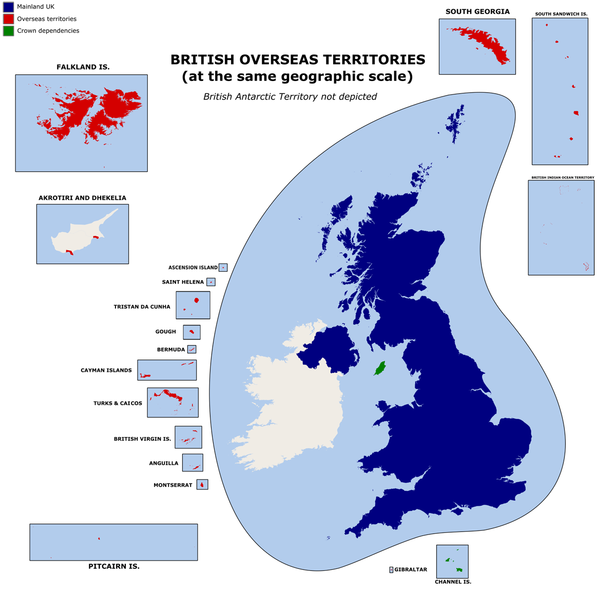 The UK was one of the more reluctant countries to sign up to a deal that would have a significant impact on tax havens in various British overseas territories and crown dependencies, such as the British Virgin islands, Bermuda, the Cayman Islands, the Channel Islands and Isle of Man. The agreement also calls into question whether the announced UK freeports can go ahead. Although these are largely concerned with waiving tariffs and other taxes on raw materials and parts imported into the freeport, which are then made into finished or semi-finished products within the freeport for export, they are still seen by many as not in the spirit of the G7 agreement.
What is more, the UK has been pushing for financial services to be exempted from Pillar 1 of the deal, which would otherwise see taxes partly diverted from the UK to other countries where such firms do business. For example, HSBC generates more than half its income from China and Standard Chartered operates mostly in Asia and Africa.
Update: July 2021
The G7 plan was agreed by the finance ministers of the G20 countries on July 11 in Venice. By that point, 130 of the 139 countries which are part of the Inclusive Framework of the OECD and which represent more than 90% of global GDP, had signed up to the plan and it was expected that there would be a global agreement reached at the OECD meeting later in the month. The other nine countries were Ireland, Hungary and Estonia in the EU and Kenya, Nigeria, Peru, Sri Lanka, Barbados and Saint Vincent and the Grenadines. Several of these countries use low corporate taxes to encourage inward investment and are seen as tax havens.
Videos
Articles
- G-7 nations reach historic deal on global tax reform
CNBC, Silvia Amaro, Joanna Tan and Emma Newburger (5/6/21)
- Rishi Sunak hails ‘historic’ breakthrough as G7 ministers agree global tech tax deal
The Telegraph, Lucy Burton and Edward Malnick (5/6/21)
- G7 backs Biden’s sweeping overhaul of global tax system
CNN, Tara John and Kevin Liptak (5/6/21)
- ‘Historic’ G7 deal to stop global corporate tax avoidance welcomed by tech giants Google and Facebook
Sky News, Ajay Nair (6/6/21)
- Finance Leaders Reach Global Tax Deal Aimed at Ending Profit Shifting
New York Times, Alan Rappeport (5/6/21)
- G7 strikes historic agreement on taxing multinationals
Financial Times, Chris Giles (5/6/21)
- G7 tax deal is ‘starting point’ on road to global reform
LAPM Journal, Chris Giles and Delphine Strauss (FT) (6/6/21)
- G7 tax deal doesn’t go far enough, campaigners say
BBC News (6/6/21)
- Rishi Sunak announces ‘historic agreement’ by G7 on tax reform
The Observer, Phillip Inman and Michael Savage (5/6/21)
- G7 deal is as much about balance of power as global tax reform
The Guardian, Richard Partington (6/6/21)
- Global G7 deal may let Amazon off hook on tax, say experts
The Guardian, Jasper Jolly (6/6/21)
- Explainer: G7 tax deal – what was agreed and what does it mean for Ireland?
The Irish Times, Cliff Taylor (5/6/21)
- G7 deal: UK is badly conflicted between offshore tax havens and Biden’s global tax drive
The Conversation, Atul K. Shah (4/6/21)
- G7 tax dodging deal ‘sets bar so low companies can just step over it’
Independent, Emily Goddard (6/6/21)
- UK pushes for City of London to be exempt from G7 tax plan
The Guardian, Phillip Inman and Richard Partington (9/6/21)
- The global pandemic, sustainable economic recovery, and international taxation
Independent Commission for the Reform of International Corporate Taxation (May 2020)
- G20 finance ministers back deal to tax companies
BBC News (11/7/21)
Questions
- How are multinationals currently able to avoid paying corporate taxes in many countries, even though their sales may be high there?
- If the deal is accepted at the OECD meeting in July, would it still be in the interests of low-tax countries to charge tax rates below the agreed minimum rate?
- Why was the UK reluctant to accept the 21% rate proposed by the Biden administration?
- Find out about the digital services tax that has been adopted by many countries, including EU countries and the UK, and why it will be abolished once a minimum corporate tax comes into force.
- Argue the case for and against taxing the whole of multinational profits in countries where they earn revenue in proportion to the company’s total global revenue. Would such a system benefit developing countries?
- Should financial services, such as those provided by City of London firms, be exempted from the deal?
 Many developing countries are facing a renewed debt crisis. This is directly related to Covid-19, which is now sweeping across many poor countries in a new wave.
Between 2016 and 2020, debt service as a percentage of GDP rose from an average of 7.1% to 27.1% for South Asian countries, from 8.1% to 14.1% for Sub-Saharan African countries, from 13.1% to 42.3% for North African and Middle Eastern countries, and from 5.6% to 14.7% for East Asian and Pacific countries. These percentages are expected to climb again in 2021 by around 10% of GDP.
Incomes have fallen in developing countries with illness, lockdowns and business failures. This has been compounded by a fall in their exports as the world economy has contracted and by a 19% fall in aid in 2020. The fall in incomes has led to a decline in tax revenues and demands for increased government expenditure on healthcare and social support. Public-sector deficits have thus risen steeply.
And the problem is likely to get worse before it gets better. Vaccination roll-outs in most developing countries are slow, with only a tiny fraction of the population having received just one jab. With the economic damage already caused, growth is likely to be subdued for some time.
This has put developing countries in a ‘trilemma’, as the IMF calls it. Governments must balance the objectives of:
- meeting increased spending needs from the emergency and its aftermath;
- limiting the substantial increase in public debt;
- trying to contain rises in taxes.
Developing countries are faced with a difficult trade-off between these objectives, as addressing one objective is likely to come at the expense of the other two. For example, higher spending would require higher deficits and debt or higher taxes.
The poorest countries have little scope for increased domestic borrowing and have been forced to borrow on international markets. But such debt is costly. Although international interest rates are generally low, many developing countries have had to take on increasing levels of borrowing from private lenders at much higher rates of interest, substantially adding to the servicing costs of their debt.
Debt relief
 International agencies and groups, such as the IMF, the World Bank, the United Nations and the G20, have all advocated increased help to tackle this debt crisis. The IMF has allocated $100bn in lending through the Rapid Financing Instrument (RFI) and the Rapid Credit Facility (RCF) and nearly $500m in debt service relief grants through the Catastrophe Containment and Relief Trust (CCRT). The World Bank is increasing operations to $160bn.
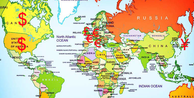
The IMF is also considering an increase in special drawing rights (SDRs) from the current level of 204.2bn ($293.3bn) to 452.6bn ($650bn) – a rise of 121.6%. This would be the first such expansion since 2009. It has received the support of both the G7 and the G20. SDRs are reserves created by the IMF whose value is a weighted average of five currencies – the US dollar (41.73%), the euro (30.93%), the Chinese yuan (10.92%), the Japanese yen (8.33%) and the pound sterling (8.09%).
Normally an increase in SDRs would be allocated to countries according their IMF quotas, which largely depend on the size of their GDP and their openness. Any new allocation under this formula would therefore go mainly to developed countries, with developing economies getting only around $60bn of the extra $357bn. It has thus been proposed that developed countries give much of their allocation to developing countries. These could then be used to cancel debts. This proposal has been backed by Janet Yellen, the US Secretary of the Treasury, who said she would “strongly encourage G20 members to channel excess SDRs in support of recovery efforts in low-income countries, alongside continued bilateral financing”.
 The G20 countries, with the support of the IMF and World Bank, have committed to suspend debt service payments by eligible countries which request to participate in its Debt Service Suspension Initiative (DSSI). There are 73 eligible countries. The scheme, now extended to 31 December 2021, provides a suspension of debt-service payments owed to official bilateral creditors. In return, borrowers commit to use freed-up resources to increase social, health or economic spending in response to the crisis. As of April 2021, 45 countries had requested to participate, with savings totalling more than $10bn. The G20 has also called on private creditors to join the DSSI, but so far without success.
Despite these initiatives, the scale of debt relief (as opposed to extra or deferred lending) remains small in comparison to earlier initiatives. Under the Heavily Indebted Poor Countries initiative (HIPC, launched 1996) and the Multilateral Debt Relief Initiative (MDRI, launched 2005) more than $100bn of debt was cancelled.
Since the start of the pandemic, major developed countries have spent between $10 000 and $20 000 per head in stimulus and social support programmes. Sub-Saharan African countries on average are seeking only $365 per head in support.
Articles and blogs
Podcast
Report
Data
Questions
- Imagine you are an economic advisor to a developing country attempting to rebuild the economy after the coronavirus pandemic. How would you advise it to proceed, given the ‘trilemma’ described above?
- How does the News24 article define ‘smart debt relief’. Do you agree with the definition and the means of achieving smart debt relief?
- To what extent is it in the interests of the developed world to provide additional debt relief to poor countries whose economies have been badly affected by the coronavirus pandemic?
- Research ‘debt-for-nature swaps’. To what extent can debt relief for countries affected by the coronavirus pandemic be linked to tackling climate change?
 The development of open-source software and blockchain technology has enabled people to ‘hack’ capitalism – to present and provide alternatives to traditional modes of production, consumption and exchange. This has enabled more effective markets in second-hand products, new environmentally-friendly technologies and by-products that otherwise would have been negative externalities. Cryptocurrencies are increasingly providing the medium of exchange in such markets.
 The changes are built on new attitudes and new technologies. New attitudes include regarding nature and the land as living resources that need respect. This would involve moving away from monocultures and deforestation and, with appropriate technologies (old and new), could lead to greater output, greater equality within agriculture and increased carbon absorption. The podcast gives examples from the developing and developed world of successful moves towards smaller-scale and more diversified agriculture that are much more sustainable. The rise in farmers’ markets provides an important mechanism to drive both demand and supply.
 These problems were made worse by the response to the financial crisis of 2007–8, when governments chose to save the existing model of capitalism by propping up financial markets through quantitative easing, which massively inflated asset prices and aggravated the problem of inequality. They missed the opportunity of creating money to invest in alternative technologies and infrastructure.
 A final hack is one that can directly tackle the problem of externalities – one of the greatest weaknesses of conventional capitalism. New technologies can support ways of rewarding people for reducing external costs, such as paying indigenous people for protecting the land or forests. Carbon markets have been developed in recent years. Perhaps the best example is the European Emissions Trading Scheme (EMS). But so far they have been developed in isolation. If the revenues generated could go directly to those involved in environmental protection, this would help further to internalise the externalities. The podcasts gives an example of a technology used in the Amazon to identify the environmental benefits of protecting rain forests that can then be used to allow reliable payments to the indigenous people though blockchain currencies.
 Hacking capitalism
 The global battle for fuel is expected to peak this winter. The combination of rising demand and a tightening of supply has sparked concerns of shortages in the market. Some people are worried about another ‘winter of discontent’. Gas prices have risen fivefold in Europe as a whole.
  There has also been a longer-term impact on demand throughout the industry due to the move to cleaner energy. The transitioning to wind and solar has seen a medium-term increase in the demand for gas. There is also a long-term impact of the target for net zero economies in the UK and Europe. This has hindered investors’ willingness to invest in developing supplies of fossil fuels due the fact they could become obsolete over the next few decades.
  A concern for the UK is that it has scant storage facilities with no long-term storage. The UK currently has very modest amounts of storage – less than 6% of annual demand and some five times less than the average in the rest of Europe. It has been increasingly operating a ‘
 Gas prices for suppliers have increased fivefold over the past year. Therefore, many companies face a considerable rise in their bills. MSome may need to reduce or pause production – or even cease trading – which could cause job losses. Alternatively, they could pass on their increased costs to customers by charging them higher prices. Although energy-intensive industries are particularly exposed, every company that has to pay energy bills will be affected. Due to the growing concerns about the security of winter gas supplies those industries reliant on gas, such as the fertiliser industry, are restricting production, threatening various supply chains.
  Even without the prospect of a colder than normal winter, bills are still increasing. October’s increase in the fuel cap means that many annual household fuel bills will rise by £135 or more. The price cap sets the maximum price that suppliers in England, Wales and Scotland can charge domestic customers on a standard, or default tariff. The cap has come under the spotlight owing to the crisis among suppliers, which has seen eleven firms fold, with more expected.
 The record prices being paid by suppliers and deficits in gas supply across the world have stoked fears that the energy crisis will get worse. It comes at a time when households are already facing rising bills, while some energy-intensive industries have started to slow production. This has started to dent optimism around the post-pandemic economic recovery.
  The coronavirus pandemic and the climate emergency have highlighted the weaknesses of free-market capitalism.
  At the same time as the world has been grappling with the pandemic, global warming has contributed to extreme heat and wildfires in various parts of the world, such as western North America, the eastern Mediterranean and Siberia, and major flooding in areas such as western Europe and China. Governments again have intervened by providing support to people whose property and livelihoods have been affected. Also there is a growing urgency to tackle global warming, with some movement, albeit often limited, in implementing policies to achieve net zero carbon emissions by some specified point in the future. Expectations are rising for concerted action to be agreed at the international
  Western governments seem more committed to spending on socially desirable projects, such as transport, communications and green energy infrastructure, education, science and health. They are beginning to pursue more active industrial and regional policies. They are also taking measures to tax multinationals (see the blog
  At a meeting of the
  These meetings follow growing concerns about the ability of multinational companies to avoid taxes by basing regional headquarters in low-tax countries, such as Luxembourg or Singapore, and declaring their profits there, despite having only a tiny proportion of their sales in these countries.
  Another criticism is that the reallocation of some tax liabilities to countries where sales are made rather than where profits are booked applies only to profits in excess of 10%. This would therefore not affect companies, such as Amazon, with a model of large-scale low-margin sales and hence profits of less than 10%.
  The UK was one of the more reluctant countries to sign up to a deal that would have a significant impact on tax havens in various British overseas territories and crown dependencies, such as the British Virgin islands, Bermuda, the Cayman Islands, the Channel Islands and Isle of Man. The agreement also calls into question whether the announced
  Many developing countries are facing a renewed debt crisis. This is directly related to Covid-19, which is now sweeping across many poor countries in a new wave.
  International agencies and groups, such as the IMF, the World Bank, the United Nations and the G20, have all advocated increased help to tackle this debt crisis. The IMF has allocated $100bn in lending through the Rapid Financing Instrument (
 The G20 countries, with the support of the IMF and World Bank, have committed to suspend debt service payments by eligible countries which request to participate in its Debt Service Suspension Initiative (