 Back in June, we examined the macroeconomic forecasts of the three agencies, the IMF, the OECD and the European Commission, all of which publish forecasts every six months. The IMF has recently published its latest World Economic Outlook (WEO) and its accompanying database. Unlike the April WEO, which, given the huge uncertainty surrounding the pandemic and its economic effects, only forecast as far as 2021, the latest version forecasts as far ahead as 2025.
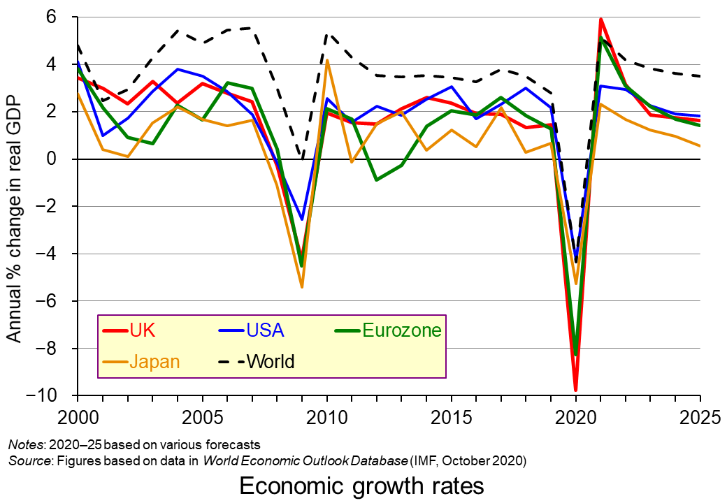 In essence the picture is similar to that painted in April. The IMF predicts a large-scale fall in GDP and rise in unemployment, government borrowing and government debt for 2020 (compared with 2019) across virtually all countries.
World real GDP is predicted to fall by 4.4%. For many countries the fall will be much steeper. In the UK, GDP is predicted to fall by 9.8%; in the eurozone, by 8.3%; in India, by 10.3%; in Italy, by 10.8%; in Spain, by 12.8%. 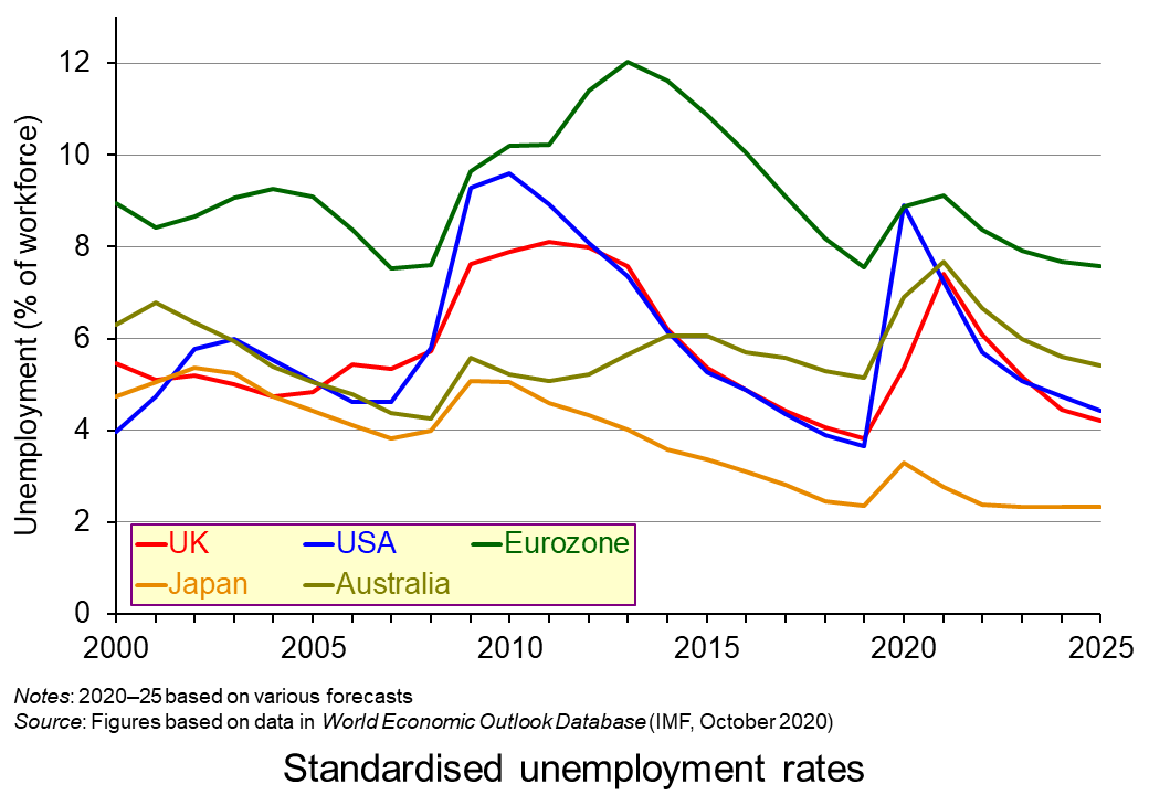 There will then be somewhat of a ‘bounce back’ in GDP in 2021, but not to the levels of 2019. World real GDP is predicted to rise by 5.2% in 2021. (Click here for a PowerPoint of the growth chart.)
Unemployment will peak in some countries in 2020 and in others in 2021 depending on the speed of recovery from recession and the mobility of labour. (Click here for a PowerPoint of the unemployment chart.)
 Inflation is set to fall from already low levels. Several countries are expected to see falling prices.
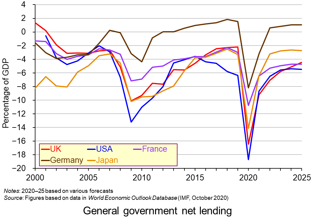
Government deficits (negative net lending) will be sharply higher in 2020 as a result of government measures to support workers and firms affected by lockdowns and falling demand. Governments will also receive reduced tax revenues. (Click here for a PowerPoint of the general government net lending chart.)
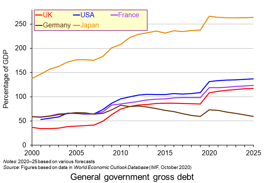 Government debt will consequently rise more rapidly. Deficits are predicted to fall in 2021 as economies recover and hence the rise in debt will slow down or in some cases, such as Germany, even fall. (Click here for a PowerPoint of the general government gross debt chart.)
After the rebound in 2021, global growth is then expected to slow to around 3.5% by 2025. This compares with an average of 3.8% from 2000 to 2019. Growth of advanced economies is expected to slow to 1.7%. It averaged 1.9% from 2000 to 2019. For emerging market and developing countries it is expected to slow to 4.7% from an average of 5.7% from 2000 to 2019. These figures suggest some longer-term scarring effects from the pandemic.
Uncertainties
 In the short term, the greatest uncertainty concerns the extent of the second wave, the measures put in place to contain the spread of the virus and the compensation provided by governments to businesses and workers. The WEO report was prepared when the second wave was only just beginning. It could well be that countries will experience a deeper recession in 2000 and into 2021 than predicted by the IMF.
This is recognised in the forecast.
The persistence of the shock remains uncertain and relates to factors inherently difficult to predict, including the path of the pandemic, the adjustment costs it imposes on the economy, the effectiveness of the economic policy response, and the evolution of financial sentiment.
With some businesses forced to close, others operating at reduced capacity because of social distancing in the workplace and with dampened demand, many countries may find output falling again. The extent will to a large extent depend on the levels of government support.
In the medium term, it is assumed that there will be a vaccine and that economies can begin functioning normally again. However, the report does recognise the long-term scarring effects caused by low levels of investment, deskilling and demotivation of the parts of the workforce, loss of capacity and disruptions to various supply chains.
The deep downturn this year will damage supply potential to varying degrees across economies. The impact will depend on various factors … including the extent of firm closures, exit of discouraged workers from the labour force, and resource mismatches (sectoral, occupational and geographic).
 One of the greatest uncertainties in the medium term concerns the stance of fiscal and monetary policies. Will governments continue to run large deficits to support demand or will they attempt to reduce deficits by raising taxes and/or reducing benefits and/or cutting government current or capital expenditure?
Will central banks continue with large-scale quantitative easing and ultra-low or even negative interest rates? Will they use novel forms of monetary policy, such as directly funding government deficits with new money or providing money directly to citizens through a ‘helicopter’ scheme (see the 2016 blog, New UK monetary policy measures – somewhat short of the kitchen sink)?
Forecasting at the current time is fraught with uncertainty. However, reports such as the WEO are useful in identifying the various factors influencing the economy and how seriously they may impact on variables such as growth, unemployment and government deficits.
Report, speeches and data
- World Economic Outlook, October 2020: A Long and Difficult Ascent
IMF, Report (October 2020)
- World Economic Outlook Databases
IMF (October 2020)
- “We Must Take the Right Actions Now!”—Opening Remarks for Annual Meetings Press Conference
IMF, Speech, Kristalina Georgieva, IMF Managing Director (14/10/20)
 Press Briefing: World Economic Outlook
IMF, Gita Gopinath, Chief Economist and Director of the Research Department, IMF; Gian Maria Milesi-Ferretti, Deputy Director, Research Department, IMF; Malhar Shyam Nabar, Division Chief, Research Department, IMF; Moderator: Raphael Anspach, Senior Communications officer, Communications Department, IMF (13/10/20)
Articles
Questions
- Explain what is meant by ‘scarring effects’. Identify various ways in which the pandemic is likely to affect aggregate supply over the longer term.
- Consider the arguments for and against governments continuing to run large budget deficits over the next few years.
- What are the arguments for and against using ‘helicopter money’ in the current circumstances?
- On purely economic grounds, what are the arguments for imposing much stricter lockdowns when Covid-19 rates are rising rapidly?
- Chose two countries other than the UK, one industrialised and one developing. Consider what policies they are pursuing to achieve an optimal balance between limiting the spread of the virus and protecting the economy.
 In a little over a decade economies around the world have experienced two ‘once-in-a-lifetime’ shocks. First, there was the global financial crisis of the late 2000s, which saw an unsustainable expansion of banks’ balance sheets that resulted in a global economic slowdown. Now in 2020, a global health emergency has meant unprecedented falls in economic activity. In both cases, the public sector has been the economy’s shock absorber but this has had dramatic effects on its financial wellbeing. We consider here the effect on the UK public finances and reflect on their sustainability in light of the recent Fiscal Sustainability Report published by the Office of Budget Responsibility (OBR).
The COVID-19 pandemic saw the government initiate a range of fiscal interventions to support people and businesses. Interventions directly affecting public-sector spending included a series of employment support measures. These included the Coronavirus Job Retention Scheme, commonly referred to as the furlough scheme, the Self-employed Income Support scheme, a ‘Kickstart Scheme’ of work placements for universal credit recipients aged between 16 and 24 and a ‘Job Retention Bonus’ whereby employers can receive a one-off payment of £1,000 for every furloughed employee continuously employed from the cessation of the Job Retention Scheme on 31 October through to 31 January 2021.
Further spending interventions have included small business grant schemes, such as the Coronavirus Small Business Grant Fund, the coronavirus Retail, Hospitality and Leisure Grant Fund and the Coronavirus Local Authority Discretionary Grants Fund.
Meanwhile, taxation relief measures have included a business rates holiday for retail, hospitality and leisure businesses and a reduced rate of VAT of 5 per cent for hospitality, accommodation and attractions until 12 January 2021.
OBR’s central scenario
The OBR in its Fiscal Stability Report in July 2020 attempts to assess the wellbeing of the public finances not just in the short term but in the medium and longer term too. This longer-term perspective allows it to assess the sustainability of the public finances.
 Its analysis is based on some key assumptions, including population growth and future demands on public services, but, understandably, the timing of this report has necessitated some key assumptions around path of the economy, including the extent to which the economy will experience scarring effects, also known as hysteresis effects. While the analysis does not incorporate the Chancellor’s measures announced in its summer statement on the 8 July, including the kickstart scheme, job retention bonus and the reduced rate of VAT, which would have a material effect on this year’s numbers, the OBR concludes that there would be less significant impact on its medium-term analysis.
In what it describes as its ‘central scenario’ the OBR forecasts that national output (real GDP) will fall by 12 per cent in 2020 before growing by 9 per cent in 2021 and 4 per cent in 2022. National output therefore reaches its pre-virus peak at the end of 2022. However, 20 quarters on from the pandemic shock in Q1 2020 output is estimated to be 3.2 per cent less than it would otherwise have been, while the cumulative loss of output is expected to be 6.4 per cent over the period. The cumulative loss of output in the 20 quarters following the financial crisis (Q2 2008) is estimated to have been 9.3 per cent of actual cumulative output.
While national output is expected to be permanently lower because of the pandemic, consistent with hysteresis, the forecast assumes that the longer-term growth rate is unaffected. In other words, there is not expected to be what some now refer to as ‘super hysteresis’, whereby the scarring effects have persistent effects on rates of capital accumulation, innovation and productivity, which therefore depress structural economic growth rates.
Meanwhile, the unemployment rate is expected to peak at 11.9 per cent in the final quarter of this year, before falling to 8.8 per cent in Q4 2021 and 6.3 per cent in Q4 2022. By Q4 2025 the unemployment rate is forecast to be 5.1 per cent, one percentage point higher than the OBR was forecasting at the time of the Budget in March.
Spending and receipts
Chart 1 shows shows the predicted paths of (nominal) public-sector receipts and expenditures as a percentage of (nominal) GDP. Receipts are expected come in at £740 billion this financial year (excluding the impact of the summer statement measures), some £133 billion lower than was forecast at the time of the March budget. This will amount to a 10 per cent fall in receipts in the financial year, driven by a much-shrunken economy. However, the fact that nominal GDP falls somewhat more means that the receipts-to-GDP ratio ticks up slightly. (Click here for a PowerPoint of the chart.)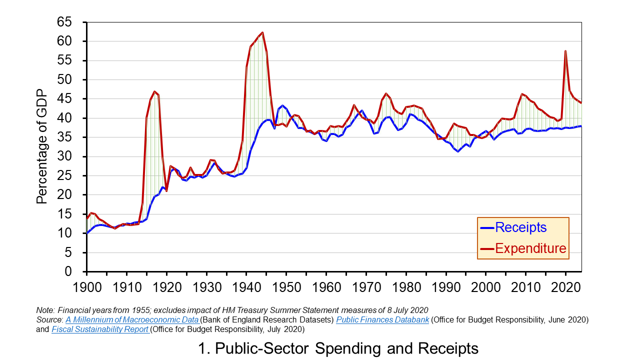
Public-sector spending is expected to be higher in 2020/21 than was forecast in the March by £135 million (excluding the summer statement measures) reflecting the COVID-19 interventions. This would result in spending rising to £1.06 trillion, a 20 per cent rise in the financial year. It would also mean that public-sector spending as a share of GDP rises to 54 per cent – its highest since 1945/46.
Going forward, in cash terms receipts are permanently lower than forecast because GDP is lower, though as a share of GDP cash receipts increase very slightly, but remain below what was expected at the time of the March budget. Spending in cash terms is expected to fall back by close to 8 per cent next financial year before increasing by 3 per cent per year up to 2024/25. This means that the spending-to-GDP ratio falls back to around 43 per cent by 2024/25, a couple of percentage points higher than was forecast back in March.
Deficits and debt
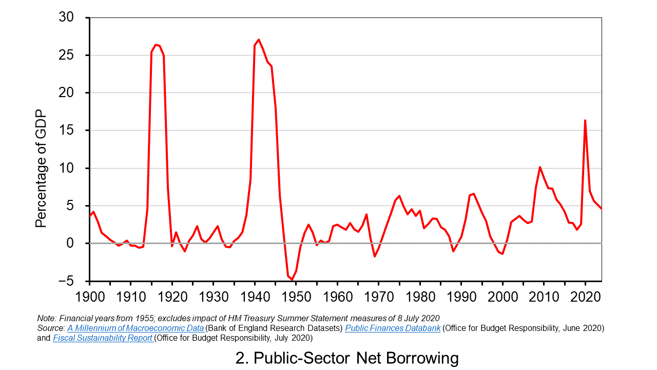
The difference between spending and receipts is known as public-sector net borrowing. While the extent of borrowing can be inferred by inspection of Chart 1, it can be seen more readily in Chart 2 which plots the path of public-sector net borrowing as a share of GDP.
The OBR is now forecasting a budget deficit of £322 billion (excluding the summer statement measures) in 2020/21 compared to £55 billion at the time of the March Budget. This would be equivalent to over 16 per cent of GDP, the highest since the Second World War. In a follow-up presentation on the Fiscal Stability Report on the 14 July the OBR suggested that the inclusion of summer statement measures could mean the deficit being as high as £375 billion, implying a deficit-to-GDP ratio of just shy of 19 per cent. (Click here for a PowerPoint of the chart.)
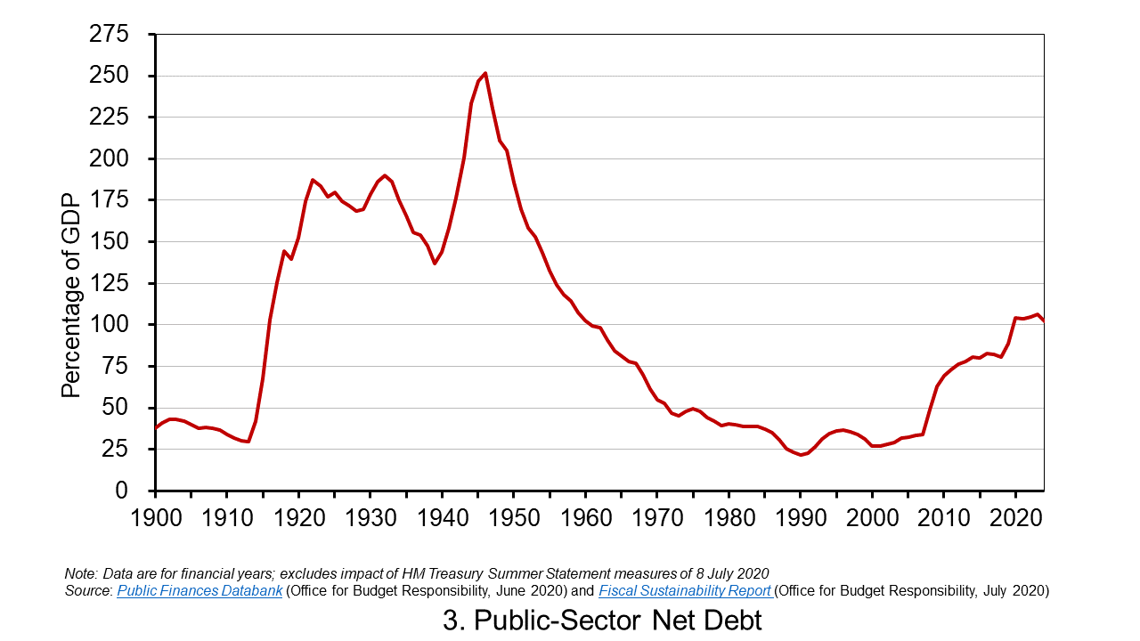
Deficits represent borrowing and are therefore a flow concept. The accumulated deficits over the years (minus any surpluses) gives total debt, which is a stock concept. The public-sector’s net debt is its gross debt less its liquid assets, principally deposits held with financial institutions and holdings of international reserves. This is also affected by Bank of England interventions, such as the Term Funding Scheme which enables banks and building societies to borrow funds at close to Bank Rate for up to four years. Nonetheless, the key driver of net debt-to-GDP ratio going forward is the persistence of deficits.
Chart 3 shows the expected path of the net debt-to-GDP ratio. The OBR expects this to exceed 100 per cent in 2020/21 for the first time since 1960/61. This reflects an increase in cash terms of the stock of net debt to £2.2 trillion, up from £1.8 trillion at the end of 2019/20, as well as a fall in GDP. By 2024/25 the net debt stock is expected to have risen to £2.6 trillion, £600 billion more than expected at the time of the March budget, with the net debt-to-GDP ratio still above 100 per cent at 102.1 per cent. (Click herefor a PowerPoint of the chart.)
Sustainability
The higher debt-to-GDP ratio raises longer-term questions about the sustainability of the public finances. The government is currently reviewing its fiscal rules and is expected to report back in time for the autumn budget. A key question is what debt-stabilising level might be considered appropriate. Is it the 102 per cent that the OBR is predicting at the end of 2024/25 (the medium-term horizon)? Or is it the 75 per cent that was being forecast for this point back in the March budget? This has profound implications for the fiscal arithmetic and, specifically, for the primary balance (the difference between non-interest spending and receipts) that the public sector needs to run.
If the government accepts a higher debt-to-GDP ratio as a ‘new norm’ that eases the fiscal arithmetic somewhat. However, some economists would be concerned about the economic consequences of larger public-sector debts, most notably so-called potential crowding-out effects on private-sector investment if upward pressure on interest rates was to materialise (see the news item MMT – a Magic Money Tree or Modern Monetary Theory?).
Even if the higher stabilising debt level was deemed appropriate, the OBR’s report analysis suggests problems in the government meeting this because it could still be running a primary deficit of 3.7 per cent of GDP by 2024/25. Therefore, even with interest rates expected to be lower than economic growth rates in 2024/25 (a negative growth-corrected interest rate) that enable governments to run primary deficits and yet maintain debt-to-GDP ratios, the debt-stabilising primary deficit for 2024/25 is estimated at only 3.2 per cent. All in all, this points to difficult fiscal choices ahead.
Articles
Questions
- What do you understand by the term financial wellbeing? What might this mean in respect of the government?
- What is meant by the fiscal arithmetic of government debt? Explain the factors that determine the fiscal arithmetic and the path of government debt?
- What is the difference between an increase in the size of a government deficit and an increase in the stock of government debt?
- Discuss the economic argument that, following the COVID-19 pandemic, government should avoid a return to an agenda of fiscal austerity ?
- What is the difference between the budget deficit, the primary deficit and the structural deficit?
- What are hysteresis effects? Discuss their relevancy in the design of the UK’s COVID-19 interventions.
 Boris Johnson gave a speech on 30 June outlining his government’s approach to recovery from the sharpest recession on record. With the slogan ‘Build, build, build’, he said that infrastructure projects were the key to stimulating the economy. Infrastructure spending is a classic Keynesian response to recession as it stimulates aggregate demand allowing slack to be taken up, while also boosting aggregate supply, thereby allowing recovery in output while increasing potential national income.
A new ‘New deal’
He likened his approach to that of President Franklin D Roosevelt’s New Deal. This was a huge stimulus between 1933 and 1939 in an attempt to lift the US economy out of the Great Depression. There was a massive programme of government spending on construction projects, such as hospitals, schools, roads, bridges and dams, including the Hoover Dam and completing the 113-mile Overseas Highway connecting mainland Florida to the Florida Keys. Altogether, there were 34 599 projects, many large-scale. In addition, support was provided for people on low incomes, the unemployed, the elderly and farmers. Money supply was expanded, made possible by leaving the Gold Standard in 1934.
 There was some debate as to whether the New Deal could be classed as ‘Keynesian’. Officially, the administration was concerned to achieve a balanced budget. However, it had a separate ’emergency budget’, from which New Deal spending was financed. According to estimates by the Federal Reserve Bank of St Louis, the total extra spending amounted to nearly 40% of US GDP as it was in 1929.
By comparison with the New Deal, the proposals of the Johnson government are extremely modest. Mostly it amounts to bringing forward spending already committed. The total of £5 billion is just 0.2% of current UK GDP.
Focusing on jobs
A recent report published by the Resolution Foundation, titled ‘The Full Monty‘, argues that as the Job Retention Scheme, under which people have been furloughed on 80% pay, is withdrawn, so unemployment is set to rise dramatically. The claimant count has already risen from 1.2m to 2.8m between March and May with the furlough scheme in place.
 Policy should thus focus on job creation, especially in those sectors likely to experience the largest rise in unemployment. Such sectors include non-food retail, hospitality (pubs, restaurants, hotels, etc.), public transport, the arts, entertainment and leisure and a range of industries servicing these sectors. What is more, many of the people working in these sectors are young and low paid. Many will find it difficult to move to jobs elsewhere – partly because of a lack of qualifications and partly because of a lack of alternative jobs. The rising unemployment will raise inequality.
The Resolution Foundation report argues that policy should be focused specifically on job creation.
Policy makers should act now to minimise outflows from the hard-hit sectors – a wage subsidy scheme or a National Insurance cut in those sectors would reduce labour costs and discourage redundancies. Alongside this, the Government must pursue radical action to create jobs across the country, such as in social care and housing retrofitting, and ramp up support for the unemployed.
Dealing with hyteresis
The economy is set to recover somewhat as the lockdown is eased, but it is not expected to return to the situation before the pandemic. Many jobs will be lost permanently unless government support continues.
Even then, many firms will have closed and others will have reassessed how many workers they need to employ and whether less labour-intensive methods would be more profitable. They may take the opportunity to consider whether technology, such as AI, can replace labour; or they may prefer to employ cheap telecommuters from India or the Philippines rather than workers coming into the office.
Policies to stimulate recovery will need to take these hysteresis effects into account if unemployment is to fall back to pre-Covid rates.
Videos
Articles
- Coronavirus: Boris Johnson pledges ‘new deal’ to build post-virus
BBC News (30/6/20)
- Boris Johnson hails his economic plan as a new ‘New Deal.’ Try ‘small deal’ instead
MarketWatch, Pierre Briançon (30/6/20)
- Boris Johnson announces state-led post-coronavirus relaunch
Financial Times, George Parker, Jim Pickard and Chris Giles (30/6/20)
- How does Boris Johnson’s ‘new deal’ compare with Franklin D Roosevelt’s?
The Guardian, Richard Partington (30/6/20)
- Coronavirus: Ministers urged to stave off ‘second wave’ of unemployment with major job creation plan
PoliticsHome, Matt Honeycombe-Foster (29/6/20)
- Biggest job creation package in peacetime needed to deflect increase in UK unemployment, think tank reports
Independent, Alan Jones (29/6/20)
- UK needs ‘biggest-ever peacetime job creation plan’ to stop mass unemployment
The Guardian, Richard Partington (29/6/20)
- The International Labour Organization was founded after the Spanish flu – its past lights the path to a better future of work
The Conversation, Huw Thomas, Frederick Harry Pitts and Peter Turnbull (17/6/20)
- Seven charts on the coronavirus jobs market
BBC News, By Lora Jones and Daniele Palumbo (16/6/20)
- Covid, hysteresis, and the future of work
Vox, Richard Baldwin (29/5/20)
- The economy won’t snap back after Covid-19
Financial Times, Tim Harford (5/6/20)
- Addressing The Covid-19 Shock -Keeping People In Work And Businesses Afloat
Forbes, Linda Yueh (20/3/20)
- Cutting labour taxes brings back the jobs lost to COVID-19
Vox, Christian Bredemeier, Falko Juessen and Roland Winkler (28/6/20)
Report
Questions
- What are the arguments for and against substantial increased government expenditure on infrastructure projects?
- Should the UK government spend more or less on such projects than the amount already pledged? Justify your answer.
- What are the arguments for and against directing all extra government expenditure towards green projects?
- Look through the Resolution Foundation report and summarise the findings of each of its sections.
- What are the arguments for and against directing all extra government expenditure towards those sectors where there is the highest rate of job losses?
- What form could policies to protect employment take?
- How should the success of policies to generate employment be measured?
- What form does hysteresis play on the post-Covid-19 labour market? What four shocks mean that employment will not simply return to the pre-Covid situation?
 Three international agencies, the IMF, the European Commission and the OECD, all publish six-monthly forecasts for a range of countries. As each agency’s forecasts have been published this year, so the forecasts for economic growth and other macroeconomic indicators, such as unemployment, have got more dire.
The IMF was the first to report. Its World Economic Outlook, published on 14 April, forecast that in the UK real GDP would fall by 6.5% in 2020 and rise by 4% in 2021 (not enough to restore GDP to 2019 levels); in the USA it would fall by 5.9% this year and rise by 4.7% next year; in the eurozone it would fall by 7.5% this year and rise by 4.7% next.
The European Commission was next to report. Its AMECO database was published on 6 May. This forecast that UK real GDP would fall by 8.3% this year and rise by 6% next; in the USA it would fall by 6.5% this year and rise by 4.9% next; in the eurozone it would fall by 7.7% this year and rise by 6.3% next.
The latest to report was the OECD on 10 June. The OECD Economic Outlook was the most gloomy. In fact, it produced two sets of forecasts.
The first, more optimistic one (but still more gloomy than the forecasts of the other two agencies) was based on the assumption that lockdowns would continue to be lifted and that there would be no second outbreak later in the year. This ‘single-hit scenario’ forecast that UK real GDP would fall by 11.5% this year and rise by 9% next (a similar picture to France and Italy); in the USA it would fall by 7.3% this year and rise by 4.1% next; in the eurozone it would fall by 9.1% this year and rise by 6.5% next.
The second set of OECD forecasts was based on the assumption that there would be a second wave of the virus and that lockdowns would have to be reinstated. Under this ‘double-hit scenario’, the UK’s GDP is forecast to fall by 14.0% this year and rise by 5.0 per cent next; in the USA it would fall by 8.5% this year and rise by 1.9% next; in the eurozone it would fall by 11.5% this year and rise by 3.5% next.
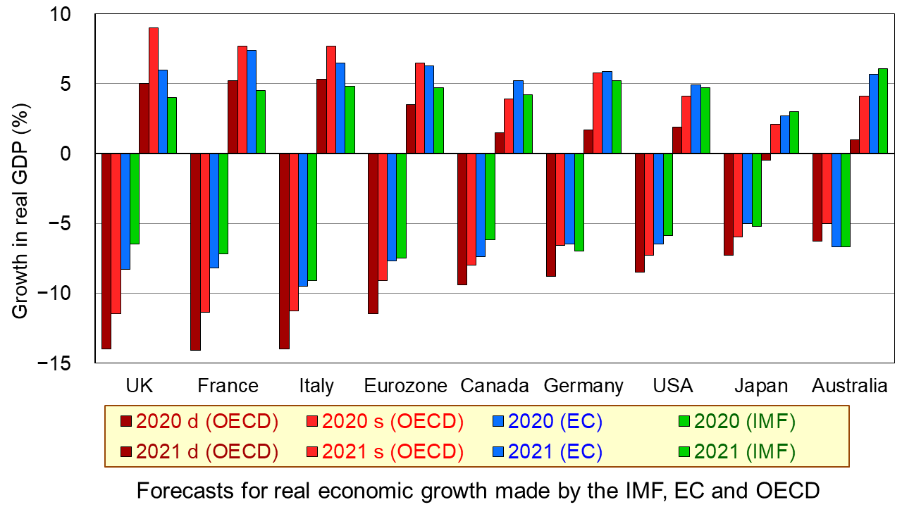
The first chart shows the four sets of forecasts (including two from the OECD) for a range of countries. The first four bars for each country are the forecasts for 2020; the other four bars for each country are for 2021. (Click here for a PowerPoint of the chart.)
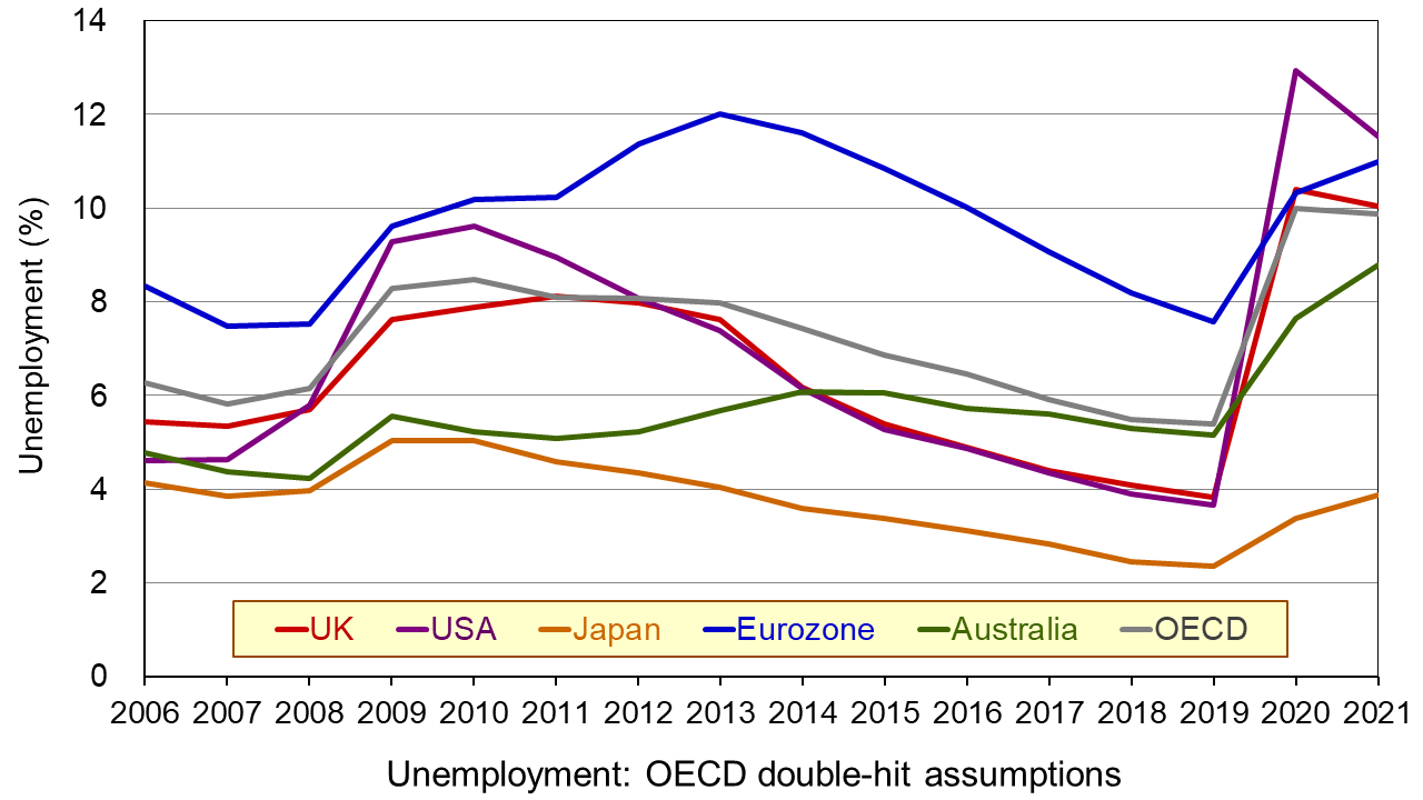
The second chart shows unemployment rates from 2006. The figures for 2020 and 2021 are OECD forecasts based on the double-hit assumption. You can clearly see the dramatic rise in unemployment in all the countries in 2020. In some cases it is forecast that there will be a further rise in 2021. (Click here for a PowerPoint of the chart.)
As the OECD states:
In both scenarios, the recovery, after an initial, rapid resumption of activity, will take a long time to bring output back to pre-pandemic levels, and the crisis will leave long-lasting scars – a fall in living standards, high unemployment and weak investment. Job losses in the most affected sectors, such as tourism, hospitality and entertainment, will particularly hit low-skilled, young, and informal workers.
But why have the forecasts got gloomier? There are both demand- and supply-side reasons.
Aggregate demand has fallen more dramatically than originally anticipated. Lockdowns have lasted longer in many countries than governments had initially thought, with partial lockdowns, which replace them, taking a long time to lift. With less opportunity for people to go out and spend, consumption has fallen and saving has risen. Businesses that have shut, some permanently, have laid off workers or they have been furloughed on reduced incomes. This too has reduced spending. Even when travel restrictions are lifted, many people are reluctant to take holidays at home and abroad and to use public transport for fear of catching the virus. This reluctance has been higher than originally anticipated. Again, spending is lower than before. Even when restaurants, bars and other public venues are reopened, most operate at less than full capacity to allow for social distancing. Uncertainty about the future has discouraged firms from investing, adding to the fall in demand.
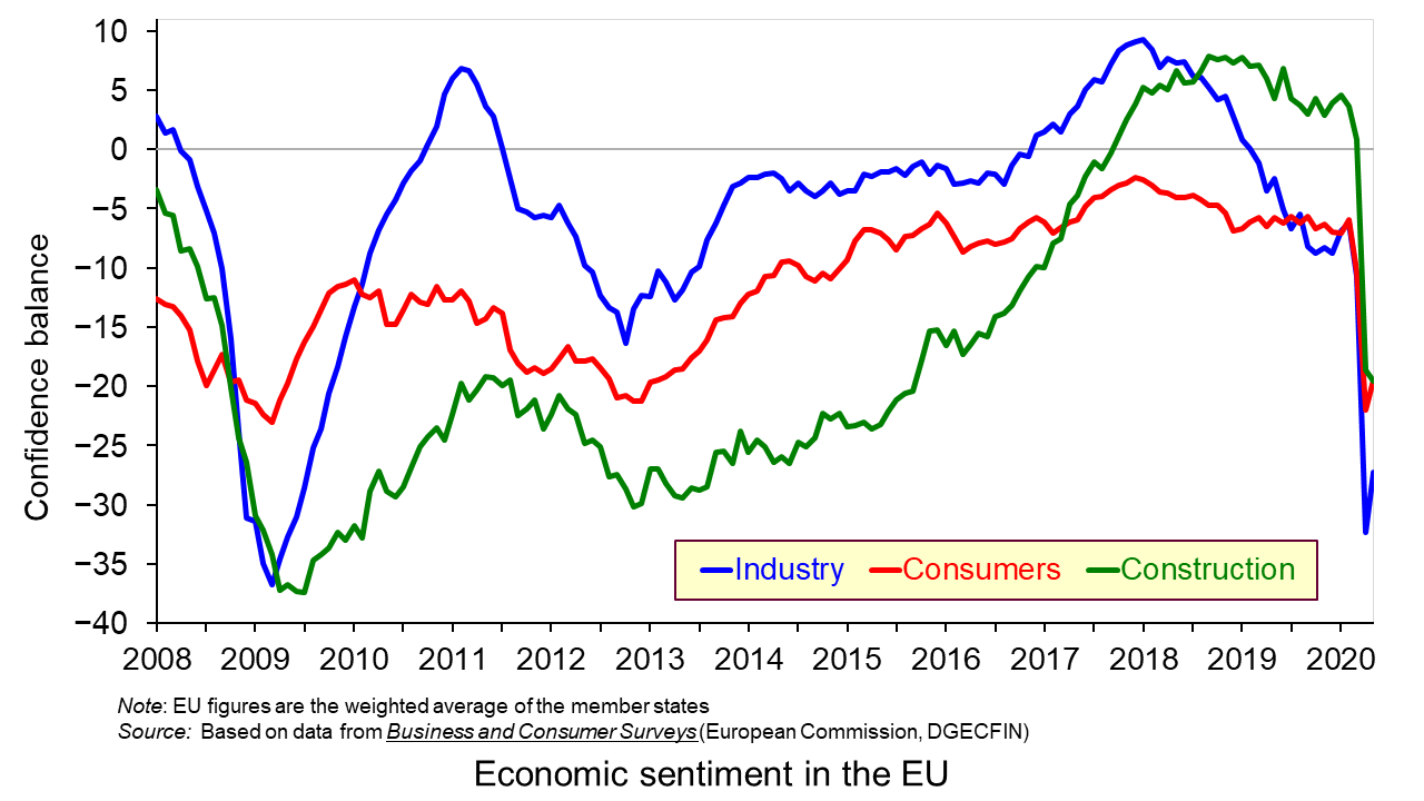
On the supply side, there has been considerable damage to capacity, with firms closing and both new and replacement investment being put on hold. Confidence in many sectors has plummeted as shown in the third chart which looks at business and consumer confidence in the EU. (Click here for a PowerPoint of the above chart.) Lack of confidence directly affects investment with both supply- and demand-side consequences.
Achieving a sustained recovery will require deft political and economic judgements by policymakers. What is more, people are increasingly calling for a different type of economy – one where growth is sustainable with less pollution and degradation of the environment and one where growth is more inclusive, where the benefits are shared more equally. As Angel Gurría, OECD Secretary-General, states in his speech launching the latest OECD Economic Outlook:
The aim should not be to go back to normal – normal was what got us where we are now.
Articles
OECD publications
Questions
- Why has the UK economy been particularly badly it by the Covid-19 pandemic?
- What will determine the size and timing of the ‘bounce back’?
- Why will the pandemic have “dire and long-lasting consequences for people, firms and governments”?
- Why have many people on low incomes faced harsher consequences than those on higher incomes?
- What are the likely environmental impacts of the pandemic and government measures to mitigate the effects?
 Pre-Covid 19, the climate change movement had gathered momentum with climate activist Greta Thunberg regularly in the news and people around the world striking in protest of inadequate government action on the climate crisis. However, now in a world overtaken by the pandemic, climate change is no longer at the centre and appears a more distant threat. The majority of the large climate change events due to take place this year have been delayed and policy announcements are aimed at supporting the current economic hardships. This is not surprising nor debatable, but there is a risk that, as Covid-19 dominates the news, policy and debates for a long time to come, this will overshadow any environmental initiatives that were due to be implemented.
Governments around the globe are navigating their economies through the pandemic and starting to think about the future road to recovery. However, there is an argument that it doesn’t have to be a case of ‘either or’, as there is the potential for policies to address the Covid-19 crisis and climate change at the same time. How policy makers respond now could shape the fight against climate change for the future. One of the lessons from the pandemic is that quick responses to high impact risks are vital to reduce costs. With that in mind, and given the costs of climate change, it is arguable that now is the best time to address its challenges.
Climate change and Covid
 It is estimated that there was a total global loss of $3tn caused by natural disasters over the past decade. By 2050, cumulative damages from climate change are predicted to reach $8 trillion, impoverishing the world as a whole by 3% of GDP and the poorest regions by more. Climate activists argue that despite the economic consequences of climate change, the action taken by governments has been insufficient. In 2015, the then Bank of England governor, Mark Carney warned: ‘Once climate change becomes a defining issue for financial stability, it may already be too late.’
However, since the pandemic struck all over the world, there have been positive consequences for the environment. Pollution levels started dropping fast as airlines grounded fleets, car travel came to a stop and industries shut down. With 2.6bn people living under restrictions under their country’s lockdown, there has also been an impact on the environment, not just the spread of the virus. Given that the lockdowns across the world have come at huge social and human costs, is now not the time to ensure that these improvements for the environment are not just temporary but ignite long-term changes?
 Given the clear impacts and risks of Covid on peoples’ health, our ability to change our behaviour quickly has been striking. The importance of behaviour change has been brought to the centre and, arguably, it shows that we are capable of change when lives are at risk and are deemed more important than business-as-usual GDP growth. The application to climate change, however, is not as straightforward, as the costs to human lives are often viewed as a future problem.
Global cooperation
Dr Laure de Preux, Assistant Professor of Economics at Imperial College Business School, highlights the important role that cooperation across borders plays in the face of a global crisis like Coronavirus, and how that can be applied to the fight against climate change.
The big challenges the world is facing, including the climate change crisis, can only be dealt with efficiently through international cooperation. We cannot only act individually; the benefits of our actions are multiplied if integrated into a global strategy. In the case of COVID-19, social distancing measures can only be truly effective if they are adopted at a large scale.
World leaders are aware that their economies now face one of the most severe recessions in history as a consequence of the coronavirus restrictions. Governments are going to have to dedicate huge budgets to enable the economic activity to resume again. This presents a unique challenge, but also a massive opportunity for global cooperation. The question to be asked, therefore, is that if these stimulus packages are a one-off chance to transform the economy, how should the government spend it and what should be their focus? Should the recovery policies focus on creating a greener economy?
 The European Union unveiled what it is calling the biggest ‘green’ stimulus package in history. Ursula von der Leyen, the European Commission president, told European Parliament members that this issue is about all nations and it is bigger than any one of them. The deputy Prime Minister of Spain, Teresa Ribera, states that there is a greater risk by not acting in this way. She argues that if the recovery is not green, then it will be nothing but a short-cut to solve the current problems rather than a true economic recovery.
It is not just in Europe where the recovery has an environment focus. Joe Biden is believed to be planning a similarly huge green stimulus package for the US. The model echoes the vast investment projects of the New Deal that helped lift America out of the Great Depression in the 1930s.
There are sound economic reasons why politicians see green technology as a prudent investment. Renewable energy is now often cheaper than fossil fuels in large parts of the world and the technologies are proven and can be built at scale today. The argument for renewables providing a pathway for clean future growth is based on the logic of much of manufacturing – the more you produce, the cheaper it gets. However, China does not appear to have similar plans for their recovery. China produces almost a third of the world’s emissions, as much as the USA and the EU combined. At the annual National People’s Congress, there was no indication that the big expansion of coal-fired electricity generation would be reversed, even though it is also expanding the production of renewable energy. China expanded its coal-fired power stations as a key part of its stimulus package after the 2008 financial crisis.
Policy decisions
 The UK government receives ongoing pressure from energy companies. The boss of energy giant SSE, Alistair Phillips-Davies has warned that a failure to deal with climate change could eventually have a greater economic impact than coronavirus. SSE wants the UK government to encourage private investment in renewables by giving the green light to big new projects, such as hydrogen and carbon capture plants and boosting electric vehicles. Despite the impacts of climate change not being immediately felt in comparison to Covid-19, Phillips-Davies argues that a failure to deal with climate change could lead to great long-term impacts:
While it is still too early to predict with confidence the full human, social and economic impact of coronavirus, we can say with certainty that significant investment will be needed to rebuild the UK economy in its wake.
It is clear that any pandemic-induced financial decisions made over the next 12 months will shape the global economy for the next decade. The full impact of the virus on climate change will be determined by the world’s stimulus measures adopted post-pandemic. Following the 2008 financial crisis, the energy-intensive stimulus measures that followed, particularly in China, boosted emissions. Therefore, if we are to meet the reduction in emissions target our response needs to be green, helping to shape a sustainable future. Dr Alex Koberle, of the Grantham Institute at Imperial College London, argues that Governments should take time to reflect, learn from past mistakes and redirect development towards a sustainable future.
Shouldn’t growth be given priority?
With 1.6 billion people working in the informal economy worldwide reckoned to be in immediate danger of losing their livelihoods (according to the International Labour Organization), is now the right time to be focusing on the climate? Industries such as airlines and car manufacturing are strategic industries, employing millions of people. Headlines of longer-term environmental targets will be given less importance than headlines of job losses. Recovery relies on the government finding ways to employ lots and lots of people. There is a close relationship between real GDP, employment and energy consumption. Therefore, any policies aimed at reducing greenhouse gas emissions, unless carefully directed, could reduce economic growth and employment for both less and more developed economies. Such policies would increase the cost of conventional energy sharply.
Critics of a green energy policy for recovery argue that investing in renewable energy ignores the adverse effects of reduced investment and higher energy costs in other sectors. By governments prioritising policy to focus on the environment, they could harm the ability of most people to improve their own circumstances, especially given the terrible economic shock caused by the lockdowns.
Conclusion
 With the majority of news in recent months providing little joy, there has been at least the positive impact on the environment. However, advocates say it not a cause for celebration and warn that any benefits are likely to be short lived. There have been some positive behavioural impacts but the true test will be what happens in the recovery phase. If the focus is returned to business as usual what happens to the targets actioned prior to Covid-19?
The immediate priority of all governments right now is to control the pandemic and to save lives. As their policy interventions have an impact and economies start to emerge from this crisis, then there is an important debate to be had about how new investments can help create a cleaner, greener recovery. We have learnt from the current pandemic that changes can be made when consequences are imminent, however, climate change is a threat that doesn’t go away, and is arguably just as urgent. Solutions to both crises can be integrated into a coherent response to propel the global economy towards sustainable growth and increased resilience.
Articles
Letter
Questions
- Are government attempts to reduce the impact of climate change beneficial or harmful to UK firms?
- What policy instruments can the government use to increase economic activity?
- How does an increase in investment affect aggregate demand?
- What are the costs and benefits of economic growth?
- Why can climate change be described as a market failure?
 Back in June, we examined the macroeconomic forecasts of the three agencies, the IMF, the OECD and the European Commission, all of which publish forecasts every six months. The IMF has recently published its latest World Economic Outlook (WEO) and its accompanying database. Unlike the April WEO, which, given the huge uncertainty surrounding the pandemic and its economic effects, only forecast as far as 2021, the latest version forecasts as far ahead as 2025.
 In essence the picture is similar to that painted in April. The IMF predicts a large-scale fall in GDP and rise in unemployment, government borrowing and government debt for 2020 (compared with 2019) across virtually all countries.
  There will then be somewhat of a ‘bounce back’ in GDP in 2021, but not to the levels of 2019. World real GDP is predicted to rise by 5.2% in 2021. (Click here for a PowerPoint of the growth chart.)
 Inflation is set to fall from already low levels. Several countries are expected to see falling prices.
  Government debt will consequently rise more rapidly. Deficits are predicted to fall in 2021 as economies recover and hence the rise in debt will slow down or in some cases, such as Germany, even fall. (Click here for a PowerPoint of the general government gross debt chart.)
 In the short term, the greatest uncertainty concerns the extent of the second wave, the measures put in place to contain the spread of the virus and the compensation provided by governments to businesses and workers. The WEO report was prepared when the second wave was only just beginning. It could well be that countries will experience a deeper recession in 2000 and into 2021 than predicted by the IMF.
 One of the greatest uncertainties in the medium term concerns the stance of fiscal and monetary policies. Will governments continue to run large deficits to support demand or will they attempt to reduce deficits by raising taxes and/or reducing benefits and/or cutting government current or capital expenditure?
  Press Briefing: World Economic Outlook
 In a little over a decade economies around the world have experienced two ‘once-in-a-lifetime’ shocks. First, there was the global financial crisis of the late 2000s, which saw an unsustainable expansion of banks’ balance sheets that resulted in a global economic slowdown. Now in 2020, a global health emergency has meant unprecedented falls in economic activity. In both cases, the public sector has been the economy’s shock absorber but this has had dramatic effects on its financial wellbeing. We consider here the effect on the UK public finances and reflect on their sustainability in light of the recent
  Its analysis is based on some key assumptions, including population growth and future demands on public services, but, understandably, the timing of this report has necessitated some key assumptions around path of the economy, including the extent to which the economy will experience scarring effects, also known as hysteresis effects. While the analysis does not incorporate the Chancellor’s measures announced in its summer statement on the 8 July, including the kickstart scheme, job retention bonus and the reduced rate of VAT, which would have a material effect on this year’s numbers, the OBR concludes that there would be less significant impact on its medium-term analysis.


 Boris Johnson gave a speech on 30 June outlining his government’s approach to recovery from the sharpest recession on record. With the slogan ‘Build, build, build’, he said that infrastructure projects were the key to stimulating the economy. Infrastructure spending is a classic Keynesian response to recession as it stimulates aggregate demand allowing slack to be taken up, while also boosting aggregate supply, thereby allowing recovery in output while increasing potential national income.
 There was some debate as to whether the New Deal could be classed as ‘Keynesian’. Officially, the administration was concerned to achieve a balanced budget. However, it had a separate ’emergency budget’, from which New Deal spending was financed. According to estimates by the Federal Reserve Bank of St Louis, the total extra spending amounted to nearly 40% of US GDP as it was in 1929.
 Policy should thus focus on job creation, especially in those sectors likely to experience the largest rise in unemployment. Such sectors include non-food retail, hospitality (pubs, restaurants, hotels, etc.), public transport, the arts, entertainment and leisure and a range of industries servicing these sectors. What is more, many of the people working in these sectors are young and low paid. Many will find it difficult to move to jobs elsewhere – partly because of a lack of qualifications and partly because of a lack of alternative jobs. The rising unemployment will raise inequality.
 Three international agencies, the IMF, the European Commission and the OECD, all publish six-monthly forecasts for a range of countries. As each agency’s forecasts have been published this year, so the forecasts for economic growth and other macroeconomic indicators, such as unemployment, have got more dire.


 Pre-Covid 19, the climate change movement had gathered momentum with climate activist Greta Thunberg regularly in the news and people around the world striking in protest of inadequate government action on the climate crisis. However, now in a world overtaken by the pandemic, climate change is no longer at the centre and appears a more distant threat. The majority of the large climate change events due to take place this year have been delayed and policy announcements are aimed at supporting the current economic hardships. This is not surprising nor debatable, but there is a risk that, as Covid-19 dominates the news, policy and debates for a long time to come, this will overshadow any environmental initiatives that were due to be implemented.
 It is estimated that there was a total global loss of $3tn caused by natural disasters over the past decade. By 2050, cumulative damages from climate change are predicted to reach $8 trillion, impoverishing the world as a whole by 3% of GDP and the poorest regions by more. Climate activists argue that despite the economic consequences of climate change, the action taken by governments has been insufficient. In 2015, the then Bank of England governor, Mark Carney warned: ‘Once climate change becomes a defining issue for financial stability, it may already be too late.’
  The European Union unveiled what it is calling the biggest ‘green’ stimulus package in history. Ursula von der Leyen, the European Commission president, told European Parliament members that this issue is about all nations and it is bigger than any one of them. The deputy Prime Minister of Spain, Teresa Ribera, states that there is a greater risk by not acting in this way. She argues that if the recovery is not green, then it will be nothing but a short-cut to solve the current problems rather than a true economic recovery.
  The UK government receives ongoing pressure from energy companies. The boss of energy giant SSE, Alistair Phillips-Davies has warned that a failure to deal with climate change could eventually have a greater economic impact than coronavirus. SSE wants the UK government to encourage private investment in renewables by giving the green light to big new projects, such as hydrogen and carbon capture plants and boosting electric vehicles. Despite the impacts of climate change not being immediately felt in comparison to Covid-19, Phillips-Davies argues that a failure to deal with climate change could lead to great long-term impacts:
  With the majority of news in recent months providing little joy, there has been at least the positive impact on the environment. However, advocates say it not a cause for celebration and warn that any benefits are likely to be short lived. There have been some positive behavioural impacts but the true test will be what happens in the recovery phase. If the focus is returned to business as usual what happens to the targets actioned prior to Covid-19?