 According to the first estimate by the Office for National Statistics, the UK economy shrank by 0.3% in the final three months of 2012. This means that over the whole year growth was flat.
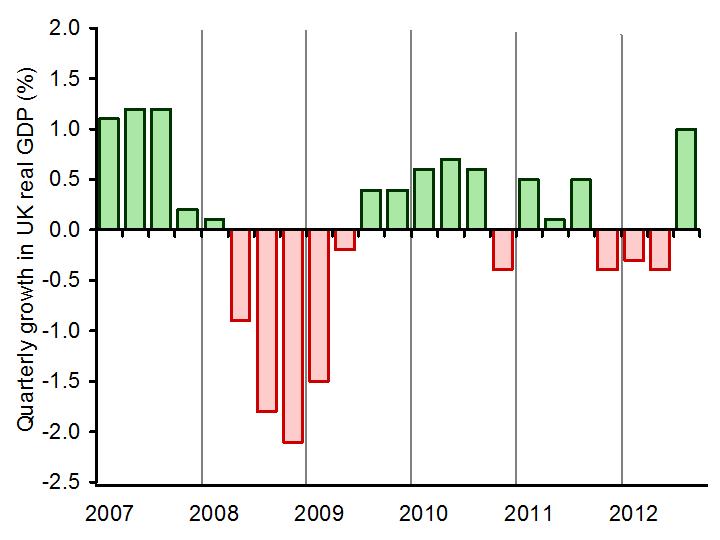
The biggest contributor to the fall in GDP in Q4 was the production industries, which include manufacturing. Output of the production sector fell by 1.8% in Q4. Construction sector output, by contrast, was estimated to have increased by 0.3%. Service sector output was flat. The chart below shows quarterly and annual growth in the UK from 2007 to 2012. (Click here for a PowerPoint.)
Latest estimates by the IMF are that the UK economy will grow by 1.0% in 2013 – well below the long-term growth in potential output (see also the last blog, High hopes in the Alps). But some forecasters are predicting that real GDP will continue to fall for at least one more quarter, which means that the economy would then be in a ‘triple-dip recession’.
 Not surprisingly politicians have interpreted the statistics very differently, as have economists. The government, while recognising that the UK faces a ‘very difficult economic situation’, argues that now is not the time to change course and that by continuing with policies to reduce the deficit the economy will be placed on a firmer footing for sustained long-term growth
The opposition claims that the latest figures prove that the government’s policies are not working and that continuing attempts to bear down on the deficit are depressing aggregate demand and thereby keeping the economy depressed.
The following webcasts, podcasts and articles expand on these arguments. Try to be dispassionate in using economic analysis and evidence to assess the arguments.
Webcasts and podcasts
 Video Summary: Gross Domestic Product Preliminary Estimate, Q4 2012 Media Briefing (Click here for the following Q&A) ONS (25/1/13)
 Triple dip on the menu? Channel 4 News, Siobhan Kennedy and Faisal Islam (25/1/13)
 Getting and spending – the key to recovery Channel 4 News, Cathy Newman (25/1/13)
 UK economy shrinks by 0.3% in the last three months of 2012 BBC News, Hugh Pym (25/1/13)
 Danny Alexander on GDP figures and economic plans BBC Daily Politics (25/1/13)
 Osborne defends government’s deficit reduction plan BBC News (25/1/13)
 Ed Balls: UK economy urgently needs a ‘Plan B’ BBC News (25/1/13)
 UK heads for triple dip as GDP contracts 0.3pc The Telegraph, Philip Aldrick (25/1/13)
 Economist: Government may need to rethink its fiscal policy The Telegraph, Jim O’Neill (25/1/13)
 Has austerity really been tried in Britain? BBC Today Programme, Jonathan Portes and Andrew Lilico (29/1/13)
Articles
UK GDP: Economy shrank at end of 2012 BBC News (25/1/13)
UK GDP shrinks by 0.3% in fourth quarter: what the economists say The Guardian (25/1/13)
New Bank of England head Mark Carney hints at big shift in policy The Guardian (26/1/13)
The Bank of England, the chancellor, and the target BBC News. Stephanie Flanders (29/1/13)
The Entire World Of Economics Is Secretly Thankful To The UK Right Now Business Insider, Joe Weisenthal (26/1/13)
Data
Gross Domestic Product: Preliminary Estimate, Q4 2012 ONS (25/1/13)
 Video Summary: Gross Domestic Product Preliminary Estimate, Q4 2012 ONS (25/1/13)
Preliminary Estimate of GDP – Time Series Dataset 2012 Q4 ONS (25/1/13)
Business and Consumer Surveys DG ECFIN
Questions
- What are the reasons for the decline in GDP in 2012 Q4??
- Examine how likely it is that the UK will experience a triple-dip recession.
- What measures could be adopted to increase consumer and business confidence?
- If there is substantial spare capacity, is expansionary fiscal policy the best means of achieving economic growth?
- What additional monetary policy measures could be adopted to stimulate economic growth?
- Find out what has happened to the UK’s public-sector deficit and debt over the past three years. Explain what has happened.
 What lies ahead for economic growth in 2013 and beyond? And what policies should governments adopt to aid recovery? These are questions examined in four very different articles from The Guardian.
The first is by Nouriel Roubini, Professor of Economics at New York University’s Stern School of Business. He was one of the few economists to predict the collapse of the housing market in the USA in 2007 and the credit crunch and global recession that followed. He argues that continuing attempts by banks, governments and individuals to reduce debt and leverage will mean that the advanced economies will struggle to achieve an average rate of economic growth of 1%. He also identifies a number of other risks to the global economy.
 In contrast to Roubini, who predicts that ‘stagnation and outright recession – exacerbated by front-loaded fiscal austerity, a strong euro and an ongoing credit crunch – remain Europe’s norm’, Christine Lagarde, head of the IMF and former French Finance Minister, predicts that the eurozone will return to growth. ‘It’s clearly the case’, she says, ‘that investors are returning to the eurozone, and resuming confidence in that market.’ Her views are echoed by world leaders meeting at the World Economic Forum in Davos, Switzerland, who are generally optimistic about prospects for economic recovery in the eurozone.
The third article, by Aditya Chakrabortty, economics leader writer for The Guardian, looks at the policies advocated at the end of World War II by the Polish economist, Michael Kalecki and argues that such policies are relevant today. Rather than responding to high deficits and debt by adopting tough fiscal austerity measures, governments should adopt expansionary fiscal policy, targeted at expanding infrastructure and increasing capacity in the economy. That would have an expansionary effect on both aggregate demand and aggregate supply. Sticking with austerity will result in continuing recession and the ‘the transfer of wealth and power into ever fewer hands.’
 But while in the UK and the eurozone austerity policies are taking hold, the new government in Japan is adopting a sharply expansionary mix of fiscal and monetary policies – much as Kalecki would have advocated. The Bank of Japan will engage in large-scale quantitative easing, which will become an open-ended commitment in 2014, and is raising its inflation target from 1% to 2%. Meanwhile the Japanese government has decided to raise government spending on infrastructure and other government projects.
So – a range of analyses and policies for you to think about!
Risks lie ahead for the global economy The Guardian, Nouriel Roubini (21/1/13)
Eurozone showing signs of recovery, says IMF chief The Guardian, Graeme Wearden (14/1/13)
Austerity? Call it class war – and heed this 1944 warning from a Polish economist The Guardian, Aditya Chakrabortty (14/1/13)
Bank of Japan bows to pressure with ‘epoch-making’ financial stimulus The Guardian, Phillip Inman (22/1/13)
Questions
- What are the dangers facing the global economy in 2013?
- Make out a case for sticking with fiscal austerity measures.
- Make out a case for adopting expansionary fiscal policies alongside even more expansionary monetary policies.
- Is is possible for banks to increase their capital-asset and liquidity ratios, while at the same time increasing lending to business and individuals? Explain.
- What are the implications of attempts to reduce public-sector deficits and debt on the distribution of income? Would it be possible to devise austerity policies that did not have the effect you have identified?
- What will be the effect of the Japanese policies on the exchange rate of the yen with other currencies? Will this be beneficial for the Japanese economy?
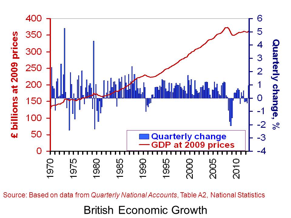
 We know two things about economic growth in a developed economy like the UK: it is positive over the longer term, but highly volatile in the short term. We can refer to these two facts as the twin characteristics of growth. The volatility of growth sees occasional recessions, i.e. two or more consecutive quarters of declining output. Since 1973, the UK has experienced six recessions.
Here we consider in a little more detail the growth numbers for the UK from the latest Quarterly National Accounts, focusing on the depth and duration of these six recessions. How do they compare?
The latest figures on British economic growth show that the UK economy grew by 0.9 per cent in the third quarter of 2012. However, when compared with the third quarter of 2011, output was essentially unchanged. This means that the annual rate of growth was zero. Perhaps even more telling is that output (real GDP) in Q3 2012 was still 3.0 per cent below its Q1 2008 level.
 The chart helps to put the recent output numbers into an historical context. It shows both the quarter-to-quarter changes in real GDP (right-hand axis) and the level of output as measured by GDP at constant 2009 prices (left-hand axis). It captures nicely the twin characteristics of growth. Since 1970, the average rate of growth each quarter has been 0.6 per cent. This is equivalent to an average rate of growth of 2.35 per cent per year. The chart also allows us to pin-point periods of recessions.
One way of comparing recessions is to compare their ‘2 Ds’: depth and duration. The table shows the number of quarters each of the six recessions since 1973 lasted. It also shows how much smaller the economy was by the end of each recession. In other words, it shows the depth of each recession as measured by the percentage reduction in output (real GDP).
British recessions
|
Duration (quarters) |
Depth (output lost, %) |
| 1973Q3–74Q1 |
3 |
3.25 |
| 1975Q2–75Q3 |
2 |
1.76 |
| 1980Q1–81Q1 |
5 |
4.63 |
| 1990Q3–91Q3 |
5 |
2.93 |
| 2008Q2–09Q2 |
5 |
6.28 |
| 2011Q4–12Q2 |
3 |
0.90 |
 According to the first estimate by the Office for National Statistics, the UK economy shrank by 0.3% in the final three months of 2012. This means that over the whole year growth was flat.
 Not surprisingly politicians have interpreted the statistics very differently, as have economists. The government, while recognising that the UK faces a ‘very difficult economic situation’, argues that now is not the time to change course and that by continuing with policies to reduce the deficit the economy will be placed on a firmer footing for sustained long-term growth
 Video Summary: Gross Domestic Product Preliminary Estimate, Q4 2012 Media Briefing (Click here for the following Q&A) ONS (25/1/13)
 Triple dip on the menu? Channel 4 News, Siobhan Kennedy and Faisal Islam (25/1/13)
 Getting and spending – the key to recovery Channel 4 News, Cathy Newman (25/1/13)
 UK economy shrinks by 0.3% in the last three months of 2012 BBC News, Hugh Pym (25/1/13)
 Danny Alexander on GDP figures and economic plans BBC Daily Politics (25/1/13)
 Osborne defends government’s deficit reduction plan BBC News (25/1/13)
 Ed Balls: UK economy urgently needs a ‘Plan B’ BBC News (25/1/13)
 UK heads for triple dip as GDP contracts 0.3pc The Telegraph, Philip Aldrick (25/1/13)
 Economist: Government may need to rethink its fiscal policy The Telegraph, Jim O’Neill (25/1/13)
 Has austerity really been tried in Britain? BBC Today Programme, Jonathan Portes and Andrew Lilico (29/1/13)
 Video Summary: Gross Domestic Product Preliminary Estimate, Q4 2012 ONS (25/1/13)